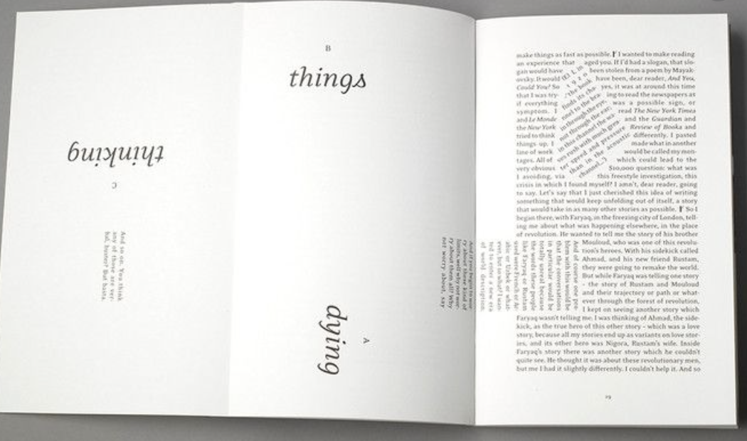
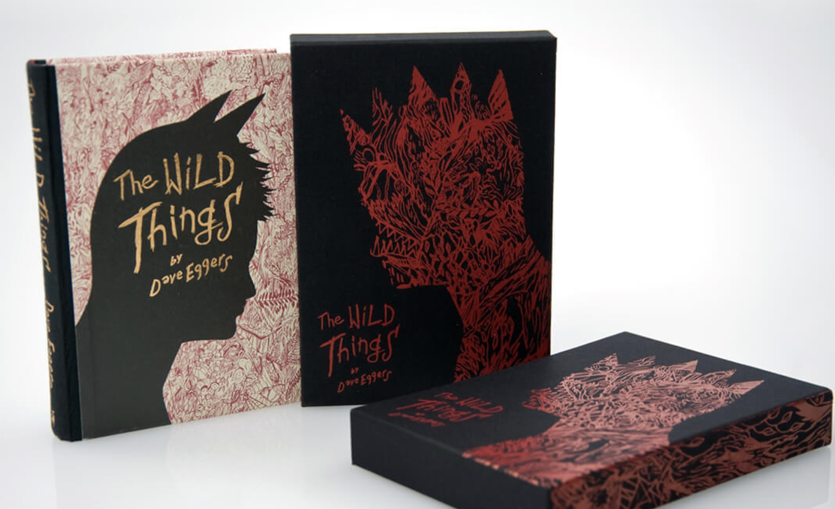
Brief: Create two books explaining and exploring the typographic and layout principles you have researched in this section.
Book 1: My Little Book of… Good Typography
Using reference material that you’ve gathered throughout the exercises and research tasks in Part 3, design a book which explores traditional ‘good practice’ in typography. What is readability and, as a designer, how can you aid it? Visually explain the typographic principles that we’ve touched on in part 3, such as type size, leading and line length. For example, you could demonstrate kerning by creating a page which looks at letter combinations applying this principle. Equally, explore good layouts and use grids to help support and design layouts that feel easy and engaging to read, and look at it. Be creative in how you do this, developing a range of options and possibilities. Show off your good typography skills as well as talking about what makes good typography in your text. To support this, find quotes and type rules by other typographers and examples of good typography within book design you can present and talk about. Your booklet should be a celebration of good typography, whatever you think that is.
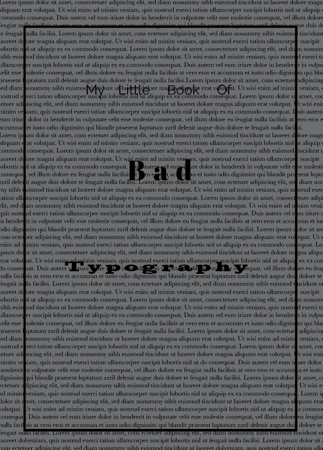
Book 2: My Little Book of… Bad Typography
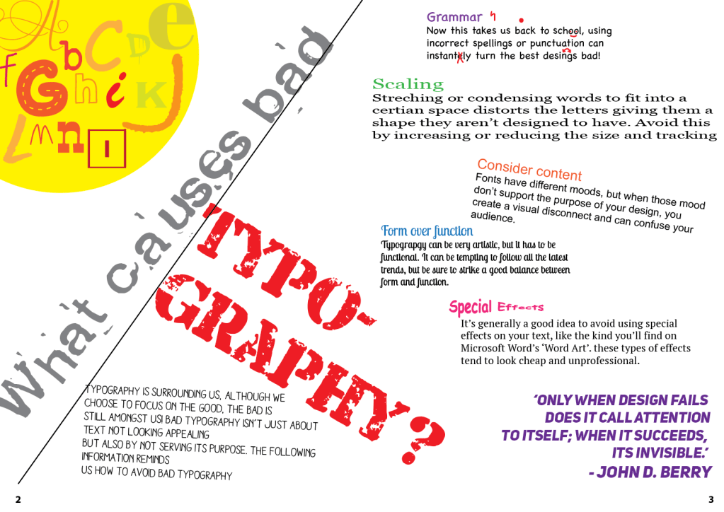
The rules surrounding what constitutes ‘good’ typography are entrenched in tradition and convention, as you demonstrated in book 1. Having looked at ‘the rules’ surrounding readability and legibility, now is your opportunity to break them! Be inventive and experimental in how you explore what might constitute ‘bad’ typography. For example, negative leading, too-long line length and ‘inappropriate’ application of typographic principles may produce visually jarring and uncomfortable results. what does ‘bad typography’ mean to you and how might it manifest itself? Express you ideas in a visually imaginative way within your second book. This is an opportunity to be playful and push your design layouts, typography and ideas to the limits – celebrate bad typography through your designs and content. Again, find quotations you can work with or examples of bad typography to draw on.
Your books should each take the form of a simple eight-page booklet – folded, stapled or stitched. Design the cover and contents for each. When creating your content for both books, be aware of your audience, and how you might want them to engage with your content. While both these books are about typography, make sure you also include images within the text. These could be your own illustrations, photographs, or stand alone typography pieces that accompany your text.
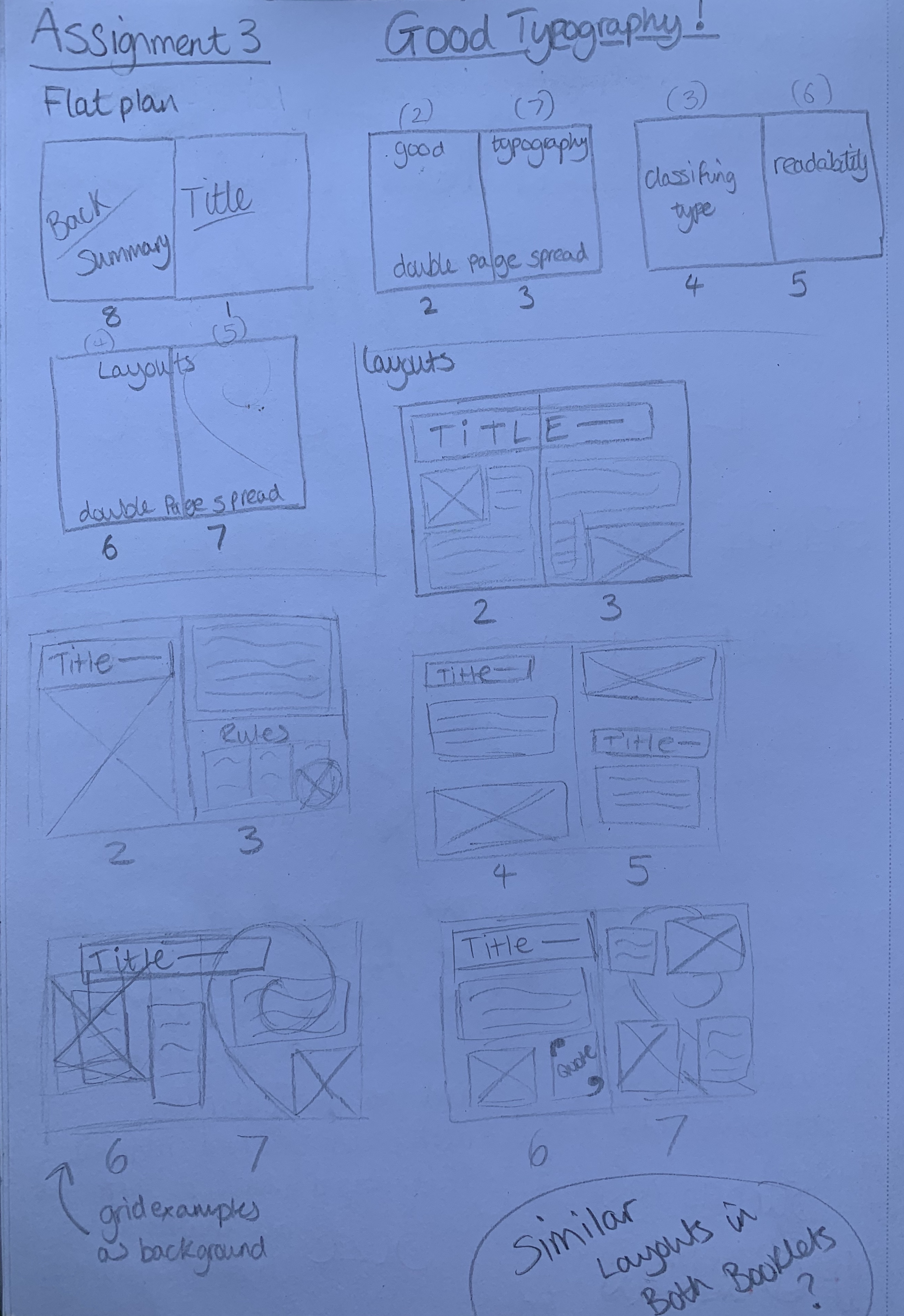
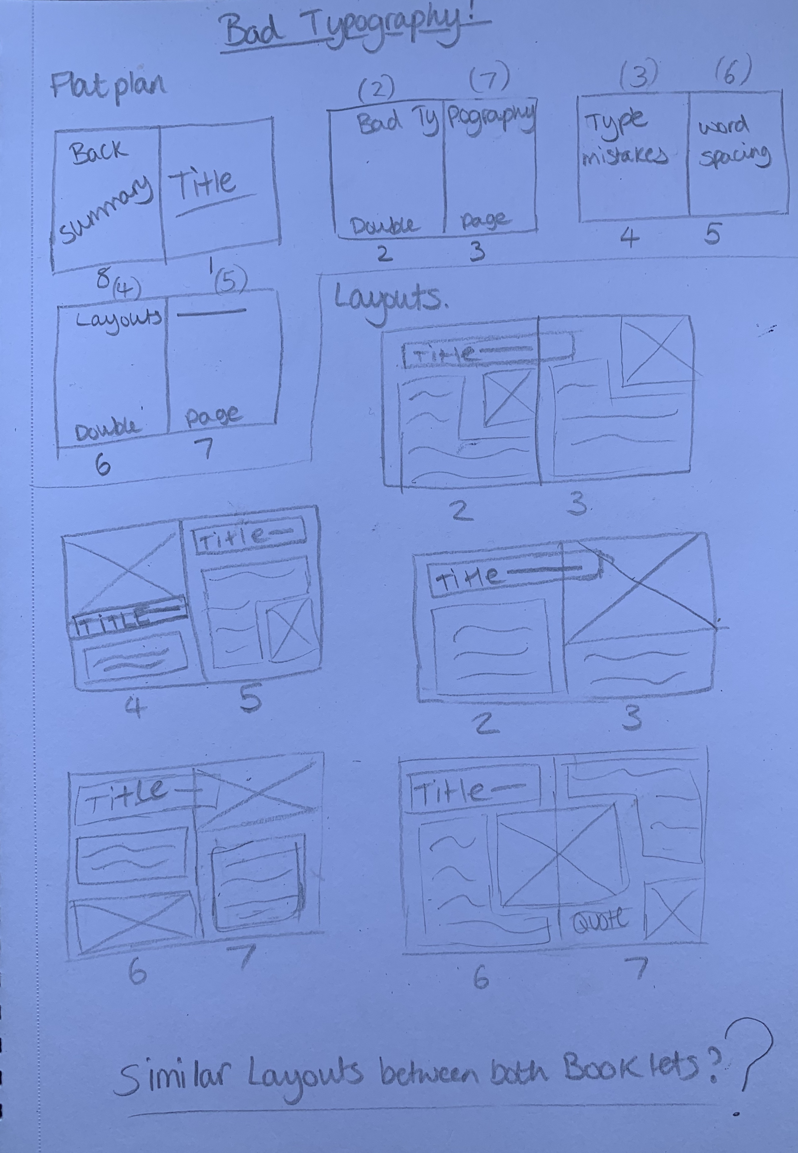
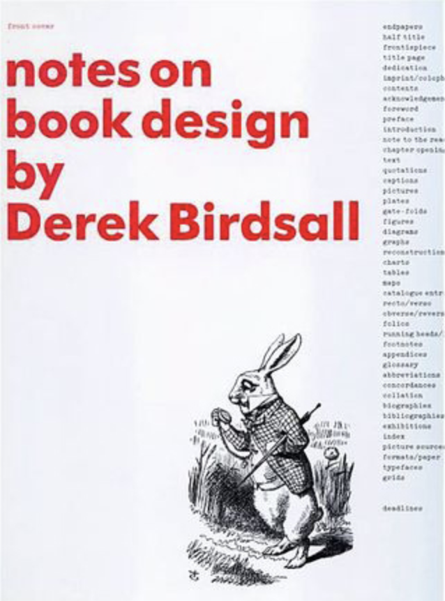
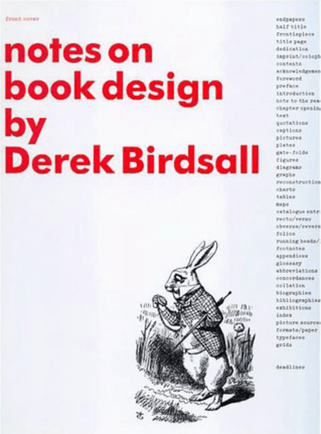
Use a flatplan to organise your content and indicate where important text and images occur, on a recto (right-hand) or verso (left-hand) page, or as a double page spread. Suggest images by a crossed box, as in the example for ‘front cover’ in the diagram on the previous page. These crossed rectangles indicate image boxes in desktop publishing (DTP) software, and are used in drafts and sketches to signify image material. There is no need to go into detailed drawing regarding text or image material at this stage. Text can be indicated by a series of thick horizontal lines, with main headings sketched in. Use the flatplan to familiarise yourself with the structure of a booklet. Note the blank pages and how they organised to complement the preceding or following page. Note the extent (number of pages) in the book and whether it has been printed in signatures, or sections.
Analysing the Brief:
This brief is split into two parts;
Book 1 : Good Typography – Design an 8 page booklet on good typography using the work gathered from previous exercises.
Objective – Create a booklet based on Good Typography explaining and exploring the typographic and layout principles you have researched in part 3.
Format – 8 page booklet, folded/stapled/stitched. Design cover and contents for each. Imagery and quotes as well as type
Other information – Visually explain typographic principles, show off your good typography skills as well as talking about what makes good typography – a celebration of good typography. Include title, rules & quotes
Target Audience – Everyone (particularly people with interest in design)
Keywords from brief – Reference materials, readability, type size, leading, line length, demonstrate principle, grids, quotes
Book 2 : Bad Typography – Design an 8 page booklet on bad typography. Break the rules surrounding readability and legibility.
Objective – Create a booklet based on Bad Typography. What does bad typography mean and how it manifests itself. Break the traditional typography rules.
Format – 8 page booklet, folded/stapled/stitched. Design a cover and contents, use imagery and quotes as well as type.
Other information- Be inventive and experimental in how you explore what mights constitute as bad typography.
Target audience – Everyone (particularly people with interest in design)
Keywords from brief – Inventive, experimental, negative leading, too long line length, visually jarring, playful
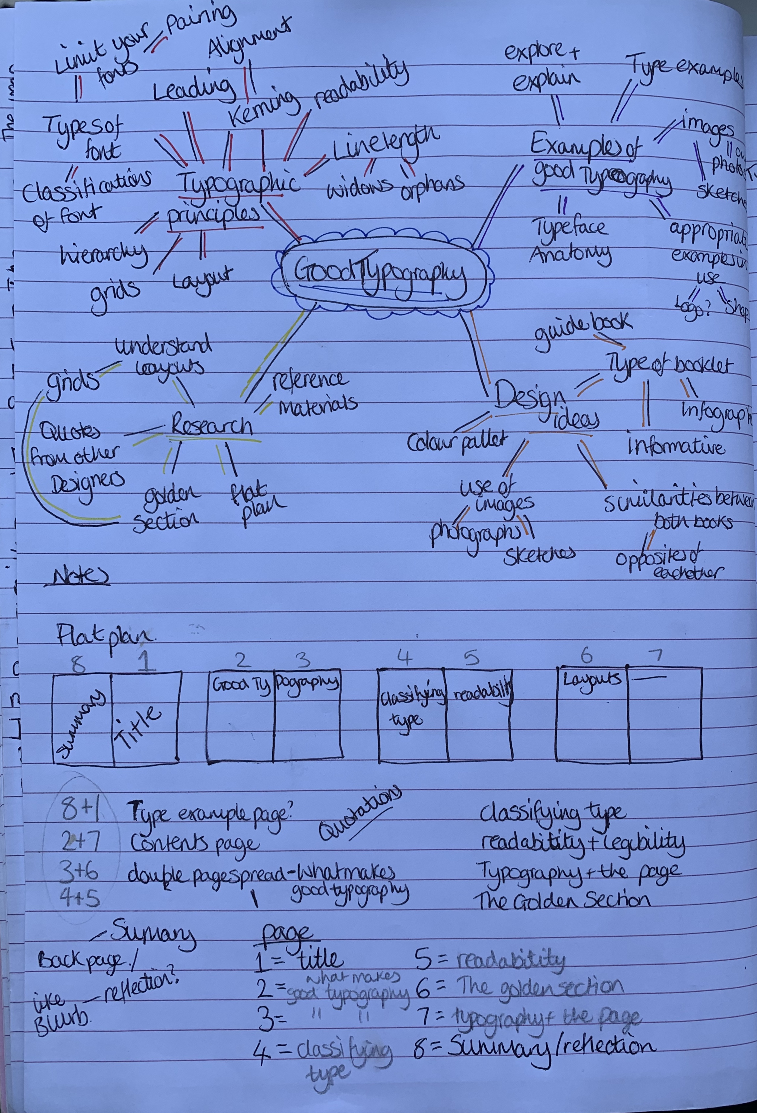
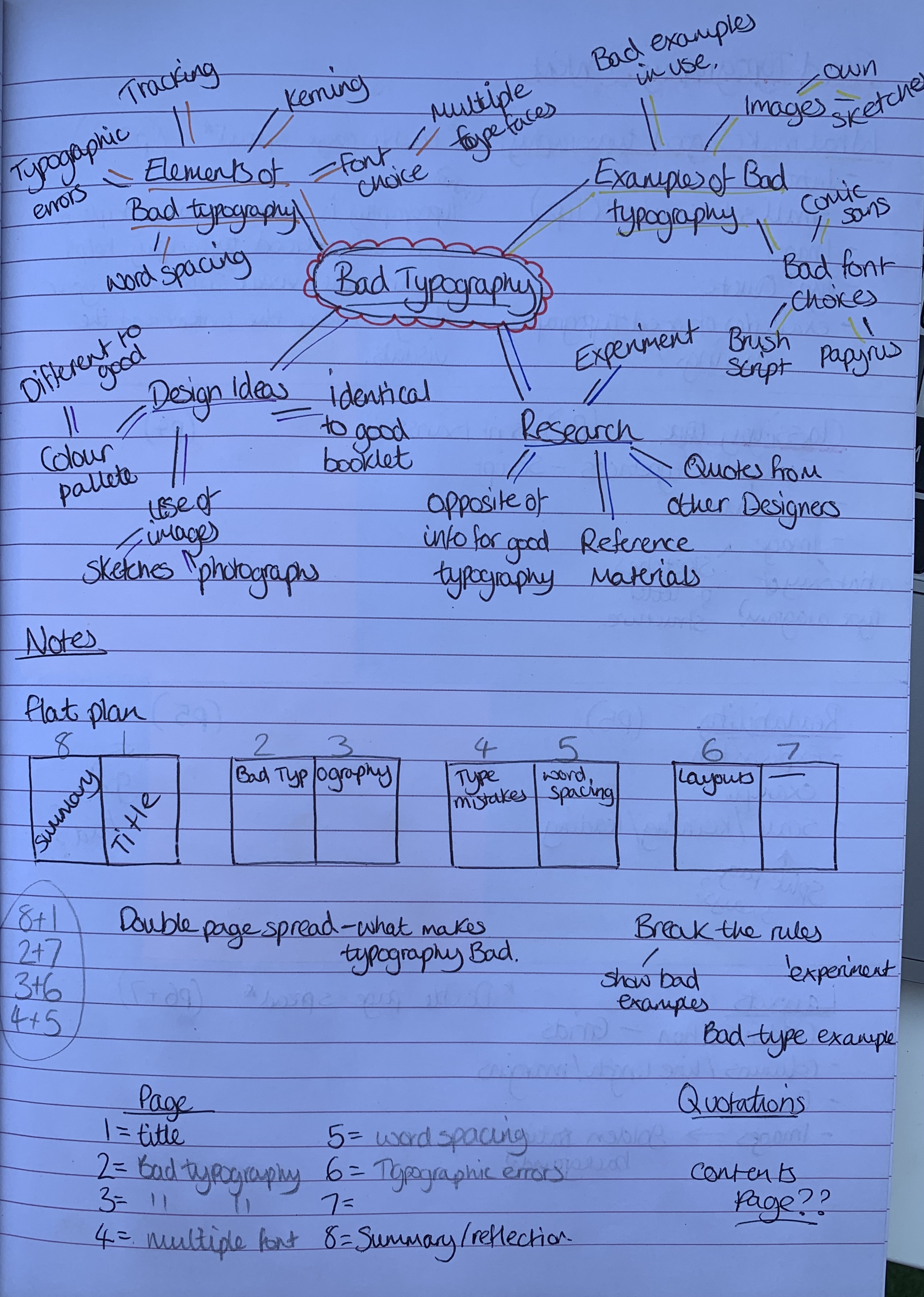
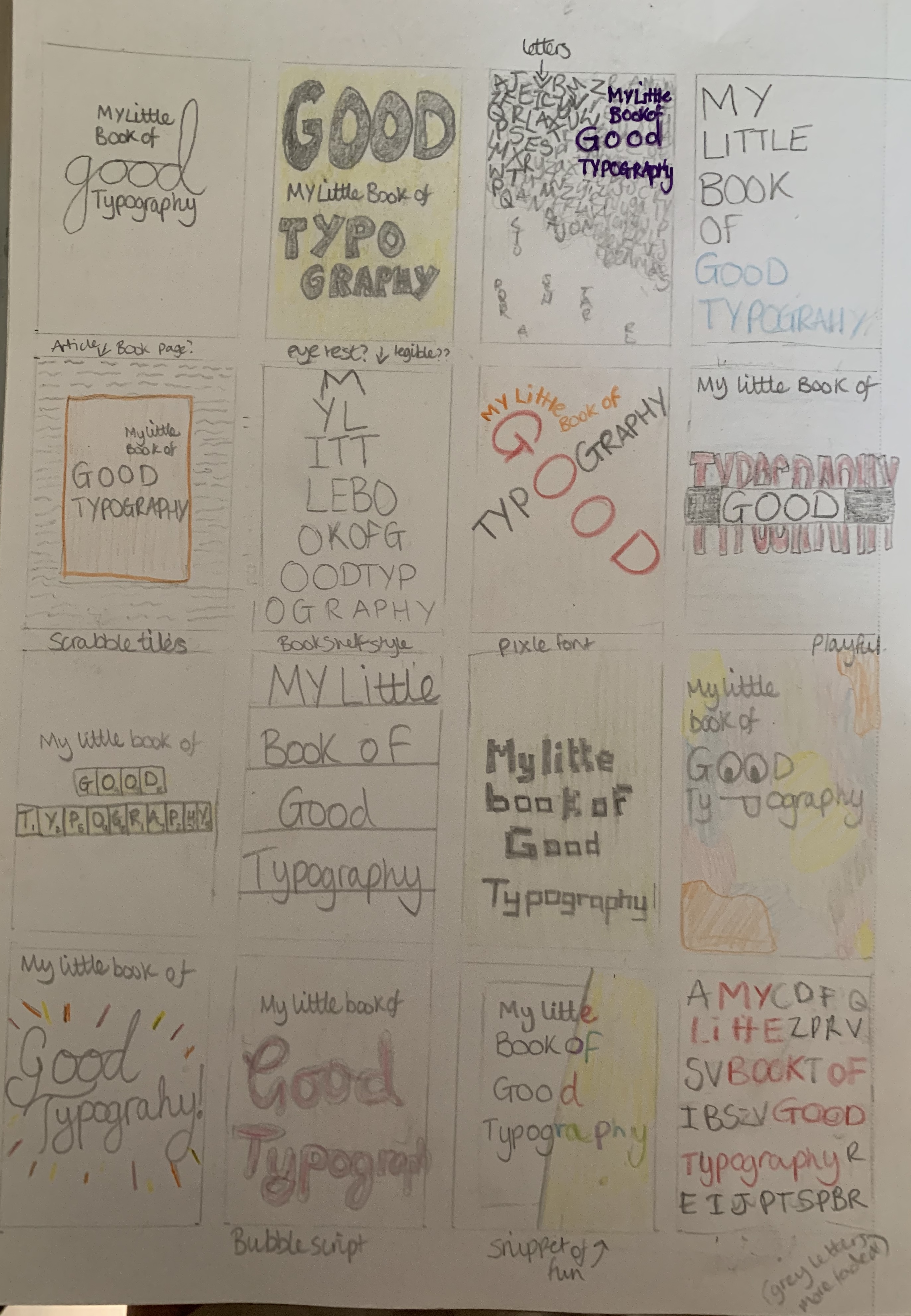
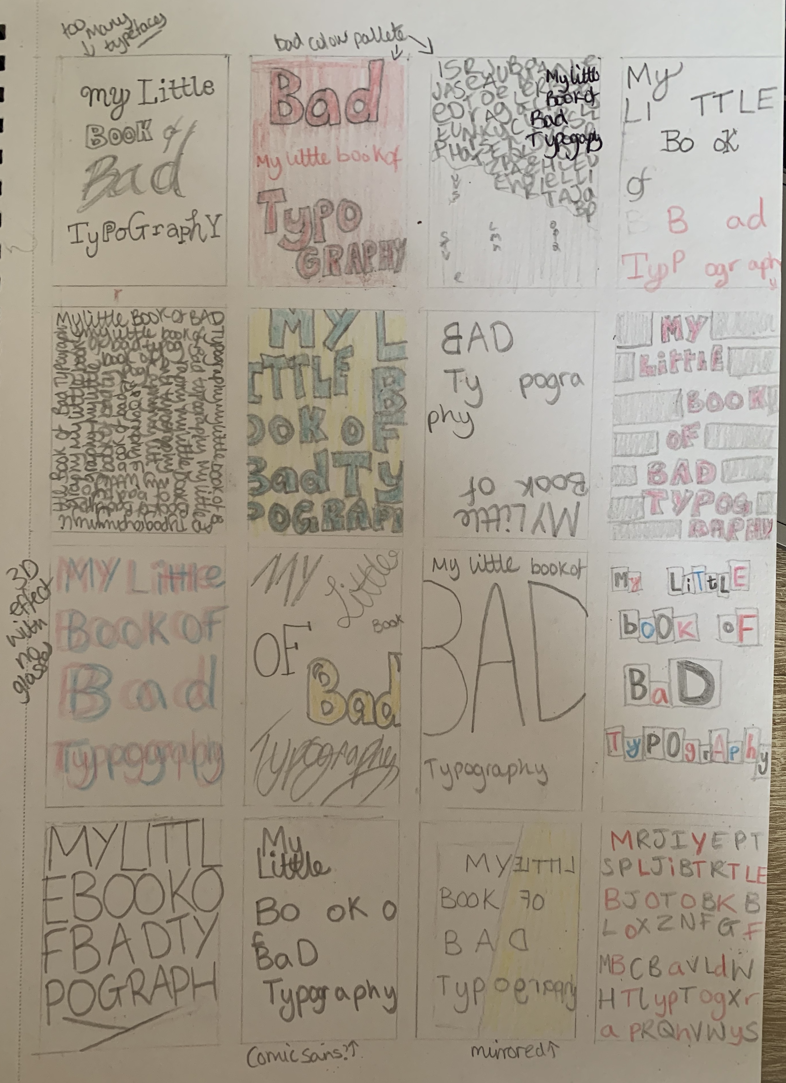
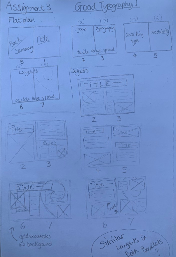
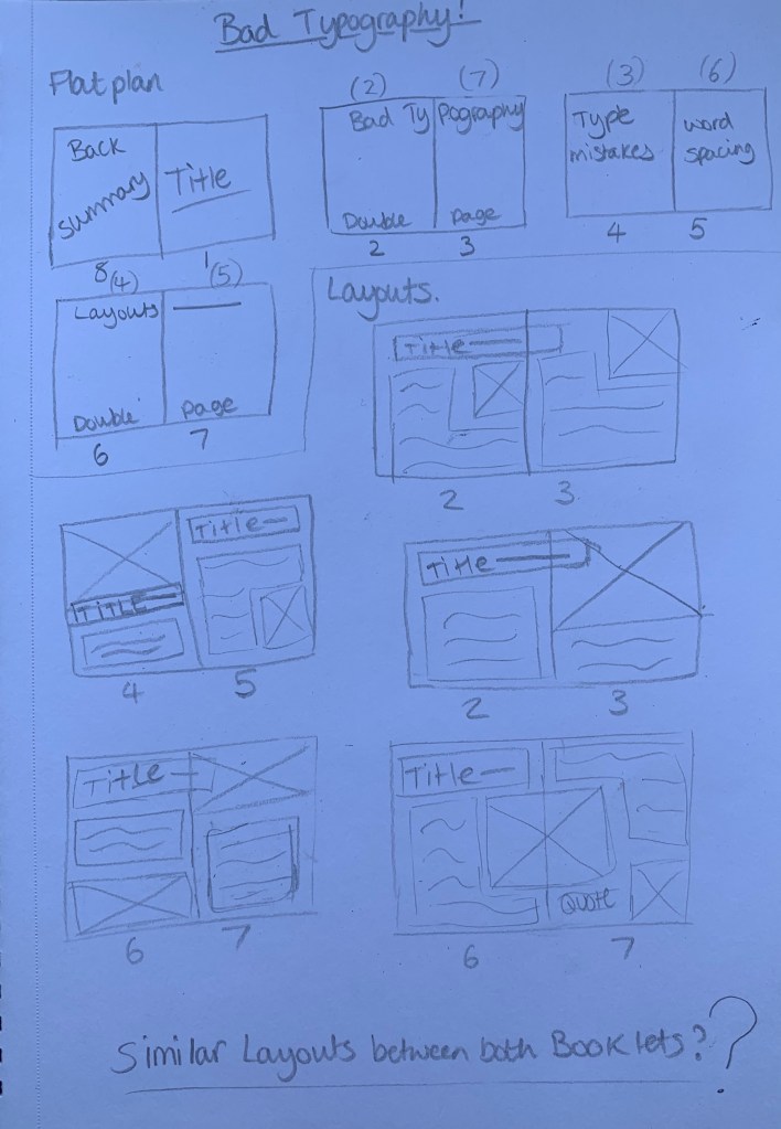
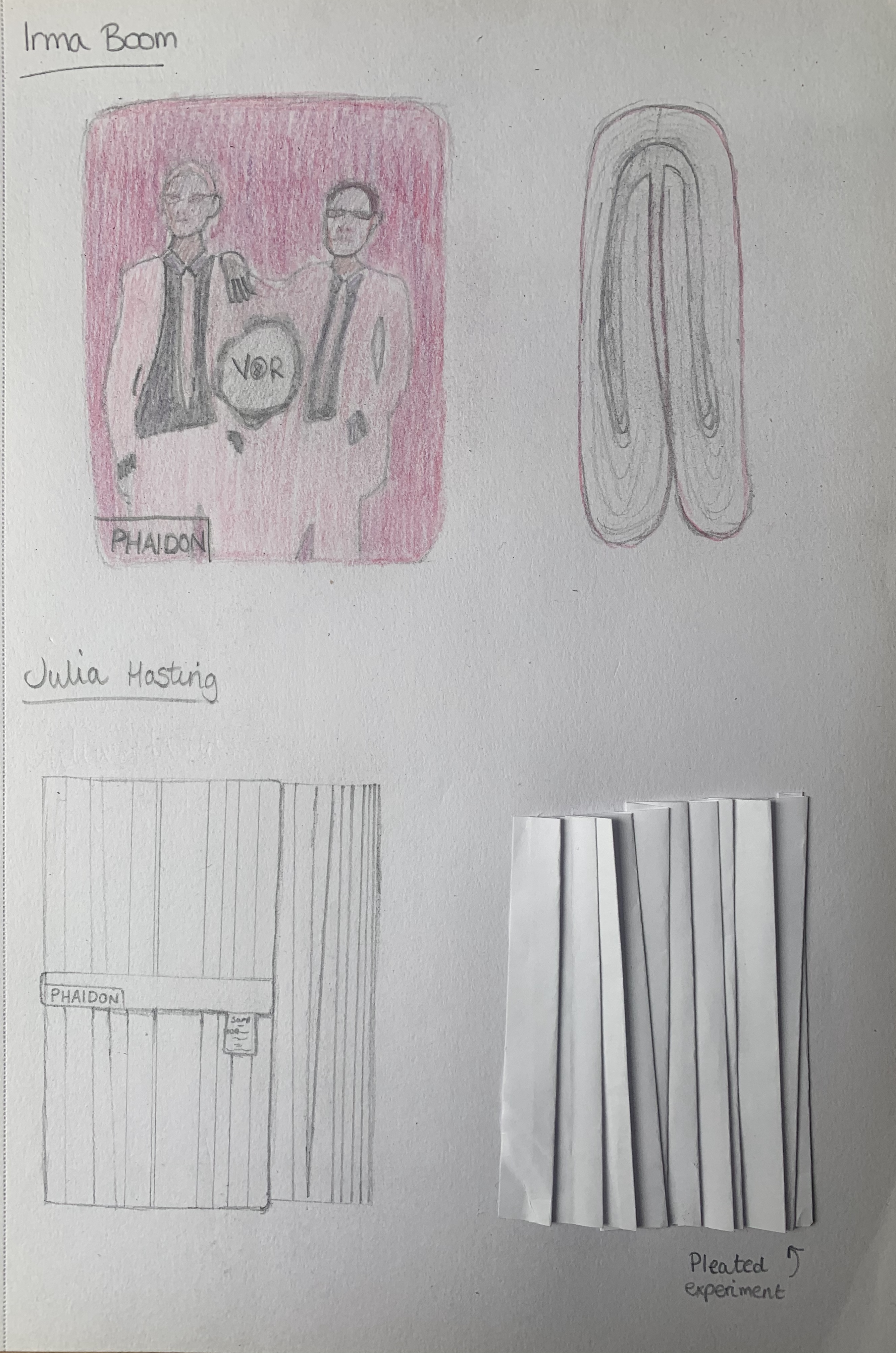
I started off by creating mind maps for both the good and bad booklet to stimulate ideas. I referred back to one of my folded booklet mockups from part 1 to help me visually see my booklet in order to start creating my flat plan.
I went straight in with planning my flat plan and deciding what topics my contents would cover. I decided against including a contents page as the booklet is so small, I felt it wasn’t necessary.
Now I had a plan to follow I decided to start my research for the chosen topics and also for inspiration from other designers.
Research
I re visited all of part 3 and made notes which I felt would be appropriate for my content, alongside doing further research reminding me of important factors used within typography.
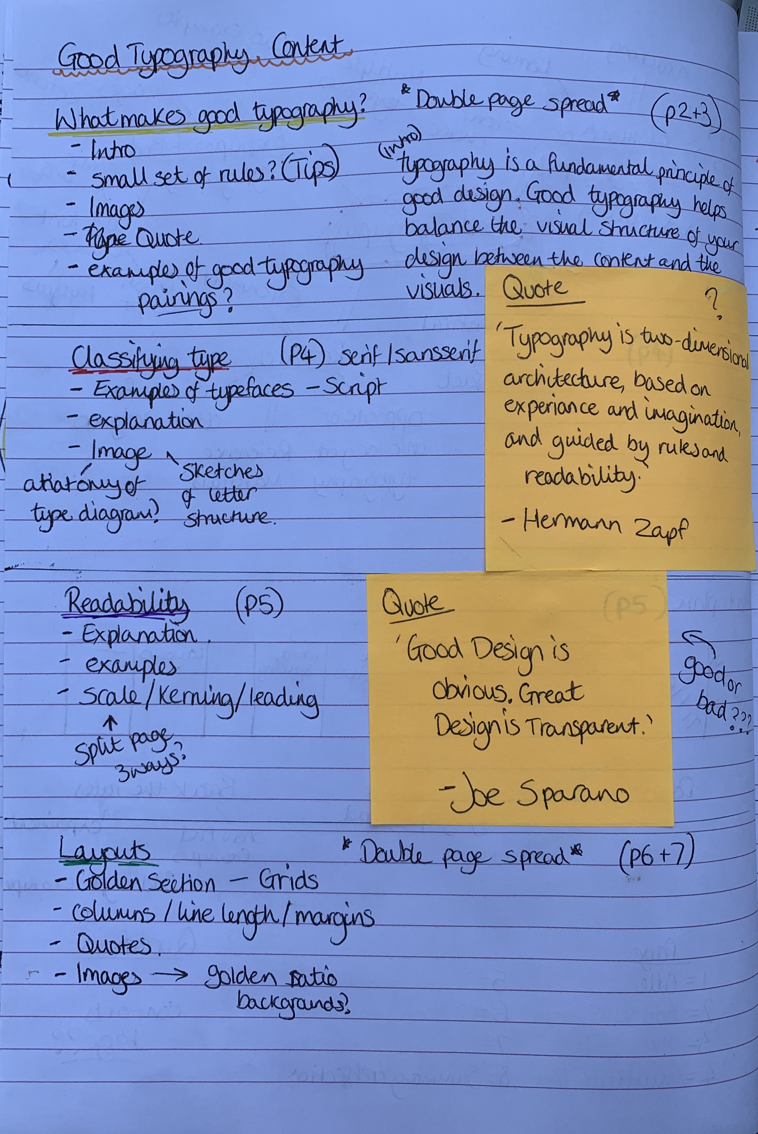
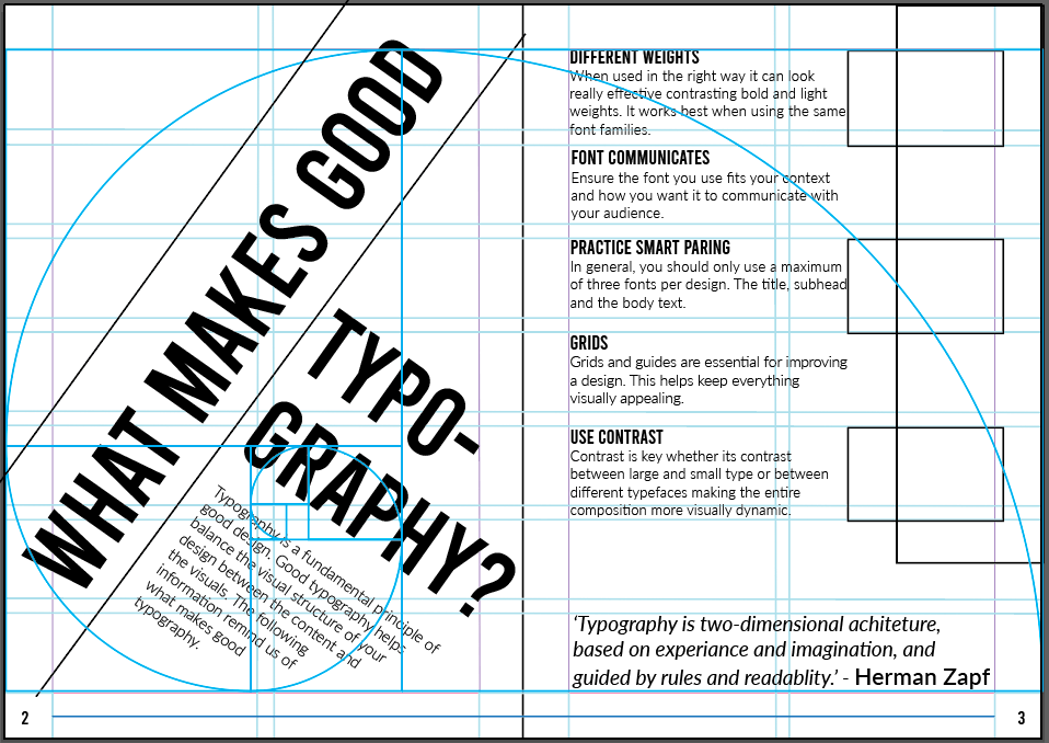
The contents for my Good Typography booklet will include;
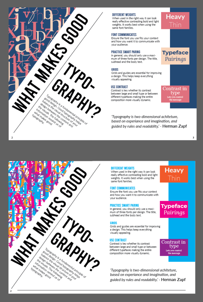
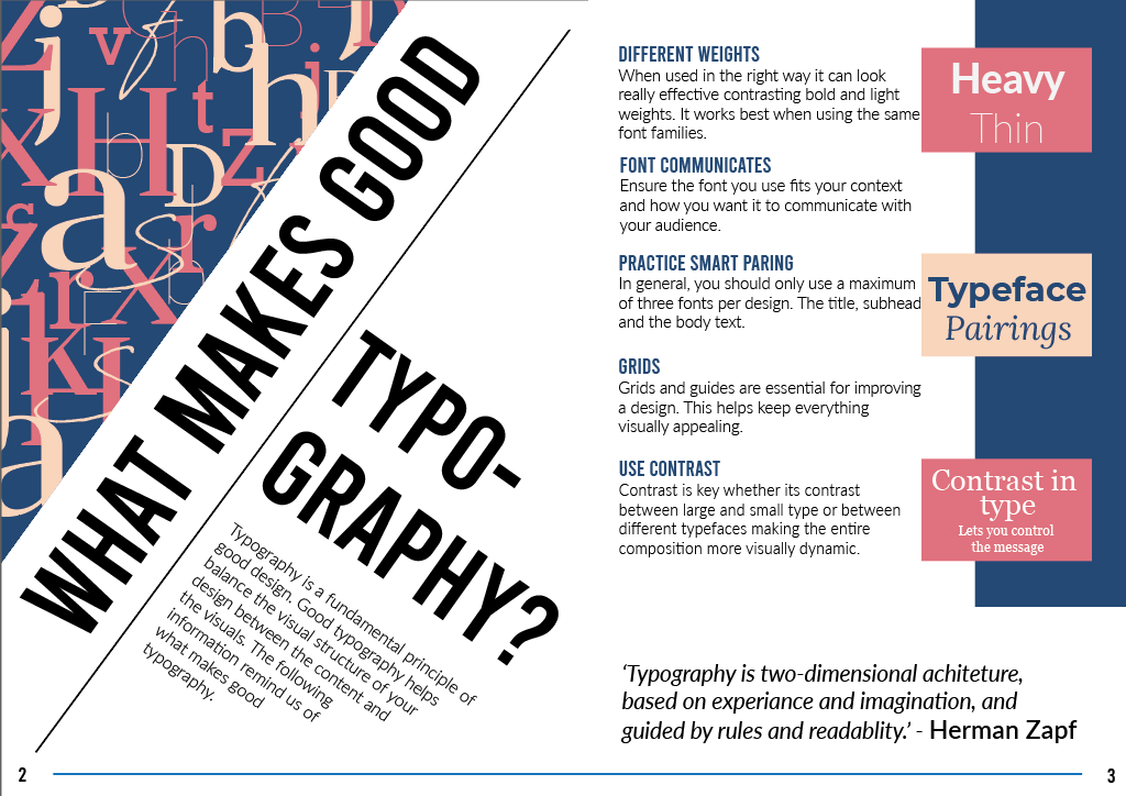
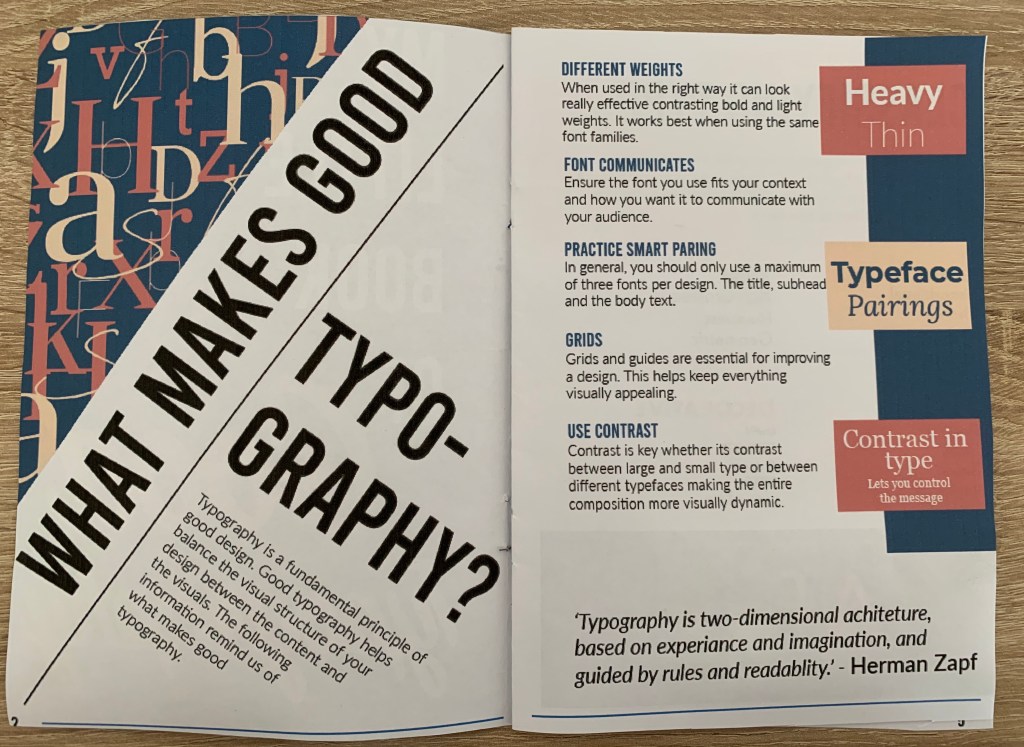
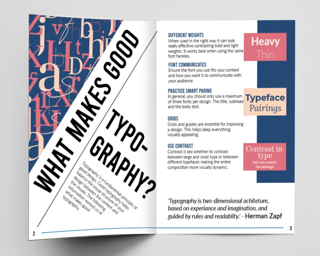
What makes good typography? (Double page)
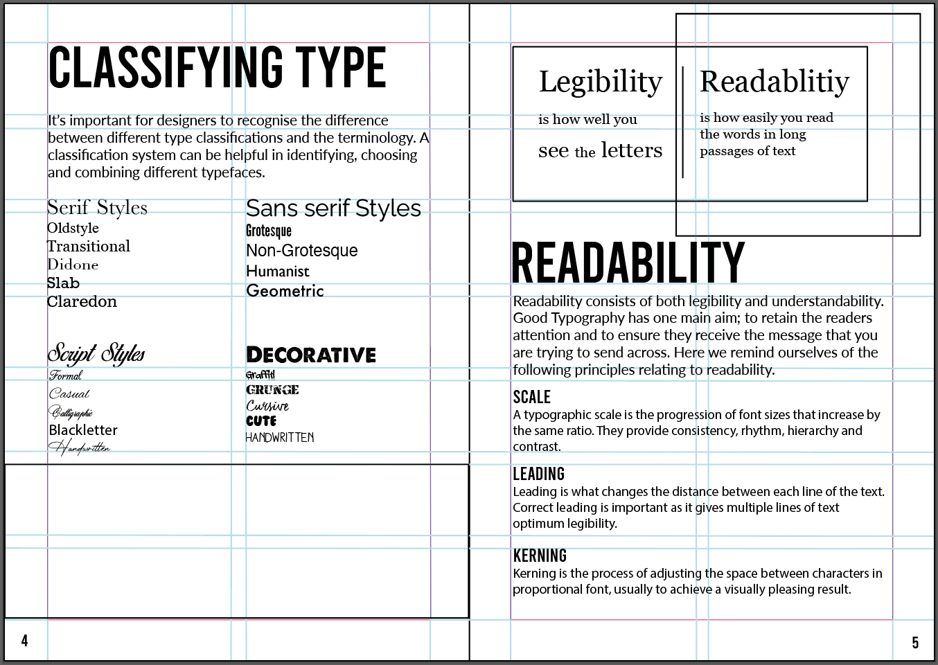
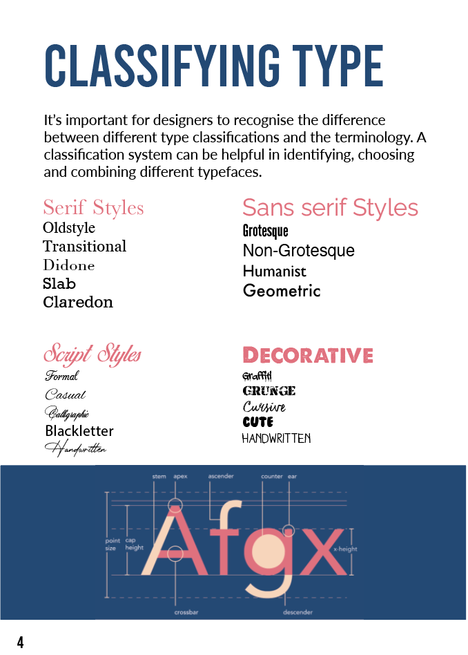
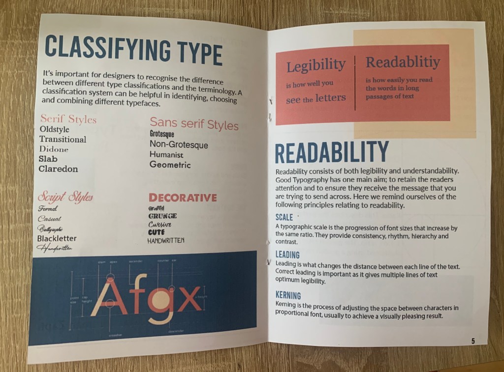
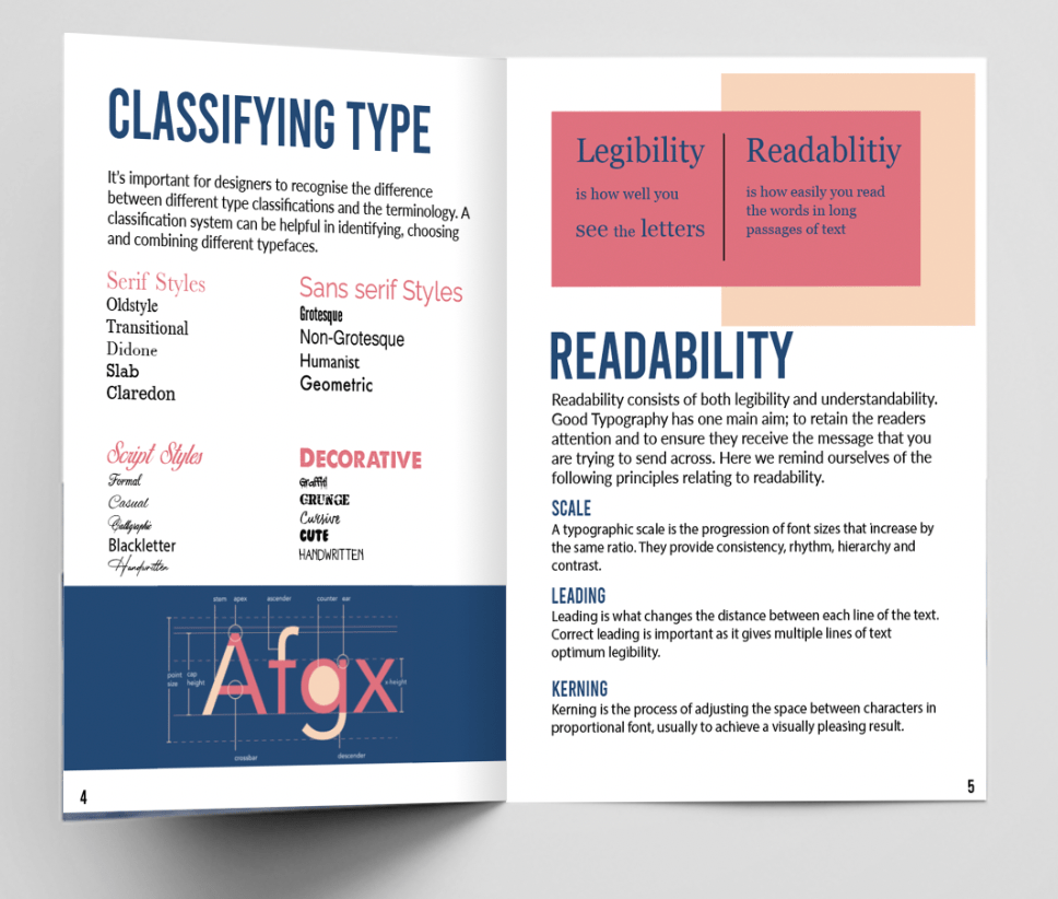
Classifying type
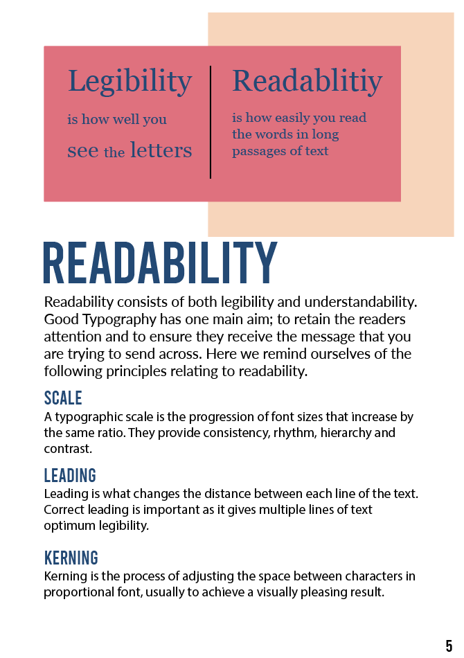
Readability
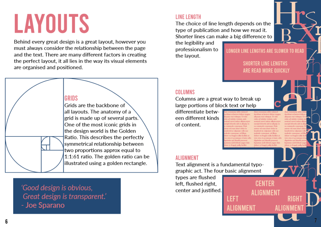
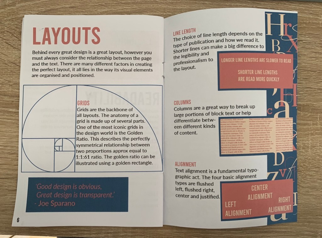
Layout (Double page)
Each page will include useful information relating to the contents of that page, with the What makes good typography page as mainly an introduction to the booklet.
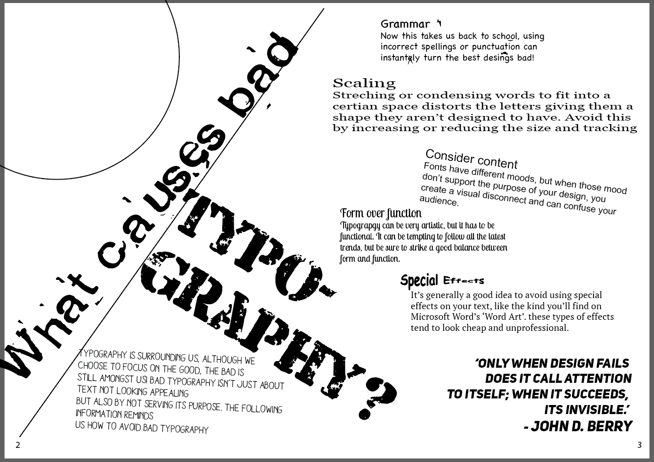
The contents for the Bad Typography booklet will include;
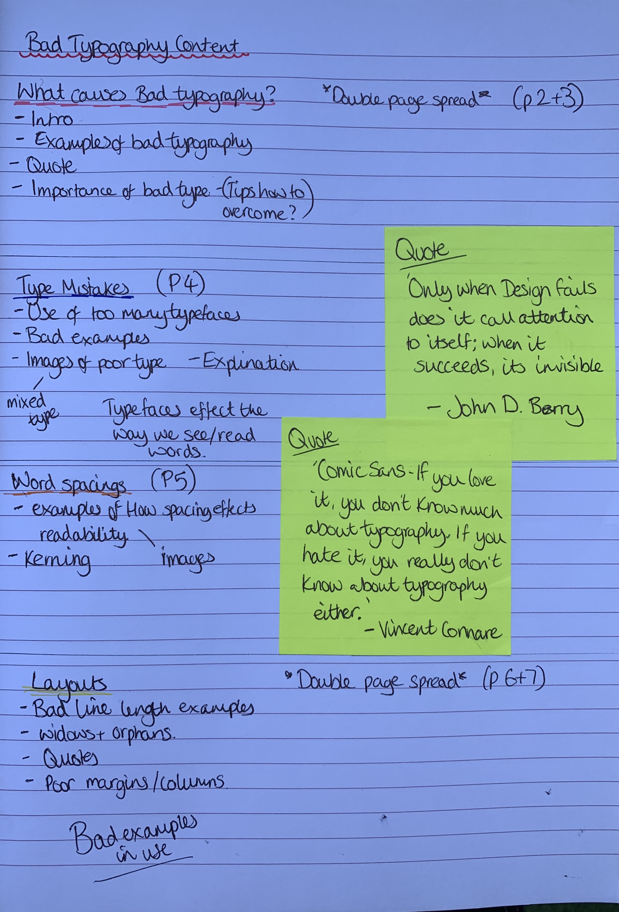
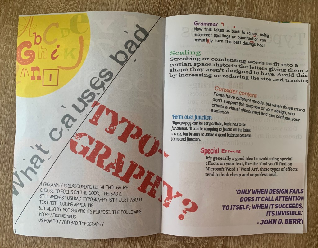
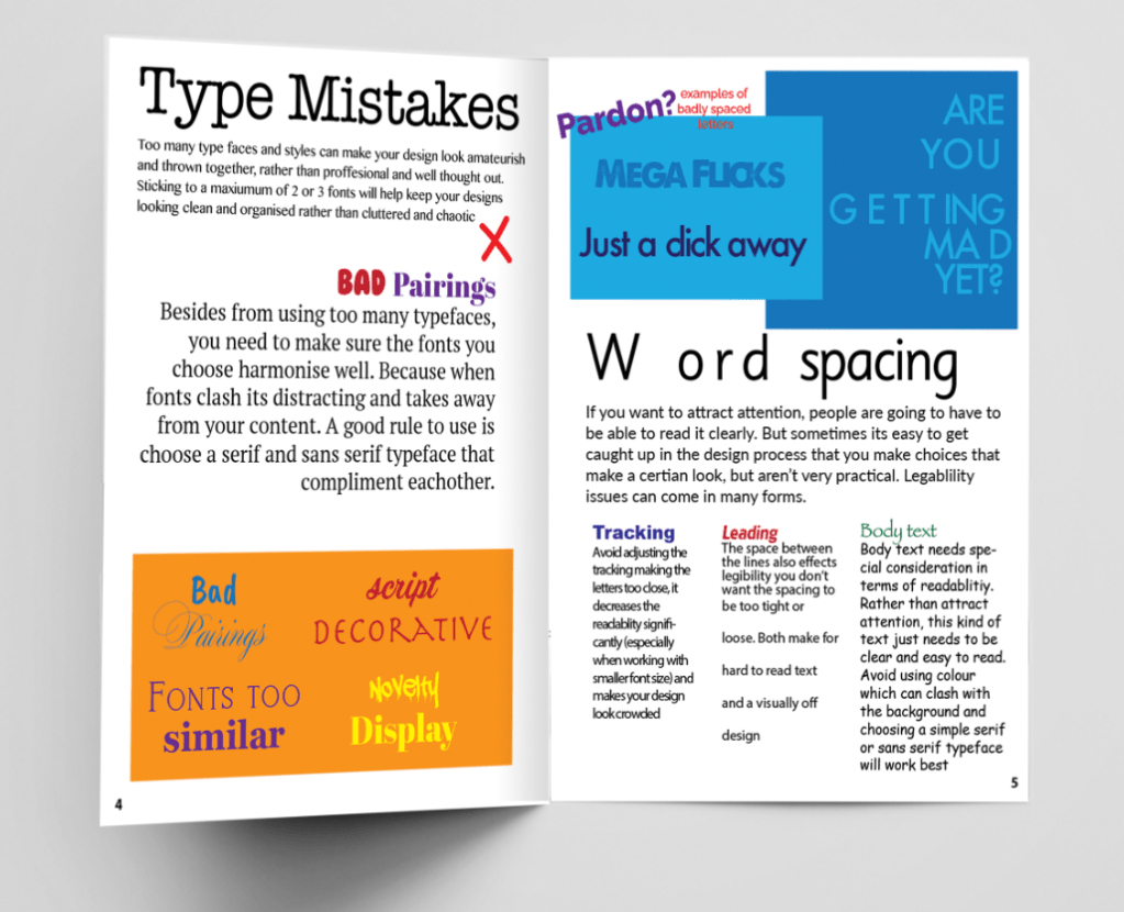
What is bad typography? (Double page)
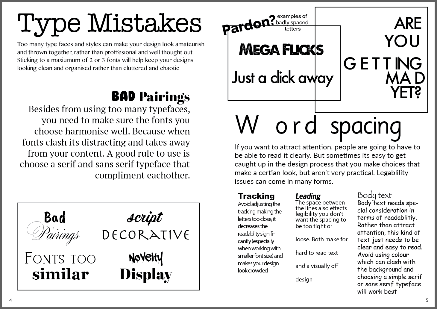
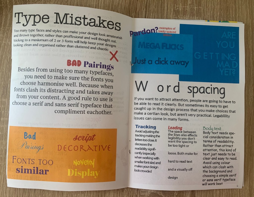
Type mistakes
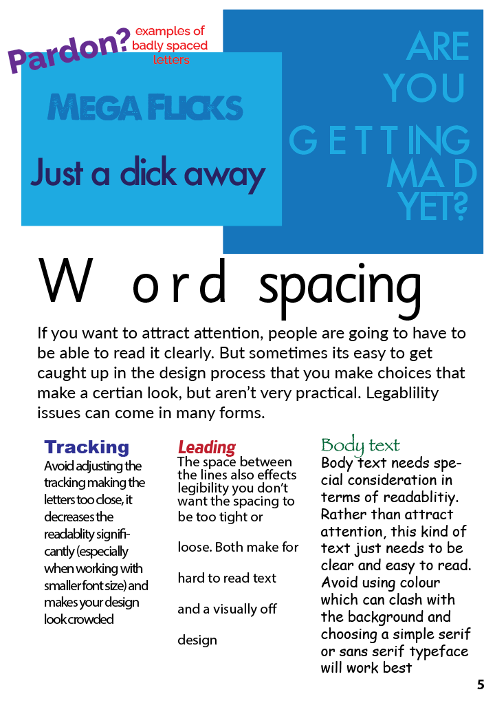
Word spacing
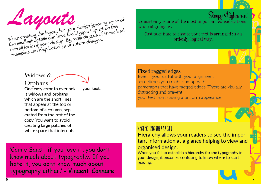
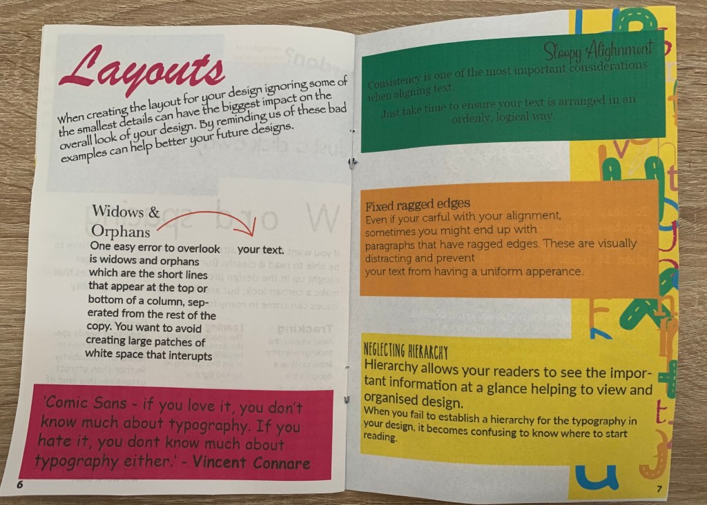
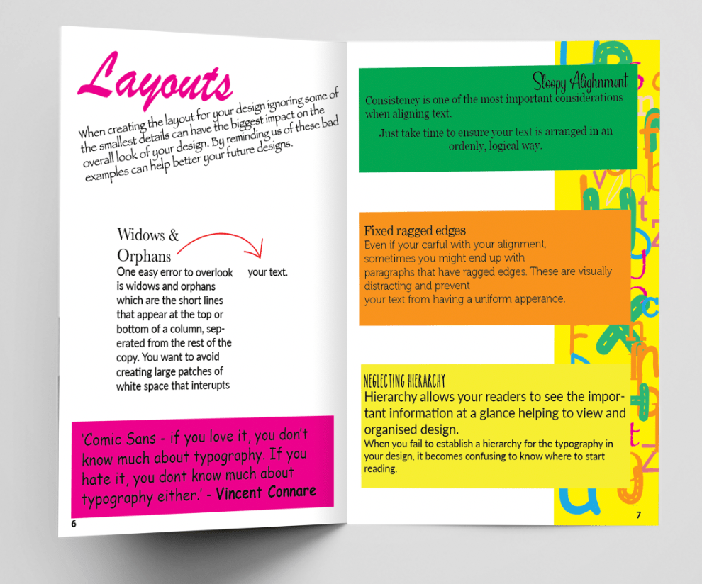
Layouts (Double page)
Again the information will follow the appropriate title, I plan on creating the Bad booklet as a guide to counteract with the good book to show how things can be used badly and what not to do, This will make the booklets become the perfect learning pair.
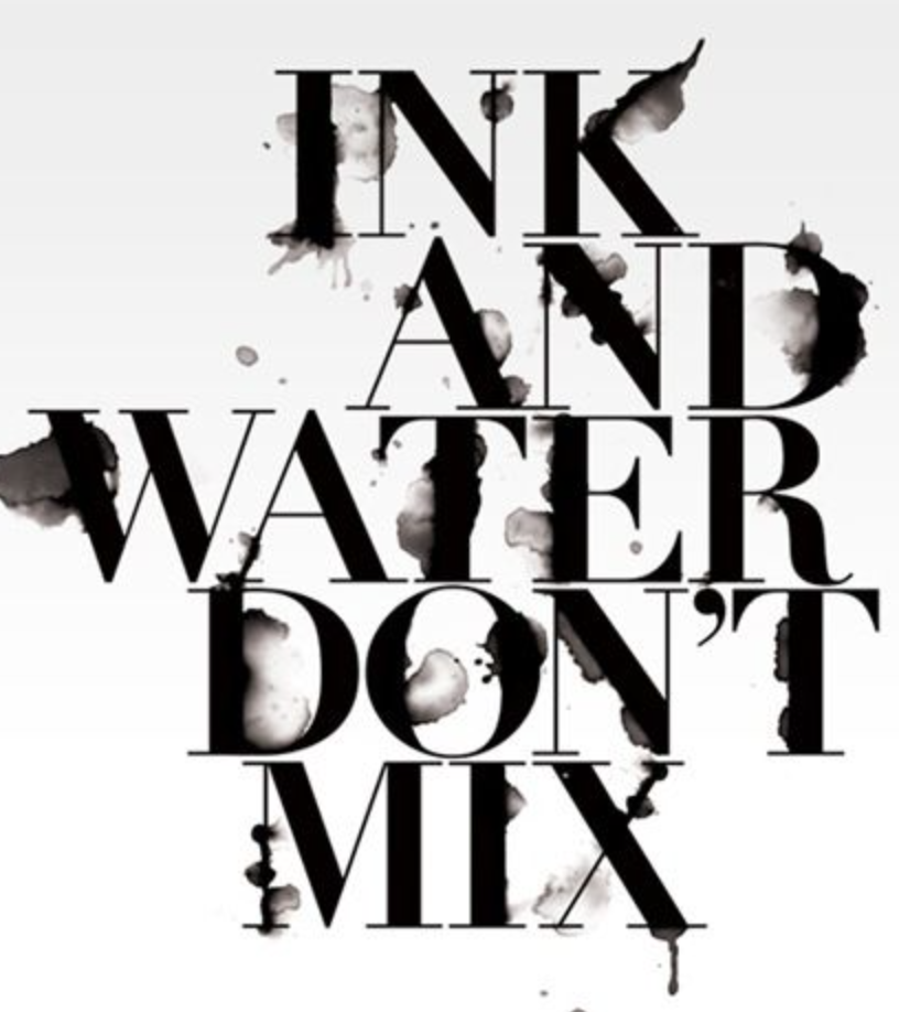
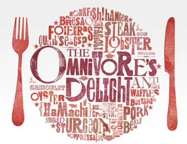
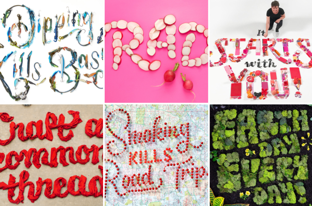
Craig Ward
I wanted to look at inspiring typographers and came across Craig Ward. The design which caught my eye was the good/bad typography piece, I found some other interesting artworks too as shown below.
Craig Ward has created many typography designs for many different brands and campaigns. I like Ward’s impactful designs with clear and creative compositions. He plays with the grid layouts and effects within his type causing the audience to focus more on the design rather than to view it at a quick glance. This makes great inspiration for both booklets creating playful typography and pushing the boundaries in both a successful way for the good and in a confusing way for the bad booklet.
Design Process
Once gathering all the basic information needed I was ready to start my design process. The booklet I would like to create will be A5 in size and stapled. To make my designs even more impactful from good to bad I thought it would be an interesting idea to print the good booklet on better quality paper and the bad booklet on more of a basic paper – however this may effect the quality too much, so perhaps for an example I could print a single page on the lower quality paper to use as a small example? (something to consider later in the design process!!)
Good Typography
Bad Typography
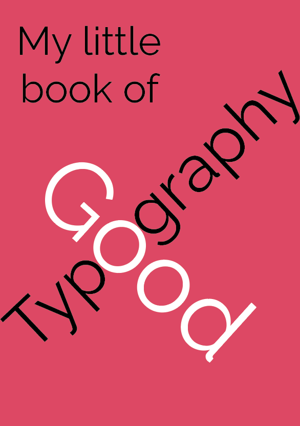
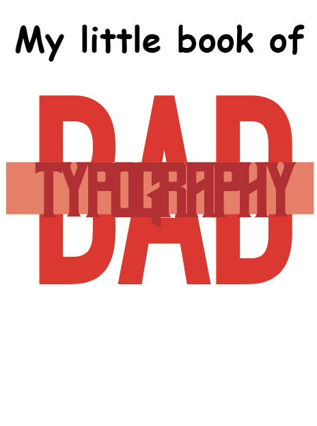
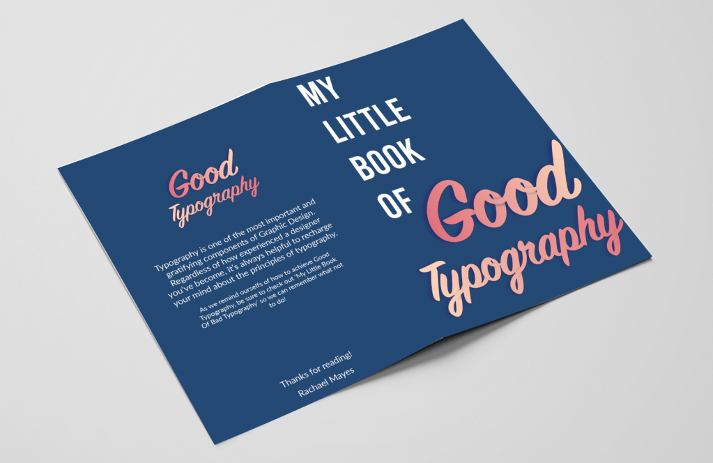
After digitally creating some of my sketches I needed to narrow down my choices, I was stuck between the two designs as shown below. I wanted to focus on my Good Typography design so that I can perfect this so that I could move onto creating my bad typography cover. I want both booklets to be the opposites of each other, this the same for the contents of each booklet.
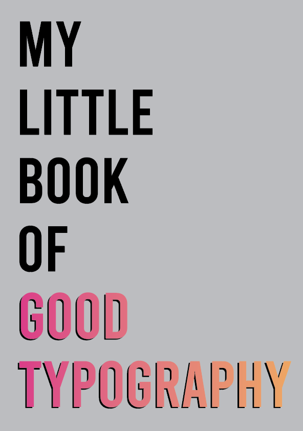
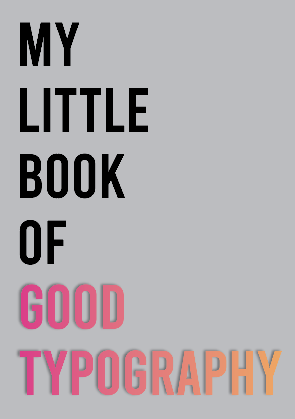
Design 1: I like the simplicity of this design, the clear bold ‘Bebas’ typeface fills the page nicely. The added shadow behind the words ‘good typography’ help for it to stand out along with the colour making this the focal point. I really like the composition of the text in this design, it looks clean and sophisticated.
Design 2: Slightly more detailed than design one with the added shadows in the type to create more of a 3D look, the words ‘Good typography’ grab your attention immediately.
I decided to experiment further with the designs as I didn’t feel satisfied with either design above.
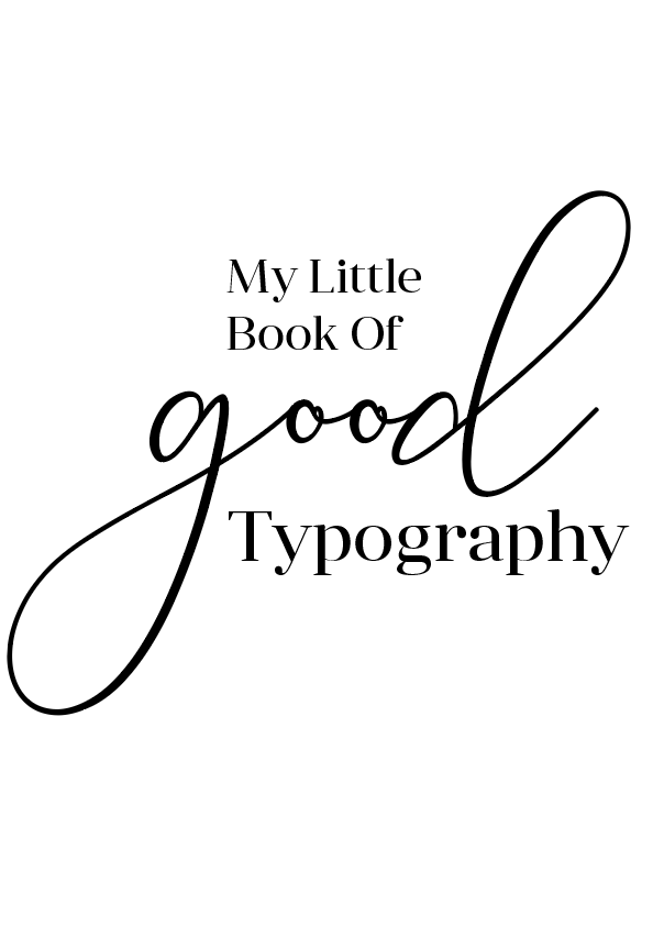
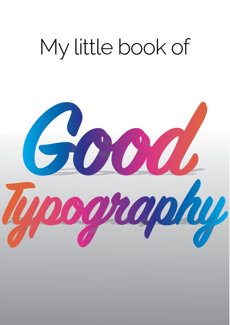
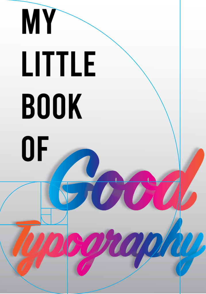
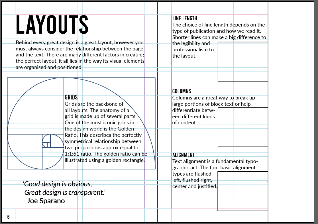
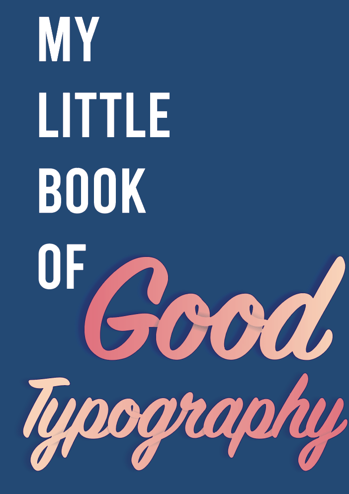
I ended up combining the two designs and came up with the design on the left. The text positioning fills the page and creates the perfect balance, I achieved this by using the golden ratio grid.
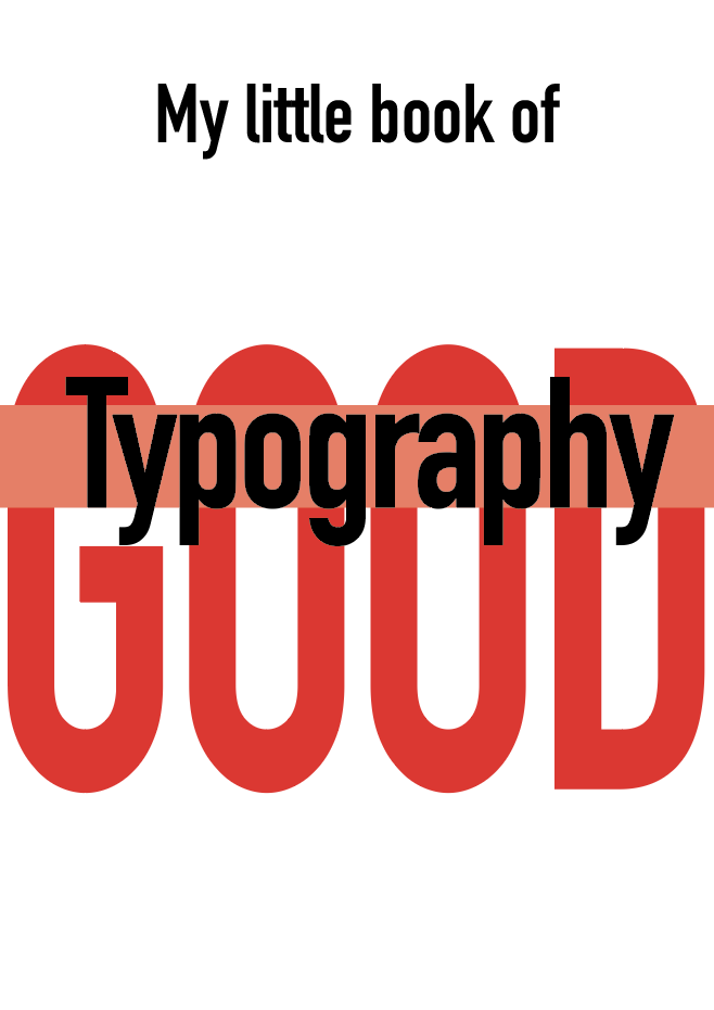
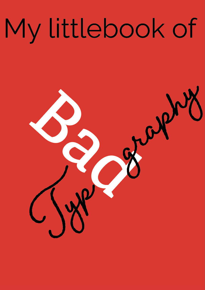
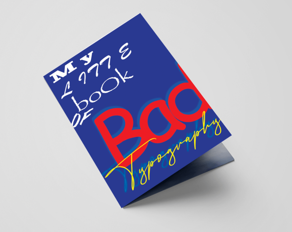
I then moved onto creating the cover design for the Bad typography book, originally I wanted both booklets to be the opposite of each other so this will be my first experiment.
Bad Typography
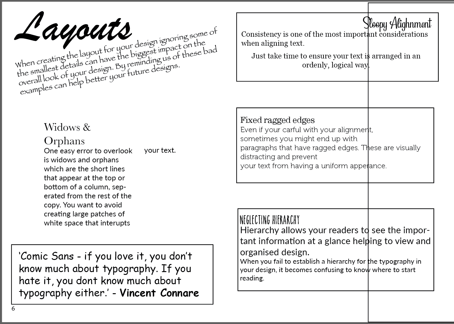
For my bad design I focused on using the fonts which are usually frowned upon such as, Comic Sans, Brush Script & Papyrus along with a mixture of too many other typefaces. I kept a similar layout as the good typography design just so they still remain as part of a series. I adjusted the kerning and had completely ignored aligning the text.
Content design
Now that I was happy with the covers I was able to move onto working on the contents for both booklets. I figured it would be best if I worked on each book side by side to ensure I create the correct conflict between them both. Following my flat plan I decided to make a start on the first double page spread of my booklet.
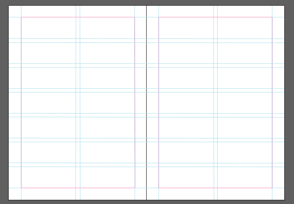
I started by creating all of my notes before hand so I knew how much text I had to work with in order to create the best grid for my booklet. I decided to use a modular grid, as this would be easy to follow with both booklets and each page along with the contents inside. I also wanted to keep in mind the golden selection grid. Once I was happy with my grid layout I started to experiment with layout ideas.
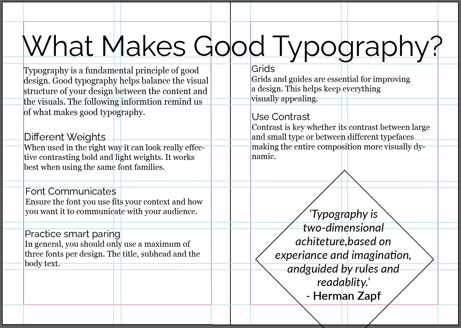
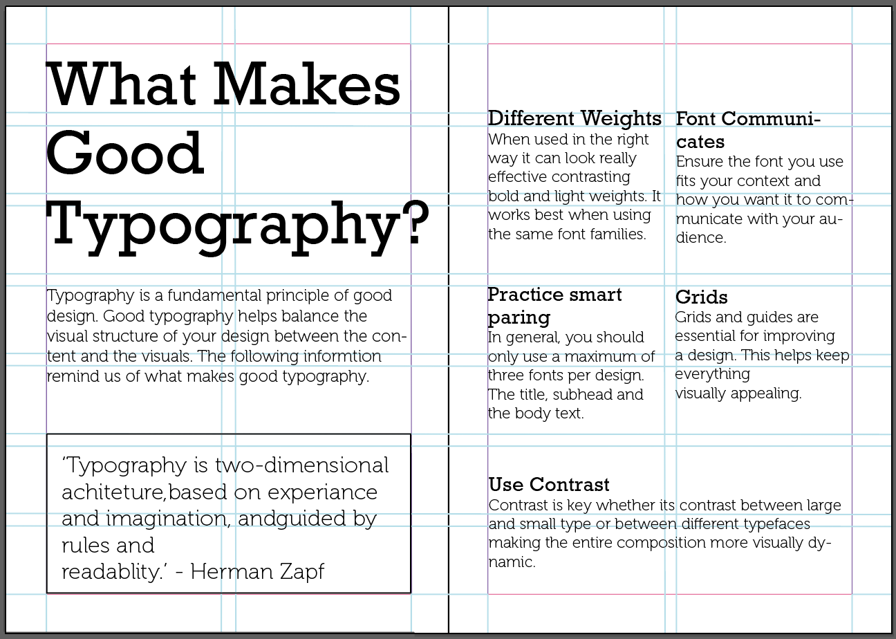
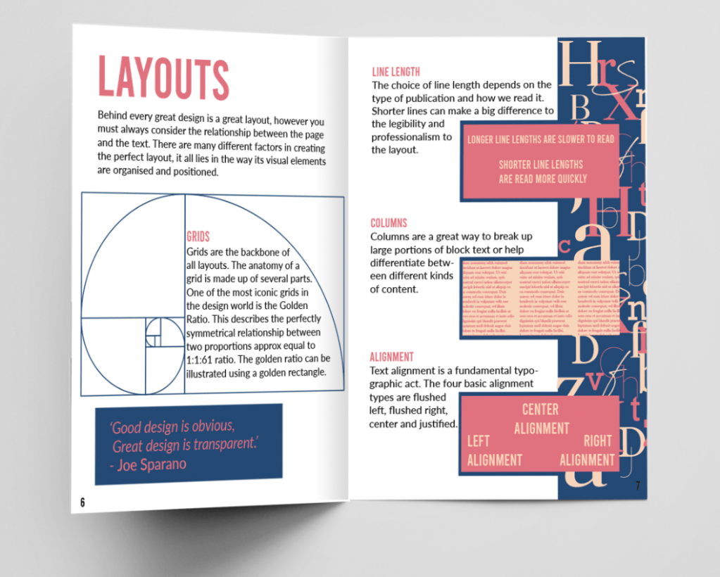
Out of the designs above, the first is my favourite, I like the way the title fills the page in an eye catching position along with the introduction paragraph. I plan on adding colour to the boxes on the right along with examples relating to some of the topics covered on this page. To fill the top left hand corner I will fill this with letters of different typefaces in the style of one of the designs used for one of my cover designs above. Another reason why this design feels pleasing to the eye is because the golden ratio applies within this design.
The contents for my booklets include
Good Typography; (reminder and advice guide)
What makes good typography? (double page) – Tips on what makes good typography and the terminology.
Classifying type – Reminder of type classification and the anatomy of a typeface
Readability – Reminder of principles relating to readability
Layouts (double page) – Different factors of what makes the perfect layout
Bad Typography; (a what not do to guide)
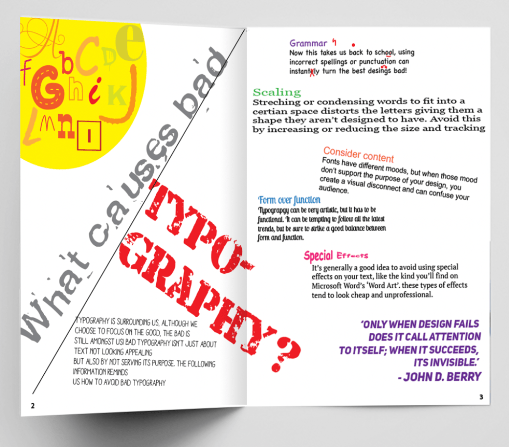
What causes bad typography? (double page) – Pointers as to what makes bad typography
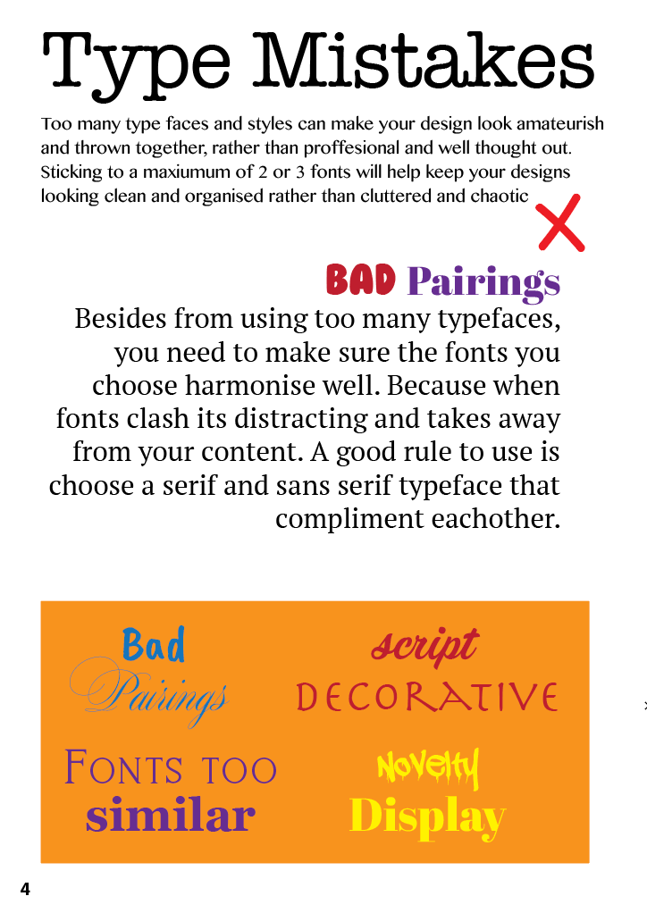
Type mistakes – Focusing on bad pairings
Word spacing – Advise and examples of how spacing can effect type
Layouts (double page) – Reminding of how the small details can negatively effect the layout
Now that everything has been established I can work on the layouts for both my good and bad booklet, as mentioned previously I am going to work side by side with these so that I can achieve that ‘badly’ copied style to create a what not to do guide. Below you can see the layouts side by side.
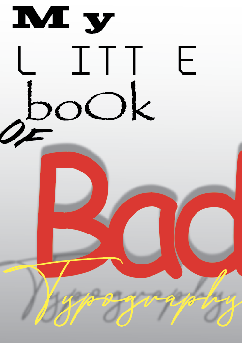
Im happy with the idea of each book being the wrong and right examples of each other, because they are almost identical it is clear to see that they are part of a set. For the bad typography booklet I completely ignored the grid and went against my designer instinct to create the layout and to show examples of bad typography in action, such as too many typefaces clashing, bad alignment and terrible kerning.
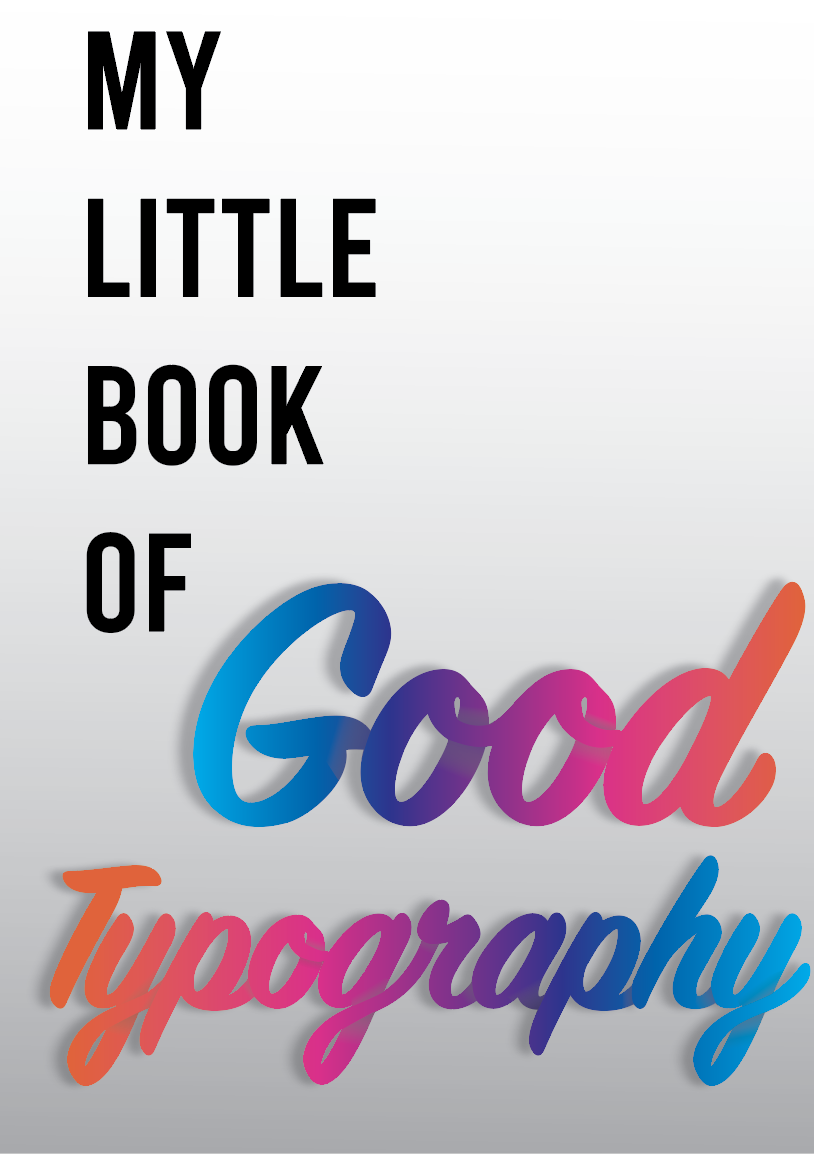
I then moved onto adding colour starting with the good typography booklet. I decided to use the colour palette used on the front cover however seeing these colour in use for the contents reminded me of something I would see in the bad typography book, the colours clashed too much and looked amateurish. I came up with a colour palette of blue and two different shades of pink, this has more of a sophisticated professional feel (see photo to left of bottom before and top after). I applied this colour palette throughout my booklet and also reapplied it to the front cover. For the Bad book I have used a mixture of bright clashing colours, I also used colour to help highlight the mix matching fonts – just to add extra offence!
Final Designs
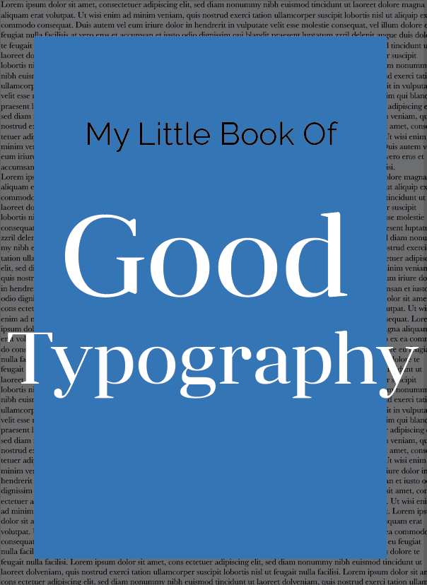
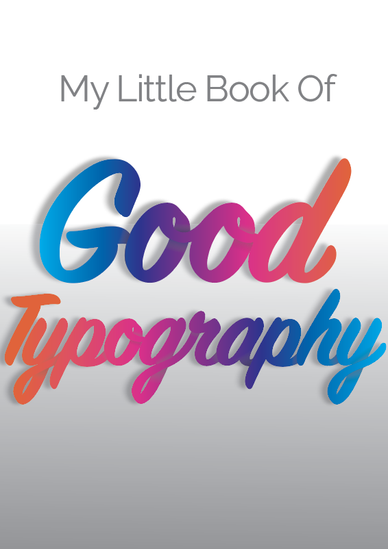
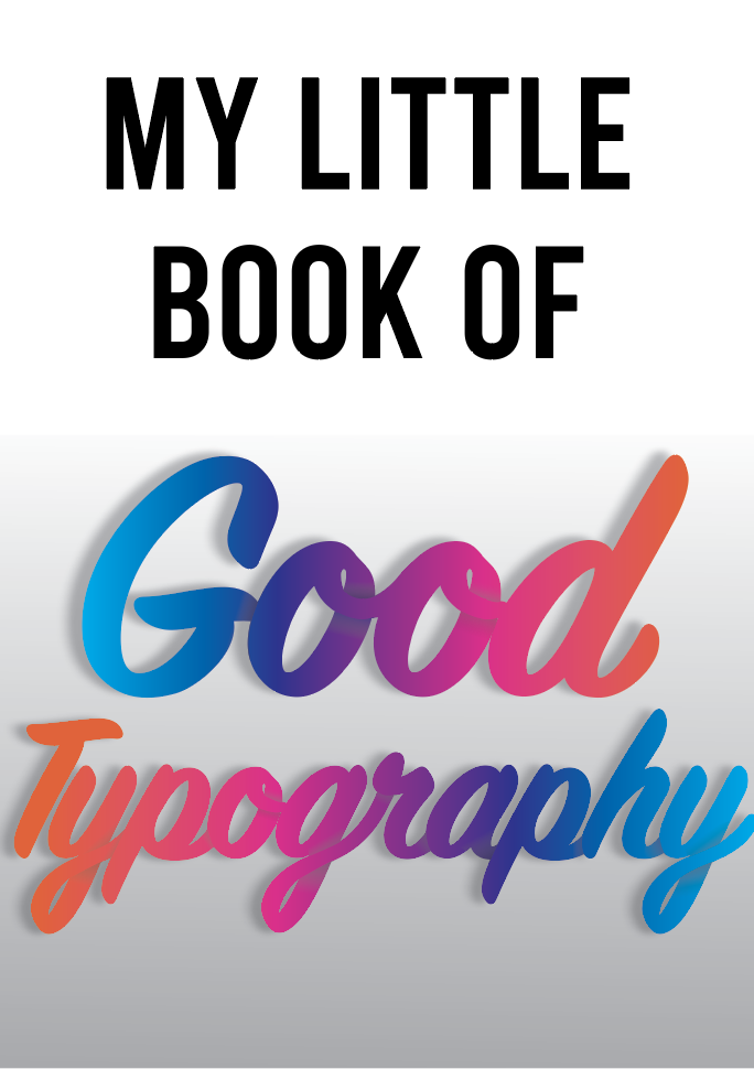
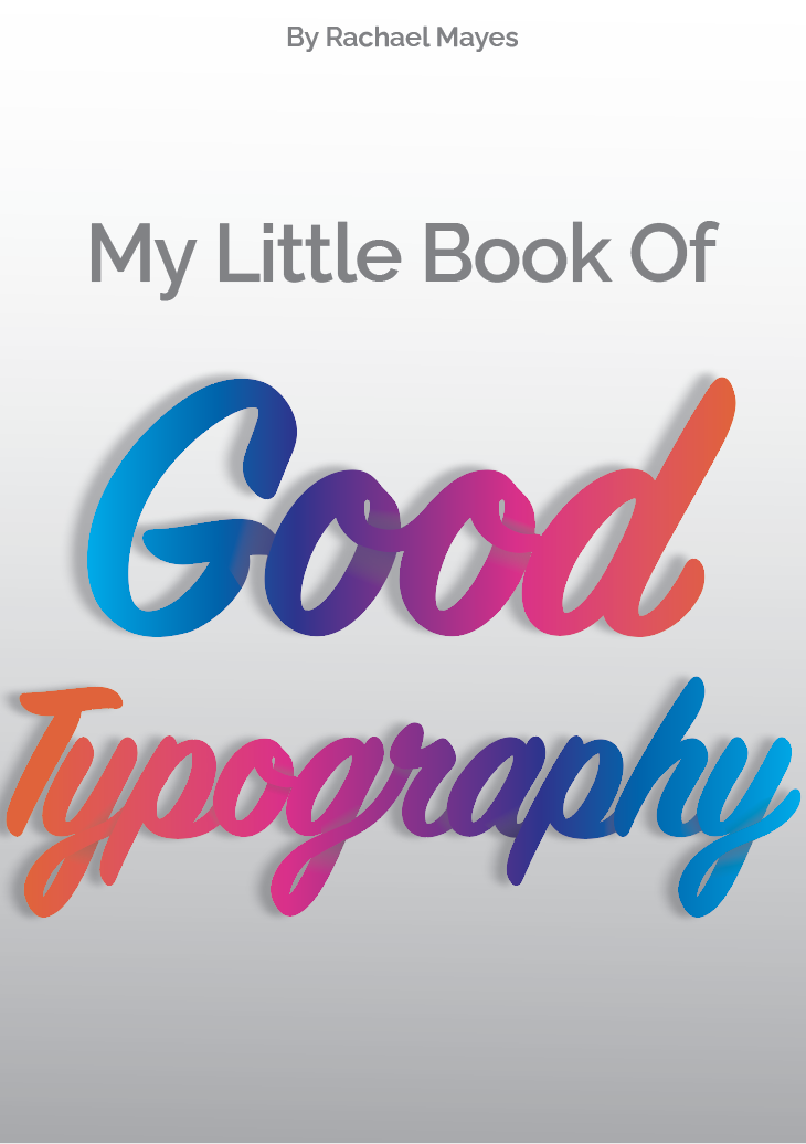
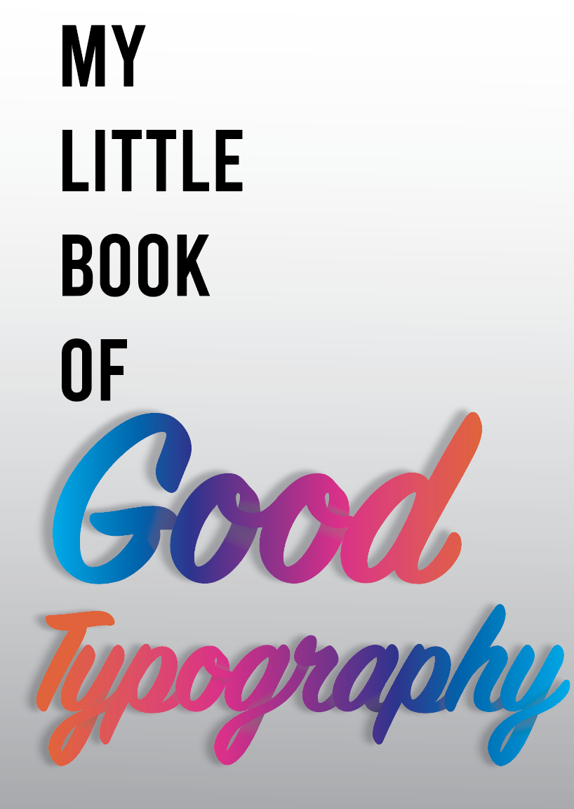
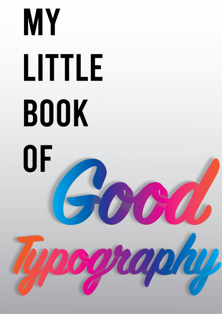
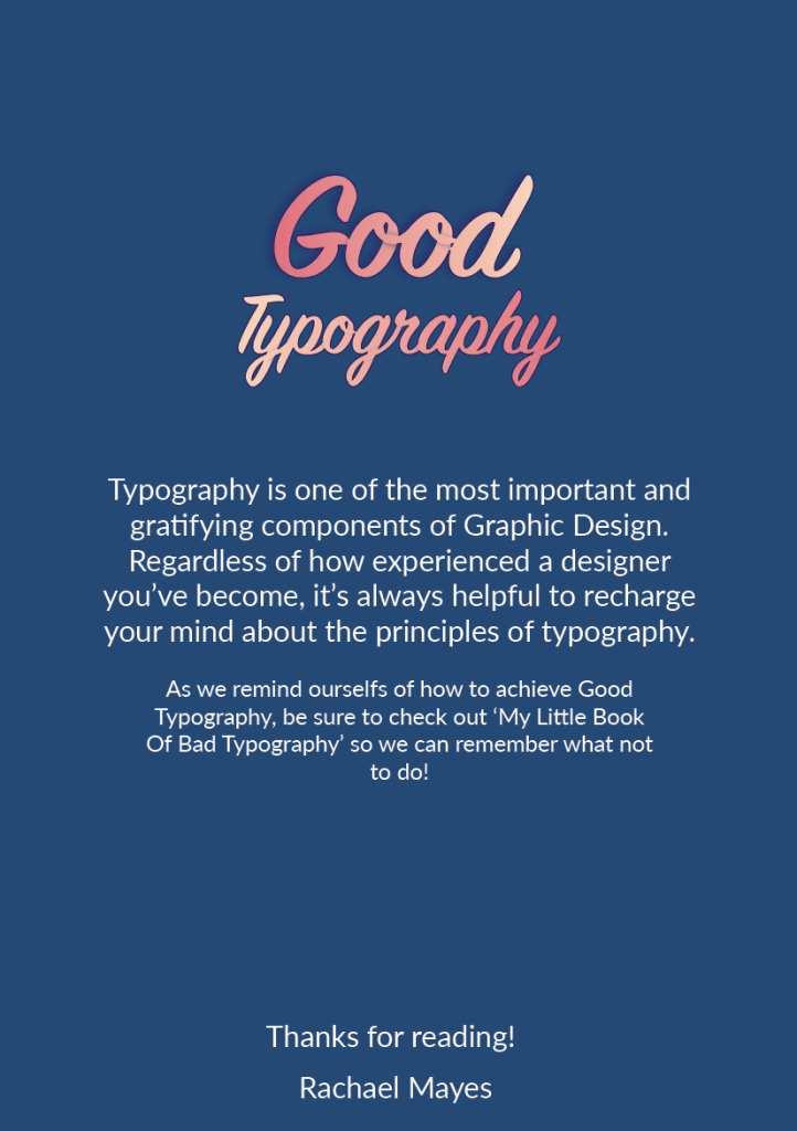
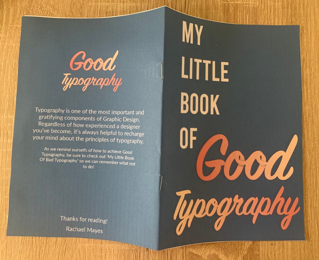
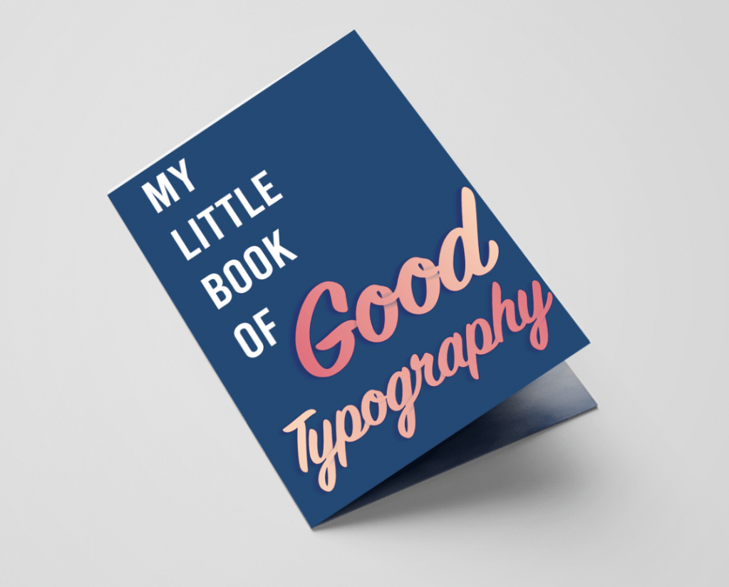
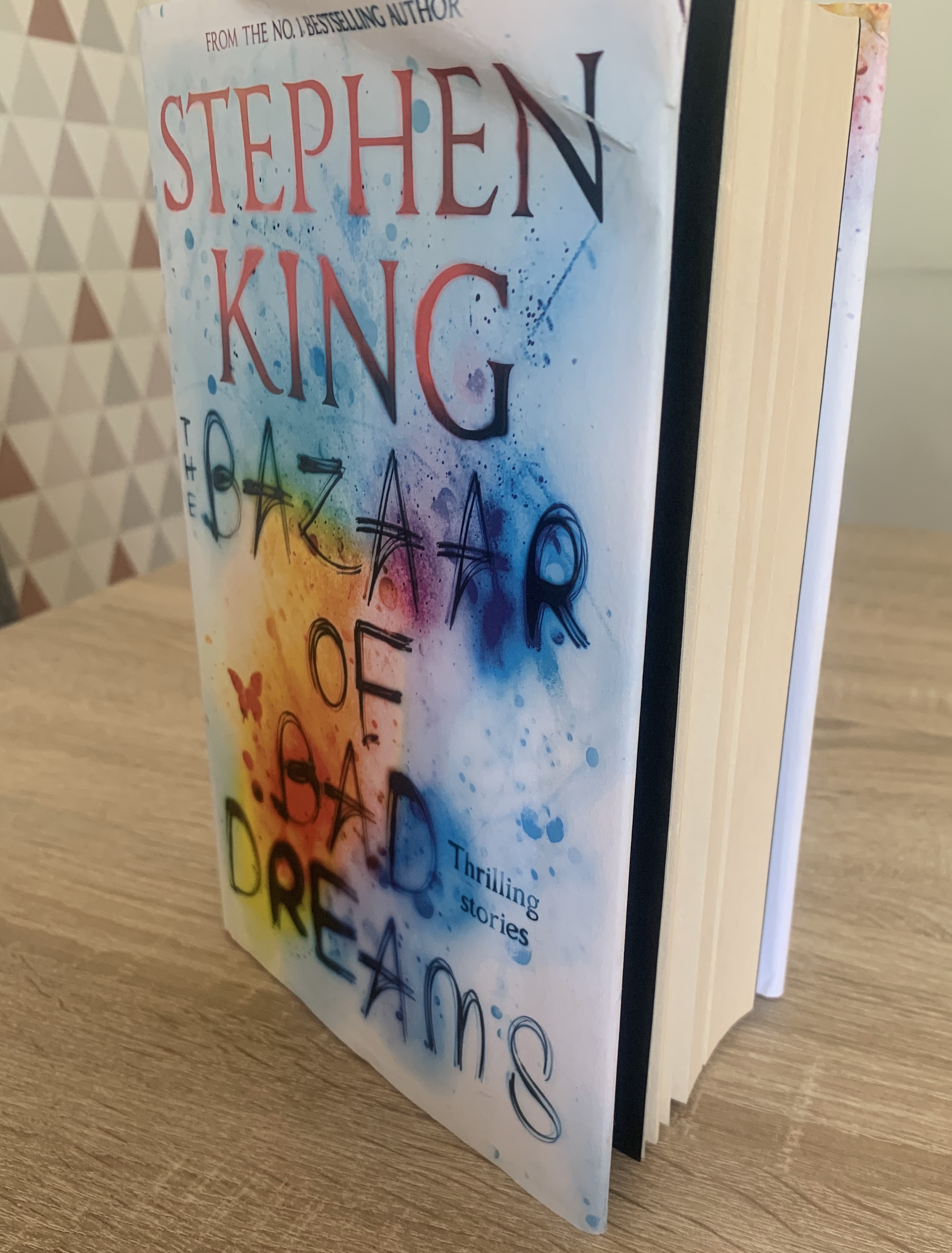
My Little Book Of Good Typography
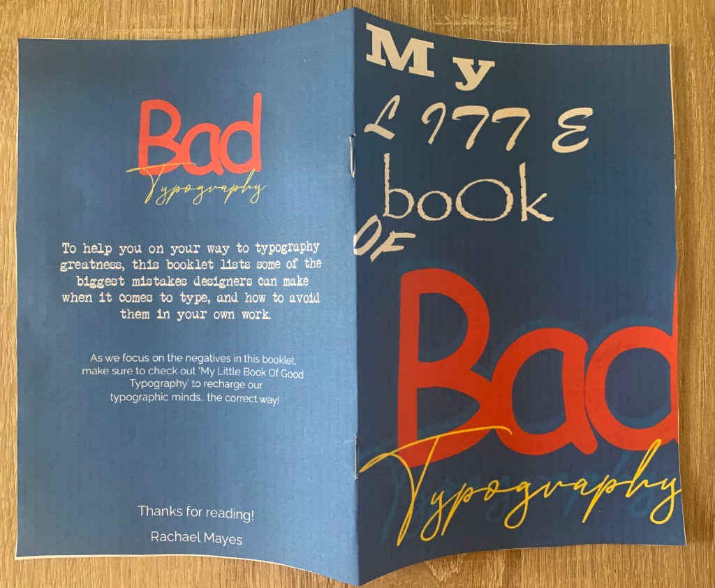
This booklet lists what I believe are some important principles for successful typography. Found with research, knowledge, quotations and examples, this would make a handy quick read for those who need to refresh their minds or seeks fast minimal advice/reassurance. This stapled A5 booklet will be printed on 130gsm silk paper, making it cheap to produce with extra protection of wear from being silk coated.
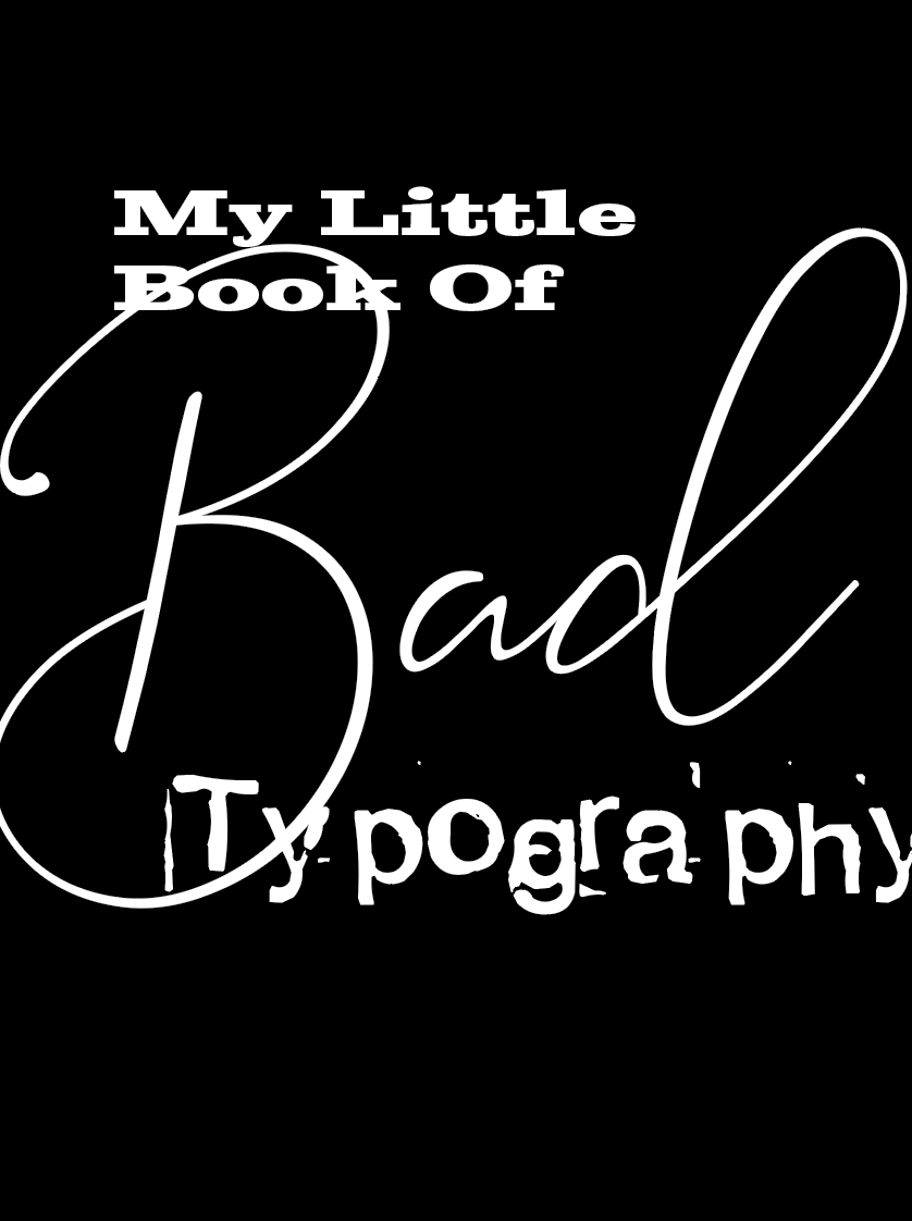
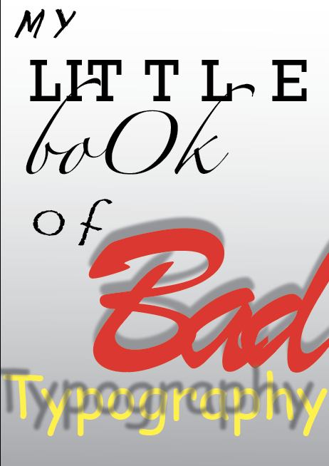
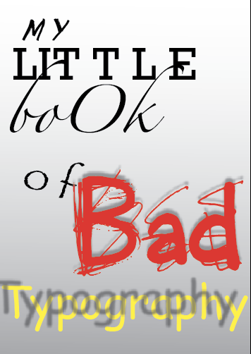
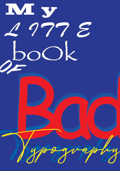
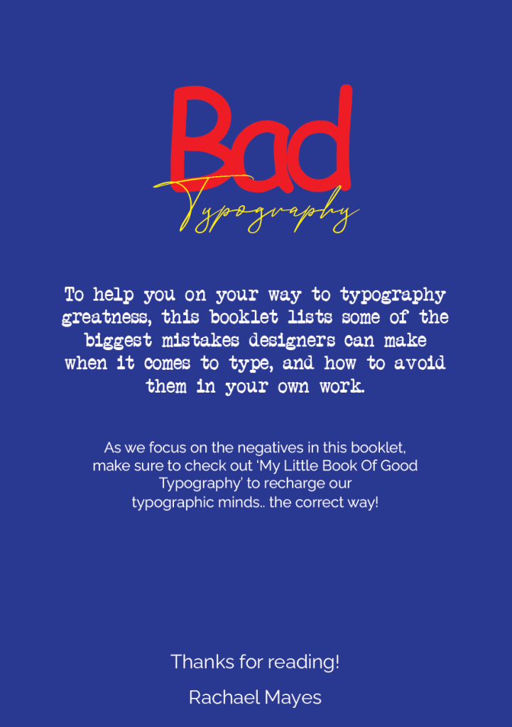
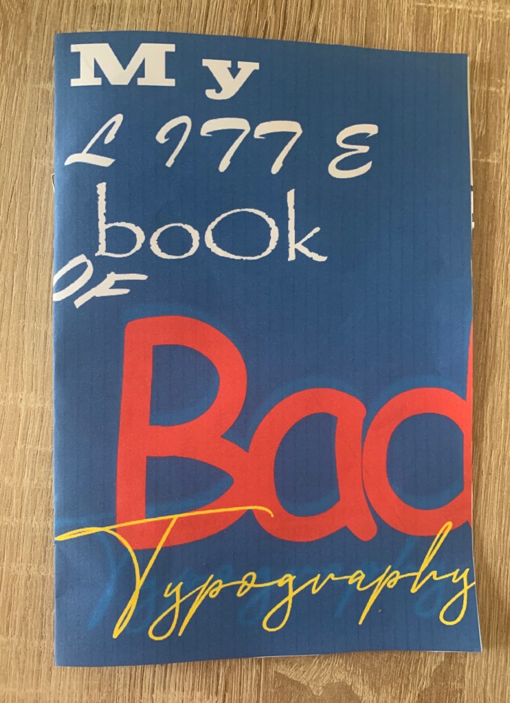
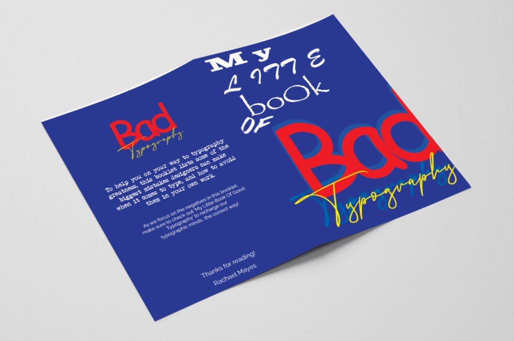
My Little Book Of Bad Typography
This booklet is a show and tell of bad typography! Here it lists all the mistakes which can cause havoc in your designs and reminds us of what to avoid from clashing typefaces to sloppy alignment. Filled with plenty of bad examples of what NOT to follow. This stapled A5 booklet will be printed on 115gsm uncoated paper – a slightly lower quality version of the Good Typography booklet (however will still be somewhat of good quality) So when seen side by side paper quality could be brought to light.
Mockups
I printed off both booklets with help of my flat plan to organise which pages are paired together for printing. Below shows the printed results. I printed the good booklet on 100gsm premium paper and the bad on 90gsm cheap printer paper, This made a noticeable difference in the quality of the booklets.
Digital Mockups
Reflection
Im pleased with the outcome of this booklet, Its refreshing to look back on my design process to see how my booklet has progressed, the colour palette is much better and helps the booklet to feel more professional and trusting – For future designs I will take time to test colour combinations in the design process. It is clear to see both booklets are part of a set, however still work well on their own (also with the additional advertising on the back suggesting the read of the opposite booklet). The content is informative and helped remind myself of the right and wrongs with typography, so hopefully will have the same impact on others!
Seeing my booklets in both printed and digital mockups helped me to feel even more confident in my designs, I believe they both work well with the brief and with each other, as well as individually. My only concern with the bad typography booklet is that I went too literal with the bad examples – although I suppose this is just my designer eyes watering from the amount of typographic errors!
I have enjoyed this assignment, its helped refresh my mind of the do’s and don’ts of typography. I enjoy looking back through the process to see how I got from start to finish and hopefully it is clear for others to see too.
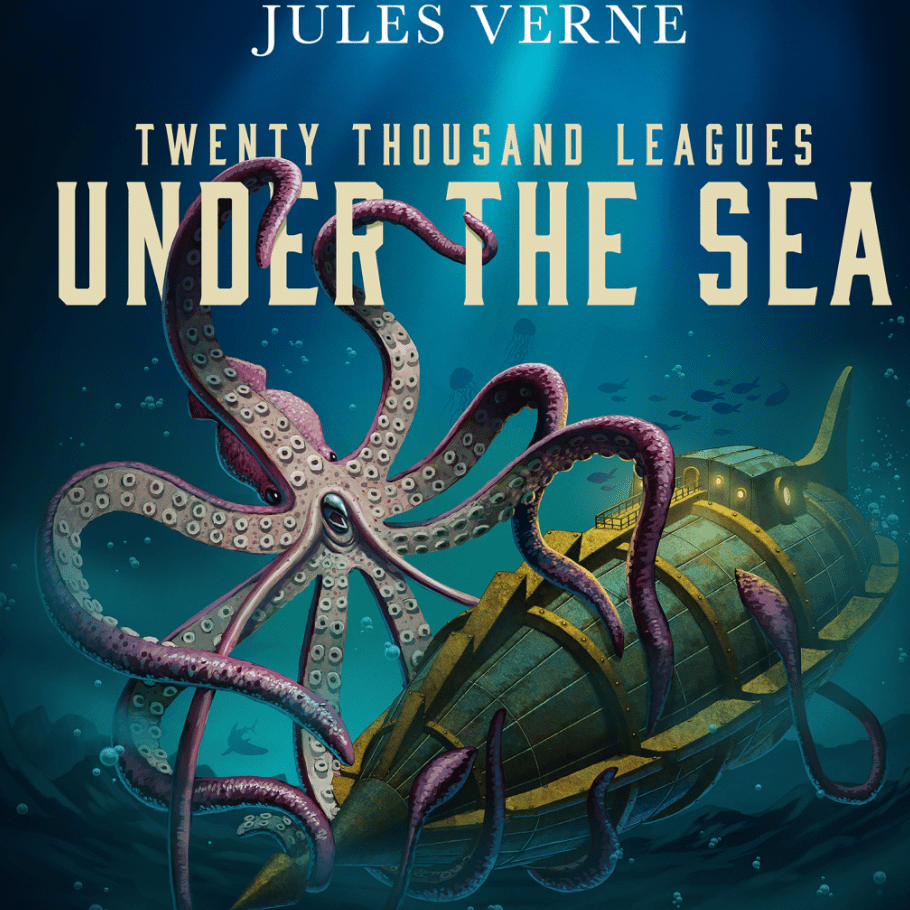
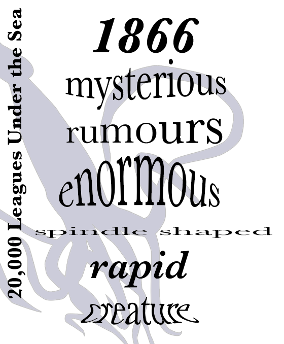
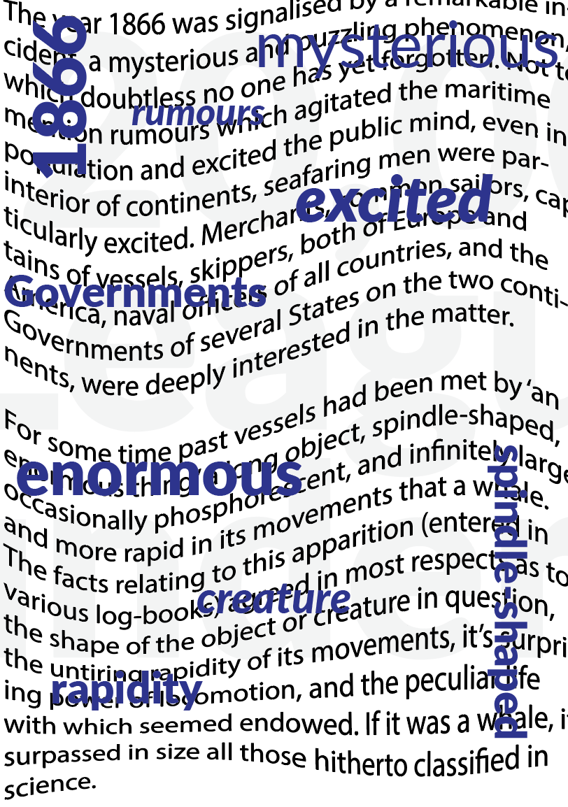
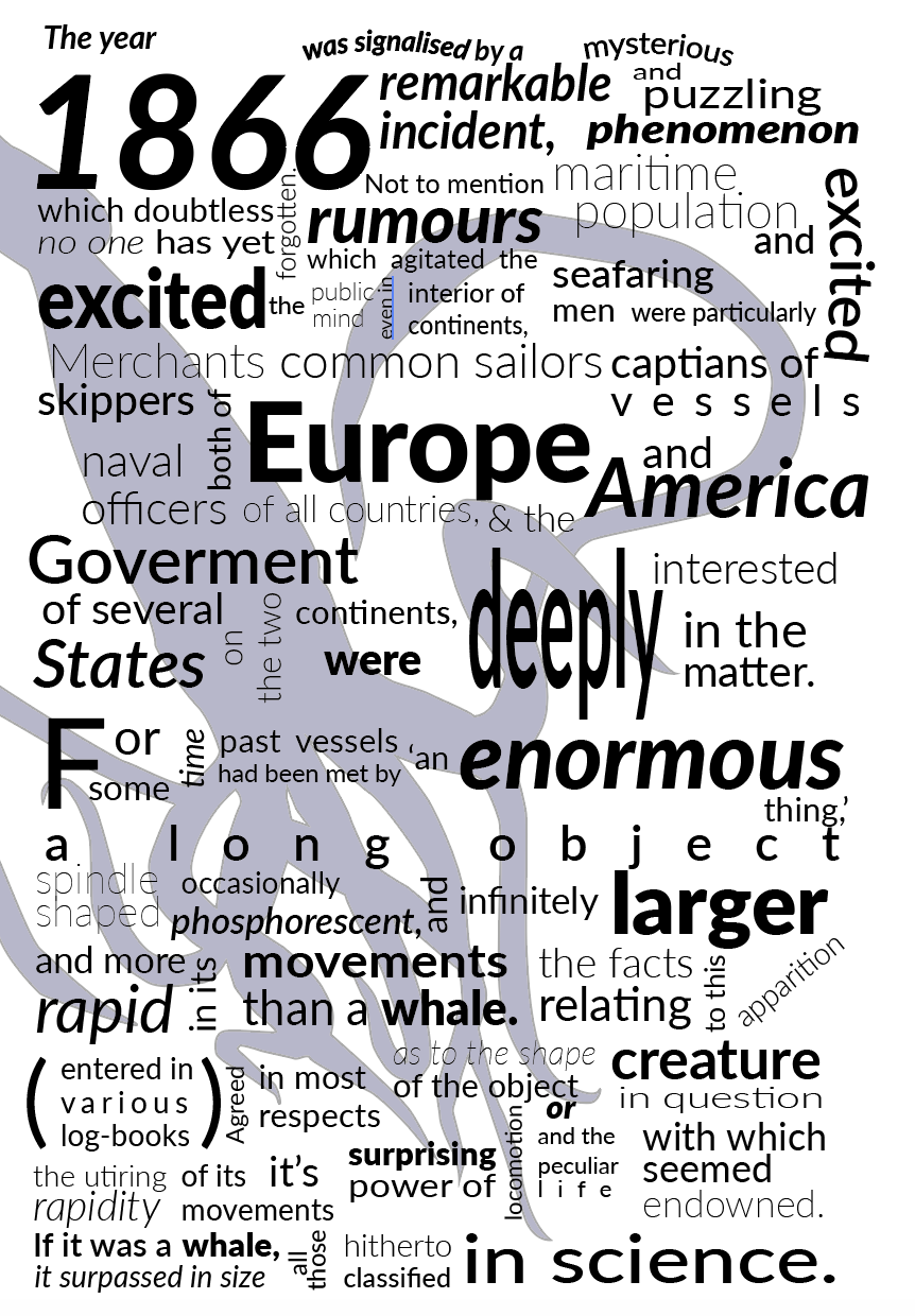
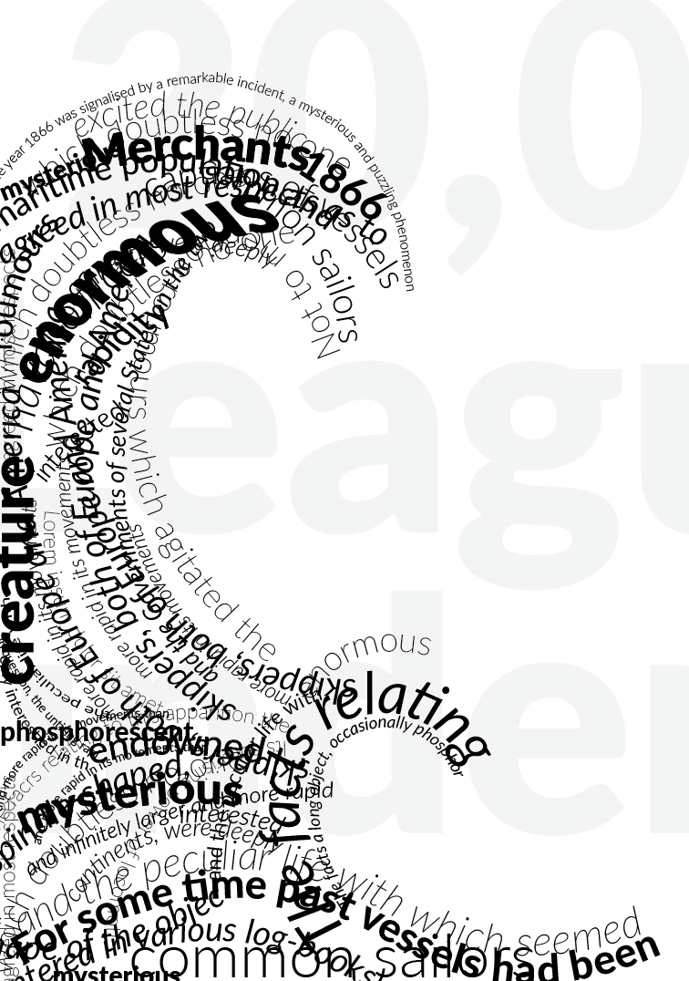
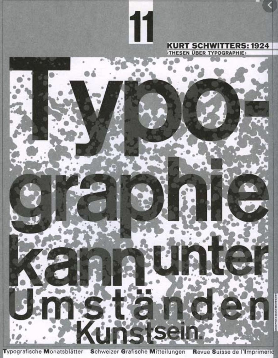
Below is an extract from Jules Verne’s 20,000 Leagues Under the Sea. Using a single typeface of your choice, lay out the test in as inventive a way as possible. Experiment with the letters and words, using typographic principles you researched in earlier exercises to significantly alter the arrangement of the text, its rhythm and readability.
Think about design group Tomato’s definition of typography – ‘Sound as from’ – and how this concept might apply to your own work. Use the content of the text to inspire visual ideas. How might you experiment with the type to communicate something of the essence of the descriptive content? Think about how the designers you researched in the previous section e.g David Carson and El Lissitsky, would approach the test – or artists like Marimetti and Schwitters.
It is important that you play with the text, with individual letters and words. How experimental can you be in making expressive typographic designers? Can you reveal something of the character and nature of the letterform by experimenting with scale and orientation, so as simple unassuming letter becomes a monumental, almost sculptural form?
Think about the sound of the words you are working with, how can your typographic decisions help to communicate these? As a book designer, you might be more drawn to analog or digital ways of working. Whatever your preference, try to mix and match both approaches. Your work on paper might become a starting point for digital experimentation with this text, or print out your initial ideas, so that you can experiment with what happens when you start to cut, collage or physically alter the text in some way. This physical work can be scanned to kick start a new digital stage.
Read the text through once before starting to manipulate the type. Make several designed versions of this passage, or parts of it, spanning several pages if need be. Feel free to focus on certain aspects of the text, or use the whole text within your designs. Use your learning log to reflect your creative decision making as well as sharing the various stages of your process.
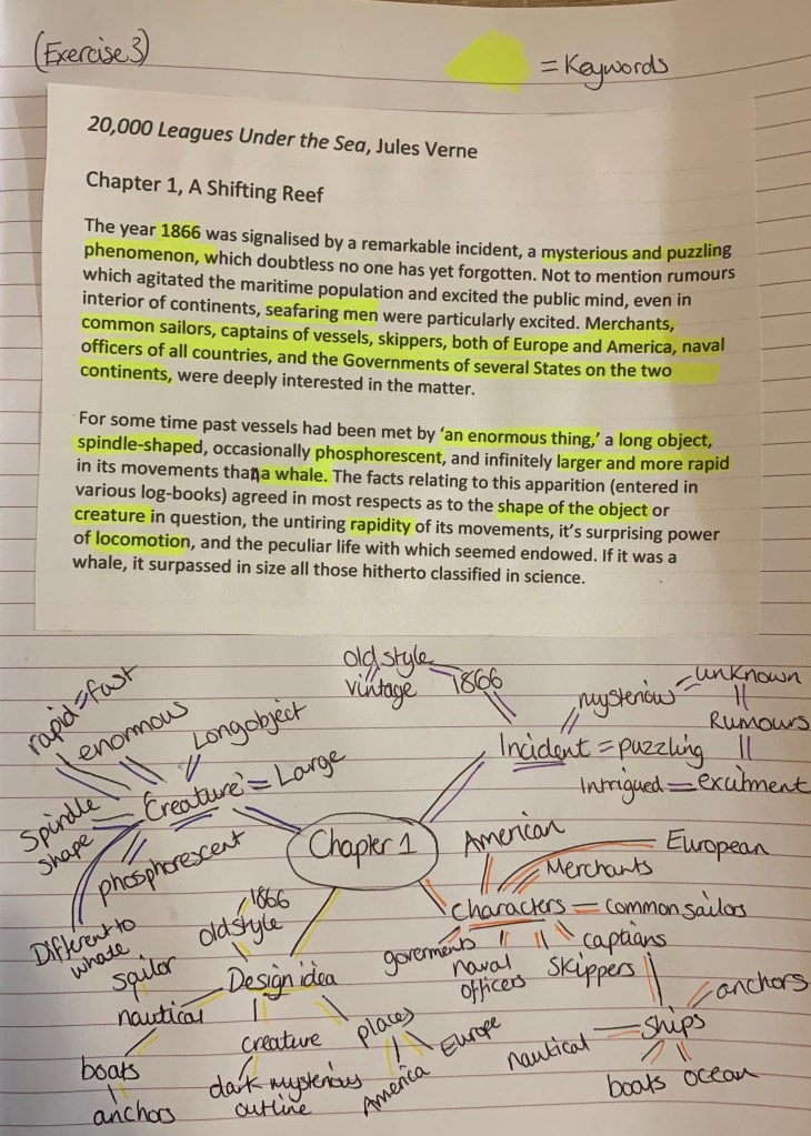
I started off by reading the extract then decided to print off my own version of the text so I was able to make notes to start stimulating ideas.
To get a better understanding I was intrigued to find a little more out about the book and the story.
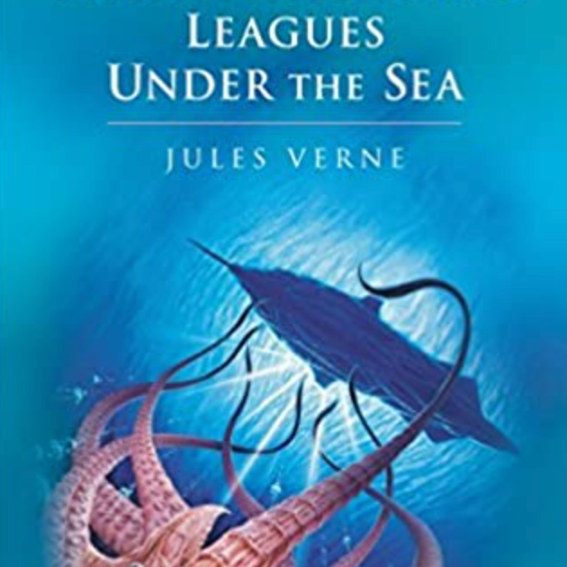
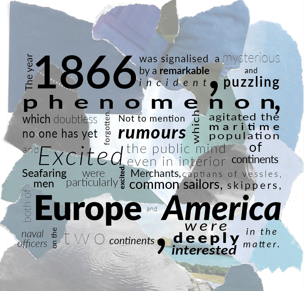
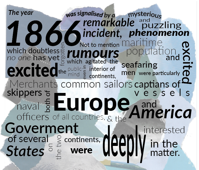
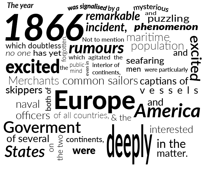
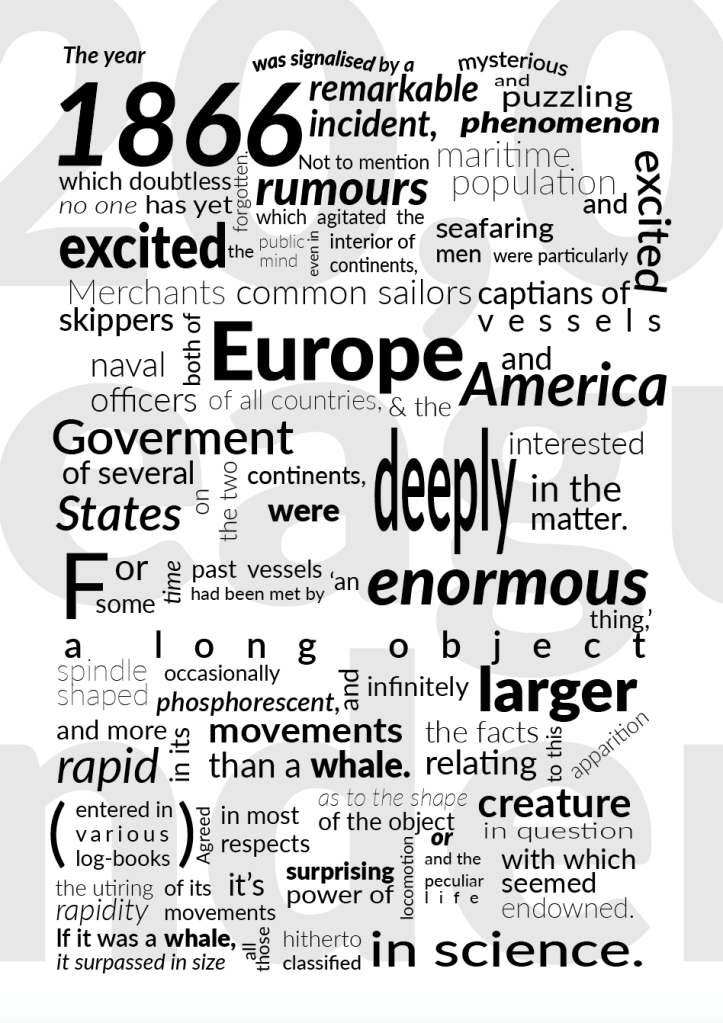
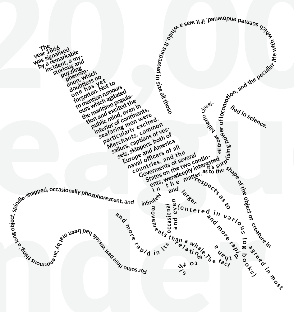
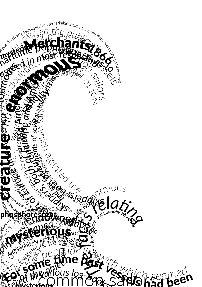
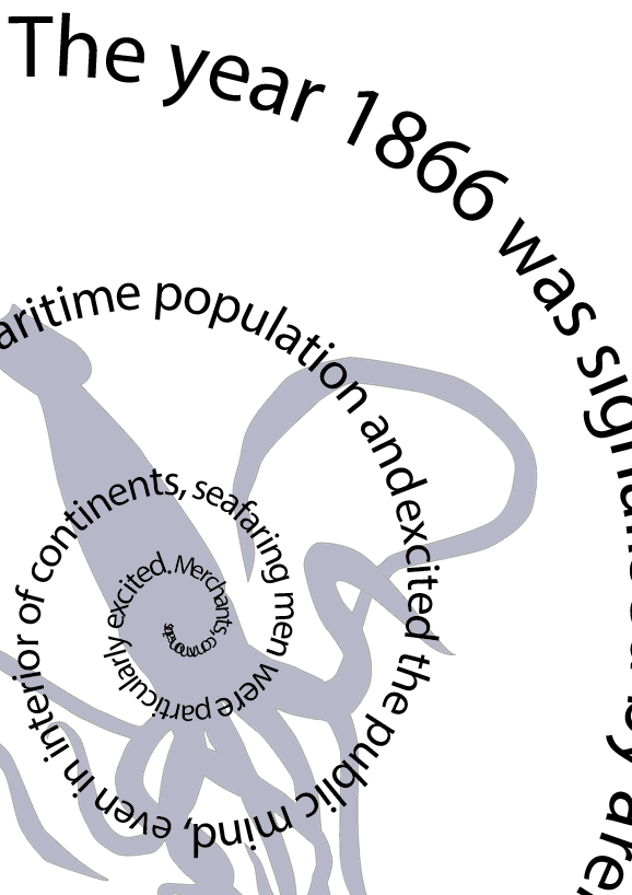
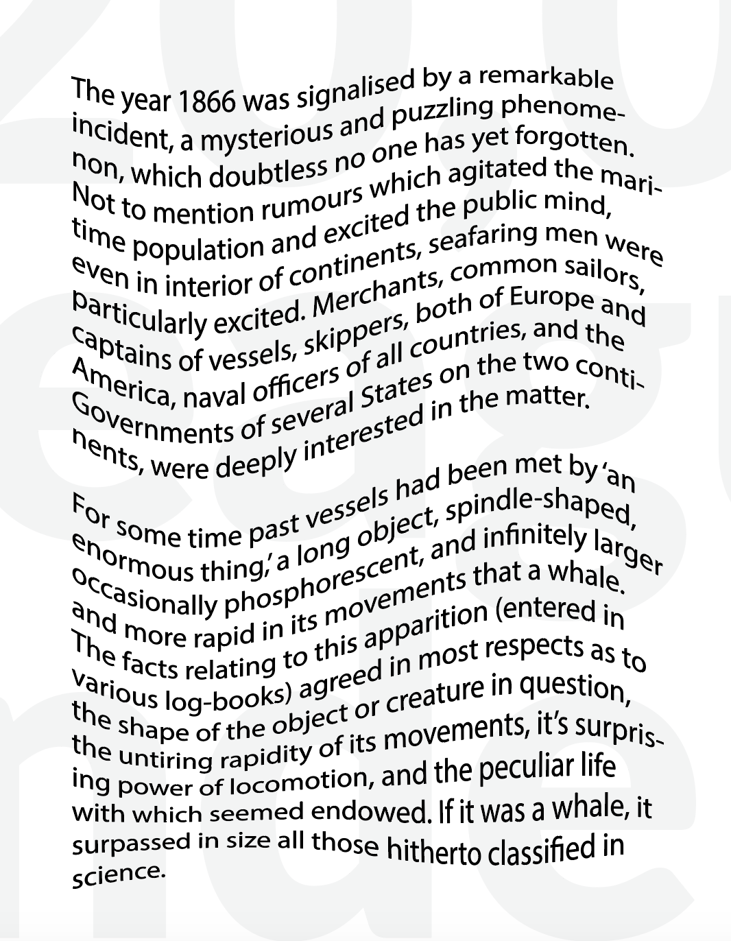
Written by Jules Verne in 1870, 20,000 Leagues Under the Sea is a book that tells us the story of three accidental visitors to an underwater world hosted by the mysterious Captain Nemo. They originally encounter the Nautilus in the Pacific Ocean as part of an expedition to find out what species of undiscovered whale has been damaging world shipping. However, far from encountering a whale that has wrecked world shipping. As the book progresses, the men hunt underwater, fight sharks, encounter Atlantis, and fight off giant squid.
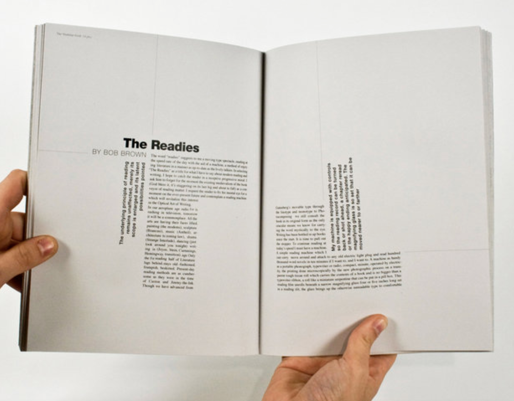
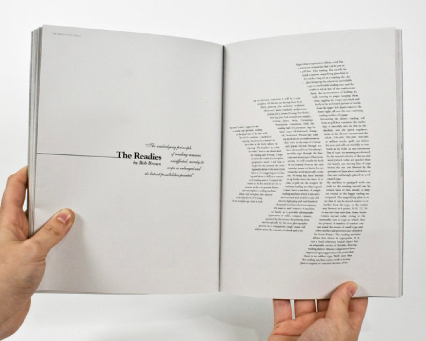
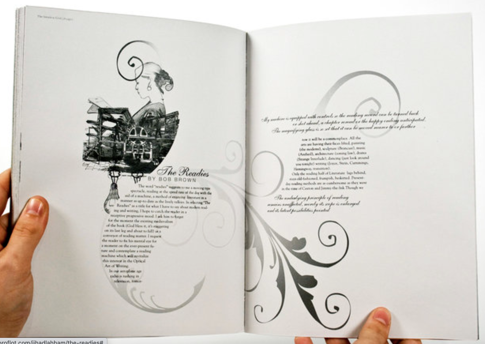
Following the advice in the brief before starting my design process I wanted to research and remind myself how other designers have approached this kind of task.
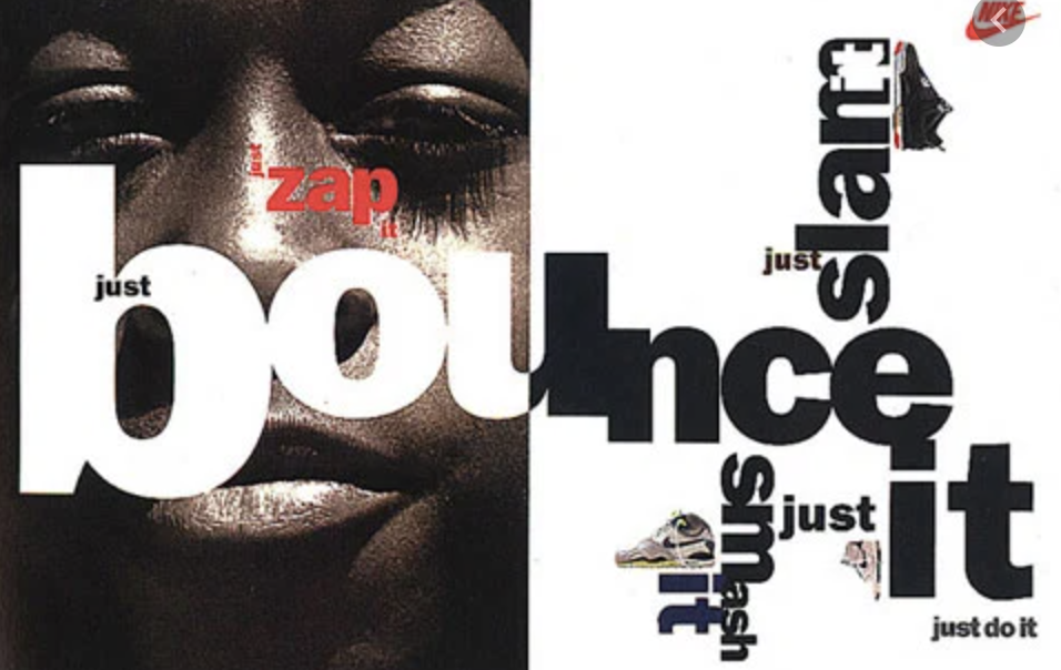
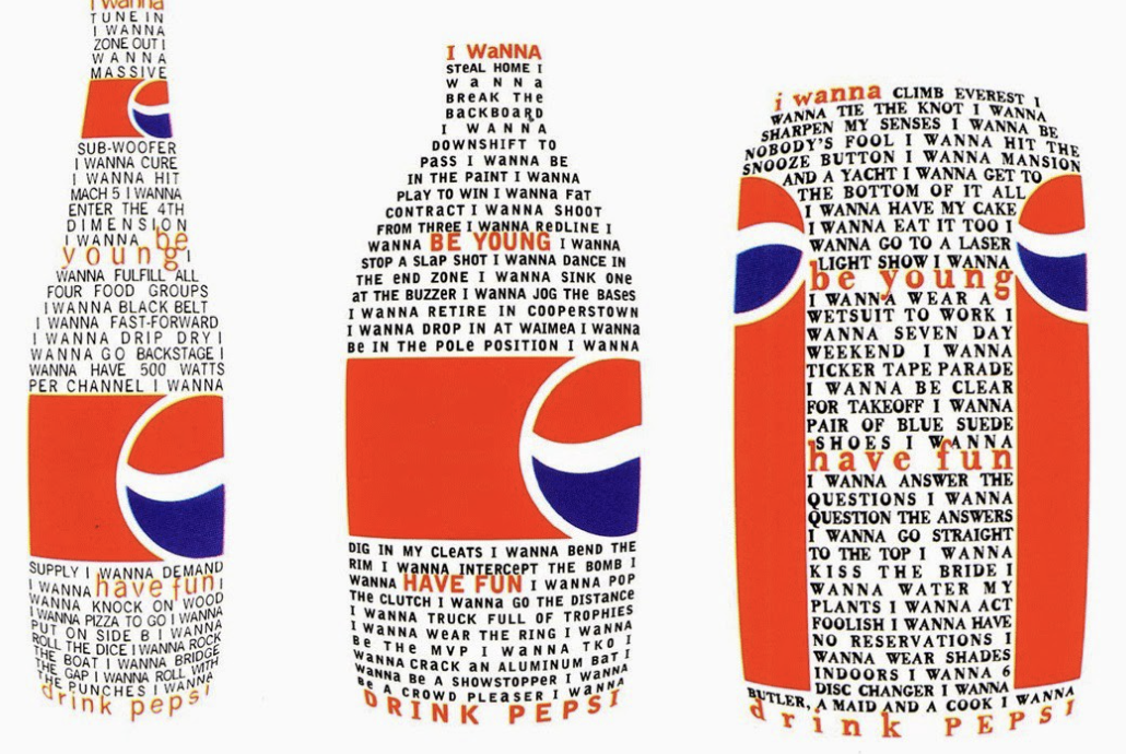
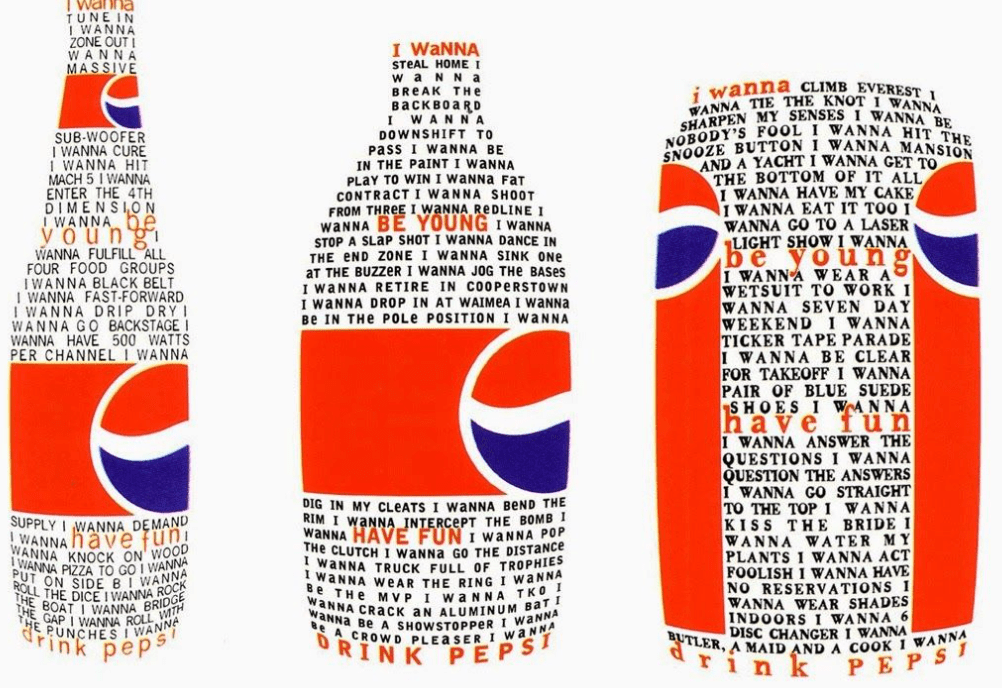
David Carson
David Carsons is a very experimental designer and his style of work for this exercise has inspired me. No two designs are the same, the chaotic typography and pattern created with objects overlapping looks confusing yet holds the design together so well. I particularly like the Pepsi deigns and the mixed media collage – both very strong pieces of work which has given my ideas for this exercise!
Sketchbook Designs
Im not too sure where I want to go with this design however I wanted to experiment with a few different techniques.
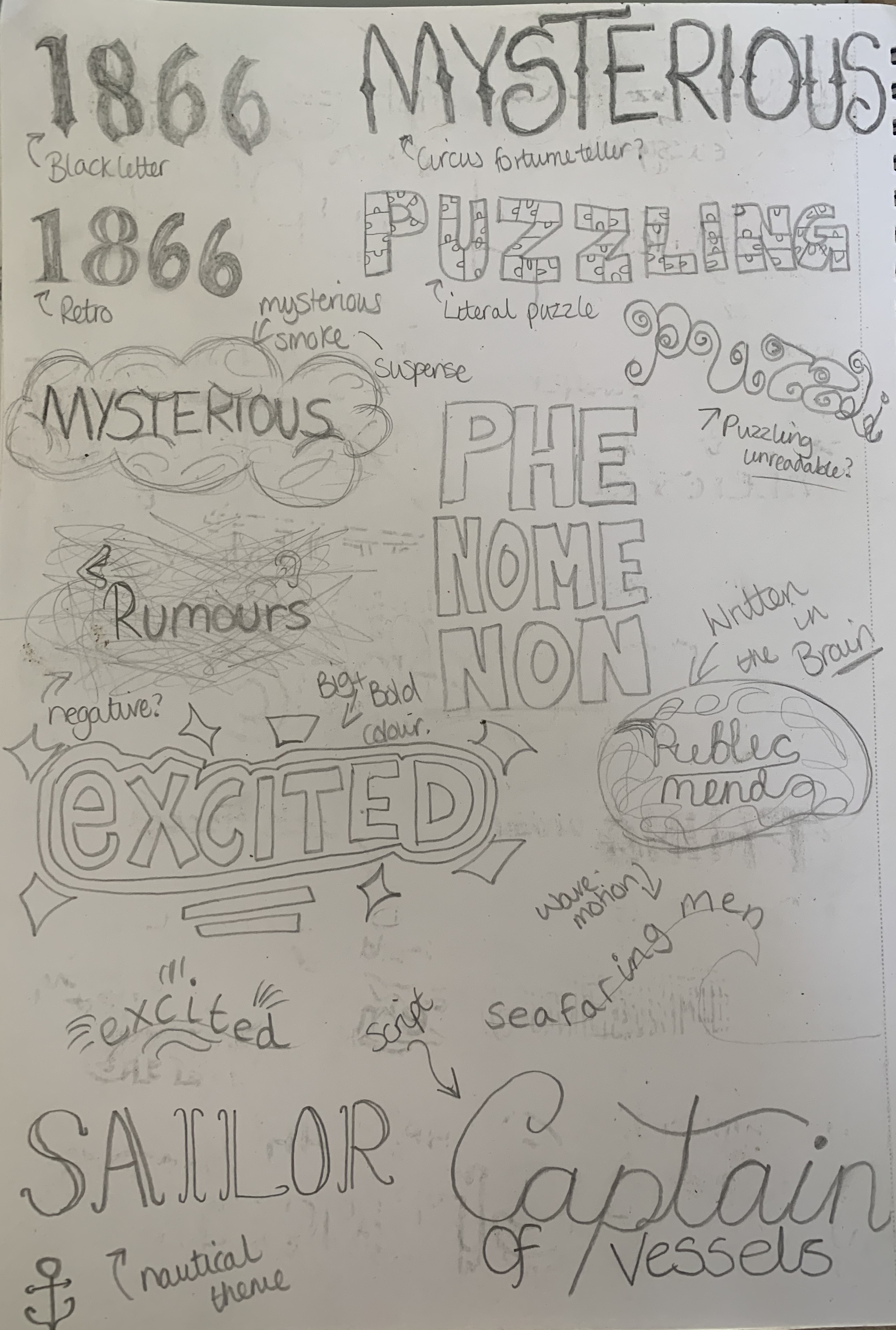
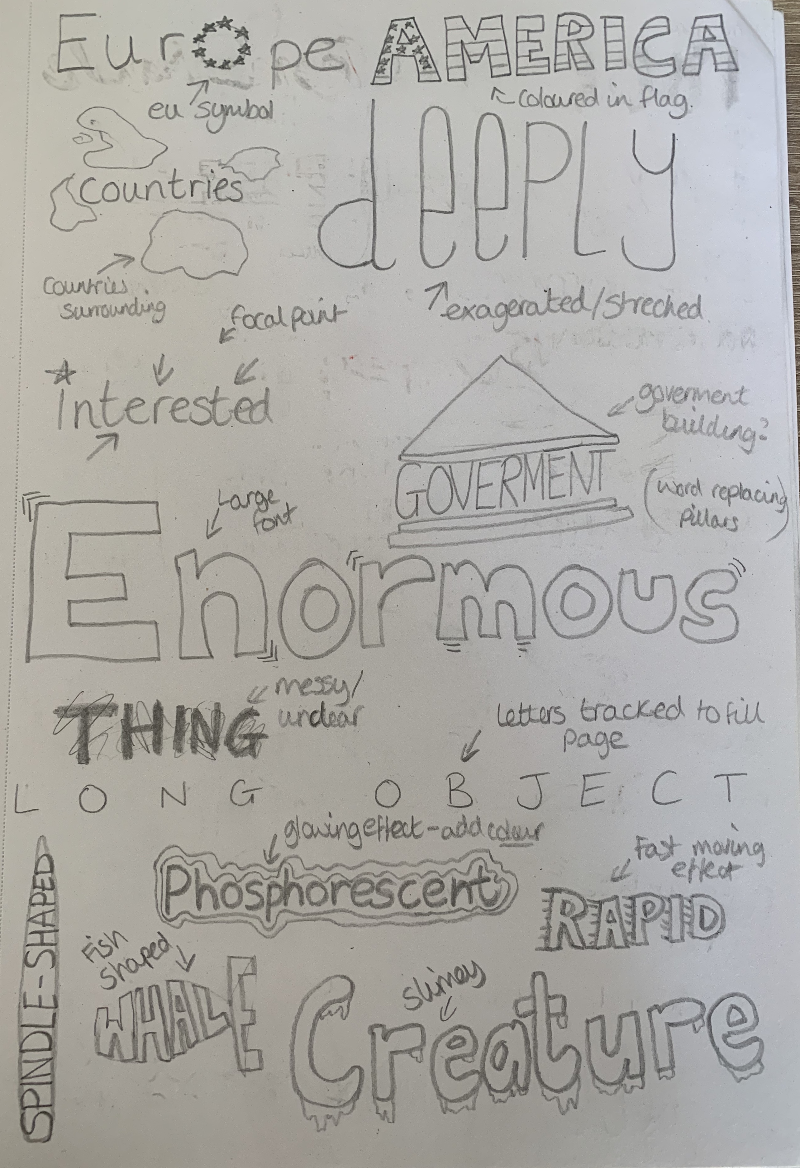
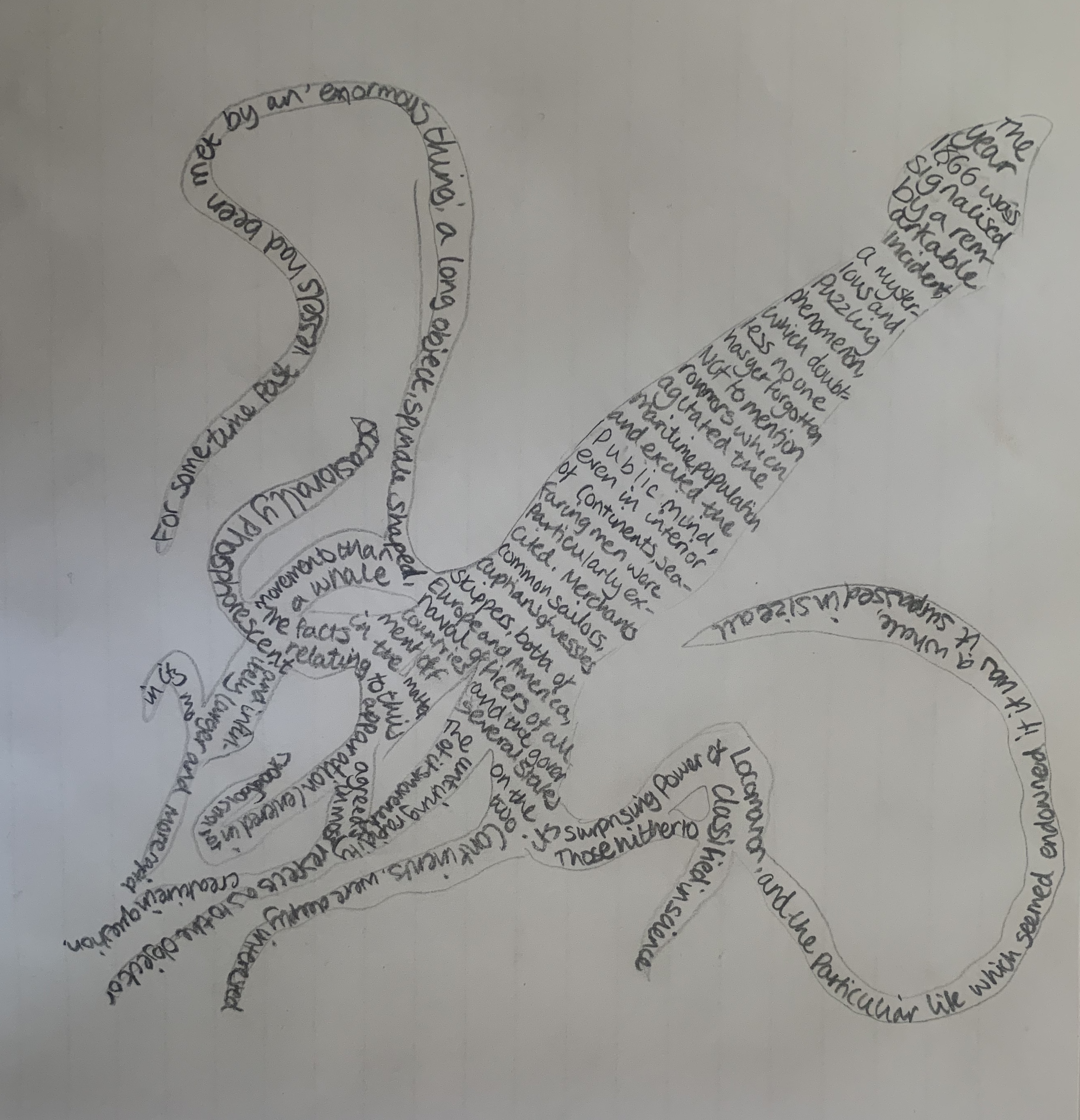
Firstly I decided to roughly sketch out the words visually, I done this as a quick thinking task as I didn’t want to think too deeply into the meanings at this point.
I then decided to write out the first chapter of 20,000 Leagues under the sea using some of the visual representations of the words. Some words are more successful than others, however I still feel that the meaning is expressed correctly. Perhaps if this was created digitally it may look neater however to me looks rather messy. Im glad I experimented with my sketchpad but I would much prefer to work digitally for this exercise. Also it wasn’t until after completing this I remembered the brief stated to use one typeface!
Design 1
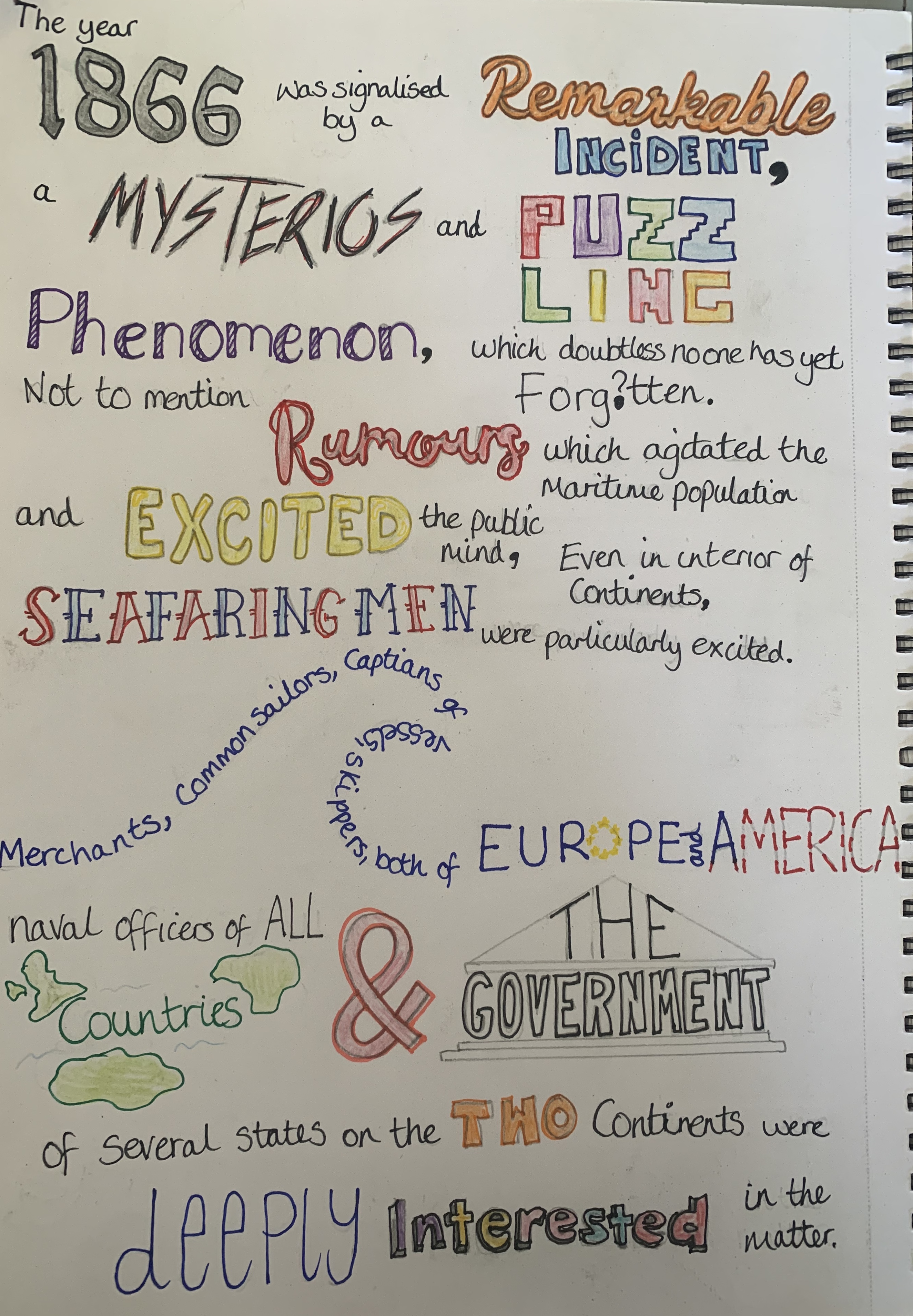
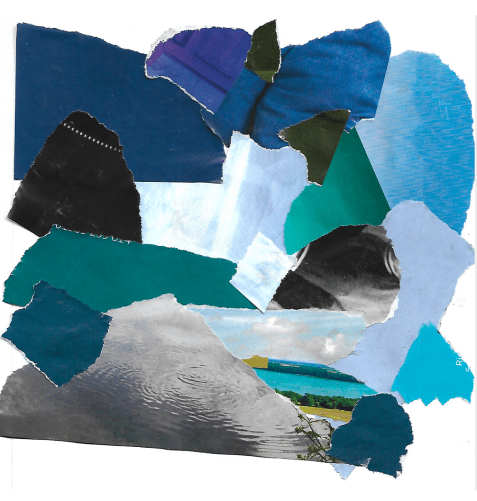
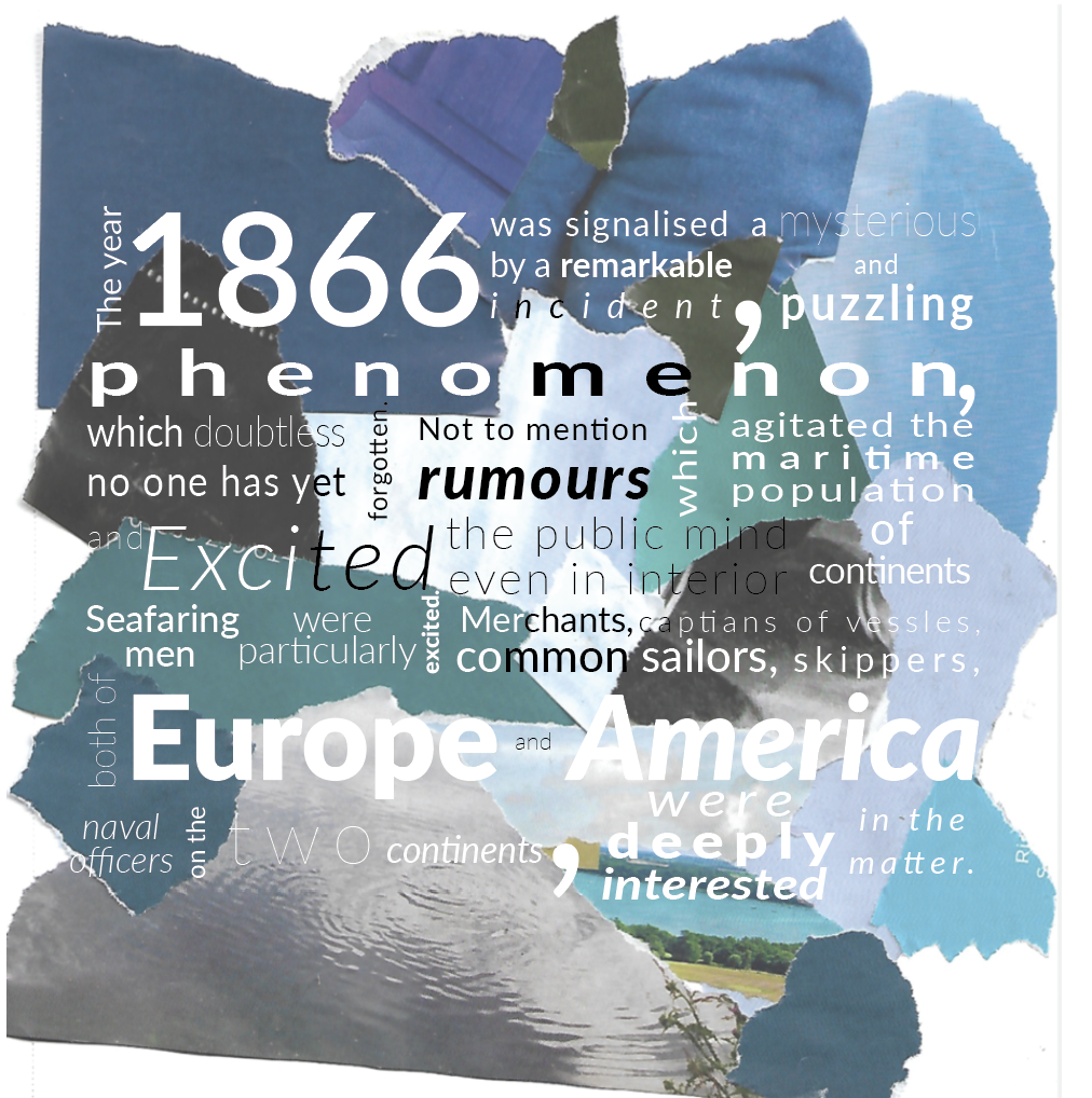
Inspired by one of David Carsons artworks I went ahead and tore off different shades of blue from a magazine along with images of water and created a collage and scanned it onto my computer. I want to use this as the background and apply the typography over the top. This is experimental and may not succeed however I really wanted to test this design out!
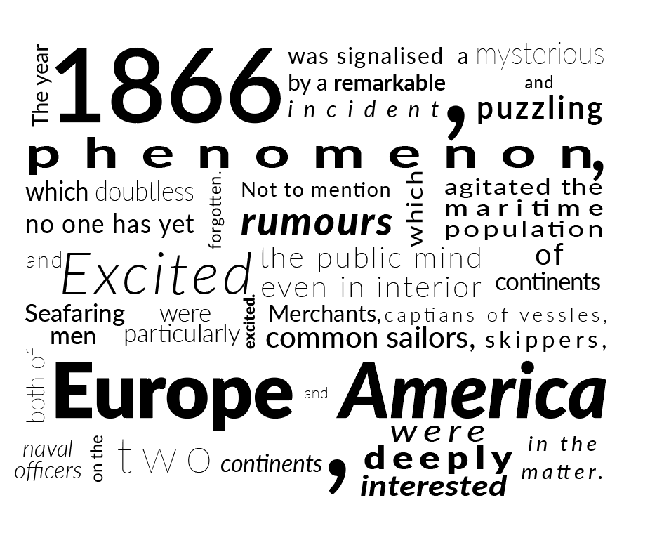
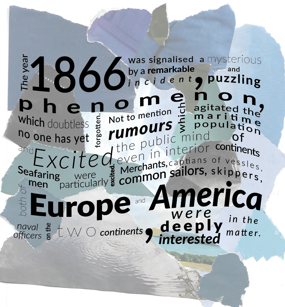
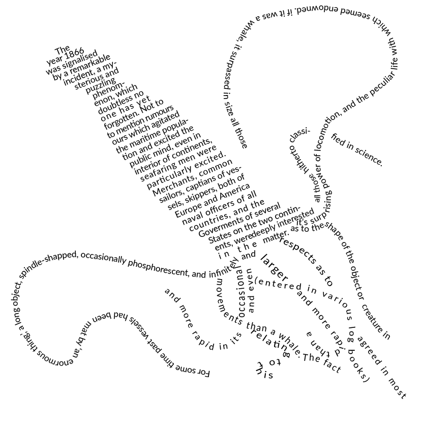
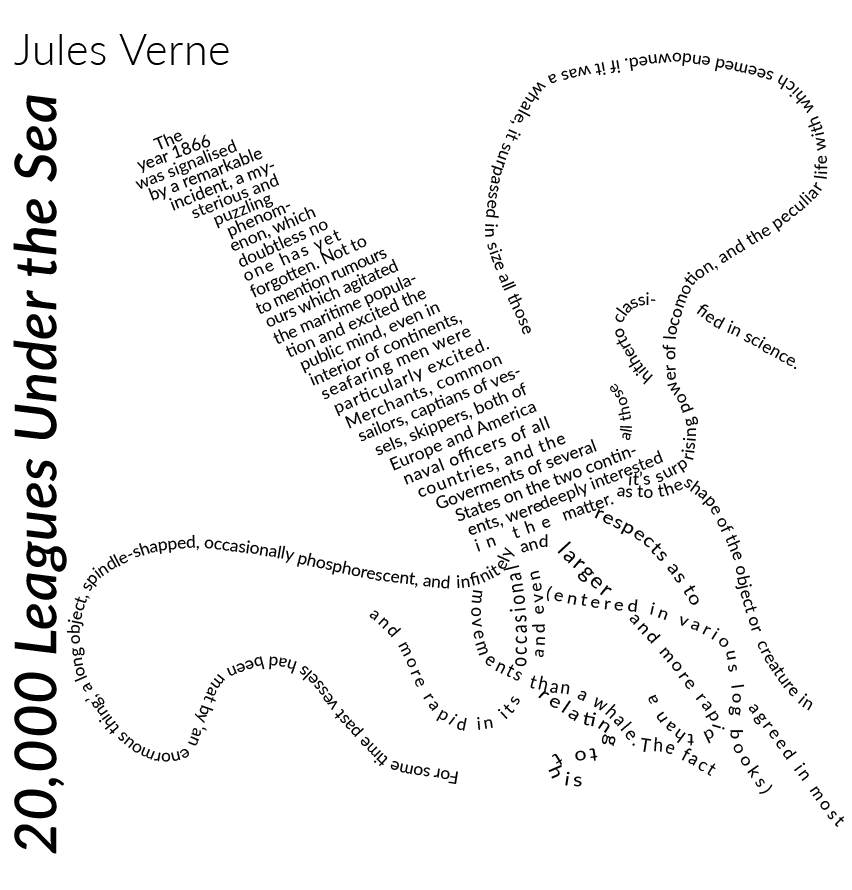
For my first typography experiment I decided to used the typeface Lato and make use of the variety of different font styles, adjusting the tracking, size and position of words to create an interesting layout. By adjusting these features I was able to select certain words to exaggerate them and make them stand out from the rest. I was slightly disappointed that it didn’t look how I wanted with the torn background, yet still looks interesting and creative on its own.
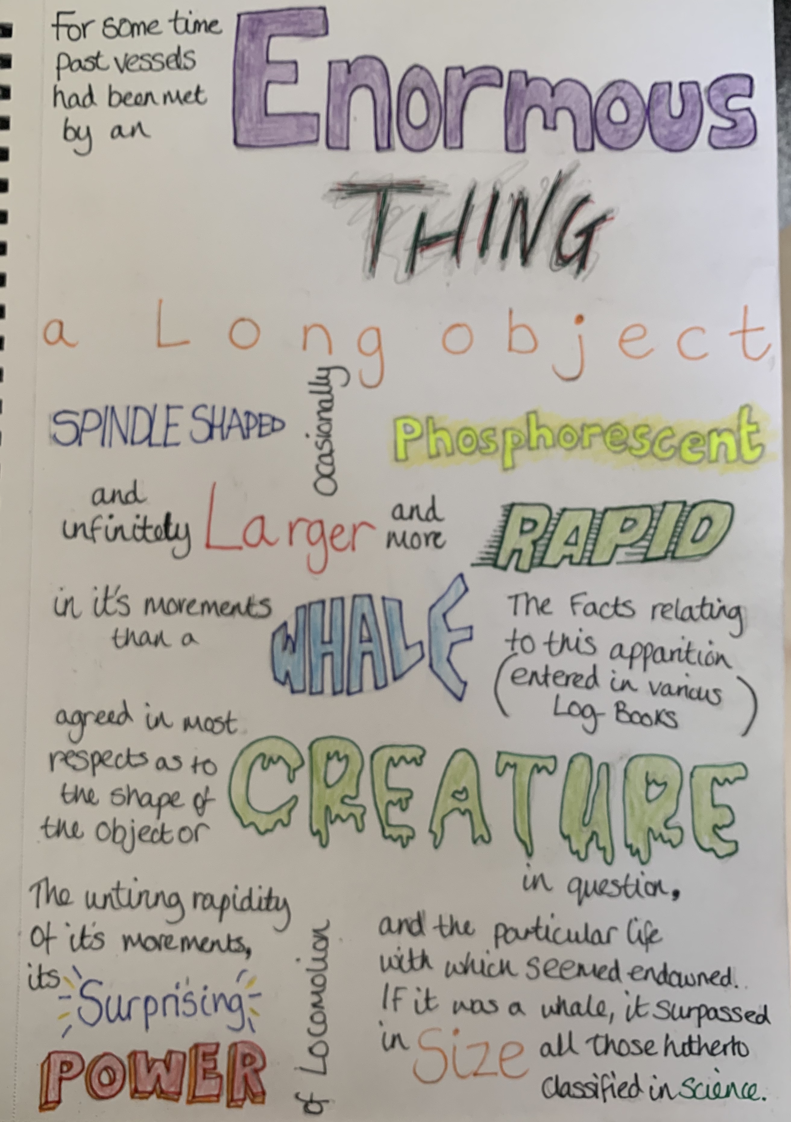
I completed the rest of the chapter and added in a large font of the title in the background. Im happy with the end result of this design, I feel it fits the brief as stated by using the same typeface in interesting ways. By adjusting the size, tracking and style I was able to achieve an interesting layout which adds contrast, I was able to highlight some of the keywords by making them larger and bold.
Design 2
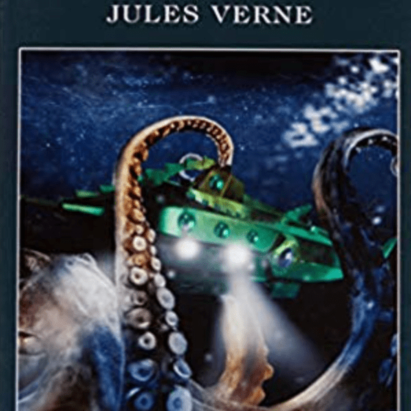
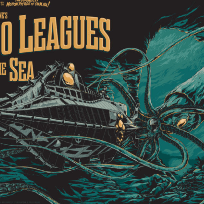
I looked further into previous designs of 20,000 leagues under the sea for further inspiration and found the majority of designs seem to feature the giant squid as mentioned in the book. Using this creature I wanted to create something again inspired by David Carson.
The image to the left is where I found inspiration for this design, I sketched out a drawing of a giant squid the simply filled the shape with the words from chapter 1.
I’m really pleased with the outcome for this design, the text clearly symbols a squid in a creative way.
Design 3
Following from the design technique above I wanted to create the shape of a wave, I overlapped the text as I wanted to experiment with this technique in a less structured and ‘messier’ way.
I think this is my favourite design out of all three, I like the roughness of the overlapping creating texture and contrast in the design. I gained inspiration for the wave design with the use of the golden ratio, along with the technique used in design 2.
Other design ideas
To ensure I was satisfied with my designs above I decided to try some fast thinking designs to create different variations using a single typeface to see if any other ideas came into comparison.
Although these are fast thinking designs and very rough, It has made me feel much more confident in the 3 designs I had previously created.
Final Designs
Reflection
I found this exercise slightly slow burning, it took me a while to move on between each of the design as I lost my ‘creativity’ however now looking back Im glad that I managed to get there in the end! I had experimented with colour however I felt the designs looked much stronger in black and white, it seemed to take away the focus from the words. Im glad to of been able to create successful experimental typographic designs, I feel that each design works well with the brief and each design is very different.
Brief: This two part exercise aims to understand the relationship between typography, the grid, and the page in more depth by analysing existing layouts and creatively developing alternative ones. Both of these activities will feed into assignment three.
Part 1 – Understanding layouts Research into book layouts that you find interesting. These could be art or design books, or others that have more complex layouts that balance images, typography and other content across multiple columns. Trace the grid structure of your chosen double-page spread using tracing paper and a sharp pencil. Measure the margins, column width and depth, plus spaces between the columns. Transcribe the tracing onto a clean sheet of paper, drawing on the measurements. Compare your drawings to other double-page spreads within the same publication. Identify the similarities and differences – is there an underlying grid system and how does it adapt to deal with different content? Now recreate the same double-page spread using DTP software. Use your traced drawing measurements as a guide.
Part 2 – Experimental layouts
Extend the project by thinking about how you might radically change these layouts – what creative decisions around the grid would you make to improve these designs? Develop layout ideas that ignore the grid structure, challenge it, or offer radical alternatives to the existing layouts. Develop a range of ideas through thumbnail drawings and DTP layouts, in a similar way to the first part of the exercise. Use this as an opportunity to take creative risks, and find radically different ways to layout the existing content. This process might challenge any preconceived rules about how a layout should normally work. Reflect on the process in your learning log.
Part 1 Understanding Layouts
I started off by collecting interesting design layouts, It was fascinating to see some of the way designers have presented their layouts to create unique and eye catching designs – however it made me question of how easy they would be to follow and read.
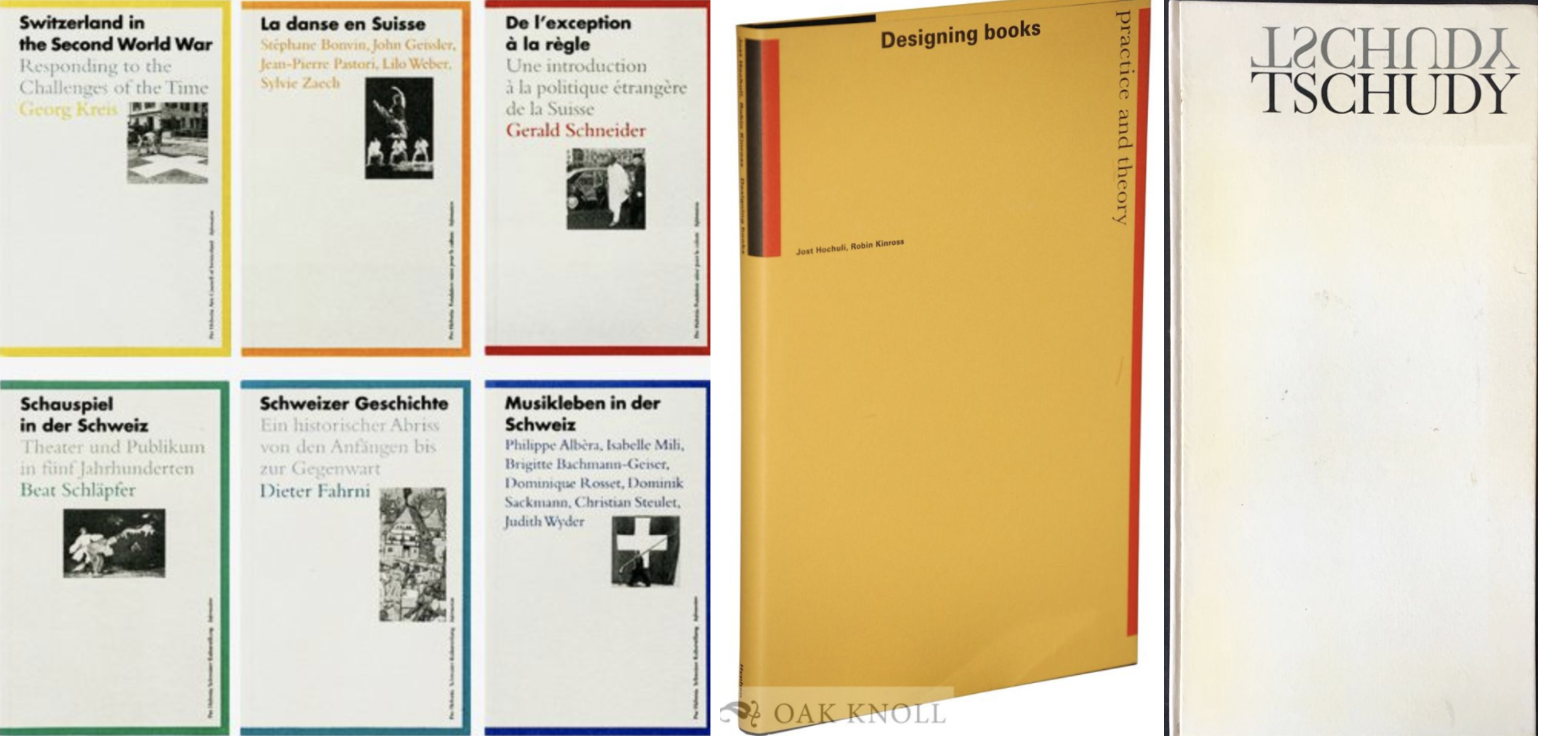
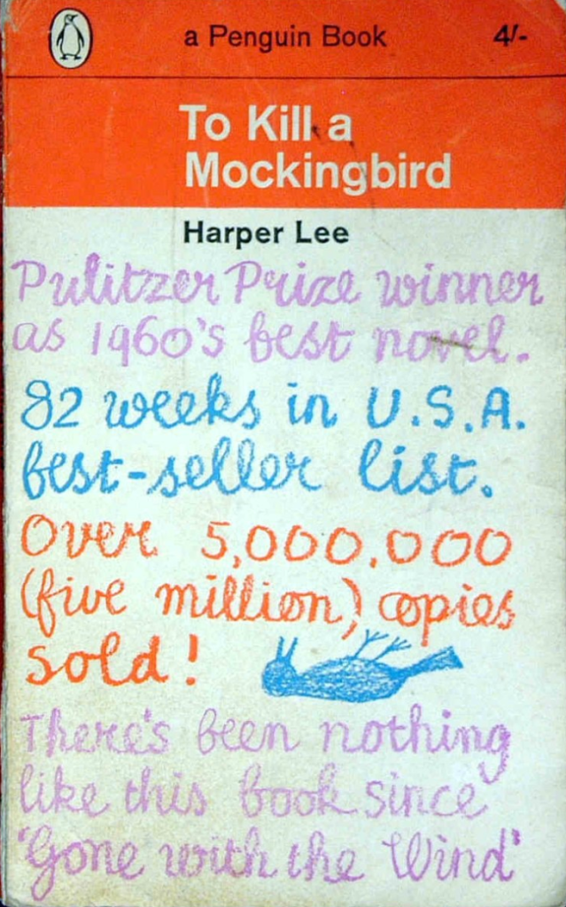
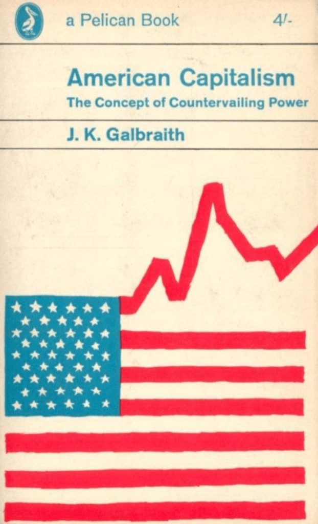
I then looked at layouts in magazines that I had, there are a few that I disliked (see first 3 images) These came from cheap gossip magazines & a tv guide. I dislike these because of how cluttered and crammed the pages look, there is too much to concentrate on and I don’t feel that the columns flow as nicely as the more ‘plainer’ layouts.
I was disappointed I didn’t have more of a selection to choose from, which reminded me that I needed to update my collection! However as you can gather I prefer more of a sophisticated layout where the columns are evenly spaced out with the use of large imagery.
I wanted to see the difference between magazine layouts to a couple of design textbooks which I have. Of course the layouts for these are very different, these are more imagery based with the text in one single column rather than multiple. All these examples contain little text as they are more factual in relation to the images surrounding, other than the last image which is more textbook style than art book.
Grid layouts
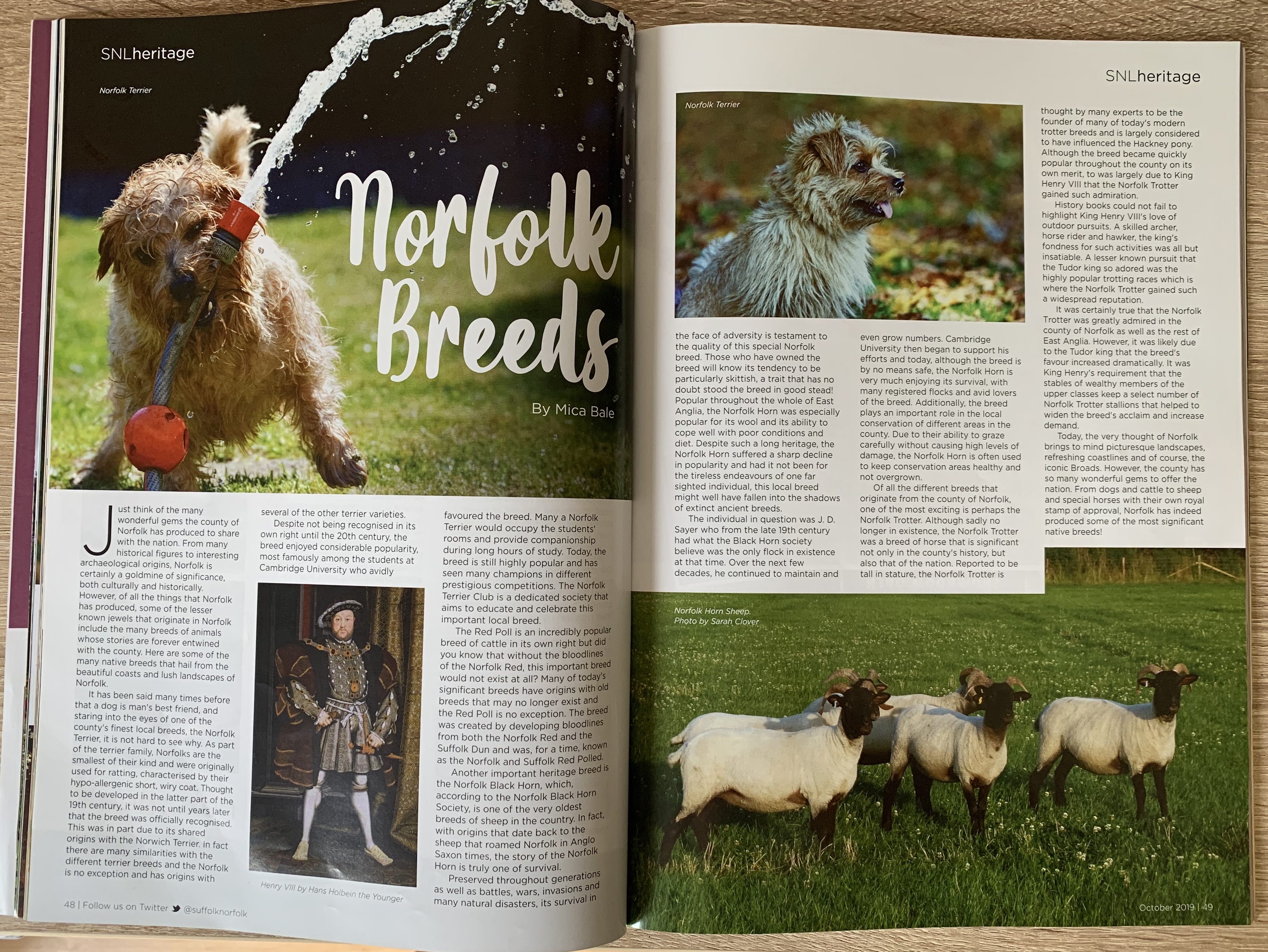
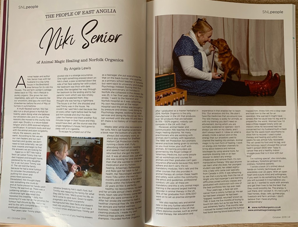
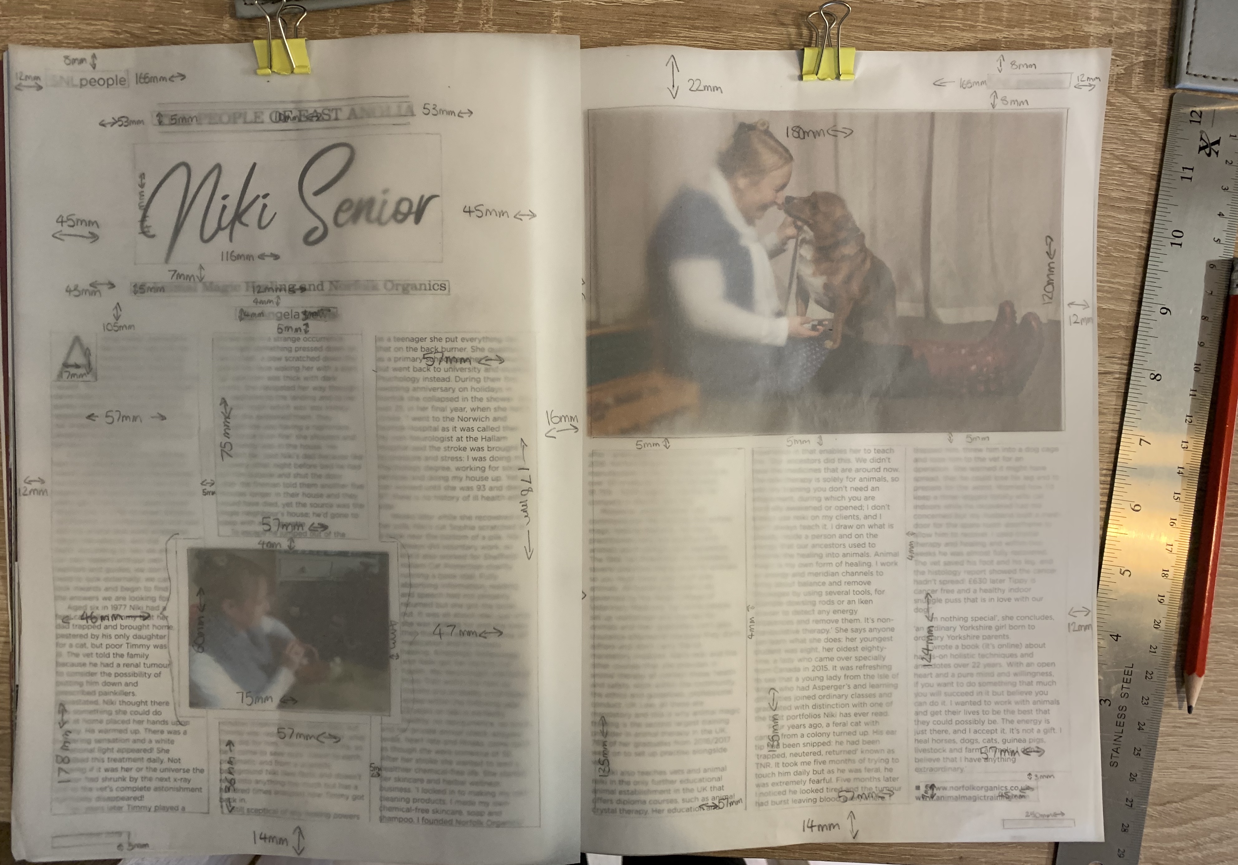
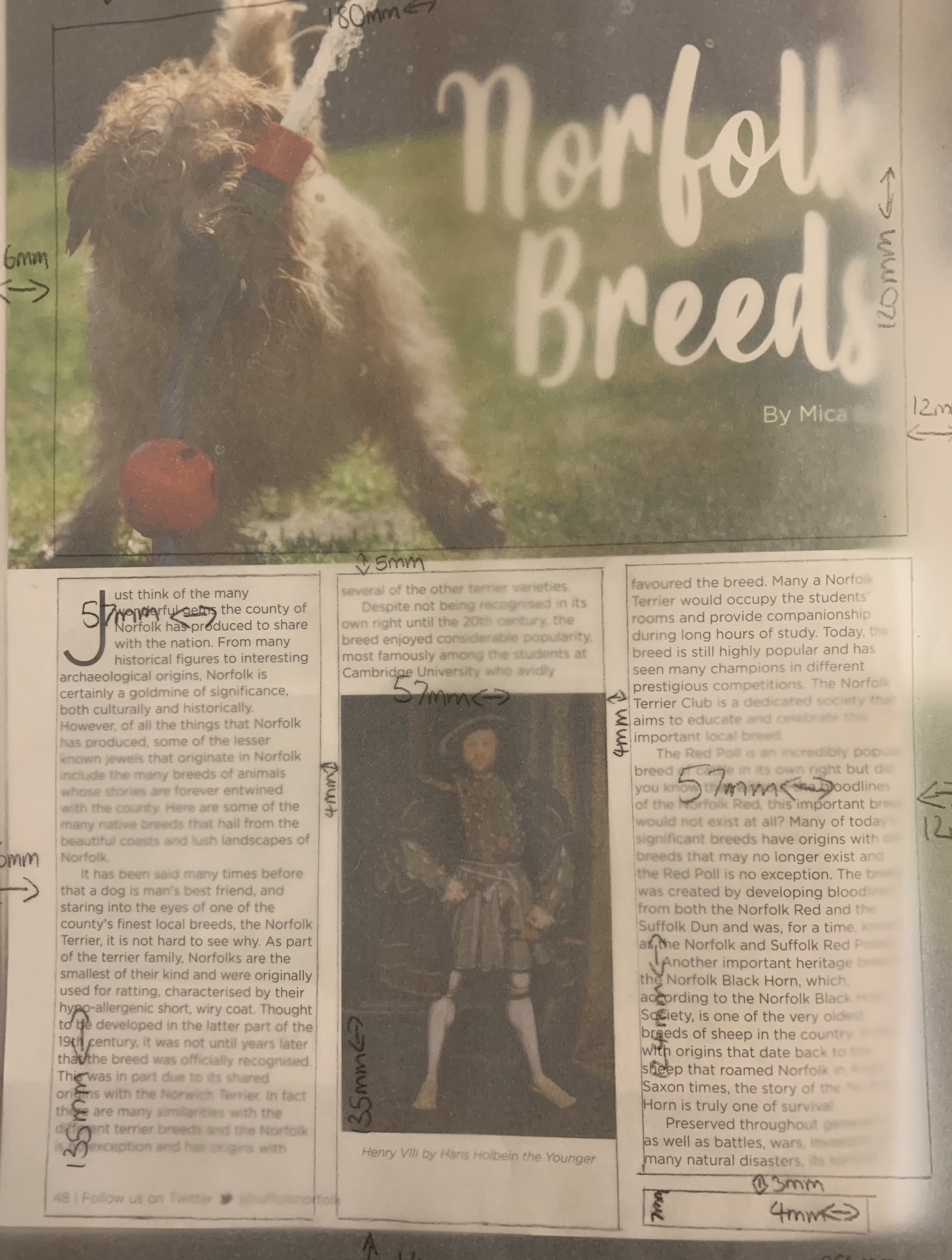
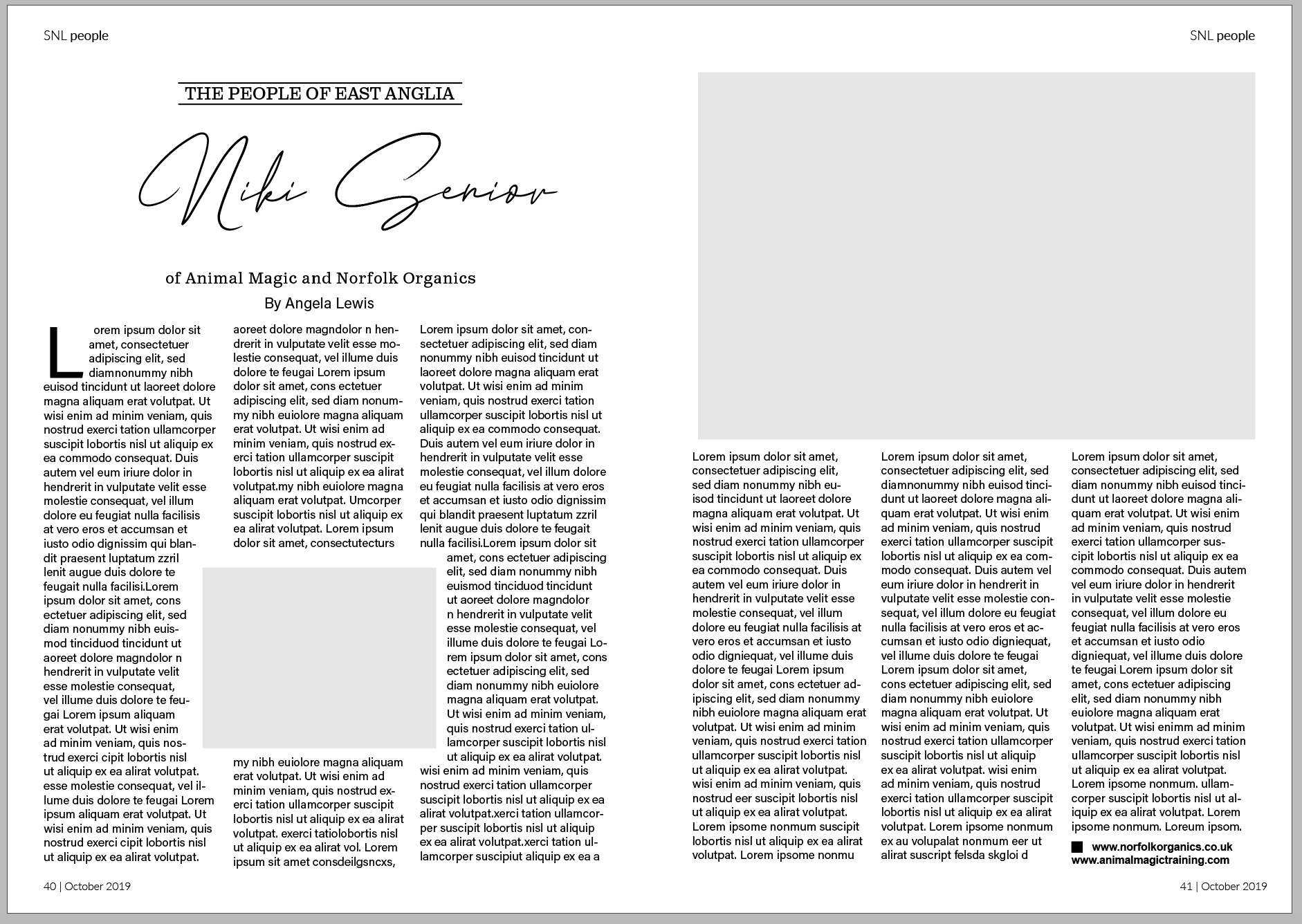
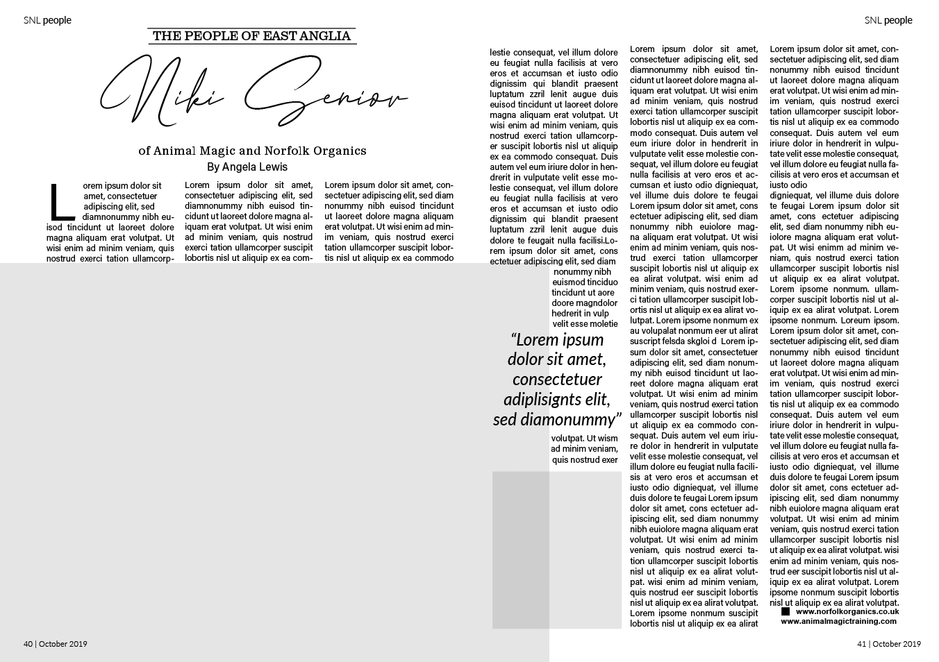
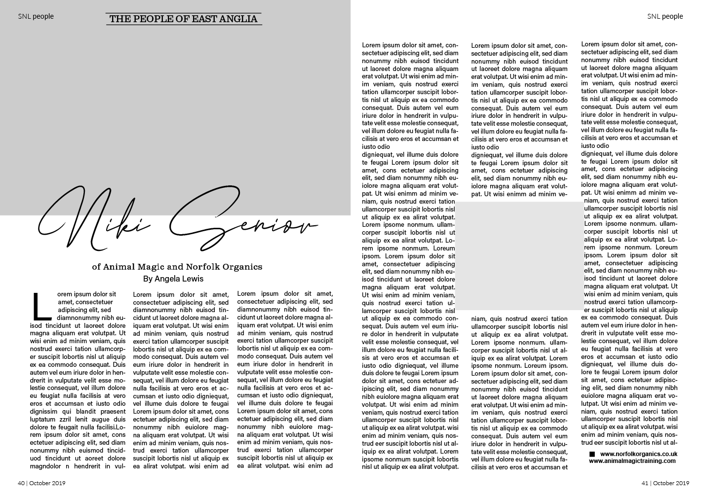
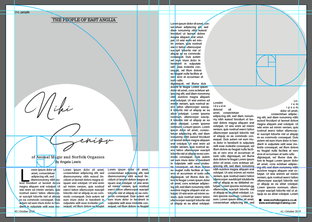
The design I wanted to look at the grid first is from a country life magazine called ‘Suffolk Norfolk Life’ October 2019. I liked this particular layout because of its clear structure and balanced images (small image on the same page as the title to even out the larger on the opposite page).
Original layout Suffolk Norfolk Life Oct 2019
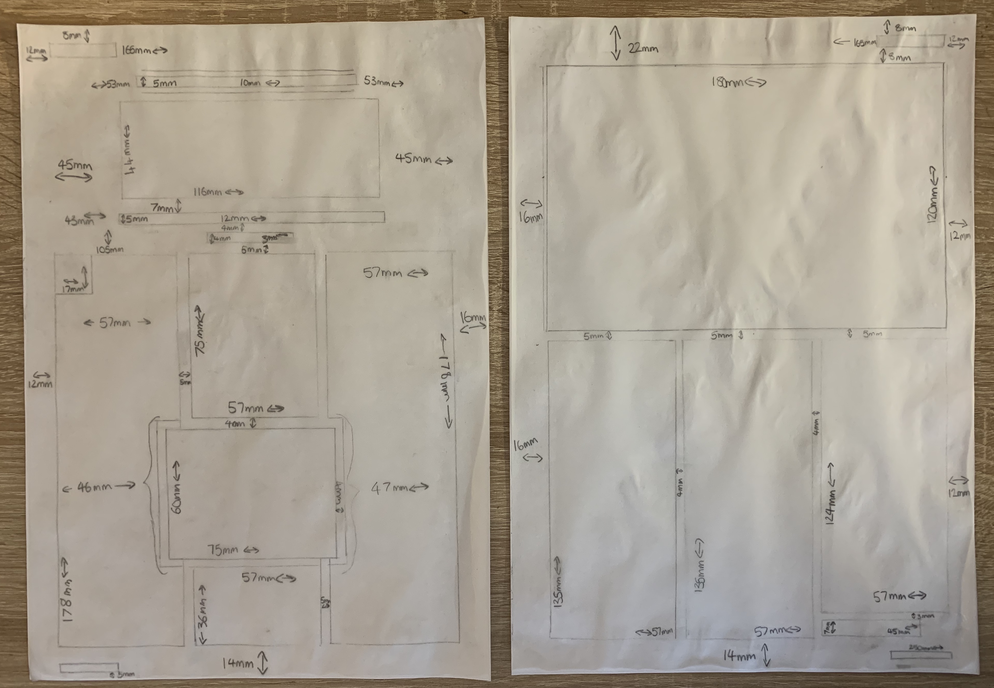
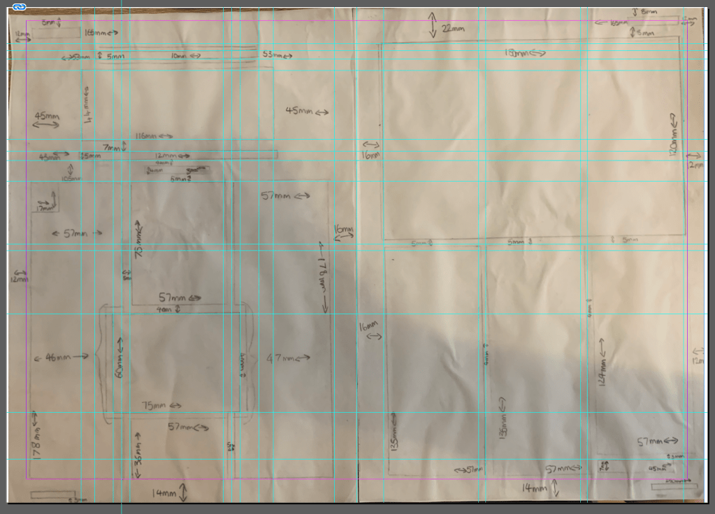
I started off by tracing the layout of this article measuring each column, image, title and margin to reveal the grid originally used. I had a slight issue of collecting the measurements around the inner joint of the magazine however soon overcome this by using the measurements of the front cover.
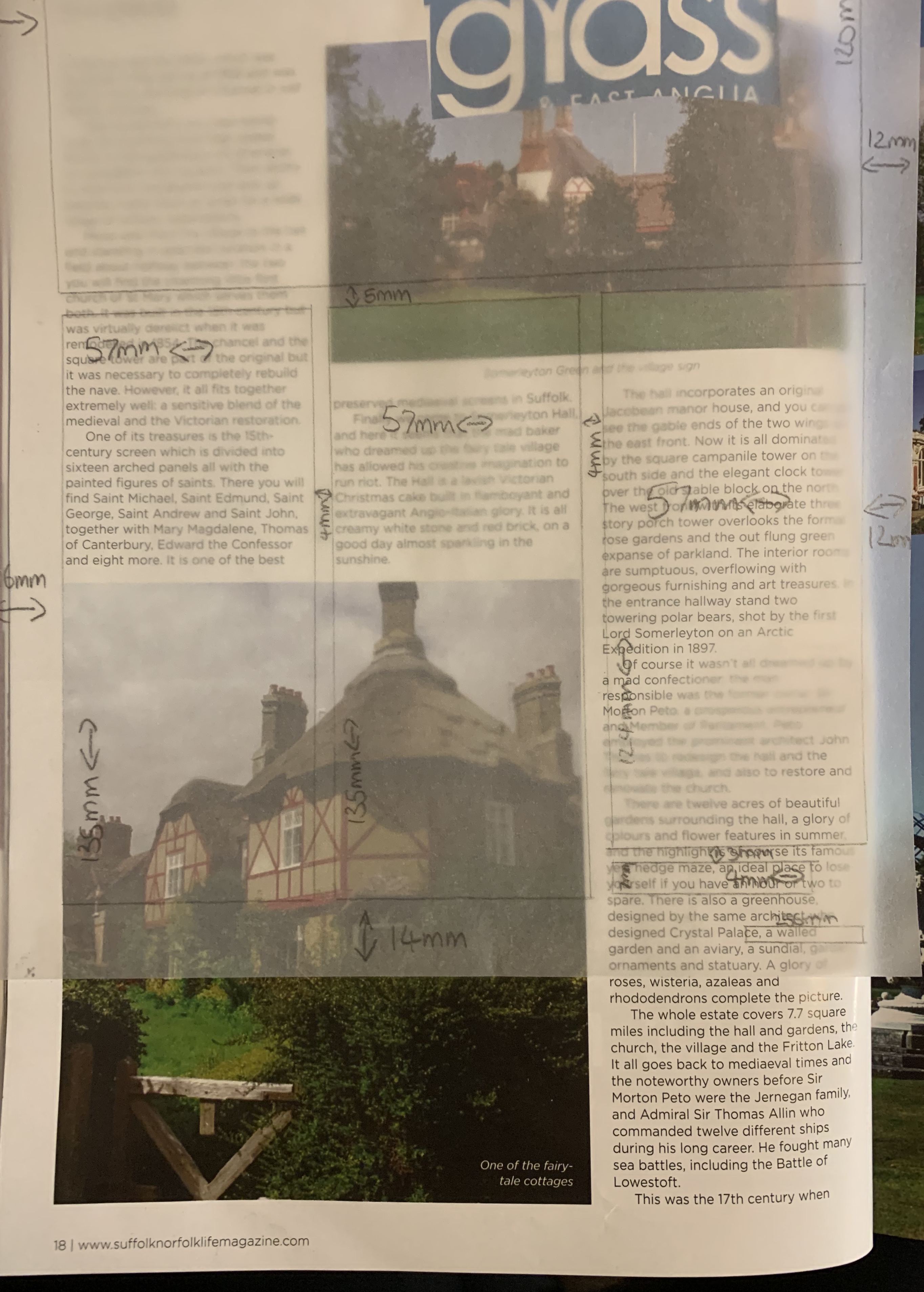
Flicking through the magazine I had noticed a number of the articles in this magazine held a similar grid guide with the columns in particular, making each article different by placing different size images in different positions, but this is something I hadn’t noticed prior to making this grid! Below you can see examples of different articles using the same grid.
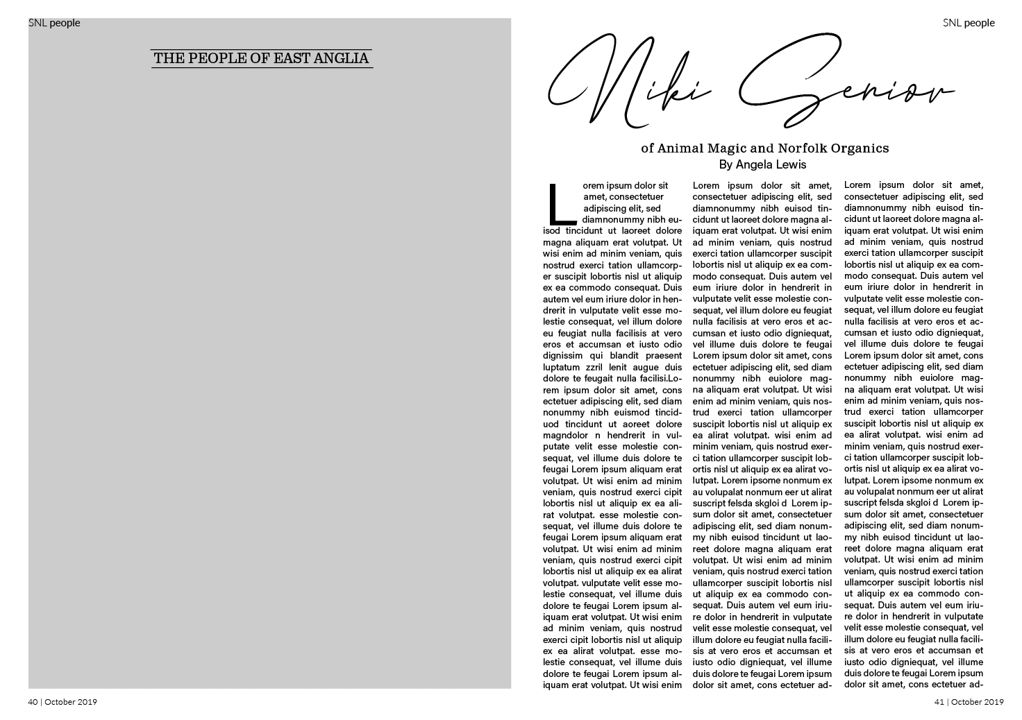
Digital Mockup
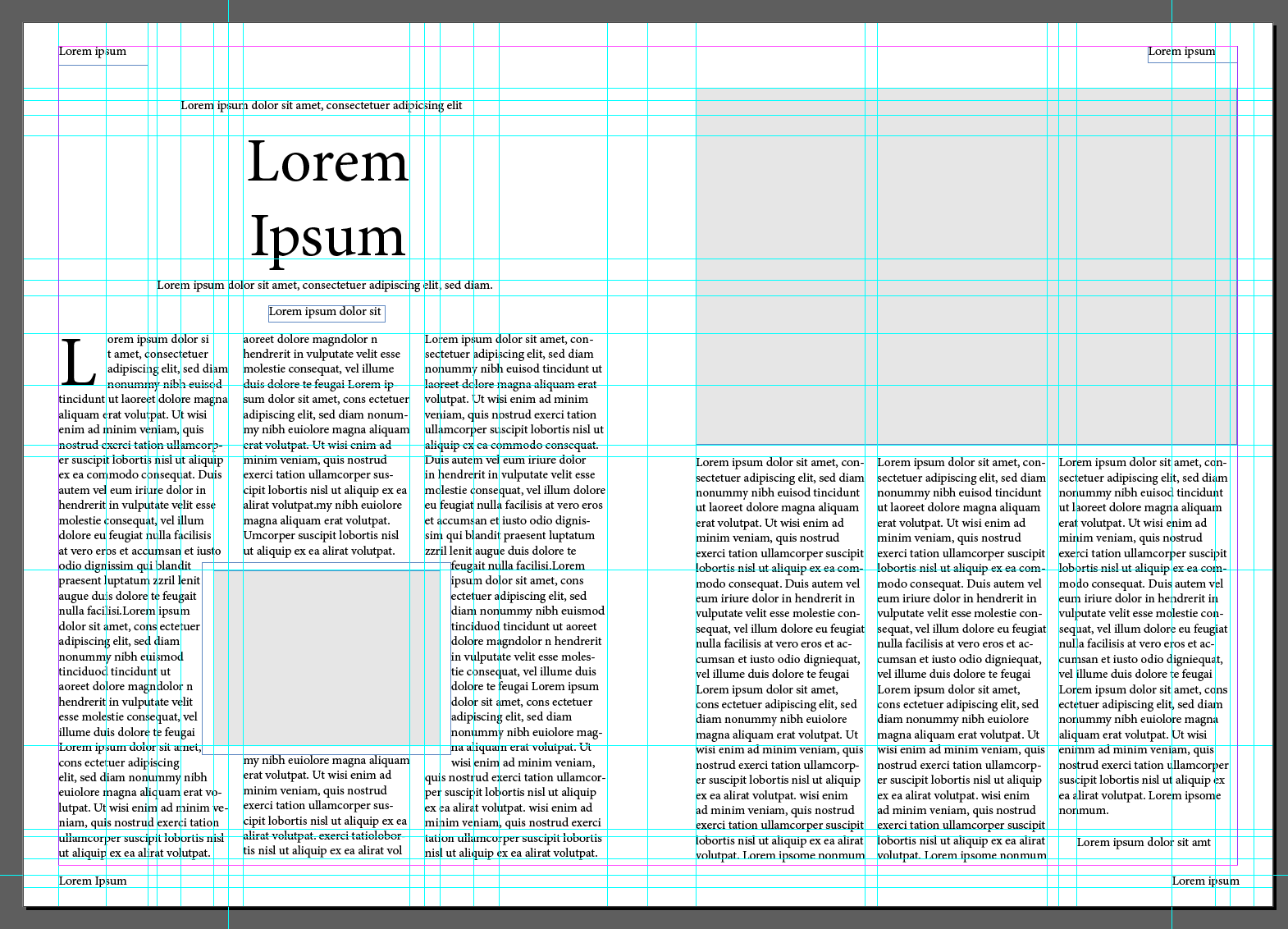
Using InDesign as this is a programme I’m not hugely confident in, so thought this would be the perfect opportunity to widen my knowledge around the software! Using the measurements I had made earlier along with rulers, I was able to create a digital version of the double page spread.
Although it looks very complex I found it easy to create this grid using in design, with the on screen rulers and and measurements beside I was able to do some quick maths to map out where guides needed to be placed. I uploaded a photo of my grid to help remember what went where but other than that InDesign provided a lot of help, making it easier for me!
Once the text boxes were in place and image boxes shaded in it quickly developed the structure of the double page spread and all fell into place.
Now that I had my double page spread layout complete I wanted to match the fonts used in the original. I used font squirrel and identifont to help find the typefaces.
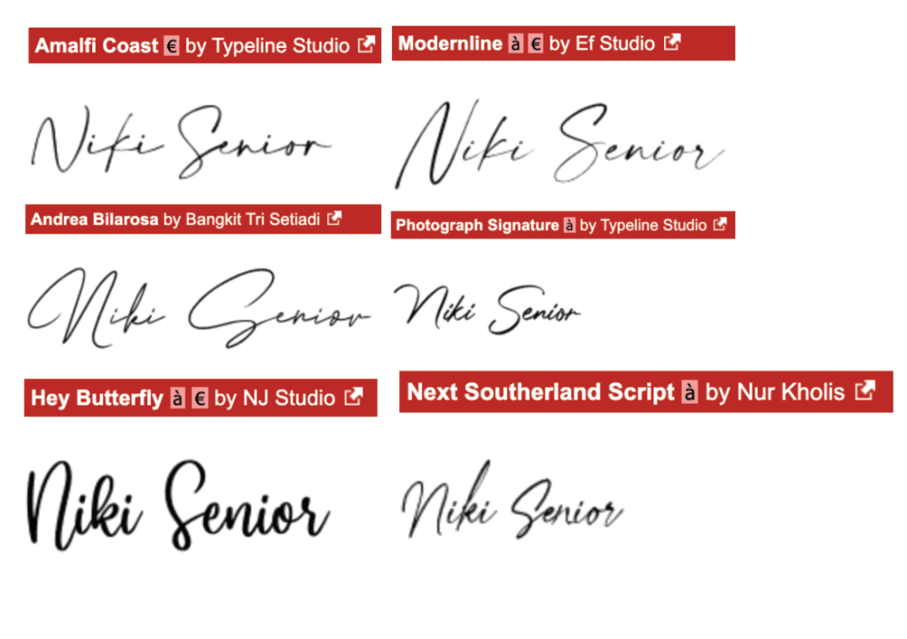
I had no luck locating the script font used for the title in this article, both font squirrel and identifont couldn’t give me a match. I decided to search through fonts on Dafont.com. Beside you can see a selection of similar fonts, I paid close attention to the formations of the letters with the strokes and widths. The font I feel matches best is ‘Andrea Bilarosa by Bangkit Tri Setiadi’. I successfully identified the subheading typeface as ‘Claredon’ and the body text as ‘NuOrder’.
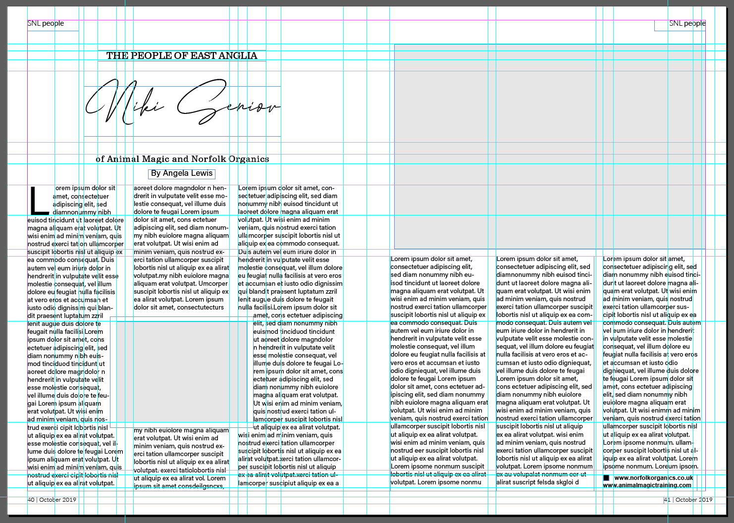
Here you can see my completed double page spread with typefaces matching the original.
Part 2 – Experimental layouts
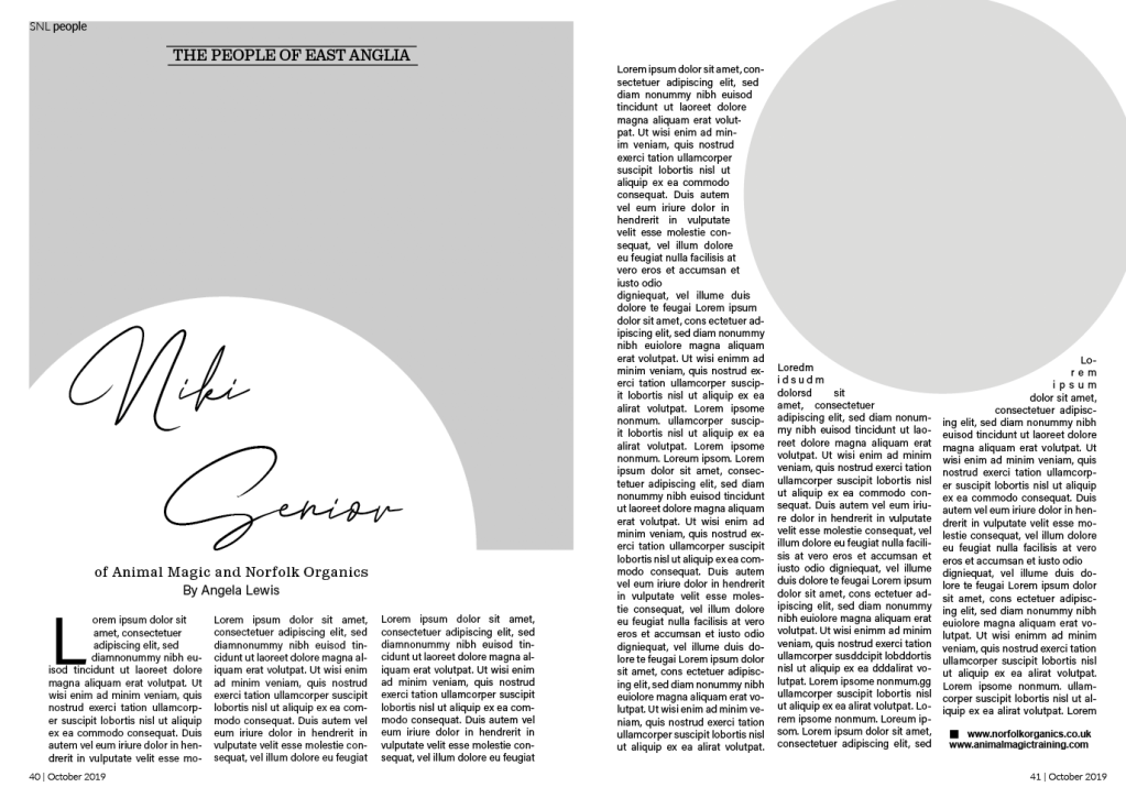
After successfully recreating the double page spread, the brief now states to think about how to radically change the layout and what creative decisions could improve the designs around the grid.
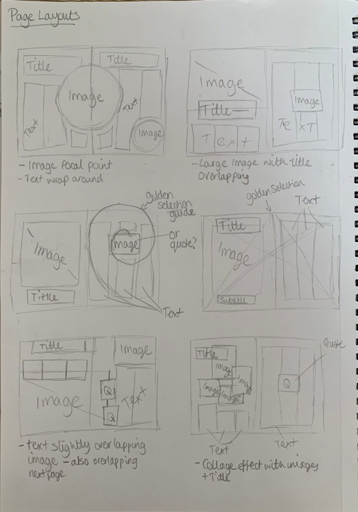
I started off by sketching out a few ideas oh how to change the layout in more of a creative way.
I kept in mind the golden selection whilst sketching out ideas, I wanted to be experimental with alignment and positioning. Although it was useful to sketch out some initial ideas, I do find it easier to experiment on screen to see what works best and is most pleasing to the eye. With saying that I jumped straight into InDesign to start experimenting with different layouts.
During my experimentation I aligned the columns, I felt this gave a cleaner appearance especially in the more complex layouts. I enjoyed playing around with the layouts however I did feel slightly challenged at times on how to make the double page spread more interesting. A few of the designs above didn’t radically change the layout however I did still keep in mind the type of magazine this came from and wanted the redesign to still be fitting with this genre.
Favourite redesign
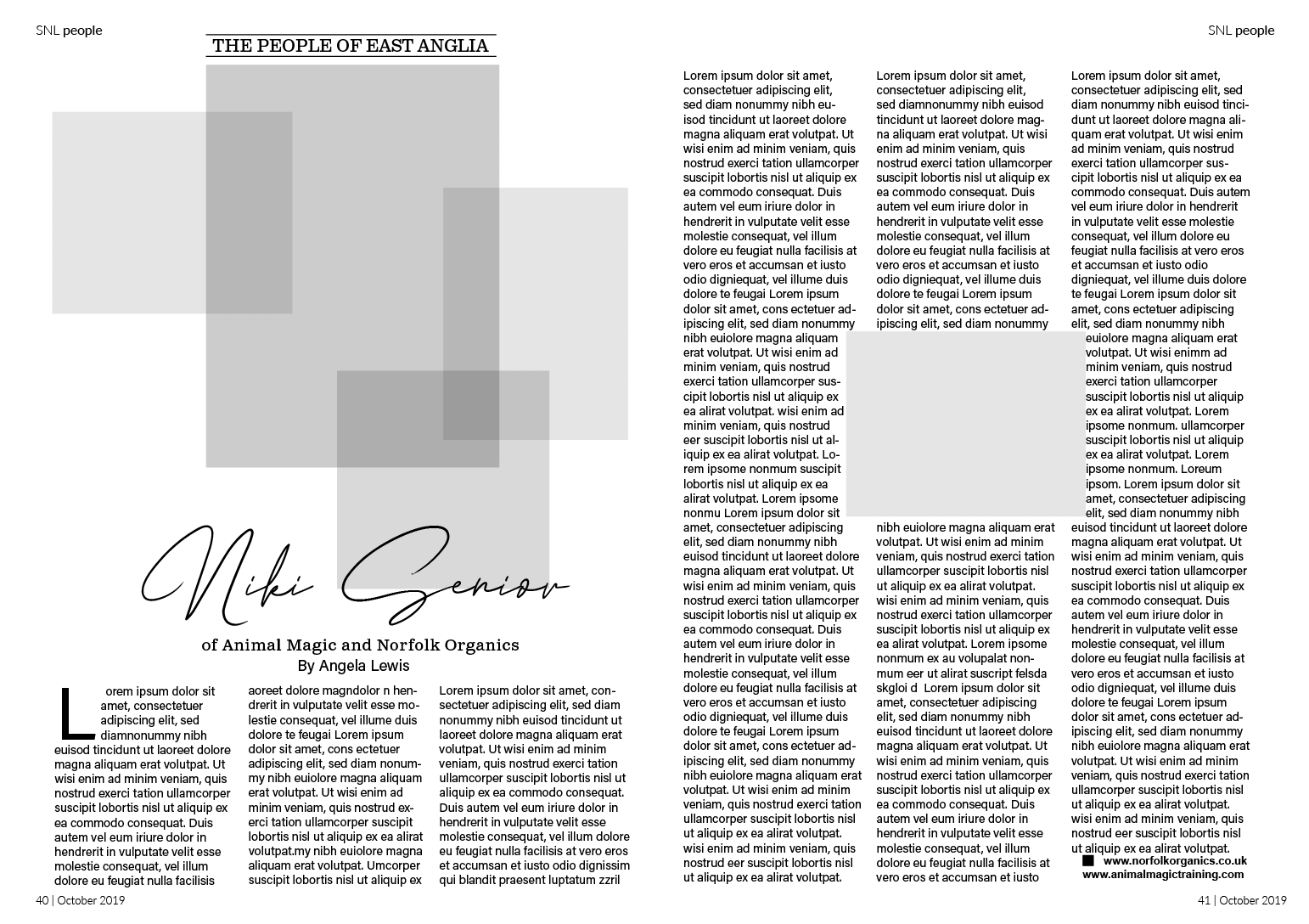
The layout above is my favourite redesign, I like the use of the circular image/cut out – however for the main image on the first page, the image choice could be an issue depending on how much image is lost from this cutout?? I aligned the columns to give a cleaner appearance, especially around the small circle. I followed the golden selection with this design for the grid creating a clear spiral on both pages as seen on the left.
Reflection
I enjoyed this exercise, I glad I took the time to fully understand the golden selection and even use the guide in my redesigns. At times I felt it challenging to get motivated however looking back I feel very positive about my redesigns. The exercise had helped me realise the importance of grids and how they can improve designs.
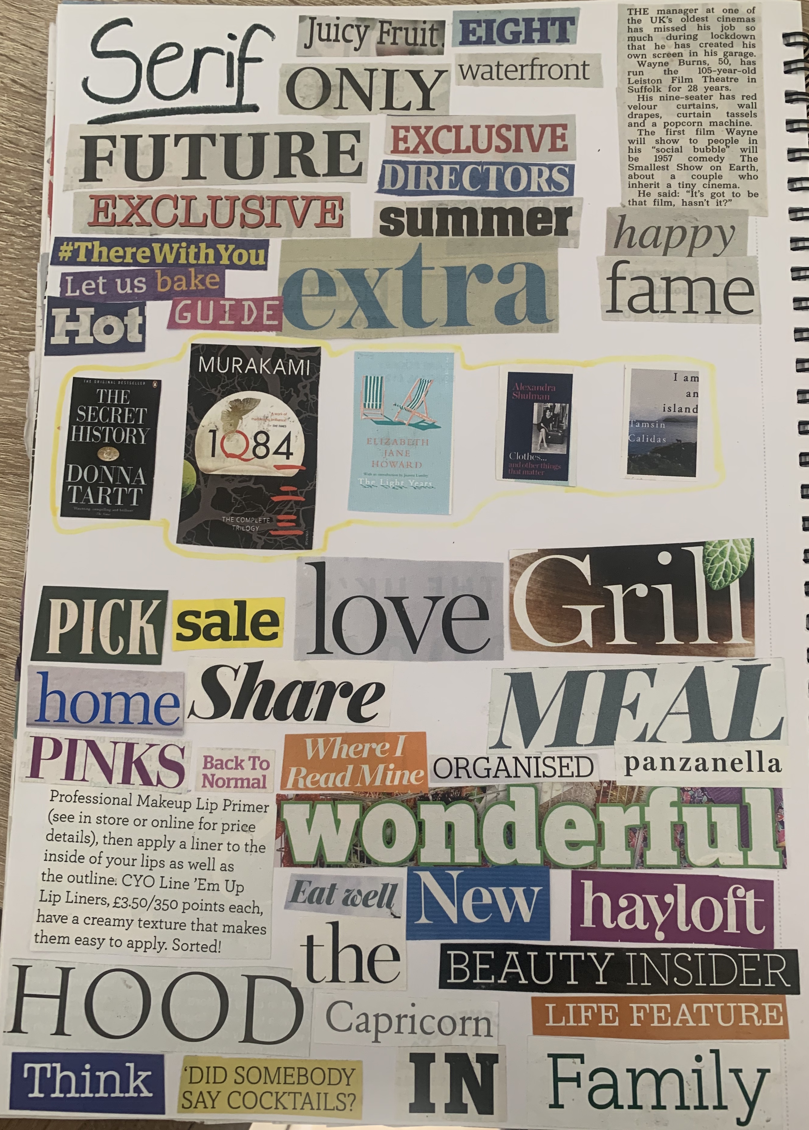
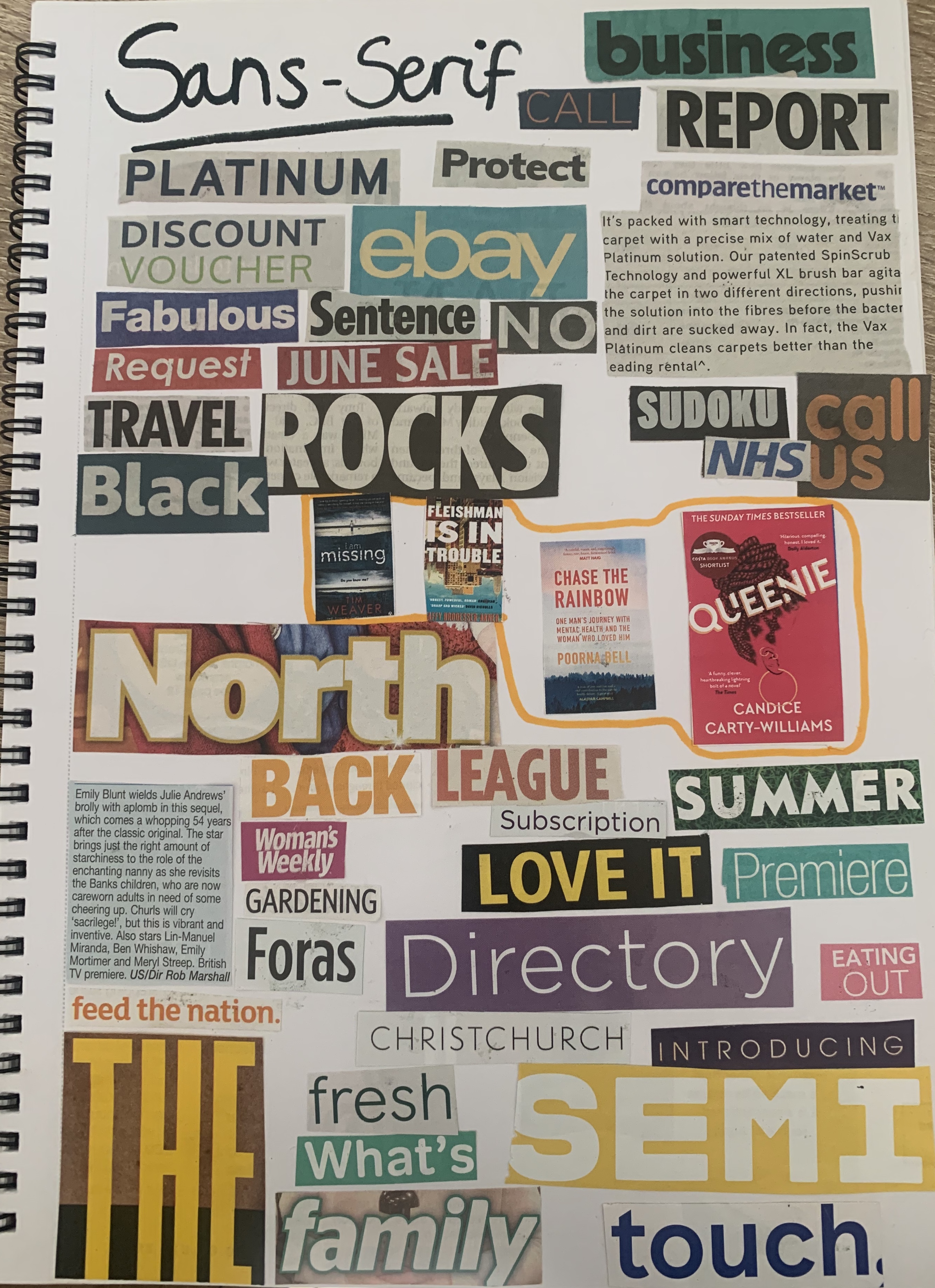
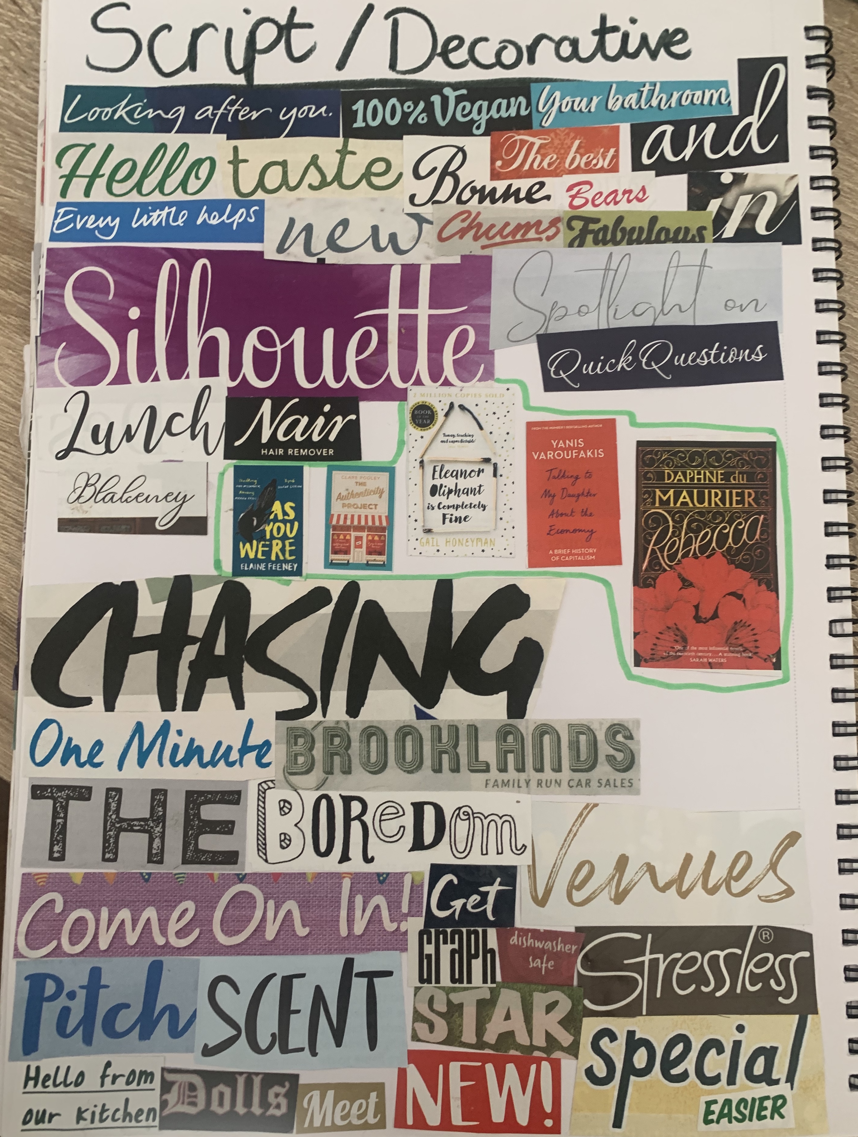
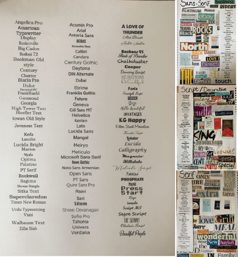
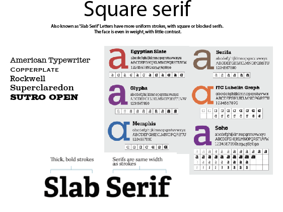
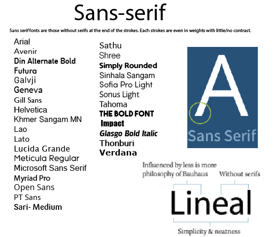
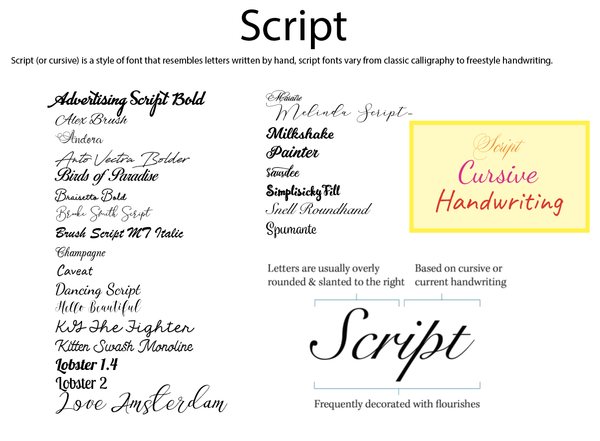
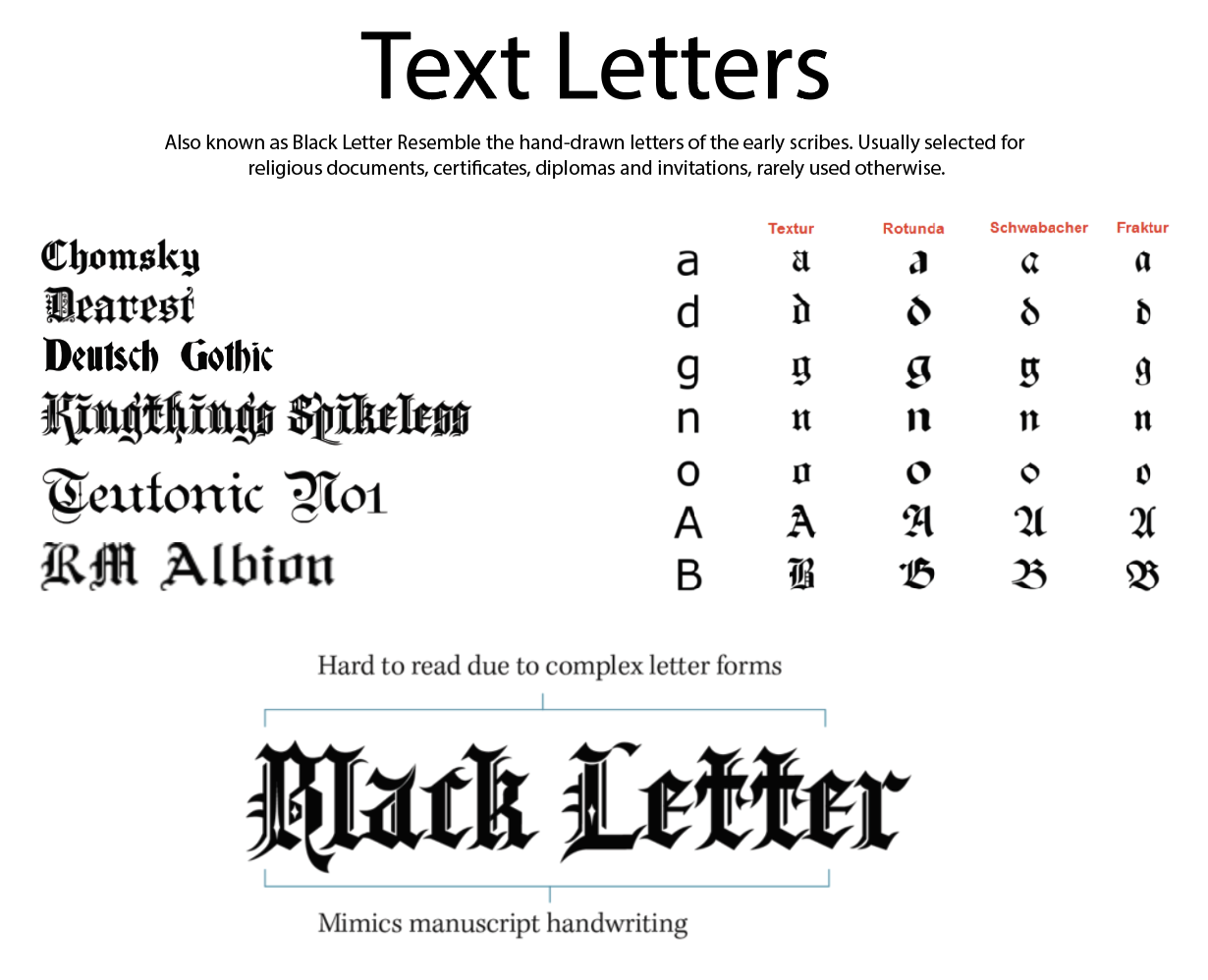
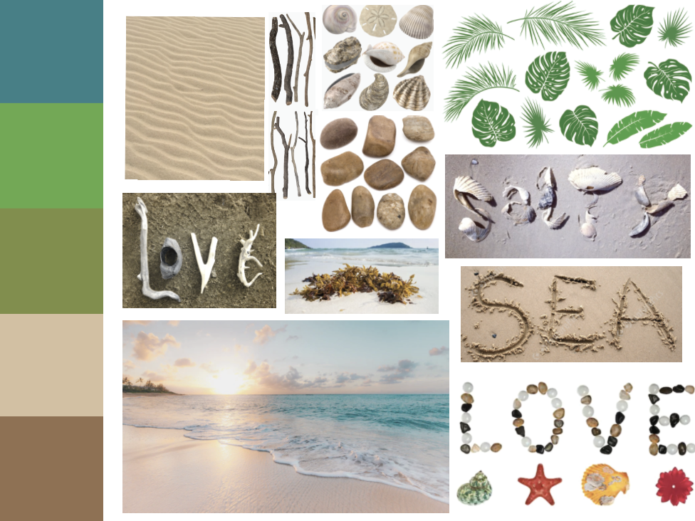
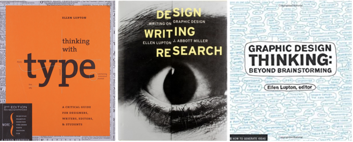
Brief: Find as many examples of type as you can from a range of sources, including newspapers, magazines, flyers, leaflets, online and printed ephemera. Broadly classify them into serif and sans-serif groups. Explore your computer to see whether you have any of the typefaces mentioned on the previous page. Find other examples on your computer that relate to these classifications. Print these off and begin to create a collection of type samples.
Identify: Choose five different typefaces from your classification collection and now look for examples of how they can be used for reading in different contexts. For example, which typeface would be appropriate for a magazine, a science book or newspaper? Have you collected a typeface that might be suitable for all these subjects? As a way of testing out which typefaces might be appropriate for a particular job, also consider them as inappropriately as you can – find contexts in which they don’t work, look ugly or feel ‘wrong’ in some way. Do this by experimenting visually with your typeface choices.
Reflect: Consider and reflect on the nature of the type you are collecting. Examine and annotate printouts with your own impressions of the letterforms. Use descriptive words that express something of the form and character of the typeface. Follow the same process fro your ‘wrong’ typefaces as well.
Develop: Trace some interesting, unusual and everyday letterforms onto clean paper. This will help you to understand the distribution of weight of line within a particular letterform. Draw over the tracing to enhance the line and fill in the letterform with an even darker grey tone – H8 pencil is fine 0 to recreate the impression of print.
Document and present: The work you produce for this exercise will feed directly into your assignment, so collate your notes, printouts, traced letterforms and samples of type you have gathered. Consider how these could be inventively and visually integrated, and how your ideas could be creatively developed further for your assignment.
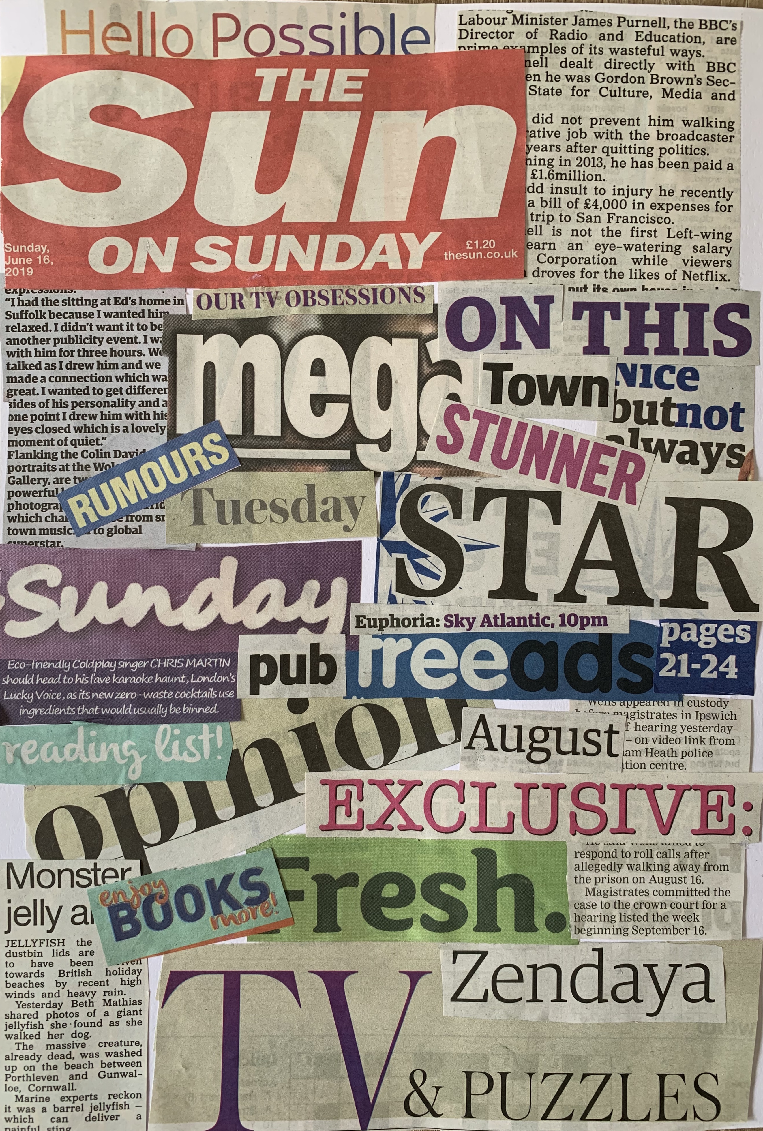
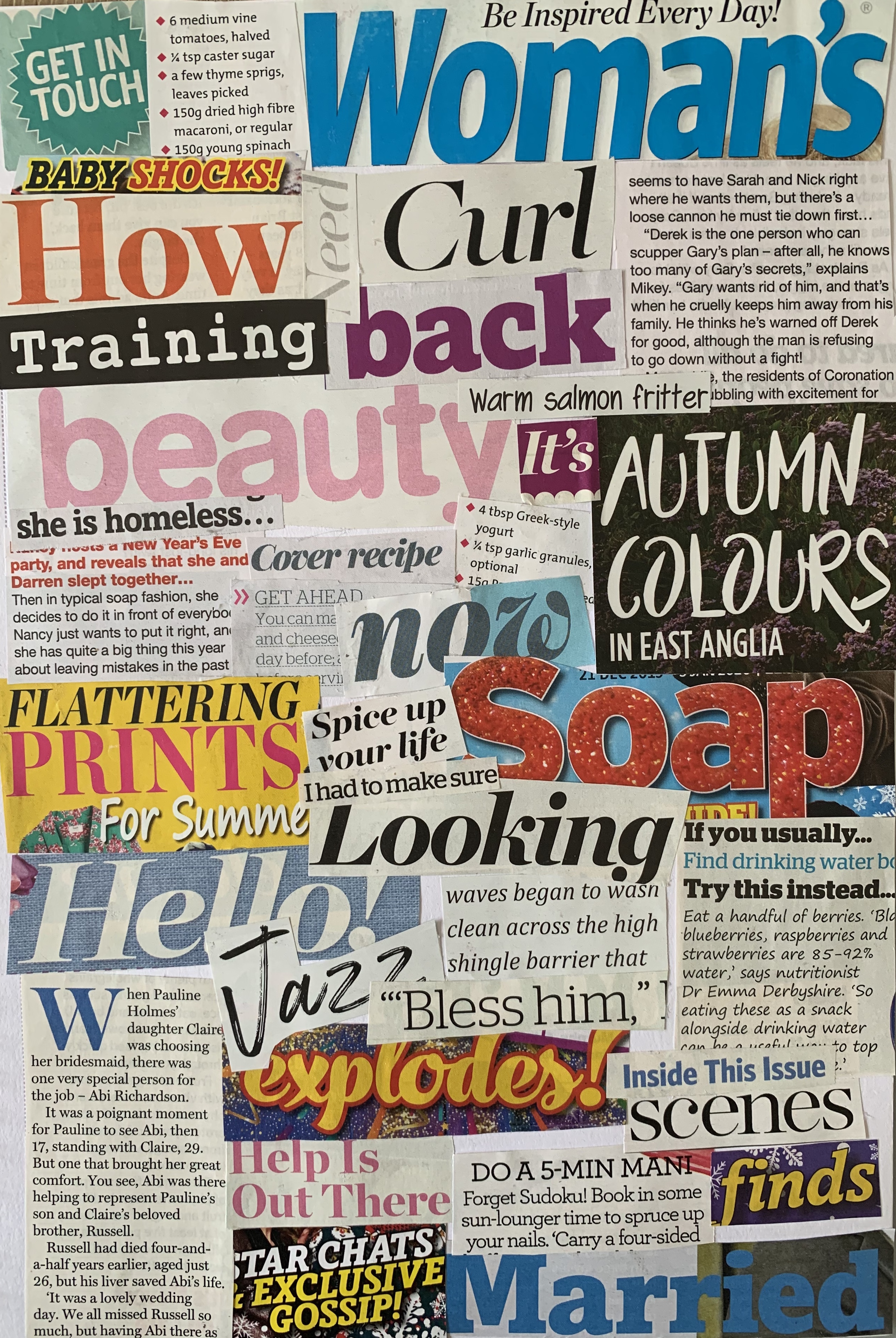
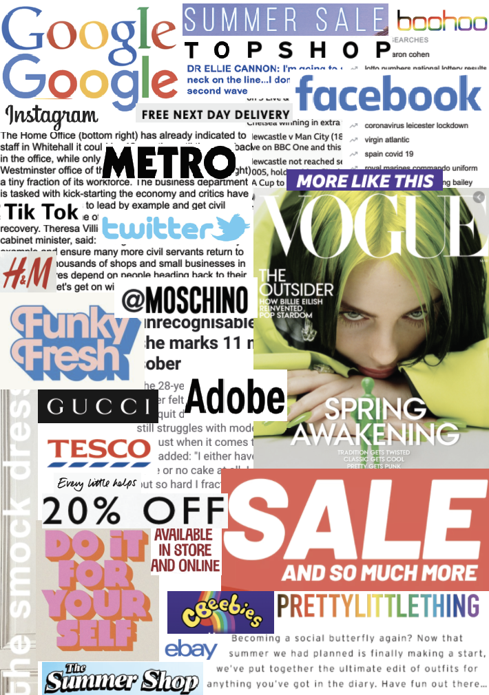
Following the structure of the brief I went straight into collecting type examples from a range of different sources. I collected newspapers, magazines, flyers and online type and created them into collages.
By creating collages I felt this allows me to easily compare typefaces with their weights, heights and style, showing a broad range of variety.
I started off by creating collages from newspapers, magazines and online. Each source uses a variation of typefaces including serif, sans-serif and script. After sticking these down I thought it would of been better to create a mixed collage depending on typeface rather than source! So I went on to create these from new cuttings, the results are as followed.
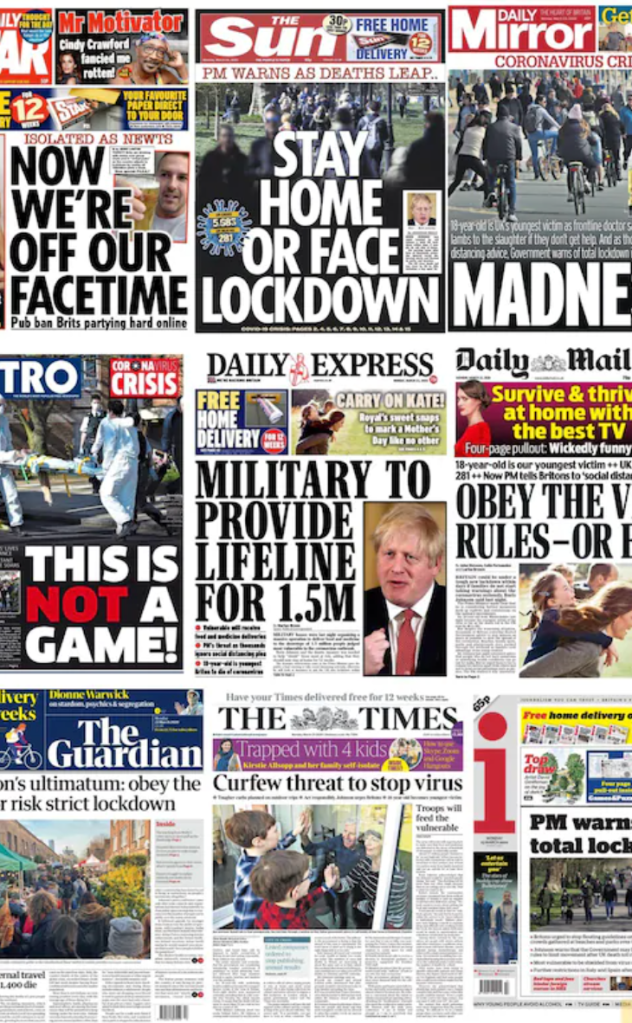
I collected a number of typefaces and arranged them into the correct groups. I noticed that Sans-serif tend to be used more commonly as titles, especially in newspapers – a clear bold font allows things to be read from a distance and to catch the readers attention. I also found sans-serif to be the chosen typeface in most adverts within the newspaper. The body text within papers is Serif, this has been said to help the reader skim read the text and for it to be easier to be read on a small scale.
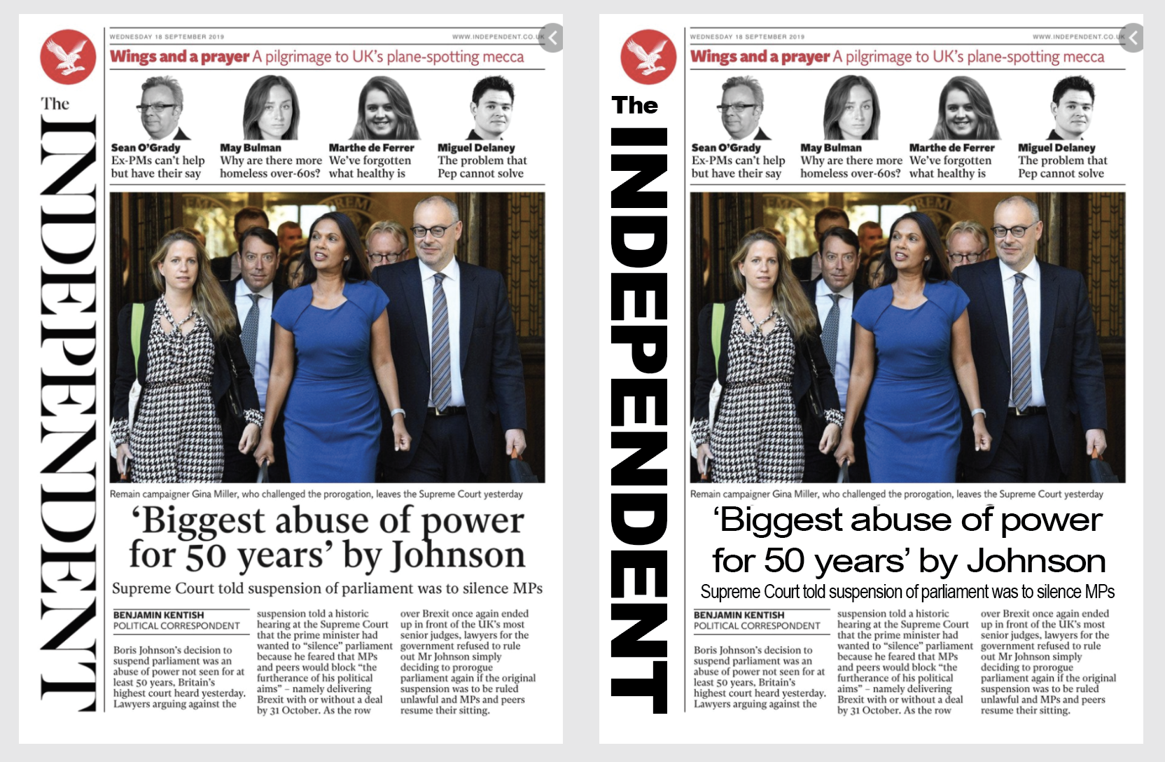
However reflecting on the choices of materials I have with me, they all seem to fall under the same genre (gossip magazines, cheap newspapers) As other papers such as The Daily Mail & The Guardian use serif fonts for their headlines, this gives these particular papers more class and seriousness when read and appear more expensive. The same goes for magazines, within my selection of mainly cheap gossip mags, I had a county magazine which included serif and script typefaces, this feels a lot more luxurious compared to the rest. As a designer it is important to remember these factors so that the work fits within the correct criteria. Typefaces are more important than we think!
Im glad I made the two collages, as whilst writing my reflection above I found myself referring back to the newspaper and magazine collages to see the varieties and quantities of typefaces used within. So both ended up become beneficial which was a relief that I hadn’t wasted my time, nor pages in my sketchbook!
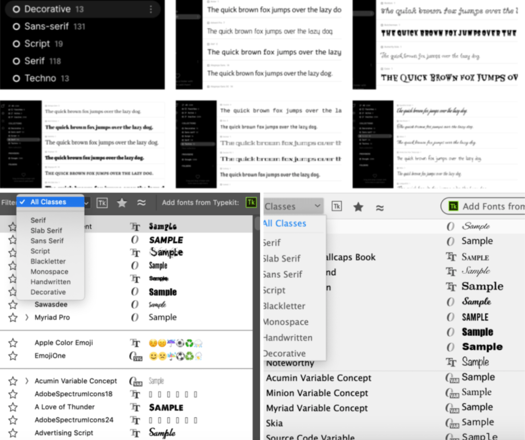
I then sorted through the fonts I have on my computer, I set each typeface to 14pt so I could see how each font varied with weights and x-height etc, I then cut each column and attached it to the collages.
Because I have so many fonts on my laptop I decided to search for a font organiser online and came across FontBase. FontBase helps you quickly manage many fonts, create collections, organise your folders, and start using your fonts in an efficient way. Also both Illustrator and Photoshop have built in filters which sort each typeface into the correct folder.
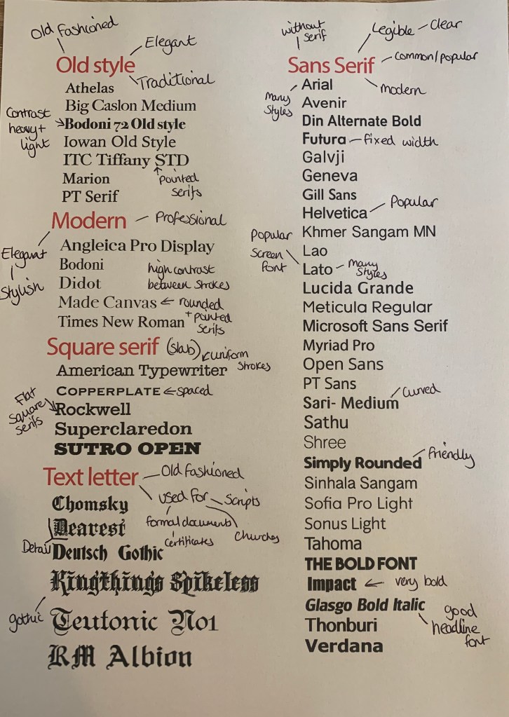
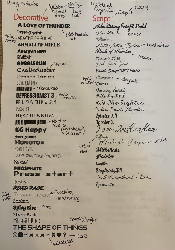
Following the brief I sorted these fonts out into classifying type groups and added extra information, the results are as followed.
Each page contains the list of typefaces found on my computer along with a brief description of the category, an anatomy diagram and examples of other typefaces which I haven’t got downloaded. Once printed I was able to make brief notes along side some of the typeface.
Identify
For this part of the brief I needed to choose 5 different typefaces from my classification collection and look for examples of how they can be used for reading in different contexts.
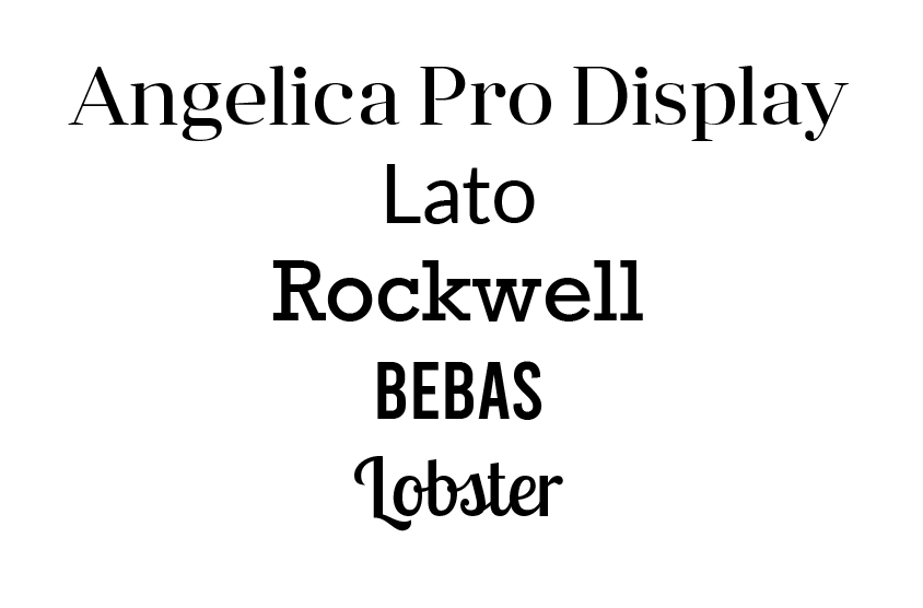
The 5 typefaces I have chosen are;
I have selected these particular fonts as I wanted include one from each classification category to give a variety of typefaces and for further exploration.
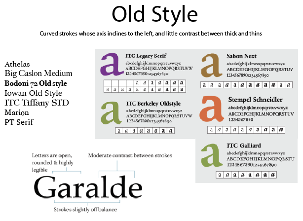
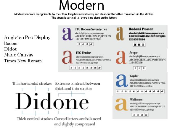
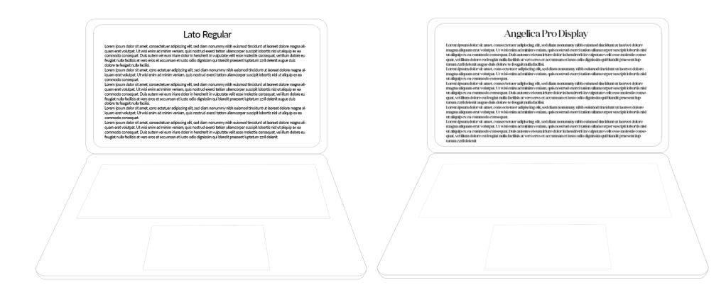
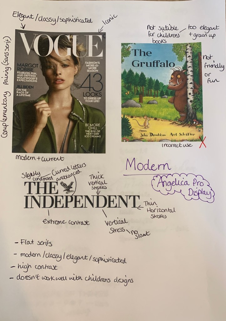
Angelica Pro Display – (modern)
Angelica Pro Display is a modern typeface. This Font Family is developed by Mint Type. They are freely distributed under the SIL Open Font License. Although it was hard to pin point designs used with this exact font, to get an idea of where this typeface has been used and works best, I have found a selection of modern typeface examples.
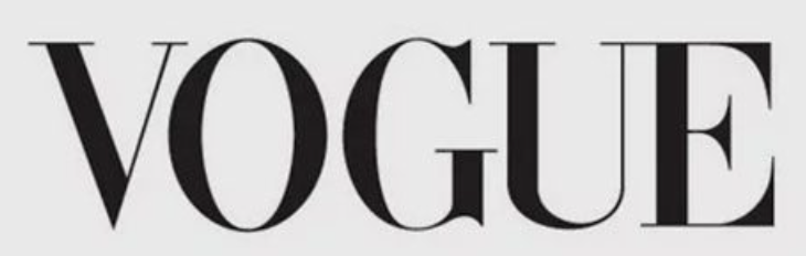
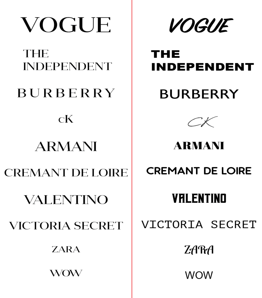
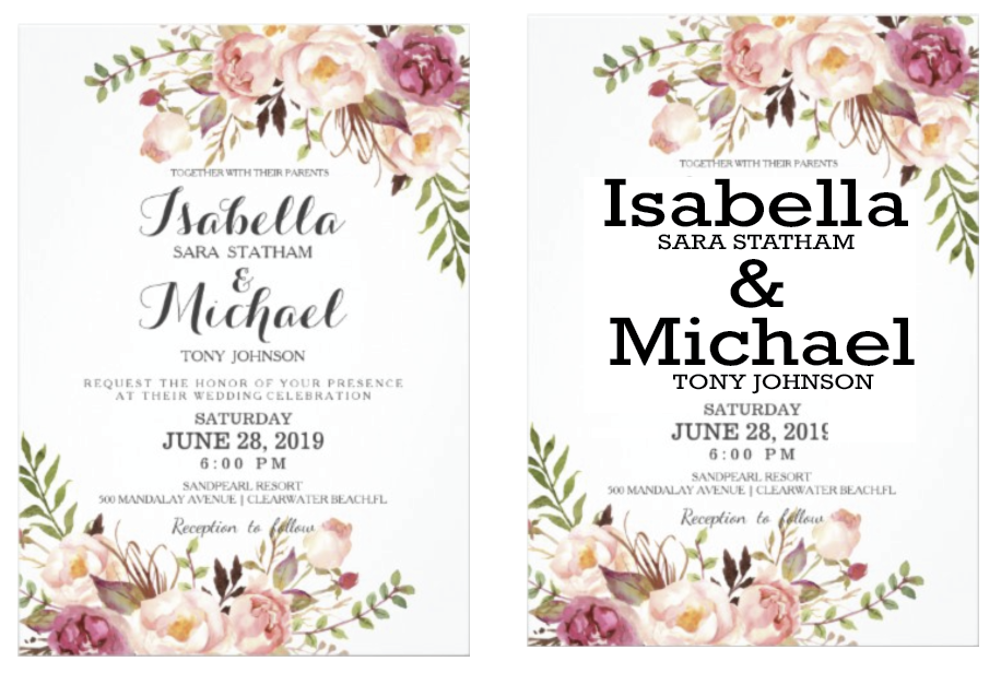
The Good
This font look expensive, sophisticated and look as if it represents products of high quality. I wanted to see how the use of typefaces can effect the appearance, and how it changes the way we the things written in this font. I have typed each of the above designs in Angelica pro display (equaling to the closet typeface used) against a mixture of alternative typefaces to see how they change the appearance.
The Bad (comparisons)
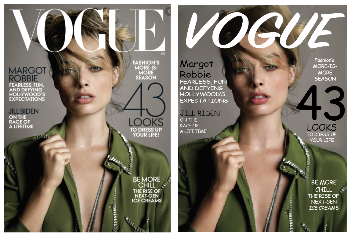
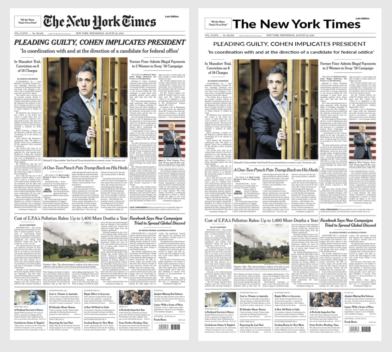
As you can see they change the look completely, this shows the importance of choosing the right typefaces. Although they have been changed to a mixture of typefaces, non of them work well or live up to the ‘high standards’ as the Angelica Pro Display font gives for said ‘brands’. They appear to look cheaper, unrecognisable and less professional. To give a higher impact I have used the alternative typefaces in replacing the original.
In both of the ‘re-designs’ this automatically takes away the seriousness and class away from both the magazine and newspaper when compared to the original. It shows how delicate the typeface is and how sophisticated it makes things seem; for example the Vogue magazine with the alternative typeface makes it seem like a cheaper gossip magazine, rather than the global successful fashion magazine that it is. The same with The Independent, it looks as if it could be a cheaper news paper in which some may say sells fake news.
& The Ugly!
Visually seeing the above typeface being used successfully against the alternative typefaces, I wanted to see where this typeface (Angelica Pro Display) would look bad and out of place. I have selected two options where I think the font would look out of place and ugly.
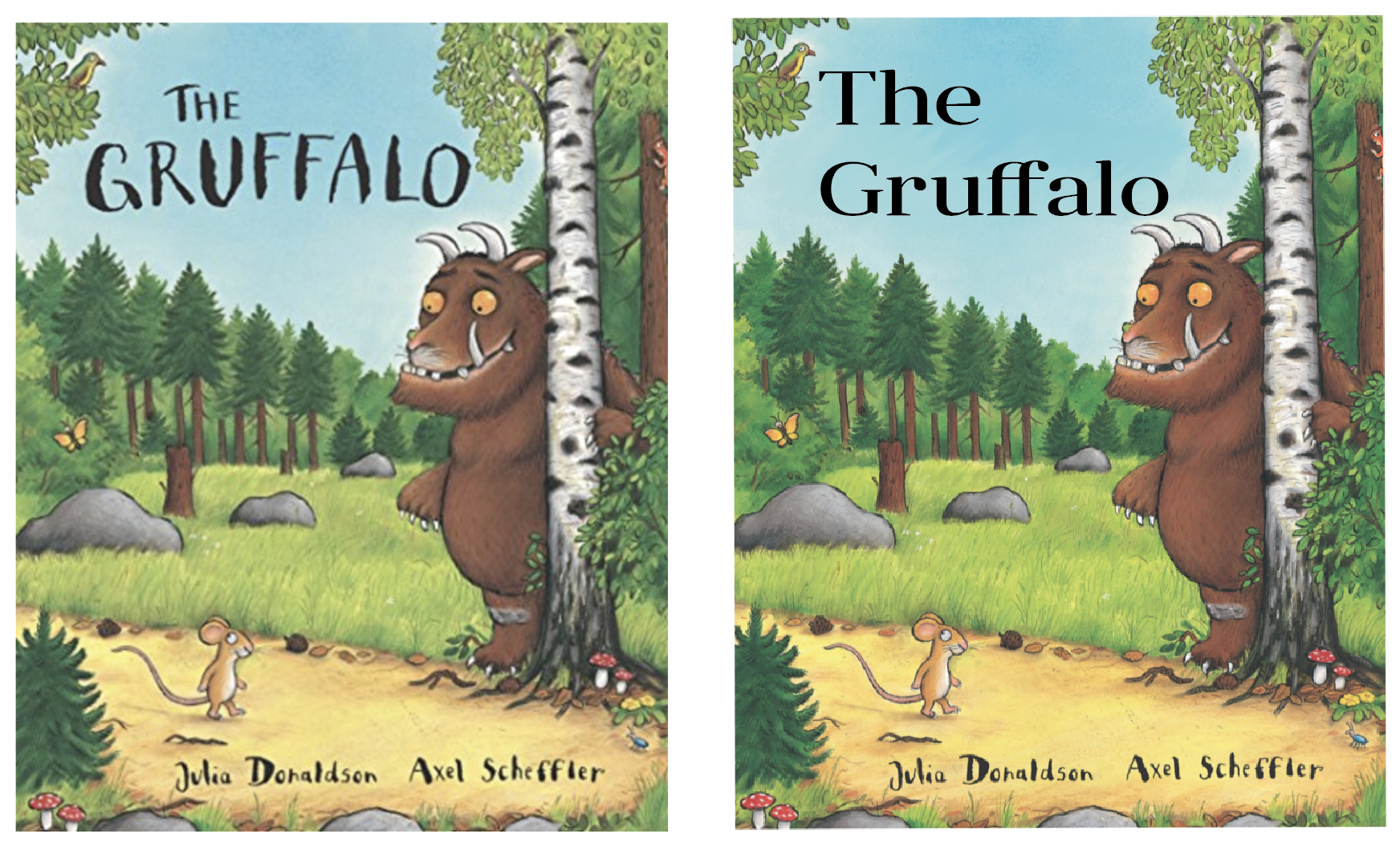
Angelica Pro Display would make a terrible body text font as when the letters are sized down to a smaller size, it becomes totally unreadable and a sight for sore eyes. I then replaced the font on a popular children’s book which I feel changes the cover, it makes it feel more serious and formal rather than the playful fun story that it is.
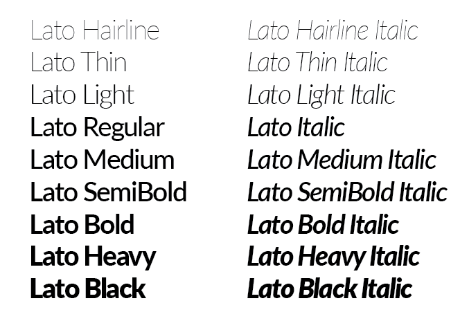
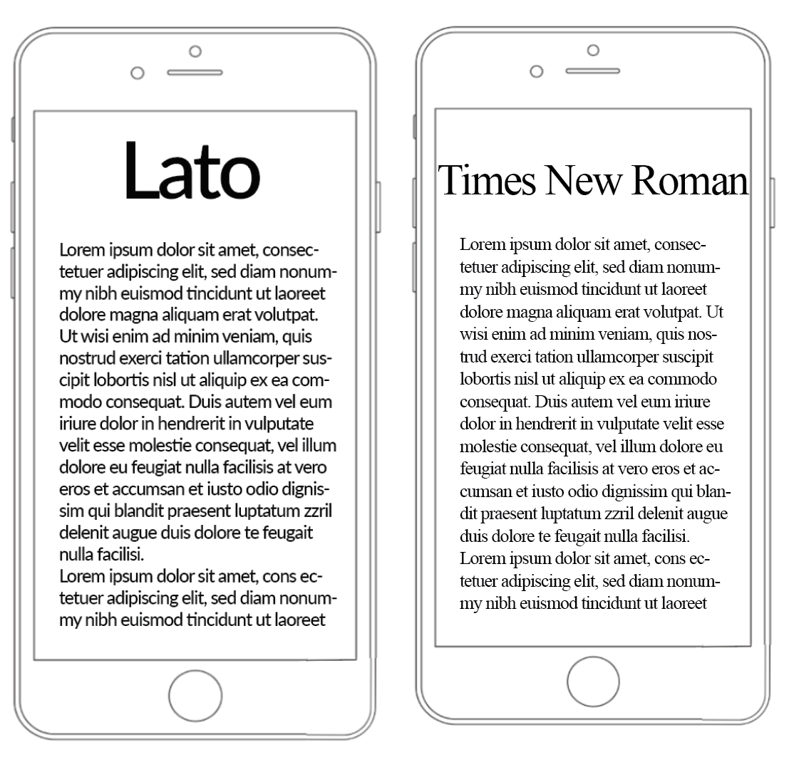
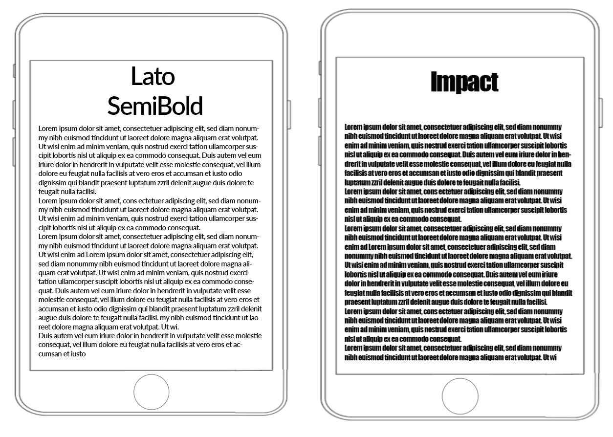
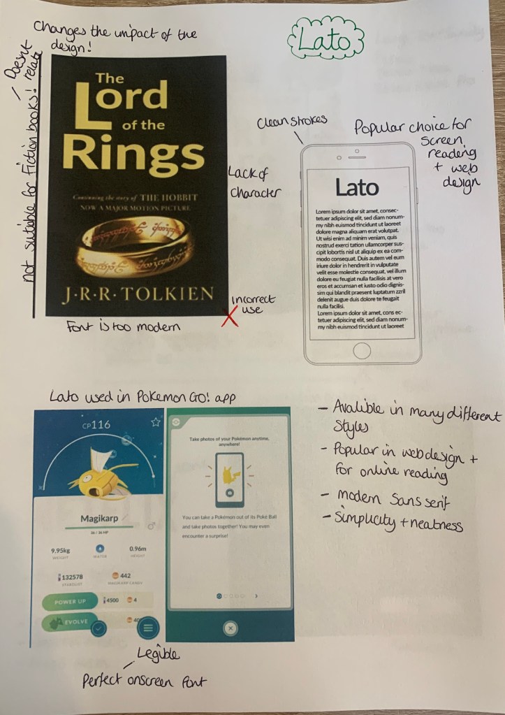
Lato – (sans-serif)
Lato is a sans serif typeface family started in the summer of 2010 by Warsaw-based designer Łukasz Dziedzic (“Lato” means “Summer” in Polish). In December 2010 the Lato family was published under the Open Font License by his foundry tyPoland, with support from Google.
I managed to find this incredibly useful website whilst in the search of Lato in use, (https://fontsinuse.com/typefaces/7521/lato) here it lists places where the fonts have been used.
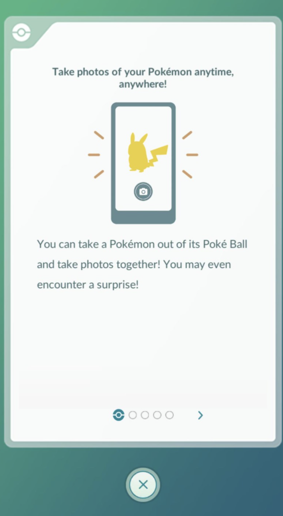
The Good
As you can see above, Lato is mainly used in wed design on websites and apps. The clean, crisp lines of this sans serif fonts is the main reason why many web designers prefer this type of font for on-screen use. It was interesting to discover that Lato was used in the popular Pokemon Go App!
There are many different styles available for this typeface, which would attract more designers to opt for this typeface, some of the thicker and thinner strokes also would make good pairings.
The Bad (comparisons)
As Lato is more popular in the wed design world I wanted to compare this typeface to others which wouldn’t work successfully on screen.
As you can see from the above examples, regardless of the size of the screen Lato can be easily read, this is due to its clean clear stokes which makes the font legible and easy on the eye. This typeface also has a modern feel to it which I feel oddly makes the technology look better? I feel the modern typeface with the modern technology make a complimentary pair.
& The Ugly!
Here I wanted to see where this typeface wouldn’t look as successful, my first thought was for it to feature on printed items to see how it would look.
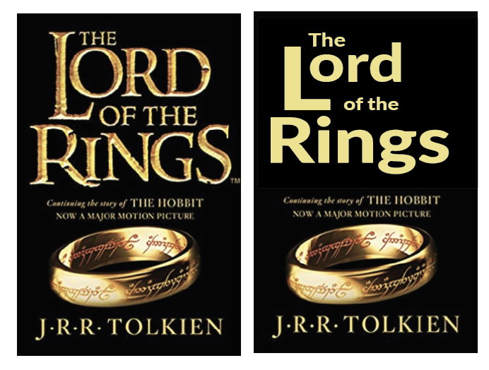
As you can see from replacing the main typefaces on ‘The New York Times’ newspaper it has given it a ‘homemade’ cheaper appearance. Lato is not suited for either of the above designs, The book cover of Lord of the rings looses a large impact from the medieval serif typeface used in the original.
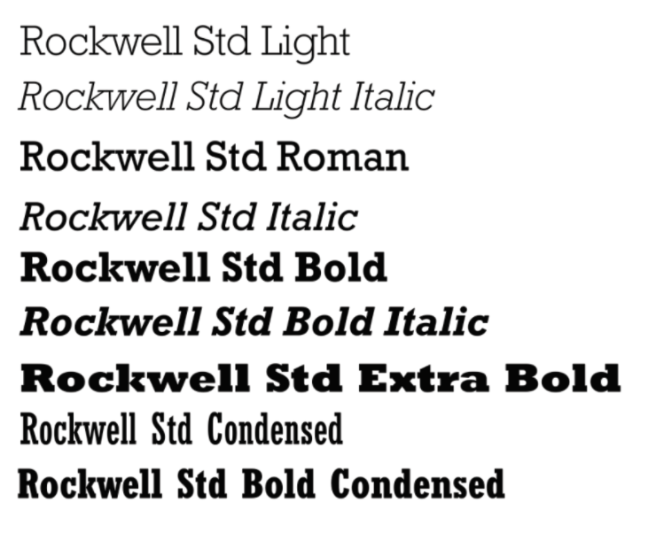
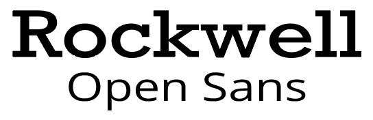
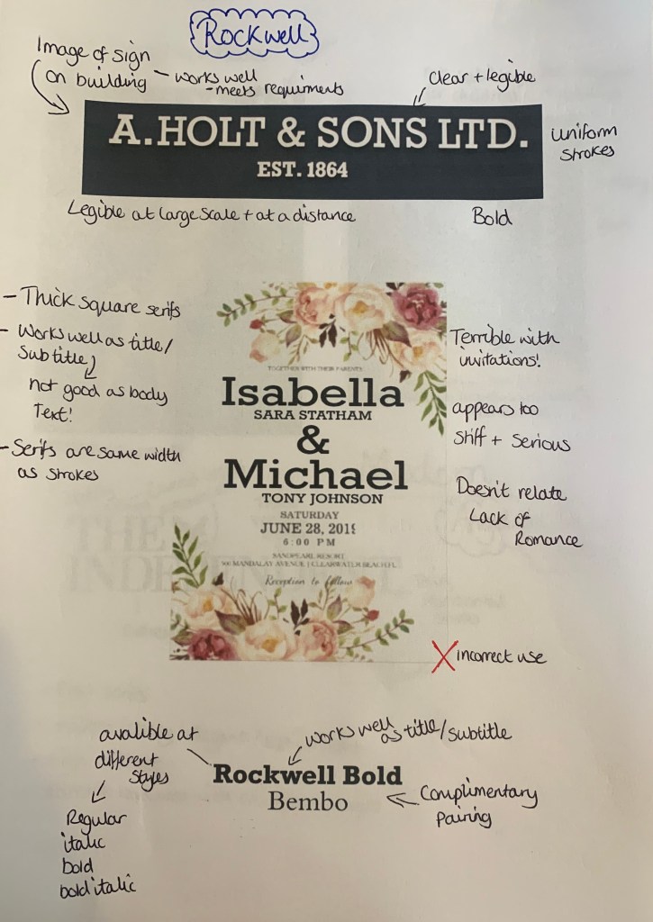
Rockwell – (square serif)
Rockwell is a square/slab serif typeface designed by the Monotype Corporation and released in 1934. This typeface is distinguished by a serif at the apex of the uppercase A, while the lowercase a has two storeys. Because of its monoweighted stroke, Rockwell is used primarily for display or at small sizes rather than as a body text.
The Good
Rockwell appears to be a very bold and an attention grabbing font used in small doses to attract the attention of an audience. Although it is a serif font, it is bold and heavyset, making it a poor choice for large pages of text. Above its been used in a variety of ways from shop signs to book covers to logos.
The Bad (comparisons) – This ones not so bad!
Rockwell is available in a number of different styles, all which would make ideal headings/subheadings, but as mentioned before not ideal for body text. This made me think about which typefaces would make good parings with to create a successful design.
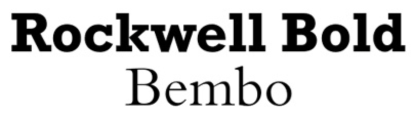
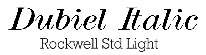
Although Rockwell can be a ‘bulky’ font, when paired with more delicate fonts such as Bembo & Dubiel Italic it creates the perfect balance for something you may seen in the pages of a magazine or in some cases the cover of books or posters.
& The Ugly!
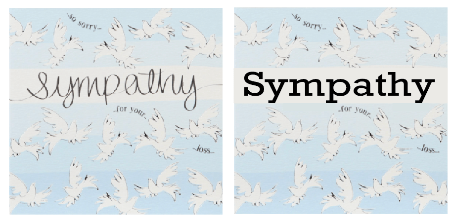
Here I wanted to experiment with how Rockwell can be used badly and where it shouldn’t be seen!
Because Rockwell is the opposite to a script typeface with its sharp, blunt serifs I thought this would be the perfect Not to do examples, as you can see the by replacing the script on items which are meant to be joyous and sympathetic it makes you read the words differently due to the font. This has been the first example so far of my selection which has made me feel this way.
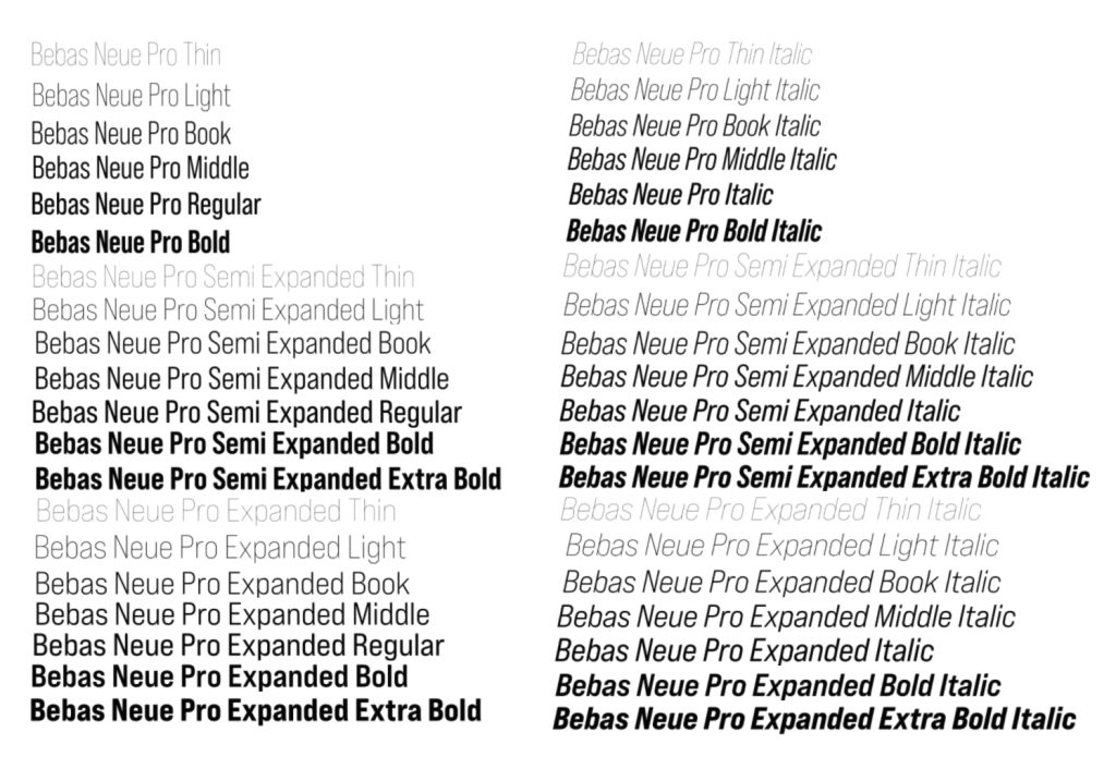
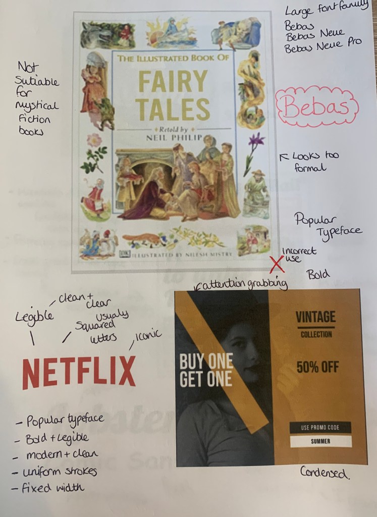
Bebas – (Display)
Bebas is a display family suitable for headlines, captions, and packaging, designed by Ryoichi Tsunekawa. It’s based on the original Bebas typeface. The Bebas family has had many adaptations over the years, the newest style out (2019) is Bebas Neue Pro, with 40 different styles making this typeface ascetically pleasing.
The Good
Bebas seems to be widely used from book covers, to posters, to album artwork even to the famous Netflix logo. This typeface seems to be a favourite due to its clear bold modern font which seems to fit in place with most designs.
The Bad (comparisons)
I found a couple of adverts online which used the typeface Bebas so I decided to compare these along with the Netflix logo with different typefaces.
Seeing the originals next to the ‘re-designs’ you can see why it was chosen in the first place, Bebas is bold and eye catching.
& The Ugly!
Finally I wanted to test out where Bebas isn’t suited and looks out of place.
It was a little harder than with previous fonts to find a place where Bebas looks out of place, however I decided to achieve the highest impact I needed to replace Old style typefaces, this took a few goes but eventually settled on two which I felt Bebas looked out of place, it seems too modern for the style and design of the book. But as mentioned.. this was a challenge! (plus this is one of my go to fonts so I found it harder to dislike it)
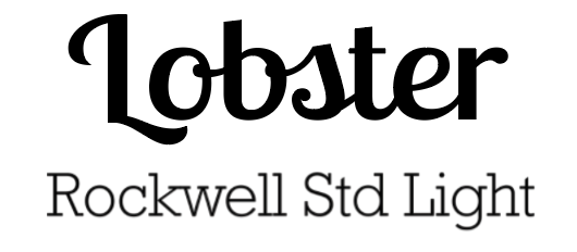
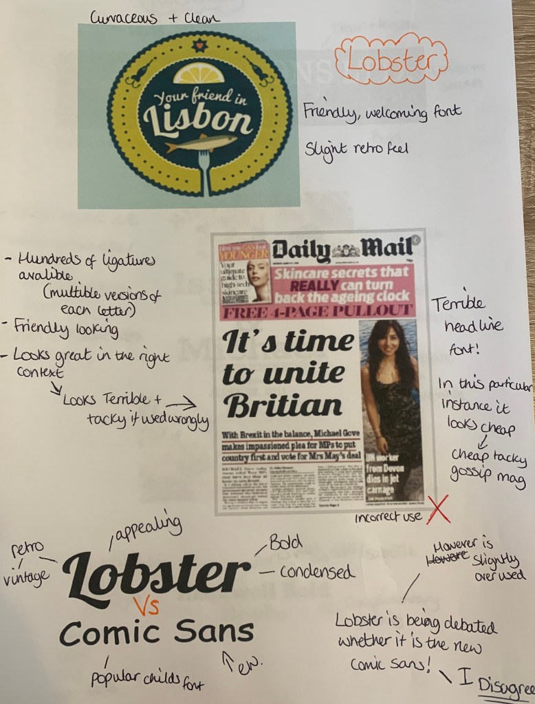
Lobster – (script)
A lovely Bold Condensed Script fully loaded with hundreds of ligatures and alternates giving us the possibility to have multiple versions of each letter. The font was created in 2010 and introduced to the Google font library.
The Good
Lobster seems to be used vastly across the design world in many countries. Upon research of this typeface I discovered that it isn’t loved by all, with many asking if this is the modern day Comic sans. I feel Lobster is much more elegant font, with its neat details, strong personality, and a large number of ligatures, which have been carefully designed. – So I strongly disagree with this being compared to Comic Sans.
The Bad – (comparisons)
I wanted to compare Lobster to other typefaces to see how it works in comparison to other typefaces. What better way to start than with Comic Sans!
Lobster has a friendly and welcoming feel to itself, I especially noticed this in the ‘your friend’ image, the Serif typeface Baskerville gave this cheery image a more serious and well, boring feel to it.
& The Ugly!
Finally I wanted to see how Lobster would look in the wrong places!
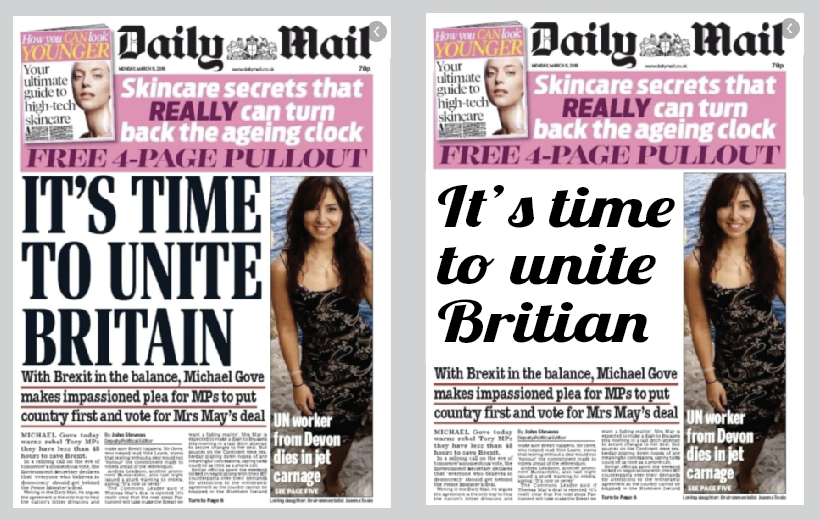
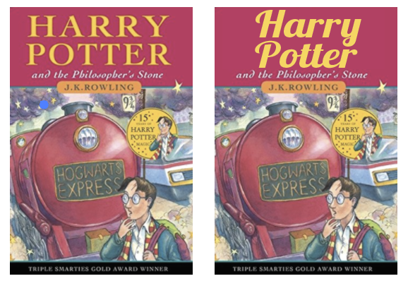
The Daily Mail headline replacement of Lobster was an easy bad choice, because when ever have you seen a script typeface on the front of a national newspaper? It’s difficult to read and looks out of place with the pairings of the other typefaces used. With the Harry Potter book although its doesn’t look as terrible as the previous, it’s still not the best choice for the type of book. Although I like the typeface Lobster, if used in the wrong context it can look rather… tacky!
Reflect
For this part of the brief I have been asked to consider and reflect on the nature of the type that I have collected and to annotate printouts with my own impressions of the letterforms.
I have made notes alongside some of the examples used above and came up with the following;
Develop
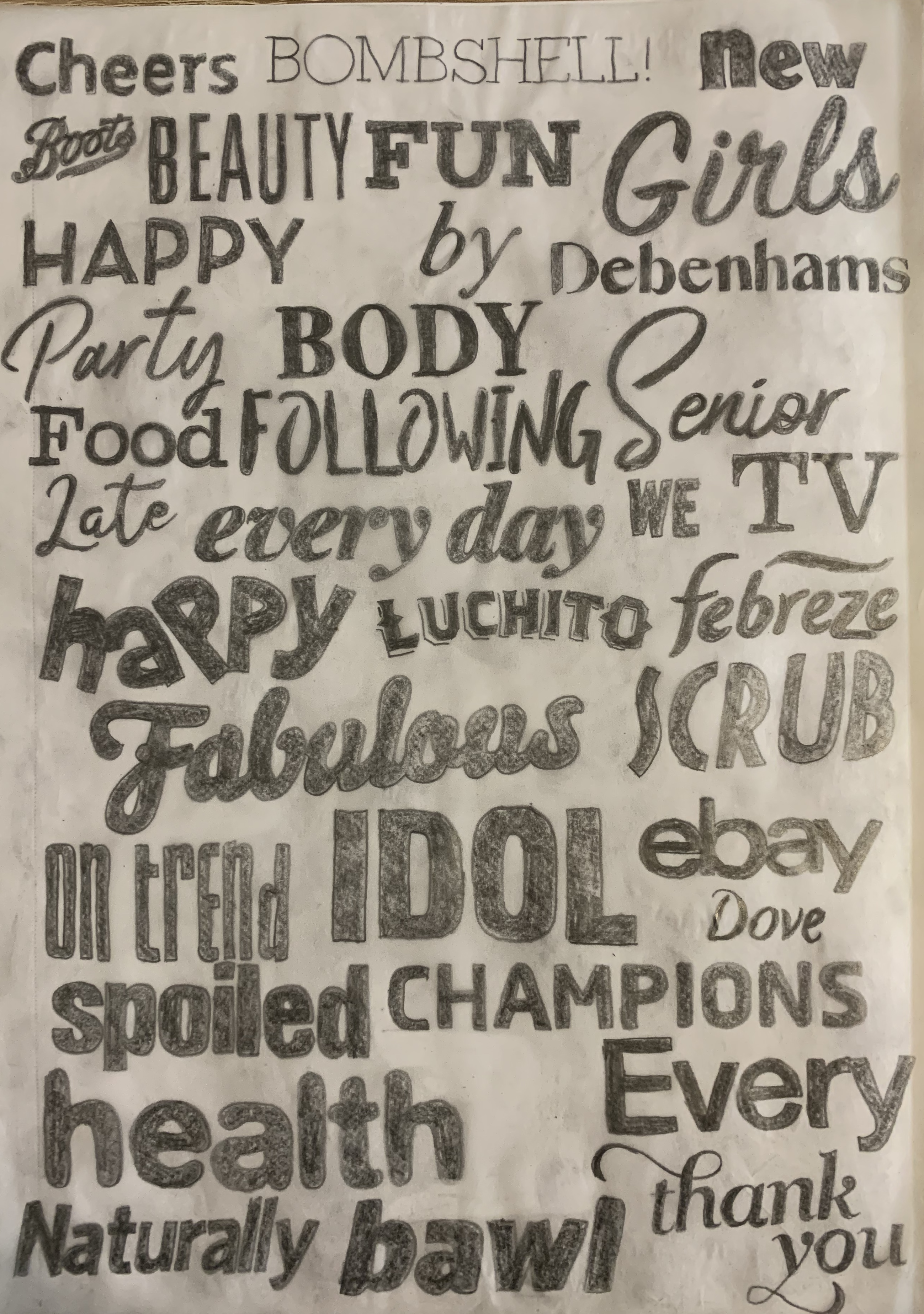
I needed to trace some interesting, unusual and everyday letterforms to help with the understanding of the distribution of weight of line within a particular letterform.
I used a mixture of magazines, leaflets and newspapers to trace over as many different typefaces as possible. Firstly I drew the outside of the letterforms to focus on the structure of the strokes, serifs and curves of the letters, this made me pay close attention! I then coloured these in to see the full effect of the typefaces. I found the script typefaces most challenging due to the various stroke widths and smoothness of the curves.
Reflection
I found this exercise really interesting, I have always been a fan of typography but haven’t explored it quite like this. It was good to test how and experiment how the typefaces can be used in the wrong context and to be seen in an unpleasing way. It has reminded me in the importance of choosing the correct typeface and how they can be read and what characteristics they carry in themselves.
Overall I was pleased with my tutors feedback, I feel that I was given some good pointers towards work which I have added to and amended at the bottom of those particular sections.
Starting this unit I felt quite overwhelmed by everything as mentioned before I am not a book reader, so felt worried that I wouldn’t be able to connect with the work. However I feel this is not the case, I am taking this all as a learning curve and to widen my knowledge in areas which I am not too confidence in and lack experience. When it comes to the designing of book covers I enjoy researching the books and developing ideas from there, but its interesting to look past the cover and learn about the structure of it. Having positive comments from my tutor helps boost my confidence and also helps me to work on my weaknesses, which is why I find the comments so important – as after all, this area is completely new to me. I have also decided that I will be putting my work forward for assessment at the end of the course.
Following my tutors advice I have added to exercise 1, 2 & 3
Brief: Design the book format and cover artwork for two different versions of Daniel Defoe’s classic 1719 novel Robinson Crusoe. The publishers, Viking Press, have decided to re-release this title as a new pocket edition for readers on the move that reflects the adventurous nature of the story within a contemporary setting. This paperback version should have a modern visual feel that can compete with new titles in the bookshop. They also want a deluxe edition for armchair readers and classic book collectors that references the historical nature of the story and its associations. Produce book design ideas and cover artwork to reflect the content of the story across both formats and contexts. Be creative and inventive with both the look and format of these books.
As a side project to accompany the re-release of Robinson Crusoe, Viking Press has also asked you to design a new book called Washed ashore: The ultimate guide to surviving on a desert island by Rik Bennett. This is a ‘how to’ guide that should reflect not only the practical advice it offers, but something of the adventure of being a castaway.
The scale, stock and binding of these publications are up to you. The pocket edition needs to celebrate the functionality of the book as a lightweight, transportable object, and to connect to the story’s travel or survival themes in a contemporary way. The deluxe edition can present the content in a larger, finer, more luxurious, considered or explained way, that perhaps makes reference to the history of the book itself. Your designs need to be seen as part of a series across both versions, so think about how you adapt your designs to fit each format. The shipwreck guide needs to be seen as a separate genre, piggy-backing on the success of Robinson Crusoe. Develop visual ideas that can distinguish the survival guide from your Robinson Crusoe designs, while at the same time making some thematic connection between them.
Your design should include the front, back, spine and flaps of your covers – if you opt for a traditional book binding. You can also come up with alternative ways of binding, and therefore designing your books if you want to. Generate your own illustrations, photography or artwork for the covers, source copyright free images, or treat the covers purely typographically. This is an opportunity to be creative with both your design thinking and outcomes, so experiment, and test out a range of visual physical options.
You may want to extend your project also by designing a number of sample pages from the inside of the book. When creating sample pages, try to make a link between the cover design and the design of the inside pages.
Present your ideas by mocking up each of the books and their covers, and by presenting the overall spec of your designs (what paper stock you are using etc) Work through the design process, documenting it in your learning log as you go. Use rough drawings, notes, diagrams, mock-ups of your books, photographs of what you’re working on, and by saving different stages of any digital work to show your process. Talk about your creative process through notes and reflections.
Analysing the brief:
This brief is split into three parts;
Part 1 Paperback edition: Design the book format and cover for Daniel Defoe’s classic 1719 novel Robinson Crusoe. This will be a re-release pocket edition with a modern feel, aimed at readers on the move that reflects the themes of travel and adventure in a contemporary setting.
Objective – Recreate the cover with a modern feel that competes with other new books on the shelves. The book needs to be portable and lightweight for the particular target audience. Reflect on the content of the story and connect to the travel/survival themes in a contemporary way.
Format – Paperback, lightweight and suitable for traveling. Include front, back and spine designs. Scale stock and binding to be decided at later date – alternative formats can also be considered. Include Title, author & publisher
Other information – Designs for part 1 & 2 need to be seen as part of a series
Target Audience – Readers on the move – Travellers/commuters
Keywords from brief – Modern, contemporary, survival, travel, portable
Part 2 Deluxe edition: Design a deluxe hardback collectors’ version of Daniel Defoe’s Robinson Crusoe, it should reflect the historical themes of the story and its associations. This version can present the content in a larger, finer, more luxurious way, suitable for armchair readers and classic book collections.
Objective – Create a larger and luxurious cover for Robinson Crusoe. Reflect on the content of the story. Reference the historical nature of the story and the history of the book. This will be seen as a collectors book.
Format – Luxurious, fine book suitable for armchair readers and collectors. Including front, back and spine designs. Scale stock and binding to be decided at later date – alternative formats can also be considered. Include Title, author & publisher
Other information – Designs for part 1 & 2 need to be seen as part of a series
Part 3 Washed ashore deign: Design a ‘how to’ guide called Washed ashore: The ultimate guide to surviving on a desert island by Rik Bennet, that offers practical advice on what to do if you are shipwrecked, as well as reflect the theme of adventure.
Objective – Design a shipwrecked guide which reflects practical advice and something of the adventure of being a castaway.
Format – Include front, back and spine designs. Scale stock and binding to be decided at later date – alternative formats can also be considered. Include Title, author & publisher
Other information – This guide needs to be in a separate genre to the first two books – i.e. an instructional manual rather than a novel, yet still keep a thematic connection between them.
Keywords from brief – Shipwreck, guide, practical, adventure, castaway, Robinson Crusoe theme, desert island
Research
I wanted to start off my research by toughly researching the book Robinson Crusoe, to me the name is very familiar but not the book.
Robinson Crusoe is a novel by Daniel Defoe, first published on 25th April 1719. The first edition credited the work’s protagonist Robinson Crusoe as its author, leading many readers to believe he was a real person and the book a travelogue of true incidents. Epistolary, confessional, and didactic in form, the book is presented as an autobiography of the title character, a castaway who spends 28 years on a remote tropical desert island near the coasts of Venezuela and Trinidad, encountering cannibals, captives, and mutineers, before ultimately being rescued. The story has been thought to be based on the life of Alexander Selkirk, a Scottish castaway who lives for four years on a Pacific island called ‘Mas a Tierra’, now part of Chile, which was renamed Robinson Crusoe Island in 1966.
Despite its simple narrative style, Robinson Crusoe was well received in the literary world and is often credited as marking the beginning of realistic fiction as a literary genre. It is generally seen as a contender for the first English novel. Before the end of 1719, the book had already run through four editions, and it has gone on to become one of the most widely published books in history, spawning so many imitations, not only in literature but also in film, television and radio, that its name is used to define a genre, the Robinsonade. (https://en.wikipedia.org/wiki/Robinson_Crusoe)
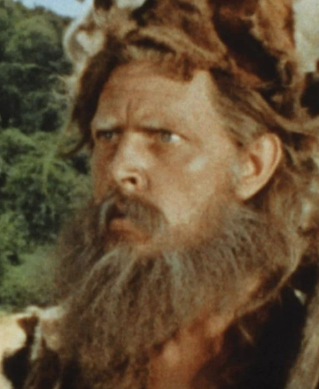
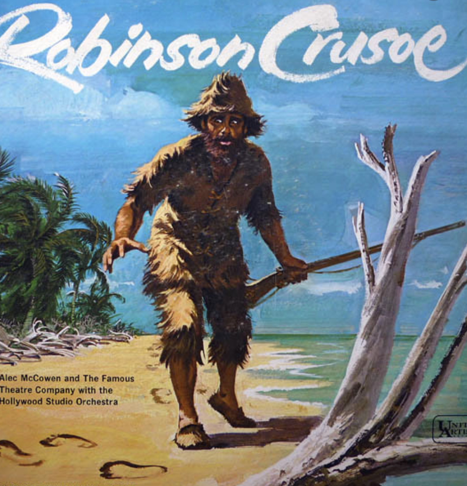
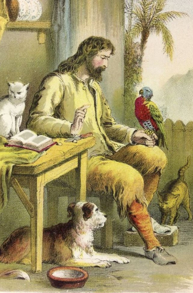
After learning about the book and the plot I wanted to visually research Robinson Crusoe, I started off by distinguishing what the appearance of Robinson Crusoe is, these images include movie/tv actors playing the role, paintings and sketches from various artists.
Images of Robinson Crusoe; (Source: Google Images)
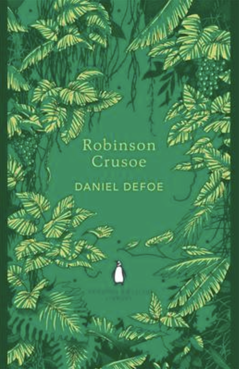
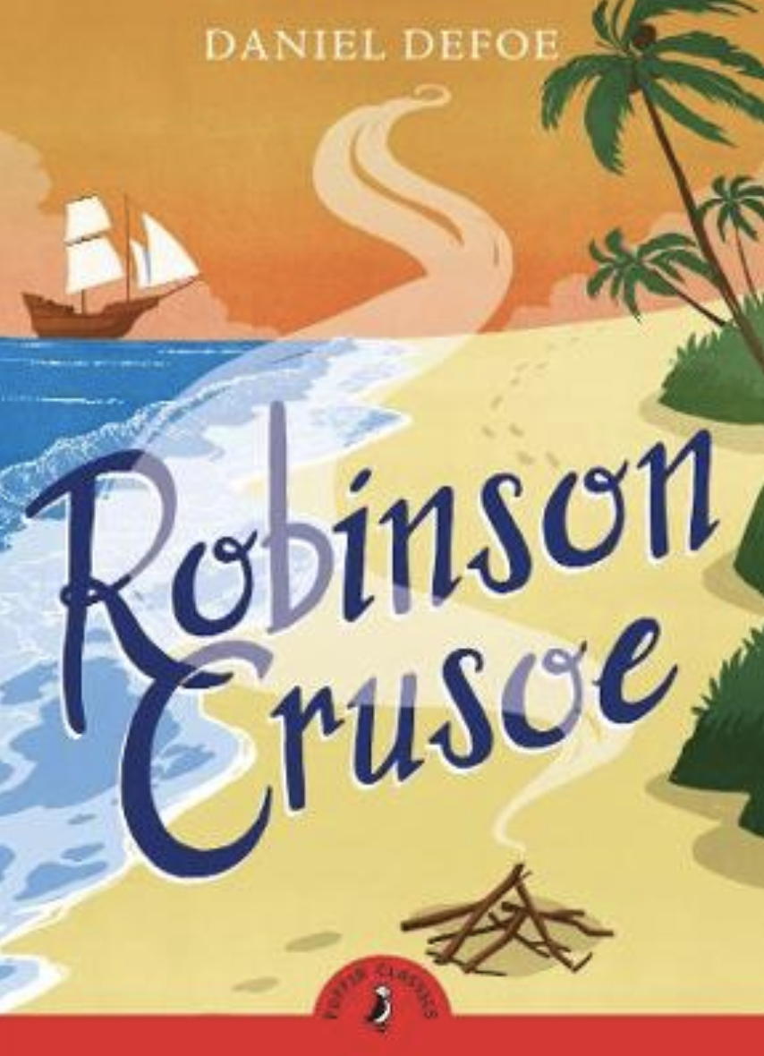
Below are some book cover designs which I came across on the Waterstones website. The designs all contain a theme of beaches, sandy footprints and pirates as well as the title being large and eye catching. Although it is clear what the motifs are, each design is still carries its own style. I am particularly drawn to the first cover with the jungle leaf boarder, this stands out to be because it is bold, different to others and suits the adventure genre of the book.
2019, Illustrated by Eko Publisher: Simon and Schuster Group
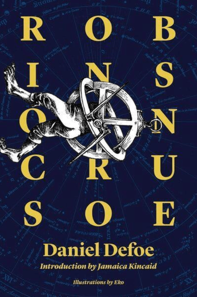
This particular cover stood out to me with its unusually placed illustration amongst the typographic cover. The dark navy background contains what appears to be a ships radar map, which creates an interesting and background. The illustration appears to have worn bare feet but the body has been replaced with an old sundial compass, again imaginative and clear that the designer has thought outside the box when designing this. This is something I want to make sure I achieve during this assignment so I find this quite inspirational. The type of imagery used helps the reader to recognise that the story is set in the past from the black and white sketched image with the vintage sundial compass.
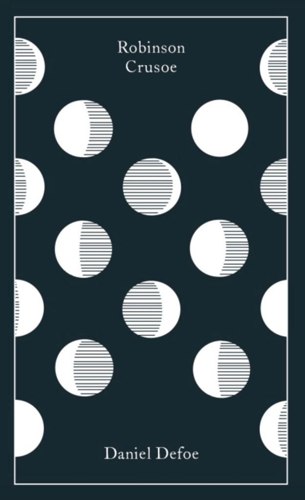
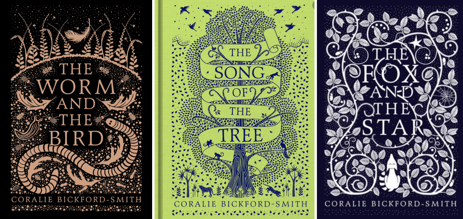
This clothbound edition has a foil stamped design making this more of a Deluxe edition. The design doesn’t really explain what the books about, to me this looks like different stages of the moon perhaps? Which could represent the passing of time Robinson spent on the island. Thinking back to previous exercises, the pattern used is very much Coralie’s style with the use of repetitive pattern and clear typography.
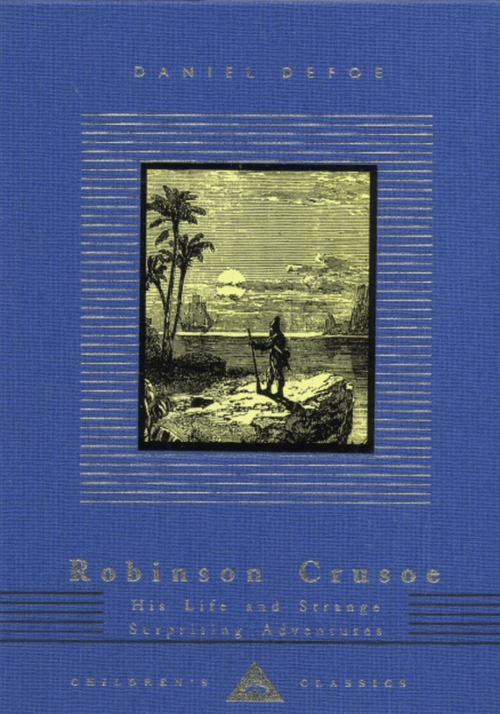
1993, Penguin Books Children’s Classics
Again this is another Deluxe cloth bound book with foil detail, this book looks classic and mature even though its a children’s book. It is pared with elegant typography and simple lines surrounding what looks like an original image. This book is apart of a series with the same layout featuring on all books, giving them all a classical appearance.
Adventure Genre – I looked into other books from the same genre to see if there are any design styles apparent and each varied, although some of the main motifs are; Darker colour palettes, formal typefaces, detailed imagery, title as the focal point. This gave me a little guide as to what to the design of the genre is about.
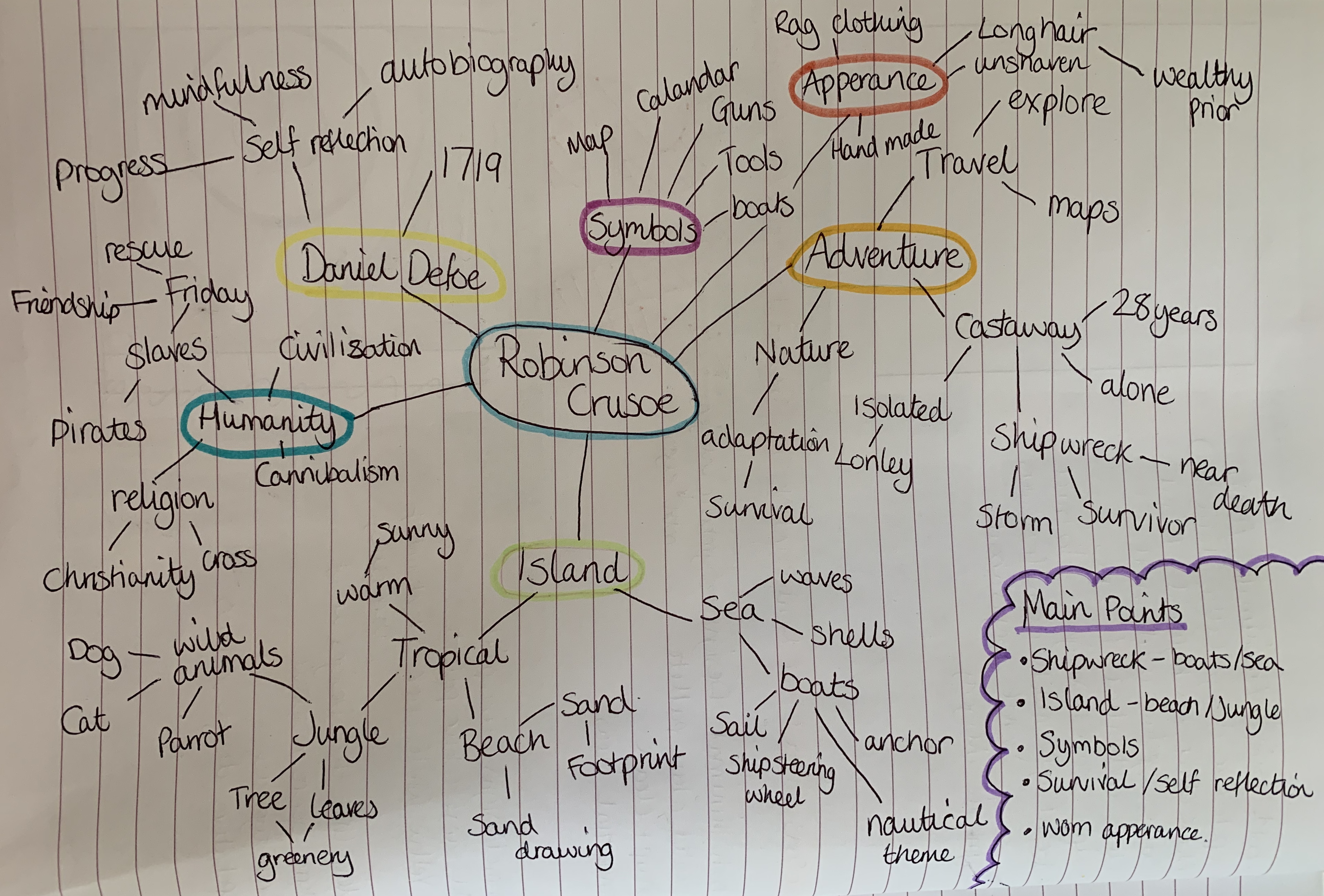
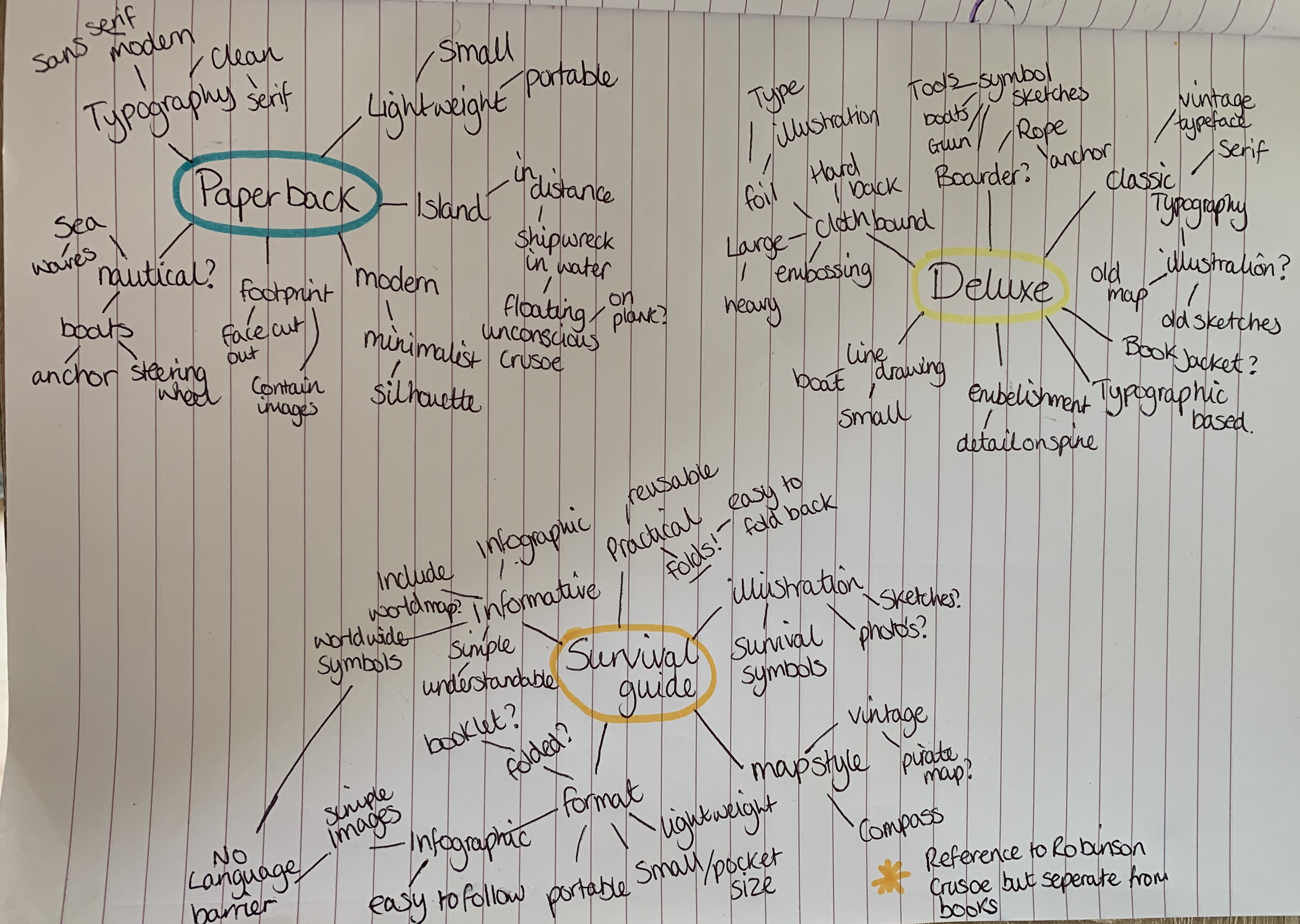
I created two mind maps, one focusing on Robinson Crusoe and the other on design ideas for the three books.
Design Ideas and Further Research
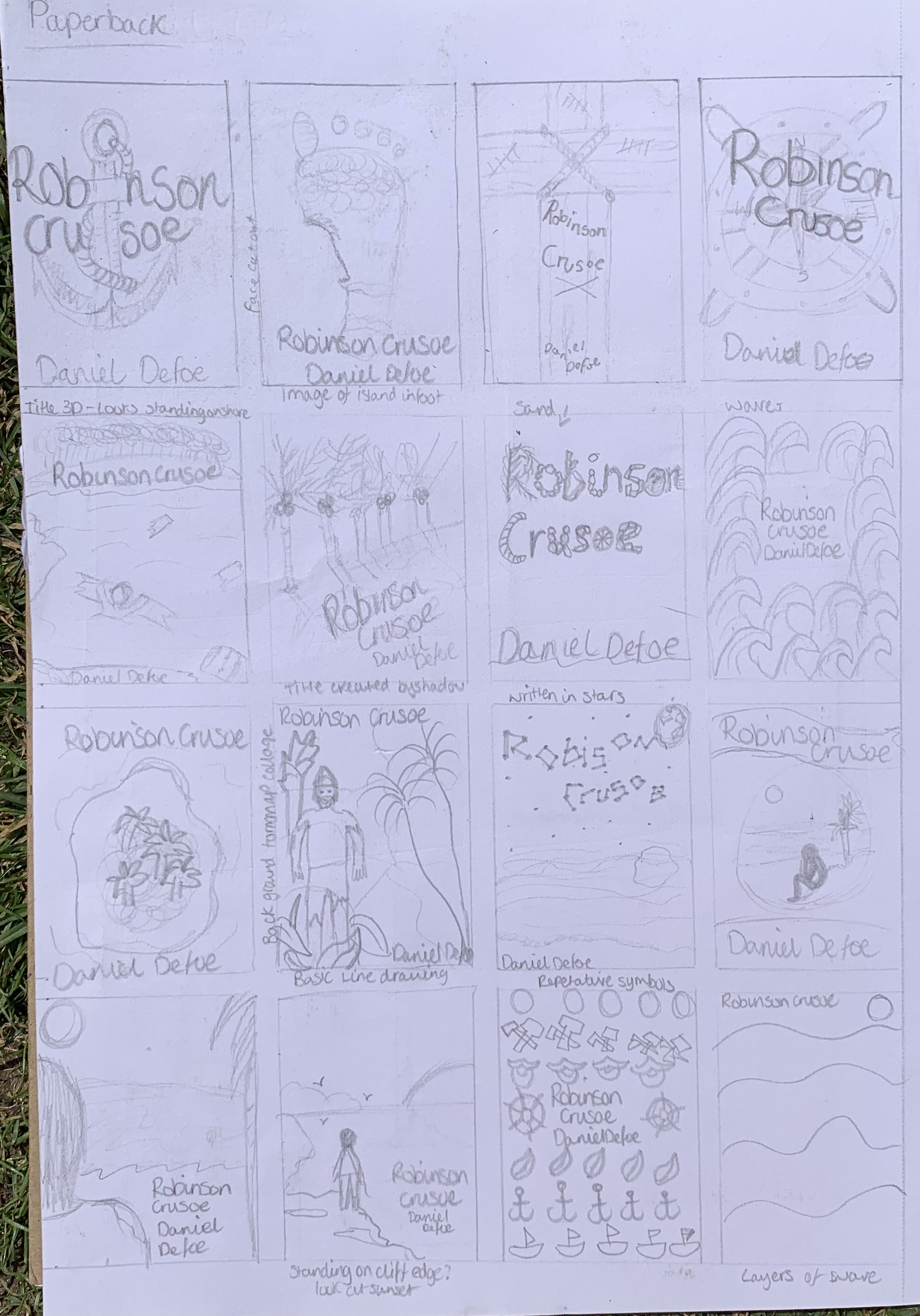
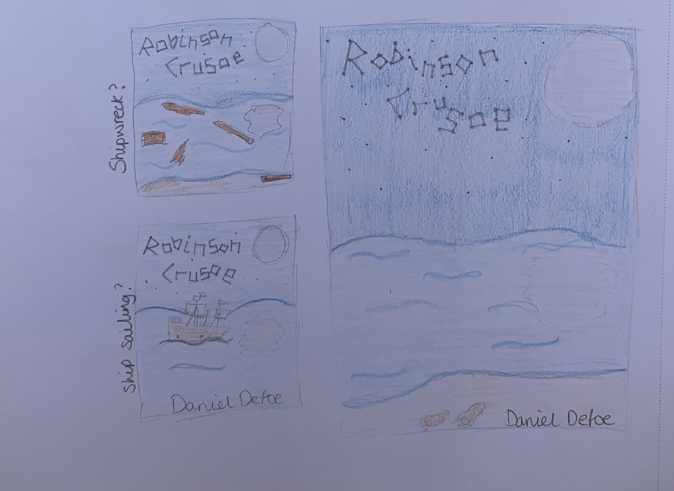
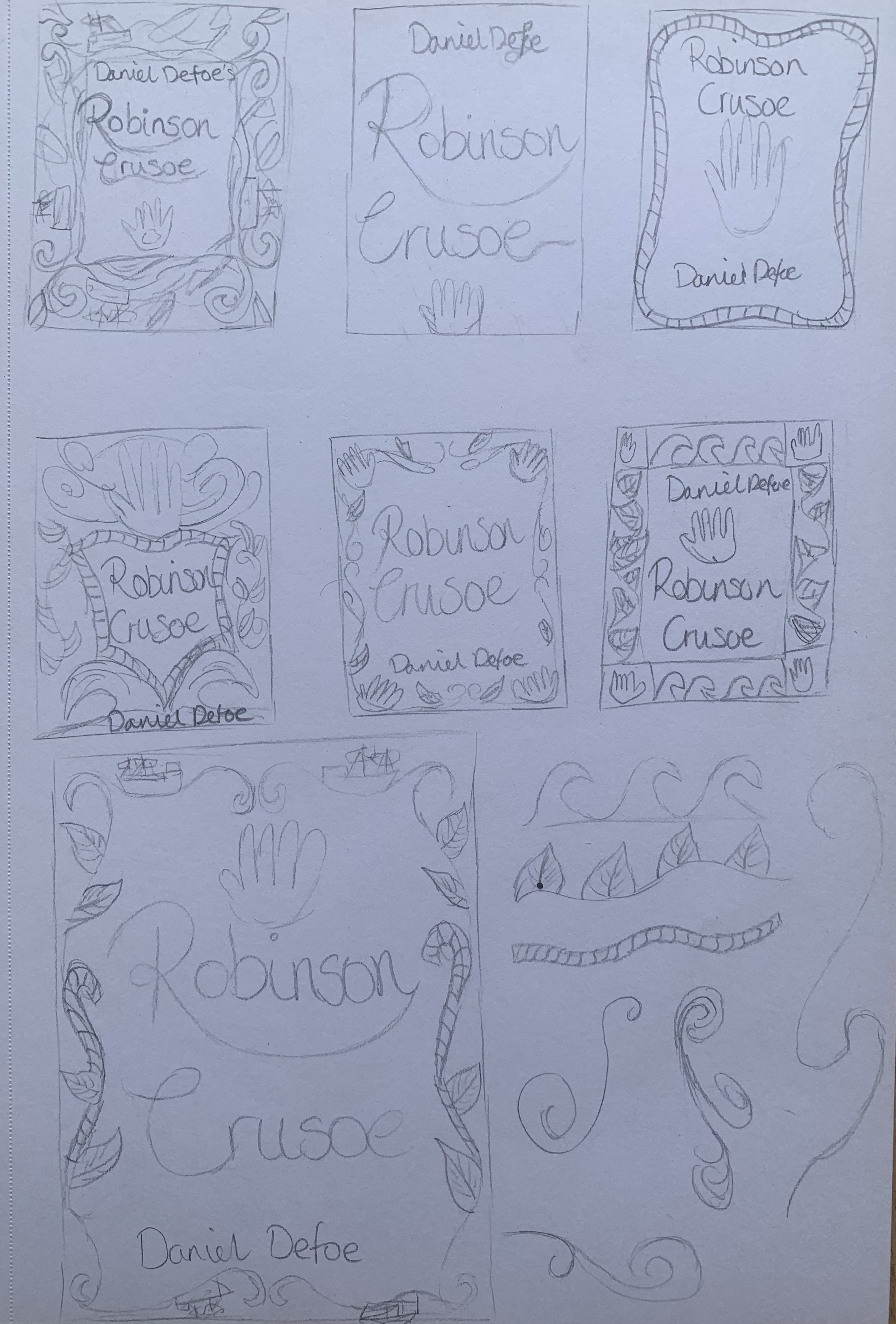
I started to sketch some thumbnail ideas to see which ones I wanted to look further into. To start my design process I decided to narrow down my sketches by focusing on a couple of designs, creating a more detailed sketch along with a mood board.
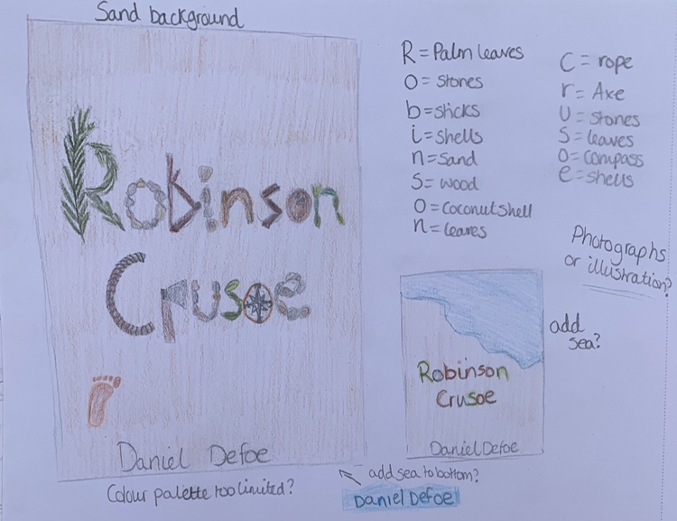
The first sketch I looked at was a typography cover with elements making up the letters. I thought about the different elements and objects that could be found on a desert island along with key objects from the book. I like the idea of this being made entirely out of objects, creating a unique cover. My only concern would be the limited colour palette, but by adding a snippet of the ocean it may give the pop of colour the cover needs. This will be something to experiment with.
I came across the artist Danielle Evans who is famous for her food typography, I found her work inspiring for this design. https://marmaladebleue.com/
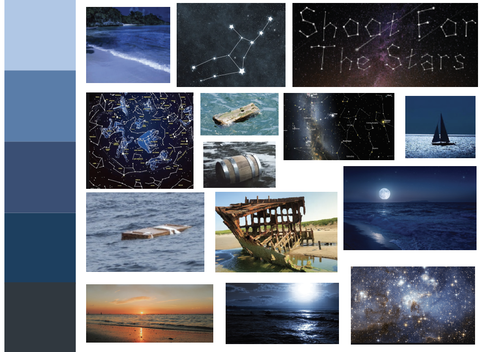
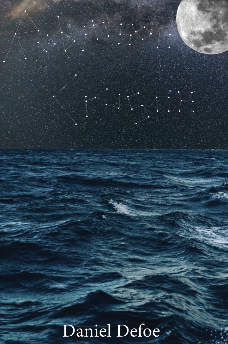
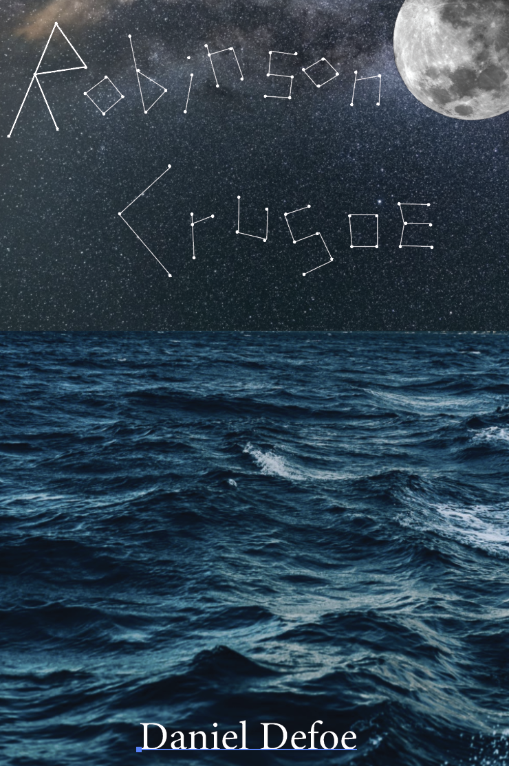
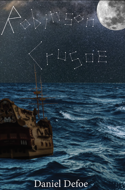
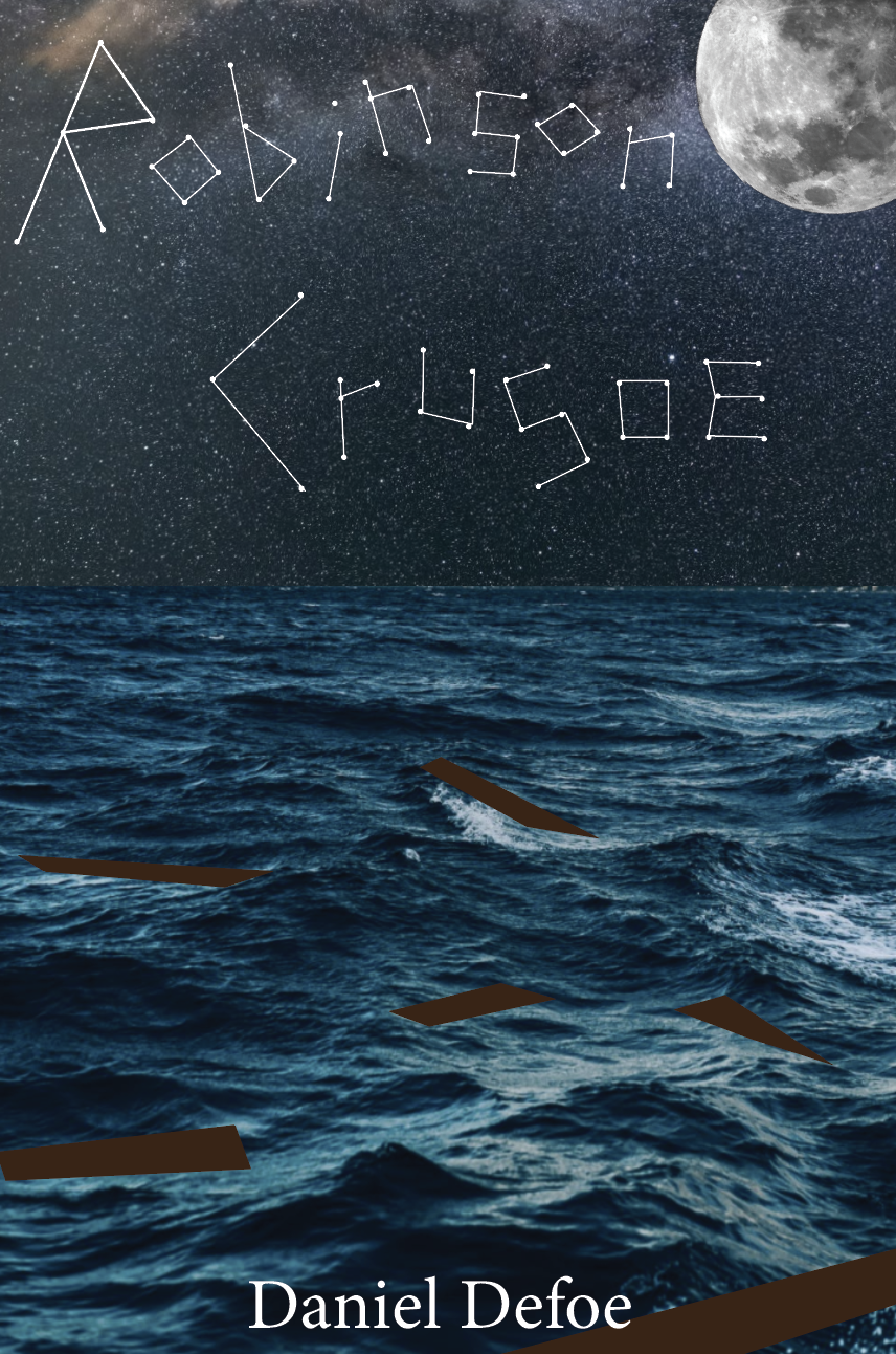
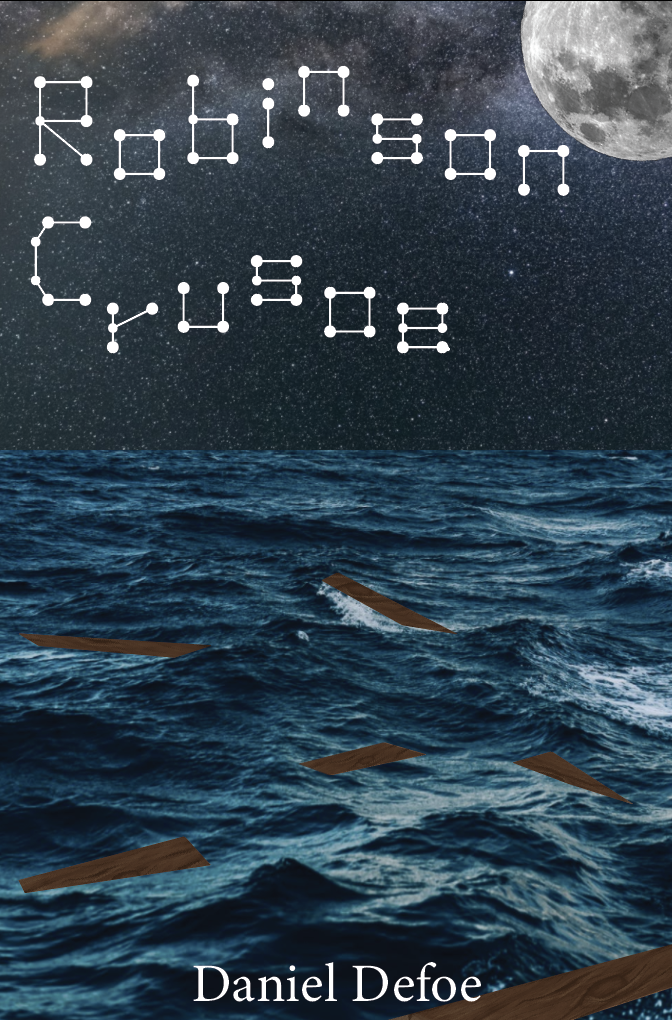
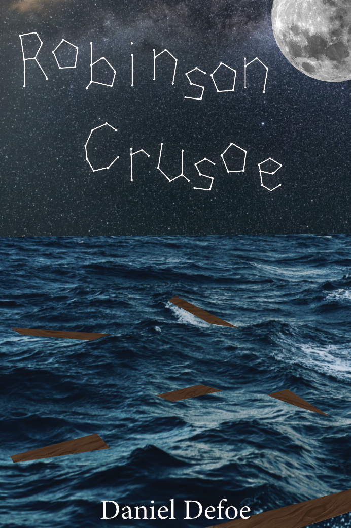
The second design I looked further into was the ‘written in the stars’ design. After sketching out I decided the ship wrecked cover would be more fitting creating a cover more relatable to the story. I feel this design is different to any other existing covers for the book.
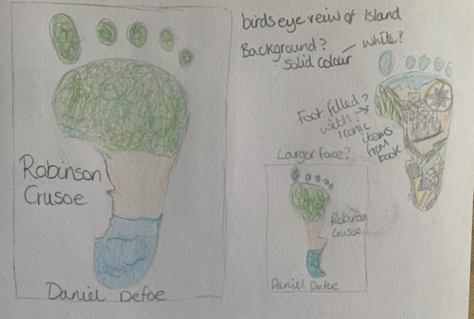
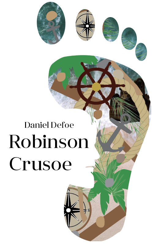
After sketching out the larger design of the footprint masking the island, I thought of including the key symbols from the story within the footprint rather than it just being a birds eye view of the island. By adding in these elements it creates a more intriguing design causing more concentration when studying the image.
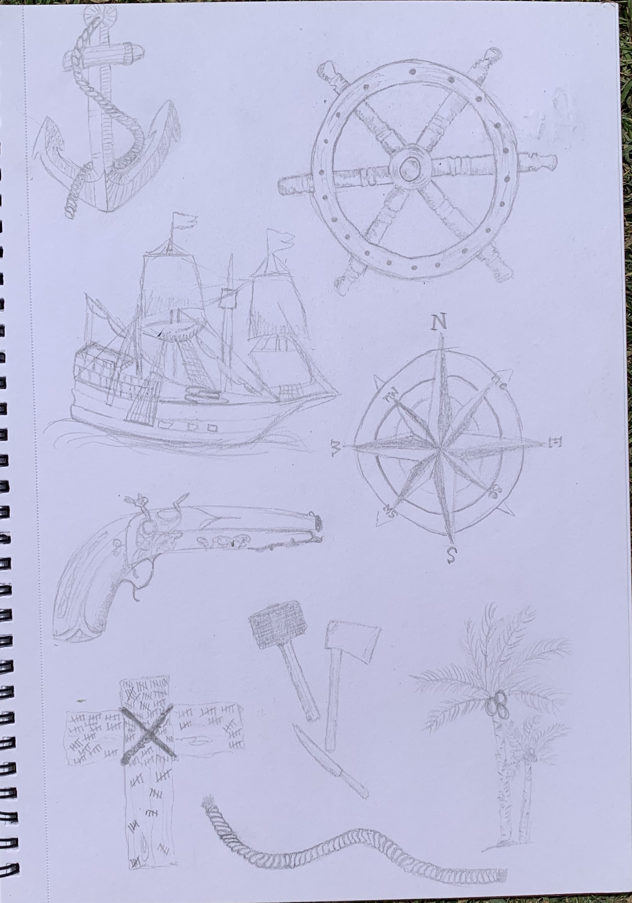
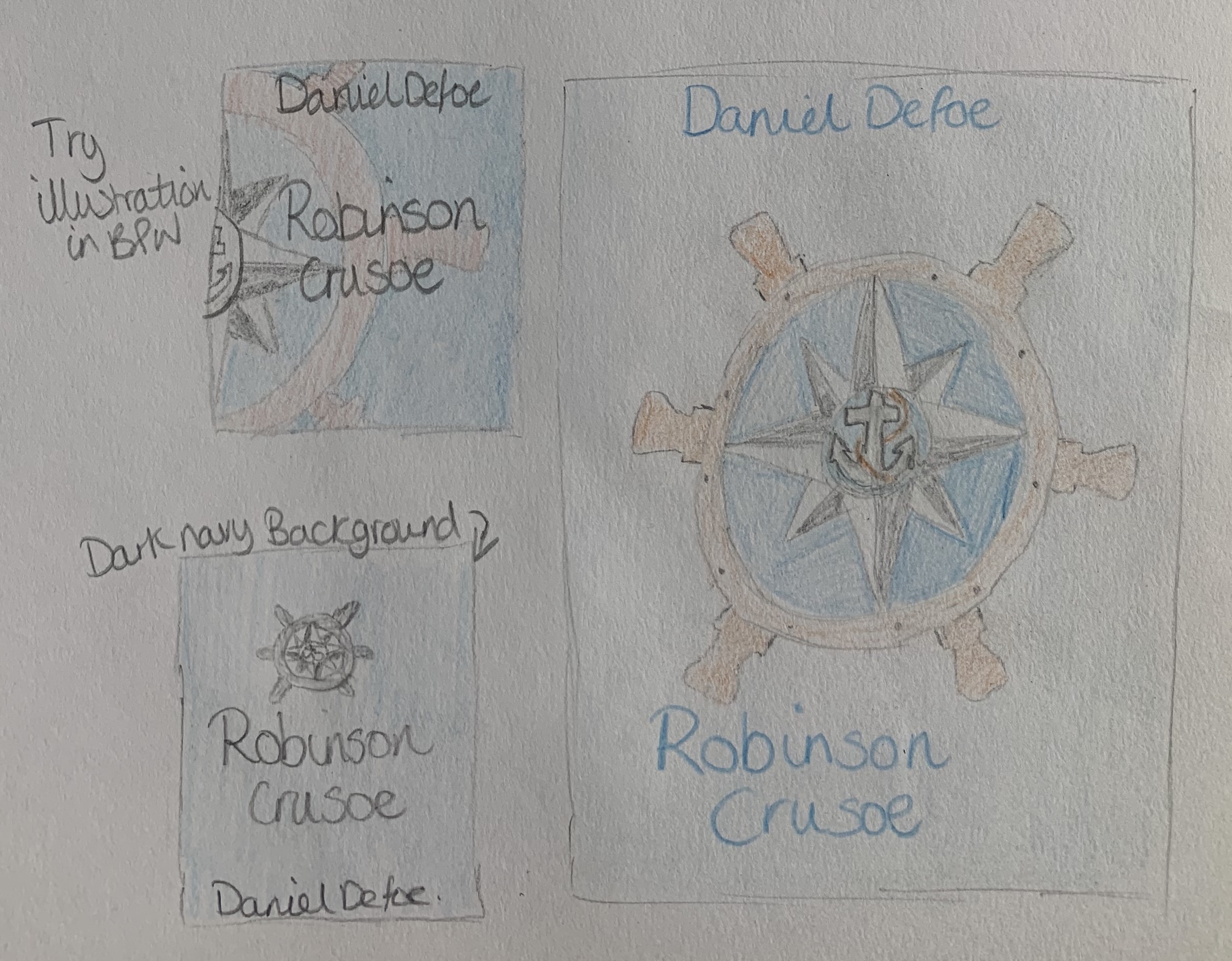
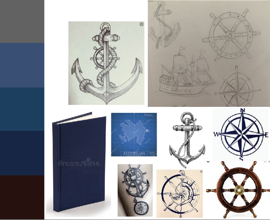
Looking at my sketches of the anchor, wheel and compass I decided to look at combining these three items giving the book a nautical theme focusing on the sailing part of the book, before the ‘disaster struck’. I would like to experiment with this design and the visual dynamics to see which layout works best. This design would also be worth thinking about for the more Deluxe version too.
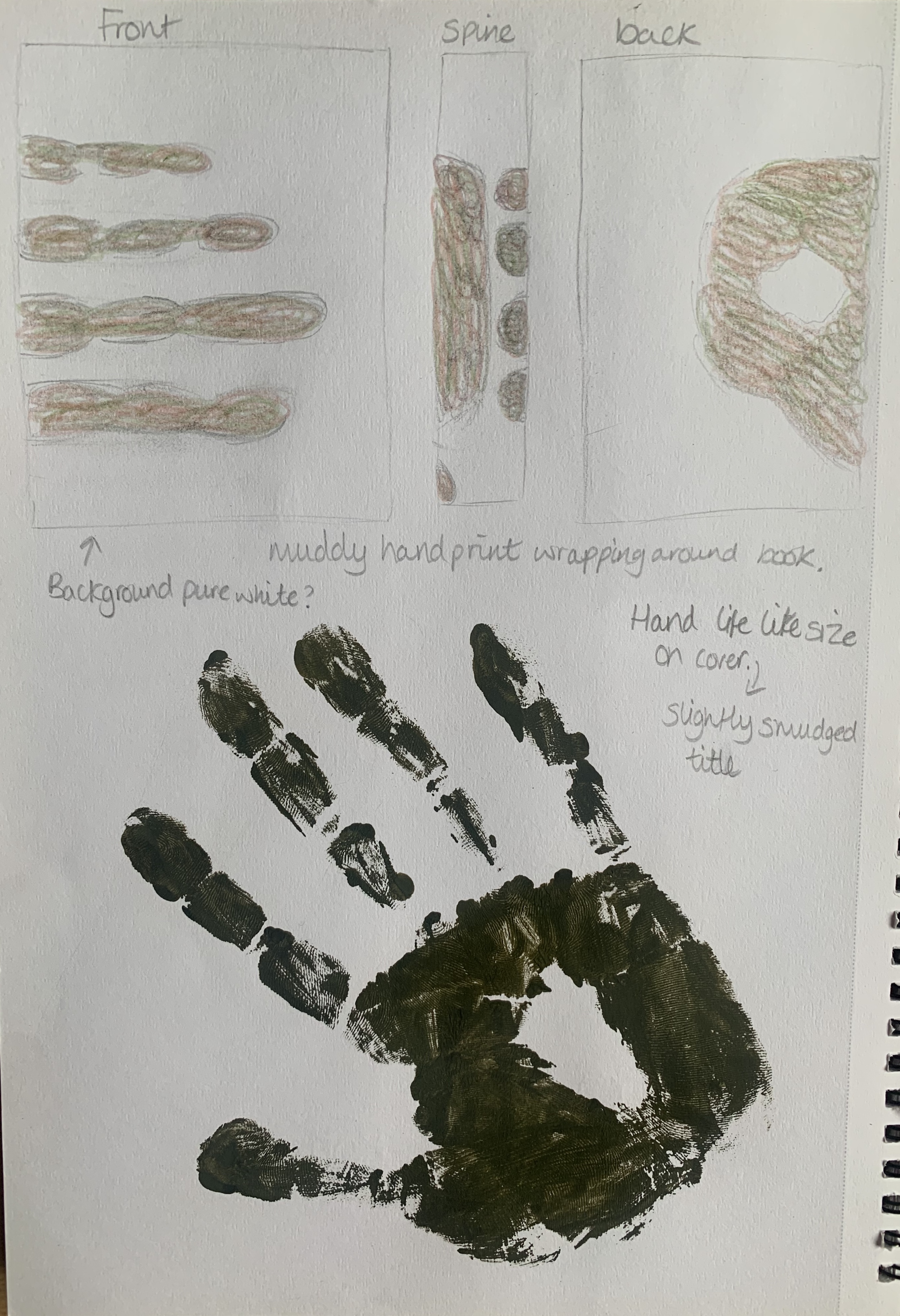
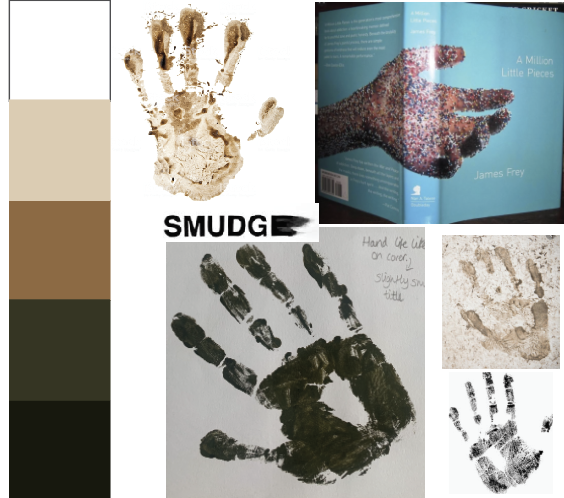
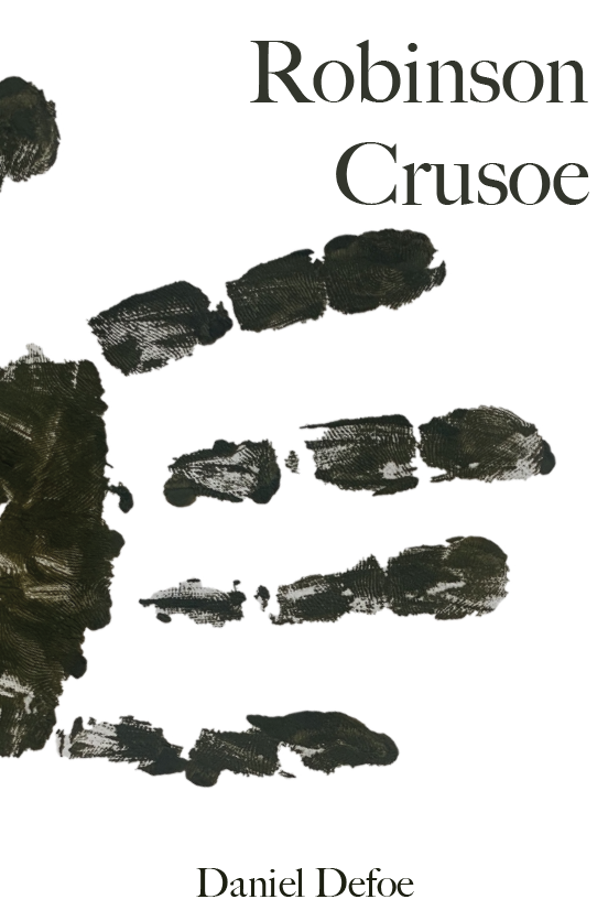
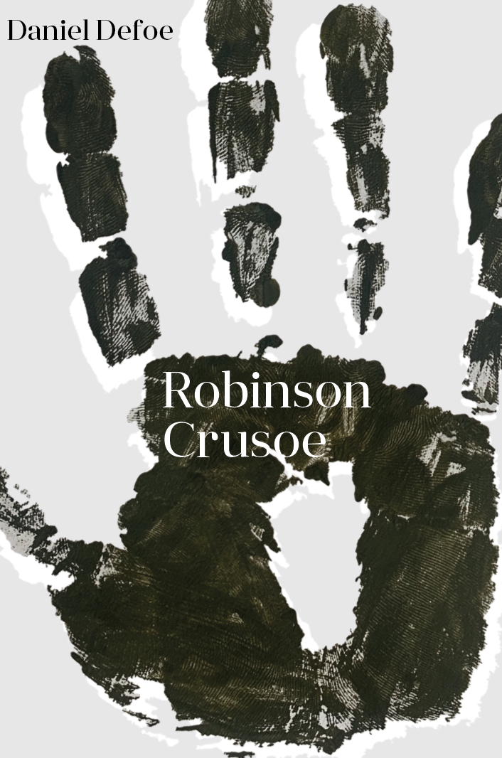
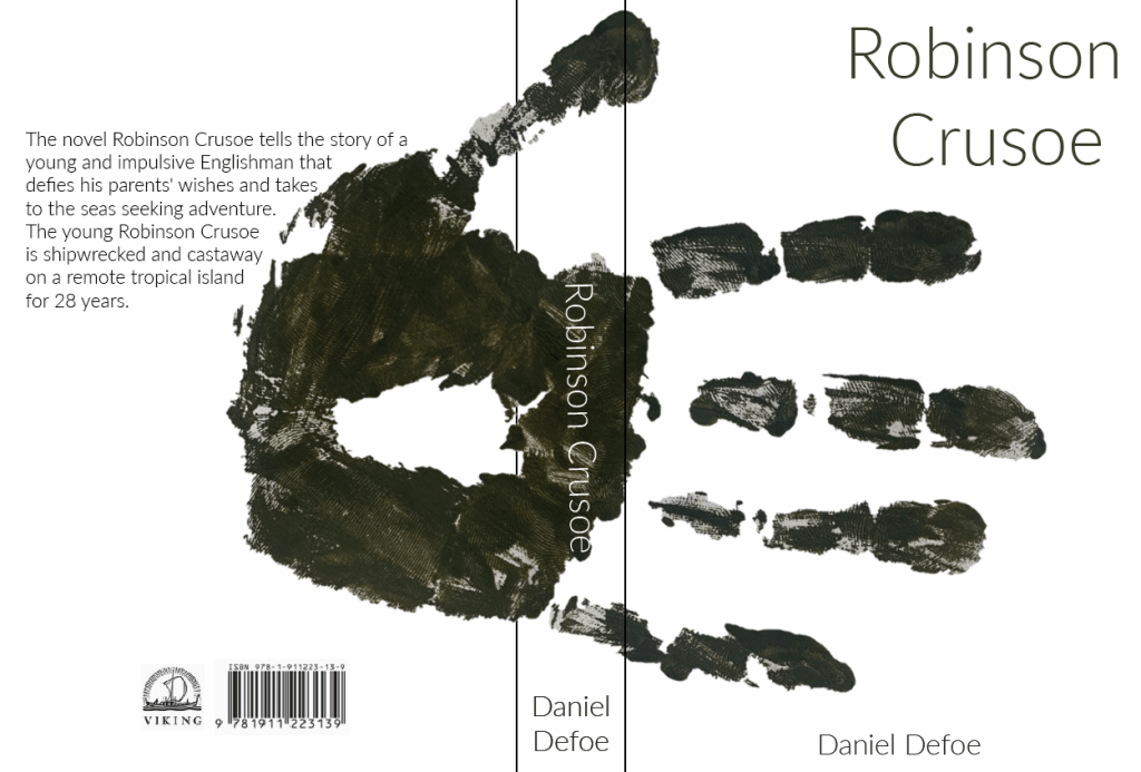
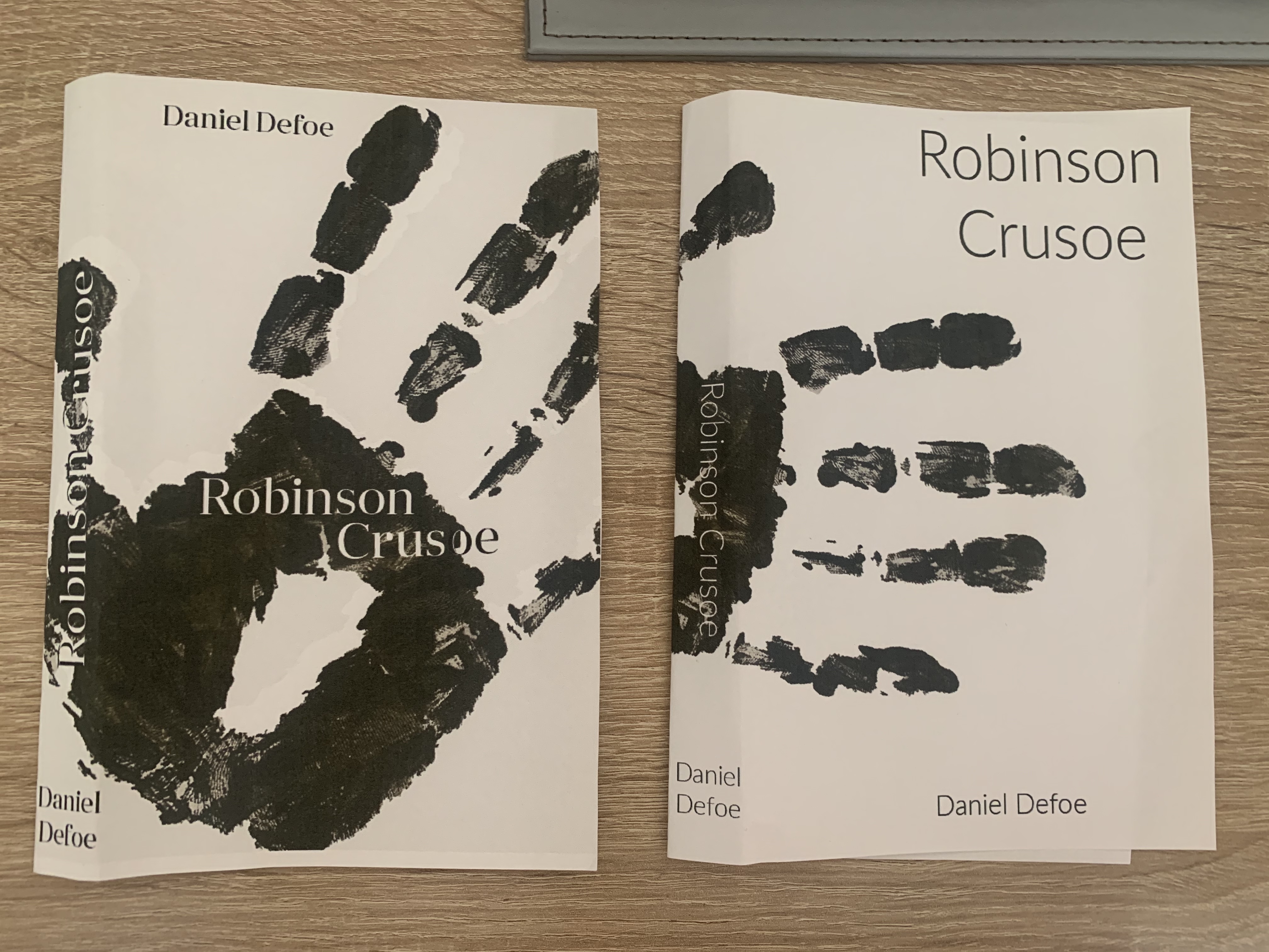
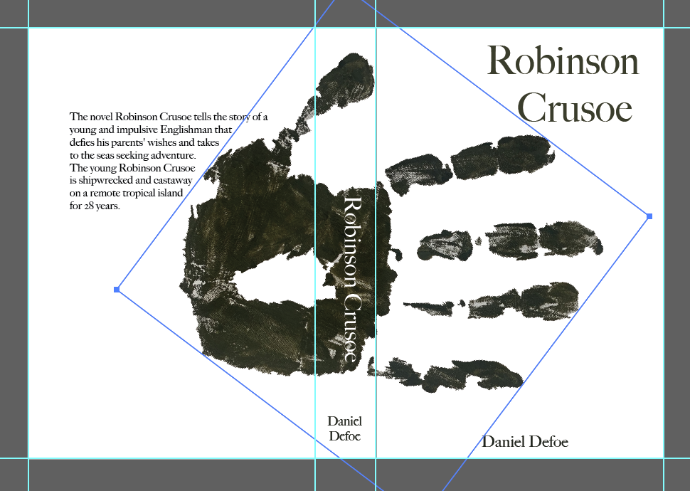
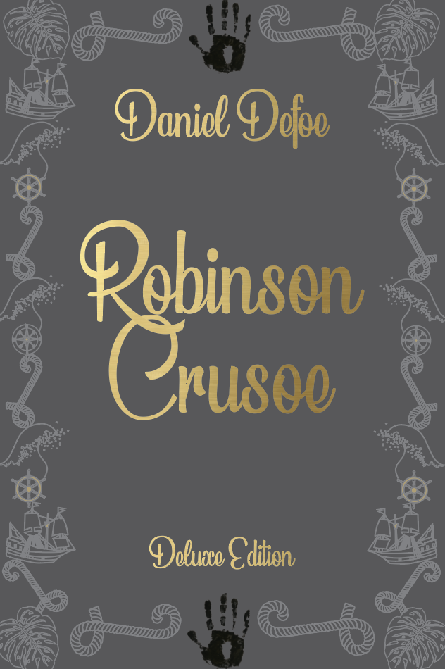
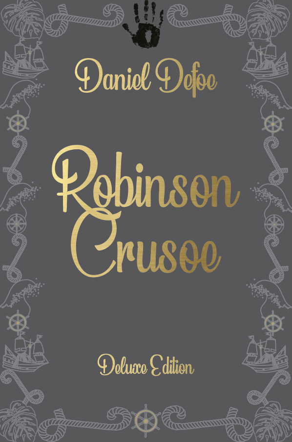
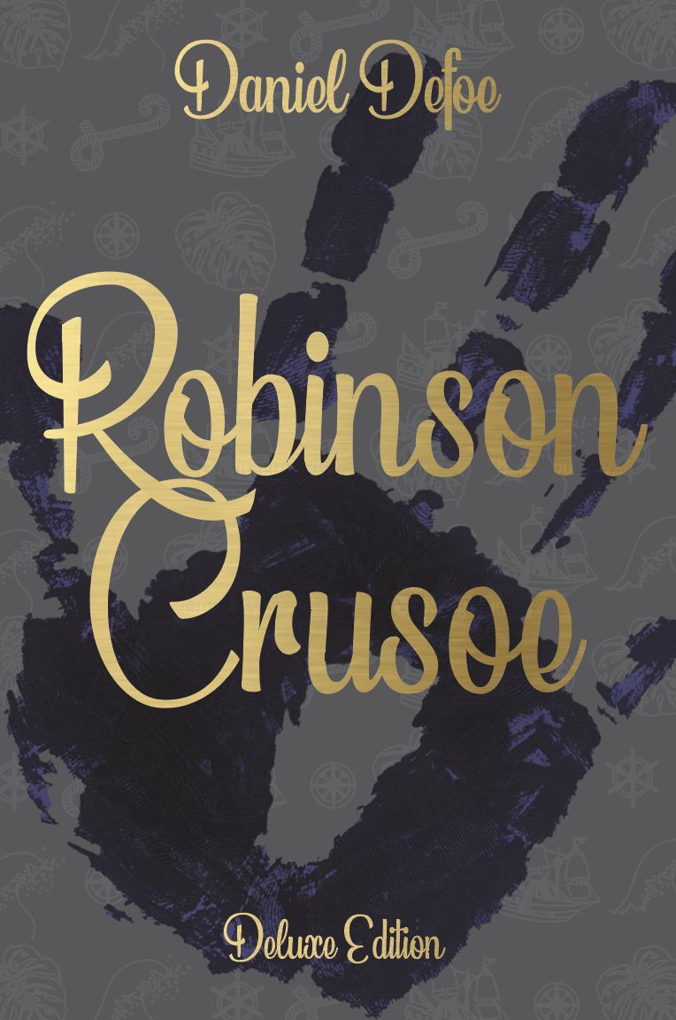
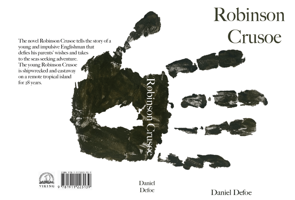
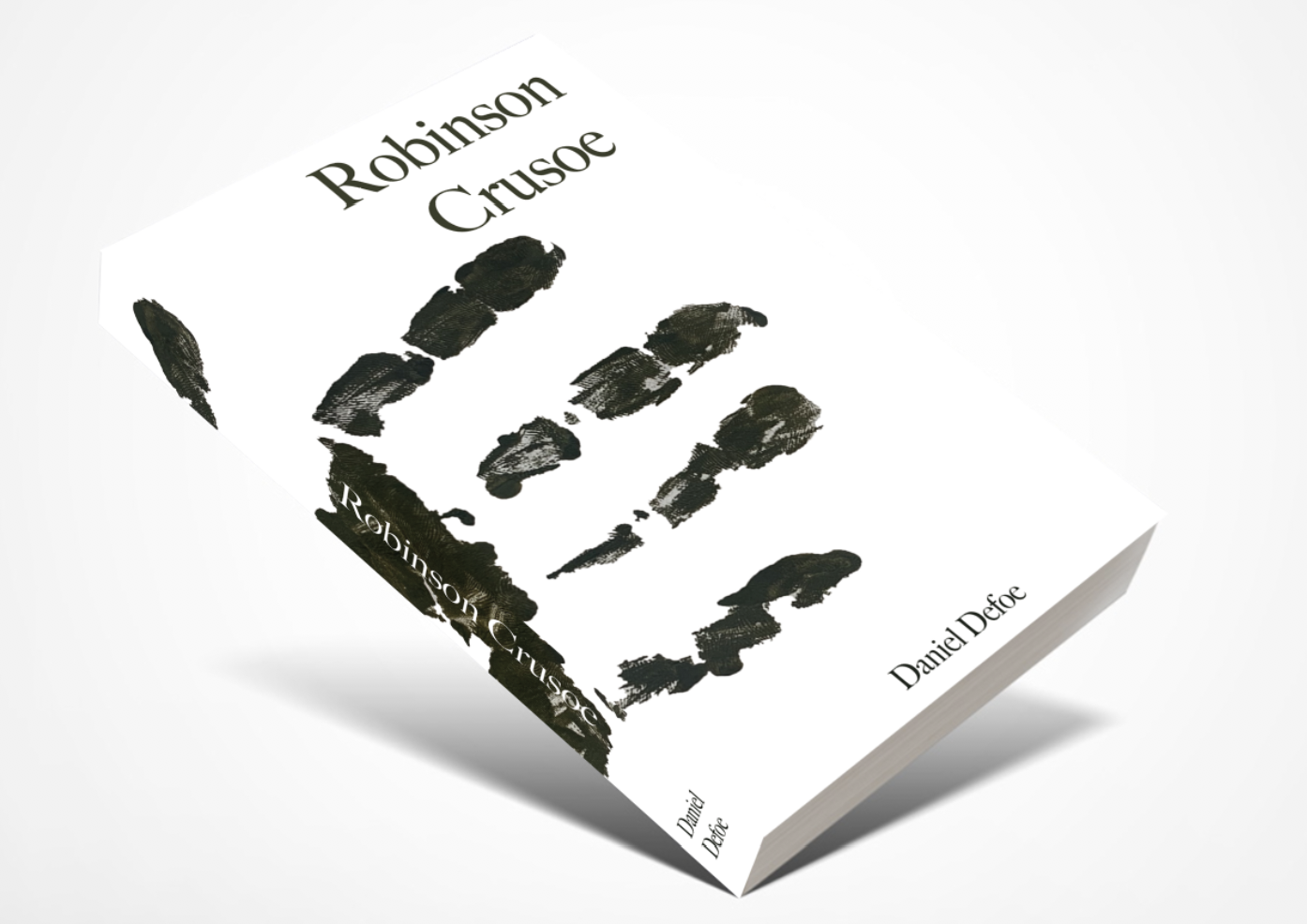
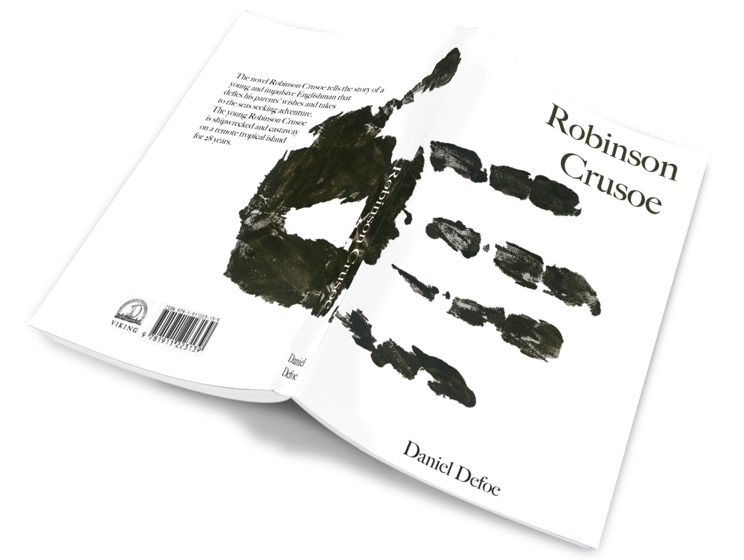
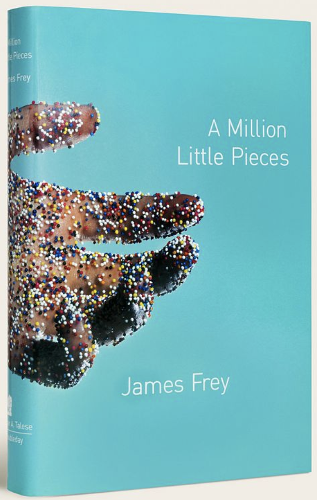
My final design is one which isn’t included in my thumbnail sketch’s, this design came to me whilst creating my mood boards. I like the idea of having a crisp white background with a dirty muddy handprint wrapped around the book, looking like it was held by someone. I then remembered from a previous exercise the cover ‘A Million Little Pieces’ by Rodrigo Corral which I found very interesting. At this moment the handprint design is my favourite.
Visual Ideas
To move onto the next step I decided to roughly mock up each design to see how they worked visually.
Design 1
For the typography cover, whilst sketching I was concerned about the limited colour palette and thought about adding part of the ocean to add more colour. Although this is a very rough mockup I am happy with the look of the design and feel its has potential, however I am still keen to try out the other designs first to see which looks the best.
Design 2
Again for very rough mock ups I feel that the last design suits the book best, by adding the remains of a shipwreck it helps tie the cover in more with the story. If I decide to focus on this design further, I would experiment with the title more, perhaps try make the letters look neater.
Design 3
This design came out better than expected. I prefer the last design, however is it too plain and un-relatable to the story? An idea to carry forward with this design would be to consider using an actual bare foot print to add more depth and texture to the design.
Design 4
With more detail added I think this could be a good option for the Deluxe version, having a deep navy cloth book with gold foiled title and detailed image with the layout of the second design.
Design 5
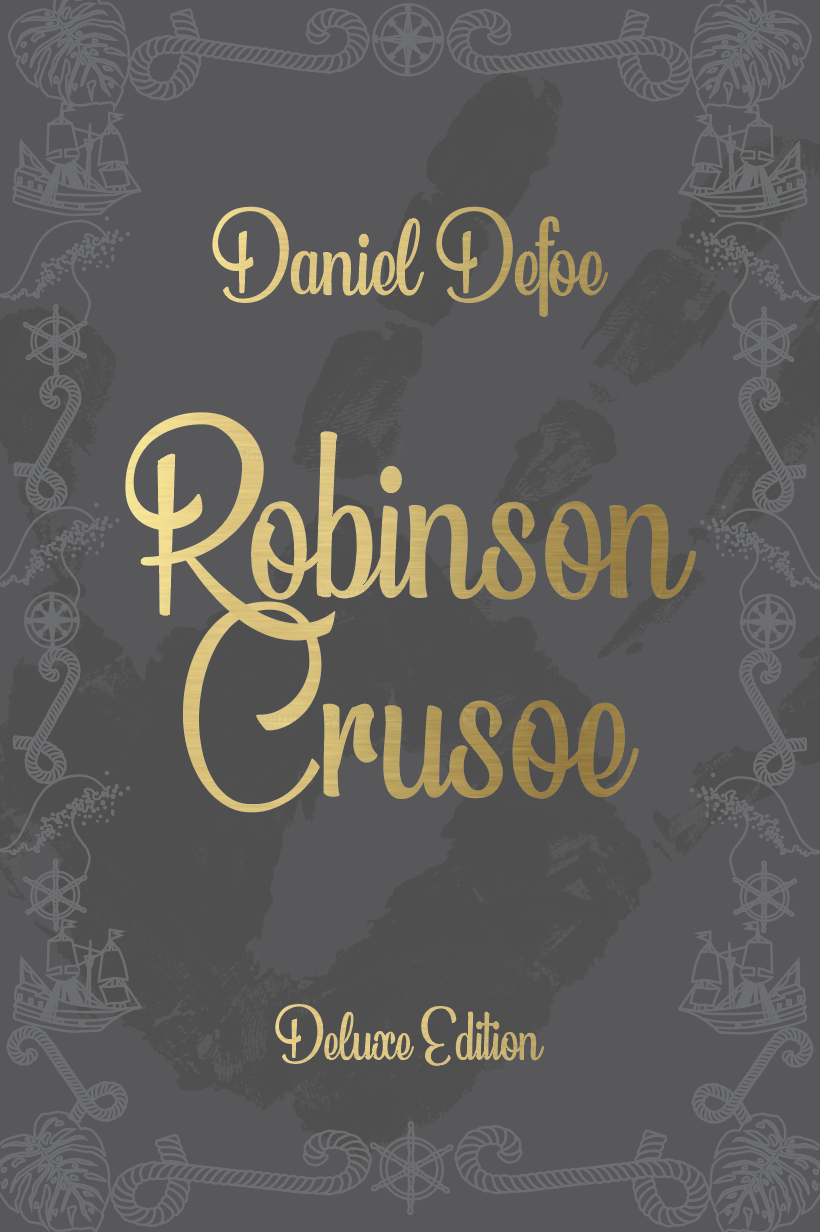
I like how this design turned out, I feel it shows survival without giving too much of the story away. The plain white background gives the book a modern crisp feel. I did attempt to add a background of tree bark however I felt that this took away some of the impact of the design and the handprint looks out of place.
Out of all the designs above I like both the constellation design (design 2) and the handprint design (design 5). I will work further on both of these designs to see which one I will use as my final cover.
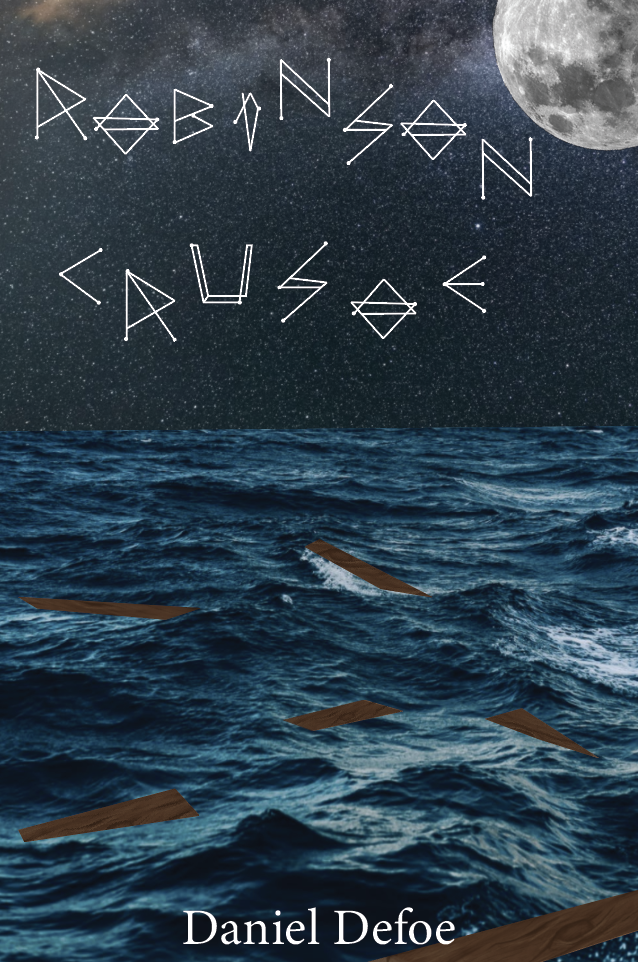
Pocket Book (Paperback)
After visualising some of the ideas above I felt I was ready to move onto the designing of the first cover. I wanted to remind myself before moving on what all the requirements are for the book set in the brief.
The book needs to be portable and lightweight for the particular target audience. Reflect on the content of the story and connect to the travel/survival themes in a contemporary way.
I also need to think about the format of the book including the scale, stock and binding techniques.
Design Development
Design 1
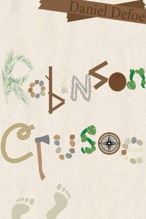
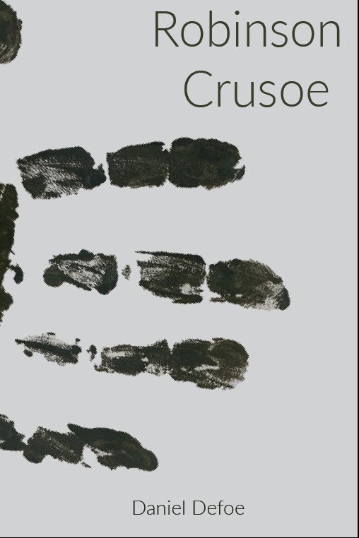
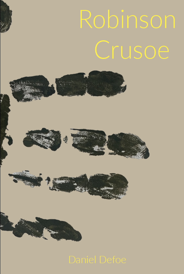
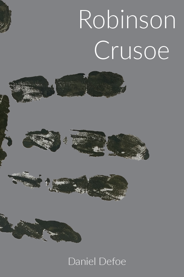
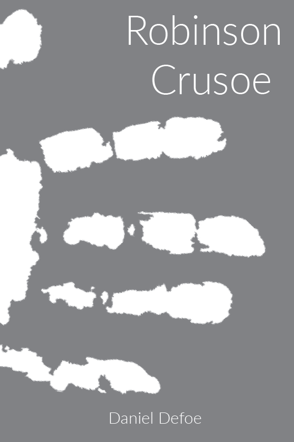
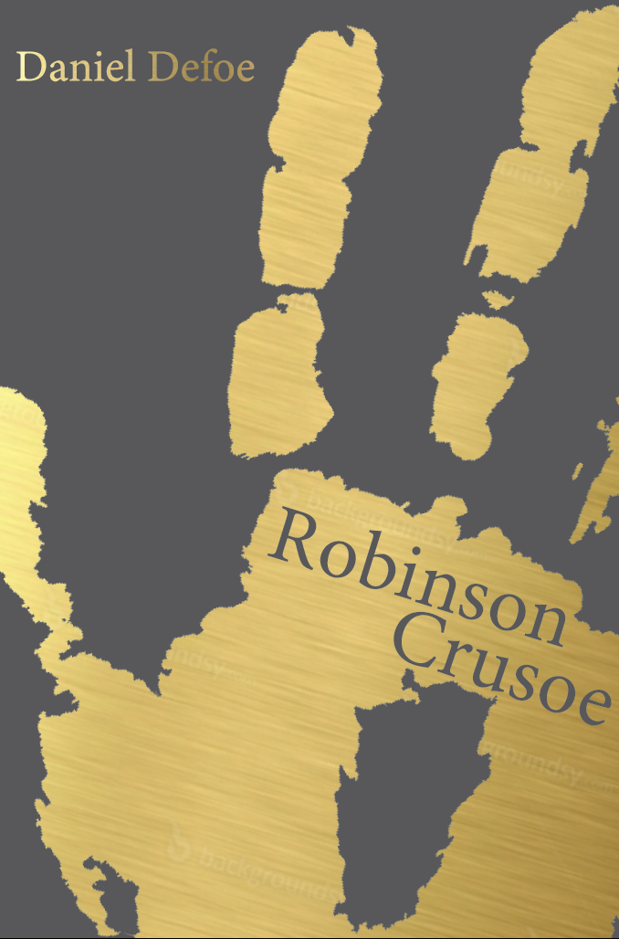
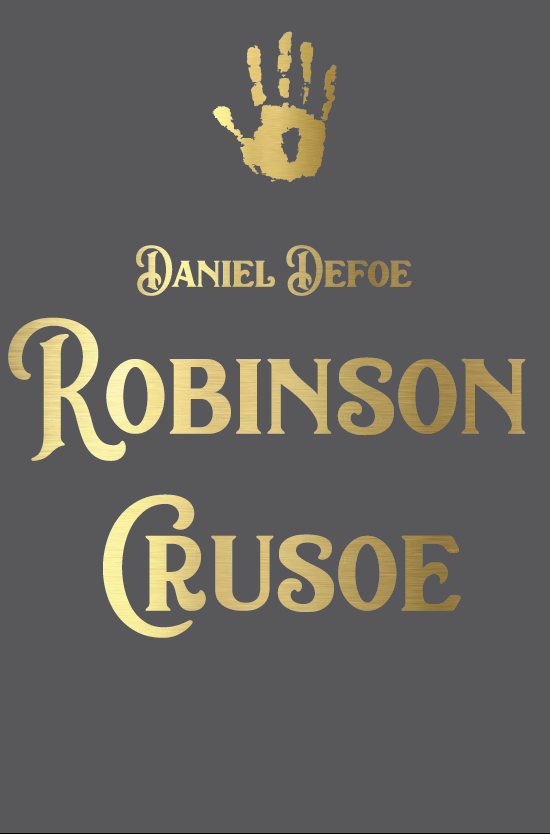
Starting with my favourite design – the handprint design I feel is minimal, clean and modern. I experimented with the colour palettes, positioning and typefaces.
I like the placement of the handprint wrapping around the book against the crisp white background and the clean clear typeface.
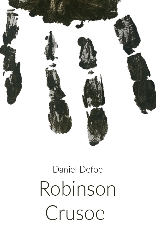
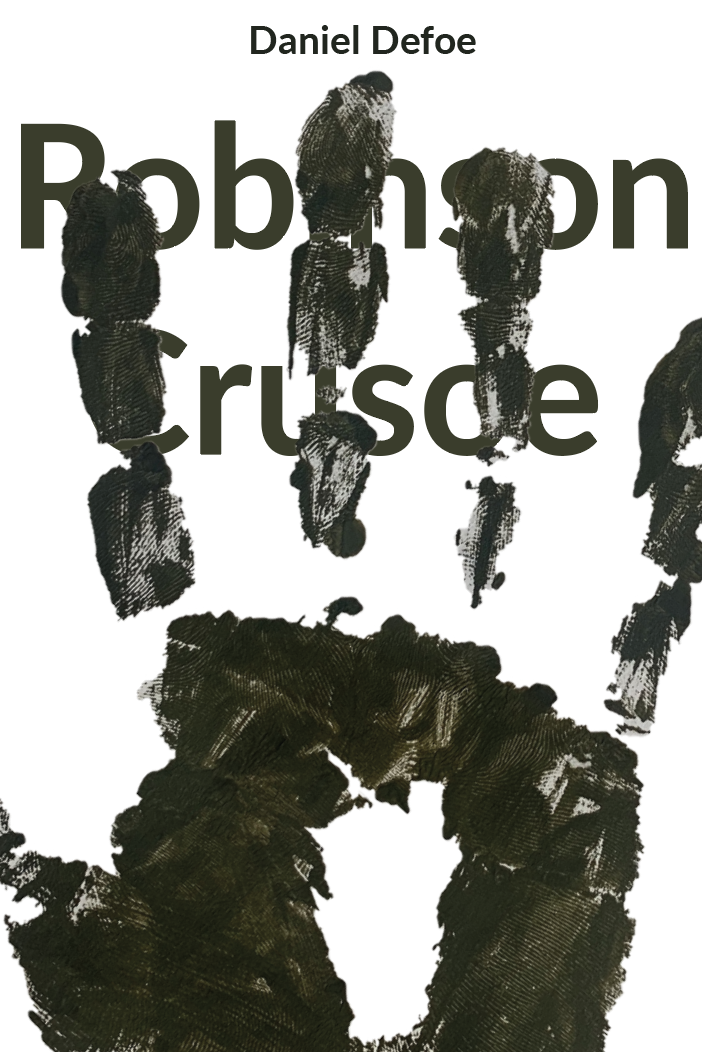
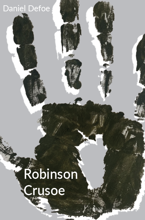
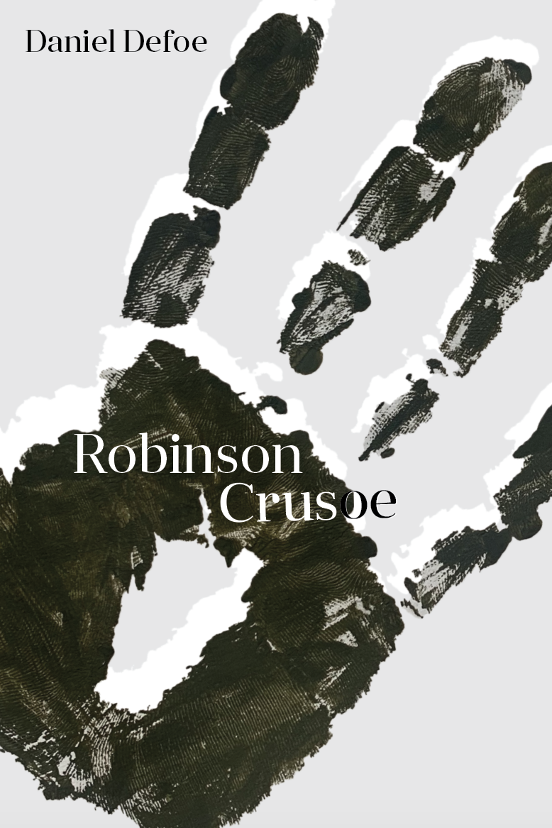
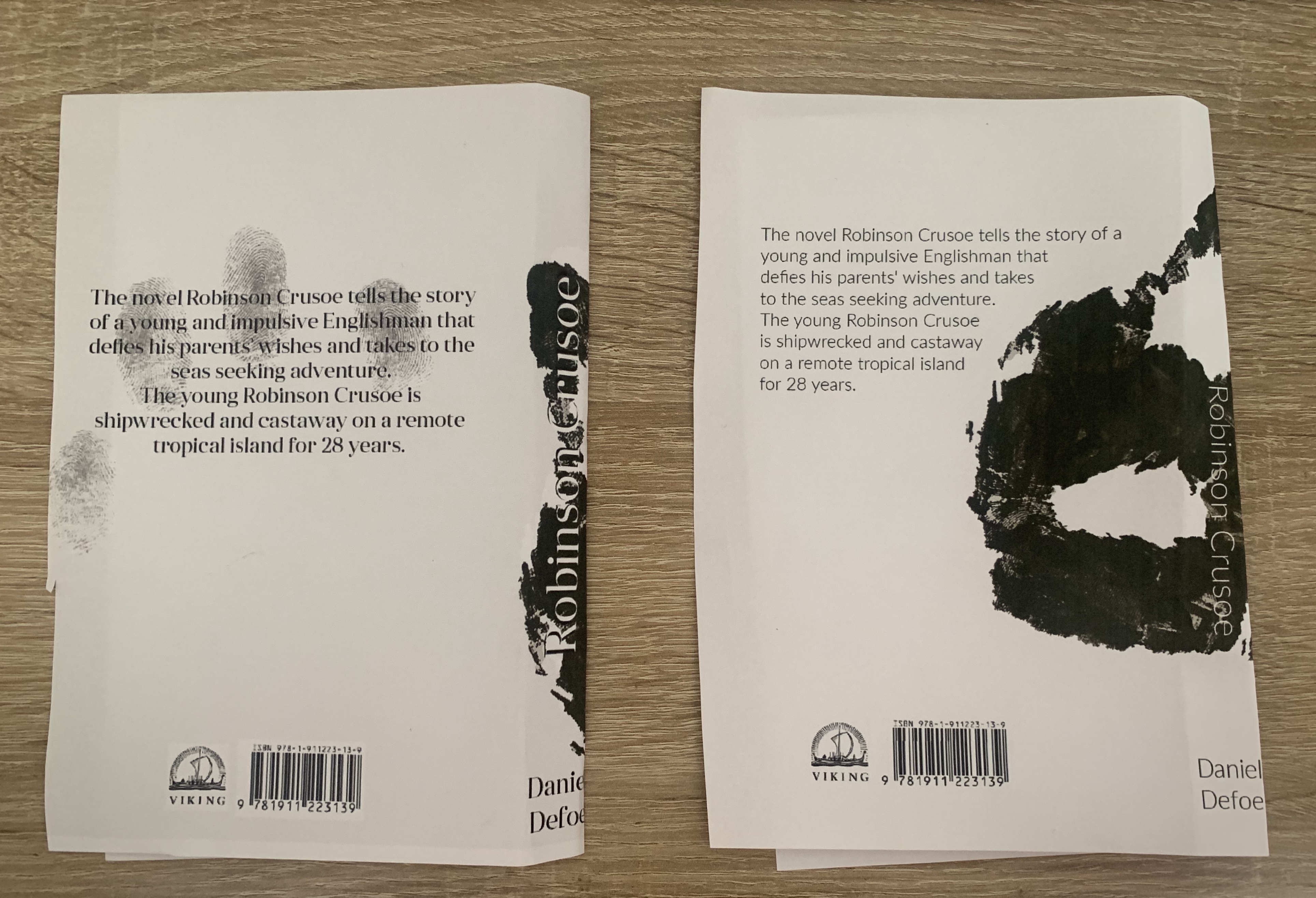
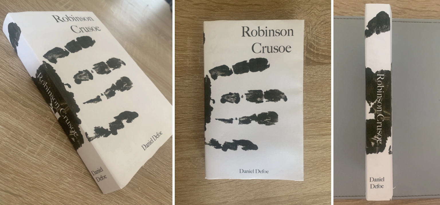
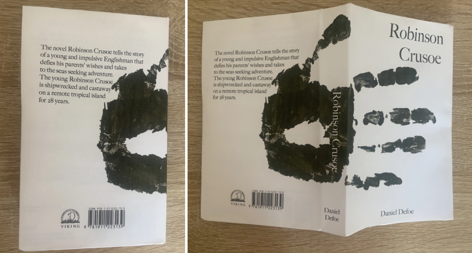
I also like the design below which shows more of the design on the cover, rather than just the fingers of the handprint. I added a free stock image of fingerprints on the back cover to save it from becoming too plain. I feel the only way I could choose from the top and bottom designs is to print them off and mock them up as a real book.
Design 2
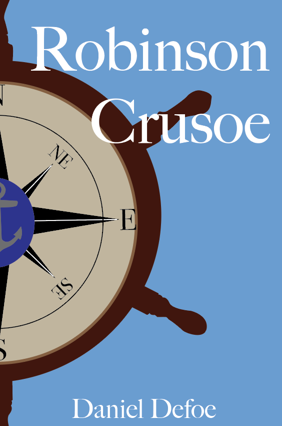
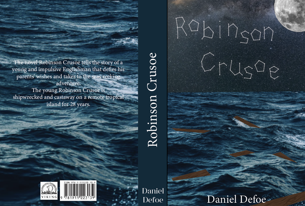
I liked this design because I felt it was completely different to the other designs I had seen of Robinson Crusoe. It shows remains of a shipwreck lit by the nights sky, with the title and name ‘Robinson Crusoe’ written in the stars.
I wanted to focus on the lettering first, it needs to be more detailed and neater but still holding the constellation factor.
Although I like the idea of this design, I’m not keen on the text for the title. I feel it lacks professionalism however Im glad I attempted to test out different text options.
Mock-up
After printing both the handprint designs I like the design on the left, with the handprint more visual on the cover is slightly more appealing, I like the way the text inverts as it overlaps too. The design on the right is interesting as my initial vision for the handprint design, I feel this is modern, minimal and interesting. I feel biased to both these designs and unsure of which I prefer.
When asking for feedback the majority preferred the left design especially with the fingerprint detail on the back, and others liked the way the hand wraps around the book creating an interesting and unusual design.
I think it will be easier to determine which design I will use for my final cover once I look into the deluxe designs, to see how they look together.
Book Format & Design Requirements
Once I was happy with my chosen design I decided to think about the format of the book. The first step was to determine the size of the book. I found an interesting article about trim size (https://blog.reedsy.com/standard-book-sizes/) here it spoke about standard book sizes in publishing and for certain genres. As mentioned in the brief I decided to stick to the smallest trim size available to achieve a pocket sized edition – This is 4.25″ x 6.87″.
The spine should be flexible in order for pages to be bent around to give the reader the ability to hold the book single handedly, and bound with glue.
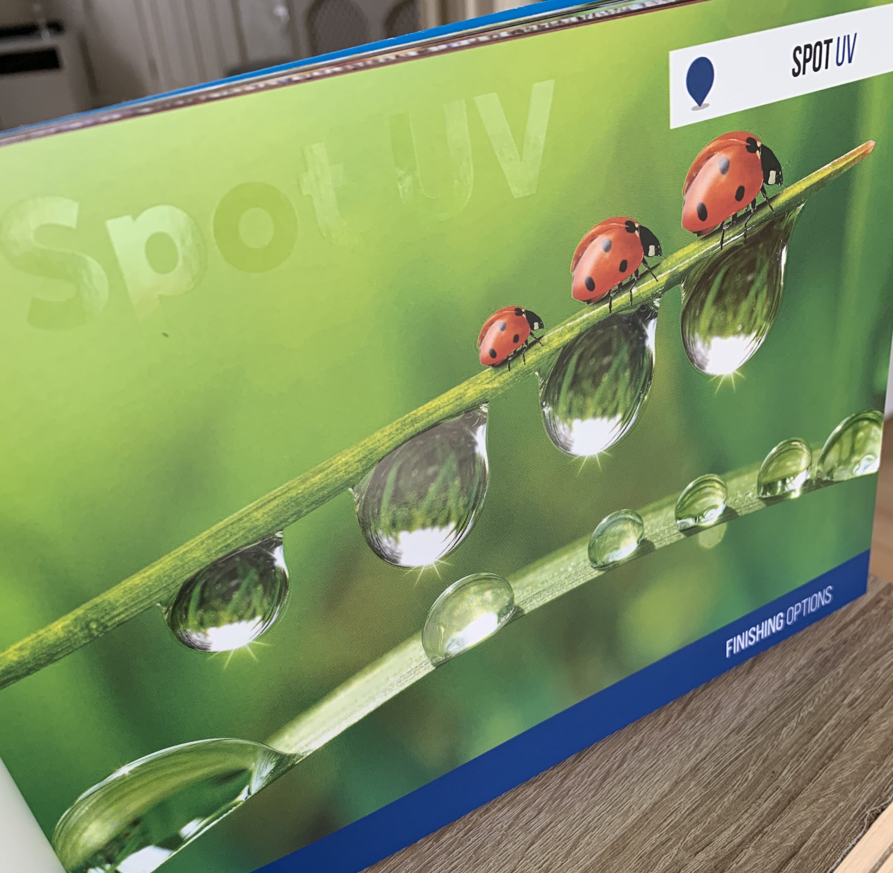
A matt coated cover with the handprint being slightly embossed would give the book a modern and ‘expense on a budget’ feel for this book, I feel it would really help impact the design too to be able to run your fingers across the book and feel the raised handprint. Or the image of the hand could be printed in Spot UV to add a texture difference to the cover, However this may be costly considering its only for a pocket edition.
The paper should be smooth and thin allowing that pages to neatly fall back into the compact size, adding a textured paper/thicker paper would add bulk to the book and cause tension on the spine.
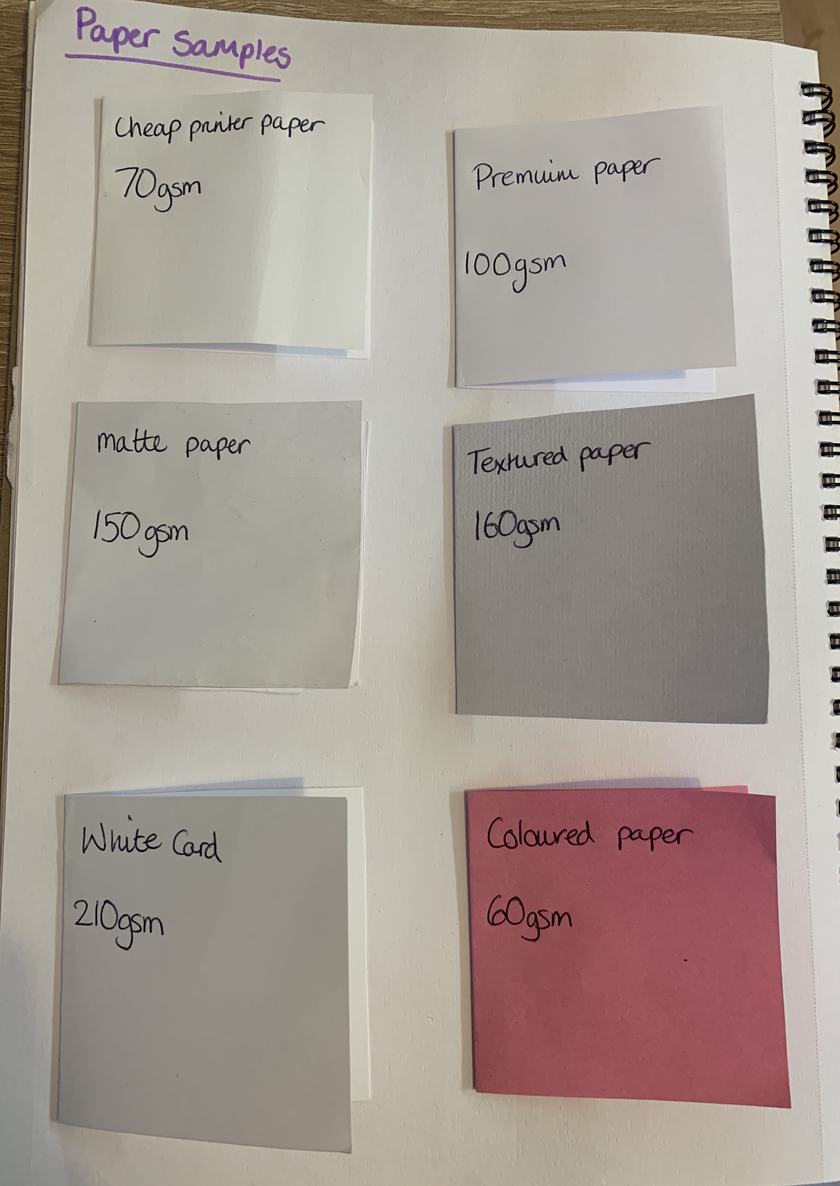
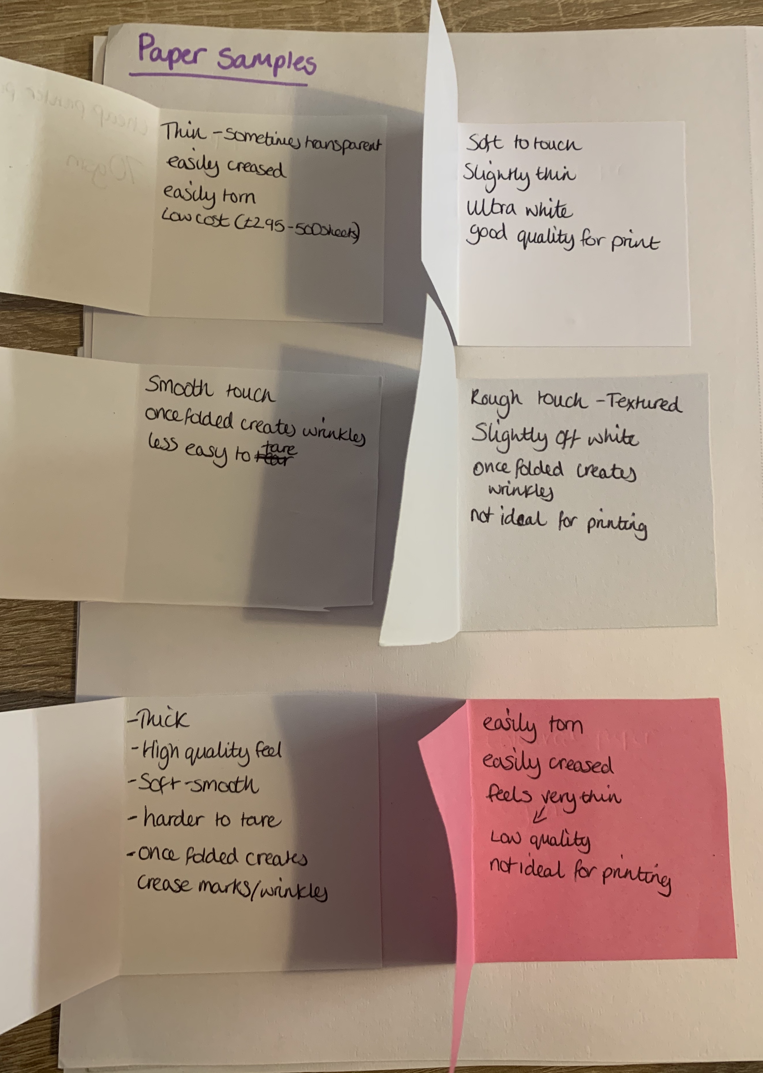
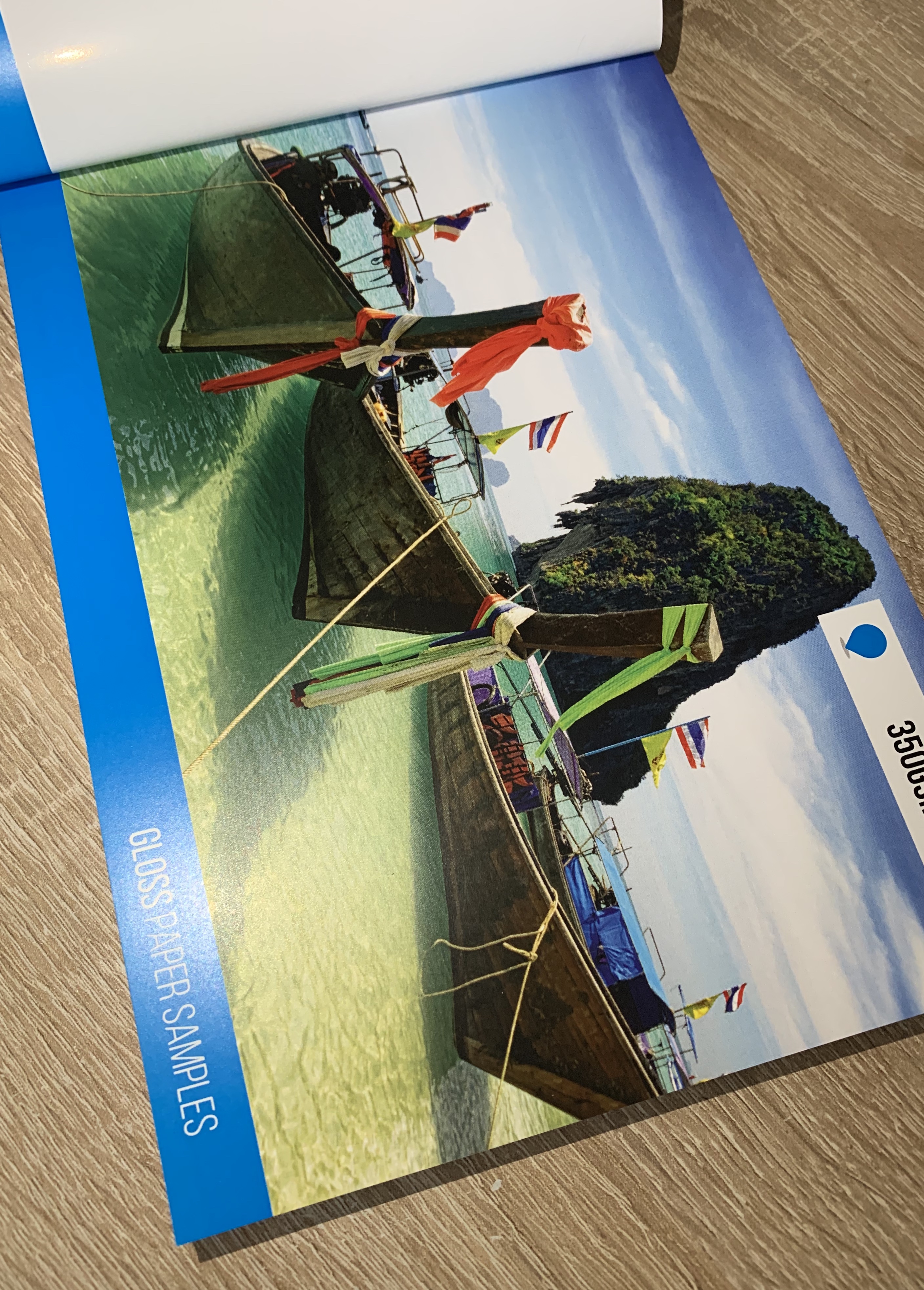
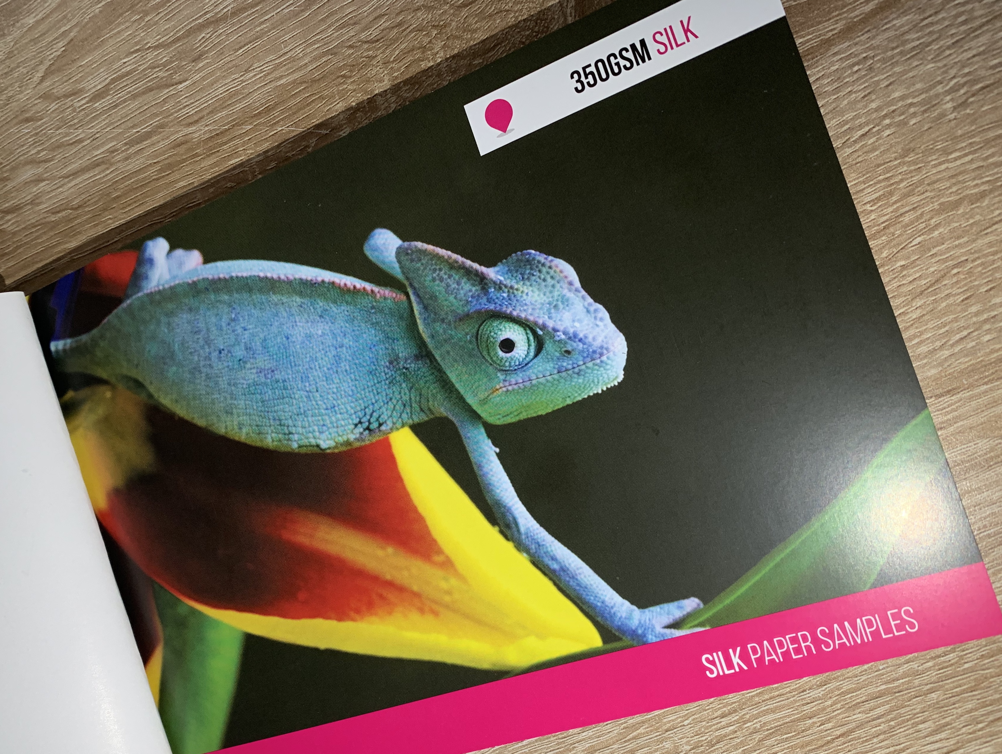
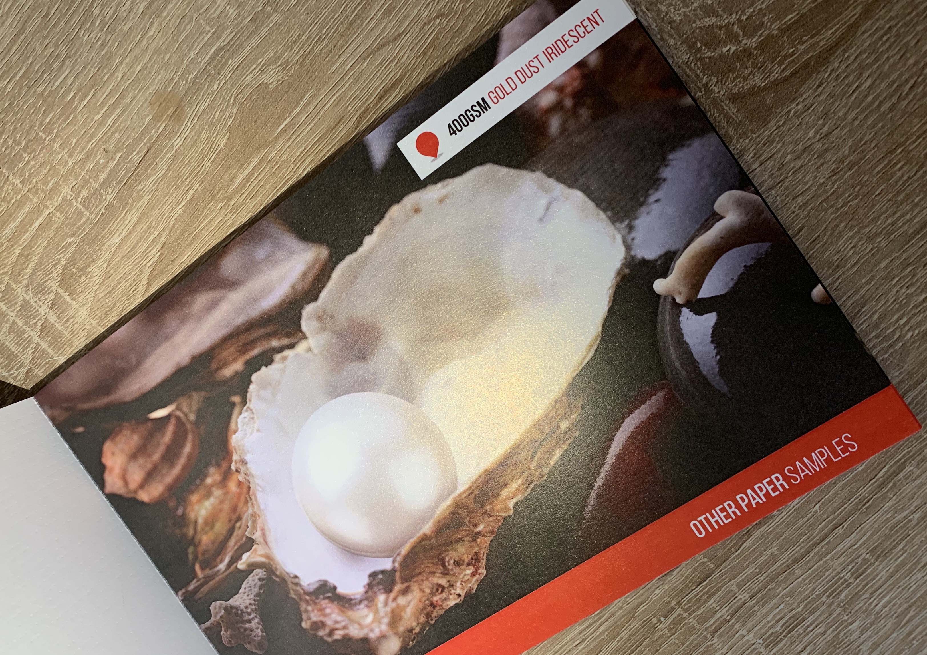
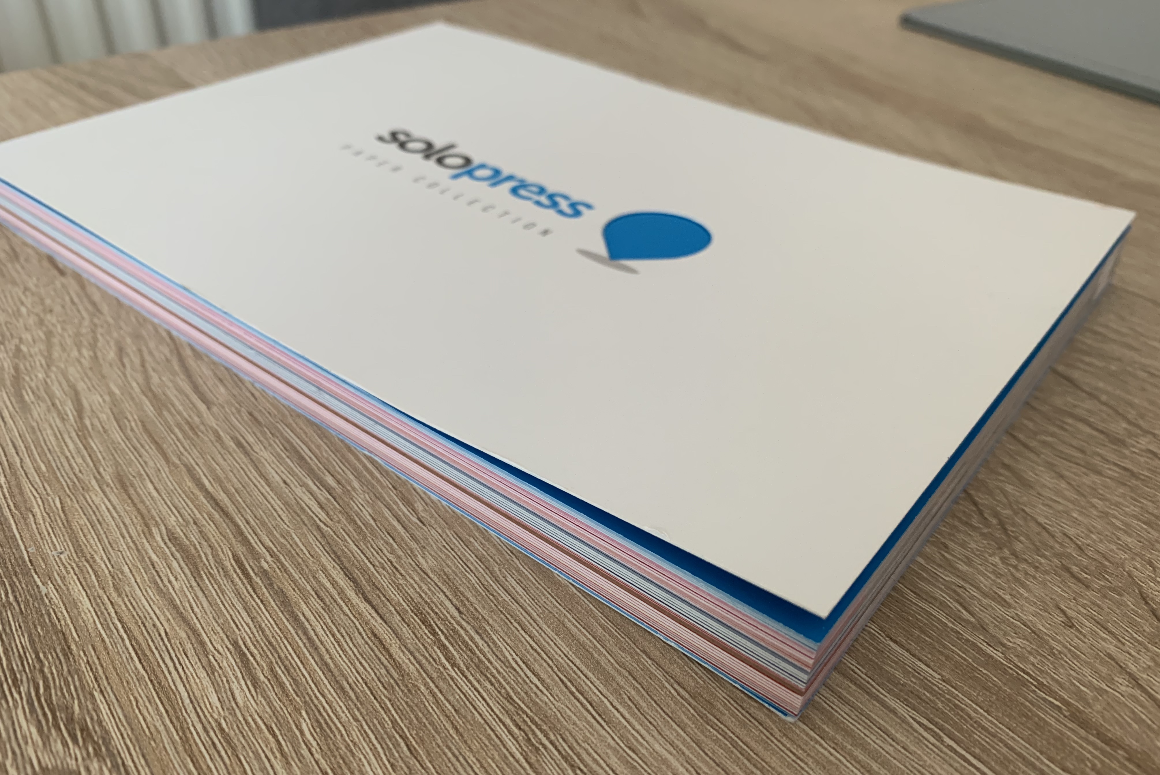
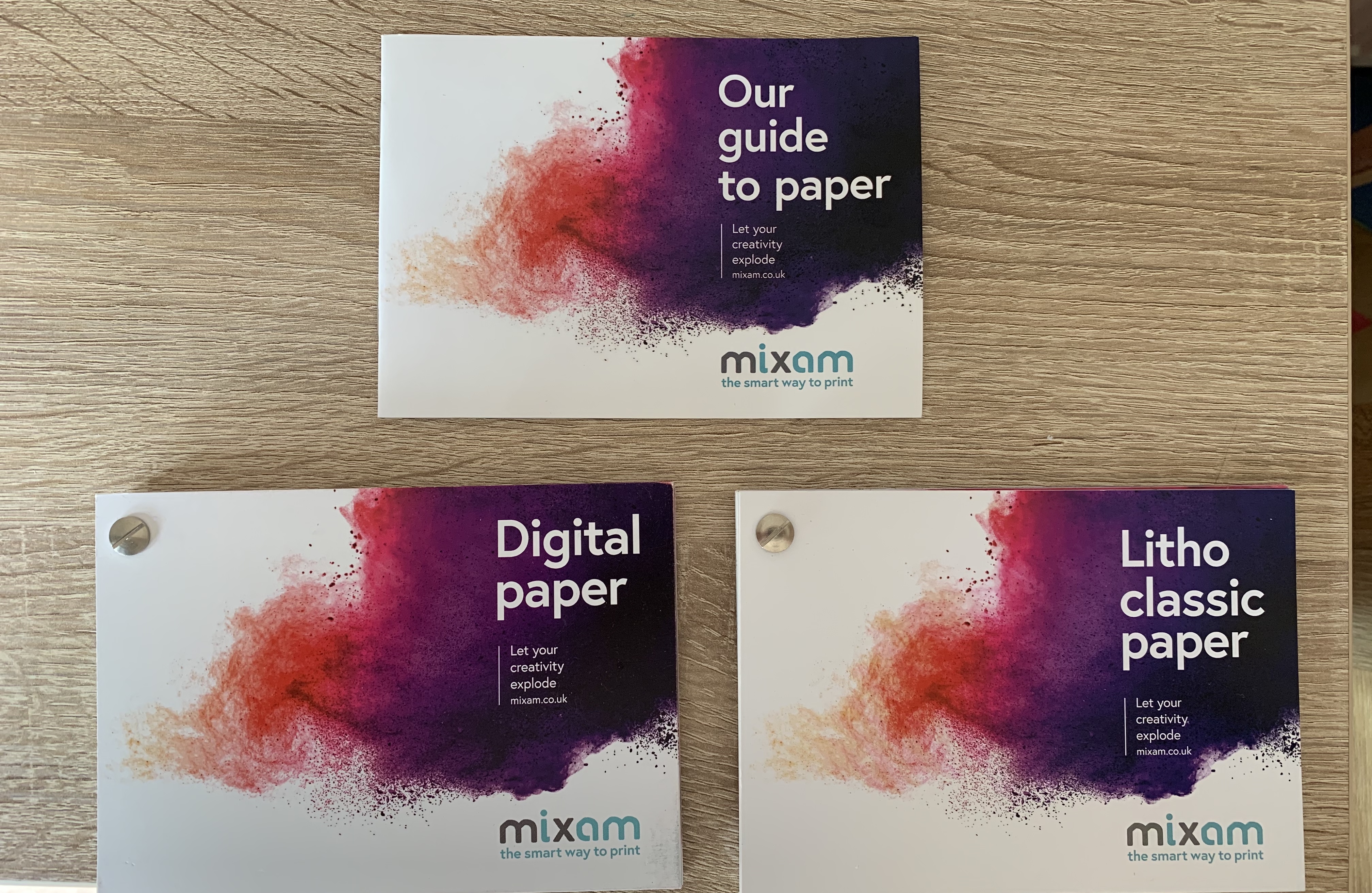
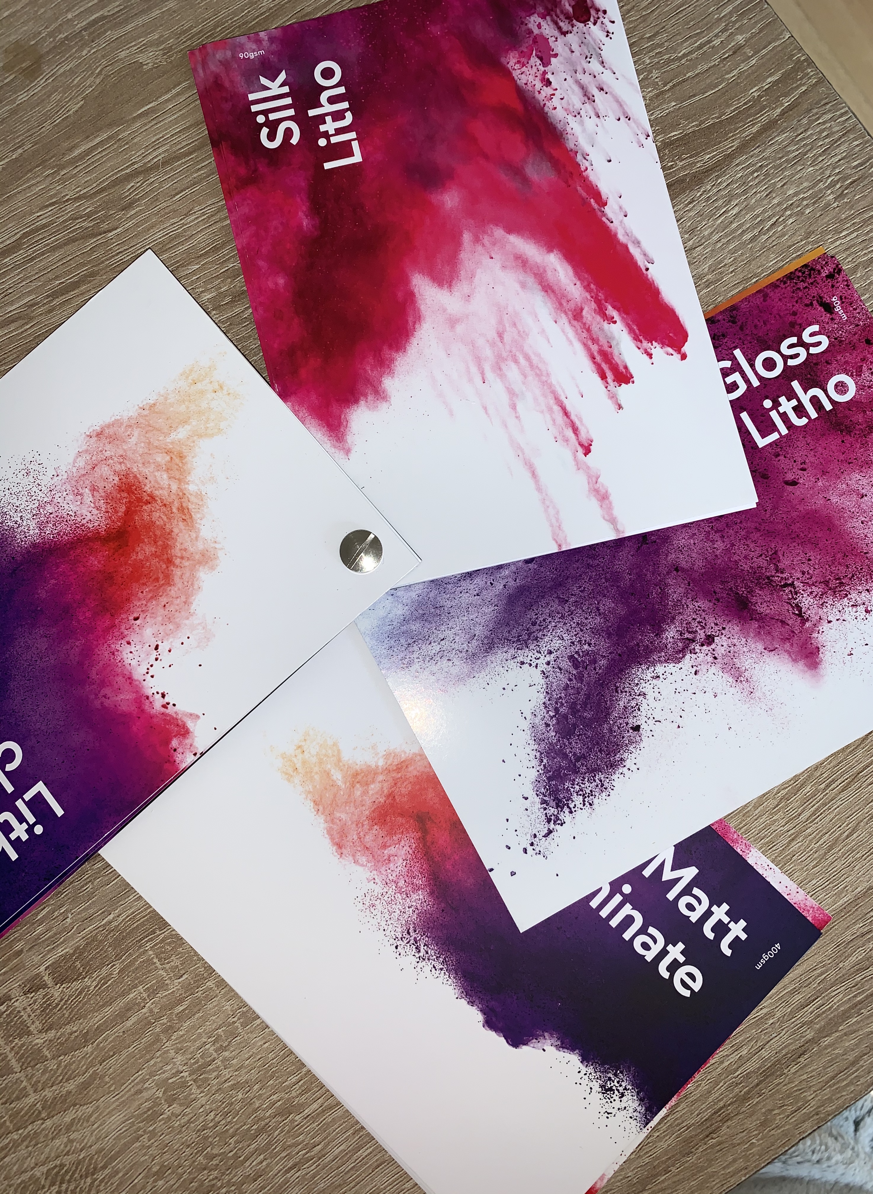
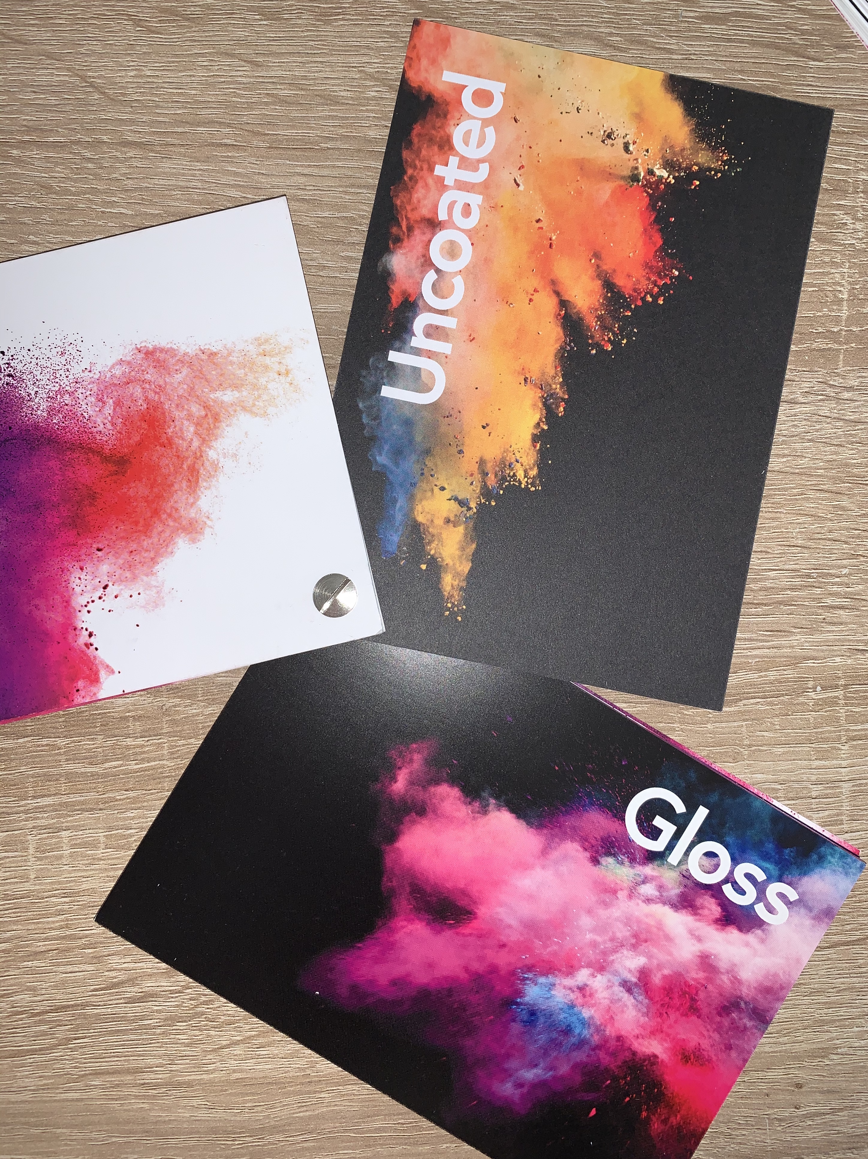
Looking back at the paper samples I received from ‘Mixam’ and ‘Solopress’ I found a few samples which I would consider using, I made notes on these along with photos (below)
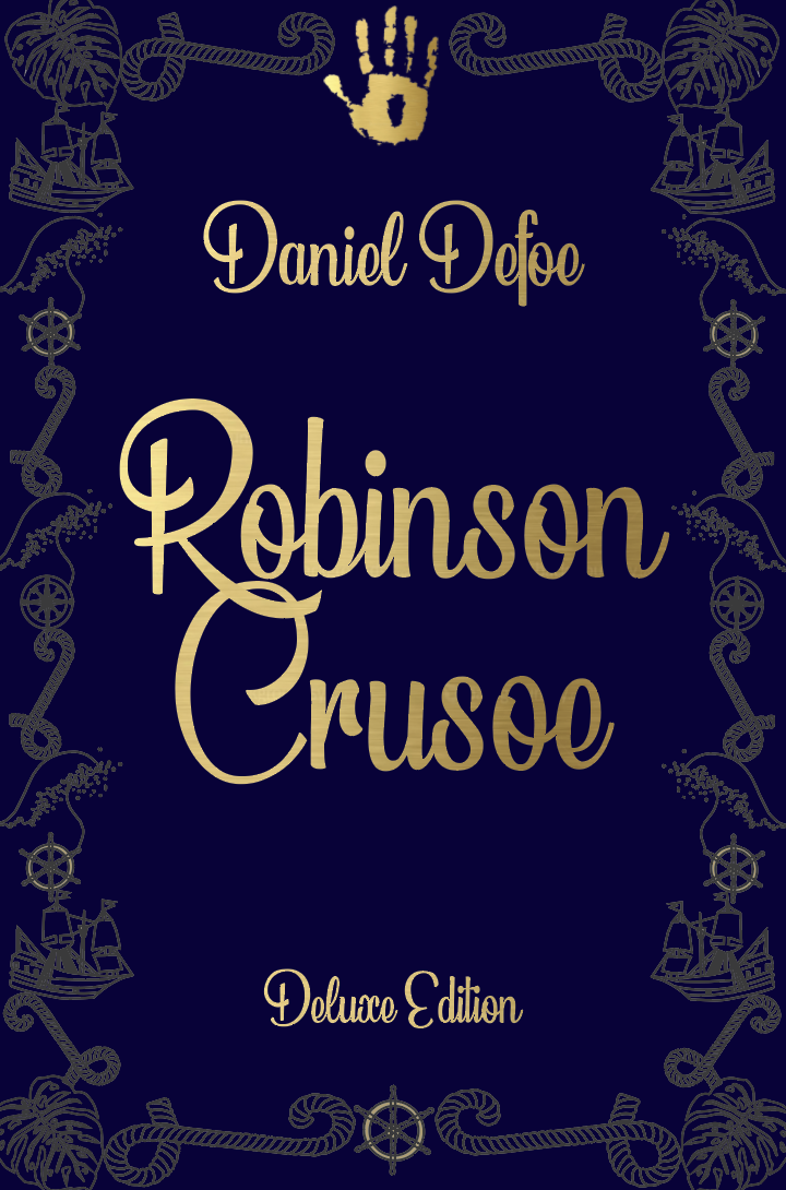
Deluxe Cover (hardback)
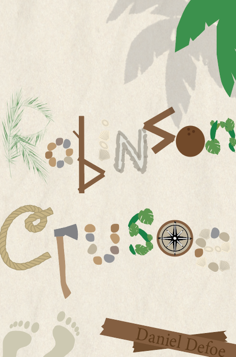
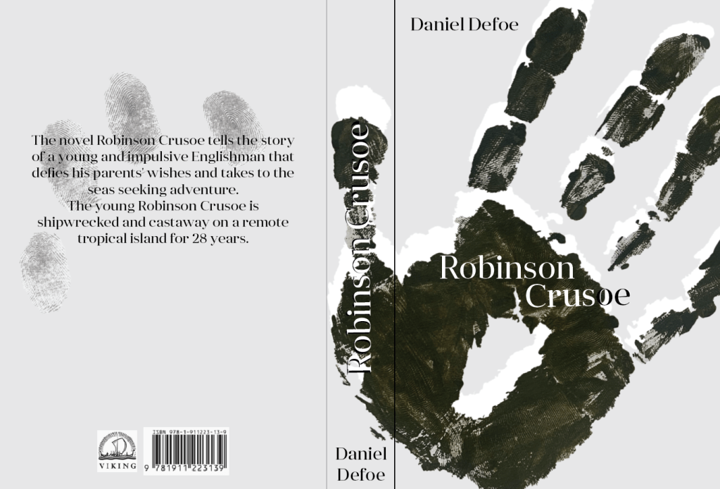
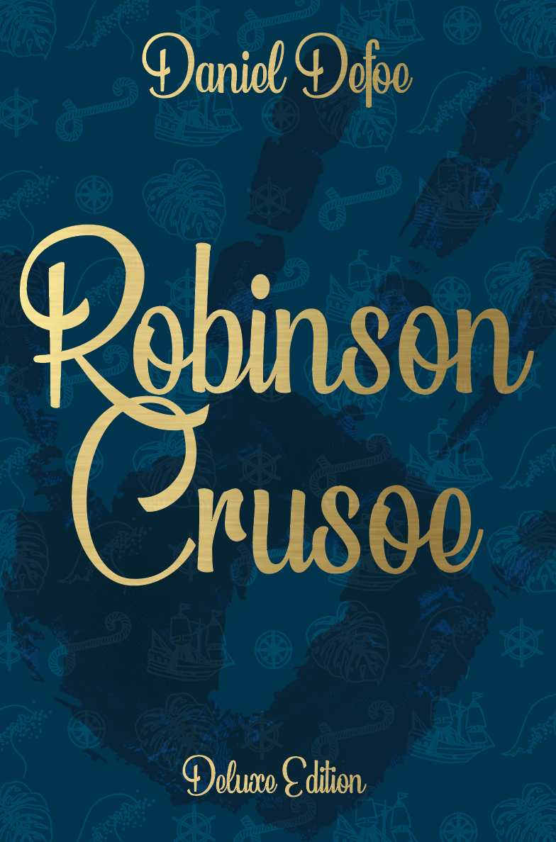
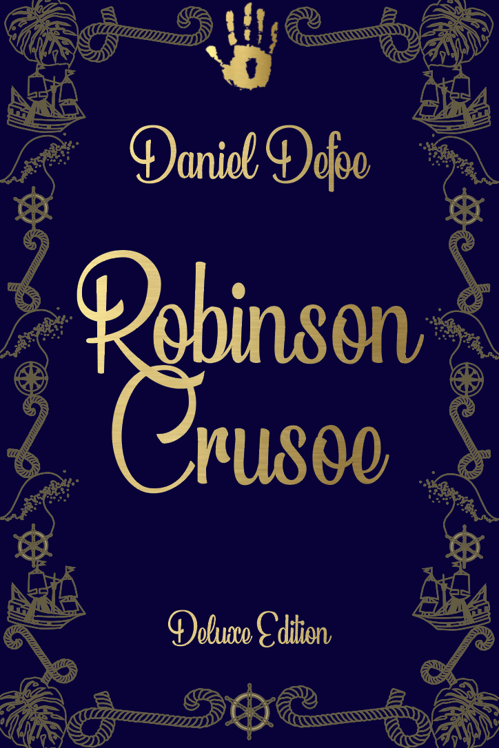
Following on from the chosen design of the paperback I wanted to think about how I could create a more deluxe version as the brief has stated they need to be seen as part of a series.
I also reminded myself that the brief had said to create a larger and luxurious cover for Robinson Crusoe. Reflect on the content of the story. Reference the historical nature of the story and the history of the book. This will be seen as a collectors book.
The mentioning of referencing the ‘historical nature’ of the story worried me as the design I had come up with for the paperback is more modern, this questioned me as to how I can create a cover with similarities to be seen as part of a series, yet linking to a historical nature.
Most Deluxe books are cloth covered, some in slipcases with gold foiled details and mainly consist as typography covers. These are all features to keep in mind for the design of my cover.
Thinking of the historical part of the brief I decided to look at book covers from the 17th century to see what their main design features are. It seems they use a lot of filigree detail in the designs, this pattern could be something I use within my design.
Design Development
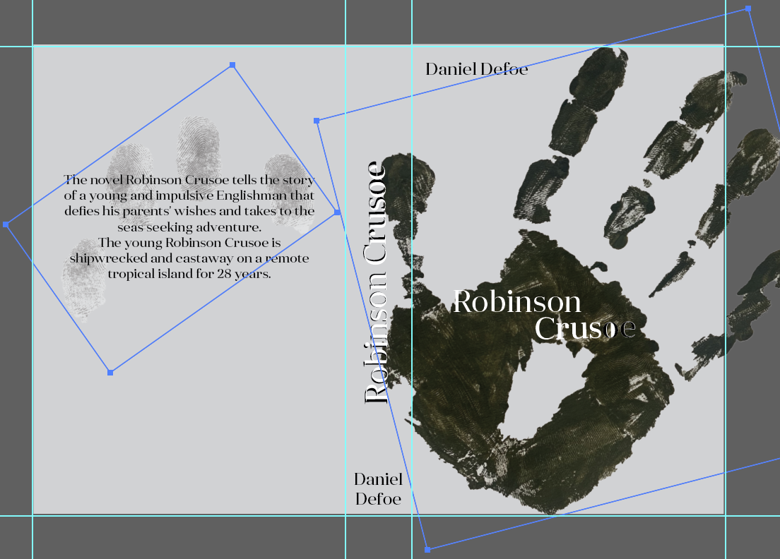
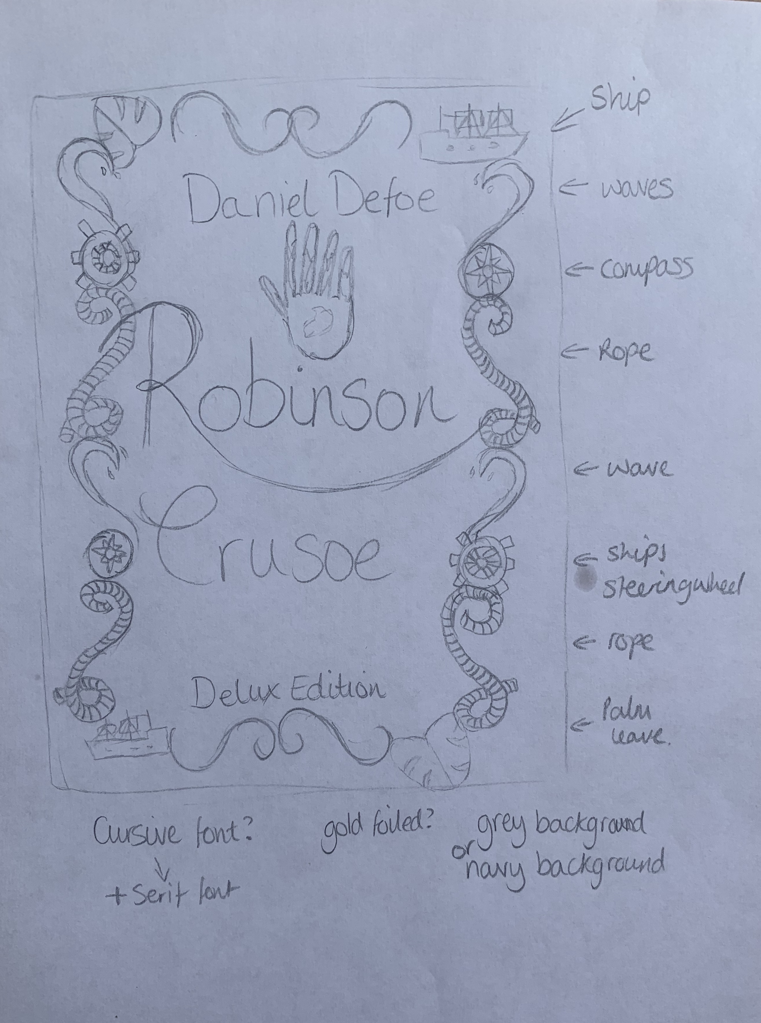
I started off by creating some sketches focusing on ornate filigree, I feel by combining this, the handprint and a few other elements relating to the story I can link back to the historical nature and by including the handprint, it can then be seen as part of a series.
Visualising Ideas
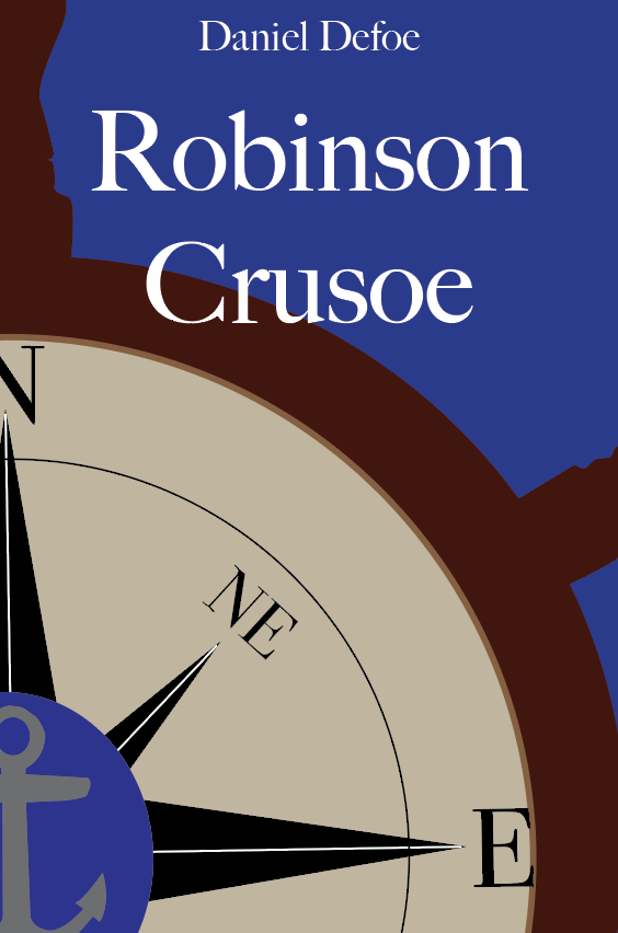
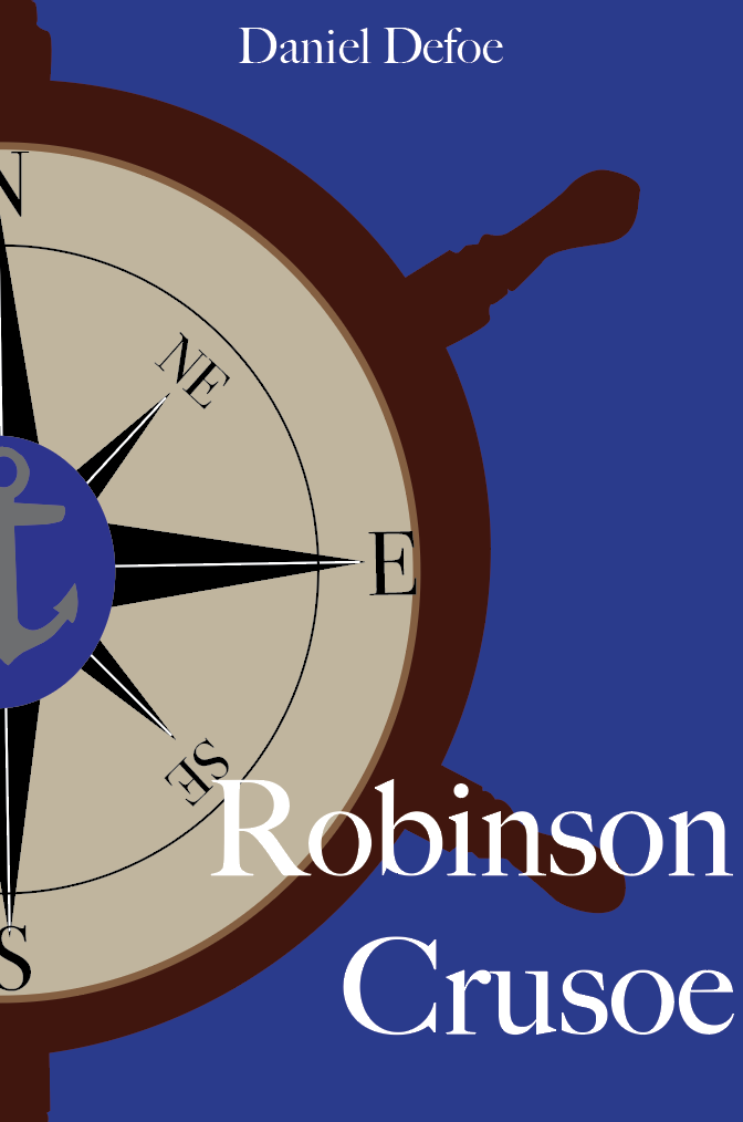
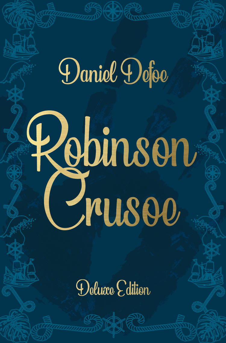
I experimented with different layouts in attempt to have this cover look luxurious yet relatable to the paperback cover. I created a border out of items relevant to the story, taking slight inspiration from the ornate filigree designs. I wanted to keep a script typeface as I feel this adds class and extra detail to the design. Out of all the above variations I think that the deep navy background works well with the gold lettering.
Reflecting on the design above to the design of my pocketbook I struggled to see the connection between them two (for them to be seen as part of a series) so I decided to follow one of the layouts created for the paperback and rework it to give it a deluxe feel, to see if this worked better.
Seeing the two designs side by side I now feel the design on the right is much more suited as part of a series with the bronze foiled letters and faint patterned detail in the background. However the left design does show more of a historical look.
Mock ups
I printed off both designs so I could see how they looked in person.
Left design (navy) – The background came out far too dark and needs to be lightened slightly so that boarder detail is more present, however this design does has a classic historical feel. My only worry is that it isn’t relatable enough to the pocketbook edition to be seen as part of a series!
Right design (white) – A similar issue as before with the backgrounds, this needs to be slightly darker so that the detail of the symbols in the background can be seen. Im unsure if the spine suits the design but attempted to create an historical element within the cover. By using a similar design as the pocketbook this makes it clear that the books are part of a series.
Endpapers
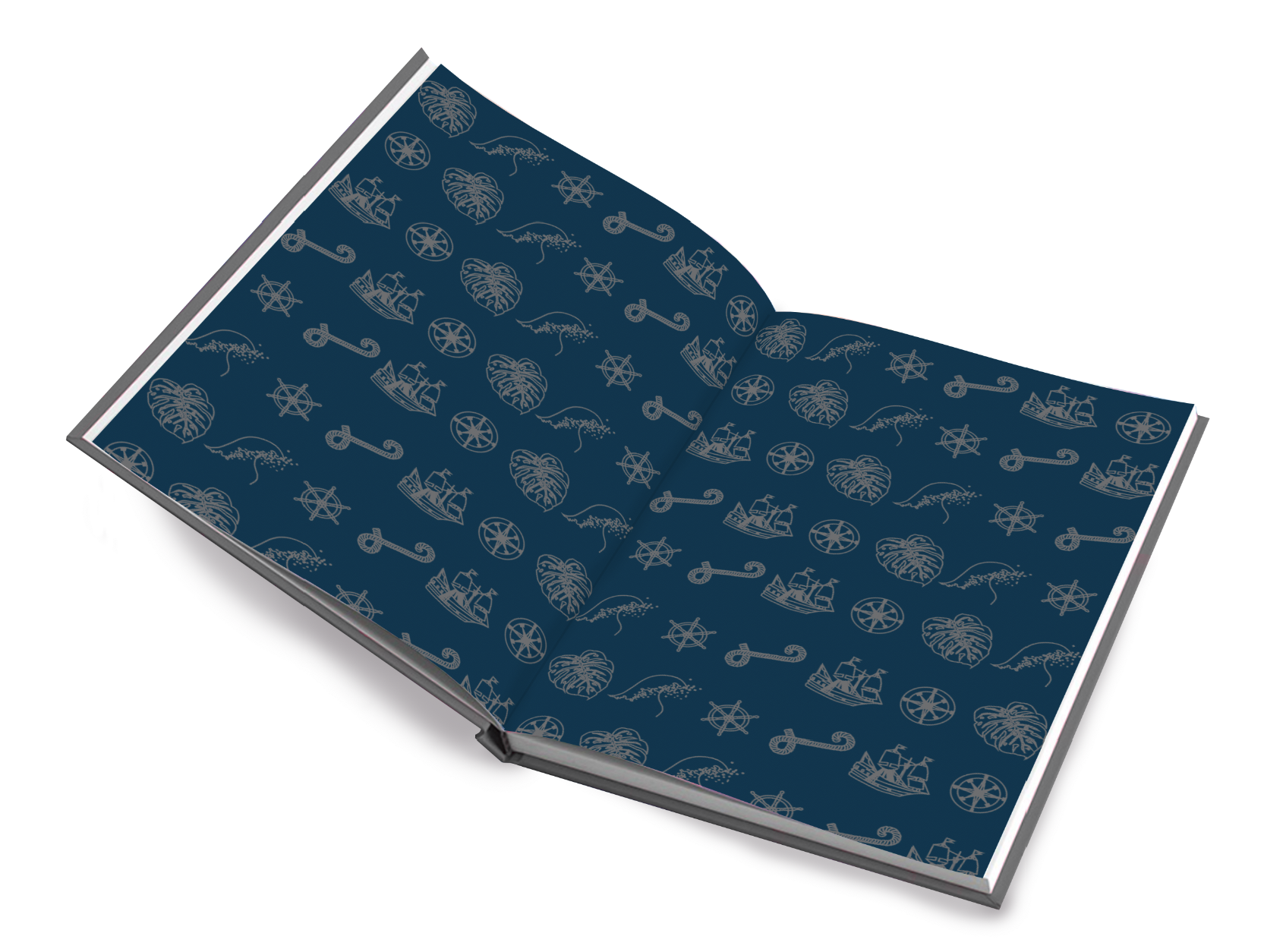
After taking the time creating these symbols used in the boarder of the first deluxe design I didn’t want them to go to waste so decided they would make great end papers for the deluxe edition. I experimented with different coloured backgrounds however I feel that the dark teal would add a nice contrast between the light cover and the pages.
Book Format & Design Requirements
Once I was happy with my chosen design I wanted to look at different size deluxe books. I found a very helpful website listing all the standard book sizings (https://digital.imprint.co.uk/paperback-book-size/) This may come in useful for the remainder of this course! As mentioned in the brief I decided to choose one of the larger trim sizes to achieve high luxuriousness – This is 6″ x 9″.
There are a few more features to think about for a deluxe book rather than a paperback, such as; Dust jackets, boards & the textures, end papers, binding techniques – headbands etc.
For my deluxe edition I have decided to create a slipcase, I feel this will be a good competitor to previous existing copies of the book and also against other books on the market. This will help mark a 300 year edition appealing to collectors and fans of the book.
The book itself will be cloth covered with the slipcase matt laminated with spot uv, for a smooth finish with an eye catching glisten to the handprint (which I also plan to use on the pocket edition)
The paper used should be smooth and of a higher quality allowing the pages to neatly fall back into place (minimum 100gsm).
Slipcase Research
Protective covering where the book (or a set of books) is slipped in for protection leaving the spine exposed. Slipcases are lined with either paper or suedel.
Slipcases provide five side protection of the book, leaving the spine of the book facing the observer. This means the books are protected from dust, light and other influences such as neighbouring books when placed on a shelf. Not only do slipcases protect the books, they also present the book in an attractive way, which is why many collectors are interested in them.
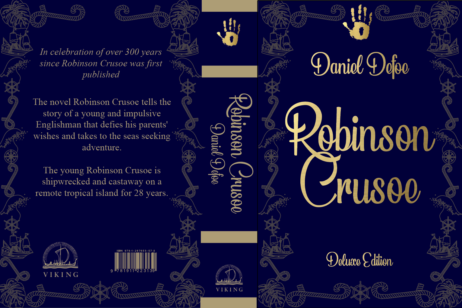
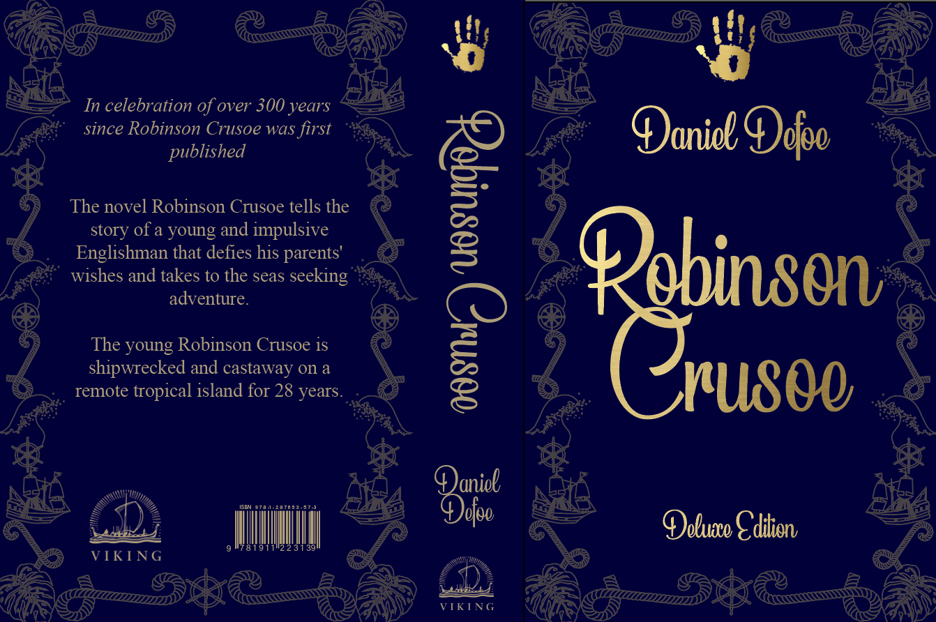
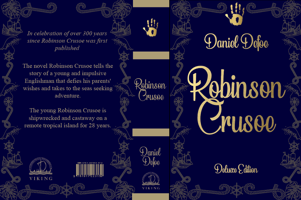
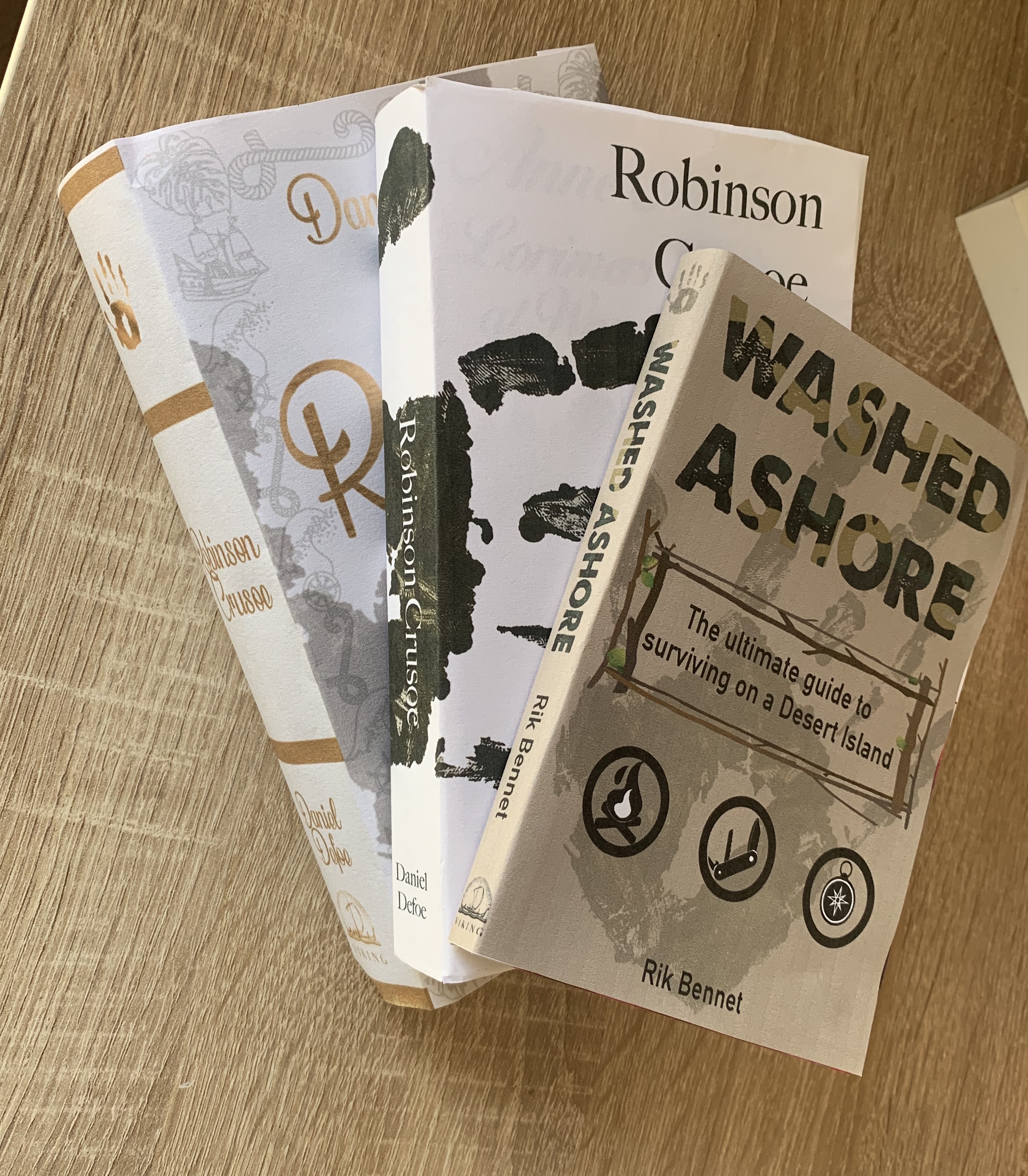
Final Designs
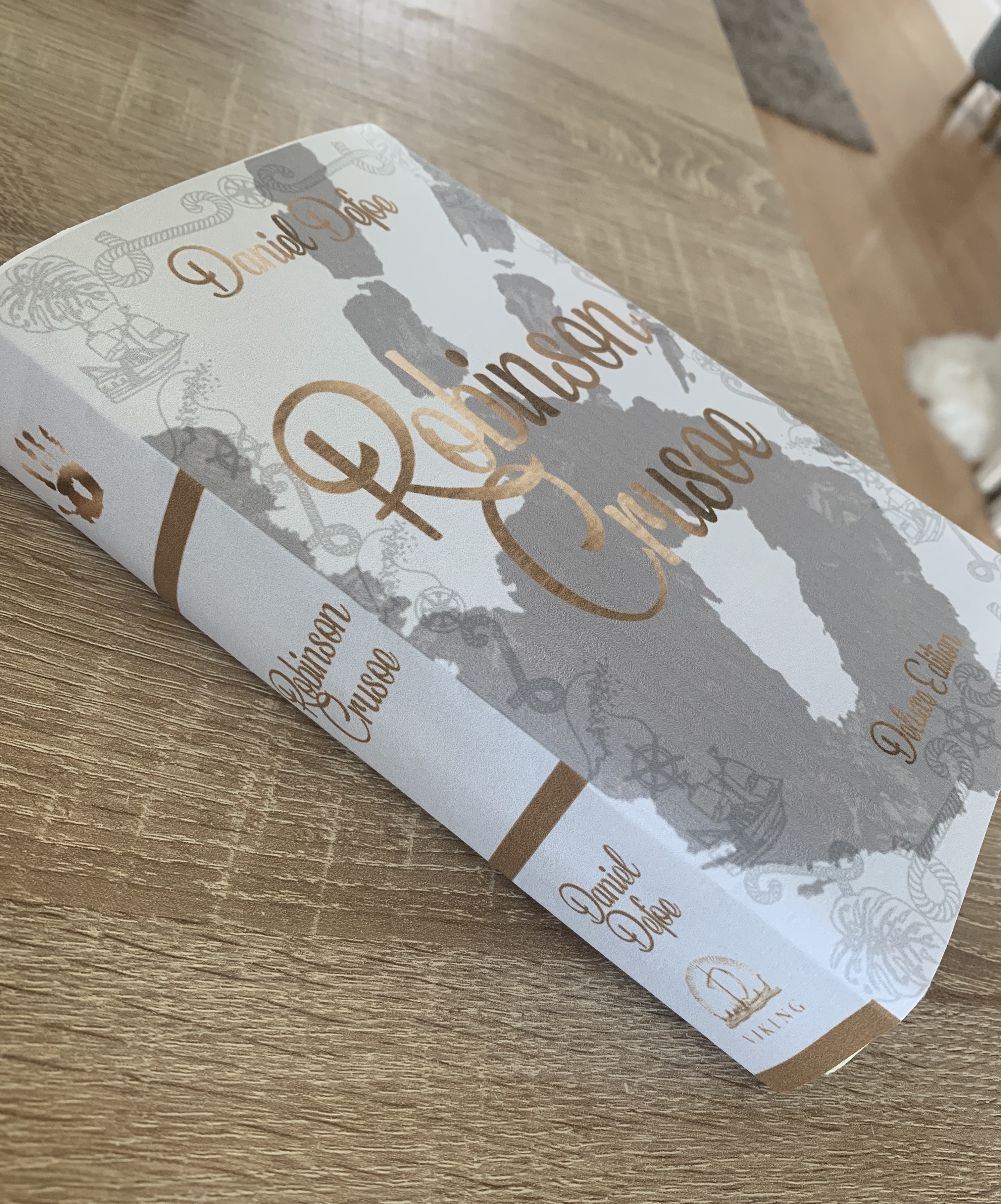
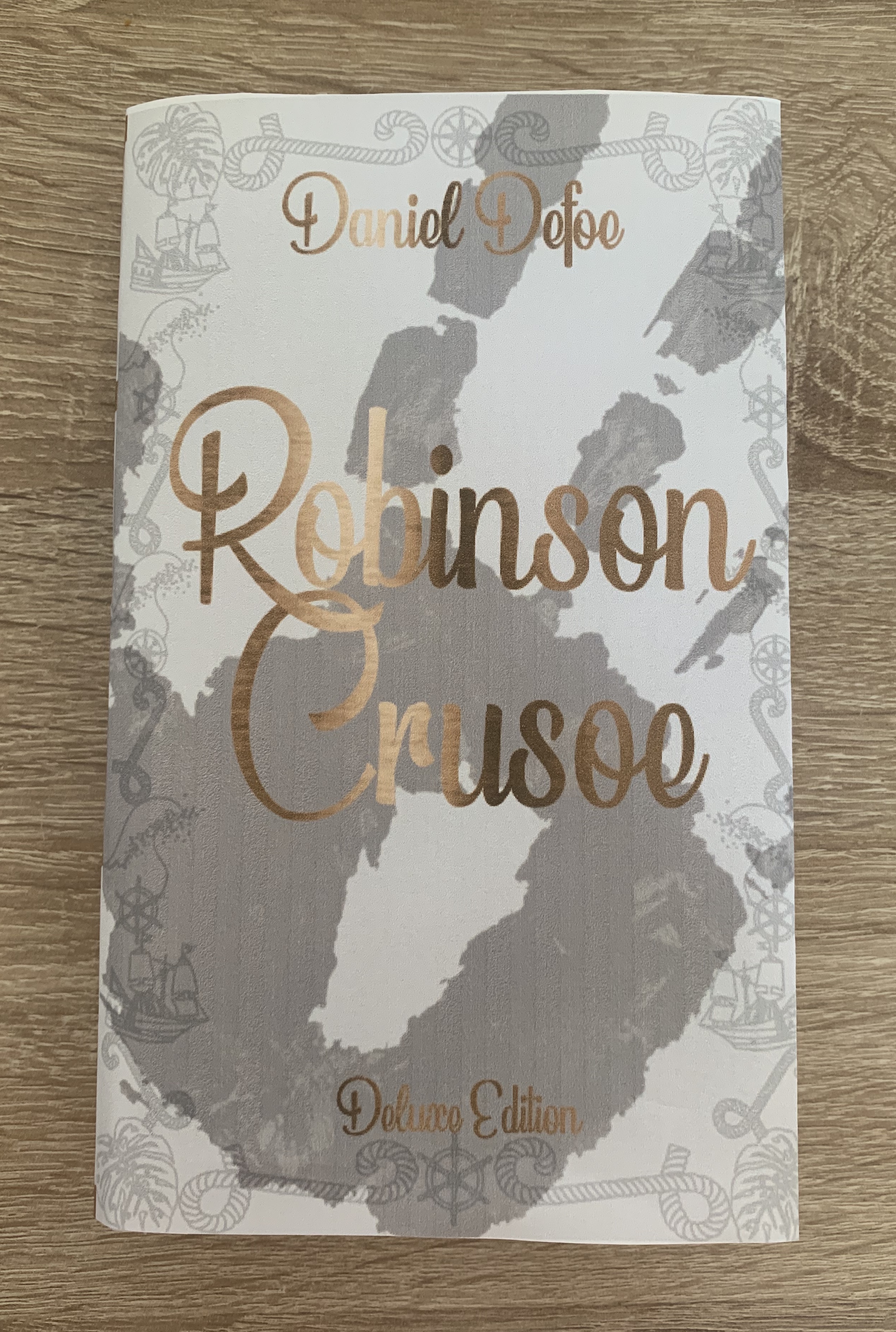
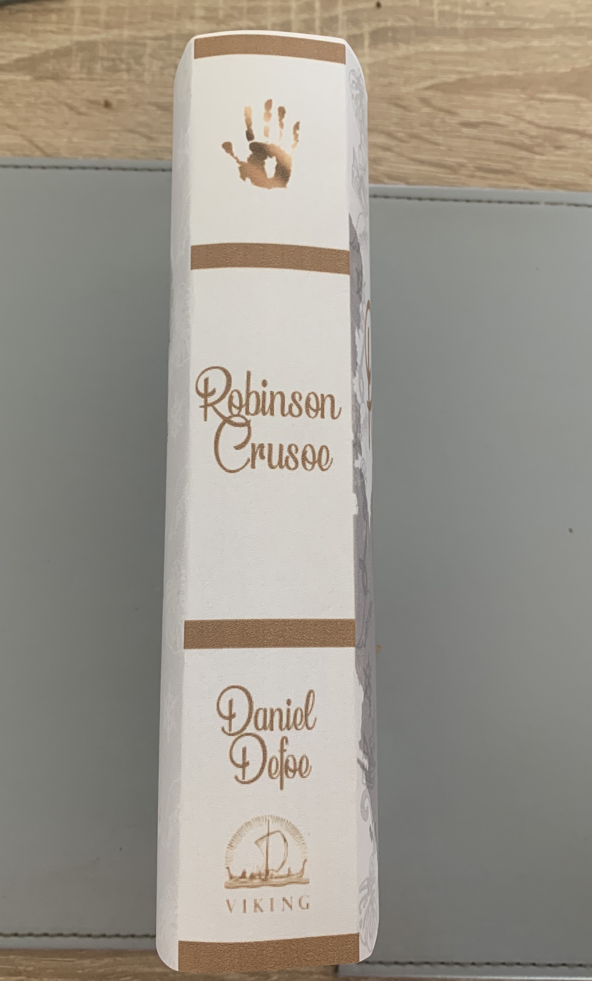
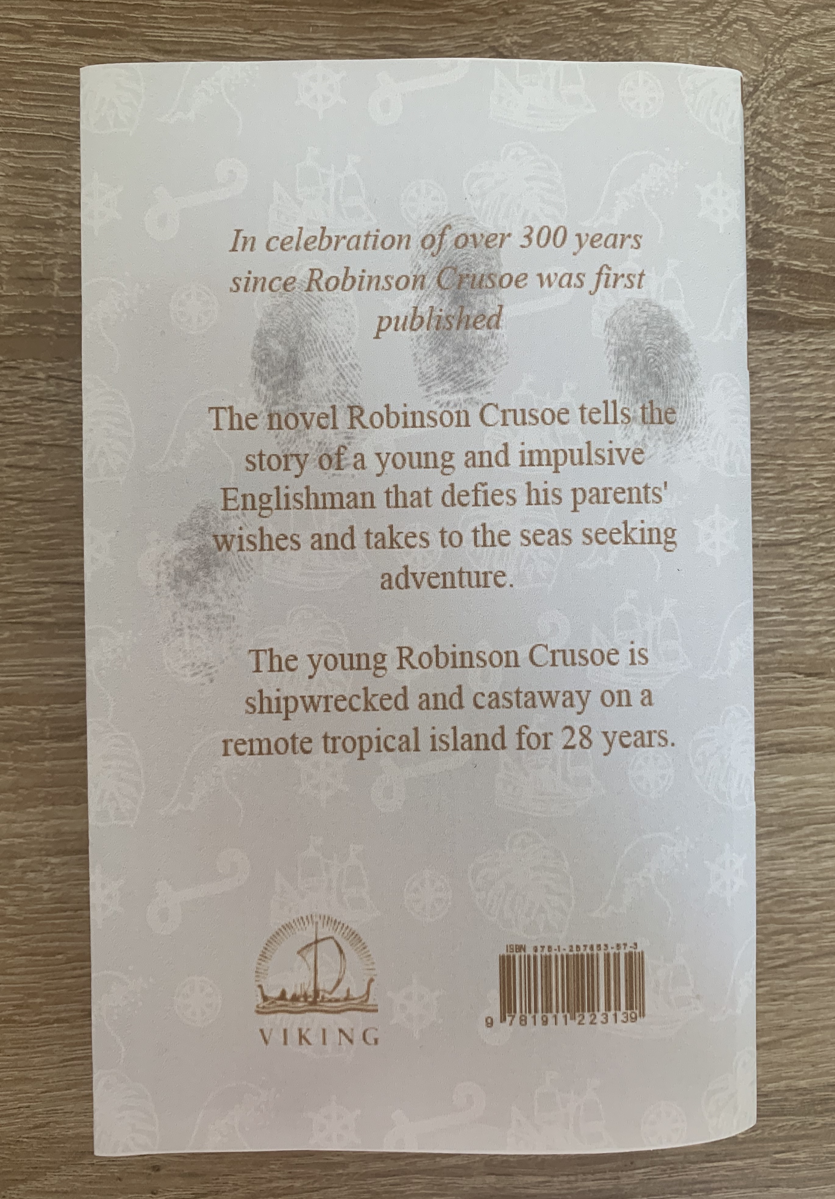
Pocket book edition
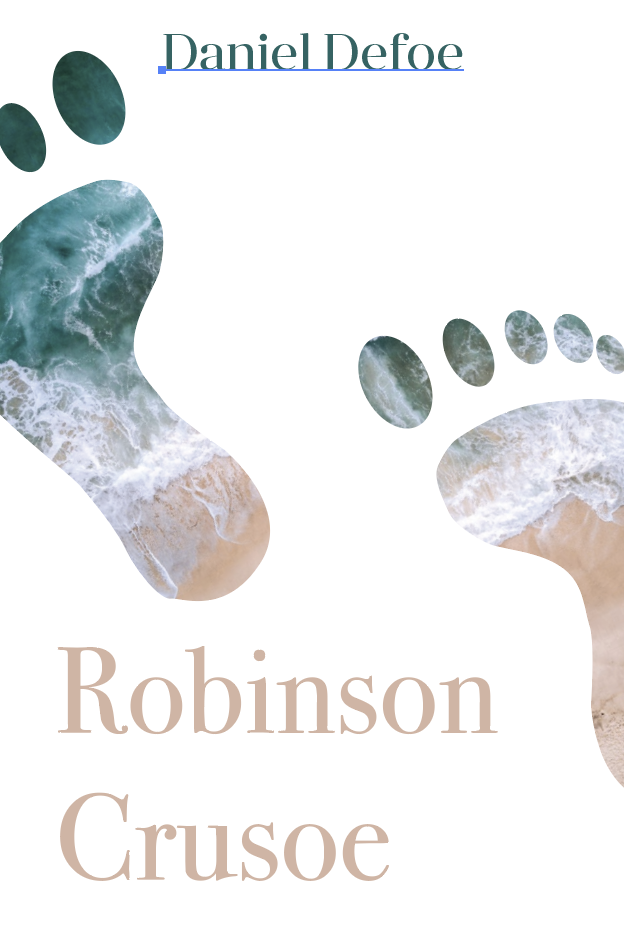
Final Design of Pocketbook
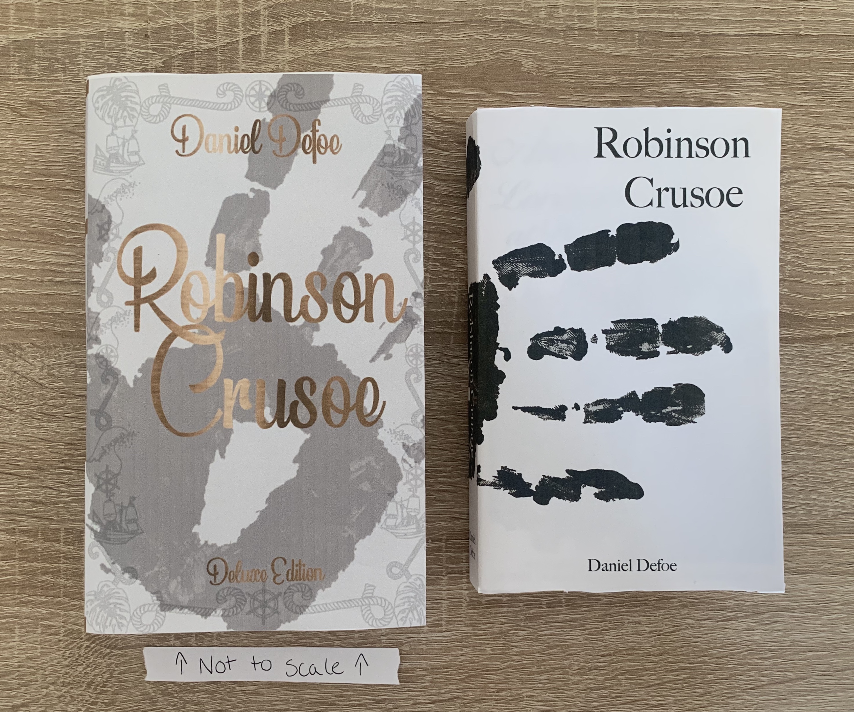
I have chosen this design for my pocketbook as I feel the design is modern, unique and compelling.
The cover of the paperback edition will be 300gsm matt laminate finish to give the book protection and extra durability. The pages will be printed on 80gsm bond paper to keep the costs down and bound together using Eva-con R Adhesive. The size of the book is 4.25″ x 6.87″ with a 2cm spine.
Reflection
I’m really pleased with the outcome of this cover, I love the simplicity of the design and feel it fits the brief well. It is also very different to existing versions of the book. I did a lot of backwards and forwards between two of the final designs, however feel I chose the right one in the end. The feedback I have received from this cover has been positive with comments impressed by the wrap around image.
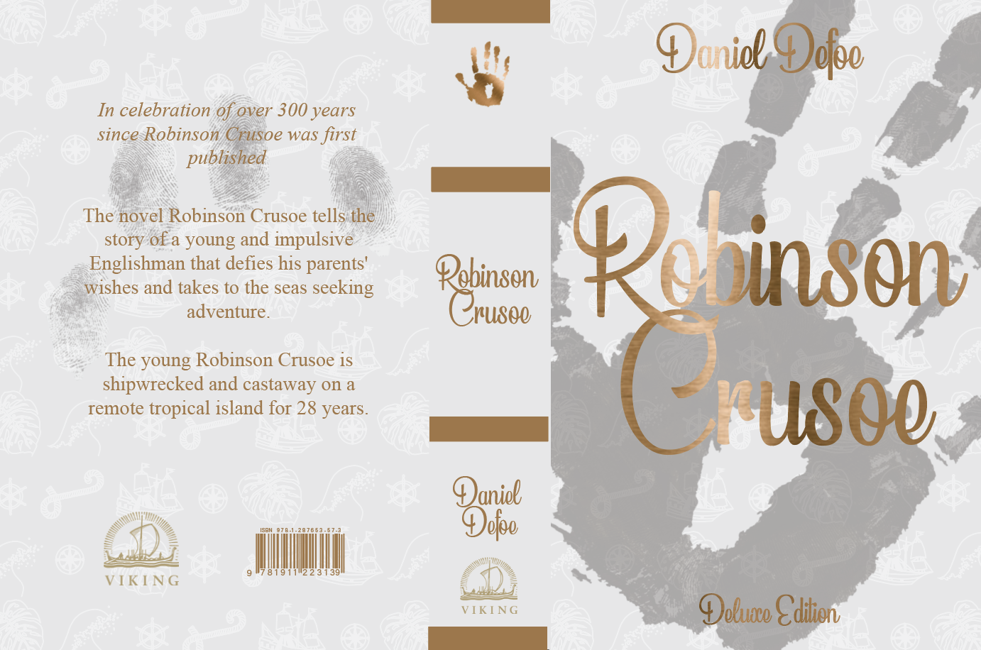
Deluxe edition
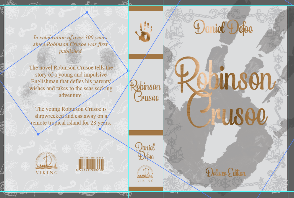
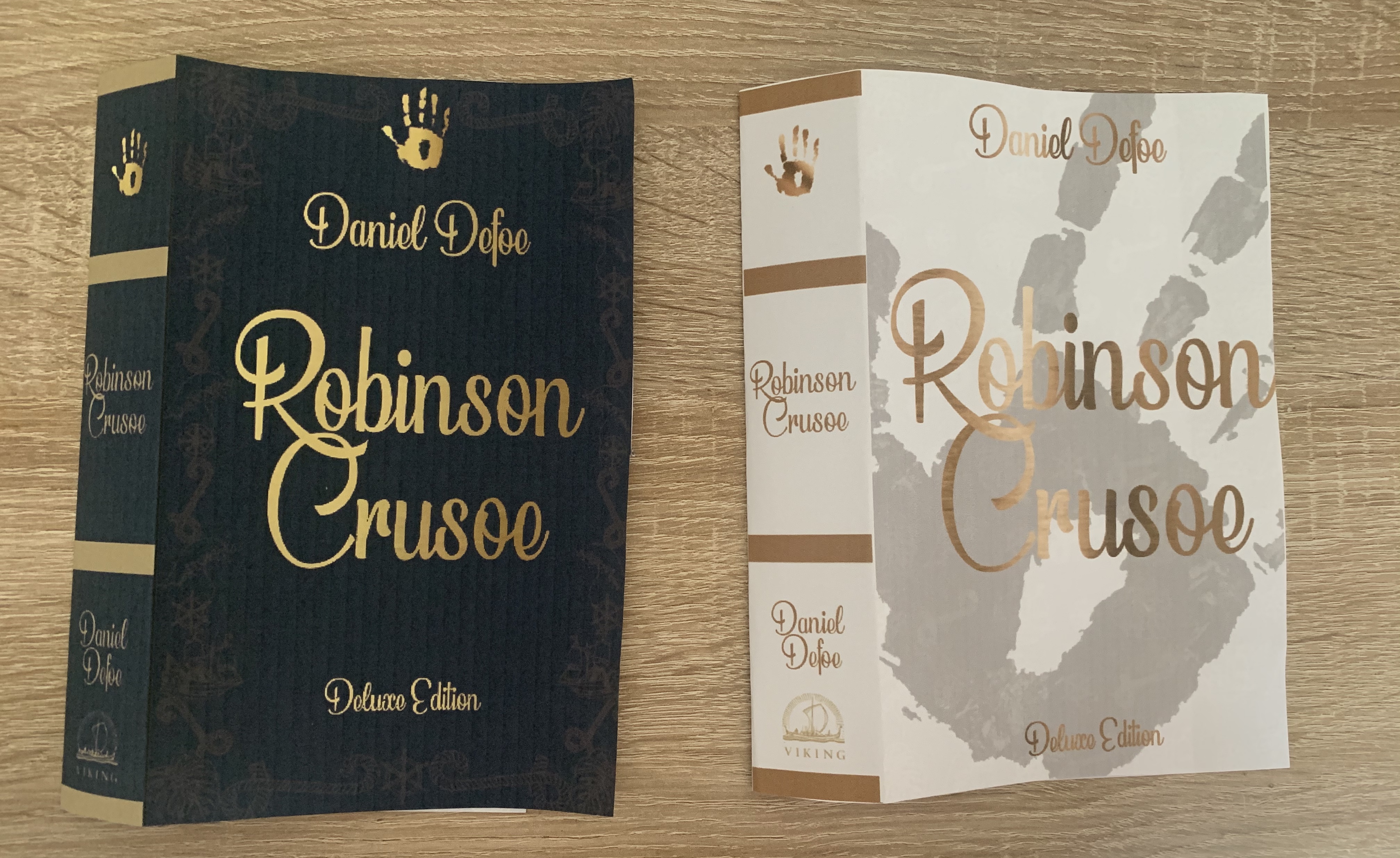
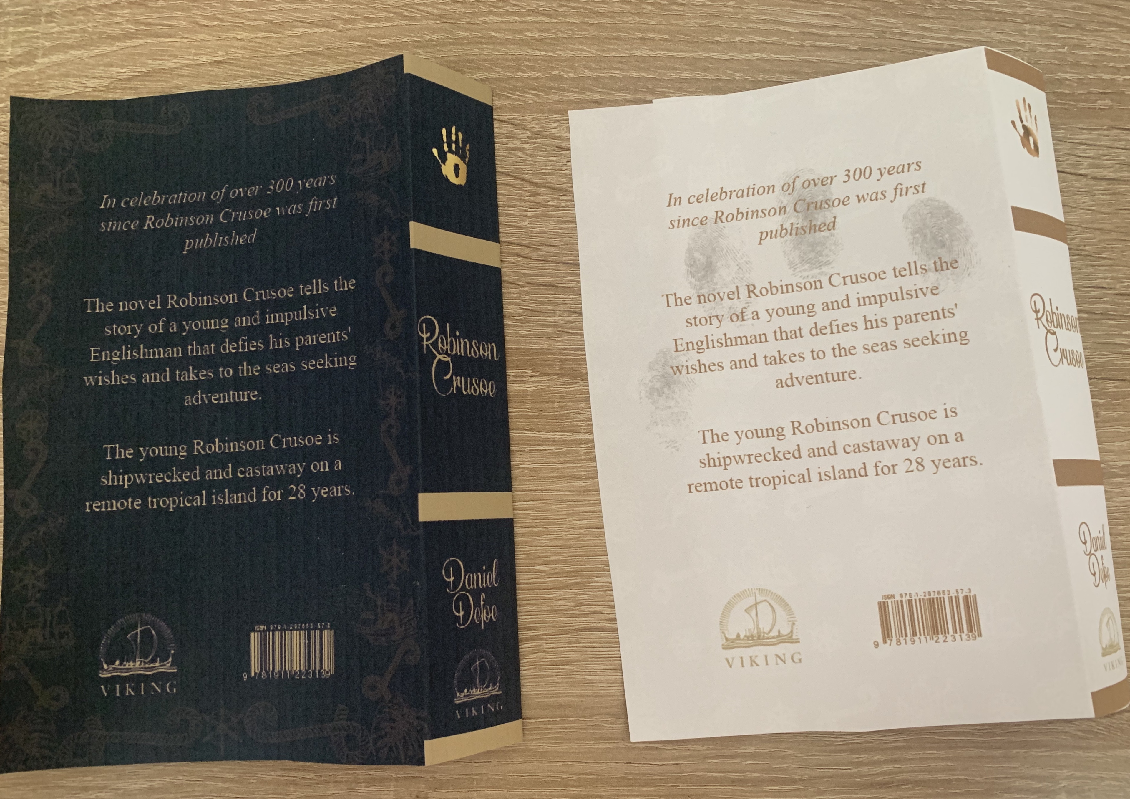
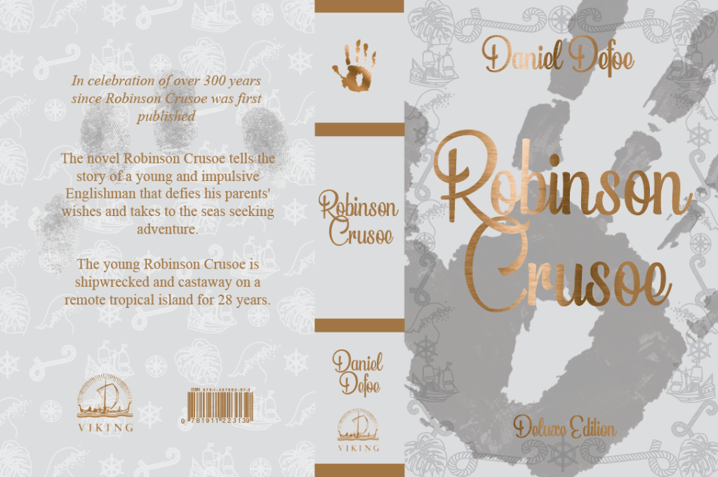
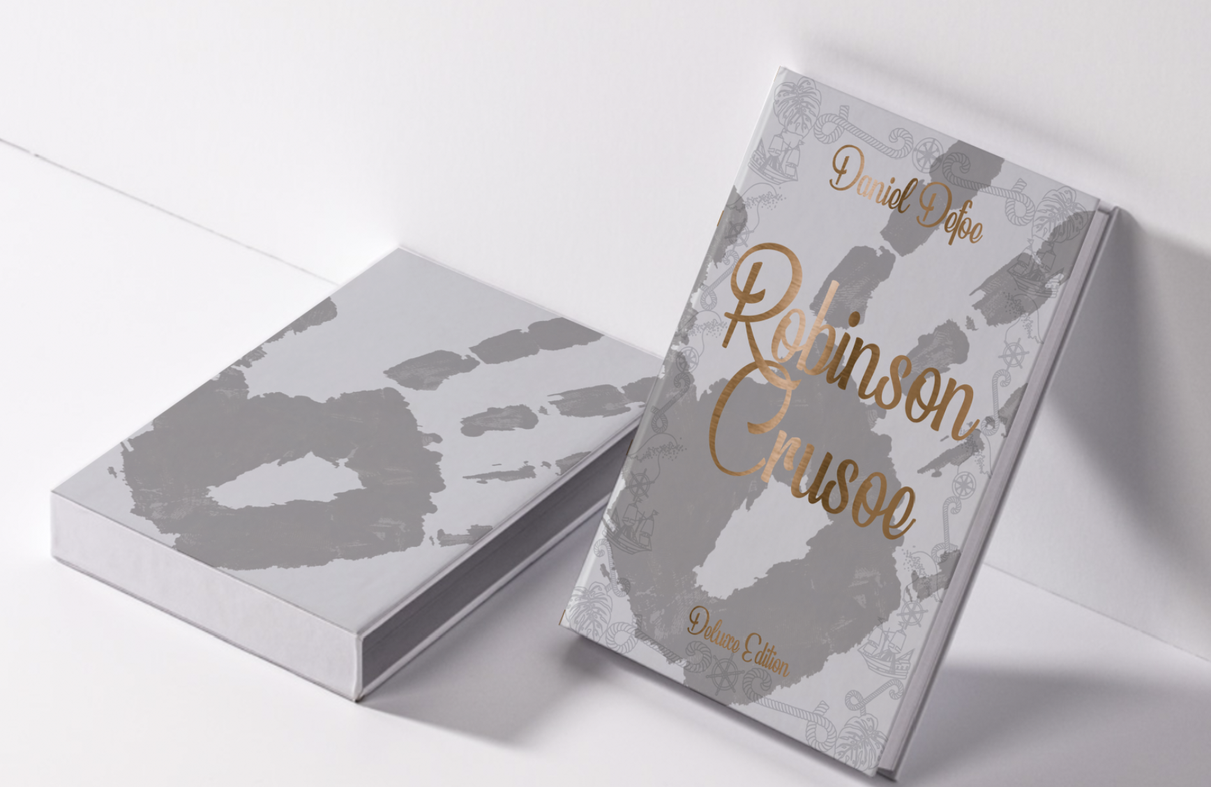
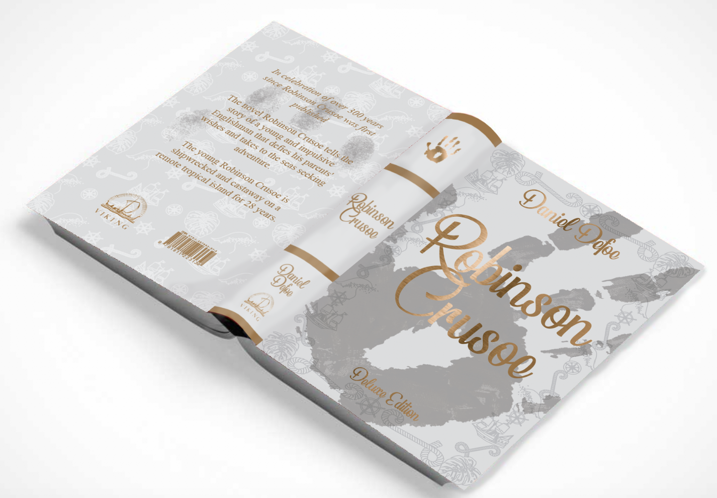
Final Design Deluxe edition
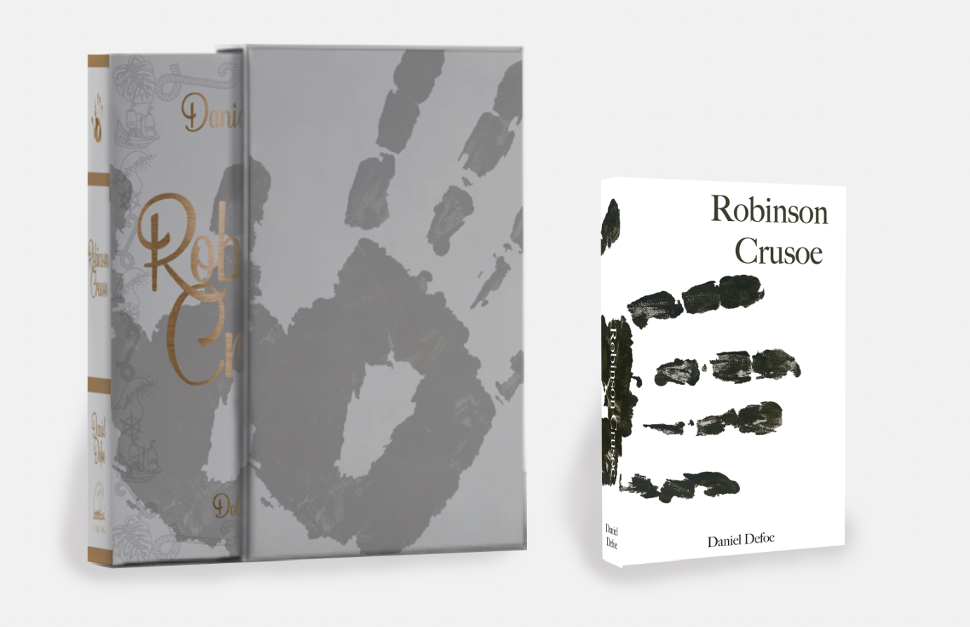
In the end I decided to combine the boarder from the first deluxe cover onto the layout of the second, I felt this eased my worry over the lack of the ‘historical’ feel. I have created a plain slipcover with just the handprint on in the same position as the book within, I felt it looked more endearing without placing the title on the slipcase, making the audience want to sneak a peek at what the book is.
The cover of the hardback cover will be made from 1500 micron board covered cloth with the design printed onto it, all the text on the cover will be a brass/copper foil along with the handprint on the spine. The endpapers will be printed onto 150gsm matt paper. The pages will be printed onto 120gsm bond paper, casebound into the cover with grey headbands for finishing touches. The slipcase will be made of a slightly thicker board of 2000 micron board with the handprint design on the outside coated in a matt laminate finish with spot uv applied on the handprint, the inside of the slipcase will be lined with the same design as the end paper to give it a complete finish.
Reflection
Im very happy with how my books turned out in the end, It took me a while and a lot of backwards and forwards with my deluxe version but I’m really pleased with my end result. I feel that both books look great on their own and also side by side. I feel that both designs fit the requirements asked for in the brief. The feedback I have received for this design have been great with many liking the finer detail of the book such as the detailed boarder and the fingerprints on the back of the book.
How to guide
Now to move onto the final part of the brief ; to design a how to guide. I wanted to remind myself of the requirements for this part.
Part 3 Washed ashore deign: Design a ‘how to’ guide called Washed ashore: The ultimate guide to surviving on a desert island by Rik Bennet, that offers practical advice on what to do if you are shipwrecked, as well as reflect the theme of adventure.
Objective – Design a shipwrecked guide which reflects practical advice and something of the adventure of being a castaway.
Format – Include front, back and spine designs. Scale stock and binding to be decided at later date – alternative formats can also be considered. Include Title, author & publisher
Other information – This guide needs to be in a separate genre to the first two books – i.e. an instructional manual rather than a novel, yet still keep a thematic connection between them.
Keywords from brief – Shipwreck, guide, practical, adventure, castaway, Robinson Crusoe theme, desert island
I started off by going straight into research of these guides.
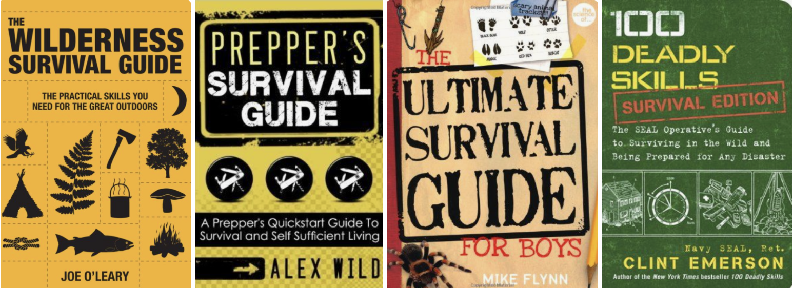
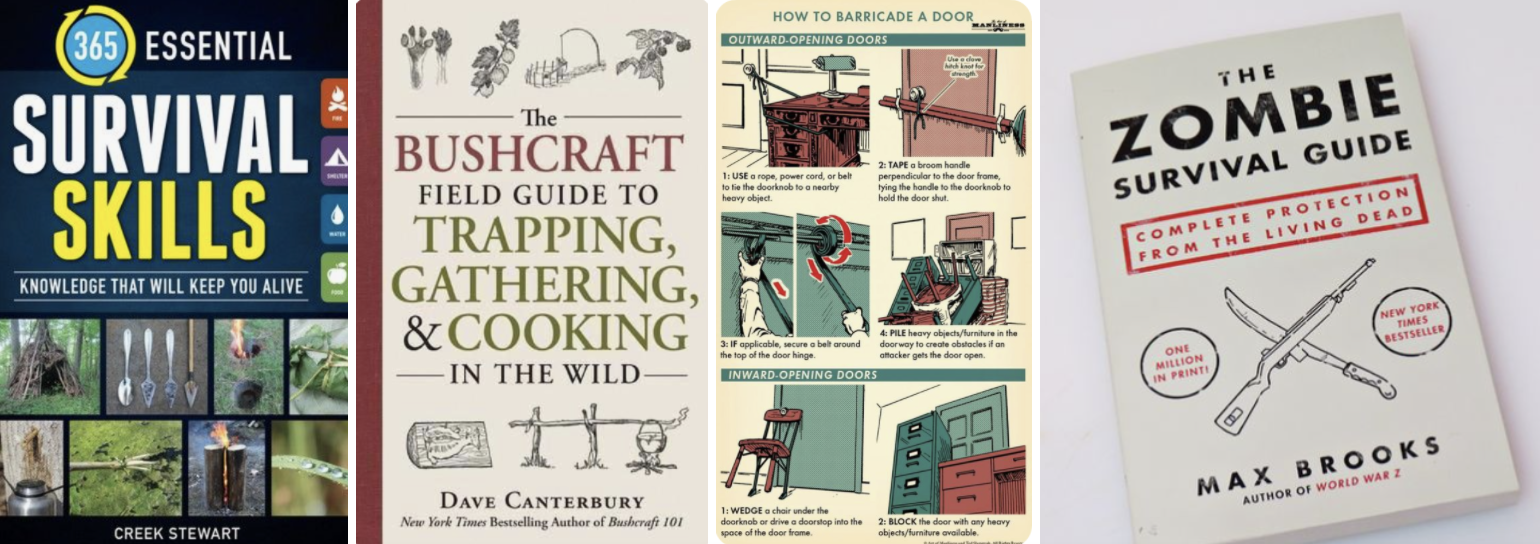
Research
Key Conceptual Motifs
Bold titles – stamped typefaces
Very informal
Images/illustrations
Simple colour palettes
I then moved onto making a mind map to help stimulate ideas. Thinking back at my Robinson Crusoe designs, it will be easy for me to incorporate the handprint in some way.
I sketched out some ideas for this cover, I didn’t want to over complicate the design as from my research most covers seem to be simple and more typography based than illustration based.
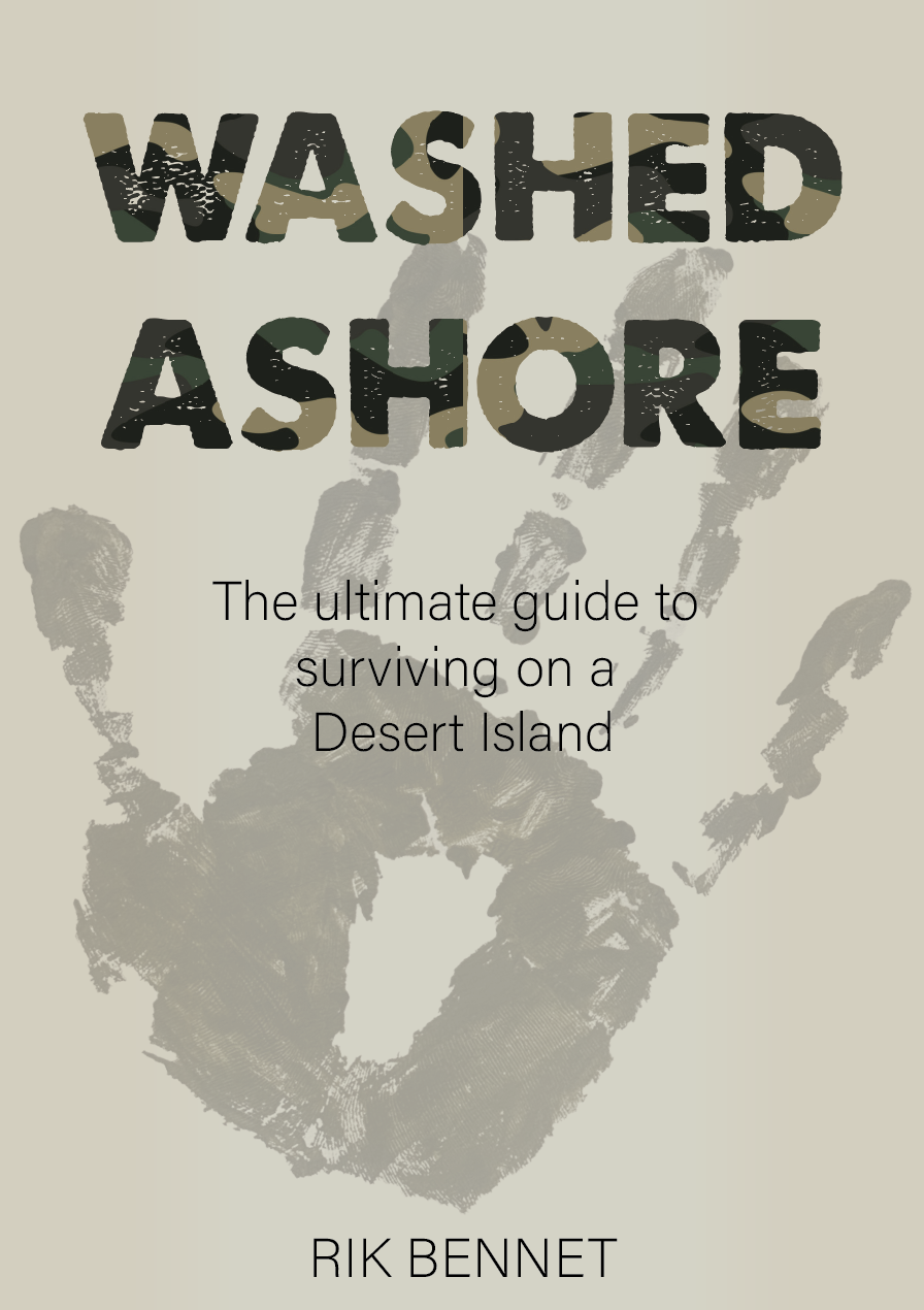
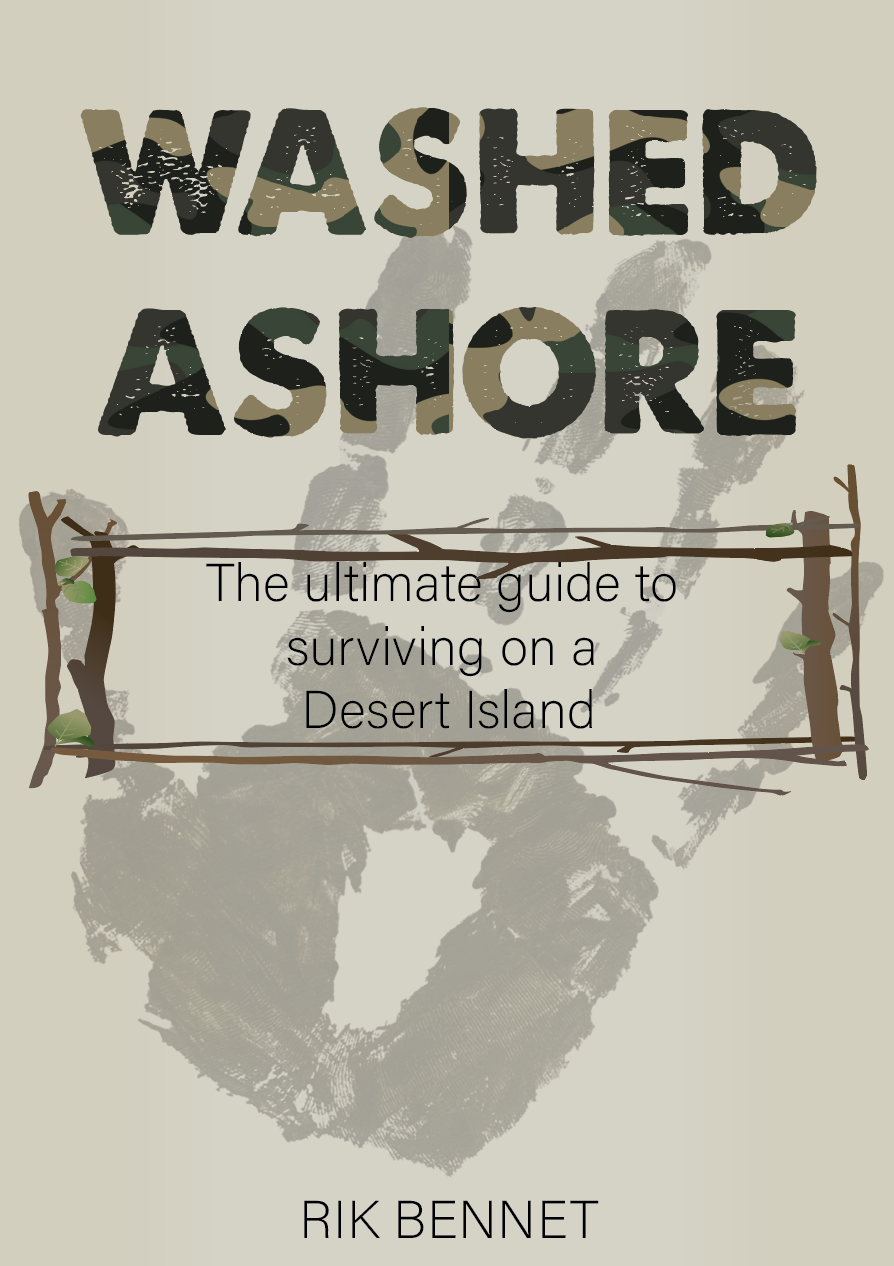
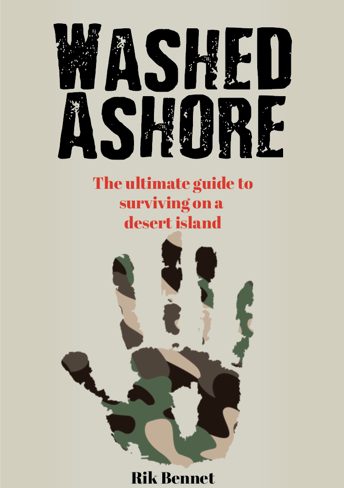
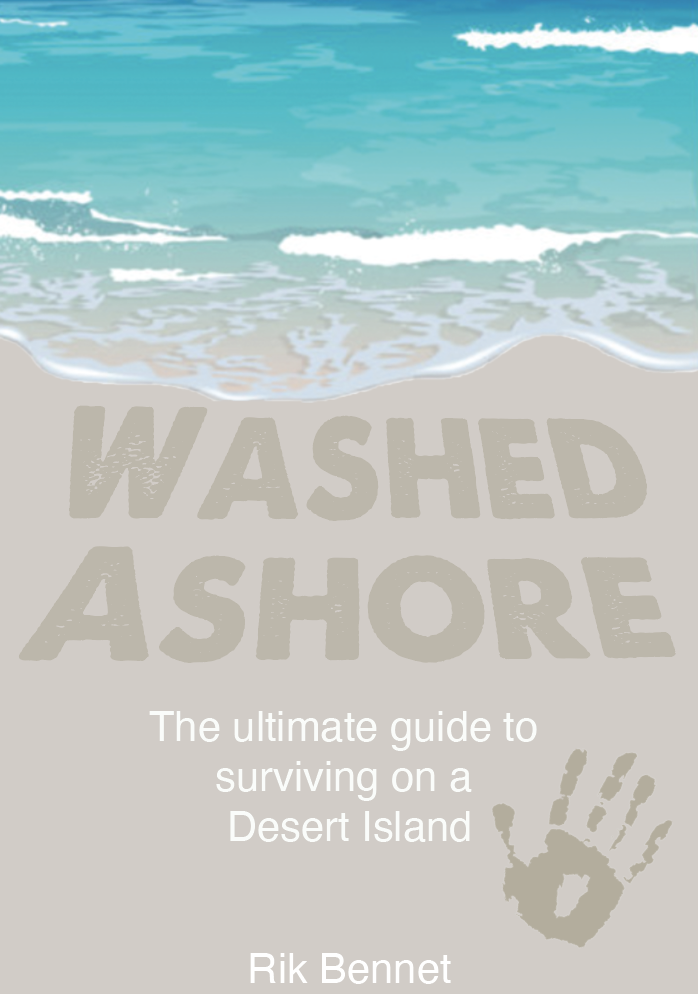
I created a few variations of the washed ashore cover following my sketches and with the key motifs in mind. Its fortunate that the main design feature of both my Robinson Crusoe design is the handprint which again works well for this genre. As you can see from the beach designs I lost myself slightly as they seem more fitting for a book rather than a guide, but by creating a few of the icons its helped achieve a more informative cover suitable for the guide genre.
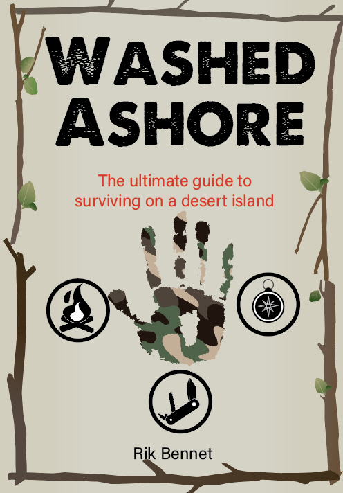
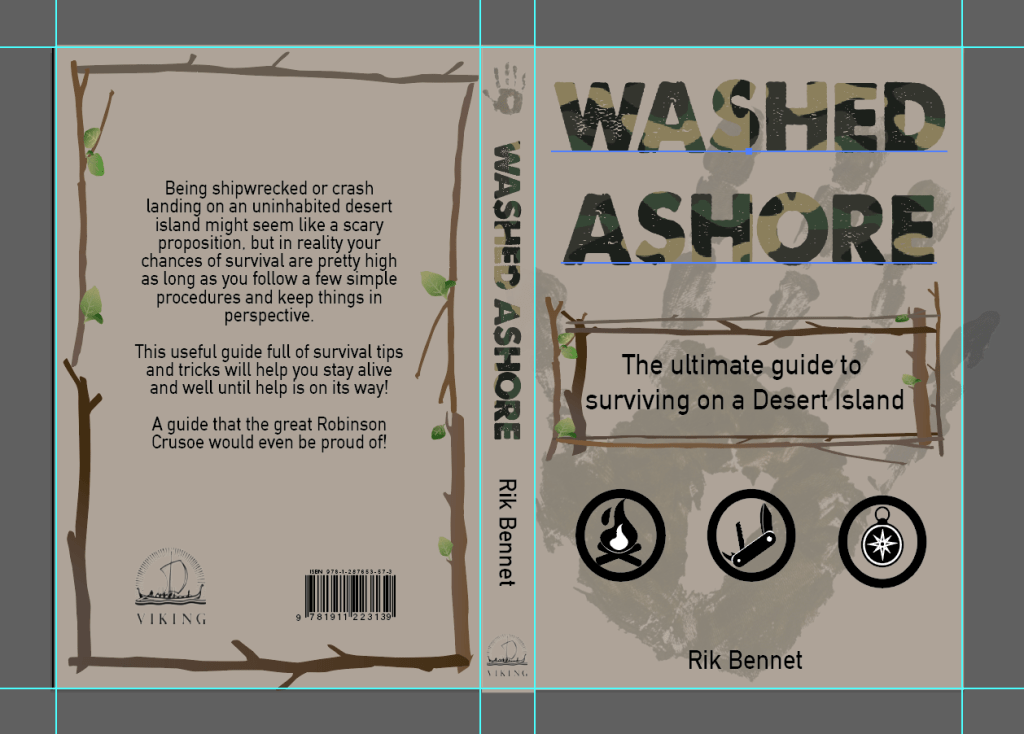
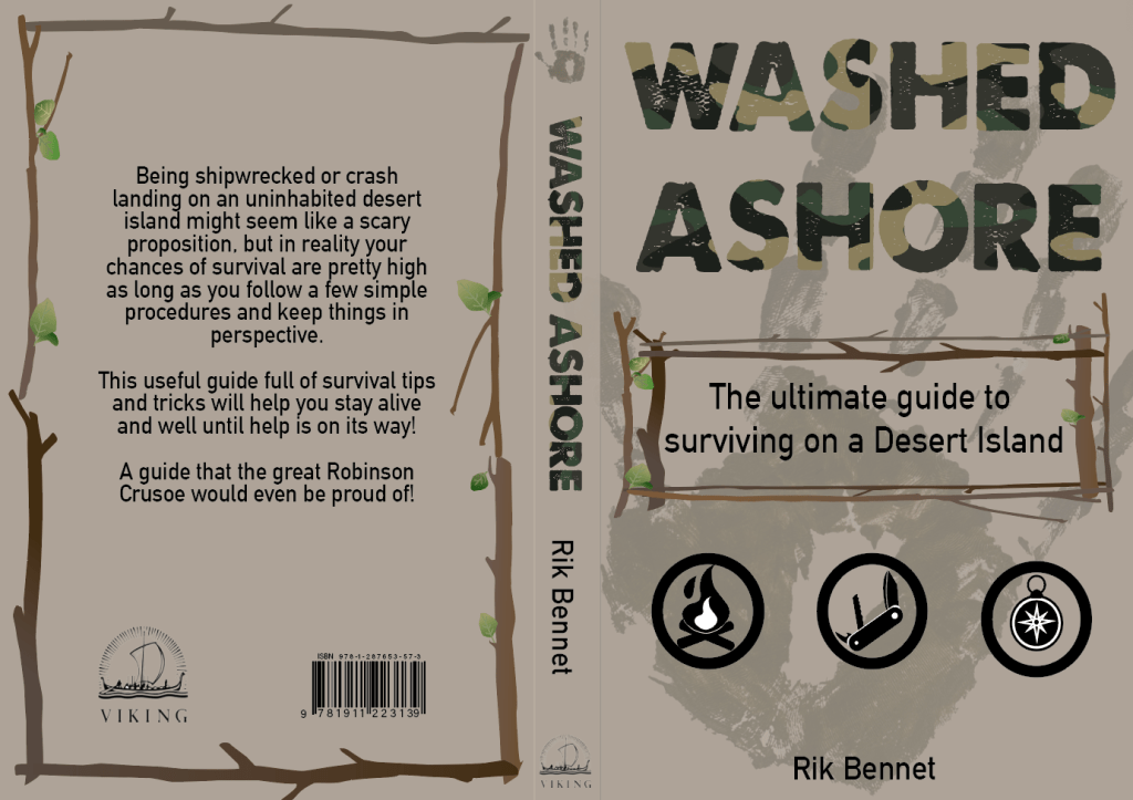
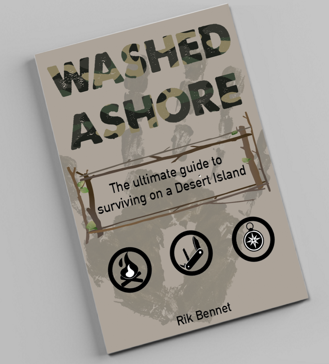
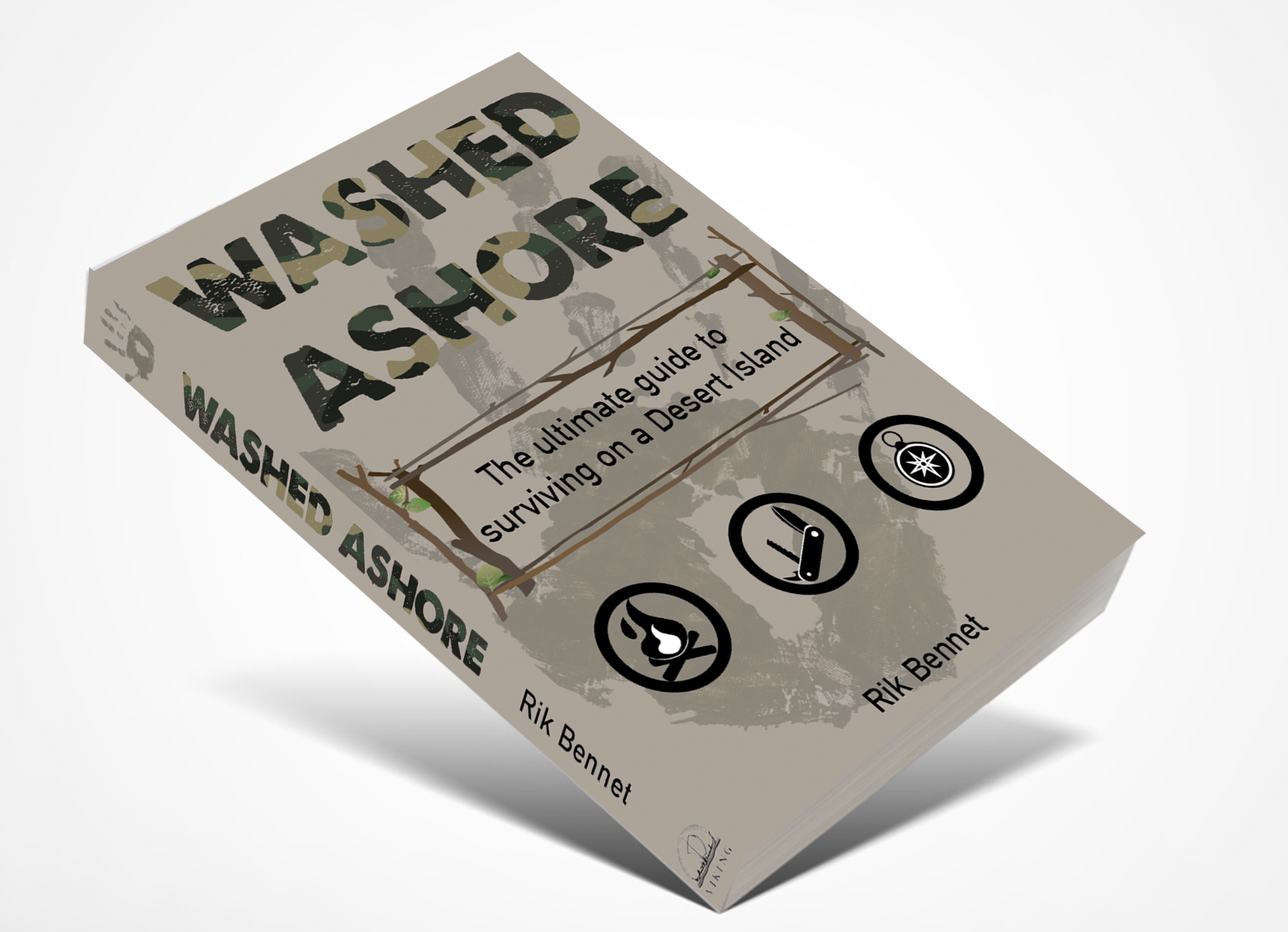
I decided to choose the second from last as my final design. This design fitted the genre the most, with its simple colour palette and use of icons, It’s simple and to the point. I combined the boarder from one of the other designs and used it on the back cover to frame the blurb. I chose a bold typeface with a worn effect, masked with camo print to add to the survival theme and also fitting in with the key motifs from research.
Book Format & Design Requirements
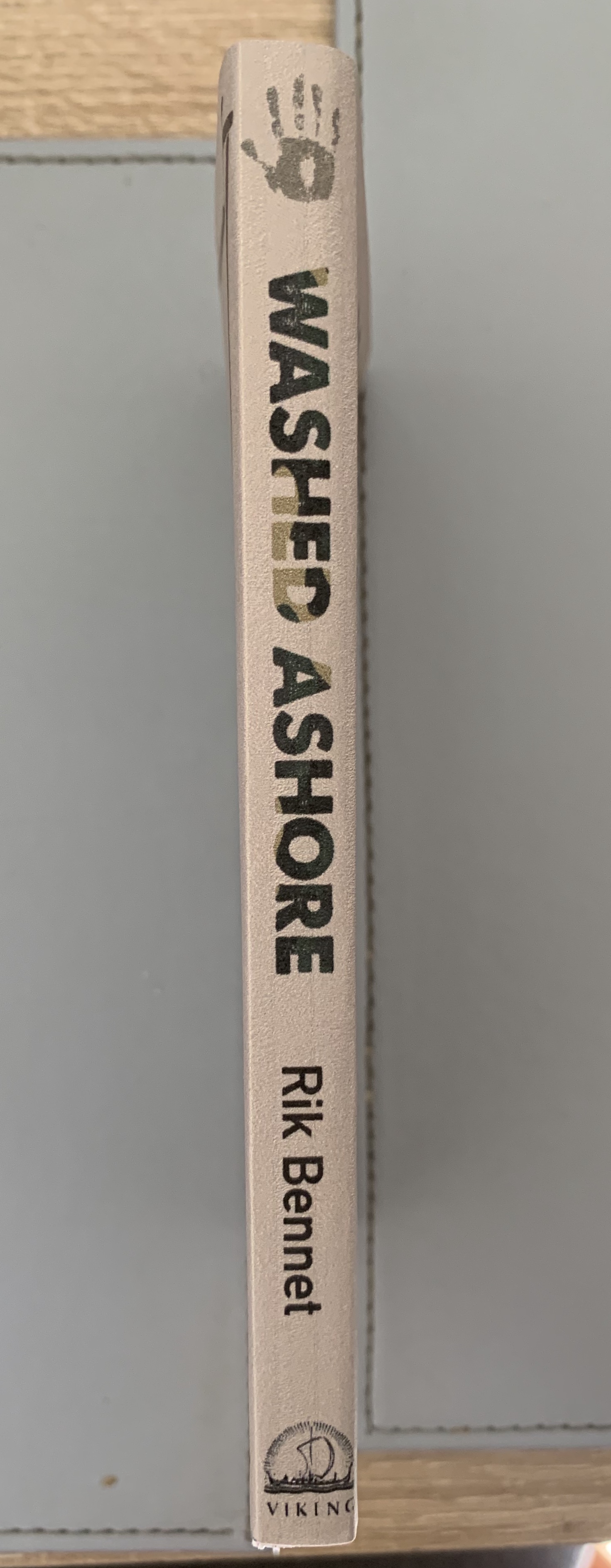
Once happy with my design I decided to think about sizes for this guidebook. I wanted to think about size as one of the main features, as if the book was small enough it could become an essential for someone traveling. The sizing I decided on was 4″ x 6″ with a 1cm spine.
The spine should be flexible in order for pages to be bent around to give the reader the ability to hold the book single handedly, and bound with glue.
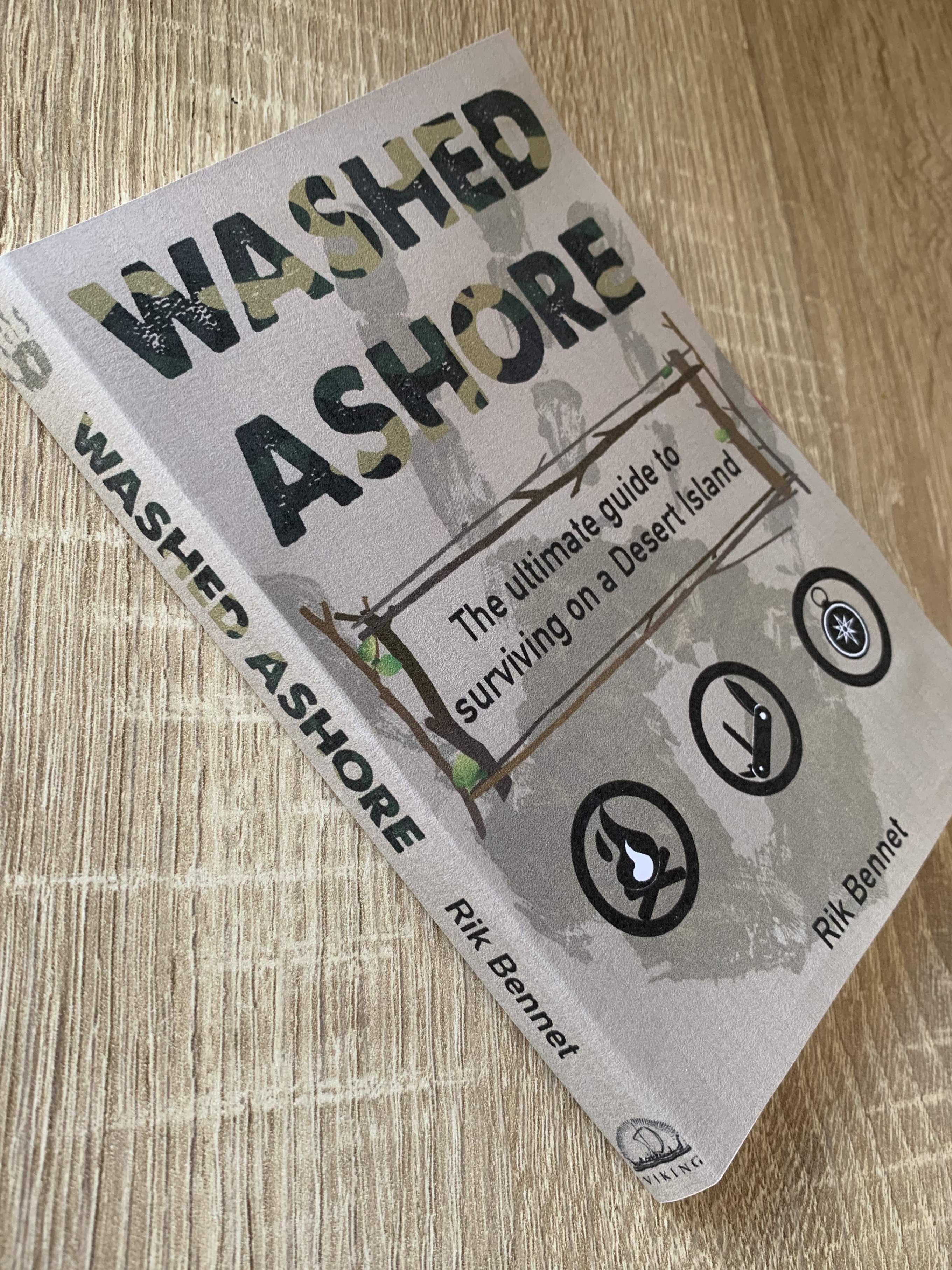
Silk coated paper would give the cover added protection and also limits the amount of ink and moisture that the paper can absorb. It also makes it more opaque and resistant to wear and dirt and hence less liable to finger marking.
The paper should be smooth and thin allowing that pages to neatly fall back into the compact size, adding a textured paper/thicker paper would add bulk to the book and cause tension on the spine.
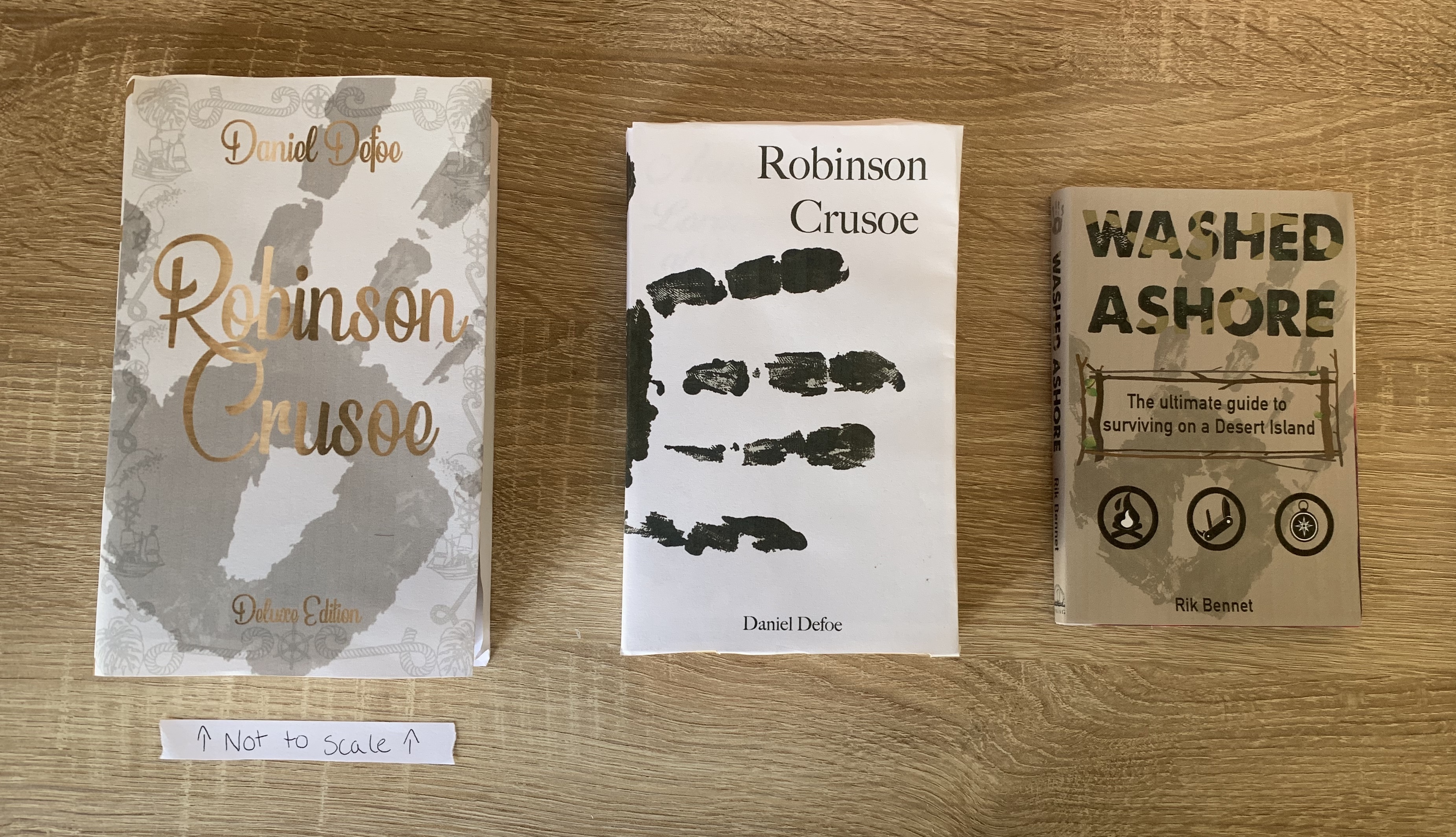
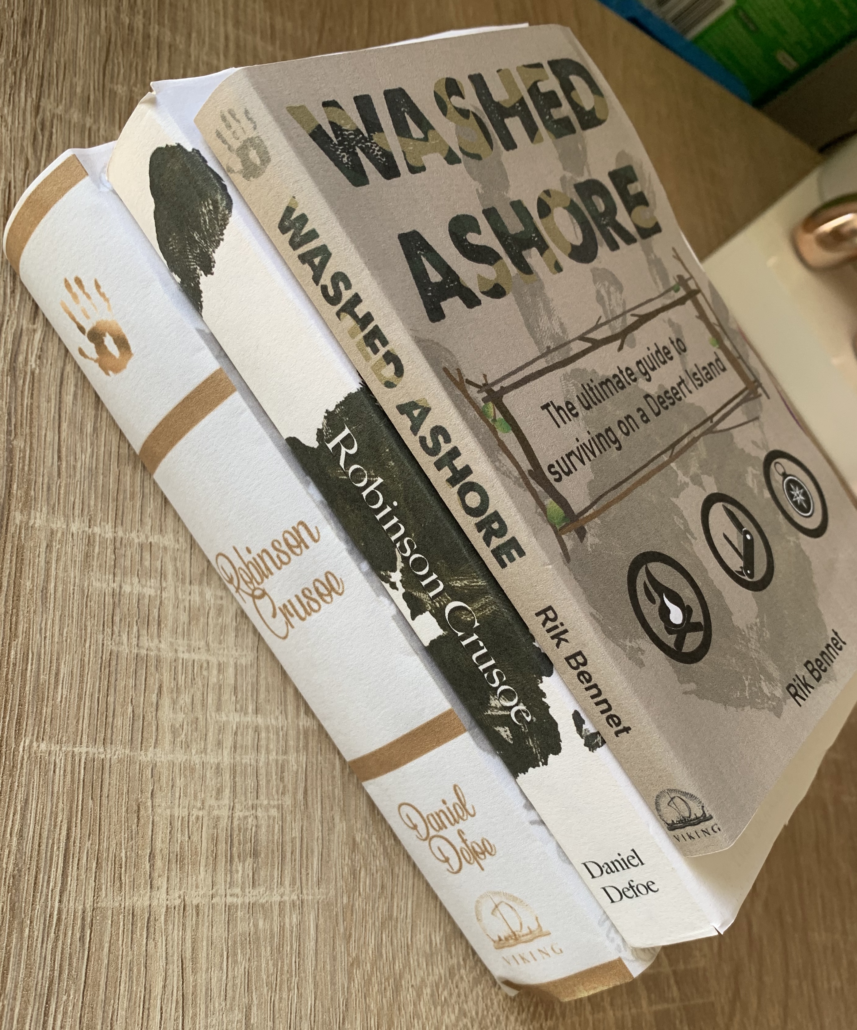
Mockups
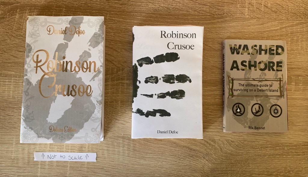
Placing the book beside the other books (deluxe version not to scale!) I feel that the sizing is perfect, although smaller it is still readable and manageable and would be perfect to accompany any adventurer on the move!
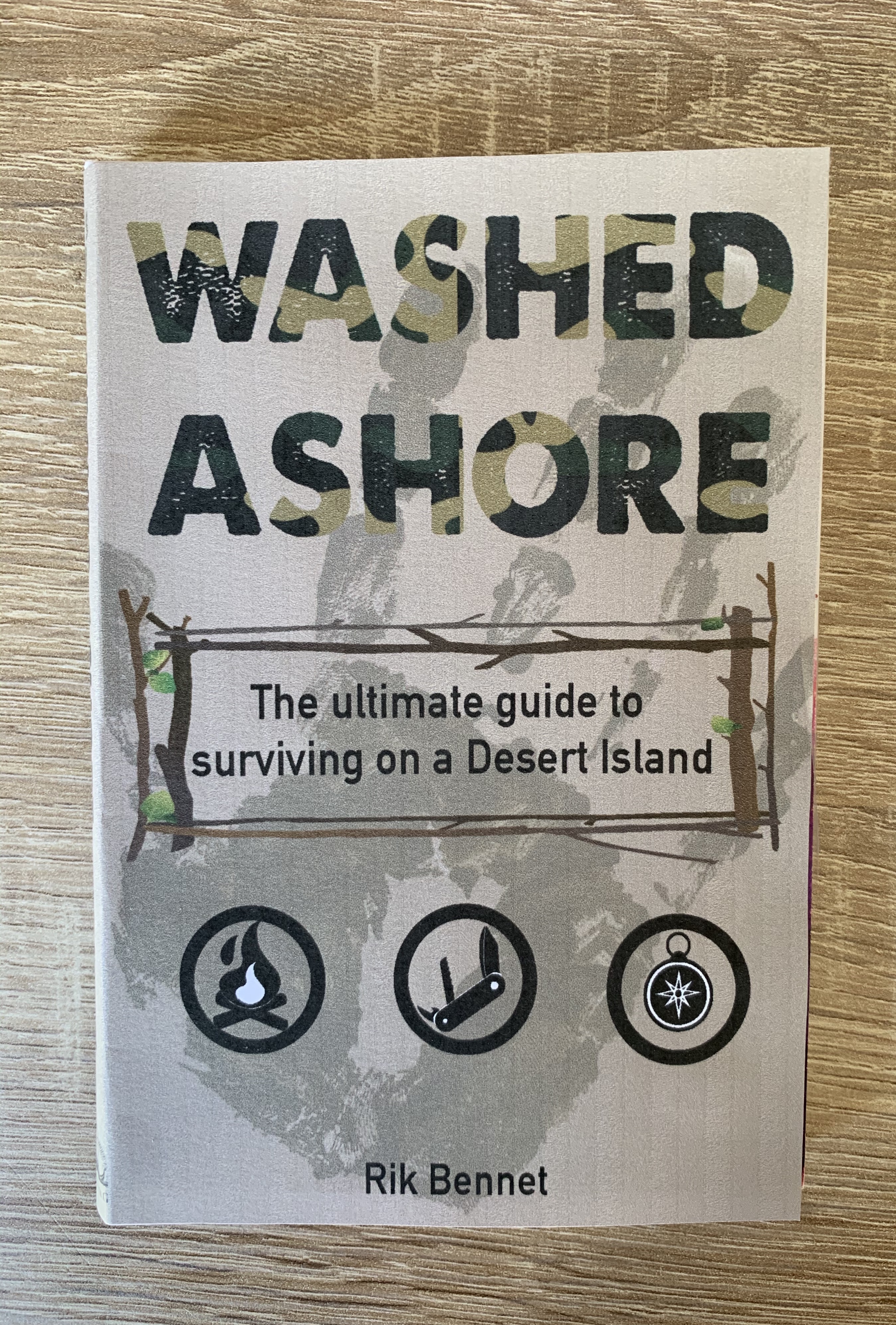
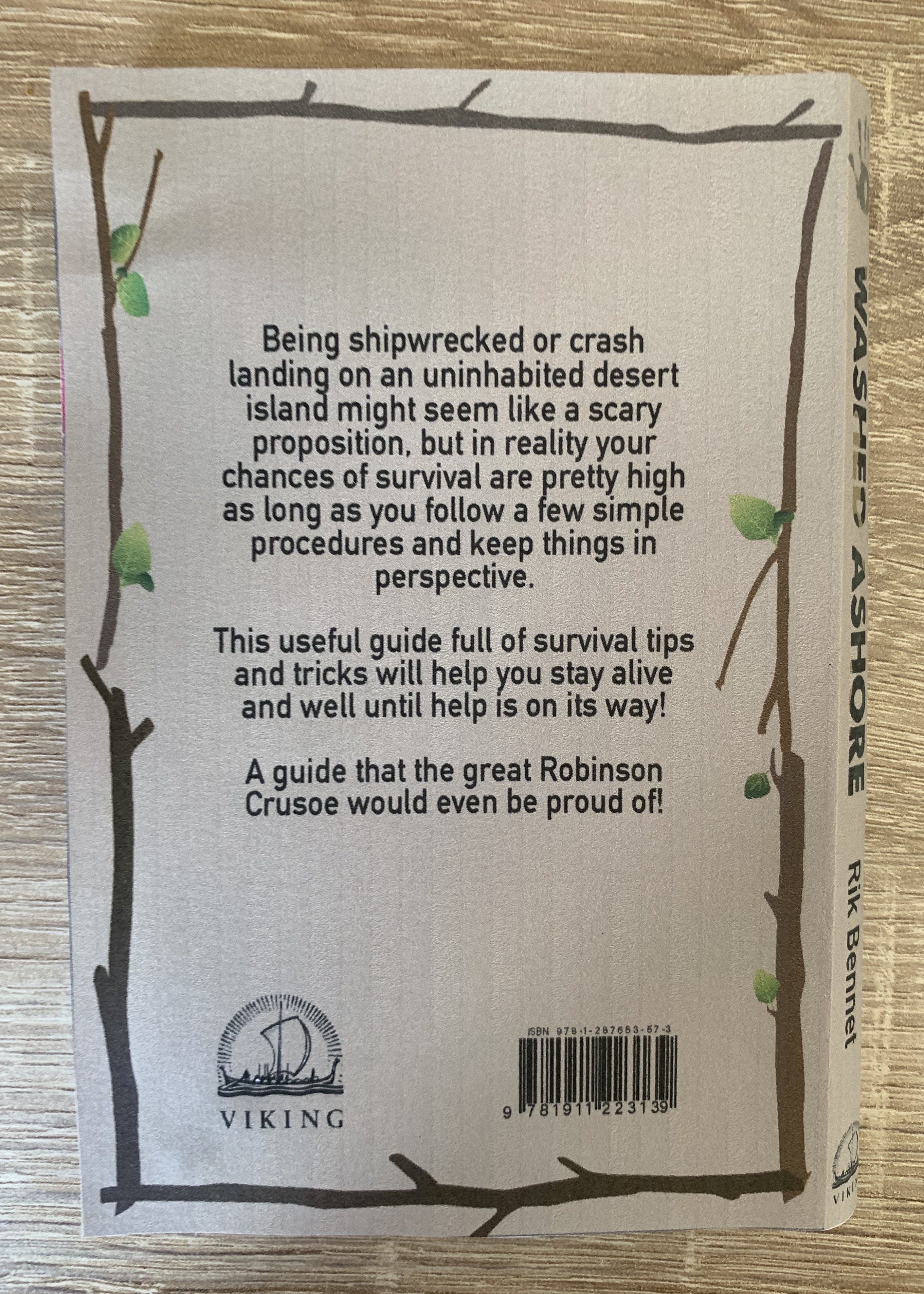
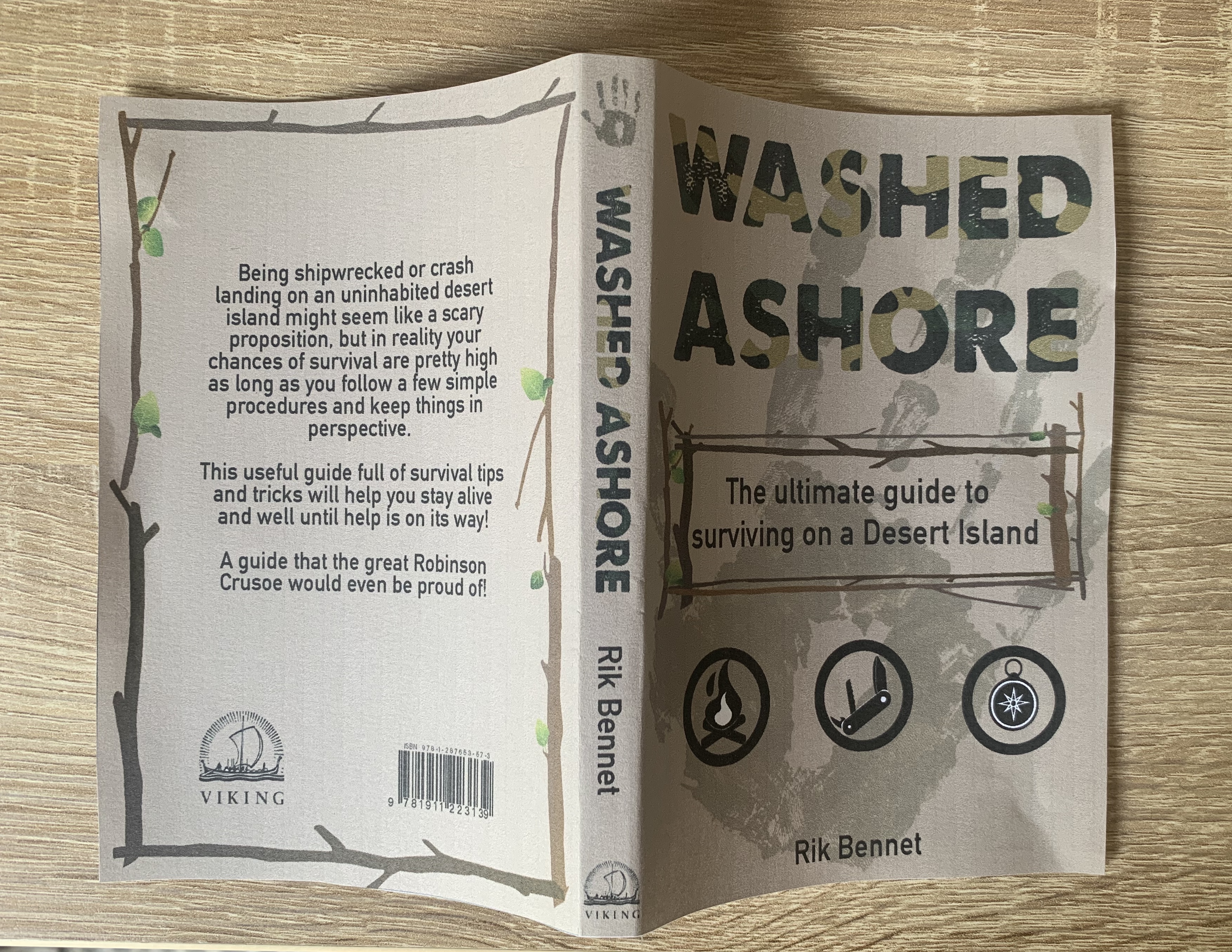
Final Design
Final Design
Im pleased with how my final design looks both printed and mocked up digitally. I was pleased that I was able to use the handprint as a mean feature on this book as well as the two previous designs, yet have all three books look unique to themselves.
The cover to this book will be made from 250gsm silk laminated paper for durability and added protection. The pages will be printed on 80gsm bond paper to keep the costs down and bound together using Eva-con R Adhesive. The size of the book is 4″ x 6″ with a 1cm spine.
Reflection
I have enjoyed this assignment and feel I have developed more knowledge and confidence towards book design. Looking back at my finished designs I am really pleased with how they turned out. I found the materials part of the books slightly challenging however I was grateful to have orders some sample books from companies during one of the previous exercises, this made it easier to touch and feel the different paper types and narrow down to my chosen piece. I also found the previous exercises in the buildup to this assignment useful – for example exercise 3 – book designers, here I discovered Rodrigo Corral’s design for ‘A million little pieces’ which gave me the inspiration of the handprint and the placement of it wrapping around the book.
Due to the pandemic I was unable to do a few things which I would of done, such as visiting local libraries and bookstores to examine existing Robinson Crusoe books and to also look at different size books to help with the sizings of the books which I created. I also would of considered having my designs printed onto better quality papers to see how the design works etc. But I am still happy with the work that was created.
Overall I feel that my designs are successful and live up to the brief. I am looking forward to hear my tutors feedback and to see if any improvements are to be made.
Brief: Following on from the discussion of George Orwell’s novel 1984, look at the covers for Margaret Atwood’s equally dystopian novel The Handmaid’s Tale (1985), in which a woman finds herself surviving inside a harsh American fundamentalist society, that sees women’s roles as subservient cooks, matrons, and mothers. Alternatively, you can pick a different book to respond to, but it needs to be one with more than one cover design, so avoid recently published books. Are there key conceptual motifs being used over and over again within different cover treatments? Can you identify more expressive versions of the covers? Check the date of each version and try to speculate about the historical, political or social context for each one. (Don’t spend long on this but it’s important to realise that creative design doesn’t happen in a vacuum.) Using one of the main motifs you have identified (such as the uniforms that feature the book), the title of the book, author’s name, and no more than three colours (including black and white), generate as many different layouts of the cover design as you can. Think about how you can dynamically layer, organise, frame, clash, or balance these elements. Work quickly and come up with lots of different visual possibilities.
Research
I firstly wanted to educate myself on the book ‘The Handmaid’s Tale by Margaret Atwood’. The Handmaid’s Tale, originally published in 1985, is a dystopian novel written by Canadian author Margaret Atwood. It is set in a near-future New England, in a totalitarian state, known as Gilead, resembling a theonomy that overthrows the United States government. The Handmaid’s Tale explores themes of subjugated women in a patriarchal society and the various means by which these women resist and attempt to gain individuality and independence. (https://en.wikipedia.org/wiki/The_Handmaid%27s_Tale)
The true first edition, 1985 (Canada) Jacket design by Tad Aronowicz. Illustration by Gail Geltner.
The cover to this edition is very odd, it shows the Commander holding a distorted figure with an infants body and adult head, it is clear that this is his handmaid. He appears to have a very protective hold over the figure keeping a close eye on her. There is an immediate sense of power in this, showing how much bigger the Commander is, to show his charge.
Dust jacket for the first American edition of The Handmaid’s Tale by Margaret Atwood, illustration by Fred Marcellino, 1986.
This edition is quite different from the original considering it was only released a year after the original. This design shows two women wearing the traditional Handmaid’s attire with the red cloaks and white bonnets. They are seen walking alongside a very tall wall which is said to represent the Berlin Wall during the Cold War. This cover gives more information about what the book is about with a traditional style.
Vintage Classic, 1996
This cover is more expressive than the last two, If shows a painting of a Handmaid with a blurred face. This makes the book look ‘dark’ and mysterious with the woman’s identity hidden. This could portray the way other’s of a higher position see the Handmaid’s as an unrecognisable person due to the order of hierarchy in the past and the way they are made to feel?
Published by Bloomsbury 2009
Unlike the previous designs, this decorative cover consists of objects rather than people, with a striking red background, the title and author are placed largely in the centre making this the focal point of the book. All objects used on the cover give the reader an insight to what the book is about if they aren’t familiar with the famous title.
Vintage Classics, 2010
This minimalist cover shows a repetitive lino effect print of faceless woman continuing with the colour palette of just red & white. Again this could be representing the lack of identity for the Handmaid’s within this book. The positioning and posture of the figures looks formal and strict.
Vintage Publishing, 2017 Designed by Suzanne Dean, illustrated by Noma Bar
This hardback cover feels more modern compared to the others with the simple abstract shapes of the red dress & white bonnet and the title and author’s name being embossed on the cover. I like the simplicity of this cover and with the black background creating a deep contrast between the red and white.
Vintage Classic 2017
This edition focuses on the hit Tv series, making the book recognisable to those who have seen the programme. This photographic cover still keeps to the red & white colour palette, with the typography on the cover contrasting against the background revealing the image in white. From looking at the cover it doesn’t give much away unless you are familiar with the actress Elisabeth Moss who plays the main character in the tv series.
This design caught my eye due to its typographic cover, the simple monospaced sans-serif typeface creates a clean and sophisticated cover. The small image of the Handmaid in red creates the perfect eye catching thumbnail image. Although the cover doesn’t give away a lot of information, I feel that it does show it’s a mature book.
Key Conceptual Motifs
Colour palettes of red, white and black
Imagery of white bonnets and red dresses (Handmaid’s clothing)
Female figures
Faceless – representing lack of identity
The uniform seems to be one of the more iconic symbols which I think is important to include on my designs. Below I have created a selection of 18 covers.
I started of by creating a more detailed silhouette however I didn’t feel it looked right, it felt too rigid and digital? I then went on to create a more basic silhouette with more of a side profile to see the bonnet clearer. On some designs I have given the red cloak a rigid edge to add depth and effect to the designs. I played around with text positioning and typefaces, I feel that the Serif typeface suits the design and book more as it feels more formal. Following traditions from previous existing designs I kept my image faceless as I feel this expresses the lack of identity for the woman in the story.
Reflection
I enjoyed getting back into a design exercise again after what seems to be a lot of research (however still being informative!) This was a useful quick thinking process to get myself back in the game and thinking about imagery and text positioning.
Brief: This exercise hopes to broaden your understanding of other book designers’ work by looking at their cover designs. Start to identify the kinds of book covers you are drawn to, and critically assess why you think these designs are successful.
Undertake a combination of library and internet research into the following designers, identifying a number of book cover designs for each. Reflect on their conceptual and/or expressive approaches to design. Write a very brief description of your selected cover designs and a brief overview of the designer – try to focus on keywords rather than long descriptions. Do this in note form, using the designer and the chosen example design to visually inform how the information appears in your learning log.
Phil Baines
Coralie Bickford-Smith
Derek Birdsall
Kelly Blair
Irma Boom
Suzanne Dean
Julia Hastings
Linda Huang
Jost Huchuli
Ellen Lupton
Peter Mendelsund
Paul Rand
Paula scher
Jan Tschichold
Wolfgang Weingart
2. Compare and contrast some of the cover designs. For example, how does the cover of Peter Mendelsund’s Kafka series compare with Coralie Bickford-Smith’s gothic horror series for Penguin? Are these expressive or conceptual in nature? Are they both conforming to genre expectations, or are they challenging them in some way? Do Jan Tschichold and Ellen Lupton’s cover designs have anything in common? Make drawings, sketch or tracing of the covers you’re comparing to help give you a better understanding of the imagery, typography and arrangement within the design. Use your learning log to reflect on your comparisons, identifying which covers you think are the strongest and why.
3. Now, select three or more designers from the list that you are particularly drawn to, either because you like their work or because you don’t understand their approach, and research their design careers in more depth. Think about how they’ve responded to very difficult design challenges, whether they have an underlying conceptual and/or expressive approach, and how their work has evolved over time. Continue to use your learning log to record their work visually, explore these covers through drawing, and your responses in note format. See this as a quick fire activity rather than a long essay.
4. Finally, identify at least three different book designers you find visually engaging. To do this you might want to visit a library, bookshop or browse online. Identify who designed these covers and find out more about them. Try to work out why you are drawn to them. Is it to do with genre or their approach to design? What is is about the design that captures you? What sort of imagery, if any, is used on the cover? How does the text relate to the image? What atmosphere or style does the cover evoke? Summarise your thinking in your learning log – focusing on the kinds of book covers you are drawn to and why – and continue to document what these covers look like.
Part 1 : Research
Phil Baines
Phil Baines is an accomplished designer and senior lecturer in typography at Central Saint Martins College of Art & Design and co-curator of the Central Lettering Record.
Images: Google Images
Makes title part of the design
Clear indication of what the book is about from the cover
Busy designs
Makes use of whole page
Sophisticated typefaces used in the typography covers
Limited colour pallet on typography covers (two colours used)
I was drawn by the first three covers as I was drawn by the strong colour palettes, in particular I liked the ‘Puffin by design’ cover, I found this interesting as the title has been created from gaps within the book collage. The last three I design’s I chose because there is a clear style present, the fonts used are elegant and the covers looks very mature and expensive.
Coralie Bickford-Smith
Coralie Bickford-Smith is one of the most renowned designers in the publishing industry, especially recognised and celebrated for her illustrated covers of Penguin’s clothbound classics.
Images: Google Images
Clear indication of a series
Busy designs
Limited colour pallets
Elegant and sophisticated designs
Look expensive
Very decorative
I was drawn to the top three as I found this series interesting with the decorative backgrounds and liked the way the presented as a series. The bottom three caught my attention due to the foil used in the designs which give a glisten when the light catches them. These look very sophisticated and perfect ‘coffee table’ books. I found it hard to narrow down my cover selection for Coralie’s designs as they where all very interesting and eye catching!
Derek Birdsall
Derek Birdsall is an internationally renowned British graphic designer.
Images: Google Images
Minimalist designs
Typography – clear large bold text
Very limited colour palette
Vintage feel (faded yellow backgrounds)
Derek Birdsall seems to have a clear style within his designs, they are very minimalistic with the use of one colour. The fonts used across the selection of designs above look very simular by being a bold sans-serif typeface. In the ‘Poverty’ and ‘Birthday’ designs Birdsall has incorporated a penny for the ‘o’ and candle for the ‘i’ which looks playful and imaginative.
Kelly Blair
Kelly Blair is the art director of Pantheon books, an associate art director at Knopf and freelance illustrator.
I like Blair’s designs, in particular I think the cover for ‘When the doves disappear’ is very strong, interesting and creative. This gives us a slight indication of what the book is about, perhaps it be about a man leaving a woman? Possibly set 60+ years ago according to the photograph used? Its very intriguing.
Irma Boom
Irma Boom, is a Dutch graphic designer who specialises in book making. Boom has been described as ‘The Queen of Books’, having created over 300 books and is well reputed for her artistic autonomy within her field.
Images: Google images
Very creative
Experimental/unusal
Bold
Not your usual book
Very colourful – bright & eye catching
Irma’s work is very interesting and unusual, particularly ‘Irma Boom Biography in books’ This appears to be a book within a book which is in-fact completely functional. These designs are completely unique to Irma Boom.
Suzanne Dean
Suzanne Dean is a creative director at Penguin Random House Group.
It was interesting to see the design process of ‘Bluets’ to see all the different elements come together to form the end design. I was also drawn to ‘C’ and ‘The book of numbers’ both containing completely different design techniques.
Julia Hastings
Julia Hasting is a German graphic designer. She is the Creative Director of Phaidon Press, head of the design department.
Experimental designs – Book binding experiments in the first book
Mixed media
Challenges the form of book – Warhol book made to look like a box
Coffee table books – Great for display
High quality
Julia Hastings’ designs are creative and experimental, it is clear to see that she likes to play with the proportion of the book. Her books look like they would make the perfect Coffee table books down to their interesting designs, making them great for display.
Linda Huang
Linda Huang is a graphic designer based in New York. She is currently an associate art director at Vintage & Anchor Books, an imprint at Penguin Random House.
Experimental in the ‘Dept of speculation’ cover with the cut out effect
I like Linda Huang’s style in her work, I find her work quite inspirational as I see myself with similar design tastes. The ‘War & turpentine’ cover is interesting with the use of mixed media, I also like the ‘Brilliant…’ cover, this is very playful with the candles being replaced by cigarettes.
Jost Huchuli
Jost Hochuli is a world-renowned book designer living in St. Gallen, Switzerland. He is the author of numerous books on graphic design and typography.
Images: Google Images
Minimalist
Simple colour palette
Experimental text positioning
Typographic covers
Very simple minimalist designs with limited colour palettes, ‘Mein St.Gallen’ stood out for me, I liked the torn page effect, the colours used creates a very bold eye catching cover. The series above is very recognisable down to the identical cover layouts.
Ellen Lupton
Ellen Lupton is a graphic designer, curator, writer, critic, and educator. Known for her love of typography, Lupton is the curator of contemporary design at Cooper Hewitt, Smithsonian Design Museum in New York City.
Interesting intriguing designs, the covers aren’t clear about what the books are about, yet still draw you in.
Paul Rand
Paul Rand was an American art director and graphic designer, best known for his corporate logo designs, including the logos for IBM, UPS, Enron, Morningstar, Inc., Westinghouse, ABC, and NeXT. He was one of the first American commercial artists to embrace and practice the Swiss Style of graphic design.
Images: Google Images
Clear style present – All designs contain similarities
Limited colour palette
Cut and paste effect
Each design shows a silhouette within the design, Rand has clearly adapted his style to relate to the contents of each book.
Paula scher
Paula Scher is an American graphic designer, painter and art educator in design. She has create many logos and designs for many large brands. She also served as the first female principal at Pentagram, which she joined in 1991.
Images: Google Images
Typography
Playful and experimental in text positioning
Bold
Handwritten words/scribbles
Limited colour palette on some designs
Paula’s book cover work main focus’s on typography, some being of large, clean and bold lettering, while others consist of handwritten words tightly packed onto a page.
Jan Tschichold
Jan Tschichold was a calligrapher, typographer and book designer. He played a significant role in the development of graphic design in the 20th century – first, by developing and promoting principles of typographic modernism, and subsequently idealising conservative typographic structures.
Images: Google Images
Creator of iconic Penguin Book design – Classic style
Typographic style
Clear hierarchy
Limited colour palette
Looking at the Penguin Books design, the cover doesn’t give away much of what the contents of the book is, instead it clearly shows it is part of the Penguin brand, which is immediately recognised still to this day.
Wolfgang Weingart
Wolfgang Weingart is an internationally known graphic designer and typographer. His work is categorised as Swiss typography and he is credited as “the father” of New Wave or Swiss Punk typography.
Images: Google Images
Bold
Experimental
Layering – mixed media
Modernist
Typography based – all designs Sans-serif typefaces
I found Weingart harder to research for book designs, although the covers I did find (above) are bold and have similar design traits. It seems that the middle two covers are more experimental with the the contents.
Part 2 : Comparisons
I wanted to start with two designers who I found their works to be similar yet totally unique, these designers are Irma Book & Julia Hastings.
Above I have made notes and sketches on the two book cover designs I have chosen for each designer.
For Irma Boom I have chosen firstly to look at ‘Viktor & Rolf Cover Cover’. This high quality fashion exhibition book is uniquely folded with a stitched binding technique which can be seen from the back rather than on the spine.
For Julia Hasting I have chosen to look at ‘Sample’. This also is a high quality fashion exhibition book, The cover and pages of this book are sculpted out of pleated paper with each signature cut differently in different lengths and angles, revealing a step effect. The cover of this book is held together by an elastic strap with stitched details attached.
Both these designs have similarities to them and it was interesting to compare two unique books from the same genre and also the same publishing house ‘Phaidon’, which I didn’t realise at the time of selection! From first glance you can see that both are high quality and make the perfect ‘coffee table books’ down to their interesting qualities, however by looking at both books, it isn’t clear what the contents is about, however when looking into the finer detail of Julia Hasting’s design it becomes clearer with the elastic detail and the tab with the books title on, that it resembles a clothing tab. Both designs I feel are expressive, experimental and both very successful.
Although I am mainly focusing on Irma Boom’s ‘Viktor & Rolf Cover Cover’ and Julia Hasting’s ‘Sample’ I also found 2 more designs which I felt had slight similarities from both designers; these are ‘James Jennifer Georgina (the yellow book)’ by Irma Boom and ‘The Andy Warhol Catalogue Raisonne Vols 1-4 by Julia Hasting. It was interesting to see that both designers used slipcases which aren’t very common.
I then wanted to look at the two designers as suggested in the brief. Peter Mendelsund’s series ‘Kafka’ and Coralie Bickford-Smiths gothic horror series for Penguin.
Peter Mendelsund’s series ‘Kafka’ shows a clear indication that all books are part of the series as they all feature the same symbolic imagery of the eye in each design. His designs are simple, minimalist and clear however they don’t express much of what the book is about. Peter has selected a script typeface which creates a contrast against the sharpness of his designs.
Coralie Bickford-Smith’s Gothic horror series for Penguin all appear to be lino print with the same colour palette used on all designs. There are similarities between each design which helps link these books to appear as part of a series. The majority of Coralie’s designs are repetitive prints, they are disjointed and have a blurred glitch effect.
From first appearance you can see that Bickford-Smith’s designs belong from the gothic genre due to the colour palette and choice of imagery used. The colour palette and typeface used on each design helps to link these designs as part of a series.
Unlike Mendelsund’s designs, Coralie’s covers express the contents of the book slightly on the cover, giving the audience a slight indication to what the book is about. However both designers have similarities within their work, they are both conceptual with repetitive imagery within their designs.
I believe Coralie’s gothic Penguin series is much stronger and expressive, these designs give a clearer indication as to what the book is about, including which genre they belong to. The designs are enticing and interesting, were as Peter’s designs look more like pieces of artwork rather than book designs due to the lack of expression/’story’ behind the designs.
Part 3: Who I’m Drawn To
Linda Huang
Linda is a graphic designer based in New York. Her work has been recognised by The Type Directors Club, Print Magazine, The New York Times, and 50 Books Covers, among others. She also workson freelance projects, which includes editorial Illustrations for the New York Times.
During the research stage I felt drawn to Linda Huang’s work. I feel like her overall style is modern with the majority of her designs relating to the context of the book, it’s clear that Huang takes time to think about the right approach for each title and the results are consistently interesting. She is experimental and adaptive making her a versatile designer.
Whilst researching Linda Huang I came across an article she wrote which I found really interesting, a particular section I found very helpful and relatable for my current position in this unit. It was as follows;
Before I begin work, I read as much as I can of and about the book and author—reviews, marketing strategies, and similar titles, jotting down anything I find metaphorically significant or visually interesting. If necessary, I collect art research for inspiration, especially for era-specific books. It helps to have a mood board containing the visual language I am trying to capture. I then ask myself: What is the overall tone or mood of the writing?Does it call for a photograph, an illustration, or a collage?Is the author important enough to warrant an all-type cover?
The Book of Heaven by Patricia Storace – 2013 – Pantheon Books. I decided to look at one of Linda Huang’s early designs. This particular design is a very interesting and unique, giving the appearance of a sharp geometrical image unlike any other designs on the shelf. The contrast between the shapes of the jet black twinkly night sky against the peaceful blue skies helps not only the type stand out, but creates dimension within the shape. This creates an expressive and experimental design. Putting the quote above to test, I wanted to research the book to see how Huang’s design relates to the contents. The book is about four women who invite us to enter into a new and powerful imagination of the divine, ‘what if a woman’s point of view were also God’s?’ I can understand why Huang decided to create something so strong, unique and imaginative to tie in with the contents of the book.
Prince of Monkeys by Nnamoi Ehirim – 2019 – Counterpoint Press. The book is written by a young Nigerian writer, tackling politics, class, spirituality, and power as a group of friends come of age in Lagos, Nigeria. Linda Huang’s design helps express the rawness of the book with the handwritten typeface, looking like it could feature as part of a graffiti statement on the side of a building, especially with the choice of background used in this design.
The Natural Order of Things by Kevin P. Keating – 2014 – Vintage Books. Unlike the previous two covers, this design’s main feature is of a distorted painting looking as if it has been folded. To me this gives a 3D illusion of a long narrow cube, which makes it quite intriguing. From first glance the book looks like contains mature content set in the past due to the imagery used. The book is a dark, powerful novel about a tragic city and its inhabitants over the course of one Halloween weekend. Unlike the previous designs I find the cover more challenging to relate to the contents of the book, however the publisher Vintage Books may have a slight reason behind this as the cover does have similarities to existing designs from other artists/authors.
The Dragonfly Sea by Yvonne Adhiambo Owuor – 2019 – Knopf. The cover to this book is very relatable to the title. The paint splatters represent the dragonflies skimming in front of us and the dark blue/teal background represents the sea. The book is a vibrant, stunning coming-of-age novel about a young woman struggling to find her place in a vast world – a poignant exploration of fate, mortality, love, and loss. Huang has taken a conceptual approach to this design, she has been experimental by using paint rather than digital design, it creates a very simple yet effective design.
Their work: Overall I feel that Linda Huang’s work is of a wide variety. No two of her designs are the same and I believe this is down to her design process of thoroughly researching the books to make sure she captures relatable and understandable content within the cover, she is experimental and adaptive making her a versatile designer. The majority of Huang’s designs are of bold typography.
How has the work evolved? It is hard to say how Linda Huang’s work has evolved due to the point mentioned above. However it is noticeable that in the recent years Huang has become more experimental with the use of mixed media in her work which creates interesting deigns.
Irma Boom
Irma Boom, is a Dutch graphic designer who specialises in book making. Boom has been described as ‘The Queen of Books’, having created over 300 books and is well reputed for her artistic autonomy within her field.
I found Irma Boom’s work interesting during the research stage but it wasn’t until the comparison stage I really took a liking to her work, with a few particular pieces which caught my eye which I will mention below. Irma’s approach to book design is like no other, she is incredibly experimental and likes to challenge the form of the book, making her work expressive, unique and inspirational.
It is clear that Irma creates books with their own unique traits, she is often asked to recreate the same designs for new clients to which she has responded “Of course I can, but you cannot repeat something unique,” she said. “I want to create new things.”
Her creation begins with a concept. (“It always has to have a concept,” as Boom likes to say.) She then carries out her vision not with software, but with models – handmade, drastically scaled down versions of her projects that she uses to test ideas and materials. The final result often looks as if it could never have been designed on a computer.
Chanel Limited Edition by Irma Boom – 2013. Totally unique, this book consists of white pages embossed to reveal patterns and images, this book contains absolutely NO ink! The book is the story of Chanel No.5 which, as the first synthetic fragrance in a radically simple bottle, was considered avant-garde in its time. Because perfume is impossible to see once applied, Irma Boom said, “I wanted to make a book with content not printed.” The text and images are embossed on soft paper, it is surprisingly readable. However It only works in its physical form, as a PDF would be include white pages.
Dieter Roth’s “Collected Works, Vol. 7.”1974
The Swiss artist Dieter Roth (1930-1998) is allegedly one of Irma Boom’s inspirations. This book had a print run, but each copy was made with pages taken from comic books, making every book different. What makes this book interesting is the cut outs on each page, creating an interesting concept to the book. The wrap around book jacket consists of a neon abstract design, where as the book cover itself includes a simple sketched design. Irma has been experimental with this book by creating an unusual book jacket and by creating holes within the pages of the book. The contrast between the contents, cover and book jacket create a balanced unusual but unique finished design.
Irma Boom: The Architecture of the Book – 2013. This miniature book contains a complete overview of Irma Boom’s work in reverse chronological order from 2013-1986. The cardboard surround acts as a holder for the tiny red book with the dimensions of 5x4cm! Although this is not completely unusual for Irma, she often creates miniature models of books to present to clients to test ideas. Irma has said that ‘Creating models helps to oversee in a less confronting way how image and text is disrupted’. Upon first glance, it isn’t clear what the book actually contains. It wasn’t until researching I discovered that it is in fact a catalogue of her work. Irma has been creative in the way she created a surround/holder for the book, this makes it less likely to loose the book.
Their work: Scale is something that Irma is fond of, wether the books be miniature or large, or contain over 2000 pages which weighs over 8lbs. Irma creates uniquely wonderful books which are considered as pieces of art, she is highly expressive and pushes the boundaries of what a book can be.
How has the work evolved? Its hard to compare Irma’s work as each is so different. It is clear that Irma is always testing out and creating new ideas for new books, this makes her such an exciting artist as we never know what to expect next.
Derek Birdsall
British graphic designer born in 1934. Educated at Wakefield College of Art and the Central School of Arts and Crafts. Amongst much other work he is known for designing Penguin book covers and Pirelli calendars.
The final designer I wanted to look into was one that I didn’t quite understand the work of, in the hope that research may enlighten me into Derek Birdsall’s design choices.
Upon research I discovered that Birdsall has remained faithful to no more than a dozen typefaces: Bell, Bodoni and Eric Gill’s Sans, Joanna and Modern among them. He has experimented with more contemporary faces, he says, but finds them usually flawed, so sticks with the old workhorses, all of which have strong personalities. He felt so strongly about the typeface that he has said he would not have done the job if the client hadn’t accepted it.
Notes on Book Design by Derek Birdsall – 2004. I felt like I wanted to start off with one of Dereks own books, to see if I can gain better understanding behind his design choices. ‘Notes on book design’ is an educational book focusing on a lifetime’s experience in designing books, and discusses nearly fifty books that he has designed. The cover for this design is clear and minimal, the choice of red font creates the perfect eye catching title, however I am slightly confused as to what the image is meant to represent? Although I suppose not all designs add images in relation to the contents. I don’t find Birdsall’s work expressive as the cover doesn’t give much away about what the genre or what the book is about.
Males and Females by Corinne Hutt – 1973 – Penguin Books. This books cover is very minimal, typography is the main feature. Derek Birdsall has been playful and creative in this design by highlighting the male and female chromosomes in ‘Sexy & Sexx’. I feel that this makes the design slightly expressive as it isn’t obvious until you start to think about what it means any why they’re highlighted.
To Kill A Mockingbird by Harper Lee – 1963 – Penguin Books. Not quite the typical Classic Penguin cover, however this still creates an interesting and different design, however I do feel it looks like somebody has just simply written notes over the cover. I found an article stating that at the age of 12 one of Derek’s teachers had recommended he join Art School, on the basis of his exceptional handwriting. Im personally not a fan of this cover, I feel it looks messy and unprofessional, quite frankly I’m surprised the client even agreed to it! BUT.. it still creates a unique and recognisable cover which expresses facts on why the book is good, which in turn will make people want to read it.
American Capitalism by JK Galbraith – 1963 – Pelican. American Capitalism contains a critique of the view that markets, left to their own devices, will provide socially optimal solutions. The cover to this book is very clear about what the contents are about, Birdsall has created the cover in an expressive way which makes it easy for the reader to know what to expect.
Their work: It is clear that Derek Birdsall design style is minimalistic, bold and mainly typography based. His covers are hard to read in the respect that they are clear as to what it’s about. However there are strong typographic designs designed by Birdsall.
How has the work evolved? It’s clear to see that over the course of Birdsall’s career he has taken more of a design style towards typography covers. He is not a showy designer interested in trends. His passion lies in the details.
Part 4: Book Designers of my choice
Unfortunately I am unable to visit bookstores or libraries at the moment due to the pandemic, which I am disappointed about as I would of liked to visually explore the shelves, however I will just have to browse online instead.
Alison Forner
Alison Forner is an American Graphic Designer. Her work has been recognised by the American Institute of Graphic Arts in their 50 Books/50 Covers Show, the New York Book Show, and in PRINT’s Regional Design Annual. She was selected for inclusion in The Best of Cover Design published by Rockport in 2011. Her work was also featured in Classic Penguin: Cover to Cover published by Penguin Random House in 2016.
The first book I came across was ‘My Ex-Life by Stephen McCauley (2018)’. I was drawn to this book by its well put together cover, I liked the effect of the text precisely placed on the torn pieces of paper. The brightness of colour used was one of the main things that caught my eye against other book designs. I decided to look further into Alison Forner to see if this was a ‘one off favourite’ but I was pleasantly surprised by how much I enjoyed the rest of her work.
I feel that Alison Forner’s work is;
Expressive
Creative
Experimental
Clean & Clear
Uses complimentary colour palettes
I have found a couple of articles Alison has written about designing covers and how she gets to the end result, I found these very interesting as she openly shows her design process and experiments, for a new designer this gives me hope and shows me to keep experimenting as the first design isn’t necessarily the best!
Rodrigo Corral is an American graphic artist known for his book cover designs. Corral has designed over 500 book covers.
Rodrigo Corral has created some of the most iconic visuals in publishing. Open to all projects big and small, he is a celebrated designer, partnering with talent such as Junot Diaz, Jay-Z, Deepak and Sanjiv Chopra, Chuck Palahniuk, Tory Burch, Gianna Angelopoulos, Gary Shteyngart, Mary Kate and Ashley Olsen, and organizations such as the Criterion Collection, New York Magazine and The New York Times. In addition to running the Rodrigo Corral studio, he is also the Creative Director for Farrar, Straus & Giroux and Creative Director at Large for New Directions. While Rodrigo’s style is diverse, each project carries enough permanence to cut through today’s noise and rise above the trends. (http://rodrigocorral.com/about)
I came across Rodrigo Corral’s website and one of the first covers I felt a connection to was ‘A Million Little Pieces by James Frey’. I really liked the photograph used with the rainbow sprinkle balls representing the ‘million little pieces’, the cover is simple yet self explanatory and has strong relation to the title, I like the positioning of the image so that the full image of the arm wraps around the book covering all area’s.
Overall I find Corral’s work very interesting, each design is different from the last. Experimenting with materials and contrasting colours and shapes has shown how Rodrigo’s designs stand out from the daily noise.
Eiko Ojala
Eiko Ojala is a renowned illustrator and graphic designer based in Estonia. He works mostly digitally and draws everything by hand. Within his work process Eiko likes to study the forms of shapes and to work closely with light and shadow.
I came across this particular cover which drew me in, I liked the depth and illusion of this illustration. I found the layering effect very effective and unique, I also felt the text positioning was very creative.
Ekio creates cut paper illustrations that present shadow and depth through creative layering of colourful pieces of paper. This makes his designs unique and recognisable, although he has only designed a short few book covers, his work is still inspiring and refreshing.
Reflection
On reflection of this exercise It is clear to see that from all the designers covers I am most attracted to the bright, colourful and creative designs, which is something that has caught my eye since taking an interest in art at high school. When it comes to book design I enjoy seeing a relation between the cover and either the title or the contents of the book as I feel it is important to entice the reader in with snippets of whats to come, I have also learnt during this exercise that it has been made clear that the majority of the designers listed above make this fact very clear and state that the research is a very important stage in the first steps to designing covers.
I felt this exercise interesting, I enjoyed researching book designers to see their design approaches and the designs which they produce, I found it very inspirational and educational, especially reading interviews of some of the most successful book designers and learning about their design process and gathering tips for my own knowledge.
Brief: Further inform your understanding of paper and bookbinding by reading pages 165-180 of Alan Pipes’ chapter ‘On Press’.
Collect lots of different paper samples, and assemble these into a standalone book, or integrate them into your sketchbook. See this as the start of an ongoing resource that you can add to, and refer back to. Add notes to your paper sample identifying the paper source, stock, ad any reflection on the paper’s qualities.
Paper Samples
I started off by looking at different paper samples I had laying around the house, these consisted of; cheap printer paper, premium paper, matte paper, textured paper, white card and coloured paper all with a variety of different weights.
Cheap printer paper 70gsm – This paper is very transparent, best used for one sided printing only as you can see what is on the other side very easily. It is easy to tear and crease leaving the marks when handled too roughly. However this paper is cheap so ideal for testing out mockups etc.
Premium printing paper 100gsm – This paper is probably my most preferred. It has a smooth finish, ultra white making the paper look crisp. It is still thin however perfect for regular print jobs.
Matte paper 150gsm – This paper is smooth to touch yet has a matte finish, the thickness of the paper makes it higher quality as it is less easy to tare and when held it doesn’t flop. Due to the weight, when the paper is folded it creates wrinkle marks along the crease.
Textured paper 160gsm – This paper came from a sketchpad, so isn’t your typical printer paper, however I have used this paper to print on (for quotation prints in my house) and the results where successful, however this wouldn’t be a recommend paper choice for printing for just regular printing jobs.
White card 210gsm – This card has a high quality feel with a soft smooth finish. I actually used this paper to print off my wedding invitations. There is no bend to this paper when held and is also hard to tear. Once folded it creates wrinkles along the crease due to its thickness.
Coloured paper 60gsm – This paper is very thin and quite low quality, it has a slight rough feel and is very easy to tare. You would only be able to print with black ink on this paper, which can give a nice effect however wouldn’t be recommended.
I then looked online at printing companies and requested paper samples from two companies.
The first company was Solopress who posted out a high quality sample book free of charge! This booklet contains 40 pages showcasing 26 of Solopress’s most popular paper types and weights.
The second print company I requested a sample book from was Mixam. They provided two swatch booklets with 50 pages of different paper types, finishes and weights. Having the booklets made in a swatch format makes it easy to fan out and compare pages without having to flick backwards and forwards.
Reflection
It was useful to look at the papers that I had in the house and to add these notes in my sketchbook, this may come in useful in the future when printing things to achieve the best quality depending on the task. Im glad I requested the two sample books from existing companies, this is a useful tool to see and feel the paper in person and to compare different paper types/weights. Im sure these guides will come in useful for the duration of this course!
The kind of stock you choose will be informed by the nature of the job you’re doing. If you were working commercially, the checking paper quality – the weight and finish of the paper – is something you would do with your client, as paper choices can add both quality and cost to a design hob. The advent of high quality digital printed in almost every high street has made high finished standards much more achievable and affordable, although you might be amazed at what can be achieved with a photocopier and coloured 80gsm paper.
Knowing what papers are available and their qualities is an important part of what you might offer as a commercial book designer. One way to do this is by requesting sample books from commercial paper merchants, or talking to your local printers, who can give you a swatch of the papers they recommend for you to share with your client and keep for future reference.
Brief: Look at as many different kinds of books as you can and critically start to gauge the weight, grain and finish of the papers. Do all books keep the same paper choices throughout? What’s the relationship between the covers and the paper inside? Which books do you like the feel of, and why?
Annalise the binding style of the books you’ve collected. How does the book block adhere to the cover? How does it adhere to the spine? Is it stitched or glued? You’ll notice that in case-bound or hardback books, the sections, or signatures, are sewn together and glued to the spine. Paperback books, on the other hand, are more likely to be ‘perfect-bound’, where the pages are glued together and then directly onto the covering.
Below is a list of the books that I had listed in the previous exercise and looked closer at the binding style and pages used within the book.
Book 1 – The Very Hungry Caterpillar by Eric Carle
Binding
Glued
No end paper
Clear signatures
Paper
Thick card pages
Smooth protective coating on pages
Curved edges
Book 2 – Dear Zoo by Rod Campbell
Binding
Glued
No end paper
Clear signatures
Paper
Thick card
Curved edges
Protective coating
Book 3 – The Queen makes a scene by Mairi Mackinnon
Binding
Glued
2 clear signatures
Paper covered hardback
Coloured end papers
Paper
Silk coated paper
Fairly thin pages (considering its a children’s book)
Book 4 – Matilda by Roald Dahl
Binding
Book block glued to spine
Paperback
Paper
Cover is matte with embossed title and holographic details within the illustration
Uncoated paper
Edge of paper dyed yellow
Book 5 – Make your own luck by Kate Moross
Binding
Glued to the spine
14 signatures
Paper
Cover is matte coated thin card
Smooth premium paper inside
Book 6 – The Bazaar of bad dreams by Stephen King
Binding
Book block glued
Black headband
Hardback cloth covered board
Black embossed title on spine
Paper
Paper dust jacket
Black end paper
Slight curvature cut to the book block
Uncoated paper inside
Book 7 – Steve Coogan – Easily Distracted
Binding
Book block glued to the spine
Paperback cover
Paper
Matte coated cover
Uncoated paper
21 pages are white gloss paper containing photographs
Reflection
It was interesting to look up close and personal to the books to see how they had been manufactured and what the qualities are. It is clear to see that some books are made better than others. I focused on paper choices in the research point following this exercise.