
Brief: This exercise hopes to broaden your understanding of other book designers’ work by looking at their cover designs. Start to identify the kinds of book covers you are drawn to, and critically assess why you think these designs are successful.
- Undertake a combination of library and internet research into the following designers, identifying a number of book cover designs for each. Reflect on their conceptual and/or expressive approaches to design. Write a very brief description of your selected cover designs and a brief overview of the designer – try to focus on keywords rather than long descriptions. Do this in note form, using the designer and the chosen example design to visually inform how the information appears in your learning log.
- Phil Baines
- Coralie Bickford-Smith
- Derek Birdsall
- Kelly Blair
- Irma Boom
- Suzanne Dean
- Julia Hastings
- Linda Huang
- Jost Huchuli
- Ellen Lupton
- Peter Mendelsund
- Paul Rand
- Paula scher
- Jan Tschichold
- Wolfgang Weingart
2. Compare and contrast some of the cover designs. For example, how does the cover of Peter Mendelsund’s Kafka series compare with Coralie Bickford-Smith’s gothic horror series for Penguin? Are these expressive or conceptual in nature? Are they both conforming to genre expectations, or are they challenging them in some way? Do Jan Tschichold and Ellen Lupton’s cover designs have anything in common? Make drawings, sketch or tracing of the covers you’re comparing to help give you a better understanding of the imagery, typography and arrangement within the design. Use your learning log to reflect on your comparisons, identifying which covers you think are the strongest and why.
3. Now, select three or more designers from the list that you are particularly drawn to, either because you like their work or because you don’t understand their approach, and research their design careers in more depth. Think about how they’ve responded to very difficult design challenges, whether they have an underlying conceptual and/or expressive approach, and how their work has evolved over time. Continue to use your learning log to record their work visually, explore these covers through drawing, and your responses in note format. See this as a quick fire activity rather than a long essay.
4. Finally, identify at least three different book designers you find visually engaging. To do this you might want to visit a library, bookshop or browse online. Identify who designed these covers and find out more about them. Try to work out why you are drawn to them. Is it to do with genre or their approach to design? What is is about the design that captures you? What sort of imagery, if any, is used on the cover? How does the text relate to the image? What atmosphere or style does the cover evoke? Summarise your thinking in your learning log – focusing on the kinds of book covers you are drawn to and why – and continue to document what these covers look like.
Part 1 : Research
Phil Baines
Phil Baines is an accomplished designer and senior lecturer in typography at Central Saint Martins College of Art & Design and co-curator of the Central Lettering Record.
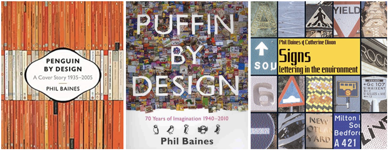
Images: Google Images
- Makes title part of the design
- Clear indication of what the book is about from the cover
- Busy designs
- Makes use of whole page
- Sophisticated typefaces used in the typography covers
- Limited colour pallet on typography covers (two colours used)
I was drawn by the first three covers as I was drawn by the strong colour palettes, in particular I liked the ‘Puffin by design’ cover, I found this interesting as the title has been created from gaps within the book collage. The last three I design’s I chose because there is a clear style present, the fonts used are elegant and the covers looks very mature and expensive.
Coralie Bickford-Smith
Coralie Bickford-Smith is one of the most renowned designers in the publishing industry, especially recognised and celebrated for her illustrated covers of Penguin’s clothbound classics.
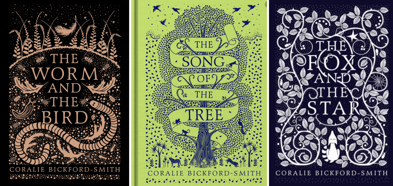
Images: Google Images
- Clear indication of a series
- Busy designs
- Limited colour pallets
- Elegant and sophisticated designs
- Look expensive
- Very decorative
I was drawn to the top three as I found this series interesting with the decorative backgrounds and liked the way the presented as a series. The bottom three caught my attention due to the foil used in the designs which give a glisten when the light catches them. These look very sophisticated and perfect ‘coffee table’ books. I found it hard to narrow down my cover selection for Coralie’s designs as they where all very interesting and eye catching!
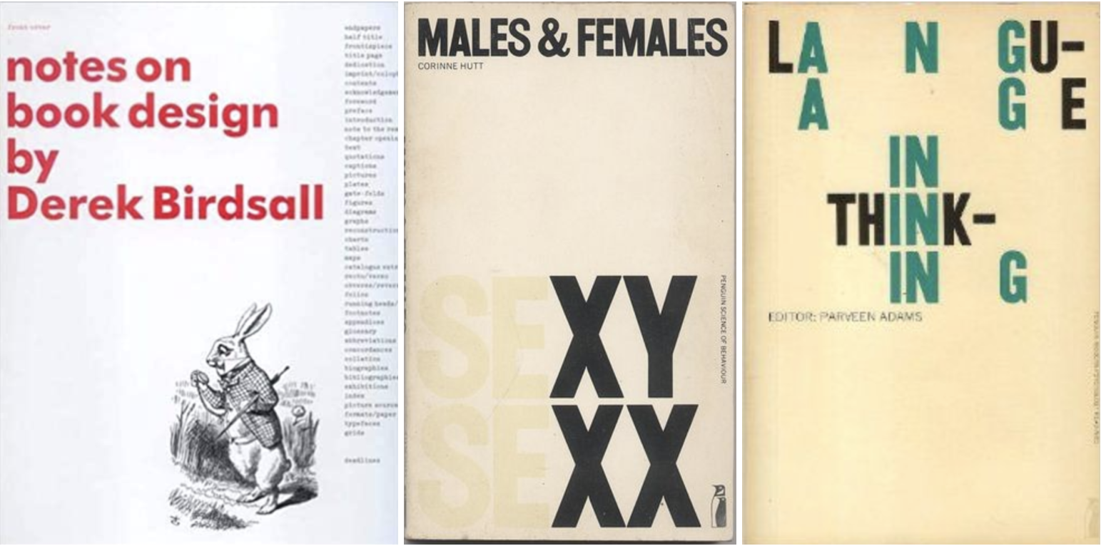
Derek Birdsall
Derek Birdsall is an internationally renowned British graphic designer.

Images: Google Images
- Minimalist designs
- Typography – clear large bold text
- Very limited colour palette
- Vintage feel (faded yellow backgrounds)
Derek Birdsall seems to have a clear style within his designs, they are very minimalistic with the use of one colour. The fonts used across the selection of designs above look very simular by being a bold sans-serif typeface. In the ‘Poverty’ and ‘Birthday’ designs Birdsall has incorporated a penny for the ‘o’ and candle for the ‘i’ which looks playful and imaginative.
Kelly Blair
Kelly Blair is the art director of Pantheon books, an associate art director at Knopf and freelance illustrator.
Images: http://kellyblair.com
- Clean designs
- Good colour palettes – bright and vivid
- Creative designs
- Doesn’t have a ‘set’ style
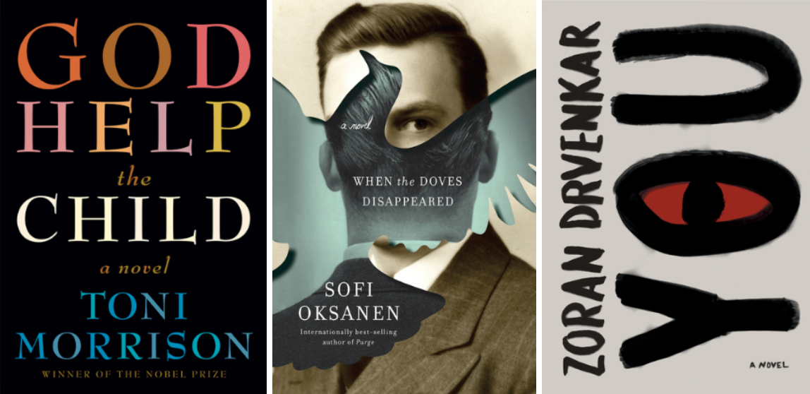
I like Blair’s designs, in particular I think the cover for ‘When the doves disappear’ is very strong, interesting and creative. This gives us a slight indication of what the book is about, perhaps it be about a man leaving a woman? Possibly set 60+ years ago according to the photograph used? Its very intriguing.
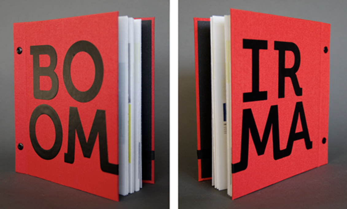
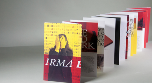
Irma Boom
Irma Boom, is a Dutch graphic designer who specialises in book making. Boom has been described as ‘The Queen of Books’, having created over 300 books and is well reputed for her artistic autonomy within her field.
Images: Google images
- Very creative
- Experimental/unusal
- Bold
- Not your usual book
- Very colourful – bright & eye catching
Irma’s work is very interesting and unusual, particularly ‘Irma Boom Biography in books’ This appears to be a book within a book which is in-fact completely functional. These designs are completely unique to Irma Boom.
Suzanne Dean
Suzanne Dean is a creative director at Penguin Random House Group.
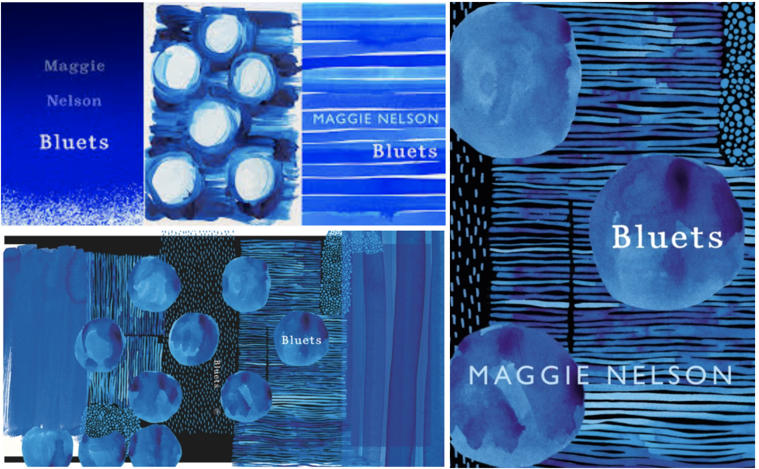
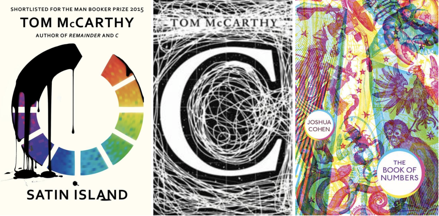
https://www.penguin.co.uk/articles/2017/making-a-cover-suzanne-dean-on-bluets/
- Use of mixed media
- Bold
- No ‘set’ design style
- Use of both small and large colour palettes
- Full page designs
- Contrast of colours
It was interesting to see the design process of ‘Bluets’ to see all the different elements come together to form the end design. I was also drawn to ‘C’ and ‘The book of numbers’ both containing completely different design techniques.
Julia Hastings
Julia Hasting is a German graphic designer. She is the Creative Director of Phaidon Press, head of the design department.
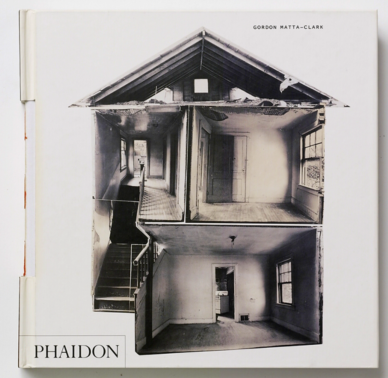

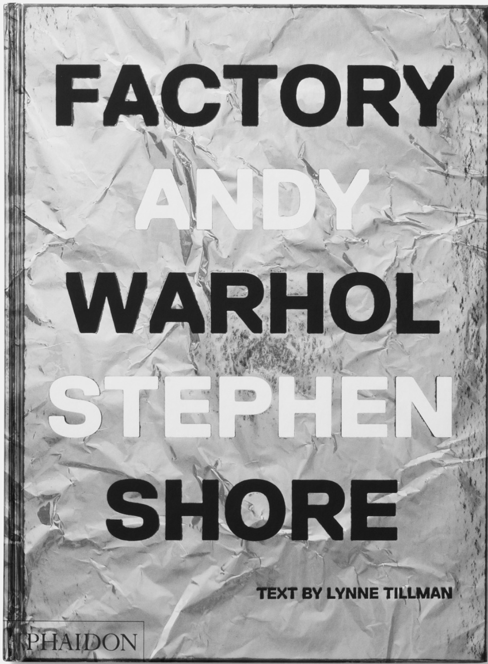
Images: https://www.juliahasting.com/
- Experimental designs – Book binding experiments in the first book
- Mixed media
- Challenges the form of book – Warhol book made to look like a box
- Coffee table books – Great for display
- High quality
Julia Hastings’ designs are creative and experimental, it is clear to see that she likes to play with the proportion of the book. Her books look like they would make the perfect Coffee table books down to their interesting designs, making them great for display.
Linda Huang
Linda Huang is a graphic designer based in New York. She is currently an associate art director at Vintage & Anchor Books, an imprint at Penguin Random House.
Images: http://www.linda-huang.com/
- Wide range of styles
- Use of mixed media in some designs
- Simple colour palettes
- Clean designs
- Handwritten fonts in some designs
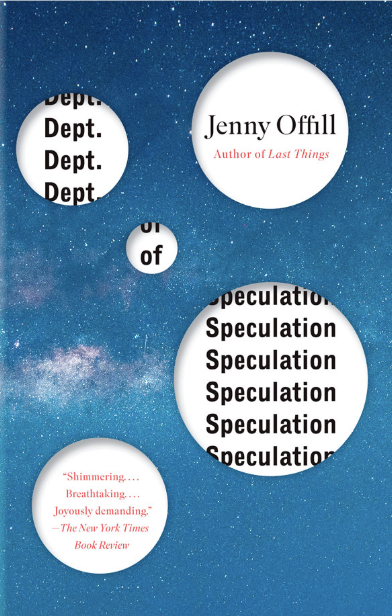
- Experimental in the ‘Dept of speculation’ cover with the cut out effect
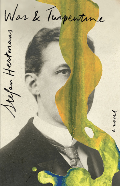
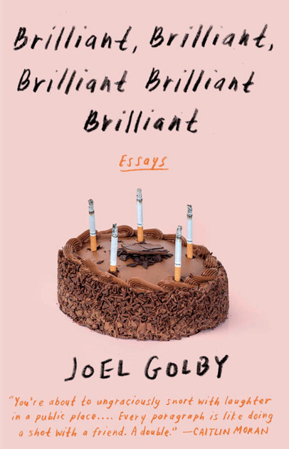
I like Linda Huang’s style in her work, I find her work quite inspirational as I see myself with similar design tastes. The ‘War & turpentine’ cover is interesting with the use of mixed media, I also like the ‘Brilliant…’ cover, this is very playful with the candles being replaced by cigarettes.
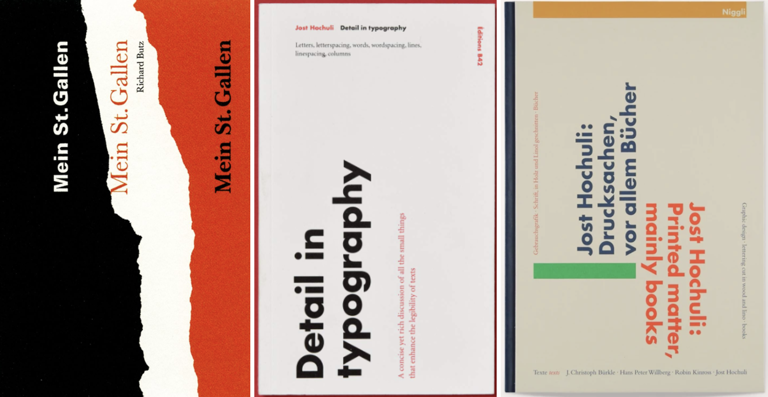
Jost Huchuli
Jost Hochuli is a world-renowned book designer living in St. Gallen, Switzerland. He is the author of numerous books on graphic design and typography.
Images: Google Images
- Minimalist
- Simple colour palette
- Experimental text positioning
- Typographic covers
Very simple minimalist designs with limited colour palettes, ‘Mein St.Gallen’ stood out for me, I liked the torn page effect, the colours used creates a very bold eye catching cover. The series above is very recognisable down to the identical cover layouts.
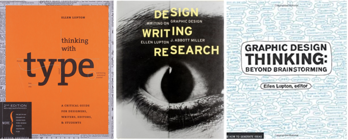
Ellen Lupton
Ellen Lupton is a graphic designer, curator, writer, critic, and educator. Known for her love of typography, Lupton is the curator of contemporary design at Cooper Hewitt, Smithsonian Design Museum in New York City.
Images: http://elupton.com/
- Clear indication that these are information/educational books
- Covers relate to contents inside
- Typography based covers
- Simple colour palettes
It was interesting to see the book ‘Thinking with type’ come up in my search as I purchased this book during Core Concepts!
Peter Mendelsund
Peter Mendelsund is the associate art director of Alfred A. Knopf Books.
Images: https://www.petermendelsund.com/covers
- Playful designs
- Mixed media – different range of materials
- Modern designs
- Variety of styles
- Complementary colour palettes
Interesting intriguing designs, the covers aren’t clear about what the books are about, yet still draw you in.
Paul Rand
Paul Rand was an American art director and graphic designer, best known for his corporate logo designs, including the logos for IBM, UPS, Enron, Morningstar, Inc., Westinghouse, ABC, and NeXT. He was one of the first American commercial artists to embrace and practice the Swiss Style of graphic design.
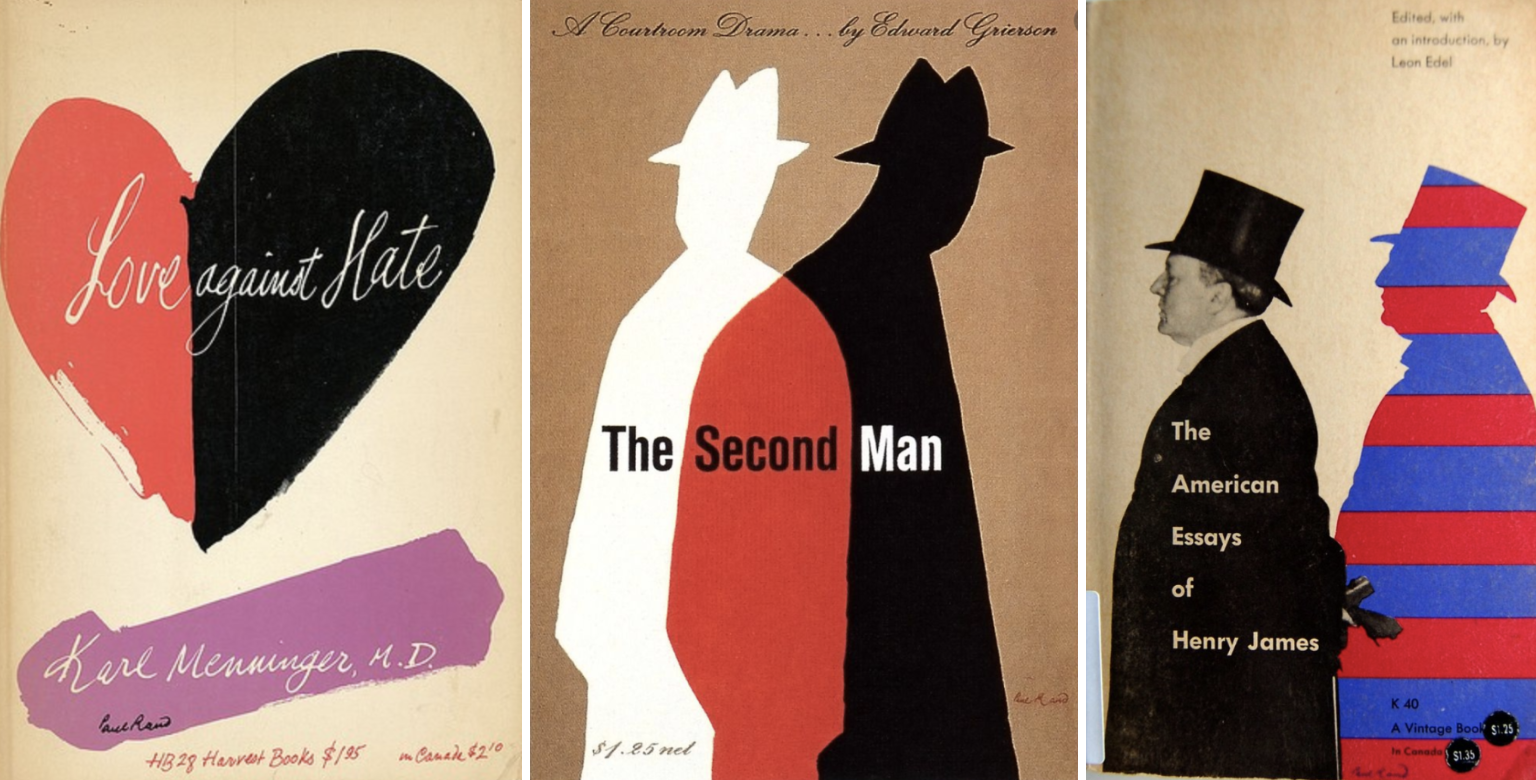
Images: Google Images
- Clear style present – All designs contain similarities
- Limited colour palette
- Cut and paste effect
Each design shows a silhouette within the design, Rand has clearly adapted his style to relate to the contents of each book.
Paula scher
Paula Scher is an American graphic designer, painter and art educator in design. She has create many logos and designs for many large brands. She also served as the first female principal at Pentagram, which she joined in 1991.
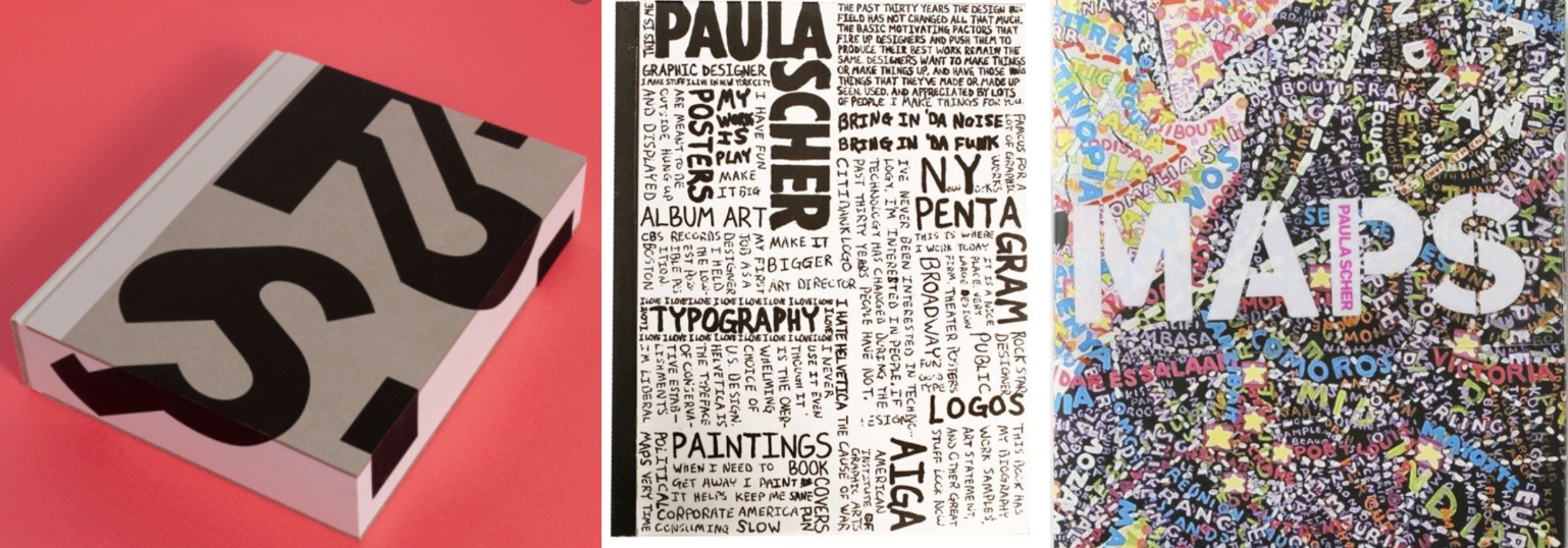
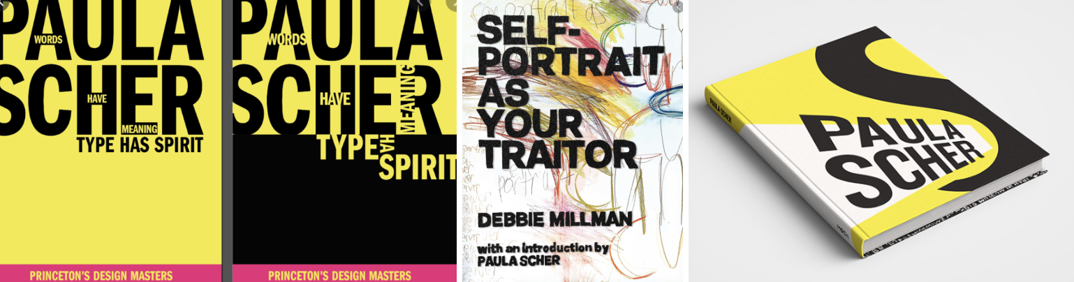
Images: Google Images
- Typography
- Playful and experimental in text positioning
- Bold
- Handwritten words/scribbles
- Limited colour palette on some designs
Paula’s book cover work main focus’s on typography, some being of large, clean and bold lettering, while others consist of handwritten words tightly packed onto a page.
Jan Tschichold
Jan Tschichold was a calligrapher, typographer and book designer. He played a significant role in the development of graphic design in the 20th century – first, by developing and promoting principles of typographic modernism, and subsequently idealising conservative typographic structures.
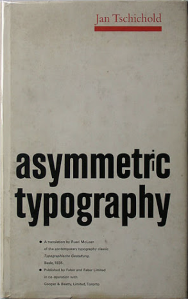
Images: Google Images
- Creator of iconic Penguin Book design – Classic style
- Typographic style
- Clear hierarchy
- Limited colour palette
Looking at the Penguin Books design, the cover doesn’t give away much of what the contents of the book is, instead it clearly shows it is part of the Penguin brand, which is immediately recognised still to this day.
Wolfgang Weingart
Wolfgang Weingart is an internationally known graphic designer and typographer. His work is categorised as Swiss typography and he is credited as “the father” of New Wave or Swiss Punk typography.
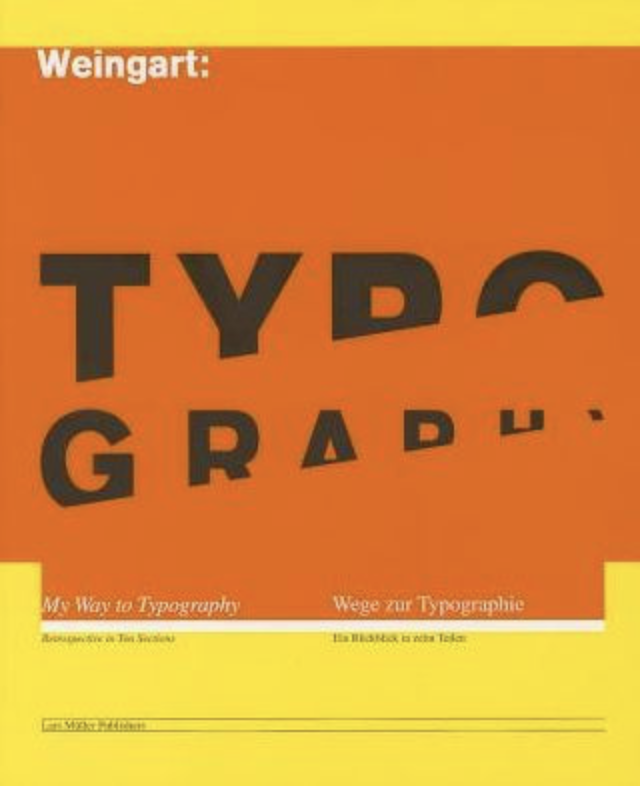
Images: Google Images
- Bold
- Experimental
- Layering – mixed media
- Modernist
- Typography based – all designs Sans-serif typefaces
I found Weingart harder to research for book designs, although the covers I did find (above) are bold and have similar design traits. It seems that the middle two covers are more experimental with the the contents.
Part 2 : Comparisons
I wanted to start with two designers who I found their works to be similar yet totally unique, these designers are Irma Book & Julia Hastings.
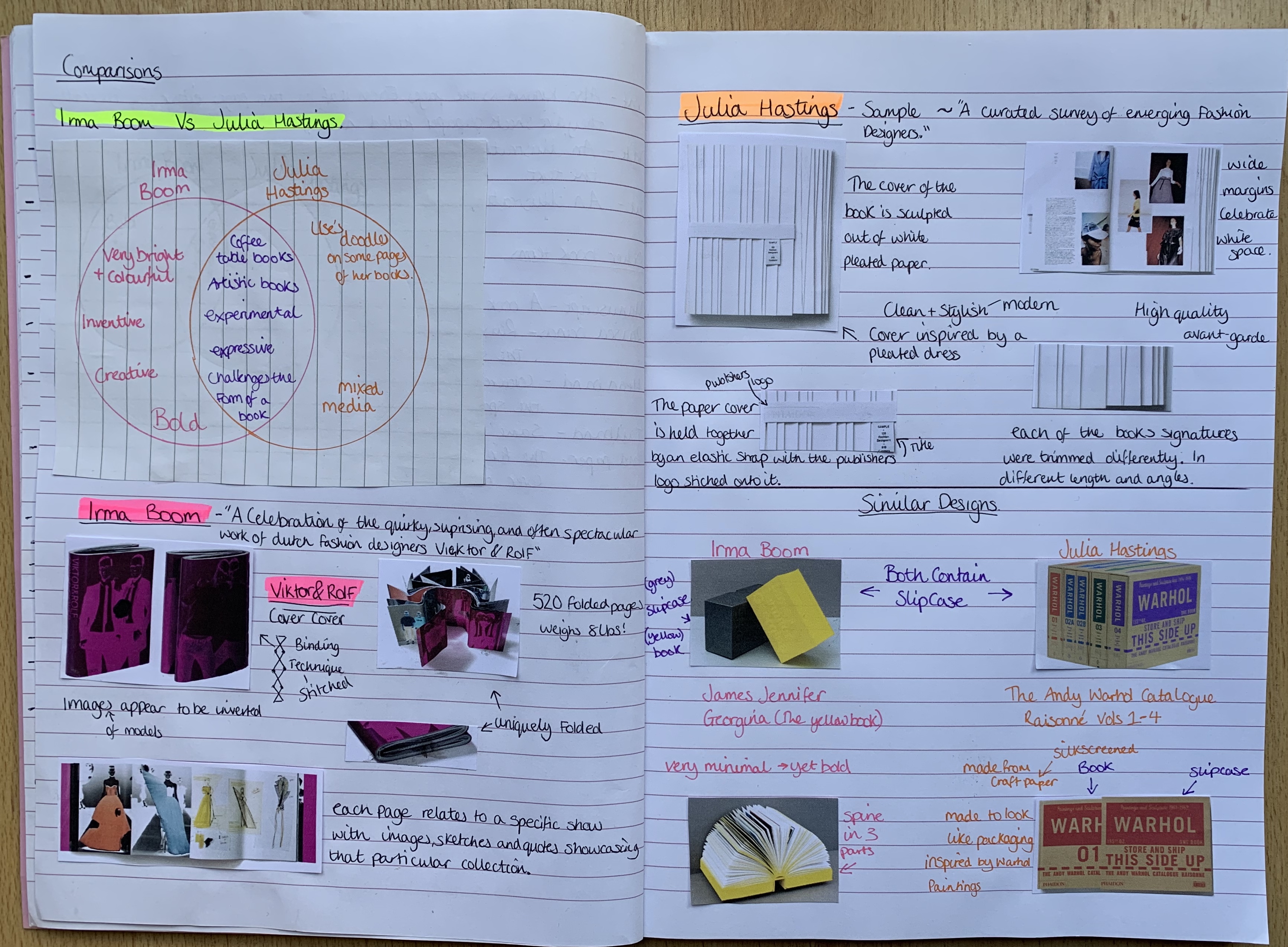
Above I have made notes and sketches on the two book cover designs I have chosen for each designer.
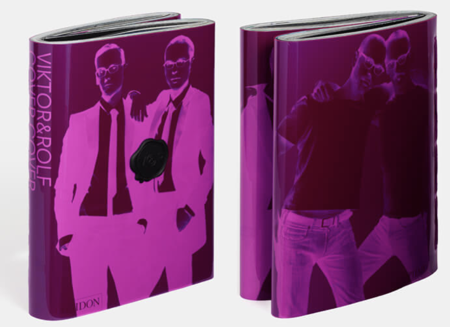
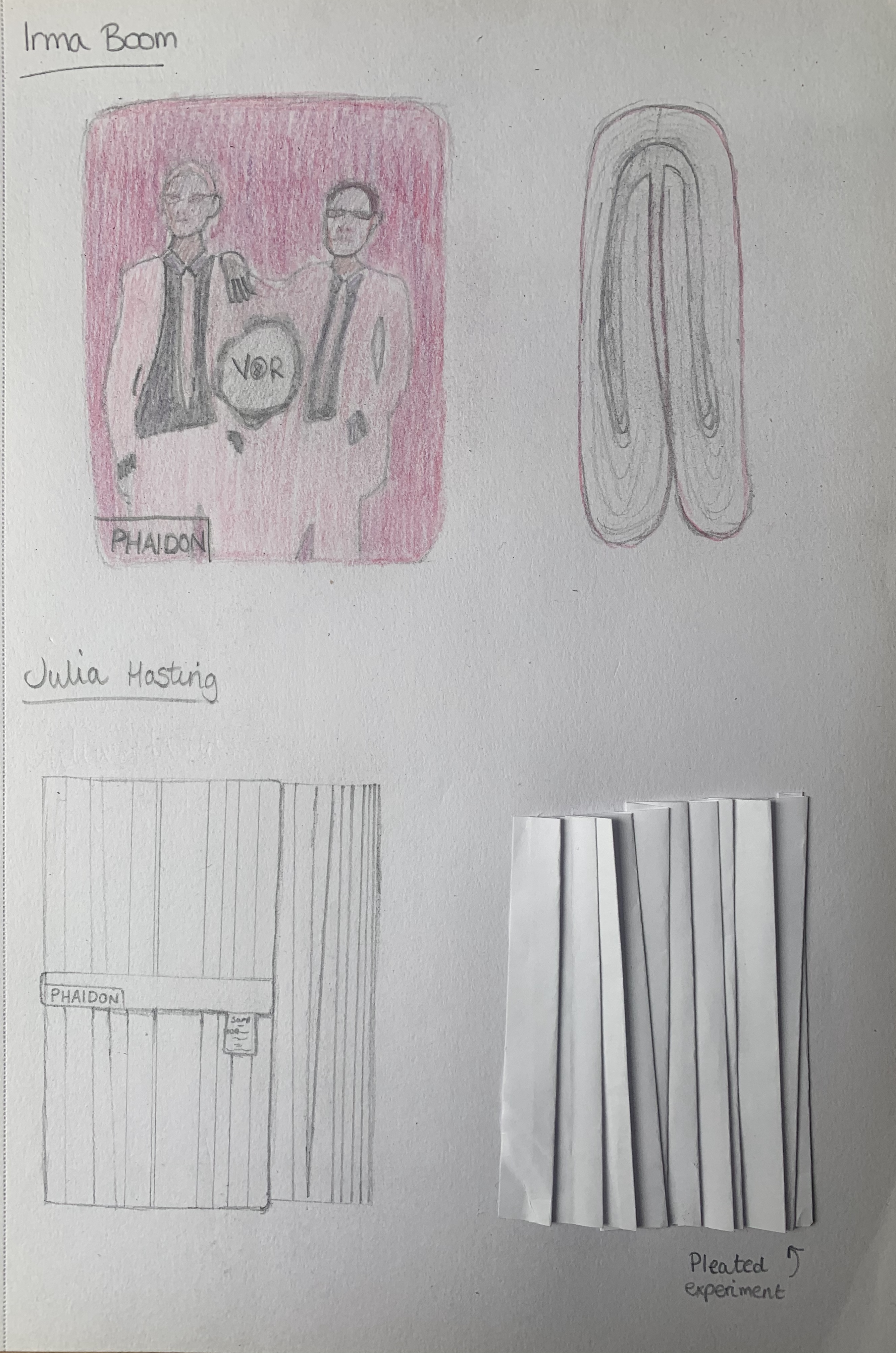
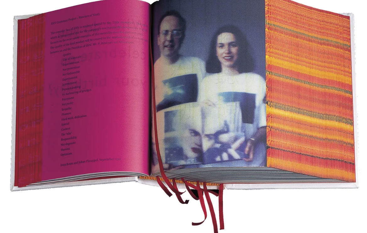
For Irma Boom I have chosen firstly to look at ‘Viktor & Rolf Cover Cover’. This high quality fashion exhibition book is uniquely folded with a stitched binding technique which can be seen from the back rather than on the spine.
For Julia Hasting I have chosen to look at ‘Sample’. This also is a high quality fashion exhibition book, The cover and pages of this book are sculpted out of pleated paper with each signature cut differently in different lengths and angles, revealing a step effect. The cover of this book is held together by an elastic strap with stitched details attached.
Both these designs have similarities to them and it was interesting to compare two unique books from the same genre and also the same publishing house ‘Phaidon’, which I didn’t realise at the time of selection! From first glance you can see that both are high quality and make the perfect ‘coffee table books’ down to their interesting qualities, however by looking at both books, it isn’t clear what the contents is about, however when looking into the finer detail of Julia Hasting’s design it becomes clearer with the elastic detail and the tab with the books title on, that it resembles a clothing tab. Both designs I feel are expressive, experimental and both very successful.
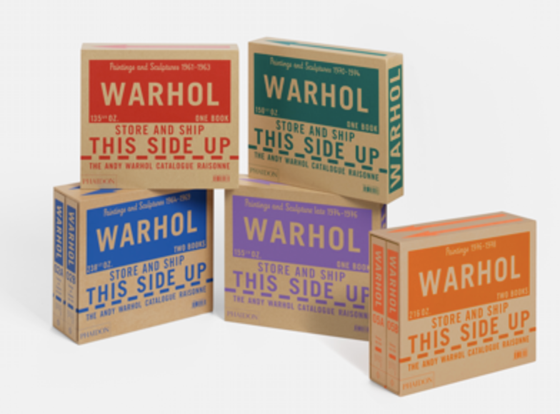
Although I am mainly focusing on Irma Boom’s ‘Viktor & Rolf Cover Cover’ and Julia Hasting’s ‘Sample’ I also found 2 more designs which I felt had slight similarities from both designers; these are ‘James Jennifer Georgina (the yellow book)’ by Irma Boom and ‘The Andy Warhol Catalogue Raisonne Vols 1-4 by Julia Hasting. It was interesting to see that both designers used slipcases which aren’t very common.
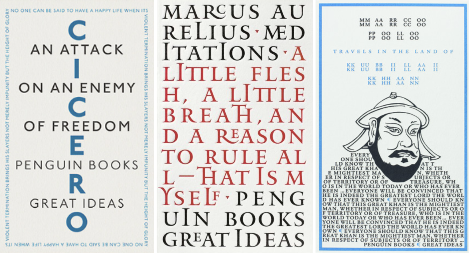
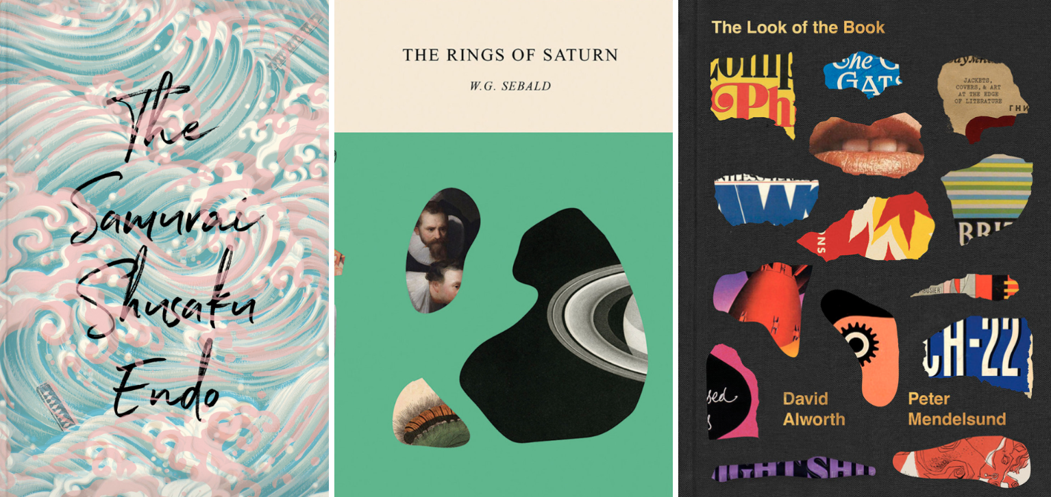
I then wanted to look at the two designers as suggested in the brief. Peter Mendelsund’s series ‘Kafka’ and Coralie Bickford-Smiths gothic horror series for Penguin.
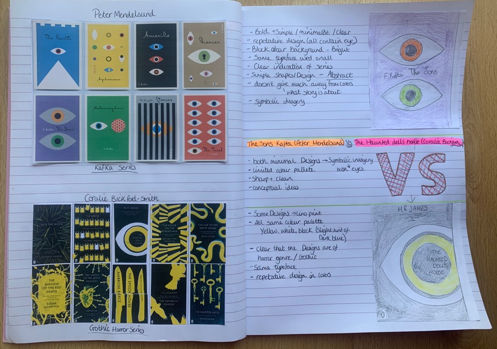
Peter Mendelsund’s series ‘Kafka’ shows a clear indication that all books are part of the series as they all feature the same symbolic imagery of the eye in each design. His designs are simple, minimalist and clear however they don’t express much of what the book is about. Peter has selected a script typeface which creates a contrast against the sharpness of his designs.
Coralie Bickford-Smith’s Gothic horror series for Penguin all appear to be lino print with the same colour palette used on all designs. There are similarities between each design which helps link these books to appear as part of a series. The majority of Coralie’s designs are repetitive prints, they are disjointed and have a blurred glitch effect.
From first appearance you can see that Bickford-Smith’s designs belong from the gothic genre due to the colour palette and choice of imagery used. The colour palette and typeface used on each design helps to link these designs as part of a series.
Unlike Mendelsund’s designs, Coralie’s covers express the contents of the book slightly on the cover, giving the audience a slight indication to what the book is about. However both designers have similarities within their work, they are both conceptual with repetitive imagery within their designs.
I believe Coralie’s gothic Penguin series is much stronger and expressive, these designs give a clearer indication as to what the book is about, including which genre they belong to. The designs are enticing and interesting, were as Peter’s designs look more like pieces of artwork rather than book designs due to the lack of expression/’story’ behind the designs.
Part 3 : Who I’m Drawn To
Linda Huang
Linda is a graphic designer based in New York. Her work has been recognised by The Type Directors Club, Print Magazine, The New York Times, and 50 Books Covers, among others. She also works on freelance projects, which includes editorial Illustrations for the New York Times.
Images Sourced: http://www.linda-huang.com/
During the research stage I felt drawn to Linda Huang’s work. I feel like her overall style is modern with the majority of her designs relating to the context of the book, it’s clear that Huang takes time to think about the right approach for each title and the results are consistently interesting. She is experimental and adaptive making her a versatile designer.
Whilst researching Linda Huang I came across an article she wrote which I found really interesting, a particular section I found very helpful and relatable for my current position in this unit. It was as follows;
Before I begin work, I read as much as I can of and about the book and author—reviews, marketing strategies, and similar titles, jotting down anything I find metaphorically significant or visually interesting. If necessary, I collect art research for inspiration, especially for era-specific books. It helps to have a mood board containing the visual language I am trying to capture. I then ask myself: What is the overall tone or mood of the writing? Does it call for a photograph, an illustration, or a collage? Is the author important enough to warrant an all-type cover?
https://lithub.com/secrets-of-the-book-designer-paperbacks/
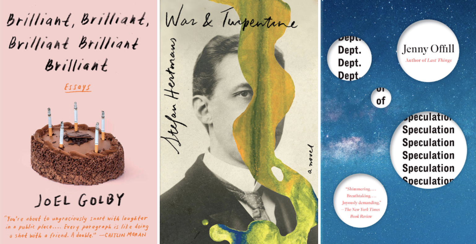
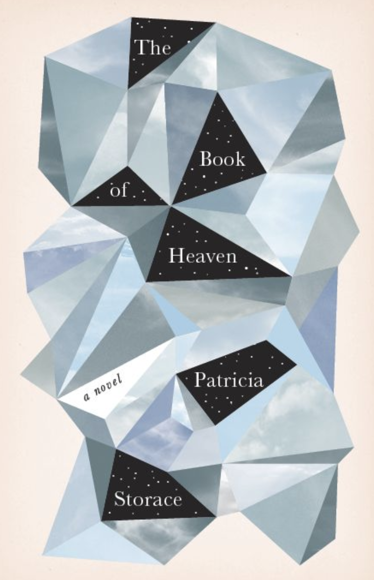
The Book of Heaven by Patricia Storace – 2013 – Pantheon Books. I decided to look at one of Linda Huang’s early designs. This particular design is a very interesting and unique, giving the appearance of a sharp geometrical image unlike any other designs on the shelf. The contrast between the shapes of the jet black twinkly night sky against the peaceful blue skies helps not only the type stand out, but creates dimension within the shape. This creates an expressive and experimental design. Putting the quote above to test, I wanted to research the book to see how Huang’s design relates to the contents. The book is about four women who invite us to enter into a new and powerful imagination of the divine, ‘what if a woman’s point of view were also God’s?’ I can understand why Huang decided to create something so strong, unique and imaginative to tie in with the contents of the book.
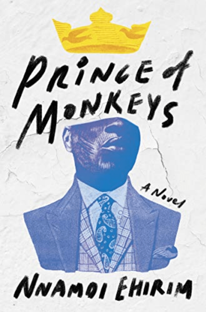
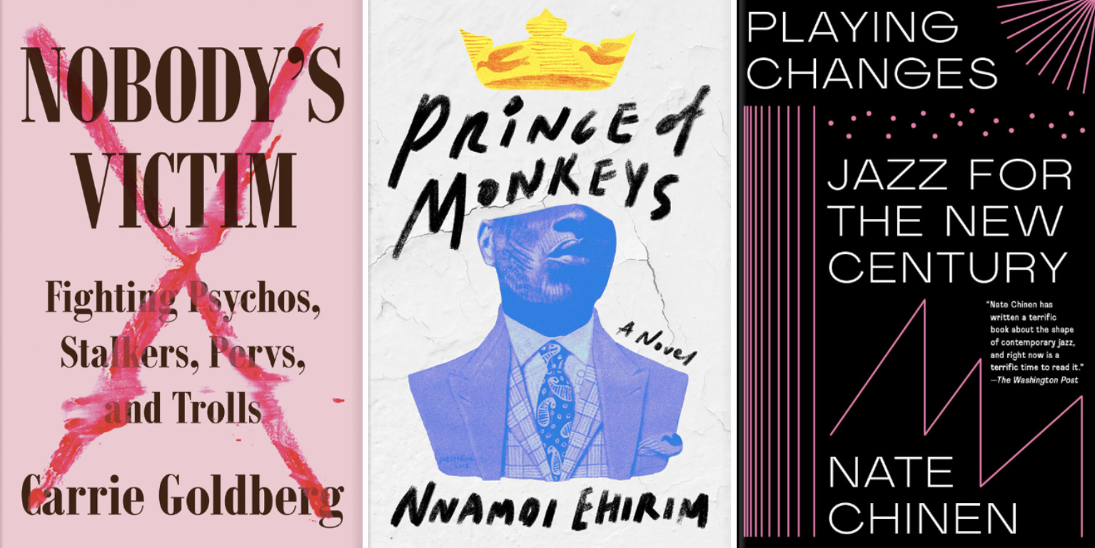
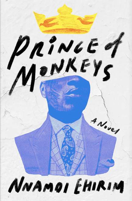
Prince of Monkeys by Nnamoi Ehirim – 2019 – Counterpoint Press. The book is written by a young Nigerian writer, tackling politics, class, spirituality, and power as a group of friends come of age in Lagos, Nigeria. Linda Huang’s design helps express the rawness of the book with the handwritten typeface, looking like it could feature as part of a graffiti statement on the side of a building, especially with the choice of background used in this design.
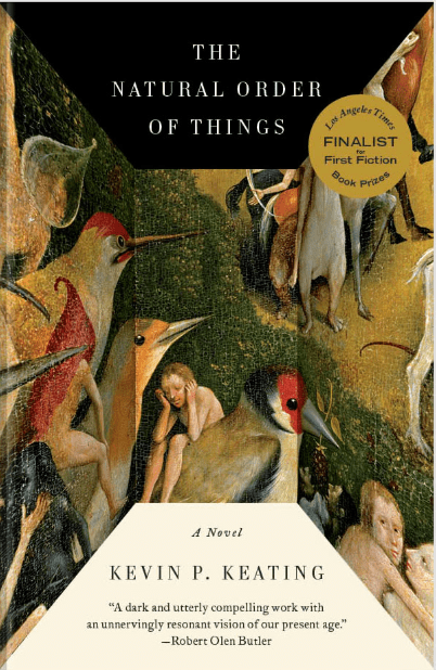
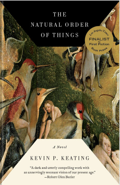
The Natural Order of Things by Kevin P. Keating – 2014 – Vintage Books. Unlike the previous two covers, this design’s main feature is of a distorted painting looking as if it has been folded. To me this gives a 3D illusion of a long narrow cube, which makes it quite intriguing. From first glance the book looks like contains mature content set in the past due to the imagery used. The book is a dark, powerful novel about a tragic city and its inhabitants over the course of one Halloween weekend. Unlike the previous designs I find the cover more challenging to relate to the contents of the book, however the publisher Vintage Books may have a slight reason behind this as the cover does have similarities to existing designs from other artists/authors.
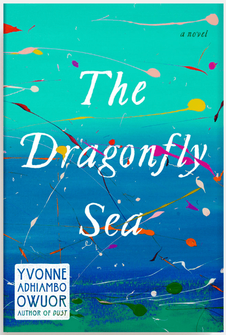
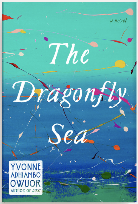
The Dragonfly Sea by Yvonne Adhiambo Owuor – 2019 – Knopf. The cover to this book is very relatable to the title. The paint splatters represent the dragonflies skimming in front of us and the dark blue/teal background represents the sea. The book is a vibrant, stunning coming-of-age novel about a young woman struggling to find her place in a vast world – a poignant exploration of fate, mortality, love, and loss. Huang has taken a conceptual approach to this design, she has been experimental by using paint rather than digital design, it creates a very simple yet effective design.
Their work: Overall I feel that Linda Huang’s work is of a wide variety. No two of her designs are the same and I believe this is down to her design process of thoroughly researching the books to make sure she captures relatable and understandable content within the cover, she is experimental and adaptive making her a versatile designer. The majority of Huang’s designs are of bold typography.
How has the work evolved? It is hard to say how Linda Huang’s work has evolved due to the point mentioned above. However it is noticeable that in the recent years Huang has become more experimental with the use of mixed media in her work which creates interesting deigns.
Irma Boom
Irma Boom, is a Dutch graphic designer who specialises in book making. Boom has been described as ‘The Queen of Books’, having created over 300 books and is well reputed for her artistic autonomy within her field.

I found Irma Boom’s work interesting during the research stage but it wasn’t until the comparison stage I really took a liking to her work, with a few particular pieces which caught my eye which I will mention below. Irma’s approach to book design is like no other, she is incredibly experimental and likes to challenge the form of the book, making her work expressive, unique and inspirational.
It is clear that Irma creates books with their own unique traits, she is often asked to recreate the same designs for new clients to which she has responded “Of course I can, but you cannot repeat something unique,” she said. “I want to create new things.”
Her creation begins with a concept. (“It always has to have a concept,” as Boom likes to say.) She then carries out her vision not with software, but with models – handmade, drastically scaled down versions of her projects that she uses to test ideas and materials. The final result often looks as if it could never have been designed on a computer.
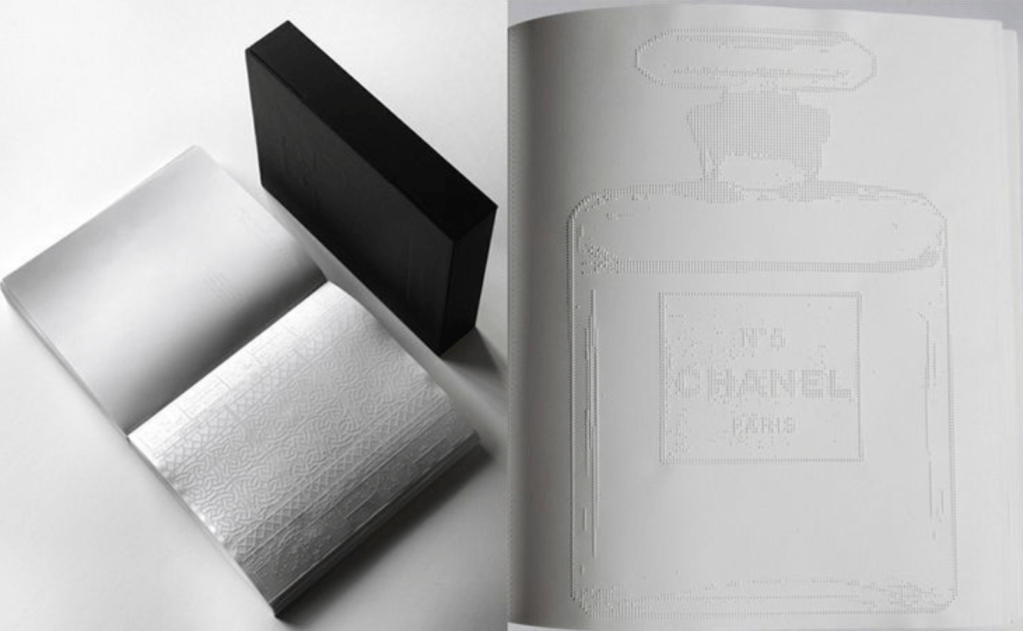
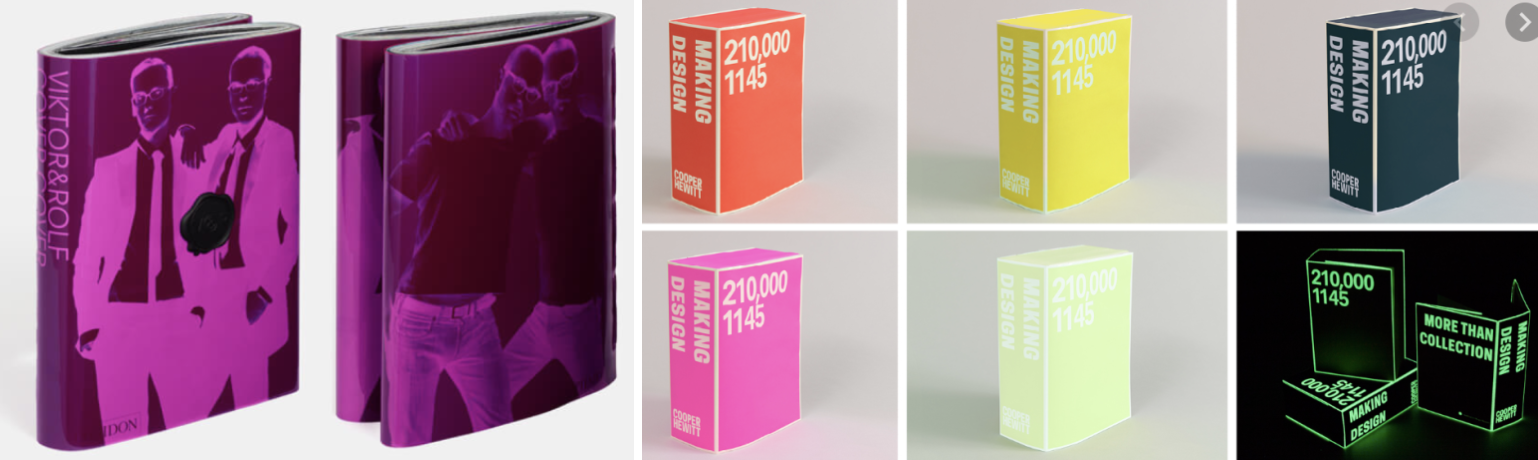
Chanel Limited Edition by Irma Boom – 2013. Totally unique, this book consists of white pages embossed to reveal patterns and images, this book contains absolutely NO ink! The book is the story of Chanel No.5 which, as the first synthetic fragrance in a radically simple bottle, was considered avant-garde in its time. Because perfume is impossible to see once applied, Irma Boom said, “I wanted to make a book with content not printed.” The text and images are embossed on soft paper, it is surprisingly readable. However It only works in its physical form, as a PDF would be include white pages.
Dieter Roth’s “Collected Works, Vol. 7.” 1974
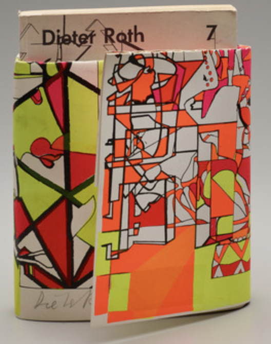
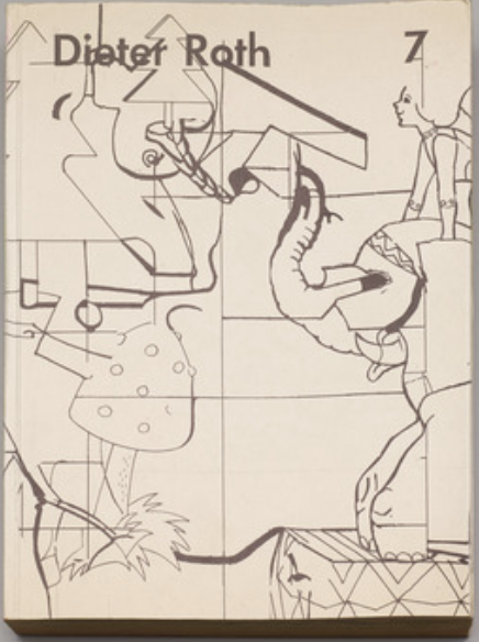
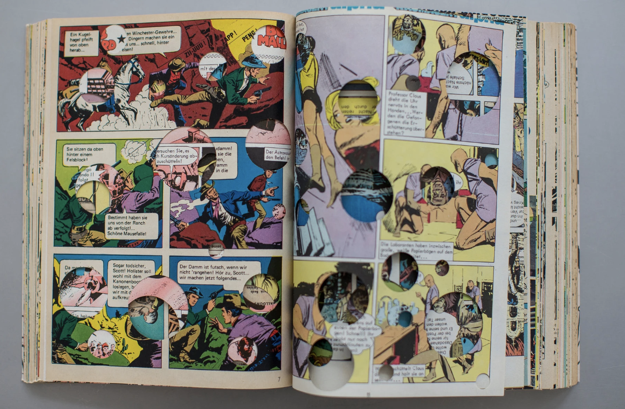
The Swiss artist Dieter Roth (1930-1998) is allegedly one of Irma Boom’s inspirations. This book had a print run, but each copy was made with pages taken from comic books, making every book different. What makes this book interesting is the cut outs on each page, creating an interesting concept to the book. The wrap around book jacket consists of a neon abstract design, where as the book cover itself includes a simple sketched design. Irma has been experimental with this book by creating an unusual book jacket and by creating holes within the pages of the book. The contrast between the contents, cover and book jacket create a balanced unusual but unique finished design.
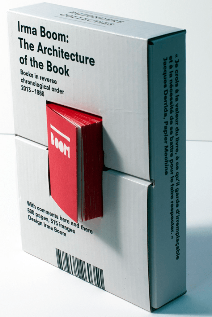
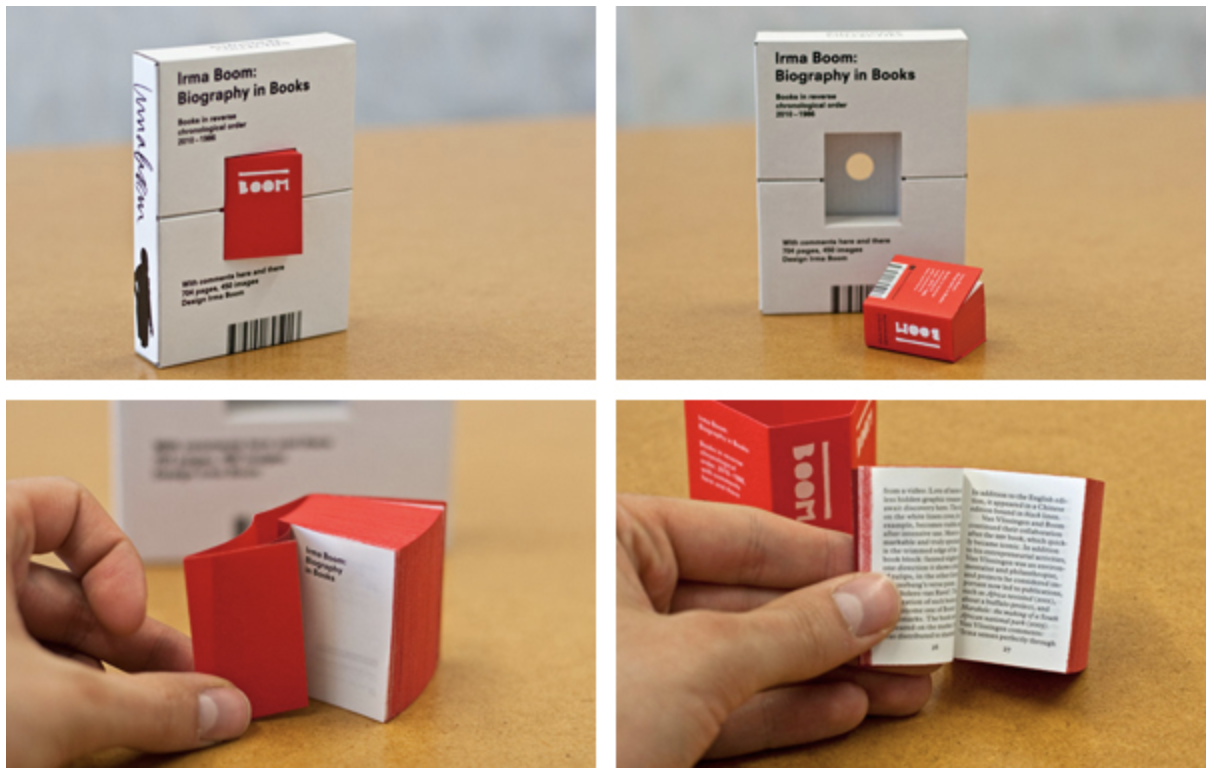
Irma Boom: The Architecture of the Book – 2013. This miniature book contains a complete overview of Irma Boom’s work in reverse chronological order from 2013-1986. The cardboard surround acts as a holder for the tiny red book with the dimensions of 5x4cm! Although this is not completely unusual for Irma, she often creates miniature models of books to present to clients to test ideas. Irma has said that ‘Creating models helps to oversee in a less confronting way how image and text is disrupted’. Upon first glance, it isn’t clear what the book actually contains. It wasn’t until researching I discovered that it is in fact a catalogue of her work. Irma has been creative in the way she created a surround/holder for the book, this makes it less likely to loose the book.
Their work: Scale is something that Irma is fond of, wether the books be miniature or large, or contain over 2000 pages which weighs over 8lbs. Irma creates uniquely wonderful books which are considered as pieces of art, she is highly expressive and pushes the boundaries of what a book can be.
How has the work evolved? Its hard to compare Irma’s work as each is so different. It is clear that Irma is always testing out and creating new ideas for new books, this makes her such an exciting artist as we never know what to expect next.
Derek Birdsall
British graphic designer born in 1934. Educated at Wakefield College of Art and the Central School of Arts and Crafts. Amongst much other work he is known for designing Penguin book covers and Pirelli calendars.
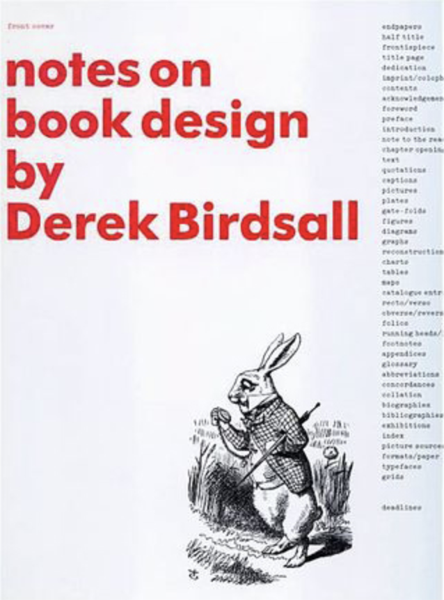
The final designer I wanted to look into was one that I didn’t quite understand the work of, in the hope that research may enlighten me into Derek Birdsall’s design choices.
Upon research I discovered that Birdsall has remained faithful to no more than a dozen typefaces: Bell, Bodoni and Eric Gill’s Sans, Joanna and Modern among them. He has experimented with more contemporary faces, he says, but finds them usually flawed, so sticks with the old workhorses, all of which have strong personalities. He felt so strongly about the typeface that he has said he would not have done the job if the client hadn’t accepted it.
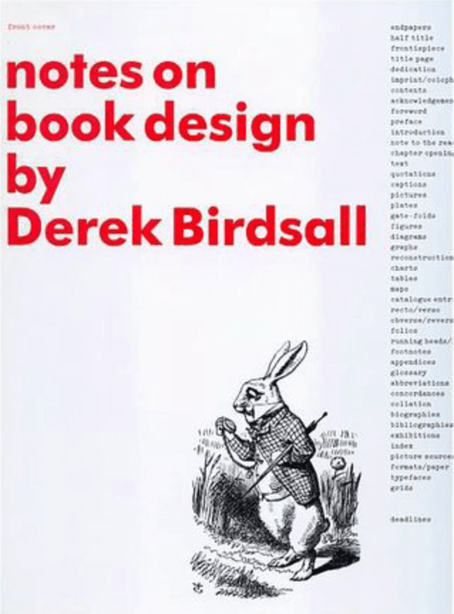
Notes on Book Design by Derek Birdsall – 2004. I felt like I wanted to start off with one of Dereks own books, to see if I can gain better understanding behind his design choices. ‘Notes on book design’ is an educational book focusing on a lifetime’s experience in designing books, and discusses nearly fifty books that he has designed. The cover for this design is clear and minimal, the choice of red font creates the perfect eye catching title, however I am slightly confused as to what the image is meant to represent? Although I suppose not all designs add images in relation to the contents. I don’t find Birdsall’s work expressive as the cover doesn’t give much away about what the genre or what the book is about.
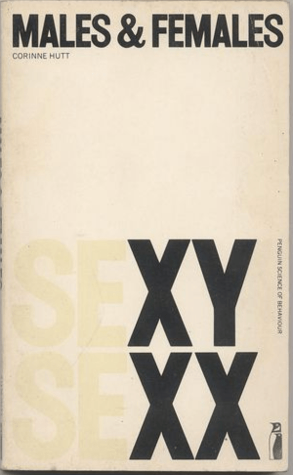
Males and Females by Corinne Hutt – 1973 – Penguin Books. This books cover is very minimal, typography is the main feature. Derek Birdsall has been playful and creative in this design by highlighting the male and female chromosomes in ‘Sexy & Sexx’. I feel that this makes the design slightly expressive as it isn’t obvious until you start to think about what it means any why they’re highlighted.
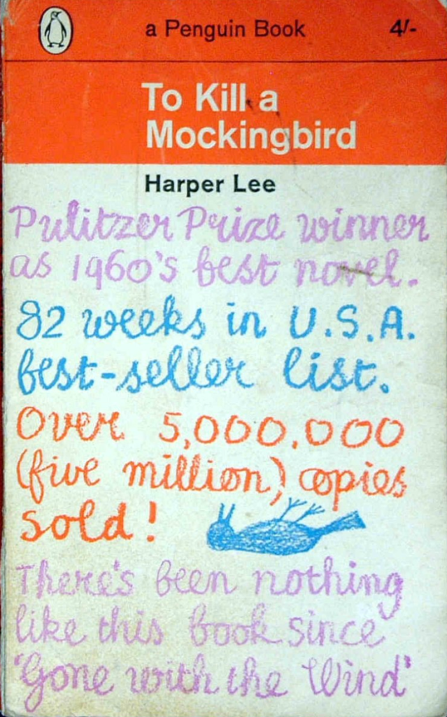
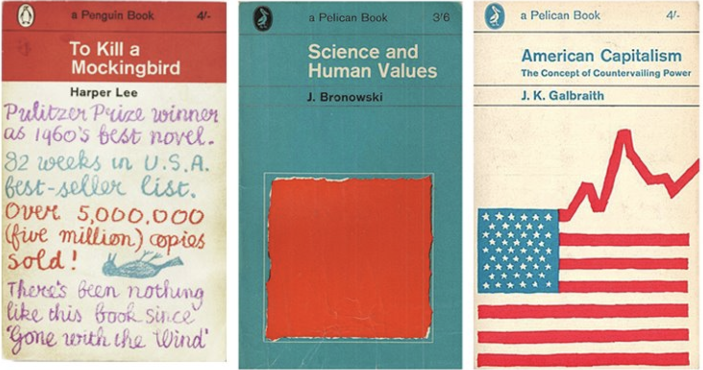
To Kill A Mockingbird by Harper Lee – 1963 – Penguin Books. Not quite the typical Classic Penguin cover, however this still creates an interesting and different design, however I do feel it looks like somebody has just simply written notes over the cover. I found an article stating that at the age of 12 one of Derek’s teachers had recommended he join Art School, on the basis of his exceptional handwriting. Im personally not a fan of this cover, I feel it looks messy and unprofessional, quite frankly I’m surprised the client even agreed to it! BUT.. it still creates a unique and recognisable cover which expresses facts on why the book is good, which in turn will make people want to read it.
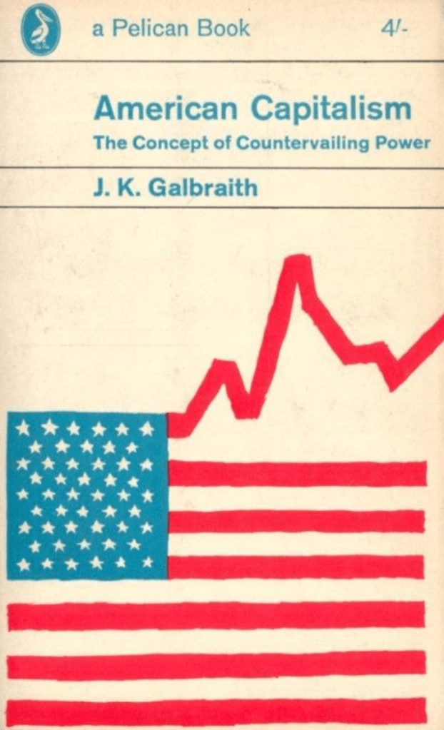
American Capitalism by JK Galbraith – 1963 – Pelican. American Capitalism contains a critique of the view that markets, left to their own devices, will provide socially optimal solutions. The cover to this book is very clear about what the contents are about, Birdsall has created the cover in an expressive way which makes it easy for the reader to know what to expect.
Their work: It is clear that Derek Birdsall design style is minimalistic, bold and mainly typography based. His covers are hard to read in the respect that they are clear as to what it’s about. However there are strong typographic designs designed by Birdsall.
How has the work evolved? It’s clear to see that over the course of Birdsall’s career he has taken more of a design style towards typography covers. He is not a showy designer interested in trends. His passion lies in the details.
Part 4: Book Designers of my choice
Unfortunately I am unable to visit bookstores or libraries at the moment due to the pandemic, which I am disappointed about as I would of liked to visually explore the shelves, however I will just have to browse online instead.
Alison Forner
Alison Forner is an American Graphic Designer. Her work has been recognised by the American Institute of Graphic Arts in their 50 Books/50 Covers Show, the New York Book Show, and in PRINT’s Regional Design Annual. She was selected for inclusion in The Best of Cover Design published by Rockport in 2011. Her work was also featured in Classic Penguin: Cover to Cover published by Penguin Random House in 2016.
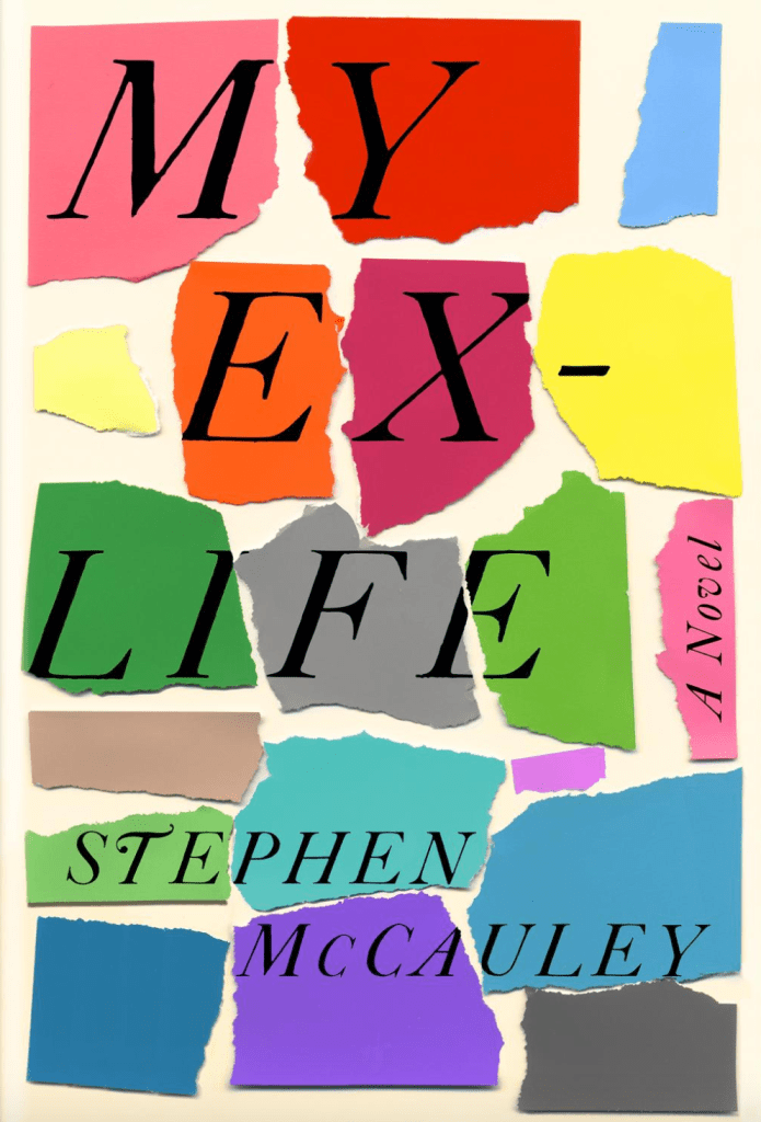
The first book I came across was ‘My Ex-Life by Stephen McCauley (2018)’. I was drawn to this book by its well put together cover, I liked the effect of the text precisely placed on the torn pieces of paper. The brightness of colour used was one of the main things that caught my eye against other book designs. I decided to look further into Alison Forner to see if this was a ‘one off favourite’ but I was pleasantly surprised by how much I enjoyed the rest of her work.
I feel that Alison Forner’s work is;
- Expressive
- Creative
- Experimental
- Clean & Clear
- Uses complimentary colour palettes
I have found a couple of articles Alison has written about designing covers and how she gets to the end result, I found these very interesting as she openly shows her design process and experiments, for a new designer this gives me hope and shows me to keep experimenting as the first design isn’t necessarily the best!
https://lithub.com/when-a-writer-wants-you-and-only-you-to-design-their-cover/
http://www.faceoutbooks.com/filter/Alison-Forner/The-Interrogative-Mood
Rodrigo Corral
Rodrigo Corral is an American graphic artist known for his book cover designs. Corral has designed over 500 book covers.
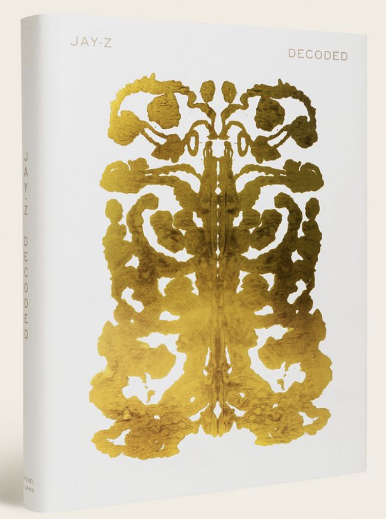
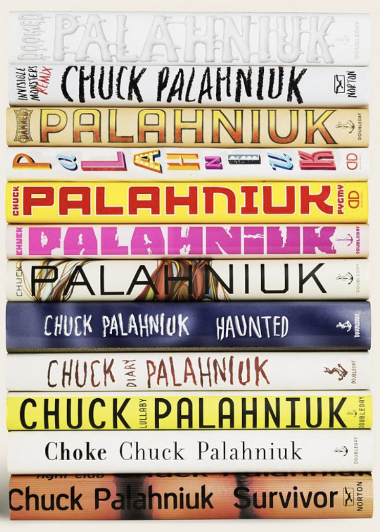
Rodrigo Corral has created some of the most iconic visuals in publishing. Open to all projects big and small, he is a celebrated designer, partnering with talent such as Junot Diaz, Jay-Z, Deepak and Sanjiv Chopra, Chuck Palahniuk, Tory Burch, Gianna Angelopoulos, Gary Shteyngart, Mary Kate and Ashley Olsen, and organizations such as the Criterion Collection, New York Magazine and The New York Times. In addition to running the Rodrigo Corral studio, he is also the Creative Director for Farrar, Straus & Giroux and Creative Director at Large for New Directions. While Rodrigo’s style is diverse, each project carries enough permanence to cut through today’s noise and rise above the trends. (http://rodrigocorral.com/about)
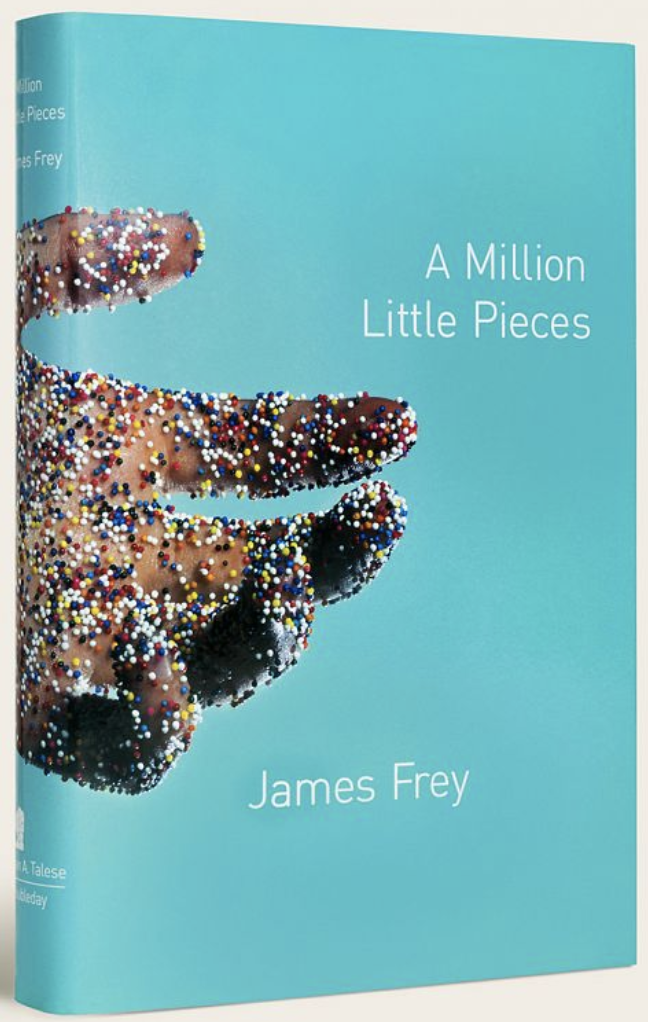
I came across Rodrigo Corral’s website and one of the first covers I felt a connection to was ‘A Million Little Pieces by James Frey’. I really liked the photograph used with the rainbow sprinkle balls representing the ‘million little pieces’, the cover is simple yet self explanatory and has strong relation to the title, I like the positioning of the image so that the full image of the arm wraps around the book covering all area’s.
Images Sourced: http://rodrigocorral.com/
I feel that Rodrigo Corral’s work is;
- Modern
- Conceptual
- Bright colour palettes
- Variety of styles
Overall I find Corral’s work very interesting, each design is different from the last. Experimenting with materials and contrasting colours and shapes has shown how Rodrigo’s designs stand out from the daily noise.
Eiko Ojala
Eiko Ojala is a renowned illustrator and graphic designer based in Estonia. He works mostly digitally and draws everything by hand. Within his work process Eiko likes to study the forms of shapes and to work closely with light and shadow.
I came across this particular cover which drew me in, I liked the depth and illusion of this illustration. I found the layering effect very effective and unique, I also felt the text positioning was very creative.
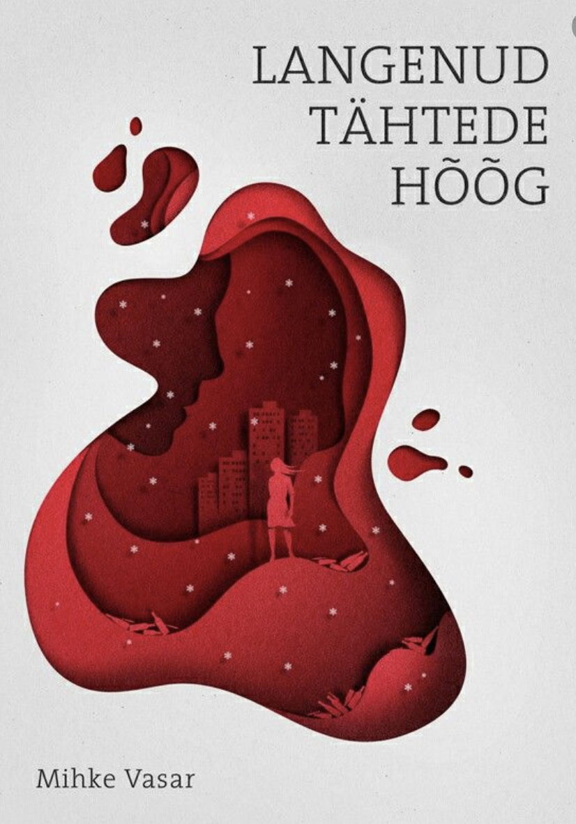

Images Sourced: https://www.behance.net/eiko
I feel that Ekio Ojala’s work is:
- Experimental
- Creative
- Bold/clean
- Bright colour palettes
- Samt style present
Ekio creates cut paper illustrations that present shadow and depth through creative layering of colourful pieces of paper. This makes his designs unique and recognisable, although he has only designed a short few book covers, his work is still inspiring and refreshing.
Reflection
On reflection of this exercise It is clear to see that from all the designers covers I am most attracted to the bright, colourful and creative designs, which is something that has caught my eye since taking an interest in art at high school. When it comes to book design I enjoy seeing a relation between the cover and either the title or the contents of the book as I feel it is important to entice the reader in with snippets of whats to come, I have also learnt during this exercise that it has been made clear that the majority of the designers listed above make this fact very clear and state that the research is a very important stage in the first steps to designing covers.
I felt this exercise interesting, I enjoyed researching book designers to see their design approaches and the designs which they produce, I found it very inspirational and educational, especially reading interviews of some of the most successful book designers and learning about their design process and gathering tips for my own knowledge.
