Brief: Identify a range of books that have fundamentally different functions in terms of how these books are engaged with – how they’re held, where they’re read, by whom, and for what purpose. Try to look at least six books, but you can extend this if you want to. The differences between these books might be determined by their genres. For example, you might look at a cookery book, a biography of a sports personality, a travel guide, a work of historical fiction, a teenage film tie-in like Twilight, this course guide – the choice is yours. Think about how each book’s form reflects its function. The front cover is an obvious starting point (and the focus on your upcoming assignment) but try to look more broadly than this. Think about things like page extent, paper quality, typeface, the weight of the book, imagery and more. Is the book illustrated with photographs, reproduced images or drawings? Are these concentrated in one or two places or distributed throughout the book? What about front matter and end matter? Historical novels like Hilary Mantel’s Wolf Hall may have family trees and/or a list of characters as part of the front matter. A scholarly biography will usually have many pages of end-notes and references.
Reflect on this in your learning log, with examples of some of the books you’ve selected. Identify how each book designer has reflected the genre and function of your chosen books in their final design.
Book Selection
I have selected 6 different types of books to look at, I have tried to be as versatile as possible with my selection.
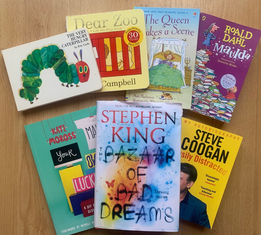
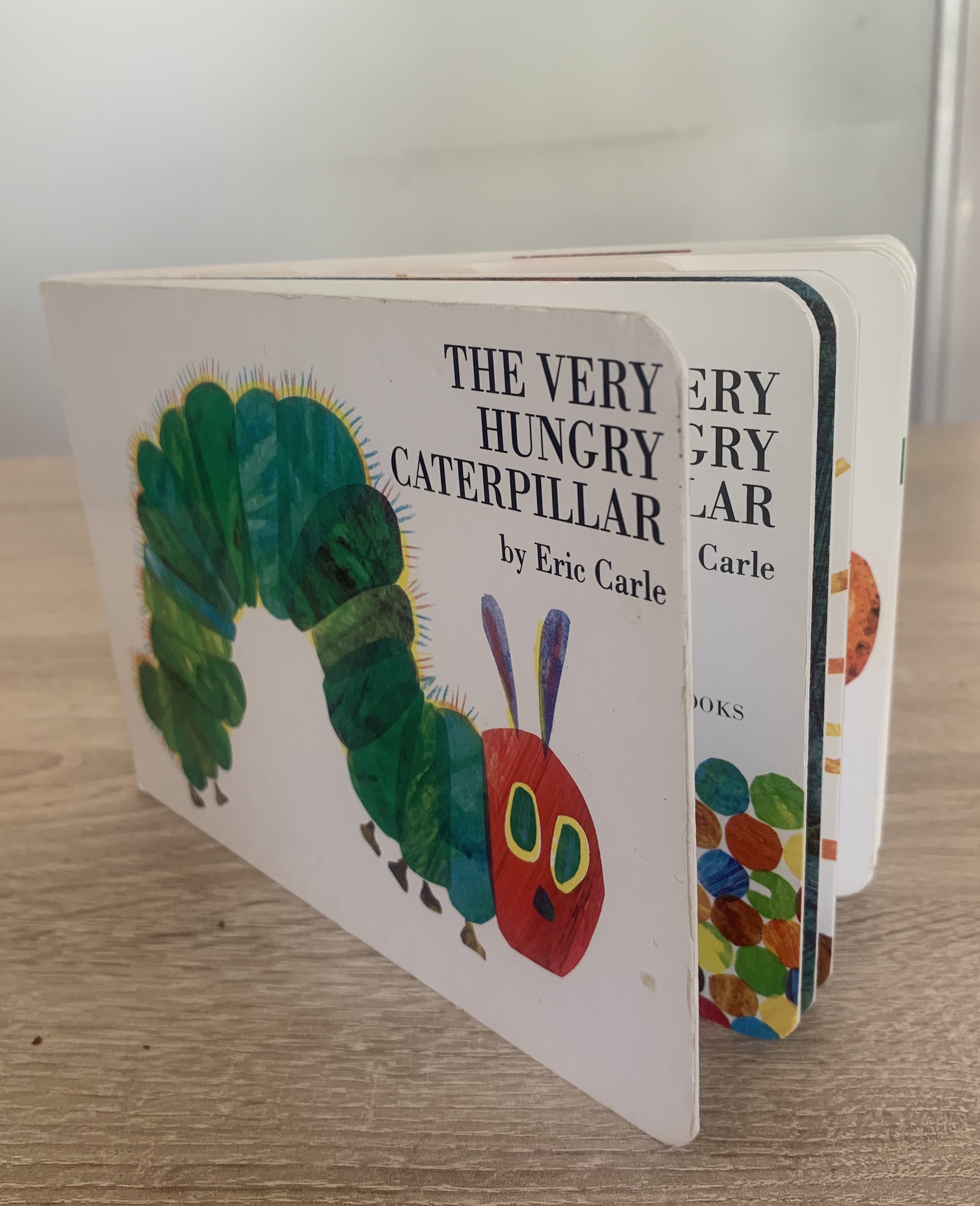
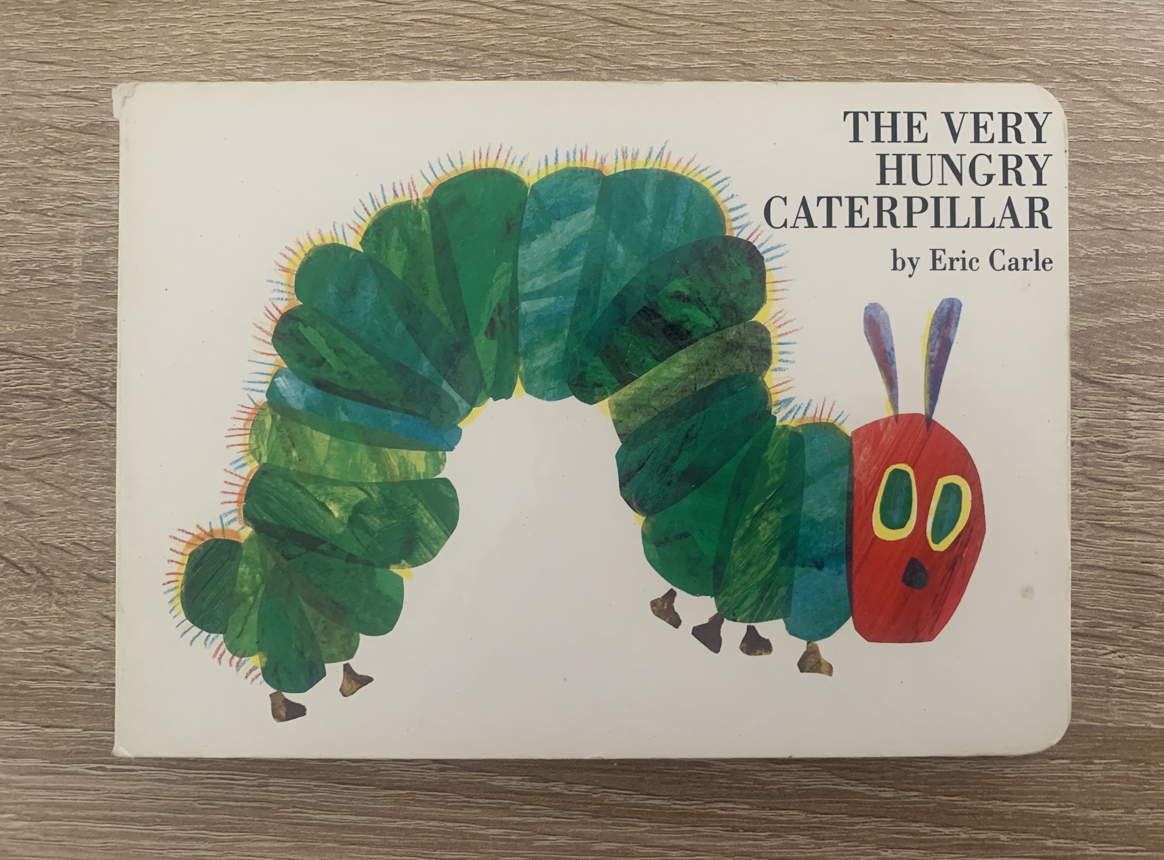
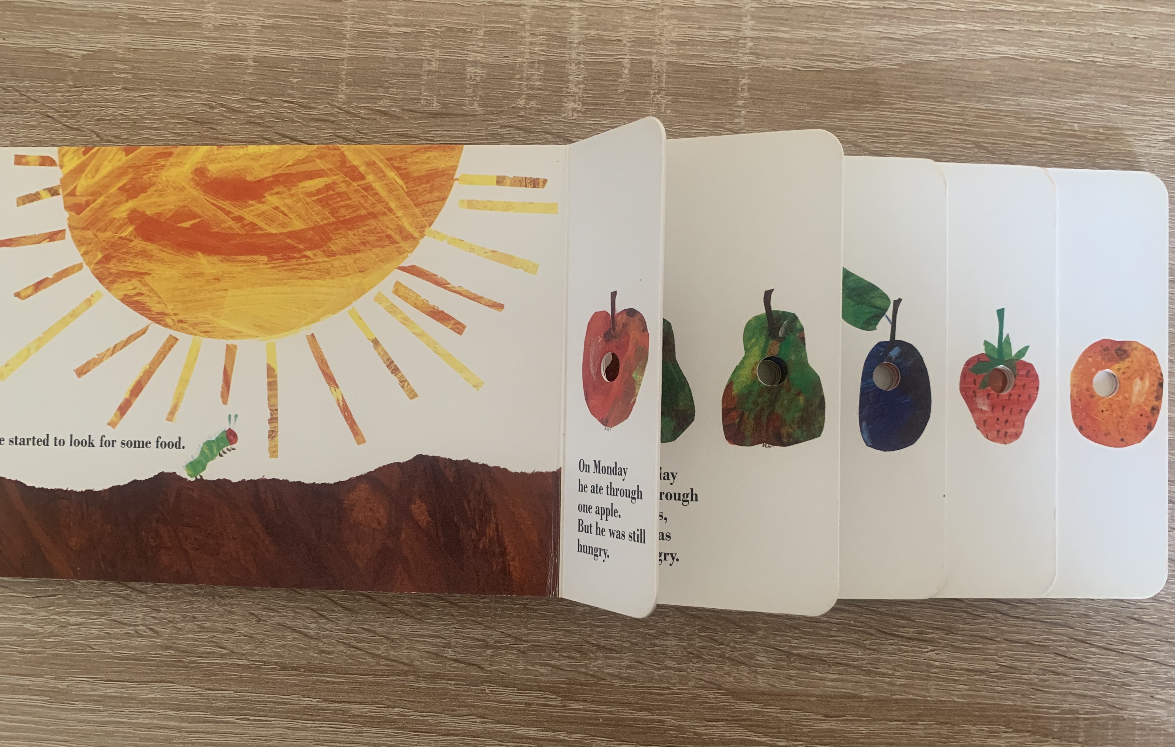
Book 1 – The Very Hungry Caterpillar by Eric Carle – Children’s board book
Upon first glance you will notice the mixed media illustration of the iconic Hungry Caterpillar on the cover, along with the title. The cover is simple and minimal and obvious that it is aimed at a younger audience. The same illustration style runs through each page of the book, these illustrations are made by different brush strokes, torn edges and coloured pencil. Within the book there is a particular part of the story where the caterpillar eats through various foods, four of these pages are cut shorter to create a step effect and contain a number of holes per page which are placed in the centre of food, this is made to look like the has caterpillar eaten through the pages and the food. This creates a fun and imaginative part of the book which children find amusing and fun, I think that this is clever and unique touch to the story.
With this particular edition of the book being a board book it makes it easier for young children to hold and turn the pages on their own, which helps them to feel involved. It’s also beneficial that they are harder wearing so children can view them without constant supervision of worrying about pages being torn or bent.
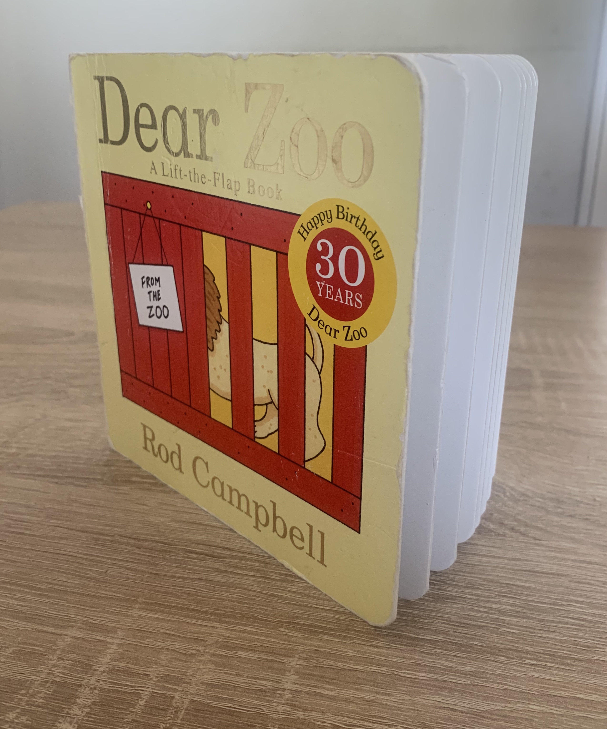
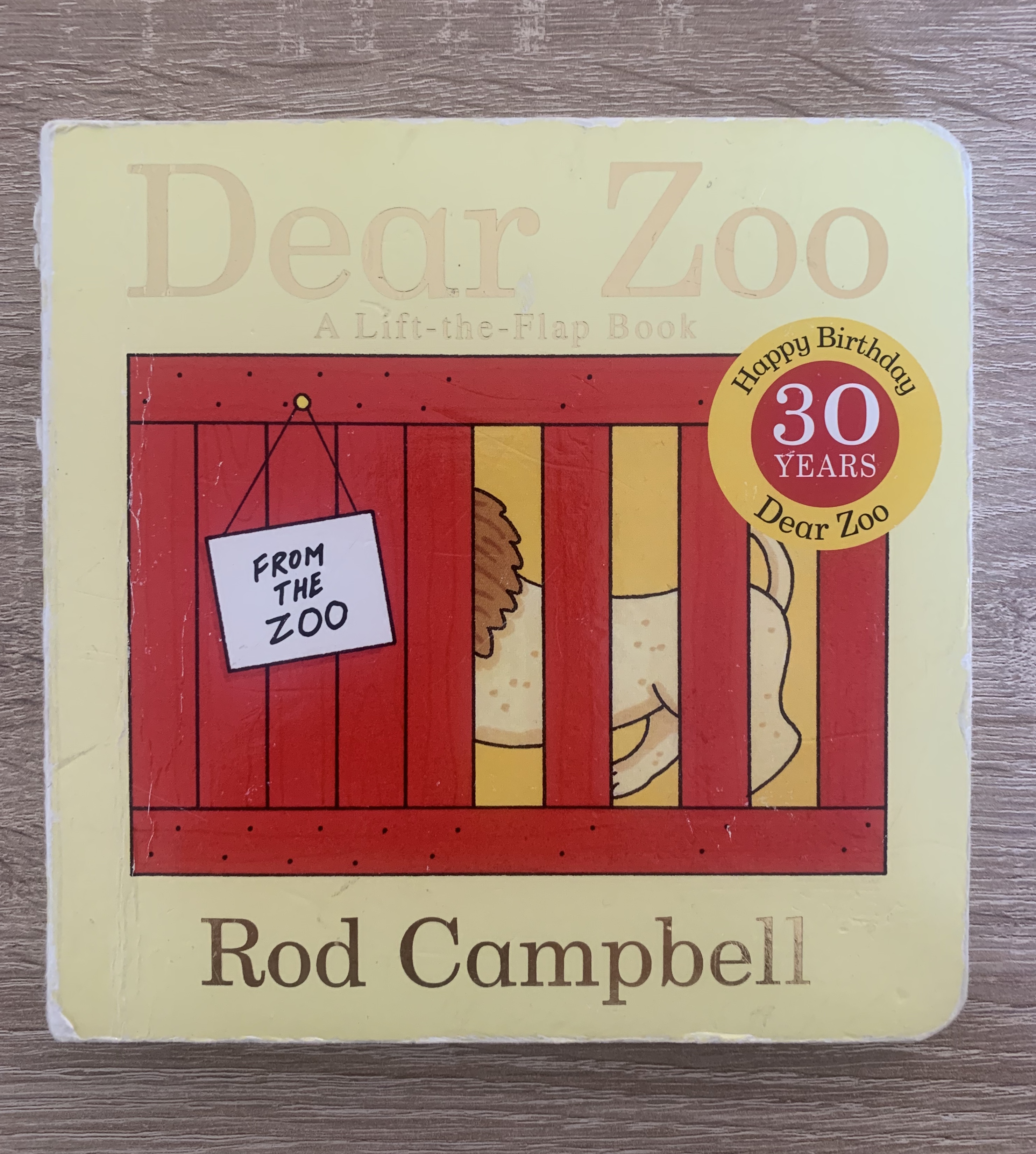
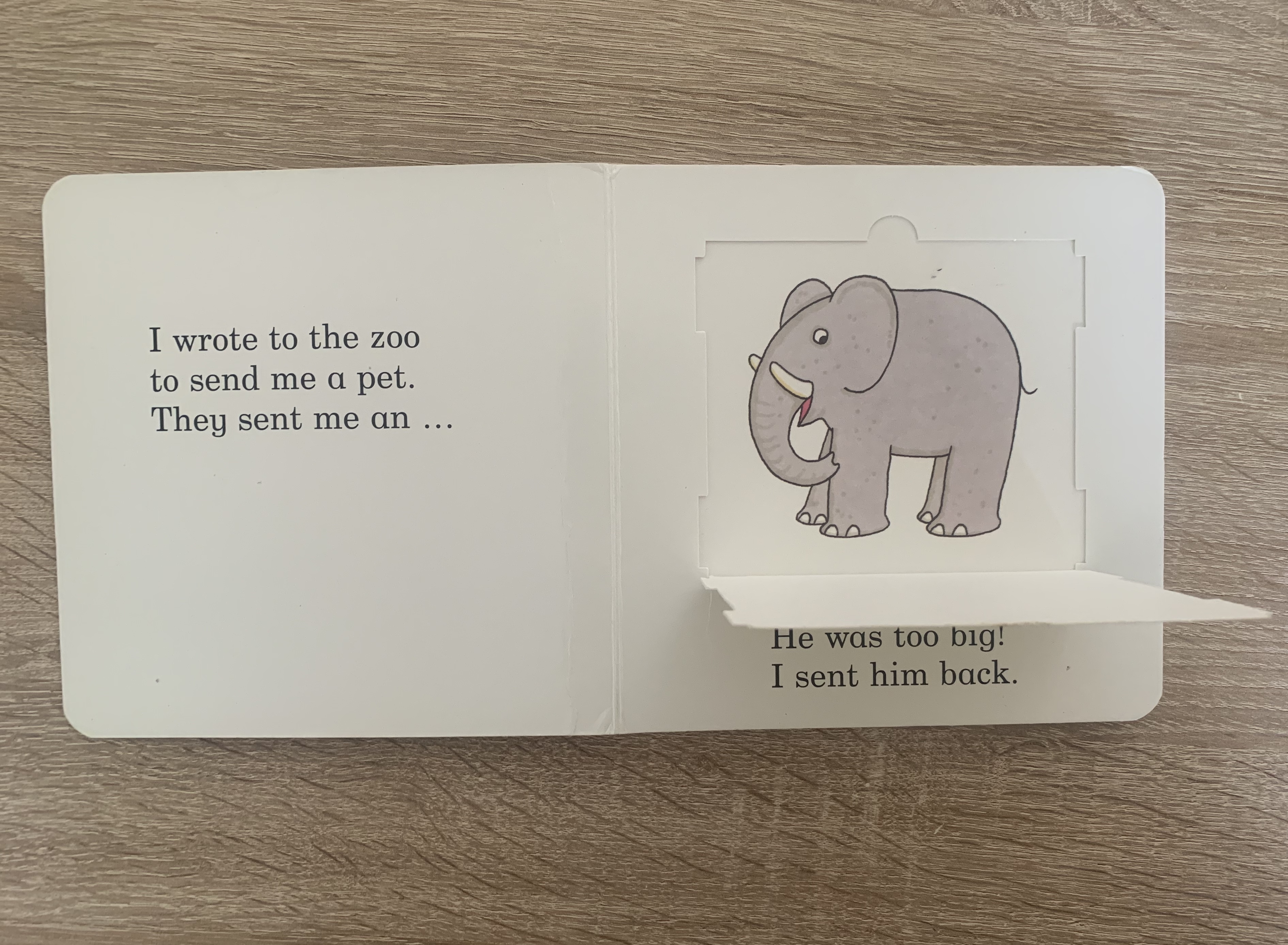
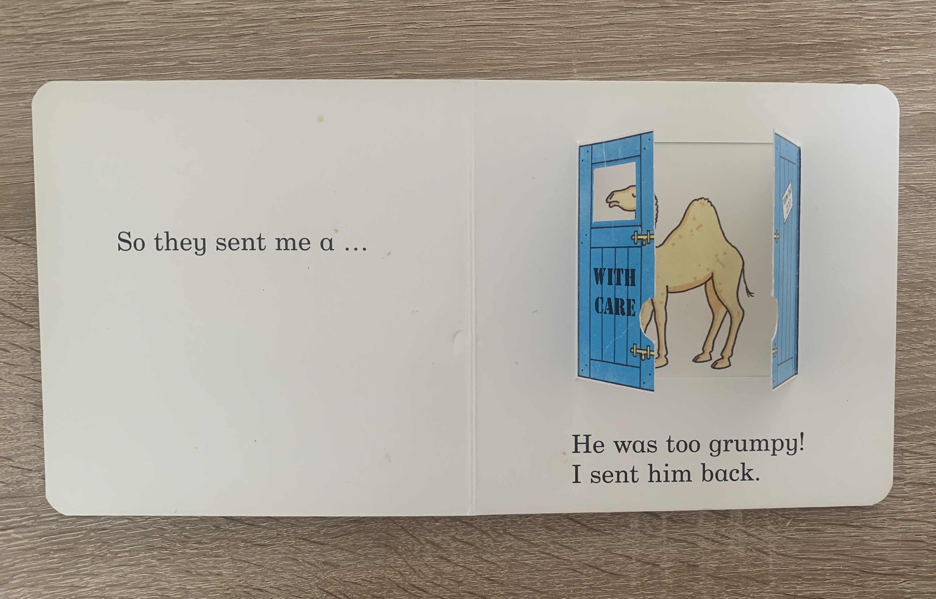
Book 2 – Dear Zoo by Rod Campbell – Children’s lift-a-flap book
This book was dearly loved by my daughter when she was younger, hence the tatty-ness of the cover. This particular copy of the book is a 30year special addition so the font on the cover is gold foil with the birthday badge printed on. The contents of this book includes 1 flap per page where children are asked to discover what animal is hiding behind the flaps. The pages of this book are plain white with the first illustration we see being the flaps. The text on the pages are printed large and in short sentences, perfect for earlier readers and for children to recognise the pages and remember the story. This copy is a board book which makes it hard wearing for the not so delicate little hands. The flaps are mounted to the pages and made from thick card so this prevents them being torn off easily.
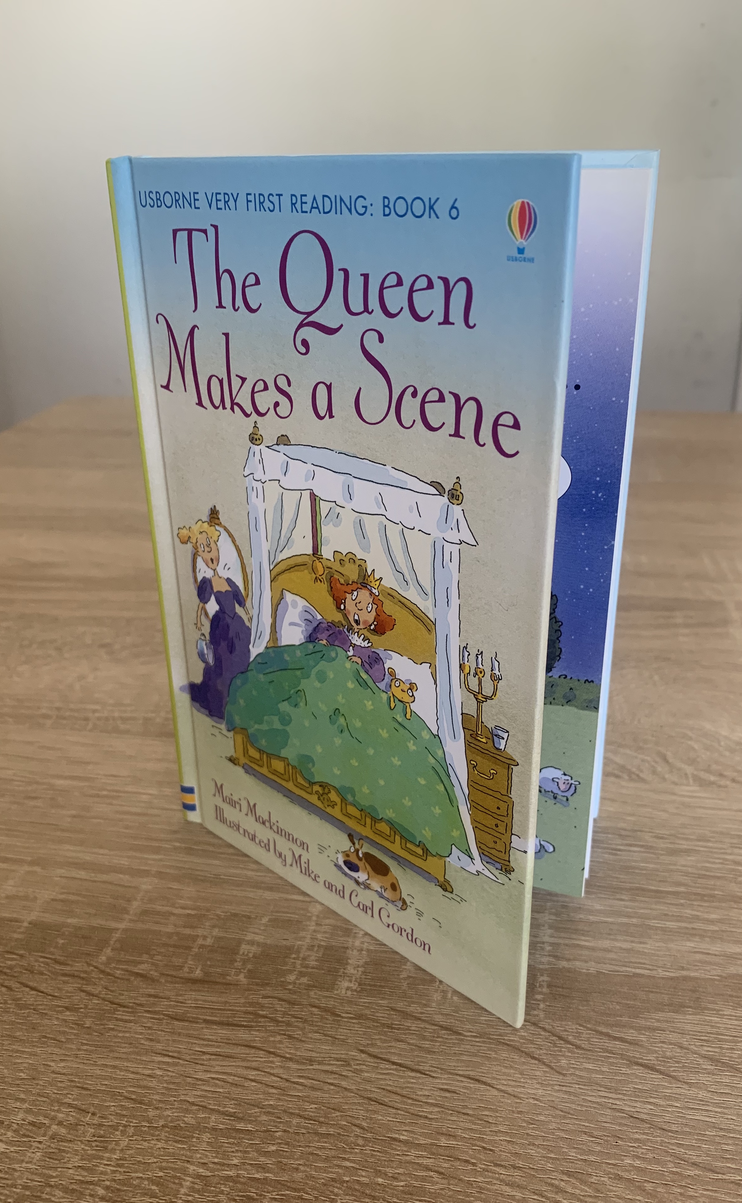
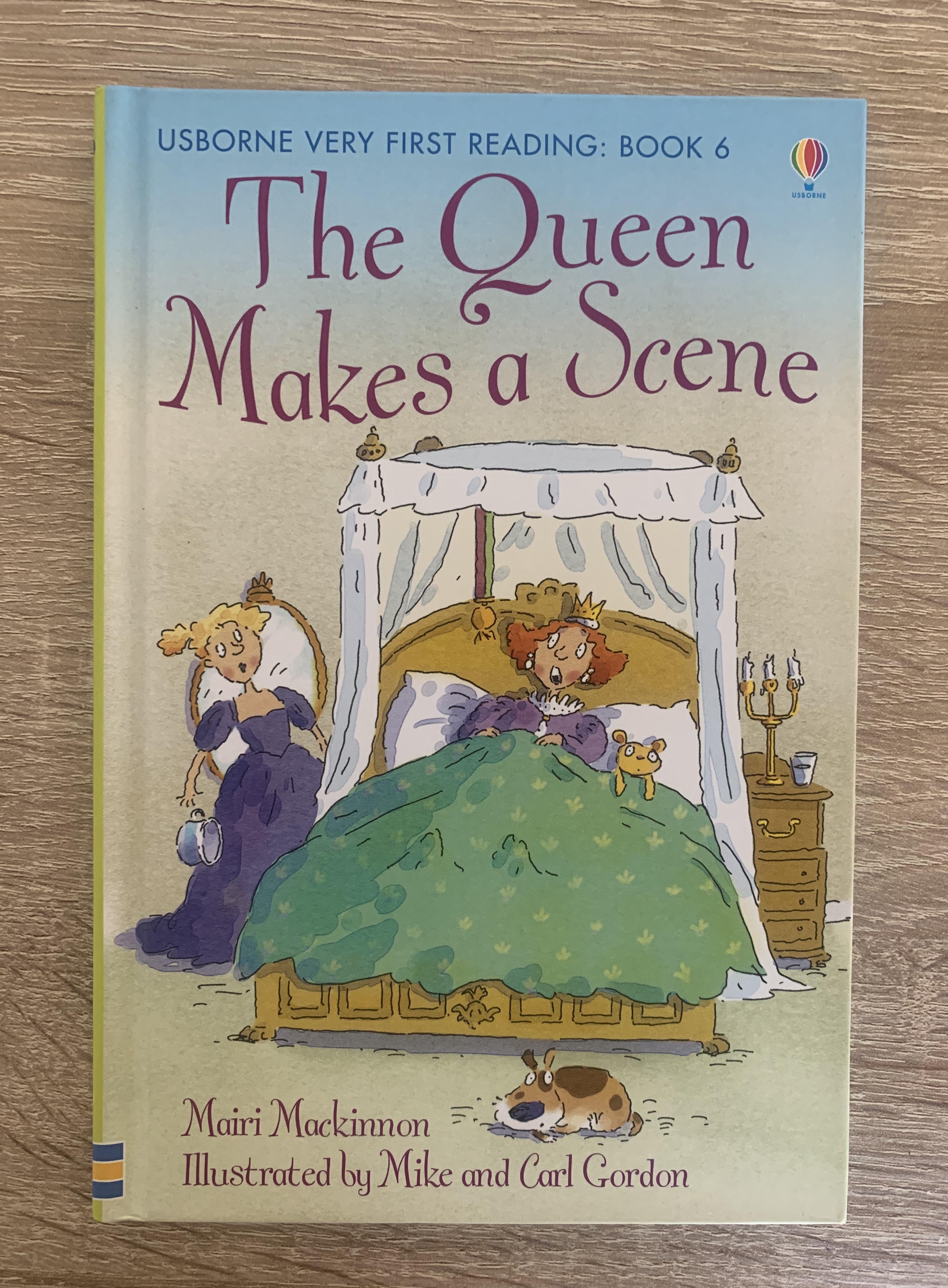
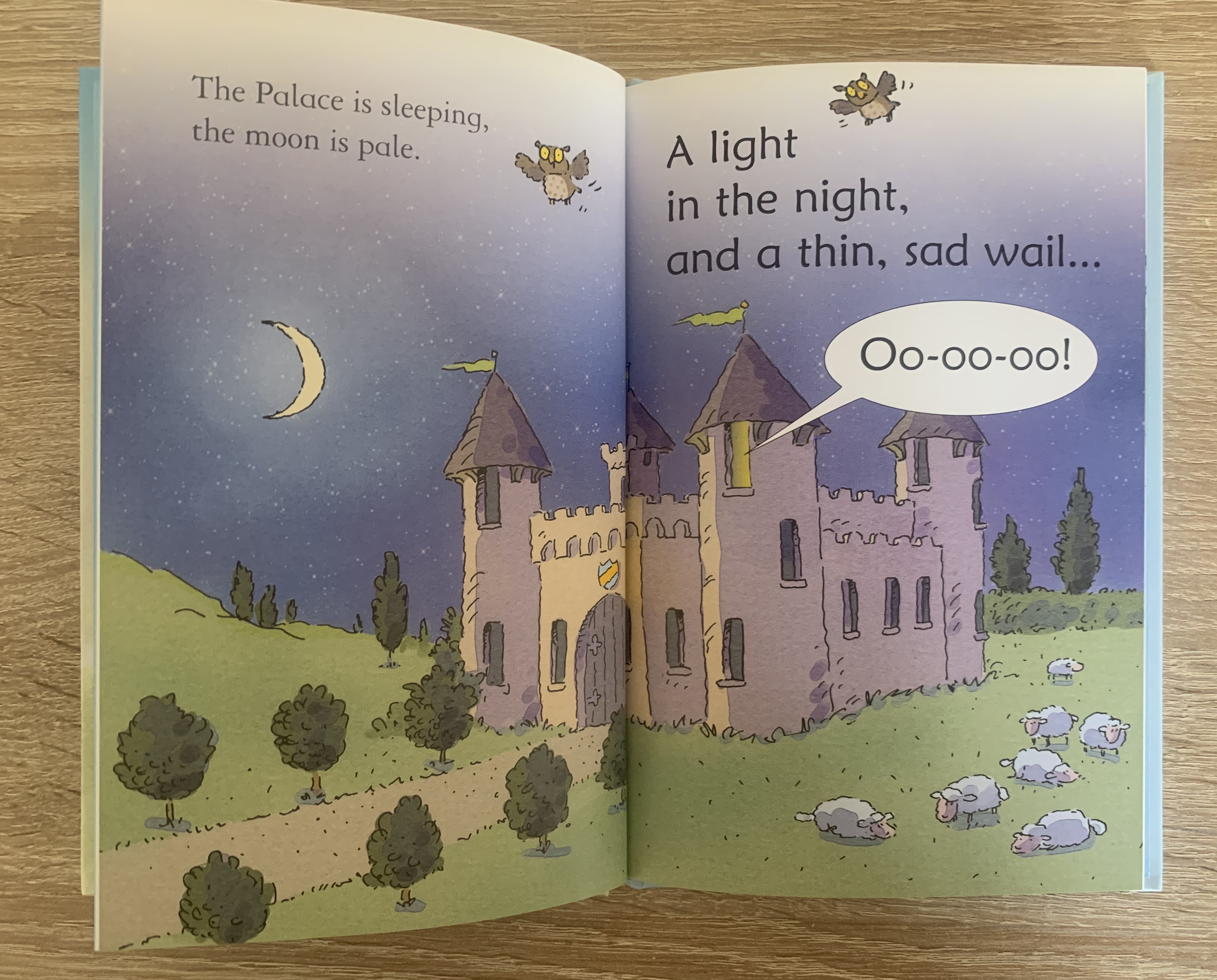
Book 3 – The Queen Makes a Scene by Mairi Mackinnon – First readers book
This was one of the first books I purchased for my daughter once she begun reading herself. The cover of this book is hardback, with a large illustration on the front. This particular book is a first readers book so not only is the font within large and in small sentences, it also includes guidance notes (on reading with your child) and puzzles at the end about the book. The pages inside the book are gloss coated which makes the colour of the illustrations print with more contrast.
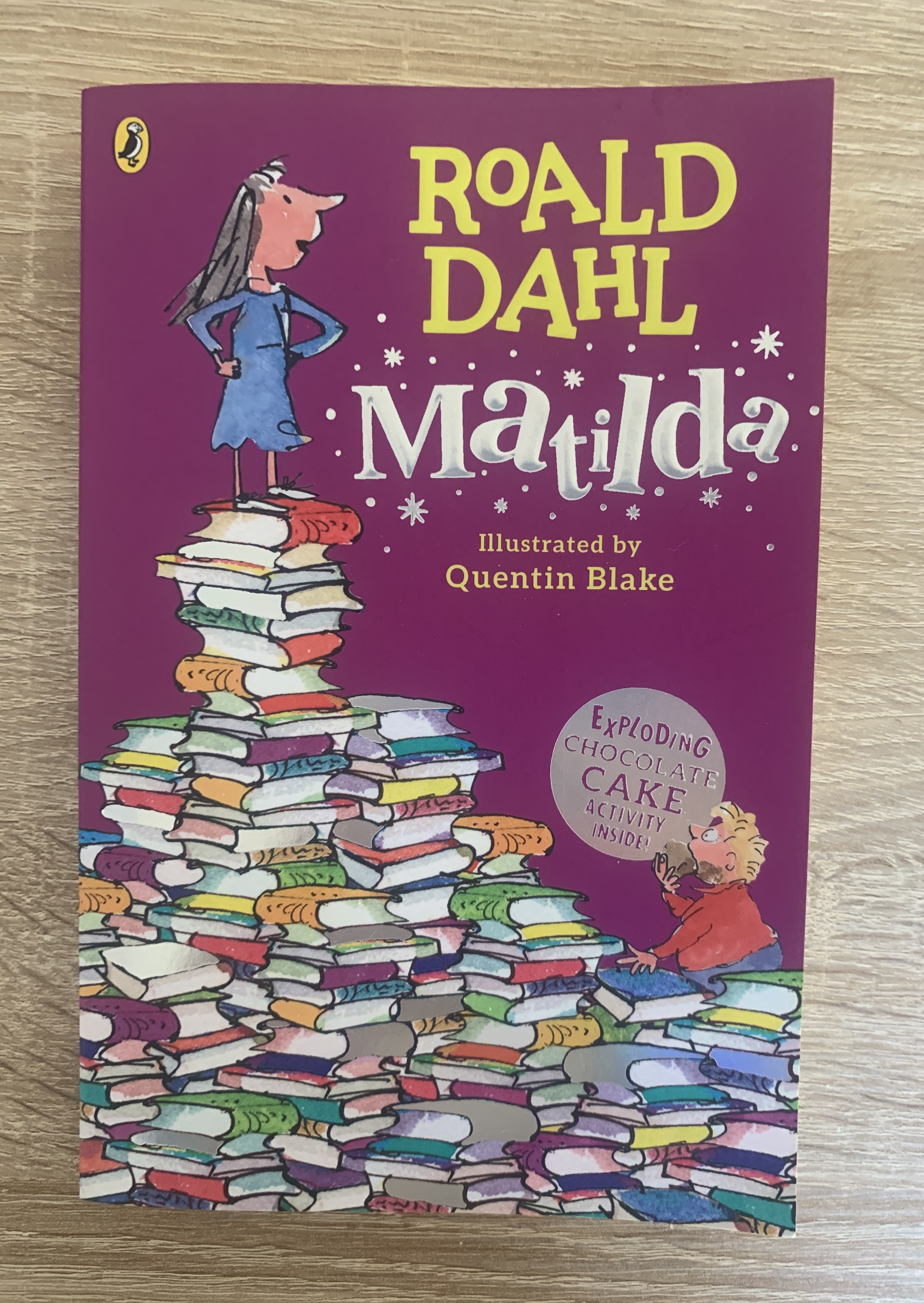
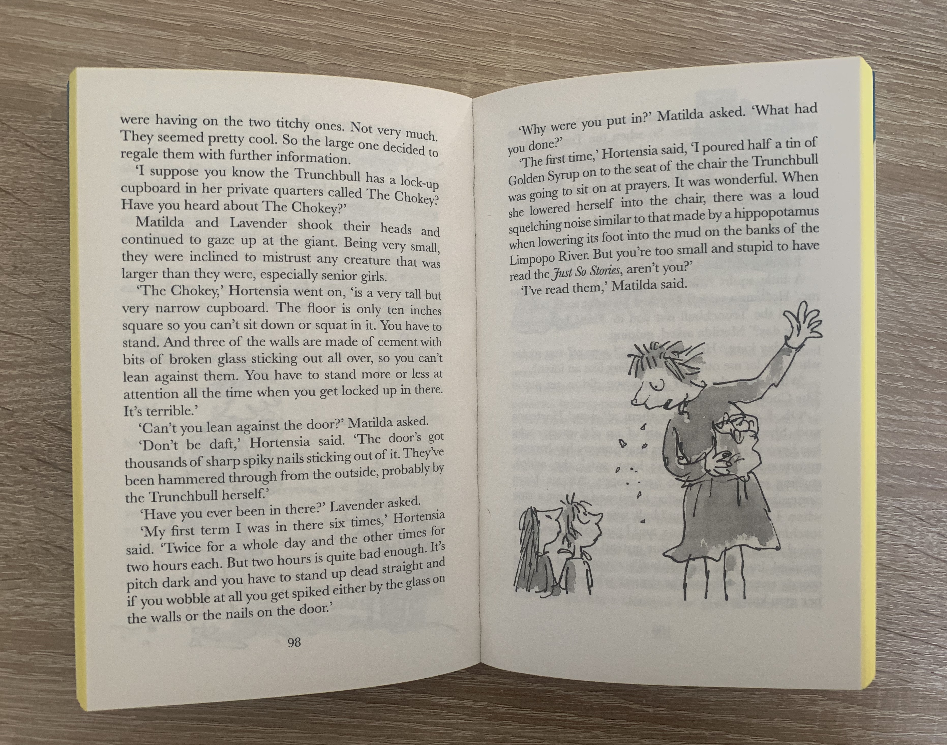
Book 4 – Matilda by Roald Dahl – Story book
There has been many different covers for this book over the past few years. The particular copy I am looking was released in 2016. The cover for this book is paperback and slightly embossed with holographic detail within the books and the title of the book. The edging of the pages are yellow so this gives the book a fun and different look to others. The pages inside hold slightly larger than usual font with the odd black and white sketch of the characters to help children stay interested and to visualise the characters. This is the perfect book for new young readers.
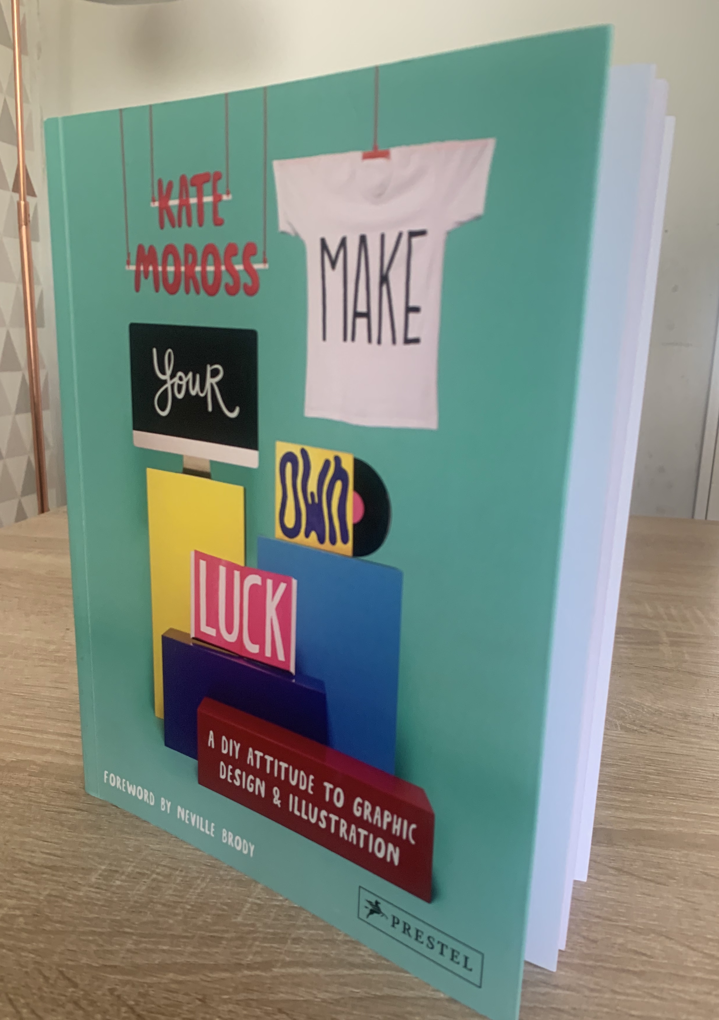
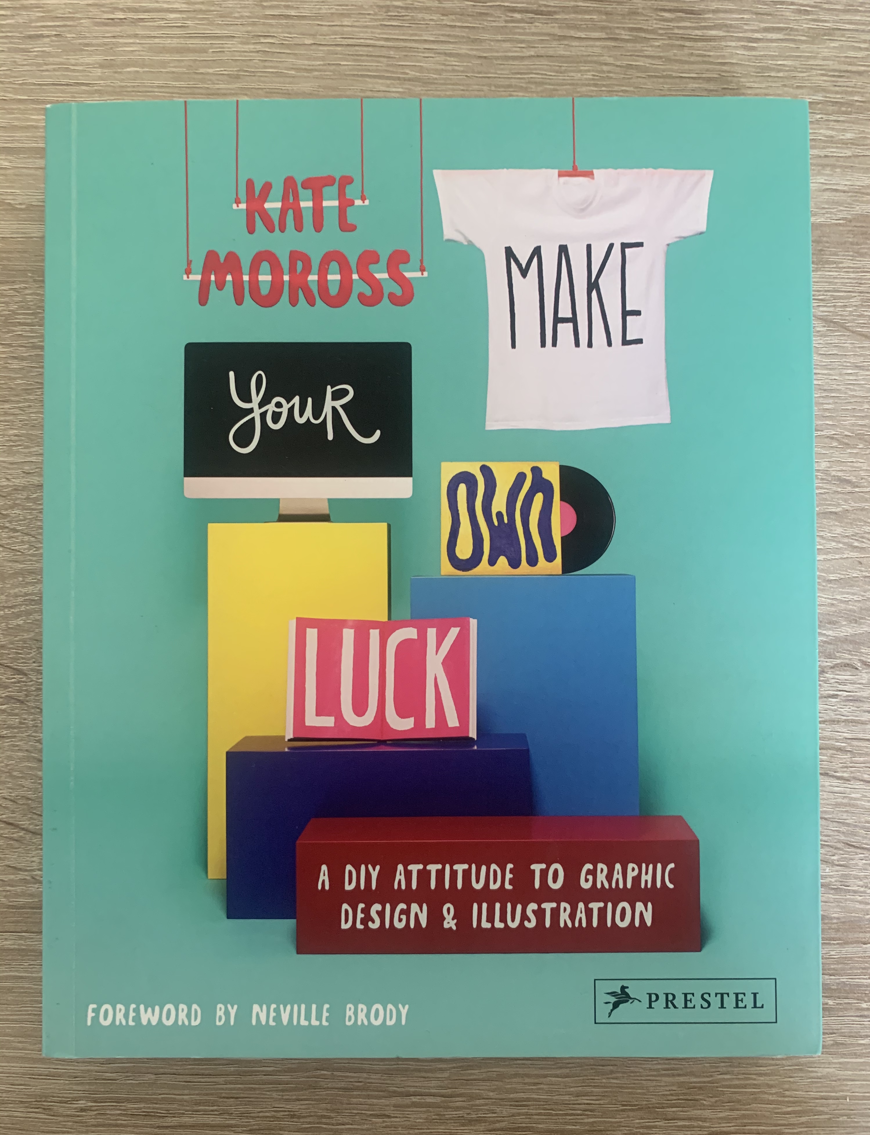
Book 5 – Make your own luck by Kate Moross – Reference book
This book I purchased during my first unit as I fell in love with Kate’s style of work and found it really inspiring. The cover to this paperback book shows different materials which Kate Moross’s designs and featured on such as clothing, books, graphics (pc) and cd covers. Inside the book consist of information about Moross’s work and plenty examples of her work. The use of colour and perfectly placed imagery makes a perfect reference book for students and fans of the artist. This book is different to those above as it consist more of images rather than words.
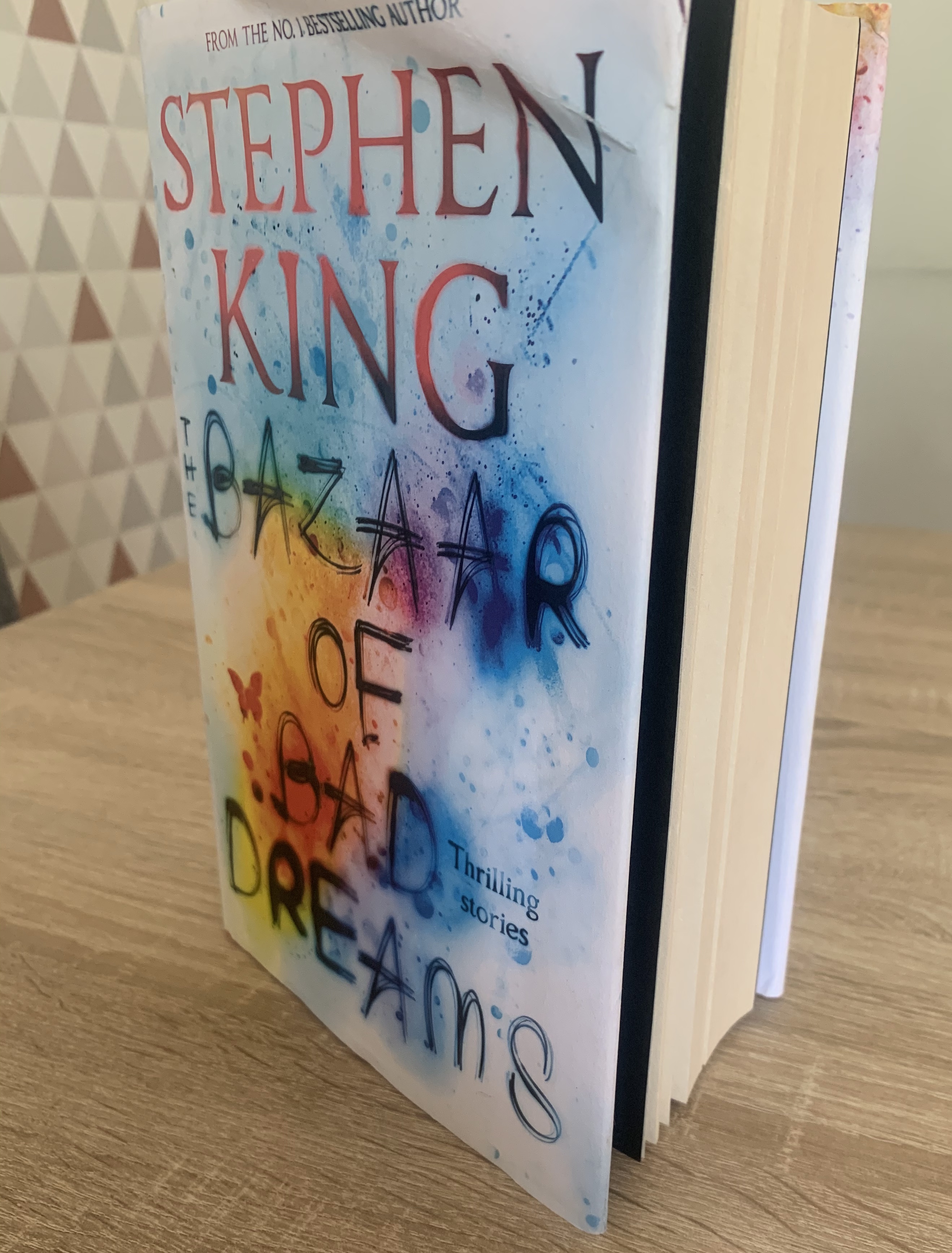
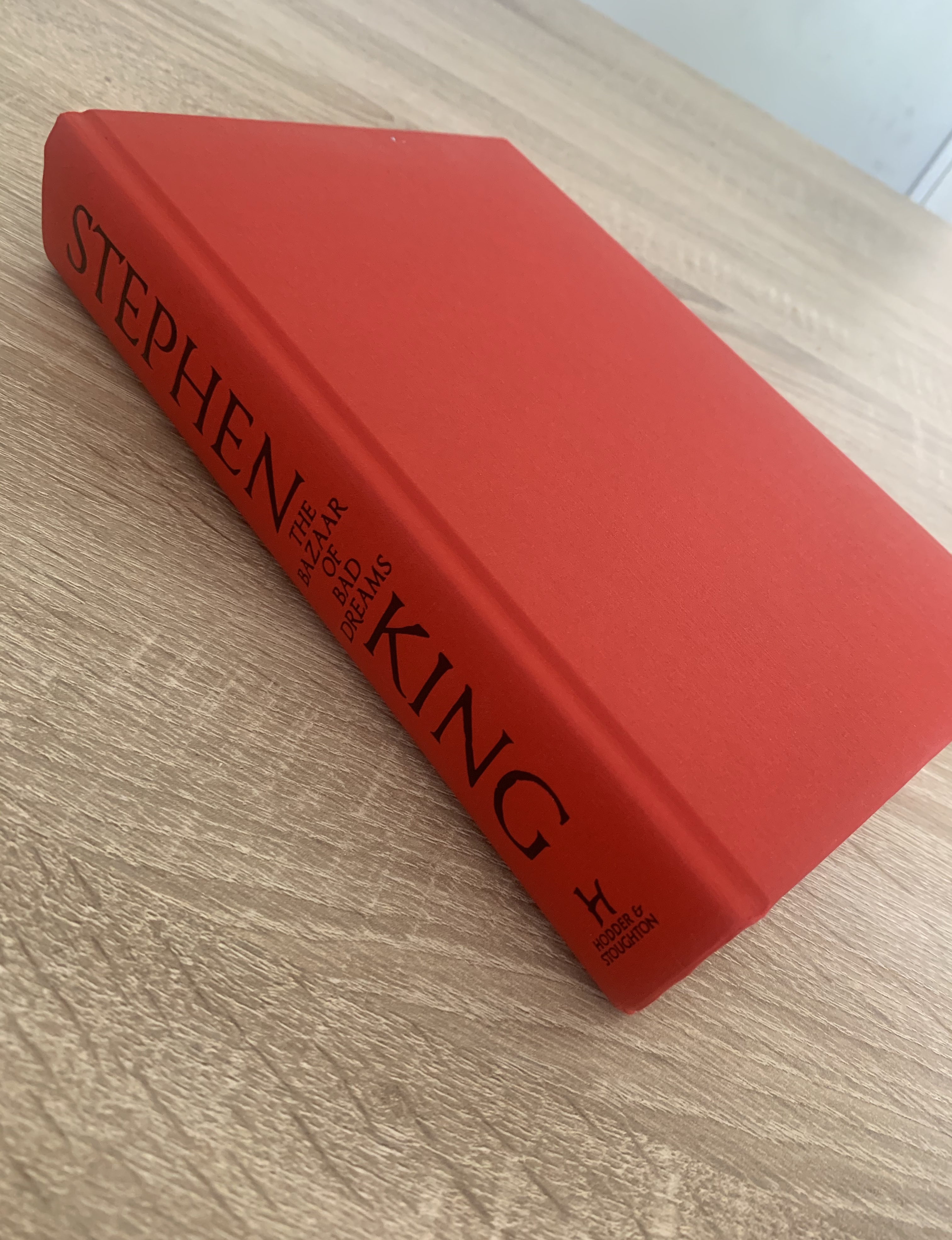
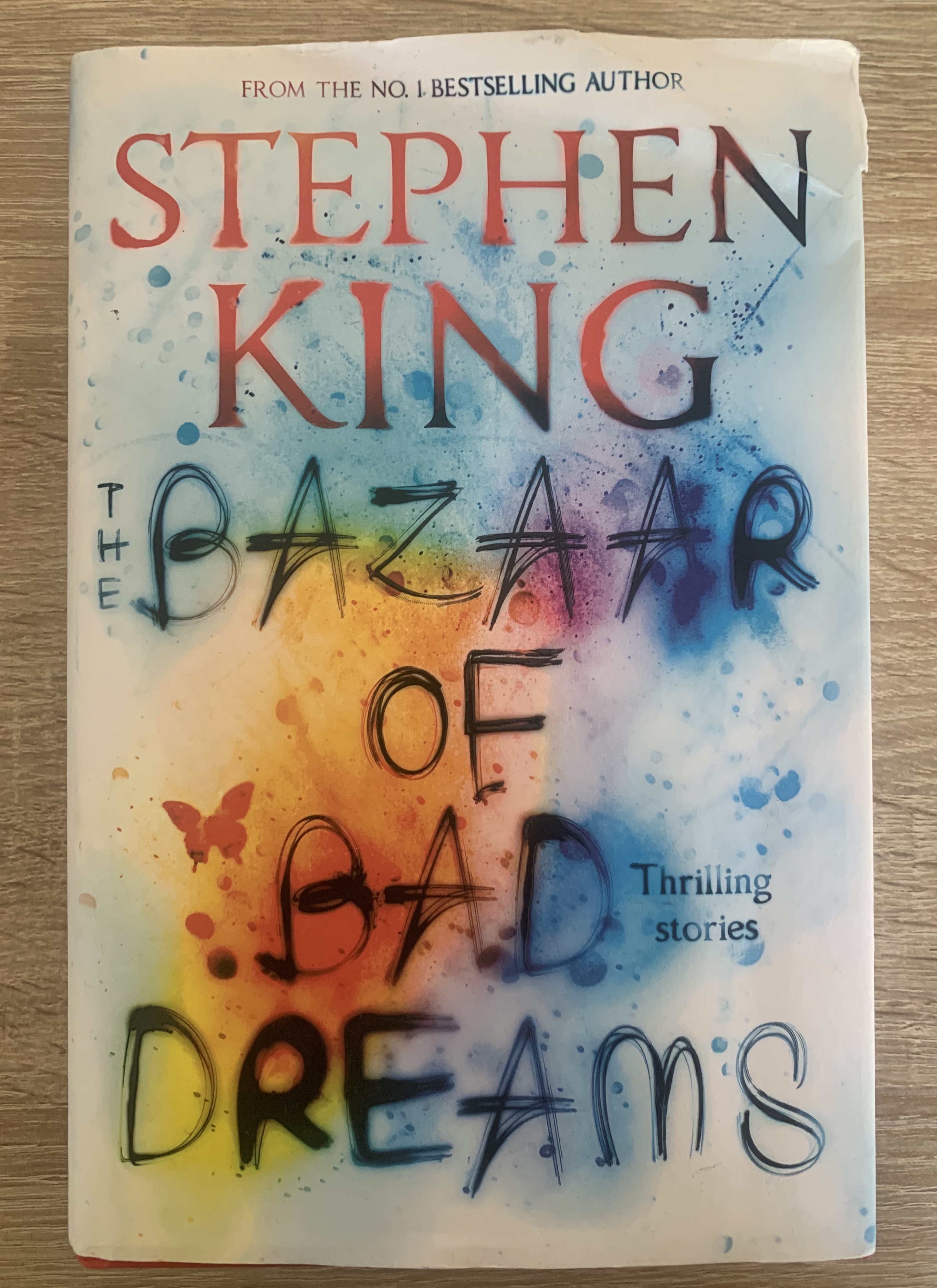
Book 6 – The Bazaar of Bad Dreams by Stephen King – Thriller book
My friend kindly leant me this book for research purposes. I’m glad I was able to analyse a hardback book to see how it differs between paperback. This book is well made, with a paper dust jacket revealing underneath a plain red linen hardback book. This book is much larger than all of the previous so of course makes it heavier, but this also feels very hardwearing and robust. At first glance of this book, you are able to tell by the quality that this is a book by a bestselling author, and with Stephen King’s iconically used typeface and position of his name on the cover makes it very recognisable.
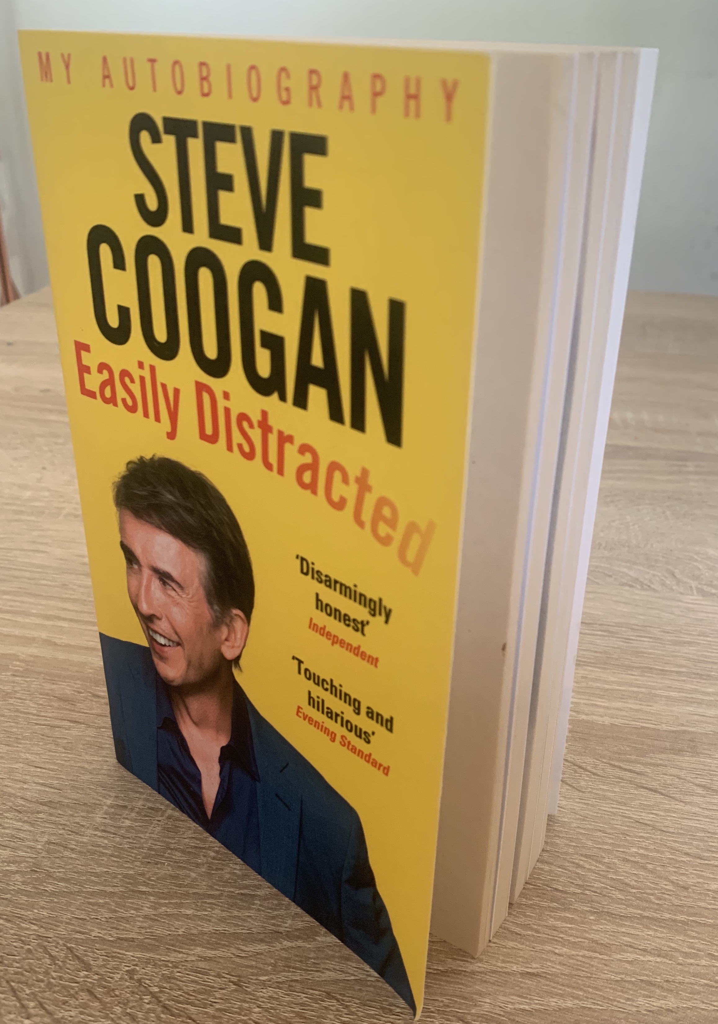
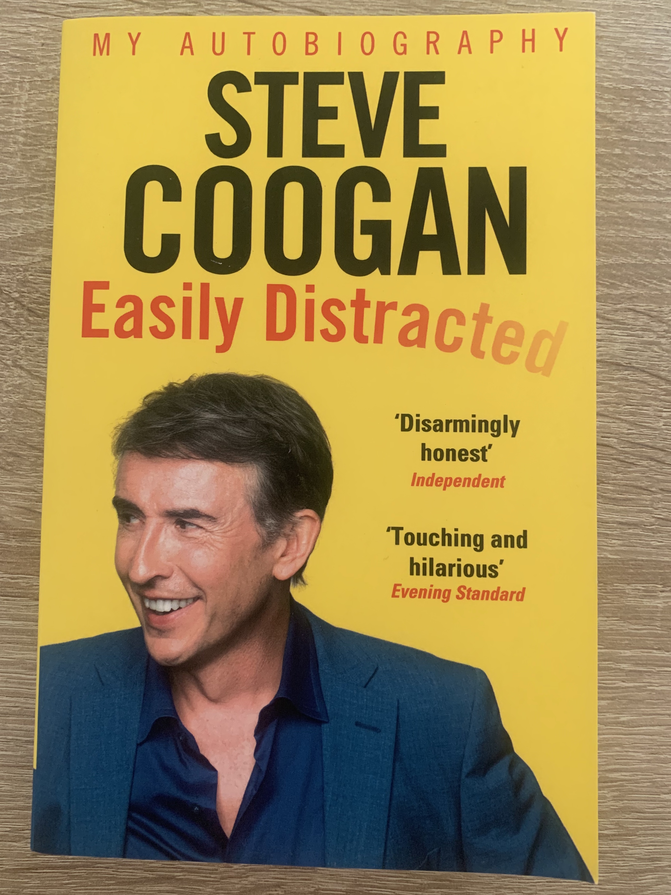
Book 7 – Steve Coogan Easily Distracted – Autobiography
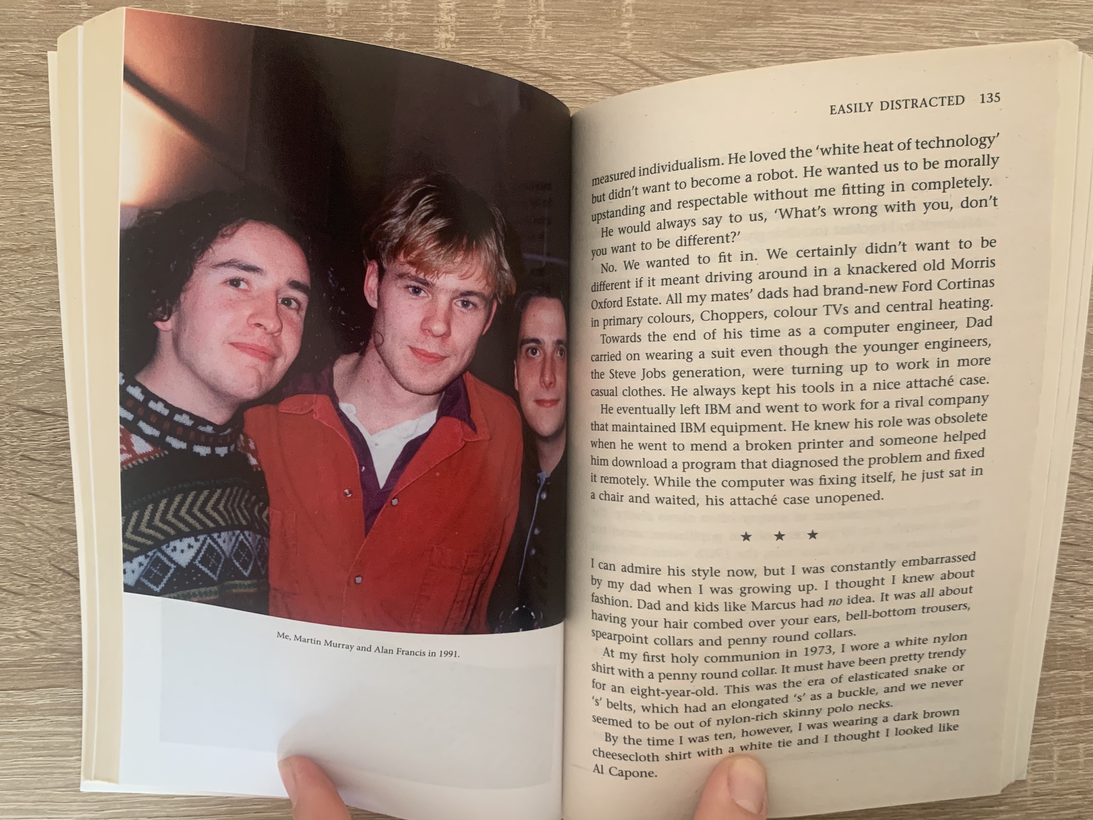
Again this book was leant to me by a friend, the reason for wanting to analyse this book was down to the select pages inside containing photographs. Automatically by looking at this book it is clear that it is an autobiography, with the large self portrait of the author and the large named title. Inside the pages consist of regular uncoated paper however split into 4 sections across the book are white gloss papers containing photographs relating to the author, this is quite common in most autobiography’s as it helps the reader visually relate to the author at that particular time/chapter of the book.
Reflection
I found it interesting looking at books this way to see how they vary between different genres, and to study the qualities of the book which is something not many do. It made me think of how the book is made to suit the audience, how the board books are thicker and more hardwearing and how they become finer and higher quality as they change between genres and target audiences.
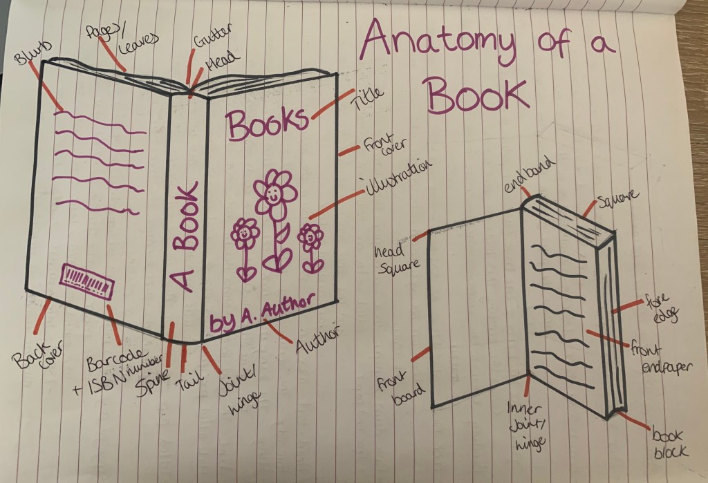
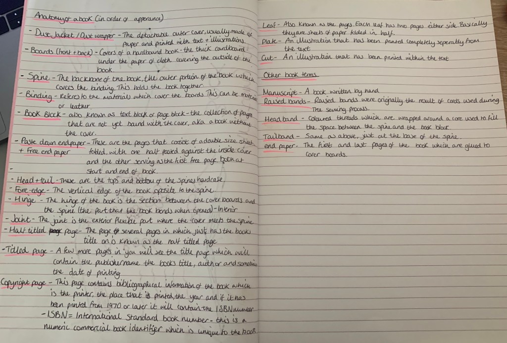
Brief: Familiarise yourself with the terminology used in describing the anatomy of a book and write some brief notes in your learning log on how the various structural elements could be modified to reflect the book’s function.
The anatomy of a book:
Head
Spine
Tail
Pages/leaves: The printed pages are usually folded into signatures, before sewing or gluing together to form the book block.
Book Block: The main block of pages created when book pages are sewn or glued together before binding.
Board: Rigid material for the covers of hardback books. Board is usually covered with leather, paper or cloth.
Cover: Hardback books usually have an outer casing made from board which wraps around the text block, protecting the pages.
Brief: Based on your work from the previous exercises, think about how your designs within the context of the book. For example, visually explore how your artwork sits within the format of your A5 pamphlet – how the page might frame the artwork, how different pages sit together or how you might begin to develop a narrative across multiple pages. This process might suggest new ways of presenting or developing your work. Think about how you want to finish your artwork, whether this is through typography, illustration, photography, drawing or another format. Critique your work – what has the format of the pamphlet offered you, how might your ideas develop further, and how has your understanding of creative book design changed through this exercise?
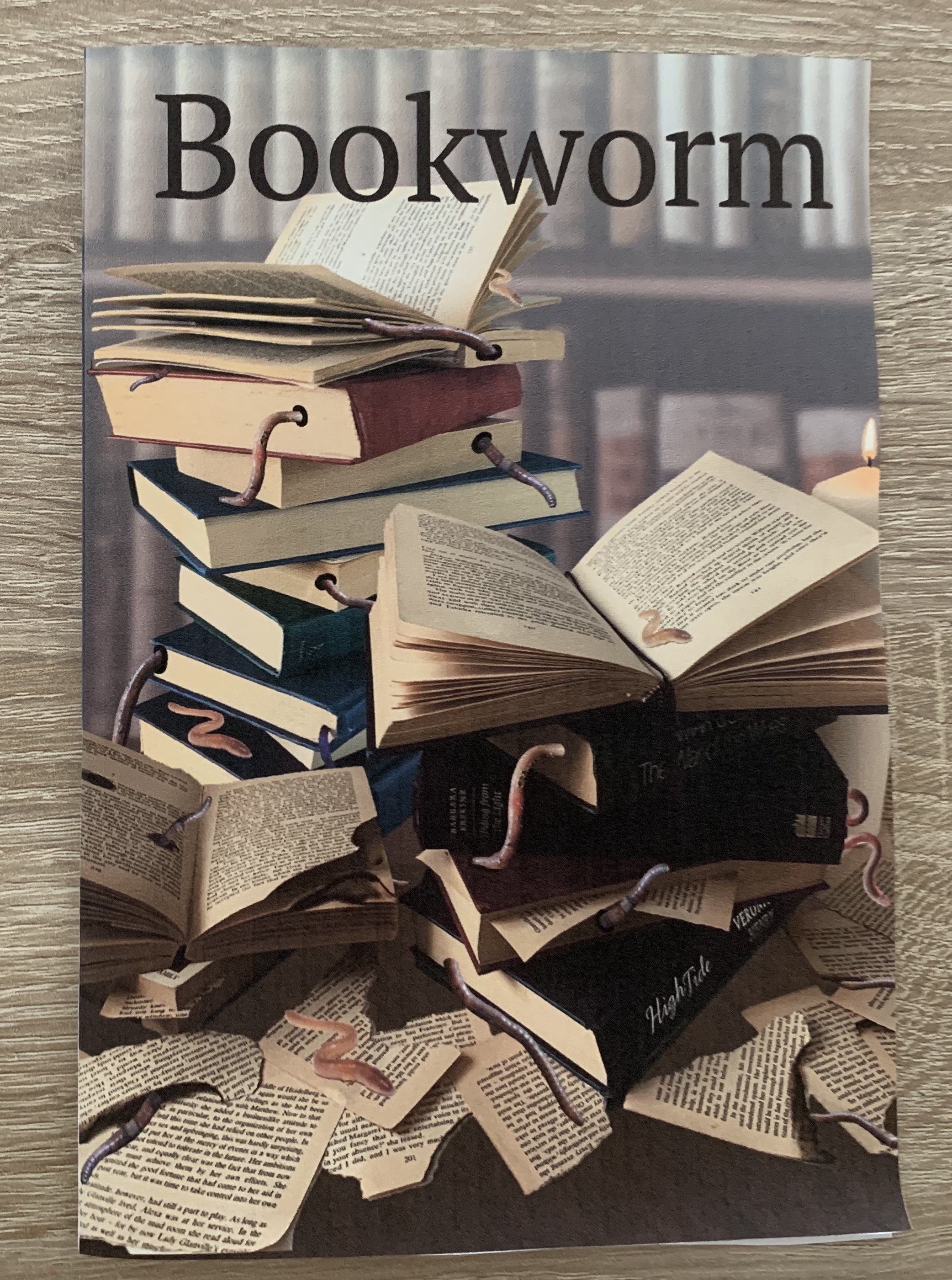
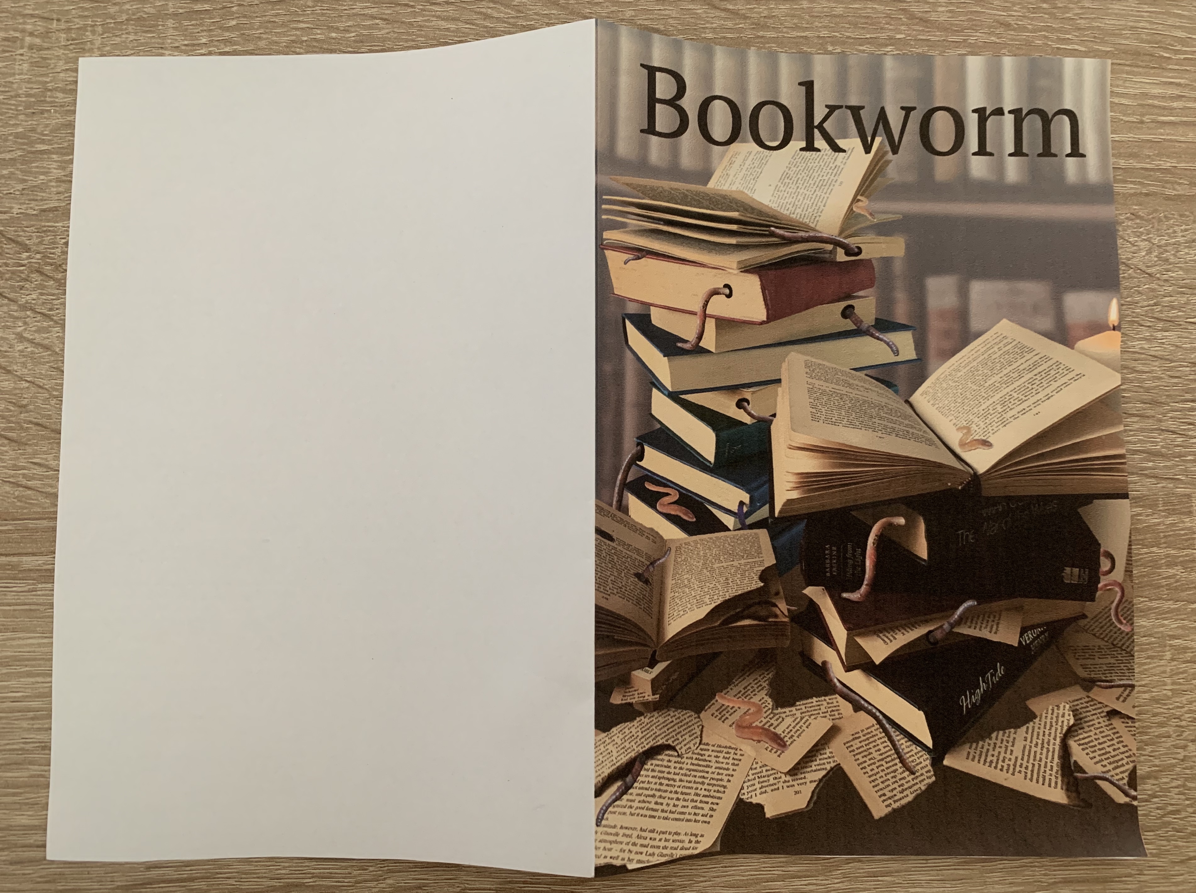
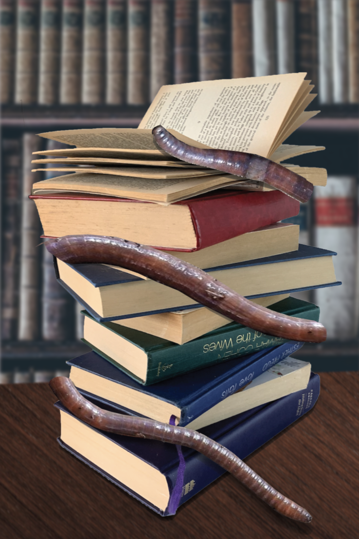
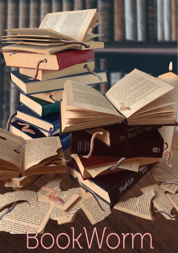
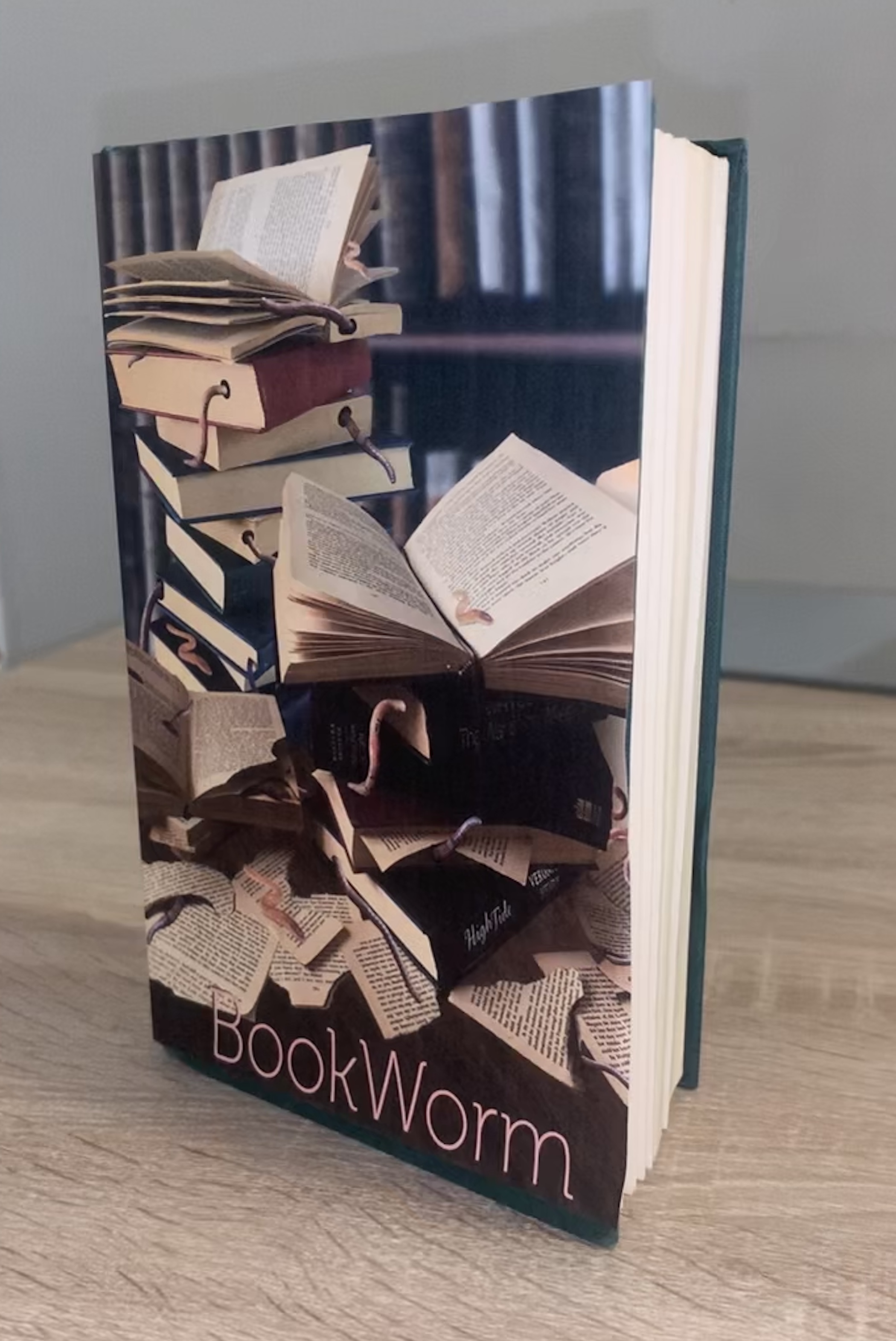
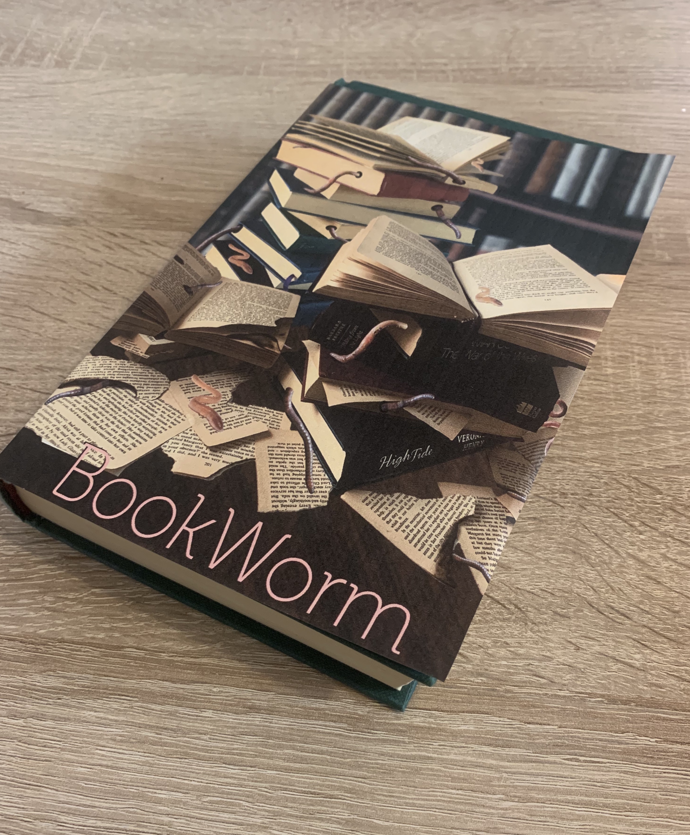
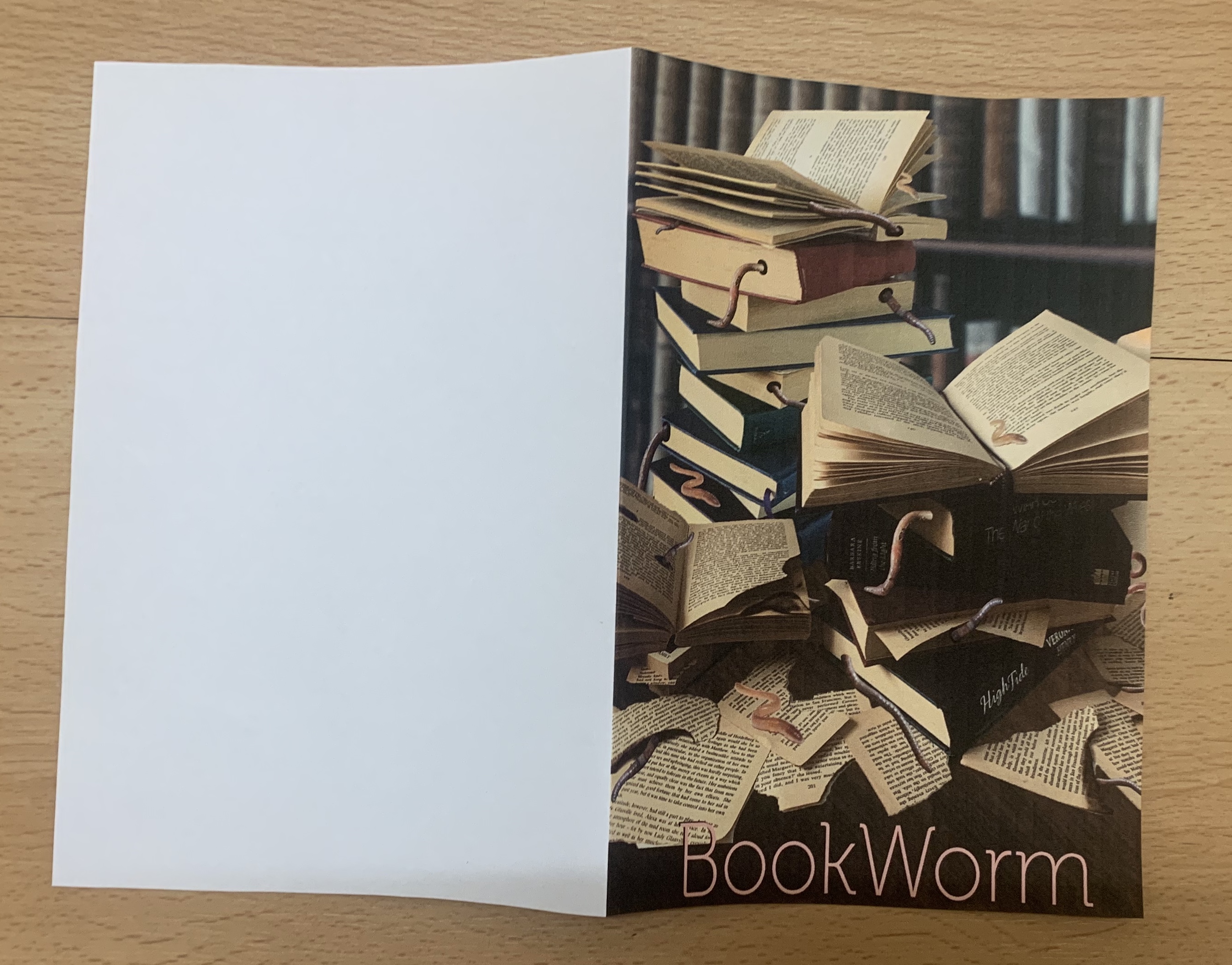
During my work in exercise 5, I printed off my artwork to create an A5 fold. I printed this with no bleed as I mocked it up as a book. Seeing my design printed was helpful to see if anything needed to be developed further.
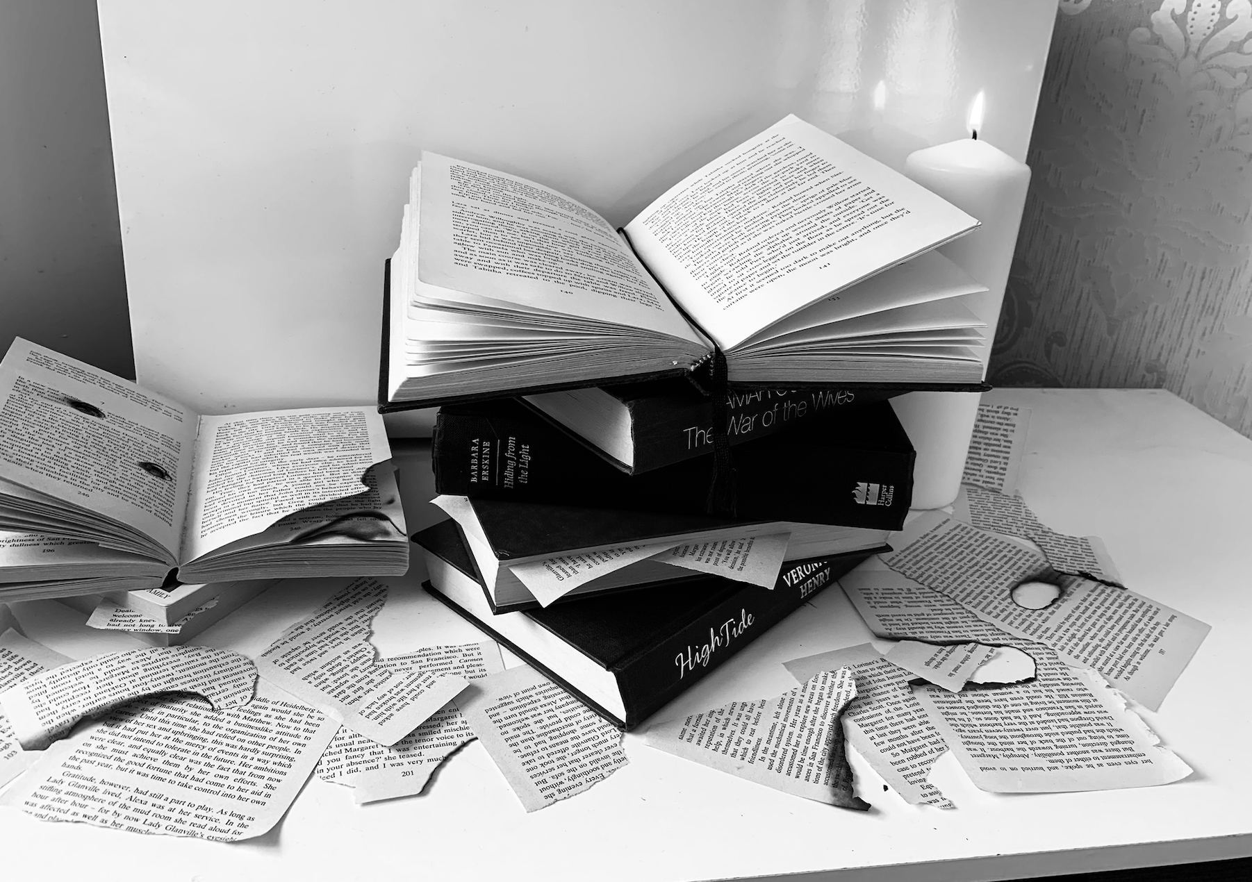
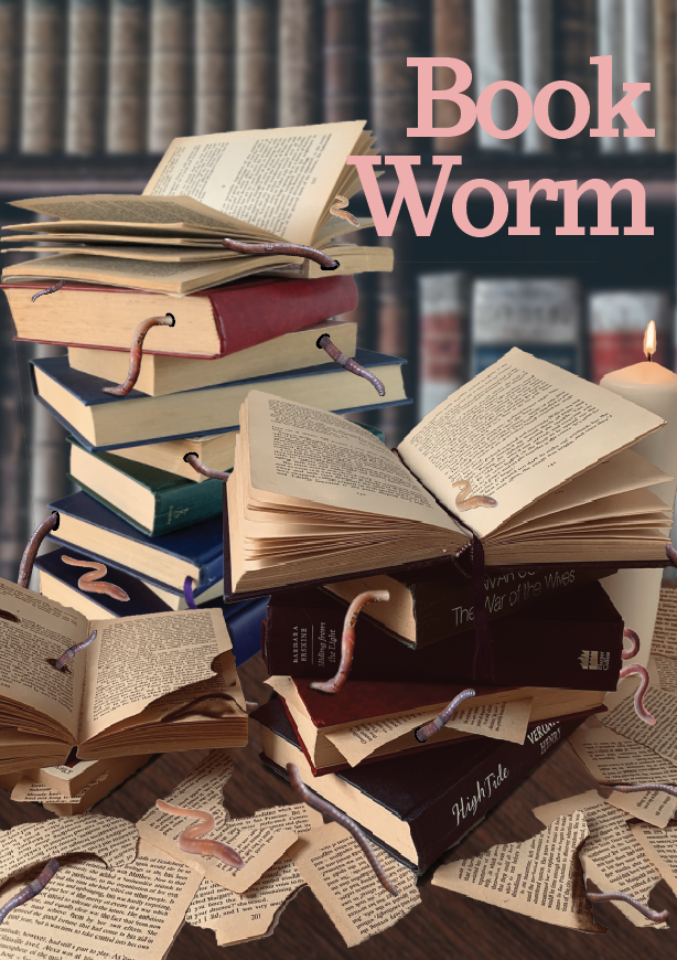
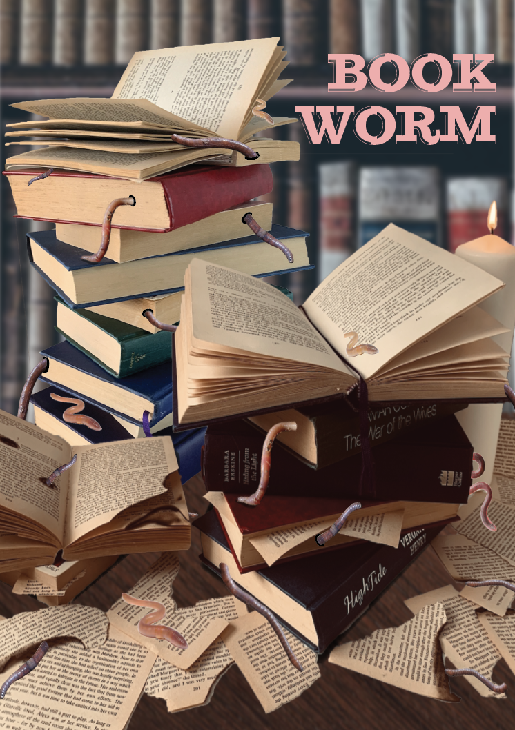
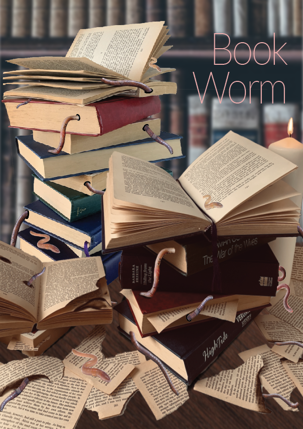
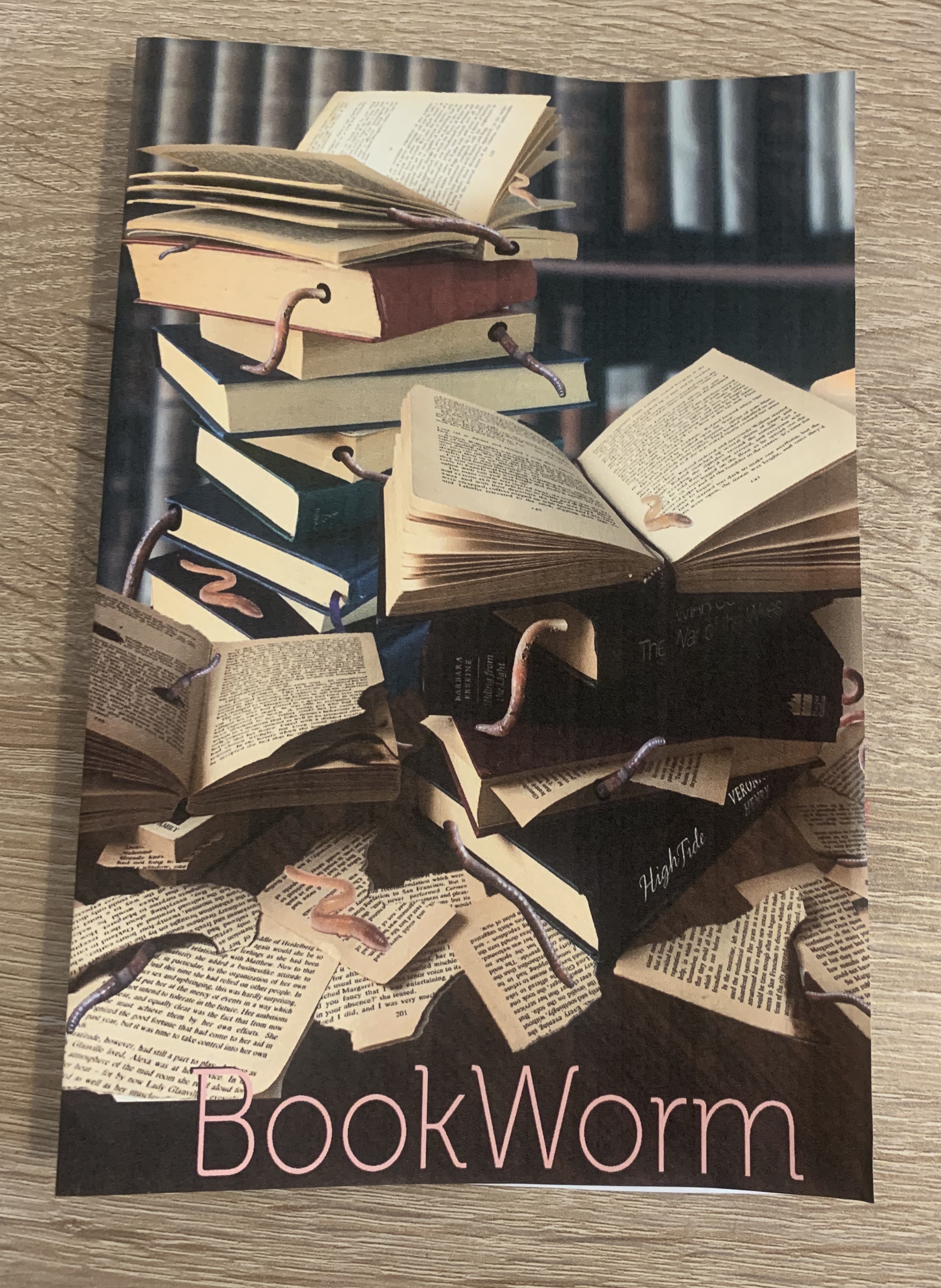
One of my main concerns with this design is that it was a lot darker printed than I wanted, I feel like the main focal point of the stacked books and worms gets lost with the darkness of the background, it all seems to merge together which I find makes it less appealing. However during my design process I had noted that I wanted the image to look as if it was set in an old dimly lit abandoned study, so from that respect I feel it fits my criteria. I have just changed my mind slightly after seeing the design printed off, it really shows the importance of experimenting with mockups.
I looked at the pros and cons for my design whilst it was printed in front of me;
Pros
Phrase is easily recognisable in the design
Eye catching
Gets the point across
Cons
Quite dark
Typeface used?
Too realistic that it looks very false?
Background?
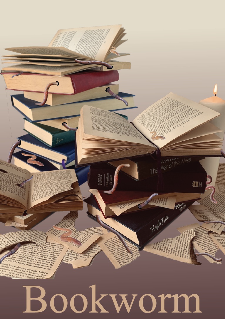
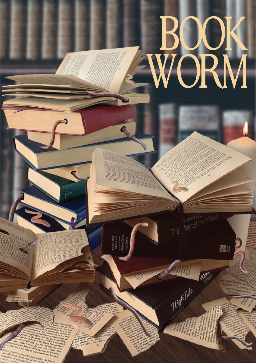
I wanted to work on the cons before I moved any further, I decided to work on the background as not only would this lighten up the design, but it would be interesting to see if with the use of a different background it could make me feel more relaxed about the realistic-ness of the design.
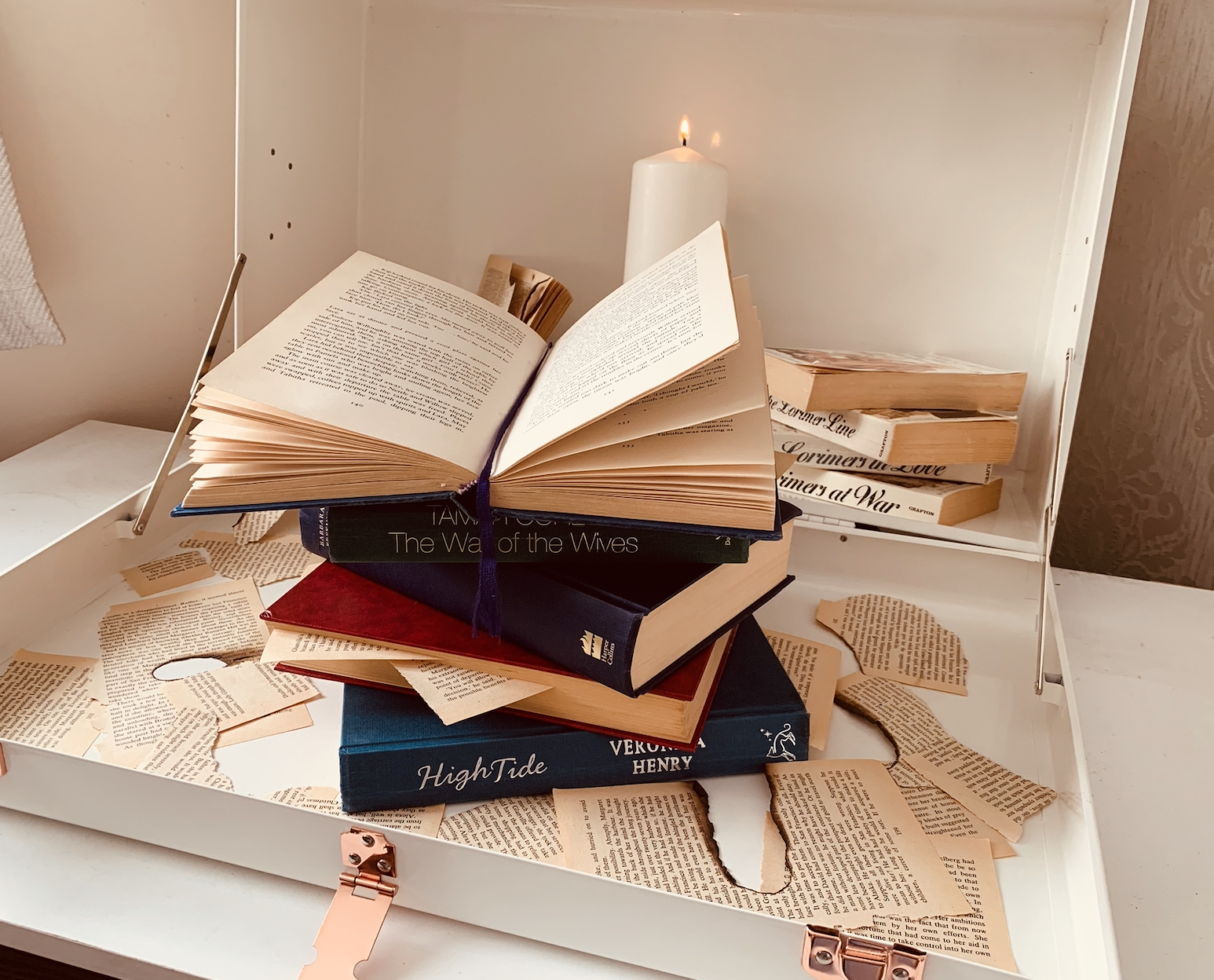
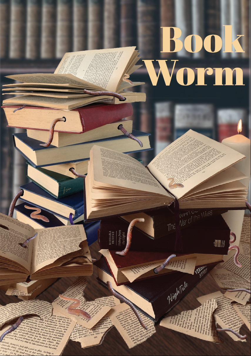
After experimenting I decided that the books looked odd when placed on a coloured background I feel that they need to look as if they are placed on some sort of surface, I then came up with the idea of placing the books onto a page however this just looked too busy, not knowing where the focal part of the design is. In the end I decided to change the opacity on the background so it made the books stand out and not all merge together. I think this works much better. I was also cautious about overlapping the title with the image at first however I feel this works well.
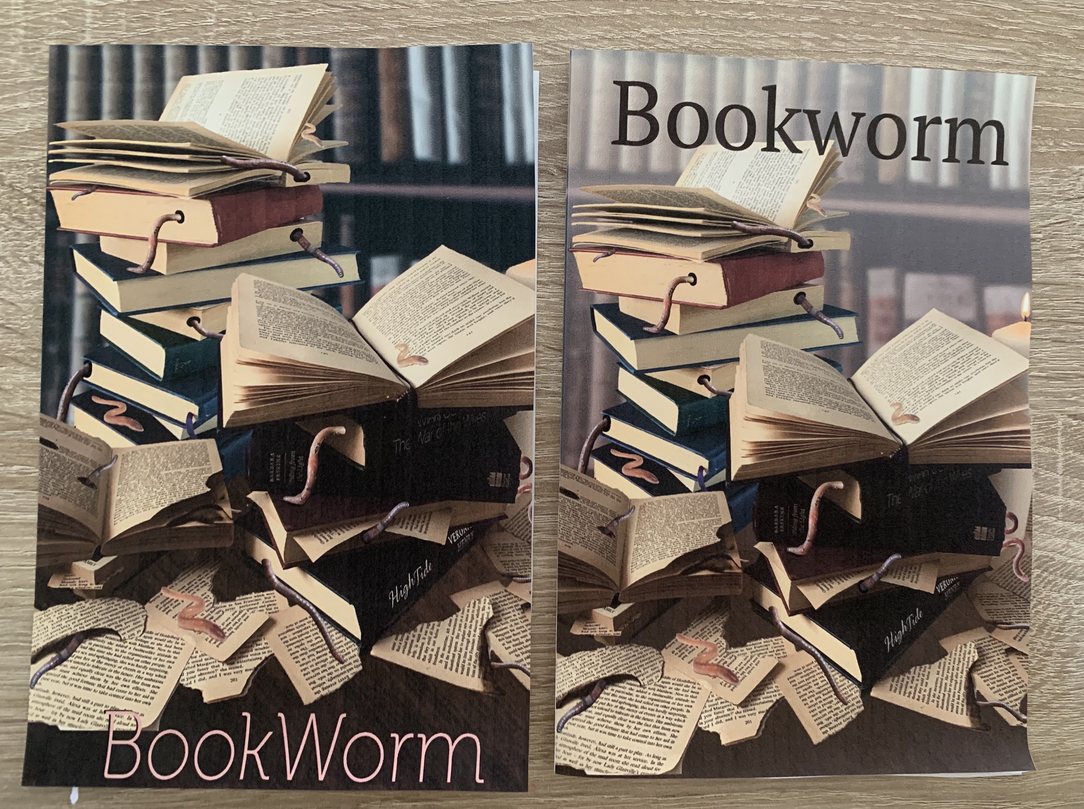
I printed off my new design to see how it looked as a folded mock-up. I felt that by lightening the background it has made a huge difference, the before design looked far too dark and everything seemed to blend together, where as now the focal point is the stacked books and the worms. The font used is also more noticeable.
Self Critique
I feel that my design is strong and relatable to the phrase. The design itself is very obvious and self explanatory, with a ‘say what you see’ feel. I think the design looks much better and is stronger after the last few steps of developing and visually critiquing the designs. Once printing off my design and folding to to create a pamphlet I feel it has brought the reality to the design. Although I haven’t thought about the contents of what would be inside, I would be willing to explore further into what could be include and how this would create a narrative across the pages. An idea would be to include a two section evaluation, one of the phrase; being of the readers love for books and the other being of the bugs that infest books? Calling it the bugs and the books. Or perhaps creating a 2 in 1 pamphlet with covers on both the front and the back pages (back being flipped upside down) and the centre pages of an illustration to separate the two parts. (reversible double sided document). Thinking of the contents of the pamphlet would encourage my ideas to develop further, as I would need to create inside pages and a back page. These ideas would all stem from the contents layout which I would pursue.
I feel that I have gained a larger understanding of creative book design during the past few exercises. It has made me aware of how the cover will narrate the contents, and I have found it very interesting on how new ideas keep arising from visualising the artwork.
Brief: There are two elements to this exercise – thinking about how you produce your publication, and making a smaller scaled down version as a mock up.
Creating a small mock up: Printers use large sheets of paper to print multiple pages, which are then cut and folded. You’re going to use a simple A4 sheet to recreate the process of imposition and folding into ‘sections’ or signatures at a smaller scale.
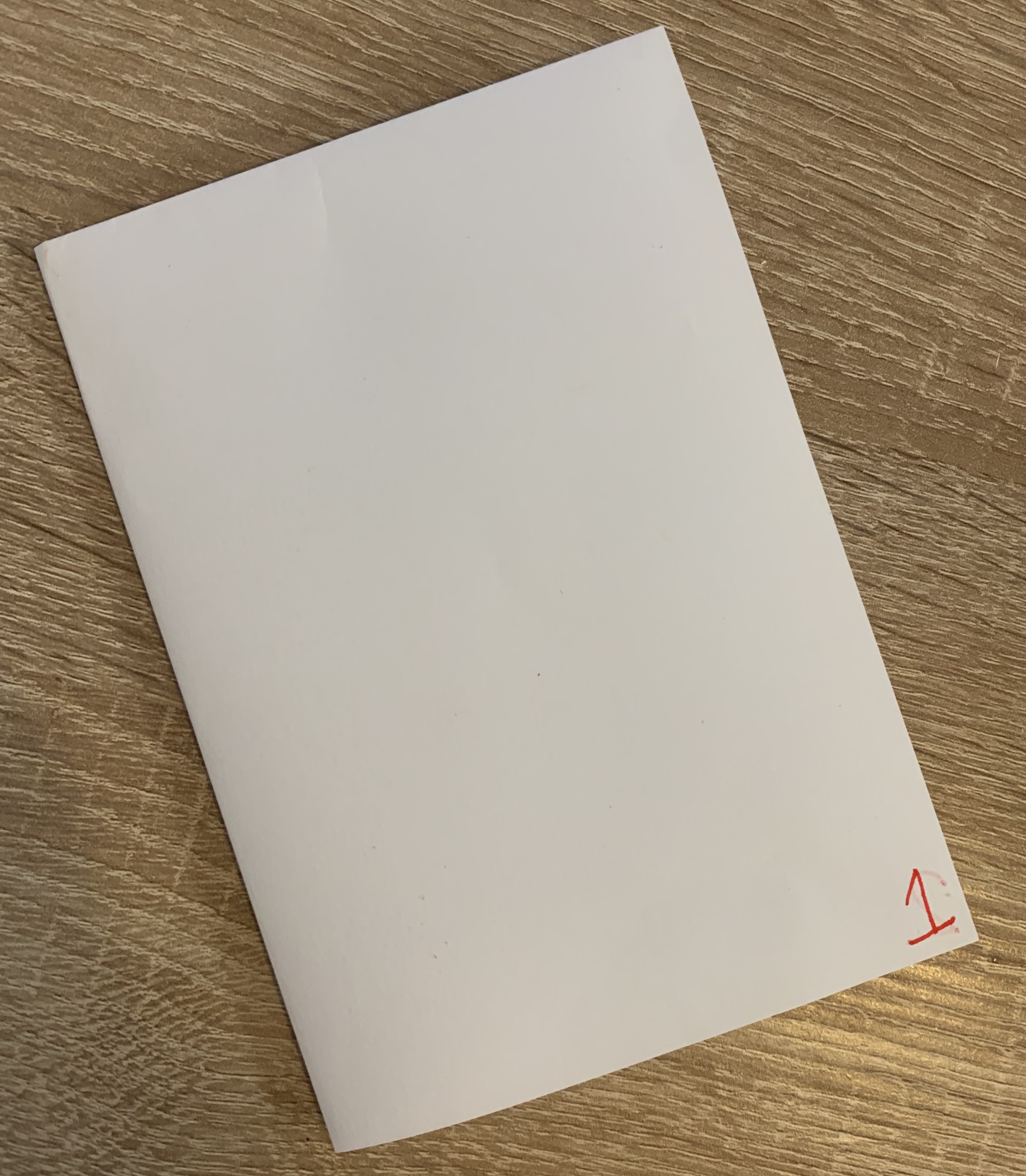
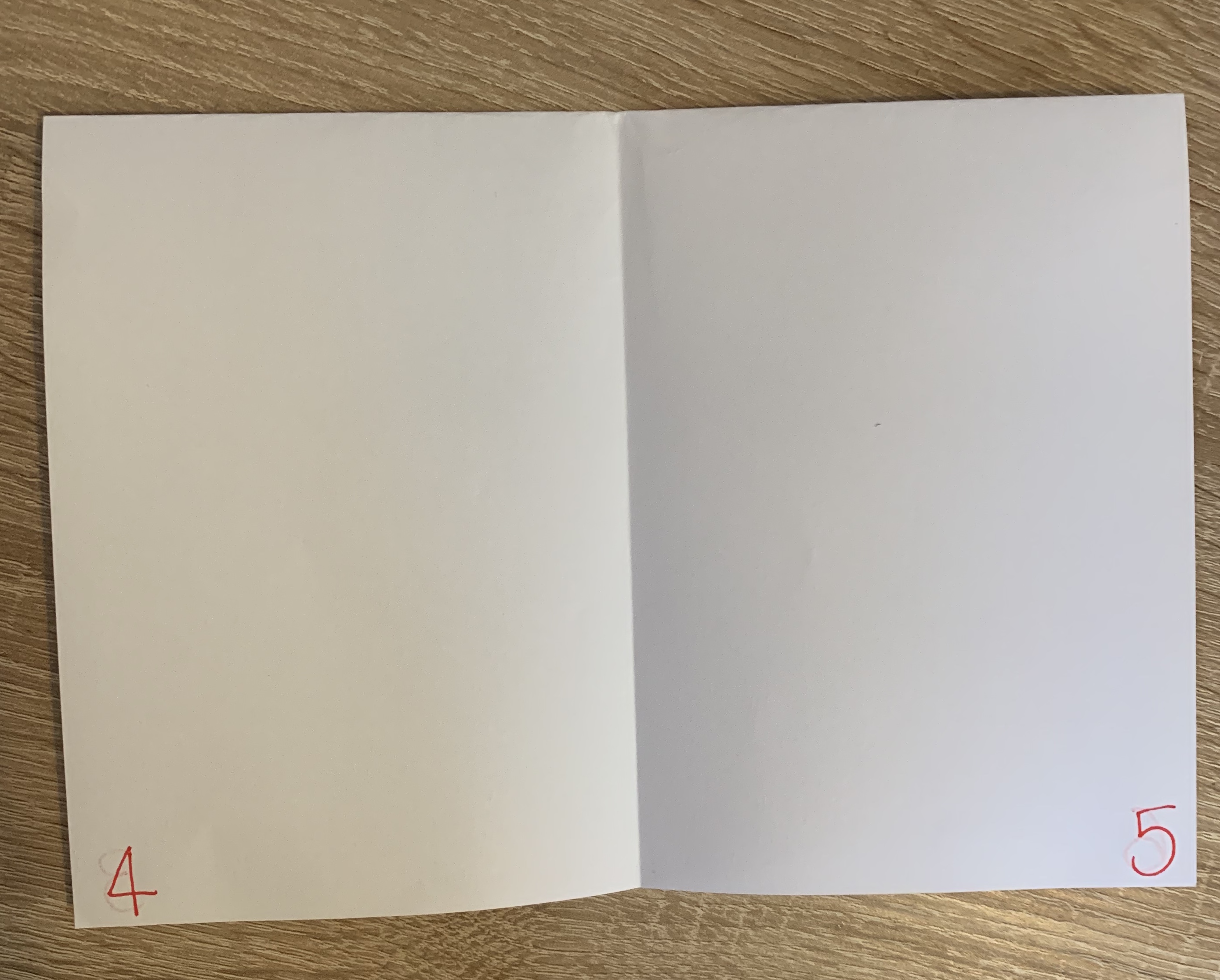
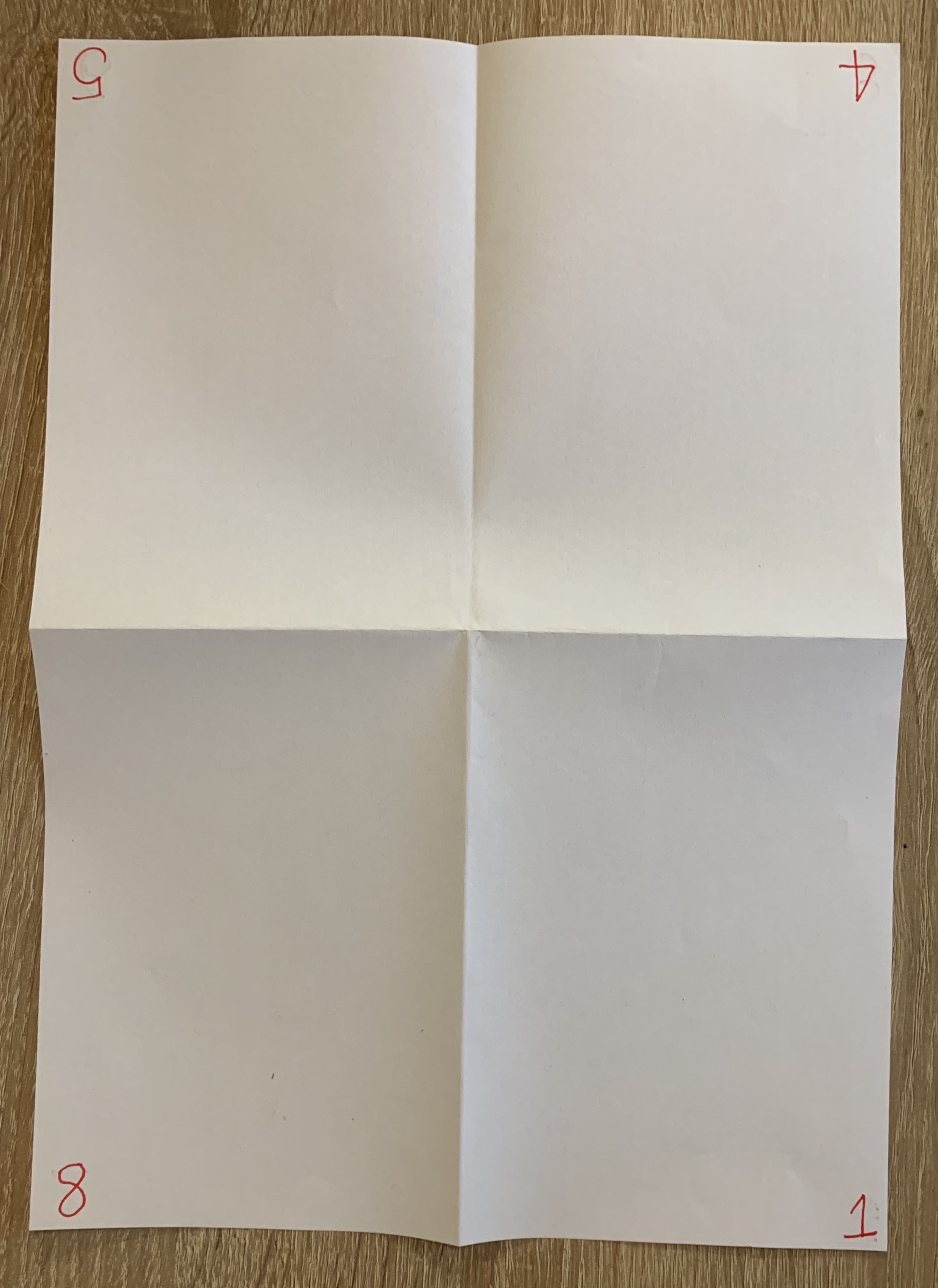
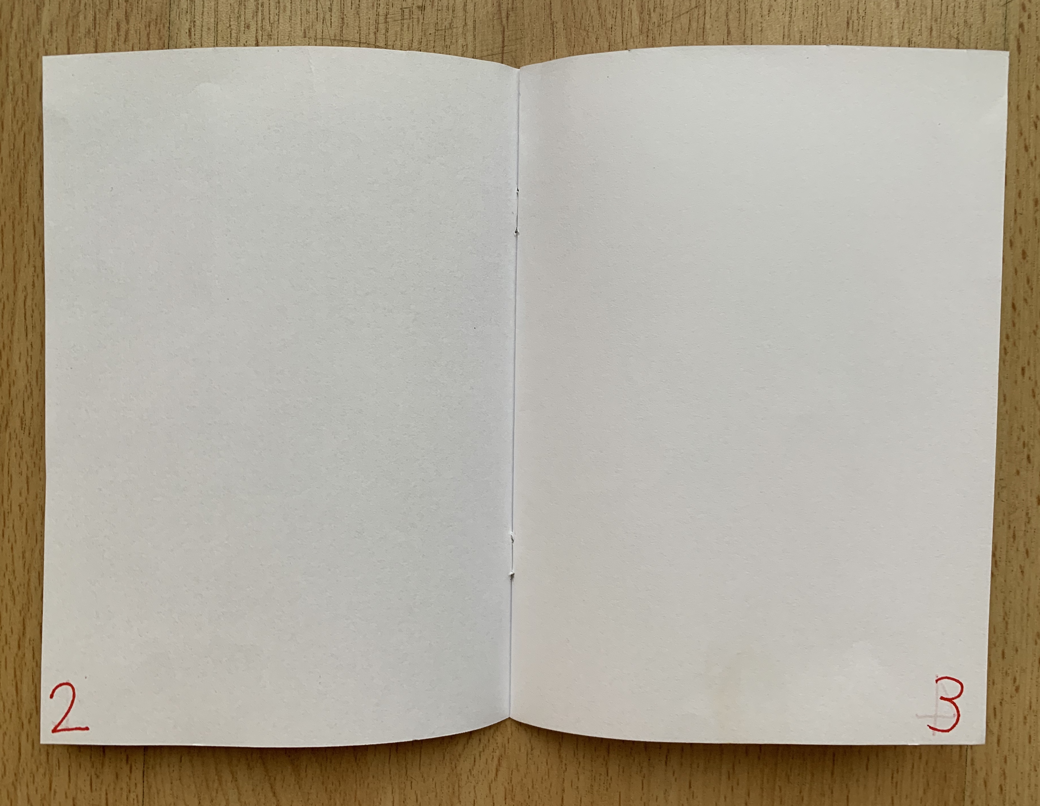
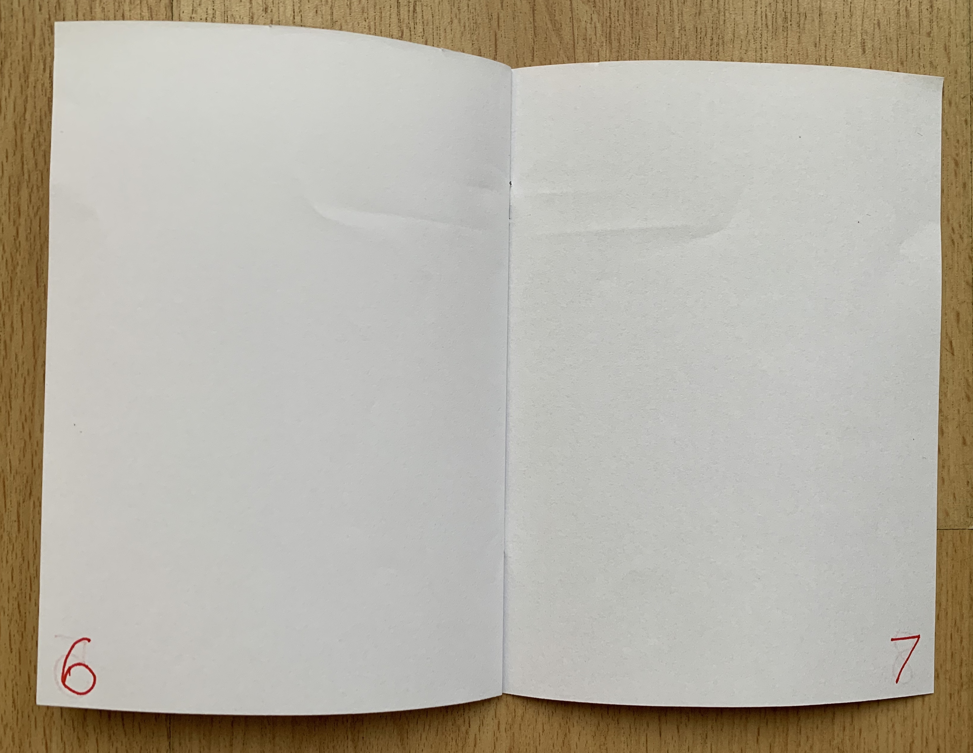
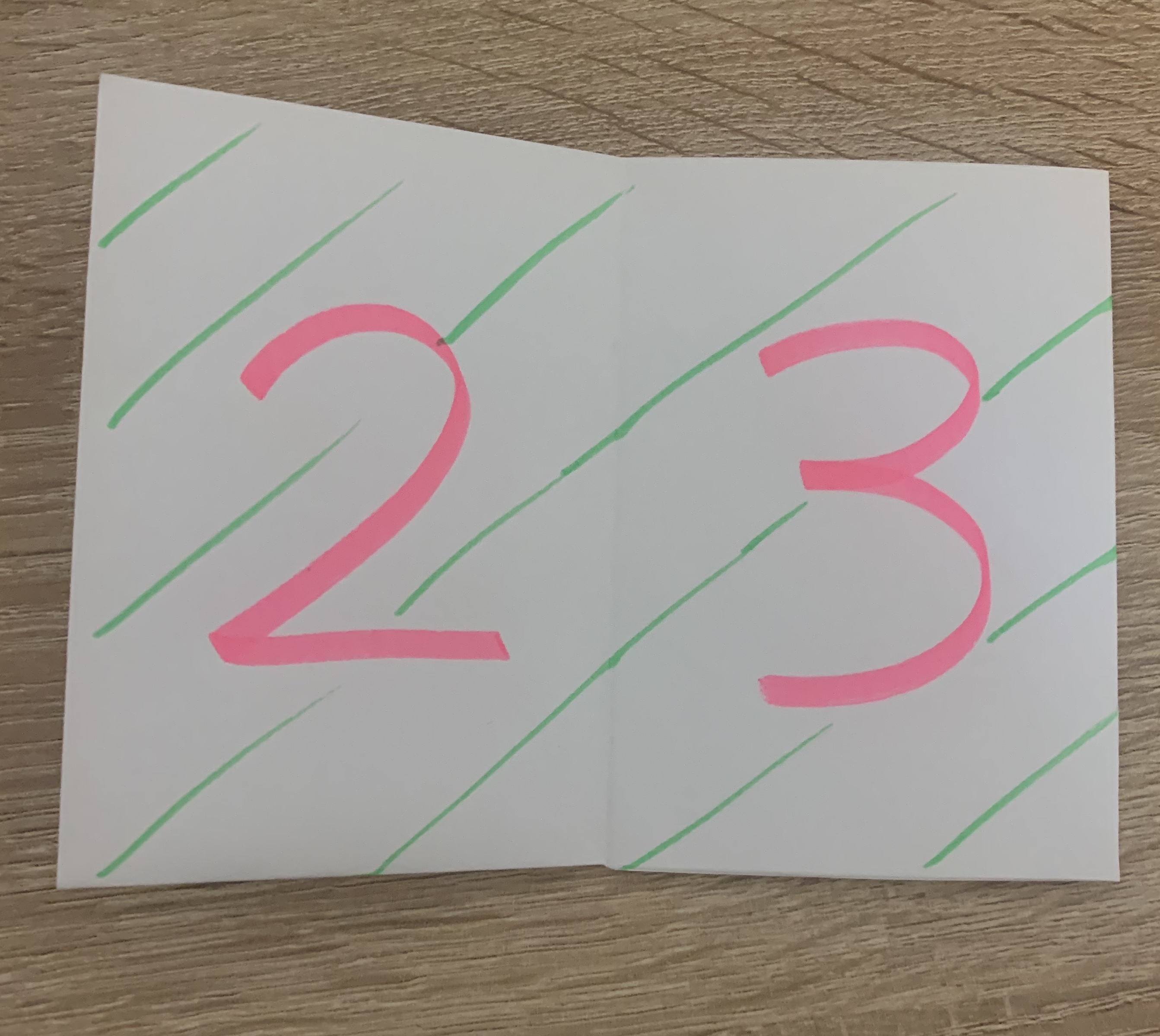
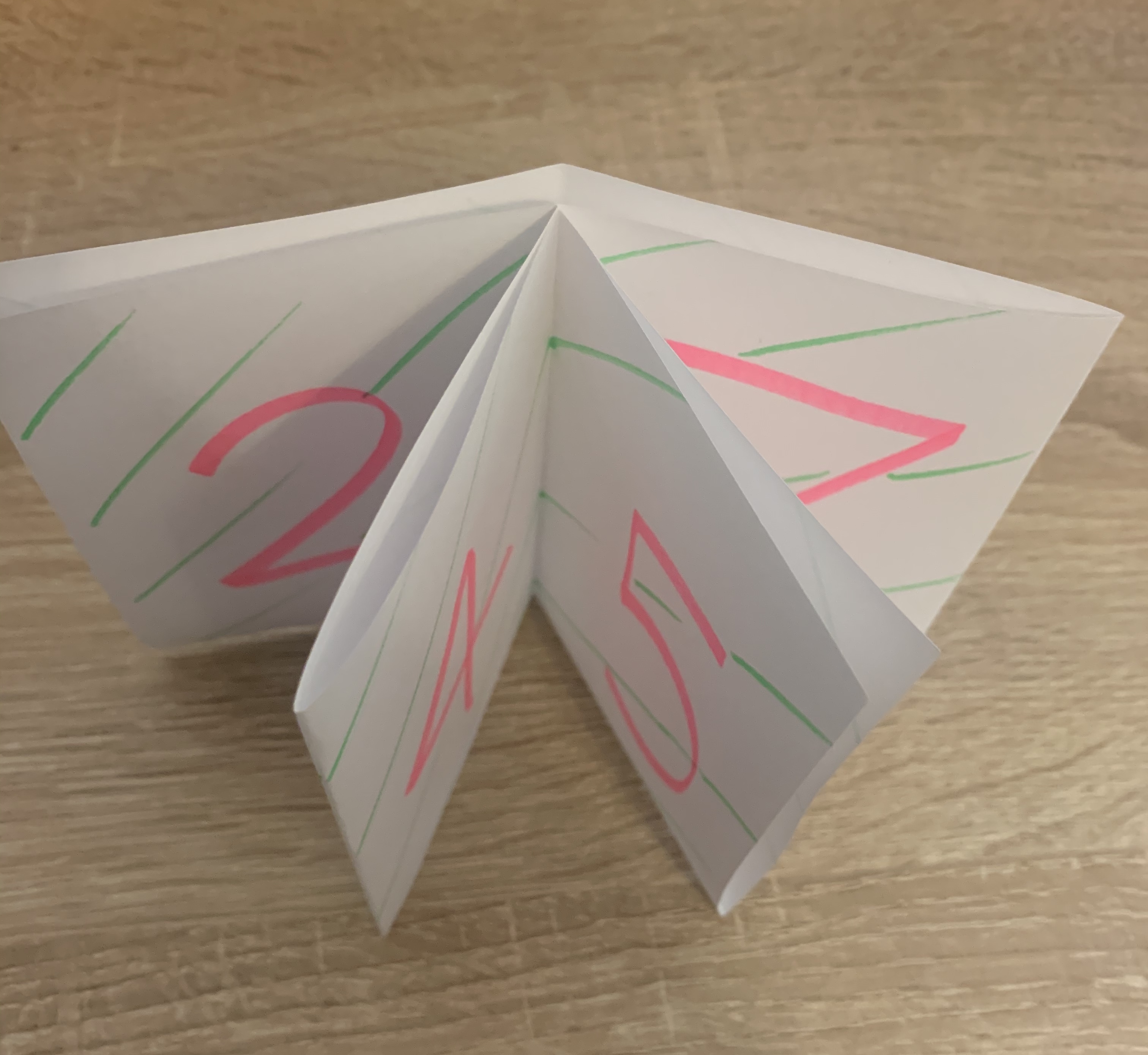
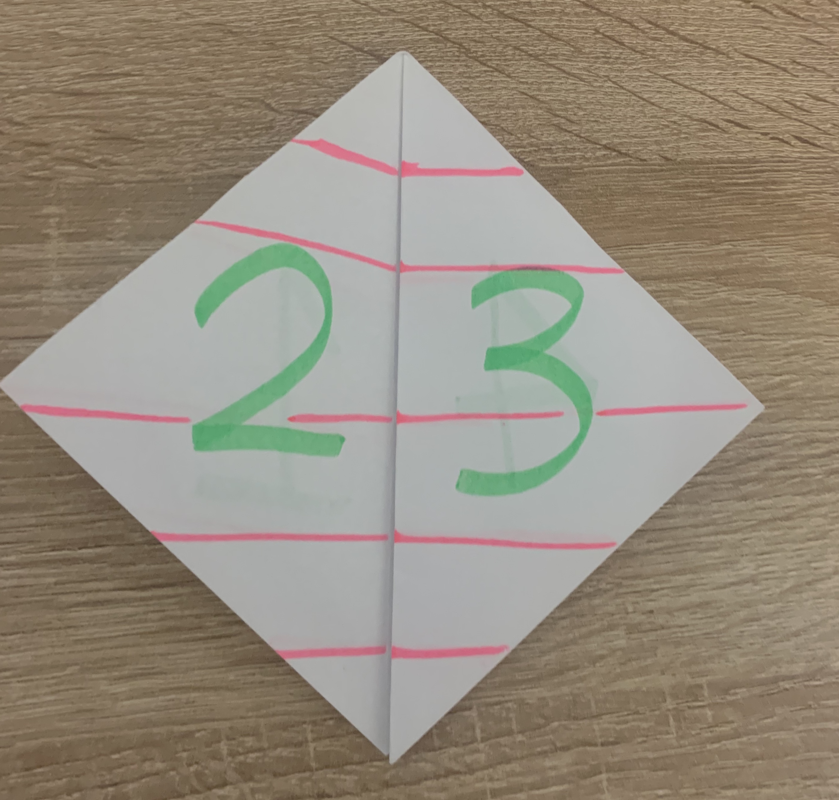
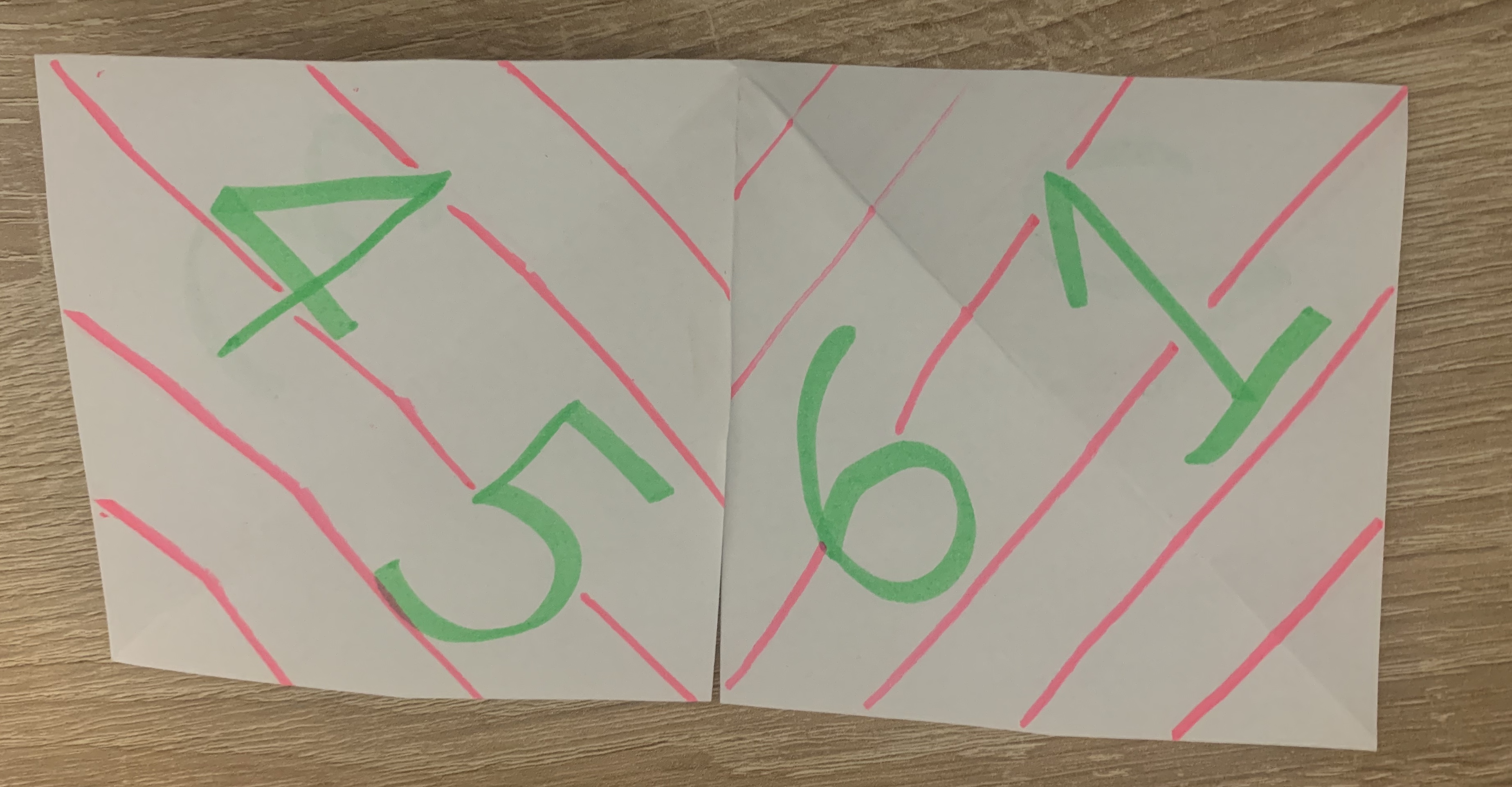
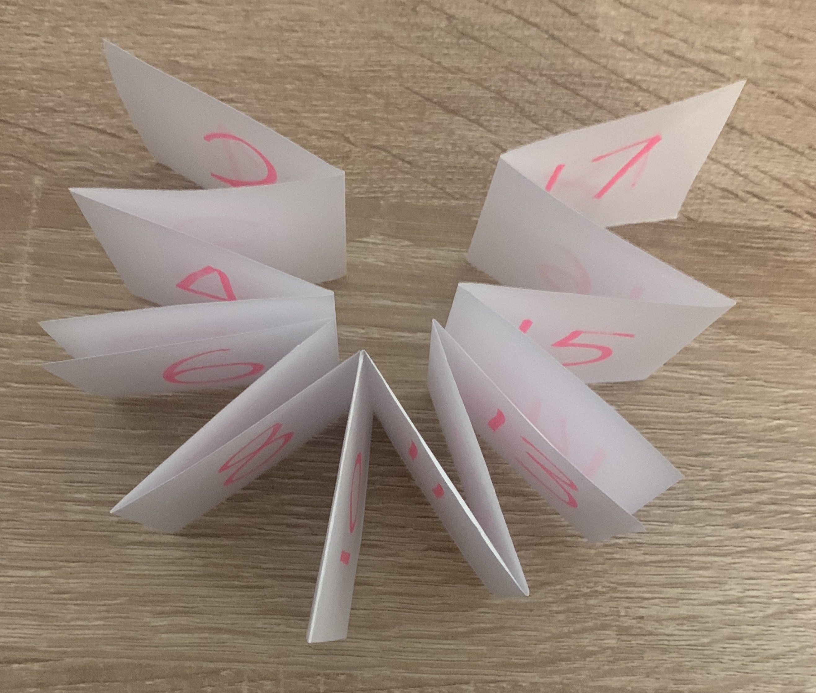
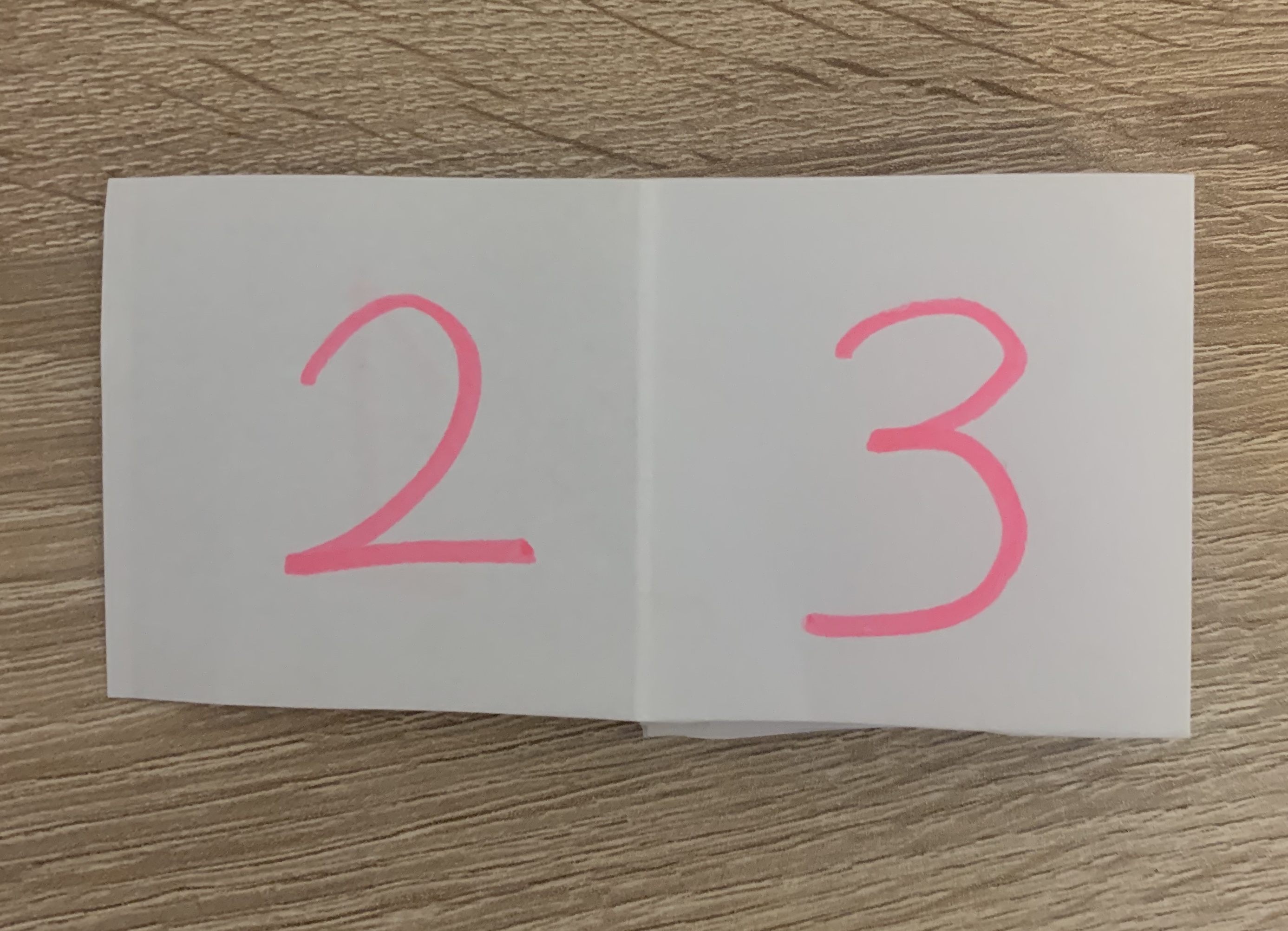
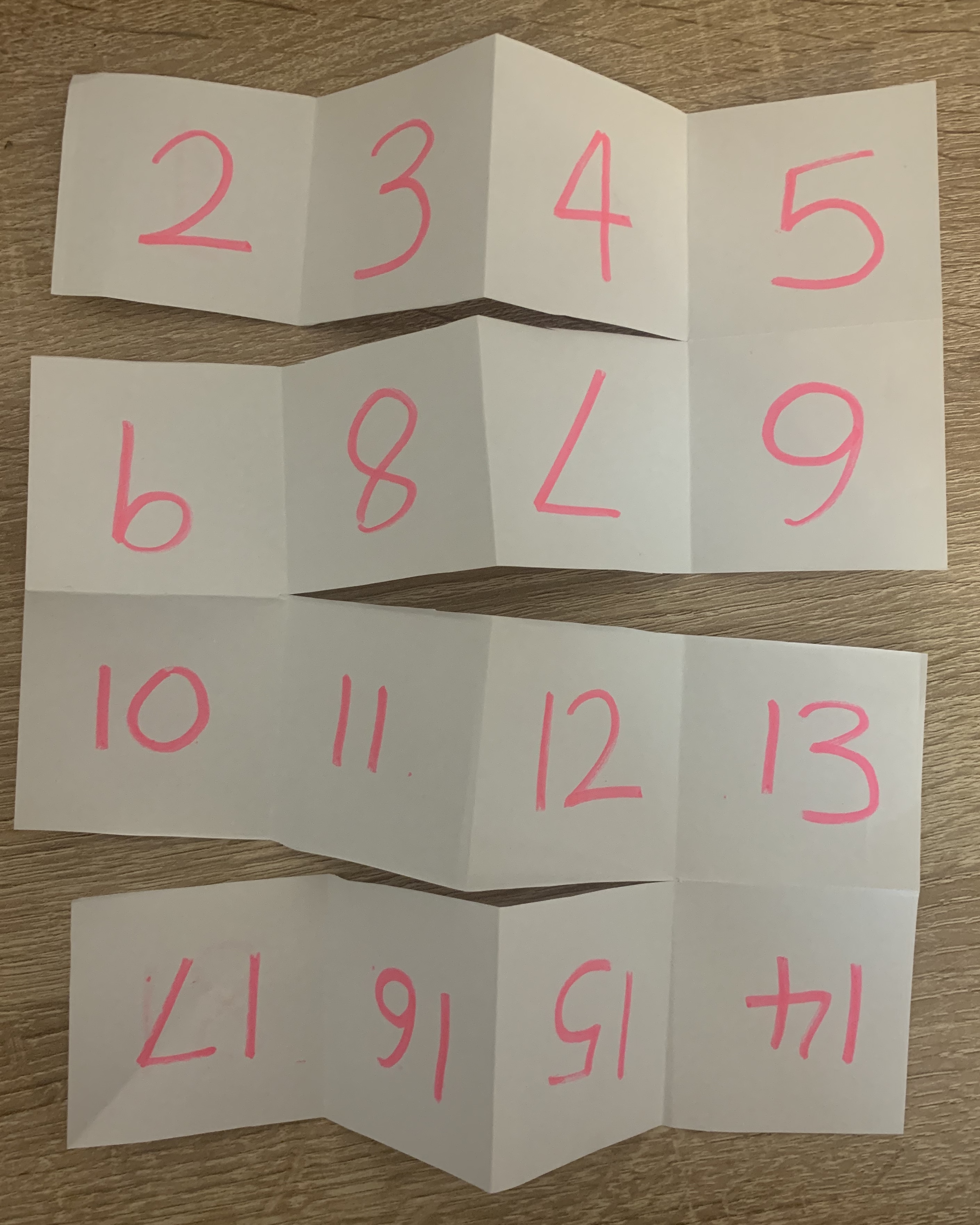
Fold an A4 sheet of paper in half, to create an A5 sheet. Now fold it in half again, so that you have an A6 size. This will comprise four leaves and eight pages. A page has a recto (facing) side and a verso (back) side. The terms recto and verso are also used to describe right-handed and left-handed pages in a double-page spread. With the sheets still folded, number the pages as they would read, from page 1, the front, through to page 8, the back. Now unfold the pages and notice how the numbers are distributed on the outspread sheet. This is a very rudimentary form of imposition, but the principle is essentially a miniature version of the same process within print production. By refolding your A4 sheet and then cutting the folded edges, you create pages, which can be stitched or stapled at the centre (gutter) to form a rudimentary book.
Books are constructed from folded sheets in this way, each on of which creates a signature. A signature is a section made up from a folded sheet which will create pages when guillotined. Signatures are built up in 2, 4, 8, 16, 32 or 128 pages then stacked up in sequence and glued or stitched (or both) across the back edge to form the book block, which is then bound to the cover.
I then stapled the paper along the gutter and cut the pages, creating a book.
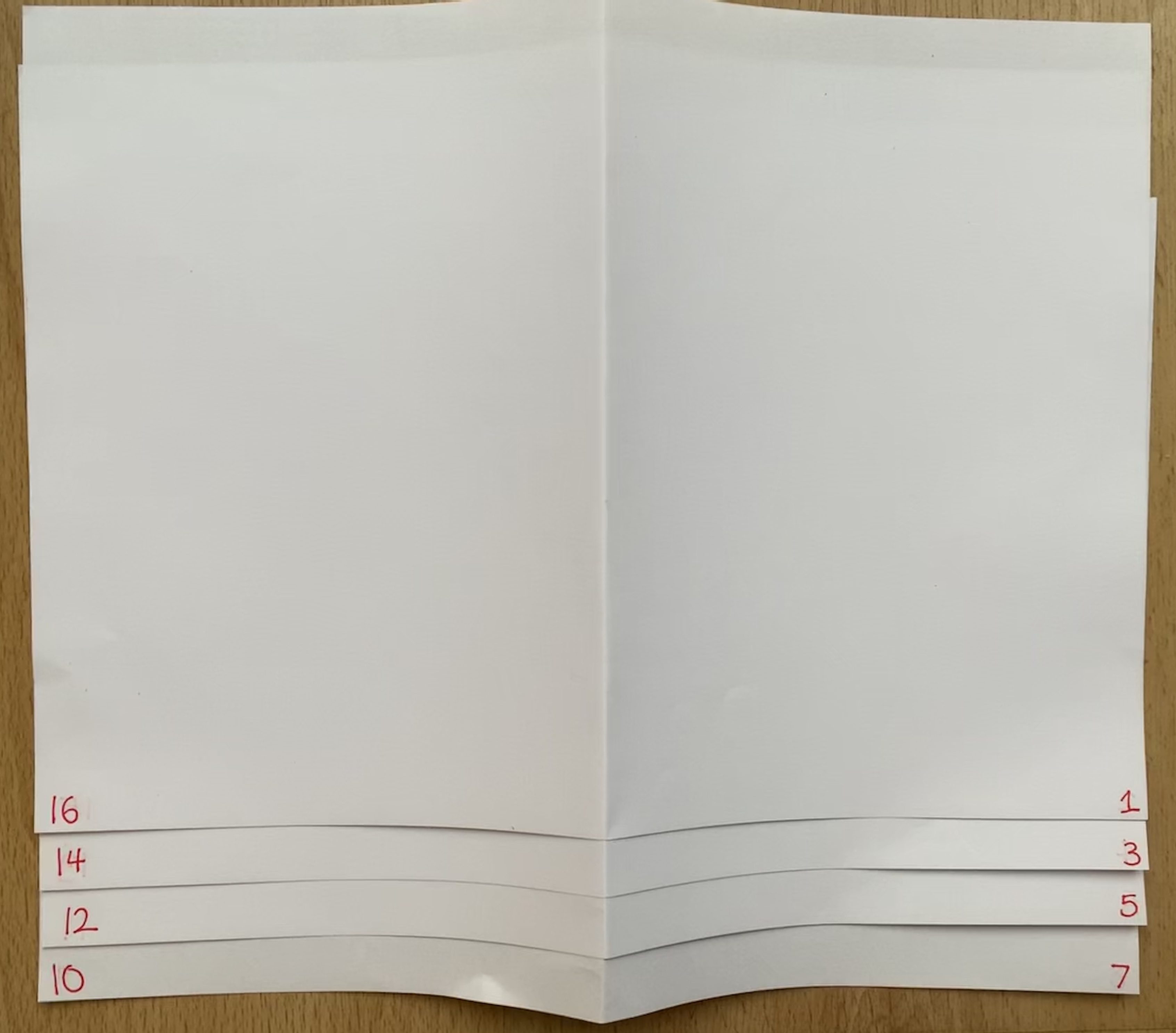
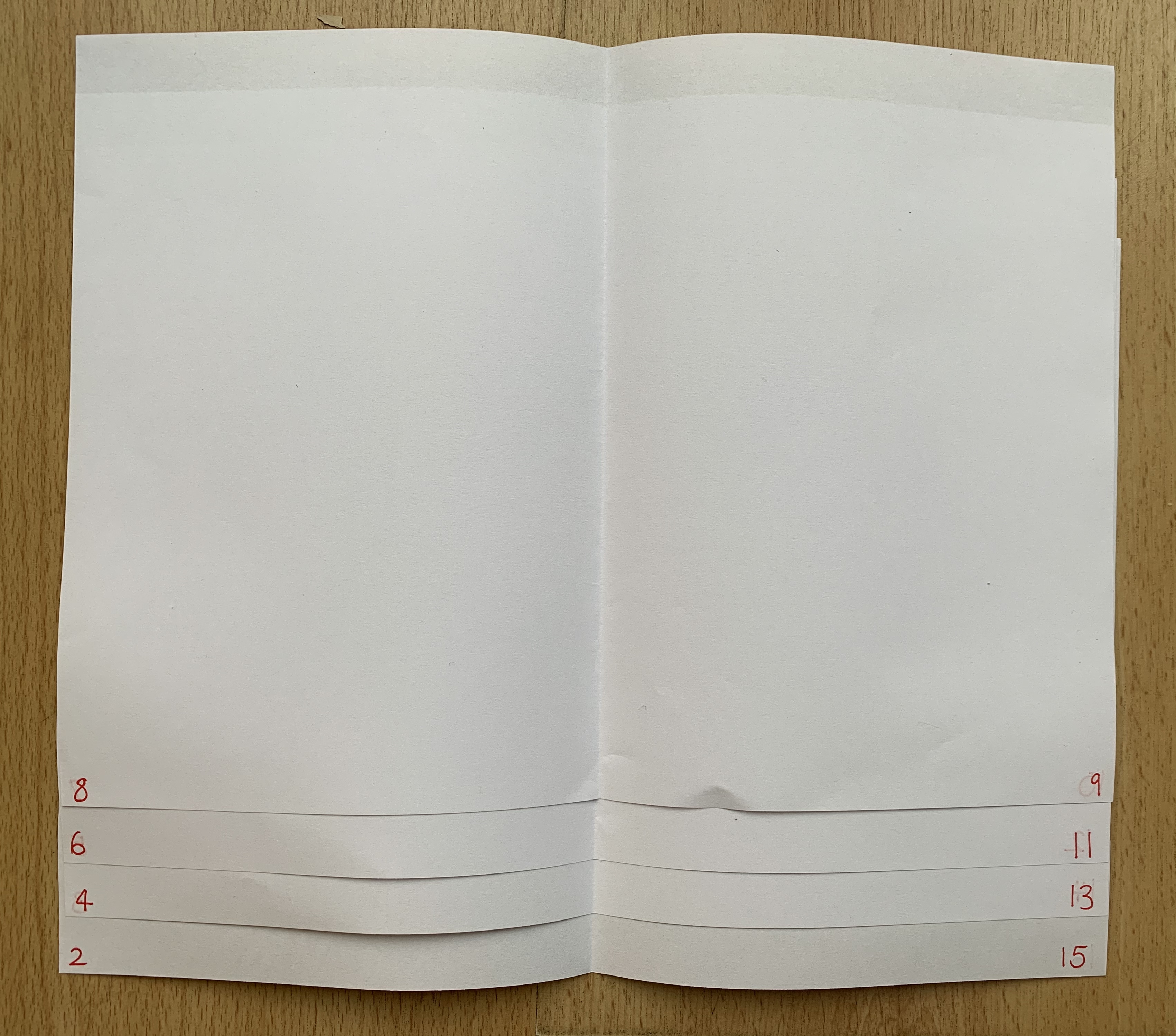
Creating a full scale mock up: To create an A5 pamphlet with 16 pages take four A4 sheets together, and with the sheets positioned landscape, fold in half. Stitching or stapling on the fold will secure the sheets and form your publication.
Additional pages can be added, but there is a finite number that can be slotted together before you notice how the folded pages start to stick out from the non-folded edge. This can be remedied by trimming the edges of your pages. For professional book designers working on large publications, this process needs to be taken through binding choices, and carefully adjusting page designs across the whole document.
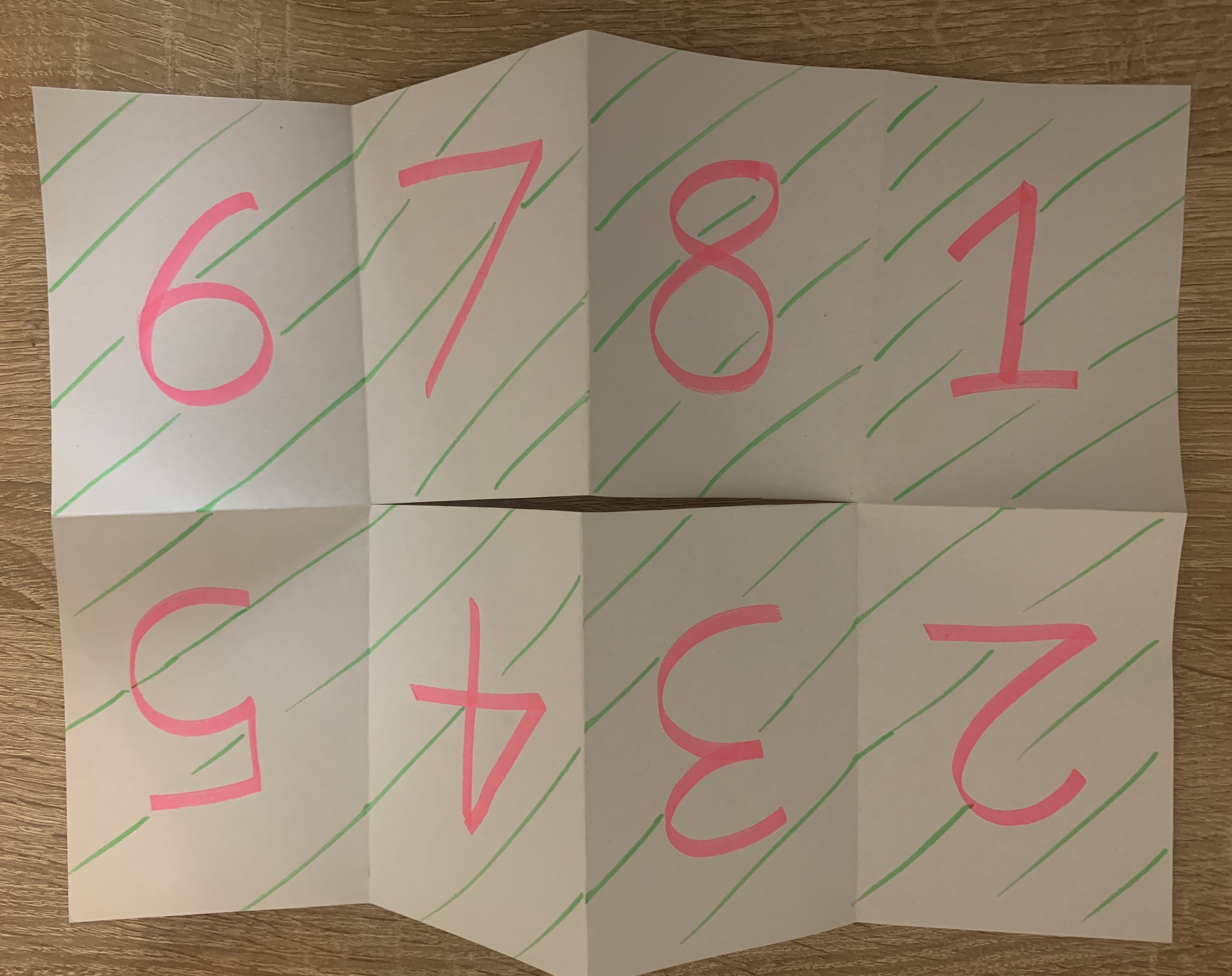
Number each of your sixteen pages from front to back cover. Unpack the document and notice how the relationship of the numbers on the front and back of each sheet. For example, 1 and 16 should be alongside each other, with 2 and 15 on the reverse. These numbers dictate where your content will go, and how this content needs to be printed, and are known as ‘printers pairs’.
Translating your DTP artwork, which has been produced in chronological order, 1-16, into the format needed to print your publication, is known as pagination. Commercially, printers often undertake this work, but as designers, it is also useful to understand how pagination works. A simple way to approach this, is by taking the overall number of pages (often including the covers), and add one. So for your sixteen page booklet the magic number is 17. Go back to your mock up and add up your page numbers – each of your spreads should add to 17.
After creating these folds it made me think of other ways to fold documents which wouldn’t necessarily be books but perhaps leaflets.
Whilst looking for folds I came across a really interesting Youtube channel called FoldFactory. They have some amazing examples of different folds which can be achieved. Although these aren’t tutorials, with practice and common sense you can easily achieve folds the same. Below is the link to their Youtube channel.
I wanted to test out a few different folds which I found simple yet satisfying.
Broadside Booklet Fold (8 Pages)
This fold works really well, also when unfolded it is laid out in an easy to navigate way by starting with one corner square and working your way around the page.
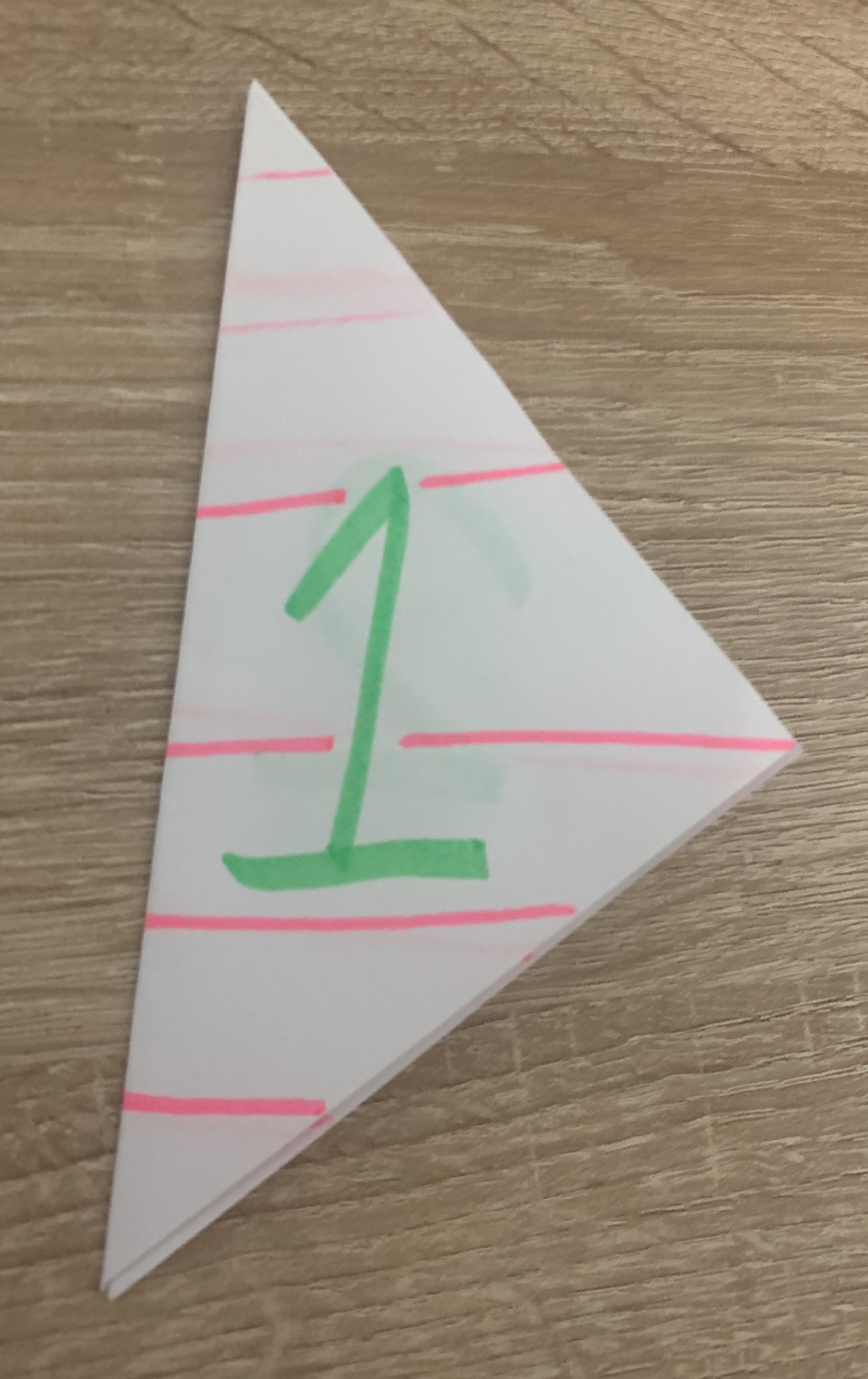
Triangle fold (6 pages)
Although this obviously wouldn’t work as a book, it is still and interesting and easily done fold. Possibly the weakest out of the 3, however I was still pleased to experiment with it.
Meander Accordion Fold (18 pages)
Although this is done on a smaller scale (A3 would of worked better than A4) it is still a successful fold due to the amount of pages, and if scored deep enough it springs back into its original state, which is important when creating a folded document as you want it to return in the original state.
Reflection
I found this exercise interesting and helpful when numbering the pages and unfolding it to see what the layout is on the page, rather than assuming the pages would flow in the order they are when in a book format.
Brief: Firstly, review your visual ideas based on from the previous exercise through a process or critical evaluation. Which ideas are you drawn to? Which ideas have ‘legs’ – possible interesting outcomes which are worth pursuing? Often the ideas which are the strongest are those which have depth, or many layers of association. Perhaps you are initiatively drawn to a particular idea. Select a few ideas you would like to push further. Use your learning log to record your thoughts.
Now, do you need to undertake any research to help move your selected ideas on? The form your research will take depends on the individual elements of your idea. Find source material that helps informs your ideas. For example, by doing objective drawings or taking photographs, to understand your subject better, and to consider aspects of composition. You can use both primary and secondary sources of research in this way. Research feeds into the development of your visual work, informing and advancing your ideas. Document this phase of the work accordingly.
The developing your ideas stage is about building on your initial ideas by reworking them, adding the visual or other insights gathered through your research, and testing out different versions or possibilities. Spend 45 minuets developing the possibilities of one of your ideas. How many different ways can you visualise this? If you want to develop a broader range of ideas, the repeat the previous exercise to generate more possibilities, potentially using a different phrase as a starting point. Use your learning log to document this process of review, research and development.
Visualising your ideas is the culmination of all your primary work in which you work up some more developed visual sketches and ideas. This artwork can be hand-drawn illustrations, photographs, and/or include typography. The presentation can be a little rough around the edges but should show the main elements of your designs. Select the strongest variation of your ideas from the previous research and development exercise to start exploring how you can visualise them within a mock-up.
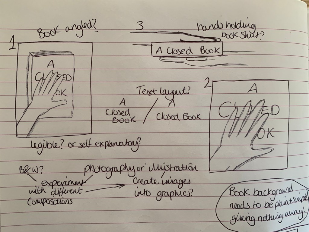
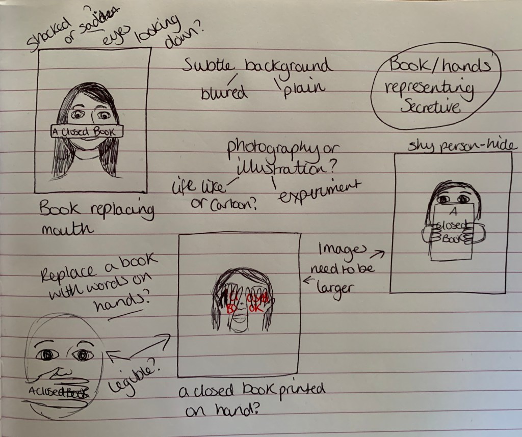
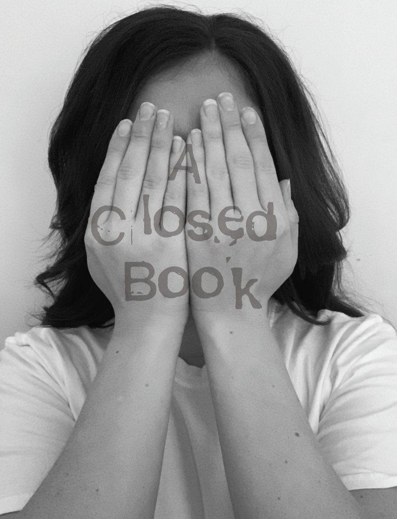
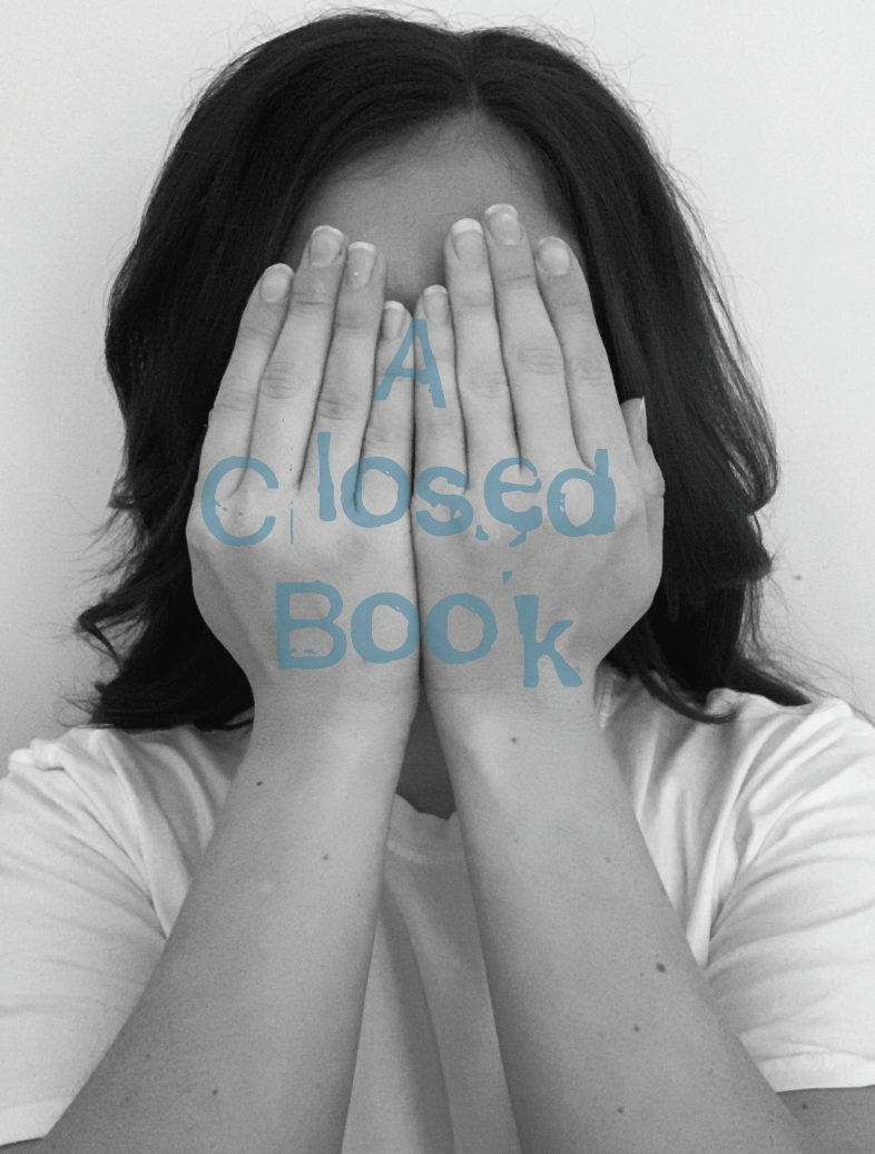
Visual Ideas Design 1 – A Closed Book
Out of the above thumbnail sketches I am drawn to the hand holding the book (to experiment both up close and a far images), The bottom left sketch of the open book background, and the sketch of the woman with the book in front of her mouth.
Hand holding book: I am intrigued to try both versions of this book, one to visually see the hand keeping the book closed, and the other to show a real visual representation of a life sized hand holding closed the book. I will experiment with photography and illustration for this design.
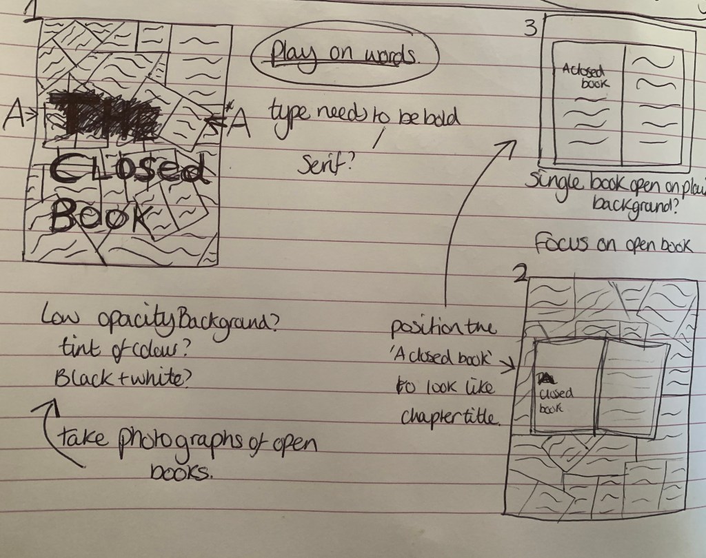
Open pages: I like the play on words for this design with the whole background being made of open books and the typography of ‘A Closed Book’ made to stand out. The best way to achieve this is by having the background in black and white, or of a tinted colour? And to choose a clear but formal typeface and colour.
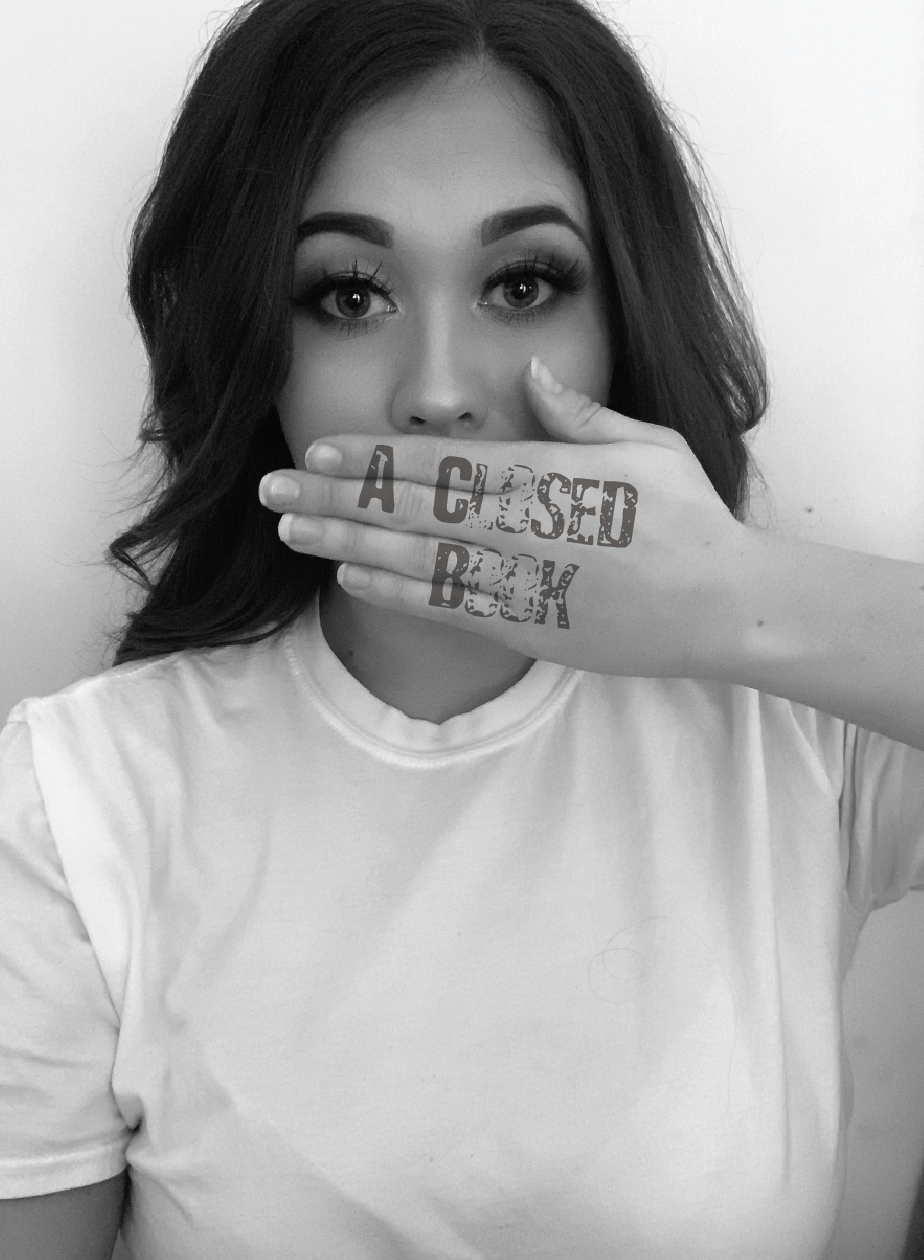
Woman and book: The idea behind this sketch is to show either a shocked or shy expression on the woman’s face with the spine of a book in front of her mouth. This is to try represent how being a closed book represents someone who is shy, quiet and reserved. The woman could either seem shocked that her mouth has been replaced – without her realising she is hard to read and is reserved, or it could be expected by the woman and she could just simply have a shy blushing expression on her face. I will experiment with both photography and illustration for this design.
Further Research
I didn’t feel there was any more necessary research I could do on ‘a closed book’. So instead I have decided to look further into each sketch and note down design elements to help narrow down my final design.
Hand holding book
For this design I felt that it would be best to create a plain background for the book, to give the sense of mystery which will relate to the phrase, so the cover will simply consist of typography half hidden underneath the hand, so I need to make sure that the typeface I choose is legible even though half of the letters will not be visible. I am still unsure of whether I would like the book to look like sketch 1, 2 or 3 at this stage. Once I experiment with the photography side of the design this should help me determine which image will work best for the design. I just need to make sure that the design carries the correct message behind the phrase.
Open Pages
I am intrigued to see what this design looks like as it is portraying the opposite of the phrase. The design with stands out for me the most is still the original sketch 1. I think with a low opacity background and to experiment with colour tints, this could make a strong, endearing design. The typeface would need to be strong and bold to stand out amongst the heavily detailed background.
Woman holding book
Im slightly unsure of which approach to take this design, I am worried that it won’t look as effective as I want it to be. However I am still very keen to experiment with this. Whilst focussing on this design I thought it would be more effective to eliminate the use of a book, as all previous design are based on actual books within the design. I like the thought of having a hand covering either the face or the mouth of a person and the text to be placed over the top almost as if it is in-printed on to their skin. When I do come to experiment with this design I will also try other creative positions. After having the idea to steer away from the obvious (not using books in the design) it has now made me question the strength of the previous designs… are they too predictable????
Developing Ideas
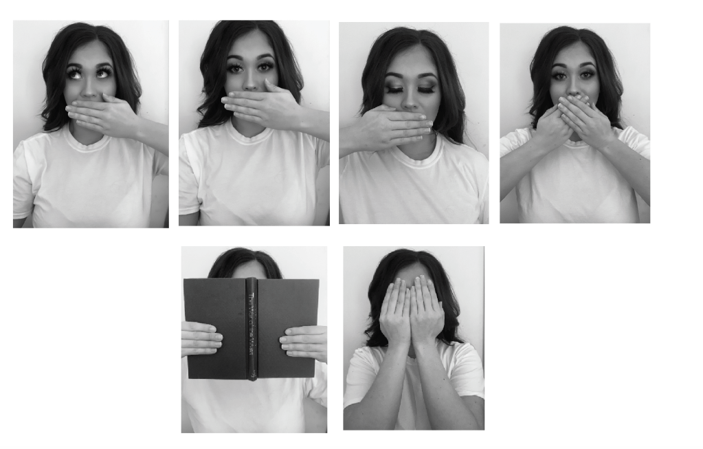
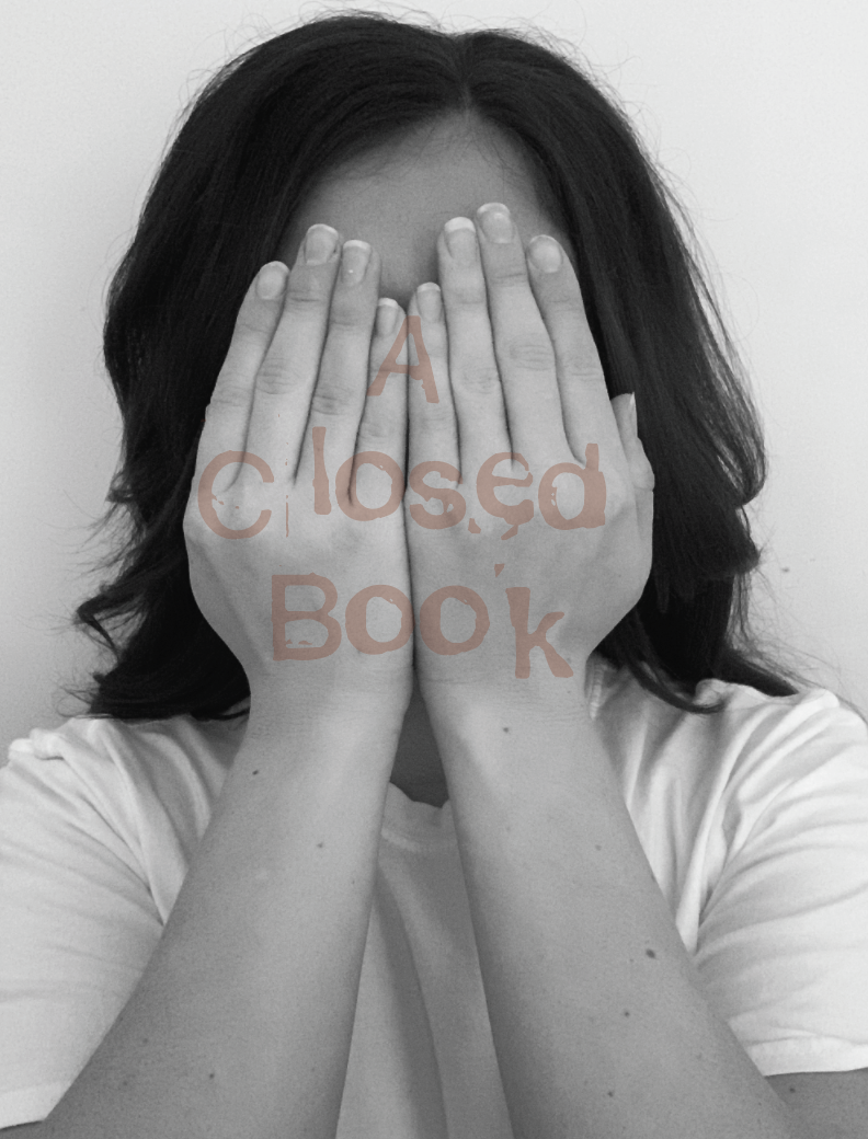
The design I have decided to develop further is the hands over face design, as part of the woman holding book idea. The reason for choosing this design is because I liked the fact it doesn’t include a book, I wanted to think of something more creative, yet still noticeable to the phrase.
I started off by experimenting with my photography skills and taking pictures of different positions and angles. The results are as followed;
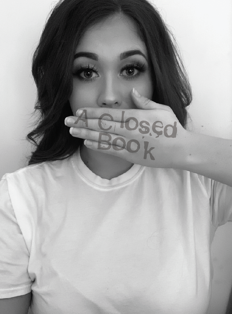
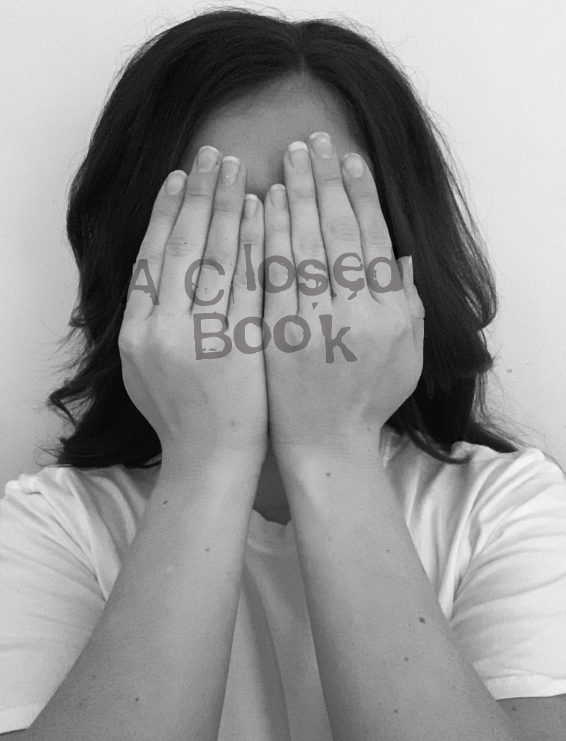
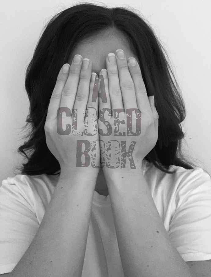
I felt that the image looking straight into the camera with the one hand was strong, I also liked both hands in front of the face. I went on to add text.
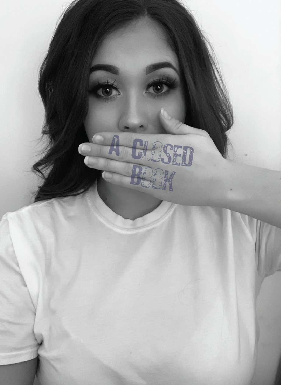
I felt that the stamp effect typeface works best for this particular design. Out of both images I feel that both hands covering the face is more fitting to the phrase, as this gives nothing away. You can see non of her face giving an intriguing feel.. What does she look like? Why is she hiding?
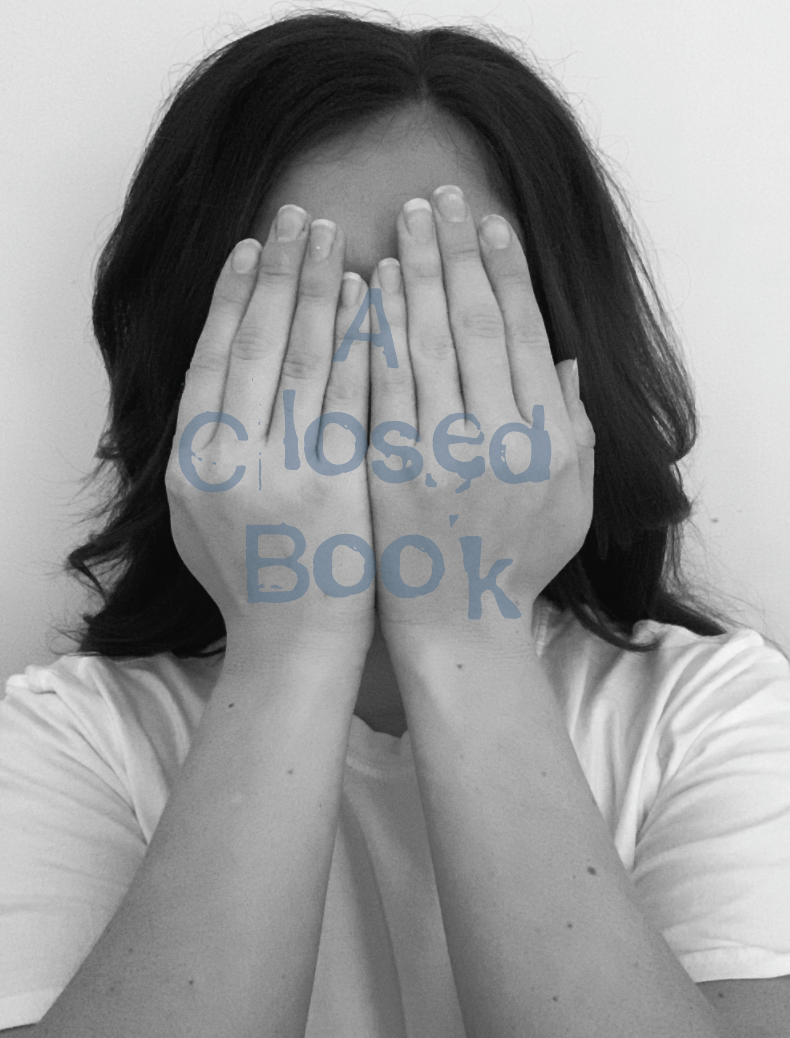
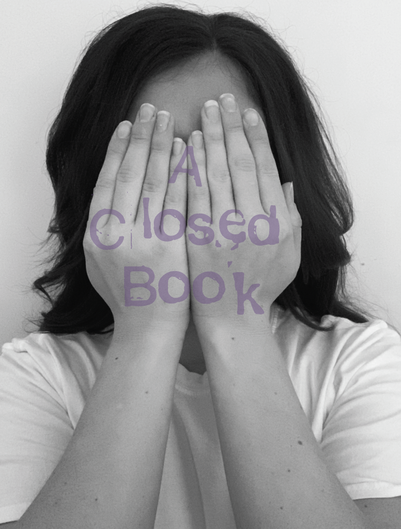
Visualising Ideas
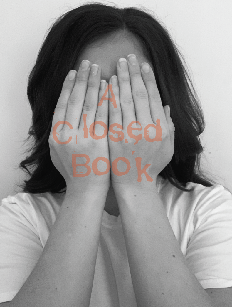
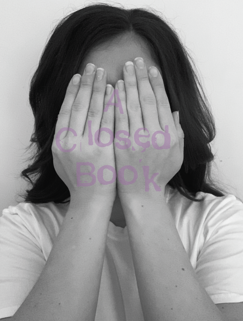
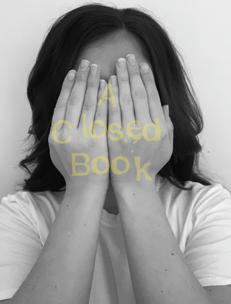
I wanted to experiment with adding colour to my design so I firstly thought about how particular colours stimulate different moods and feelings. In this case the colours associated with the phrase would range from blue stimulating feelings such as shyness, worry, sadness to purple being mysterious.
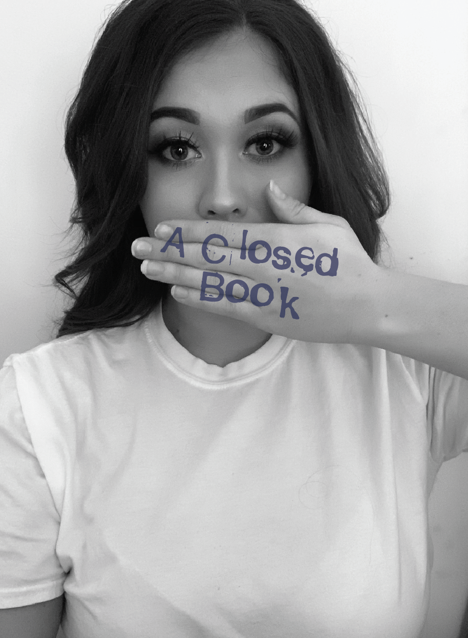
Although as mentioned previously about using colours relating to stimulating emotions, I wanted to experiment with the brightness of colours, the yellow and red create a strong contrast against the black and white image.
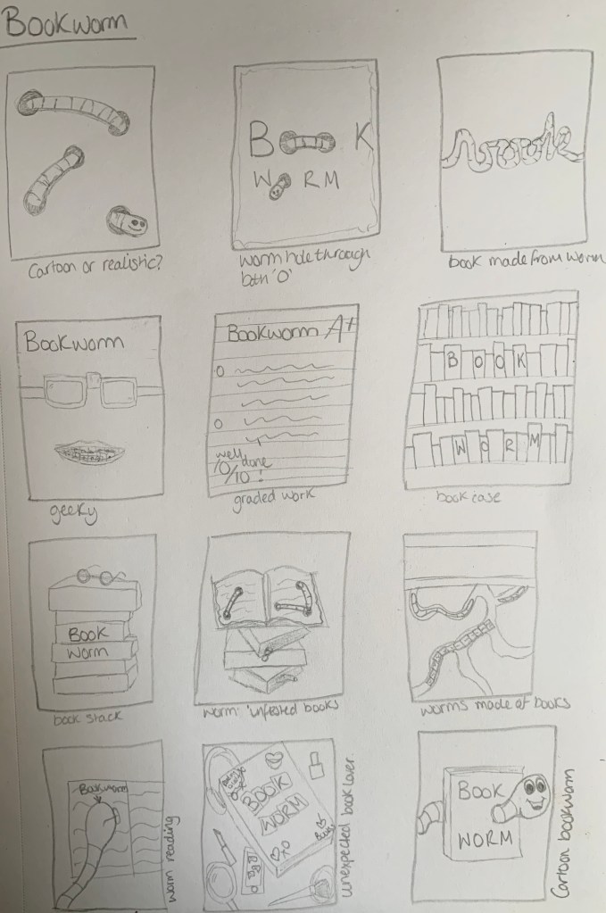
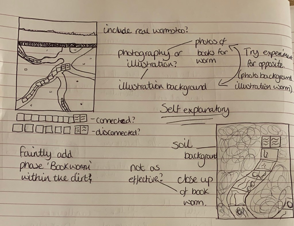
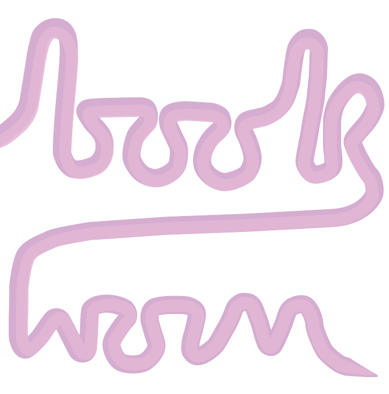
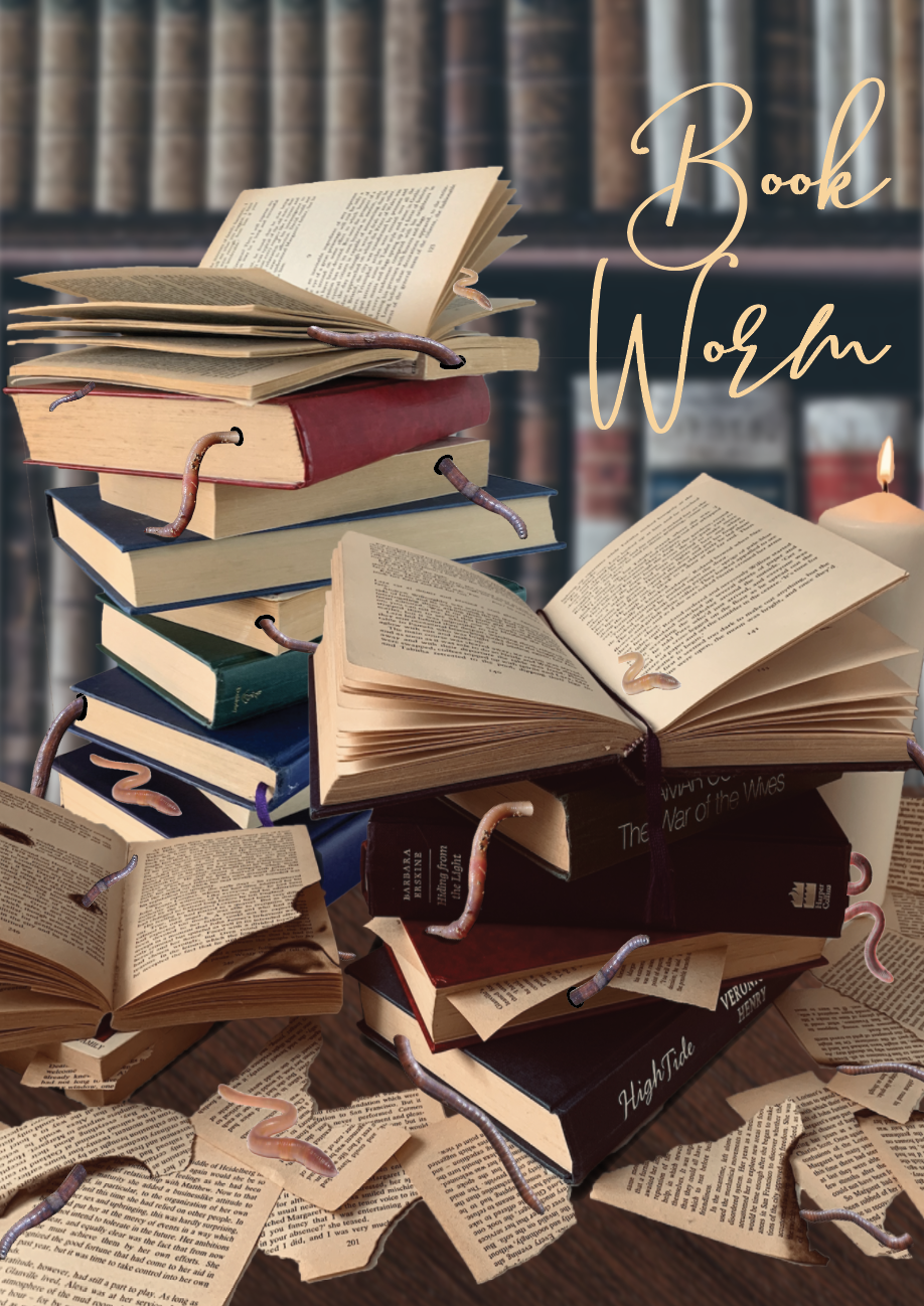
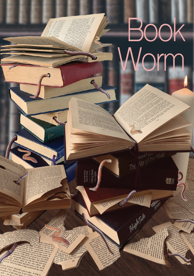
Visual Ideas Design 2 – Bookworm
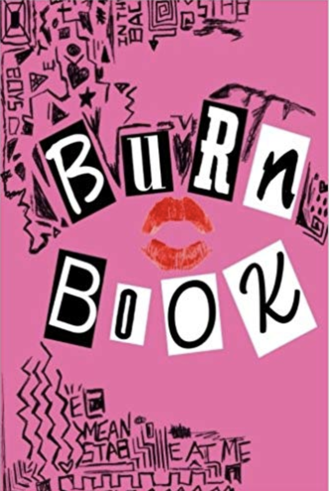
Out of the above sketches I am drawn to the word book made from a worm, the stack of books with the worm coming from the pages and the worm made of books underground. I also like the bottom centre design of an unexpected book lover, I have created the cover of a book in the style of ‘Mean girls – Burn book’ surrounded by other girly items and technology.
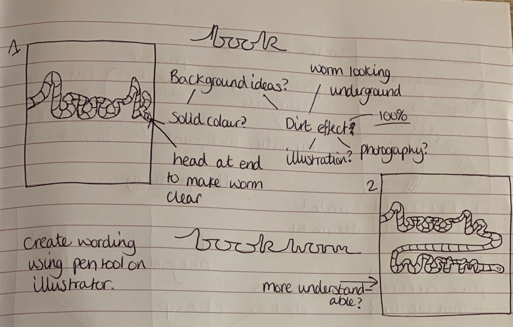
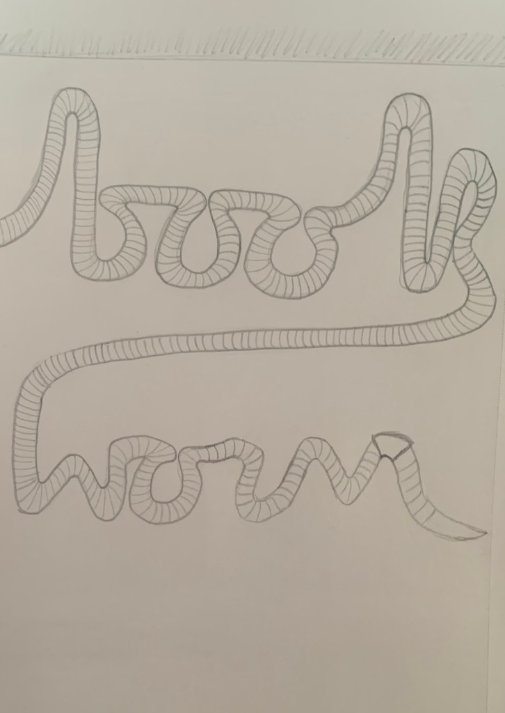
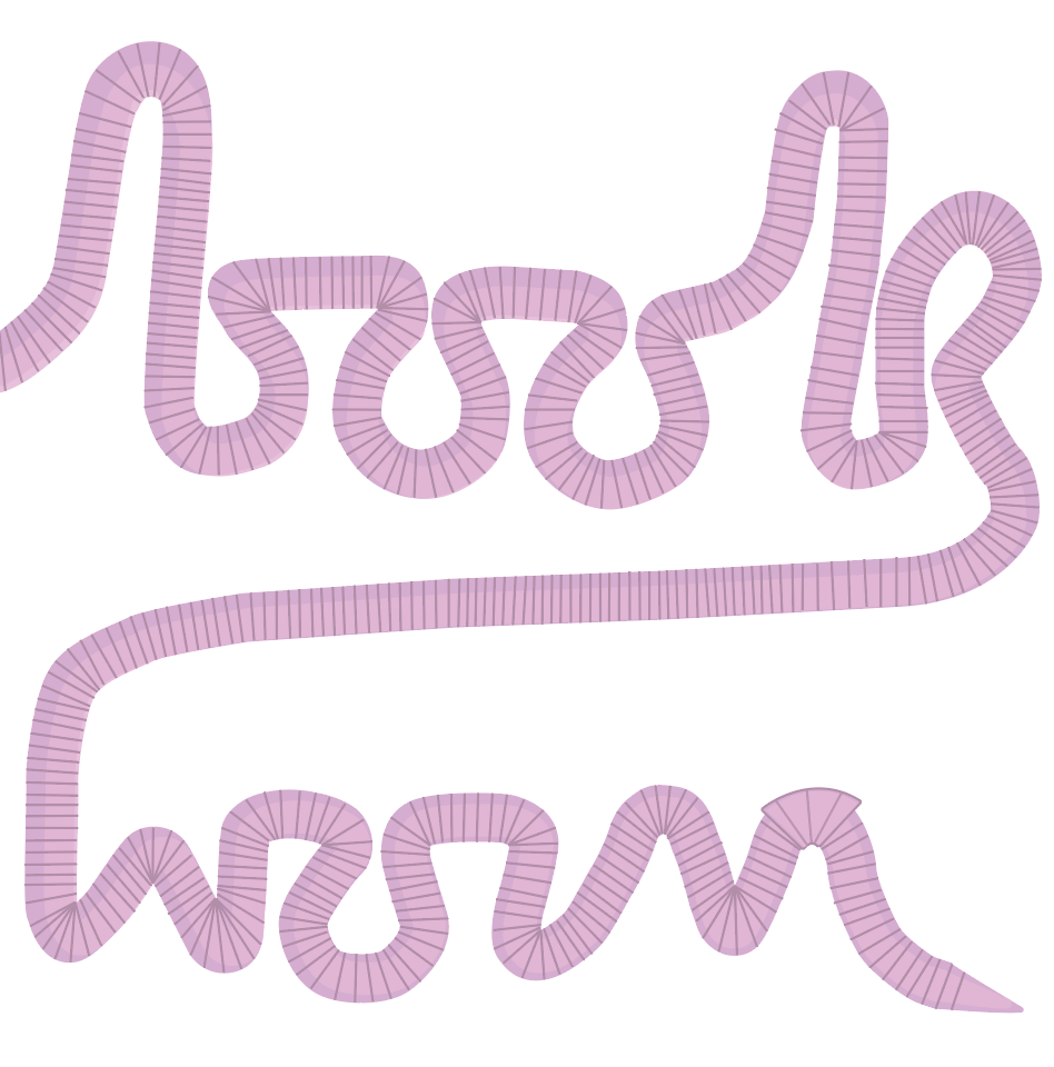
Worm Word: I like the idea of this design with the word ‘Book’ being made from a worm to create a say what you see design. To make it clear that it is a worm I will make sure to include a head at the end of the ‘k’ rather than the design carrying on past the edge.
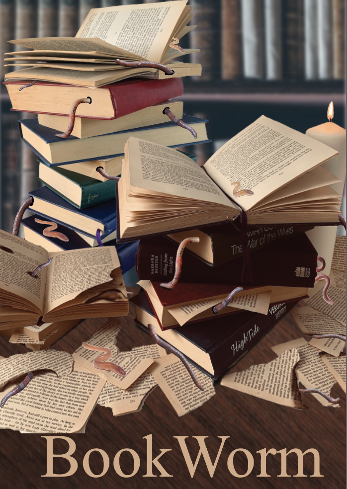
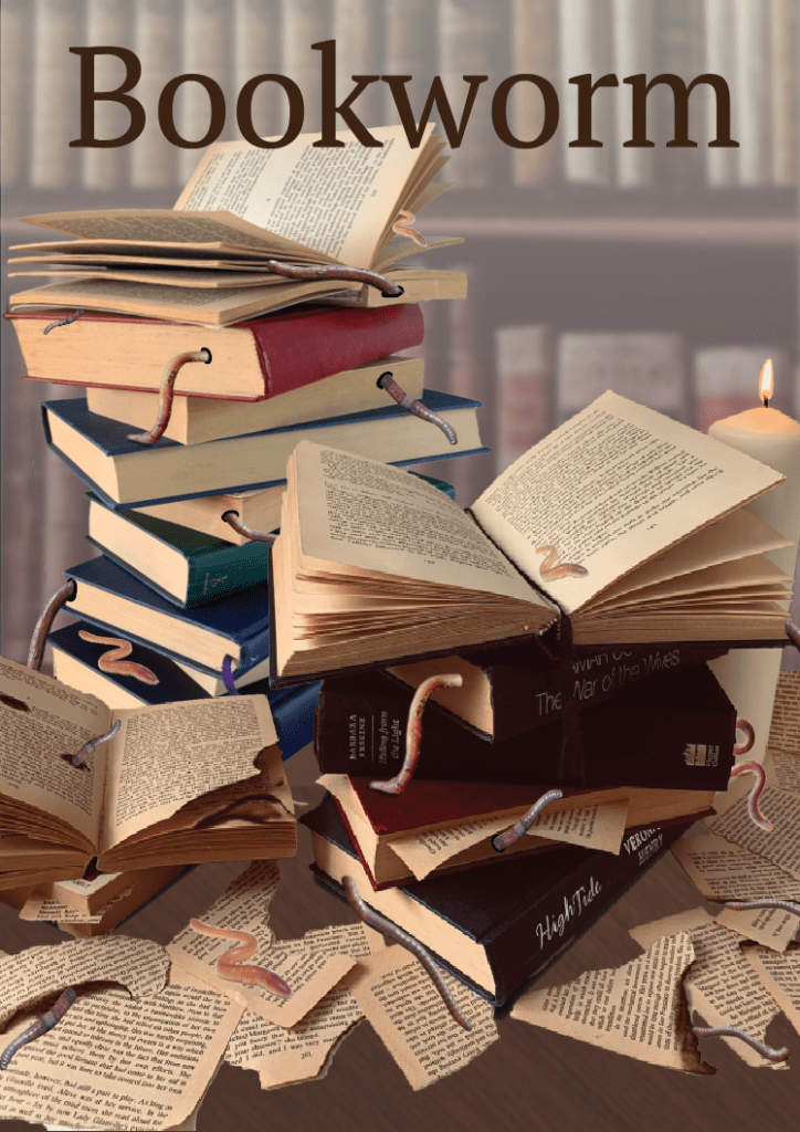
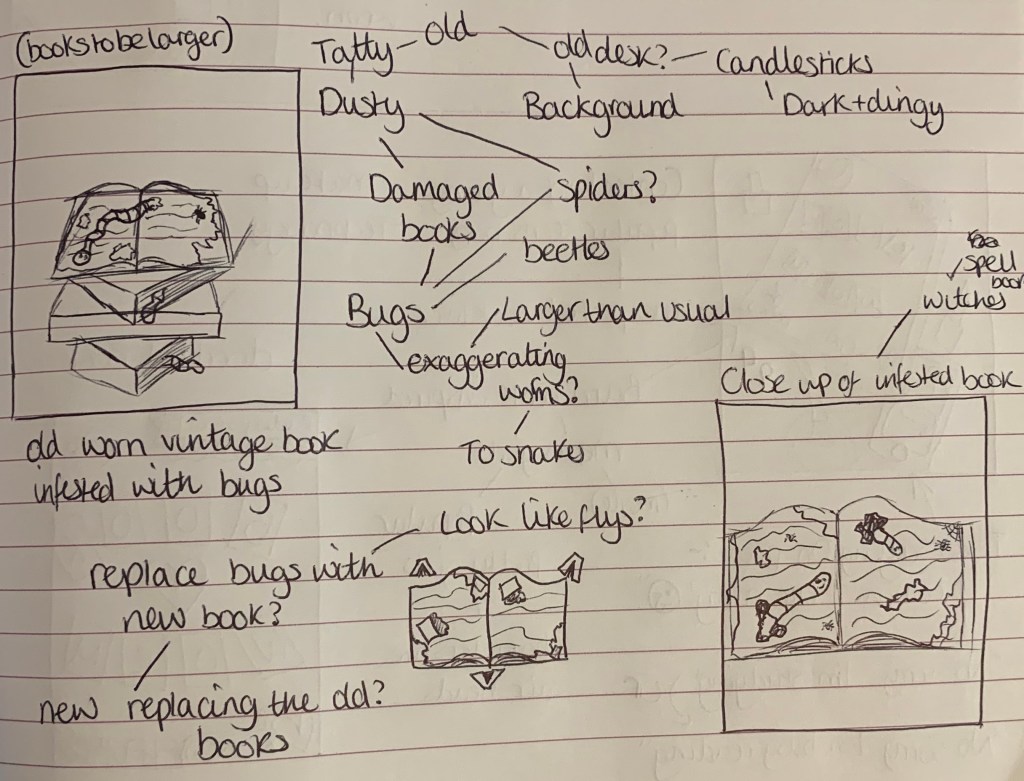
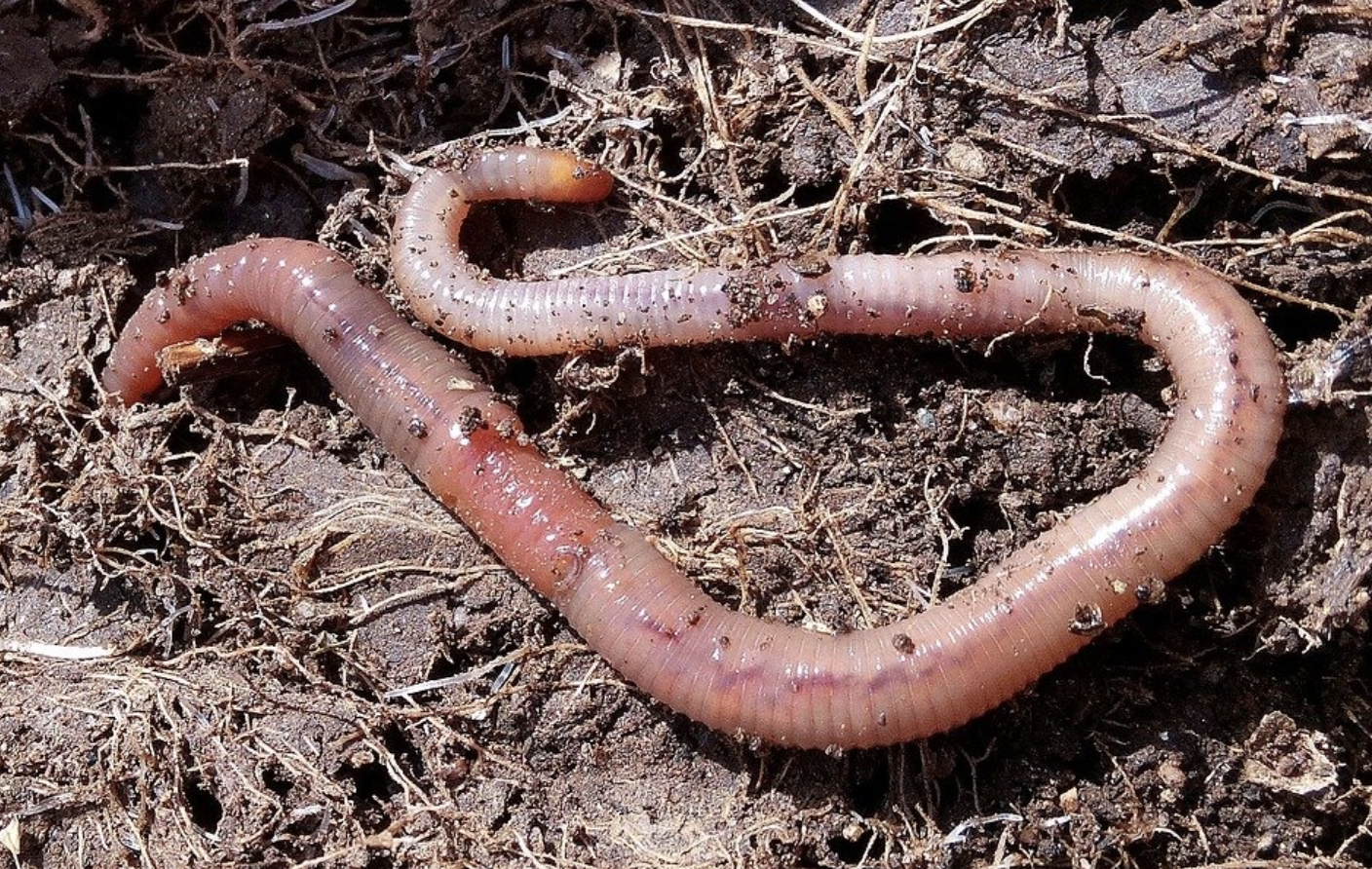
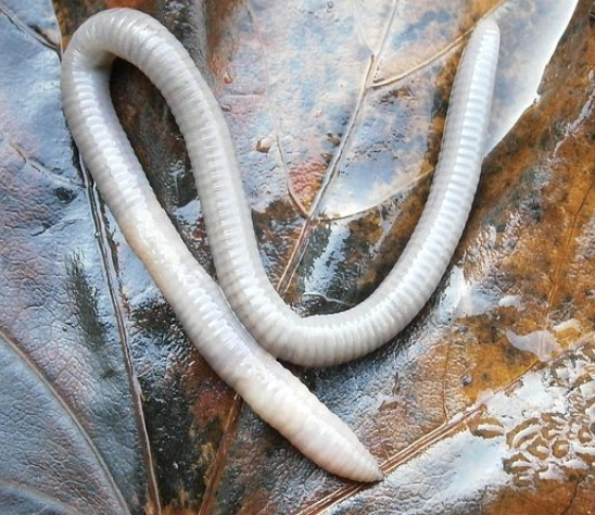
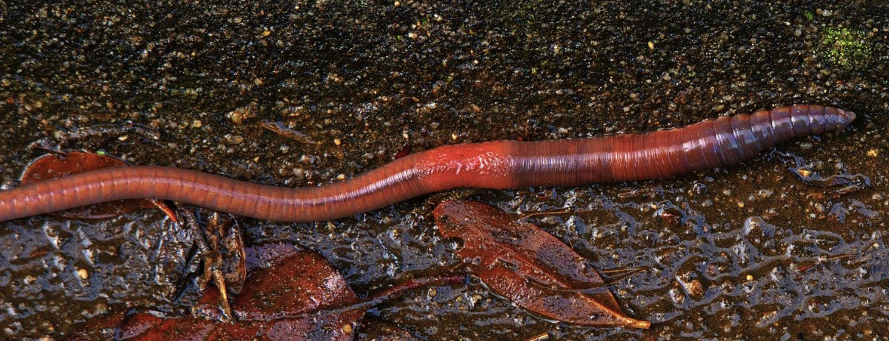
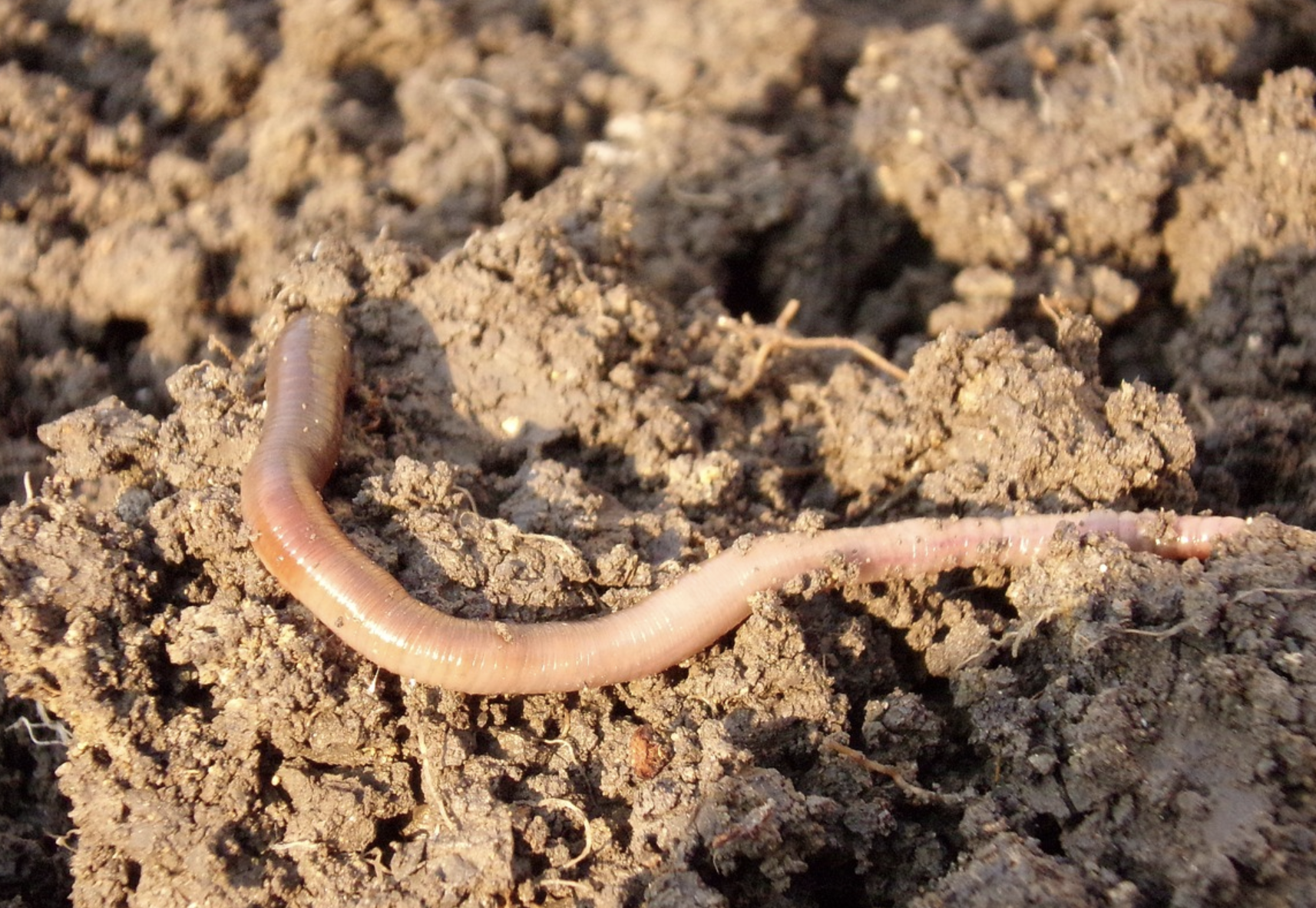
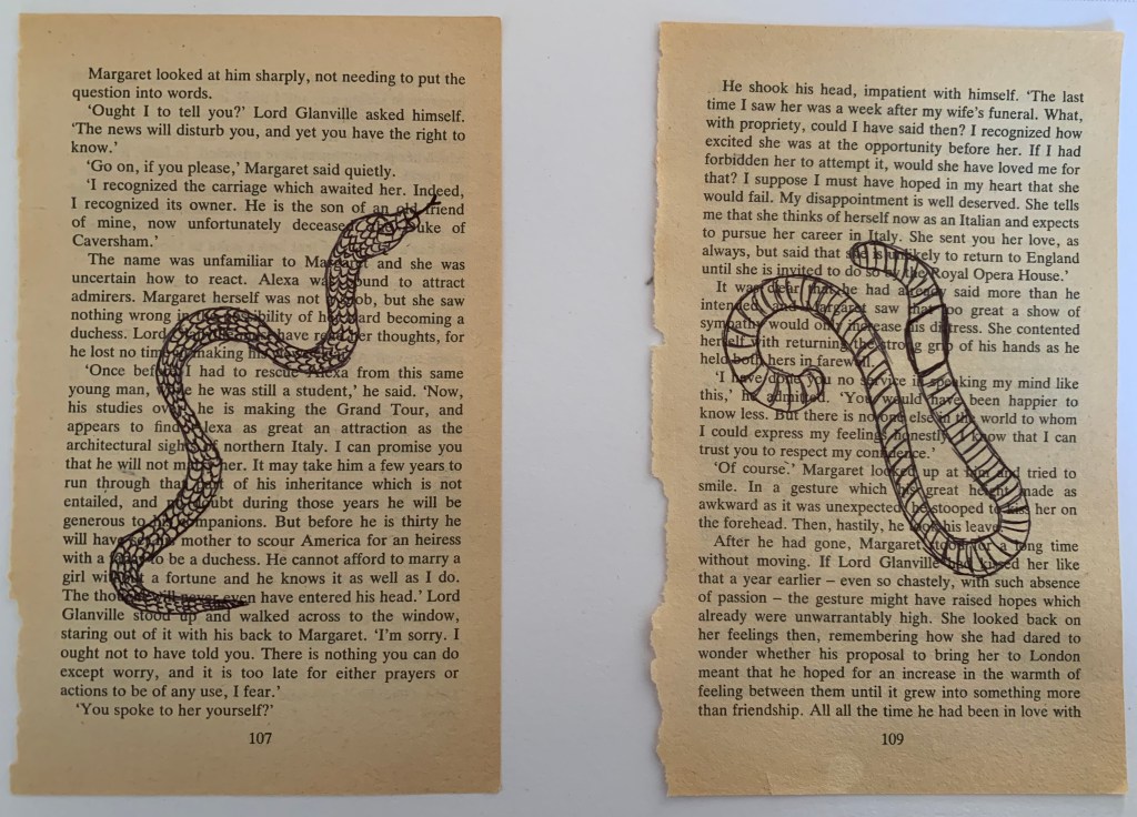
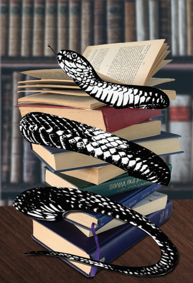
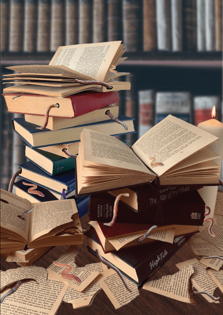
Worm infested book: With this design I feel I can be a little more creative and experimental. After researching actual bookworms rather than the phrase I have found that these particular insects eat their way through the pages and sometimes can make their way from cover to cover if undisturbed. I feel that I can rough up a vintage looking book by tearing some of the pages, maybe burning some edges and just make it look very old and ancient. I would also experiment with the worm, this could look like a snake more than a worm.. is it to be an image or illustration? Can I use things to represent as the worm/bugs? Smaller books eating a bigger book? – I seem to be stimulating lots of thoughts with this design.
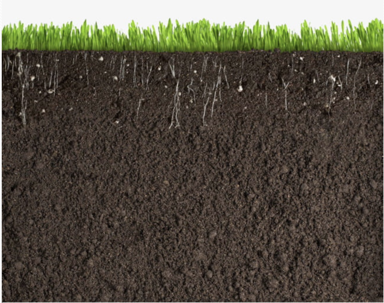
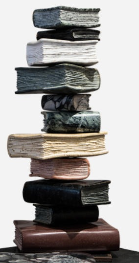
Worm made of books: For this design I thought of creating an underground view of worm tunnels, within these tunnels would contain worms and one large central worm made from books. I would need to experiment on wether the books will be open or closed however I think closed books for the body and an open for the head.
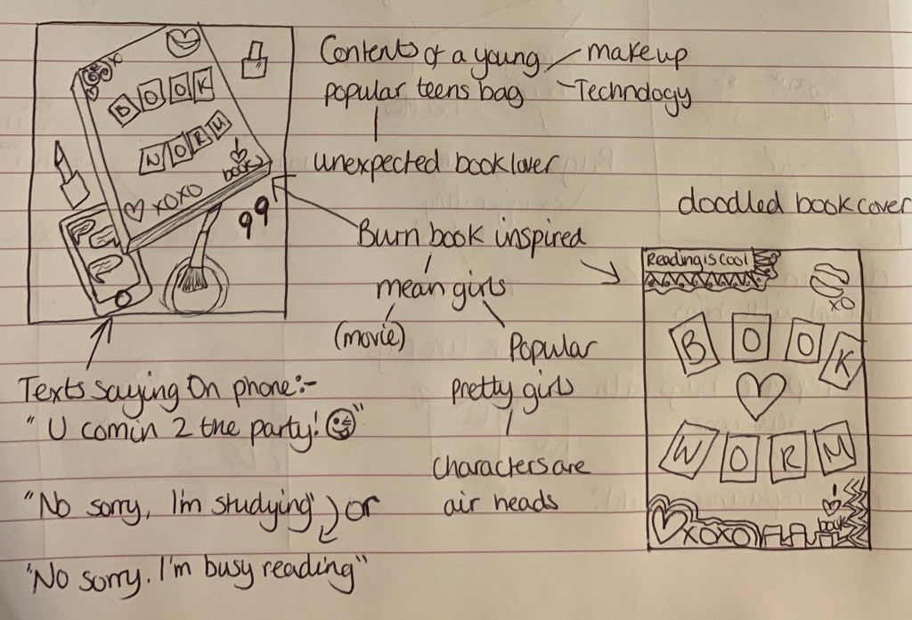
Unexpected book lover: I decided to create a design looking like the contents of a bag have been emptied. I imagined the owner of the bag looking like a young, trendy teen who nobody would expect to be a book worm, as the stereotypical image of a person who is a bookworm are either of an older generation or to be ‘geeky’. This would also carry a message of everybody loves to read, they just haven’t found the right book.
Further Research
I found the technique I created with the above design helped stimulate further design ideas.
Worm word
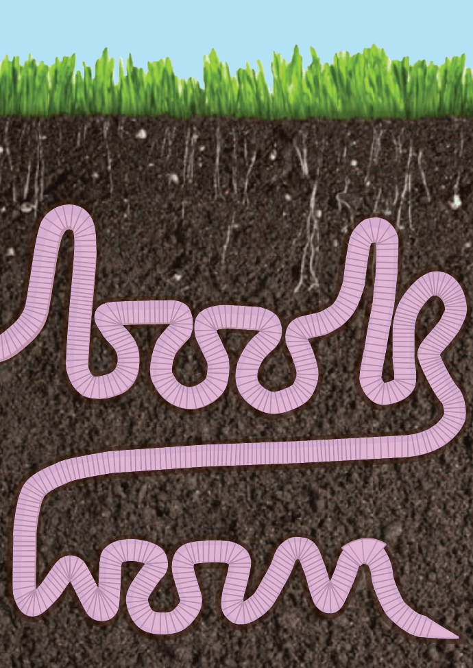
Im looking forward to see how this design looks once created. I think by adding the word ‘worm’ onto the end it makes the design clearer as to what its supposed to be implying, also it fills the page better. I liked the idea of the background being an image of soil. I would create the wording in illustrator using the pen tool as I’m not going to find a typeface which fits what I am after, I will simply draw my design, upload it, then trace over.
Worm infested book
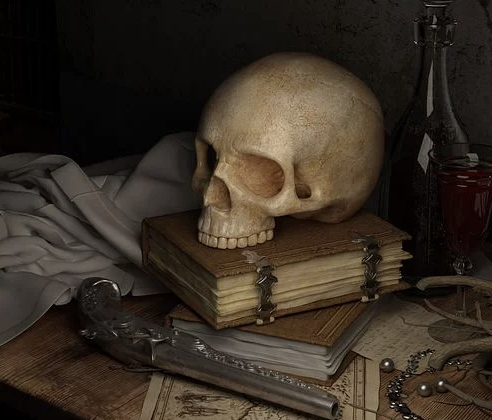
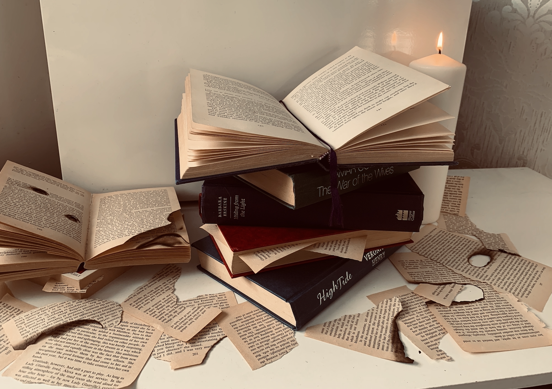
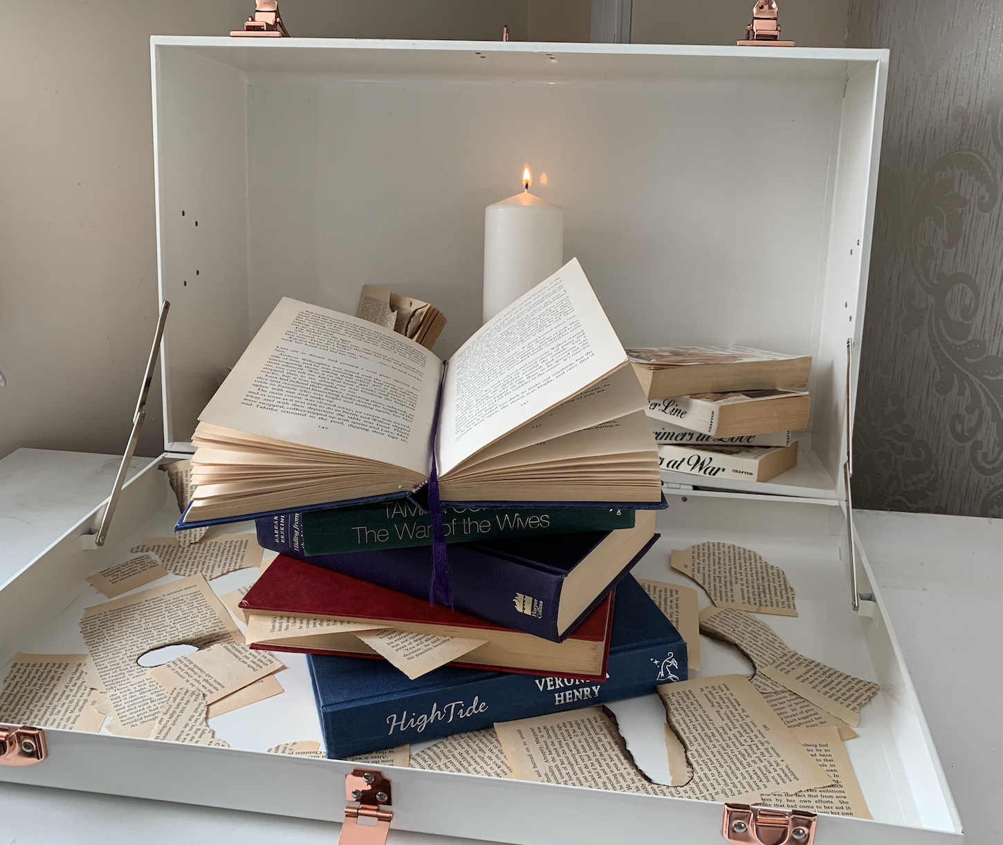
I wanted to take this design from the approach of book eating bugs. I imagine the scene of this being in a dark old fashioned abandoned study dimly lit by a candle stick in the background, the desk would be made from a dark polished wood, covered in thick dust with a stack of books which have been infested with bugs. This then made me think of witches and it being an old creepy spell book. However I’m not sure if my imagination is running off course with the phrase, I just wanted to come up with a design not so obvious to the phrase. However I’m not sure if the background will over complicate the design and take away the focus of the books. This will be something I can experiment with.
Worm made of books
I think this idea would make an interesting design. I like the thought of the whole art board being full of design rather than having a focal point and a background. I will experiment with both images and illustrations of books which would make up the worm. I envision this design to br bright, colourful and fun.
Unexpected book lover
For my final idea I wanted to create something which appears to be the opposite stereotype of a bookworm, which is typically known as someone who is geeky and quiet. I was inspired by the ‘Burn Book’ from the movie ‘Mean Girls’ for the cover design of the book, along with the spilled contents of a young popular female teen who could be an unlikely book lover.
Developing Idea 1
I am keen on developing two ideas for this phrase, one being of the worm word and the other of the bug infested books. I feel that these both will make interesting designs which give off different examples of the phrase Bookworm.
Worm Word
I started off by gathering relatable images to help gather inspiration and stimulate thoughts.
I then went to my sketchpad and drew up my design on a larger scale to my thumbnail so that I can upload it onto my computer ready to trace over in illustrator.
Although the wording isn’t perfect, I thought with it being a little rough it would look more believable to be a worm.
Visualising Idea 1
Above is the finished result of the ‘worm word’. This didn’t turn out as well as I had originally expected. I feel that although it is clear what the design is representing it isn’t as strong as I had hoped. I am still glad that I experimented with this design and visually developed it.
Developing Idea 2
Worm infested book
I gathered images relating to my design to help stimulate ideas further.
Whilst looking at the images above, it reminded me of gothic things, I then started to think about snakes with this design. Instead of going to my sketchpad I decided to test out some sketches on old book pages. I really like this look! I just think that for this particular design I have a more detailed idea in mind. (I will defiantly remember this for future exercises if required)
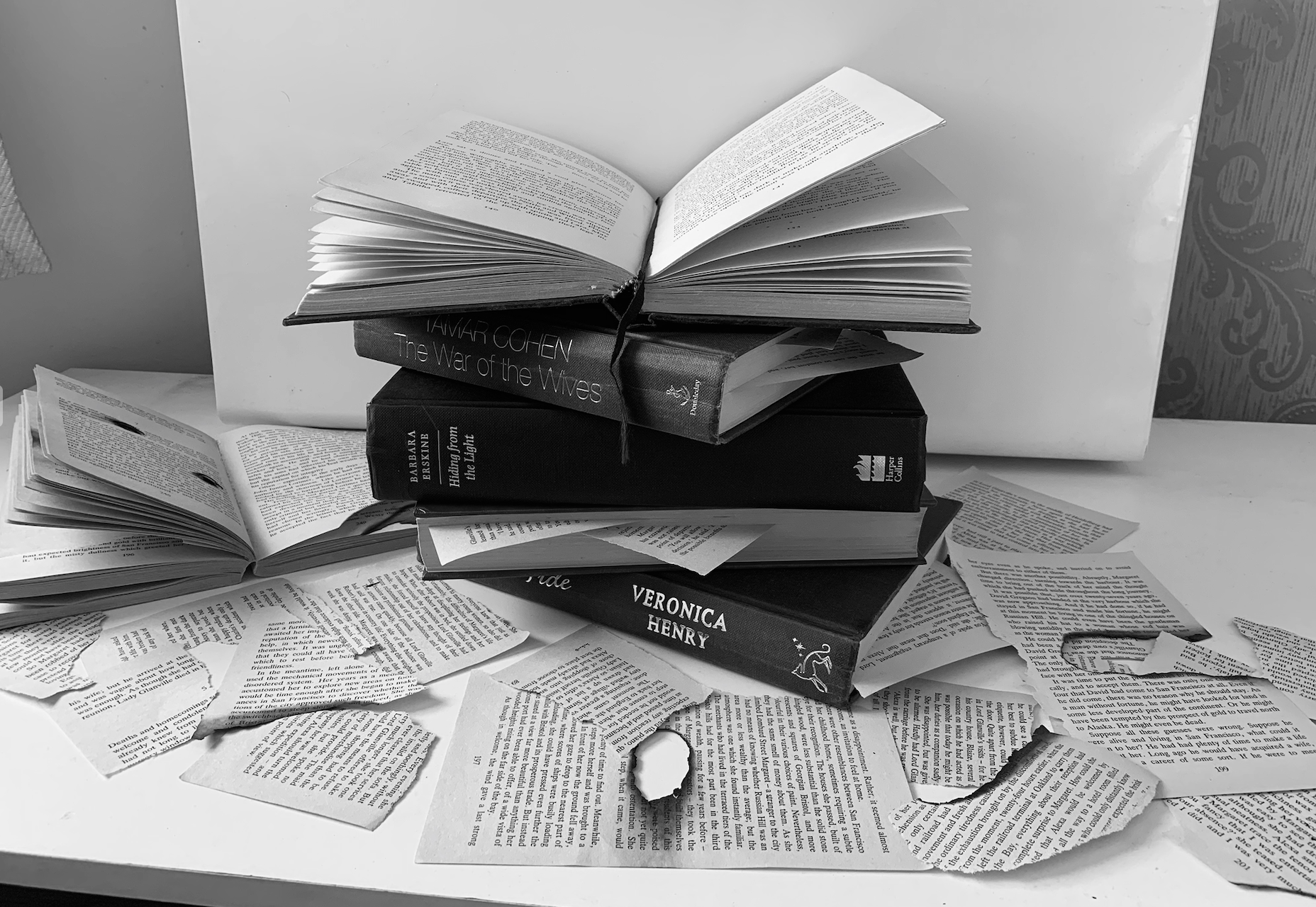
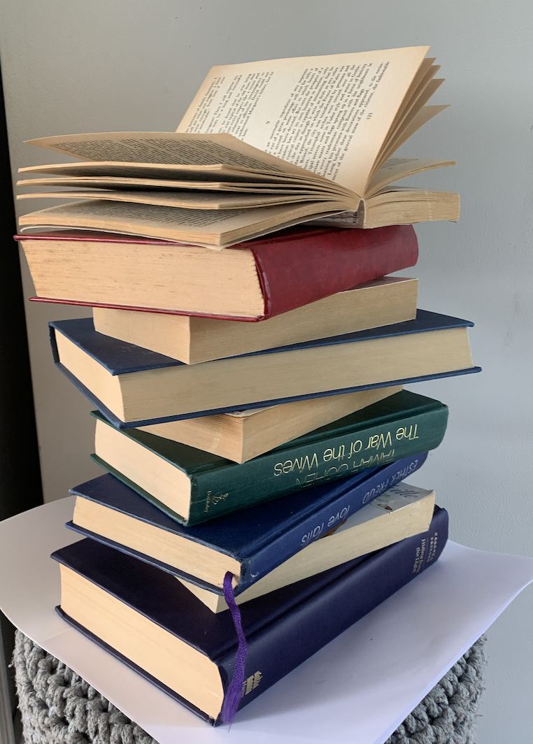
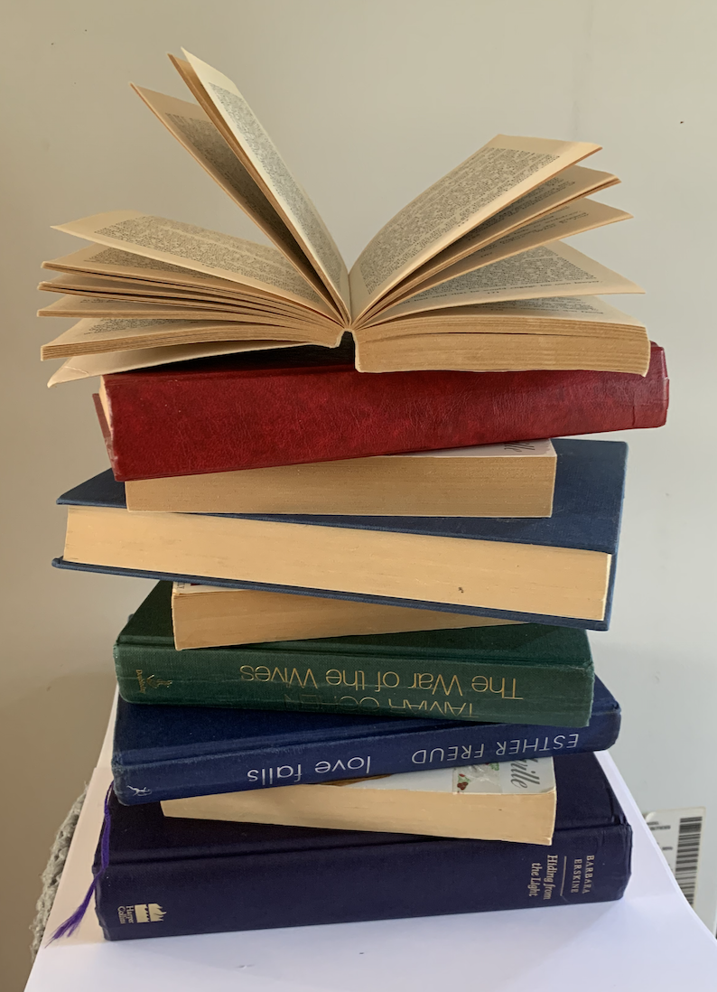
I decided to gather some books and experiment with different positions of books. I then took photos of the successful compositions from different angles and using different filters.
I really like the position I have created in these photos, I will add some bugs and worms within the images to achieve my desired idea.
Upon studying my images and with the idea of snakes in mind as mentioned above, I attempted to add in a vintage looking snake sketch to one of my designs. I liked this look however I felt it took away the meaning to the phrase.
I felt that both the wrap around effects wasn’t as successful as I had hoped, however I started to like the look of my original design with the worms weaving their way through the books.
When looking at both designs separate I couldn’t decide which one I preferred so I experimented with merging them and found the end result successful. I also forgot at the time of taking my photos that the image needed to be portrait rather and landscape so that I could create a realistic mock-up, so I scaled down the image to fit an A5 art board. I prefer both combined as I feel it fills the page nicely, looking like the scene could be from an old abandoned study.
I printed off my design to see how it looked as a mock-up. I was happy with the results however I’m not sure wether to try out different typefaces, but I’m happy with the positioning of the text rather than in the top right hand corner. The image printed out a little darker than I had hoped so thats something to remember to take into consideration.
Reflection
I ended up spending a lot more time on this exercise than planned, however I am happy with my end designs and have a clear Idea as to which one I will be developing further. I’m really pleased with the worm infested books design. My only worry is that the brief isn’t very clear, I presume that I am designing a book cover in relation to the phrase??
It’s interesting looking back at the work to see how new ideas have progressed and shows the importance of research and how ideas can develop.
Brief: Use one or more of the following book related sayings as a starting point to generate visual ideas and responses:
Bookworms
A closed/open book
The oldest trick in the book
You can’t judge a book by its cover
In someone’s good/bad books
By the book
During this early formative stage, aim to be as wide-ranging and imaginative as possible in your ideas. ALL ideas are valid at this point, so don’t censor; this is not the stage to decide what is a ‘good’ or ‘bad’ idea – at this point they are all just ‘ideas’ with equal merit. Let one idea flow fluidly, intuitively and organically into another to make unexpected links and associations. Record your thought process and ideas using thumbnail sketches, spider grams and annotations.
Design 1
Chosen Book Related Saying :A Closed Book
The phrase ‘A closed book’ can be one of two;
Something or someone that is very difficult to understand
Something that you accept has completely ended
Examples of both of these could be A) “She’s very reserved, she’s a closed book.” – or – B) “As far as I’m concerned, my relationship is now a closed book.”
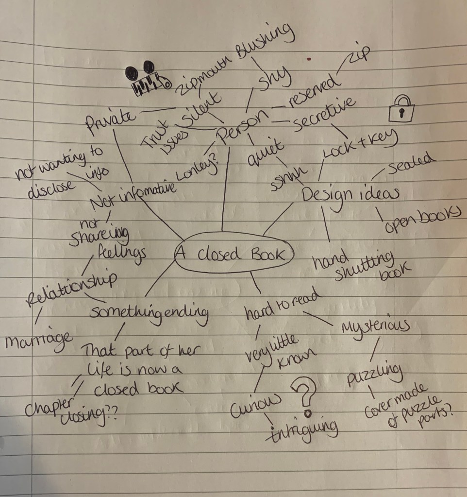
I started off by creating a mind map for ‘A Closed Book’. I didn’t feel I had many connections other than personal traits, but this is the phase I am concentrating on rather than that of ‘accepting that something has ended’.
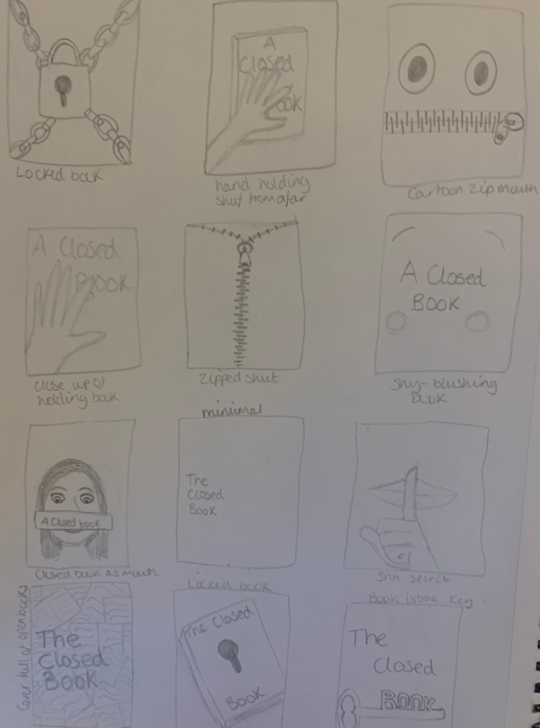
After creating my mind map I went to my sketchpad to see what sketches I could come up with.
Reflection
I was pleased that I managed to complete this exercise within the aimed 45min time slot, as I usually end up spending more time then needed on small activities. Out of my sketches I like the hand on the book design, and the play on words design of the college of open books.
Design 2
Half way through exercise 5 I wanted to explore a different phrase just to weigh out my options in producing a successful design, this may also make me look differently at the design ideas I currently have for ‘A closed book’. I thought it would be more organised to place the ideas here rather than placing it half way through the following exercise.
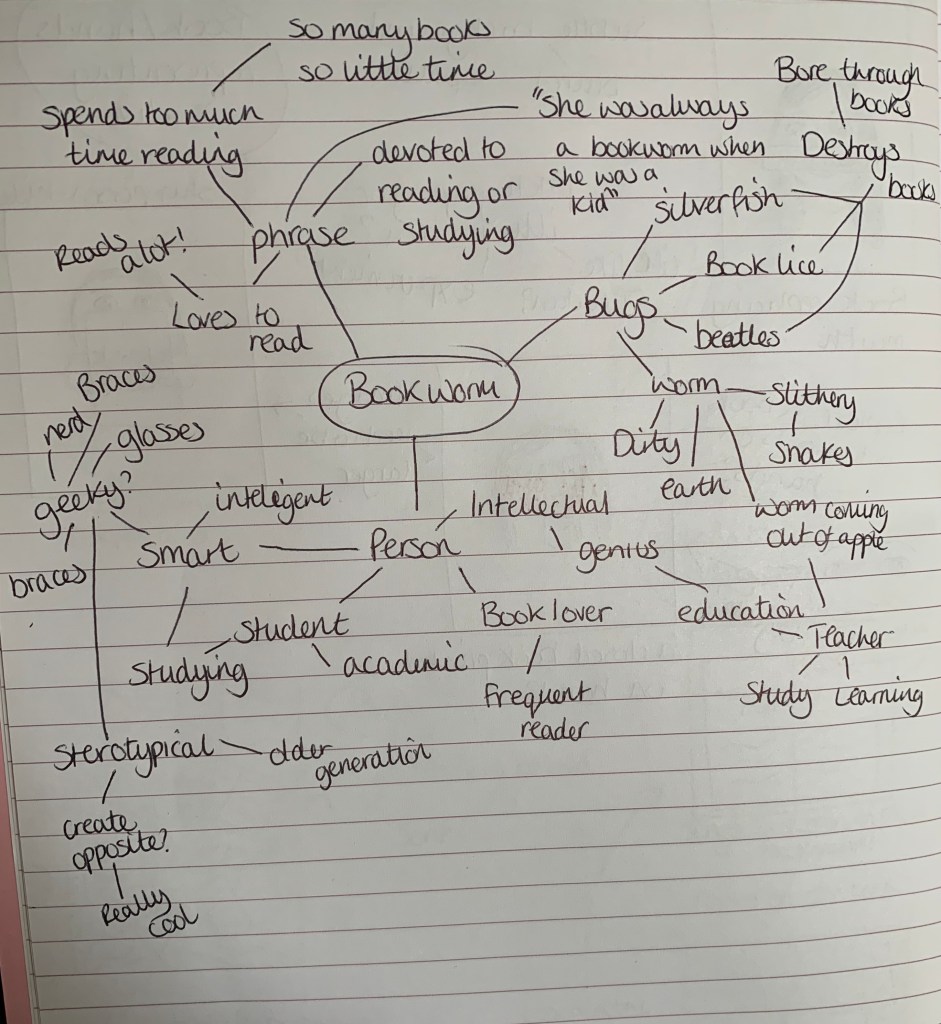
The phrase I have decided to look at is: Bookworms
Bookworm: A bookworm is somebody who loves to read, wether they do it for fun or read lots for studying purposes. A bookworm is also the general name for any insect that is said to bore through books.
If you love to read books, you may have been called a ‘bookworm’. The origin of the idiom “bookworm” probably originated as a somewhat derogatory term for a person who studied or read more than was usual. Bugs such as silverfish, book lice, and linoleum beetles were referred to as bookworms because they inhabited books; thus the idiom. Example of use: “She is such a bookworm! She seems to have a new book every day!” (https://www.gingersoftware.com/content/phrases/bookworm/#.XkqS7pP7TOQ).
I started off by creating a mind map, I felt the ideas flowed for this phrase much quicker than it did for the previous phrase (a closed book).
I then went to my sketchbook to see what thumb nail designs I could come up with.
Reflection: I feel that the designs for this phrase may consist of more illustration style designs rather than the photography style of which is mainly what ‘a closed book’ designs consist of. Im glad I decided to test out another phrase to see what other ideas I could come up with.
Brief: Using your research into artists’ books and fanzines as a starting point, think about their physical or design qualities, and creatively apply some of these approaches to your own designs. For example, there’s a distinctive visual quality to many fanzines which comes from a ‘cut and paste’ approach to designing and through the use of cheap photocopying and printing. Punk fanzines in particular make a virtue out of having limited resources, no computers and little, or no, formal training as graphic designers. Use your sketchbooks to experiment with a similar ‘cut and paste’ approach by cutting and collaging magazines and other material. What does this approach offer you as a book designer? Alternatively, you can find other ideas you would like to test out in your sketchbook. You don’t need to make any finished designs, just give yourself room to experiment and try things out.
Design Process
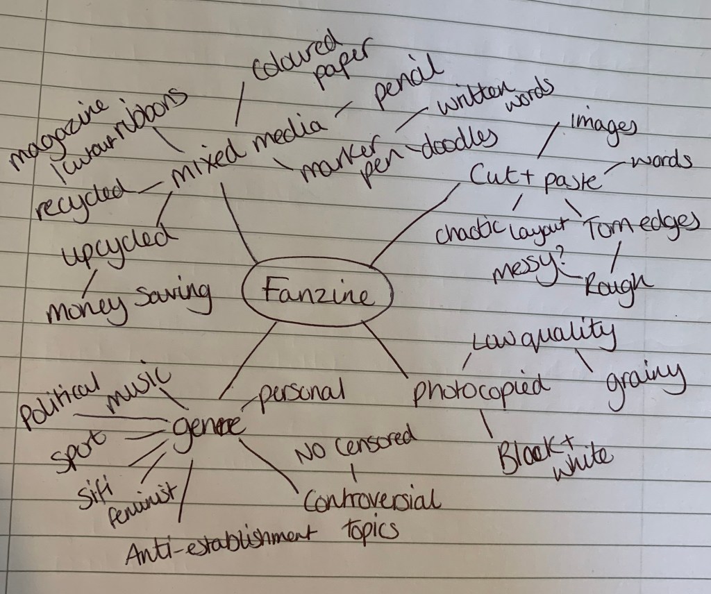
Firstly with the information still fresh in my mind from the previous research task, I wanted to note down a few design qualities which both artist’s book and fanzines contain.
Design qualities of Artist’s books:
Decorative
Multi-purpose
3D – pop up, folded
Personal
Mixed materials
Design qualities of Fanzines:
DIY – amateur
Black and white
Photocopied – low quality
Cut & Paste
Personal
I then went on to researching what it takes to actually create a Fanzine. There are plenty of articles online which I found helpful: https://thecreativeindependent.com/guides/how-to-make-a-zine/ This particular article I found which helped stimulate a few ideas.
Design 1
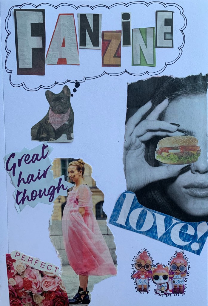
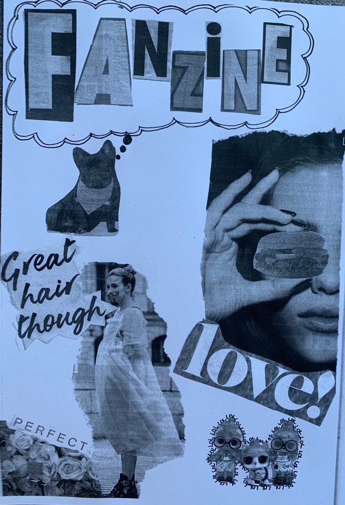
For design 1 I decided to create a collage of random images from cheap gossip magazines and newspapers. There is no purpose to this fanzine, I just wanted to experiment with different images, different cut and paste techniques (Torn pages, carefully cut images and layering). I then photocopied the original to see how it would look, I like the grainy effect of the photocopy, however on some of the images it has shown up very faintly the reverse of the page. I have also used hand drawn illustrations and writing to try and include as many qualities as possible.
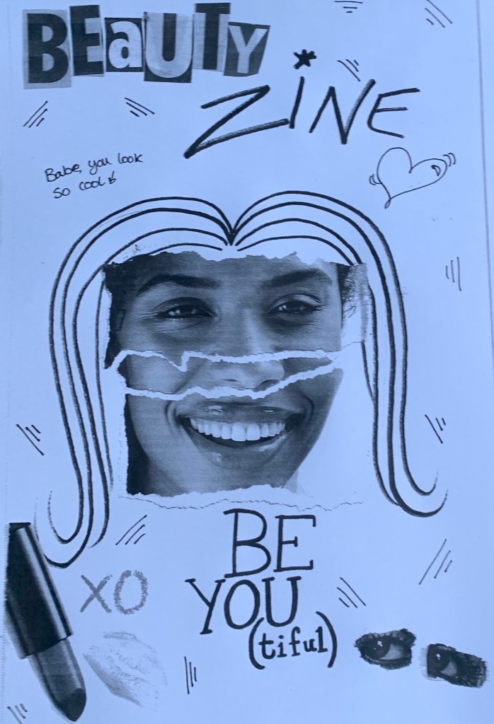
Design 2
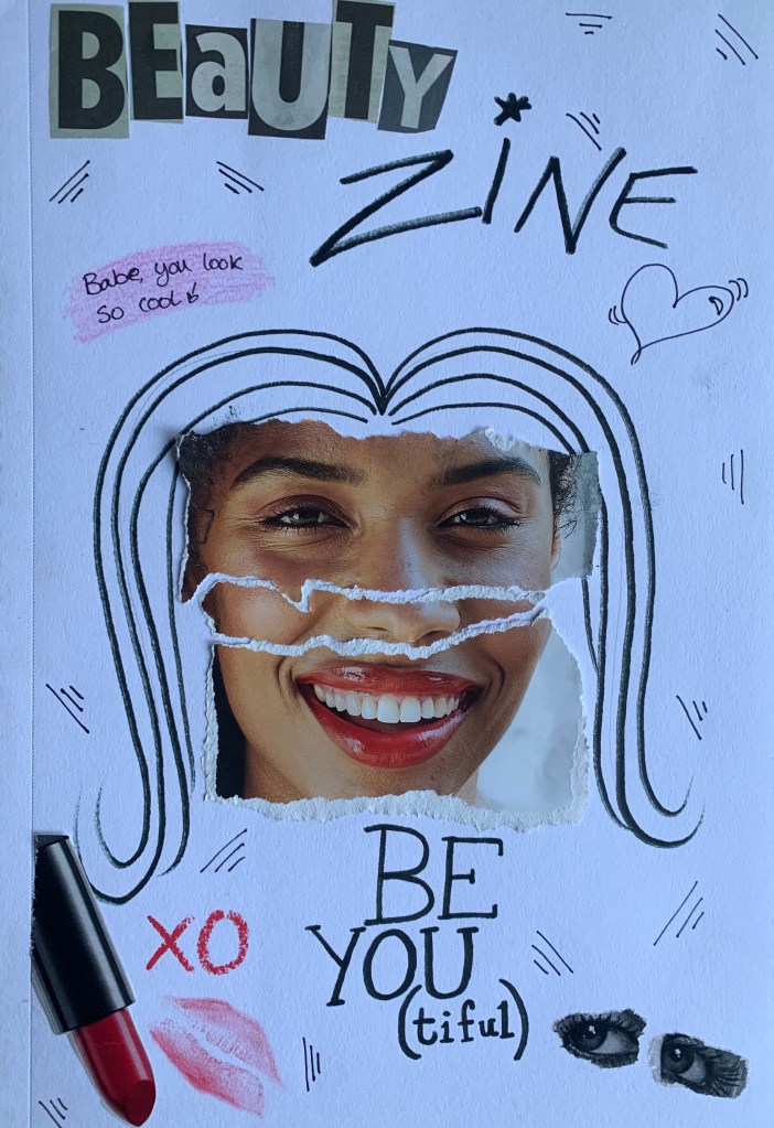
For this design I wanted to create more of a theme to my fanzine, and although beauty zines don’t exist I thought the images used where fitting. I wanted this fanzine to become less of a college so I limited myself to the amount of images used and decided to add my own illustrations and hand written content, similar to a lot of those in my research. I used a line doodle to fill the white space of the page, and drew on hair for the image. I was slightly disappointed to see the visibility of the lipstick print on this as although you can see what it is it didn’t show up as planned, nor did the pink pencil behind the writing up the top.
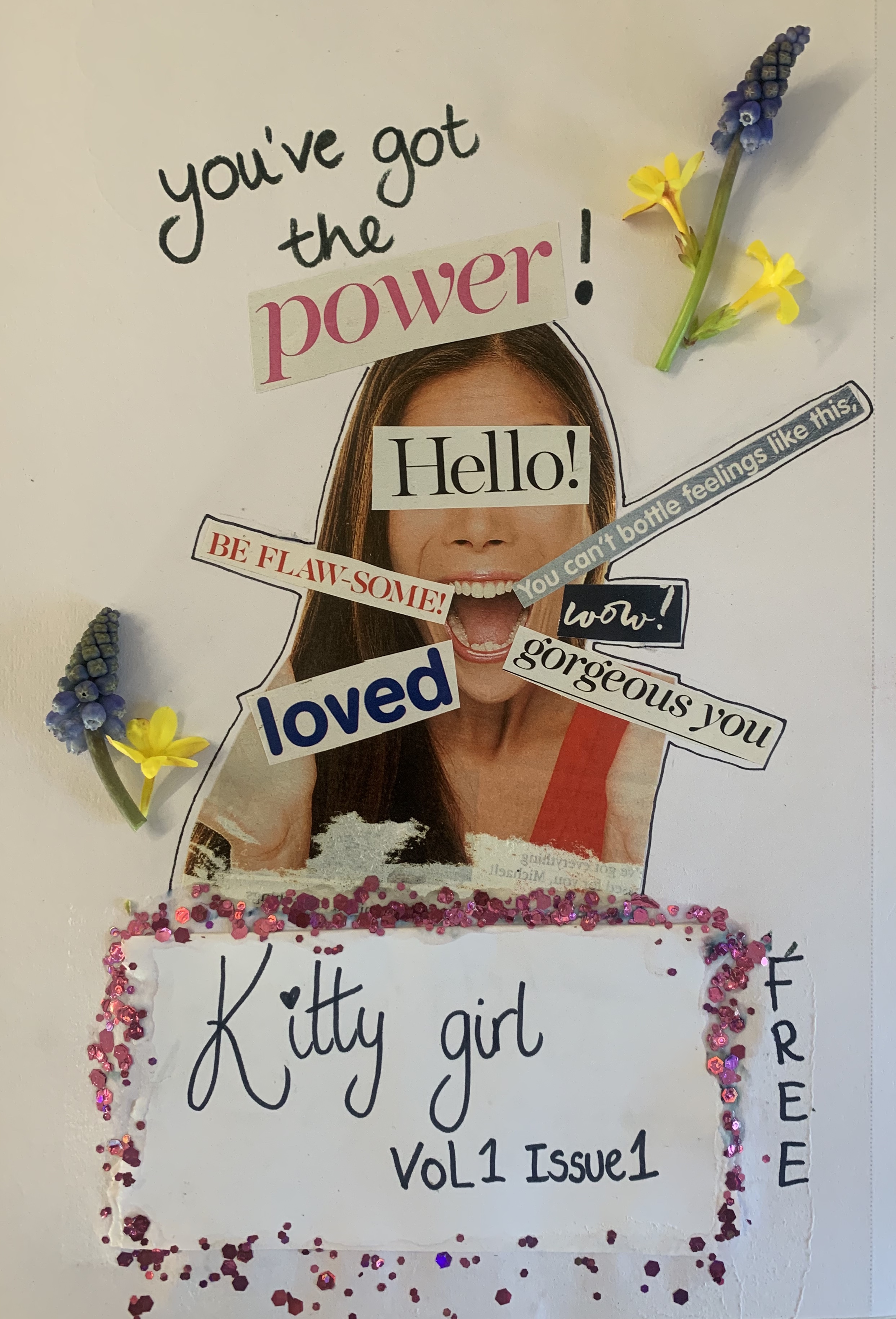
Design 3
After my experimental designs I wanted to try create a real looking Fanzine, so I went back through my magazine and newspaper clippings to see if there was a particular theme that I could create. I decided to create a ‘girly zine’ after all thats what the majority of my magazines featured. I have combined the use of cut and paste and hand written text. I stumbled towards the end of this zine as I wasn’t happy with my writing of the title so ended up having to cover it with another piece of paper. I tried different techniques to make this look fitting and ended up creating a glitter fade to hide the join. Im really disappointed I made the mistake underneath however I had to carry on working with what I had, after all Zines aren’t meant to be perfect! As a last minuet idea I decided to add a few flowers to to give the zine an extra feminine touch, however the bluebells didn’t photocopy very well and left too much shading in the background due to the thickness. Im unsure of my thoughts on the photocopied flowers however I’m glad to of experimented with them.
Reflection
I really enjoyed this exercise, I love to work hands on and this was the perfect brief. However during this exercise I had to keep reminding myself that I was creating a Fanzine and not a Photomontage poster, as originally for design 2 I had created a face made up from a variety of different images!
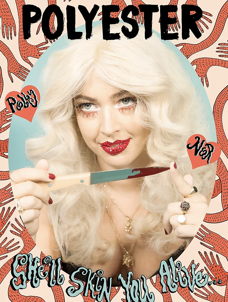
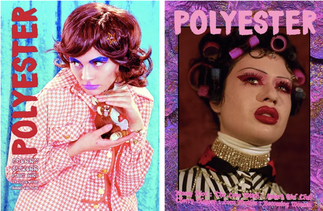
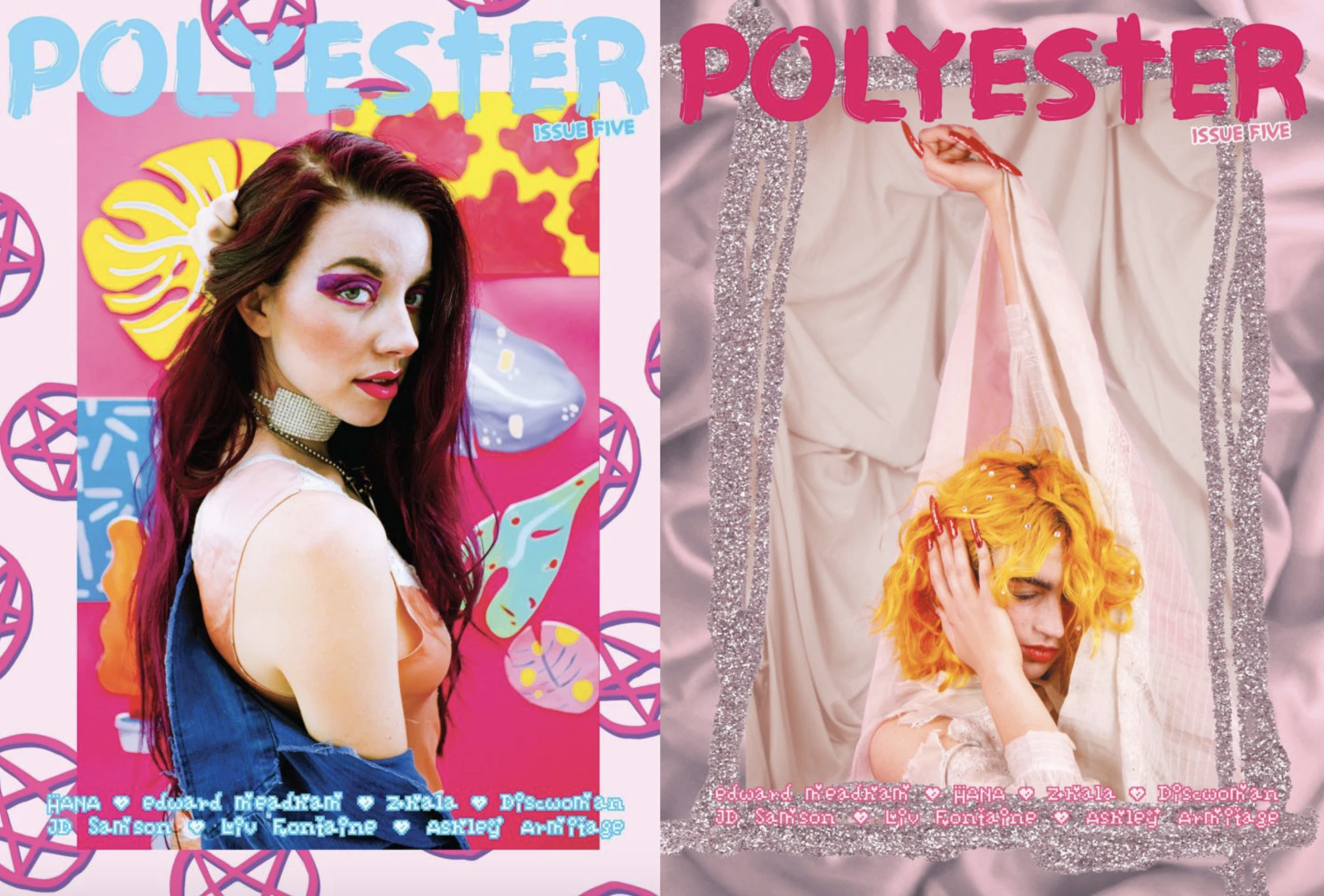
During this exercise I decided to look up Zine artists and came across Ione Gamble. Ione founded Polyester Zine in 2014, Polyester is one of London’s leading, independently published, feminist identity and culture publications. I found her work really quirky, cool and modern. It was Ione’s work that inspired me to use glitter on Design 3.
Brief: Given the current development of the book from printed to digital technologies, what do you see as the future of the book, for readers, and book designers? Where do you see the book heading? Show and tell. Try and summarise your thinking into a series of short statements, quotations, images (collage) or ideas. Be creative in how you approach this. Use your learning log to reflect on the essay and your own thoughts and visual ideas about the future of book design. This research will feed into part of your first assignment.
This brief is really interesting as mentioned during exercise 1, I downloaded my first digital book and in the aspect of it being an actual book, I did not enjoy the digital version. However when it comes to other written items such as news/online articles I have no issue with reading these digitally. I’m quite split when it comes to deciding if I am personally for or against digital technologies to printed.
Research
I started off by creating a mind map to help stimulate ideas of what I think the future of the book is.
I wanted to see what others thought of this topic, so I decided to ask three individuals of their thoughts.
Feedback 1 (Liberian) – As a liberian, this is something that passes some of our minds. The younger generation would be more adept to download and enjoy books on eReaders, where as the older generation may not have the technology or understanding to do so. The issues on library books still out do those that are downloaded. I think many would miss the joy of turning the pages in a printed book too much for the book to convert to eBooks permanently.
Feedback 2 (Student) – I prefer digital technologies for reading, I find it easier to locate what I’m looking for rather than flicking through hundreds of textbooks. It also saves space as I haven’t got to store books. When it comes to personal reading I would be lost without my Kindle. I can download whichever book I want from the touch of a button which is instantly available. I can read whilst on the go as they are small and lightweight.
Feedback 3 (Non-reader) – I think that books will soon become non existent due to the way technology is shaping our future. Although I’m not a reader, I would prefer to read an e-book as they are easier to handle and don’t look as daunting as you cant see the physical size of the book.
I wanted to research more on the topic and found a few very helpful and interesting articles. It seem that this is an on going debate between both printed books and eBooks with the divide being fairly even.
I will use this research within my design process in the next steps.
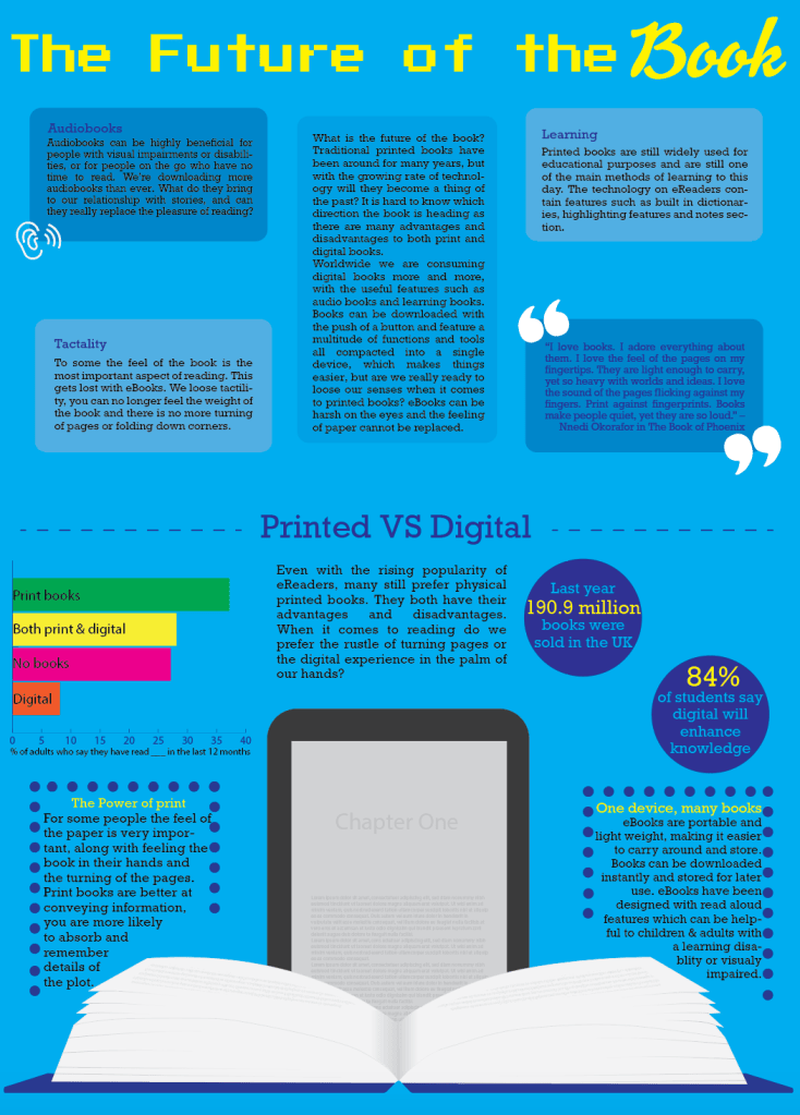
Design Process
I want to create an infographic to show the future of the book, this way I add the information informally and show the Pro’s and Con’s to the topic.
Reflection
I’m really pleased with my infographic, I feel that it is clear and informative. This exercise has been interesting to me, although I’m not a book reader I can still relate to the tactility of a printed book. However I can also understand the benefits of eBooks – with them being easily portable and stored. I’m glad that I took the time to research the matter in depth as this helped with the infographic and also to educate myself on the topic.
I think the future of the book will result in more digital books, just by the way that the world is changing and how technology is taking over. It’s a worrying thought of libraries and book stores loosing business and with the risk of closures. Although there are still many benefits to digital books such as instant downloads and easy storage. However personally I feel more distracted when reading eBook as I have the internet at my fingertips, where as when reading a book I can switch off from the real world.
My tutor mentioned that – ‘It isn’t clear where the future of the book is covered in the exercise, its clear that the past and present is addressed, but not the future of the book. And that it might be worth investigating how reading is becoming more interactive, with the reader playing an active role in where the story goes.’ https://www.barnesandnoble.com/blog/sci-fi-fantasy/10-choose-your-own-adventure-books-for-grownups/
I started off by reading the article which my tutor sent me. It was interesting to read about this particular genre of book, its a fun way to have the reader involved more rather than just simply reading a book. This is one way that could effect the future of the book – with this particular style it could be created digitally with an option which the reader chooses the fate of the characters? although in saying that it would cause the author to write alternative story endings? However it could be a huge success and draw in a new audience?
Going back to my infographic, I thought of ways that I could add more information on what ‘I’ thought the future of the book is. Originally looking back at the brief, my work and my tutors feedback I think I became slightly lost, as I simply compared printed and digital without touching on the future so I thought I would recreate the infographic with the correct information!
I have added more information about digital side of books along with an opinion. I wasn’t too sure on what to put in my infographic, as truthfully I’m not entirely sure what the future of the book will be? I believe it will be down to the readers choice, as logically authors and producers will follow the rates of the highest selling product (whether that be printed or digital copies) so they are able to compete with rivals.
Deep down I believe that printed books will remain, its refreshing to look at printed paper rather than yet another screen in todays world. As a parent I encourage my children to read to limit screen time, which I believe a lot of other people may feel too. I feel I take the contents I read in better on paper, instead of skim reading on a screen.
Brief 1: Browse the American based Smithsonian Libraries’ Artist Book achieve to identify books that you find interesting or questions the notion of the book in some way. Document visual examples of work you find interesting with annotations in your learning log.
I started off by researching what artists books are, I found the introduction on the Smithsonian Libraries’ Artist Book website helpful to get an idea of what they are and what they include. (https://library.si.edu/collection/artists-books/introduction)
Artists’ books are works of art which are in the form of a book. They are often published in small editions or sometimes produced as one of a kind artworks. There are fine artists who make books and book artists who produce work exclusively in that medium, as well as illustrators, typographers, writers, poets, book binders, printers and many others who work collaboratively or alone to produce artists’ books. Artists’ books that maintain the traditional structure of a book are often known as book art or book works, while those that reference the shape of a book are known as book objects.
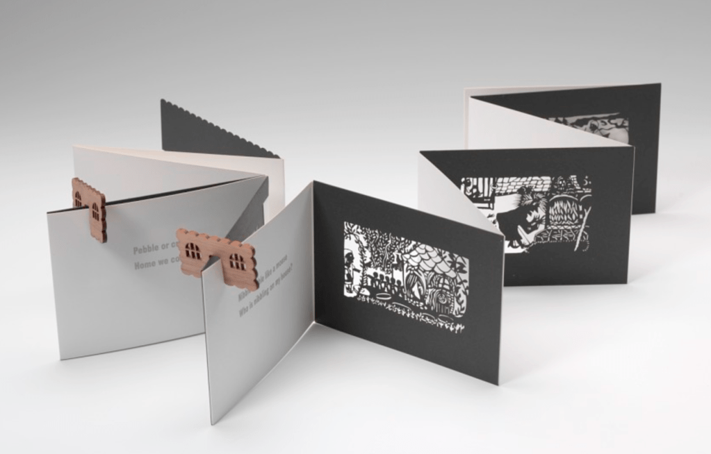
The first artists book I discovered was the Hansel and Gretel book, I was initially attracted to this by its opening. Upon investigating further I discovered that the pages are laser cut, the book can be read as a book or shine a light through the pages to project the artwork’s shadow onto a wall! I like the idea of this book being able to be viewed in two completely different ways.
This artist book is very interesting and totally unique, it draws you in by its unusual appearance. The prints used in this artist book are inspired by quilts of the African American women from Gee’s bend. I wanted to research this artist further as I have found her work very interesting and peculiar.
I searched in Carolyn Shattuck in the hope to find more of her work and came across her website (http://shattuckgallery.com/book-arts-portfolio) here show’s Carolyn’s portfolio. I enjoyed looking through her work so see her other artist books, I have selected a few more pieces which I find inspiring.
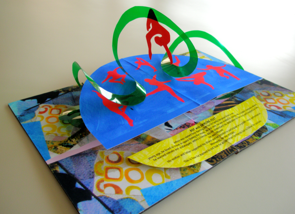
Boy With Dancing Feet
“Boy with Dancing Feet was created to acknowledge the talent and courage shown by male dancers to pursue their passion.” I find the pop up aspect of this book interesting, I feel it grabs your attention. The colour pallet used is also strong, the dancers really stand out.
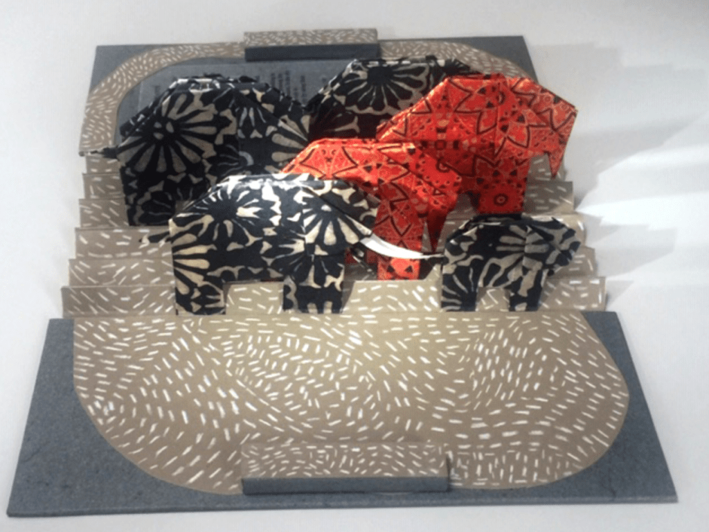
Save the Elephants
“Save the Elephants was designed to bring awareness of their struggle as the population is rapidly declining due mainly to poachers.” Initially I was drawn to this artist book by the carefully crafted origami elephants. I feel that this carries an important message in regards to the safety of the elephants in the wild.
He Had No Words
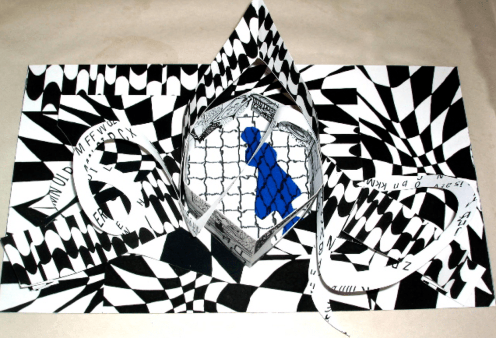
“A patterned description of a person who suffers from distorted thinking such as Dementia.” The background of this book is very eye catching, after reading the idea behind this artwork I can understand the thought processes of Carolyn’s work, with everything appearing unclear, confusing and overwhelming for the viewer, just as someone with Dementia feels on a day to day basis. It also appears that the centre contains a person who’s looking trapped standing behind a fence, this must be representing how people have the feeling of being trapped due to the illness.
Triple-Decker
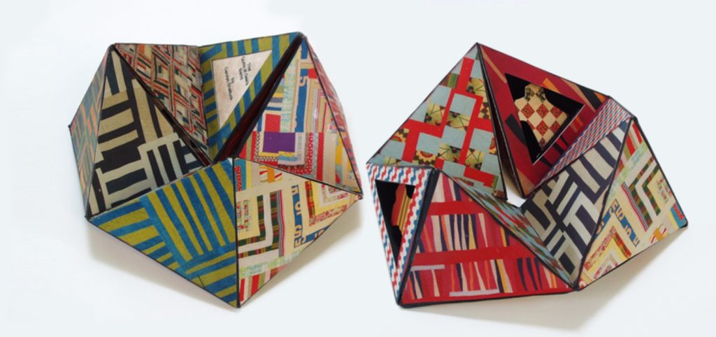
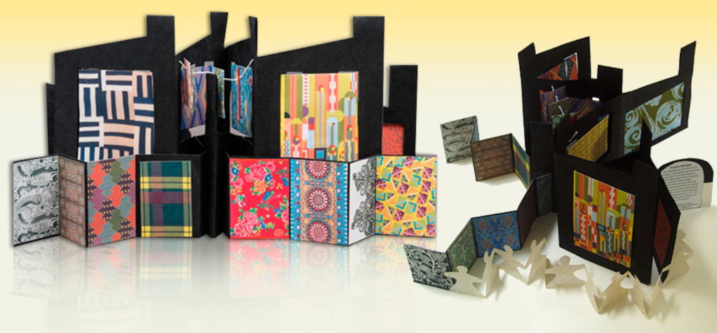
“The interweaving accordion book represents Triple-decker houses which were built in the United States to accommodate newly arrived immigrant workers and their families. The apartments are decorated with textiles, fabric and tiles that are visually integrated with those of other ethnic families signally a wide range of diversity.” There seems to be a lot going on within this artist book, but that is why I find it interesting. I like the use of the bright bold colours and patterns on the black paper. I would love to be able to examine this book in person as from the images it isn’t very clear where one part stops and the other starts. It appears that the larger folded books centre has the smaller book attached with the paper people chain connecting. Very busy and confusing but very interesting and intriguing.
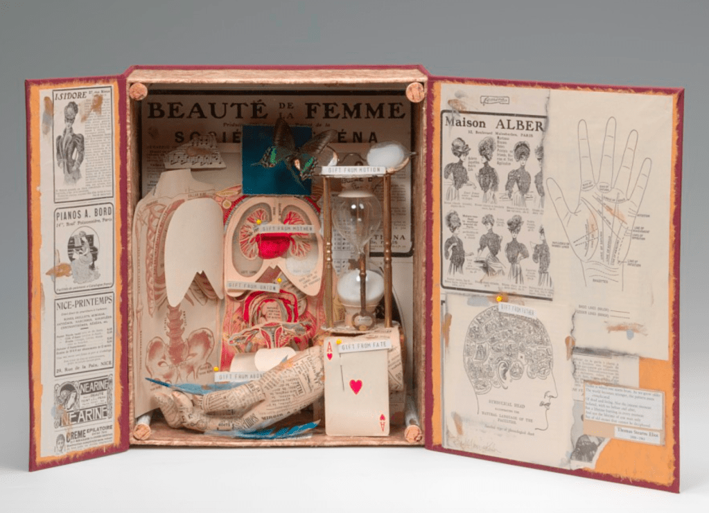
This is very different to other artists books that I have researched, I like the fact that this artist book looks like its a keepsake box, containing items of which could belong to someone from the medical industry. However the true meaning behind this book is the reflection of family history according to the artist. “Gifts is a book object that pays tribute to the tings that are given to us through heredity and the gift of life.”
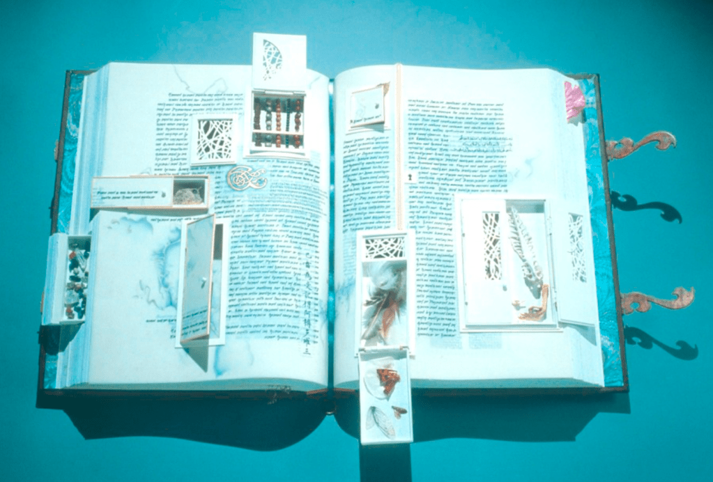
I was drawn to this book with an interest as to what was behind the little doors in the pages, upon further inspection I found that this artists book is constructed from insect wings, feathers, seeds, bones and wood. This gives the book an educational/informative artist book.
Brief 2: Explore fanzines in more depth by reading Teal Trigg’s chapter Definitions and early days (pages 6-43) from her book Fanzines: A do-it-yourself revolution (2010). Document visual examples of work you find interesting with annotations in your learning log.
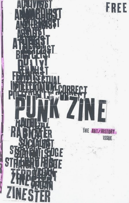
I found Teal Trigg’s Fanzines interesting and full of information on fanzines. Before reading this I wasn’t too sure on the term ‘Fanzines’ although after looking at the examples I can recall this particular style of work, especially those of the punk fanzines.I love the cut and paste, DIY style of some of the fanzines circulating, with the rough edges of the torn pages and the miss-match of typefaces used as some of the titles and the use warped/doodled political imagery.
A Fanzine is a non-professional and non-official publication produced by enthusiasts of a particular cultural phenomenon, such as a literary or musical genre for the pleasure of others who share their interest. Typically publishers, editors, writers and other contributors of articles or illustrations to fanzines are not paid. Fanzines are traditionally circulated free of charge, or for a nominal cost to defray postage or production expenses. Some fanzines are types and photocopied using standard home office equipment. A few fanzines have developed into professional publications (sometimes know as prozines).
Fanzines have a set of stereotypical traits that help to classify the genre of the ‘zine’ these include;
Photocopied images and text
Cut and Paste technique
Black and white
Handwritten text/doodles
Mixed media
Controversial topics – nothing is censored as with magazines who are afraid of upsetting advertisers.
I wanted to look at a few different popular genre of fanzines, to see how they differ between each other.
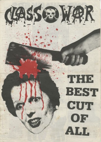
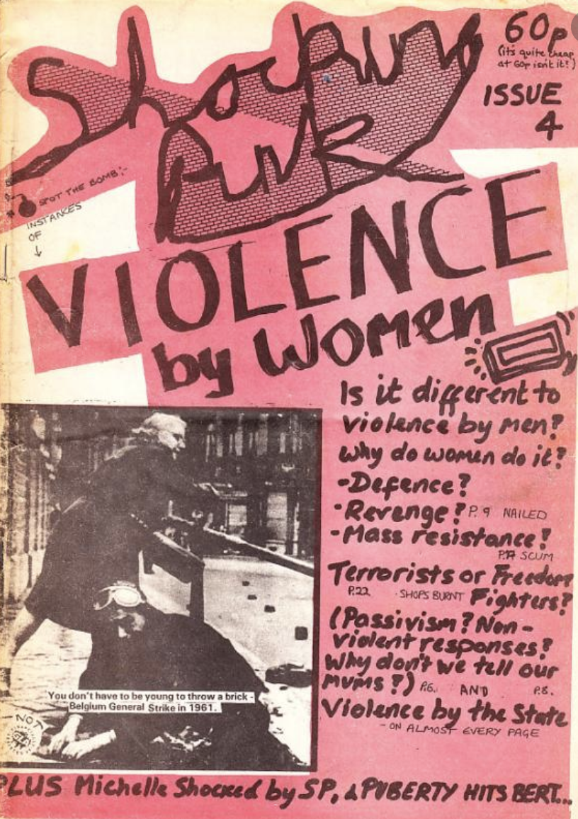
Punk Fanzines
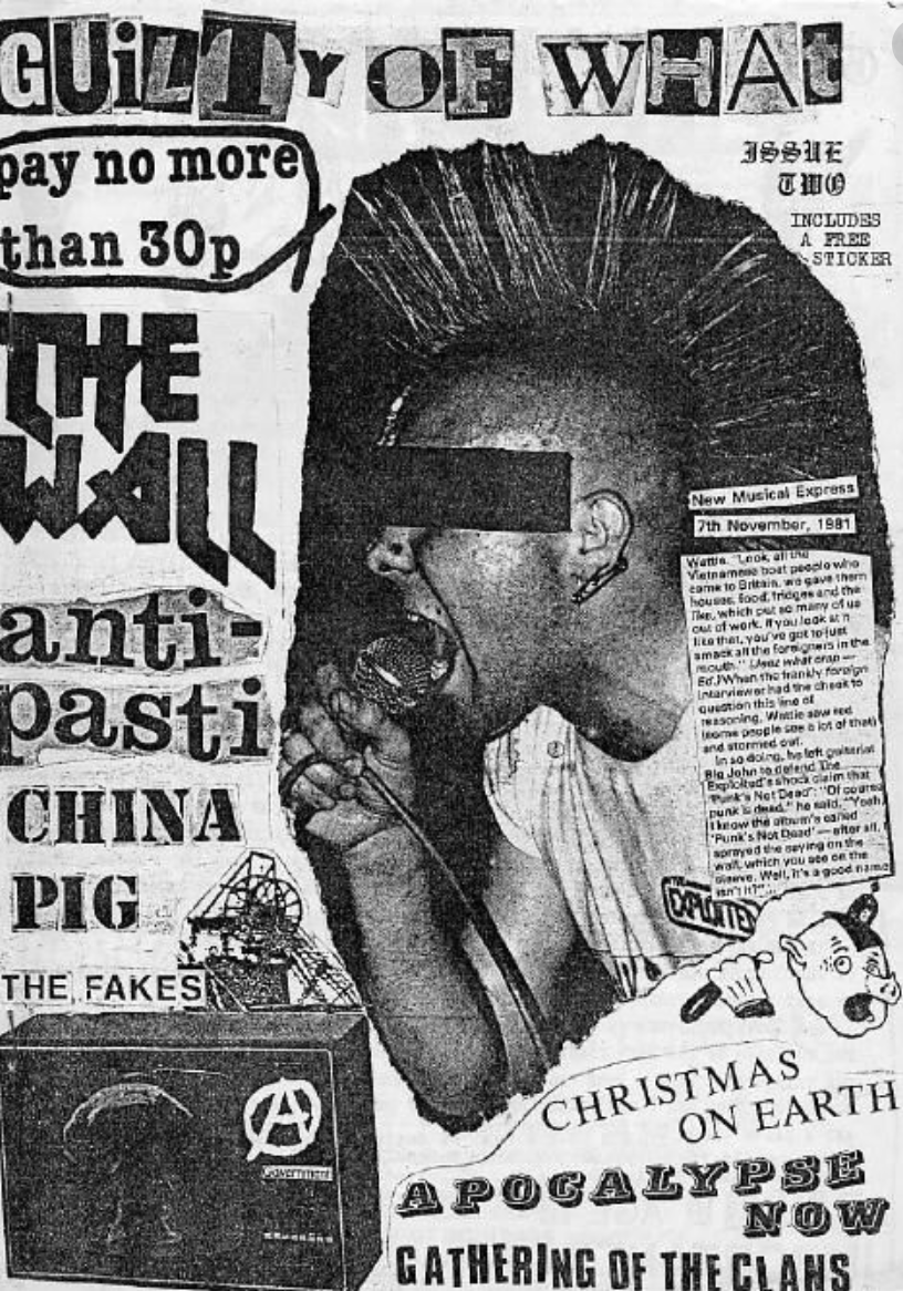
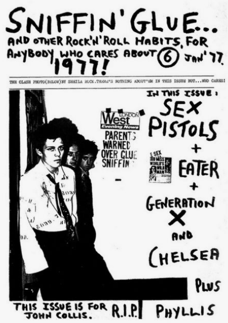
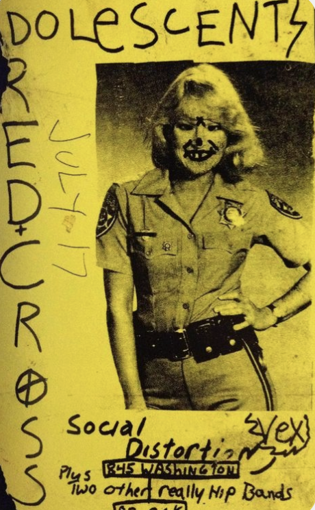
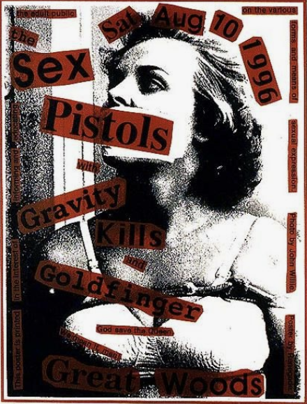
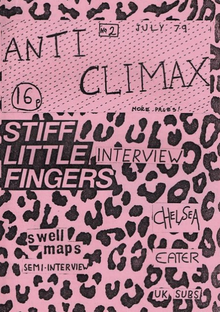
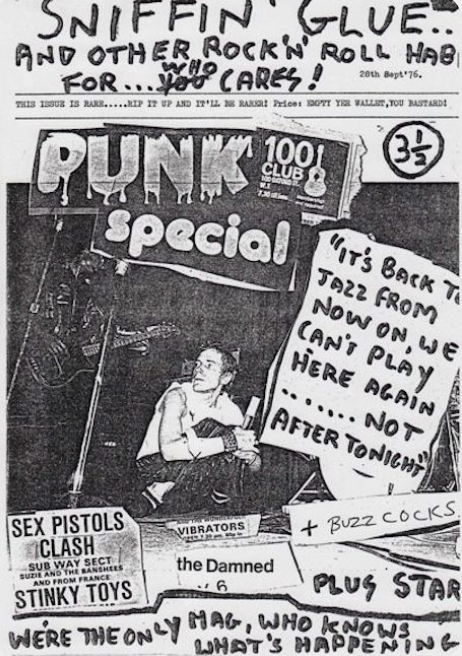
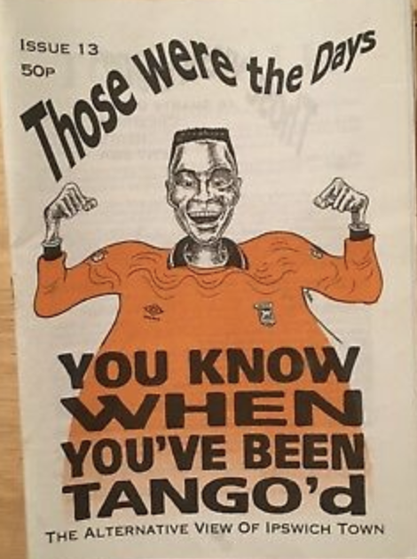
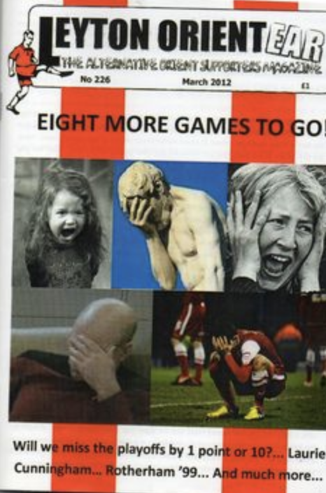
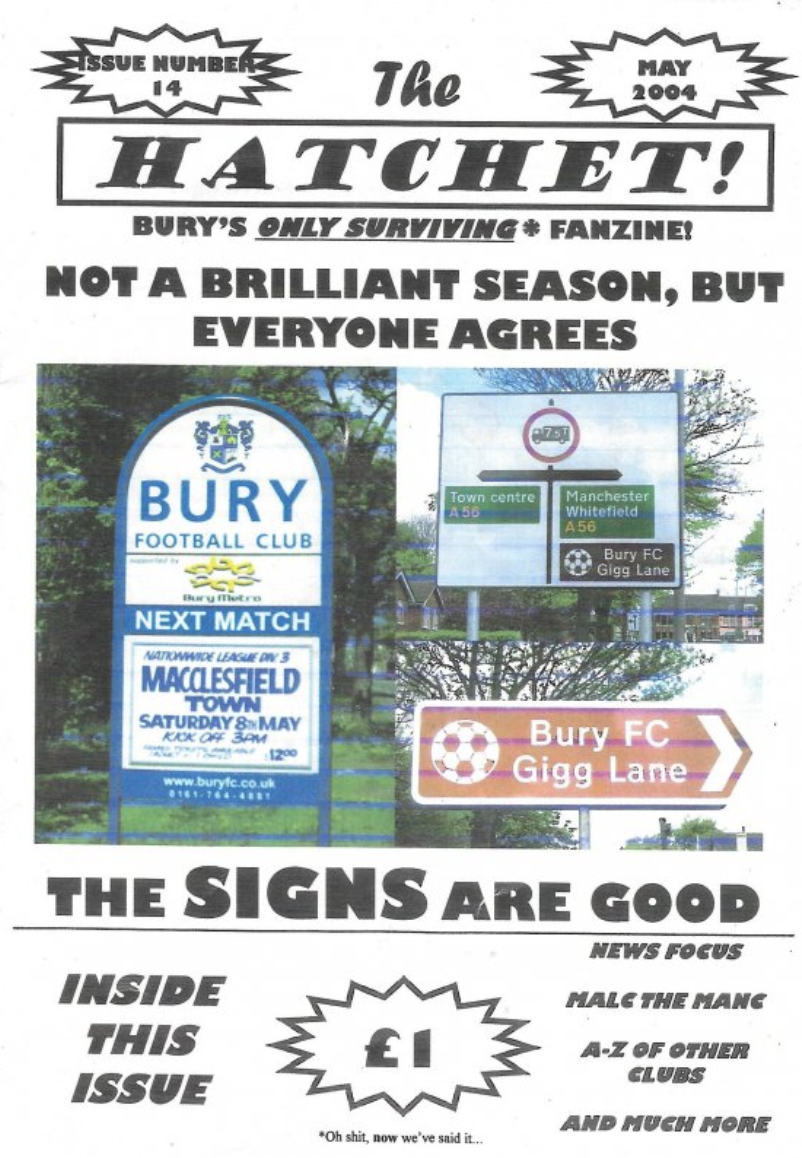
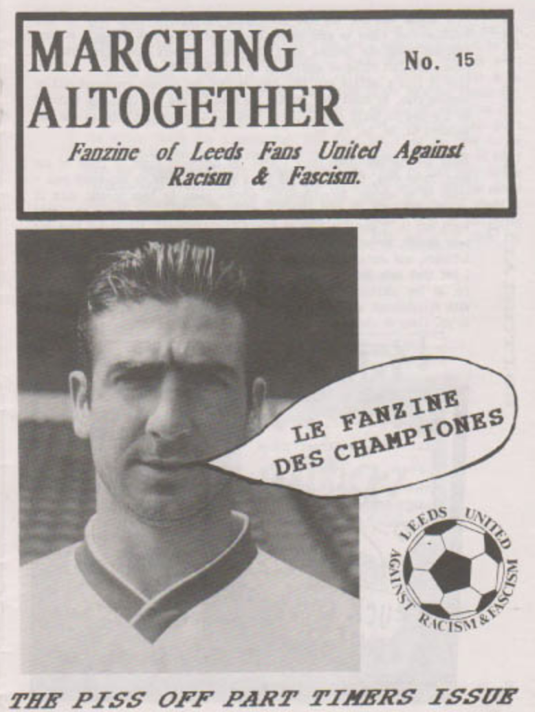
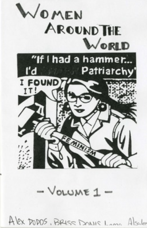
Punk Zines seem to be one of the leading fanzines. Often casually produced, they feature punk literature, such as social commentary, punk poetry, news, gossip, music reviews and articles about punk rock bands or local punk scenes. The style of punk fanzines seem to feature lots of the cut and paste technique, along with hand written words and doodles. I found the sex pistols image above interesting (red background of text), I liked the grainy image with the red and black text cut and paste over the top, it seems that this image was created digitally due to the opacity of the red boxes, as you wouldn’t be able to achieve this with already printed materials. I also liked the first image ‘Guilty of what’ I was drawn to this by the many different typefaces used, also with the large torn image and newspaper article.
Football Fanzines
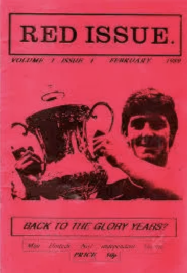
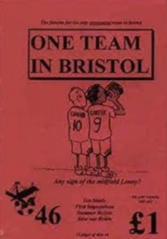
Football fanzines seem to be very different to that of punk, there isn’t much cut and paste technique, these zines seem to be clean and neatly constructed. “The first association football fanzine is regarded as being Foul, a publication that ran between 1972 and 1976. In the UK, most Premier League or Football Leaguefootball clubs have one or more fanzines which supplement, oppose and complement the club’s official magazine or match day programme. A reasonably priced ‘zine has a guaranteed audience, as is the culture of passion in being a football fan.” (Wikipedia). The majority of these look like they are created digitally then printed. Football zines contain football news, thoughts of the fans and interviews. I like the first zine ‘Red Issue’ I think this clever to be printed on the red paper to relate to the title and to stand out. Red issue is a fanzine aimed at Manchester United fans.
Feminist Fanzine
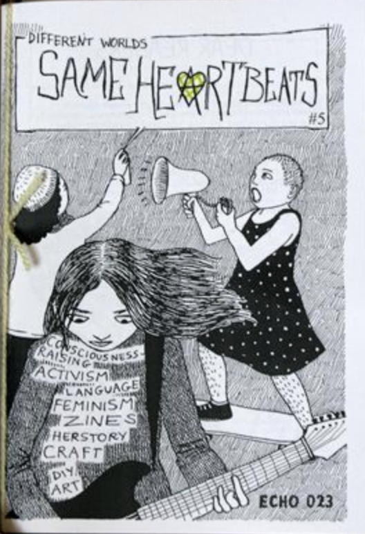
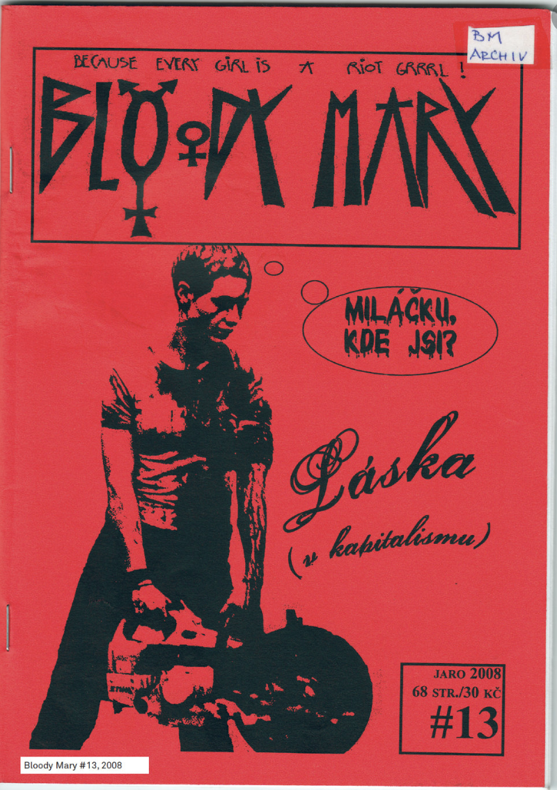
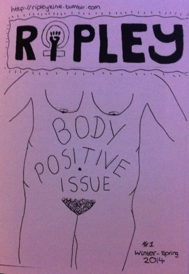
Feminist zines appearance is very much like the punk zines, with them mainly consisting of the cut and paste techniques, along with hand drawn doodles/decoration. In 1993 a new wave of feminist publications reacting against the established women’s magazines such as Cosmopolitan and Glamour came to light. I like the zines which are printed onto coloured paper, I feel that they are very effective in the most minimal way. I also found an interesting article on how feminist zine culture has evolved from past to present https://www.vice.com/en_uk/article/wjbbbb/how-feminist-zine-culture-has-evolved
Evaluation of fanzines
Combining all three genres above, plus the many more available I decided to create a mind map as to what makes up a fanzine.
Reflection
I found this task very informative, I feel that I have learnt a lot about both artist’s books and fanzines. Artist’s books come in a wide range of different styles which aren’t always in the form of a traditional book. And that Fanzines are cheap self-made publications made by the fans for the fans of that particular genre, there is no wrong or right when it comes to fanzines, however they do have particular design characteristics which consists through to most pieces.
Brief: Explore some of the factors that are at play in shaping the future of books globally by reading Chapter 7: The future of the book from David Finkelstien and Alistair McCleery’s An Introduction to Book History (2005).
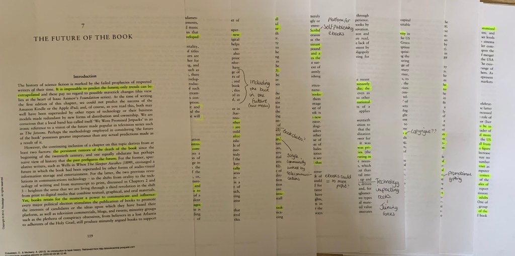
I started off by printing off Chapter 7 as I felt this would be easier to highlight and make notes as I go a long.
During this chapter, we read about facts, information and opinions contributing towards the direction in which the book could be heading. Some of the key points which I highlighted helped guide me to where I think the future of the book could be heading.
The two main points which I think will effect the books future is; the interest of the reader and the technology take over.
Technology
As stated in the introduction of the chapter (An Introduction to Book HistoryChapter 7: page 119) “It is impossible to predict the future; only trends can be extrapolated”. Over the past few years technology has rapidly developed, meaning that books are no longer our only source of information or the gateway to stimulate our creative imagination. As a young adult growing up with technology surround me, I can appreciate how technology is beneficial, however I also understand the negative impact it can make. I personally prefer to read printed materials, like this chapter for example, I attempted to read it online however I felt too distracted with the glare of the screen and the pinging of notifications.
It was interesting to read the ‘Technological Determinism’ sub chapter, this covering the main topic of how technology is impacting printed books. After reading this I feel that the use of eBooks will not ‘wipe out’ the existence of books, although, they could be more beneficial as eReaders offer different features in terms of learning and gathering information such as highlighting, built in dictionaries, bookmarks, notes and the feature to search for a particular part of the book all beneath your fingertips. eBooks can also bring more profit to the author/publisher in the fact that the books haven’t got to be printed or bound together, however as mentioned within this chapter there seems to be issue’s with privacy and ownership of eBooks, e.g. does it belong to the author or the publisher?
The Reader
Another part of the book which I found interesting was the ‘Death of the reader’ sub chapter. It’s been reported that there has been a fall from 56.9% of American adults reading fiction for pleasure in 1982 to a figure of 46.7% in 2002 (page 129) this is due to other activities taking up our time such as browsing the internet, watching tv, playing video games and social media. In this day and age I find it is hard for anyone to escape the reality of technology, although it is beneficial in most ways, it is also addictive! The quote below really spoke to me, because I feel that this is due to technology and the time we invest using them.
For the future of the book, nevertheless, the crucial issue is no longer illiteracy but aliteracy: those who can read but will not read books. – Page 130
As readers we are influenced by our next book, wether that be word of mouth recommendations or those of book reviews, even at times certain online retailers can suggest you books based on your purchase history. The things we read can be effected by our personal lives, it was interesting to read about what the average adult reads and when they start/stop (page 130) and that “52% found reading as a means of relaxing or relieving stress, 27% as escapism and 24% as an opportunity to exercise their imaginations.” (page 131)
I believe that the future of the book can also depend on the reader of books, if we continue to invest in the printed book industry then surely we can help keep it afloat? This would also help keep libraries and bookstores open.
It seems like the debate of printed and eBooks will be on going for years still to come, there are many advantages and disadvantages to eBooks such as storing many books on one device, or that you can have the risk of your device running out of battery mid sentence. The more I research the topic the more undecided I feel however, with the advantage of the eBook I feel that it is giving the book industry a chance to keep up with technologies, so that people who are into their gadgets may be swayed by downloading a book on their devices. I don’t think the printed book will die out, as mentioned before they are still one of the main learning resources, especially in developing countries and for people who simply cannot afford the devices. Plus the older generation still prefer printed books as many aren’t fans of technology, however once the older generation fades away, will this stop the popularity of printed books in favor for the eBook?
Reflection
I really struggled with this research task. I found it hard to keep motivation whilst reading the listed chapter and have spent way to much time on this, however once reading it all then skimming back over I managed to let the information sink in.