Having printed tour images from the previous exercise, take the opportunity to view all of the pages, reflect on them and evaluate before moving on to the next step of collating and binding the pages together. Which pages are successful? Which pages have not turned out as well as you had hoped? Are there any visual surprises, or happy accidents? Given the experimental and open-ended nature of this exercise, the answers may be quite subjective, but it is important you reflect assessment of your own progress. You may want to re-work some of the images, and the printing process, and this is your opportunity to do that. You may end up with more and more pieces of printed paper.
Select and Collate
Evaluate the strengths and weaknesses in your work and then begin a process of selecting up to 16 pages that work well together as a whole. Do these pages have images on each side of the page, or will the images appear on facing pages only? If you want to create back-to-back images you can work manually to cut and paste images and pages, using spray mount or similar. Equally, you can collage elements of printed ephemera onto and into the pages. Again, the brief is to be experimental, so work inventively with the process, cutting, gluing, pasting and arranging as you see fit. Collate these pages, putting them into a running order from beginning to end.
Binding
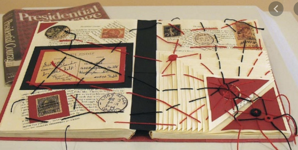
Drawing on your understanding of bookbinding so far, bind your 16 pages into a small book format. How will the pages be held together? Consider how the pages might be bound and experiment with solutions. Will you create a cover? Will the pages be stitched, sewn, glued, stapled or will you use another inventive approach? There are may ways to bind a book, either by hand or by machine. A few examples of bookbinding are saddle stitch, Japanese binding, coptic binding or perfect binding. Consider which binding is most appropriate for your book. There are some good tutorials online of bookbinding and this might be useful for you to have a look at. Try to use one of the bookbinding techniques mentioned above for your own book.
Document the whole process, photograph the book and incorporate them into your learning log, accompanied by supporting work, including pages and images you choose not to include into the final book form.
Reflect, Evaluate and Rework
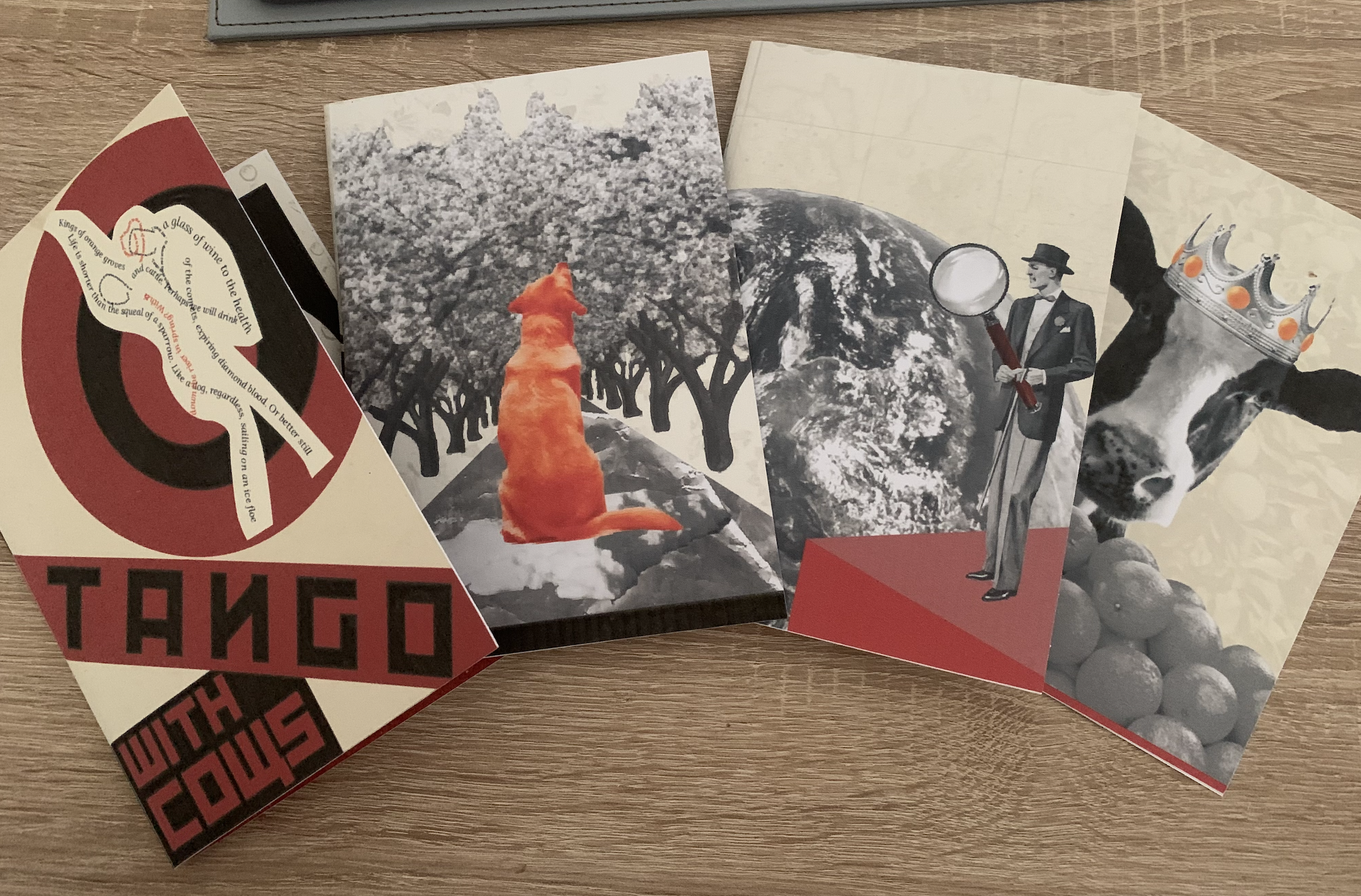
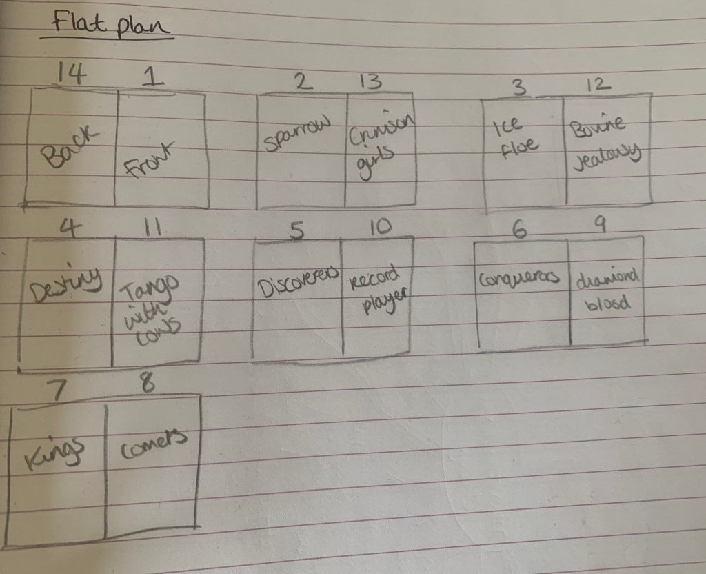
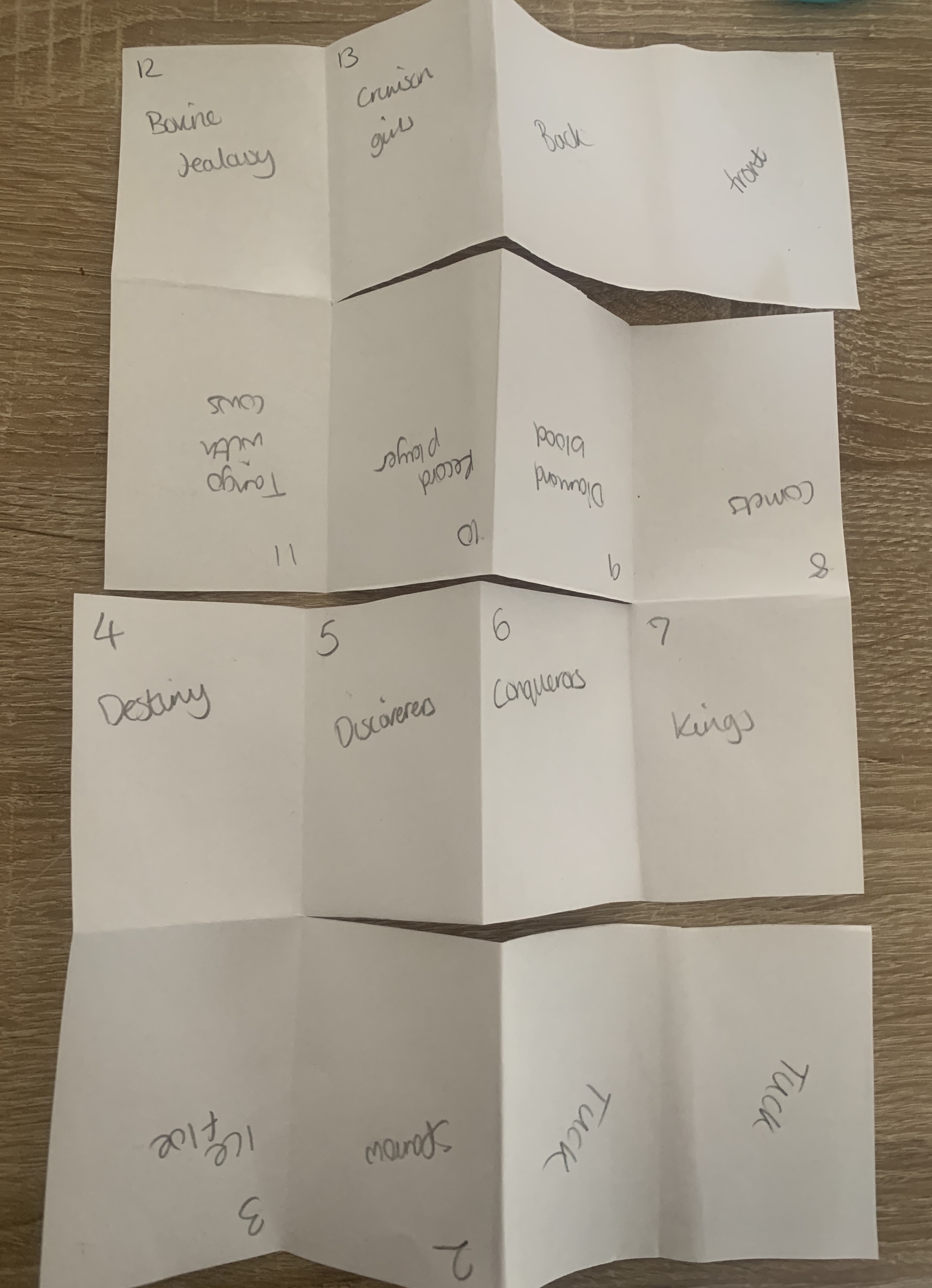
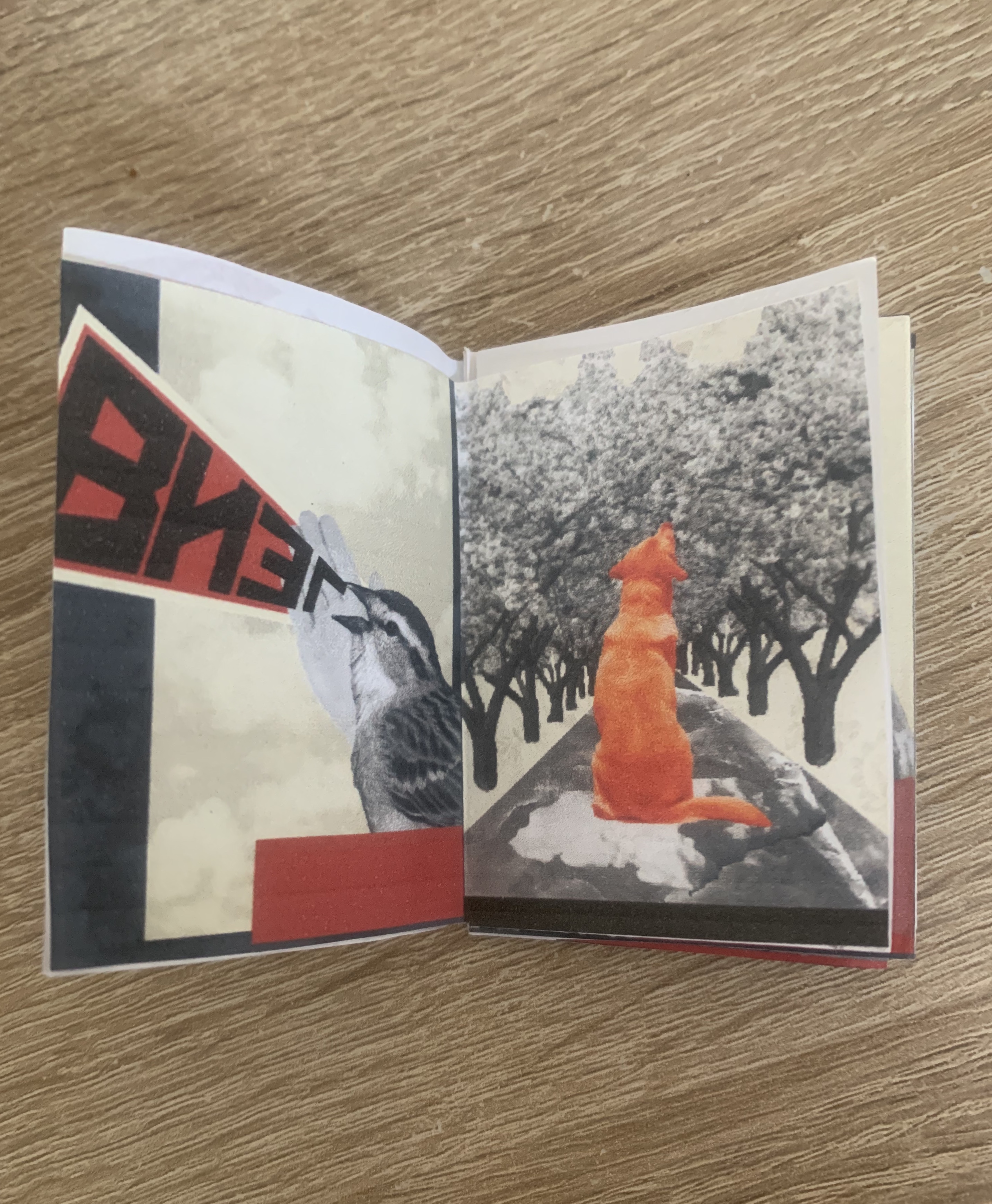
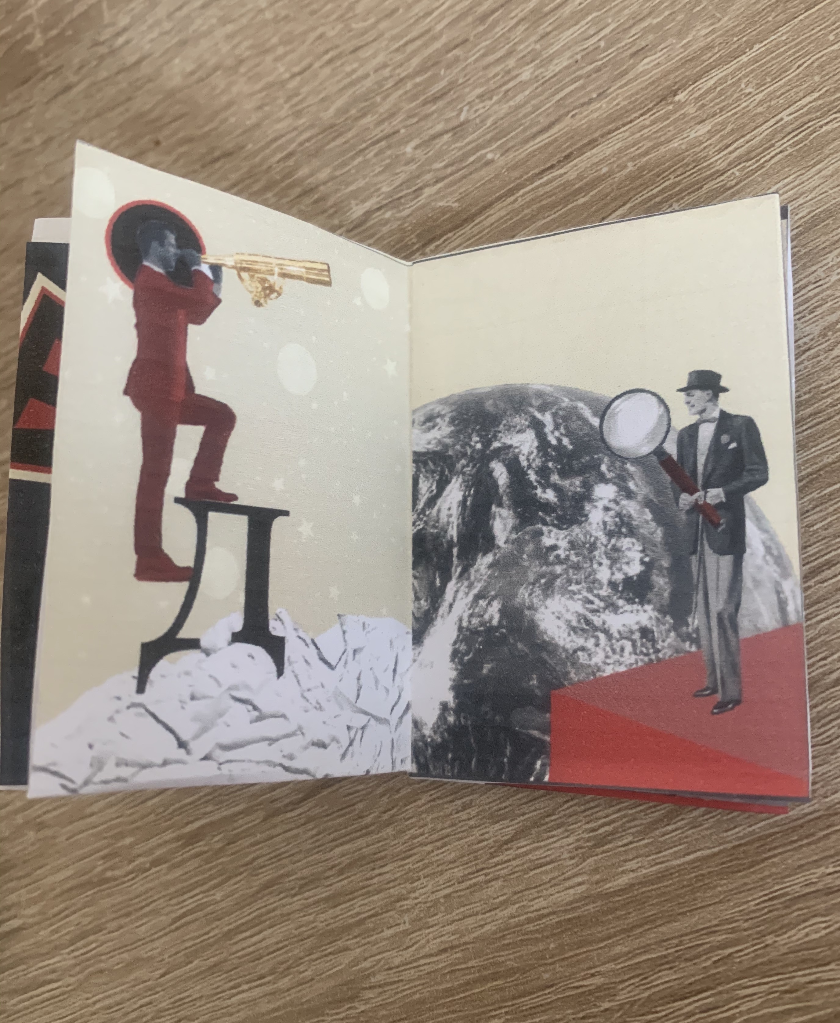
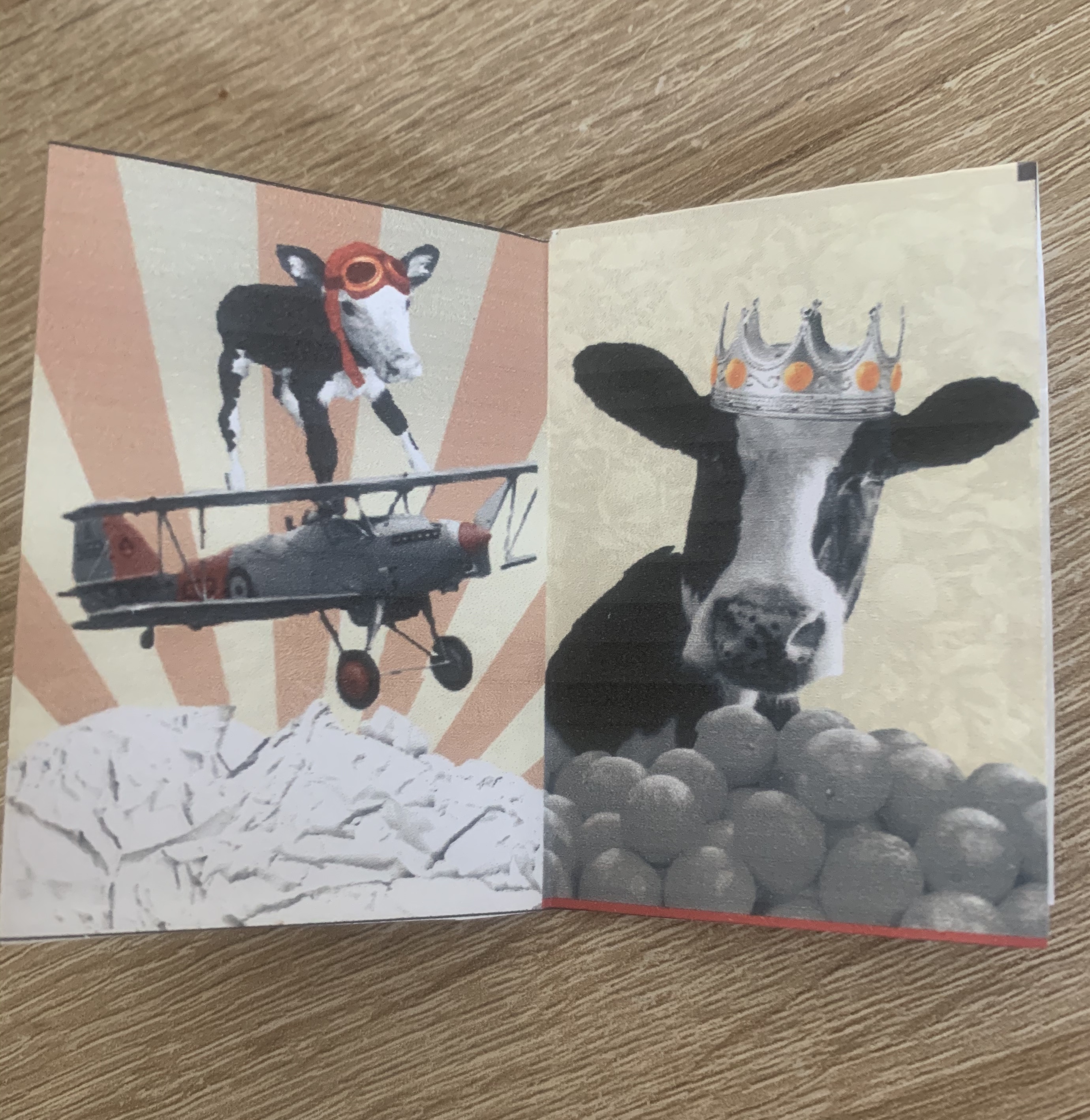
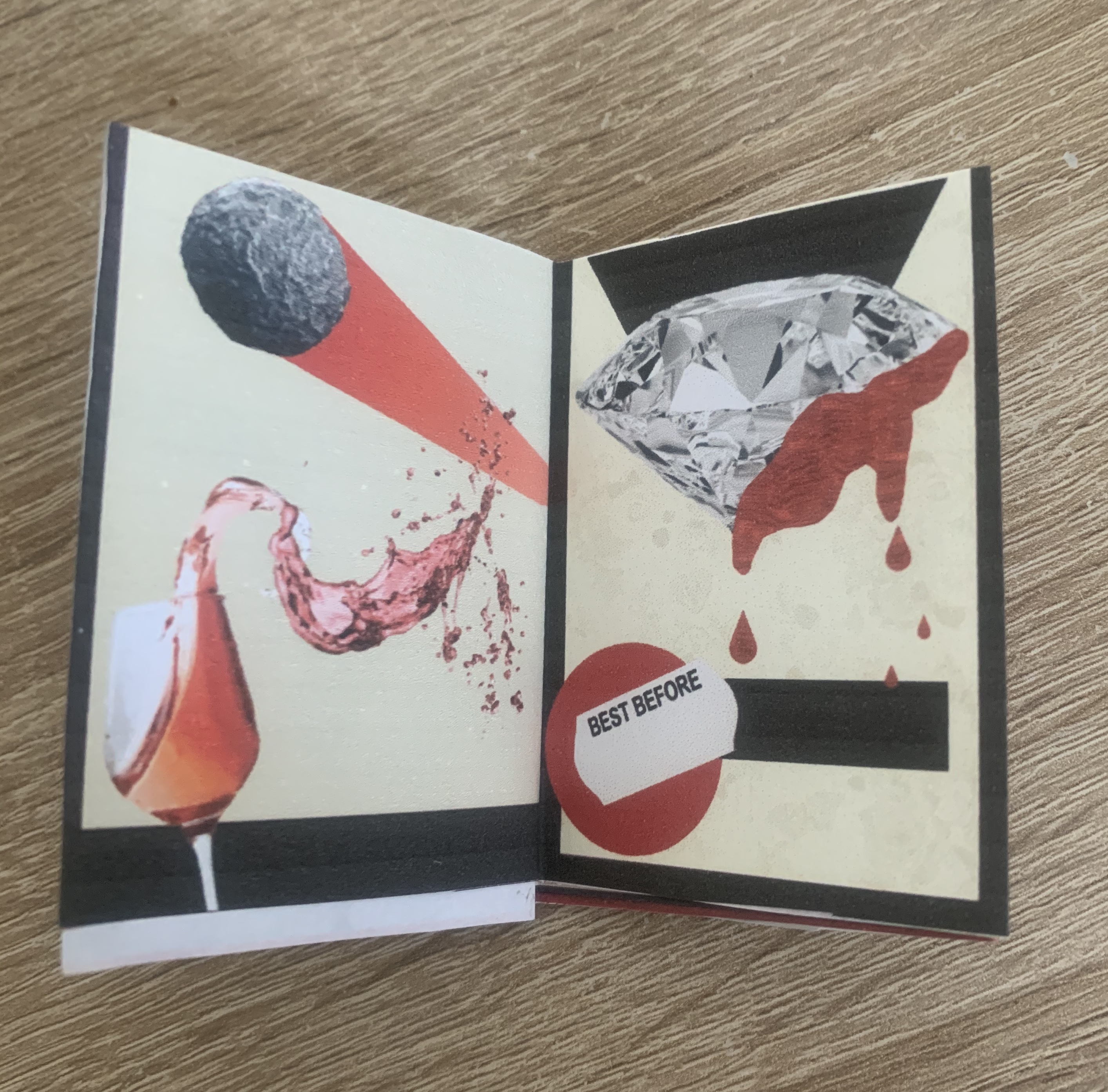
Looking back over my images I feel pleased and confident with each design. It wasn’t until I flicked through my booklet mockup that I realised I have unintentionally linked both facing pages when open, for example.. page 2 & 3 – Animal (Sparrow and dog) 4 & 5 – searching men (destiny and discoverers) 6 & 7 – cows (conquerors and kings) 8 & 9 – droplets (wine and blood) 10 & 11 – music (record play and tango) 12 & 13 – tears (bovine and crimson). I’m going to take this as a happy accident that I have created connections between the pages.
My only concern for my designs are if they are too similar – should I of stuck to the theme so strictly? I tried to differ each image, especially the backgrounds (speaking of, I need to lower the opacity on the yellow overlay on some of the designs as the background images aren’t seen as clearly as others). I am also hoping once my designs are printed out at a larger scale and on better quality paper that the finer details will be more apparent such as the use of printed mixed media so that the different textures can be seen etc.
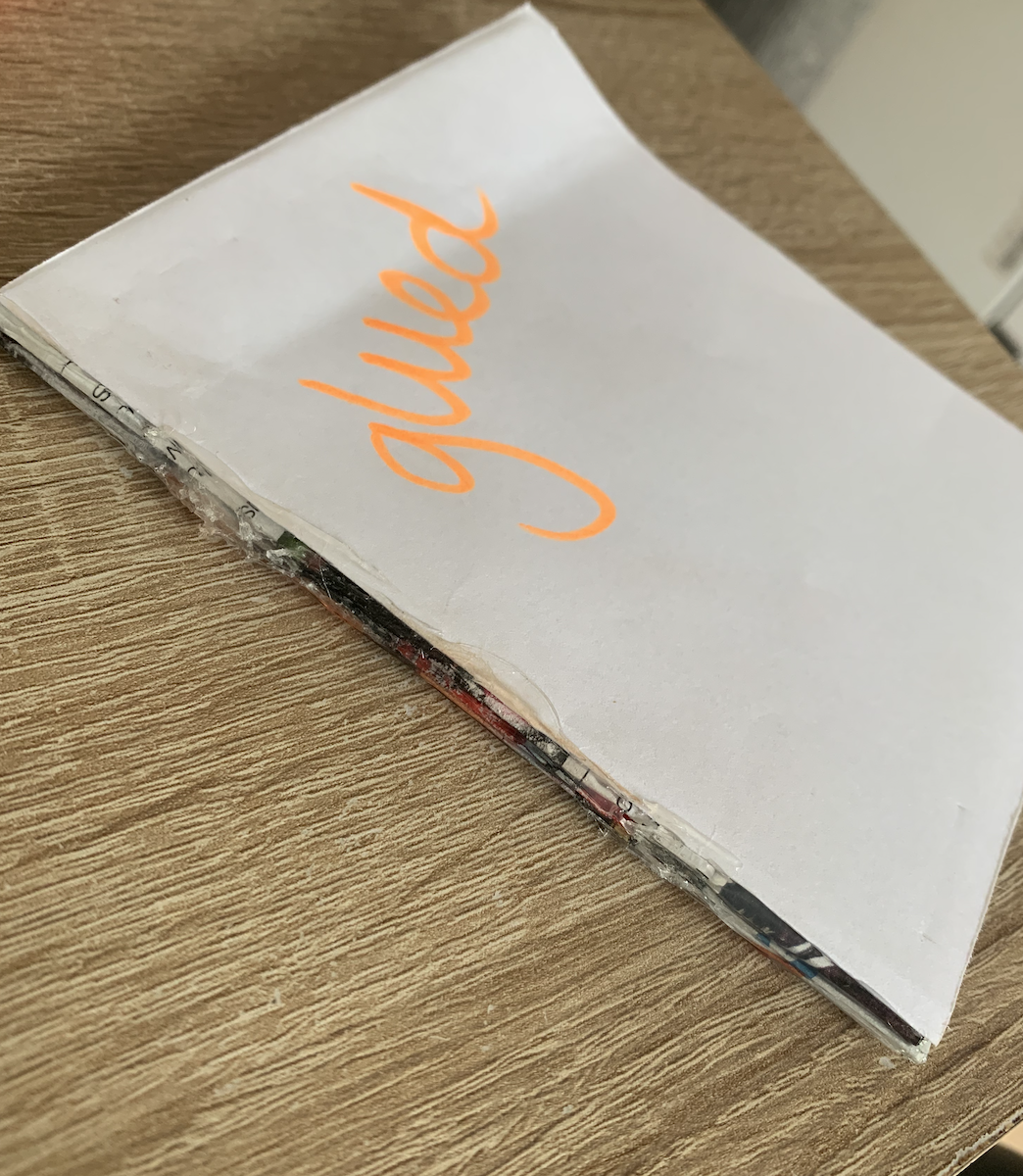
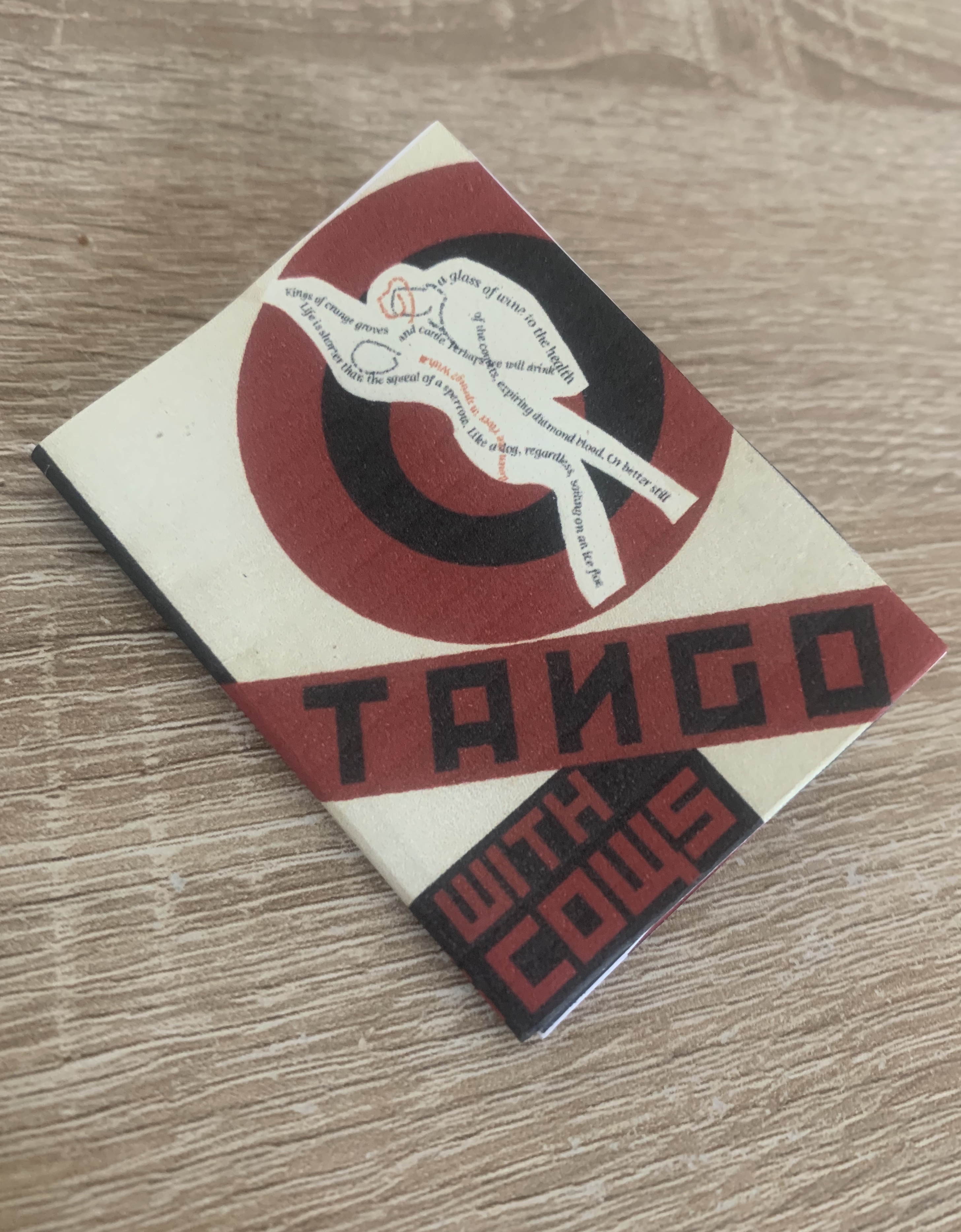
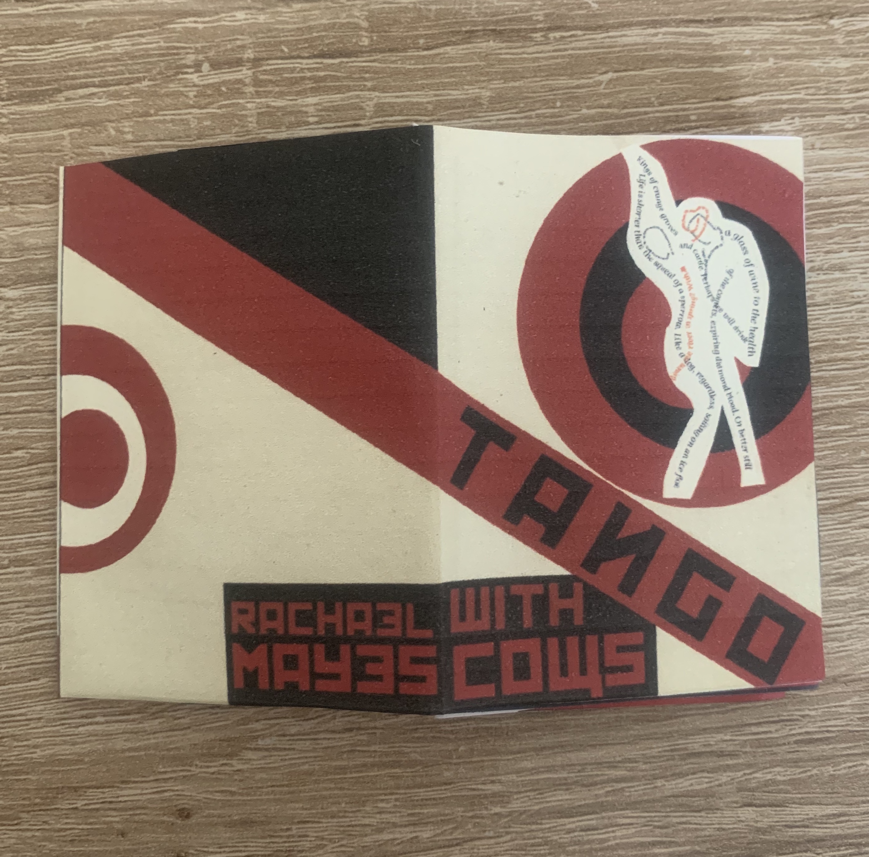
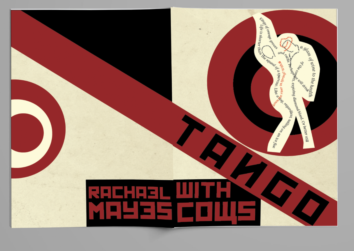
I was pleased that I was able to incorporate my concrete poem into the front cover of the booklet, I have tried to fit this in with the theme of constructivism art by creating a slight cut and paste technique, which surprisingly made this fit in well! it seemed a shame not to use it considering its about the same topic.
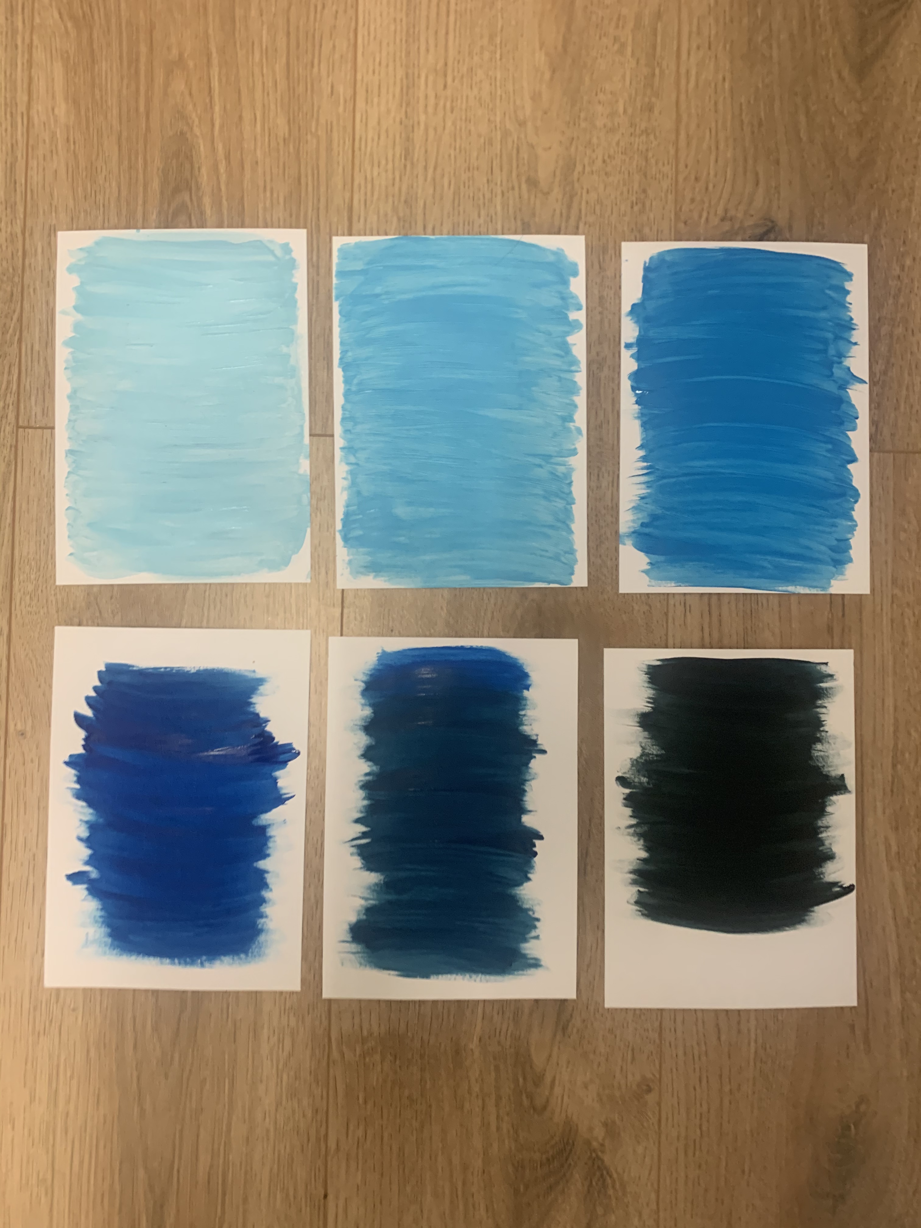
Originally I printed my images onto cheap 90 gsm printer paper, this left ink lines across the majority of the pages and also was created at such a small scale, with my amendments in place I wanted to print my images onto 210gsm white card at a larger scale of A5 rather than 5x7cm! This will enable me to analyse my images better to see them printed at a better quality.
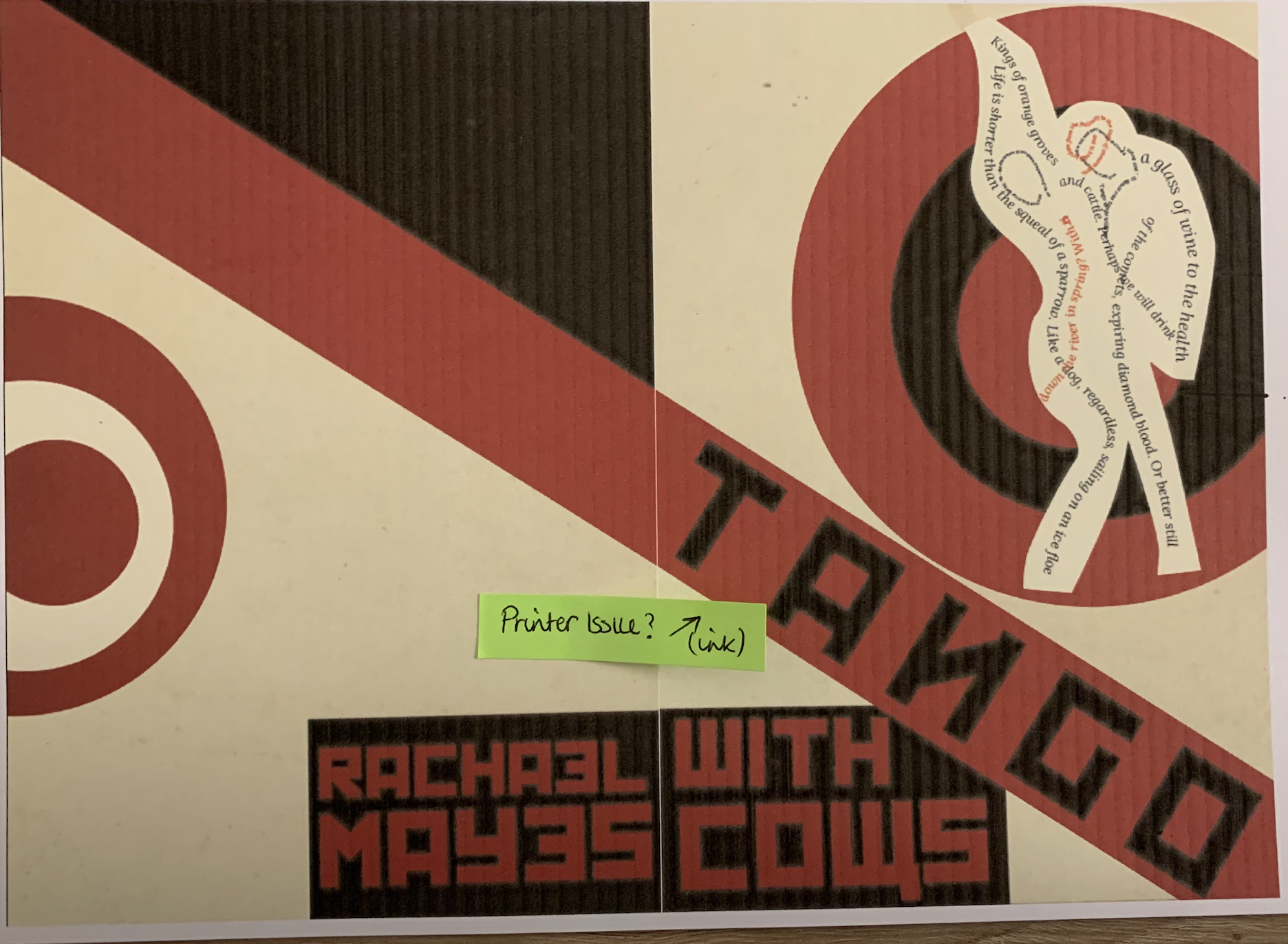
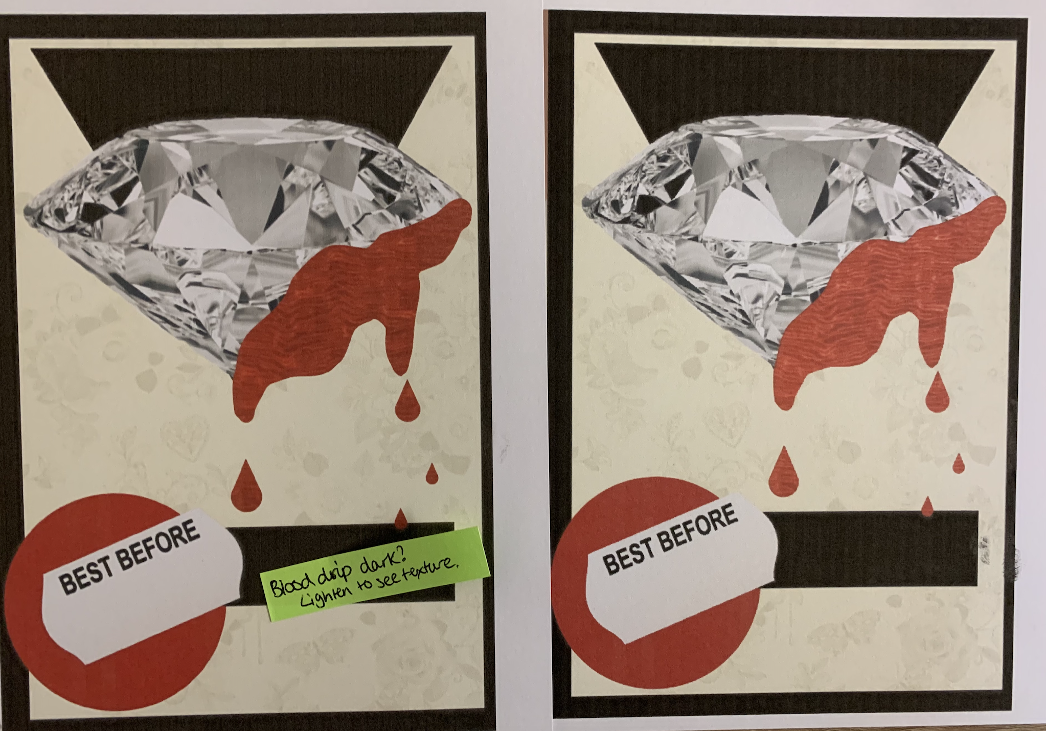
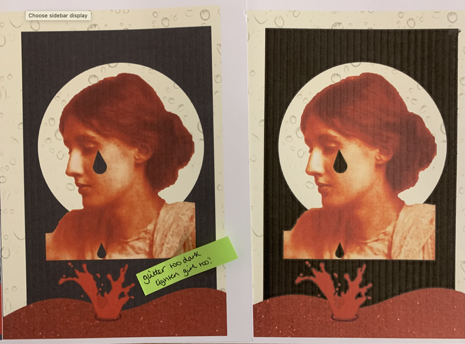
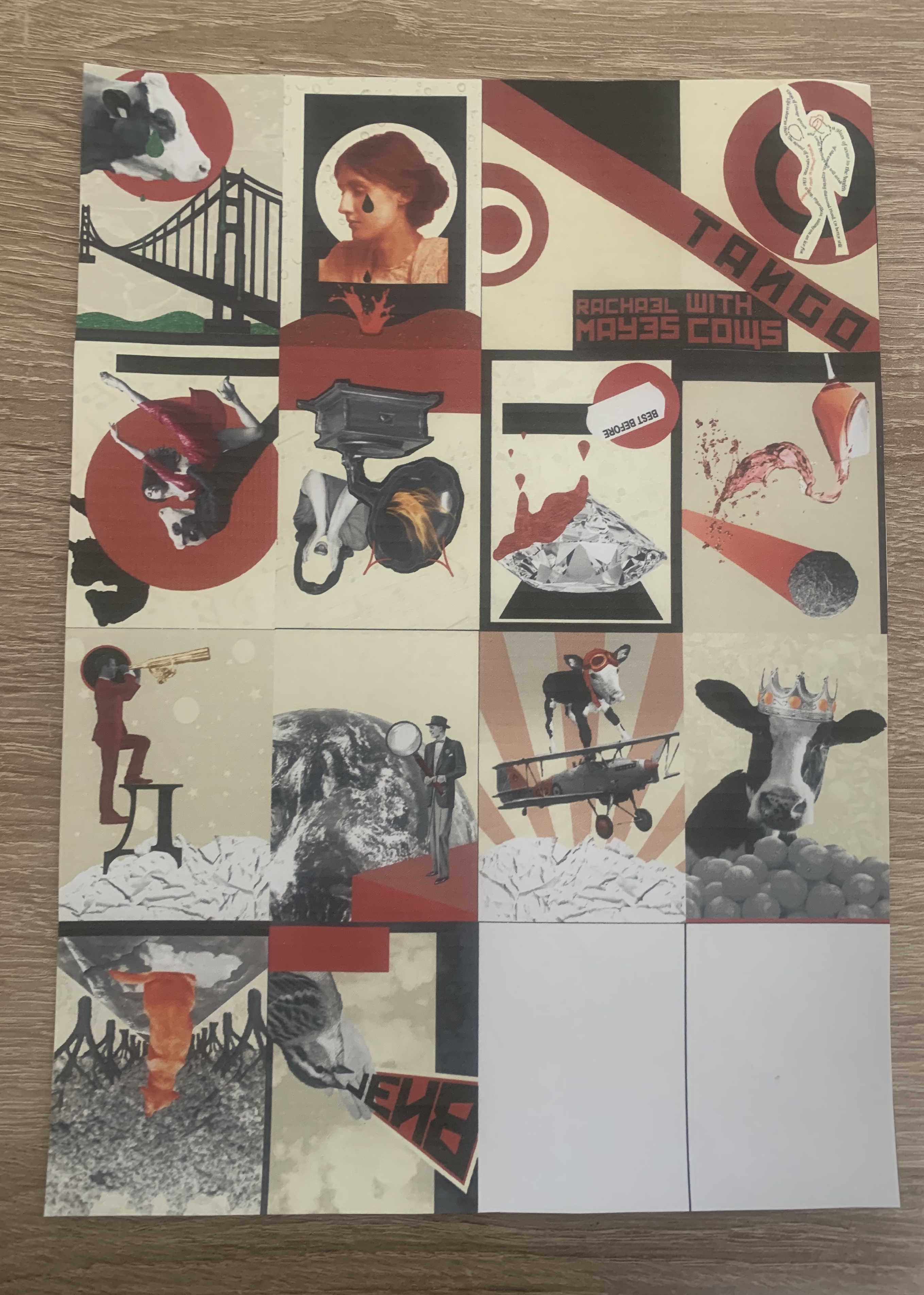
Seeing the images printed in a larger form enabled me to see the errors and quality within. I seemed to have a slight printer issue with ink when printing out my images, I made notes for the images which I wasn’t happy with, I felt that a lot of the red images printed darker hiding the texture of the mixed media paper. I simply lightened these and correct the issues and reprinted as seen below side by side of the before and afters.
Im glad I was able to emend some of the images which I had slight issues with, I just need to reprint some of the images which had the issue with the ink on (sourced the issue and the inkjet needed cleaning).
Select and Collate
I think the strengths in my images as a whole is that there is a clear design consistency fitting in with the constructivism art bracket, I have taken into account the era that the poem was written along with adding small Russian details and inspiration. After printing off my mock-up as part of the previous exercise It was effective seeing my images together in book form, when read alongside the poem the links are present making it liner, however can still be seen as non-liner focusing on the images solely.
I would have to say my negatives are possibly sticking too closely to the design style and perhaps being too obvious in my designs, meaning I sometimes opt for the simpler option and don’t allow myself to deeply connect with the meaning behind the design and become more creative.
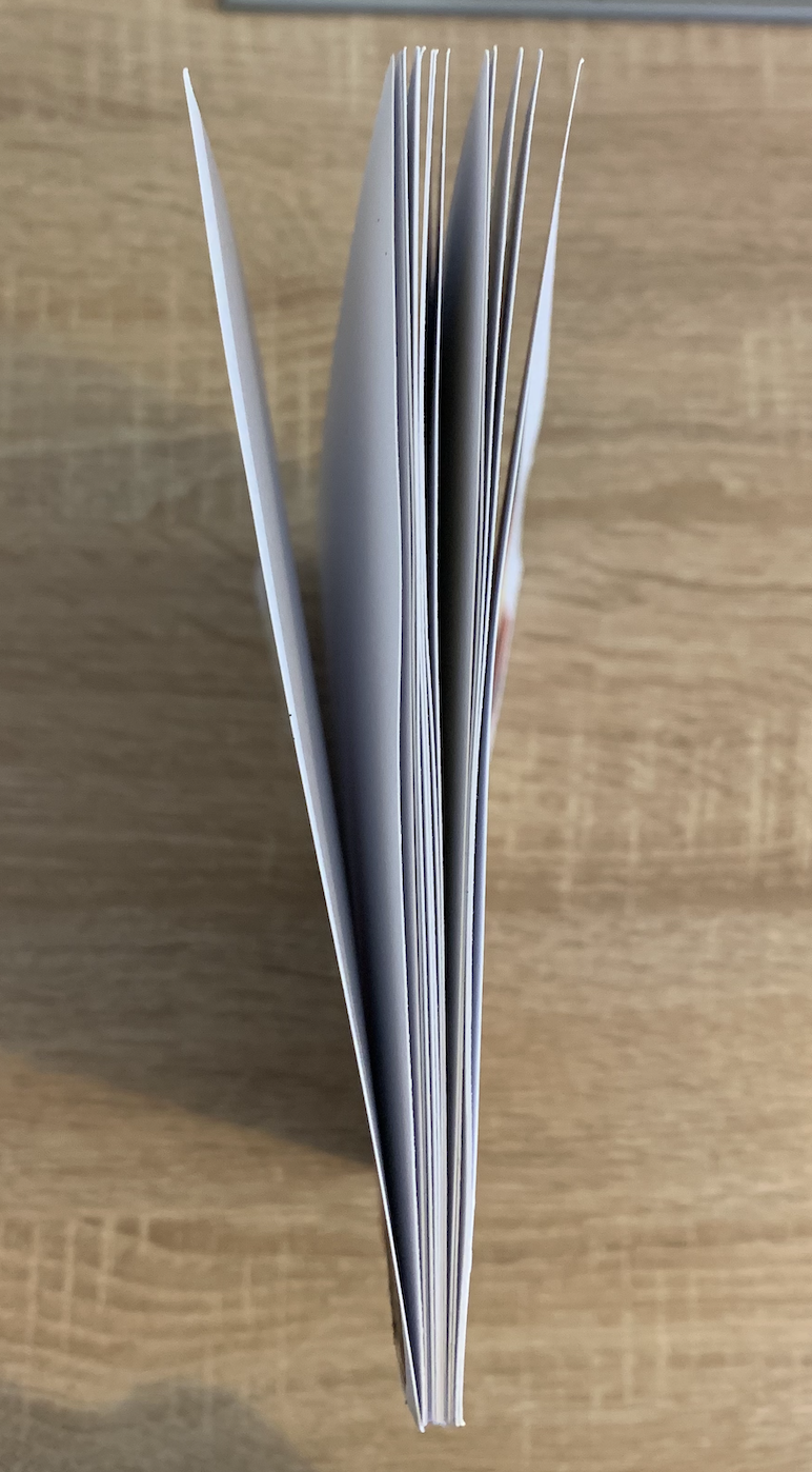
Once printing all of my amended images onto 210gsm white card I decided to stick the correct pages back to back to give thicker board like pages. I did look at alternative ways to layout each images but I felt chronological order was best, also for the fact that I subconsciously managed to create links for each two facing page.
Binding
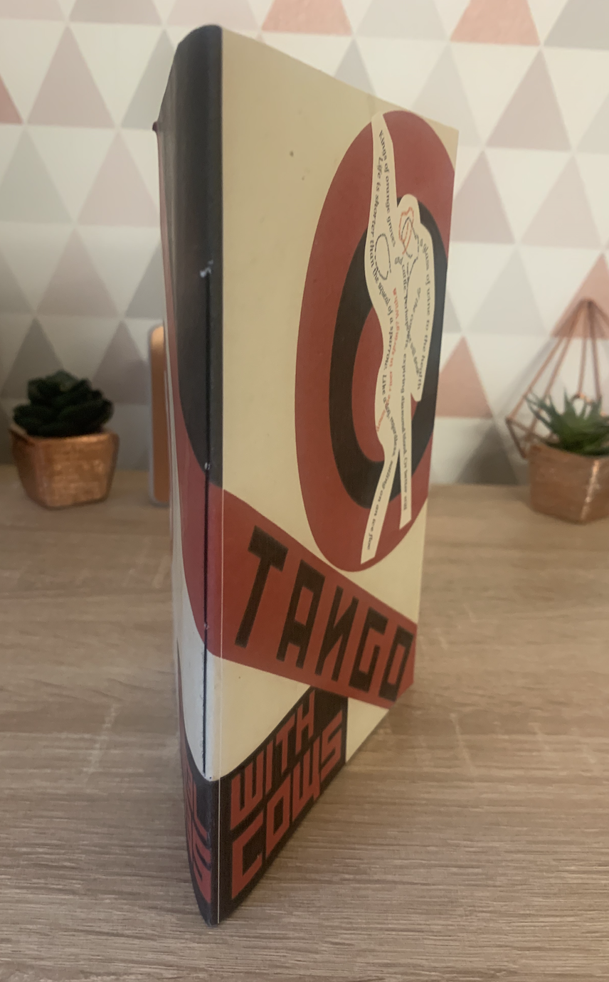
Due to my pinter only printing on A4 I feel that an A5 booklet would be best in order to see the images clearly, my miniature booklet from the previous booklet was folded and glued so there aren’t many binding techniques which would be suitable for this, choosing A5 is give me more freedom to be experimental.
Before I go straight in with my images I’d like to take this opportunity to experiment and try hands on different binding techniques on scrap paper.
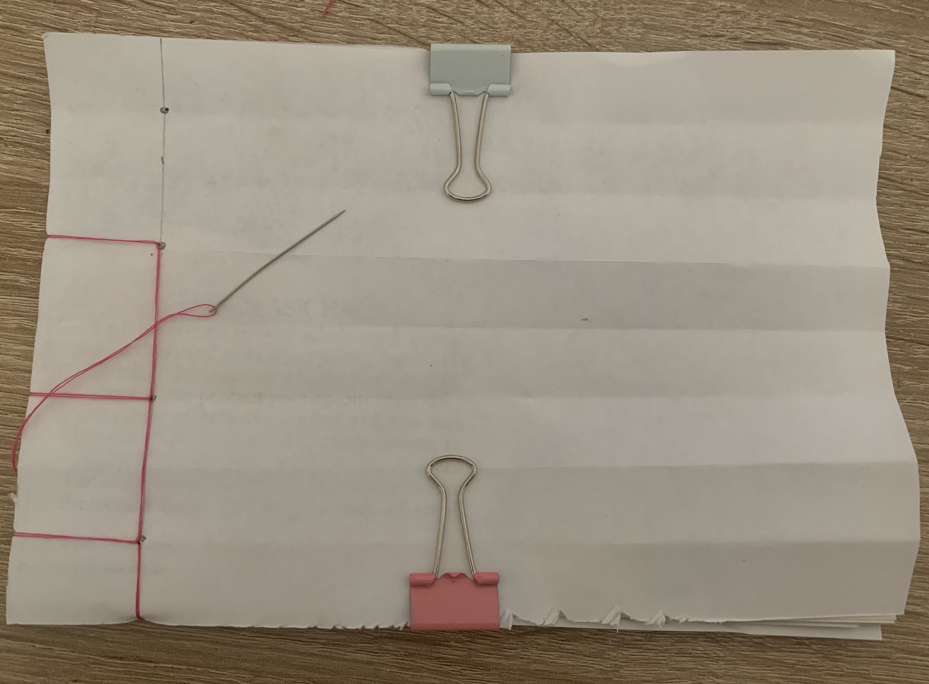
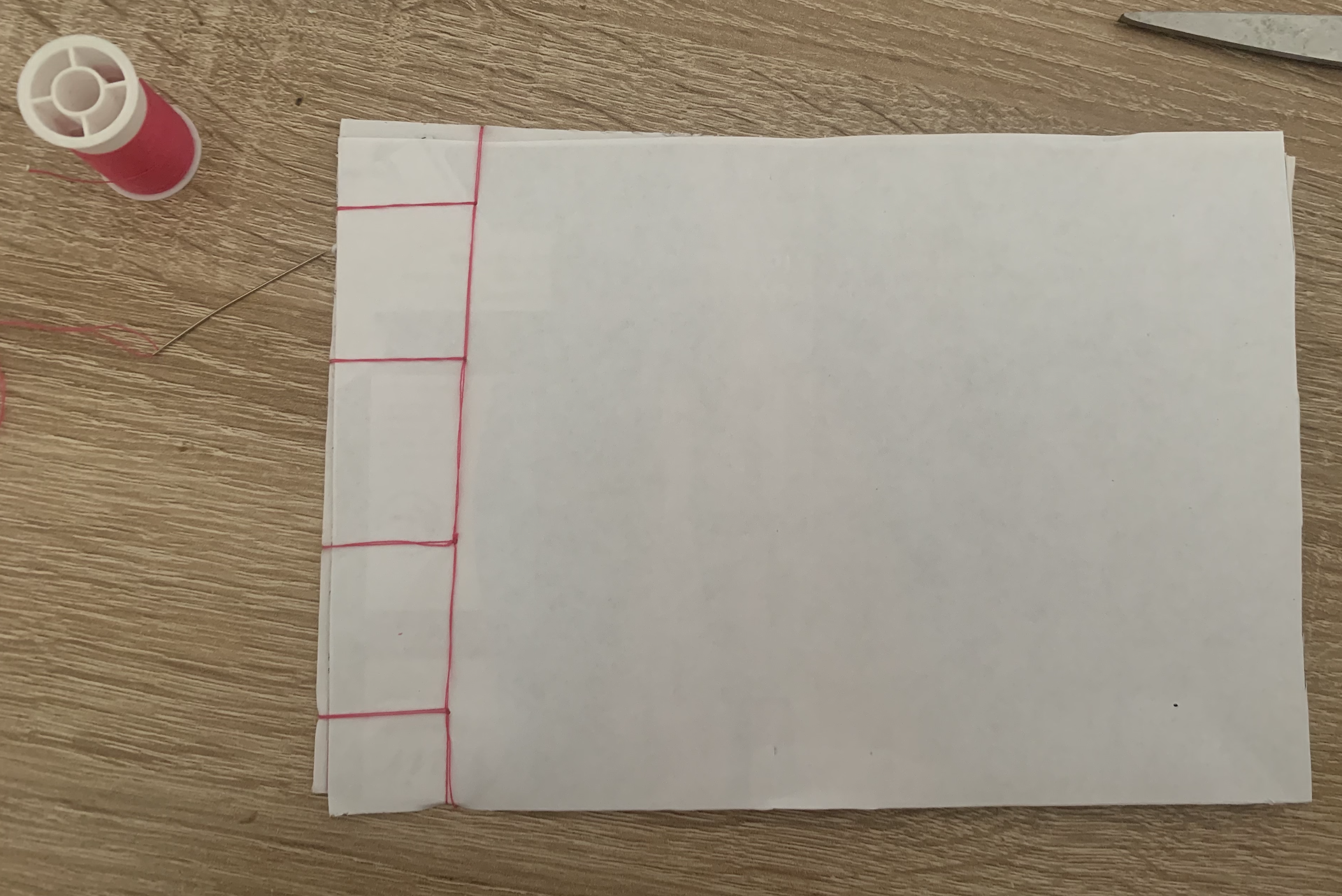
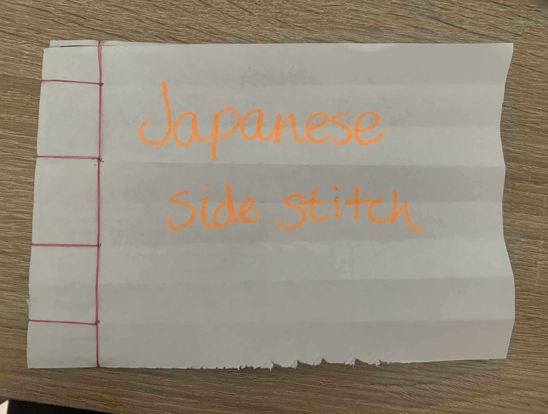
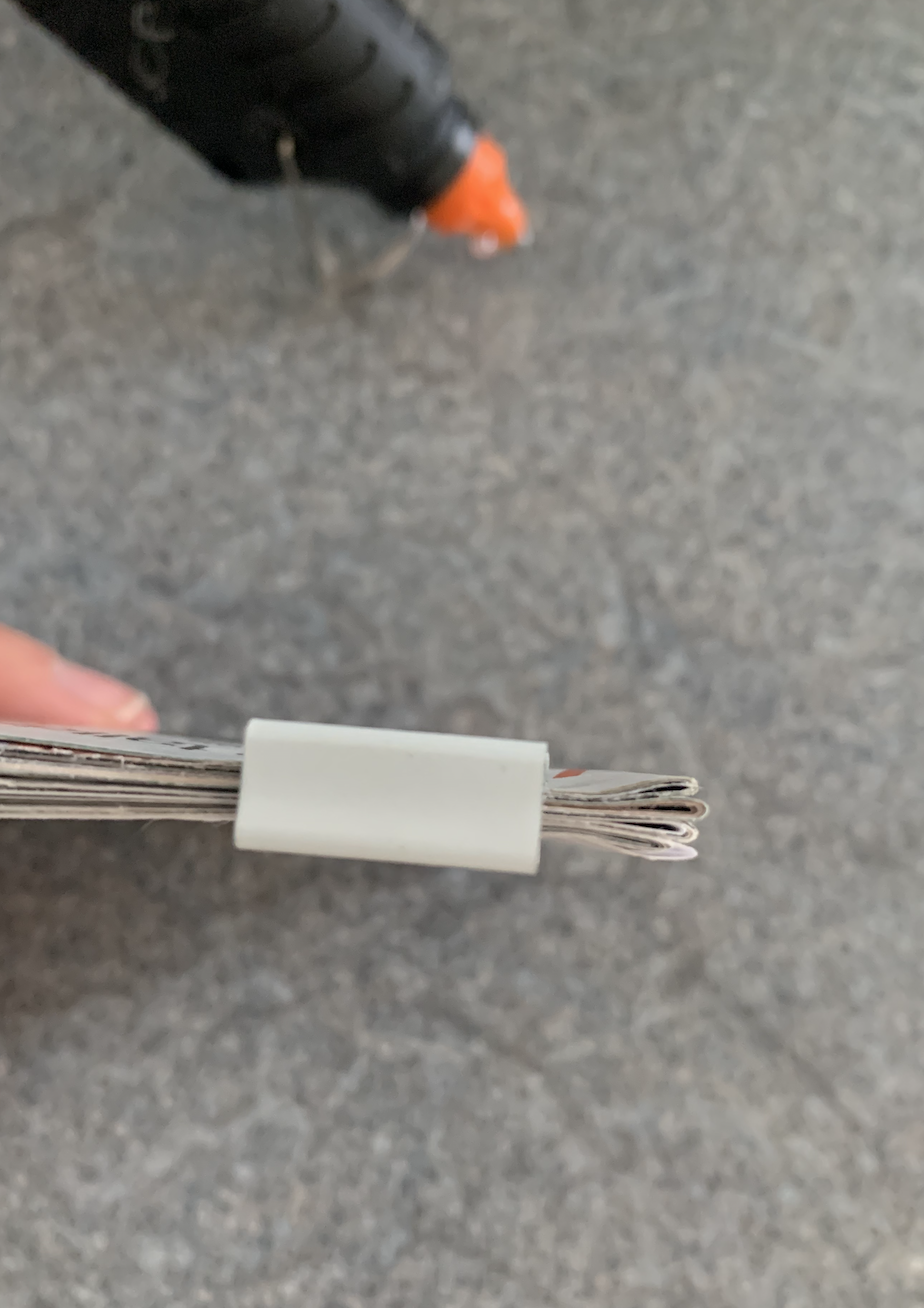
Japanese side stitch
I started off by following the example in our course materials. This was an easy and fast technique which feels as though it has a strong bond between the pages. I used bright pink thread so that the binding technique is clear.
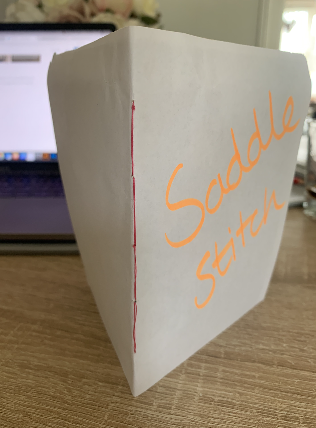
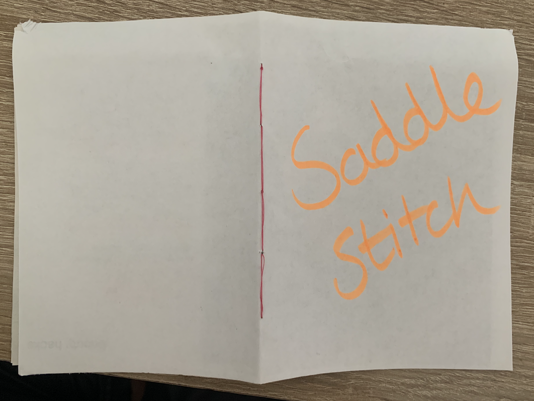
Saddle Stitch
Still using the needle and thread technique I decided to try the saddle stitch, This is less fiddly than the Japanese stitch as it only consisted of weaving backward and forward. The pages feel secure and this binding technique gives a neat finish to the spine of the book.
Glued
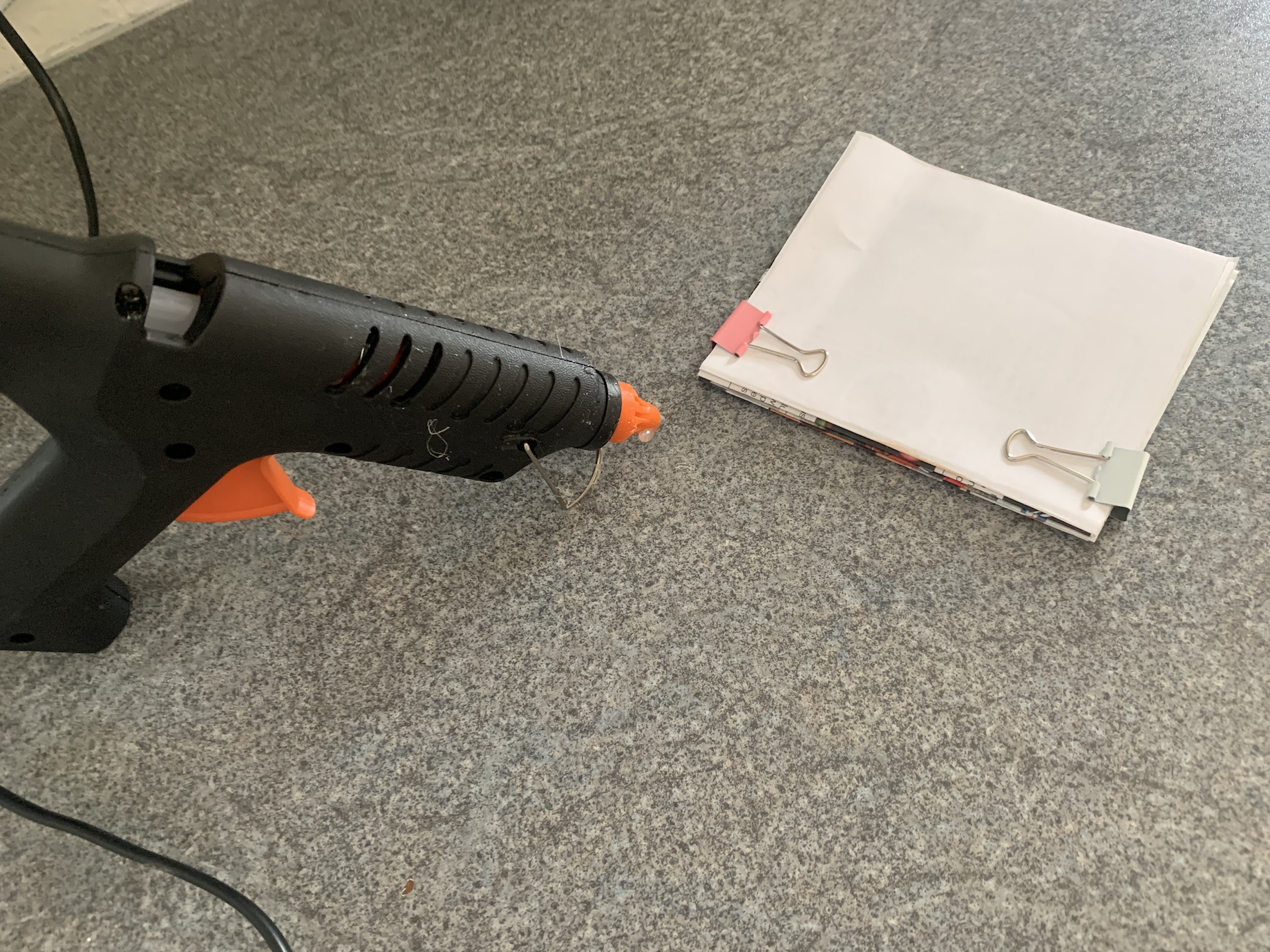
Slightly a longer process with having to saddle stitch each section before gluing, and this was a disaster in itself as I didn’t have any PVA glue, only a hot glue gun! (glue dried too quickly and went too clumpy, wasn’t able to smooth over without creating lumps) but it hold well and once backed with board would make a successful hardback!
Glued Part 2!
After the complications with the previously glued book I went and and get some PVA glue and decided to try a different technique, This time I attempted the ‘Perfect’ binding technique commonly seen in magazines. For this I used the rough copies of my images which are single sided printouts. This technique feels as though it could fall apart however that may because of the quality of glue? Although this was the easiest technique to do by simply applying layers of glue I feel its the least successful.
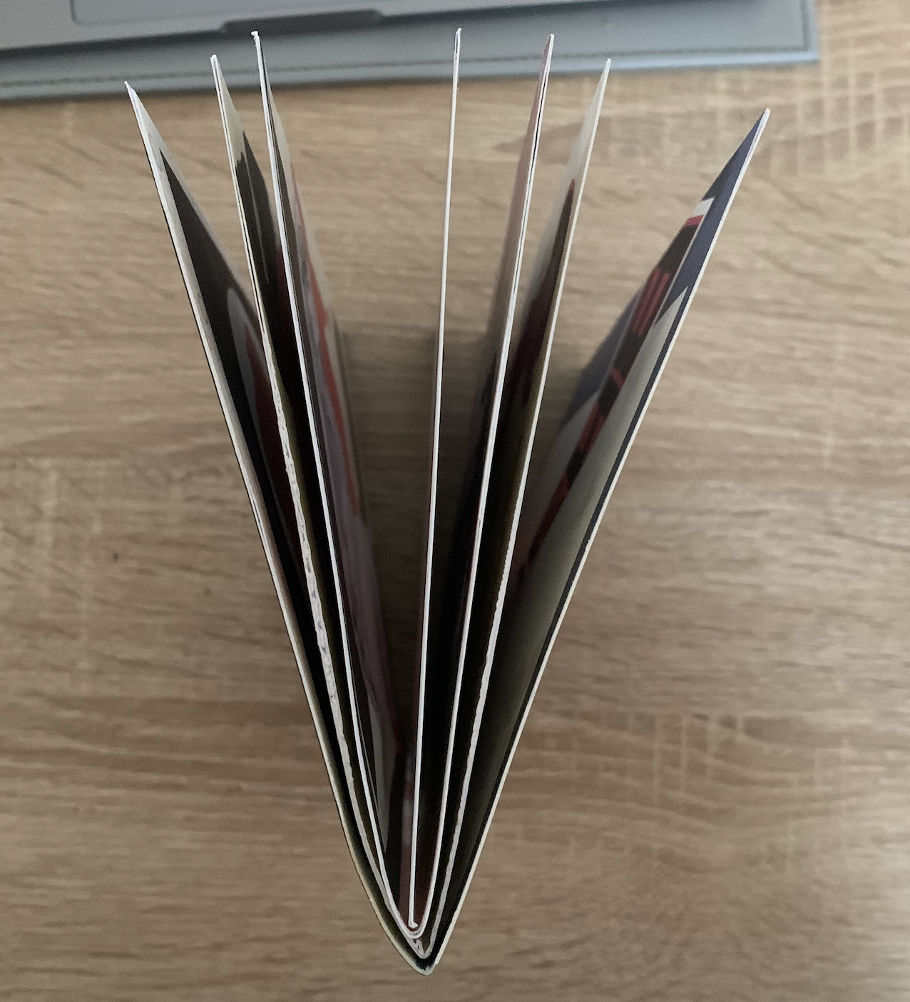
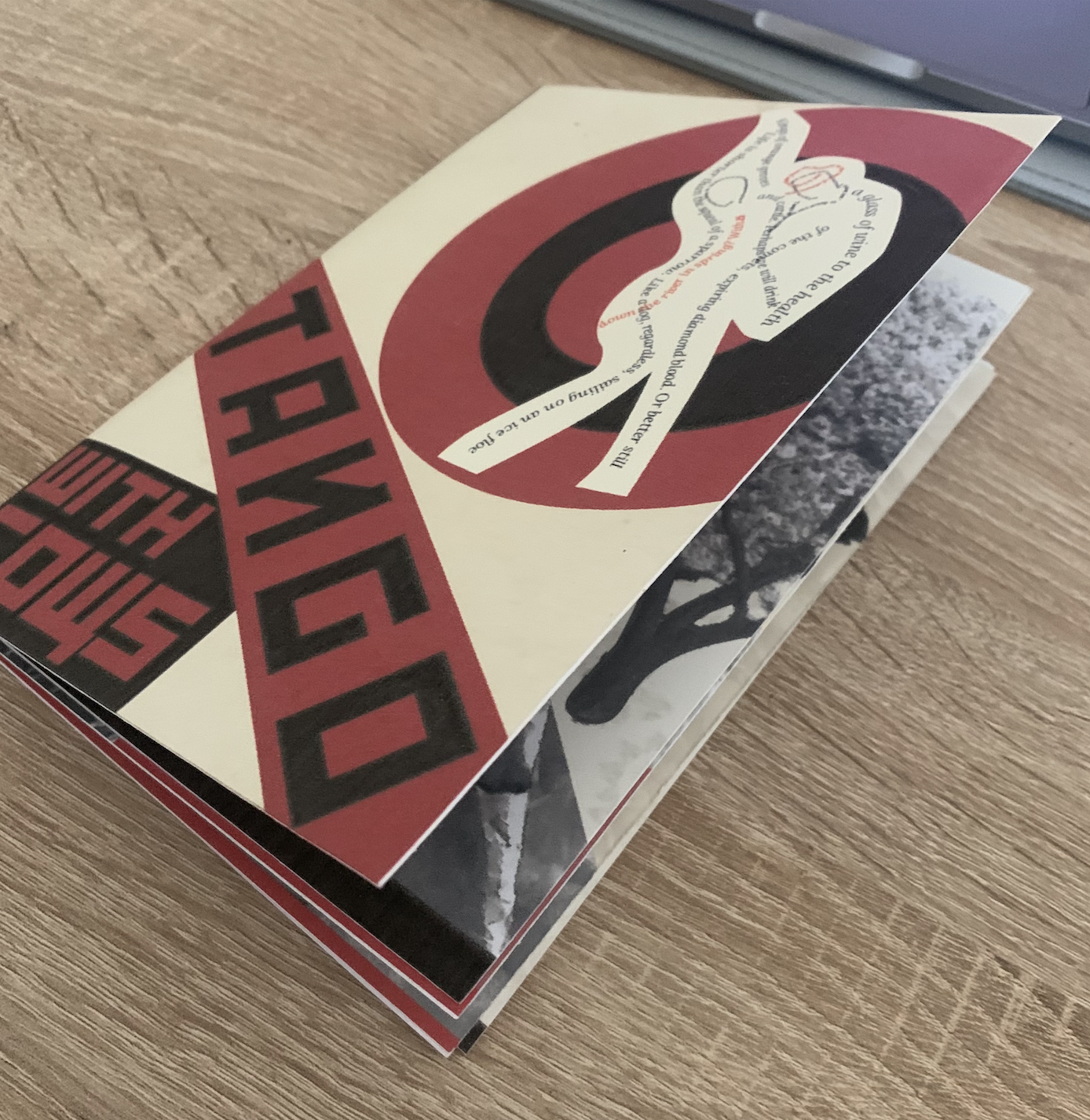
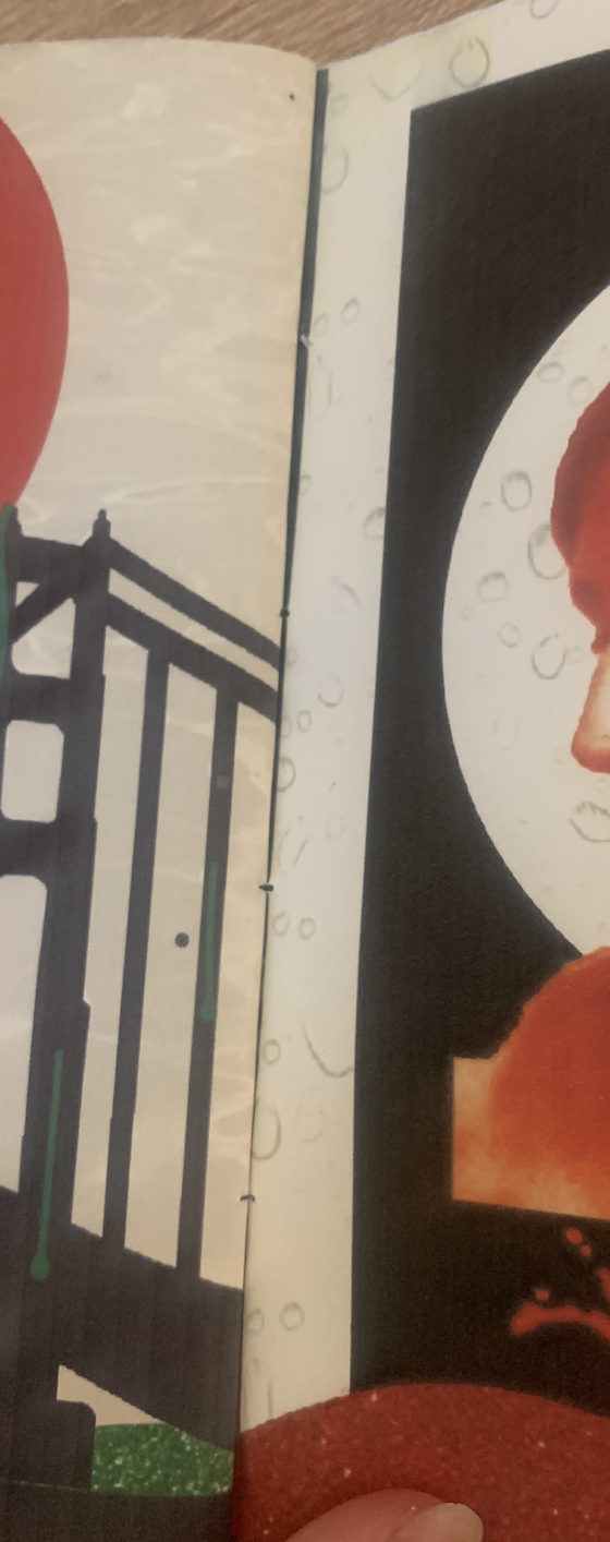
After testing out a few different binding techniques I decided that a saddle stitch would be the must successful way to bind my images together. I simply used black thread and weaved between each page.
Reflection
It was good to go back and reflect on my images thoroughly and to amend the issues which cropped up. I also found it interesting to practice different binding techniques and experiment with how easy they are to do and how well the work. Seeing my images in book form feels very rewarding and I’m very pleased with the end result!
Brief: In this exercise you’re going to create images which you’ll then print onto the papers you collected in the first exercise. You have been working with the poem Tango With Cows in the exercise ‘Concrete Poetry’, to create an experimental text. Using your interpretation of the poem as a starting point, develop a set of images you can sequence into a narrative. You can choose to create these images yourself or use existing images.
Idea Generation: Create a series of images which will build a narrative sequence over about 16 pages. Use keywords from the poem as a starting point. Work with images you have created before, developing and changing their contents, or use fresh new ideas and imagery related to the poem. Remind yourself of the creative design process. Explore the sequential narrative over the folds. Produce a folding document (2 sided) with the images you have created, Form and Function: Paper Folding.
Research and Development: A visual narrative is a way of communicating some form of ‘story’. it may be that you interpret ‘narrative’ in a conventional way, using chronological images of how your identity has changed over time, with a beginning, middle and an end. Or perhaps you’ll work in a less obvious way, exploring how your images can be exploited through abstraction and print processes, using the term ‘narrative’ as a vehicle on which to hang your concepts of the poem.
The purpose is to interpret the brief to create images that are meaningful to you, plus extend your understanding of images qualities. These images may be paintings, photographs, drawings, film stills – they can be at any scale, in any media and about whatever you want them to be, in the context of exploring the concept of of the poem. This is your opportunity to explore some of the features of digital imaging software, such as Photoshop, to layer images, cut out images, experiment with opacity, filters, hue, brightness, contrast and halftone screens, among other things. For example, can we approach text as image? What happens if you ‘rasterize’ text, then begin to manipulate it, in the same way as you would montage image material. Be creative! Explore! Remember you have access to Bridgeman and Oxford art libraries online also, if you want to download images and work in this way, but originating you own images will make the project more personal to you.
Research
I always like to start off by widening my knowledge and gaining inspiration on new topics before generating ideas of my own, below shows some brief research produced for the upcoming task.
Narratives help tell the story and move the reader through the book with two basic ways – a linear or a non-linear narrative. A linear narrative a story has a beginning, middle and end often in chronological order. Nonlinear narrative forms have no chronological order and can jump around through time with no direct pattern. Novels tend to be linear in nature as both author and reader want the narrative to be followed in a certain order, where as books like Dictionaries and phone books are nonlinear and can be dipped into to find specific pieces of information which can be scattered through the book.
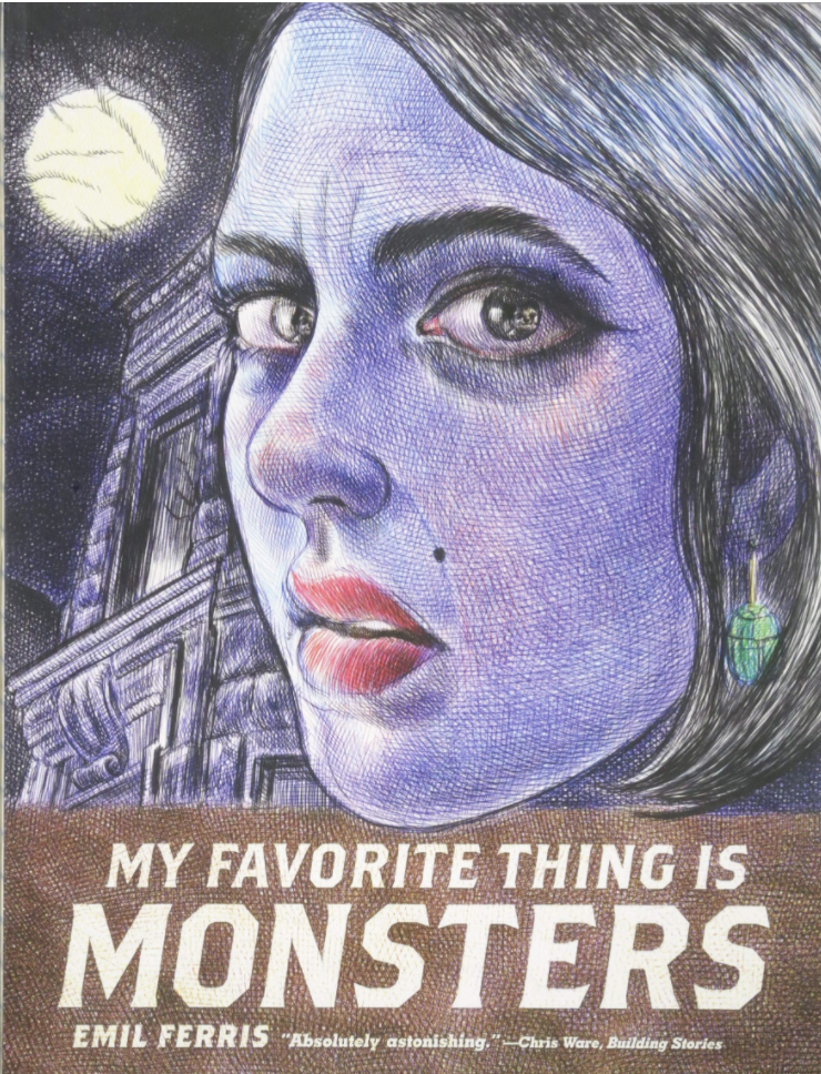
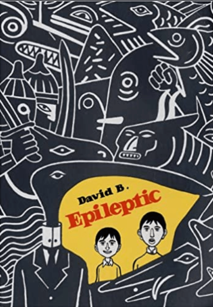
I wanted to look into graphic novels as this is something I haven’t come across as of yet and thought it may help with this exercise. The first book I came across was ‘My Favourite Thing Is Monsters by Emil Ferris‘ This Graphic Novel consist of each page scrawled in pen on lined paper – a clever storytelling format for this genre giving gritty tense images. Another graphic novel which caught my eye was ‘Epileptic, by David B.’ I was drawn to the with the bold marker like doodles which this style continues throughout the book, which with the bold, confusing, clashing images suits the topic of the book.
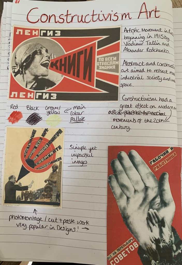
To gather further inspiration for my designs I decided to look at art movements around the time of when the poem was written, one movement which stood out for me was the Constructivism Art Movement. I felt this would be brilliant to use within my designs for this exercise. I love photomontage work and some of the examples from the movement on the left contained designs of just that, most images from this time only contained a very basic colour palette of just red black and pale yellow, along with block abstract shapes. This feels like a good starting point to my design process!
Design Process (part 1)
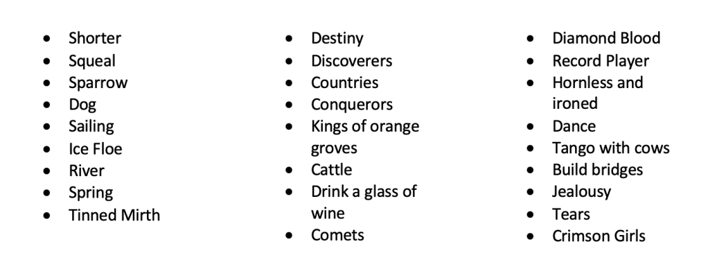
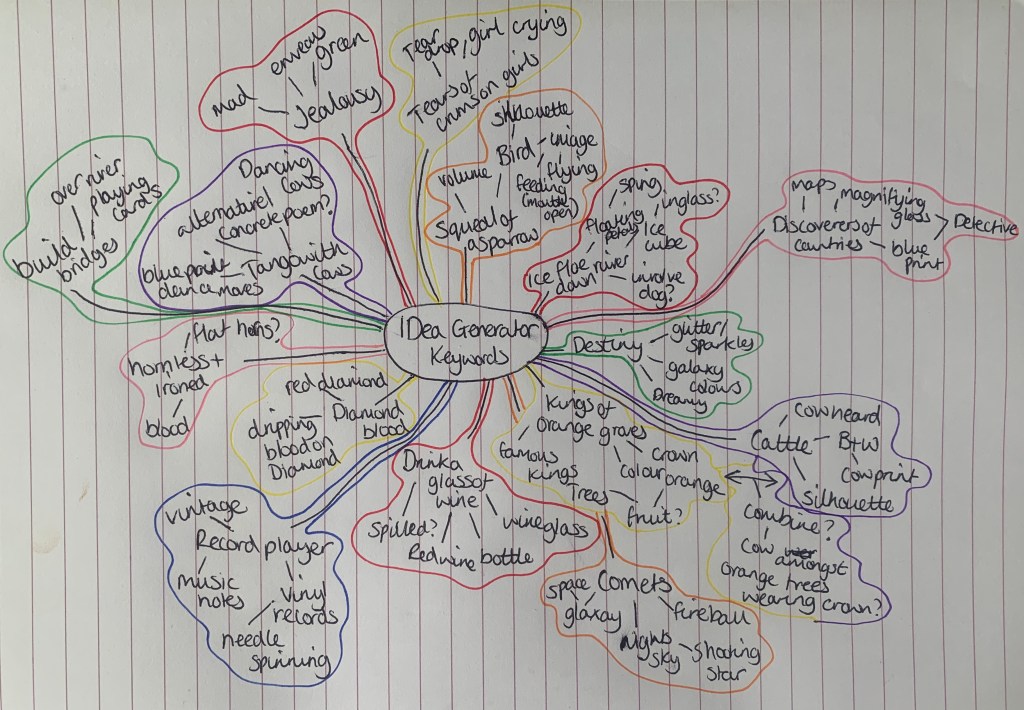
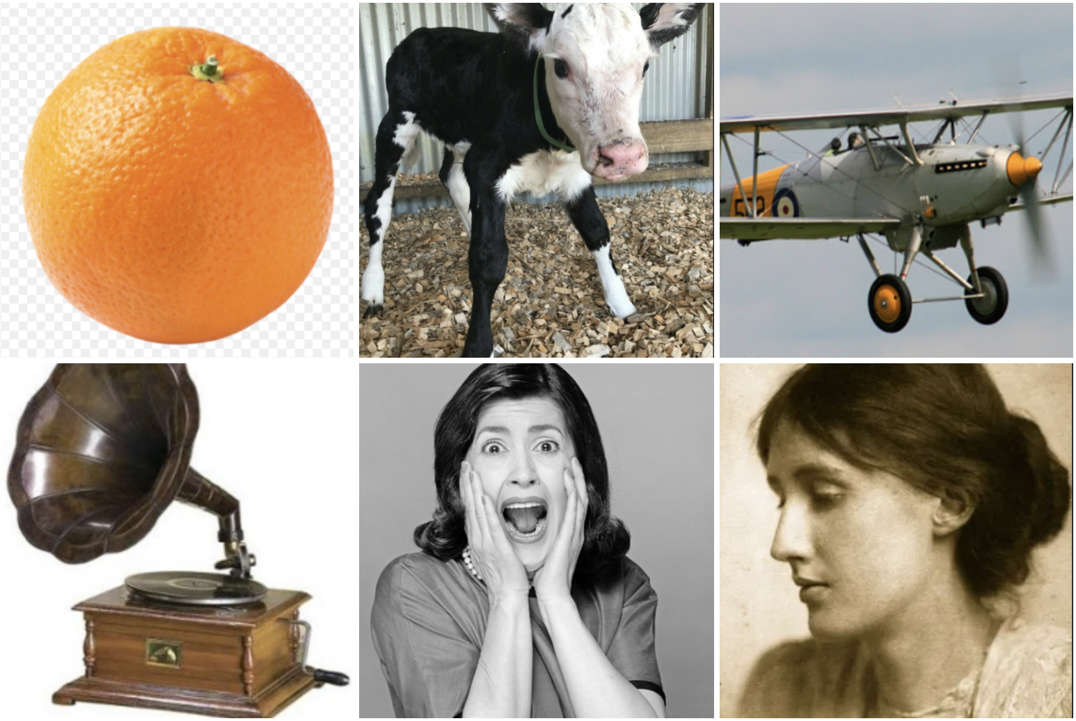
I started off by listing all the keywords mentioned in the poem ‘Tango With Cows’ I felt this was a good starting point to decide which words will be appropriate to use in this exercise;
From the selection above I narrowed down my keywords ready to start generating ideas for the series of images I am being asked to create. I jumped straight in with creating a mind map to kickstart my design process.
I would like the narrative for my images to be seen as both linear and nonlinear, so that the book can be read in chronological order following the poem but also is able to be dipped into seeing each image individual as well as being part of the series.
Sketches
I roughly sketched out some initial ideas to give myself a starting point, I plan on using Photoshop and Illustrator as my main software along with using the cut and paste technique and scanning images up onto my computer. I plan on using a basic colour palette of red black and cream with perhaps an extra colour or two to suit the design (e.g jealousy -green).
As a reminder, the key phrases I have chosen are as follows;
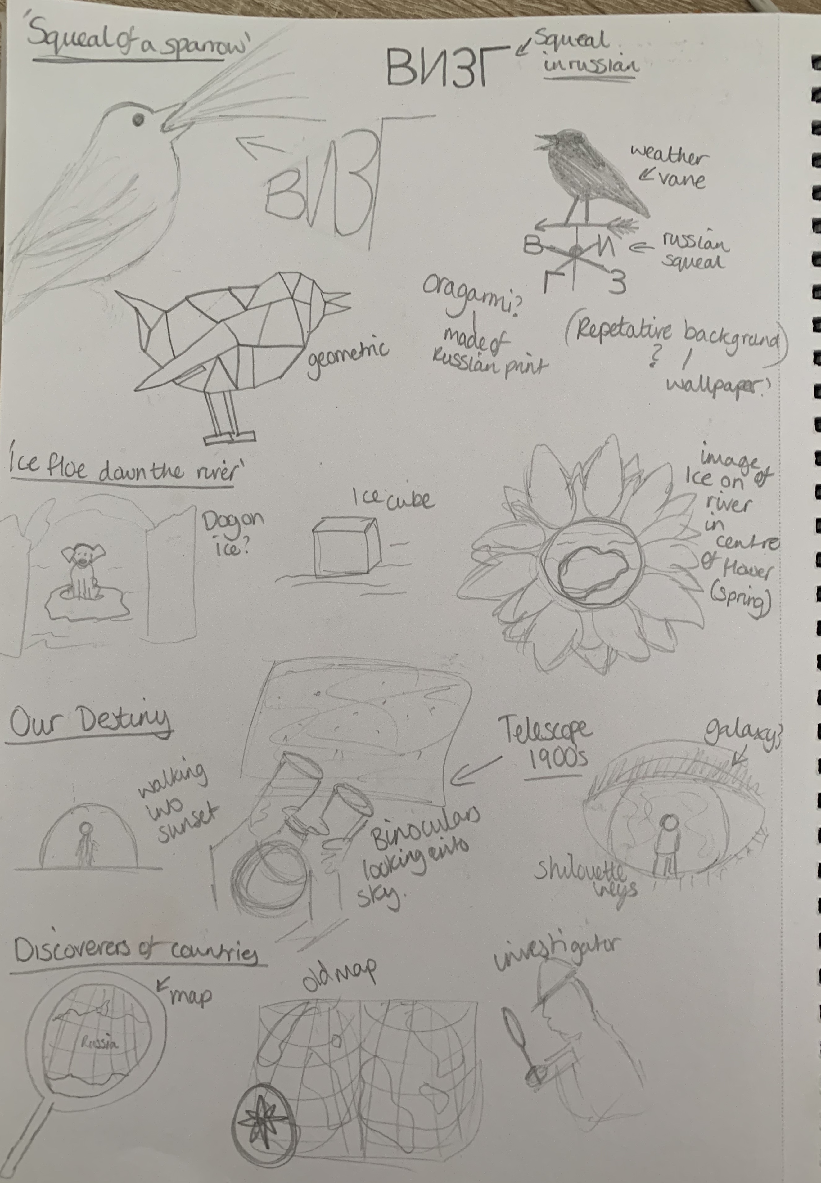
The squeal of a sparrow
Like a dog, regardless, sailing on an ice flow down the river in spring?
We look at our destiny
The discoverers of countries
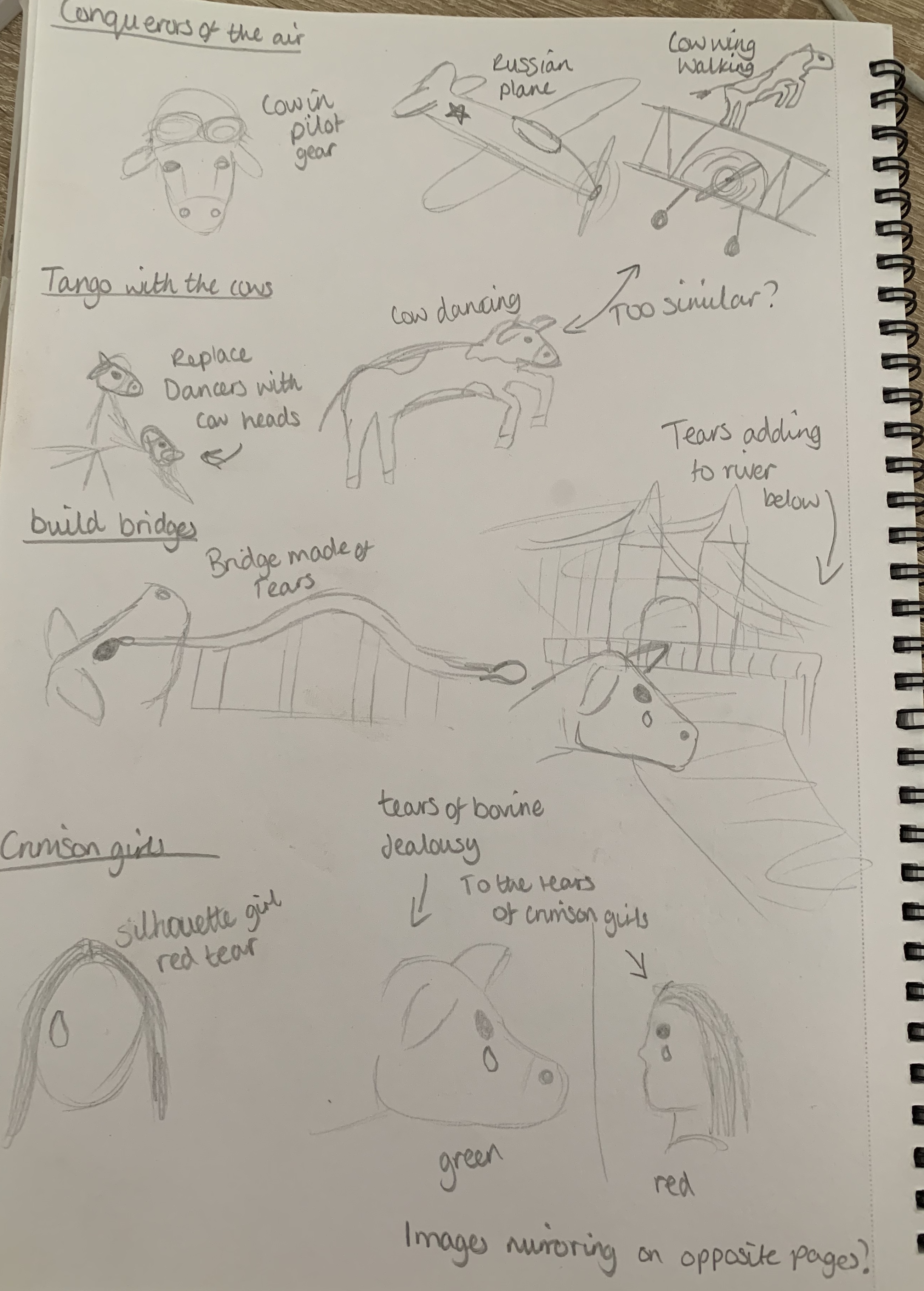
Conquerors of the air
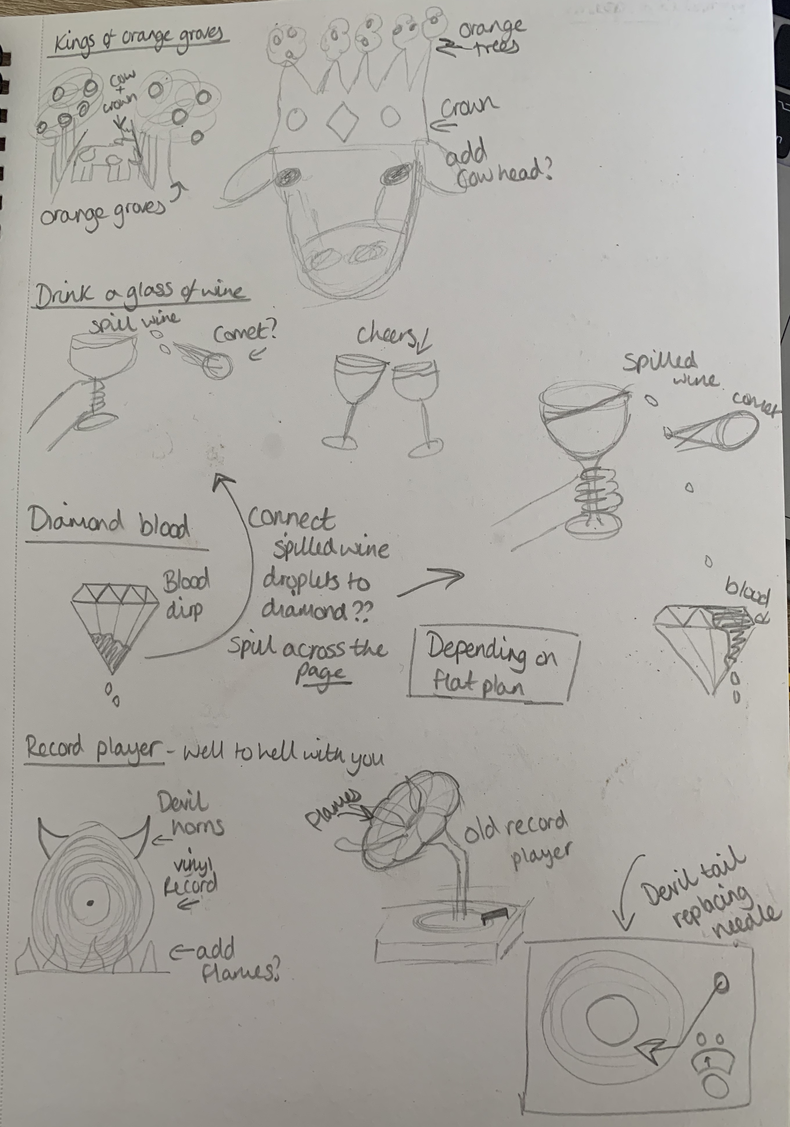
Kings of orange groves and cattle
Drink a glass of wine to the health of the comets
Expiring diamond blood
We’ll get a record player. Well, to hell with you
To dance one tango with cows
Build bridges from the tears of bovine jealousy
Tears of crimson girls
With my sketches beside me and the design styles of Constructivism art in mind I was ready to move forward into the design process. The designs I found relating to the constructivism art movement had a very simple colour palette of mainly red, pale yellow & black, along with simple black & white imagery. I jumped straight into choosing the best fitting designs out of my sketches and started to build these designs.
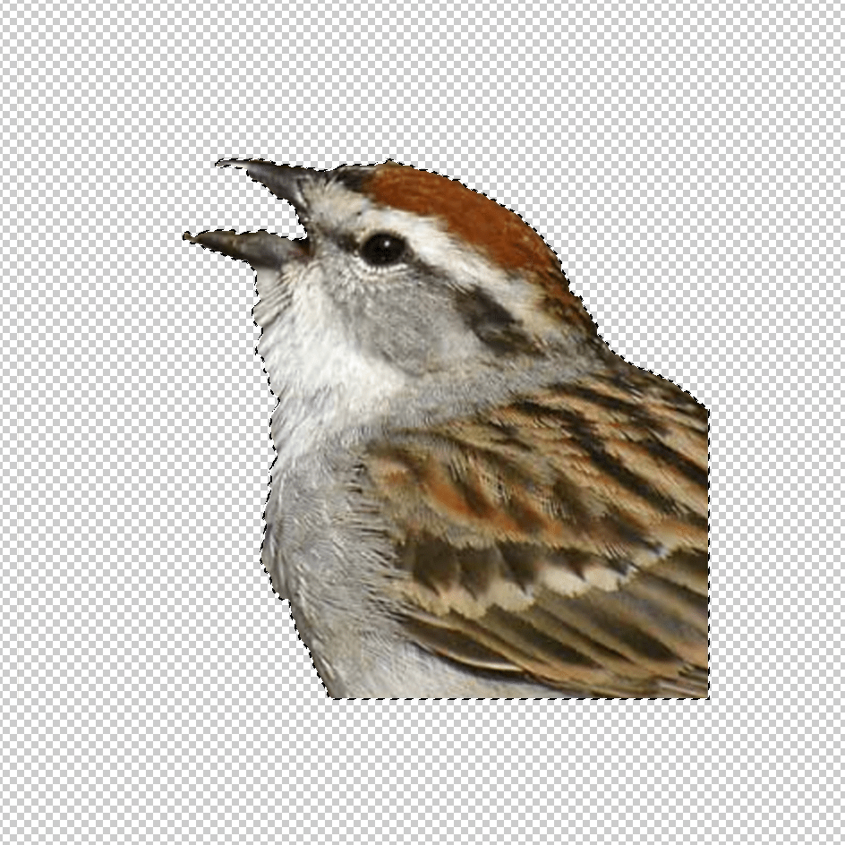
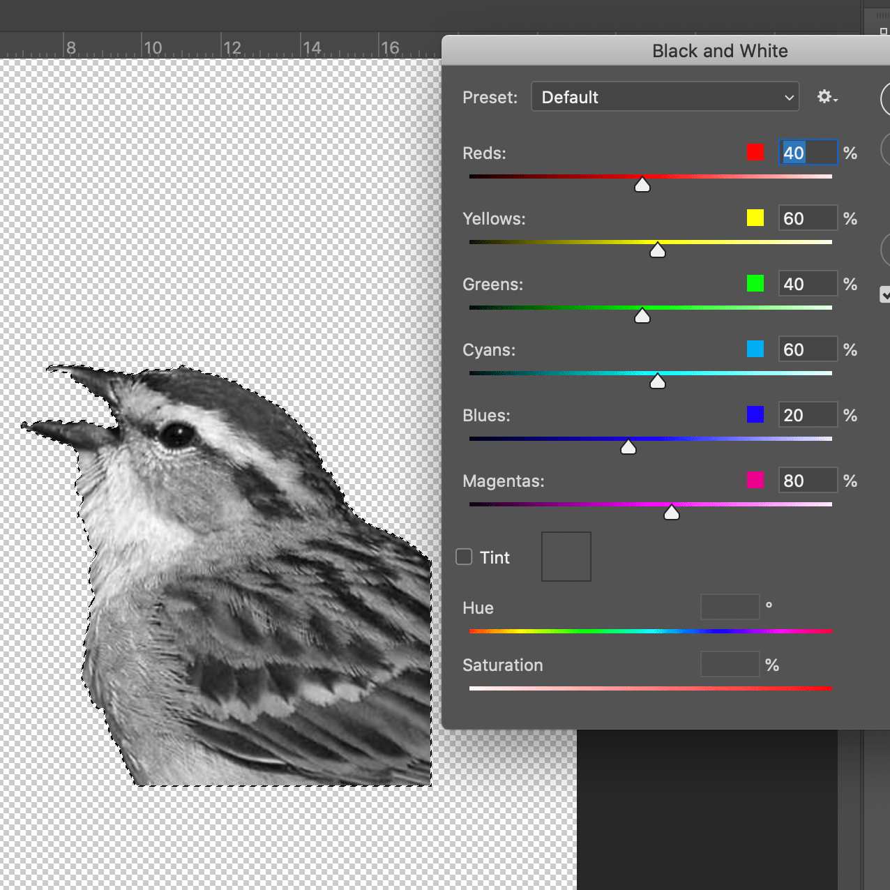
I gathered images in preparation to edit them in some way to fit in with my design plans, I used Photoshop and Illustrator as my main softwares for this exercise. I started off by cutting out all of my images using the quick selection tool on photoshop and also converting the images into Black & white. I then pasted these into illustrator.
Playing around with the opacity, filters, hue & brightness I was able to transform images into ways which fitted the designs so that I could express the phrases I’d chosen.
Design Process (part 2)
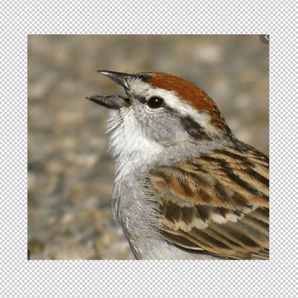
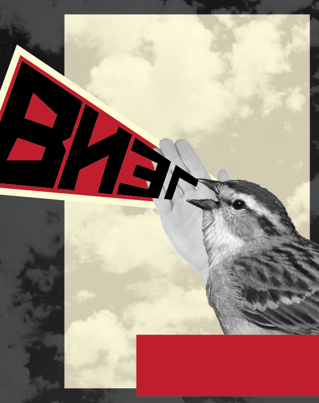
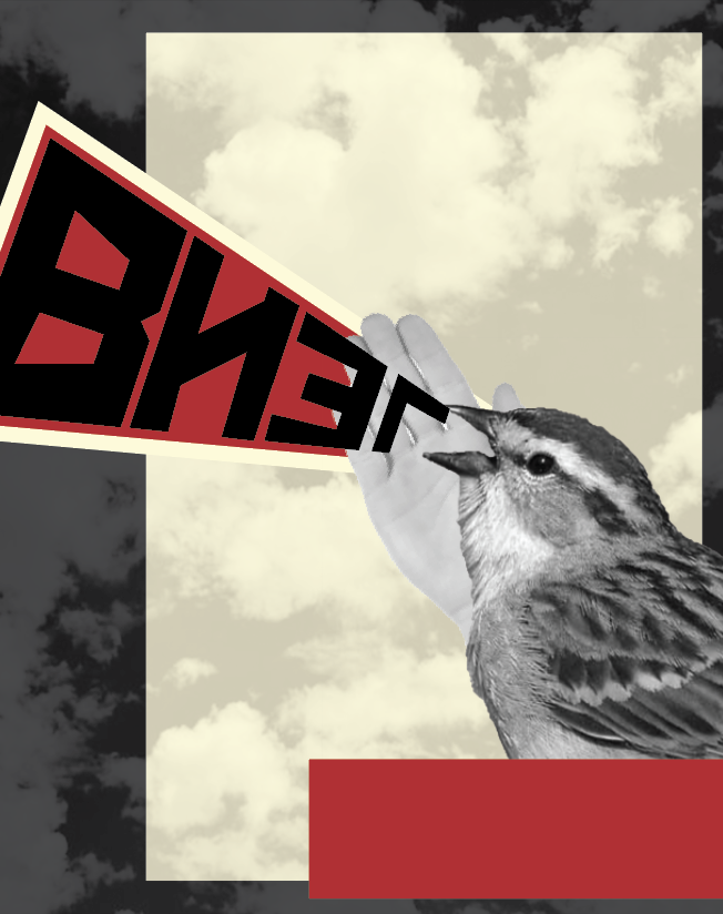
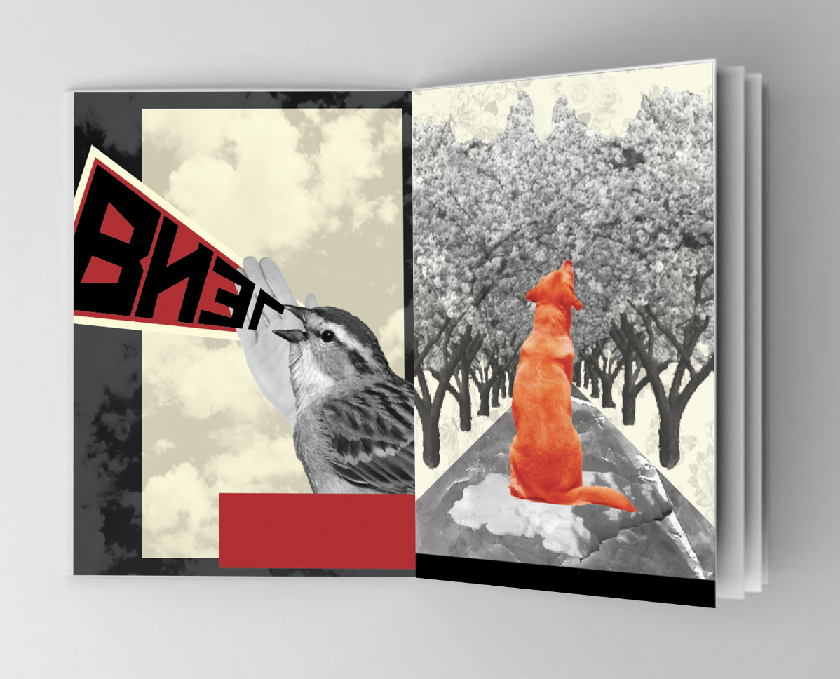
The Squeal of a Sparrow
I took inspiration for this design from Alexander Rodchenko’s design ‘Books (please!) In all Branches of Knowledge.’ which I came across when researching the Russian movement Constructivism Art. This was a good starting point for me to be able to carry on the style throughout my other designs. I felt using photomontage techniques within my designs would work well and give me the ability to develop expressive and interesting designs.
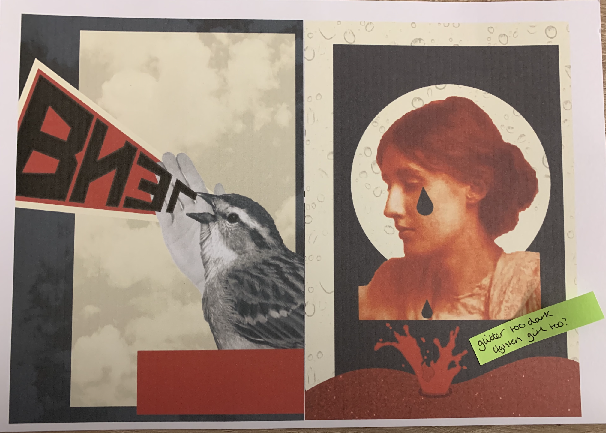
Following my sketches I created this design by cutting out an image of a sparrow and translating the word ‘squeal’ into Russian. I felt that my design was too plain so I added a clouded background some blocks and a hand behind the bird (to add to the photomontage effect).
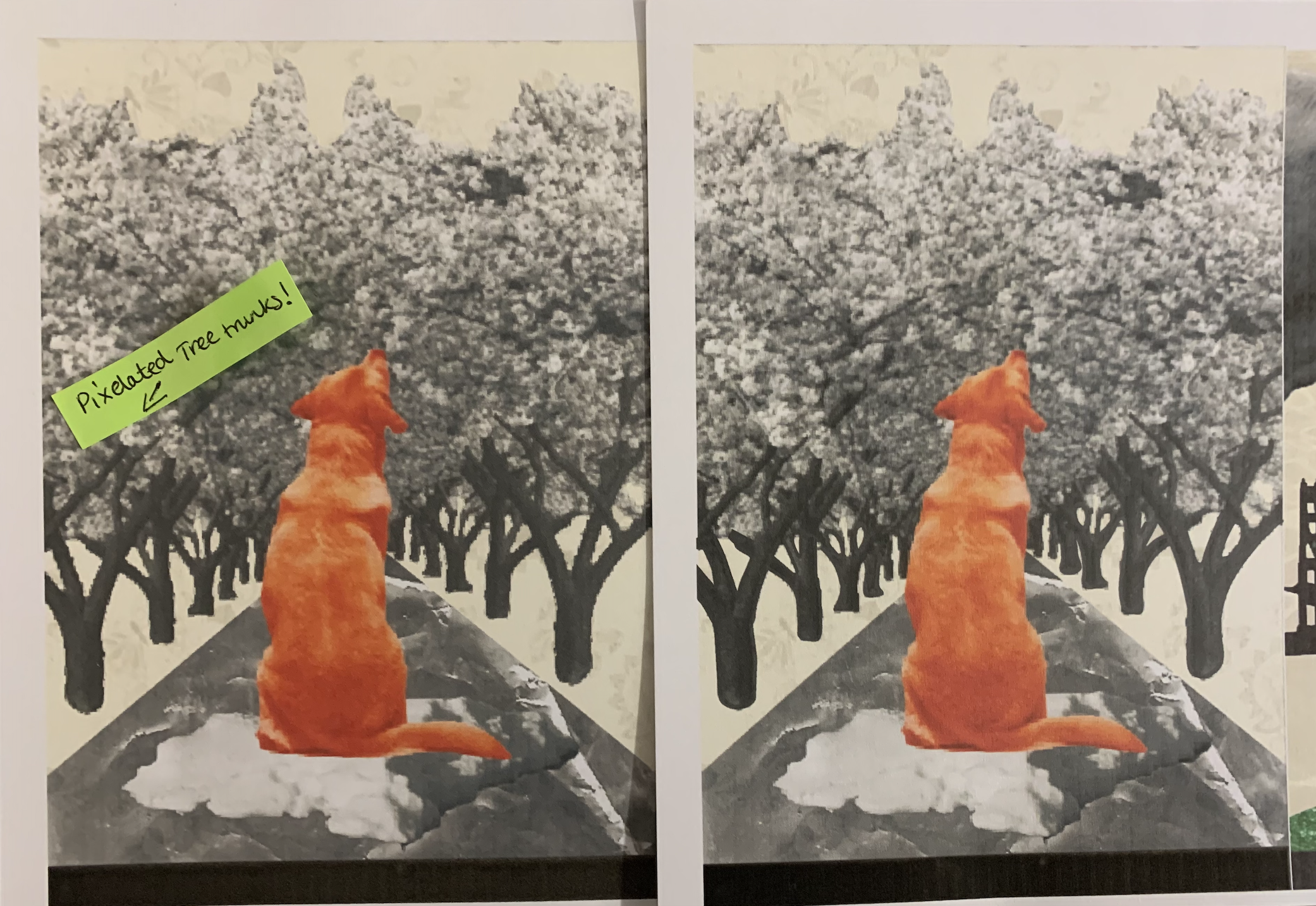
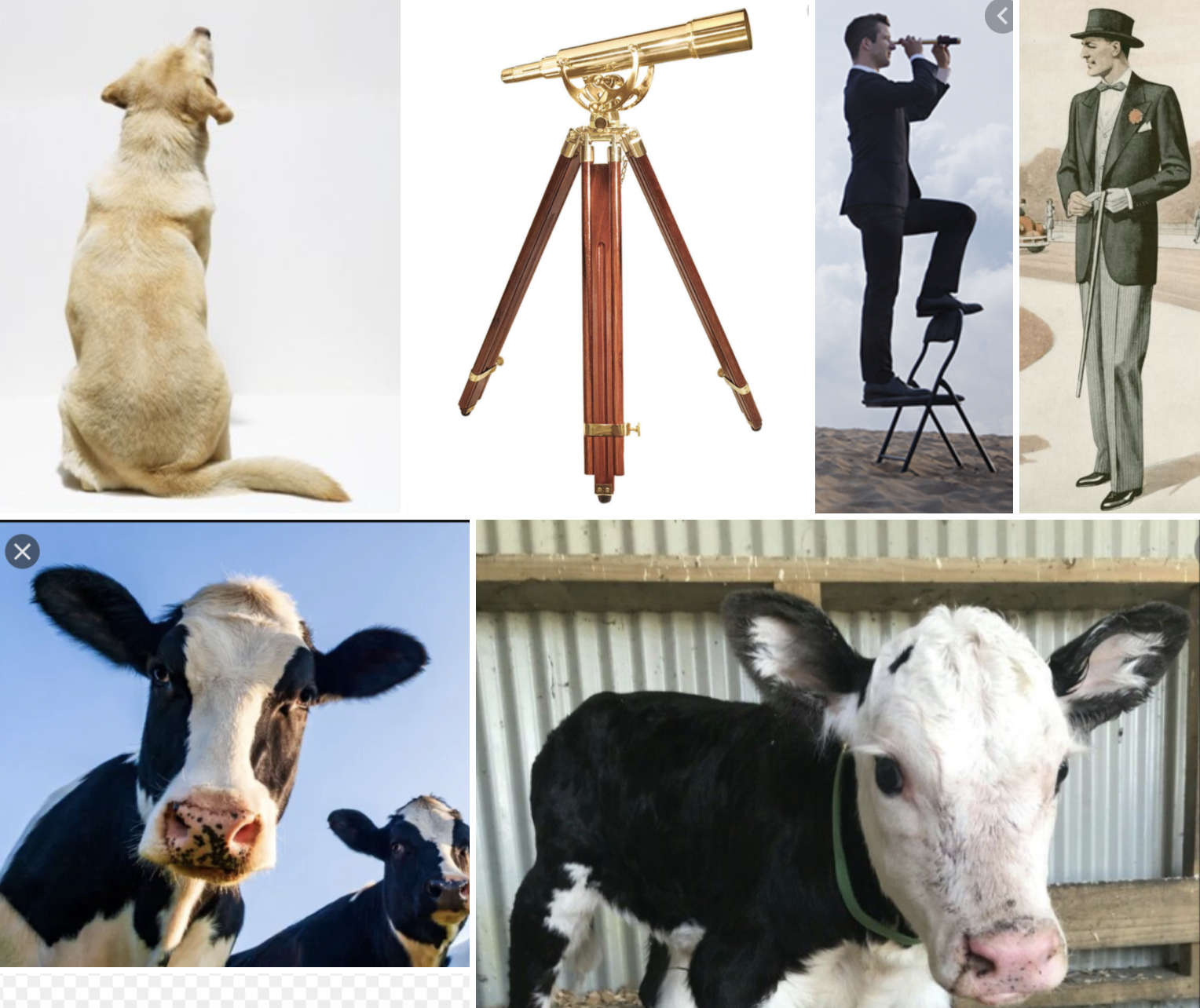
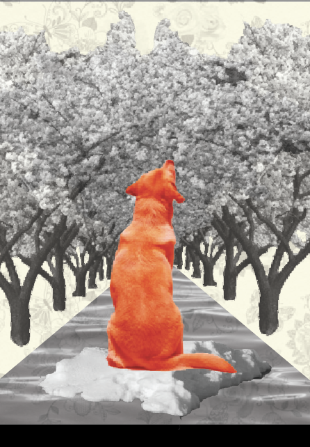
Like a dog, regardless, sailing on an ice flow down the river in spring?
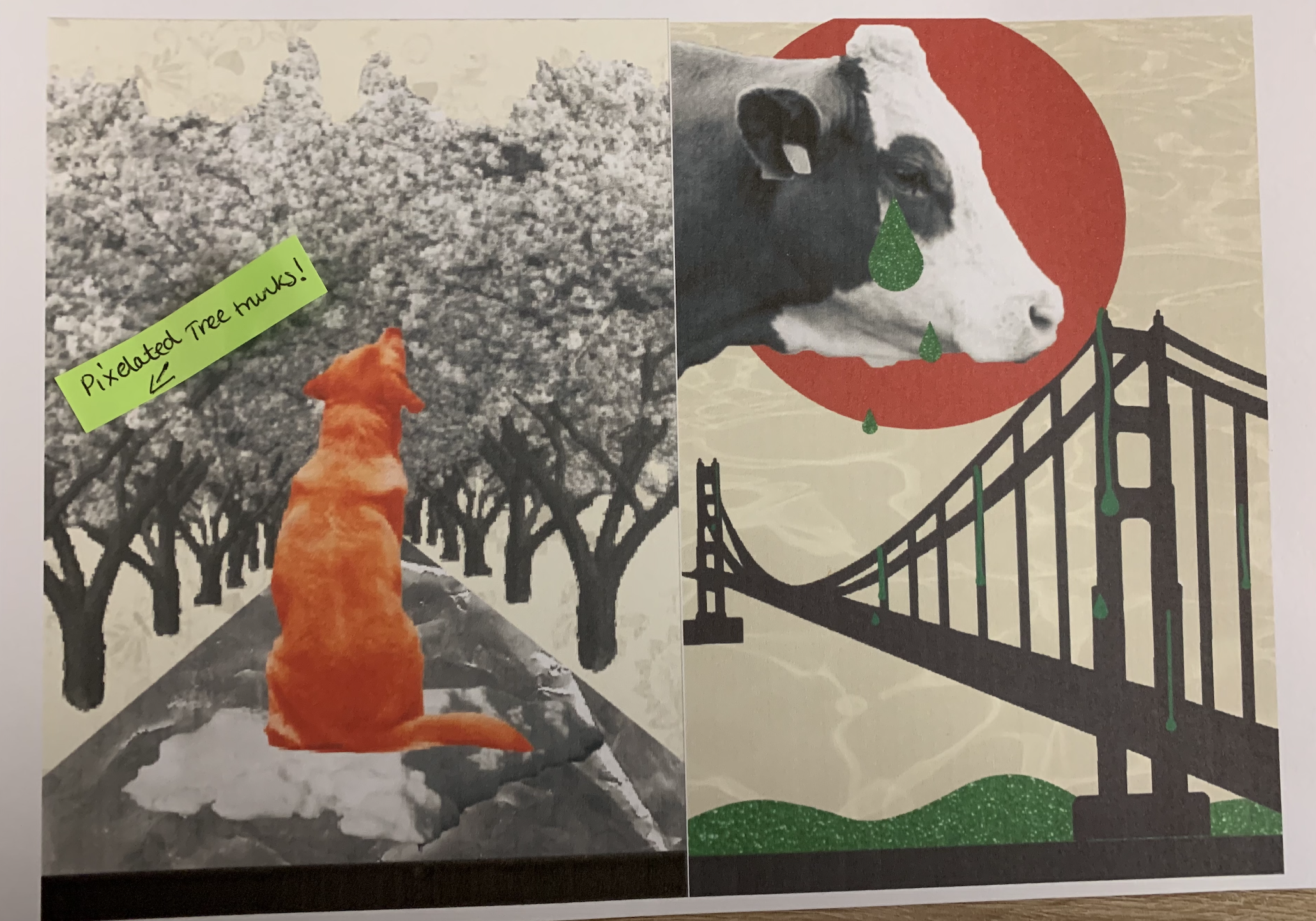
For this design I took the phrase quite literal and added in as much features as possible for the image to be automatically associated with the correct phrase. By adjusting the hue and colour balance of the image of the dog I was able to change it to red, fitting with my colour palette and also becoming the focal point of the design. I added a floral wallpaper to the background as I really liked the way I added the clouds in the sparrow image, I think this is something I will continue to add for each design to come.
.
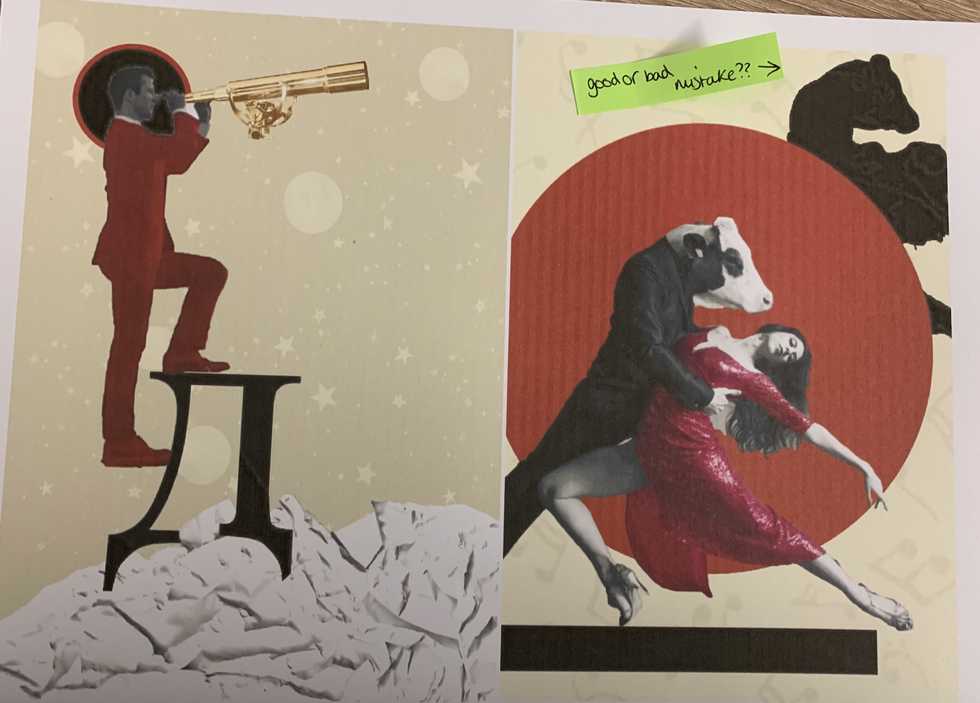
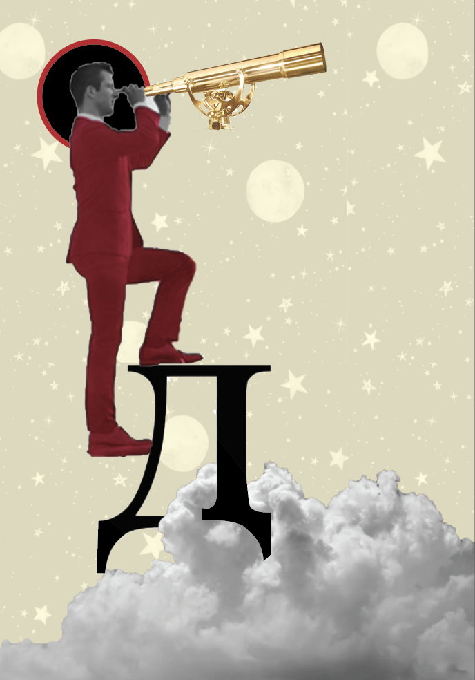
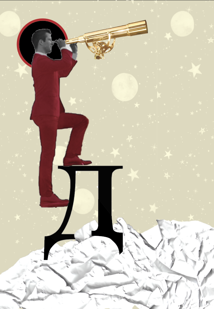
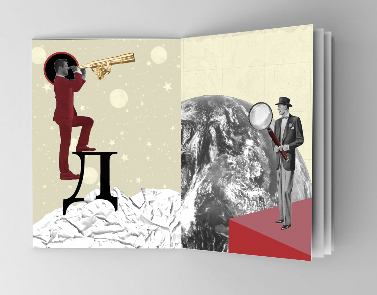
We look at our Destiny
When thinking of Destiny I automatically associate with the universe so I felt space would be a good theme to use for this design. I found an interesting image of a man stepping up a ladder and felt I could be creative in cutting the ladder out. I decided to have him stepping onto the Russian letter ‘D’ (for destiny) I changed the image of the man to black and white then adjusted the hue and colour balance to give him a red suit then added a golden telescope but kept this in colour. By placing him above the clouds it brought him closer to space, I then added a star and planet background.
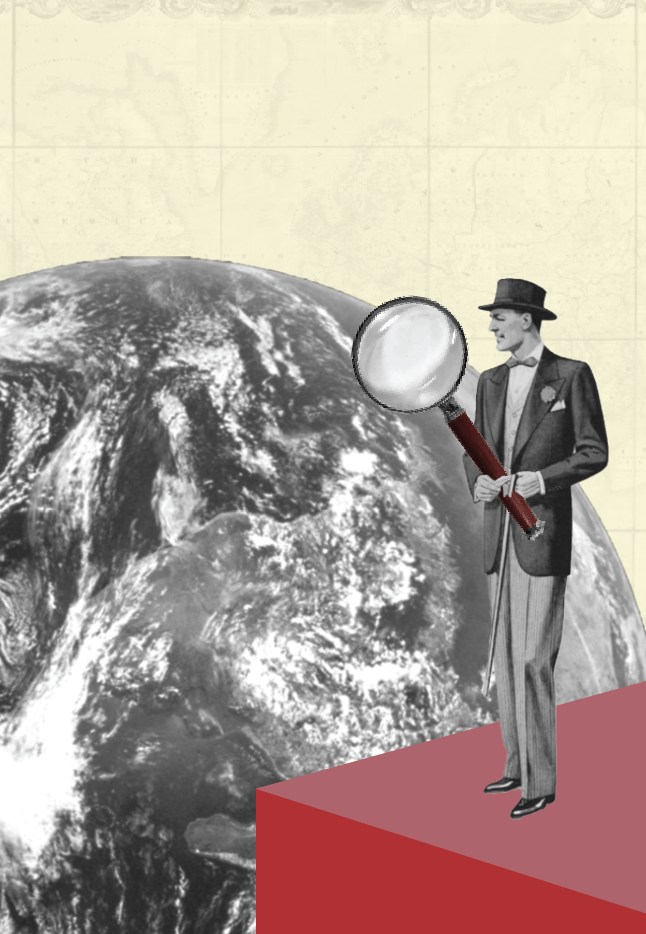
The Discoverers of Countries
When creating photomontage images I like to use old vintage images, I feel this gives more of an impact to the designs. I found this old painting of an early 1900’s man and felt would be perfect for what I had in mind. I changed this image along with an image of the world into Black and White and played around with the positioning, in the end I decided I wanted it to look as though the man had discovered not only countries but the world, to help give this effect I decided to add an oversized magnifying glass (adding red to the handle) and to have him standing on a 3D ledge. I added an old vintage image of a map to the background to relate and add to the overall look.
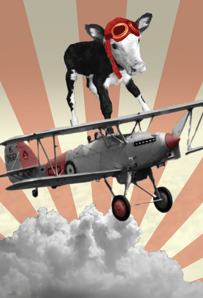
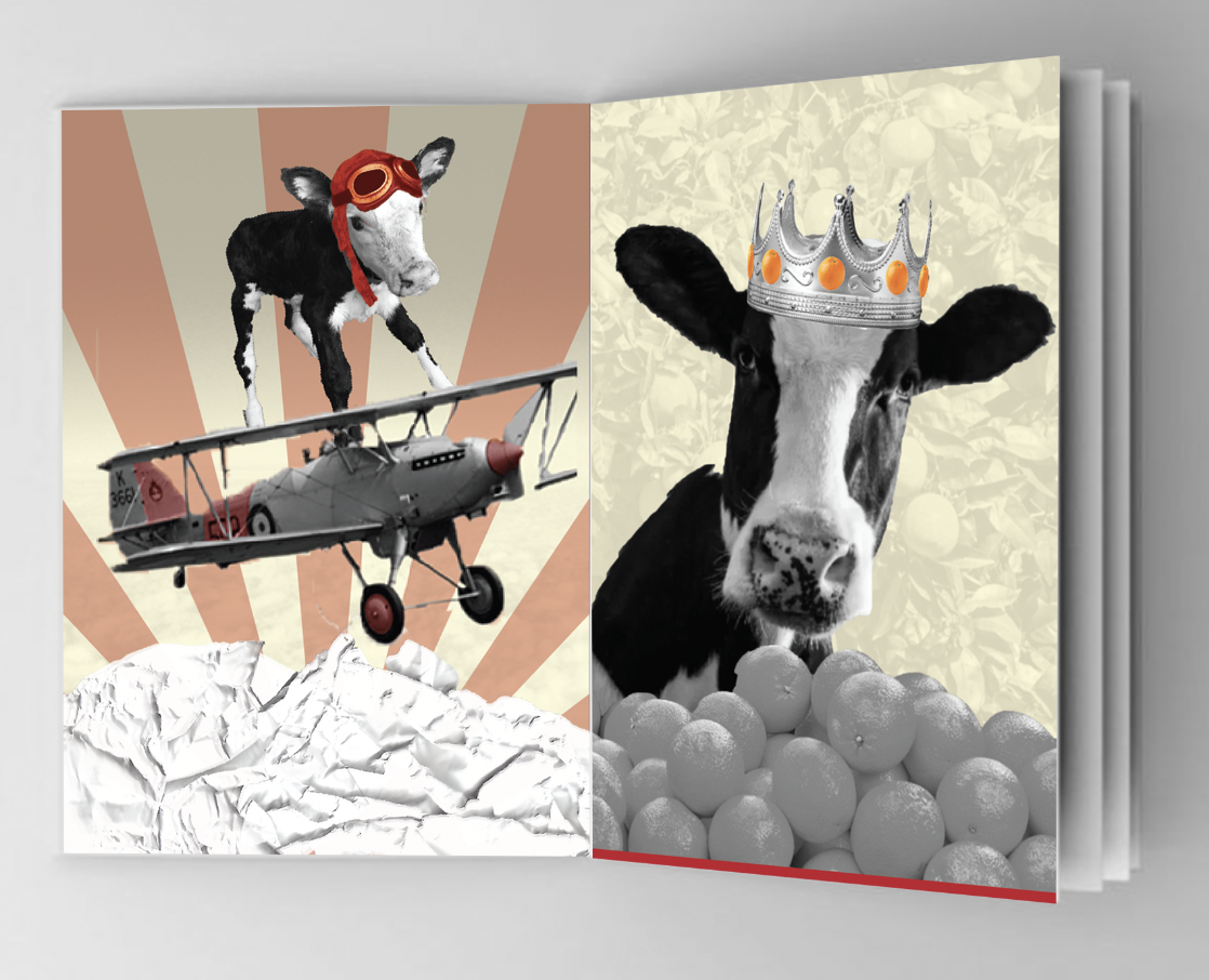
Conquerors of the Air
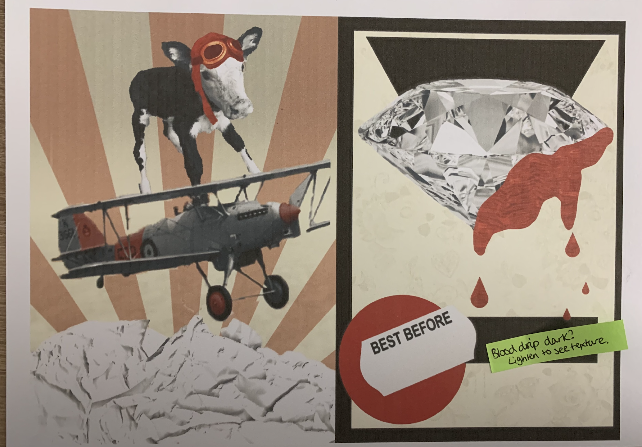
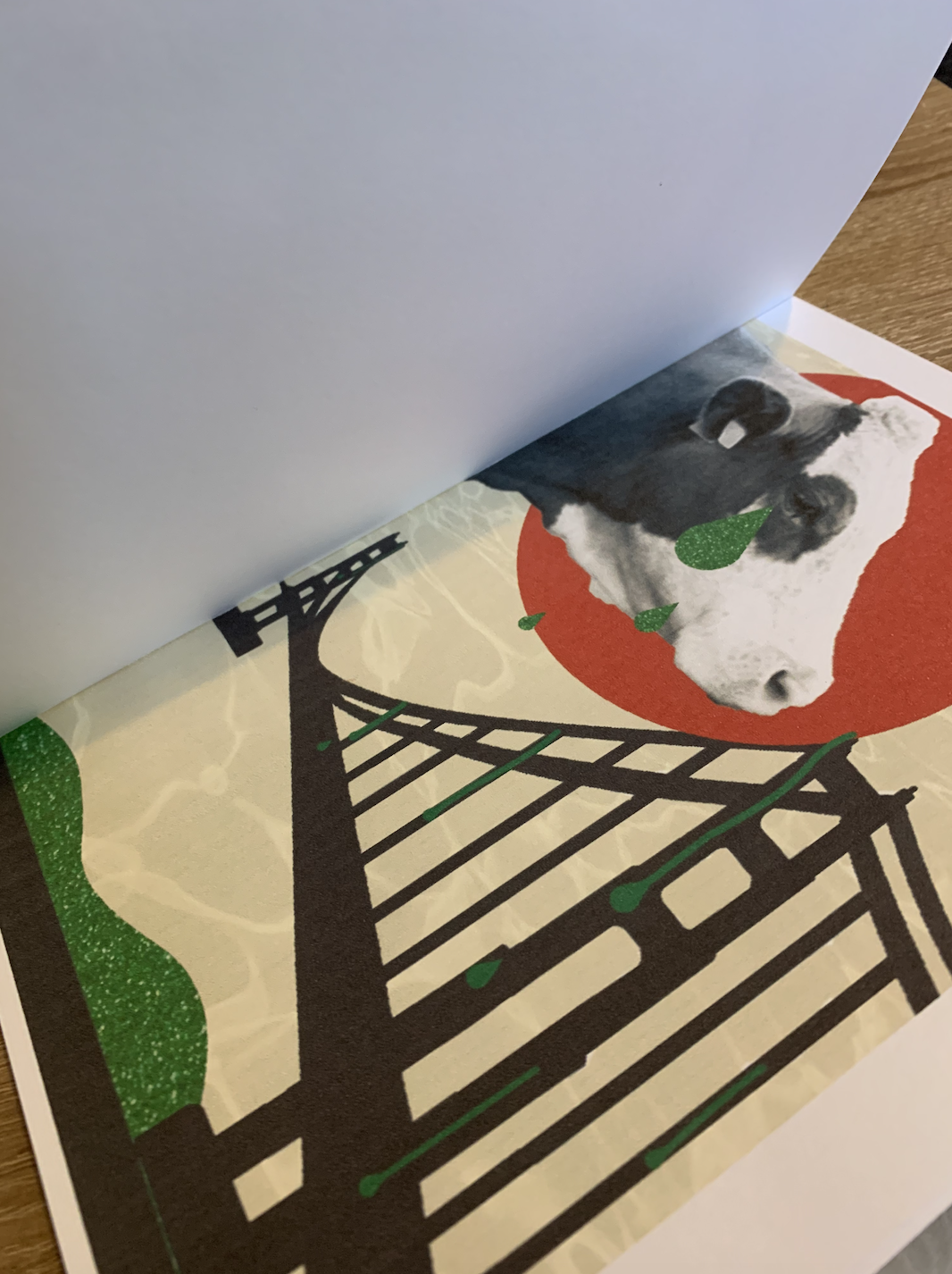
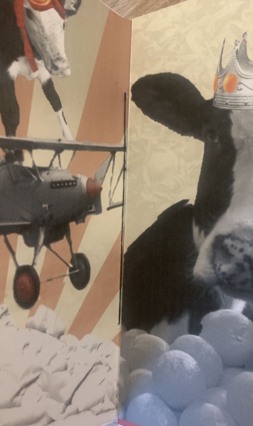
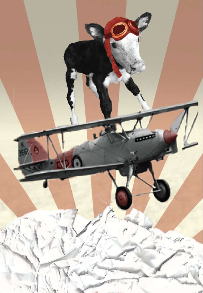
Taking the title of the poem into consideration I wanted to add a cow early on to clearly link the title to a few selected pages of the poem. I decided to create a wing walking cow image, which in the end turned out well. I did struggle with the background to this however I created the rayed effect as I felt it reflected not only the sun but victory which I related to Conqueror – this design has also been used in past constructivism art designs. I highlighted certain parts of the image red to keep up with the consistency of the theme throughout my designs.
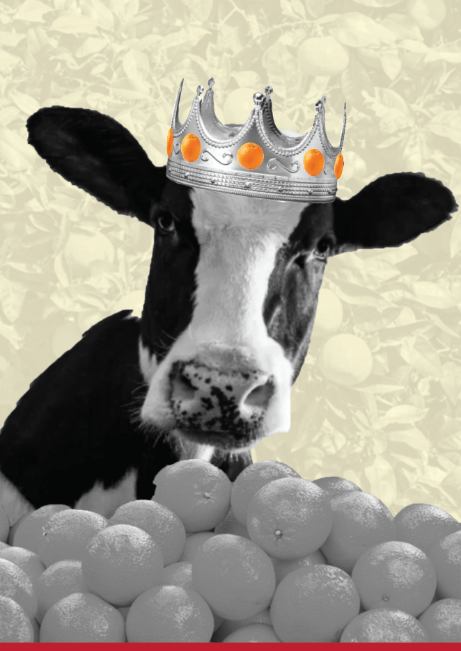
Kings of Orange Groves and Cattle
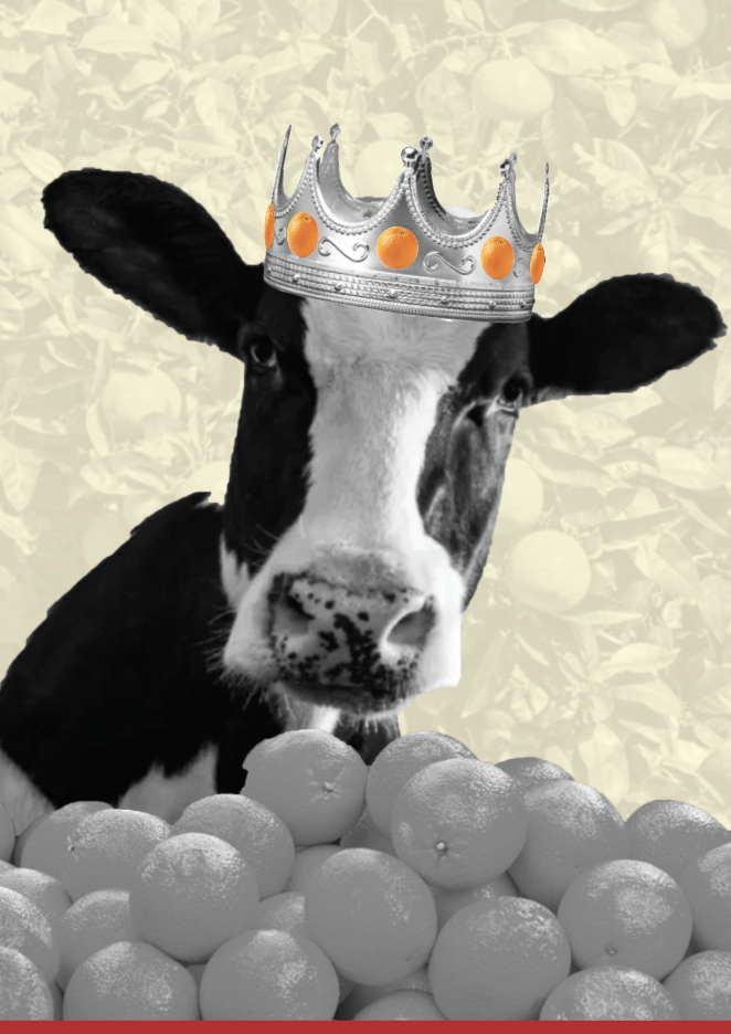
Following one of my sketches I decided to use a cow to represent as the king, wearing an orange encrusted crown, surrounded by heaps of oranges. I originally had the idea of converting the points of the crown into trees to clearly show the ‘orange groves’ but the transition between the crown and tree trucks looked terrible and would be too time consuming to make ‘perfect’. I opted for an orange tree background and decided to keep the colour of the oranges in place on the crown.
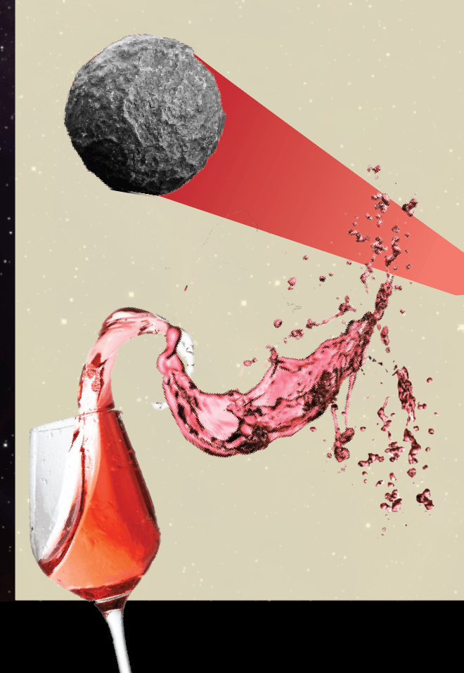
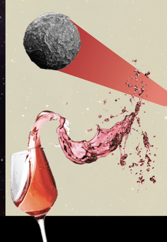
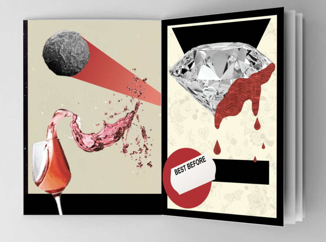
Drink a glass of wine to the health of the Comets
In my sketch pad I had noted that it would be interesting if I could connect the drops of the spilled wine to the ‘blood’ of the diamond (my next chosen phrase) but when trying to achieve this I realised it quickly became unsuccessful… I played around with this design for some time, trying out different ‘splash paths’ for the wine, I couldn’t achieve the correct positioning for the comet to come from the glass (this would of been more achievable if the art board was set it landscape) I felt a solid tail to the comet looked best, it also added to the abstract feel of the previous designs. I added a starry background to the design to fit in perfectly with the comet.
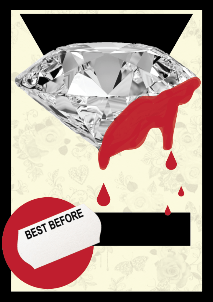
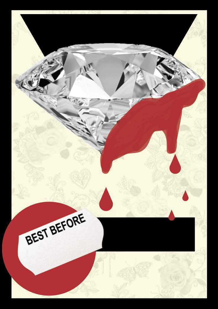
Expiring Diamond Blood
I decided to use the brush tool and freehand some blood on the side of the diamond so I could easily follow the shape of the diamond. I also added the best before sticker to emphasise the ‘Expiring’ term in the phrase. I added in a floral wallpaper background as I wanted it to add a slight feminine touch as diamonds are associated with females. I left this design as being very self explanatory.
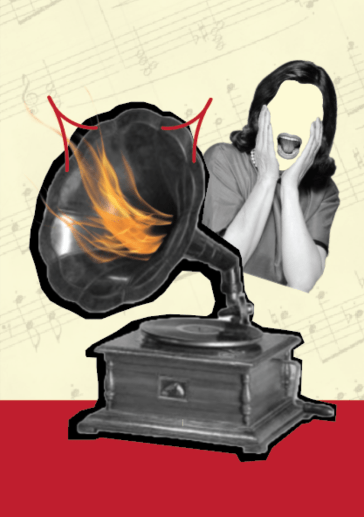
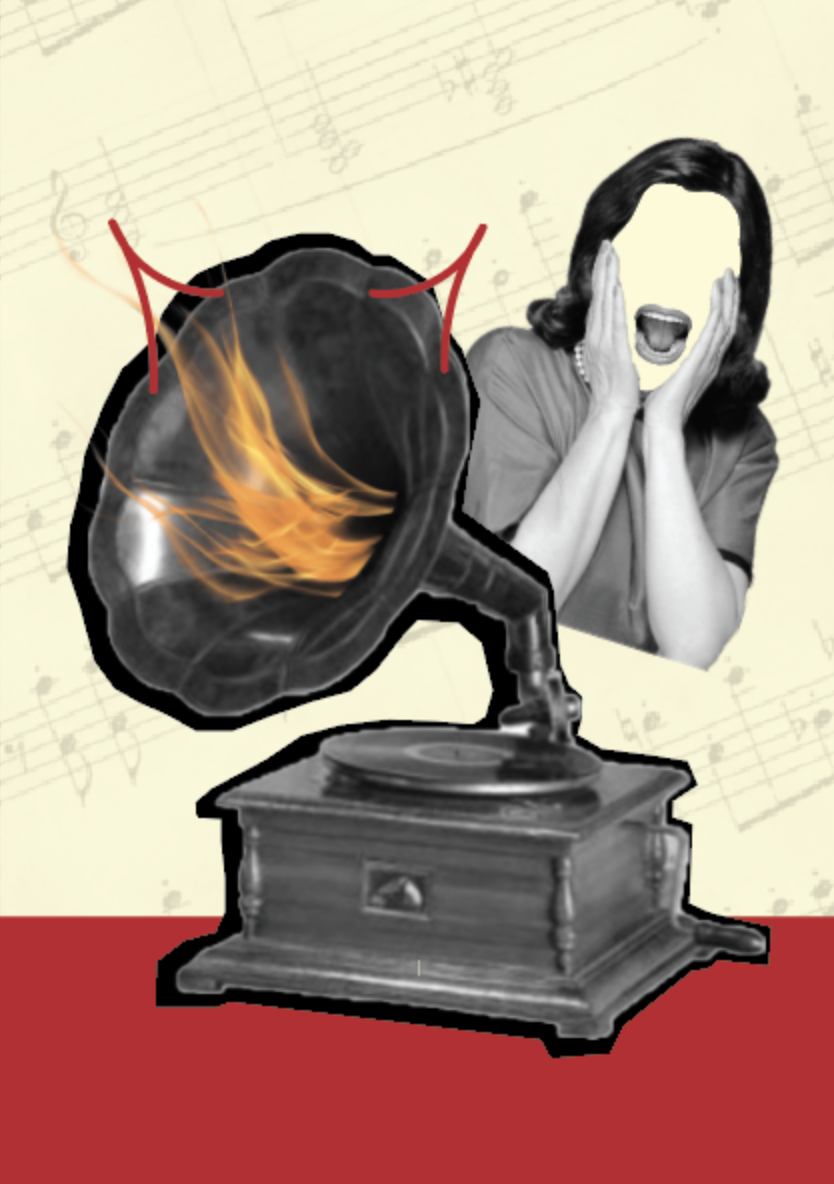
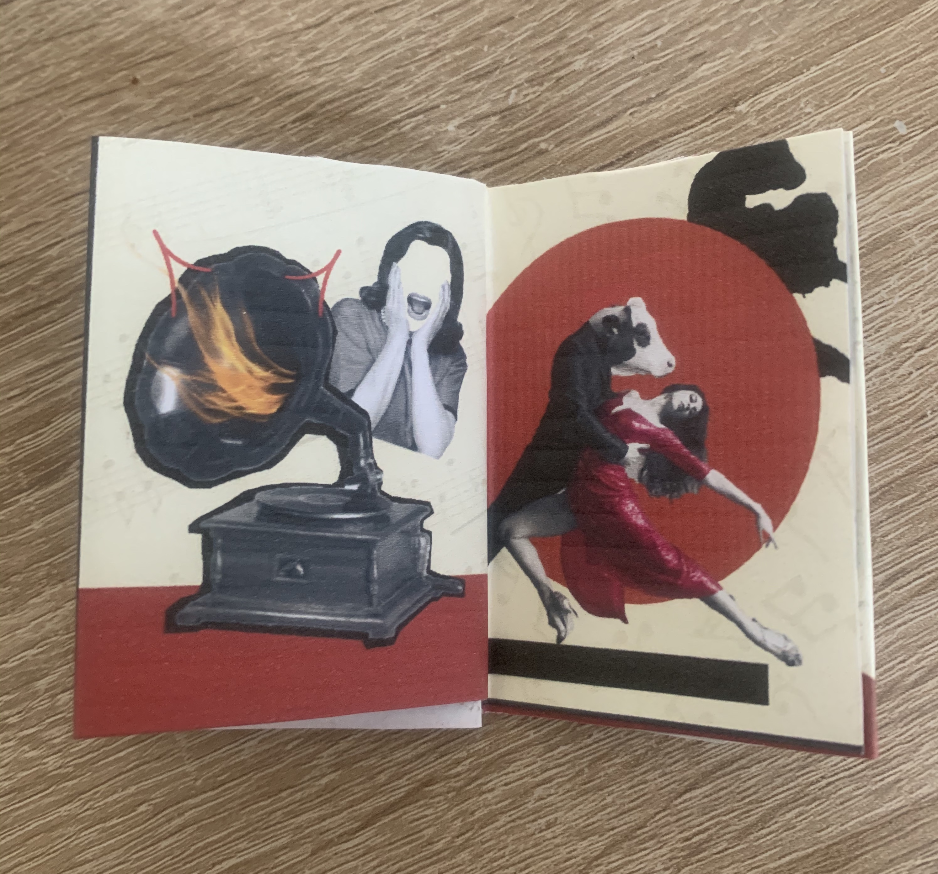
We’ll get a record player. Well, to hell with you
Using an old record player I decided to transform this into something ‘hellish’. I added flames coming from the centre of the speaker along with drawn devil horns. To add to the suspense of ‘hell’ I found an image of a woman screaming which I removed all features other than the mouth. For the background I added an old sheet of music. Im happy with how this came out as I felt it was one of the more challenging phrases.
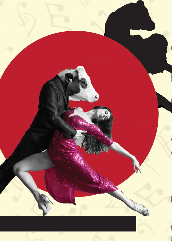
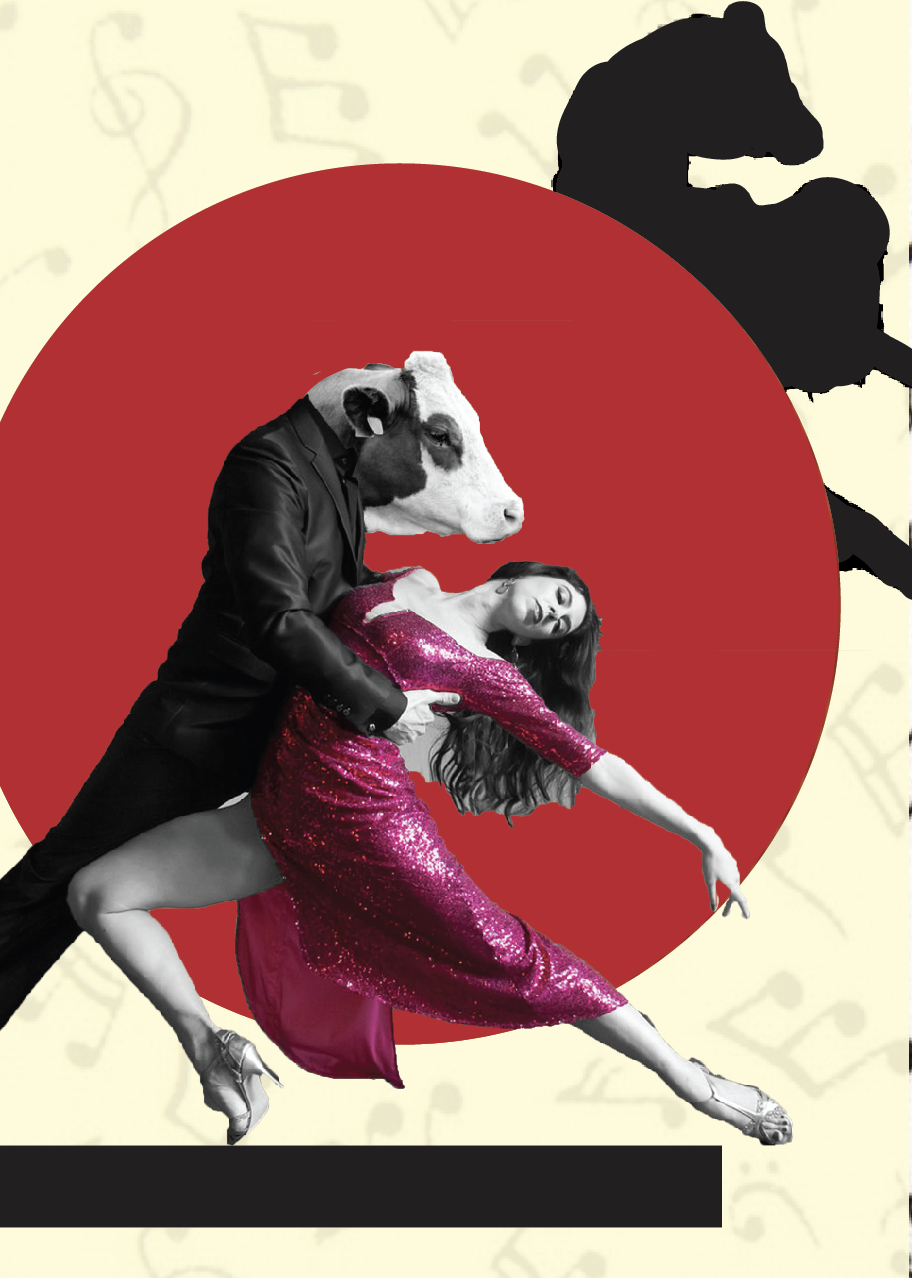
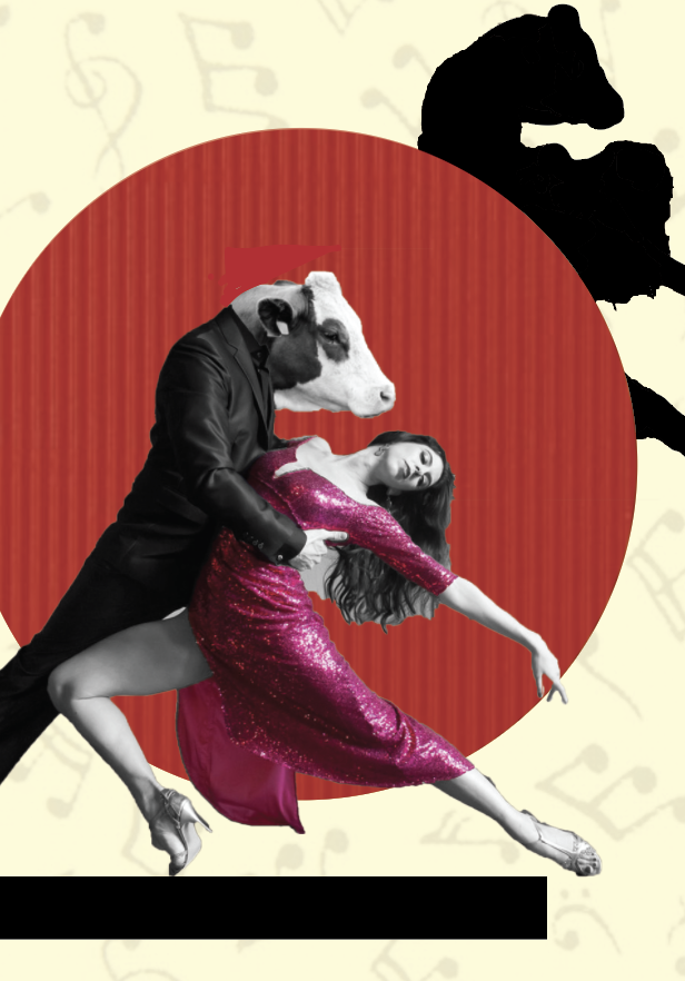
To Dance one Tango with Cows
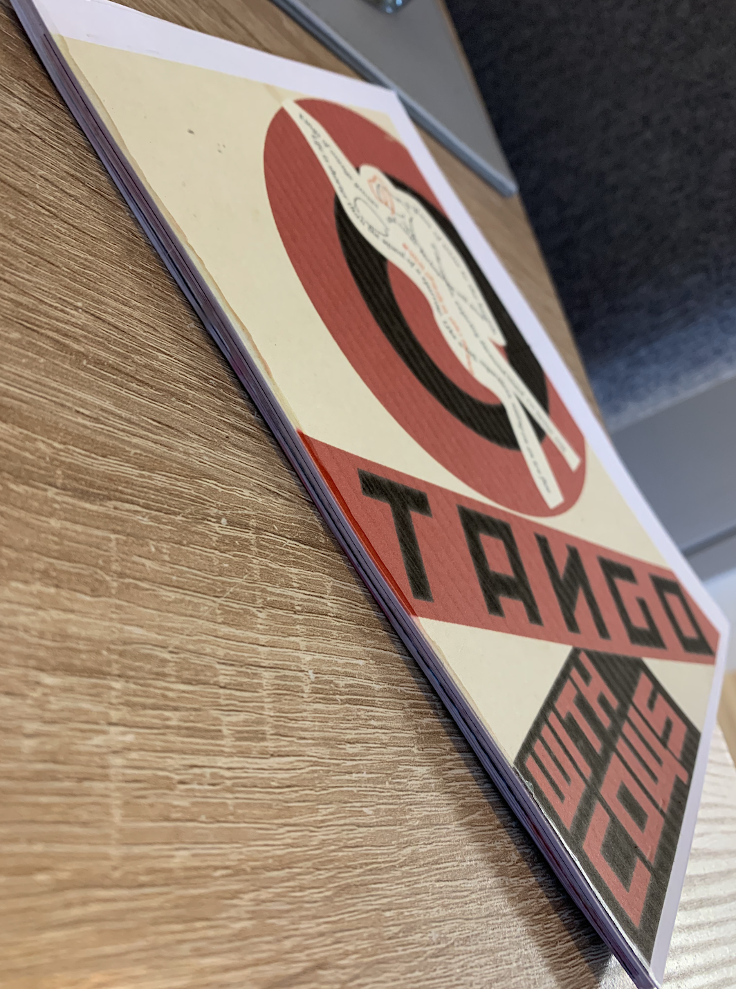
I felt this phrase was fairly simple to create and knew immediately what I wanted my focal point to be. One of the more simpler designs I didn’t want to over complicate the page, just to keep it short and to the point. I found an image of a couple dancing and replaced the males head with a cows head, I was drawn to the shape of which the female is making and felt it would fill the page nicely to which it did, by changing her dress to pink it stands out slightly from the red circular background, behind this I decided to add a silhouette. For the background I have chosen a musical notes, I did question between this and tango foot steps however I felt this linked in better.
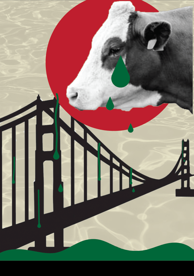
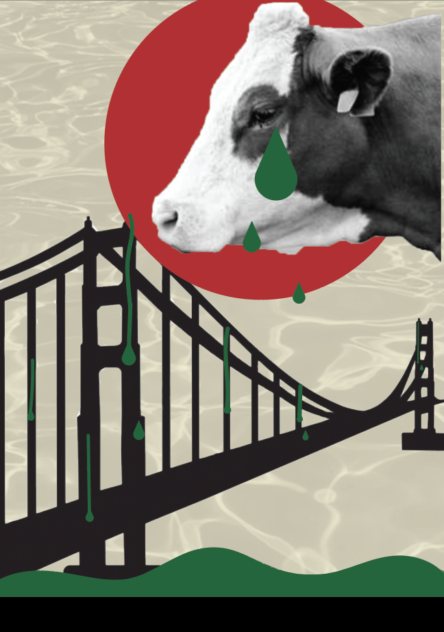
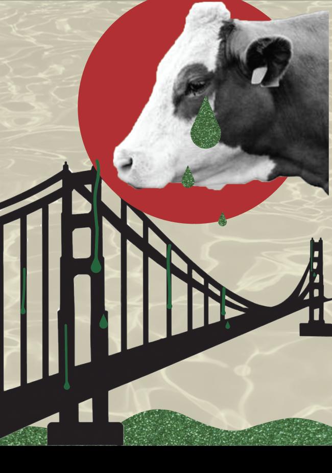
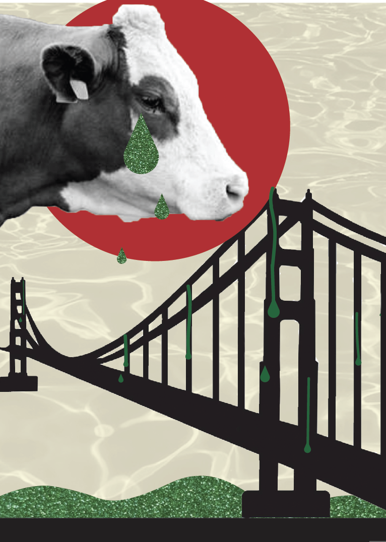
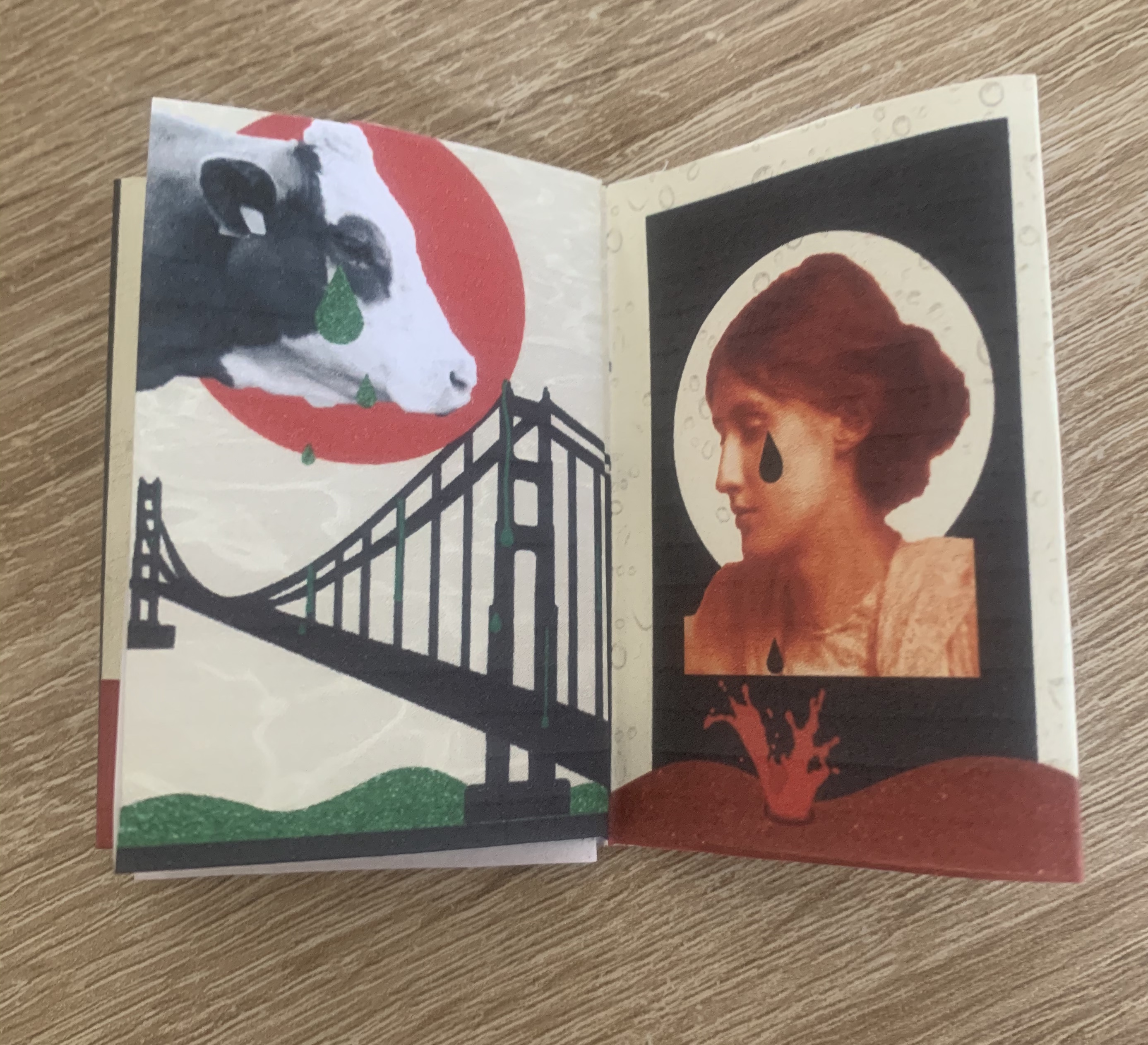
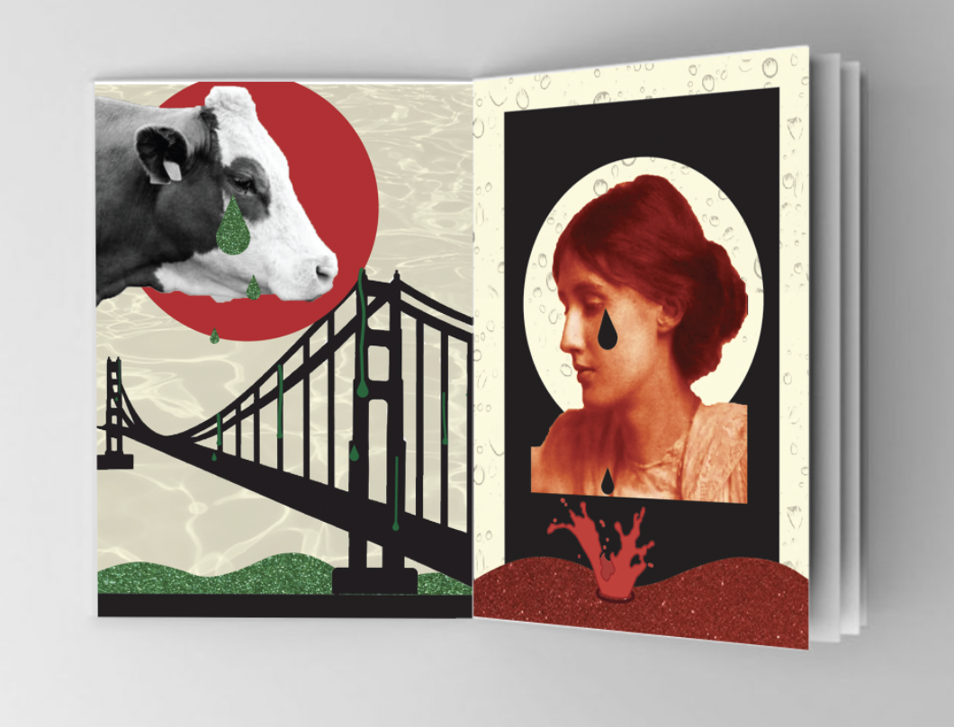
Build bridges from the tears of Bovine Jealousy
I decided to use green in this image as the colour links to jealousy (green with envy etc.) Using a silhouette of a bridge over green water, with tears running down some of the beams as well as falling from the cows face. For the background I added water to add to the impact of the tears. As noted in my sketchpad I wanted to connect this phrase with my last chosen phrase (tears of crimson girls) as they’re talking about both the tears of something. I thought the best way I could connect the two is by joining the water at the bottom of the page.
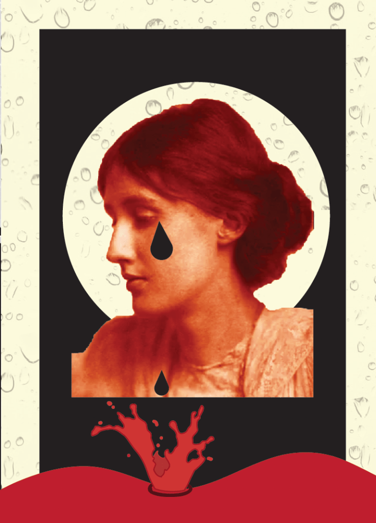
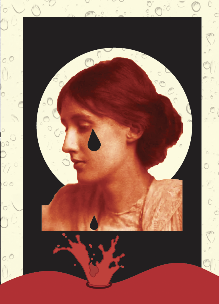
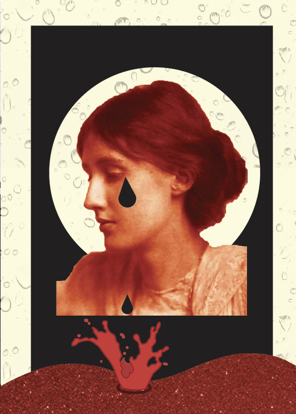
Tears of Crimson Girls
I tried a few versions for this phrase however came back to this design which was the first I mocked up. I felt it reflected the previous design well and gave slight connections. I changed the hue and colour balance of the image of the girl so that she is red to associate with crimson. I added a splash effect to show how the tears are running off her face along with a water droplet background.
After looking back at my designs and reading back through the brief I am unable to print my designs off onto sampled paper collected in previous exercise, so Im glad I managed to change the background on each design to give a varied effect on each page, however I feel I can push my designs further without having to print on different paper samples, I shall simply include these digitally.
I scanned certain types of samples onto my computer and the results are as followed.
Here I replaced the water (left) with some tin foil which I slightly creased to create a rippled effect.
Replacing the clouds (left) with screwed up pieces of greaseproof paper, this worked particularly well due to the easily manipulated paper.
I applied the same effect as the previous design by replacing the clouds with scrunched up paper.
Replacing the red hand drawn brush tool for red holographic paper. Im really pleased with how this turned out, its added more to the design and also the rippled effect helps give the appearance of dripping liquid.
Here I applied red crepe paper, I felt this gave a wood surface/table look which makes the block look more fitting to the page.
I replaced the flat round shape with red corrugated paper, I really like how this turned out, it reminds me of a show curtain revealing the dancers on stage.
For both of these images I have replaced the plain red and green for red and green glitter card. Im really pleased with this as it add a shimmer to which liquid naturally does.
Final Designs
Adding the different textures of mixed media to my designs gave it the last push it needed! I am so pleased with the improvement it has made.
Now that I was completely satisfied with my designs I was ready to look back at my flat plan and print off my designs to see how they work in person.
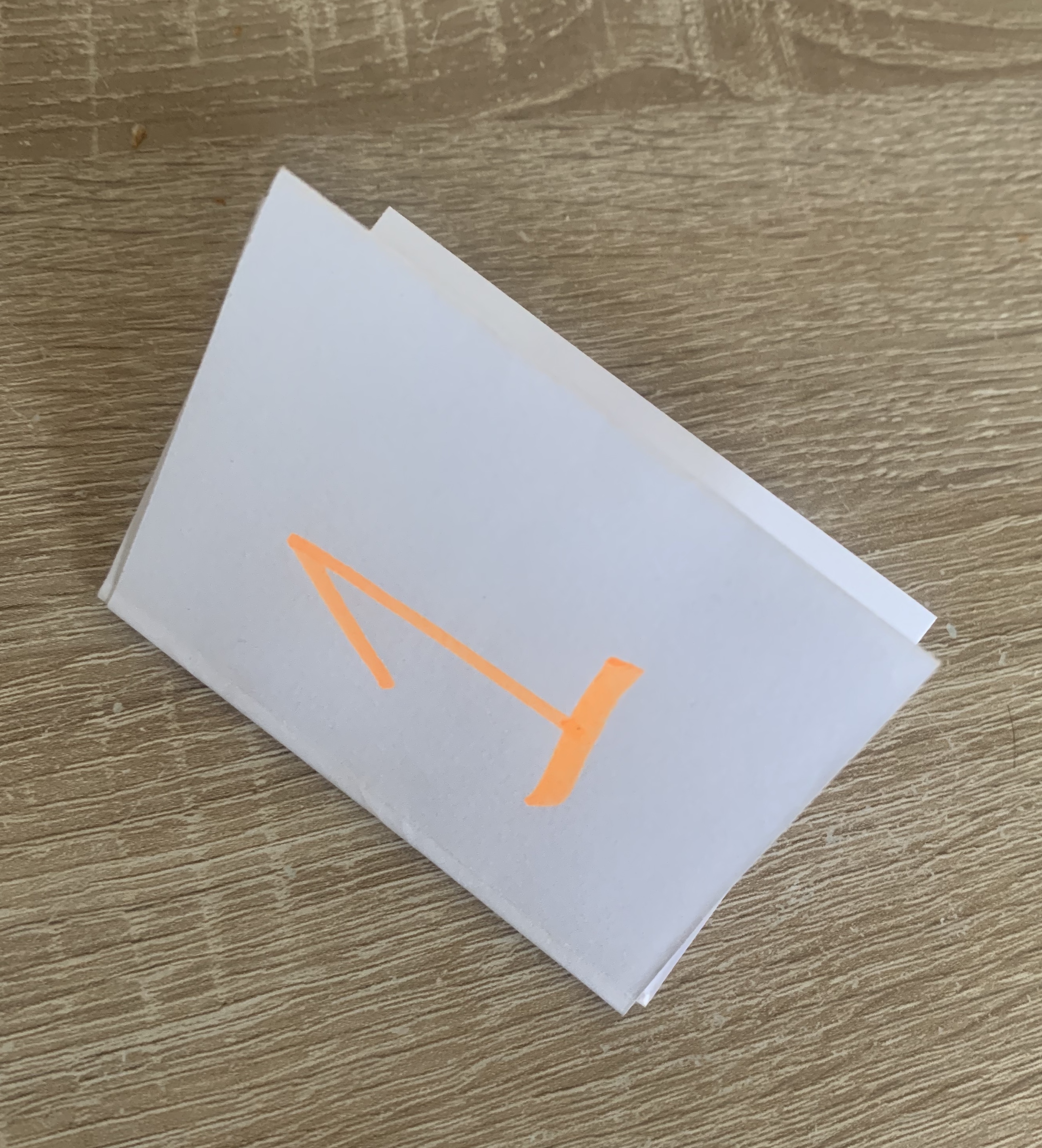
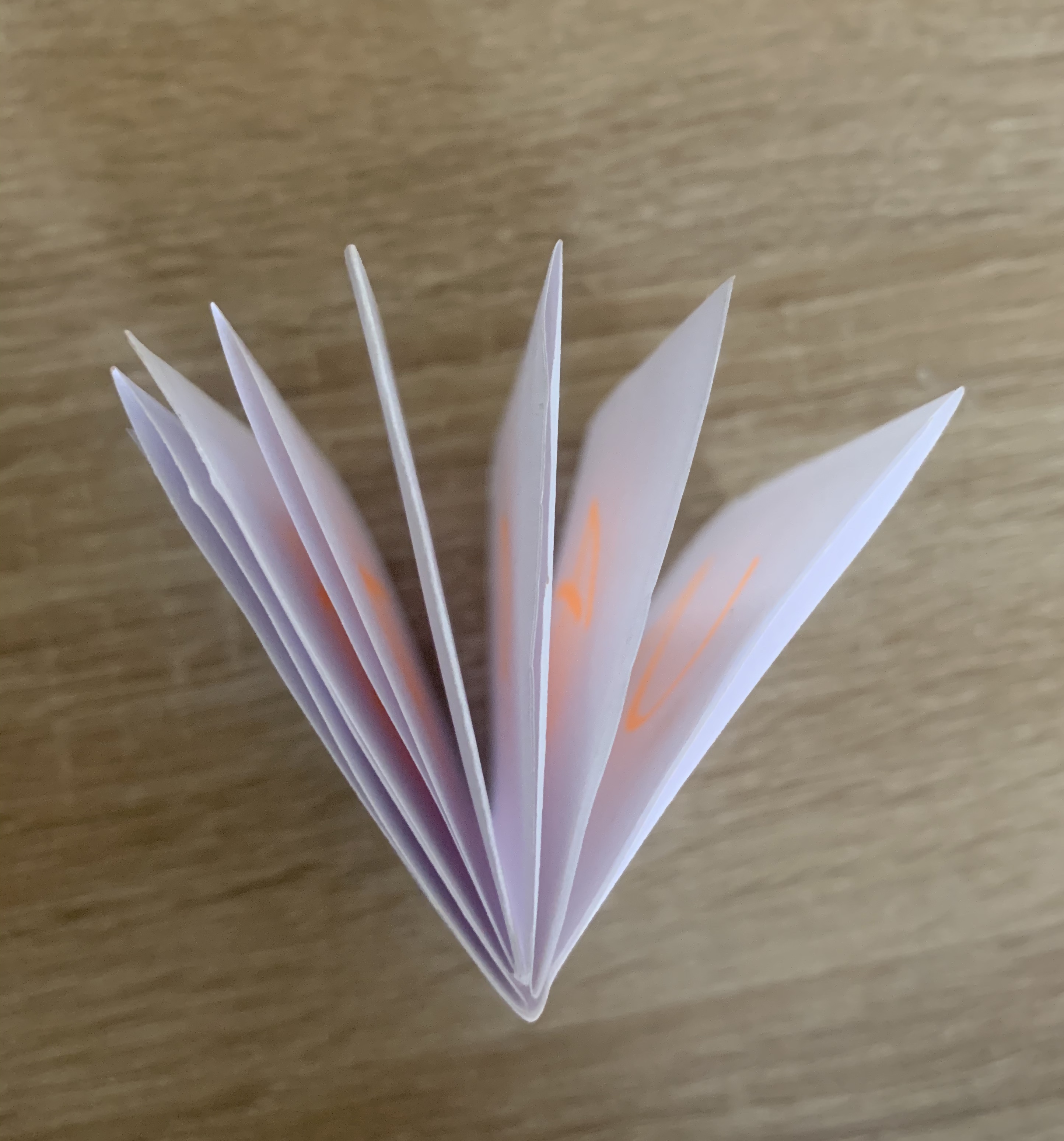
I revisited one of the previous exercise from this unit ‘Form and function: Paper Folding’ Here looking at some of the old paper folds I had created I decided that a 14 page accordion folded booklet would work best, although the scale of the booklet will be very small (5.25×7.42cm) it would still allow me to see my designs in a book form and to see how they look printed and off screen.
Below you can see the process of how I achieved this.
Digital Mock-up
Reflection
Im pleased with the final result to my sequencing images, I did spend a little longer than planned on this but in the end result it seems worthwhile. The designs I have created are more liner than non especially as they are in the correct order, however they can still be viewed as individual images. Im so pleased I took a mixed media approach within my designs, I feel this adds so much more to the designs. Seeing my booklet printed I’m happy with the fold I have chosen, especially with the tucked spare pages giving the booklet a spine. It would of been better to see it at a larger scale however that may come up in the next exercise as I understand this is about binding.
Brief: Concrete poetry, sometimes referred to as visual poetry is a form of experimental typography where the use of letter and word arrangements enhance the meaning of a poem. The typographic treatment of words within concrete poetry starts to add additional resonances through their scale, placement, overlay and styling, suggesting new ways to see and say the poem. Early examples of concrete poetry were by artists such as Kurt Schwitters and Visily Kamensky. The development of experimental typography flourished during the 1950s and 1960s with artists such as Dom Sylvester Houedard, Ian Hamiliton Finlay and Carl Andre. Often letterpress and the typewriter were used for experimental typography during this period.
Critical Writing Task
Identify and example of concrete poetry and write a short critique of the content, design and relationship between the content and form. How has the use of typography, layout, and space been employed to help generate meaning? Print out a copy of the poem and add notes directly onto the page. Write a brief summary of your thoughts, feelings and reflections on how concrete poetry creates new meanings.
As a starting point you may want to look at the following artists who practiced Concrete Poetry;
Dieter Roth
Max Bense
Eugen Gomringer
Ian Hamilton Finlay
Henri Chopin
Oyvind Fahlstrom
Emmett Williams
Geraldine Monk
Mary Ellen Solt
Ilse Garnier
Visual Task
Use on typeface to create a playful design for the Tango with cows, 1914, by Russian Futurist Vasily Kamensky. Explore and experiment with the relationship between the meaning of the text and the form you present it. Think about what kind of typeface you choose as well, does it reflect the content of the text? How does the paper relate to the design? Decide in an appropriate scale and format for this page. Create a series of sketches and ideas, and chose one to develop into your final design. Print your design on one of the papers you have collected in the previous exercise.
Critical writing task
After researching the advised artists I found two in particular stood out to me, I really liked their work and felt it was more visually pleasing. The first artist I have chosen is;
Emmett Williams
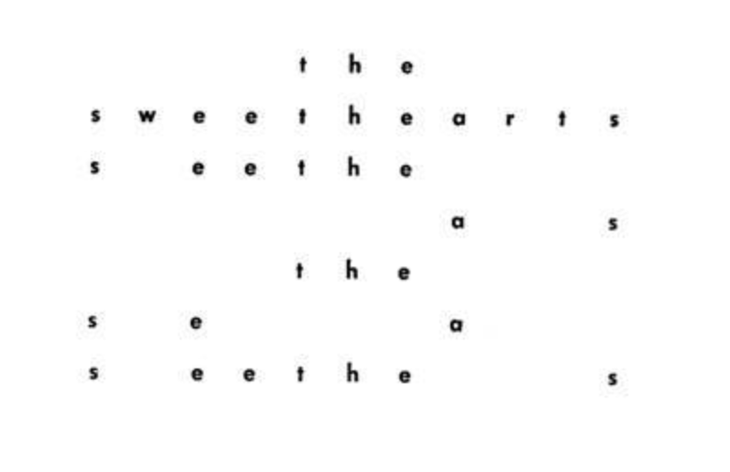
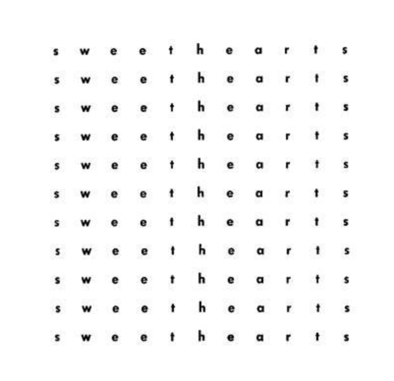
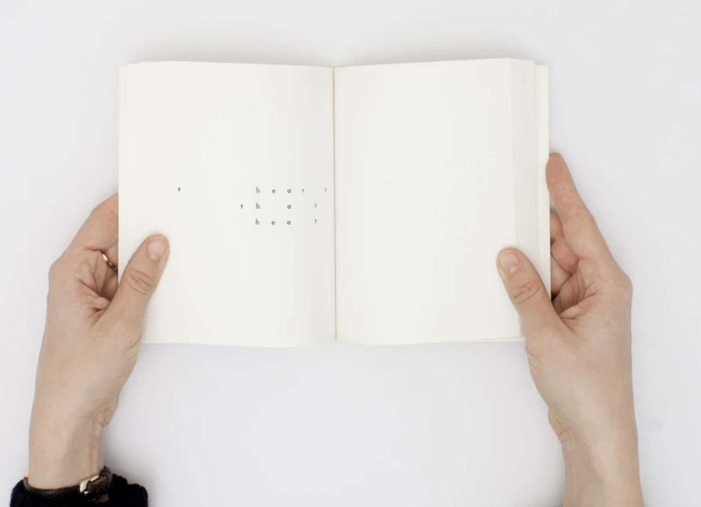
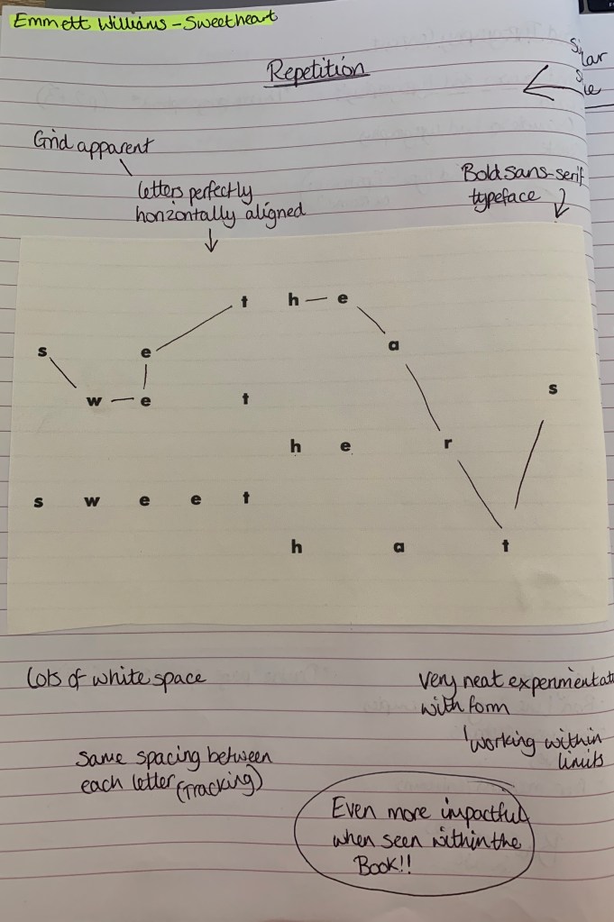
Emmett Williams was an American poet and visual artist, he created many concrete poems along with collaborations with fellow artists, paintings and books. I came across a book of concrete poems called ‘Sweetheart’. This book contains a number of different variations of the poem across the pages. Sweethearts is an anagrammatic encounter between a “he” and a “she,” whose entire vocabulary is derived from the word “sweethearts.”
By clicking the link above you will be able to see the collection of Concrete Poems for the book, It makes more sense to see how each page/poem layout correspond with the next page. Together they create a mesmerising flip book that can also be read backwards with the front cover also being printed on the back so pages can be turned with either left or right hands.
Below I have printed out a page of Sweethearts and made critique notes beside;
The layout throughout this book consists of the same spacing between each letter following a central grid, each page has identical grids with different characters removed to create unique concrete poems. The page of the poem above reads “The sea wets her sweet hat” I did find with other pages within ‘Sweetheart’ they appeared harder to make sense of what is being said, but together appear more of a visual piece. Wether it was intentional, I did notice that the staggered words clearly spelt out the title (as marked on the page). To each poem the relationship between the content and the form isn’t very clear but with this being said, once seen together with other versions of ‘Sweetheart’ contained within the book it shows the movement and diversity. Williams’s form generates a tone and type of poetry all its own.
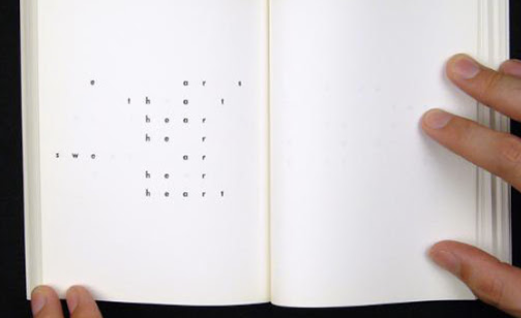
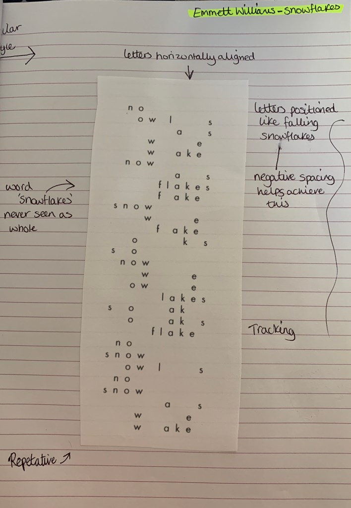
I found another interesting concrete poem which I originally thought was created by Emmett Williams however is actually created by Rob Giampietro who has taken huge inspiration of Emmett Williams. This concrete poem ‘Snowflake’ caught my eye by its clear visual representation of snowflakes falling. It was the similar layout and style which tricked me into thinking it was another by William’s!
This concrete poem shows clear representation of what the poem is about, to me this poem appears more peaceful rather than chaotic knowing that it is in relation to snowflakes. The poem reads: “No owls as we wake now. As flakes fake snow, we fake OKs. So now we owe. Lakes soak. Oaks flake. No snow owls. No snow as we wake.” This did take me a while to piece together as the large gaps between the characters makes it less legible – but this is what concrete poetry is about, it becomes more visual piece.
Mary Ellen Solt
The second artist I have chosen is Mary Ellen Solt, after reading parts of Solts’ book ‘Concrete Poetry: A world view’, I took a look at some of her work and was blown away, She has created beautiful and creative examples of concrete poetry, I was particularly interested by the pieces which appear in her book ‘Flowers in concrete’. Below I have chosen two poems to look into at a closer depth.
Marigolds (1968)
This shows a neatly positioned poem surrounded by busy circular patterns relating to the layered flower Marigold, these shapes are made up of script letters. The title itself is hidden within the poem using the first letter of each word. Personally to me, I cant make sense of the poem to the title… but the title and the imagery make perfect sense and cleverly represent the flowers. The positioning of these shapes could appear to how they would grow with some overlapping creating dense layering – as for the shapes there is no clear layout, but adds boldness to the page.
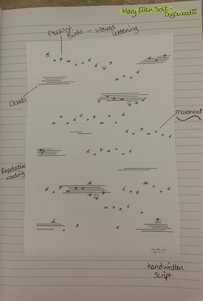
Dogswood II (1965)
When I first saw this I automatically thought of flocks of birds flying across a clouded sky, the movement in the letters help achieve this by picturing a bird per letter. The poem itself is repetitive with the only word in use of the title ‘Dogwood’ in an handwritten script. Again similar to the previous poem, I’m unsure of the link between the poem and the visuals, it seems that the link lies with the title and the visuals with these two examples.
Mary Ellen Solts work stands out to me as the visual imagery she has created is clear to the audience making her work relatable and fast to understand by being able to identify the visuals used in the artwork. The repetition of letters and words create understanding symbolic ideas within the visual.
Visual Task
Research
To begin with I wanted to research into the poem more.
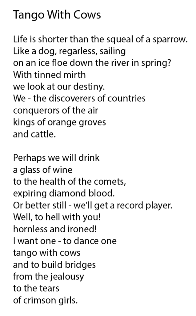
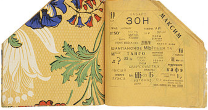
Inner spread of Tango with Cows
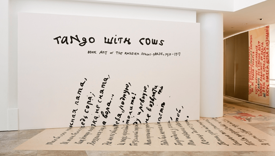
Tango With Cows: Ferro-Concrete Poems is an artists’ book by the Russian Futurist poet Vasily Kamensky published in Moscow in 1914. Tango with cows is also the name to one of the poems listed inside the book, along with 13 other poems. The work has become famous primarily for being made entirely of commercially produced wallpaper.
J. Paul Getty Museum Exhibition Design
The poems are split into two sections; the first contains 8 concrete poems that use multiple fonts and unusual spacings to express sounds and textures. The second group of 6 are arranged with diagonal grids containing cubist paintings of Picasso and Brague, and moulds that are used to make reinforced concrete. These poems refer directly to aerial views, maps and floor plans. Only 300 copies were made of the book.
Tango with Cows explored the way Russian avant-garde poets and artists responded to the crisis of the failed 1905 revolution, the famines of 1911, the rapid influx of new technologies, and the outbreak of World War I through their book art.
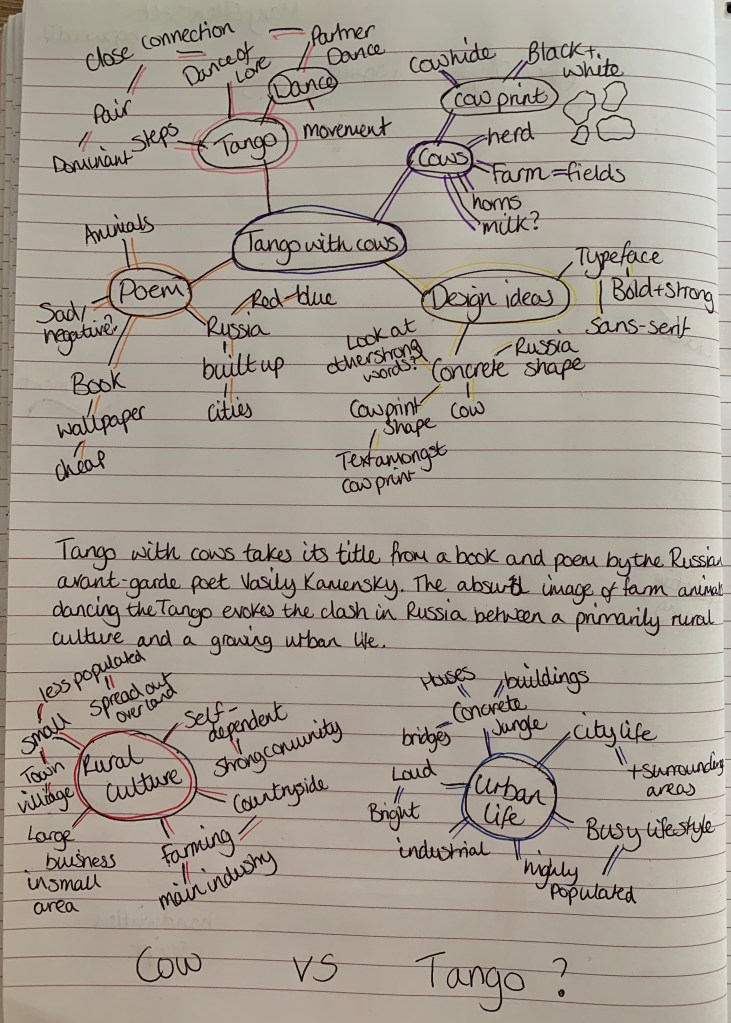
I wanted to create a mind map to help stimulate ideas, I originally started with just one then decided to create mind maps behind the meaning of the poem and chose rural culture and urban life as the two main focal points.
Developing Ideas
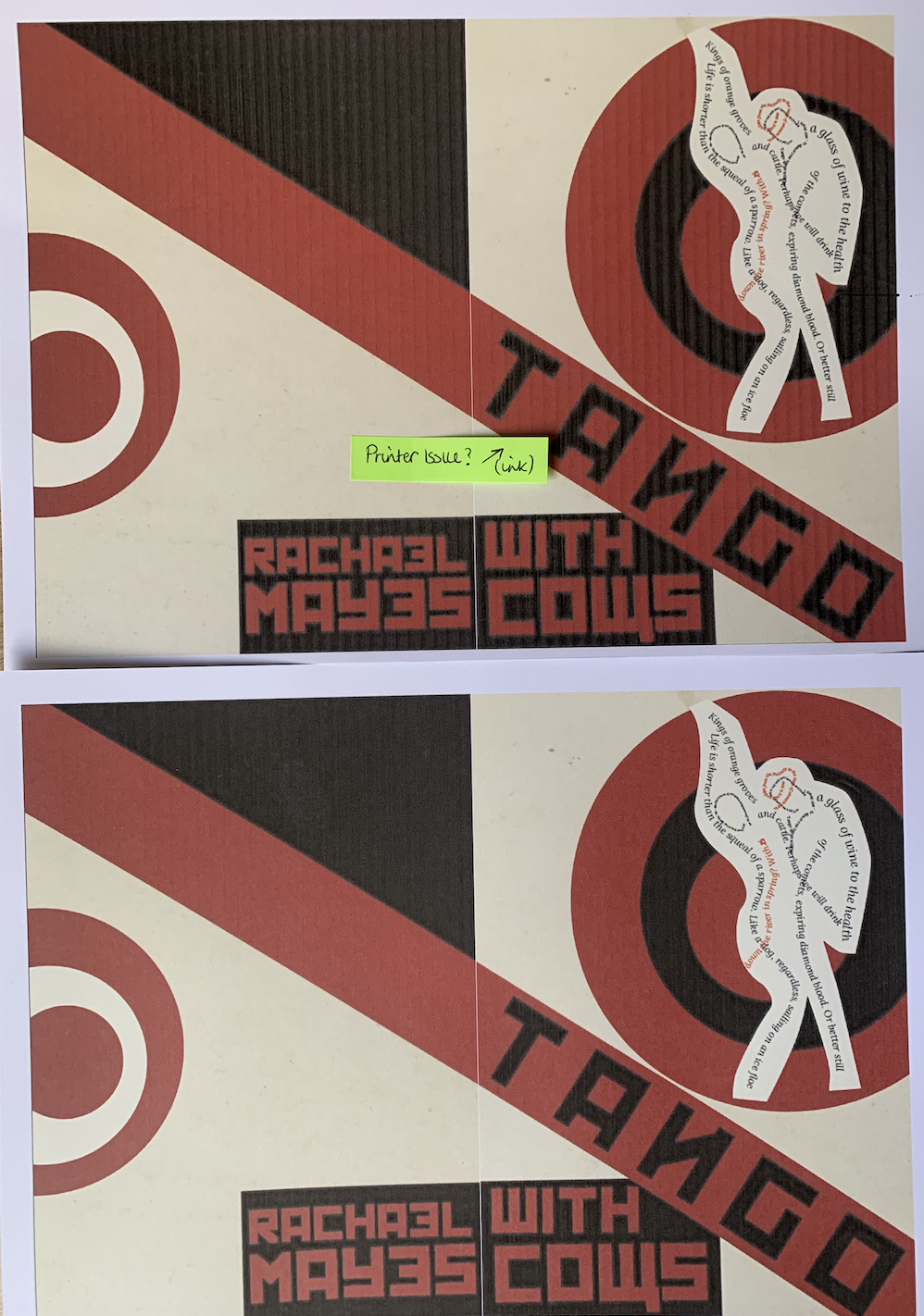
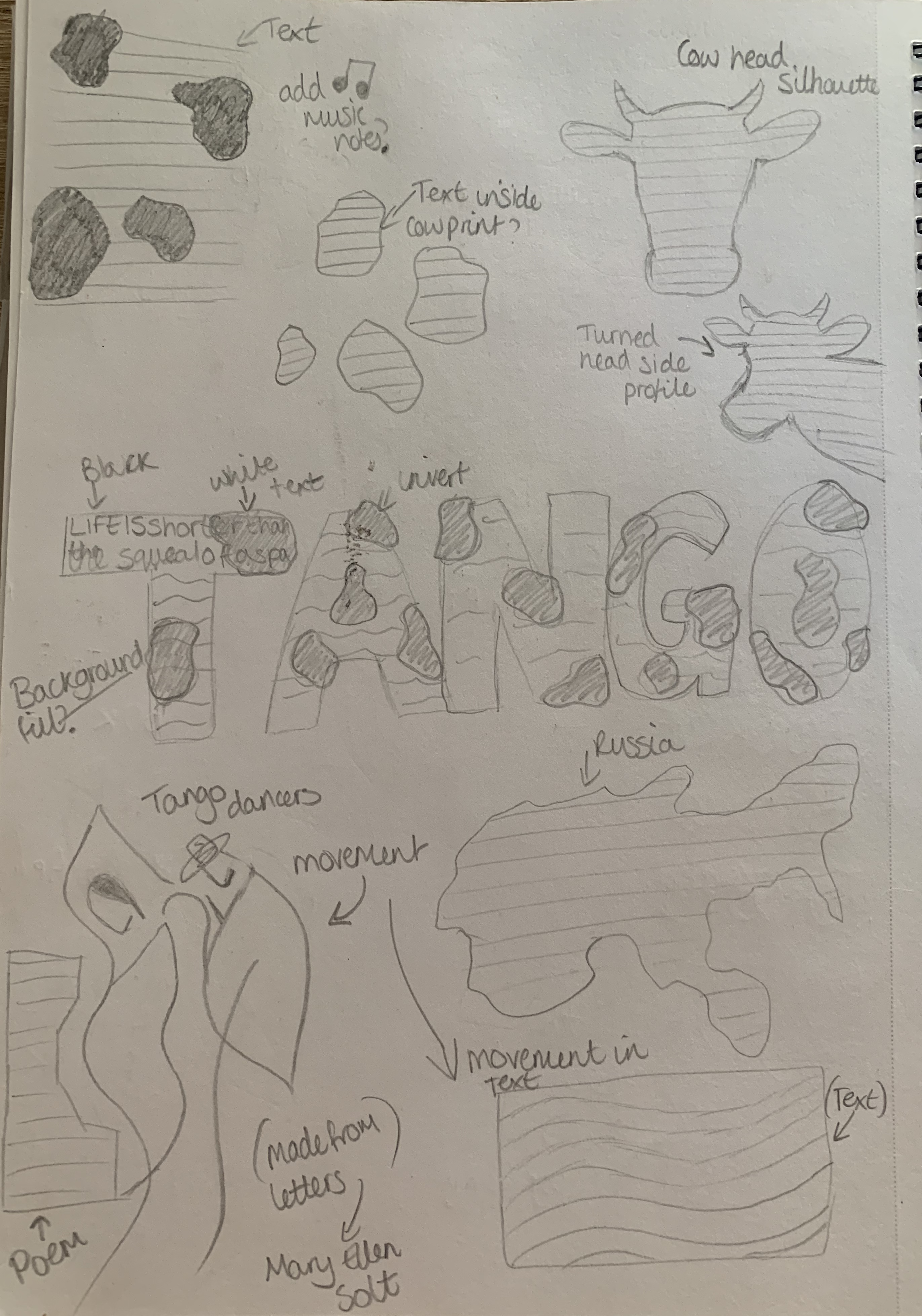
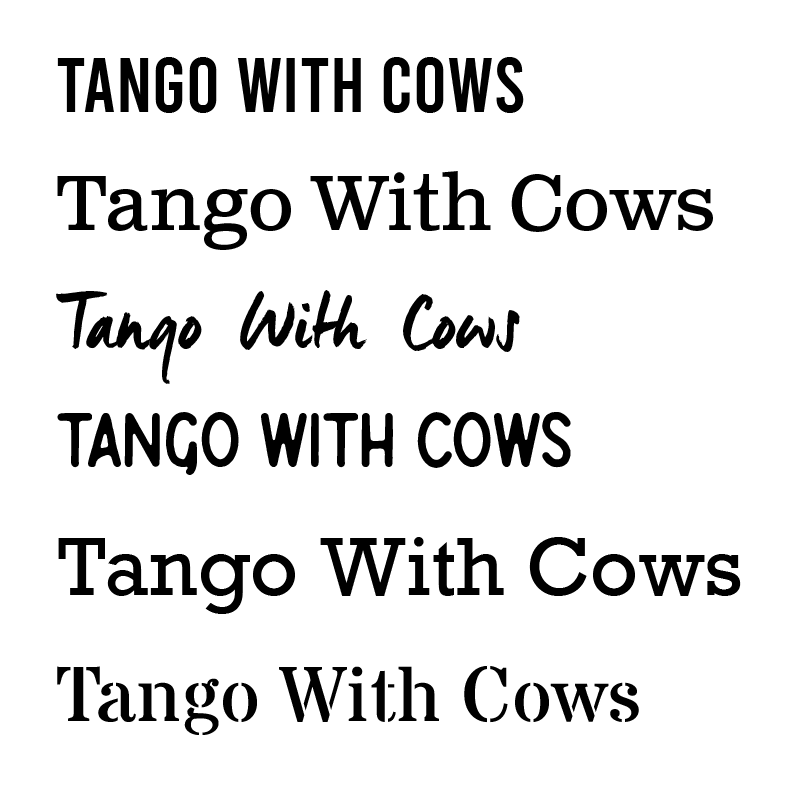
I sketched out a few ideas which came to mind after research and reading the poem. Currently I’m not sure which design I like best, I like the arrangement of the word Tango with cow print, I also find the playfulness of the cows legs in dancing shoes amusing. Before I develop my chosen design I want to determine which typeface I am going to use, below are a choice of fonts I feel reflect the poem well. I want a strong, bold and clear typeface to suit not only the poem but my design.
Design Process
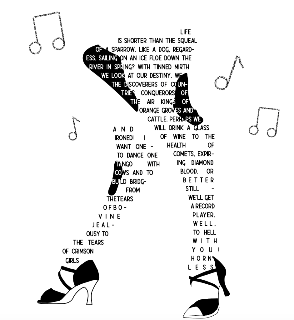
I started of by mocking up the ‘Tango’ design, however I felt this was too simple and that I could push myself further with this exercise.
I then created my second design of the cow in dancing shoes, however again I didn’t feel satisfied with how it looked, It looks rather odd and doesn’t show much relation towards to title! I’ve now decided to go back to my sketch pad and rethink some designs. Rather than focusing on creating a shape I’d like to experiment with the layout of the words more along with the meaning to the words – to see if I can exaggerate them.
I looked at highlighting a letter from each row to spell out ‘Tango with cows’ however due to the size of the poem, this didn’t look as successful as I imagined, especially as I wasn’t able to spell out the title on each row, gaps formed causing it to break the sequence.
Letters highlighted
Title on show
Attempted to line the title
I wanted to give my dancing cow another go, I decided to rework the shoes and to add some music notes made from the title. This changed the way I saw the overall look, I wanted to keep to the black and white theme as I was focusing on the cows. I feel like this creates a playful and fun design for the poem.
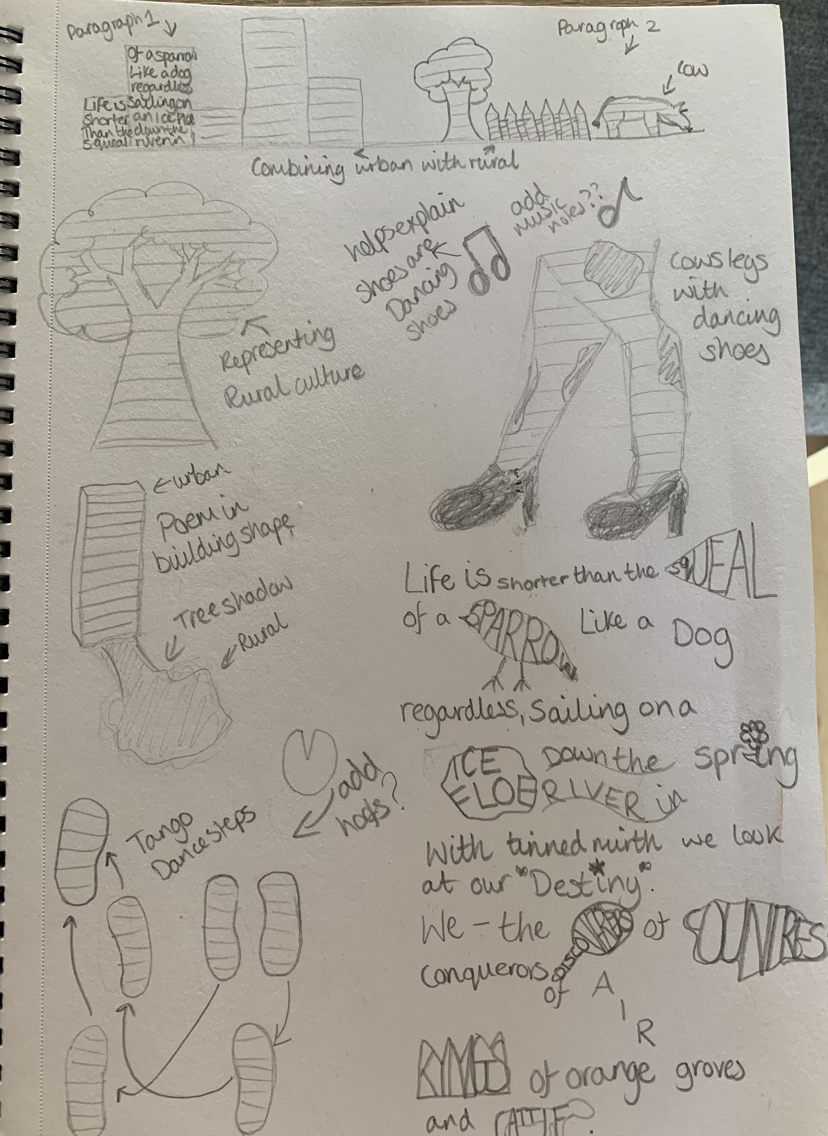
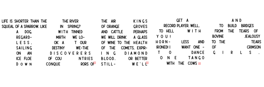
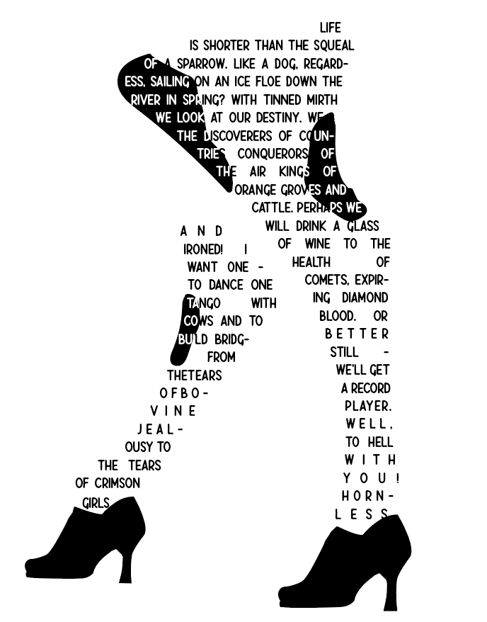
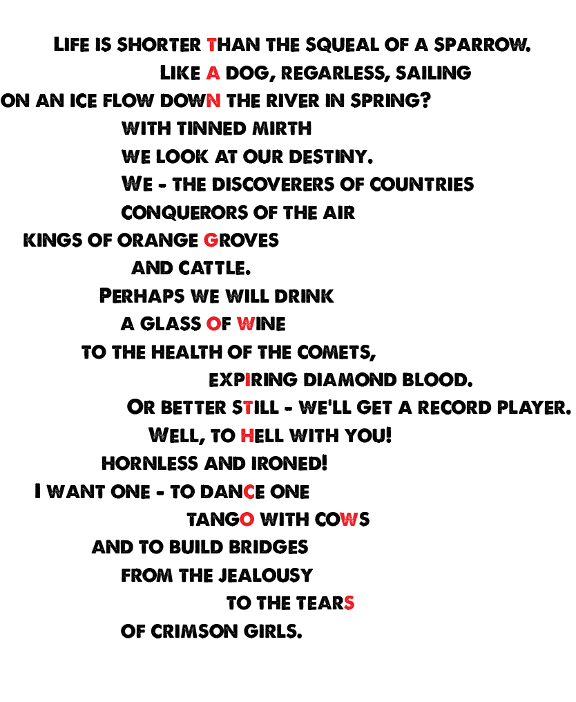
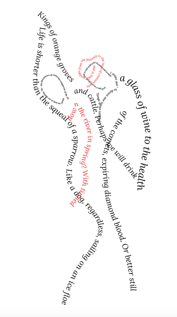
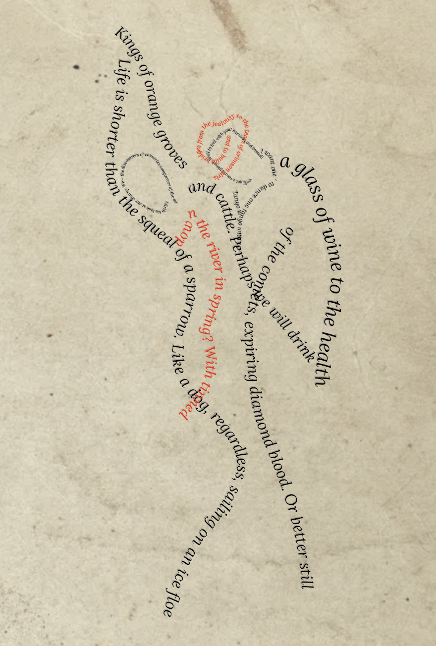
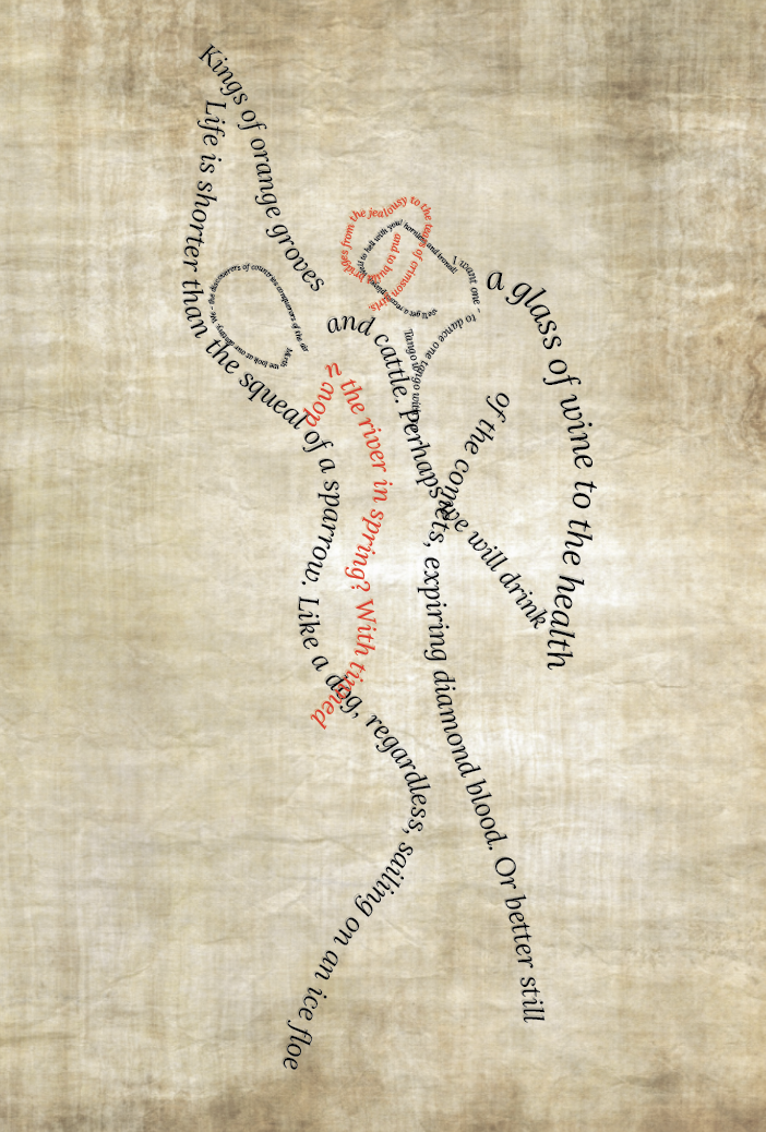
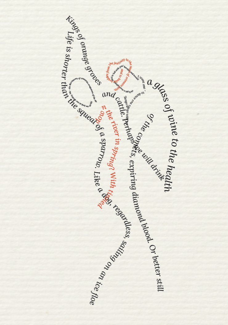
For my final design idea I wanted to try the dancing couple, I started off by taking inspiration from Mary Ellen Solt and creating the figures out of letters with the poem place to the side however felt this seemed too ‘lazy’ so instead of using letters to create the figures I used lines of the poem. This created a better overall look, I chose the serif typeface ‘Lora’ in italics to help capture the movement from not only the image but the poem itself.
Print Choices
Unfortunately for the previous exercise I was only able to gather samples! So for this part I’m not physically able to print things but I have mocked up a few choices which I feel works well for the poem.
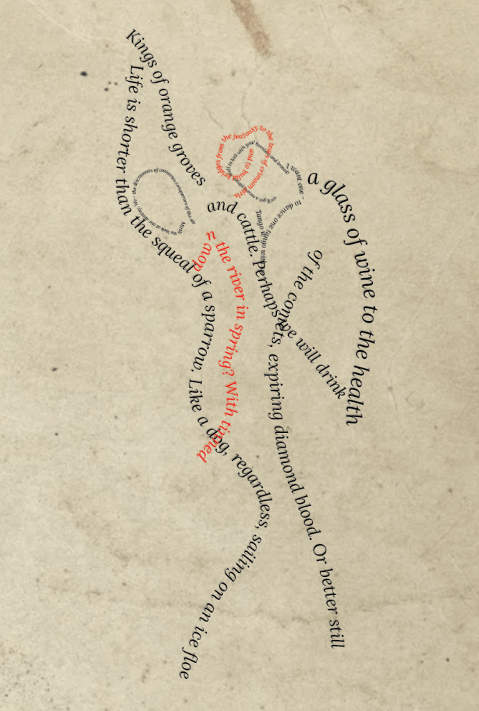
I wanted to use paper which added age to the poem, the papers I have sampled above are Kraft paper, parchment paper and hemp paper. By adding a light brown textured paper this gave a more natural feel, which reminded me of the countryside (relating to the rural culture aspect of the poem) and the modern clean design relating to the urban life of the poem. I feel the parchment paper (middle) is too ‘ancient’ looking – reminded me of a pirates treasure map? The Kraft paper seems to work best.
Final Design
Reflection
It was a struggle to get to the end result as I kept changing my mind on which design I liked best, it was also difficult to create a design to reflect the poem. For my final design I decided to shape the lines of the poem into a dancing couple changing the colour font red to help the illusion of a dress and a hat. My thought process behind the choices I made were as follows;
Font– I decided to use the serif font ‘Lora’ in italics, having the font in italics helped emphasise on the movement within the design of the dancers and also the poem itself. I felt when using a serif font it was easier to read the text in different sizes, It also added sophistication to the design. This helped highlight the more urban style of the poem.
Design – Compared to other design I had sketched this seemed to fit the poem the best, I did like the idea of the cow in the dancing shoes, however I just felt it wasn’t clear that the cow was ‘dancing’. I like the movement of the design, its very simple yet self explanatory. My only concern is that the order of the lines within the poem aren’t very clear to which way they should be read, I have placed them in a left to right order to make it as clear as possible.
Paper – Using Kraft paper as my paper choice I felt I was able to tie in the rural culture side to the poem, with the paper being biodegradable it automatically made me think of the countryside with its non bleached surface still retaining the natural wood colour.
Overall I hope that I have created a design which is fitting to the brief, as mentioned I did struggle with this exercise, I wasn’t sure which direction to take my design however I do feel I have learnt from this exercise.
To begin: Collect a wide variety of paper samples and other paper ephemera across a range of weights, textures and surface finishes. This builds on your previous paper sample exercise from Part two. Aim to collect a wide range of unprinted papers, such as blotting paper, tracing paper, lined paper, graph paper, rice paper and handmade papers. Look out for papers with special print finishes – metallic, embossed, shiny and matt. Aim to collect papers that will run through a conventional desktop printer, or indeed the print output options you have available to you – this may include board.
In addition, collect paper ephemera that you find interesting or that appeals to you in some way. This may include tickets, flyers and similar printed material or mementos or souvenirs of exhibitions, occasions and days out. Create a stack of these papers for use in your next few exercises.
In your learning log, document some of these papers and their attributes. Use a reflective approach and simple, descriptive words. For example, it may be that a heavy, coarse coloured paper reminds you of primary school, or the particular smell and shine of a paper puts you in mind of glossy magazines, or the fish and chip shop. Document these associations, however bizarre, into your learning log and/or ongoing paper sample book – you may revisit the words and phrases you use here later on in this process.
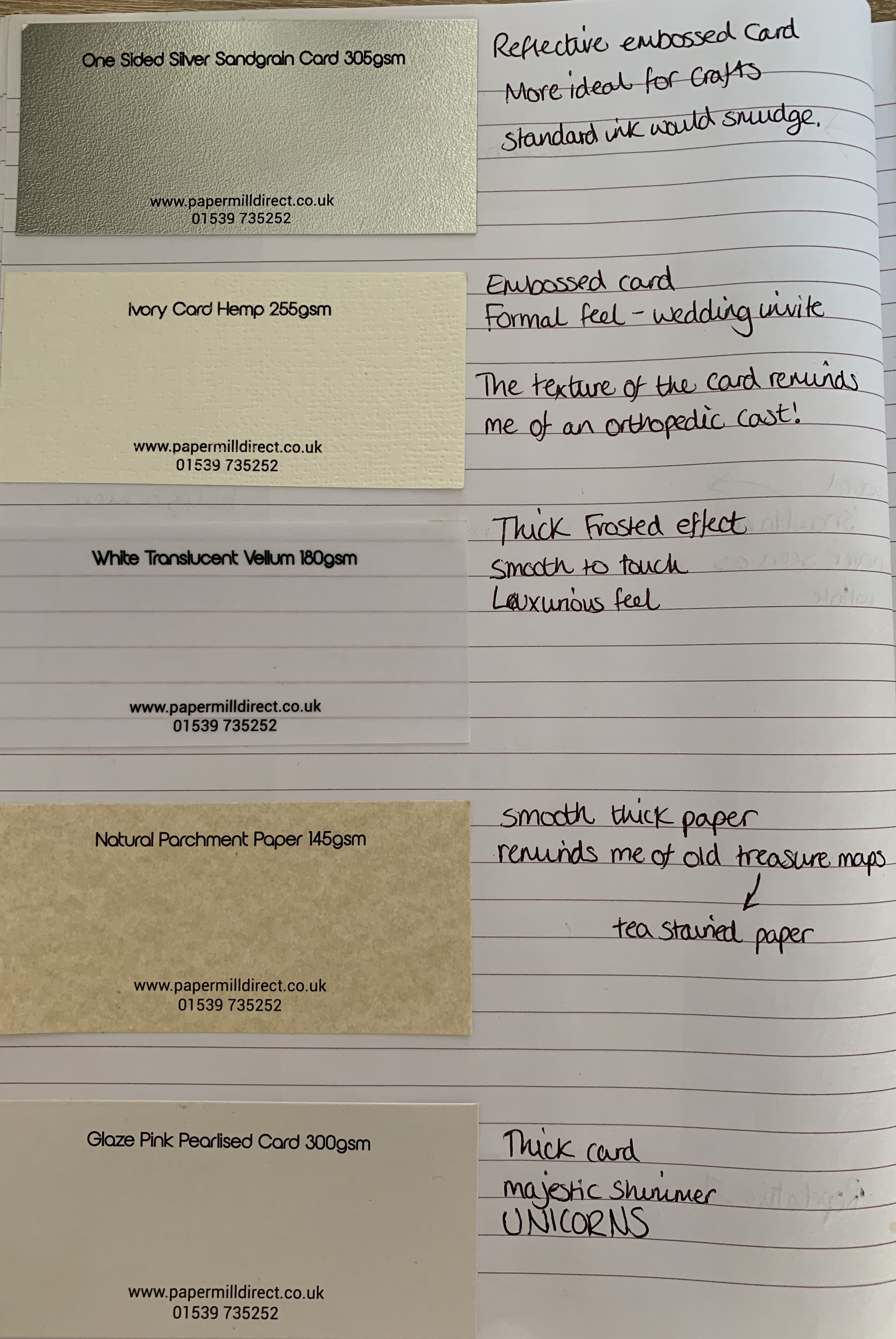
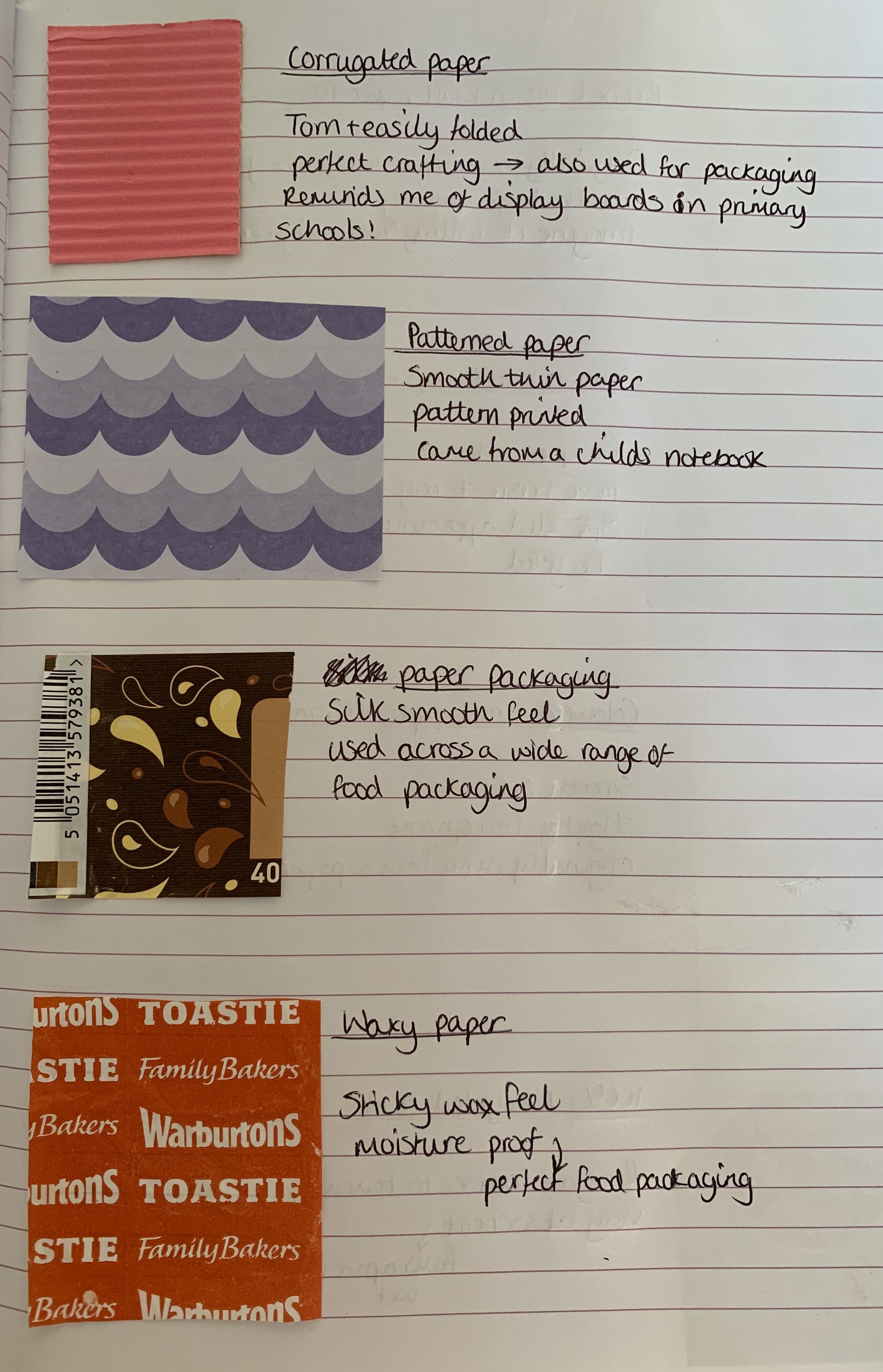
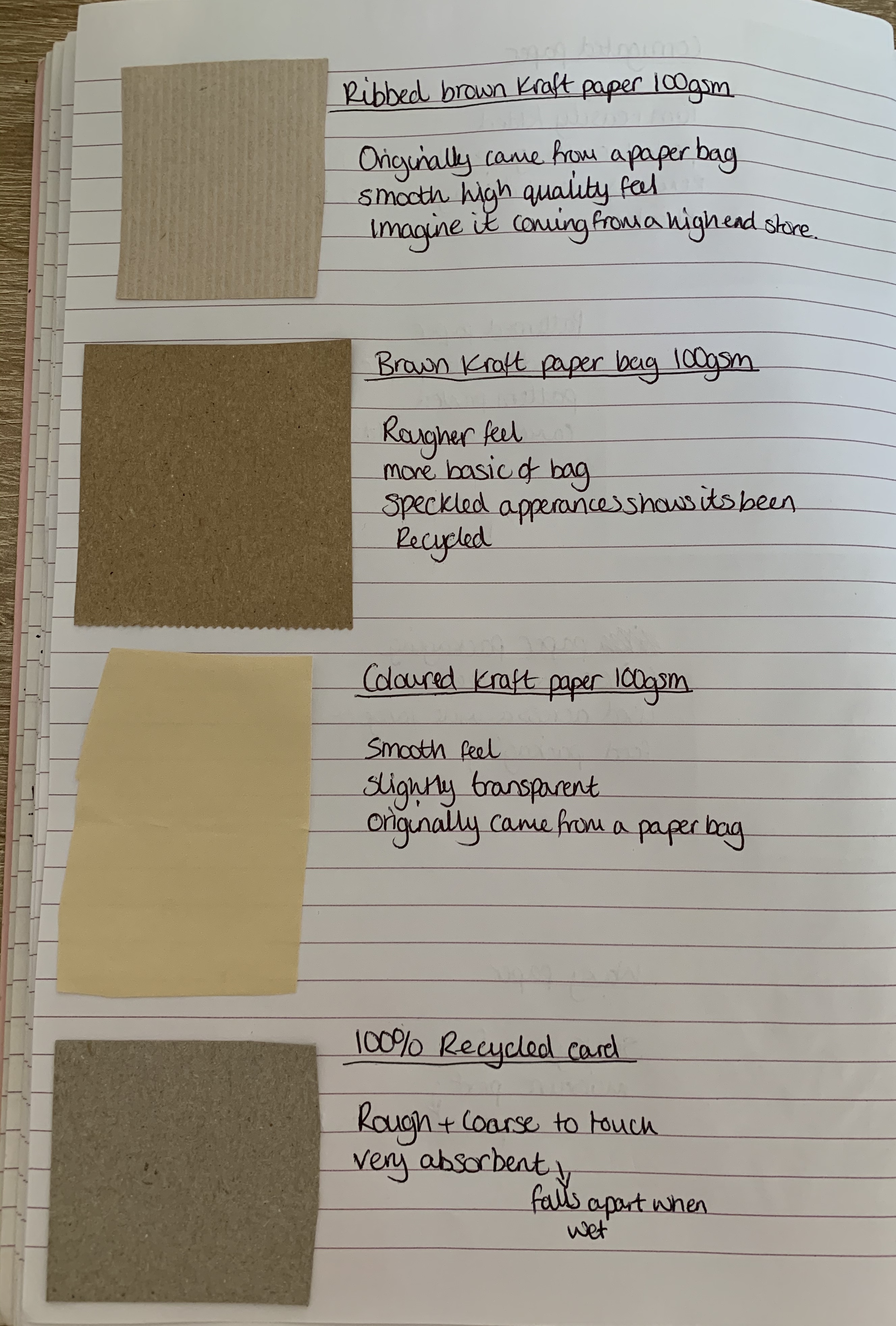
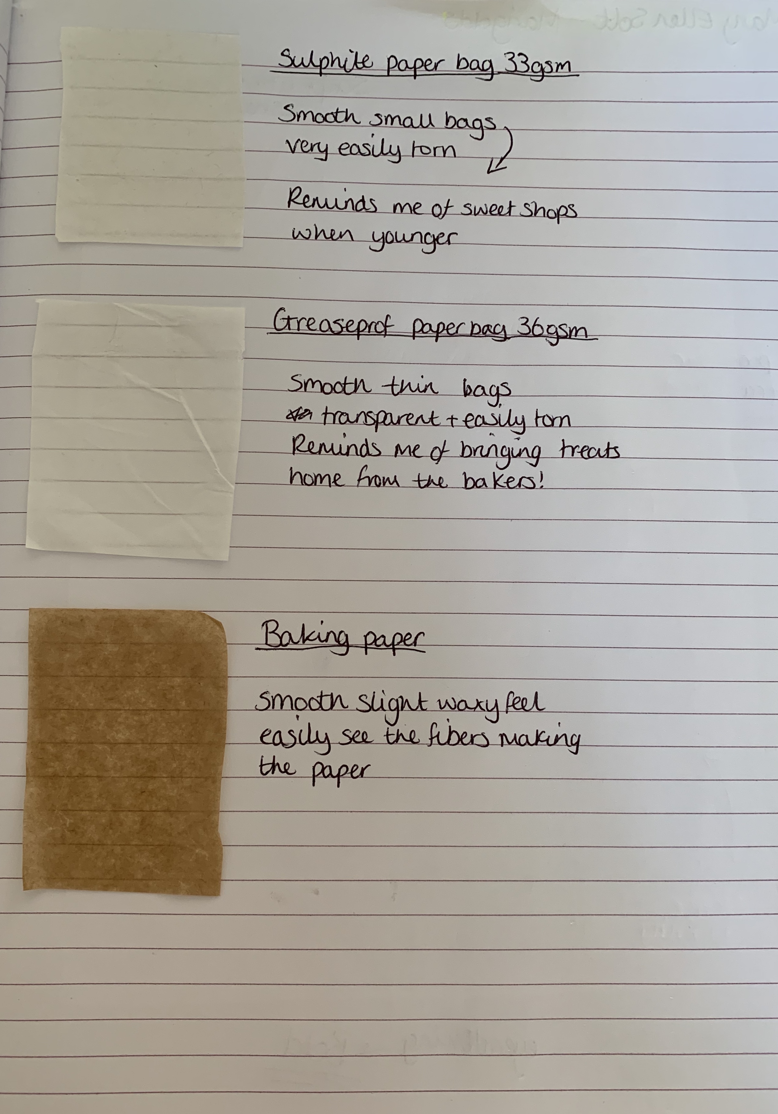
Paper Samples
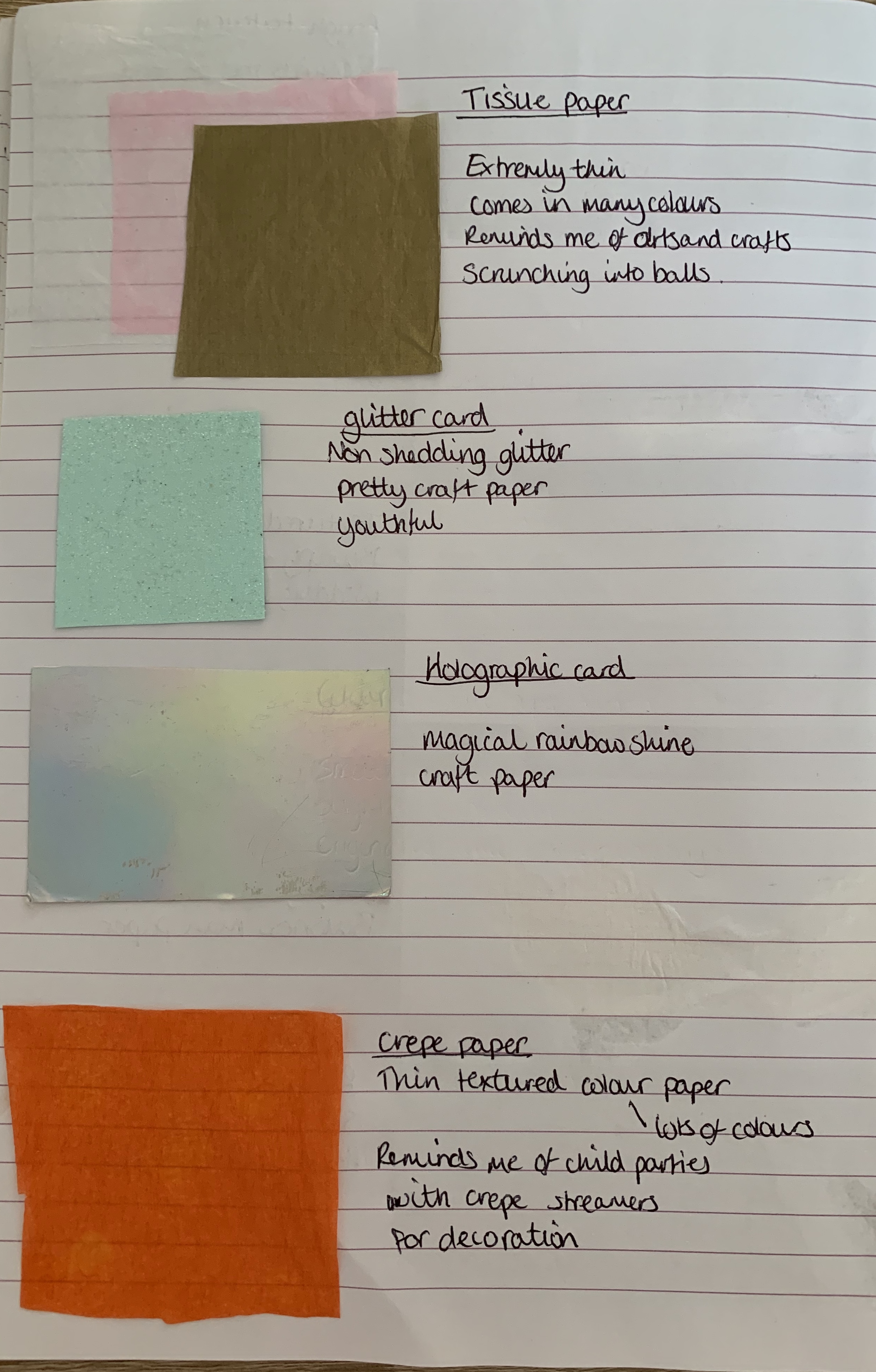
I attempted to collect as many different paper samples as possible, I ordered some different textured paper samples from http://www.papermilldirect.co.uk and also some paper bag samples from http://www.carrierbagshop.co.uk. The following images show my samples along with a very brief description and a few notes on how different papers remind me of different things.
Looking at the paper samples I have collected made me question if they would be appropriate to print in a regular printer. Although most would feed through the printer, how the ink would hold is another question for papers such as the silver sandgrain card, holographic card, pearlised card and the waxy papers I imagine would smudge very easy. The tissue paper, glitter card, crepe paper, corrugated paper, sulphite paper and greaseproof paper would need to be possibly hand printed as these wouldn’t feed or survive being ran through the printers.
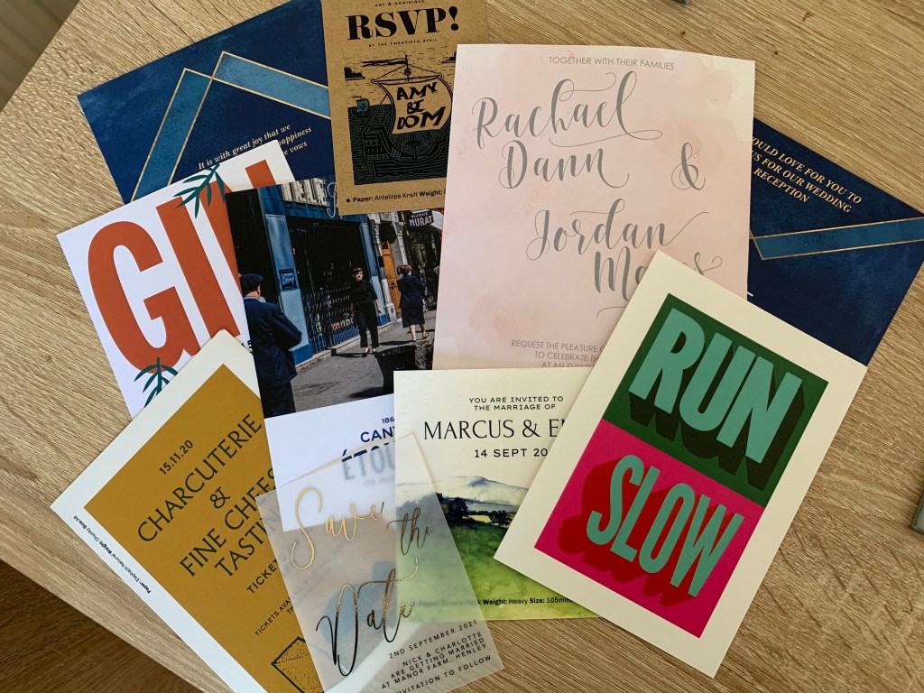
Paper Ephemera
Thankfully for this part I’m glad I can sometimes be a bit of a hoarder! I love to keep mementos of days out and events. Below shows examples of my paper ephemera.
I also have stored away which I will dig out for the appropriate exercise tickets, postcards and maps.
Reflection
I was useful to revisit paper samples but this time by seeing what each reminded us of. Due to having two young children it was useful to explore different paper types within their craft boxes – when I concentrated on these items it brought me back to my childhood and mainly primary school. I’m glad to of collected a wide variety of samples, although some are not appropriate for print it was still useful to explore the different papers available.
Brief: Find two artists’ books that you feel demonstrate an interesting relationship between their form and content through the materials that the artist has chosen to use. Reflect on these books in your learning log.
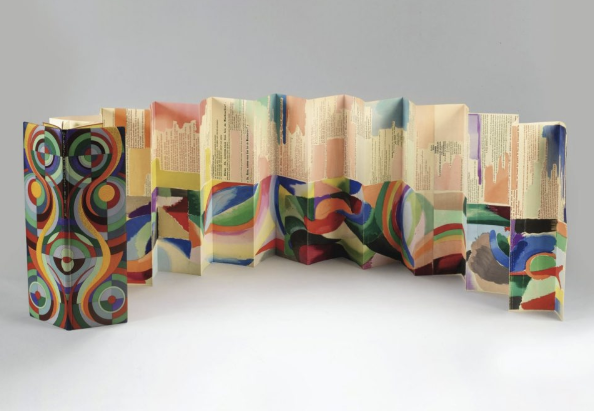
La Prose du Transsibérien et de la petite Jehanne de France by Blaise Cendrars and Sonia Delaunay-Terk 1913
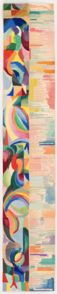
This artist book caught my eye was ‘La Prose du Transsibérien et de la petite Jehanne de France‘ (Prose of the Trans-Siberian and of Little Jehanne of France) with its accordion style fold, which allows the book to be unfolded and seen all at once. The striking bright abstract colours shows movement and different moods with brush strokes and blocks. The text inside consists of different sizes and typefaces, adding to the chaotic yet brilliantly contrasting look.
It is clear to see that the artists challenged the traditional form of the book – also needs to be took into consideration that this artists’ book is over 100 years old! So although not as ‘impressive’ now compared to others, back in 1913 this probably caused quite a stir to the industry. This book is usually exhibited unfolded and hung as a wall piece (measuring 2m). The materials used for this artists’ book have hand-applied watercolour, gouache, and printing ink on four joined sheets of imitation Japan paper with an accordion-folded.
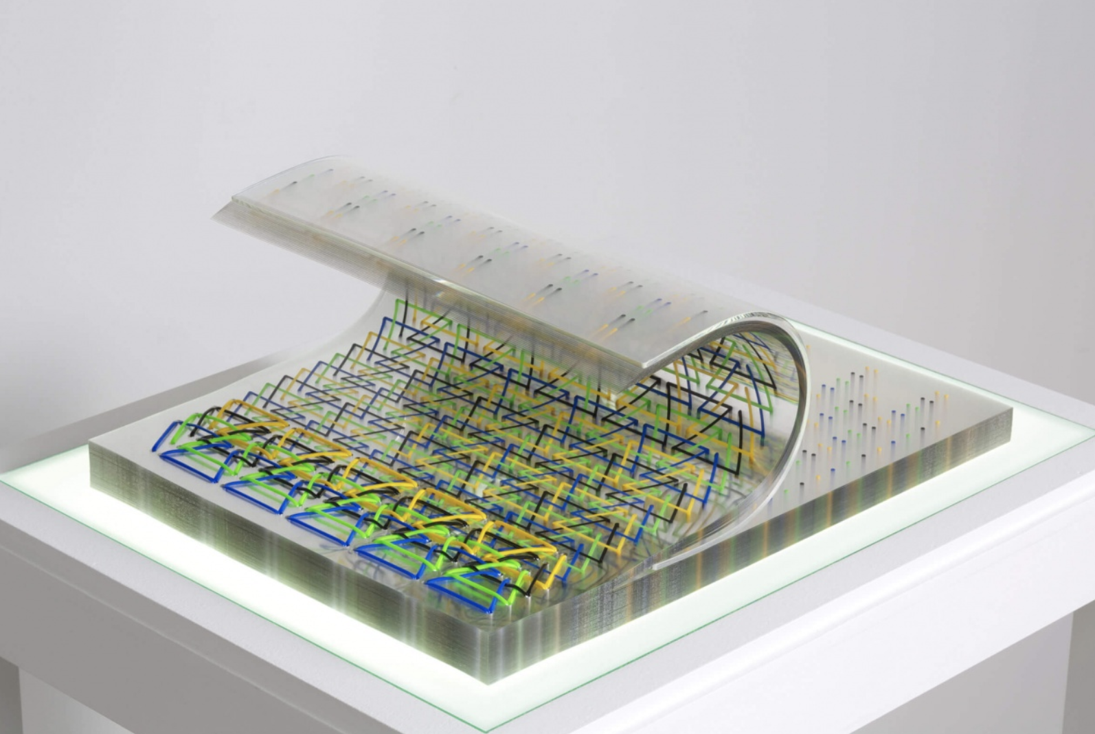
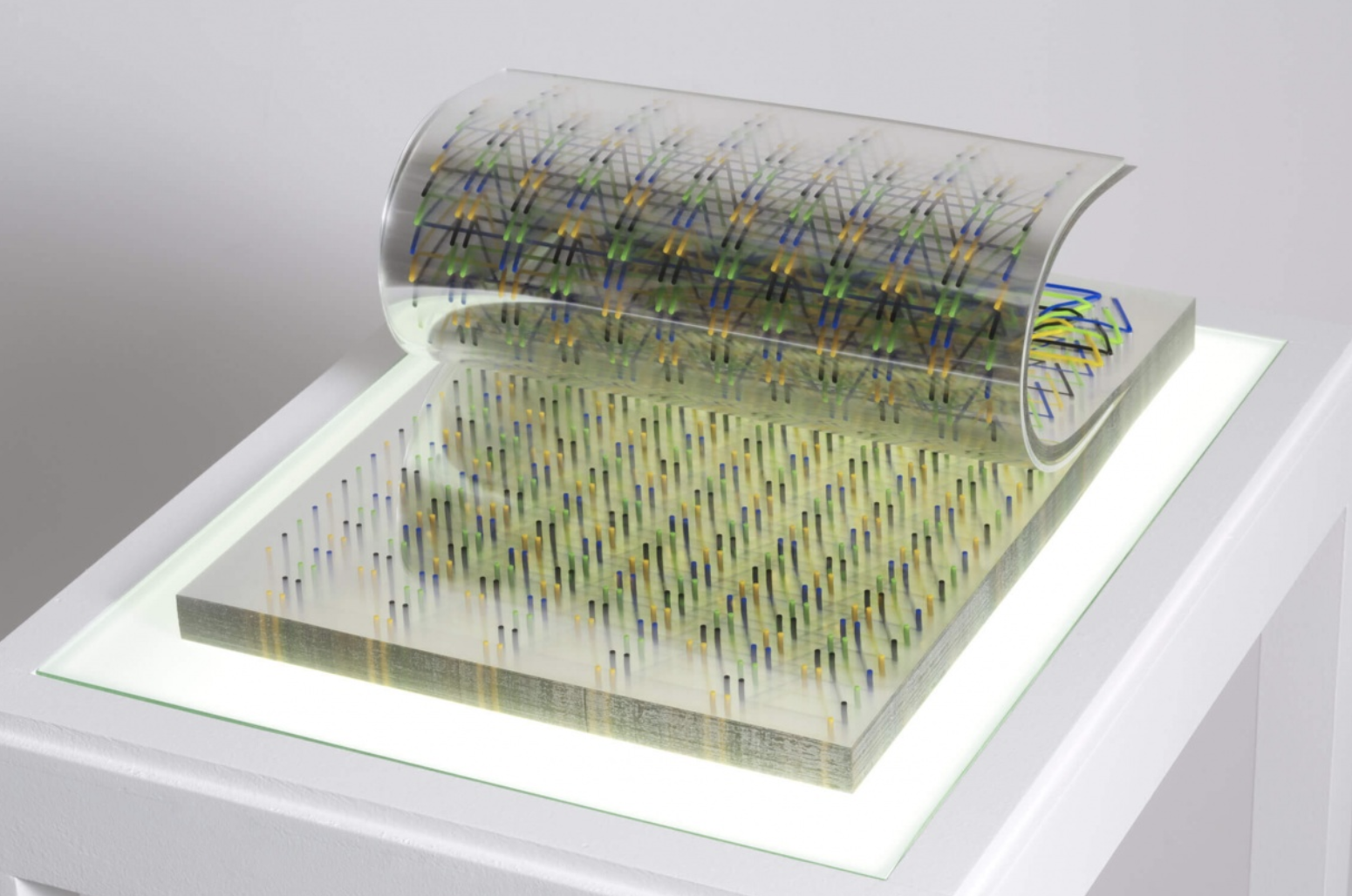
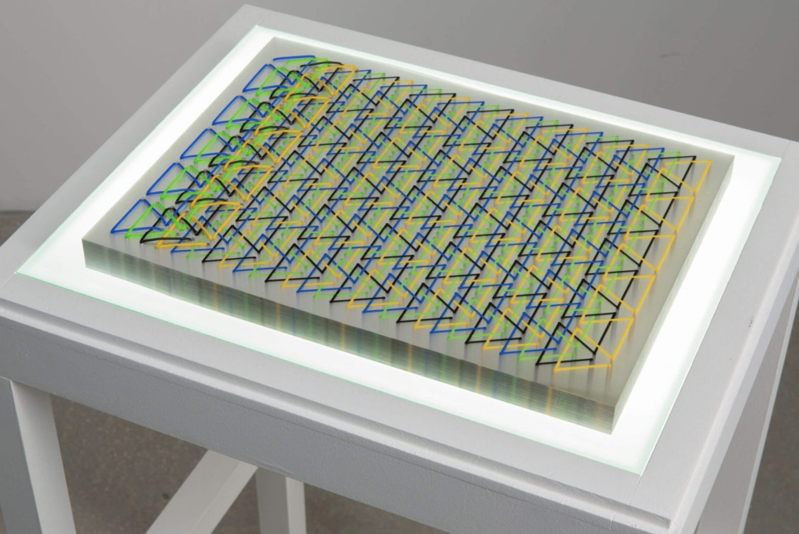
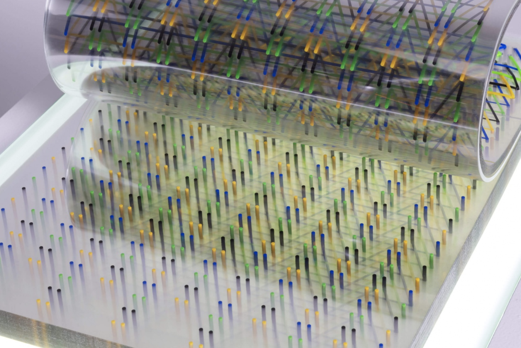
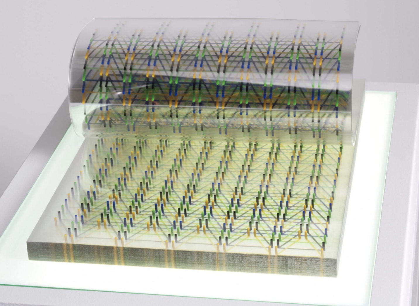
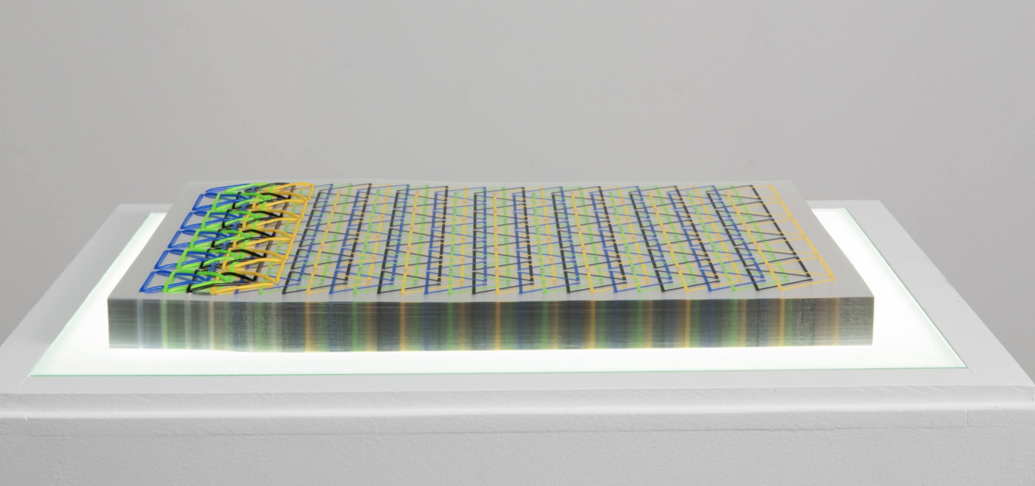
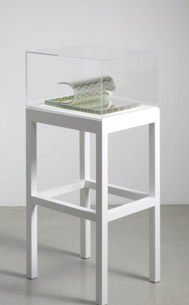
Stab / Ghost by Tauba Auerbach, 2013. Three Star Books.
I wanted my second artists’ book to be different from the first, I came across Stab/Ghost by Tauba Auberbach. This sculptural artist’s book has a compelling choice of retaining old book making techniques such as string binding and silkscreen, creating a contemporary looking book. The choice of vibrant colours form geometric shapes which are revealed through the transparent plastic which has been used replacing traditional paper, giving a sleek, modern and interesting look. This artist’s book is displayed on a custom designed light pedestal making it not only an artists’ book but a unique sculpture.
The materials used for this translucent book consist of clear plastic pages, silkscreened with patterns, sewn with plastic thread and mounted on a specially designed light table – producing a complex geometric artist book.
Reflection
It is clear to see that both artists challenged the form of the book and materials used plus, it was interesting to see the difference between two artist’s books 100 years apart. They have transformed the art of a book into something more, ‘La Prose du Transsibérien et de la petite Jehanne de France‘ with its interesting accordion fold which unfolds to a 2m piece of artwork with poem and abstract artwork along one side of the page indicating movement which relates to the poem, to the modern sleek artwork of ‘Stab/Ghost‘ which appears sculpture like when placed on its specially designed light pedestal. There is a clear indication of modernity between both pieces along with experimental materials used.
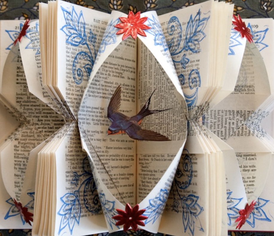
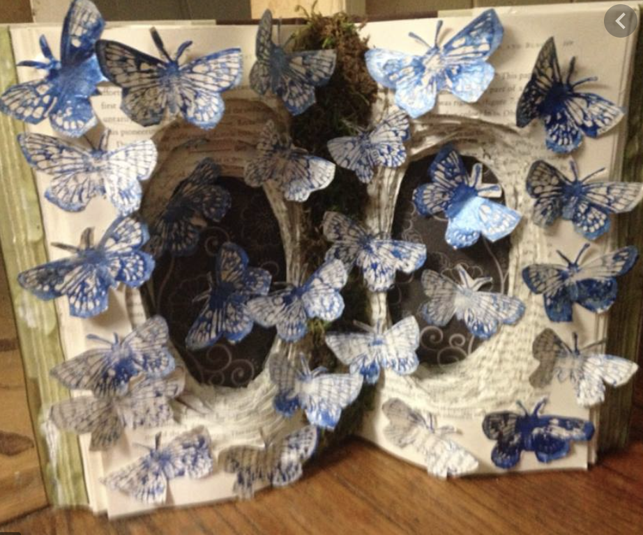
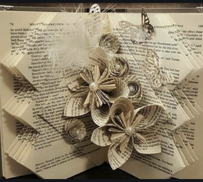
Brief: Using a found book, significantly alter the appearance of the pages to create a new volume that is personal to you. This can be any kind of book that is of interest to you, for example, a fiction book, a non-fiction book, a picture book or a photo book.
Approach the found book in a very physical way, manipulating the pages and paper inventively. If you need to, stitch or glue a number of pages together to reduce the ground you need to cover. Decide what to remove from the book, and what to add. Use the found book as a source of ideas and inspiration – the existing text may inspire illustrative, conceptual images, collages or typography as image. Embed, overlay and integrate your work into the existing pages using whatever materials, media and processes you feel necessary. This may be digital, hand-rendered, photographic, textile, or a combination of all these and more.
Think about the relationship between the content and the form, the design (text and images), the materials you use, such as papers. Perhaps you are creating a new sequence within the book? Change the book from its original form into a different form, altering the appearance and/or meaning. Apply an inventive, intuitive response to materials and how these can be exploited within context to the altered book. Refer to your contextual research into artists and designers in the unit so far. Use elements of your research as inspiration and to inform your book-altering practice.
Reflection: Write a paragraph reflecting on the assignment and reflect on your process and decision making. Are you looking in a different way to meaning, materials, design and the form of the book? Now is the time to take a good look at the assessment criteria in the introduction and make sure that your work meets the standards set. Ask your tutor whether they think you will be ready for assessment at the end of the course and what you need to improve upon.
Analysing the brief;
I have been asked to choose a book and alter the appearance and/or meaning in order to make it personal to me using the content as inspiration. I should take a very physical approach by manipulating the pages and the books structure taking into consideration the relationship between the books form and its content.
As mentioned in the brief I decided to look back over artists and designers which I have researched over the unit so far to regain inspiration.
One artist which stood out to me in light of this assignment is Eiko Ojala (research found in Exercise 3 Part 2) Eiko Ojala is a renowned illustrator and graphic designer based in Estonia. He works mostly digitally and draws everything by hand. Within his work process Eiko likes to study the forms of shapes and to work closely with light and shadow.
I really liked the idea of layering images from numbers of pages giving a 3D illusion – this has given me inspiration for my design!
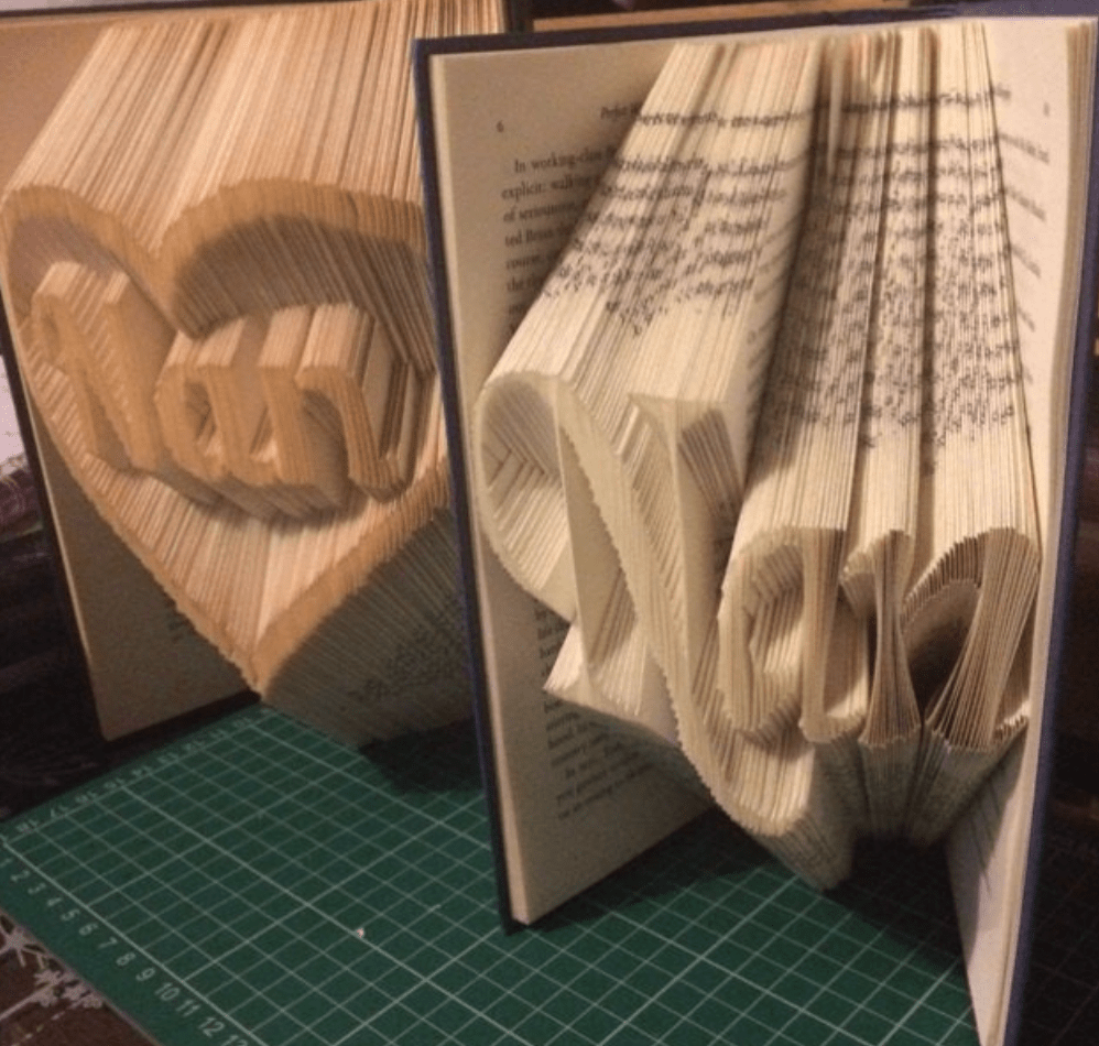
Looking at Eiko’s work it also reminded me of something I created a few years ago as a gift for my Nan, I used a page folding technique to create this form of book art. This could also be something worth remembering to feature within my designs.
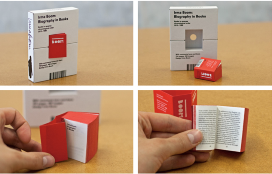
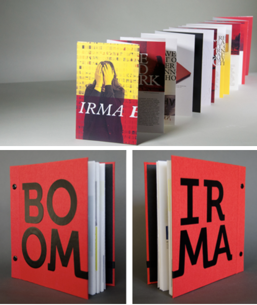
Another artist who I grew a likening to during previous research tasks is Irma Boom, she was one of the first experimental book artists which I had stumbled across and loved the way she tested and pushed the boundaries of the book. (Research taken from Exercise 3 Part 2) Irma Boom, is a Dutch graphic designer who specialises in book making. Boom has been described as ‘The Queen of Books’, having created over 300 books and is well reputed for her artistic autonomy within her field.
Altered books
After re-gaining inspiration from artists which I have previously looked at I wanted to look further into different artists who have created artistically altered books.
I started to gather a collection of images found online and some of the results are amazing! This has already given me plenty of ideas ready to use within my own design! I just need to narrow down my selection and choose the book which I think I will achieve the best results.
Generating Ideas
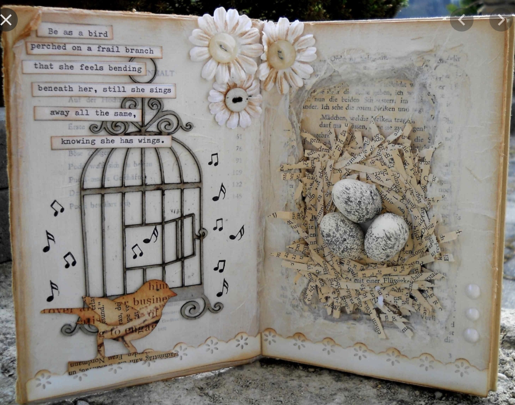
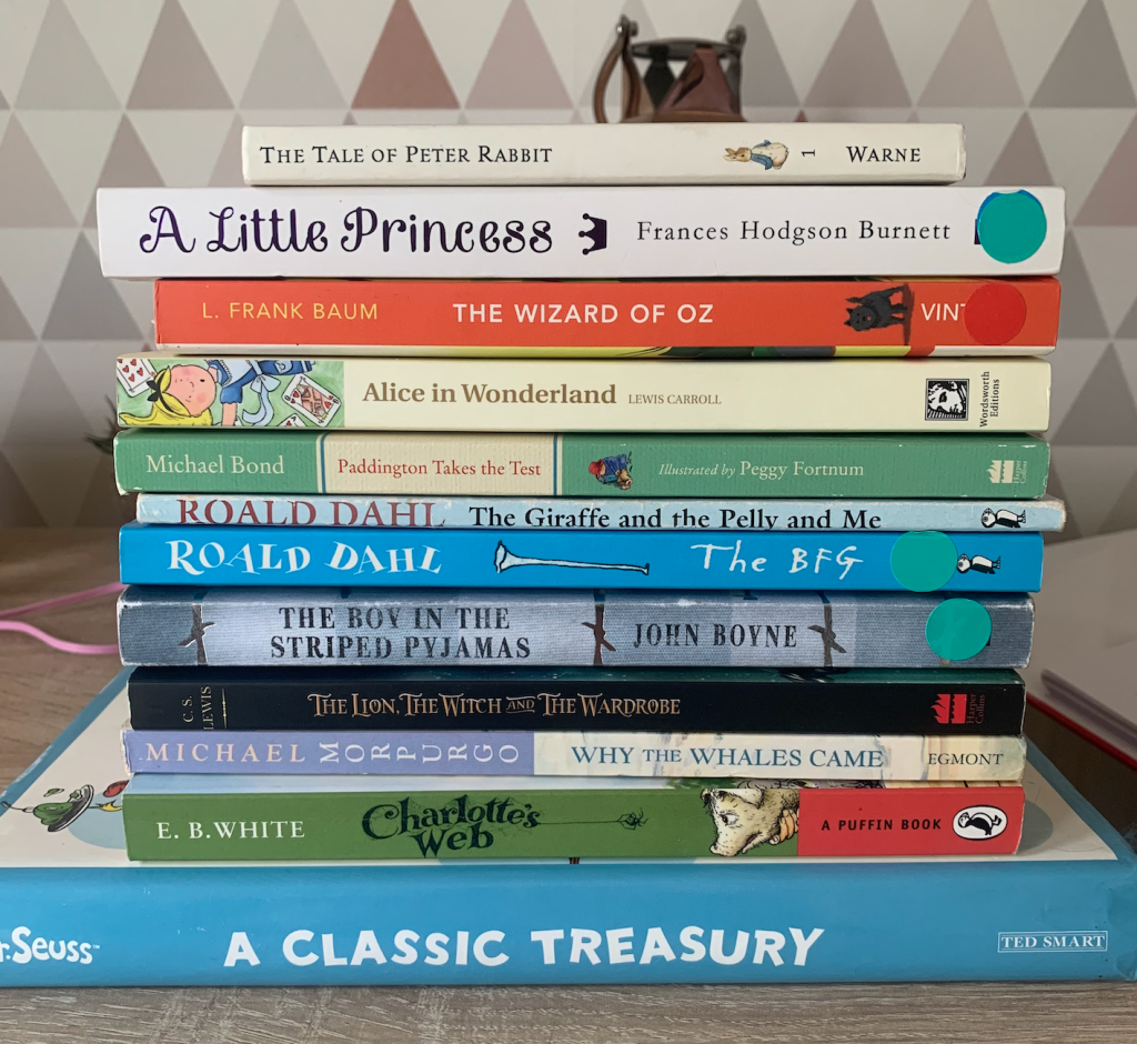
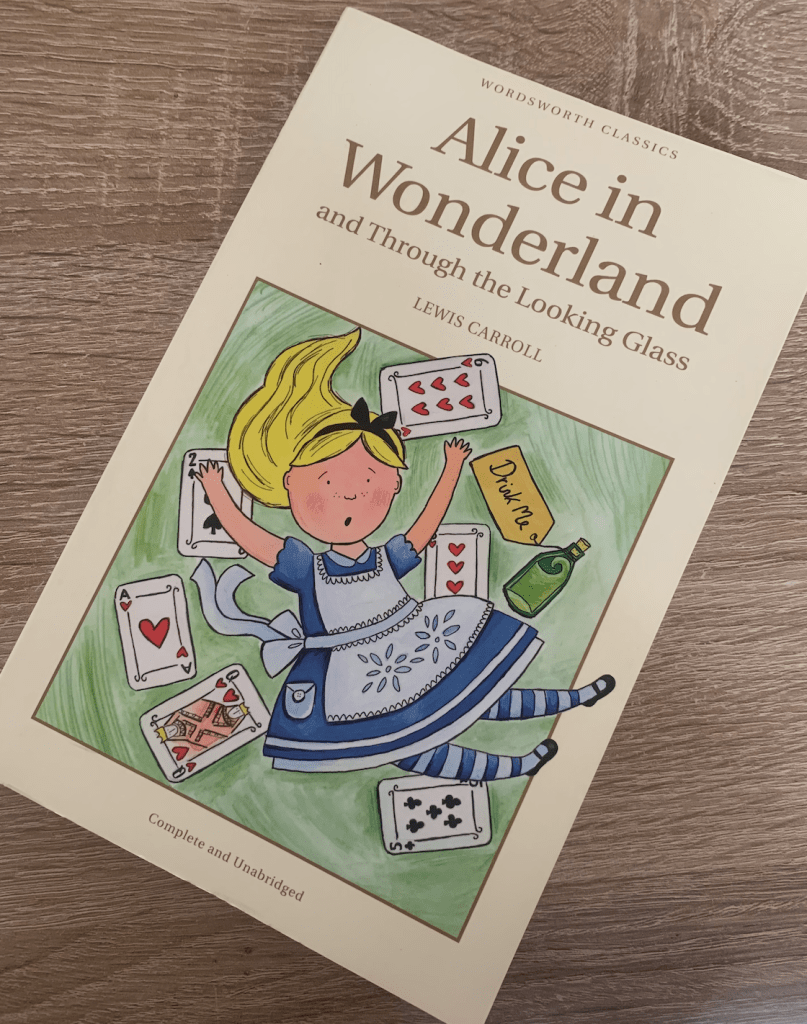
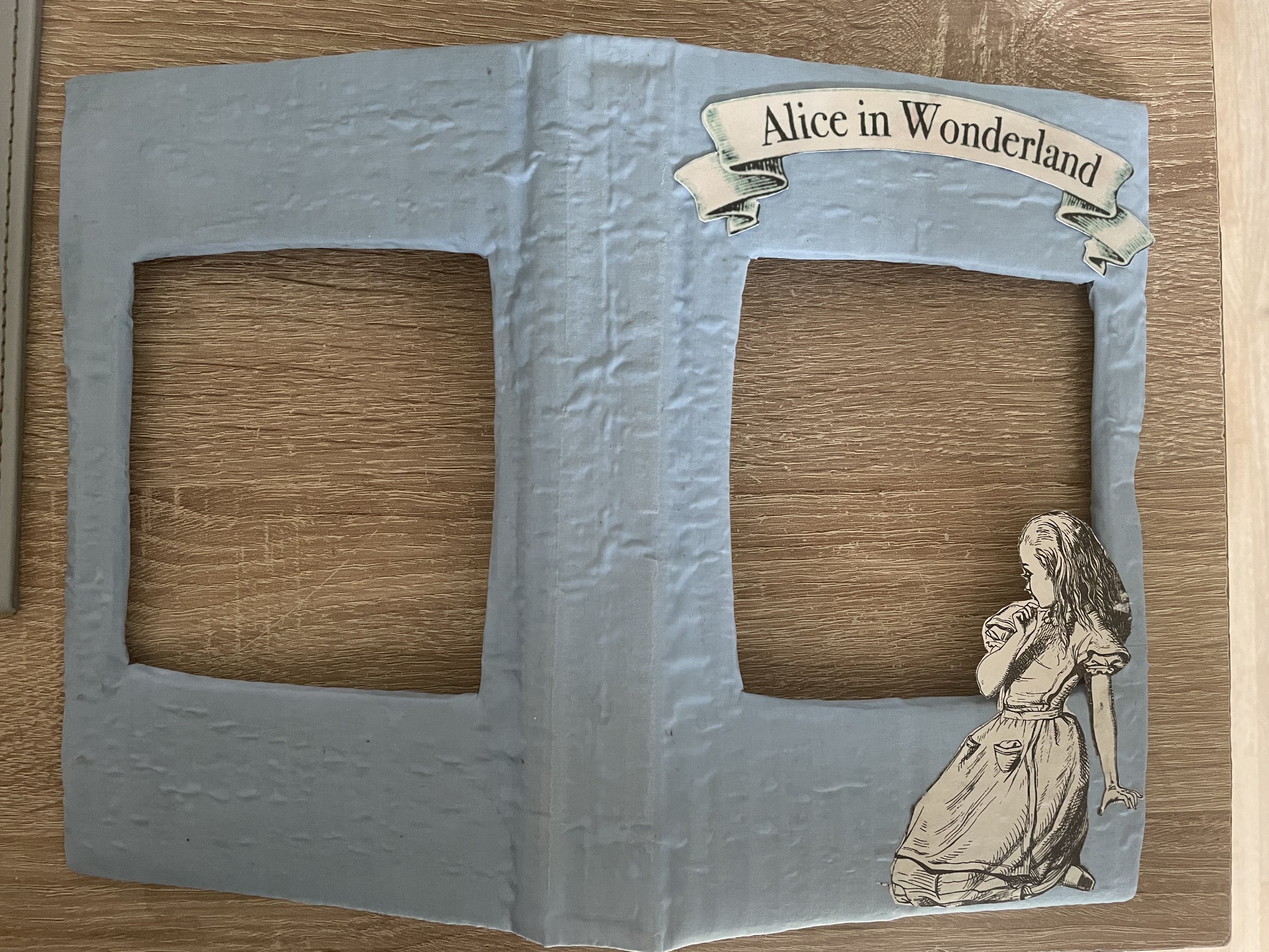
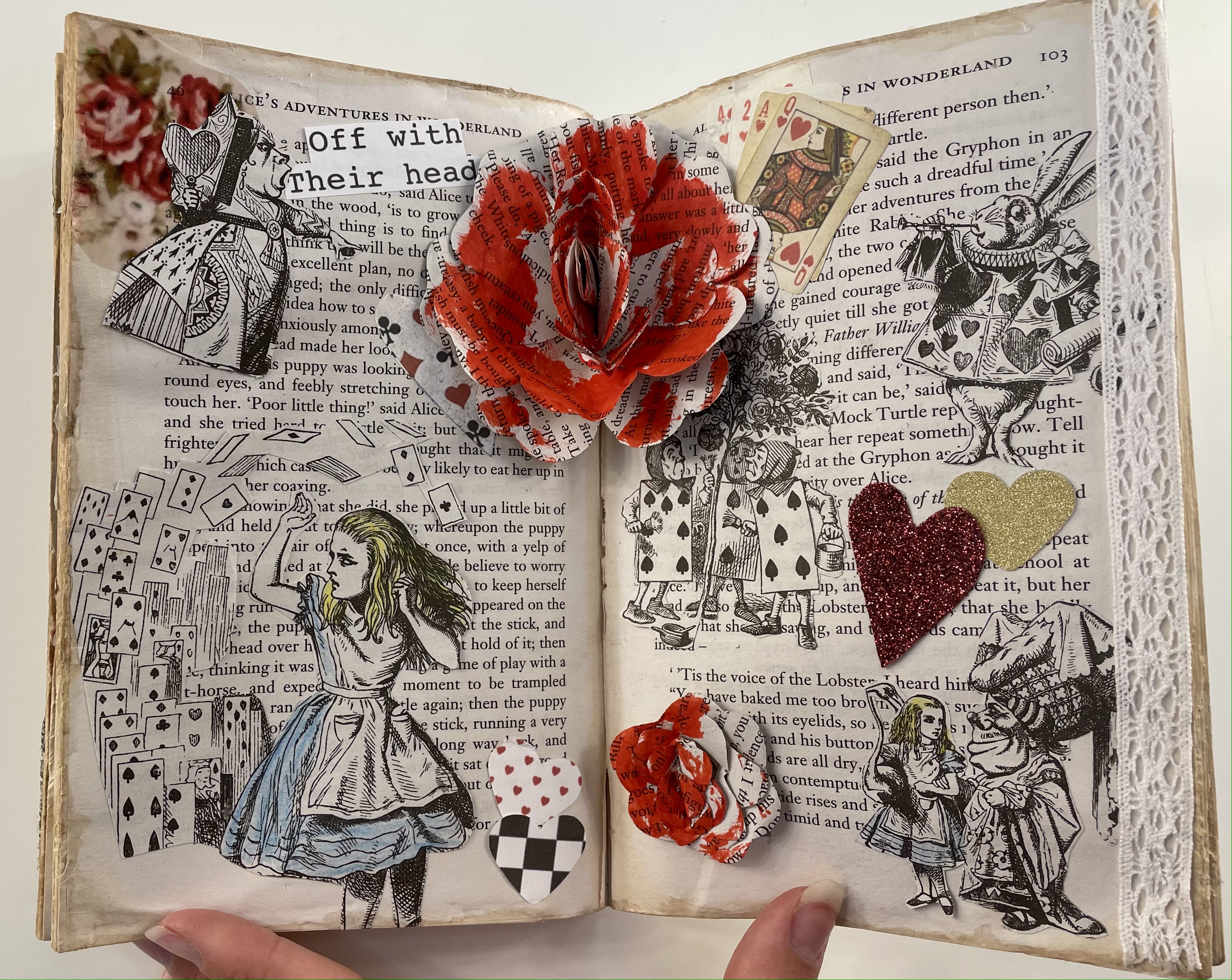
Book choice – To start with I needed to choose a book to alter, I want to choose a book which will give me the most room for experimentation. I gathered a number of books from local charity shops which I felt had potential with altering in a creative way. After much consideration I felt most drawn to was Alice in Wonderland. With this particular story there are many twists and turns along with many characters, another thing which drew me to the book was the interesting vintage looking illustrations within! I could incorporate these within my design by cutting them out and replacing them? Lots of room for experimentation which is what I wanted! I cant wait to get started.
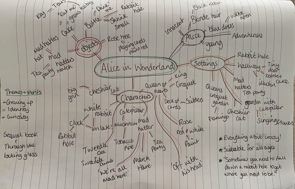
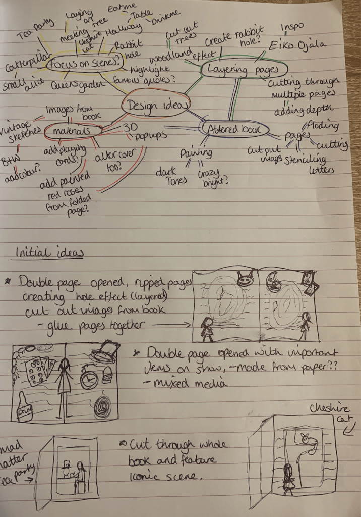
I went straight in with creating a mind map for Alice and Wonderland to explore and remind myself of the story, there are many different parts to this story each different from the last, which gives me the perfect opportunity to experiment with combining these.
After creating my mind map on Alice in Wonderland I started thinking of design ideas. I liked the idea of using the illustrations within the book, I’m unsure wether to keep everything black and white or to add my own additional colour. It would also be interesting to experiment with mixed media and add embellishments, material, textured paper etc. I like the idea of cutting the centre of the pages out giving it a layering effect (inspired by Eiko Ojala) I have some old books which I may experiment with in creating different shapes. My goal is to create a unique design which is personal to me but expressed the content of the book, I feel lucky having found the book Alice and Wonderland in the charity shop as there are many different attributes I can focus on.
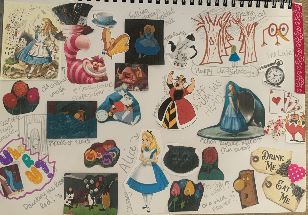
Because the story has so many avenues I felt it would be more beneficial to create myself an Alice in Wonderland mood board so I can visually be reminded of what happens in the story and become inspired and for this to reflect within my altered book. With the help of watching both the Disney and live action remake I was able to remember small things which I’d forgotten which all helps to add up to the bigger picture!
Visualising Ideas
I started off in my sketchbook by generating an idea for the front cover, Im unsure of how many pages the brief would like us to alter but as this is more of a personal adaptation I would also like to rework the cover to form my own altered book rather than just an altered page.
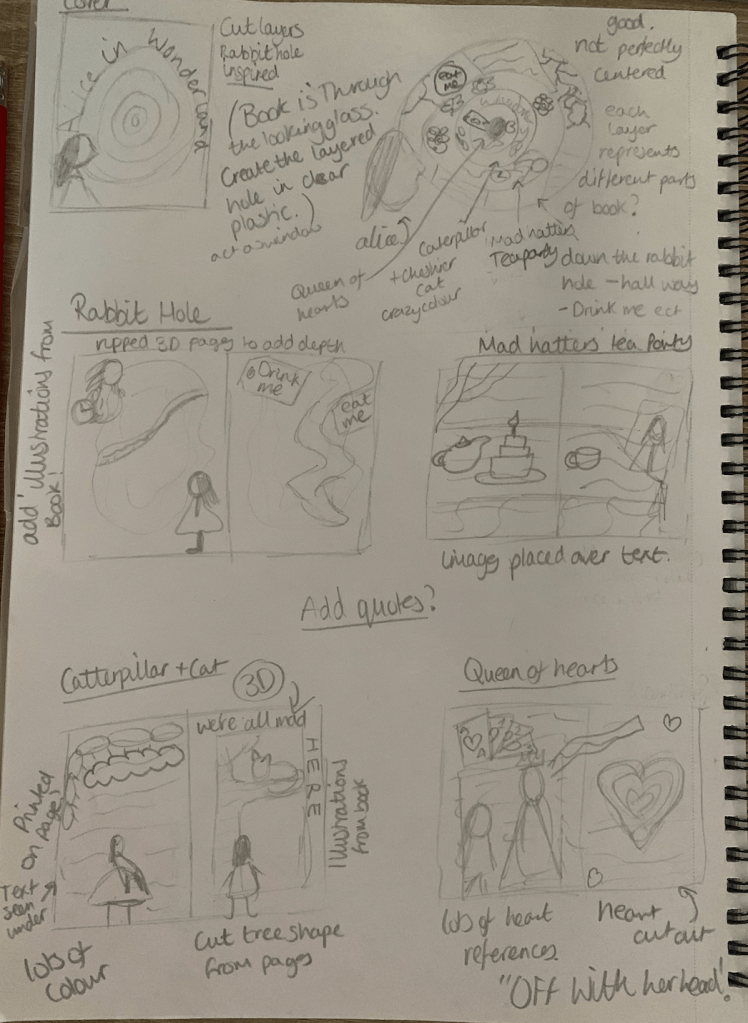
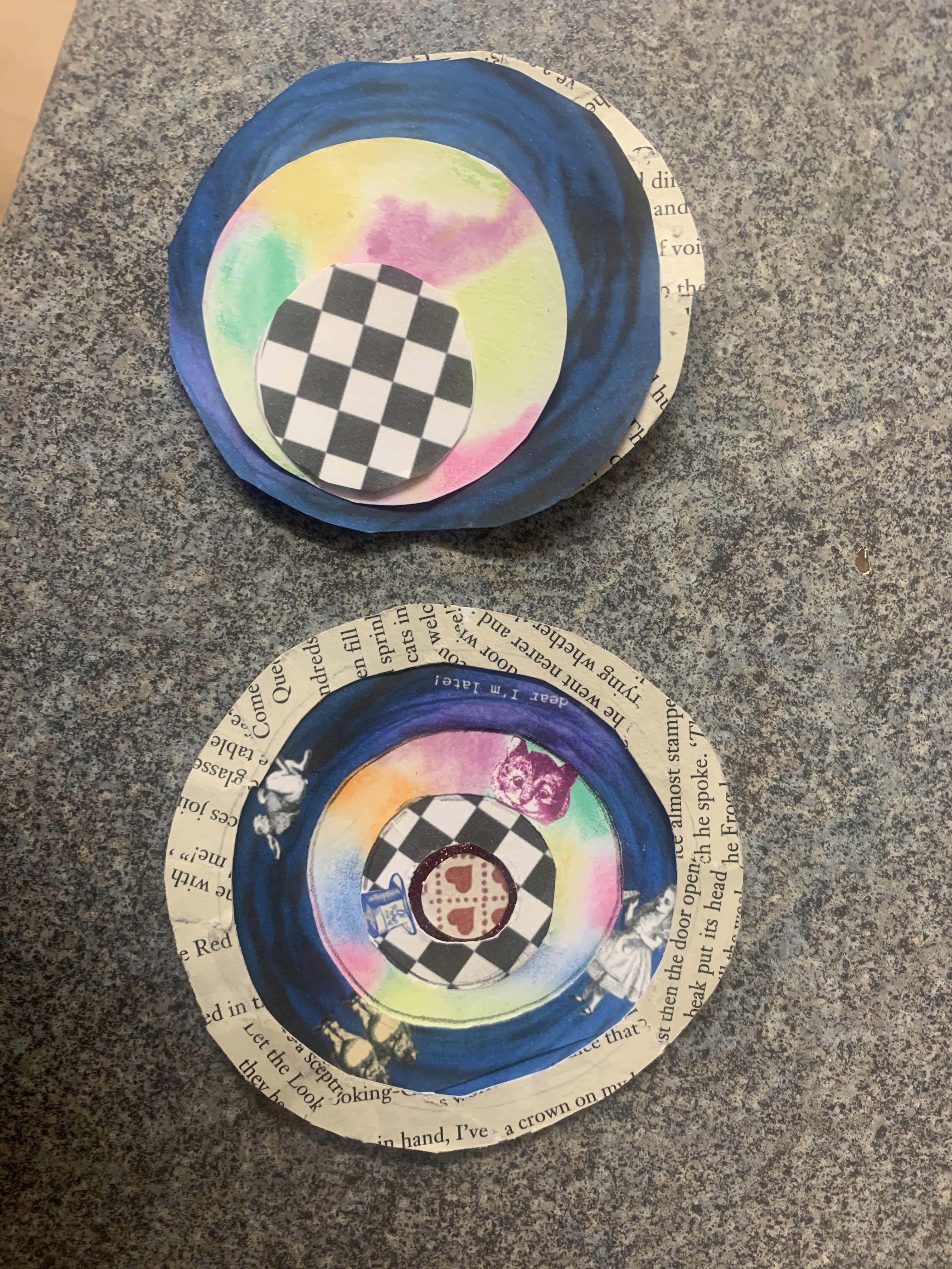
I started off with the idea of creating a layered rabbit hole, with each layer representing a different part of the story, in this instance I have created 4 layered scenes. Another idea which popped into my head was reflecting in the title of the book which is ‘through the looking glass’ for this I would like to experiment with placing the layered design in between two sheets of clear plastic creating a window for the cover.
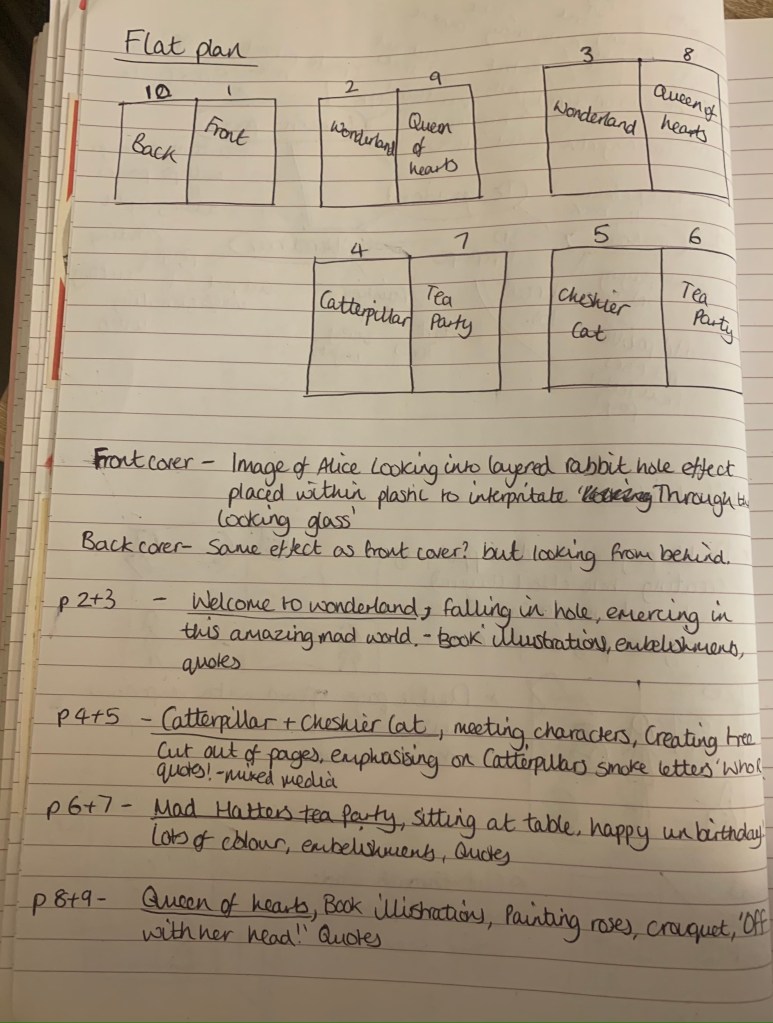
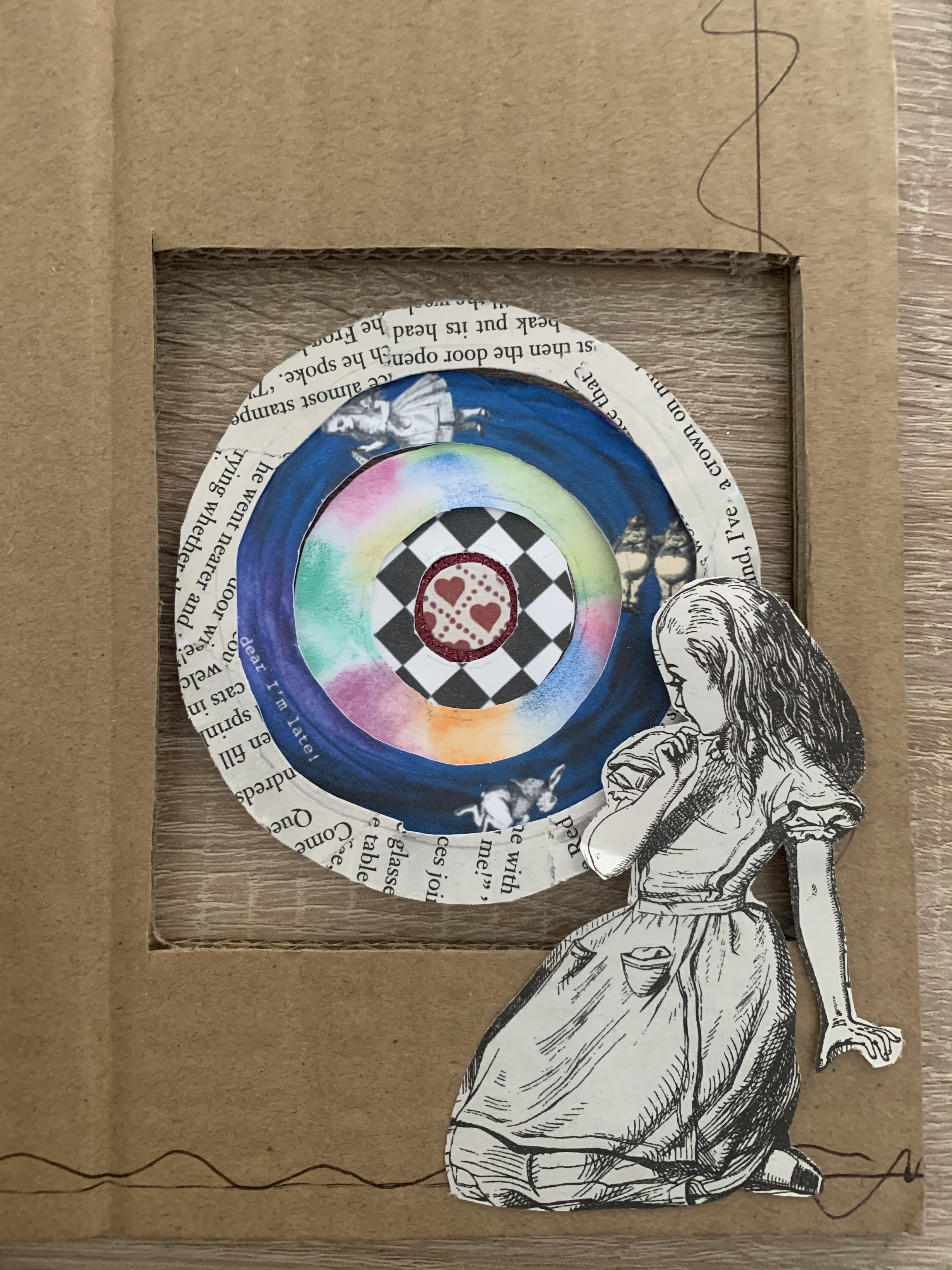
Carrying on from my cover idea I would like to create 4 separate pages focusing on the same topics featured on the cover, the scenes from the story I have chosen are; falling down the rabbit hole, mad hatters tea party, greetings from the caterpillar and Cheshire cat and the encounter with the Queen of hearts.
I went on to planning my flat plan, making notes along the way of design ideas, as I’m working with multiple pages I felt it would be beneficial to note my ideas to ensure nothing slips my mind and to refer back to. I’d like to experiment with using a wide variety or mixed media’s and testing different techniques to Create the best connection between the designs and the content of the book.
I’m looking forward to seeing my designs come to life with this assignment as I feel highly inspired for it!
Design Process
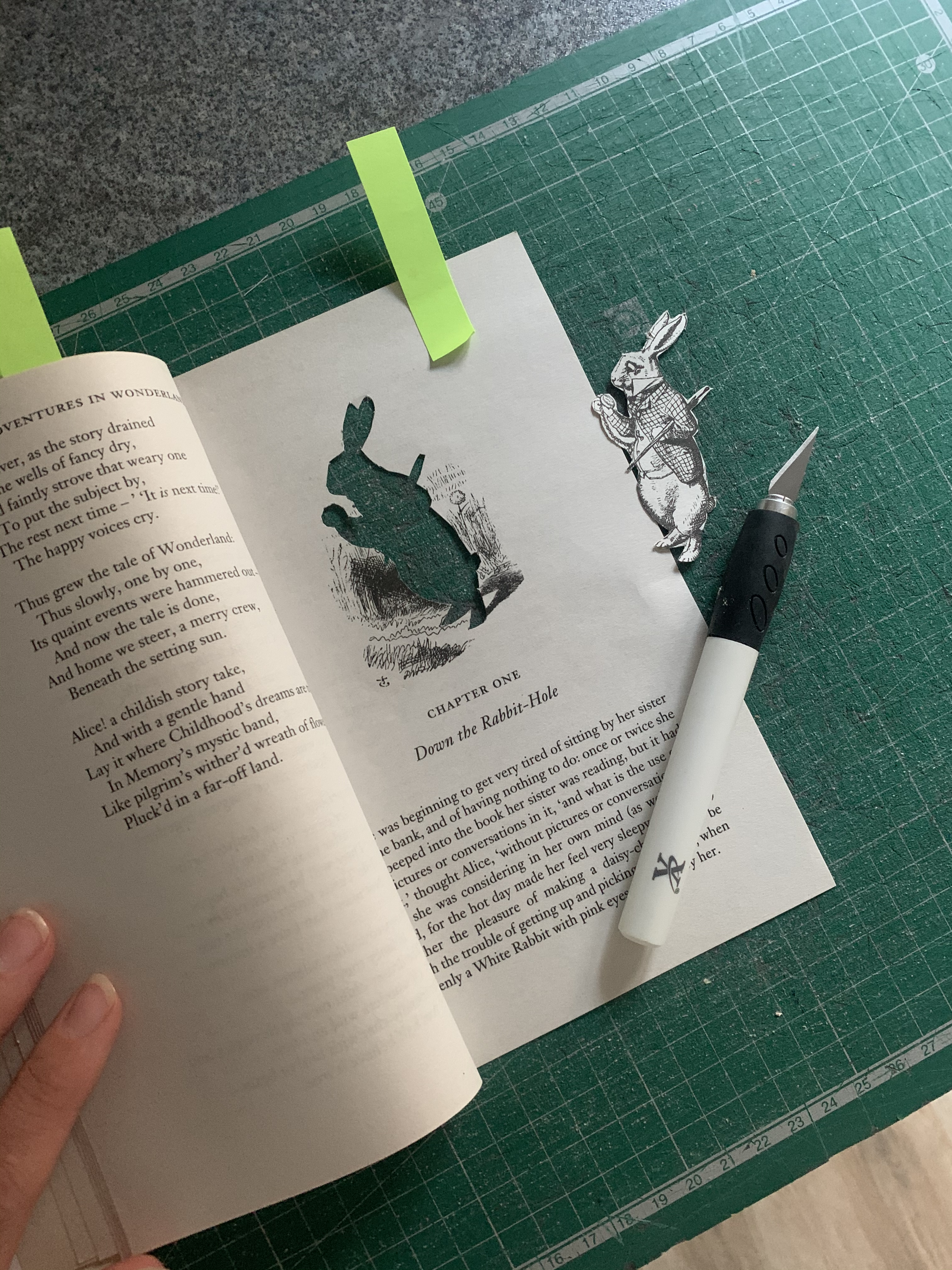
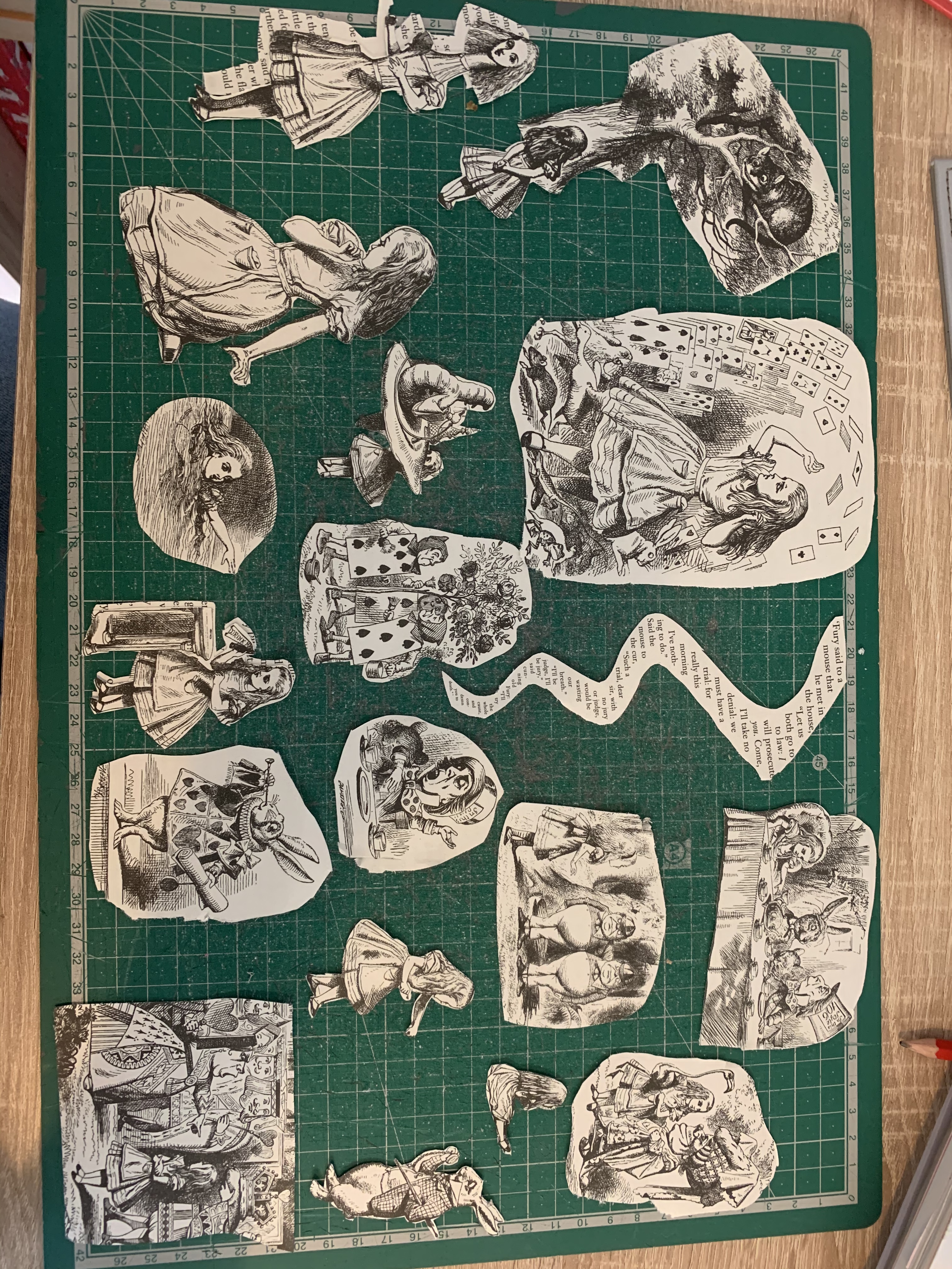
I really liked the original illustrations used within the book so I started off by cutting out each appropriate image as a starting point for my designs. I placed these to one side and also gathered a few items from my craft box and old card making supplies.
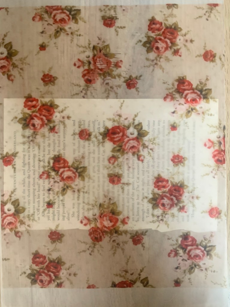
I then separated the book into 5 sections in preparation to alter. Once separated I decided I wanted to give my book more of a vintage feel, especially considering the story originated from 1865. I tea stained the edges and around the edges of the pages which would be on show, whilst damp I roughed up the edges of the book using a knife, I’m really happy with how this turned out, I’m now satisfied to make a start on my first double page spread.
For the first time I tried printing out a design on tracing paper as I wanted to add different textures and liked the idea of the text still being visible underneath, this was actually a success and worked really well! Something I will remember for future reference.
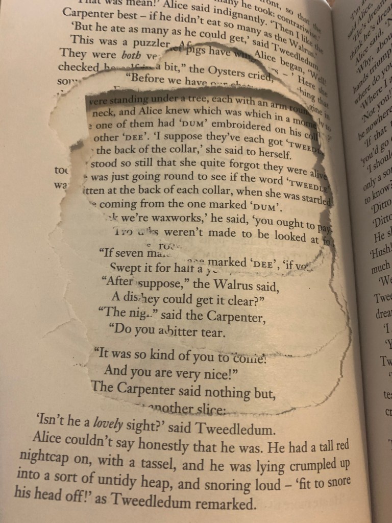
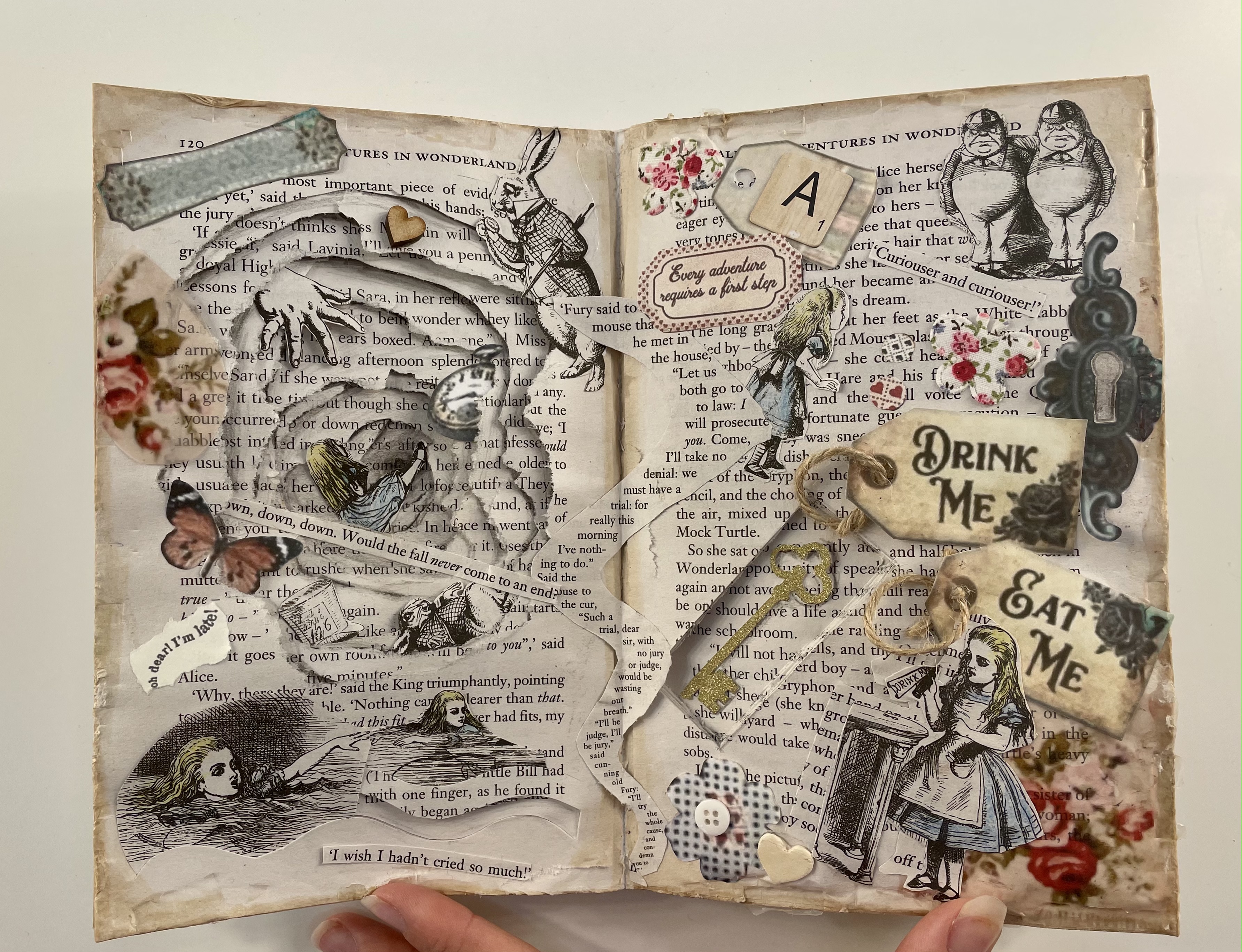
Rabbit hole – For the first double page of my book I decided to concentrate on the beginning of the book with the main focus on Alice falling down the rabbit hole and entering Wonderland. My first idea was to tear pages one by one creating a hole effect, I was really pleased with how this turned out, to add to the effect I added some shading to add depth. (See picture on the right for the starting process of ripped pages) I had quite a few vintage feel embellishments laying around which I added to this page.
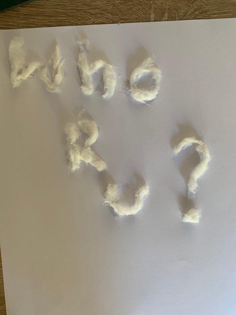
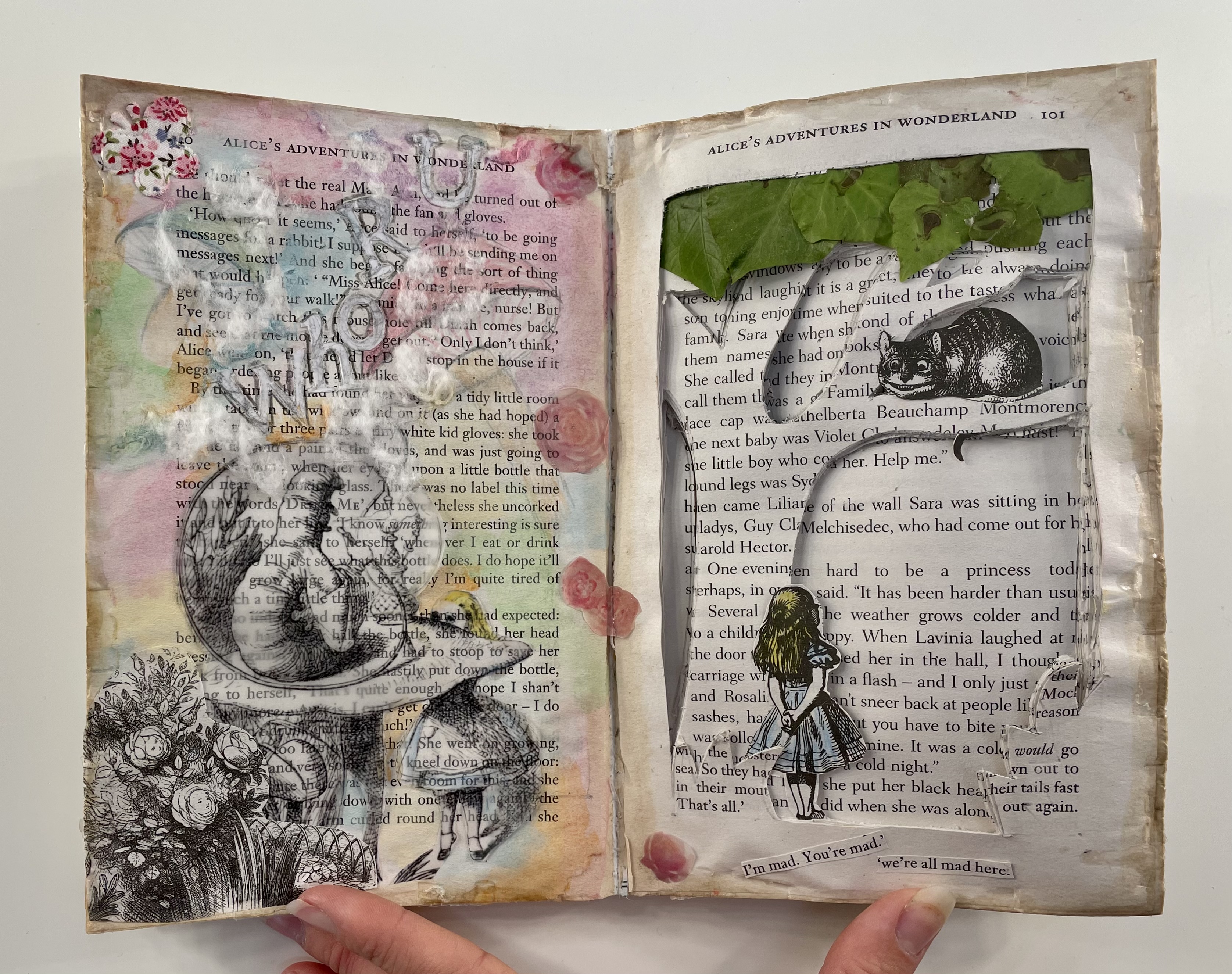
Caterpillar page – I had a rough idea for what I wanted this page to consist of however I wanted to be experimental with materials and with the overall look. The caterpillar is known for smoking a hookah so I wanted to emphasise on this along with one of his well known lines of blowing letters into Alice’s face asking ‘who are you?’. My first experiment didn’t quite go to plan, I originally wanted to spell the words out using ova glue and cotton wool to represent smoke however the letters were only achievable at too large of a scale compared to the room I had To play with. Instead I opted to sketch out a serif font and simply added cotton wool webs around the letters to give the illusion of smoke. I added Multicolour watercolour paint to the background to add to the psychedelic vibe which the caterpillar gives and also enlarging the illustration and printing this on tracing paper.
Cheshire Cat – I wanted to experiment with a 3D design for this page for the scene of when Alice meets the Cheshire Cat perched upon the tree. Firstly I attempted to screw up pages of the book to form a tree however this would make it awkward for the book to be closed. Looking at the amount of pages I have in between each section I thought it would be creative to cut the tree from the pages, this was a huge success and makes a really effective page, I carefully removed the cat from the tree illustration in the book and placed this on the branch along with the sketch of Alice standing at the bottom. I felt the page looked effective but plain so to add interesting elements I’ve added real leafs coated in pva as the leafs of the tree.
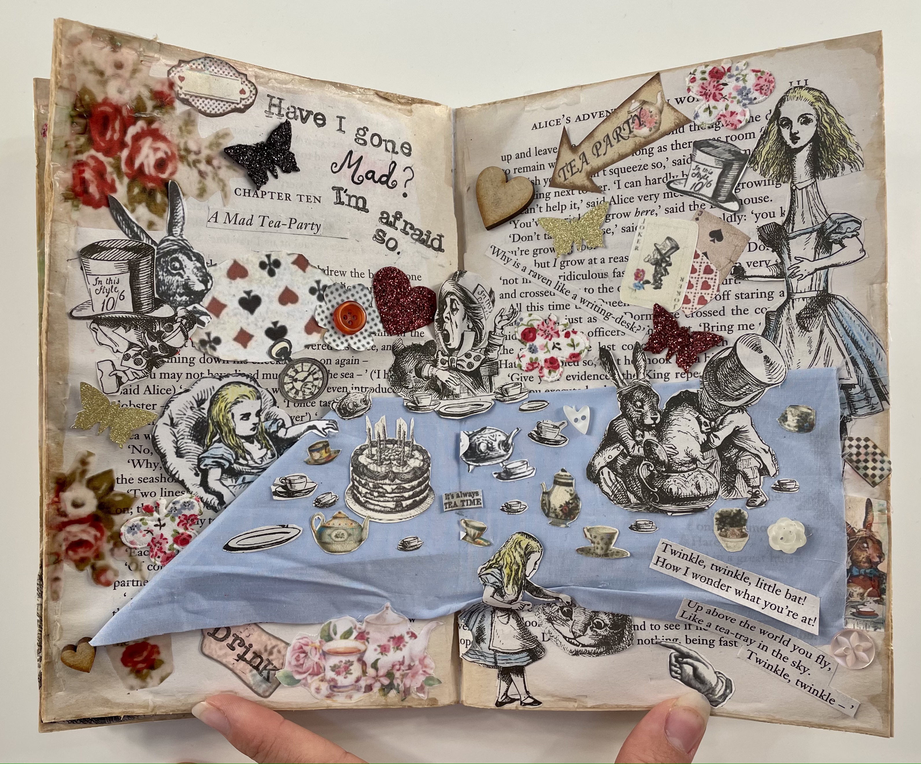
Mad hatters tea party – I wanted this page to be crazy and busy as that’s what the scene is all about. I decided to have this double page spread featuring the tea party table, I decided to use a piece of blue material to use as the table cloth which creates a focal point on the page, I carefully cut out tea cups and pots to scatter across the table along with adding the mad hatter and the March hare. Similar to the rabbit hole page I have added vintage looking embellishments and cut out Appropriate quotes from the book.
Queen of hearts – One part of Alice meeting the queen which is memorable for me is ‘Painting the roses red’ I decided to experiment with adding a pop up rose for this page, I assembled this from pages of the book folded the rose in half and lined this up with the fold in the book creating a pop up when opened. I roughly painted this red to show it had been painted like soldiers in the film, I decided to add my practice rose onto the page too as I was happy how the smaller one came out. This page is mainly book illustration based, I wanted to keep this page less busy than the previous.
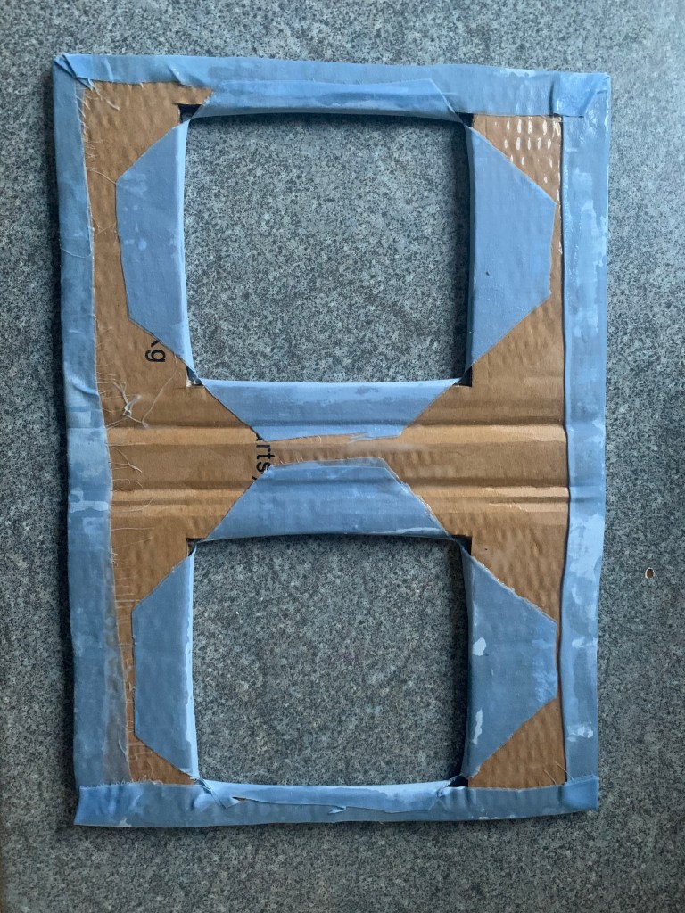
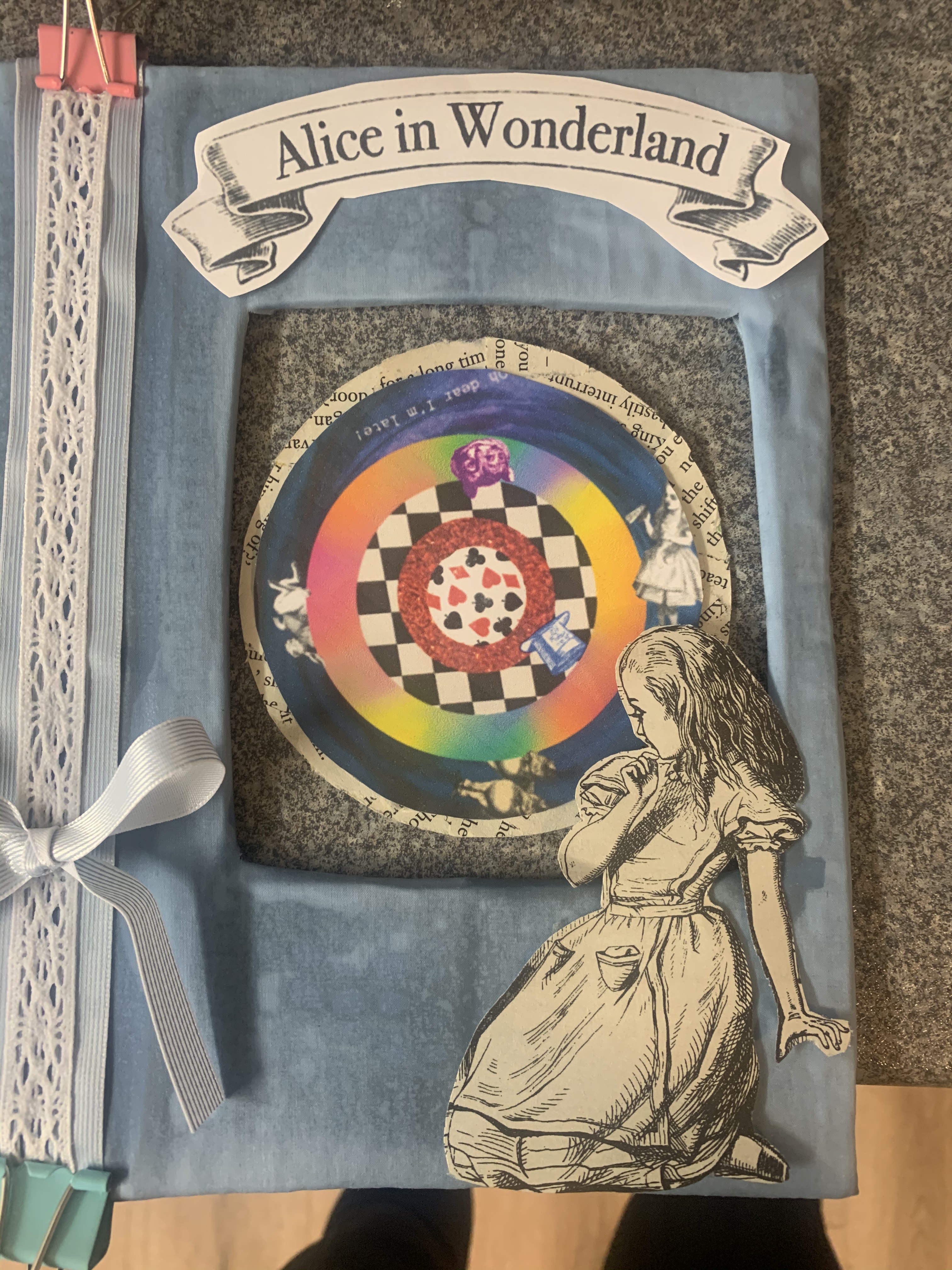
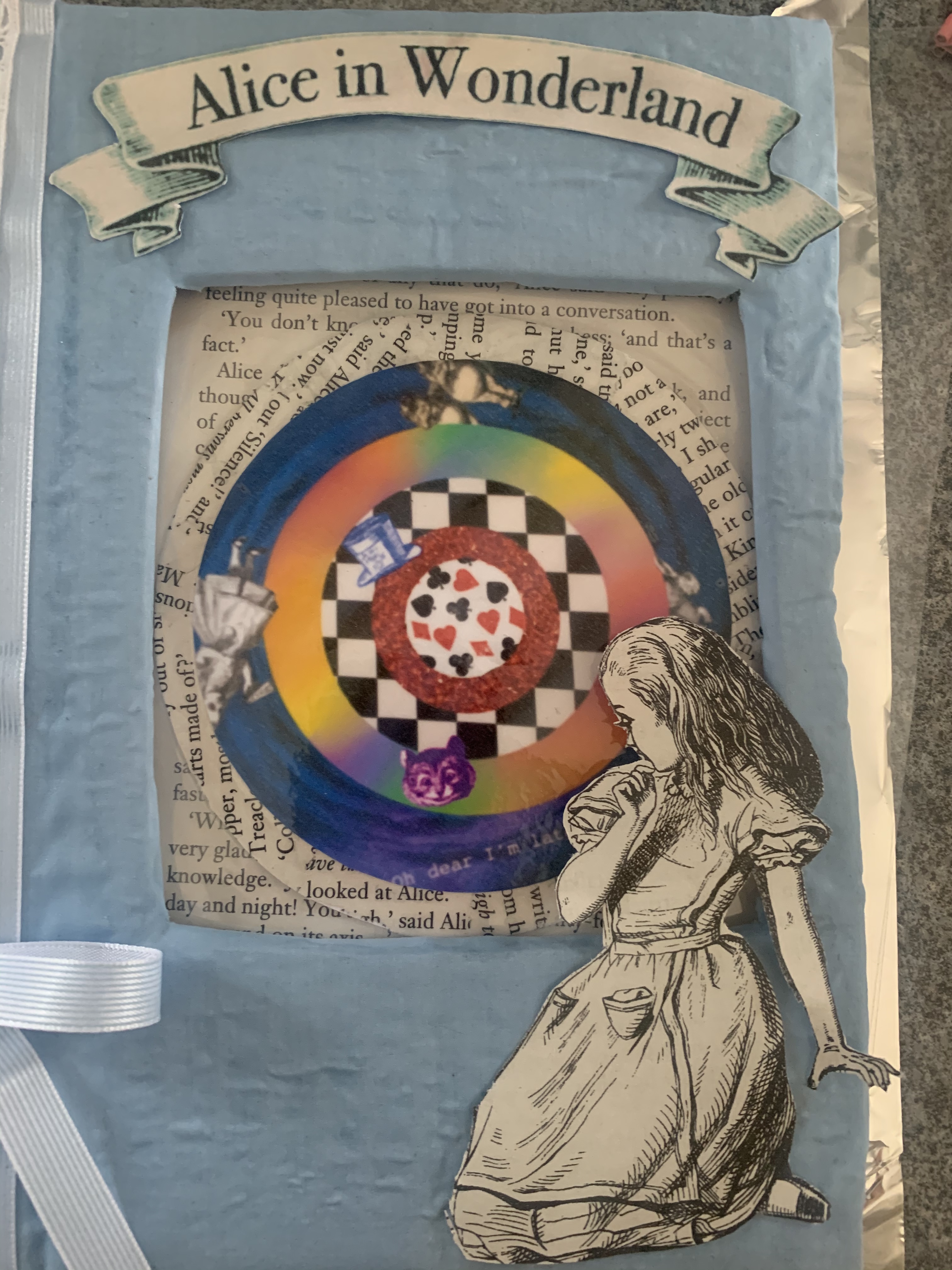
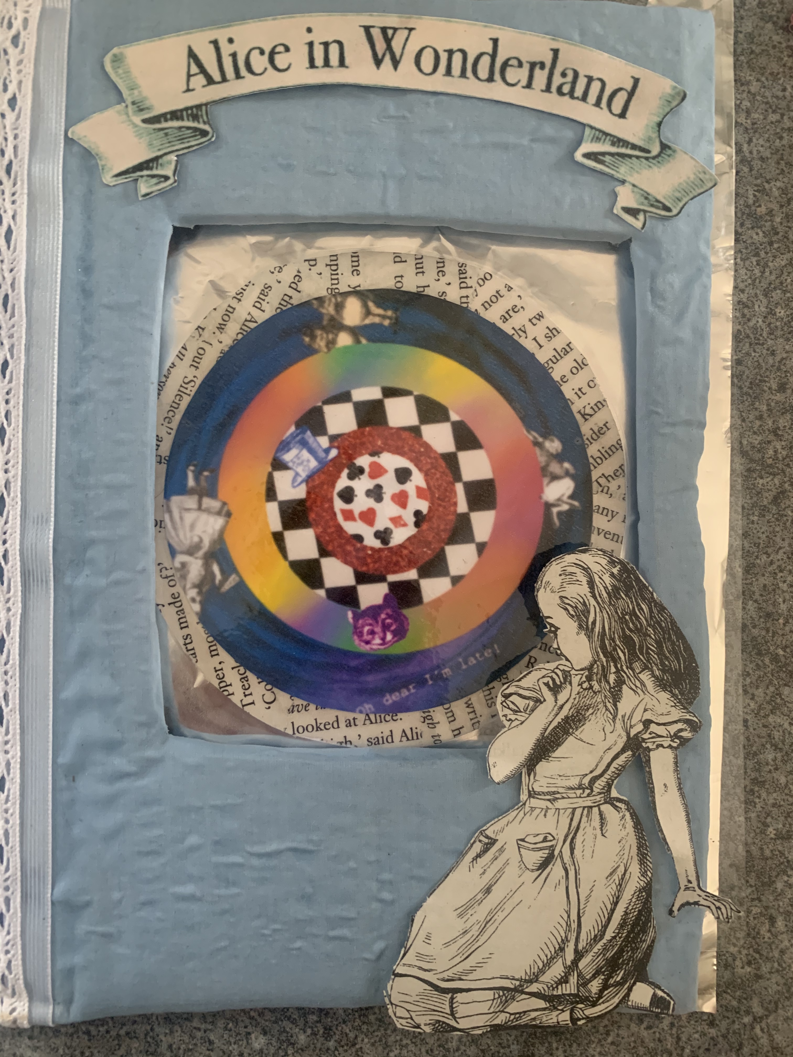
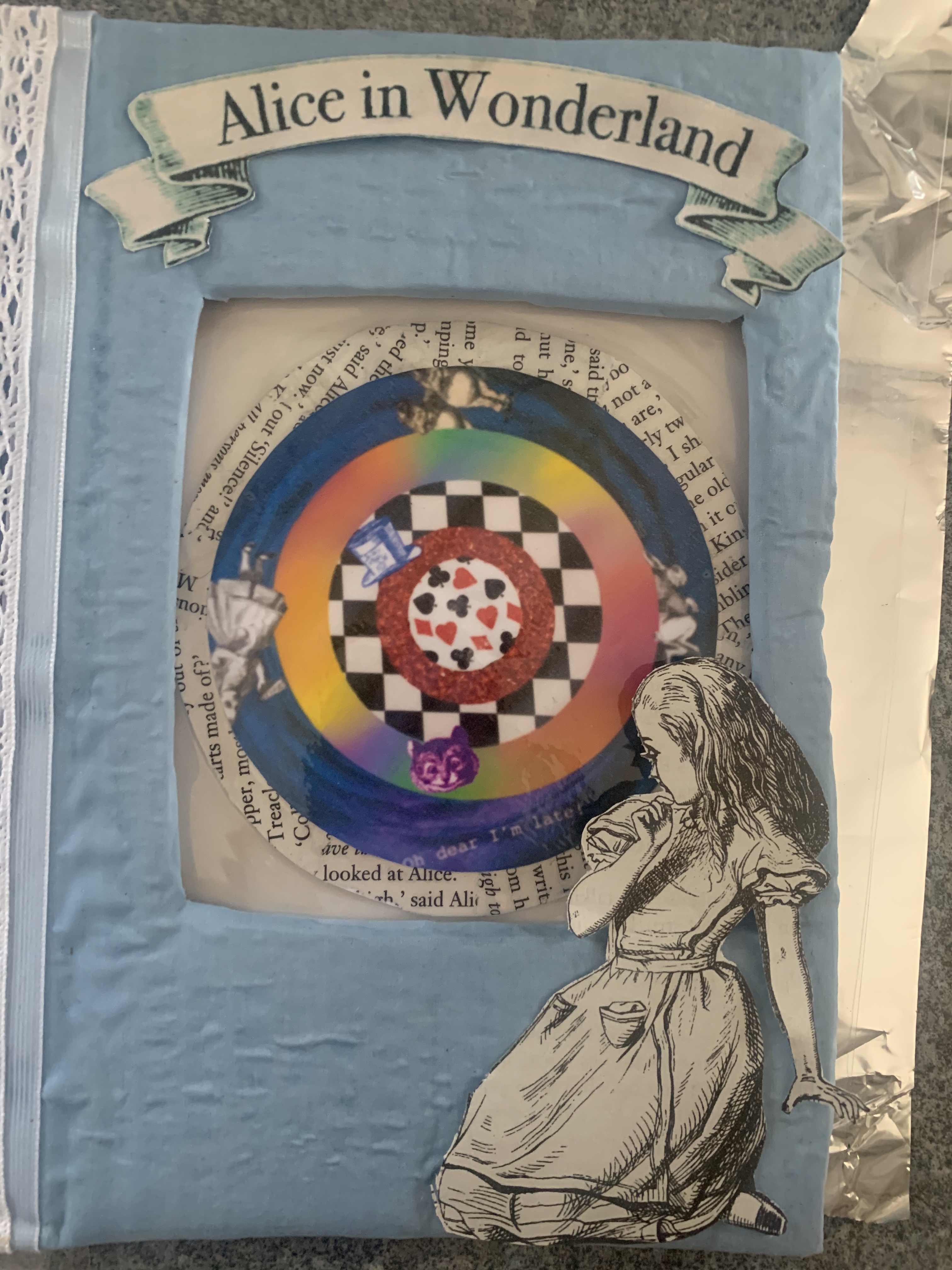
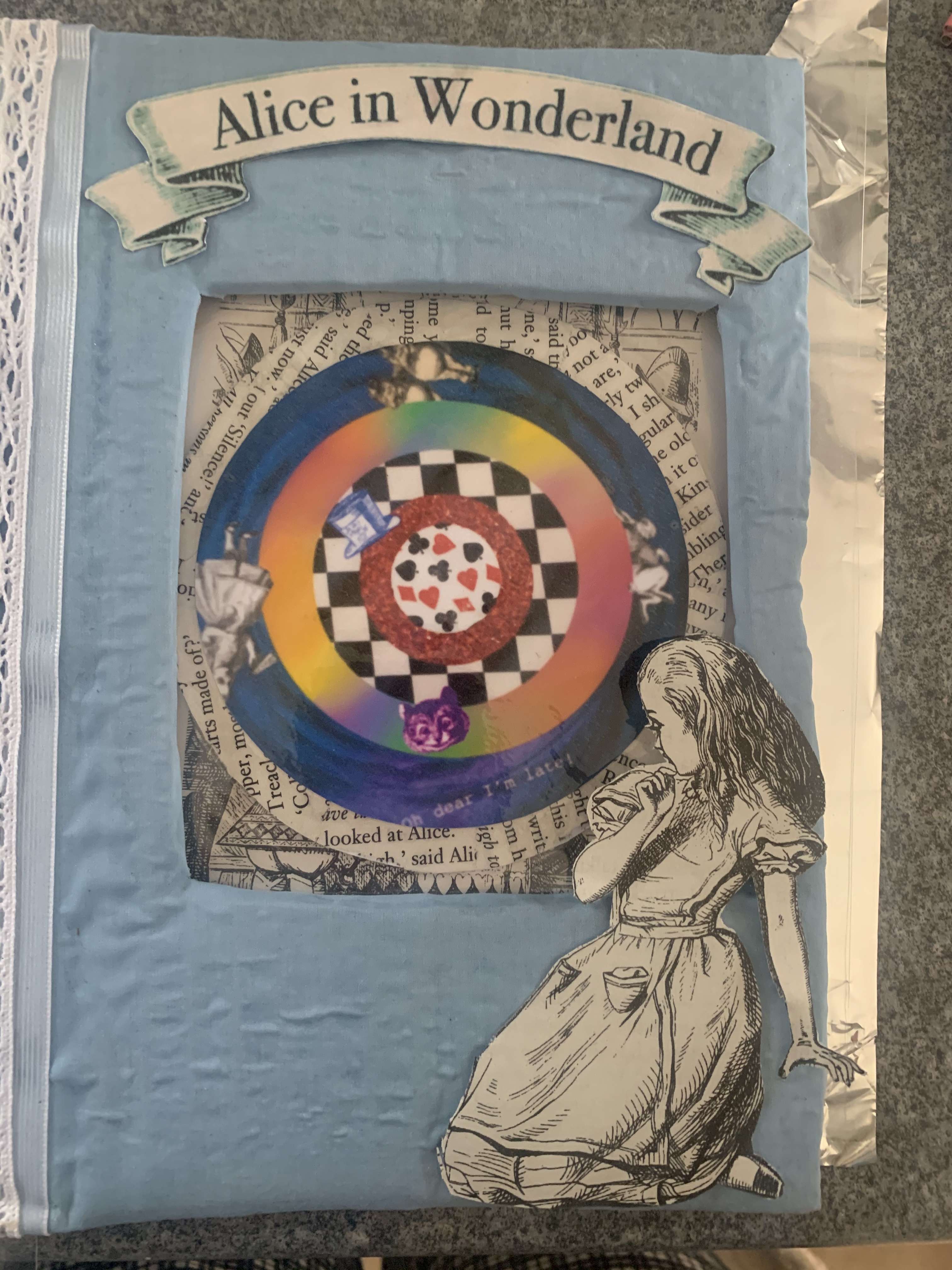
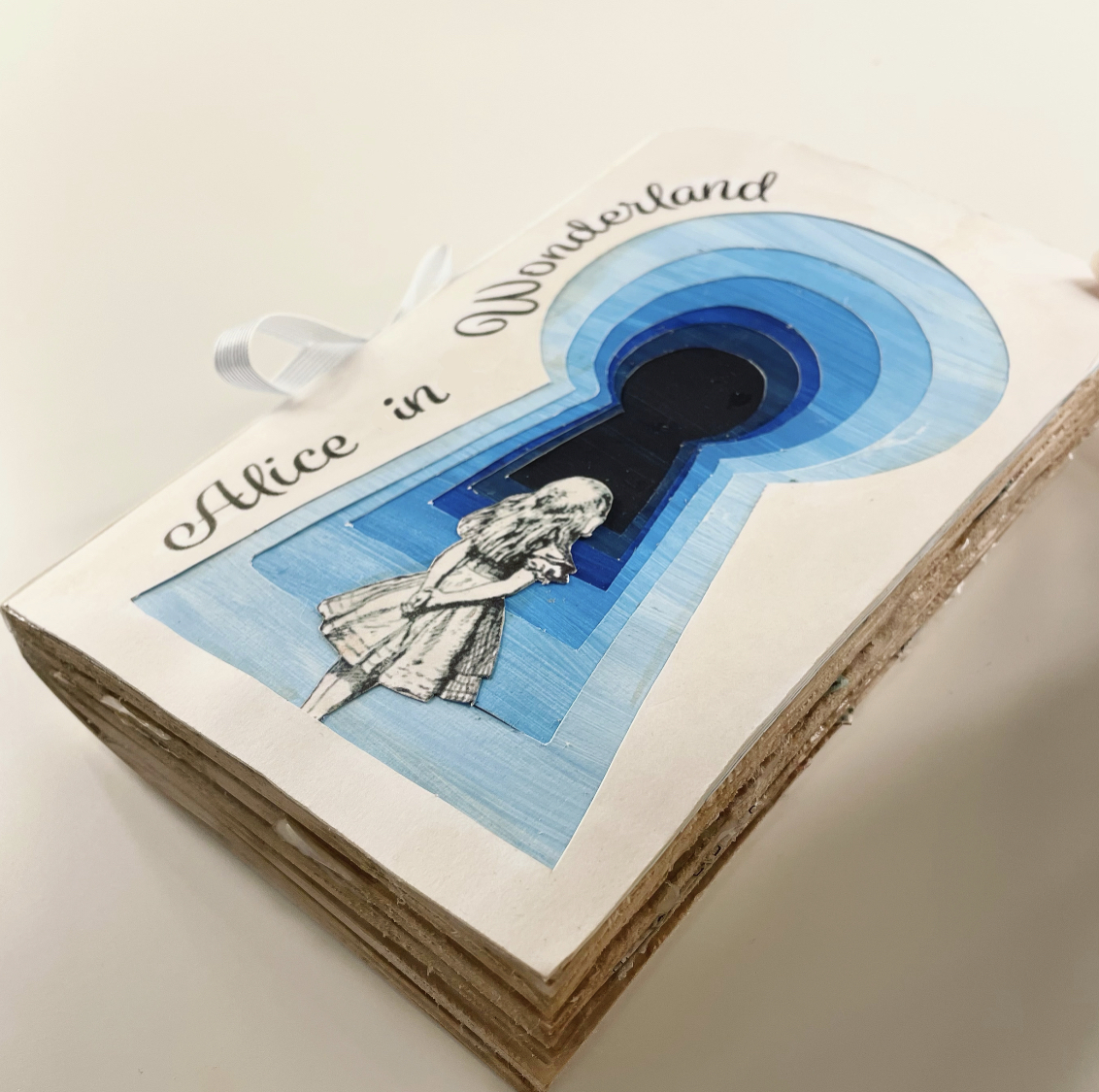
Cover – For the cover I wanted to transfer this book into a hardback and to cut a window through the middle to help tie in the second part of the book ‘through the looking glass’. I decided to cover the book in blue cotton material (no access to linen unfortunately) I measured the book and cut the cover out of cardboard, I then measured the correct size for the windows and cut these out. I ended up being very experimental with the cover as something just didn’t sit right with me. I wasn’t happy with the way the material had dried with the glue as it contained many air bubbles! After all of this I decided to scrap this idea as I felt it ended up looking very cheap and unprofessional – but this is all part of the learning process! So on with the next!…
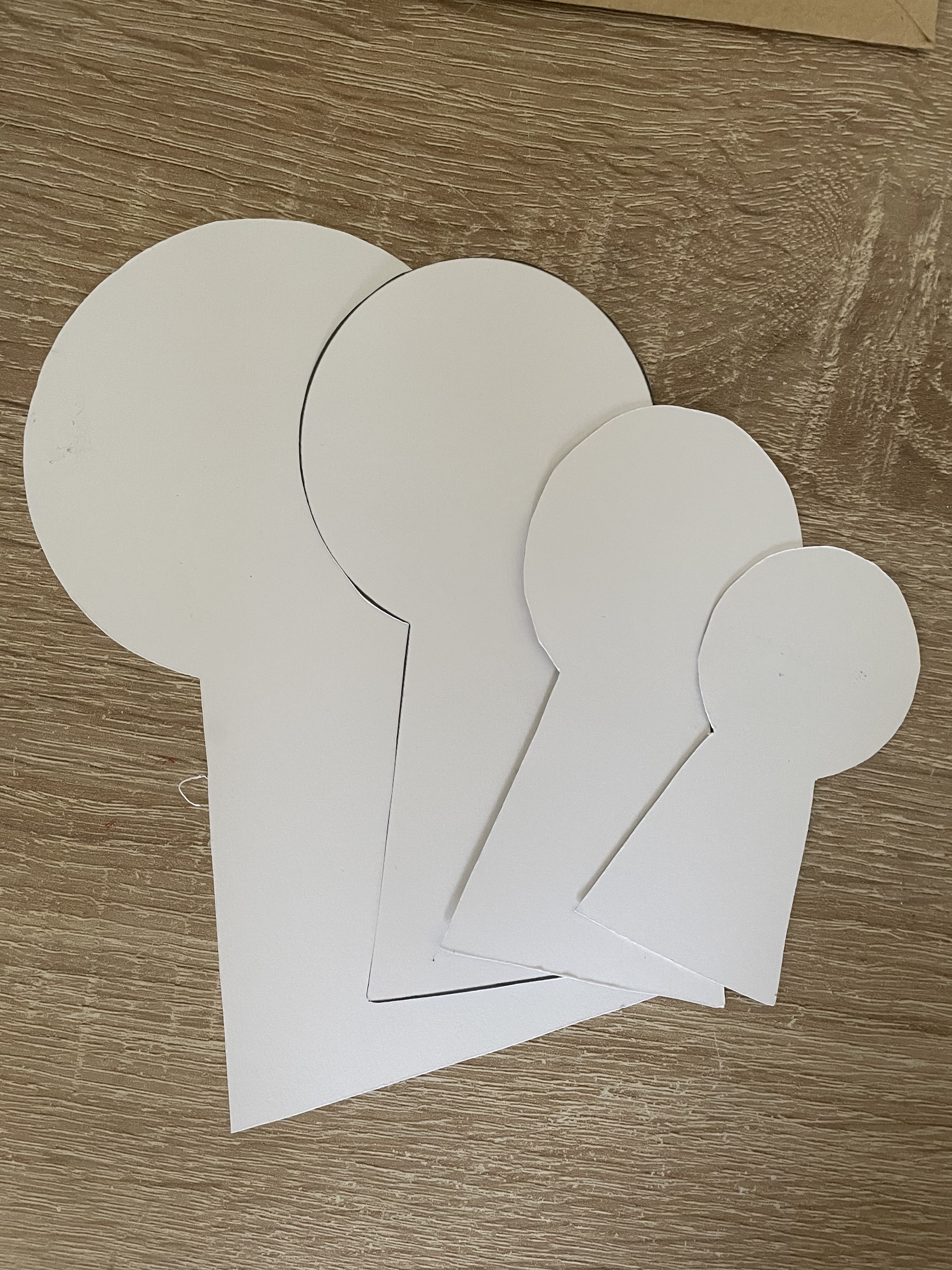
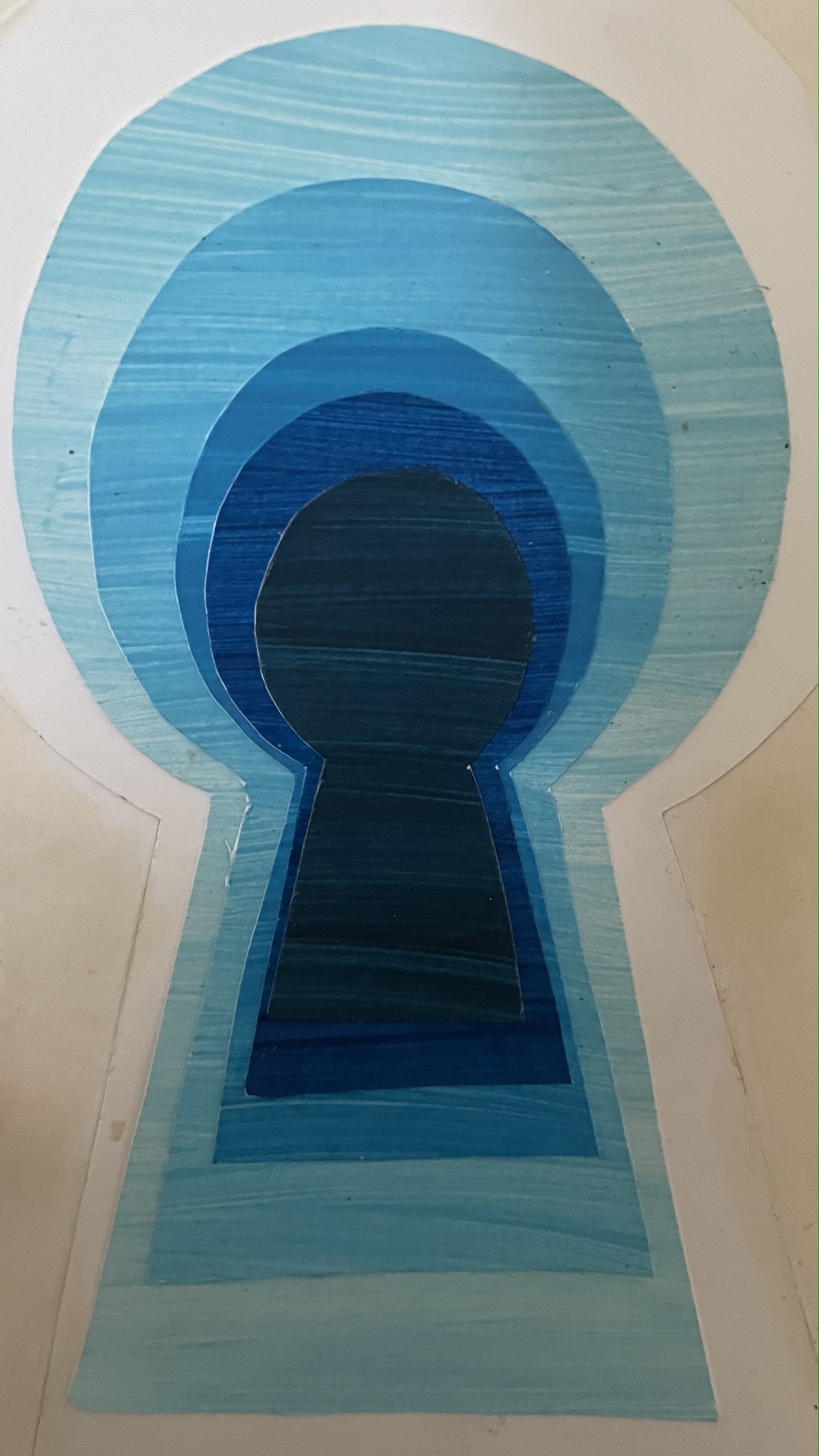
My next thought was to create a layered keyhole for the cover so I started off by painting pieces of paper different shades of blue, gradually getting darker to emphasise with a 3D tunnel effect. I simply cut out different sized keyholes and used these as a guide whilst cutting out the painted paper. I decided to add an image of Alice from the book scanned it into the computer and enlarged it slightly, I plan on having Alice standing in front of the keyholes.
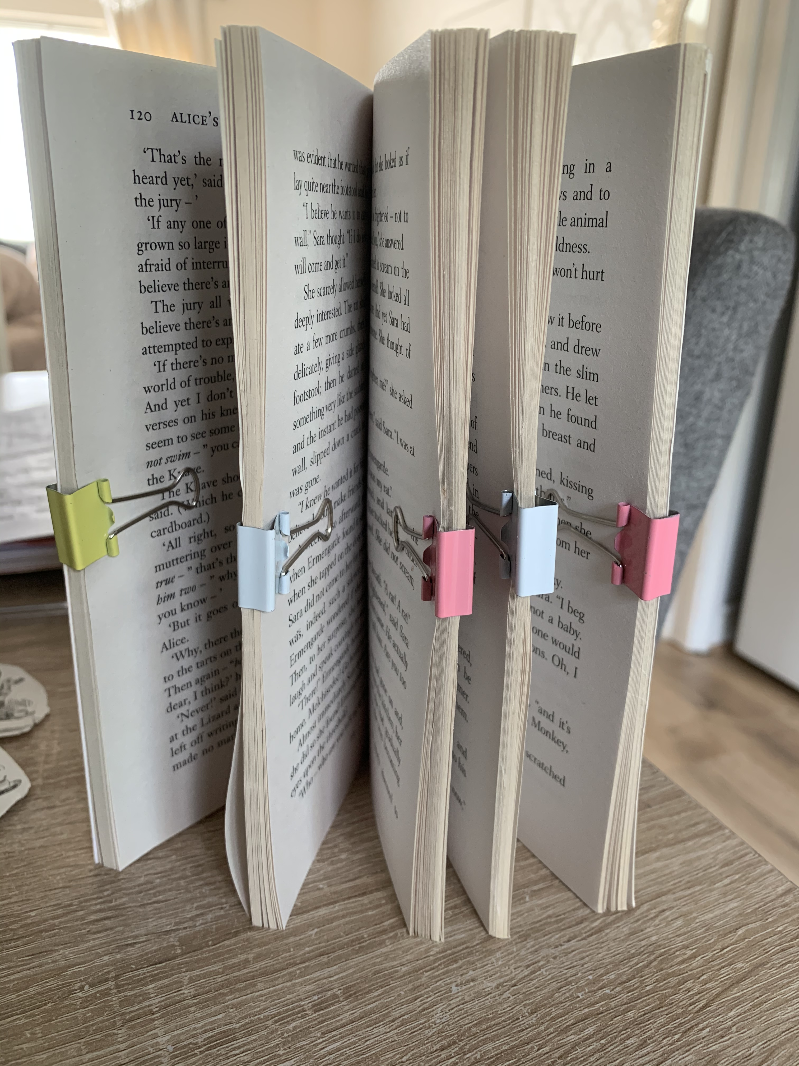
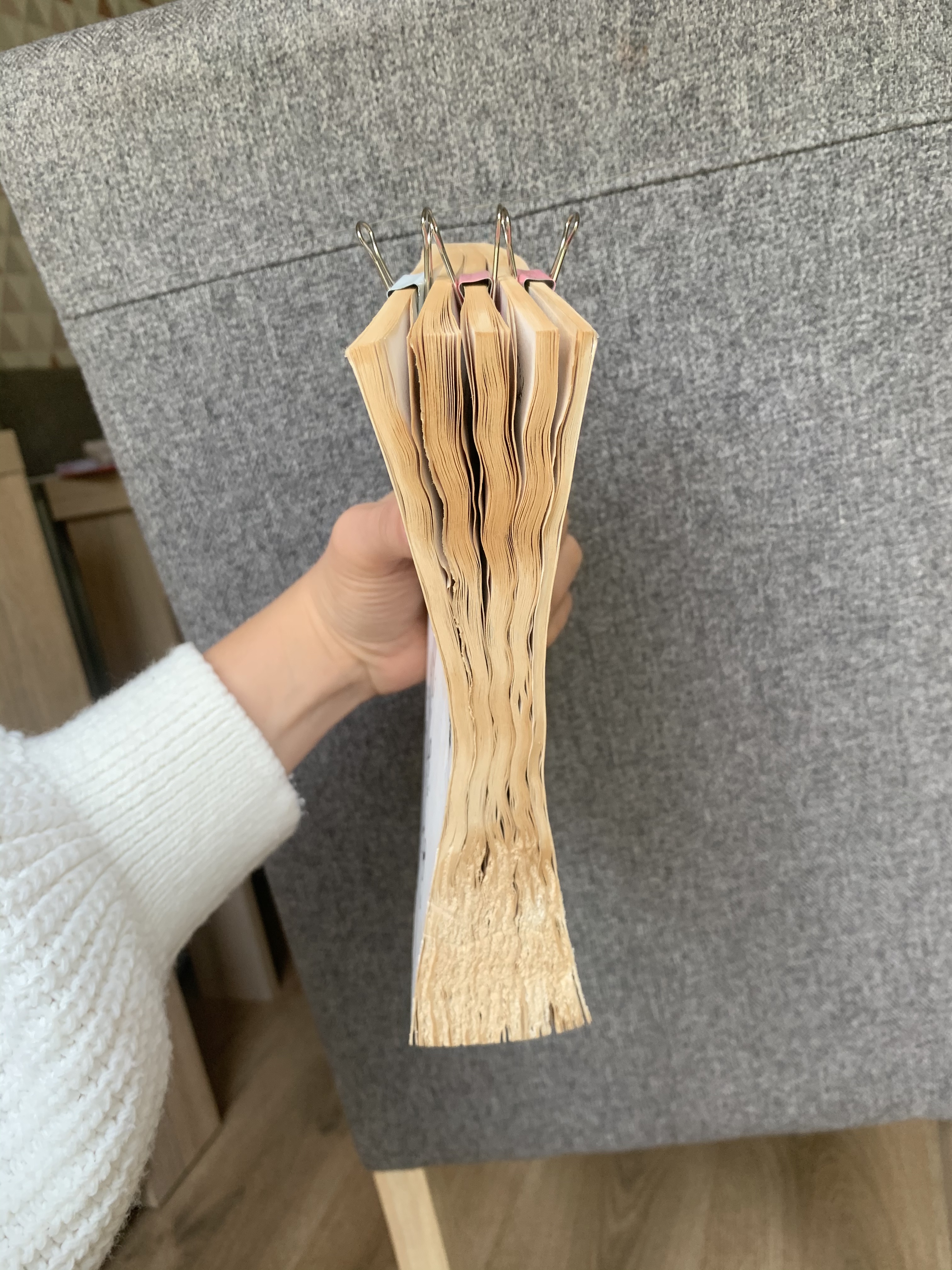
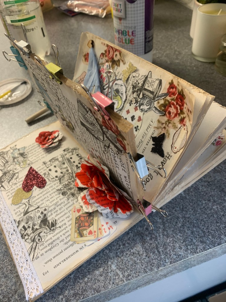
To finish my book I decided to glue the edges of the book in the style of the perfect binding technique so that it became easier to navigate through the book. I worked with one section at a time to ensure I had enough clips to hold the pages in place whilst drying. I did experiment with stitching some of the pages of another book however this would of interfered with the designs on the Pages so I felt that gluing would be the best, the only downfall to this is that the pages are now slightly stiff.
Results Of Finished Altered Book
Reflection
Seeing my altered book come to life has been very rewarding, Ive loved this assignment! I like to be hands on and to experiment with different materials and to become creative. Ive had a few changed along the way with things which didn’t quite go to plan, I also have a minor regret with my cover – I felt the bright white cover didn’t fit in with the rest of my vintage inspired book so I tea stained the cover however I wish I had done this before printing on as the title has slightly smudged and where I placed the book down on the worktop to glue It has marked very slightly on the back, however this is all part of the learning process and may be something I amend at a later date when I have slightly more time.
I hope my tutor enjoys viewing my altered book as much as I enjoyed making it!
As a student on this course you have access to Bridgeman and Oxford Art Online image libraries, which are a wonderful resource. If you haven’t already done so, spend some time finding your way around the Bridgeman Art Library and Oxford Art Online. You can access these through your OCA/UCA library access via the OCA student website.
I jumped straight to the Oxford Art Online website but unfortunately couldn’t access anything, after looking back on the OCA website it stated that the university is in the process of renewing the account for this so is temporarily unavailable.
Bridgeman Art Library was a success, this provides a wide and useful amount of artwork which will come in perfectly for research and inspiring choices. The site seems easy to navigate with everything set in clearly labelled tabs so you are able to come across artists which possibly you had never heard of!
In Exercise 3, you have to choose a typeface for the text, but how do you choose a typeface? In Notes on Book Design, Derek Birdsall describes clearly how you can choose a typeface that is appropriate for your text. Read the section ‘on choosing a typeface’ in the book, Notes on Book Design, and use this as an approach in Exercise 3.
It was useful to read the section from Derek Birdsall’s ‘Notes on Book Design’, I found it very informative and helpful. It was interesting to see Birdsall’s type specimens which he frequently used in his books, it also shows clear examples of how typefaces differentiate between each other considering they are all set at 18pt in size yet to the eye they are all different in size.
I am extremely happy with the feedback from my tutor for the work in part 2. Given the current circumstances effecting everybody at the moment I found it hard to concentrate during part 2 and worried that this reflected in my work however I still managed to stay on track and produce a good quality of work’ in fact this has probably been the best feedback I have received since joining OCA – it has given me the boost I needed to get stuck into starting part 3.
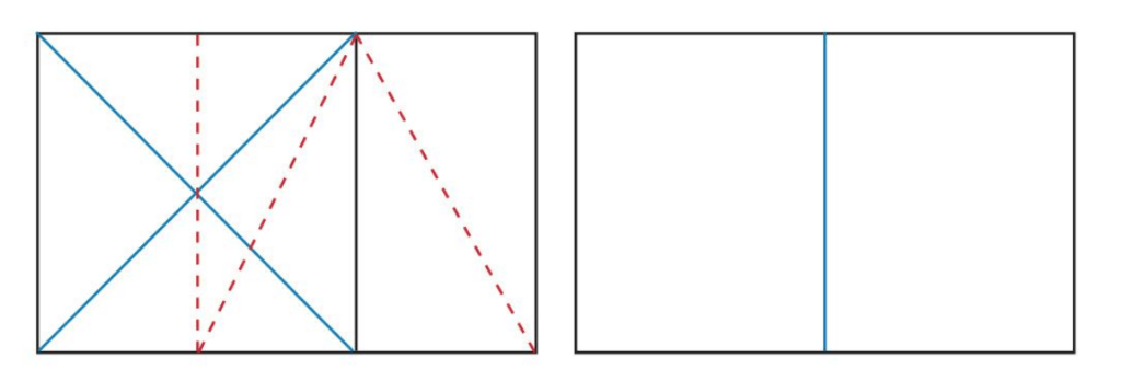
The Golden Section, or Golden Mean, has been applied by artists and designers over the centuries to create harmonious formats for their work. In his extensive research, Tschichold discovered that many book designers were based on the Golden Section. Based on a mathematical formula, and directly linked to the Fibonacci series, the Golden Selection provides a method of creating and dividing space that is a useful working framework for the book designer.
The red dotted line shows how a rectangle has been created from a square using the Golden Selection principle. It is then divided to form 2 facing pages.
Look into the golden selection more generally, by exploring how artists and designers have used these principles, and more specifically in book design, by looking at J. A. van de Graaf’s Canons of page design, Jan Tschichold’s grid designs, or other grid systems for organising the page.
After a little research I still didn’t feel like I completely understood what the golden selection was, that was until I came across an incredibly helpful video explaining the Golden ration theory. Here it explained visually the meaning and how to create your own golden ratio. I now feel confident that I understand what this all means! (https://youtu.be/CSoHCHQ3zJw)
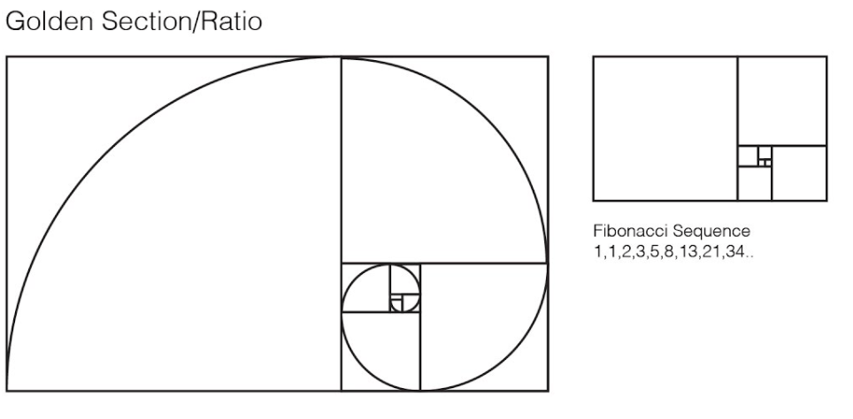
What is the Golden Selection?
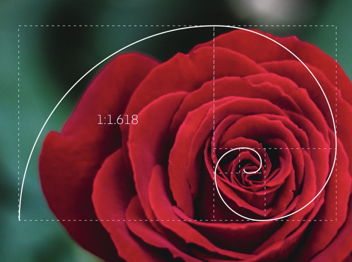
The Golden Selection/Ratio describes the perfectly symmetrical relationship between two proportions. Approximately equal to a 1:1.61 ratio, the Golden Ratio can be illustrated using a Golden Rectangle. This is a rectangle where, if you cut off a square (side length equal to the shortest side of the rectangle), the rectangle that’s left will have the same proportions as the original rectangle. The Golden Spiral is a spiral which has a growth factor of 1.618 It is found all over the natural and man-made world and is inherently aesthetically pleasing.
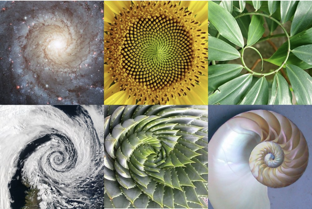
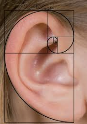
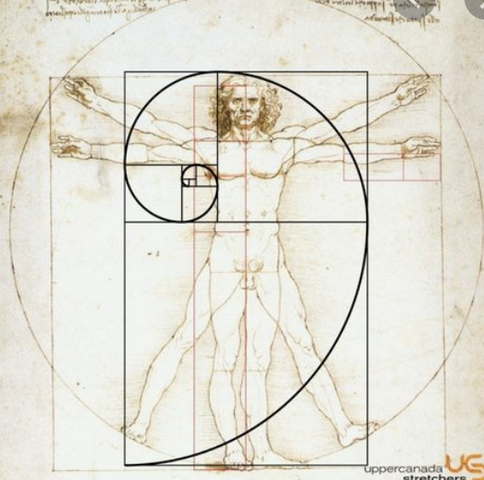
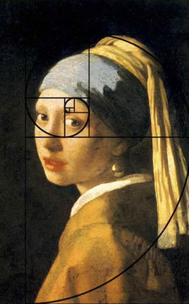
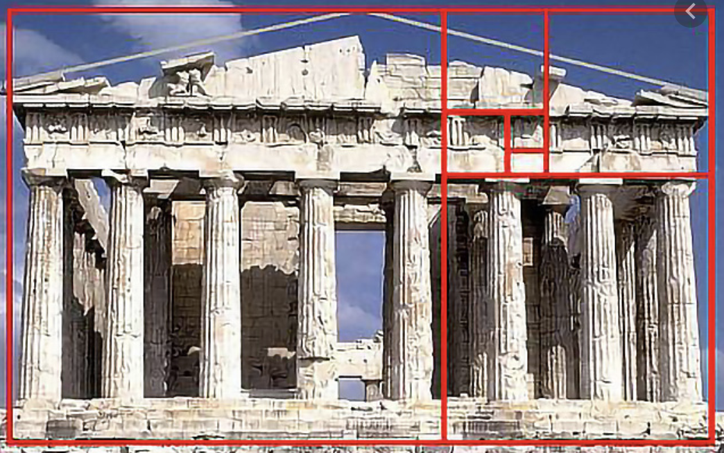
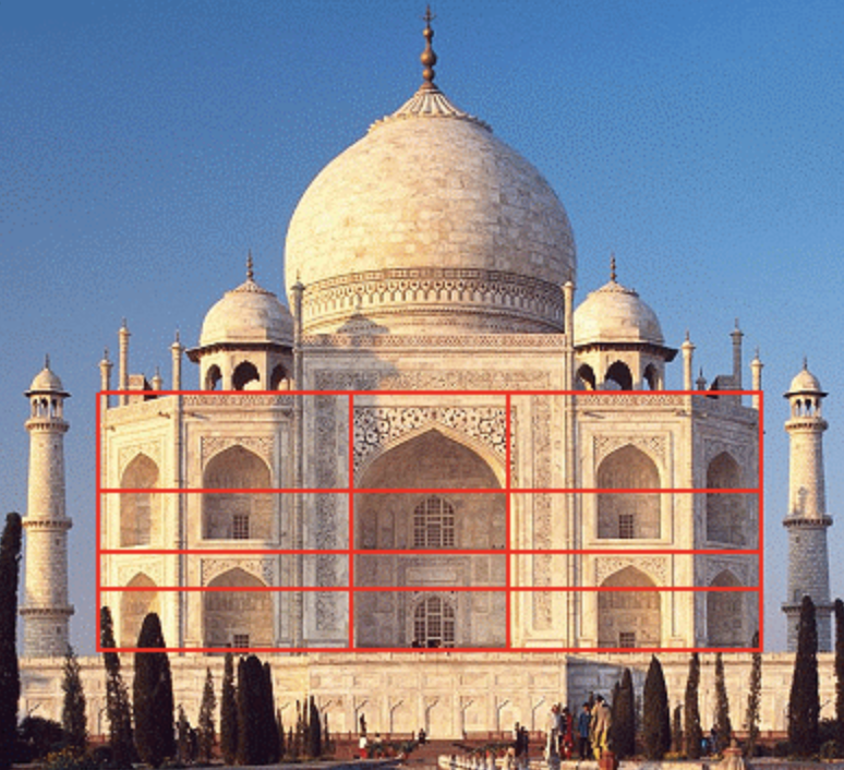
Golden Section in nature
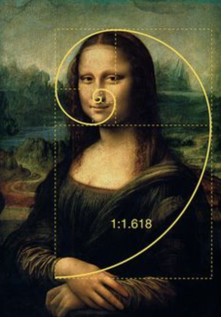
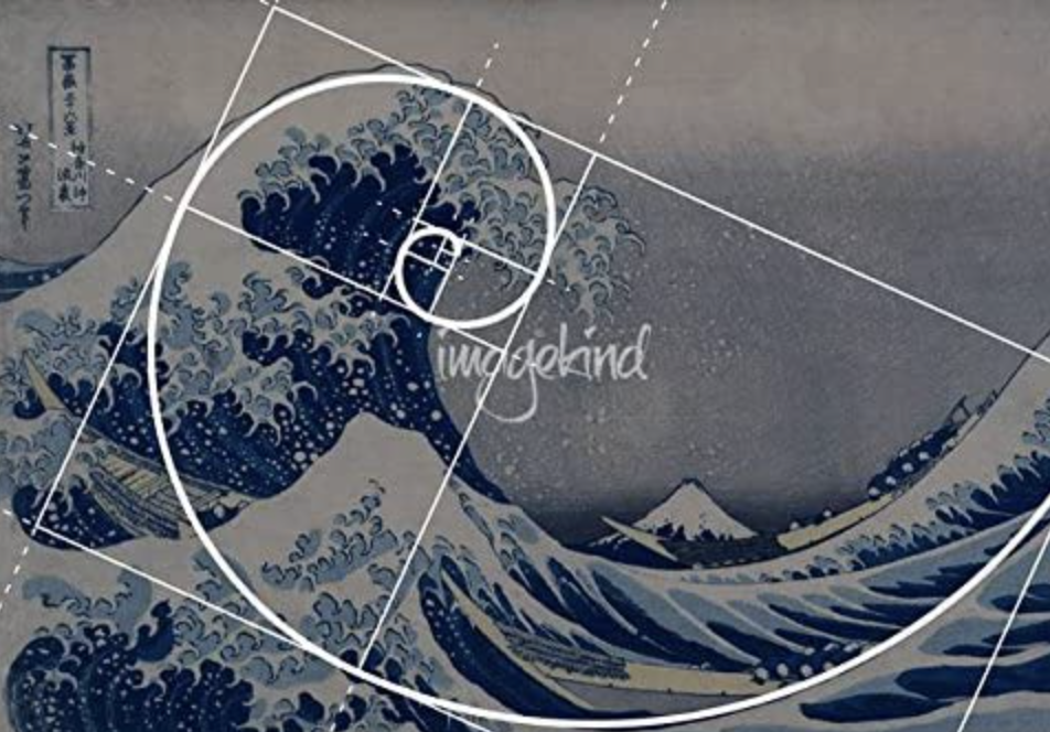
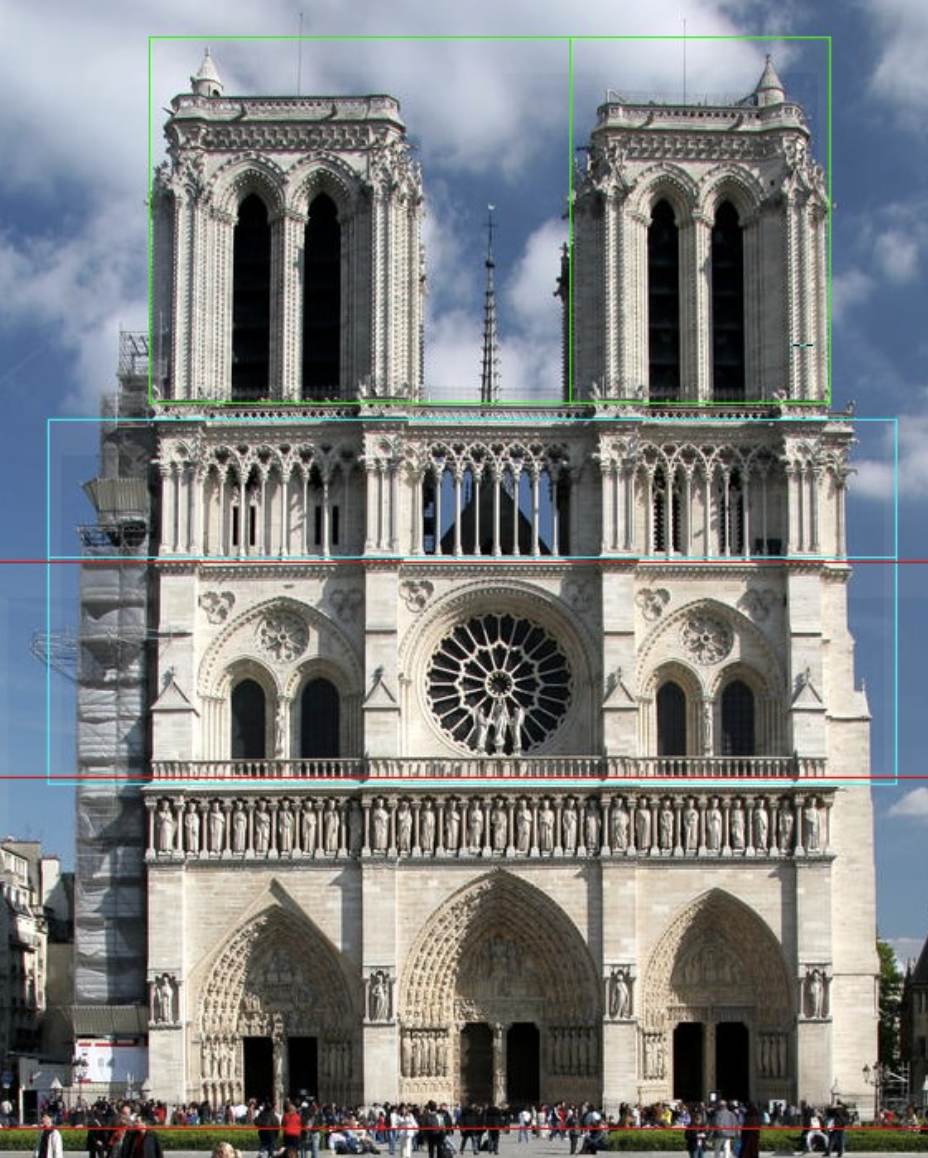
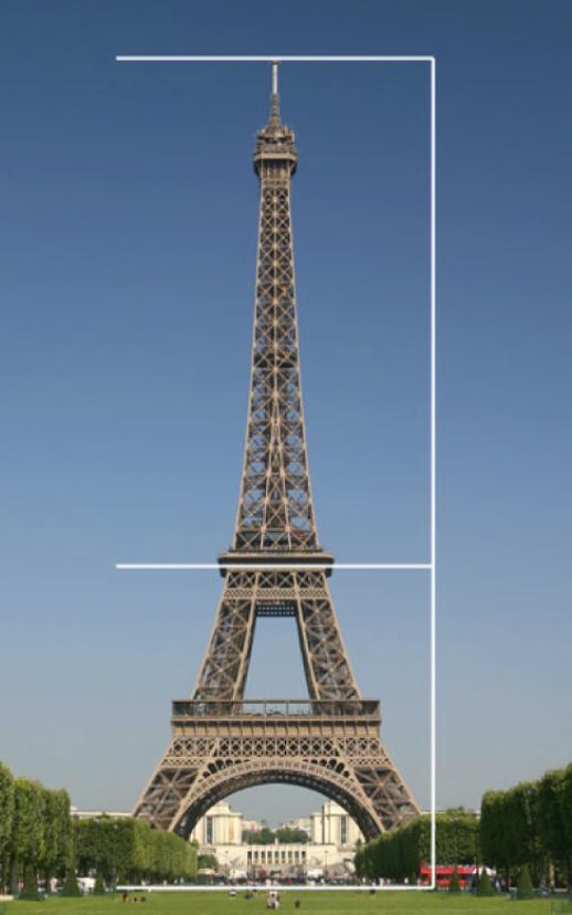
The Golden Selection in art
The Golden Selection in architecture
The above examples show the Golden Selection (1:1.681) occurring in natural and man made forms. It is clear to see how this makes things pleasing to the eye with its well balanced imagery. The Golden Section is found in the work artists and designers for hundreds of years, designers and architects have learned from the natural structures of the golden selection and by using mathematic equations they have been able to achieve the benefits for their own designs.
Golden Selection in book design
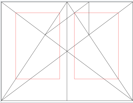
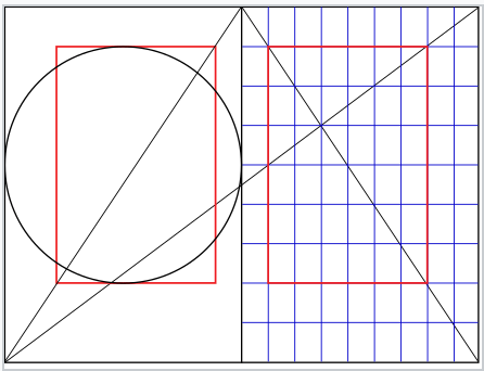
To help me in this area I started by looking at J. A. van de Graaf’s Canons of page design & Jan Tschichold’s grid designs
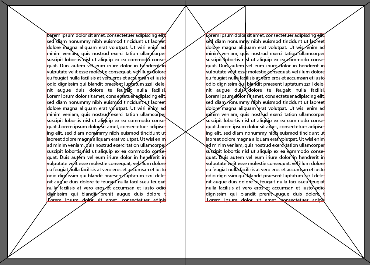
The Van de Graaf canon is a historical reconstruction of a method that may have been used in book design to divide a page in pleasing proportions. This canon is also known as the “secret canon” used in many medieval manuscripts and incunabula. The geometrical solution of the construction of Van de Graaf’s canon, which works for any page width:height ratio, enables the book designer to position the type area in a specific area of the page. Using the canon, the proportions are maintained while creating pleasing and functional margins of size 1/9 and 2/9 of the page size.
Jan Tschichold’s ‘golden canon of page construction’ is based on simple integer ratios, equivalent to Rosarivo’s ‘typographical divine proportion’. With the diagonals and circle, combined with Rosarivo’s construction by dividing the page into ninths. These two constructions rely on the 2:3 page ratio to give a type area height equal to page width as demonstrated by the circle, and result in margin proportions 2:3:4:6 (inner:top:outer:bottom).
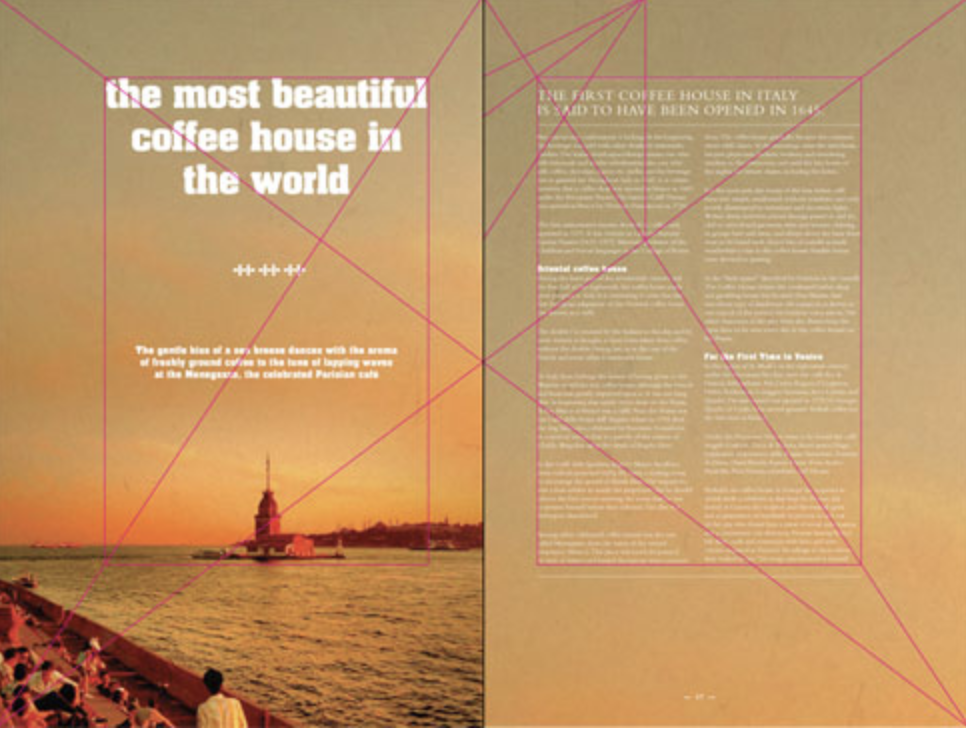
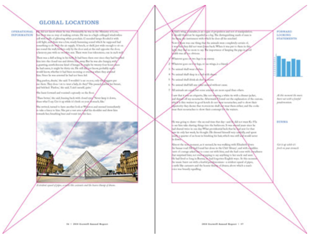
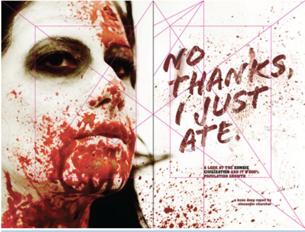
Examples of these canons being used
I then had a go at creating my own versions using this technique.
It was easier than I thought to apply this guide and the results are pleasing. This gives the pages a clean, well laid out and modern feel.
Reflection
Im pleased I finally feel confident and understand the Golden Selection as when first starting this research point I felt completely lost and overwhelmed on what it all meant, especially with the whole math part! Im still a little uncertain on how it applies to the art side as in some of the examples it looks as if the ratio diagram has simply been placed over the top! But I’m glad to understand it from the book lay out point of view. I will take this all on board and tip toe my way around the art side!