
Brief: In this exercise you can use any image created elsewhere in the course, to print onto the paper samples you collected earlier.
Active Experimentation – You are encouraged to be experimental in these exercises; it doesn’t matter if you make a mess or get things wrong in the images you make. It is important to reinforce this message at this point in the creative process, as often people tighten up when they think they are embarking on the final price, and lose some of the fluidity and spontaneity of their original ideas. We want to keep the visual outcome of this exercise fresh and not stultified by perceived conventions of what is ‘right’. When you’re exploring visual ideas and processes, the outcome may not always be what you thought they would be at the outset. You wont always get it right the first time, and this is how it should be. By repeatedly trying out and experimenting with the materials and ideas at hand, you’ll discover new ways of working. Occasionally ‘mistakes’ turn into happy accidents and prompt a way of working, or technique, that you might choose to deliberately recreate and integrate into your next project. For example, one colour may bleed into another, or your coffee cup might leave a stain on your working paper. Instead of throwing these elements away, you could integrate them into your design process.
Organising Images – When you’ve created a set of images, scan or photograph these to create digital files – JPEGS or TIFFs on your computer. Make sure the resolution is set as 300dpi. Having gathered all the images together in one folder, consider how you’re going to print them. What order will the images appear in? At what size? How will the image appear on the page? Which paper will you use for which image? Do you have a particular image in mind for a particular piece of paper? Will you try printing the same image on different sheets of paper? Draw a simple flat plan as a guide to working out how and where the image will be placed on the page, whether you will include any text, and how to explore the idea of ‘narrative’ might work. You might set up you page layout in DTP software, and work with your images digitally in this way, or you may simply print direct from your photo editing software onto the paper samples.
Printing – You may choose to use a desktop printer to output your images, or you may research other print methods such as screen printing or etching. Print at least 16 pages using the images you’ve created on the paper samples you have collected.
Firstly I decided to revisit all the work i have created on the course so far, not only in Creative Book Design but Core Concepts too. I have gathered 16 images which I will work with along with 16 different types of A4 paper.
Paper samples
I have managed to gather a range of different paper samples, some of which I automatically know which designs I would like to print on and others i will decided along the way. The samples I have managed to collect are;
- Baking paper
- Newspaper
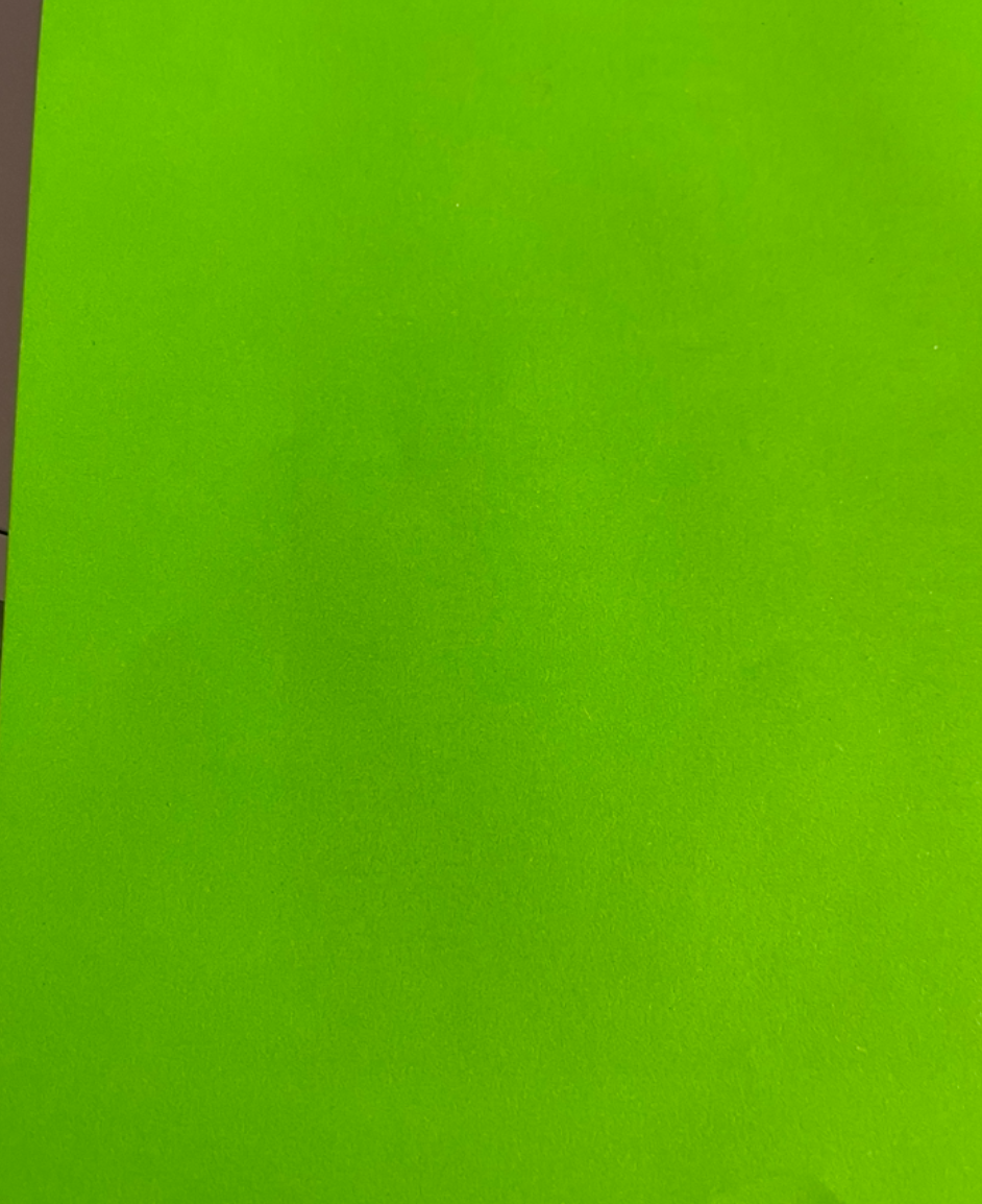
- Neon coloured paper
- Premium printer paper
- Sketchpad paper
- Tracing paper
- Glossy magazine paper
- Lined paper
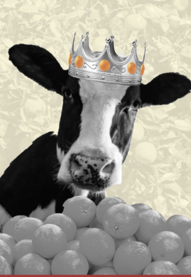
- Cheap coloured paper
- Fabric paper
- Mirrored card
- Handmade paper
- Watercolour card
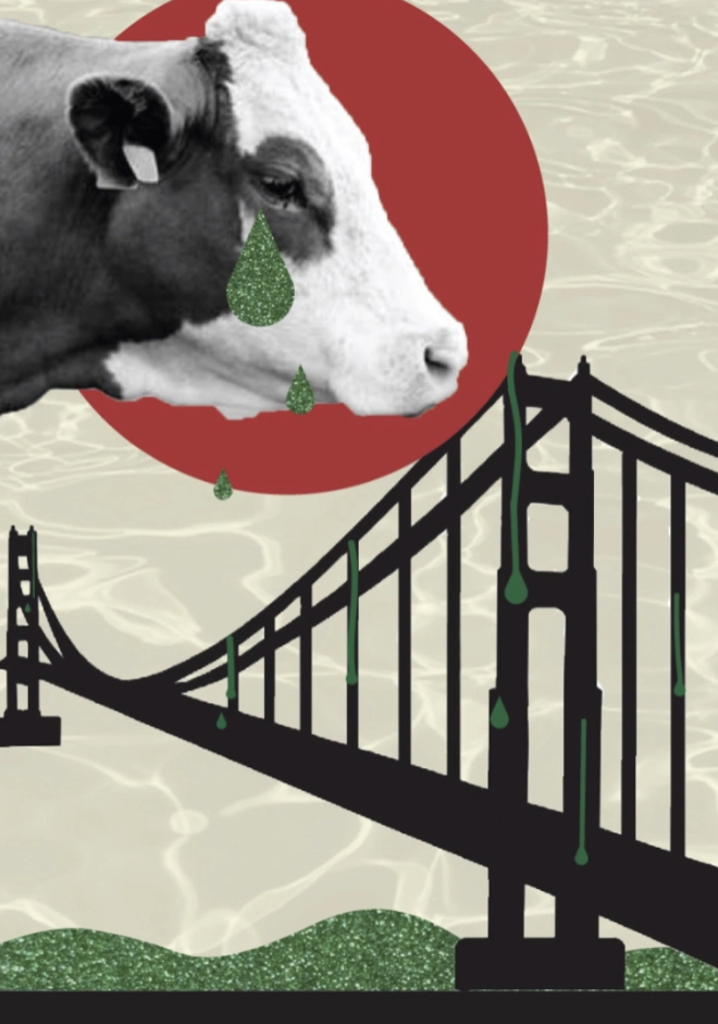
- Glitter card
- Tissue paper
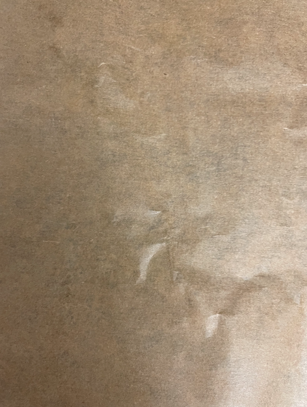
- Kraft paper
- Recycled card
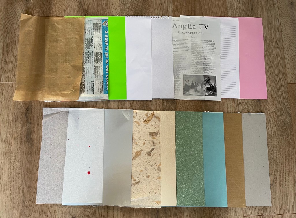
Ive sourced a wide range of papers which will allow me to become experimental and push boundaries on my designs! I’m looking forward to see how the designs look once printed, to see which paper beats my expectations and to discover if any ‘happy mistakes’ are made.
Images
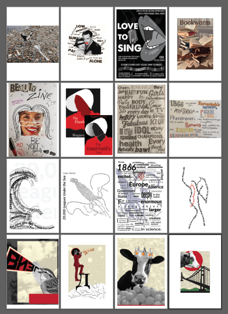
The images I have gathered are a mixture of illustrations, typography, sketches and photographs, I wanted to choose a wide diverse selection, the images below show what designs I plan to use;


All the work selected are favourites of mine, they all consist of designs which I have interpreted my style within according to the brief. I think I would like the images to be set in the order in which they were created, this could create an interesting artists book perhaps documenting my work with the designs printed on experimental and suiting paper types to help compliment even more (I hope!). I would like to try avoid duplicating any paper samples however if i feel more than one design would suit the paper sample choice I would consider using the sample more than once.
Organising Images: I have organised each image and place it into a file for this print project. They are all JPEGS files with the resolution set to 300dpi to ensure a good quality of print. I plan on printing these images myself using my HP OfficeJet 3830 printer. Before printing my first page I will ensure ink levels are good and also run a test print to ensure there is no blockages and the ink is fresh and ready to go.
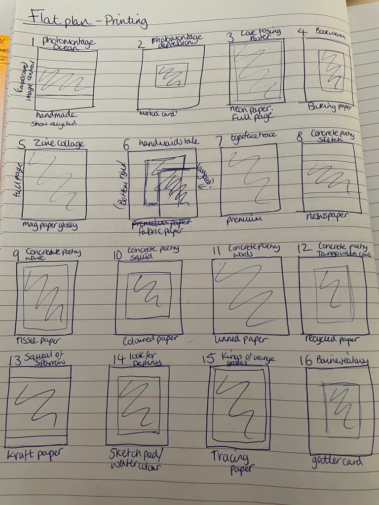
I have made a flat plan as a guide to printing so I can refer back to knowing instantly which design is paired with which paper sample. There is reasoning behind why each design is paired with the particular paper chosen, I hope that they print as imagined. I will explain my reasonings in detail during the reflection and critique stage once’s the printing has started.
After collecting and saving all of my images changing the resolution to 300dpi I was ready to start printing my images onto the chosen paper.
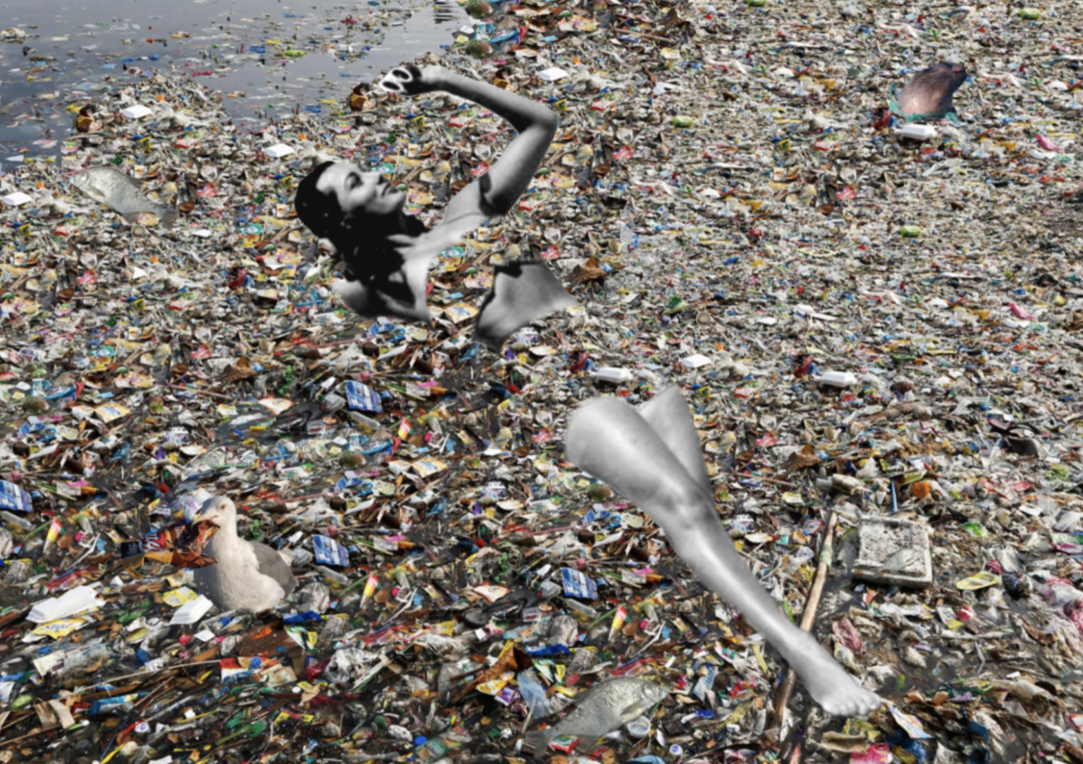
Page 1 – Photomontage of ocean pollution printed on Handmade paper.
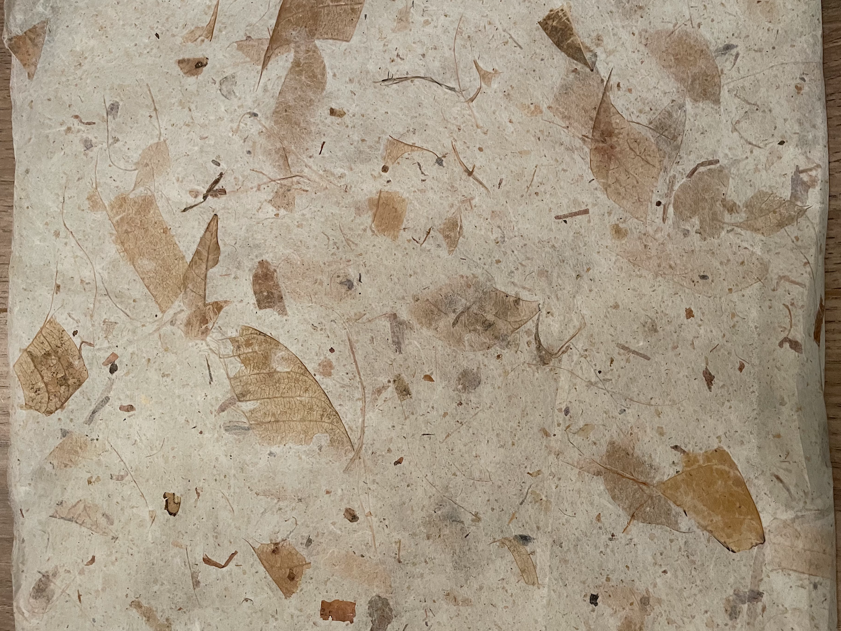
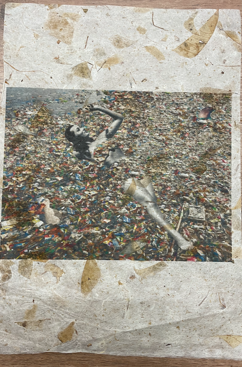
I was so pleased to be able to source some handmade paper! This paper is beautiful. I paired this paper with a photomontage image I created during Core Concepts representing the effects of Ocean Pollution, I felt the textures and the natural components of the leaves would add to the impact of the image and it defiantly lived up to my expectations. Im very pleased with how this turned out, I was worried about this running through the printer incase it tore or created a paper jam however it went through perfectly! I decided to place the landscape image central to the portrait page to ensure that the handmade paper was still visible so it complimented the image.
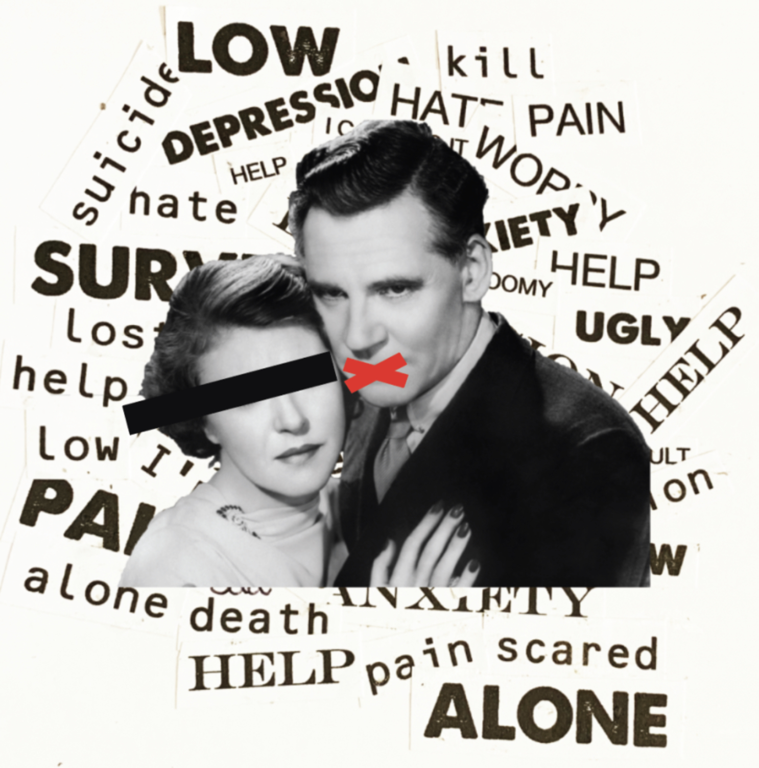
Page 2 – Photomontage of depression printed on mirrored card
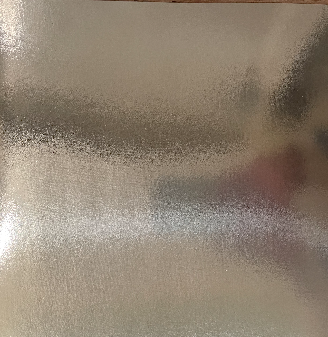
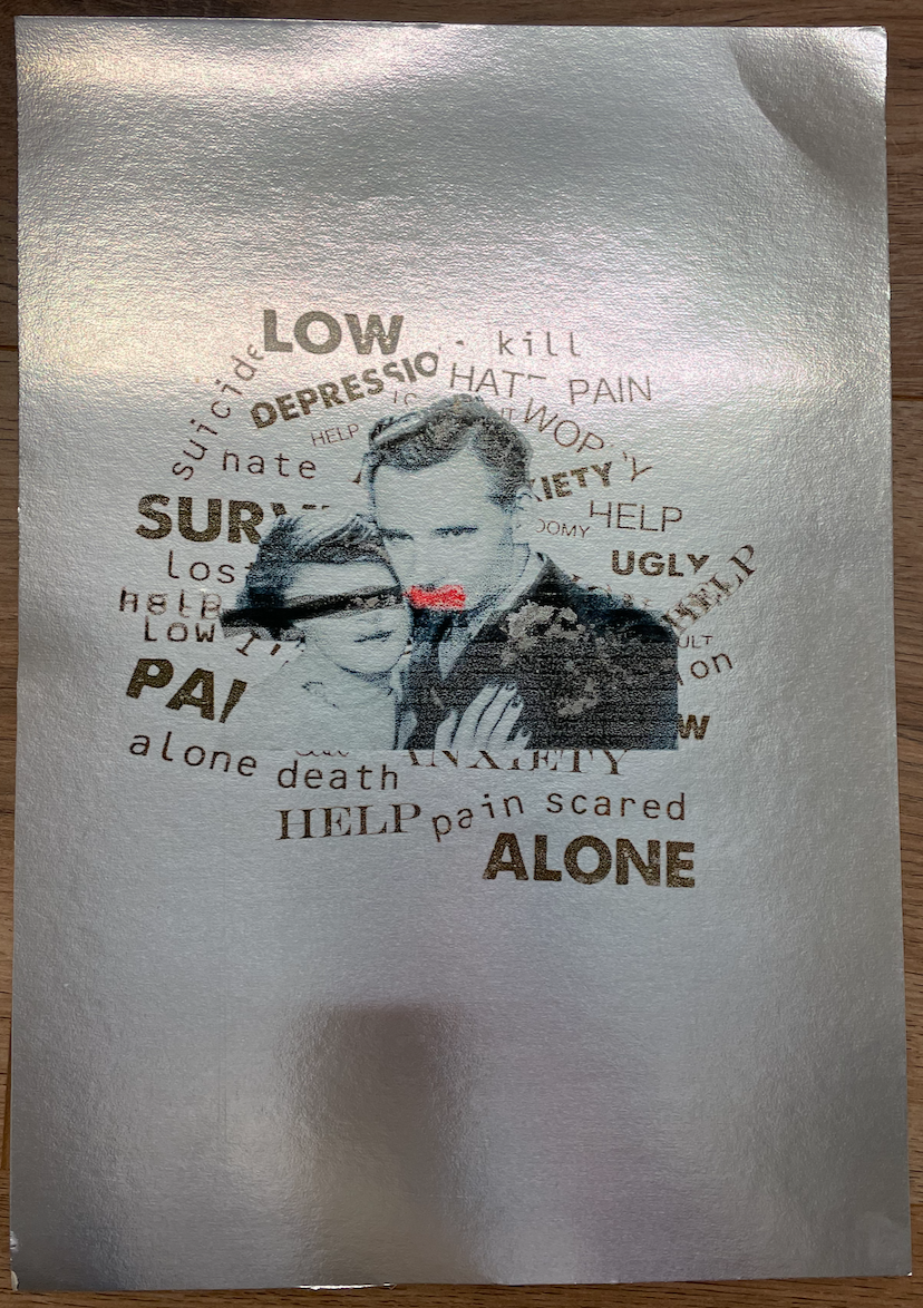
I wanted to use this mirrored card for this particular photomontage image created during Core Concepts representing depression as I felt the mirrored card could add effect by seeing your own reflection. I wasn’t sure how the ink would sit on this paper, with the touch of a finger the ink smudges which isnt ideal! The first attempt at printing this the paper became jammed in the printer so this caused my first printing fault, however due to the ink not absorbing into the paper i was able to wipe this clear and start again! I will be very careful with this page however would not recommend printing on in the future. I decided to keep this image small and central with the reflection adding to the image.
Page 3 – Love to sing poster on neon paper
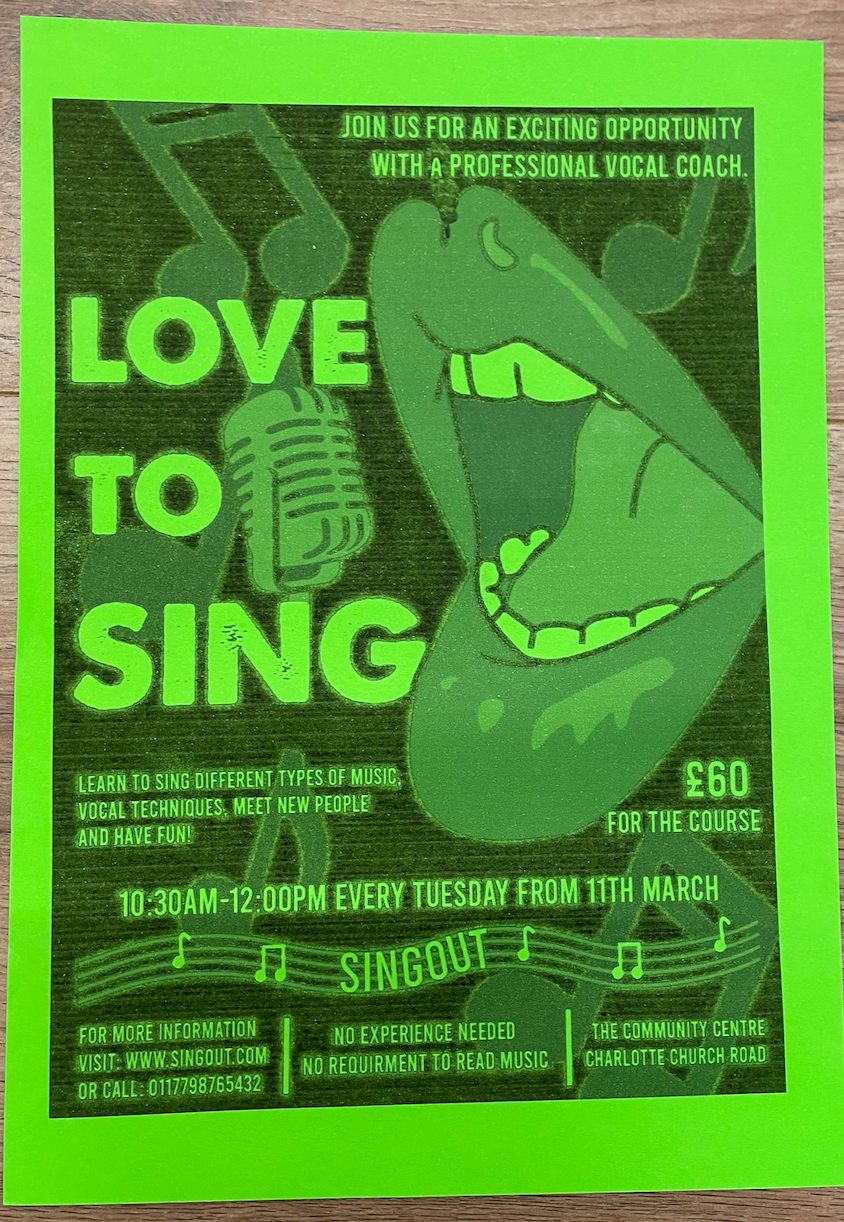
By using neon paper it gave my Love to sing poster an interesting pop of colour to what was a simple black and white design. This turned out exactly how I had planned so I’m pleased with this paper choice, it took slightly longer for the ink to absorb into the paper however this is coloured paper of a better quality (150gsm) than others which i’ve used in the past. I decided to have this image slightly smaller than the page size as initially thought the coloured paper would create a boarder, however now seeing it I think printing this full page would of been better.
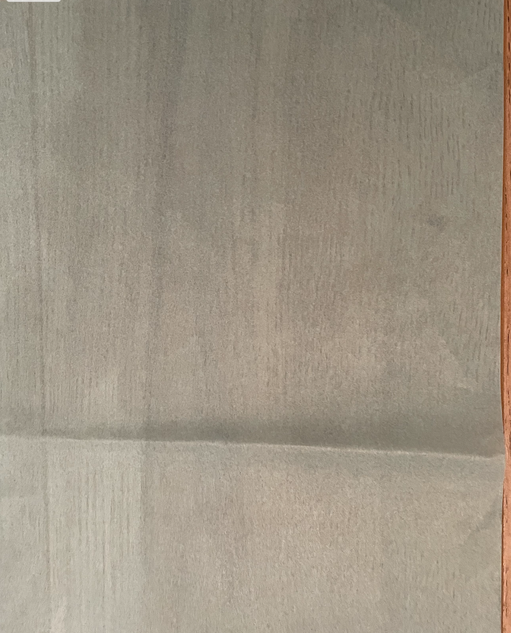
Page 4 – Bookworm on Greaseproof paper
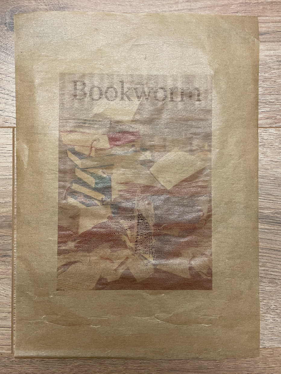
I feel that the image blends in too much for my linking on this page, I originally paired them together as I felt the paper would tie in with the image however it’s just made it slightly more difficult to see. I also printed this on the slightly waxyer side which caused a little smudge to happen during print. Perhaps a different design on this paper would work better? I probably wouldn’t use this again.
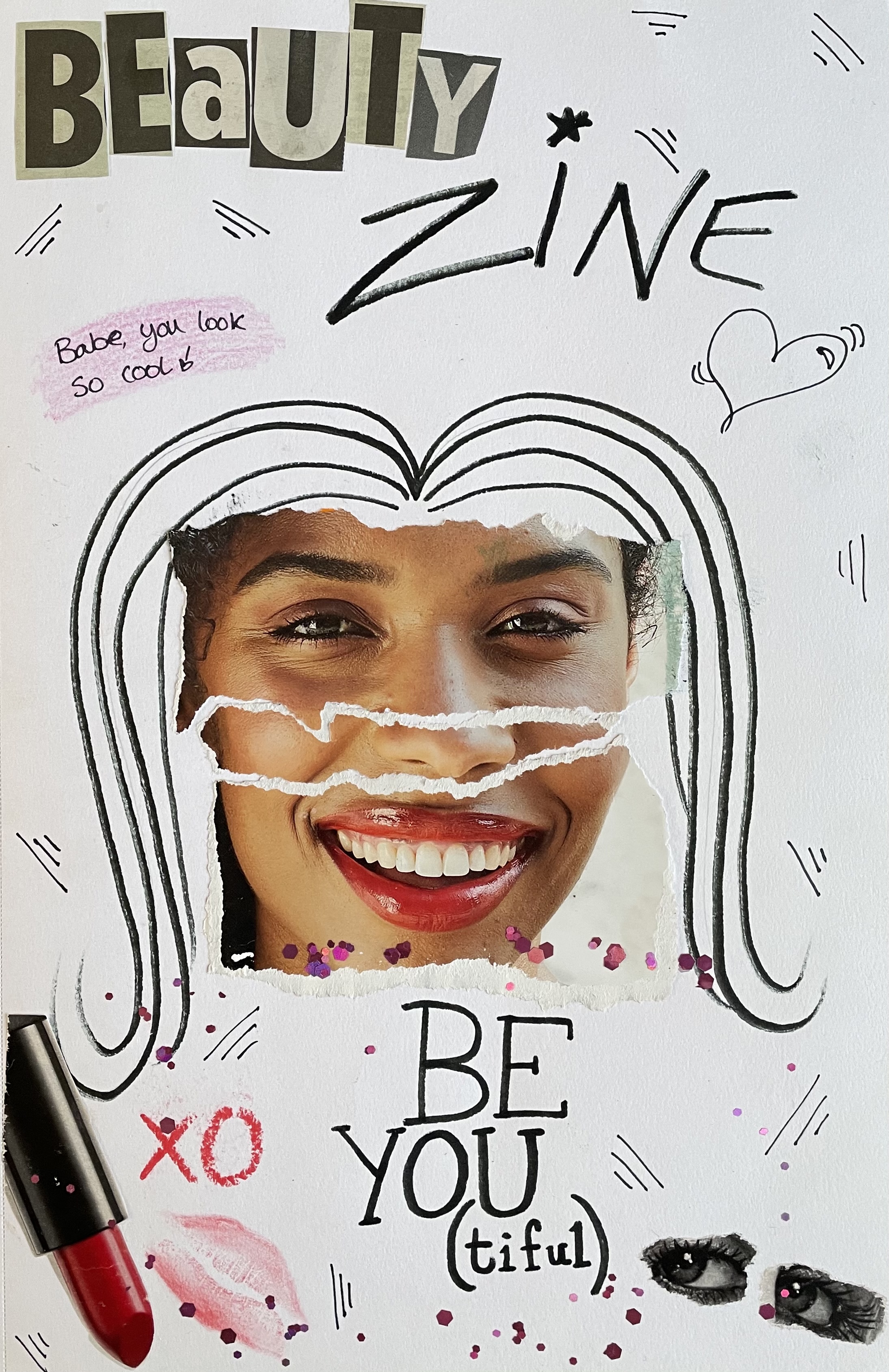
Page 5 – Zine collage on glossy magazine paper

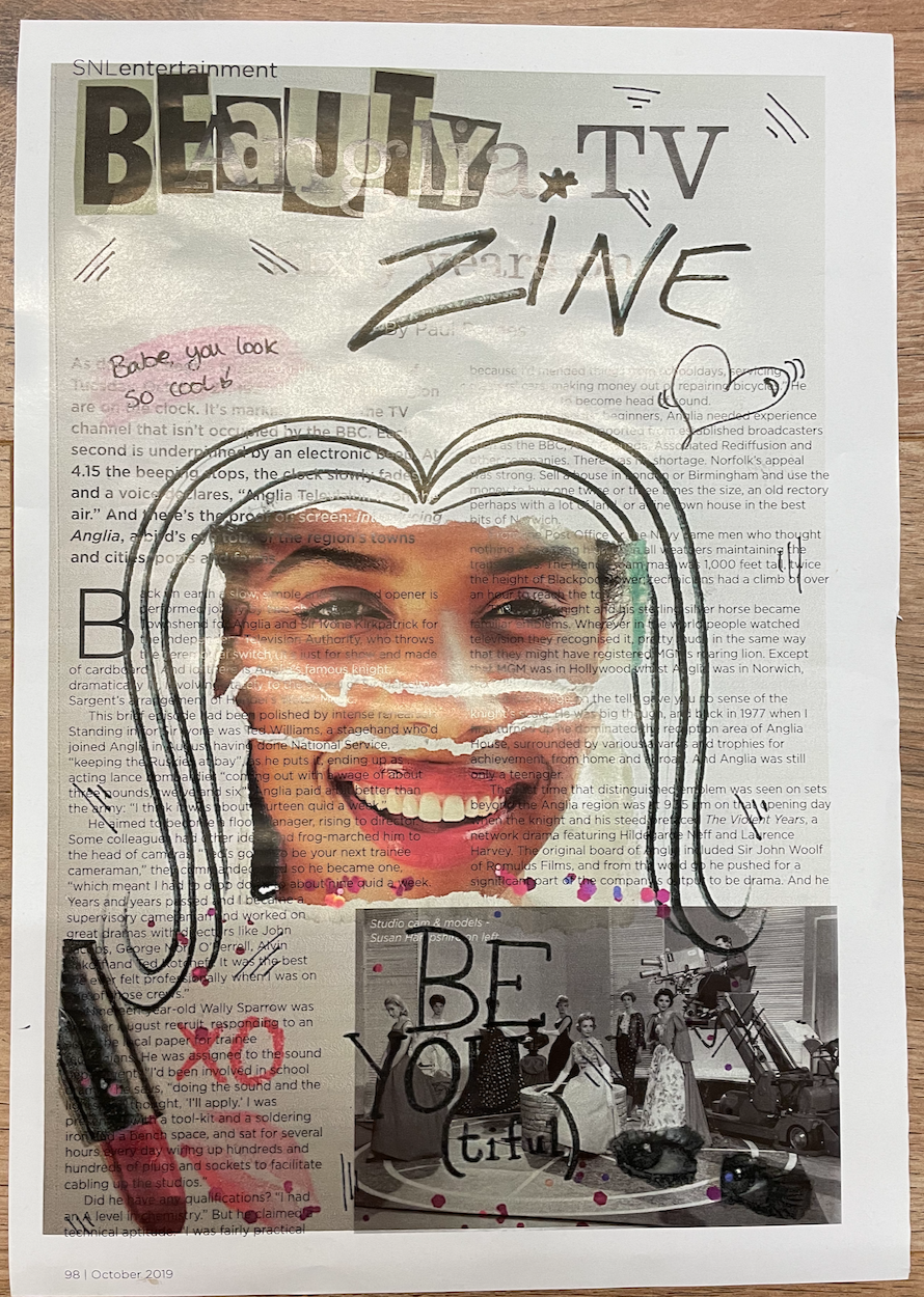
By printing a zine collage onto magazine paper I thought it would add to the effect of the whole ‘cut and paste’ technique. Im pleased with how this turned out and like the way that the text is shown through the images, also the doodle look as though they have been drawn straight onto the magazine paper, setting the resolution to 300dpi helped achieve this. This page actually contains a happy mistake/chance of luck, the size I had chosen fits perfectly within the magazines grid.
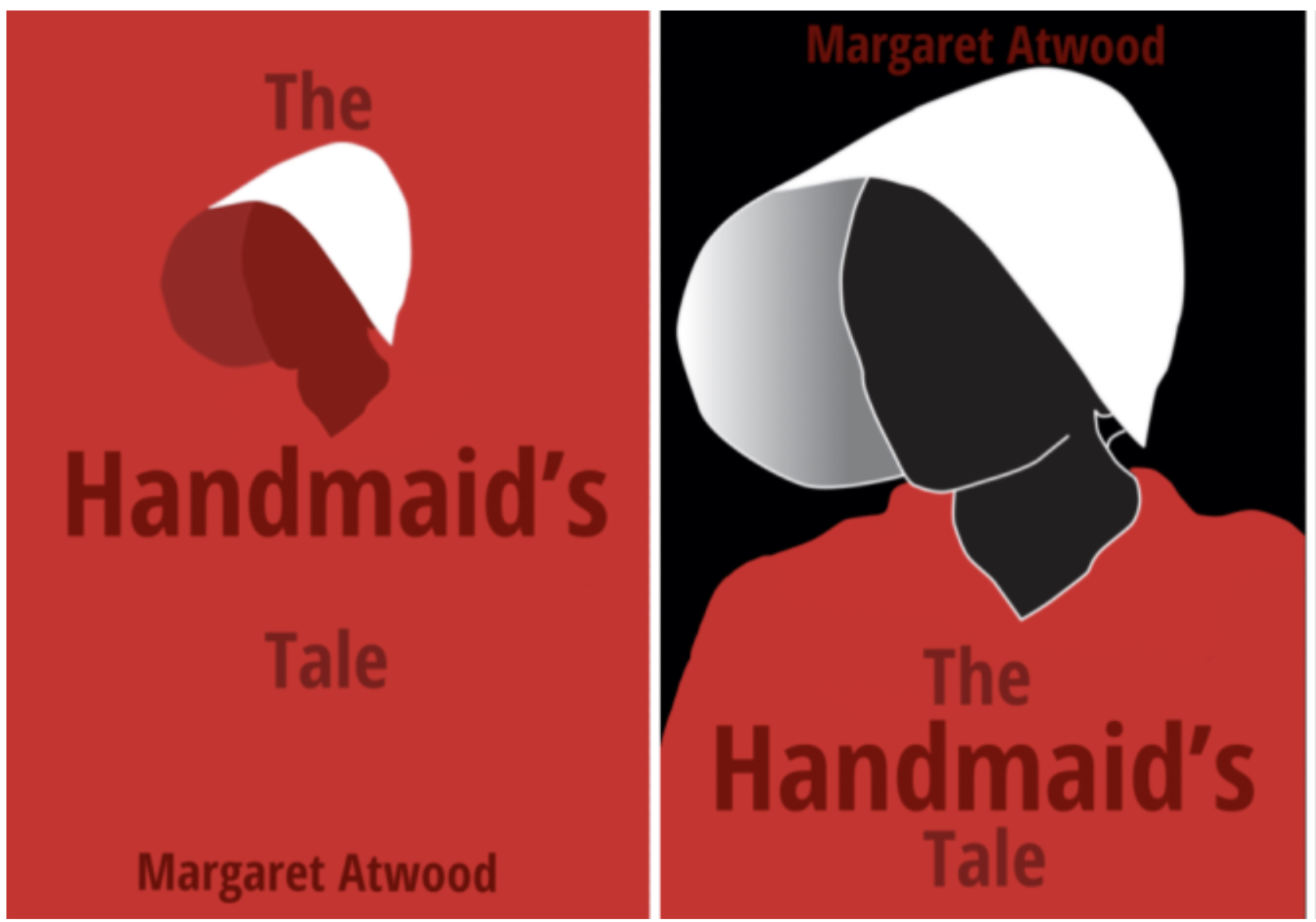
Page 6 – Handmaids tale on fabric paper
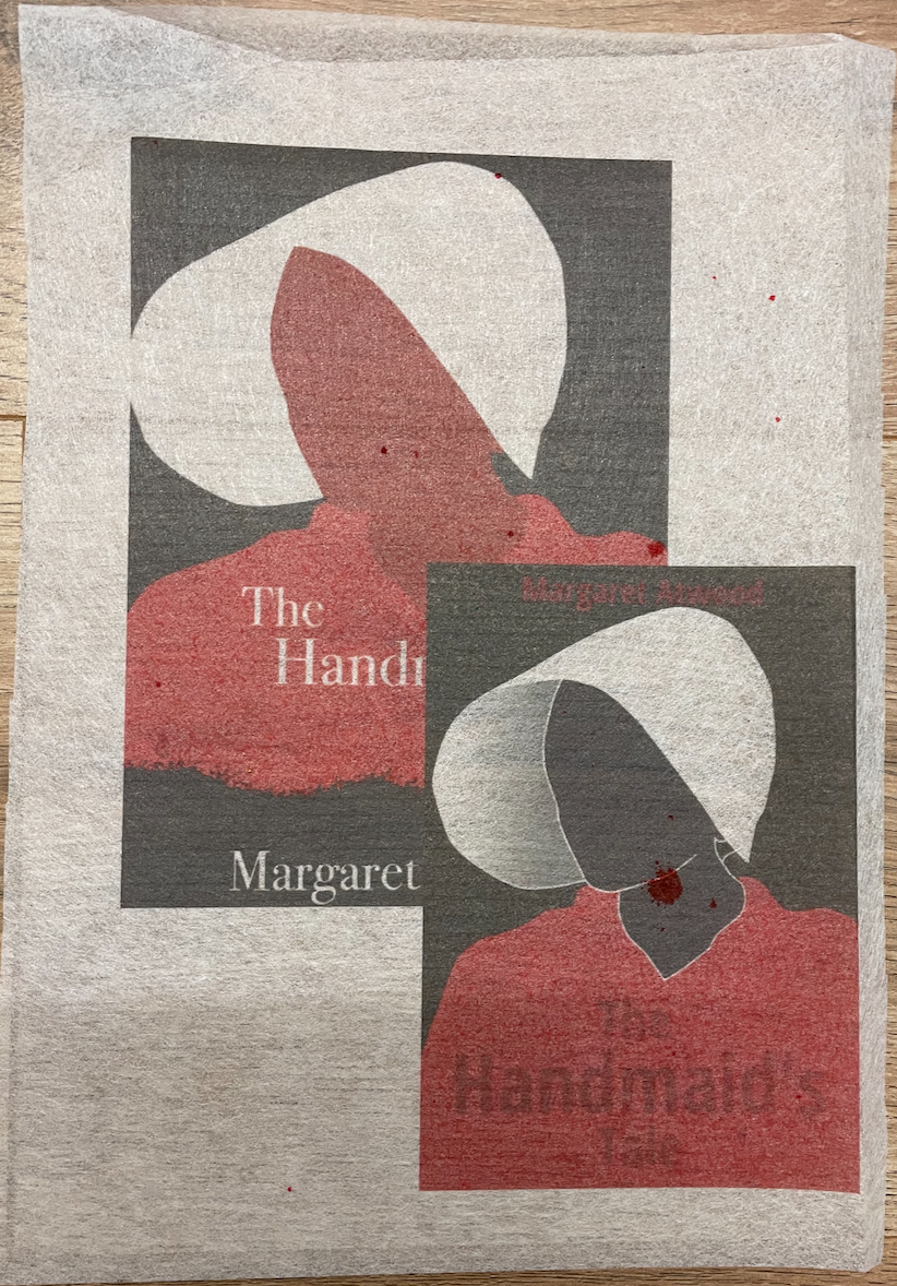
I was given this material from a friend, Im not entirely sure what its called however thought it would be perfect to attempt to print on. Again it was something I was concerned about due to how it would feed through the printer but with the help of a sheet of A4 paper behind it fed through the rollers of the printer without any issue. Im surprised at how successful this turned out to be, I really like the effect it gives. I decided to layer two of my designs from the handmaid’s tale exercise as this was an experimental exercise, i simply couldn’t choose a favourite.Im unsure of when I’ll get to use this material again to print with, perhaps it would make interesting end papers in a deluxe book?
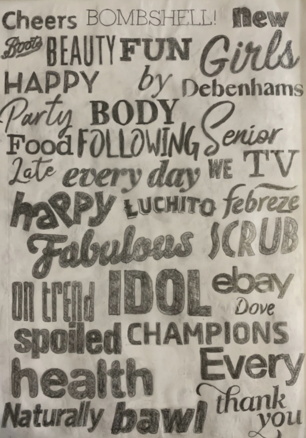
Page 7 – Type tracings on scribbled premium paper
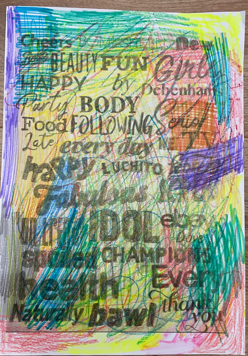
Originally I was going to print this image on just plain white paper but thought it would lack interest and there would be no experimental purposes involved. Instead I scribbled coloured pencils, felt tips and wax crayons. This gave life to a boring collection of traced logos, although hard to read this still creates an interesting page. I was unsure of how the ink would sit on top of the wax crayon however there seems to be no issue here.
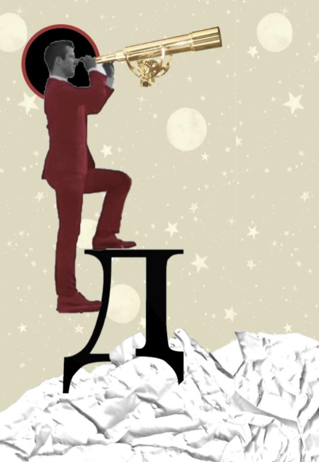
Page 8 – Experimental typography sketch printed on newspaper
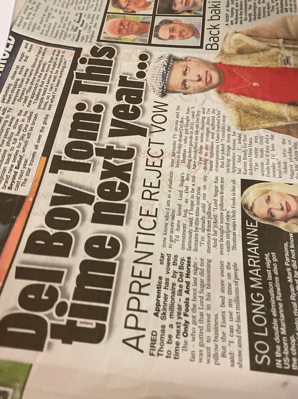
Im slightly in regret of choosing this image for the newspaper as to me it feels like a waste of creativeness, they didn’t compliment each other like I thought they might of or compared to what I think the newspaper and a different design would. However the newspaper was easy to print on, it fed through the printer well (with the help of having a4 pages in the tray to support it as it fed through the rollers to start with.
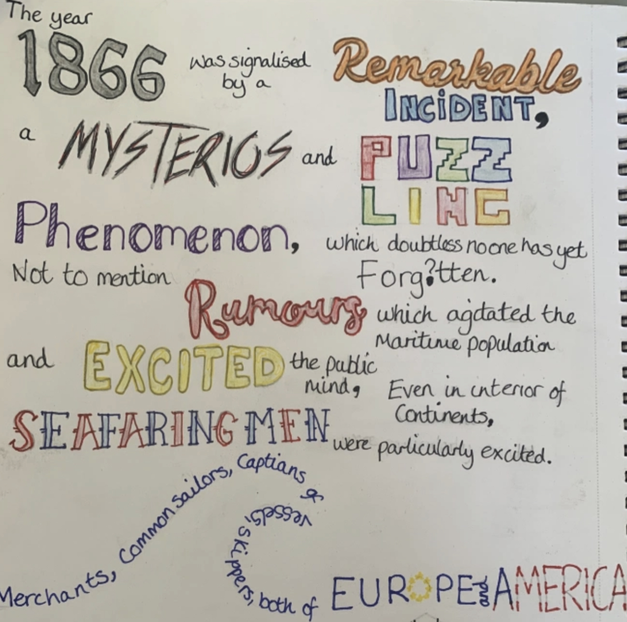
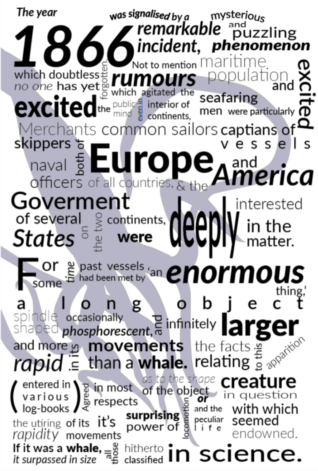
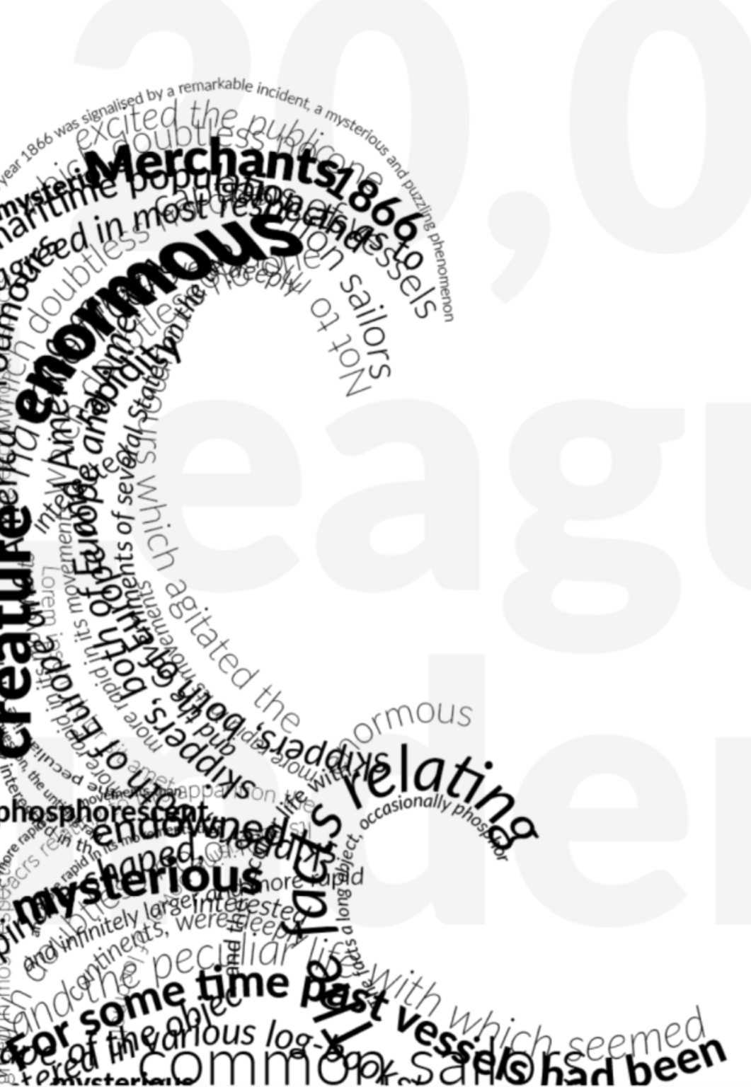
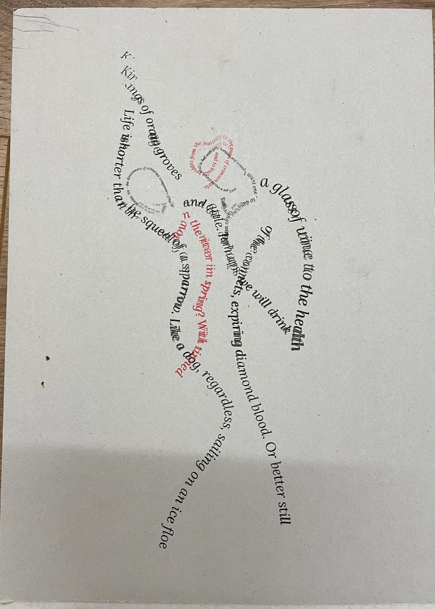
Page 9 – 20,000 leagues under the sea wave on tissue paper
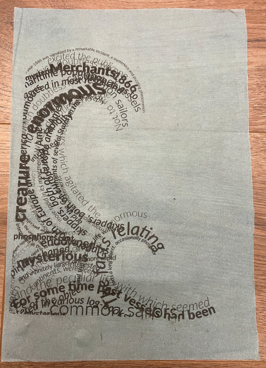
Because tissue paper is so delicate I was really surprised when this came out all in one piece with no tares or misprints. Although not my first choice of paper to print on, the print was successful. I paired this paper with the design just down to the colour being blue representing water. Upon reflection I think I should of placed the design at the bottom of the page, but im happy with the sizing of it.
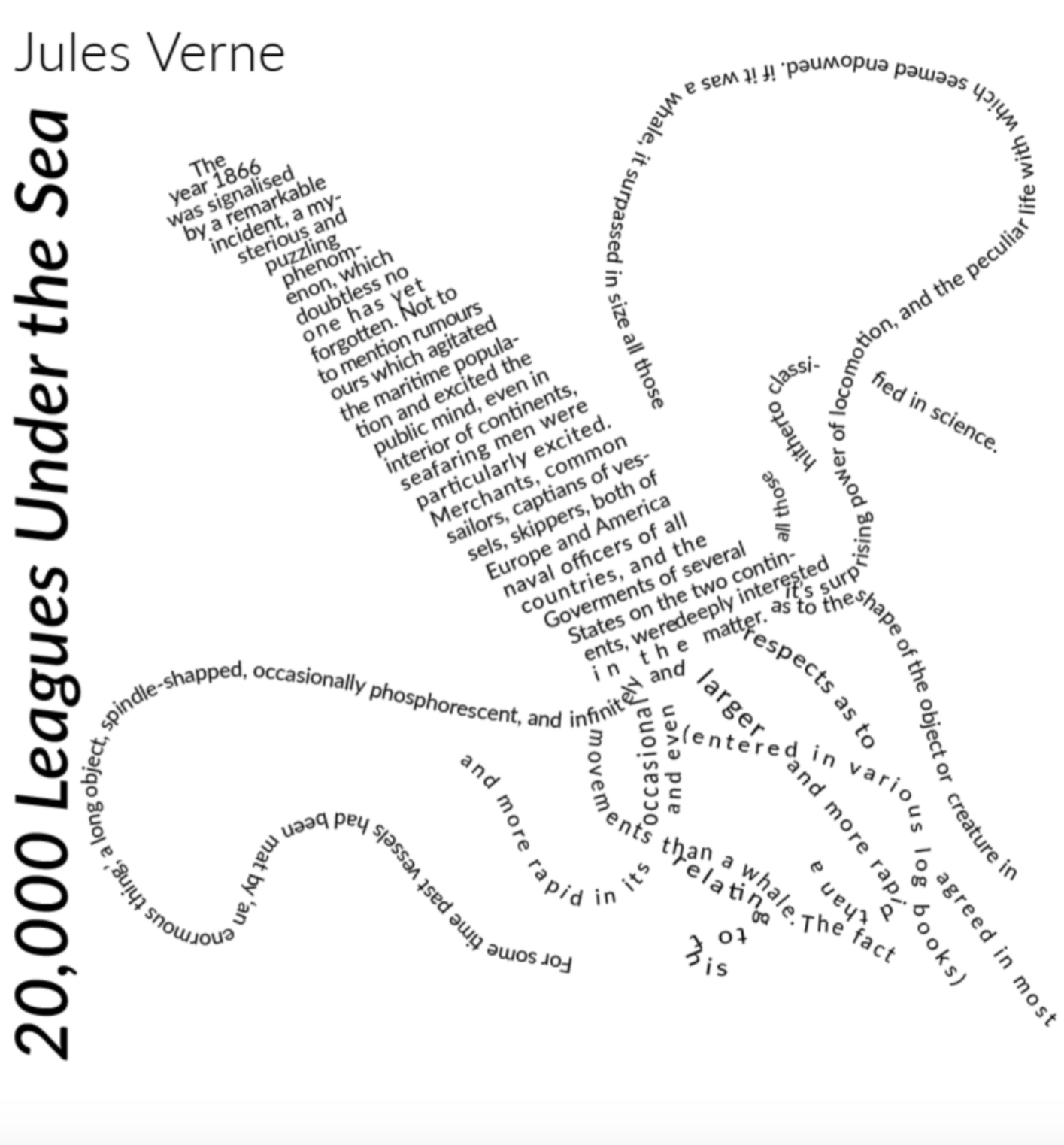
Page 10 – 20,000 leagues under the sea squid on coloured paper
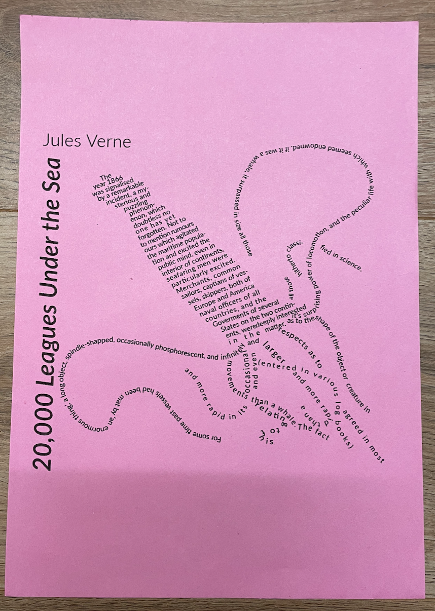
I like the effect printing on coloured paper adds to the designs by giving it a bursts of colour, this design originally was just black and white hence why choosing to print onto coloured paper. I placed the design central to the page, I didn’t want to enlarge it too much as I think it gives a better overall effect when the text is smaller. Defiantly a paper type to consider when printing posters etc or something aimed at children, i think it looses slight professionalism to the design as to me I associate coloured paper prints with fast mass printing for event gigs which are stuck on billboards.
Page 11 – 20,000 leagues under the sea printed on lined paper
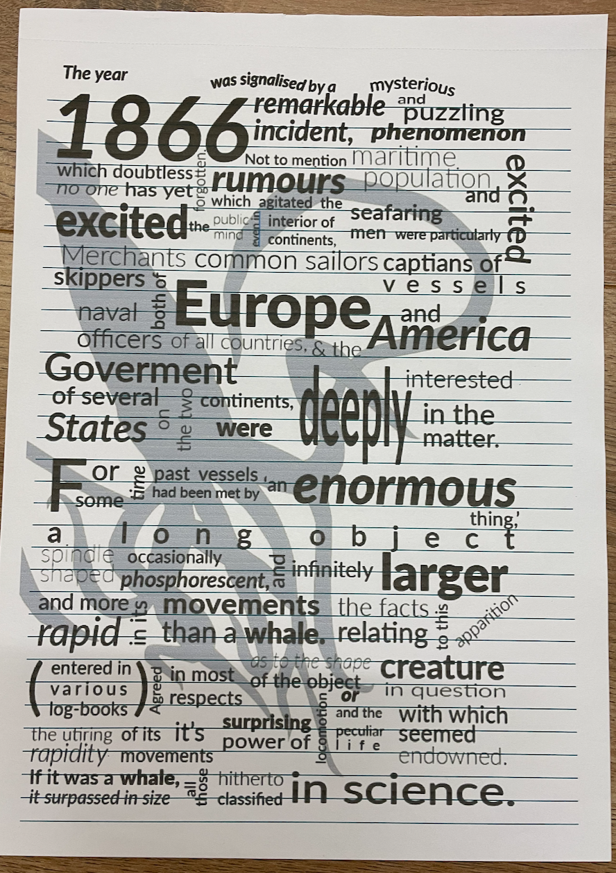
Because this design is heavily typography based I decided to print this onto lined paper and I quite like the effect its given. It ran through the printer with no issues, due to the size of some of the text I decided to print this at almost a full size to the page.
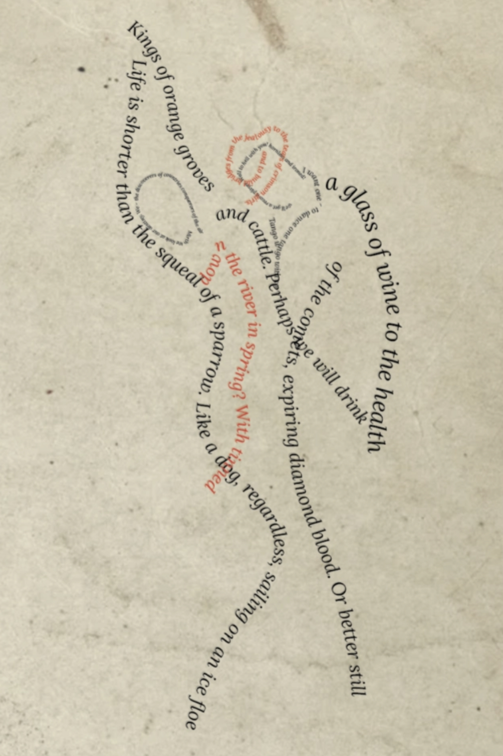
Page 12 – Concrete poetry printed on recycled card
The first time printing with this card the page became jammed as its so thick, I’m not sure of the exact weight but from guessing I would say 350gsm+ as you can see from the printed design it also struggled the second time with the help of me pushing it through as some of the wording has smudge which due to this being a word based image I’m not too pleased with as its now become illegible in places however this is solely down to the thickness of the card and the printer not being able to cope.
Page 13 – Sequencing image on kraft paper
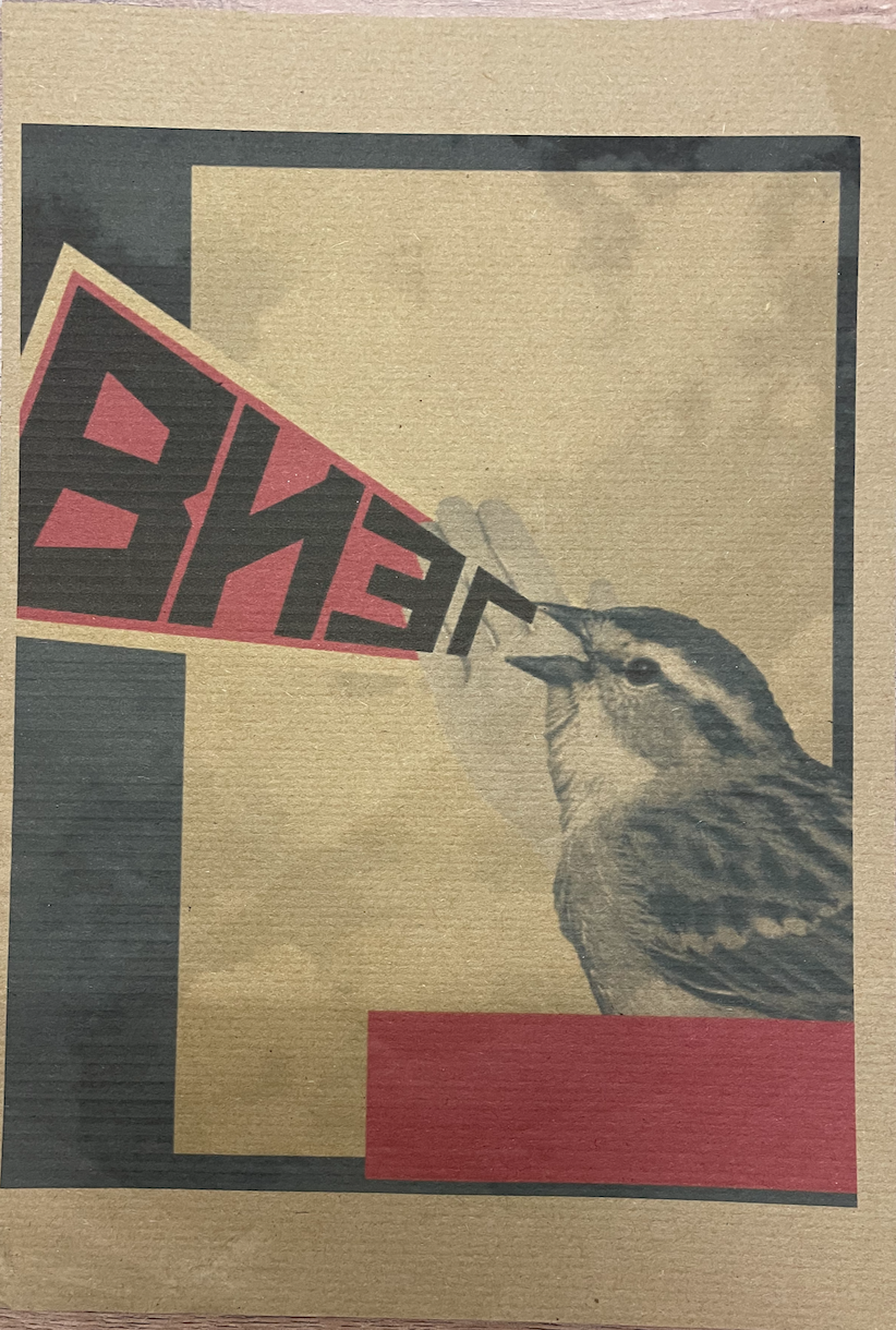
I really like the effect this paper has given my design, I was surprised at how successful I found the outcome. The only print issue is that my ink levels appear to be low hence the lines visible running through the black blocks. Im pleased with the sizing I set for this design too. I decided to print this on the more course and textured side of the kraft paper so I could see how this would print, because this has a slight ‘fuzzy’ texture to it it made me curious as to wether any colours would bleed however they have kept to their sharp lines which Im pleased about.
Page 14 – Sequencing images on watercoloured paper
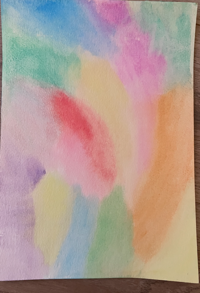
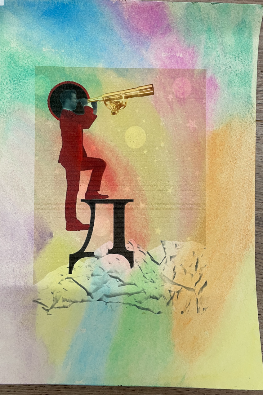
I managed to find some watercolour paper which I decided to paint myself rather than leaving it plain white. I like how this printed however I do wish I would of thought about removing the background on the original design for the purpose of it printing seamlessly onto this paper.
Page 15 – Sequencing images on tracing paper
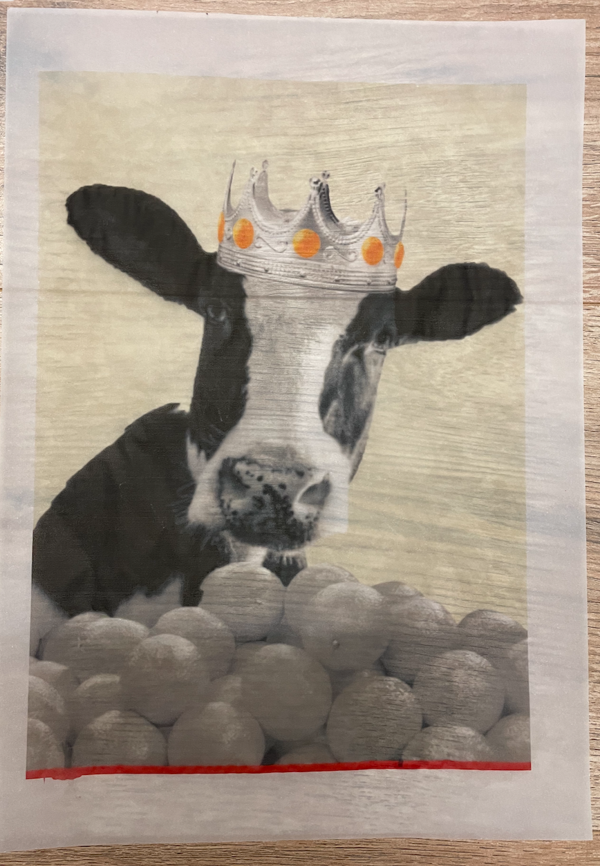
Although I have already experimented with printing on tracing paper during Assignment 4’s work I hadn’t tried it on such a large scale of an image. Printing on tracing paper always gives an interesting effect, especially when you have parts of the image which contain white so this is printed completely transparent. i had a slight smudge on the bottom red strip however overall a successful print.
Page 16 – Sequencing images on glitter card
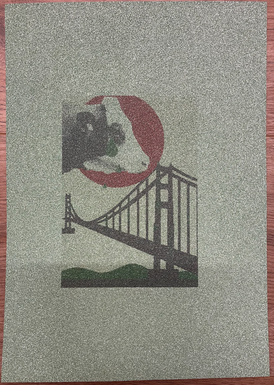
I paired this design with the glitter card because within this design I had used green glitter for the tears and river below the bridge. The image printed appears very faded although it seems to appear vibrant in the photograph, Im unsure what would of caused this issue which has left me resulting in a bad choice of paper to print on!
Reflection
It was good to experiment and test printing out images onto a vast variety of papers to see which works and which doesn’t, this has taught me the importance of paper quality and how this reflects on the design which is printed on.
AMENDMENTS MADE AFTER TUTORS FEEDBACK
My tutor advised me to bind my pages together in order to create an artists book for myself. After searching for the best binding technique I came across Single Sheet Binding. This involved punching holes in each page and carefully stitching in page by page. This gave my book a really nice effect with the best possible biding suited to the printed pages. I’m really pleased how this has turned out!
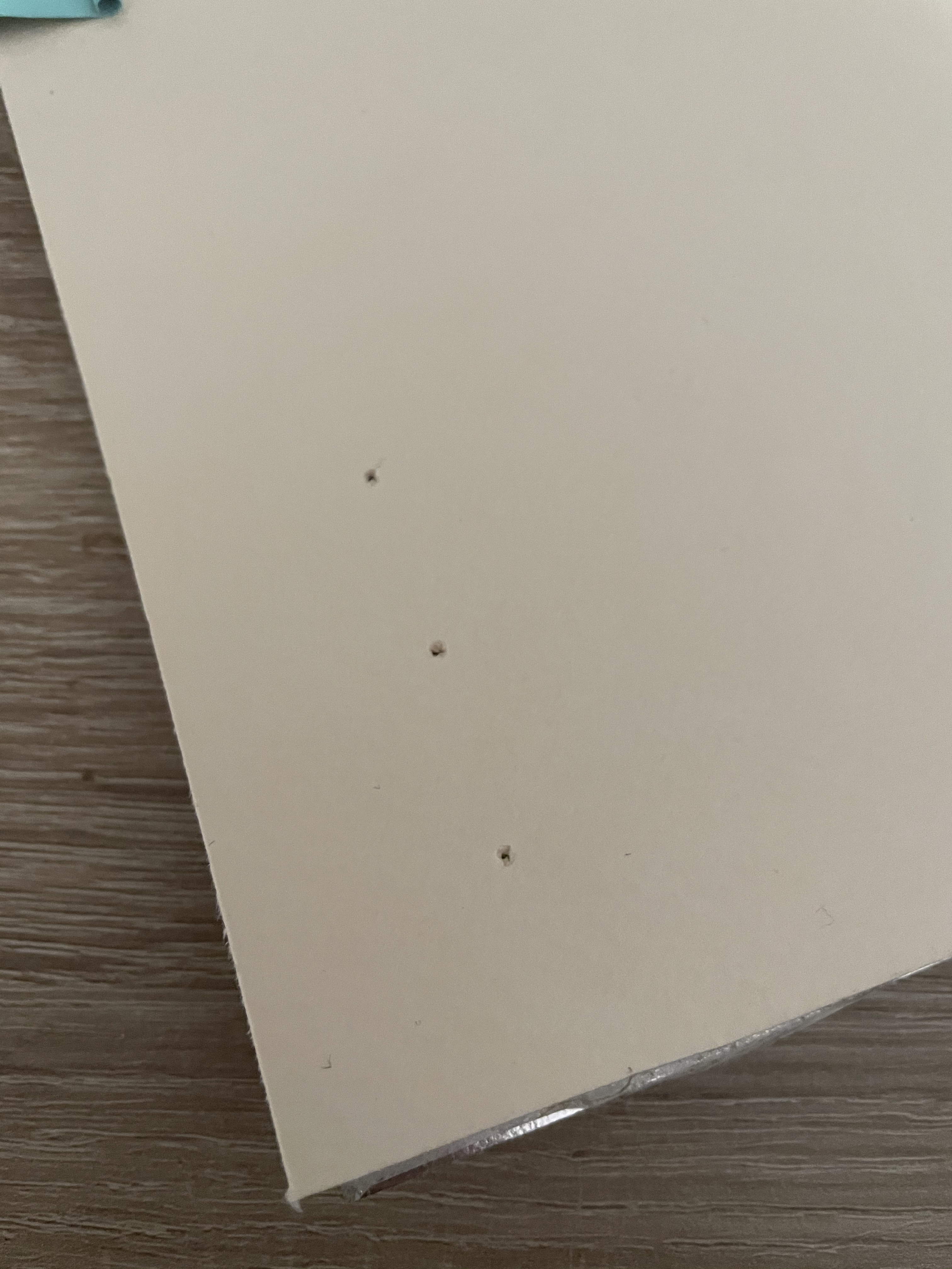
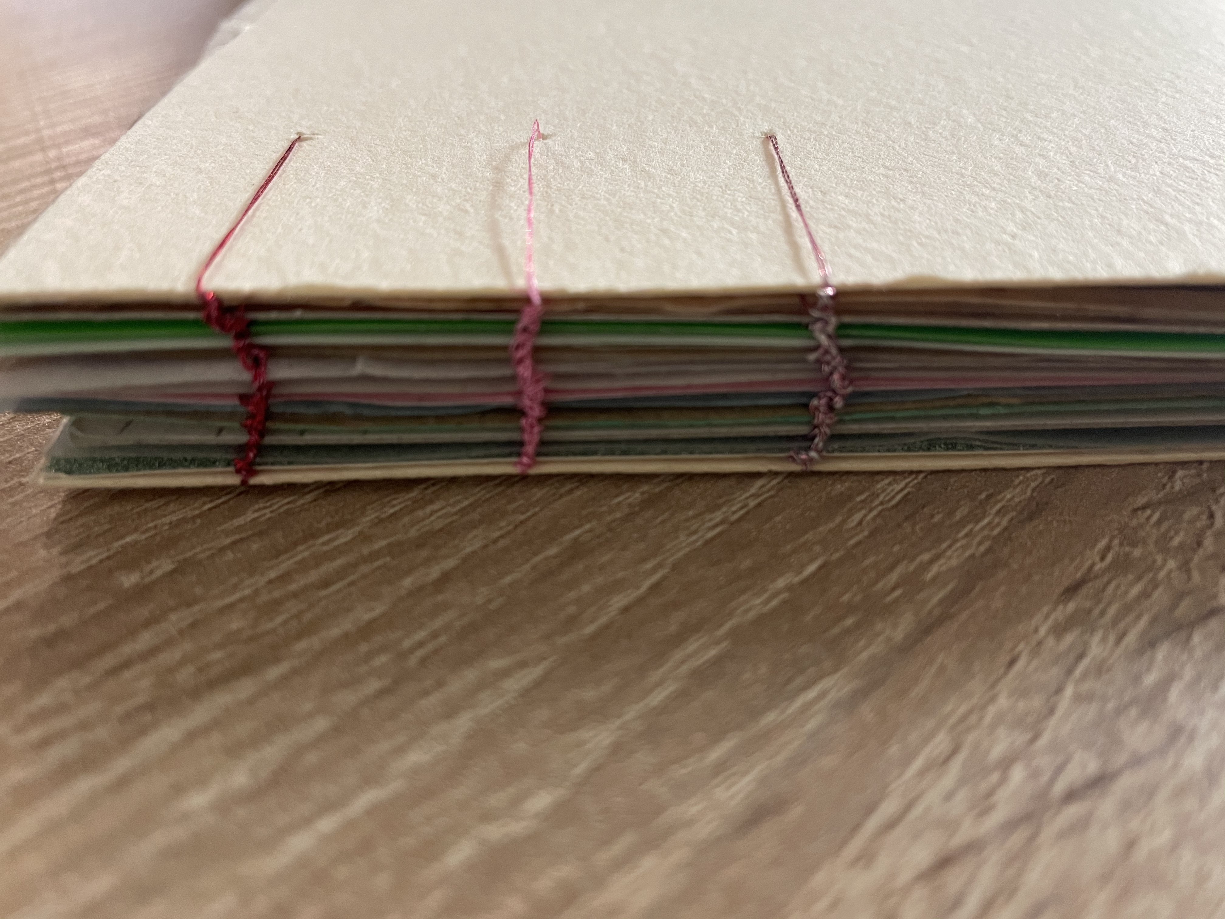
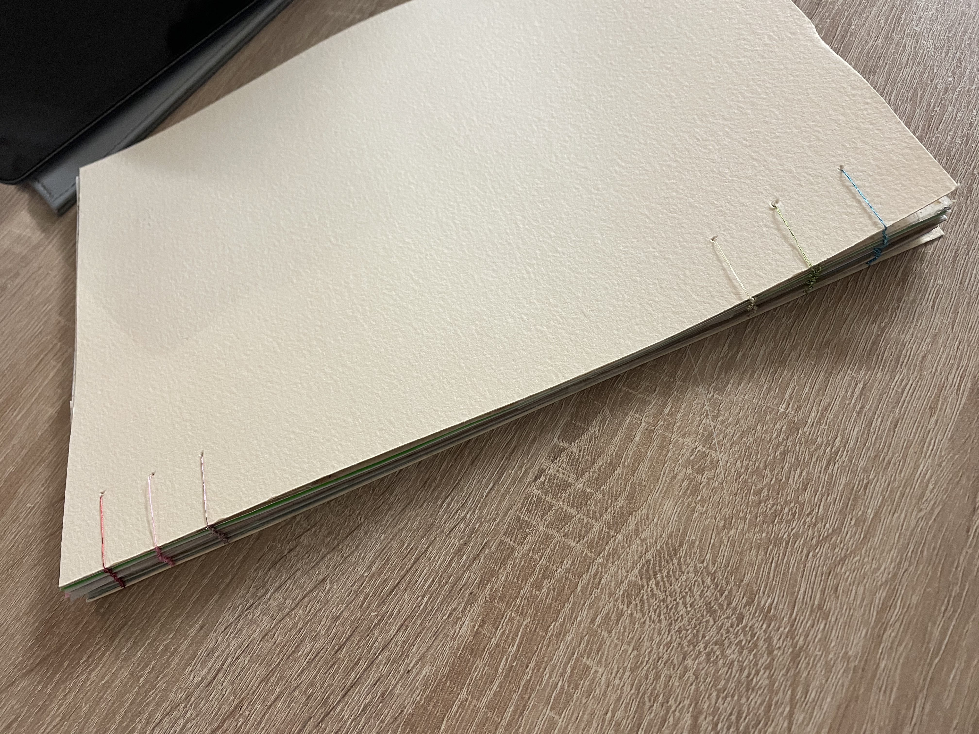
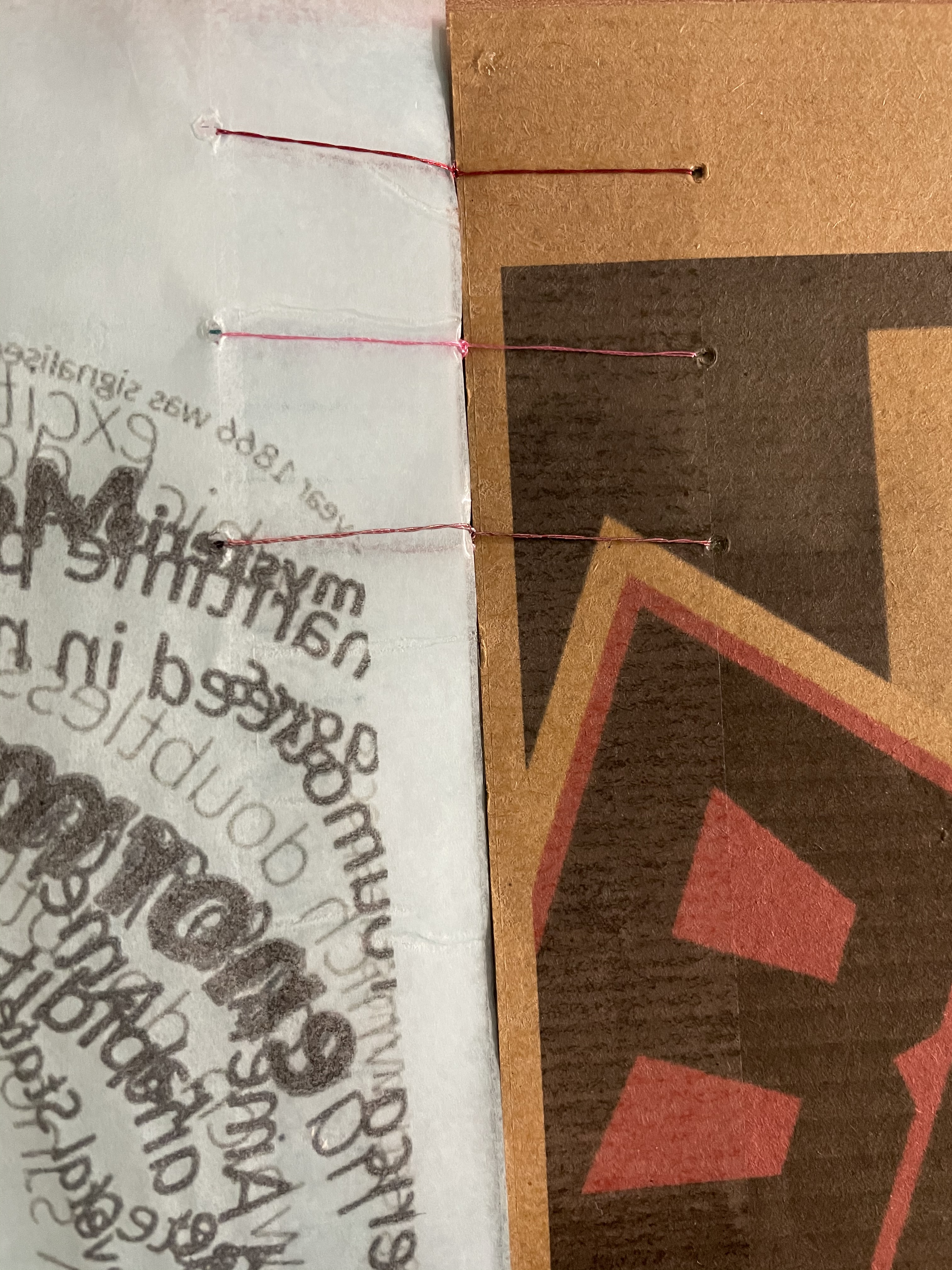
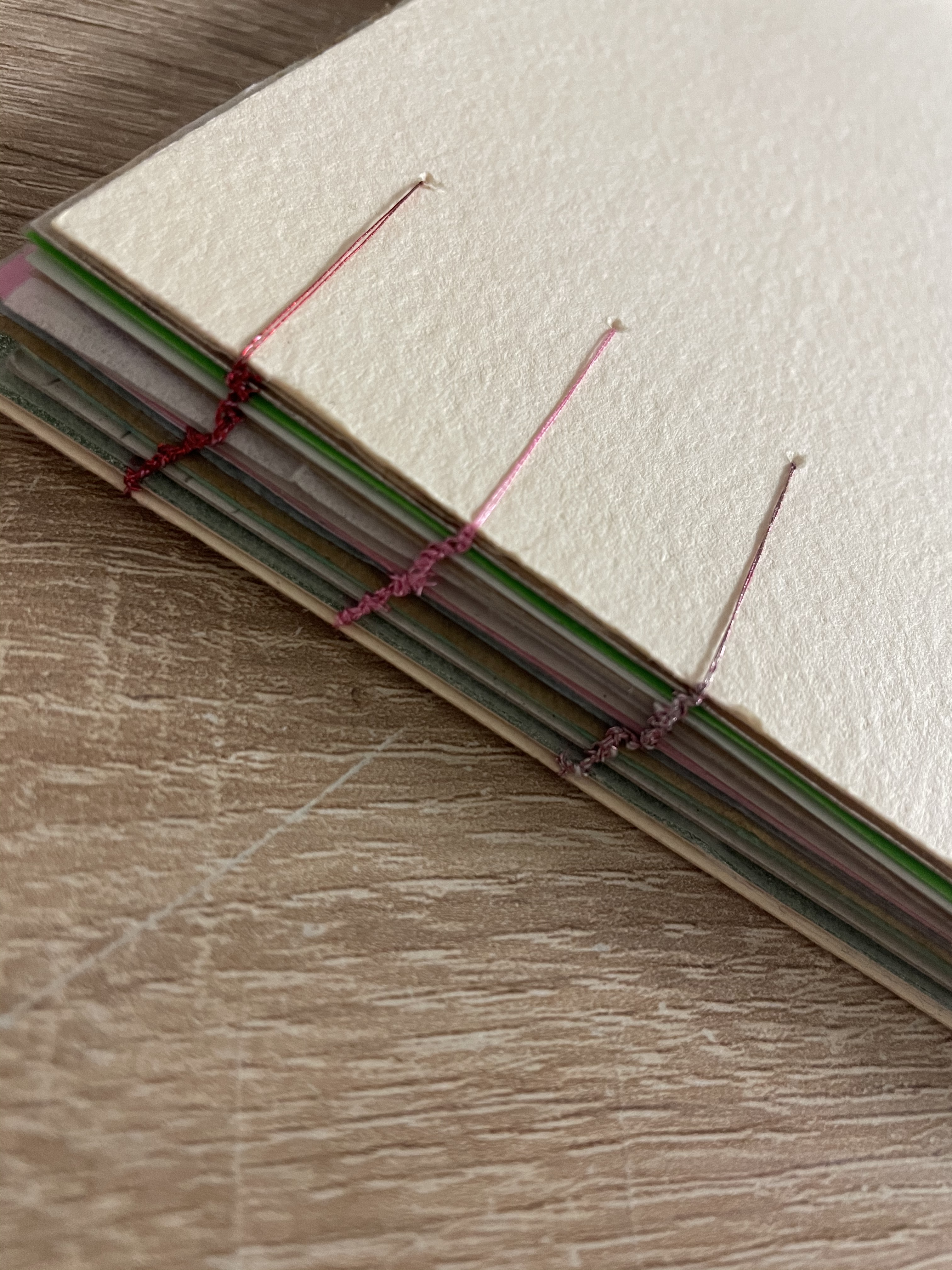
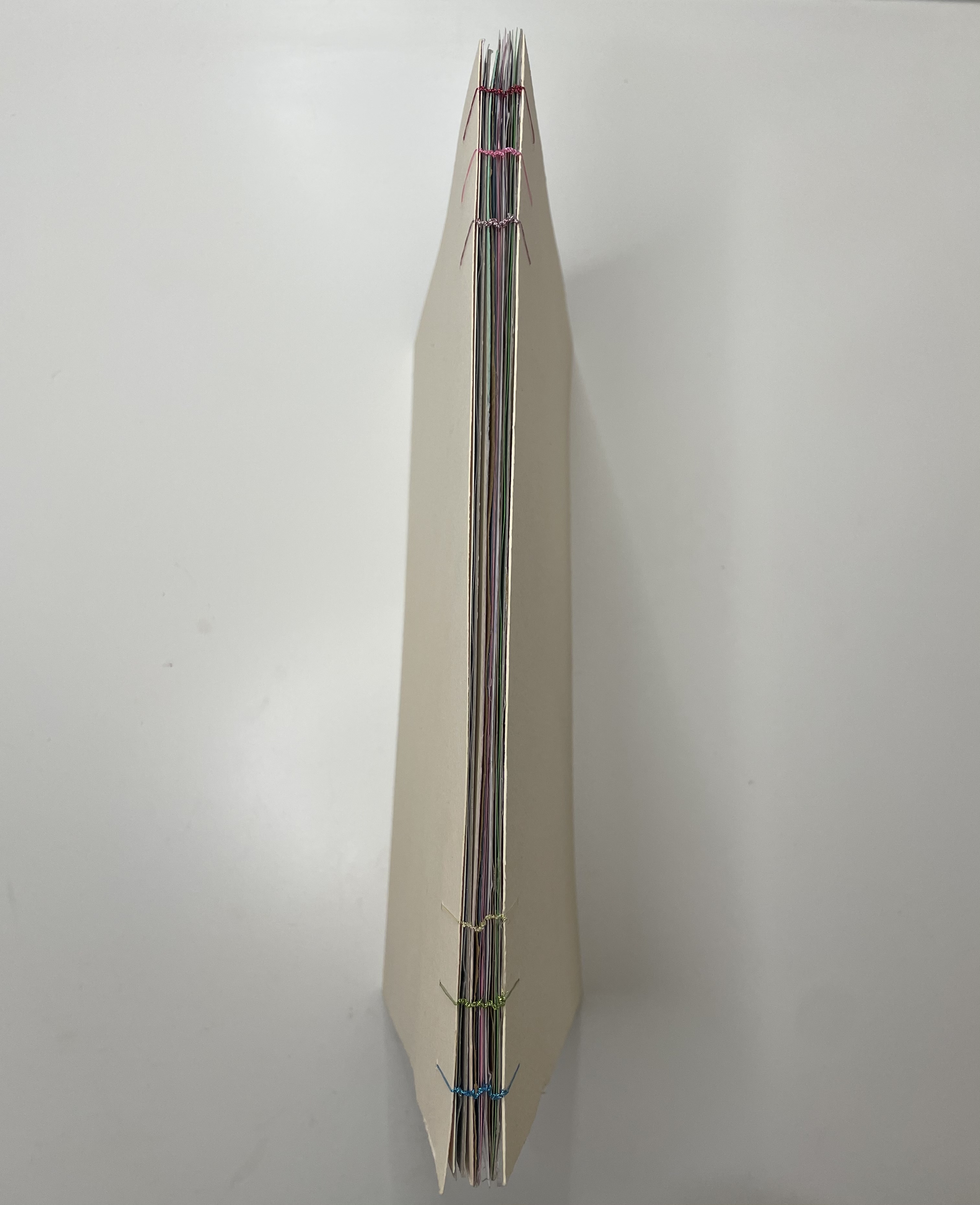
The only thing which if I feel could be improved upon would be to use thicker string such as embroidery thread rather than cotton, just so that it fills the punched holes better, however for a first attempt of this technique I’m pleased with the successful outcome.
