
Your final assignment asks you to draw on all the skills, insights and experience you have gained so far, by designing and producing a book fo your choice.
Use the following options to as a starting point or alternatively identify your own project.
- Influential Book Designers: Identify one or more book designers to present through your book. Find ways to develop your own creative responses to their ideas and visual approaches. Delve into their work, find suitable quotations, investigate their influences, and fine ways of communication this material, and your interpretation of it, to an audience through effective use of layout, narrative, and choices of material.
- Typography: Extend you exploration of typography by continuing to develop creative approaches to how typography, layout and your material choices can help generate meaning. Develop a book that explores one aspect of typography in more detail, or combines a variety of approaches. Just because your project explores typography it doesn’t mean you can’t also include images, colour or narrative.
- Found and Altered Books: Use an existing book as a creative starting point. This could be an extension of exploring altering books in some way, or as a research project into a specific book that will generate content and creative ideas for a new book. Find a physical book to work with or pick one of your influential books from part one.
Research the subject in depth and think about the editorial structure (described in part 3) of your book. What is the flow of the content, would you write articles or create imagery or both? What do you want to tell about the subject and how would you communicate this? And who is your audience? Make a flat plan before you start designing your book, and have a look at other books on the subject to see a different design approach on the subject. You may want to look at the work of designers your inspired by, in order to develop your own design approaches. You may have identified an alternative are you wish to pursue. This is fine as long as you check this out with your tutor first and document the response for your choice. Follow the creative design process in developing your creative thinking and how you will approach the workflow, in terms of content and timescale. Decide on your subject and start researching, creating content, editing content, making decisions about the materials you want to use, and designing your book. Frame this process within an overview of your workflow to help plan the production of your book. Planning he process of generating content, and how this can then be developed, is key to successfully finishing a designed physical book. Keep notes to accompany the process of making of the book in your learning log, and reflect on your design process.
You can use any medium or materials you want to in the production of your book. You may want to research and explore hand-binding, or work digitally with print on demand for production. You may want to combine these approaches and you may want to consider whether you want to produce a one-off copy or a small edition. If you would like to use a particular paper for your book, make print proofs before printing the whole final book. Test the paper, the colours and how your design works on the paper. Explore the materiality of books in more depth by considering the paper, printing and bookbinding of books, both as content and form. Think about how books are help, interacted with, and the associations of the materials you might use. Explore how these choices can start to create meaning within your book.
Reflection: Give yourself a final self assessment cheating against your assessment criteria to see how well you think you’ve done. Use this process to help reflect on your work and your achievements on the course as a while. It will also help to identify to you and your tutor any areas you may need to work on prior to submitting for assessment.
Sharing your work : Digital companies such as blurb.com have an online ‘sharing’ facility – this would be a useful way for your tutor to see the whole work without the need for expensive mail costs. If you decide to send your physical book to your tutor for feedback or to OCA for assessment, for safety, you are strongly advised to send it special delivery.
Analysing the Brief: I have been asked to produce a book of my own choice drawing on the skills and experience gained through this unit. By using one of the topics listed in the brief as a starting point i can either create a book on influential book designers finding ways to develop my own creative responses to their ideas, a book on typography showing and explaining how creative choices can help generate meaning or a book on found and altered books showing
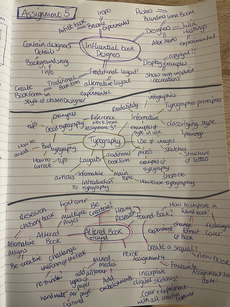
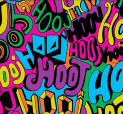
Before decided what my book will be about, I decided to create a small mind map for each topic to see which I felt more inspired and creative by. I felt that the ideas naturally flowed with both typography and the altered book options. My only concern about choosing found & altered books is that I end up repeating and creating something very similar to Assignment 4, so with a long think and a few days break to ensure I’m not rushing my choices I have decided to choose Typography as the topic of my book. (Plus I’m intrigued to see something which I design in book form! I feel this could become very rewarding and something I can keep hold of once printed)
Now that I have decided to choose Typography as my books topic I started to think about the type of book I’d like to produce as this could help influence me into what the contents would contain. As mind maps are the quickest way for me to note down Ideas I have created a larger scale mind map to brainstorm ideas to the contents and which direction I would like to take my book in.
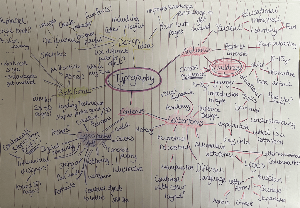
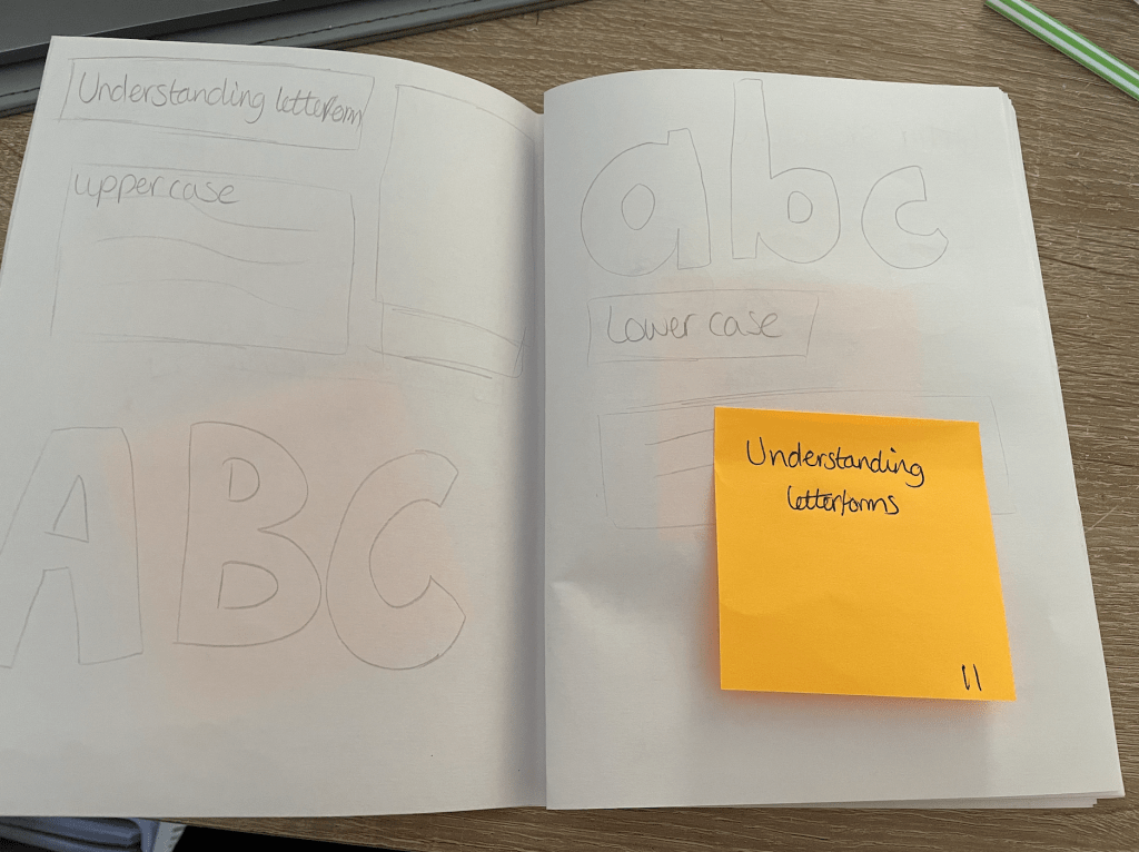
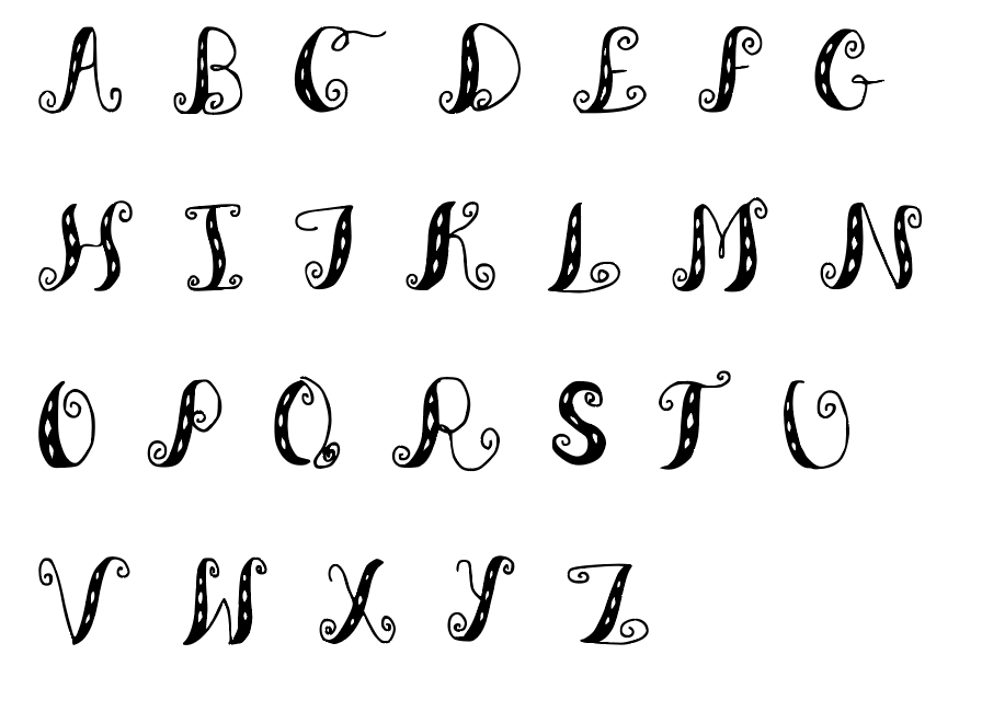
I would to create a book aimed at children ages 7-11 based on typography focusing on the topic of Letterform. I feel that I would be able to interact with the audience by including some sort of ‘do it yourself’ pages encouraging the reader to get involved and gain interest and excitement and to help the process of learning by engaging their brains. By choosing letterforms I would like to cover things such as Typeface design, an explanation, alternative letterforms including logos and letter combinations, perhaps looking at letterforms from different languages along with the reconstruction and deconstruction of the letter. However during the research process new ideas may arise.
Following the advice given in the brief I have made note of the answers to help me distinguish the route I will take for my book;
- What is the flow of the content, would you write articles or create imagery or both? – At the moment I plan to produce a book on typography focusing on letterforms, I would like the content to build up the knowledge of the reader so by the end of the book they will feel confident enough at attempting to design their own font. I plan on using short informative articles along with imagery of both illustration and sketch.
- What do you want to tell about the subject and how would you communicate this? I plan to explain and encourage people into the world of typography to show more of the artistic side of typography rather than just a ‘bunch of letters on a page’.
- Who is your audience? I’m going to create a fun and modern book for beginners from the ages of 8+. At first I wanted to focus on creating more of a children’s book however feel I would hit a larger audience aiming it at beginners, with the use of colour and creativity I hope it would appeal to all ages.
Without covering too much of what has already been covered in previous exercises and assignments which I have created on typography, I would like to including the following;
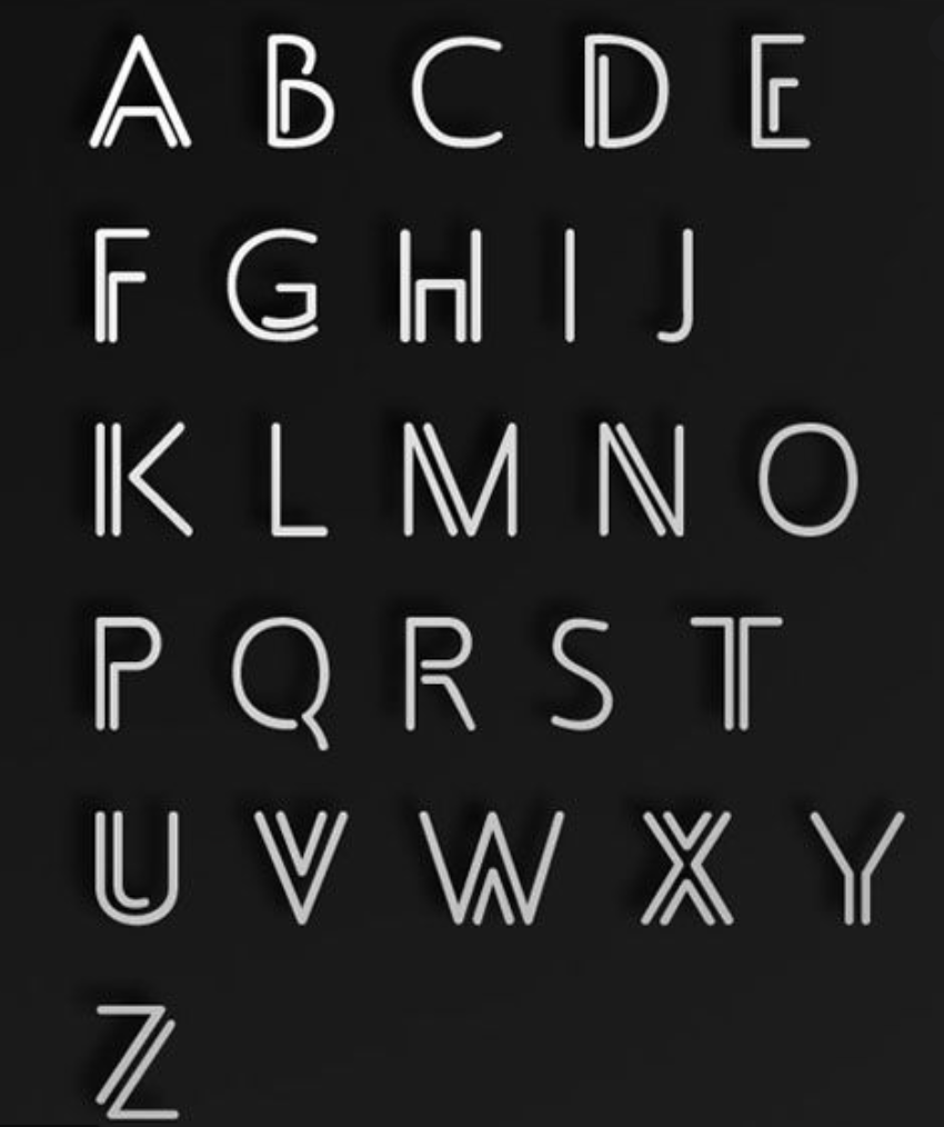
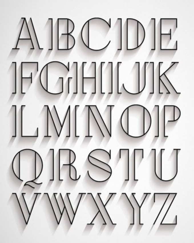
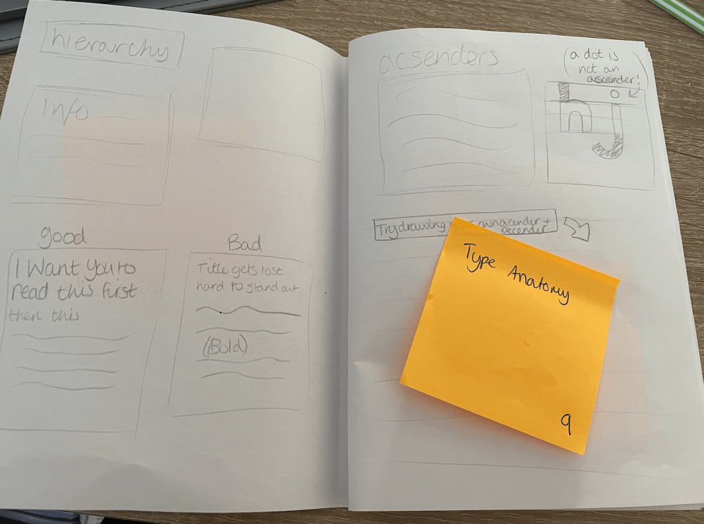
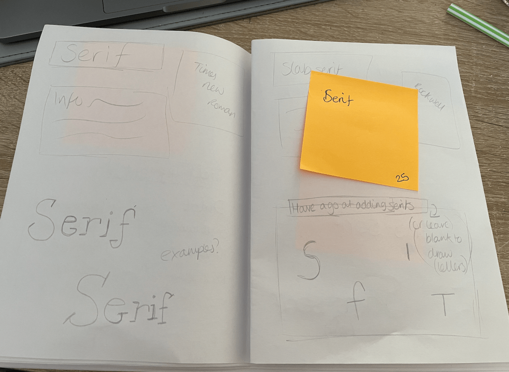
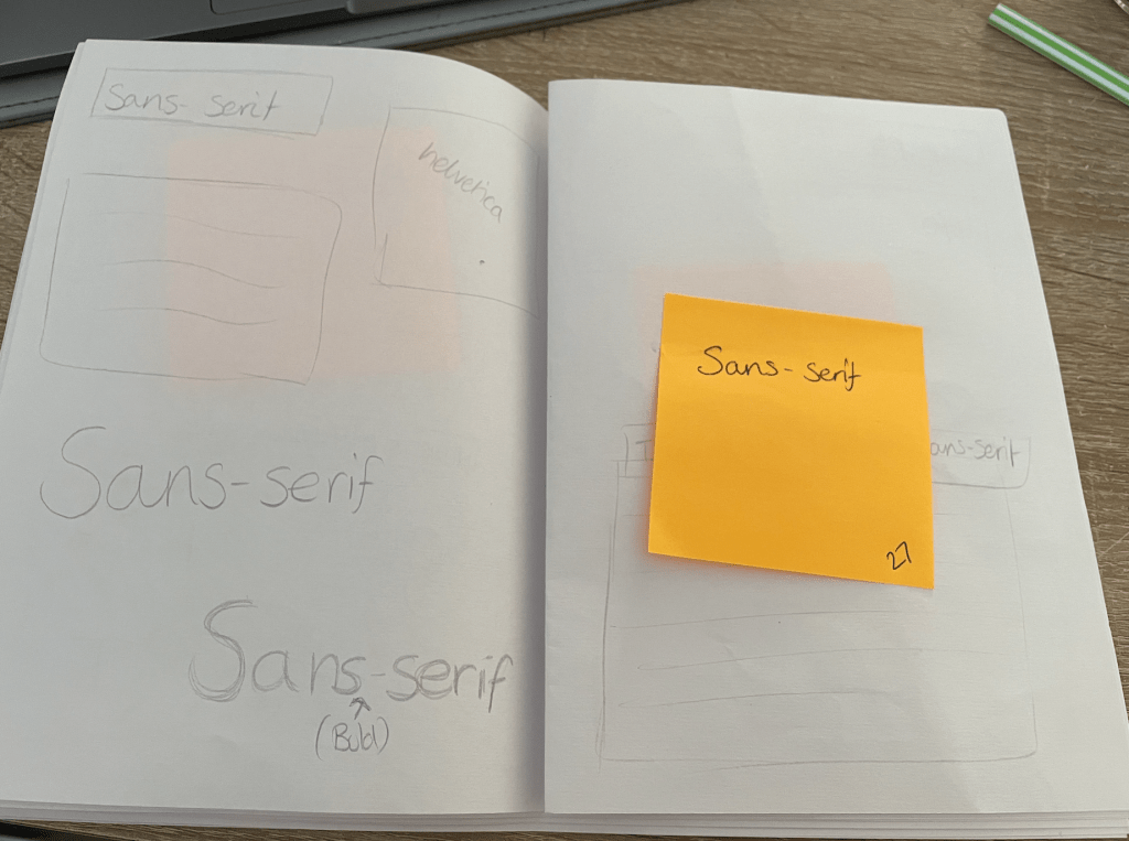
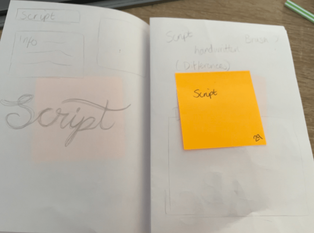
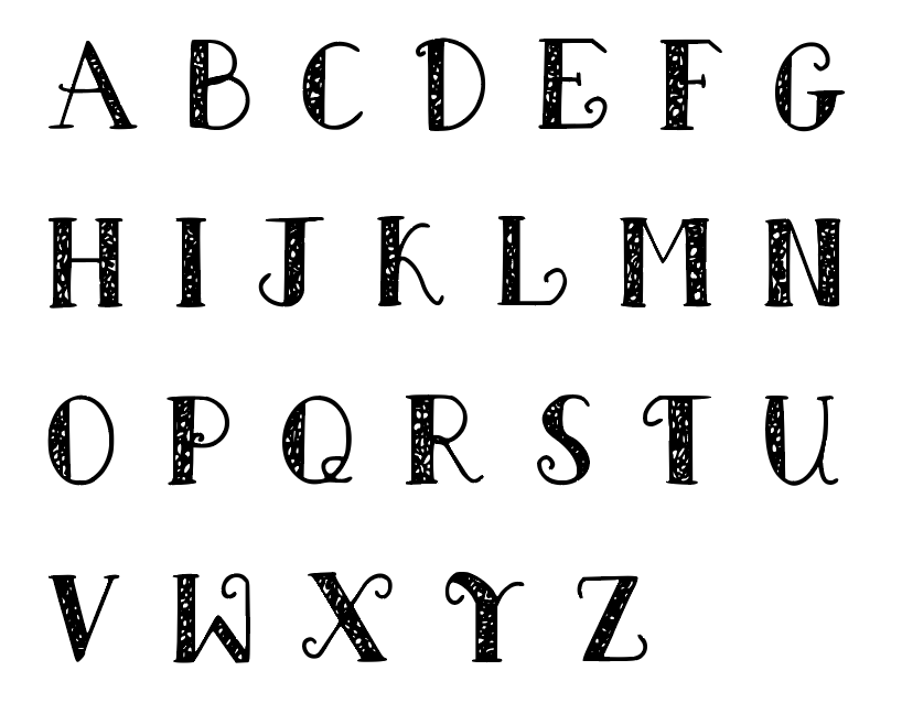
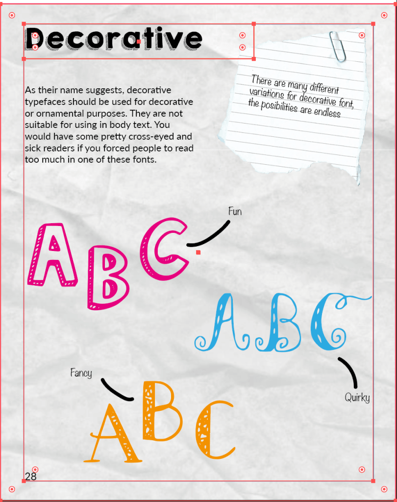
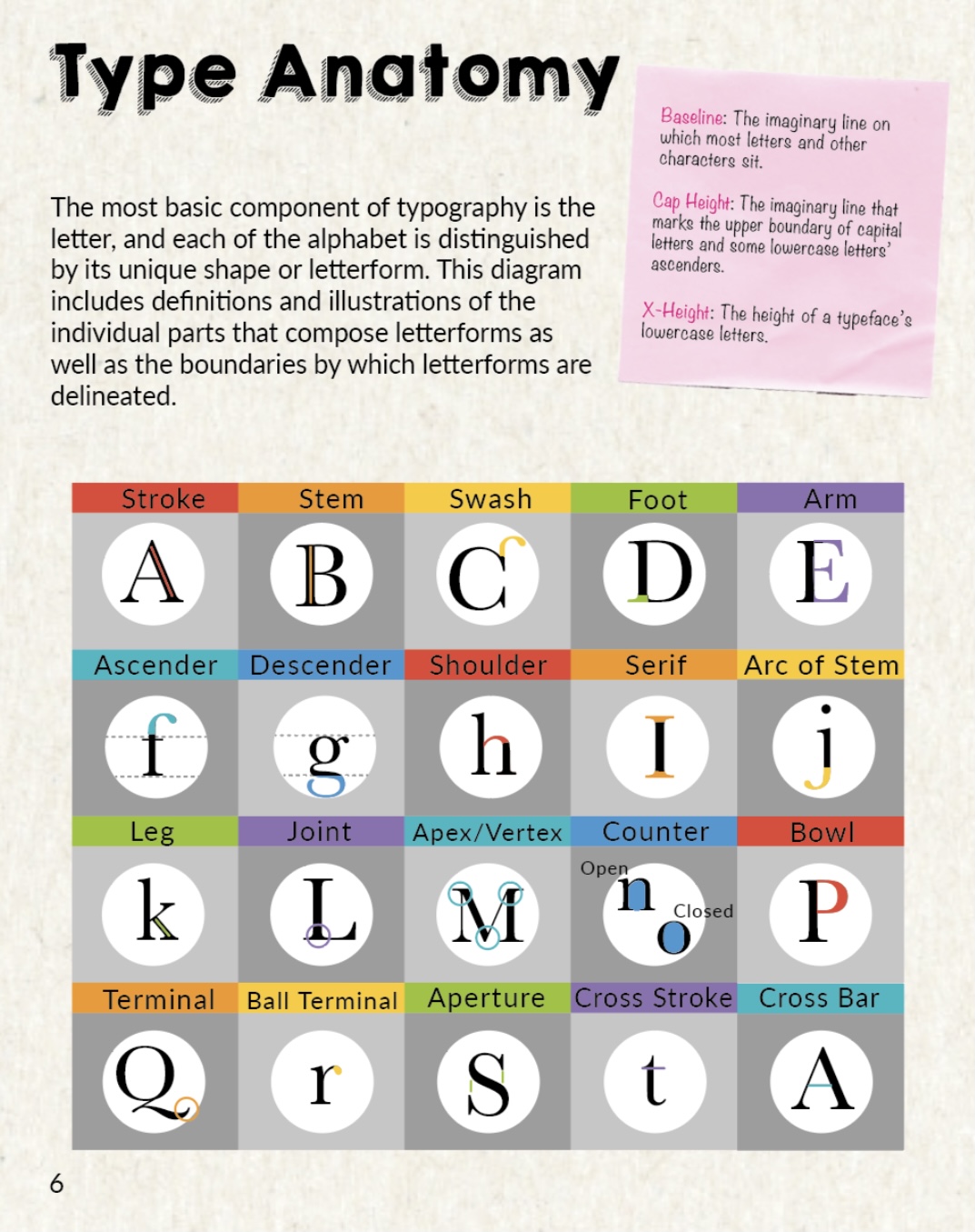
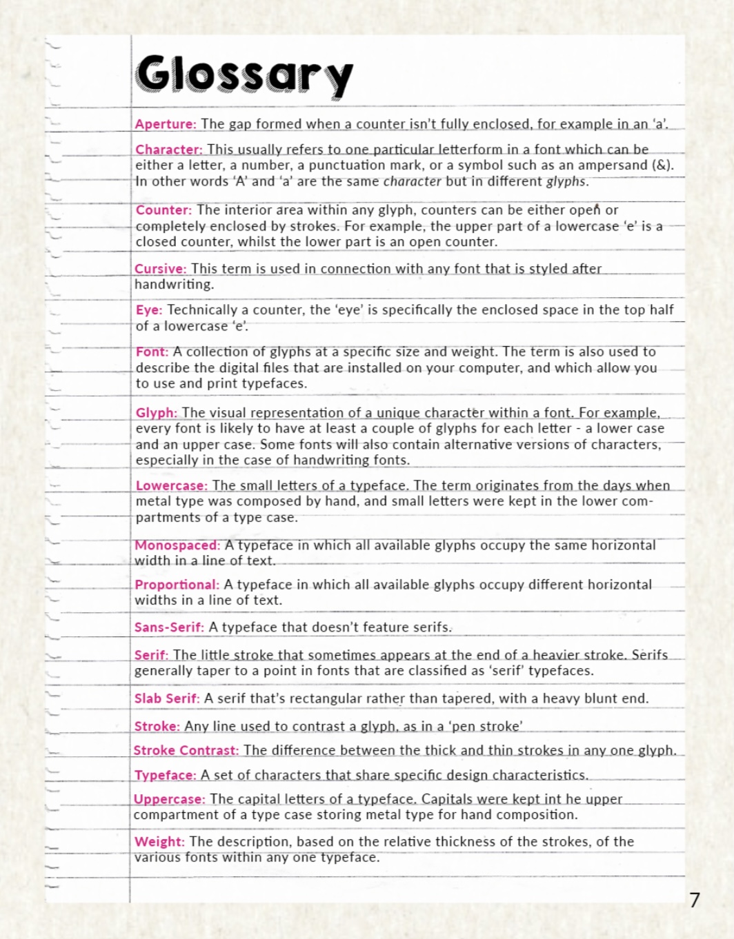
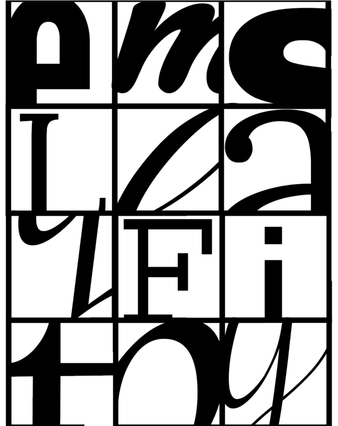
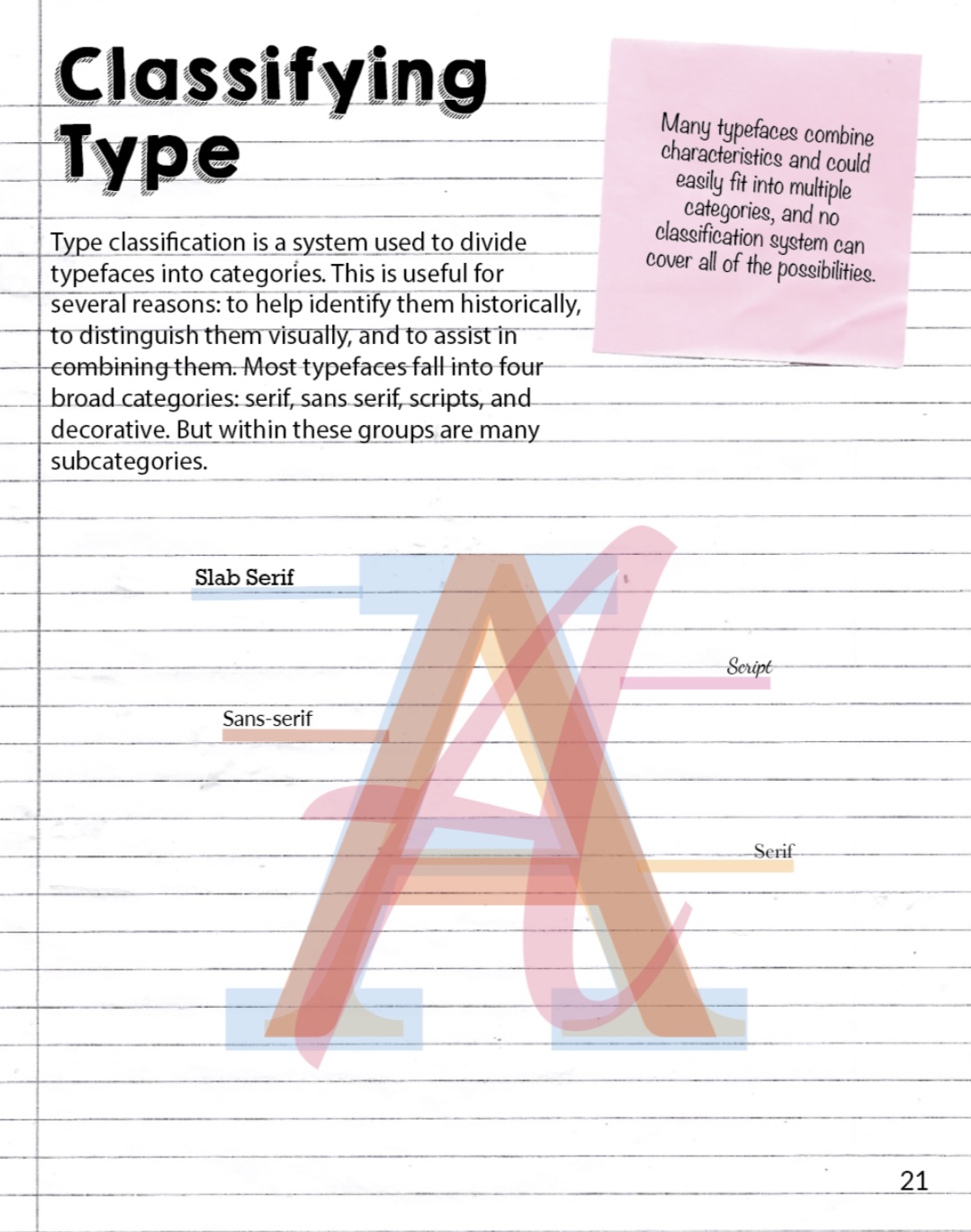
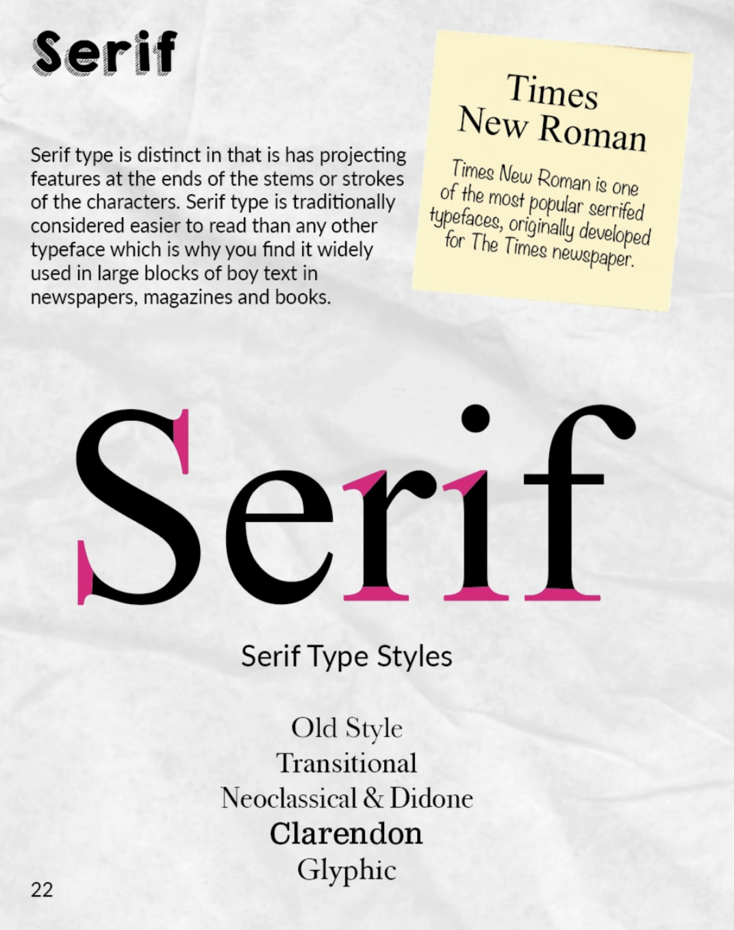
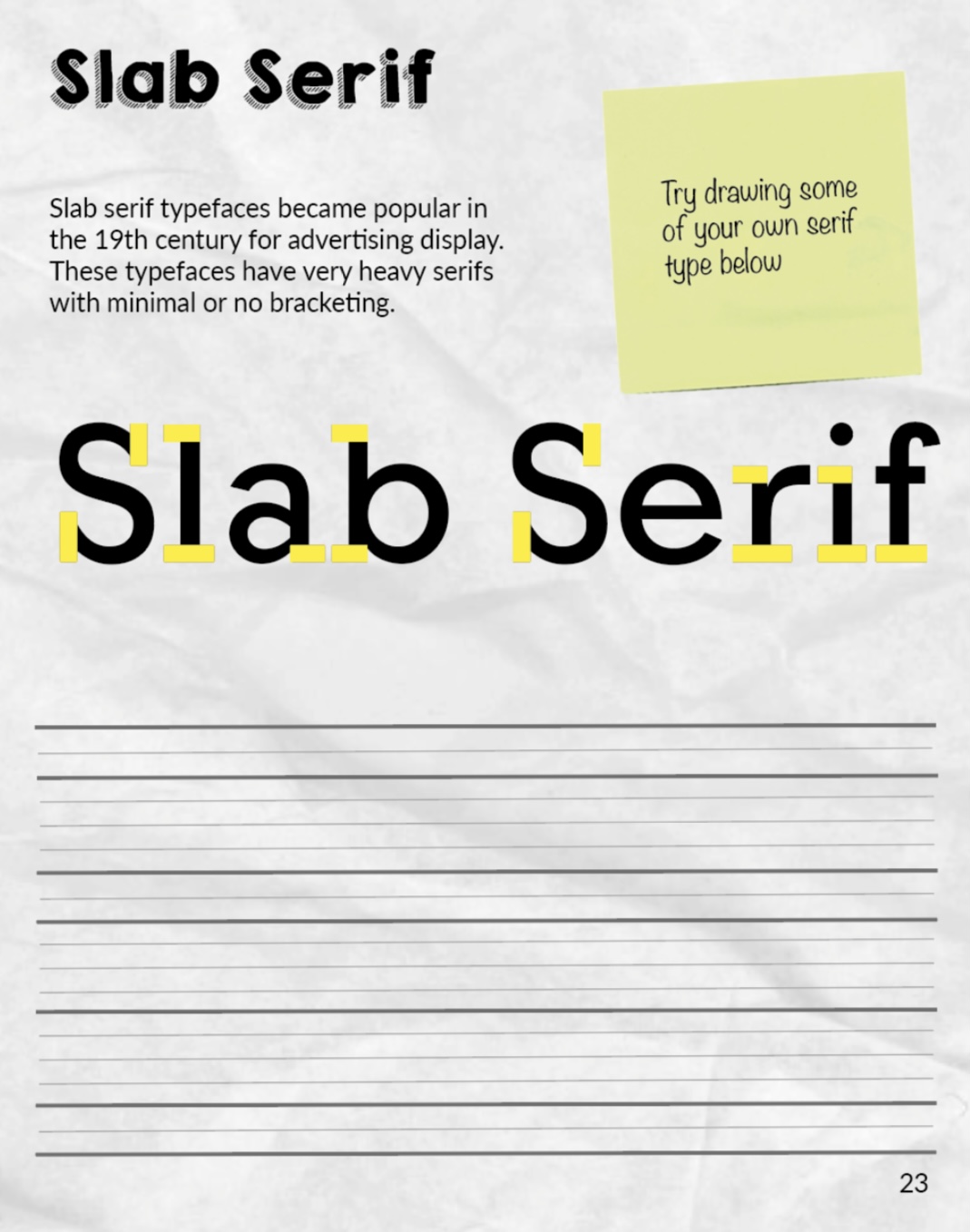
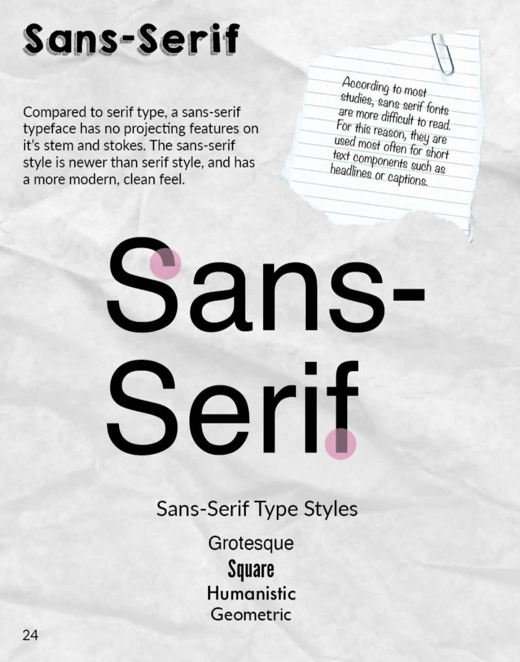
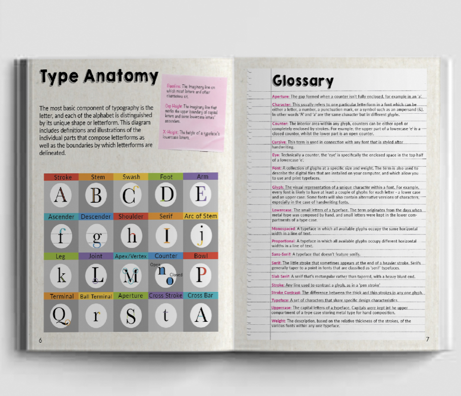
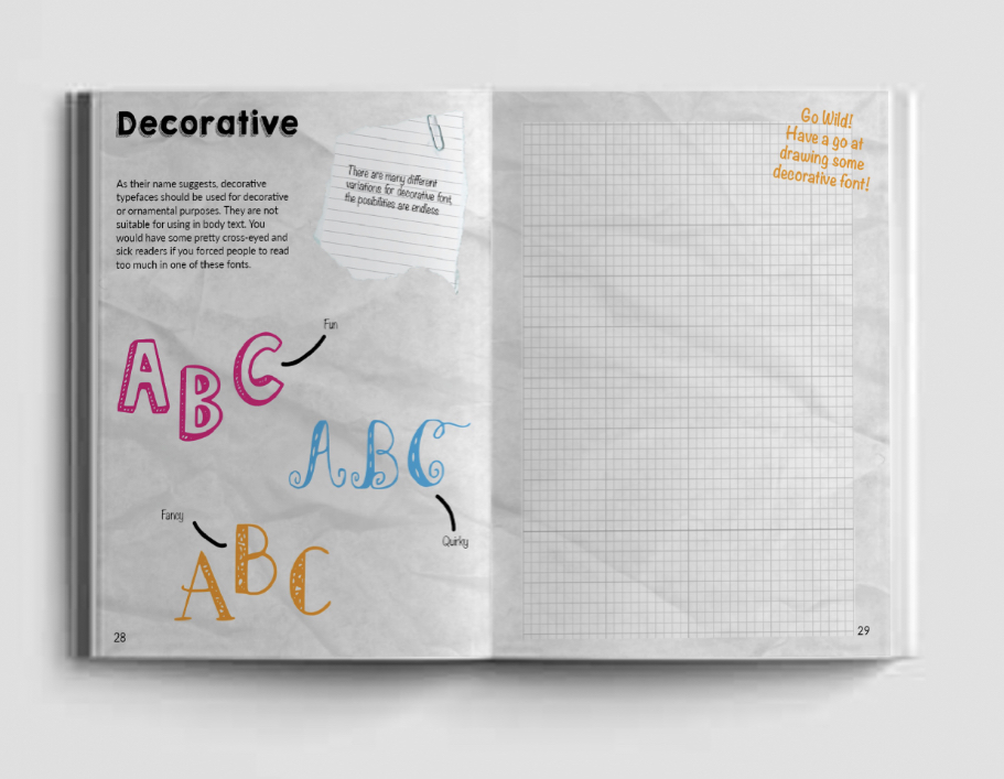
A very brief introduction of the anatomy of a typeface, this would include and informative illustration selecting and highlighting typographic parts and explaining how letterforms work. (I would need to include information on this as it is a book for beginners, however I don’t want to cover too much of what I already have in past assignments, so will keep it short and sweet). Also another insight into classified type showing examples of serif, sans serif, script etc. I think a page with 6-8 boxes showing a single letter of each typeface would work well as there will be no need going into a huge amount of detail.
Getting more into the creative side I would like to include pages encouraging the reader to deconstruct text and enhance them in whichever way they’d like, here I can add in a step by step example? or include blank pages for designs to be drawn straight into, this way the book would be less likely to be discarded after use and kept for remembrance of their work.
I like the thought of scanning in different paper samples and using these as elements within my book, a similar style to the my zine booklet part of assignment 1 which express well, my style! This would add a personal touch to the book and also would create something different to other books which are on the market in this genre.
Research
I thought it would be best to focus on researching for the contents of my book first, this way I will be able to work out my flat plan and decide how many pages my book will contain and what the main topics will be. As I felt it would be appropriate to include a brief run over for the anatomy of a typeface and classifying type in my book as the target audience will be for beginners, I don’t feel the need to research these subjects as I feel pretty confident in these areas.
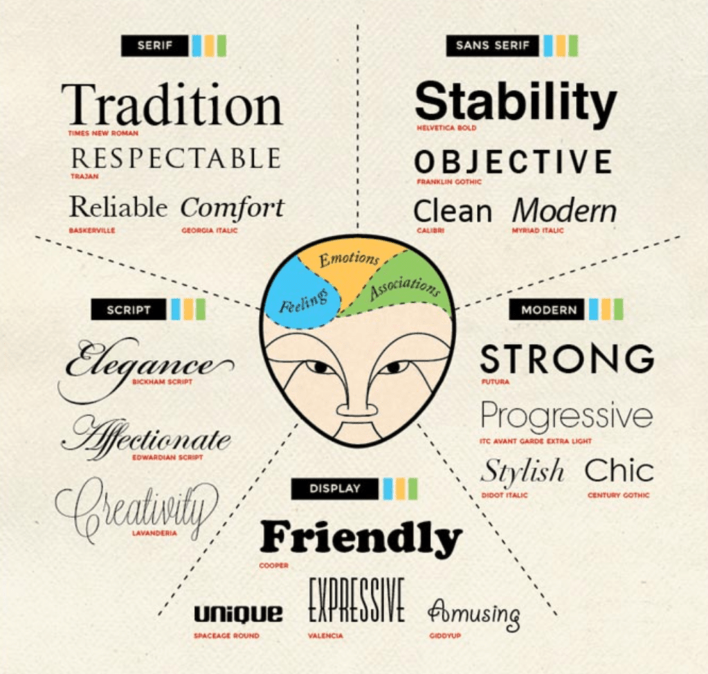
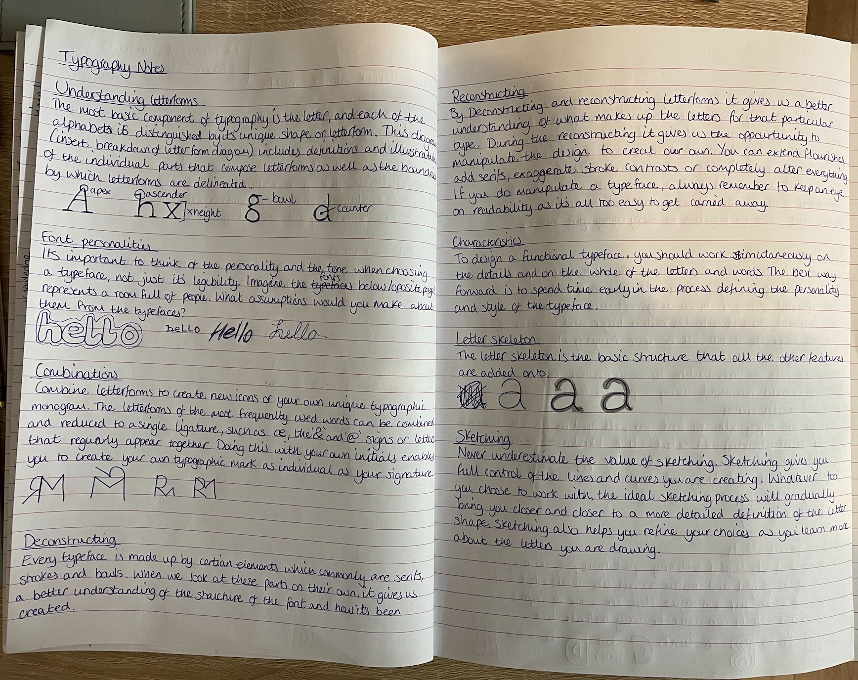
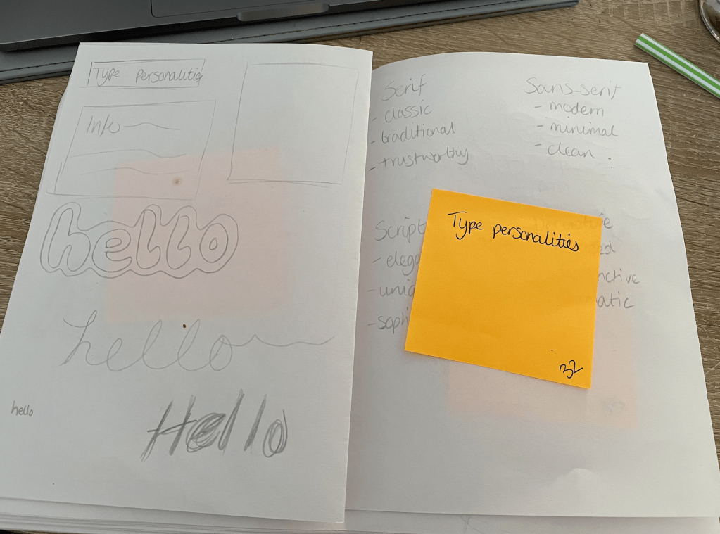
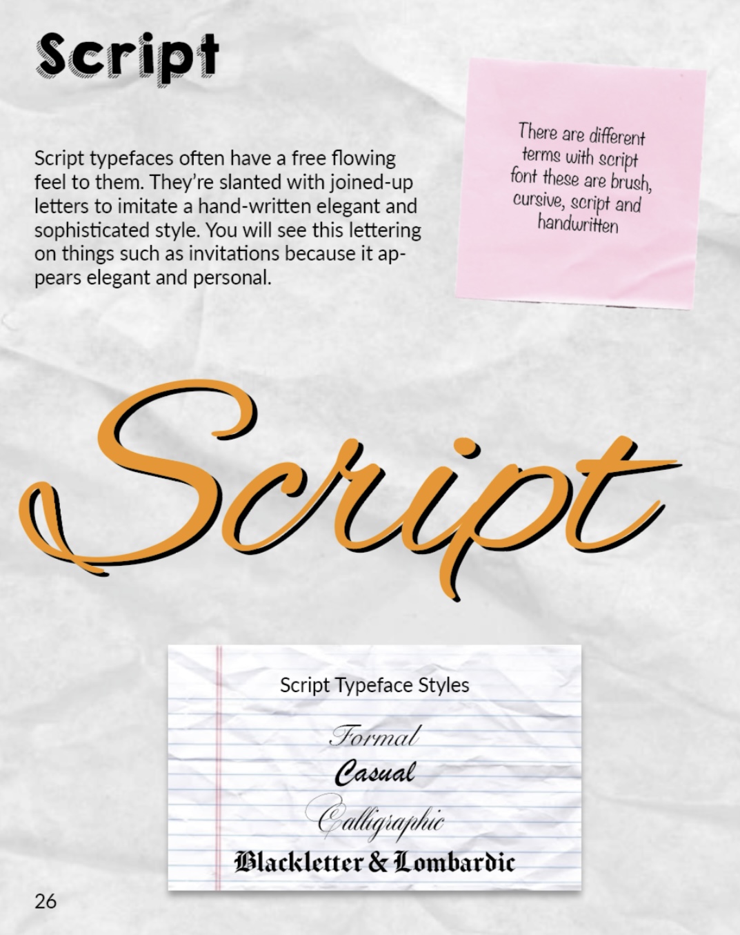
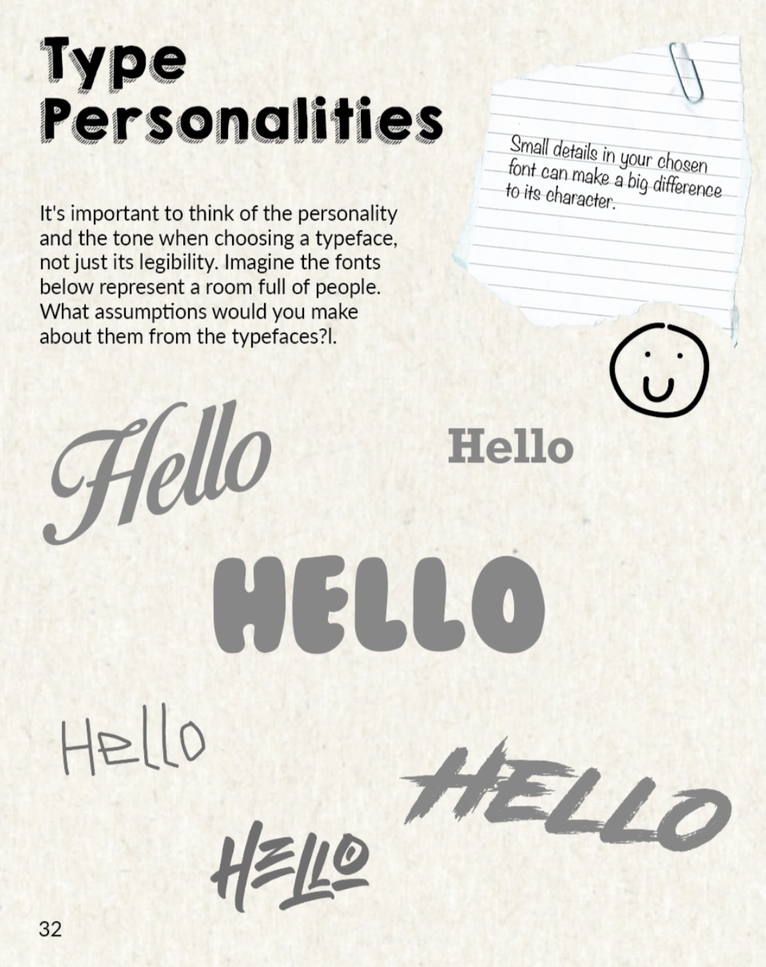
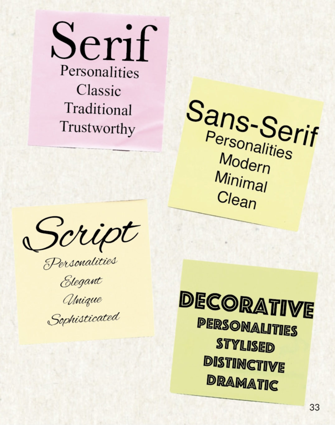
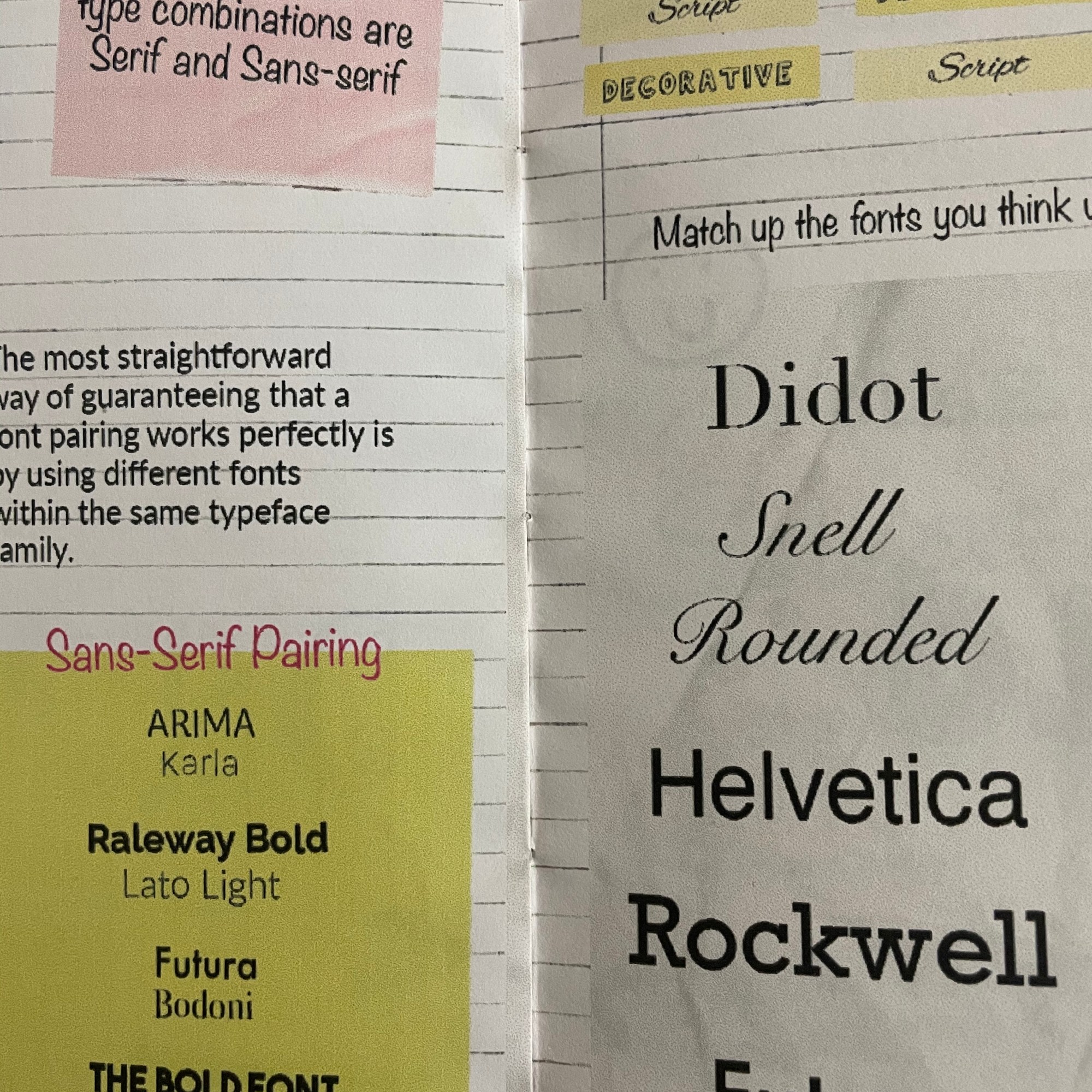
Font personalities – A font can convey mood, attitude, and tone with a personality perceived from the font’s features. Serif are seen as traditional, stable, practical, serious, mature & formal. Slab Serif are more modern, bold, masculine, harsh & assertive. Sans Serif are contemporary, and sometimes sleek and elegant. Script ranges from casual to formal, sleek, elegant & sophisticated. Display typefaces have the most diverse and outspoken personalities.
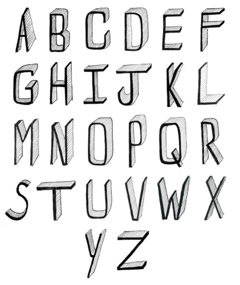
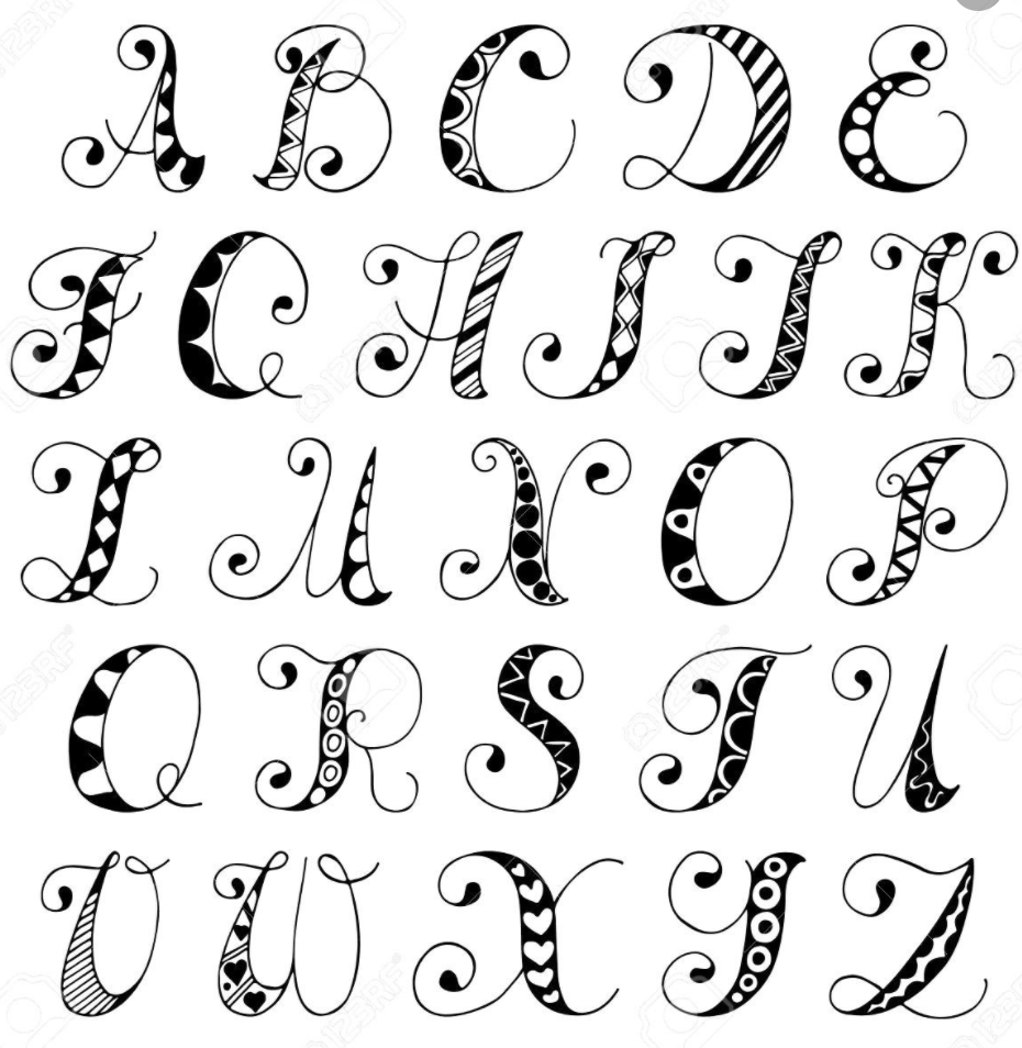
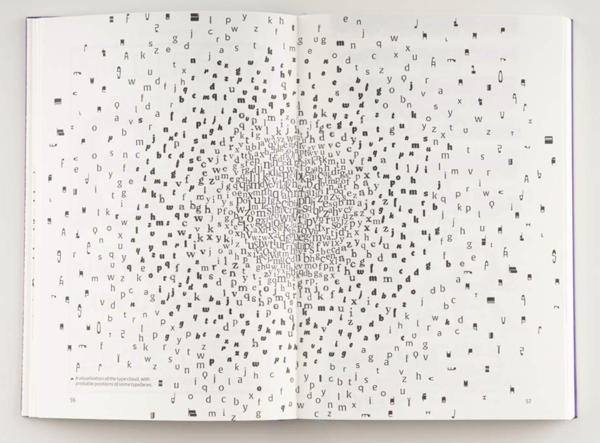
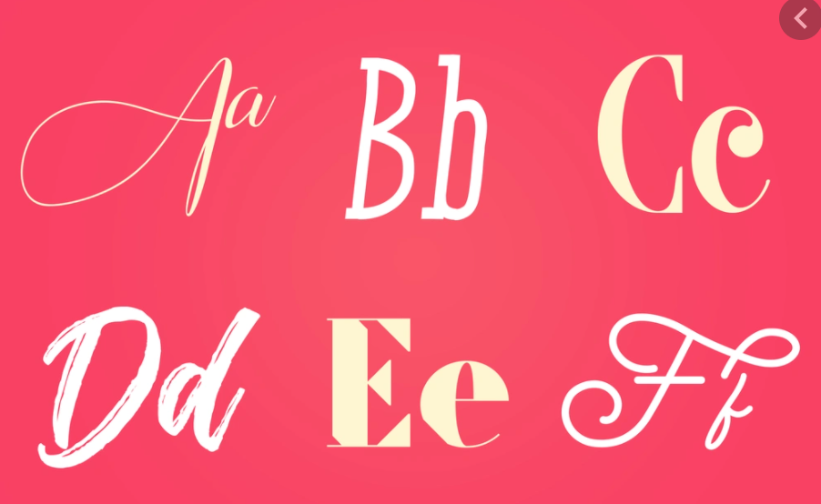
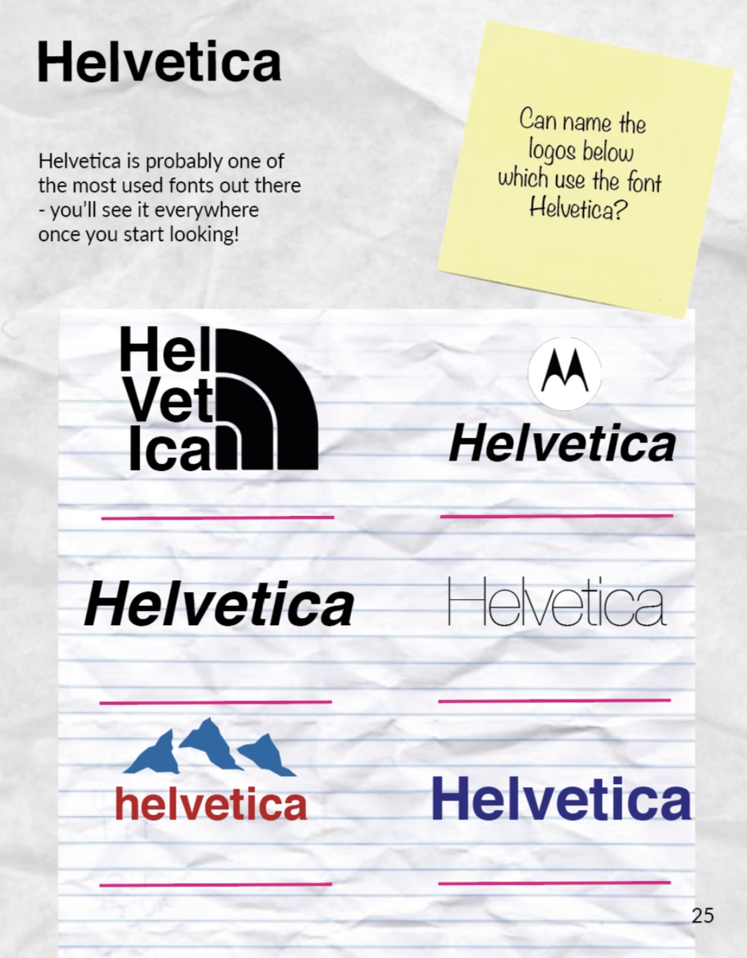
Im considering creating some sort of infographic similar to the image to the right, when information is displayed in this way it seems less text heavy but still conveys the information present.
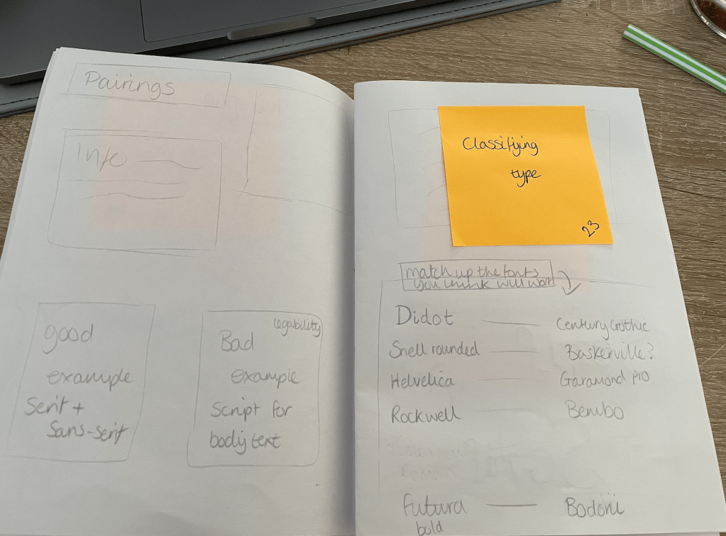
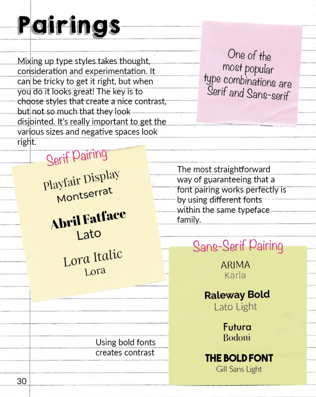
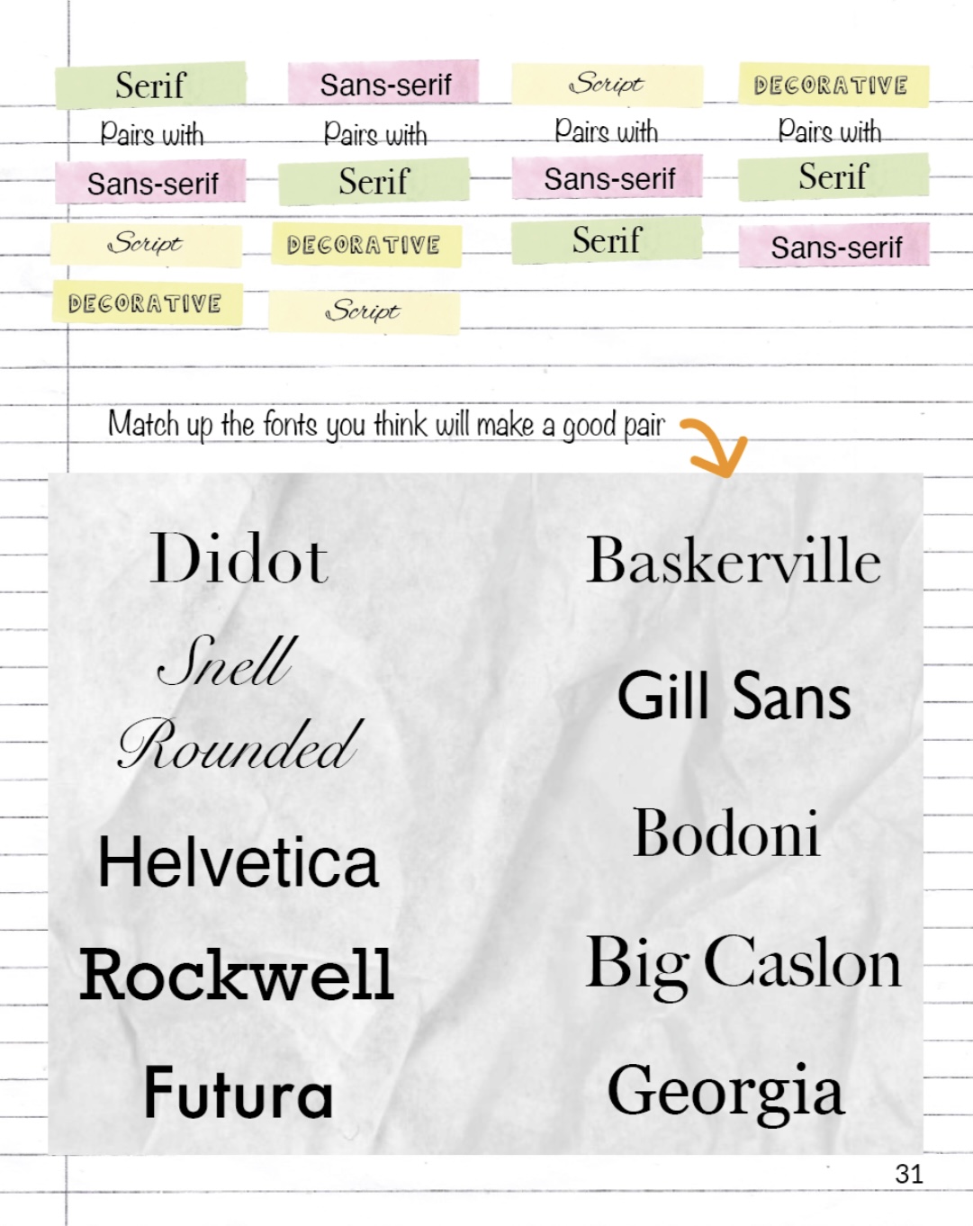
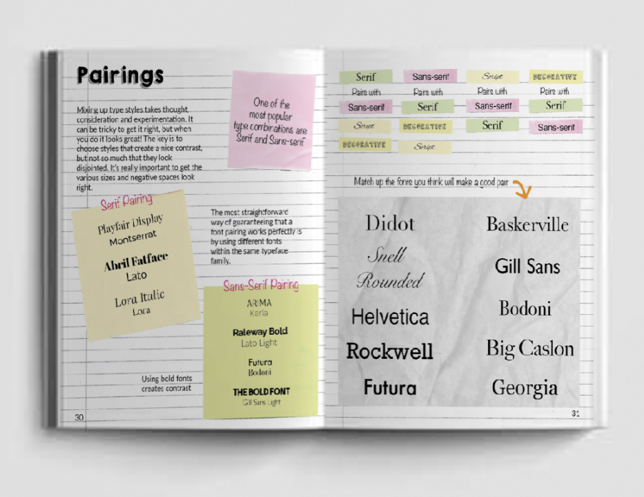
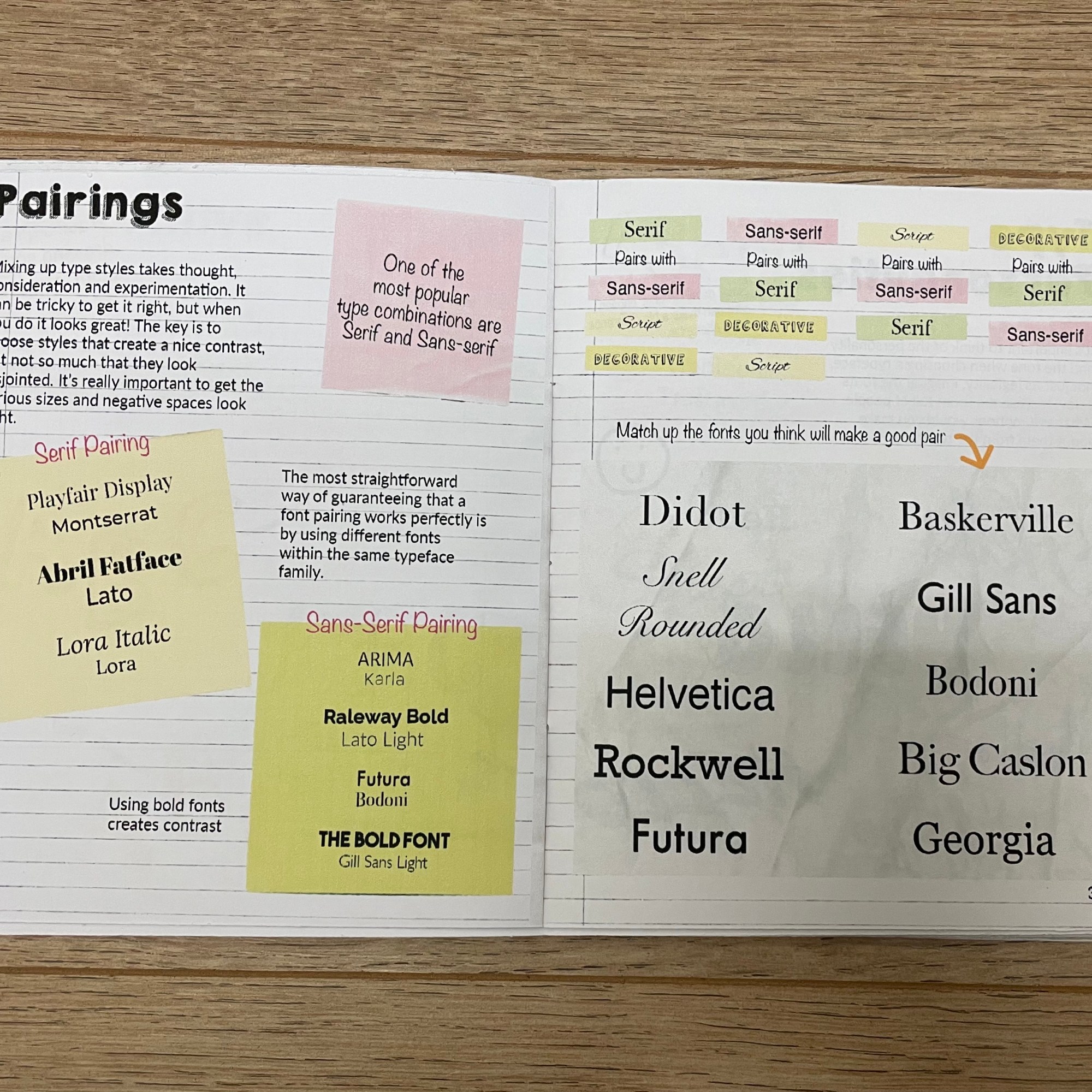
Font parings – When pairing fonts together it is crucial that the correct selection is made, you want your pairings to work and complement one another not to sit together fighting for attention. One important word comes to mind when pairing and that is Contrast, as the name implies, it is about finding totally different – but still complementary – typefaces that are each fit for their intended application. Traditionally, this involves pairing a serif with a sans serif. Serif fonts pair well with Sans serif, Script an Display. Sans-serif fonts pair well with Serif, Script and Slab Serif. Script/Display fonts pairs well with Serif and Sans-serif.
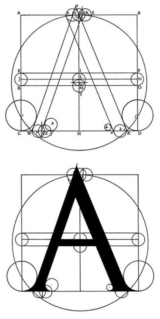
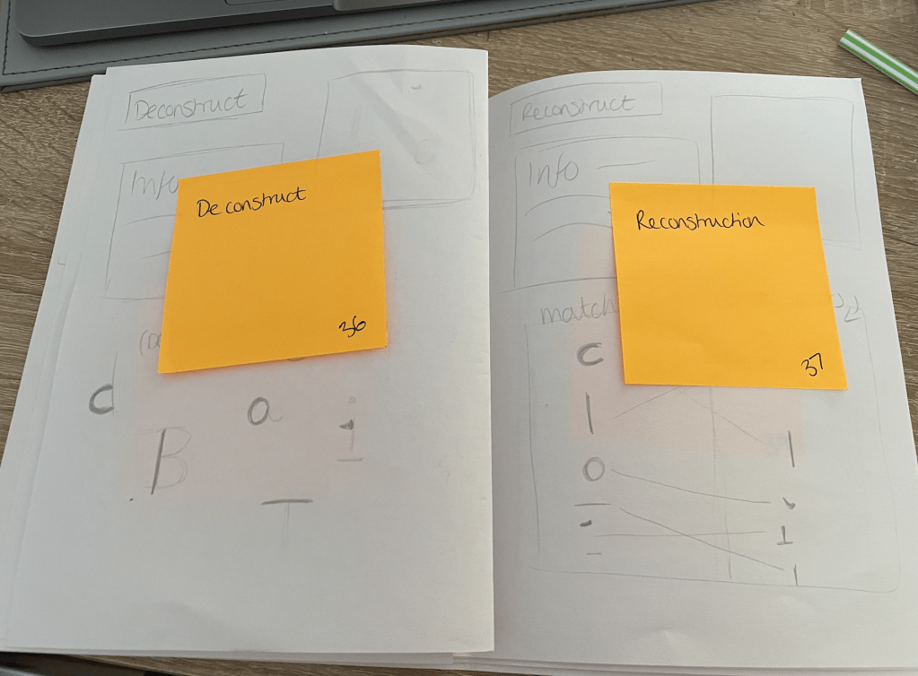
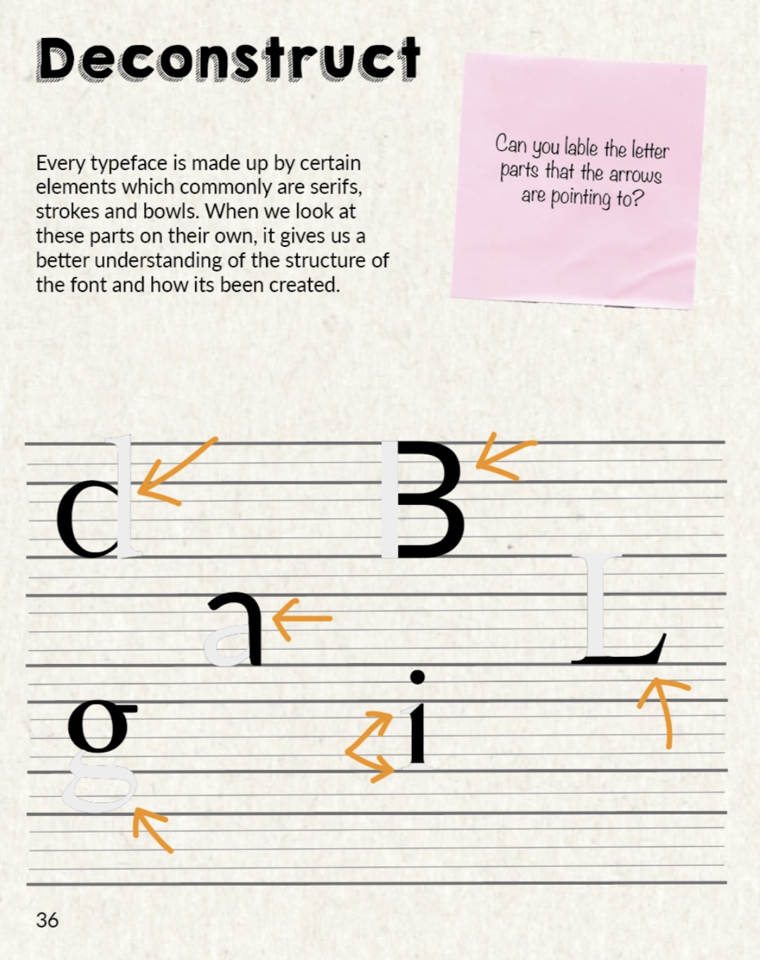
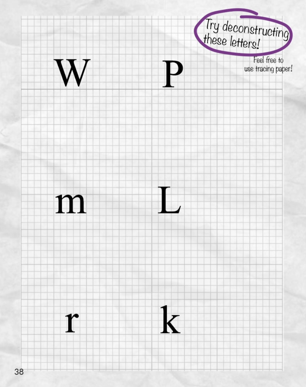
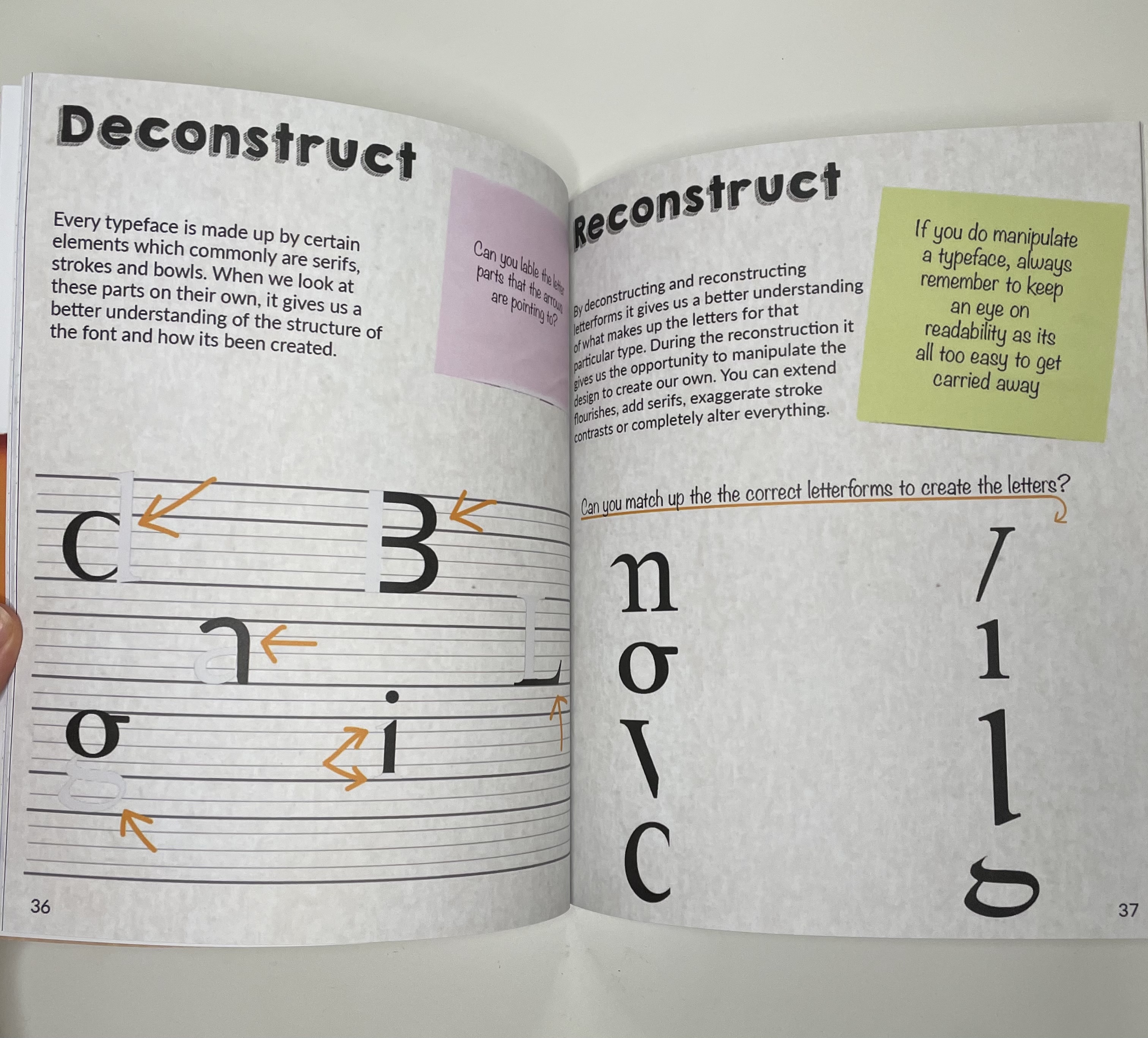
Deconstruction of letters – Typefaces are made up by the elements explained in anatomy of a typeface which commonly are serifs, strokes and bowls. By looking at these elements on their own we are able to understand the construction of the letter, The easiest way to to this is by tracing parts of the letters.
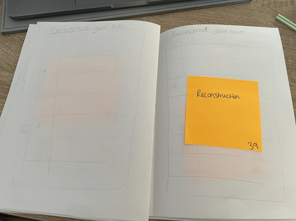
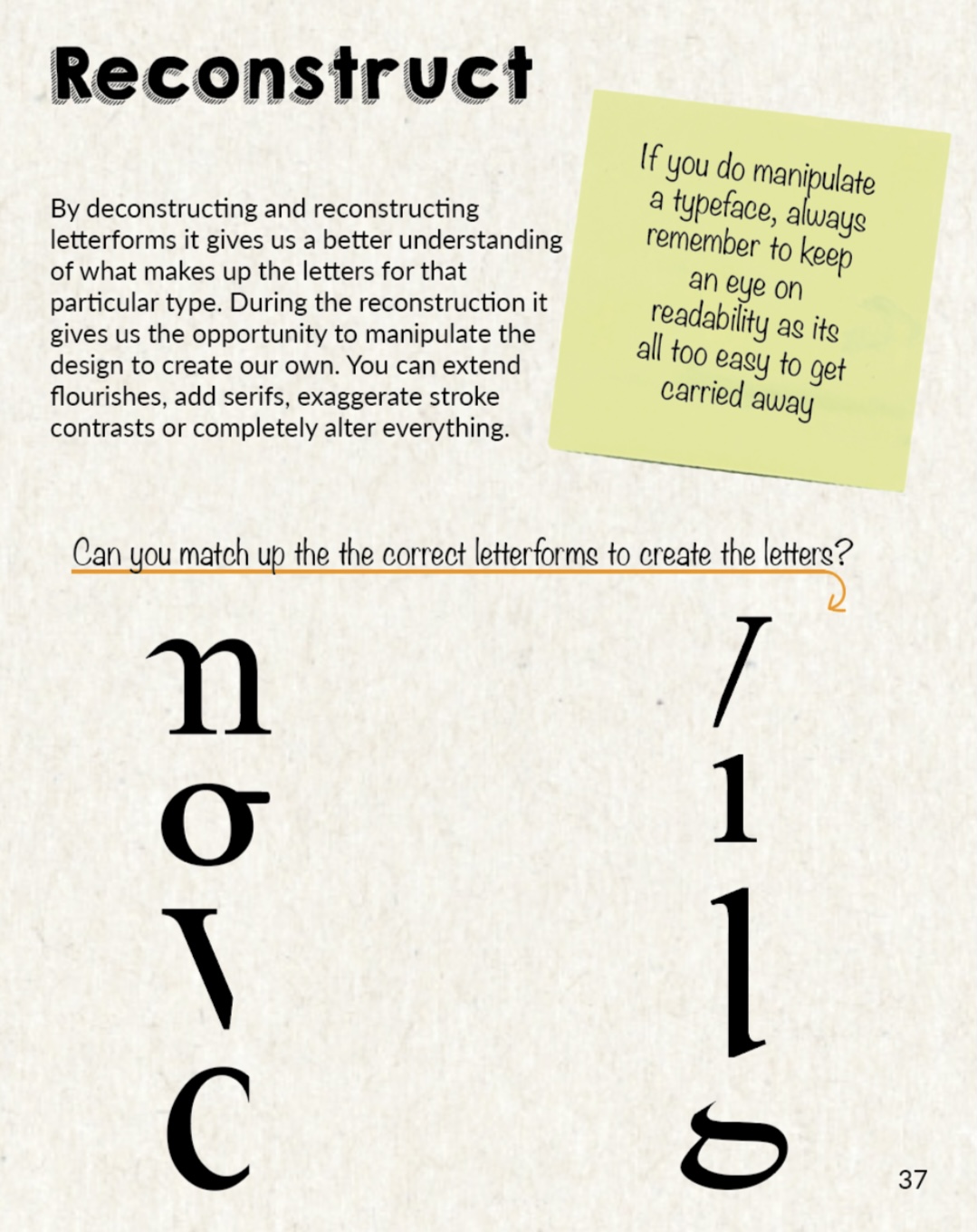
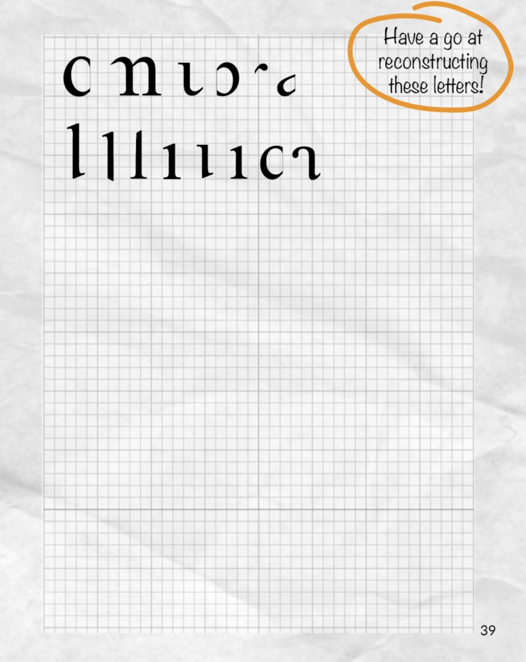
Reconstruction – By deconstructing and reconstructing letterforms it gives us a better understanding of what makes up the letters for that particular typeface. During the reconstruction it also gives us the opportunity to manipulate the designs to create our own.
The deconstruction/reconstruction has reminded me of an exercise in part 4 of Core Concepts. We were asked to complete a typographic jigsaw puzzle. I really enjoyed this and it really helped me understand how the letters of the typeface ‘Baskerville’ are constructed. This could be something I could include on one of my DIY pages to help the reader understand more this topic, just like I did.
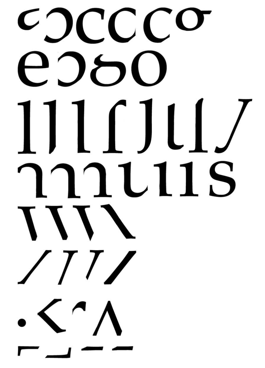
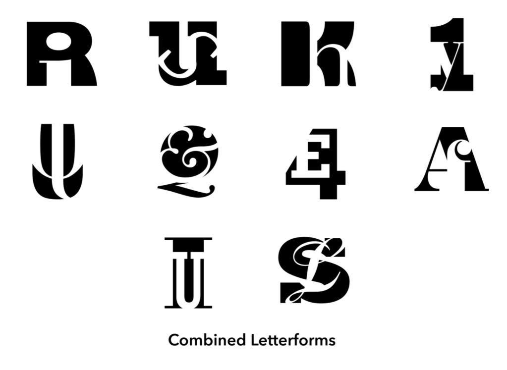
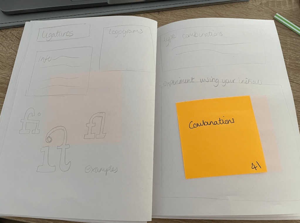
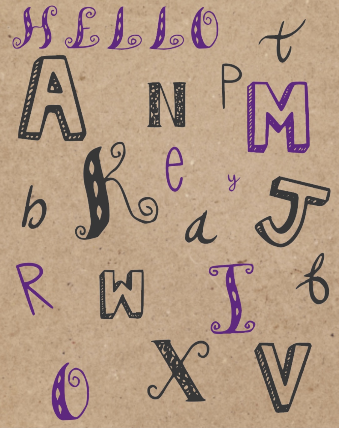
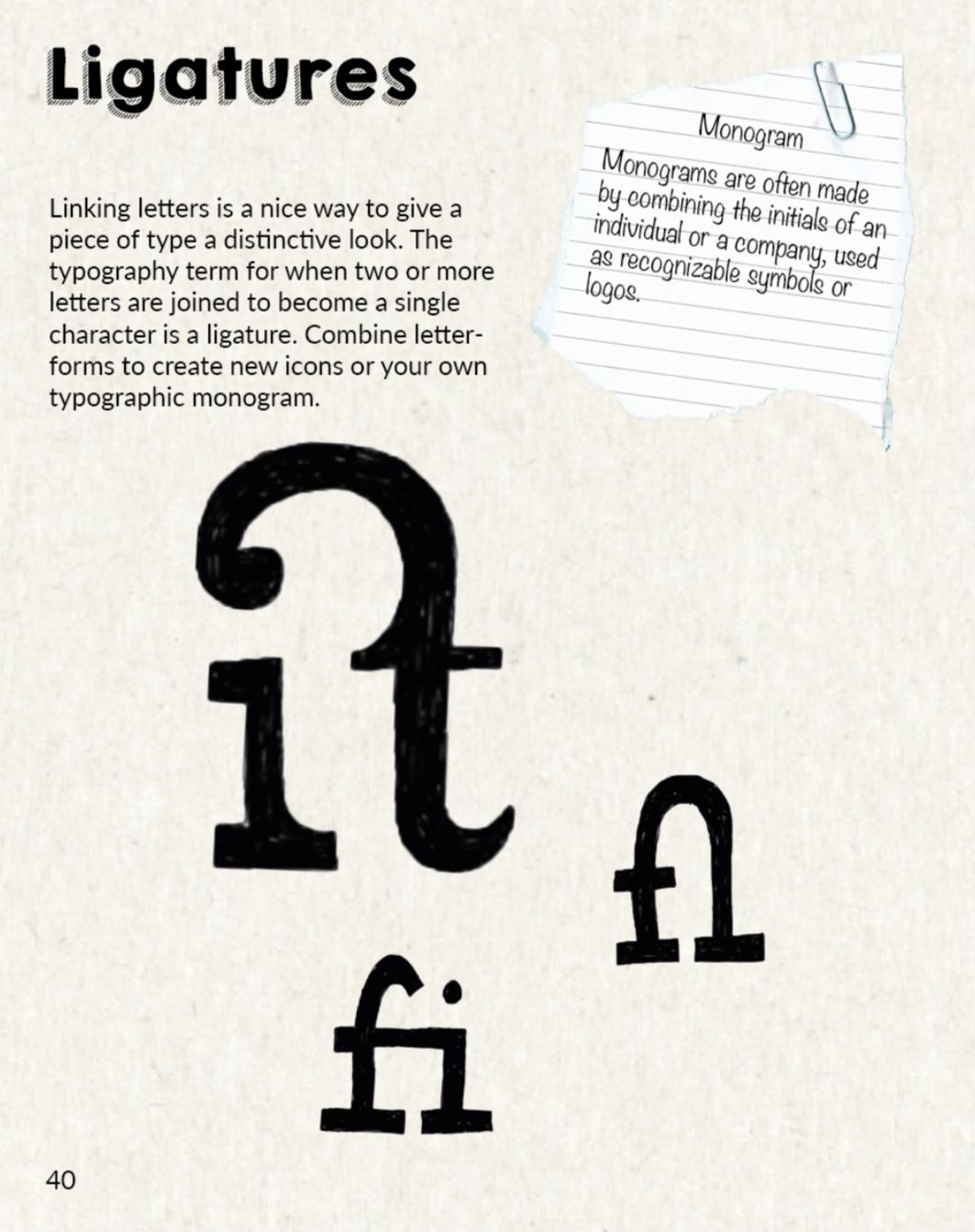
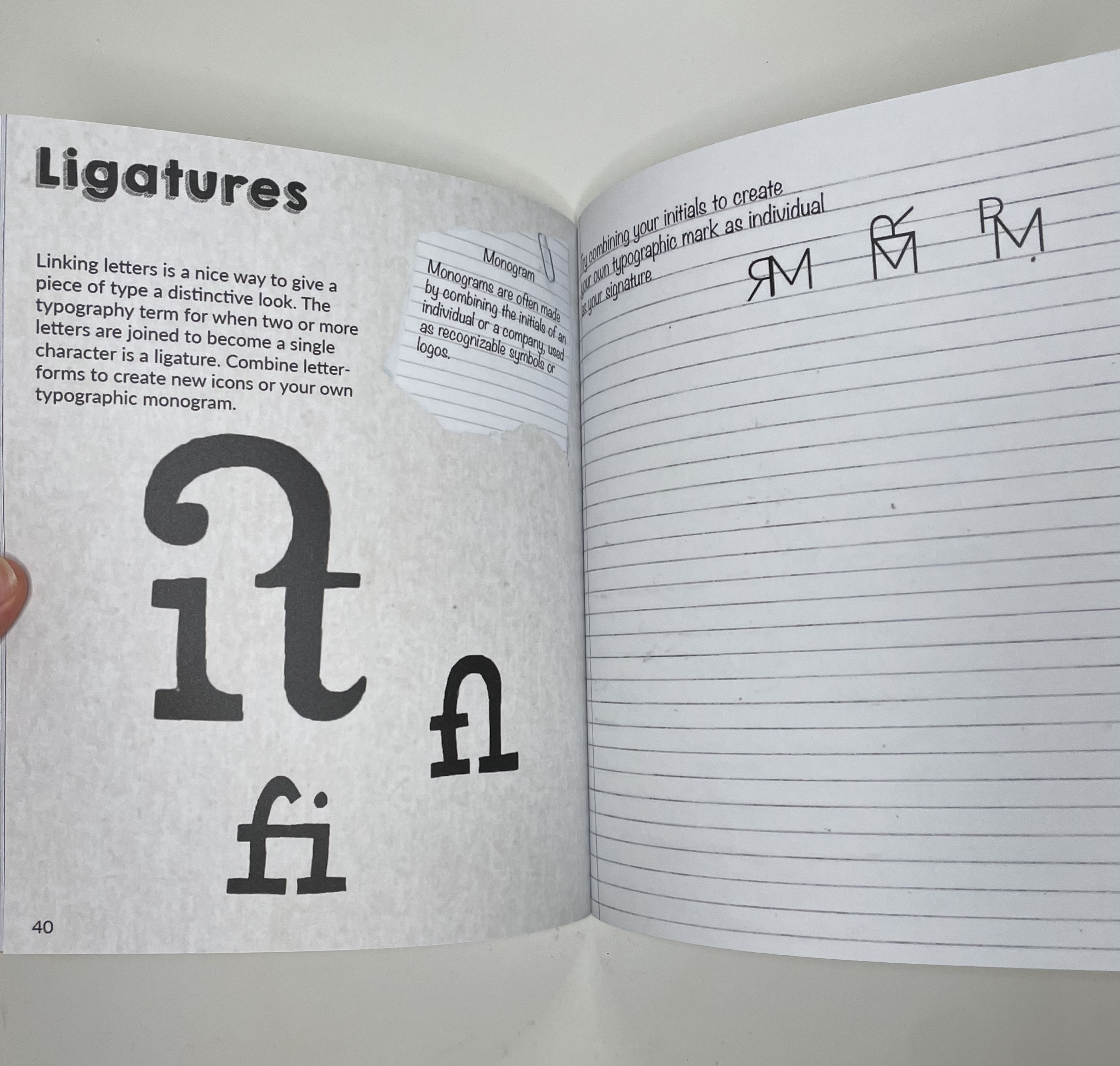
Combining Letterforms – The letterforms of the most frequently used words have been combined and reduced to a single ligature, take ae for example along with the ‘&’ and the ‘@’ sign, or letters that regularly appear together. Combining letterforms can create new original icons and your own unique typographic monogram. When combining two letterforms you need to ensure that both characters are still recognisable when considering composition. Another creative way to combine letterforms is with the use of negative and positive space, I really like the look of these and will consider creating my own as examples to use on this page within my book.
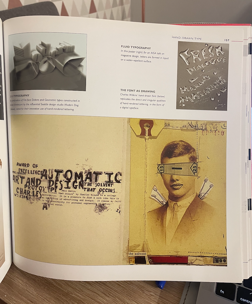
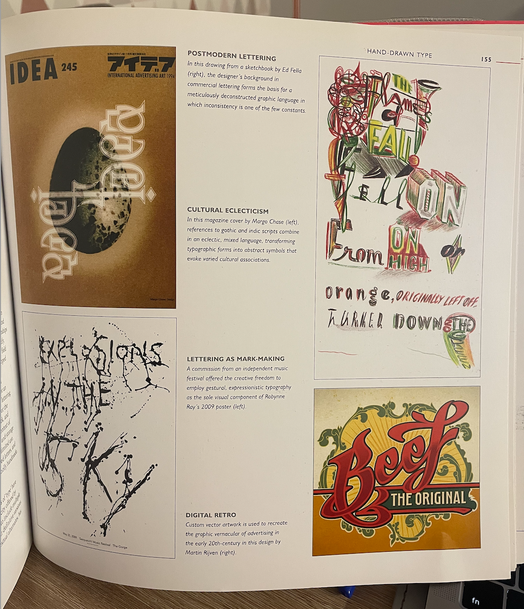
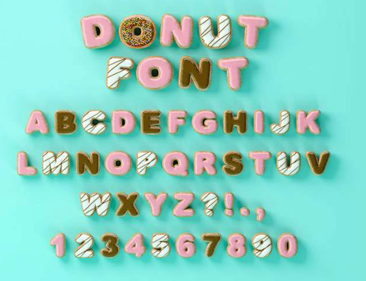
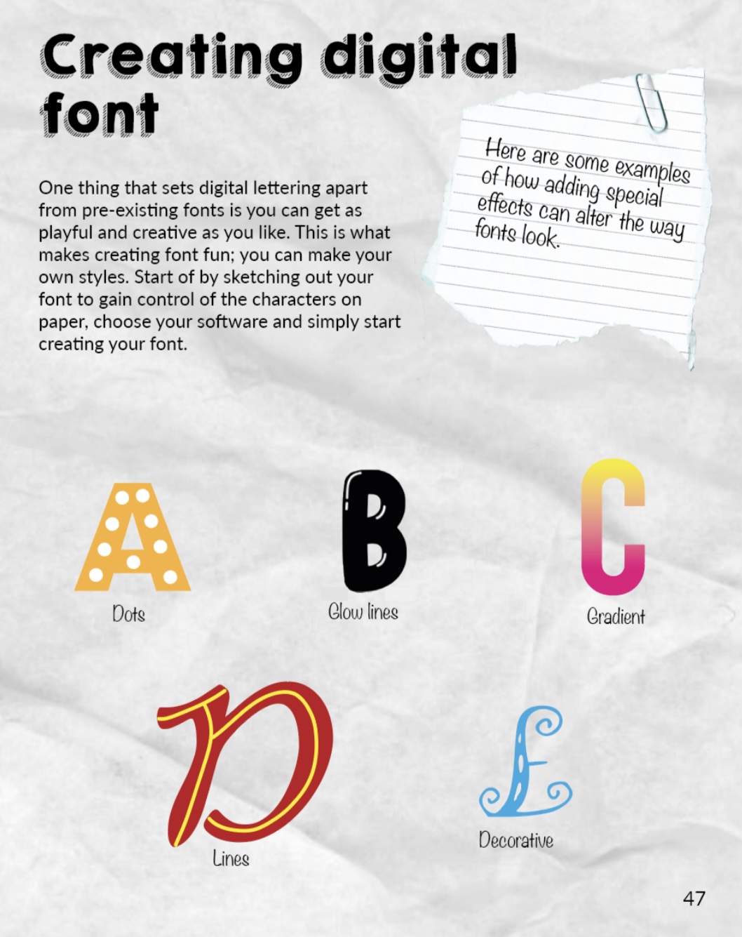
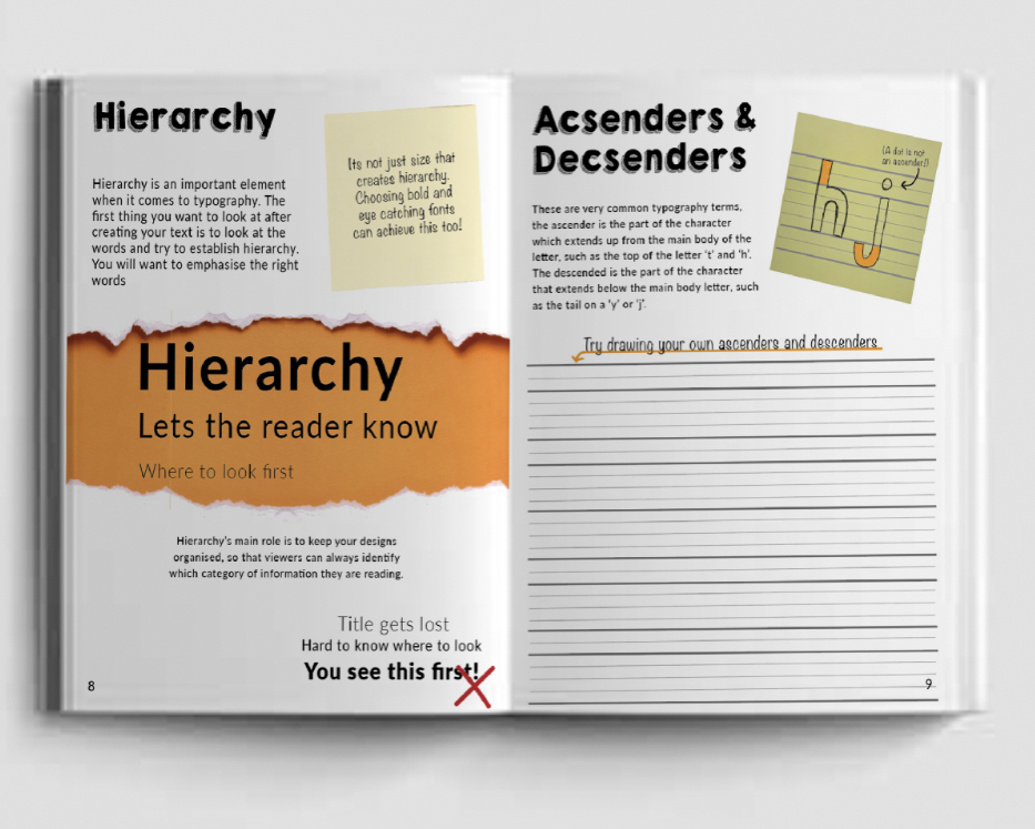
With the idea of building the reader up to creating their own typeface I thought I would look into Hand drawn type, I found an interesting section in one of the typography book I own, ‘The Complete Typographer by Will Hill’. Graphic design in the 21st century has seen a very noticeable increase in the use of hand-rendered lettering across a range of commercial graphic applications. This may indicate a reaction to the lack of physicality or tactile value in digital type, reflecting a need to imbue letters with human material characteristics.
Reaction against the precepts of modernist design in the 1980s frequently involved handmade lettering, or physical interventions designed to disrupt the formal order of type. Prior to the digital age, it had been possible to maintain clear distinctions between type design and lettering. Type was by definition a set of fixed and standardised letters, whereas lettering was a fluid and adaptable medium in which a designer could respond to the relationships of particular letter and word combinations, and could distort, modify, shade and dimensionalise. These latter characteristics entered the field of set type with the development of photo setting, and were developed to a much fuller extent with the advent of digital media. Now, the profiles of pre-existing type can be digitally crafted into customised forms, while vector drawing programs allow for an increasingly direct engagement between the hand-skills of the lettering artist and the digital environment. This provides scope both for the integration of type and custom lettering within digital artwork, and for the ready translation of the hand drawn letter into the context of the digital font. The relative economy of digital production and storage allow for a typeface to be designed for a specific and quite limited use. Faces can be readily generated from scans of hand-rendered letters, and used to produce compositions that might appear to be wholly handmade.
The renewed interest in making letters by hand in the 21st century can be seen both in unique custom designs and in the creation of fonts that have a distinctly gestural, manual quality reflecting the characteristics of brush or pen. Contemporary hand-rendered lettering often reflects an enthusiasm for the decorative and the ornamental. This frequently involves elaboration and embellishment, the decoration of letters with abstract decorative forms, or the manual distortion of existing letterforms.
To gain a better understanding of what I am asking my readers to do I myself would like to create some typefaces to use as examples within my book as samples. I would like to go more in depth of creating a typeface. I created my own typeface as part of Assignment 4 in Core Concepts and really enjoyed doing so, so I am looking forward to learning more about this process.
Although it may sound daunting to design a typeface from scratch as a beginner (and trust me I am being the guinea pig to my own book so all information will be trialed and tested) I want my book to be the first stepping stone into the right direction for the reader who may have an interest in this area. I want it to be fun and light heartened yet informal and encouraging.
I started off with the website above, it’s very structured with a step by step guide in how to start creating your own typeface without making it sound too complex. https://www.creativebloq.com/typography/design-your-own-typeface-8133919.
Exploring further into this I came across the video below, which will be the video I will follow during my typeface progress. Working with my iPad I plan to digitally sketch and convert into vectors which can be used within my book.
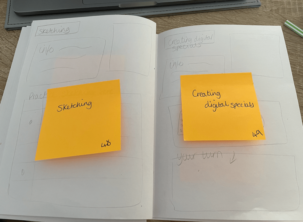
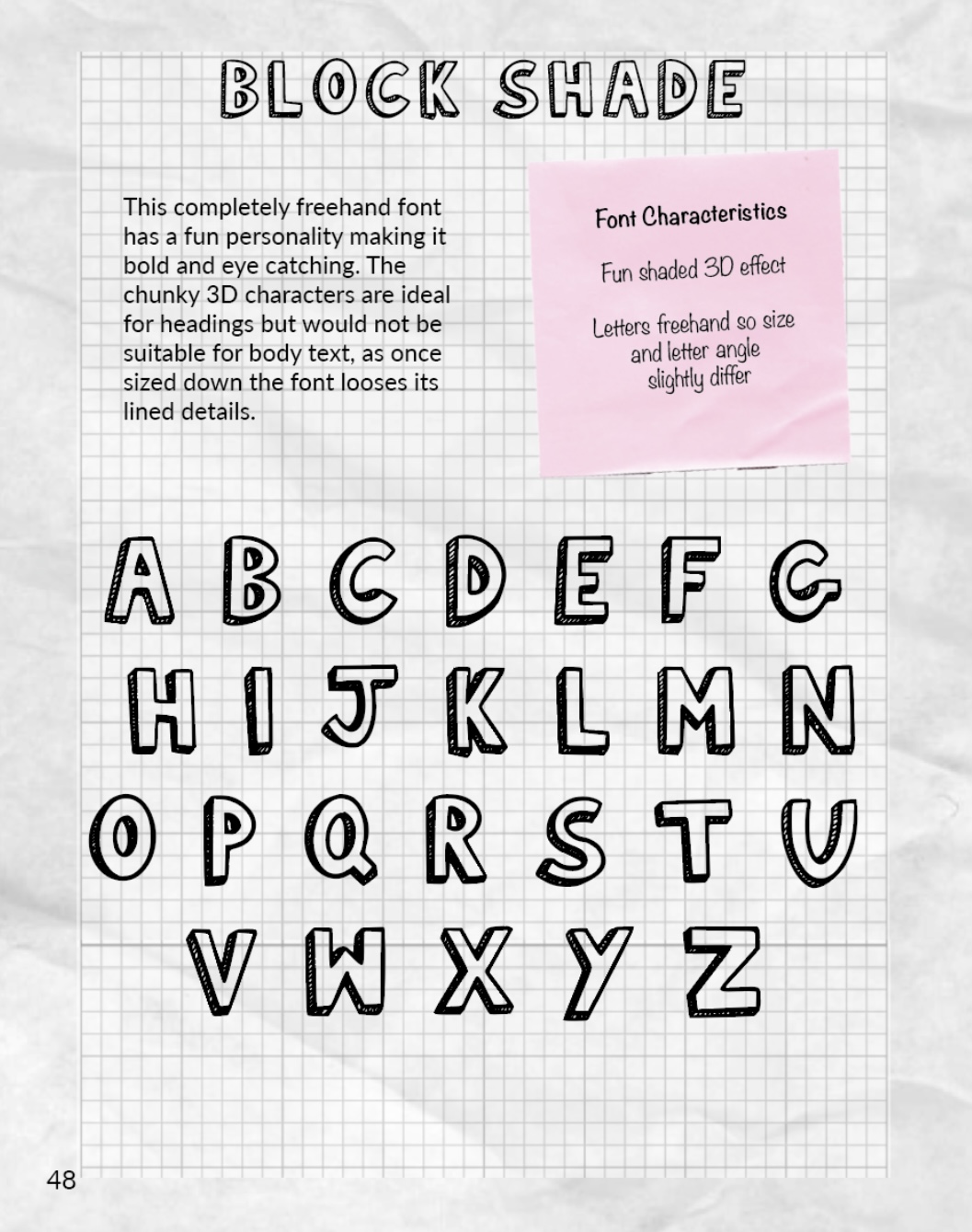
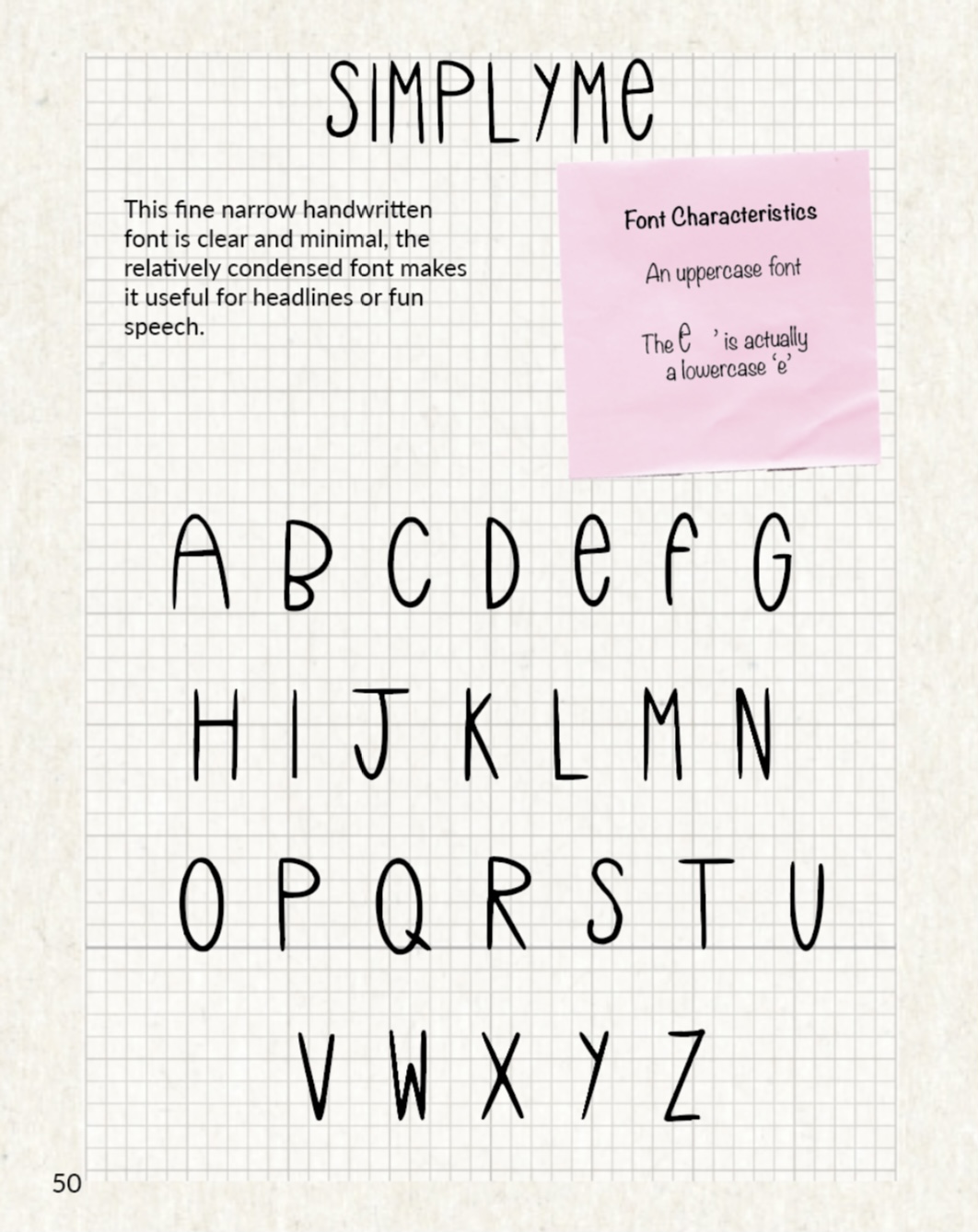
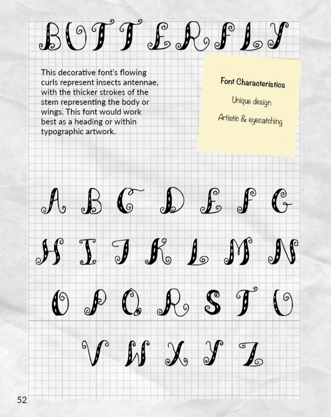
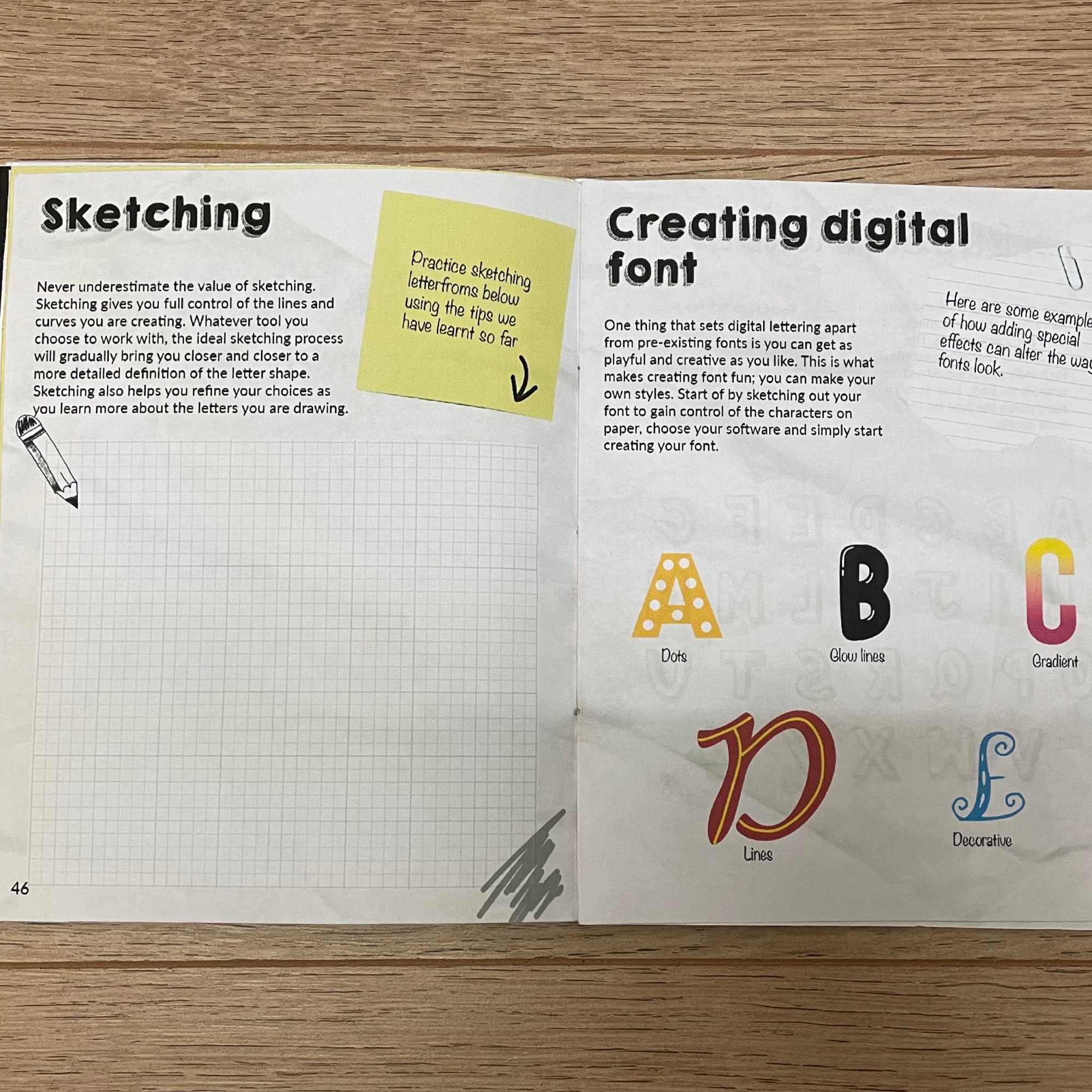
There are three main steps when creating a typeface; Research, sketching/designing and creating digitally. When I come round to creating my own I would like to create around 5 different typefaces, with the majority being hand-rendered as this would make it easier for the reader to follow.
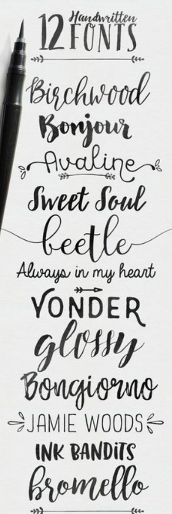

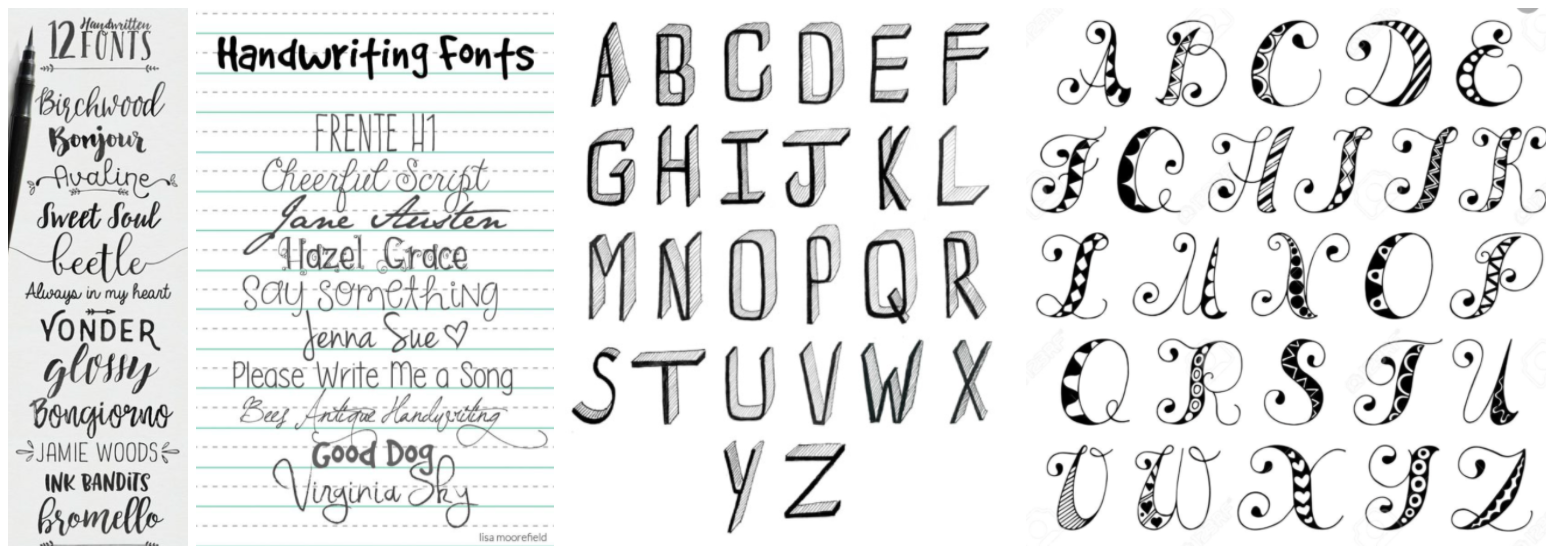
Handwriting fonts are favoured by designers because of their texture and beauty. The use of different fonts can be tricky. Often, each design requires its own font which, whether it’s thicker, thinner, curvier, or individual in some way, can express a feeling about your design and give it its own identity. And when it comes to digital design, fonts can play an even more crucial role in a typography design.
Book layout
One of the first books I purchased when starting my design journey was ‘Make your own luck by Kate Moross’, I love the layout of this book and would like to follow a similar style in my own by using large imagery with minimal, but informative text. I also love Kate’s style and take inspiration from her work which may show in the typefaces which I create.
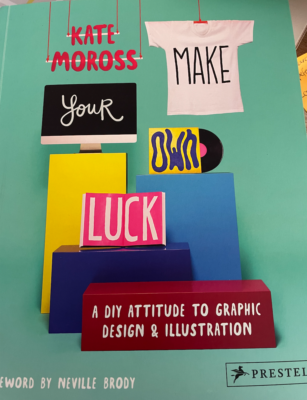
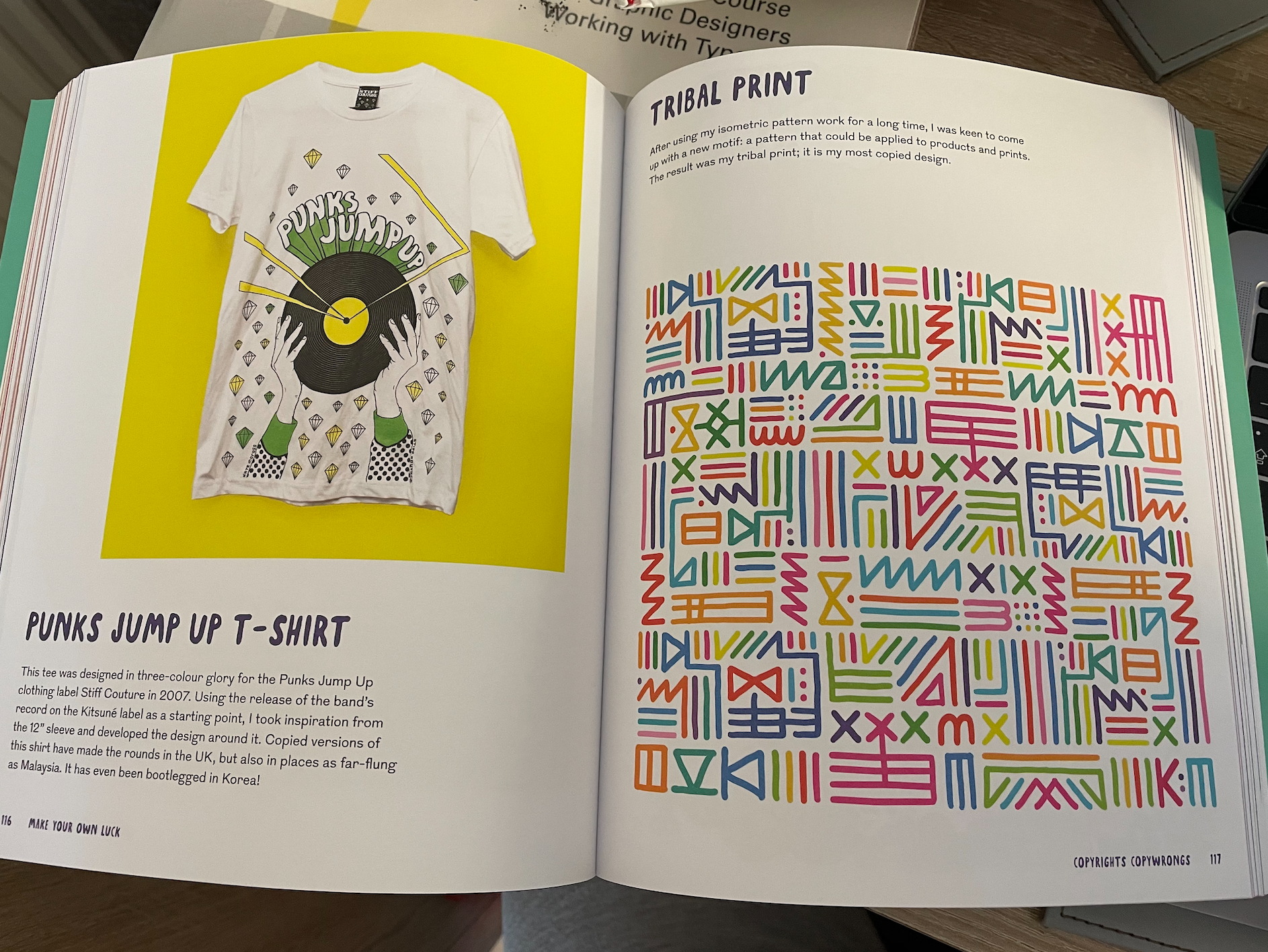
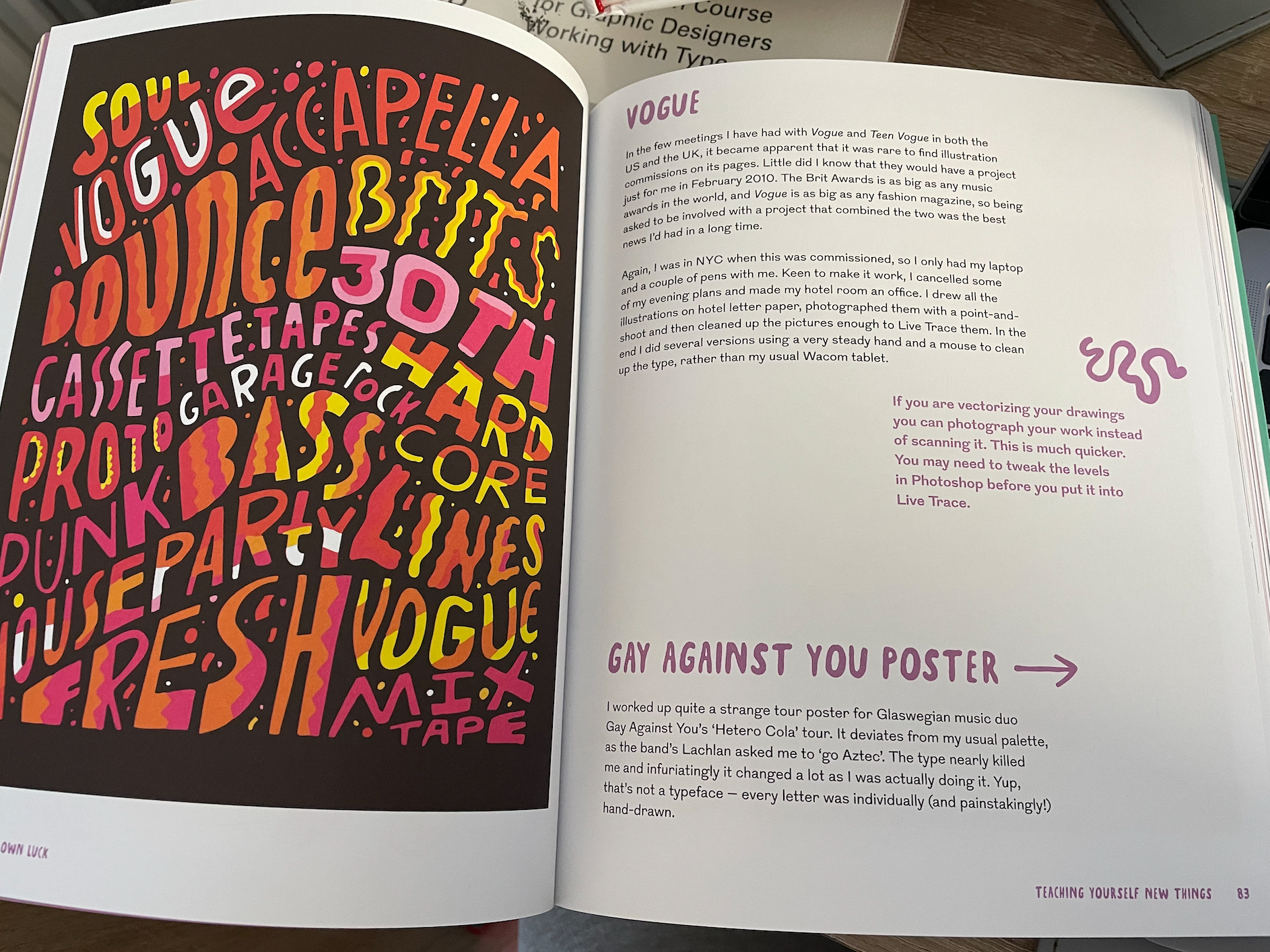
I’m really drawn to Moross’ doodle like typography with use of bright and vibrant colours, it makes her work iconic and eye catching. I love her style!
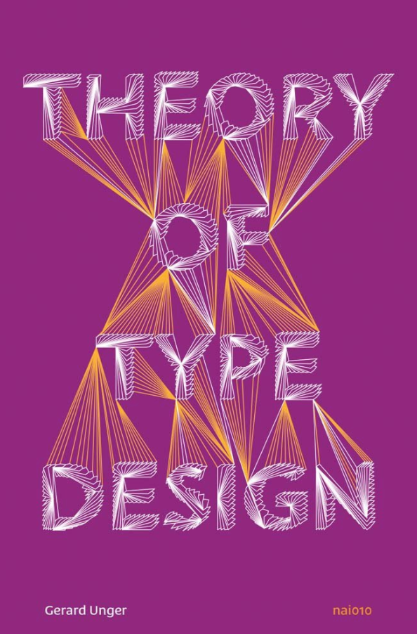
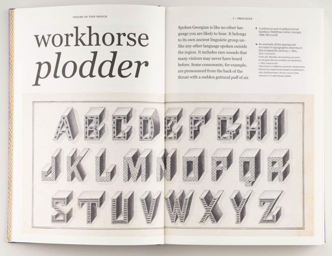
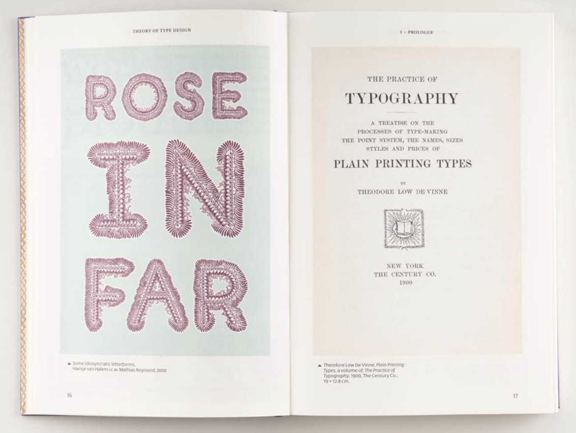
Book Inspiration – I came across this book ‘Theory of type design by Gerard Unger’ online, I like the layout of the pages with it being more example based which is what I am aiming to do, along with the double page typographic art which breaks up the book giving inspiration and additional interest to the reader.
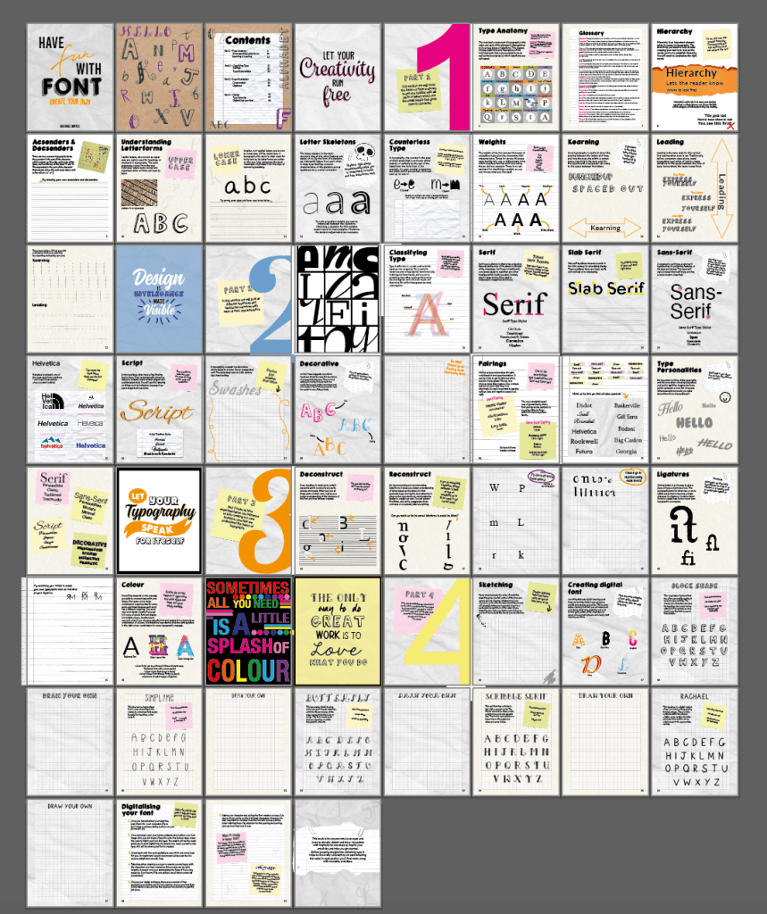
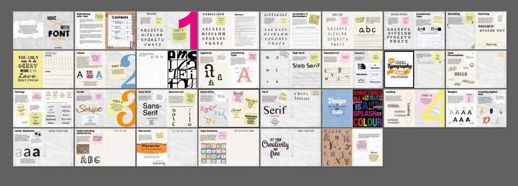
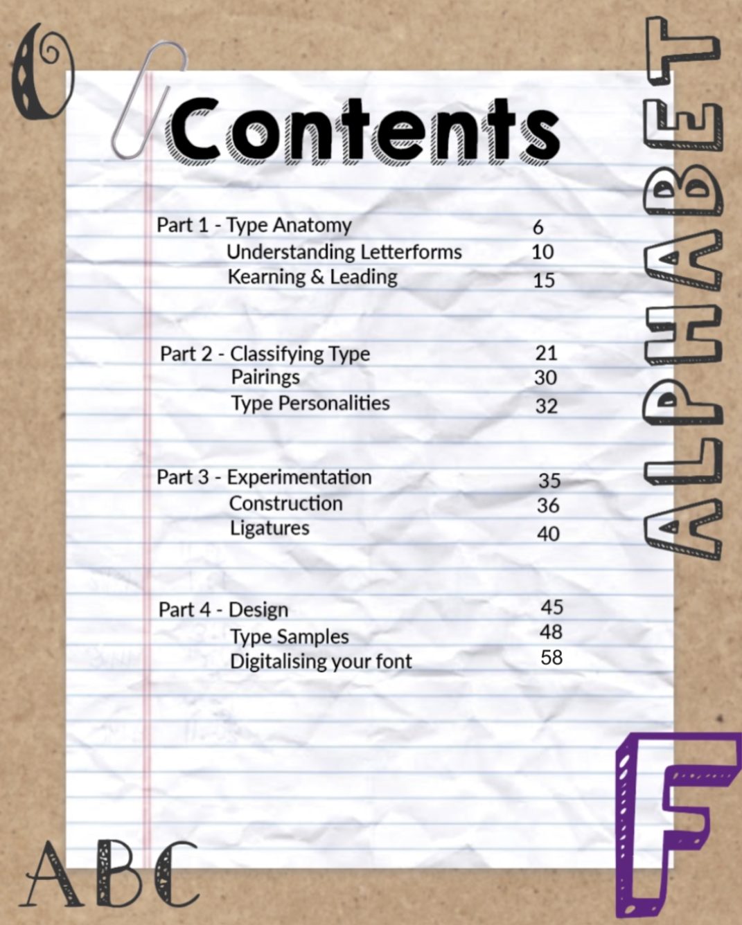
The contents to my book will be as follows;
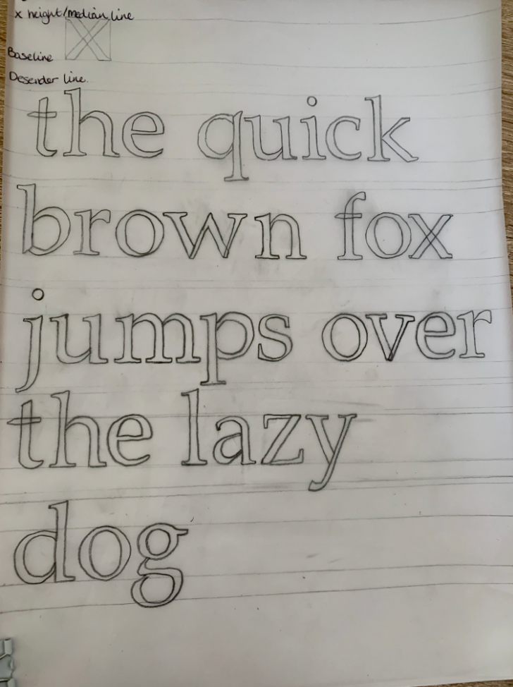
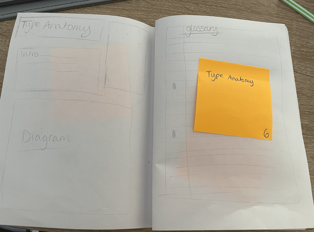
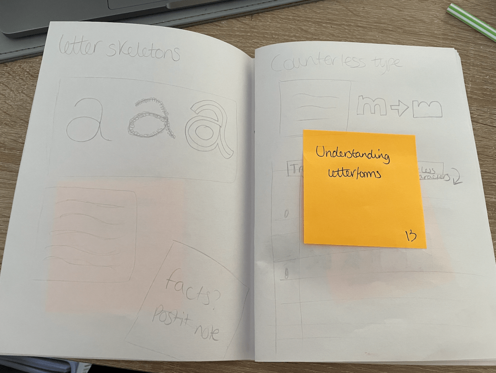
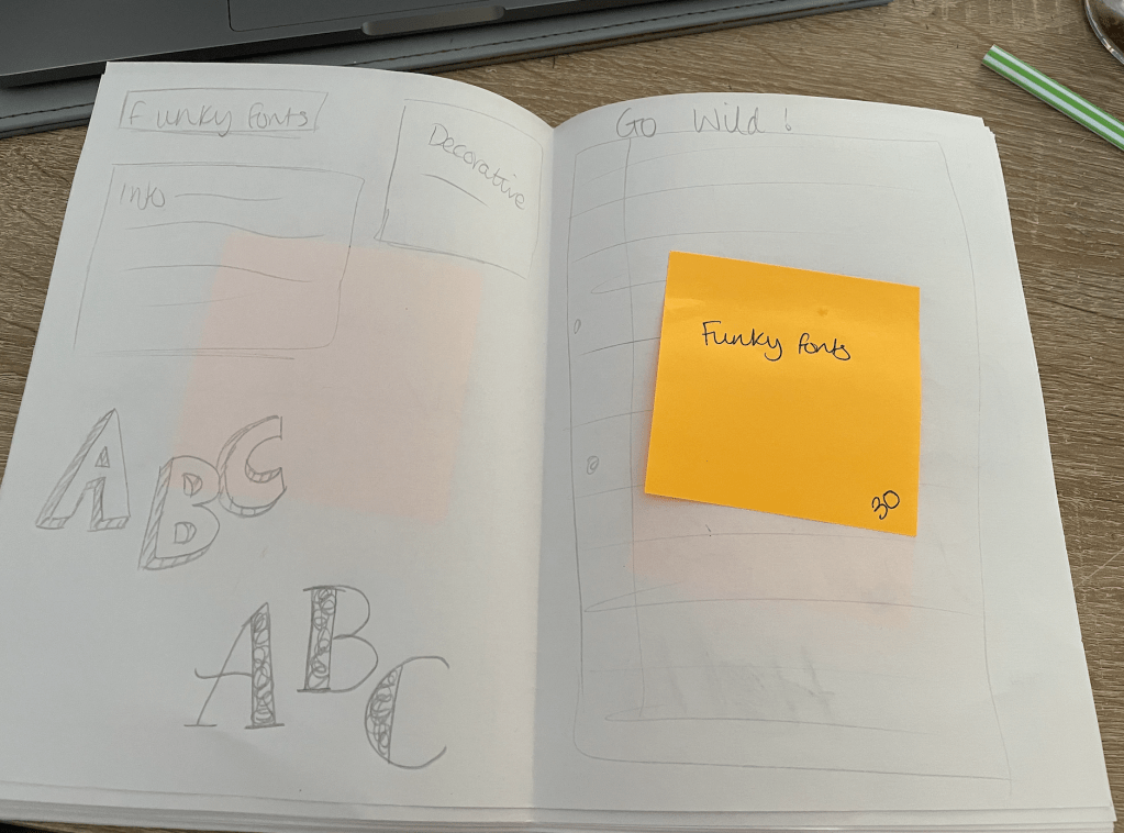
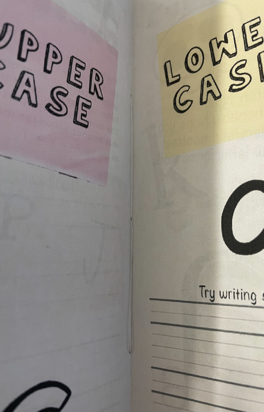
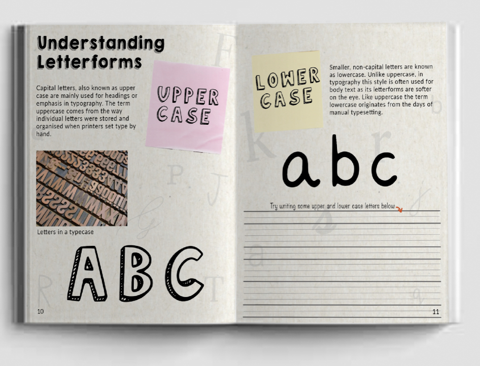
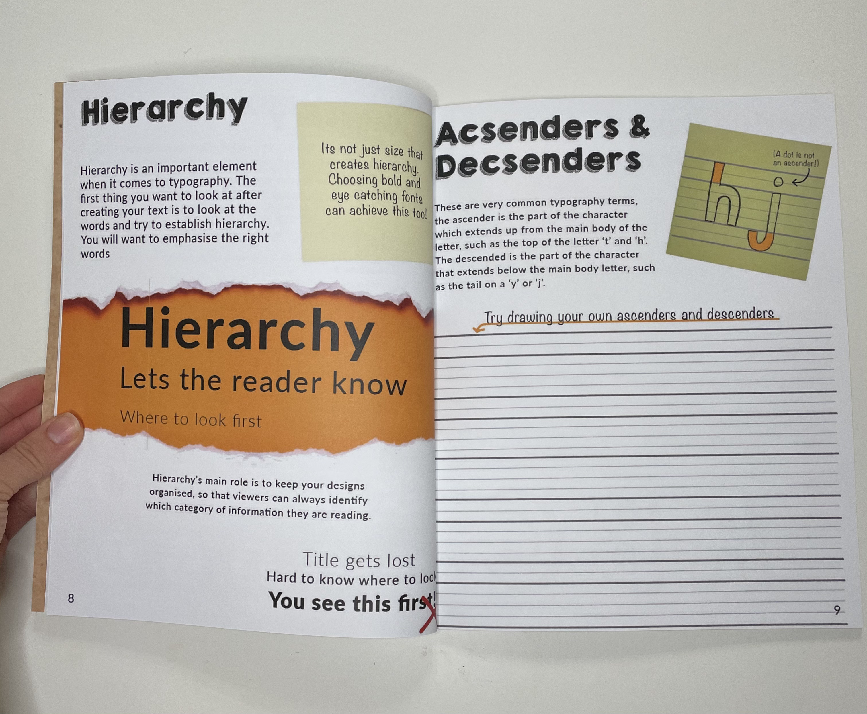
- Introduction to Typefaces and Understanding Letterforms – Here I will give a brief run over of what a typeface is with a diagram of the anatomy of a typeface, including a description of the structure of letterforms. (strokes, bowls, serifs etc).
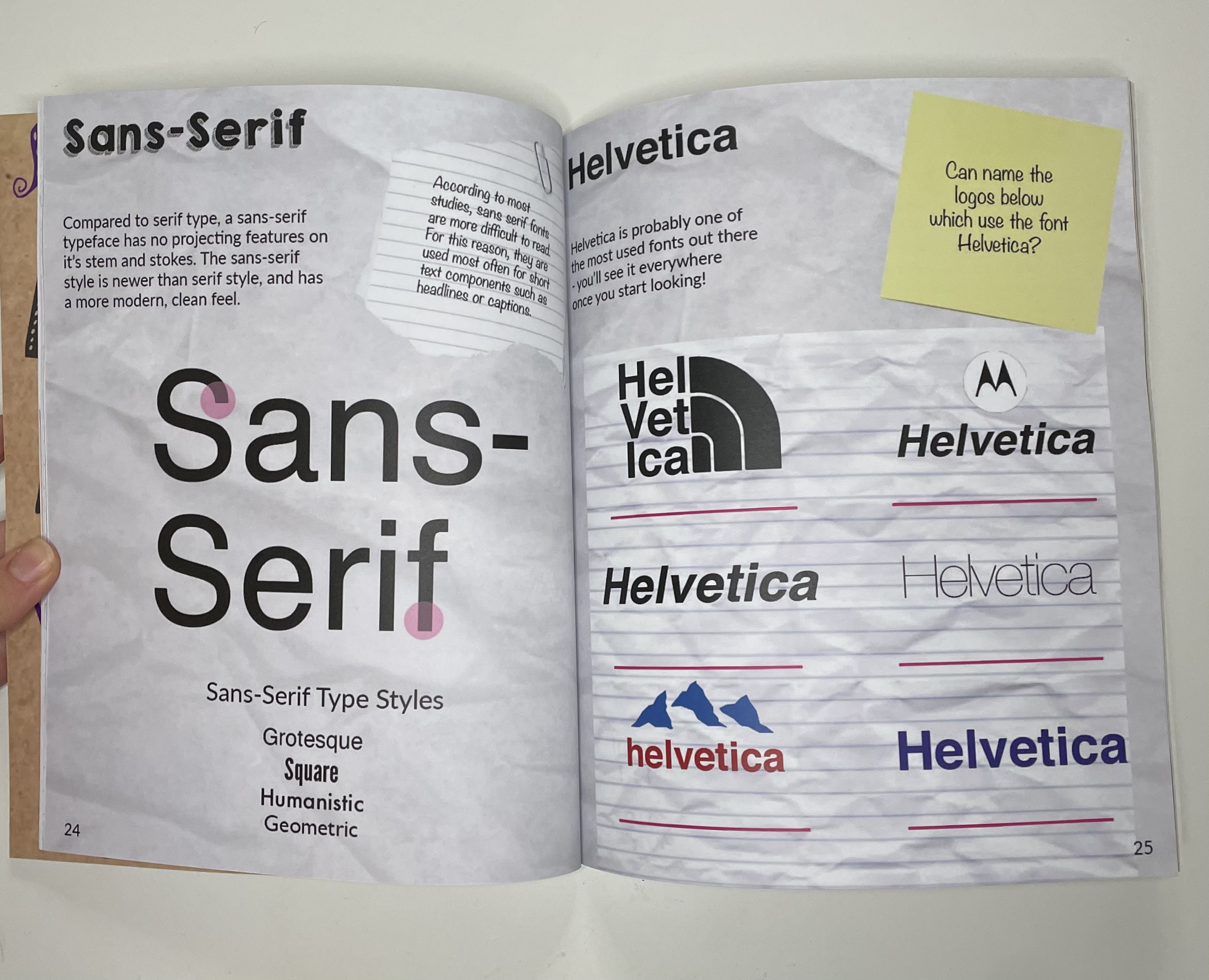
- Classifying Type – Without going into too much detail here I will show examples of single letterforms to a selection of typefaces. I will also talk and show examples of font pairings
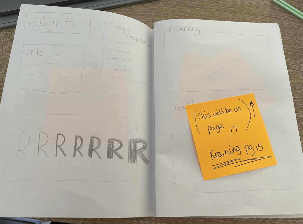
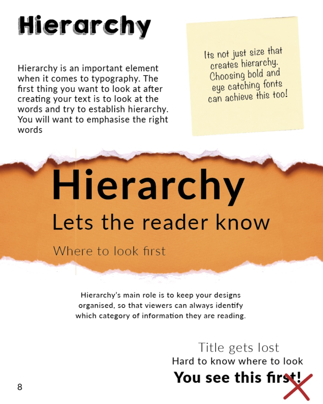
- Type Personality – Looking at how the anatomy of a letter form can convey mood and meaning and how it can be radically altered. Also possibly the mention of colour and how that can effect the way we see/read things
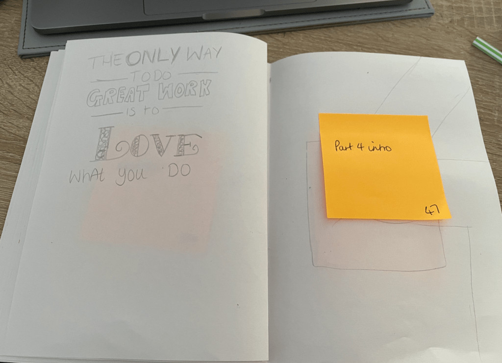
- Trace & Change – This will be the first section which will include a DIY page. With the explanation of how to deconstruct letterforms, I will explain how during reconstruction it gives us the opportunity to manipulate the structures, warming the reader up for attempting to create their own sketches.
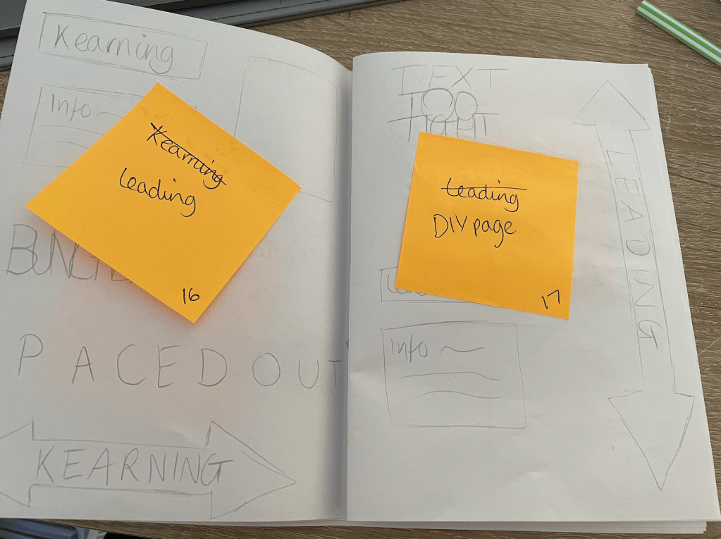
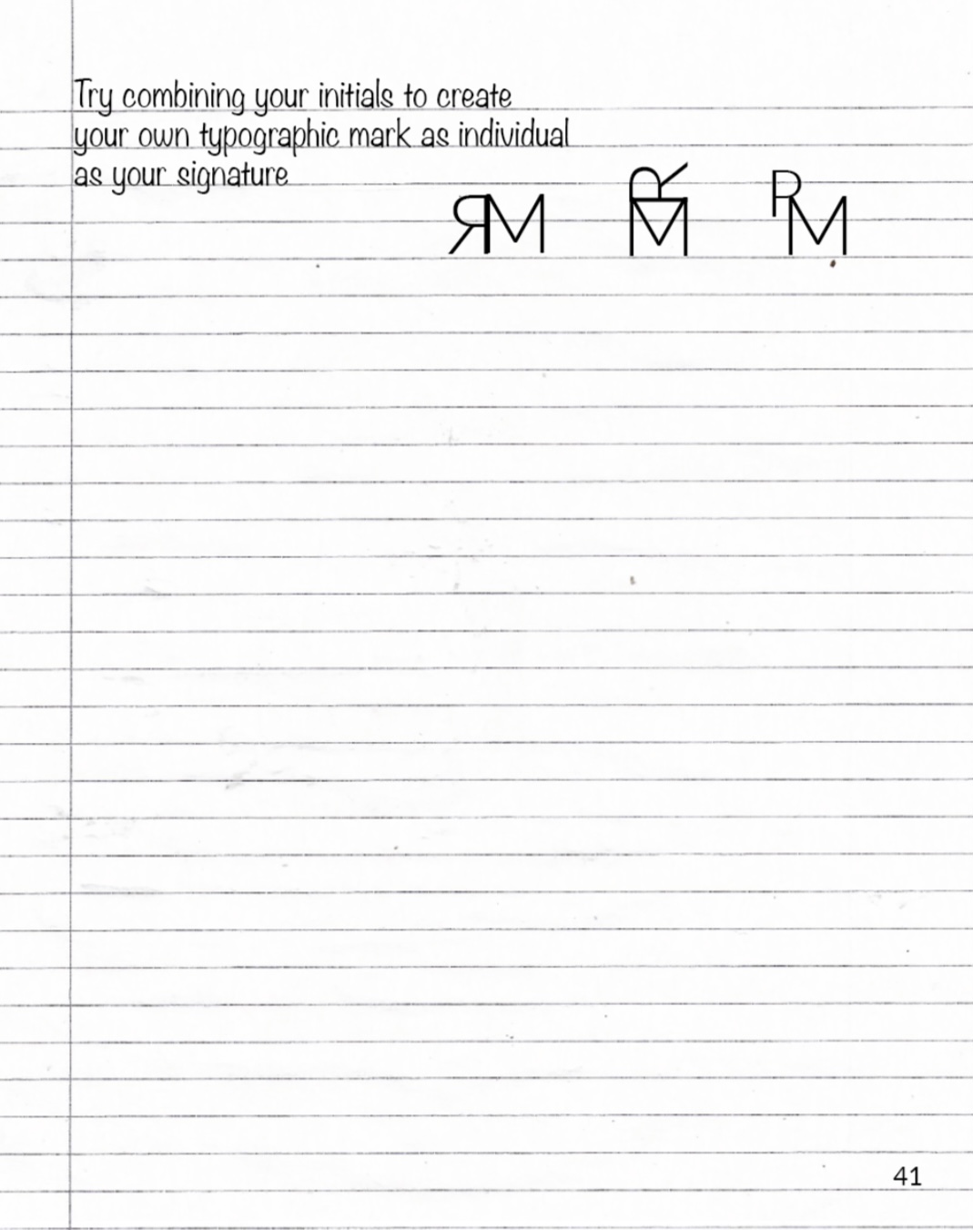
- Combinations – Another fun exercise to encourage the reader to combine different letters, prompting them to start with their initials, this will include examples of my own combinations.
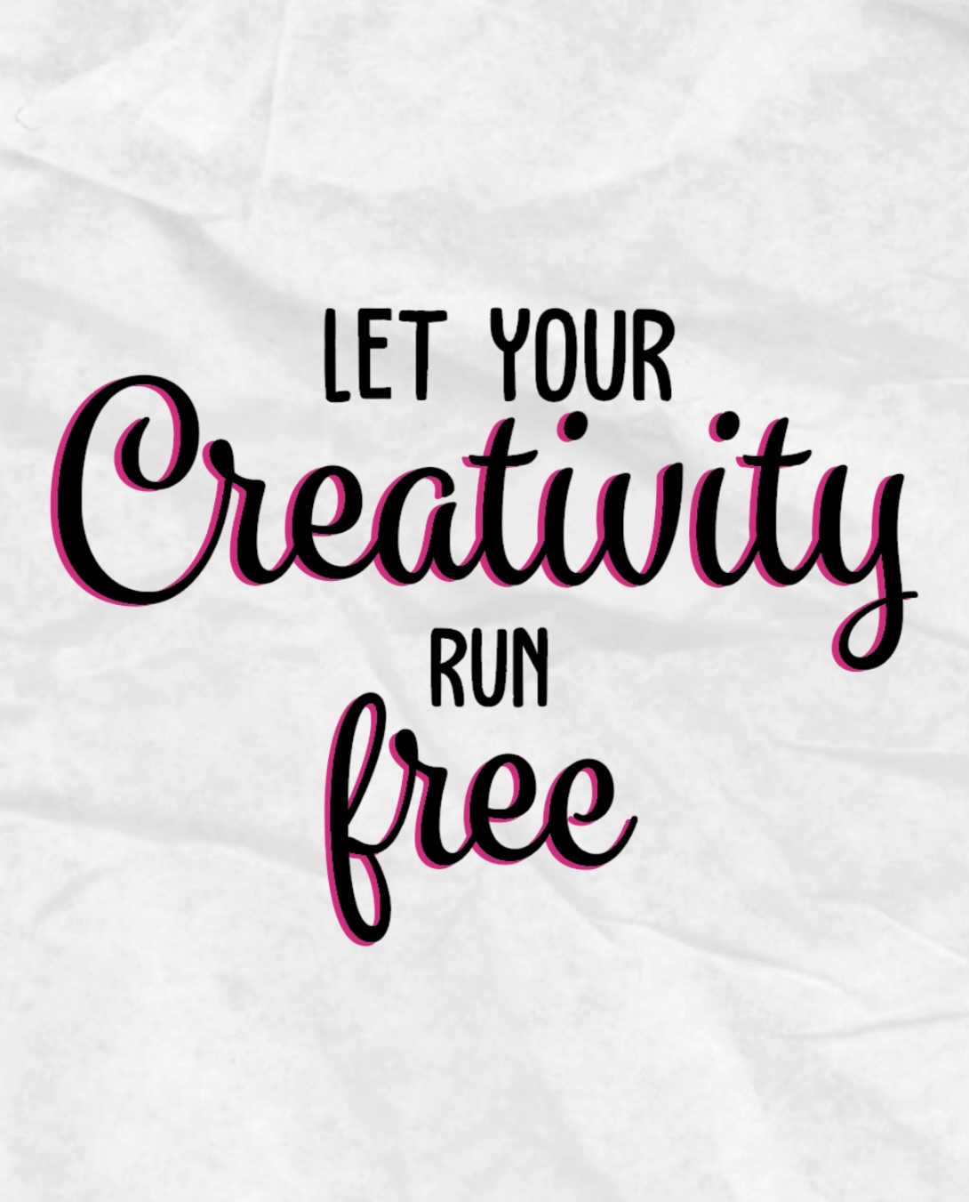
- Quote/design pages – I’d like to create inspiring quote pages to scatter throughout the book, these could be places at the beginning or end of a chapter?
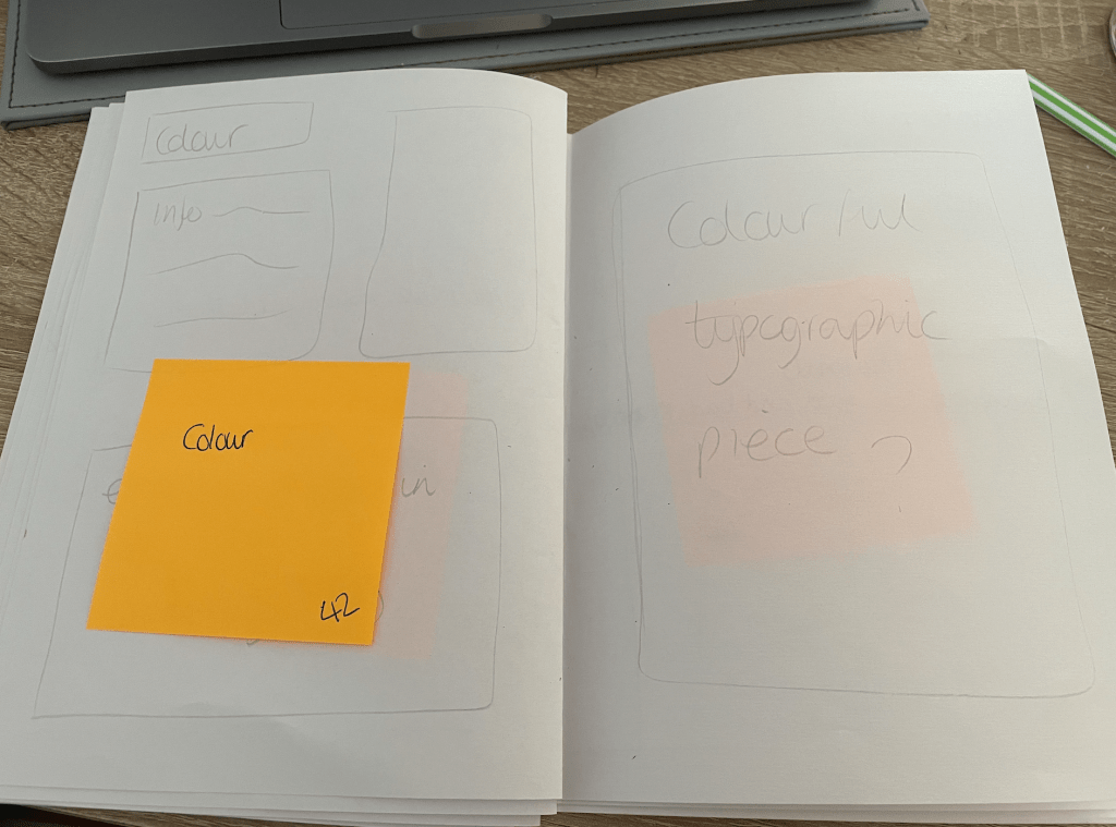
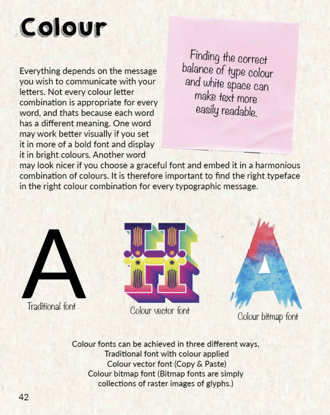
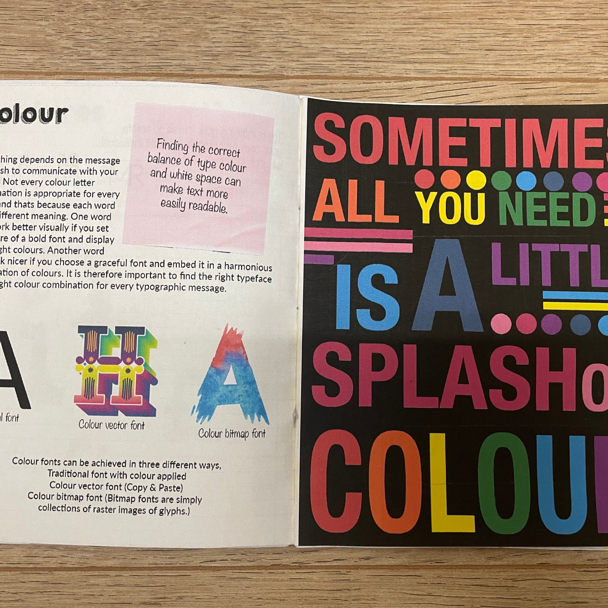
- Type & Colour – Show the pros and cons to working with colour, explain how bad colour choices effect readability and how some font and colours harmonise together
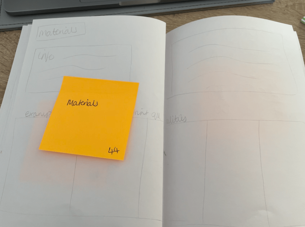
- Effects of print – Explanation of how the paper and materials we use can effect the overall result of the design with photographed/scanned imagery. This will include different papers, tools, materials etc.
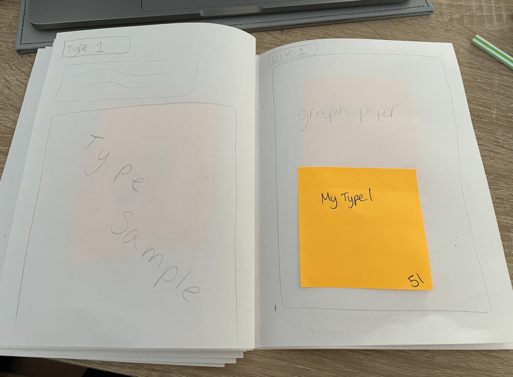
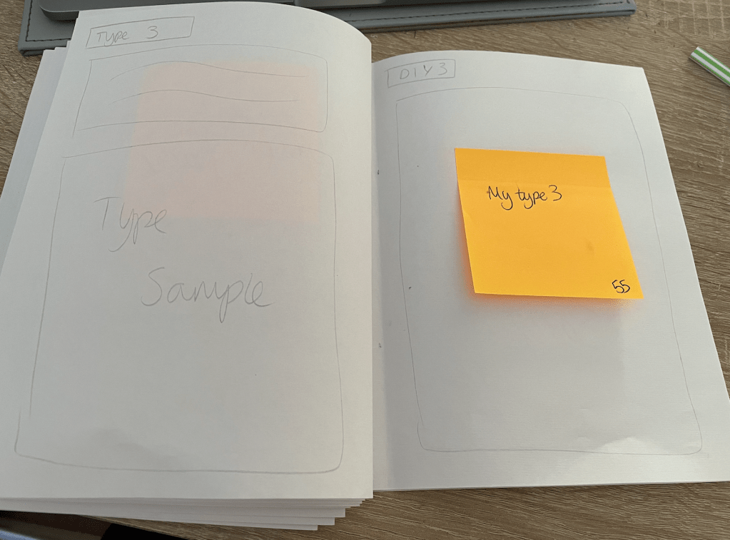
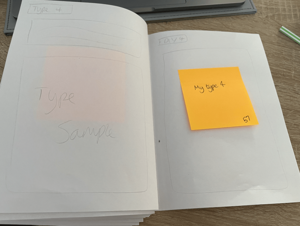
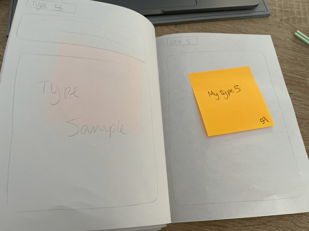
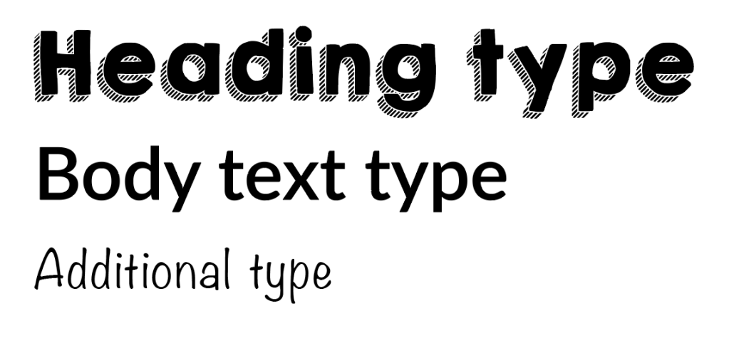
- Type Sample – a selection of my typefaces created, with font details, what it could be used for and what other typefaces it would pair well with.
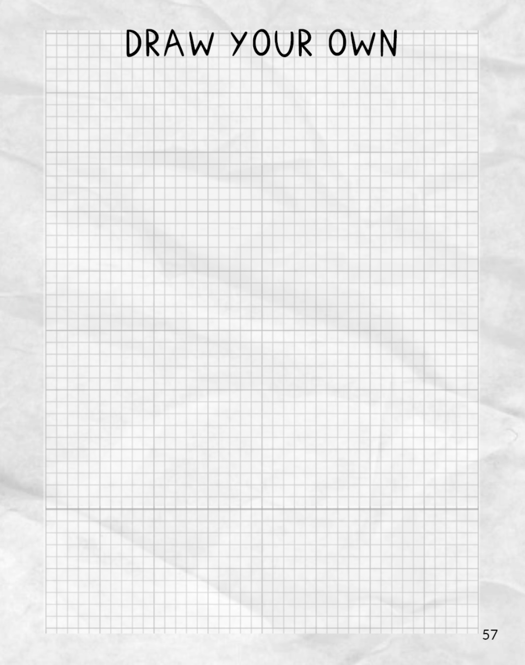
- DIY Pages – Thinking of scanning in graph paper so the reader can draw straight into the book. I’m Currently unsure if I’m going to place these one after another during the type sample pages or to include a section at the back of the book? This will be something I decide on during my flat plan.
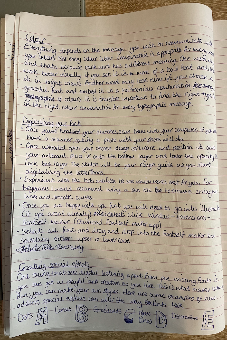
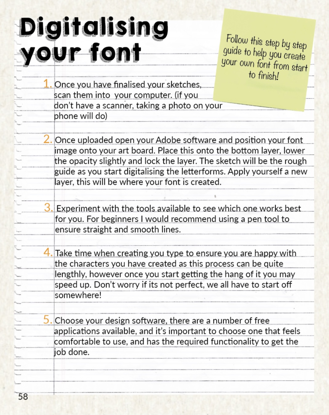
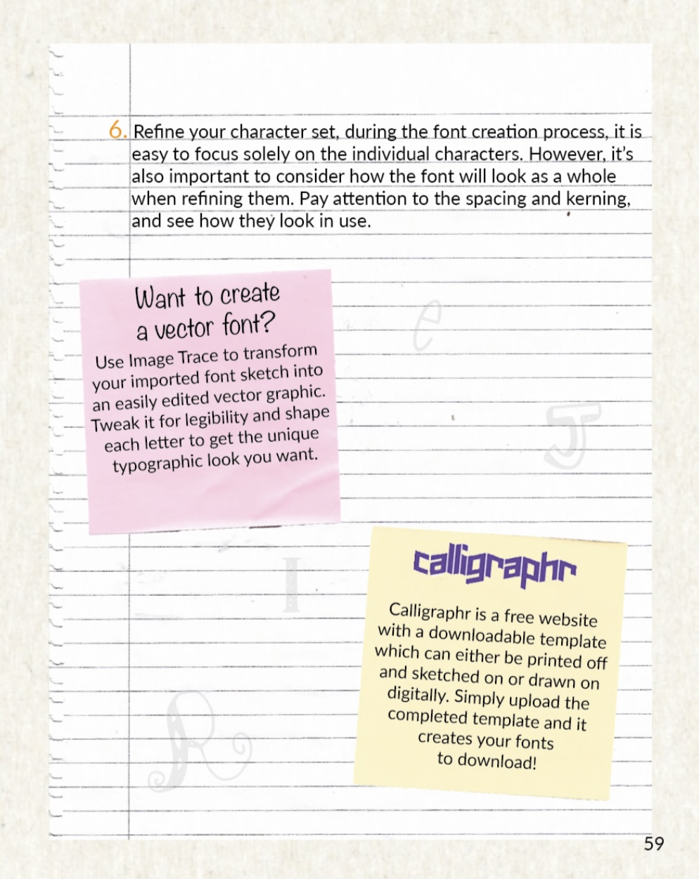
- Digitalising – Explain how to upload font onto the computer for the final step.
Following the topics above I have written out some notes whilst the research has been fresh in my mind, I will use these as a guide when it comes to writing up the text for my book.
Developing Ideas
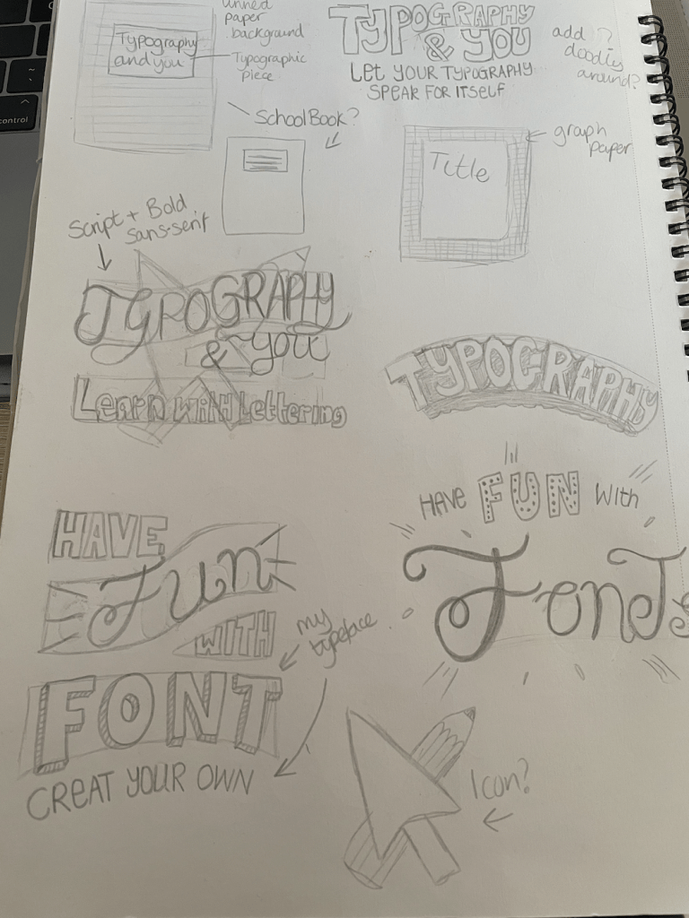
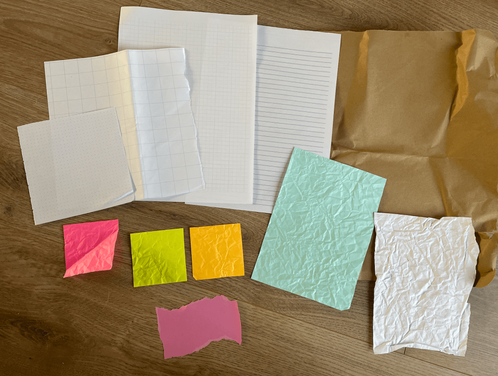
I’m keen on the idea of having a theme throughout my book, It would be fun if it was presented in the style of a notebook/journal, with lined paper backgrounds and doodles/sketches of typefaces. I could add in scanned elements similar to those used in my zine for assignment 1 of different papers and post it notes. This would give my book more of a creative and unique feel compared to others available on the market offering something similar on the chosen topic.
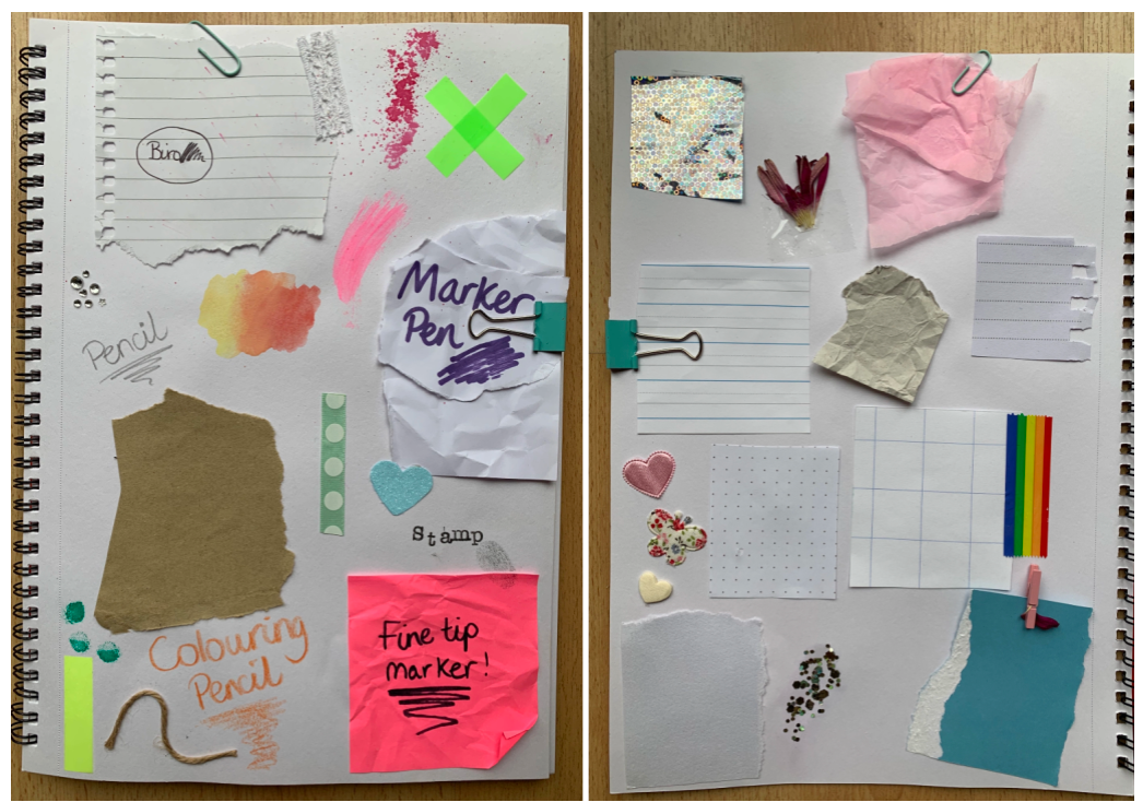
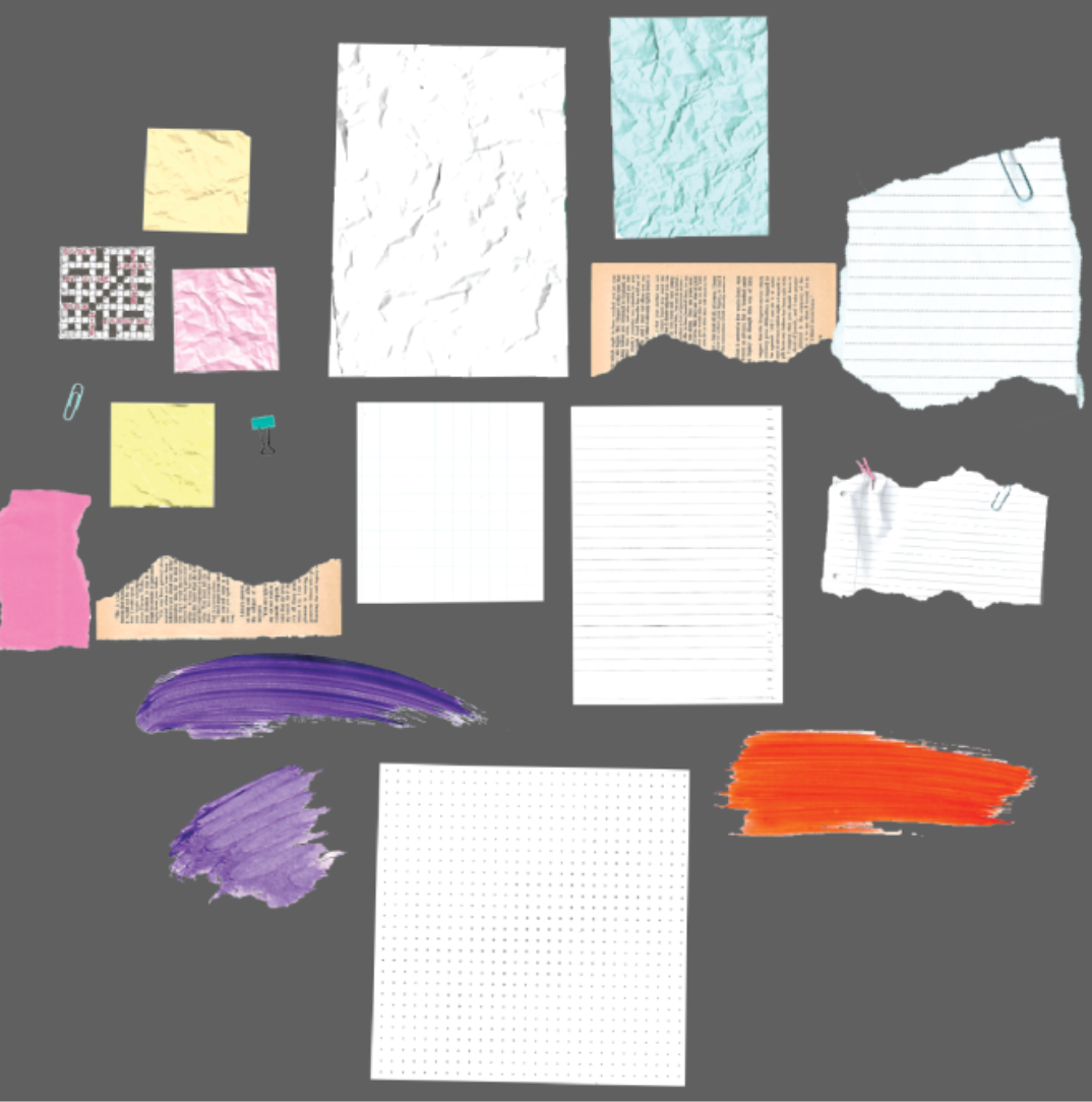
Above is an example of the elements used during assignment 1. I particularly liked the effect the crumpled paper gave, I could include important tips or key information on these in my book, or use these on the opening chapter pages. As mentioned above, I like the idea of using lined or graph paper with perhaps the cover being printed on kraft/recycled paper. The materials which I choose to use will be decided further down the line, but its defiantly the direction I would like my books style to take.
Typeface – Before I start thinking about anything else I feel it would be a good stage to start the development of my typefaces as i can base the information featured in my book around my experience, also I may decide to use my font on the cover so this could alter the design of the cover.
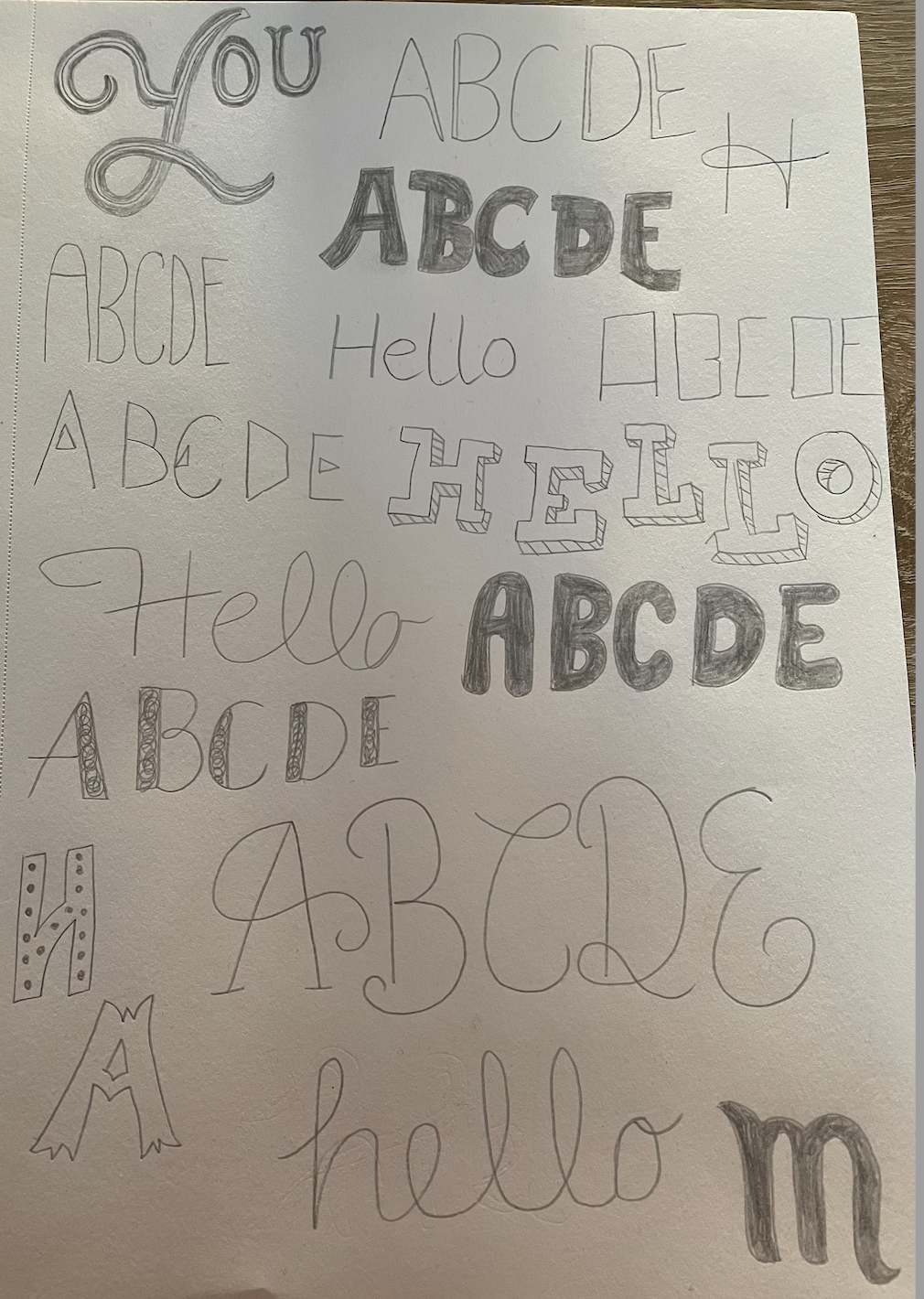
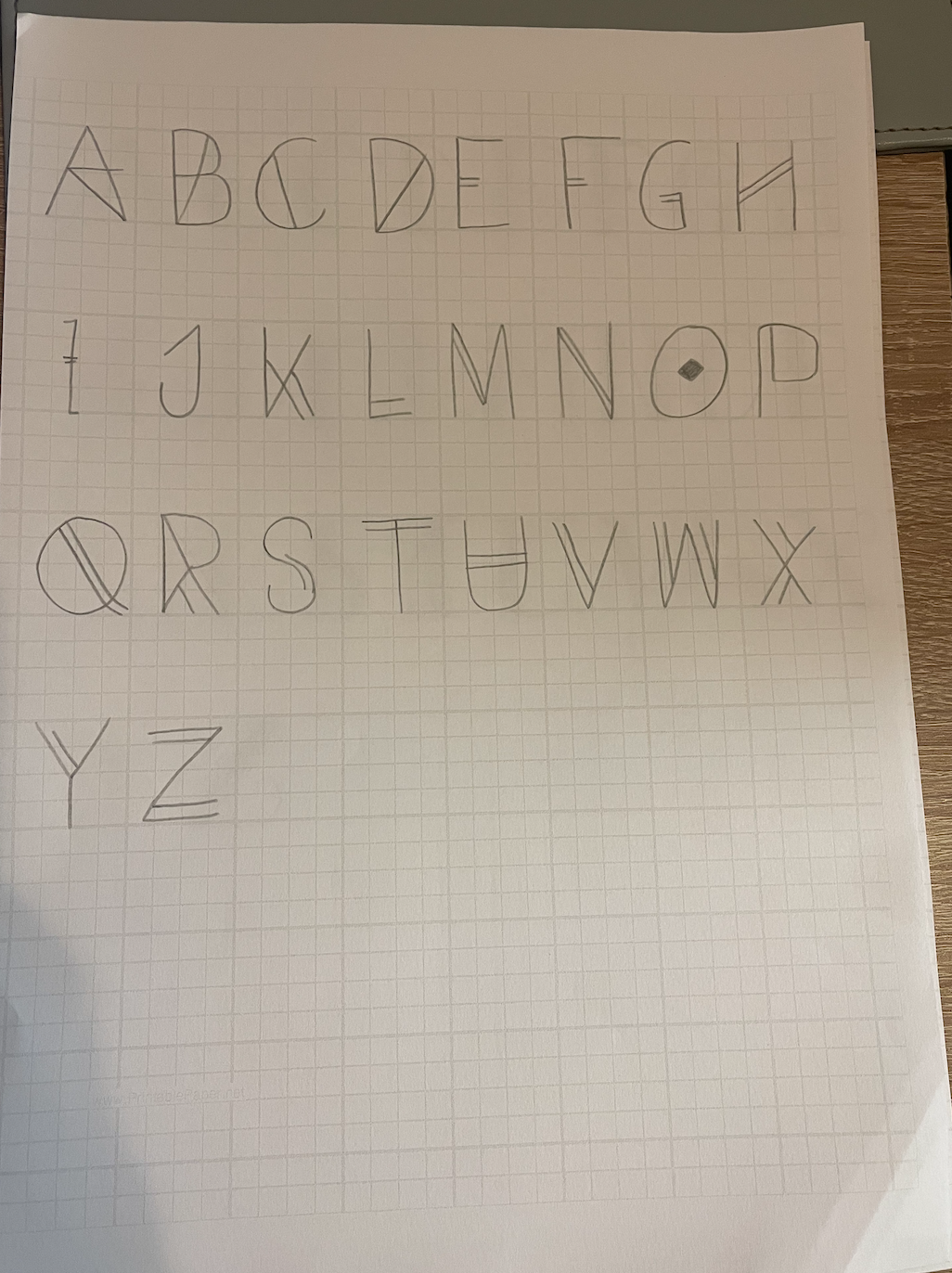
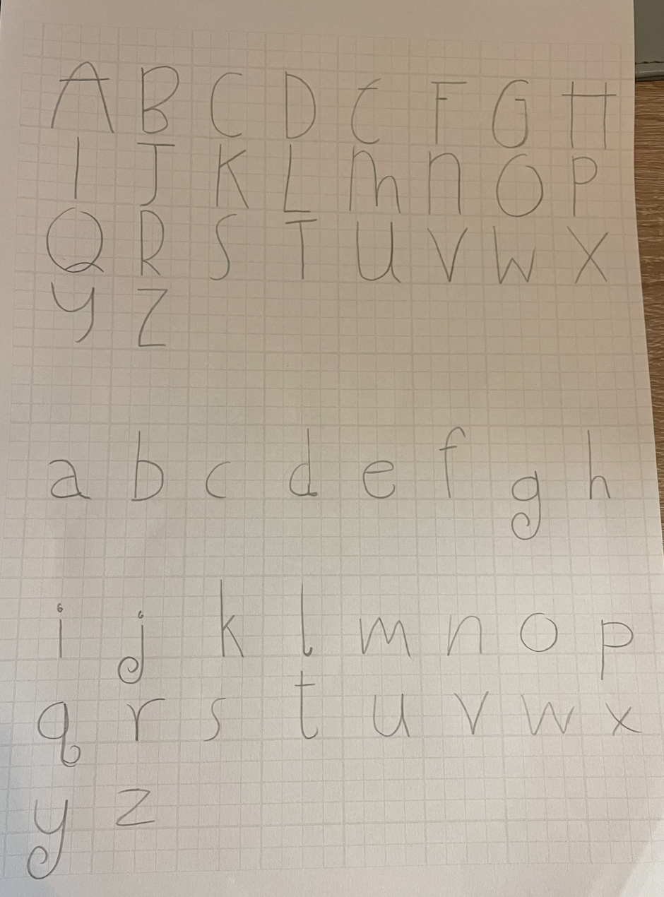
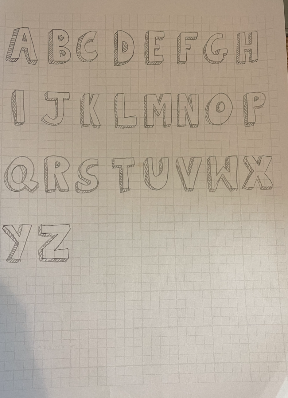
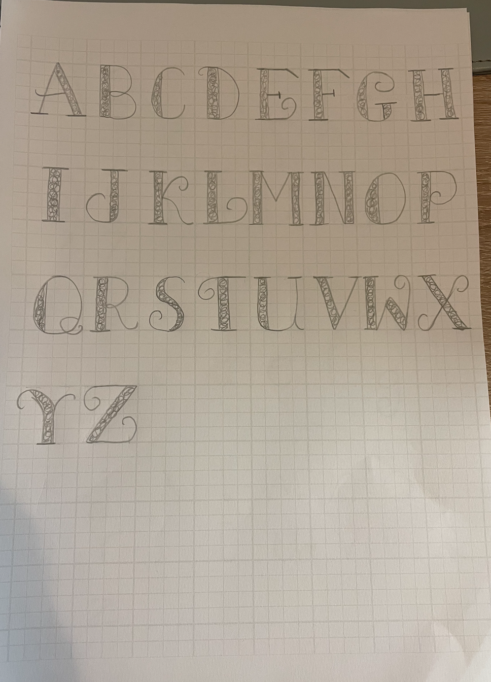
I started off sketching out some type designs, Im aiming at creating more of a decorative typeface to begin with as it seems slightly less ‘precise’ and more relaxed. I am also going to have a go at doodling on my iPad using Procreate to see what effects I can achieve with the different brushes available.
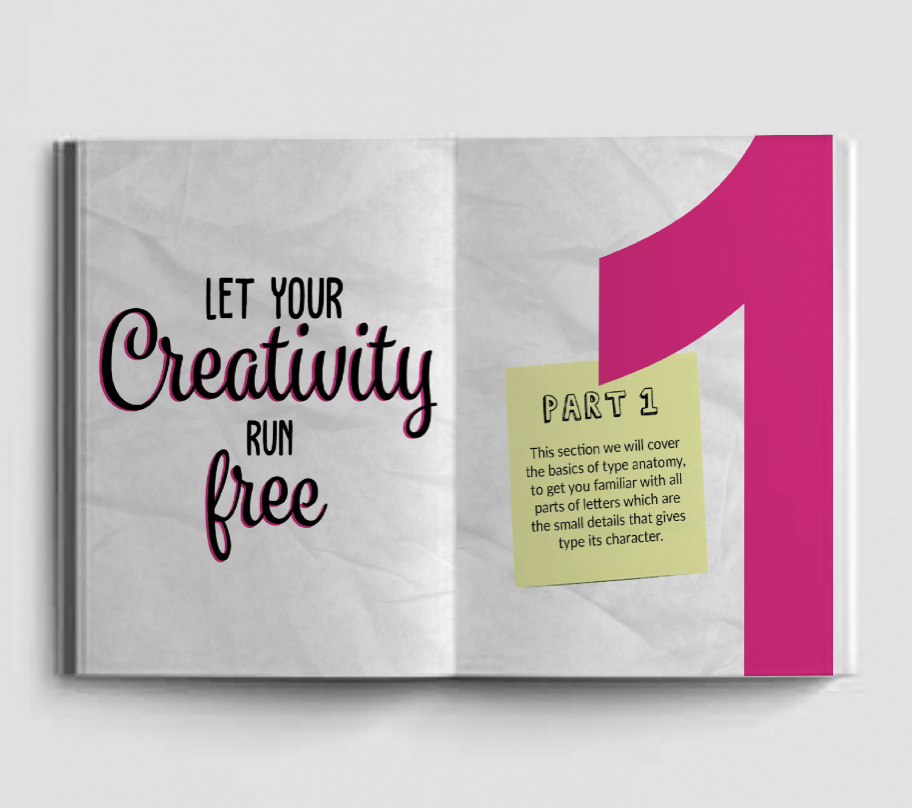
Design Process Part 1
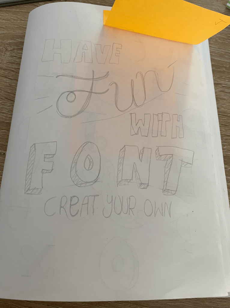
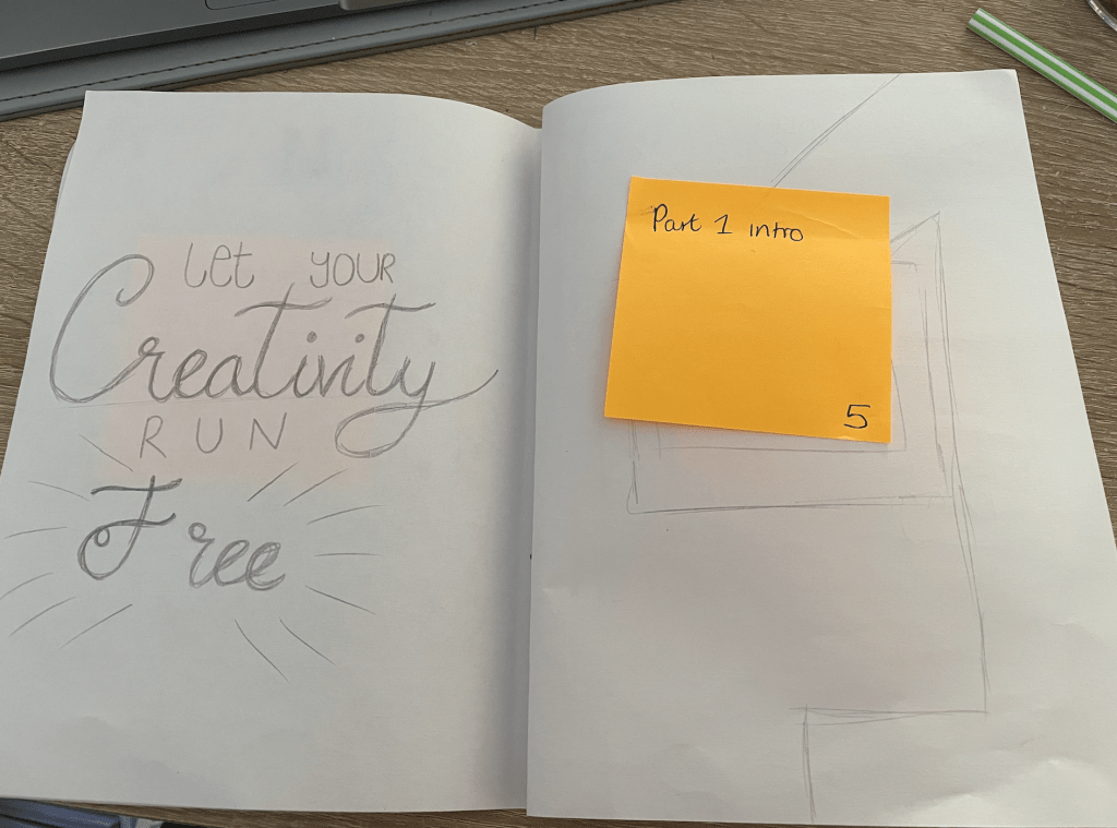
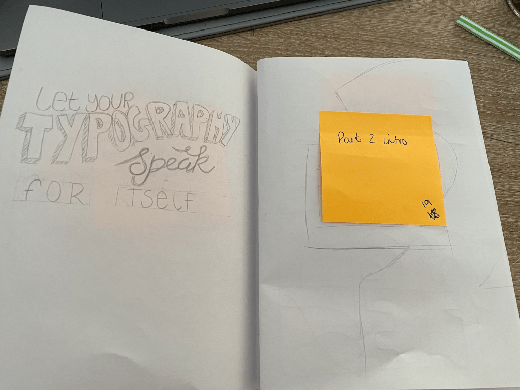
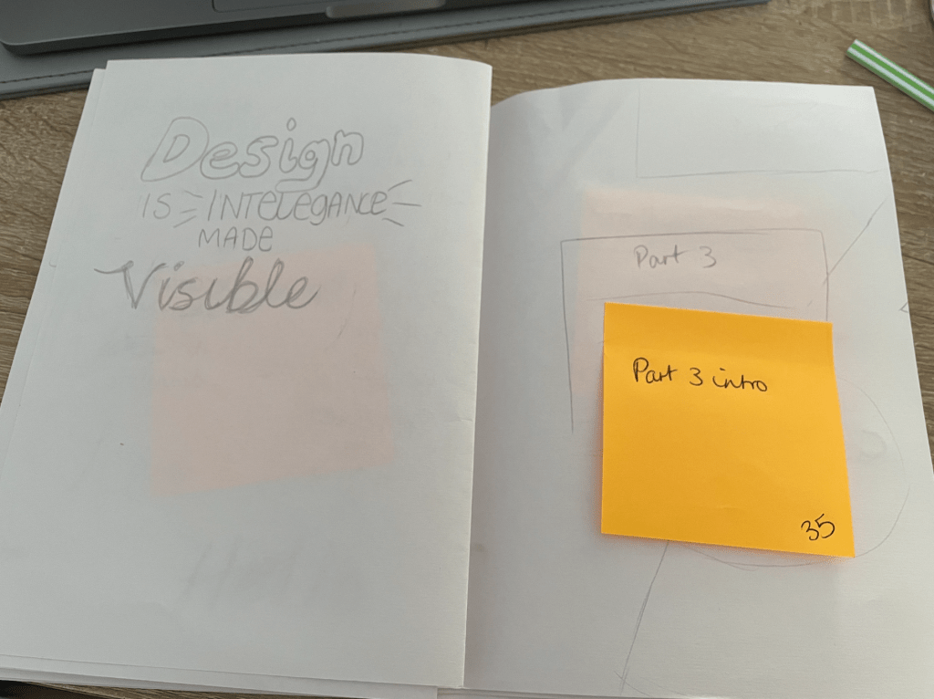
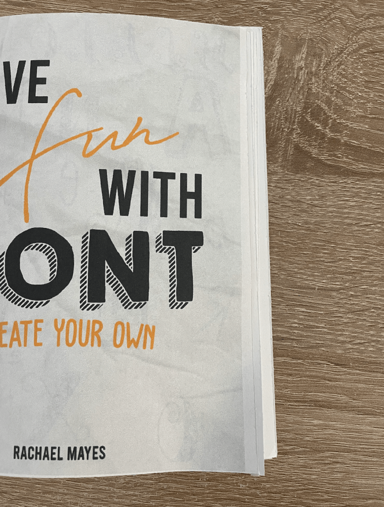
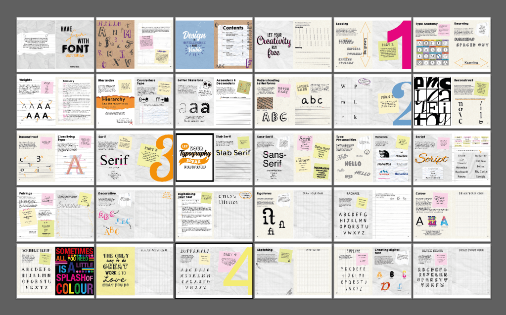
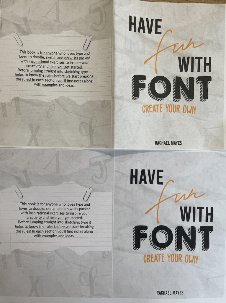
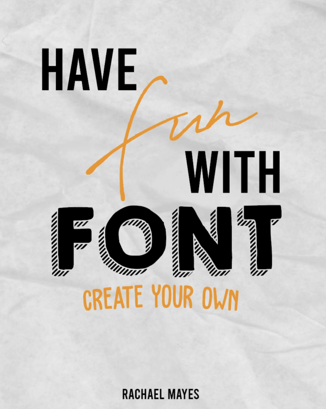
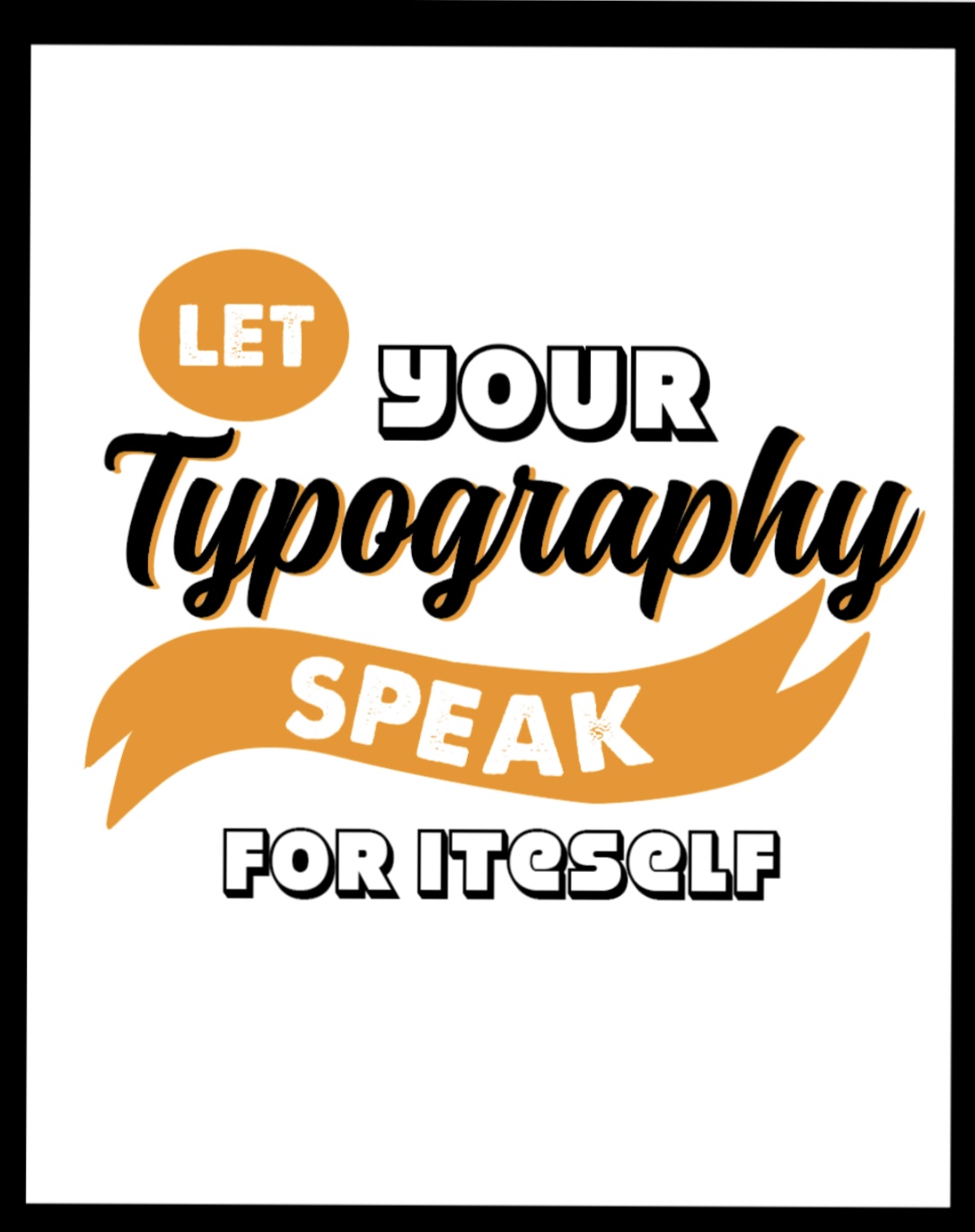
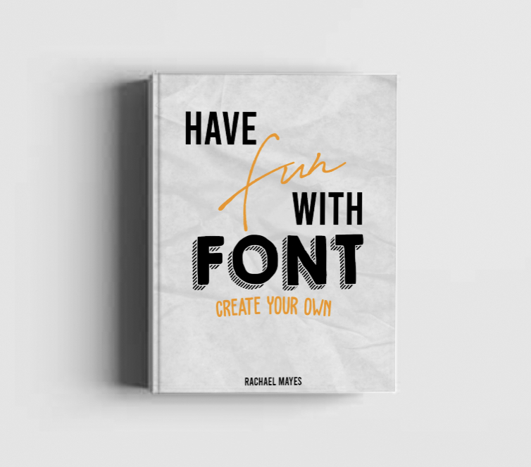
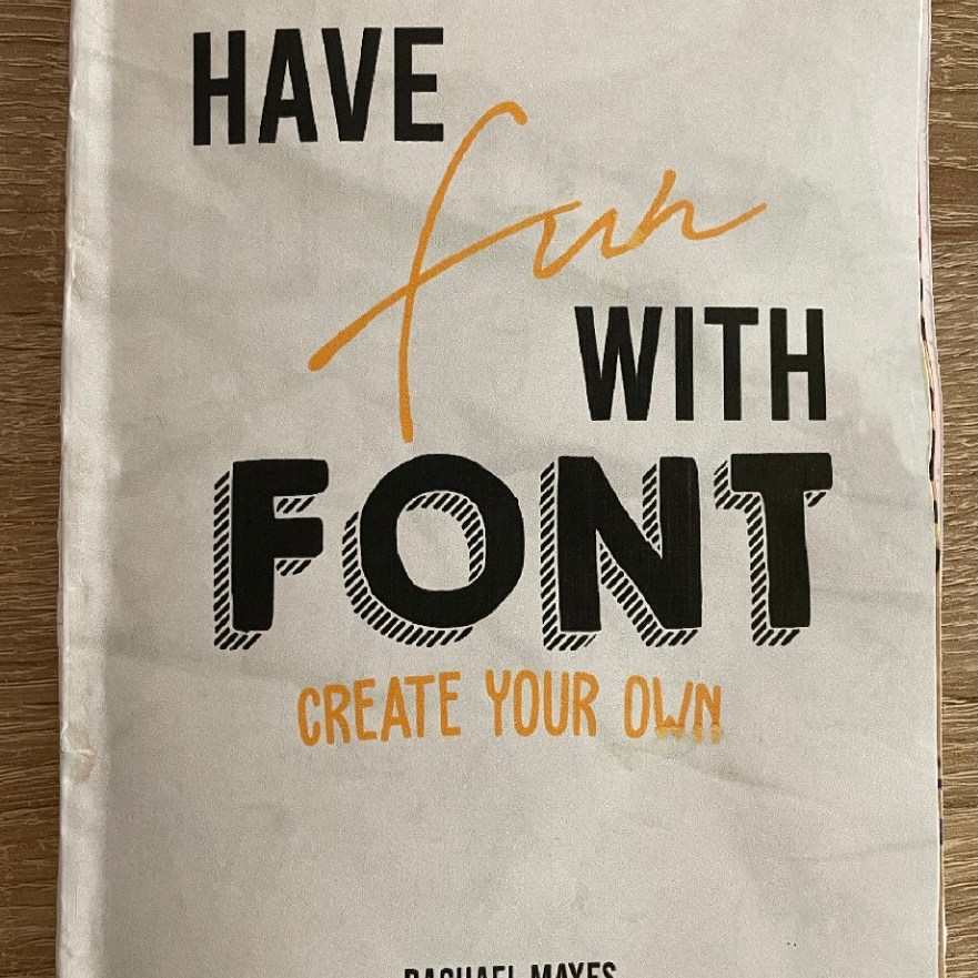
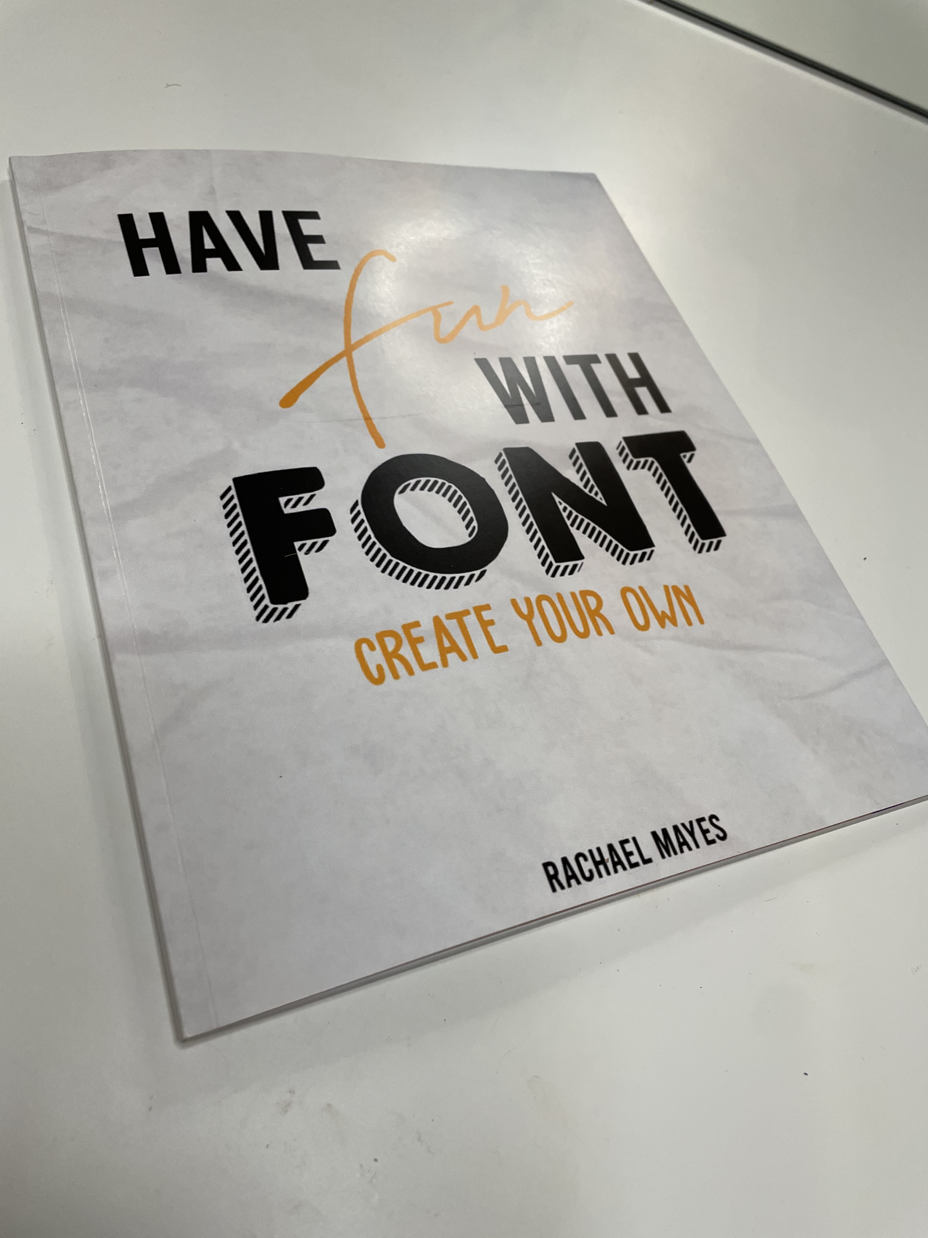
Having decided the title to my book I feel I can move onto the designing process; The title I have chosen is ‘Have fun with typography’ with sub title to be decided between ‘Create your own’, ‘Let your typography speak for itself’, or possibly ‘Learn with lettering’.
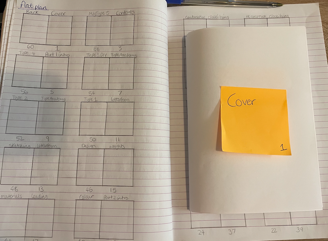
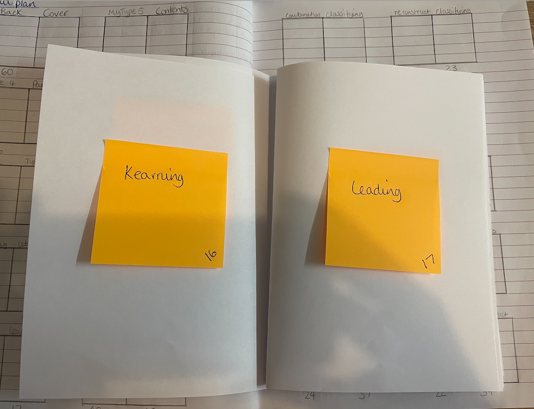
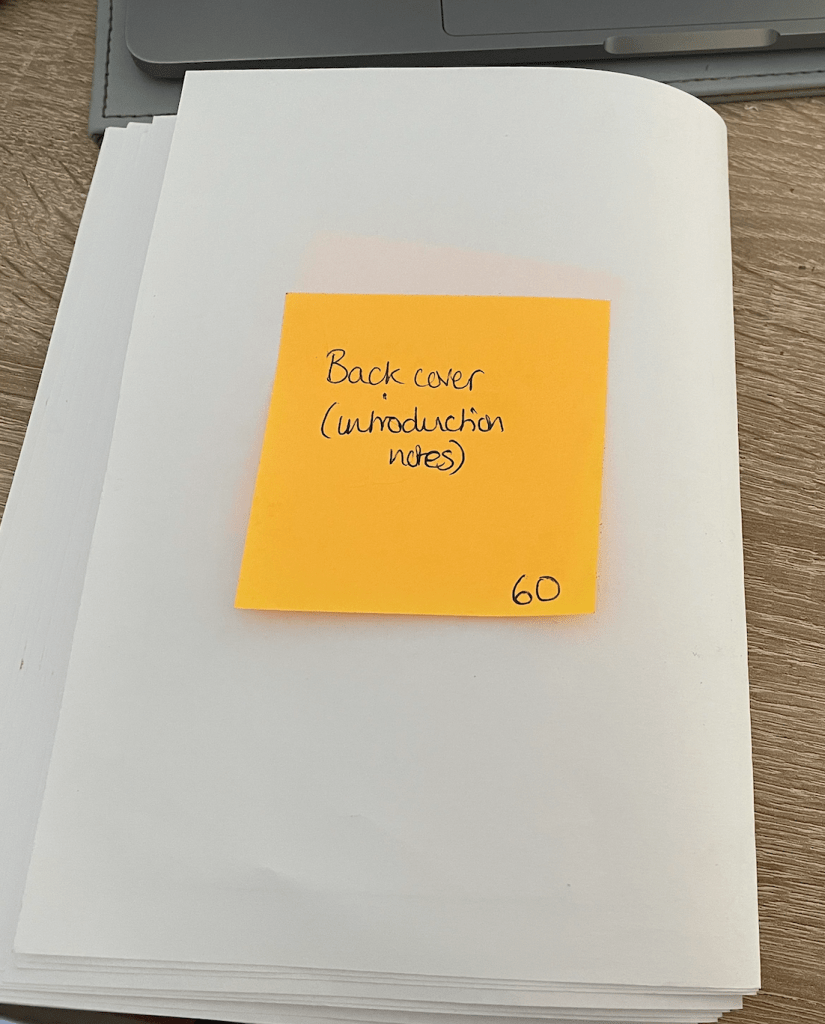
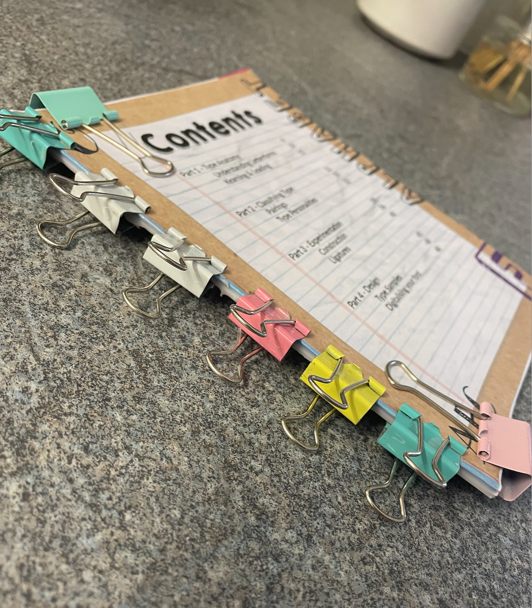
I started off by creating my flat plan along with creating a basic mockup to aid me in paring the correct correct pages together as they would be printed. I have a total of 60 pages for my book which was more than I imagined I would be creating! But after all, it is a book – not a leaflet!
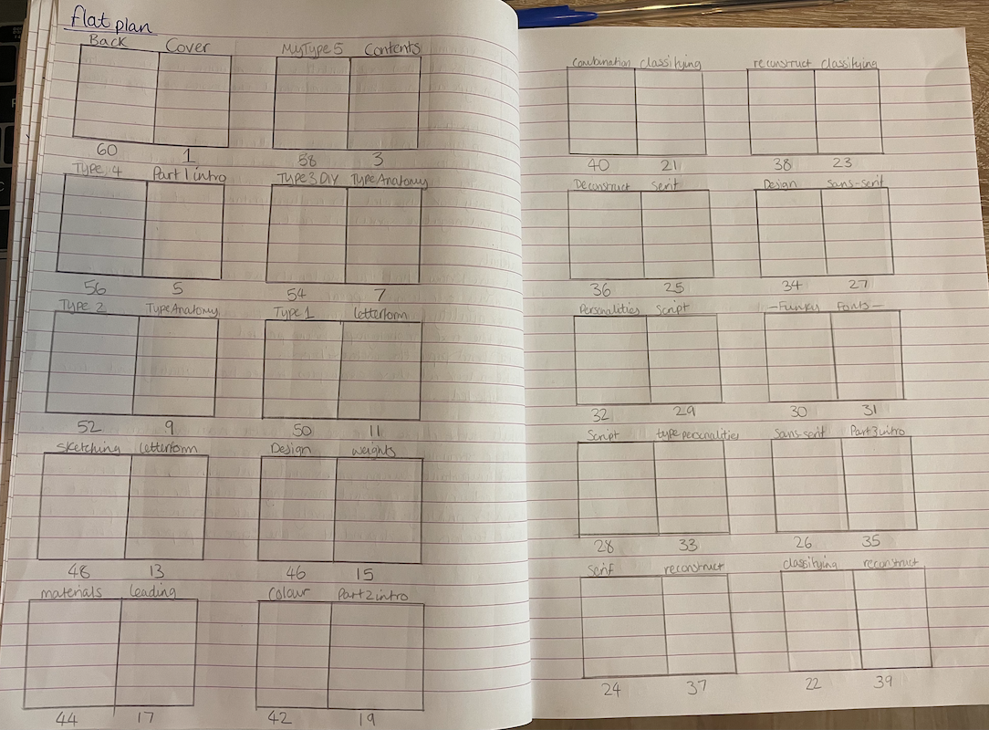
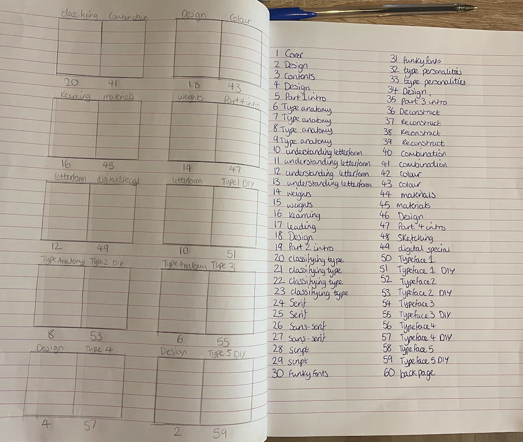
I have gathered all my notes and written up all which will be included in my book, I had to do this first to determine how many pages would be included. I am now ready to start sketching up some design ideas ready to start the process of my book. I would like to use a continuous layout on each page to ensure the correct consistency is created to give a professional feel.
To make use of the paper I folded during the mockup to help with my flat plan I have decided to use this to create rough sketches deciding were things will be placed and the layout I will create. This way I will be able to see what works and what doesn’t within the format of my book. This is going to be incredibly useful during the designing and create stage knowing which pages marry up with each other.


Materials – As mentioned previously I’d like to scan in my own elements to scatter throughout my book to give it a ‘doodled’ notebook feel as after all the purpose of my book is an encouraging interactive DIY book. I have gathered some different paper samples to include in my book, these range from textured paper for effect and graph/lined paper for interaction.
Book format – I plan to create an interactive and informal book on typography focusing mainly on encouraging the reader to create a typeface. My book will be aimed at beginners who have an interest in the topic or are starting their journey into the designing world. My book will be 8 x 10 inches (254 x 203mm) which is the standard workbook size, enabling enough space for readers to add their own sketches etc. It lends itself to a 2-column text layout which is an efficient use of space. I will use the Perfect bound technique for my book with the pages equally divided into 3 signatures with the cover overlapping.
Design Process Part 2
I created my typefaces ready to include in my book, I created these using my iPad on procreate and using the website https://www.calligraphr.com/ to create these into glyphs. It was an incredibly easy and enjoyable task, defiantly something I will remember for future, now these aren’t perfect but are ideal for me and what I have planned for them.
Following my sketches I am able to start the process of creating my book. I have scanned onto my computer all elements that I wish to use along with narrowing down my selection for my main typefaces to feature within my book.
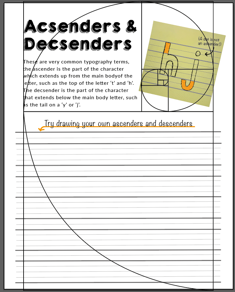
Layout – I have decided to apply the golden section, although initially I did struggle with the understanding of this in a previous research task, it helps create perfect harmony within the pages which is an important fundament when creating a successful book.
Copying up my notes and working with my layout I was able to successfully complete all 60 pages for my book, I am really pleased with how this is looking, I have reminded myself to trust the process as from afar it looks a little mix-matchy and messy however once placed together each page will work in harmony and completely fit my expectations and goal for my book.
With the help of my flat plan I was able to quickly match each page in the correct format ready for print as seen above. As mentioned above I would like my book to be 8×10″ however due to the current restrictions and Christmas period I would not be able to print my book efficiently with the correct papers/binding techniques I would of liked, but for the purpose of seeing my book in life I will print a smaller A5 size at home, this way I like to give my final evaluations and reflections.
Printed Mock-up
Mistakenly I started to print my book without its planned signatures, I didn’t like the way the book format was turning out (even though this was a mock-up for me to see how everything looked in printed form) whilst these pages were printing and placed together the book block began to have a stepped effect from where the volume was gathering at the spine. I quickly aborted the print and divided my book into the correct signatures and relabelled the correct page numbers ready to alter the page layouts.
Re-designed print preview:
You can clearly see the difference in quality between a cheap printer paper of 70gsm (top) and a premium paper of 90gsm (bottom). The colour is more washed out on the cheaper paper and is incredibly see through which ruins the effects of the pages, not only does it effect the way its printed it effects the way its handled. The premium paper is much more sturdy and comfortable to hold and turn pages, it doesn’t feel like it could tear as easily. This obviously wouldn’t be my first choice of paper (ideally would like my pages printed on 100gsm) however because I am printing from home the size and paper aren’t to how I would of liked – but I desperately wanted to see my book in a life form, and for doing this I am extremely pleased and confident with my end result of book!
Binding – I decided to do the perfect binding technique. I started off by saddle stitching my signatures together and proceeded to glue the spine together using pva glue. This took a few layers to fully secure it all together but worked successfully.
Final Result
Digital mockup
https://www.flipsnack.com/Rmayes/have-fun-with-fonts-create-your-own-rachael-mayes.html
The link above shows my book in an interactive form which allows you to turn page by page in your own time. Seeing it digitally is very rewarding!
Printed mock-up
Self-critique – I feel that I have created a fun and informative book aimed at beginners who enjoy getting hands on with work and learning, the relaxed handmade feel takes the pressure off and distracts the reader from what can be a ‘scary and overwhelming’ area. My only concern is that my book may come across too handmade and perhaps ‘under qualified’ as it is very zine style. I would have loved to of seen my book professionally printed and printed to true size however this could be something I do at a later date when there aren’t so many restrictions.
Overall I feel this book would be idea for any beginners. I created something which I would of enjoyed owning when stepping into the world of typography for the first time, and feels like it successfully briefly touches bases on all avenues for basic typography.
During my paper mock-up I mistakenly printed my cover on regular paper rather than card! I feel this did impact the overall look slightly however other than that I am pleased with how the binding worked along with the overall look of it in my hands.
Reflection
At the start of this assignment I really struggled knowing which direction to take my book and actually had to have a short break whilst i figured it out. I felt most comfortable with creating a book about Typography but didn’t know what I could do which differs to anything else I have created so far. To begin with I considered creating a book for children on typography but as my ideas progressed I decided to create a book aimed at beginners of any age who had an interest in typography and type in general.
The theme of my book is an easy going DIY style book focusing on building up the readers confidence to create their own typeface, I wanted it to be fun and informative rather than overwhelmingly full of text, and feel that I have achieved just that. I also taught myself things along the way such as creating my own typefaces, I felt by doing this I would be able to give truthful advise and helpful tips. As you may have noticed I took inspiration in my book from my zine created in Assignment 1, I loved the cut and paste look and felt it was very fitting with the style of book created. (Plus I really enjoy the process of getting hands on and creating elements along with drawn imagery used within the book!)
I felt this assignment has been the icing on the cake for this unit – I have surprised myself with how much I have enjoyed and learnt from this unit and feel that I have come a long way in my work!
AMENDMENTS FROM TUTORS FEEDBACK
After receiving my tutors feedback I realised that I had a typo on one of my pages within my book. This has taught me the importance of checking over work and asking for a second pair of eyes to proof read over things. Below is the amended design, I have also updated the above slideshows but have shown below the before and after.
As you can see, I made a very embarrassing misspelling however was easily able to amend this. It’s really proven the importance of triple checking work!
My tutor also pointed that my binding could of been neater for my book. I have since been able to have my book professionally printed which has made such a difference and given me such a rewarding feeling seeing my work in a professionally made book form! I had my book printed with http://www.mixam.co.uk. The book is 204x254mm printed on 120gsm uncoated paper (suitable for user to draw and erase on pages) with the cover 350gsm gloss paper with perfect binding.
Having my book professionally printed has given me the greatest reward! I am so pleased with he work I have produced and hope the others think so too!
