
Brief: In this exercise you’re going to create images which you’ll then print onto the papers you collected in the first exercise. You have been working with the poem Tango With Cows in the exercise ‘Concrete Poetry’, to create an experimental text. Using your interpretation of the poem as a starting point, develop a set of images you can sequence into a narrative. You can choose to create these images yourself or use existing images.
Idea Generation: Create a series of images which will build a narrative sequence over about 16 pages. Use keywords from the poem as a starting point. Work with images you have created before, developing and changing their contents, or use fresh new ideas and imagery related to the poem. Remind yourself of the creative design process. Explore the sequential narrative over the folds. Produce a folding document (2 sided) with the images you have created, Form and Function: Paper Folding.
Research and Development: A visual narrative is a way of communicating some form of ‘story’. it may be that you interpret ‘narrative’ in a conventional way, using chronological images of how your identity has changed over time, with a beginning, middle and an end. Or perhaps you’ll work in a less obvious way, exploring how your images can be exploited through abstraction and print processes, using the term ‘narrative’ as a vehicle on which to hang your concepts of the poem.
The purpose is to interpret the brief to create images that are meaningful to you, plus extend your understanding of images qualities. These images may be paintings, photographs, drawings, film stills – they can be at any scale, in any media and about whatever you want them to be, in the context of exploring the concept of of the poem. This is your opportunity to explore some of the features of digital imaging software, such as Photoshop, to layer images, cut out images, experiment with opacity, filters, hue, brightness, contrast and halftone screens, among other things. For example, can we approach text as image? What happens if you ‘rasterize’ text, then begin to manipulate it, in the same way as you would montage image material. Be creative! Explore! Remember you have access to Bridgeman and Oxford art libraries online also, if you want to download images and work in this way, but originating you own images will make the project more personal to you.
Research
I always like to start off by widening my knowledge and gaining inspiration on new topics before generating ideas of my own, below shows some brief research produced for the upcoming task.
Narratives help tell the story and move the reader through the book with two basic ways – a linear or a non-linear narrative. A linear narrative a story has a beginning, middle and end often in chronological order. Nonlinear narrative forms have no chronological order and can jump around through time with no direct pattern. Novels tend to be linear in nature as both author and reader want the narrative to be followed in a certain order, where as books like Dictionaries and phone books are nonlinear and can be dipped into to find specific pieces of information which can be scattered through the book.
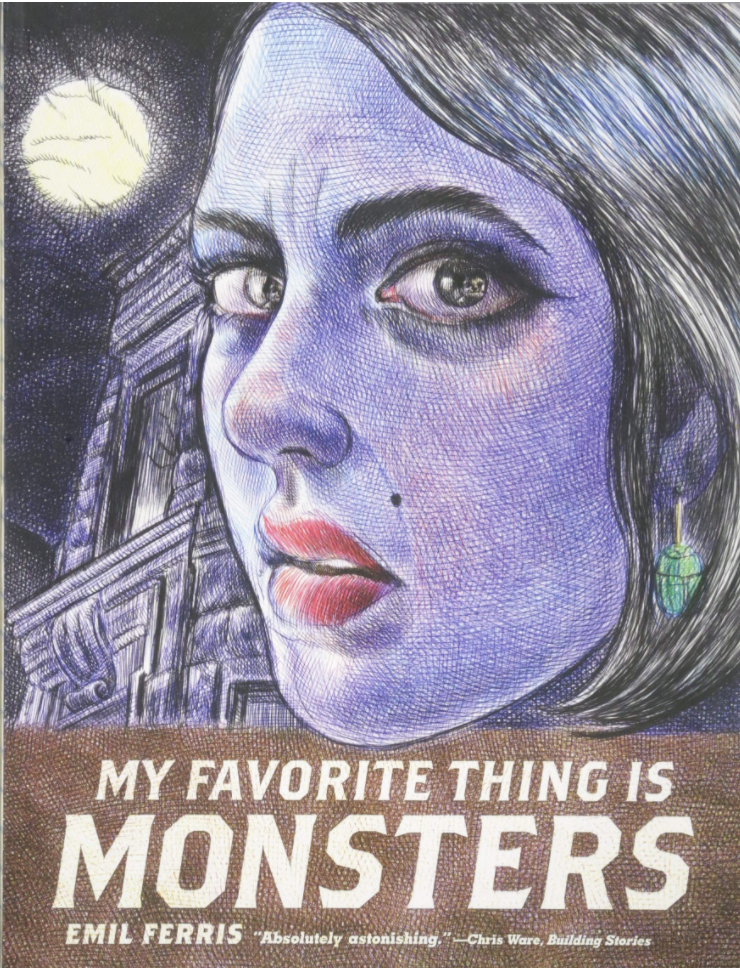
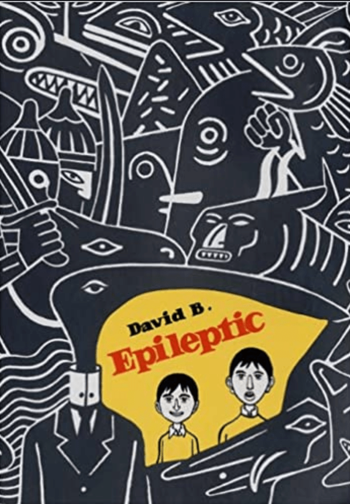
I wanted to look into graphic novels as this is something I haven’t come across as of yet and thought it may help with this exercise. The first book I came across was ‘My Favourite Thing Is Monsters by Emil Ferris‘ This Graphic Novel consist of each page scrawled in pen on lined paper – a clever storytelling format for this genre giving gritty tense images. Another graphic novel which caught my eye was ‘Epileptic, by David B.’ I was drawn to the with the bold marker like doodles which this style continues throughout the book, which with the bold, confusing, clashing images suits the topic of the book.
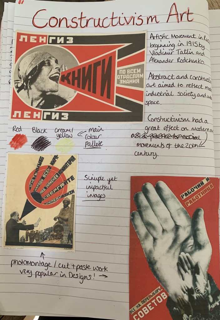
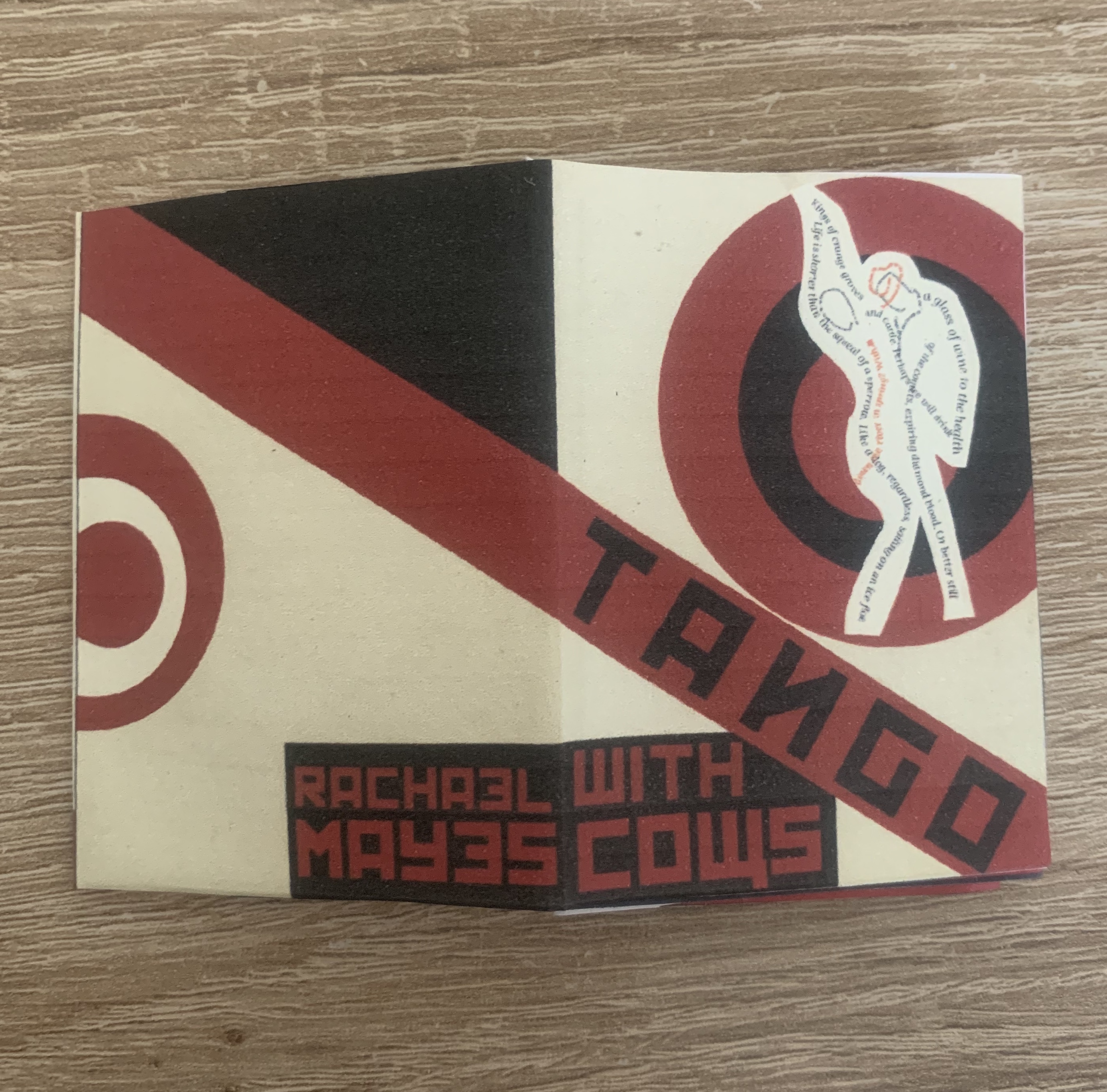
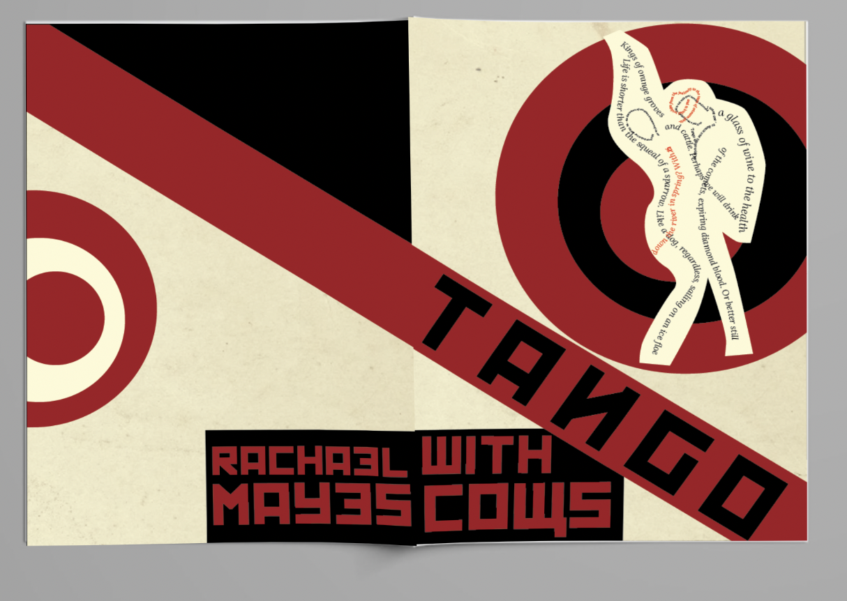
To gather further inspiration for my designs I decided to look at art movements around the time of when the poem was written, one movement which stood out for me was the Constructivism Art Movement. I felt this would be brilliant to use within my designs for this exercise. I love photomontage work and some of the examples from the movement on the left contained designs of just that, most images from this time only contained a very basic colour palette of just red black and pale yellow, along with block abstract shapes. This feels like a good starting point to my design process!
Design Process (part 1)
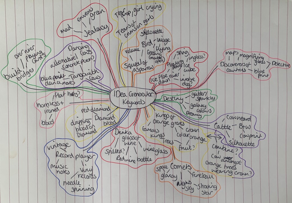
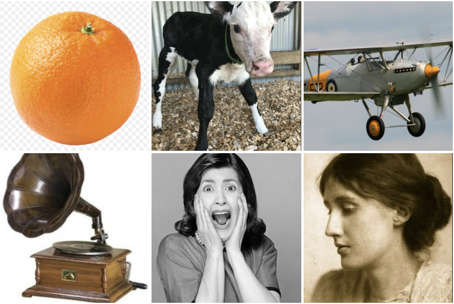
I started off by listing all the keywords mentioned in the poem ‘Tango With Cows’ I felt this was a good starting point to decide which words will be appropriate to use in this exercise;
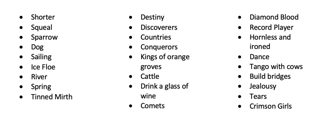
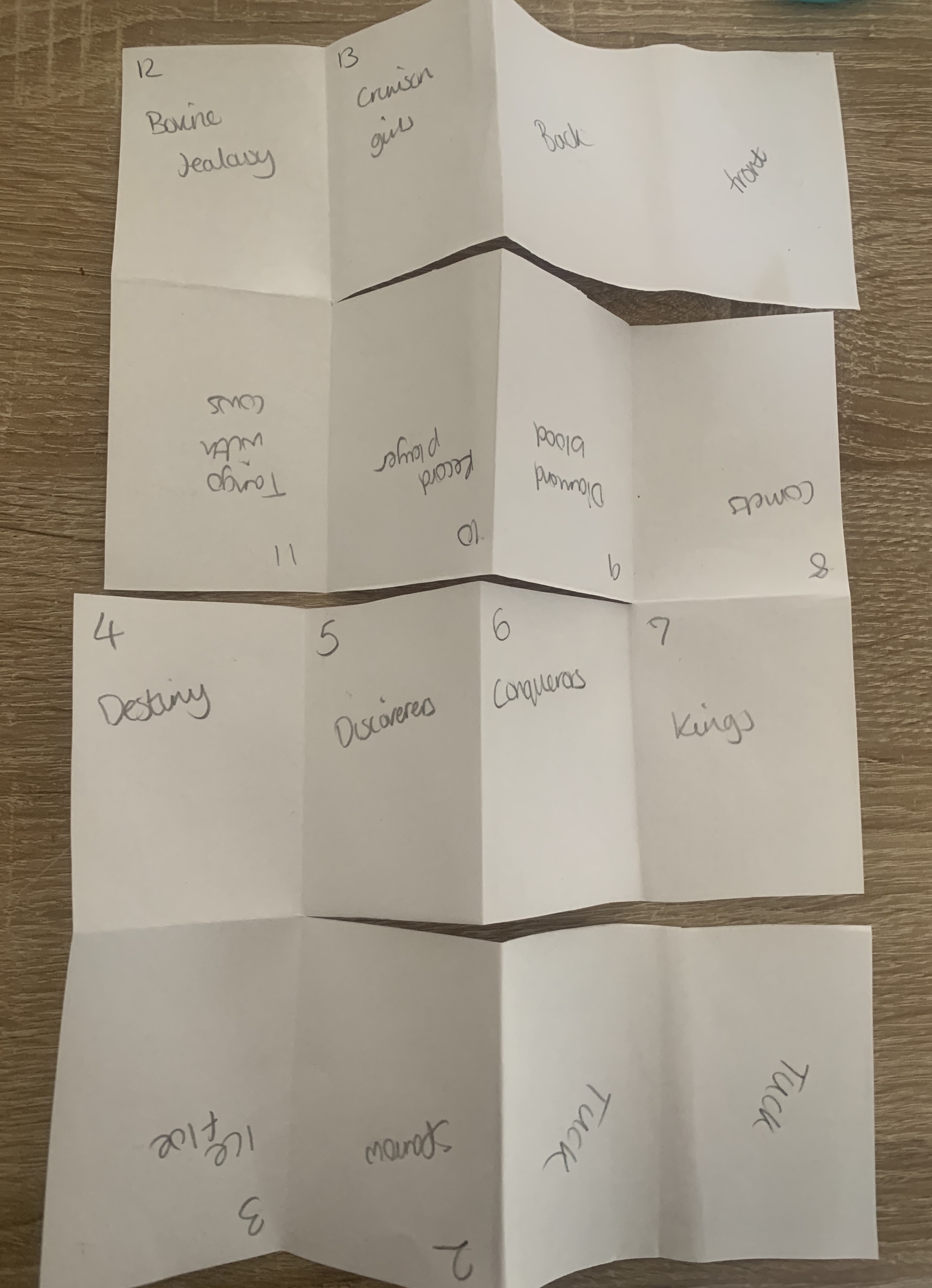
From the selection above I narrowed down my keywords ready to start generating ideas for the series of images I am being asked to create. I jumped straight in with creating a mind map to kickstart my design process.
I would like the narrative for my images to be seen as both linear and nonlinear, so that the book can be read in chronological order following the poem but also is able to be dipped into seeing each image individual as well as being part of the series.
Sketches
I roughly sketched out some initial ideas to give myself a starting point, I plan on using Photoshop and Illustrator as my main software along with using the cut and paste technique and scanning images up onto my computer. I plan on using a basic colour palette of red black and cream with perhaps an extra colour or two to suit the design (e.g jealousy -green).
As a reminder, the key phrases I have chosen are as follows;
- The squeal of a sparrow
- Like a dog, regardless, sailing on an ice flow down the river in spring?
- We look at our destiny
- The discoverers of countries
- Conquerors of the air
- Kings of orange groves and cattle
- Drink a glass of wine to the health of the comets
- Expiring diamond blood
- We’ll get a record player. Well, to hell with you
- To dance one tango with cows
- Build bridges from the tears of bovine jealousy
- Tears of crimson girls
With my sketches beside me and the design styles of Constructivism art in mind I was ready to move forward into the design process. The designs I found relating to the constructivism art movement had a very simple colour palette of mainly red, pale yellow & black, along with simple black & white imagery. I jumped straight into choosing the best fitting designs out of my sketches and started to build these designs.
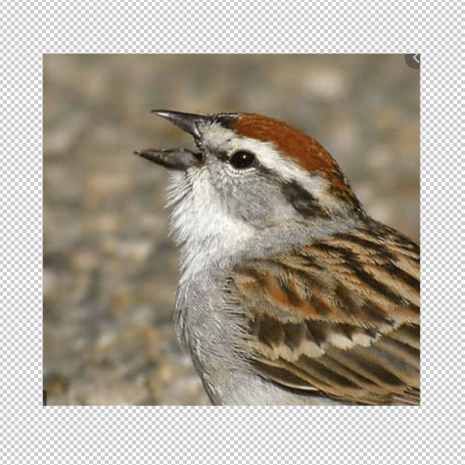
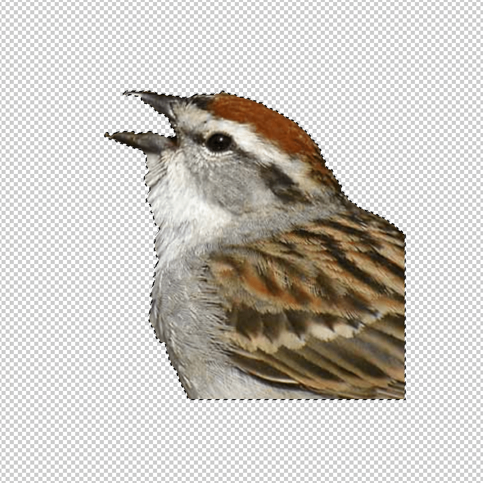
I gathered images in preparation to edit them in some way to fit in with my design plans, I used Photoshop and Illustrator as my main softwares for this exercise. I started off by cutting out all of my images using the quick selection tool on photoshop and also converting the images into Black & white. I then pasted these into illustrator.
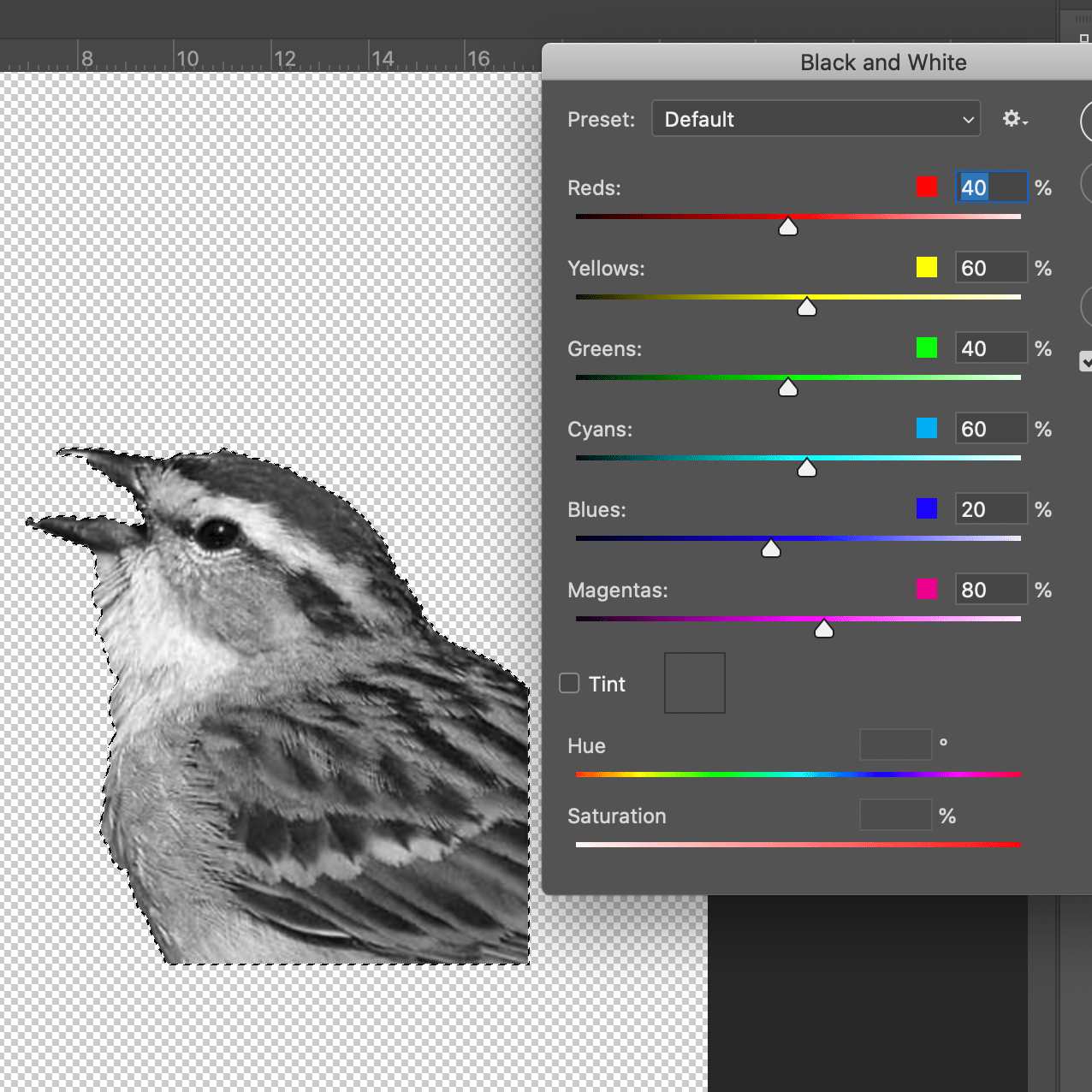
Playing around with the opacity, filters, hue & brightness I was able to transform images into ways which fitted the designs so that I could express the phrases I’d chosen.
Design Process (part 2)
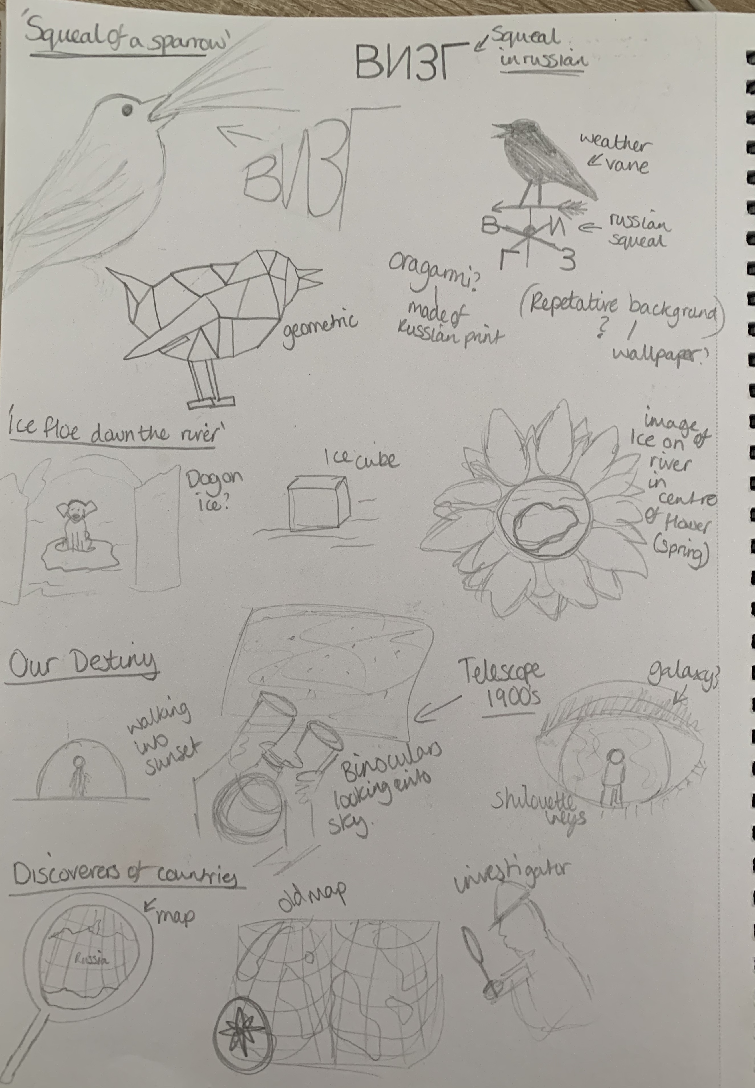
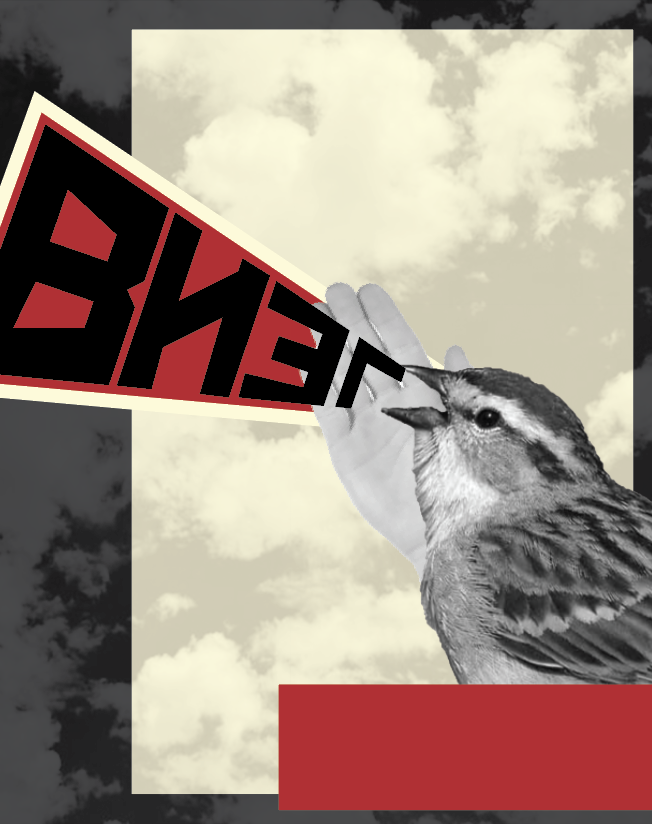
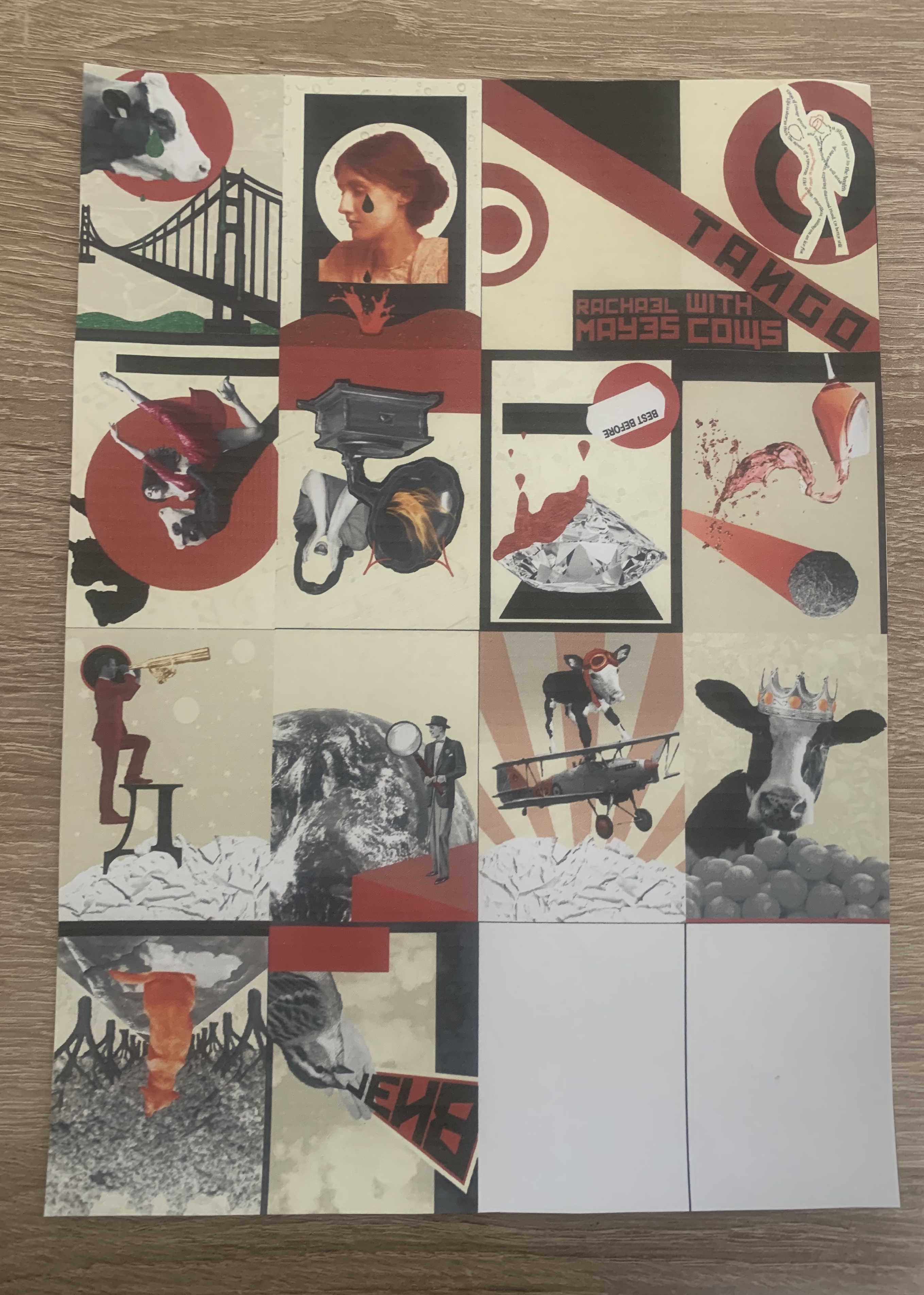
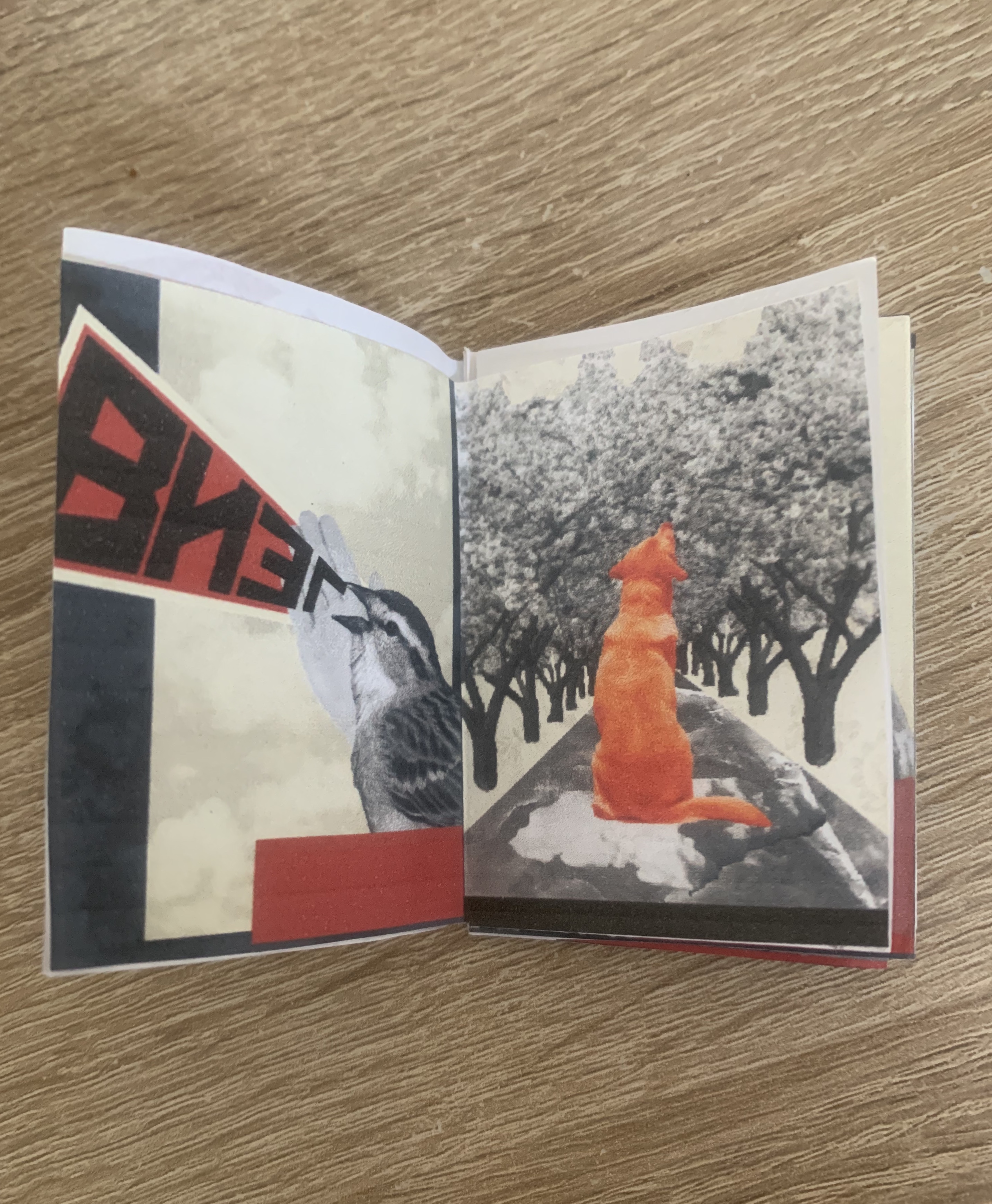
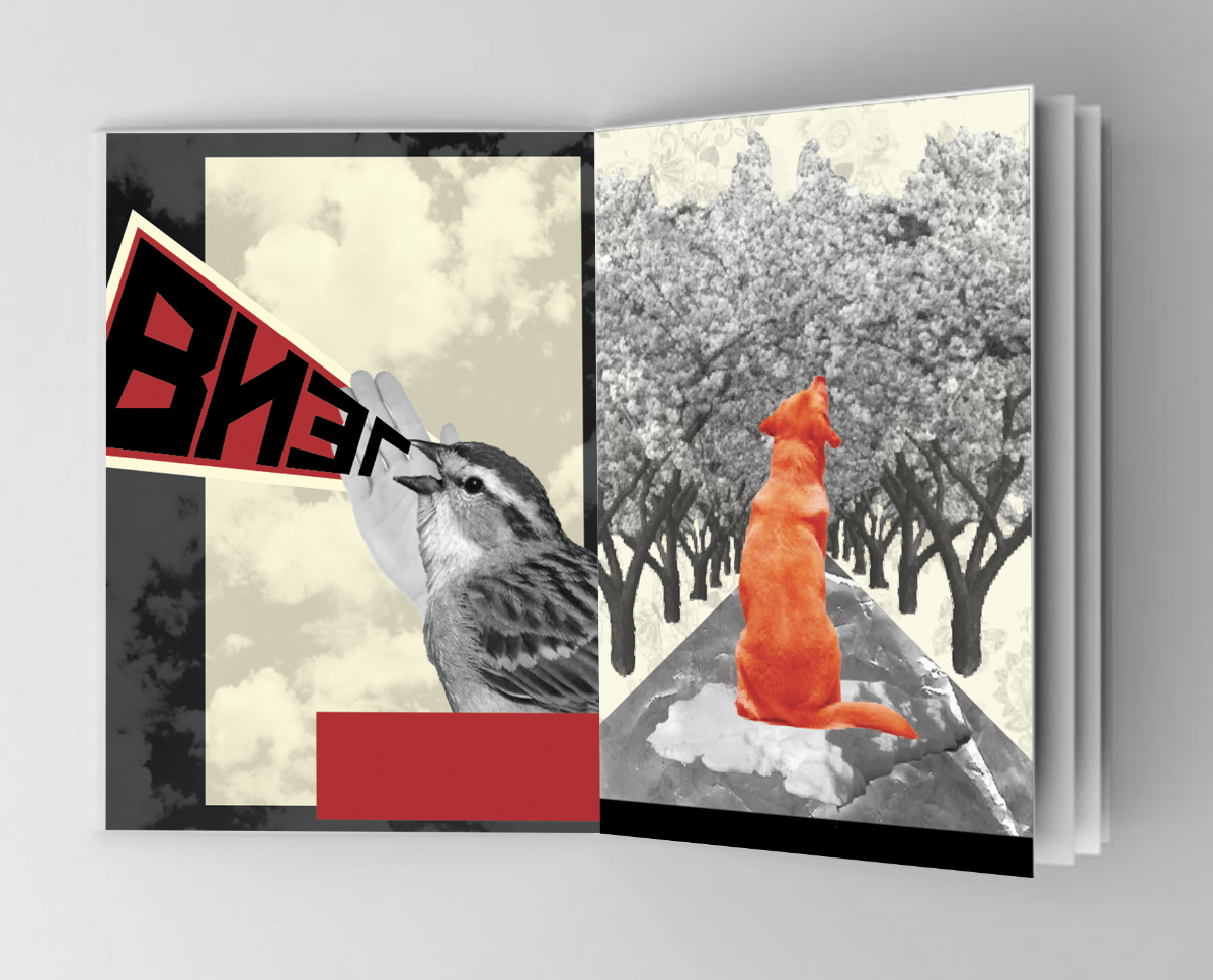
The Squeal of a Sparrow
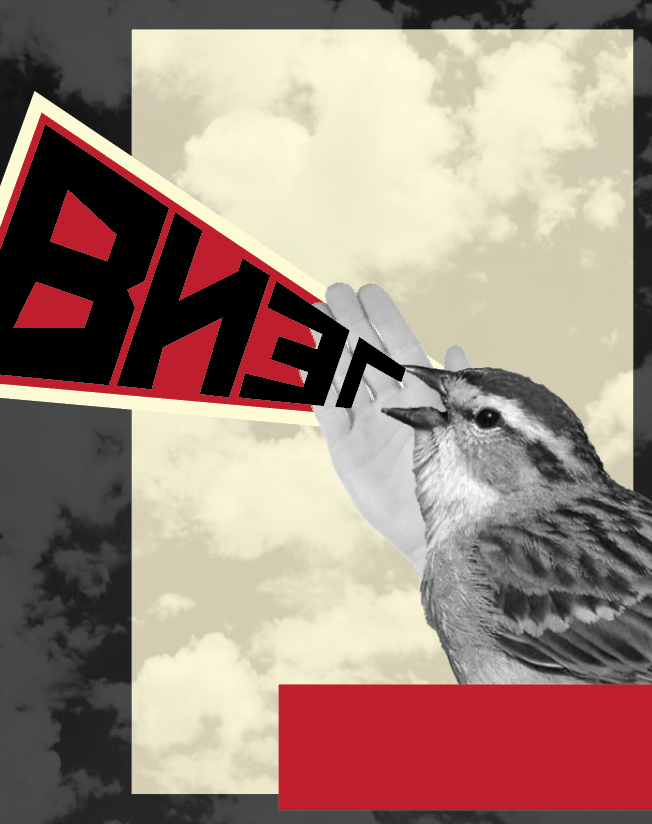
I took inspiration for this design from Alexander Rodchenko’s design ‘Books (please!) In all Branches of Knowledge.’ which I came across when researching the Russian movement Constructivism Art. This was a good starting point for me to be able to carry on the style throughout my other designs. I felt using photomontage techniques within my designs would work well and give me the ability to develop expressive and interesting designs.
Following my sketches I created this design by cutting out an image of a sparrow and translating the word ‘squeal’ into Russian. I felt that my design was too plain so I added a clouded background some blocks and a hand behind the bird (to add to the photomontage effect).
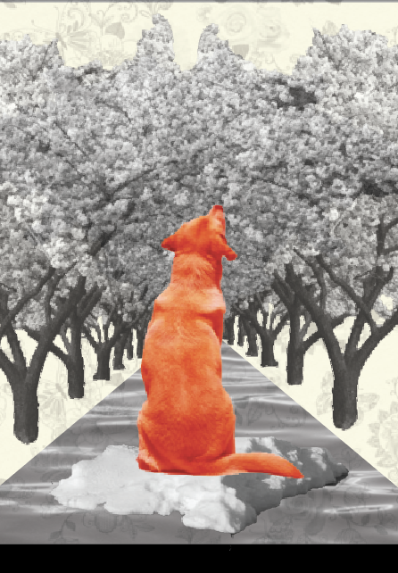
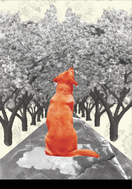
Like a dog, regardless, sailing on an ice flow down the river in spring?

For this design I took the phrase quite literal and added in as much features as possible for the image to be automatically associated with the correct phrase. By adjusting the hue and colour balance of the image of the dog I was able to change it to red, fitting with my colour palette and also becoming the focal point of the design. I added a floral wallpaper to the background as I really liked the way I added the clouds in the sparrow image, I think this is something I will continue to add for each design to come.
.
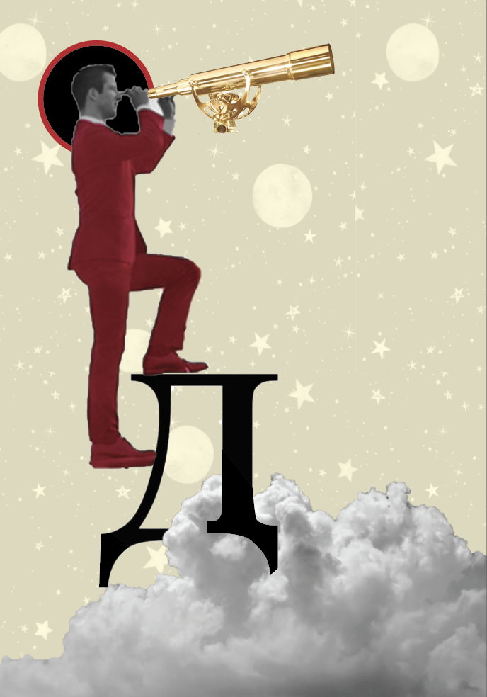
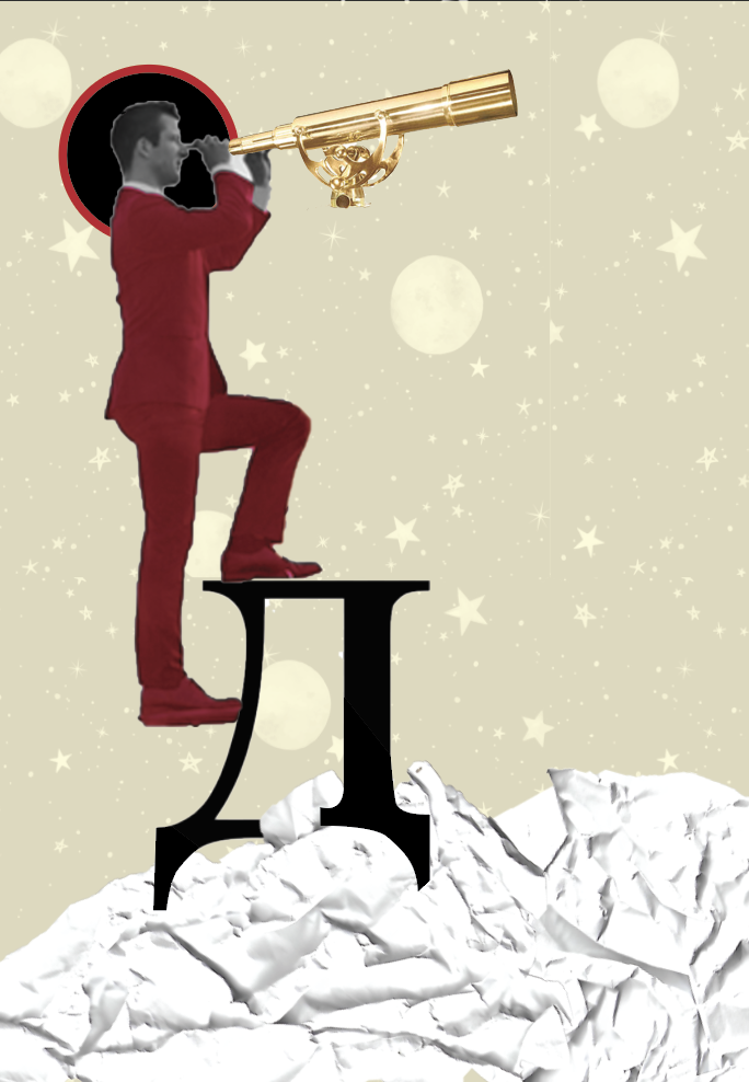
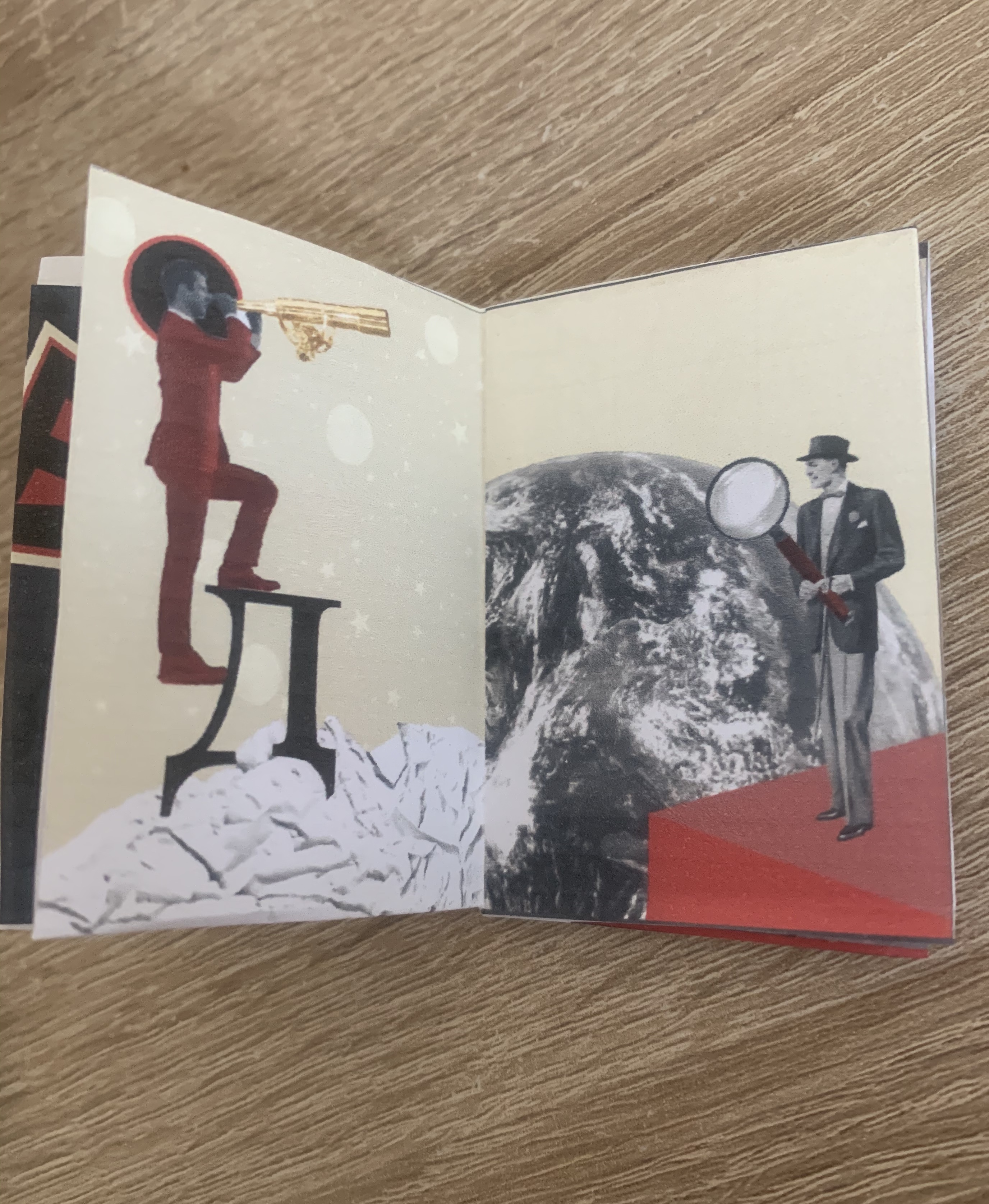
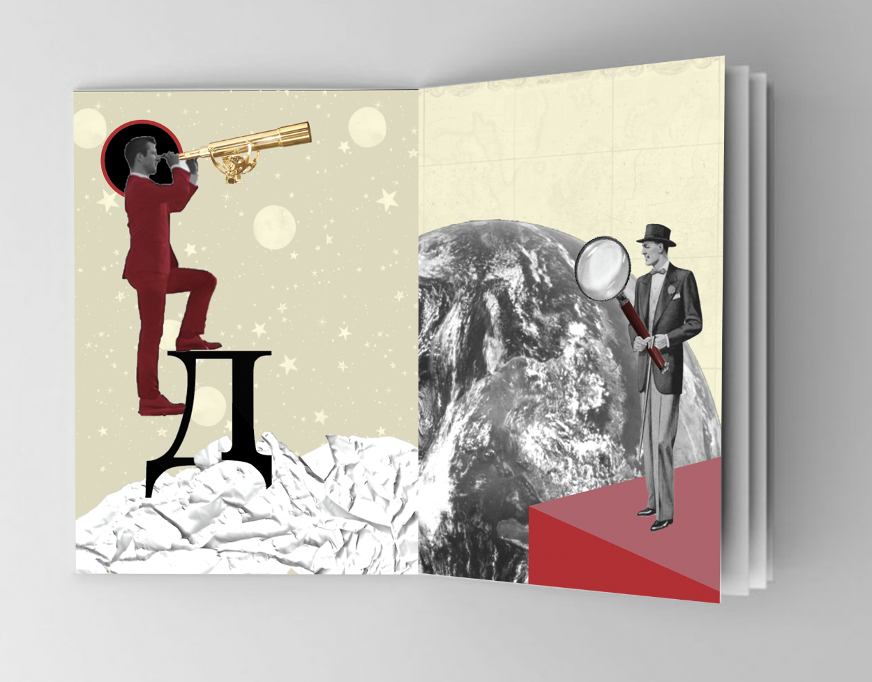
We look at our Destiny

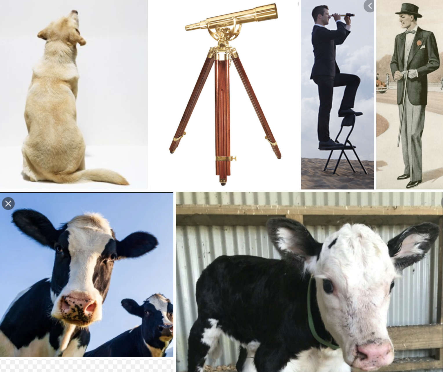
When thinking of Destiny I automatically associate with the universe so I felt space would be a good theme to use for this design. I found an interesting image of a man stepping up a ladder and felt I could be creative in cutting the ladder out. I decided to have him stepping onto the Russian letter ‘D’ (for destiny) I changed the image of the man to black and white then adjusted the hue and colour balance to give him a red suit then added a golden telescope but kept this in colour. By placing him above the clouds it brought him closer to space, I then added a star and planet background.
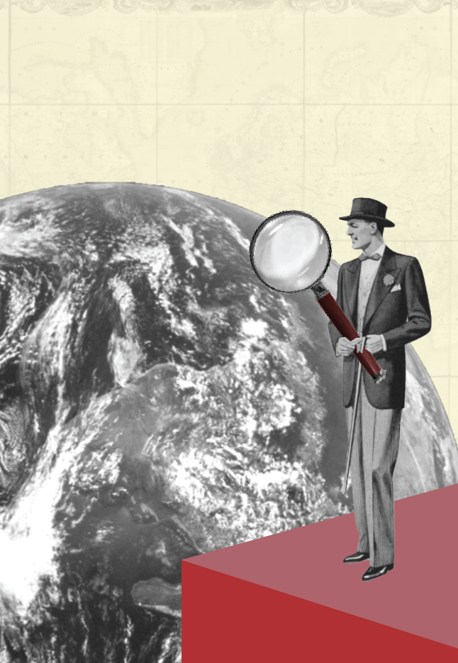
The Discoverers of Countries
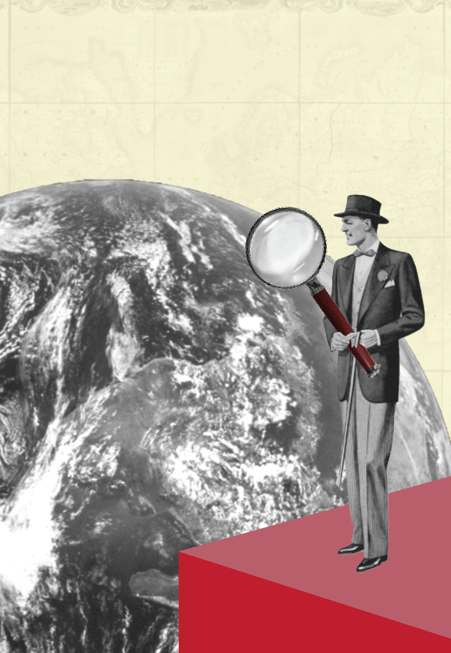
When creating photomontage images I like to use old vintage images, I feel this gives more of an impact to the designs. I found this old painting of an early 1900’s man and felt would be perfect for what I had in mind. I changed this image along with an image of the world into Black and White and played around with the positioning, in the end I decided I wanted it to look as though the man had discovered not only countries but the world, to help give this effect I decided to add an oversized magnifying glass (adding red to the handle) and to have him standing on a 3D ledge. I added an old vintage image of a map to the background to relate and add to the overall look.
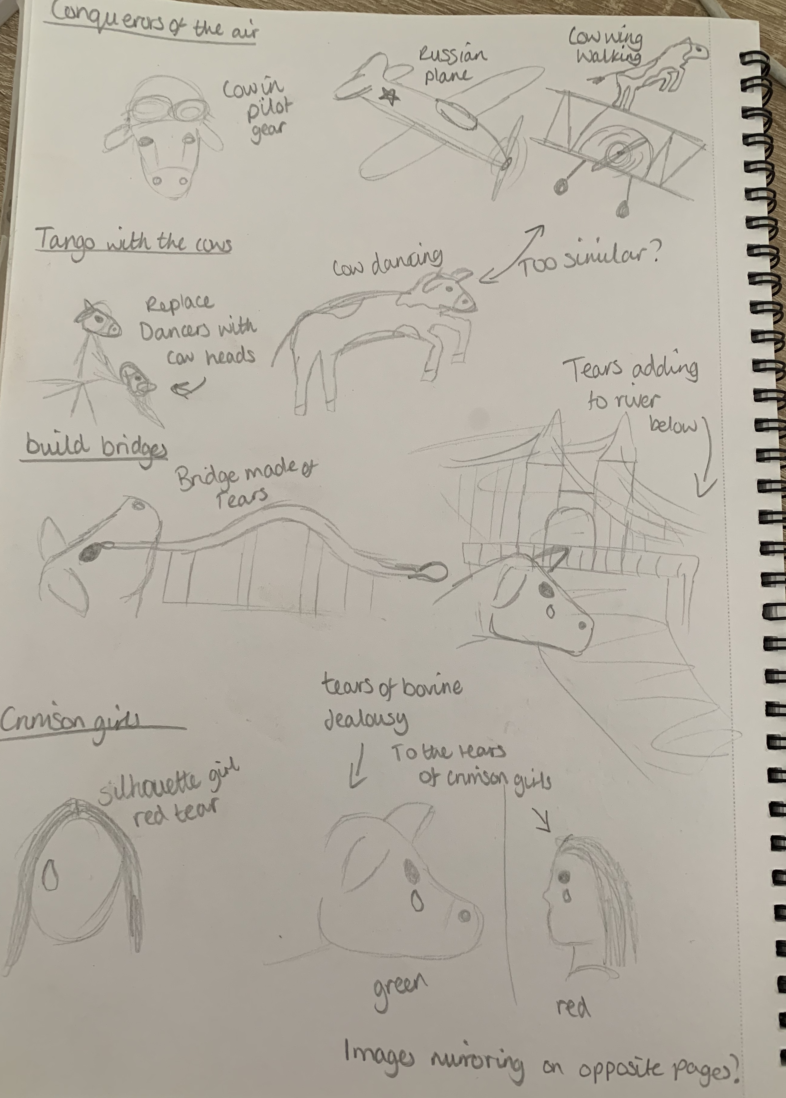
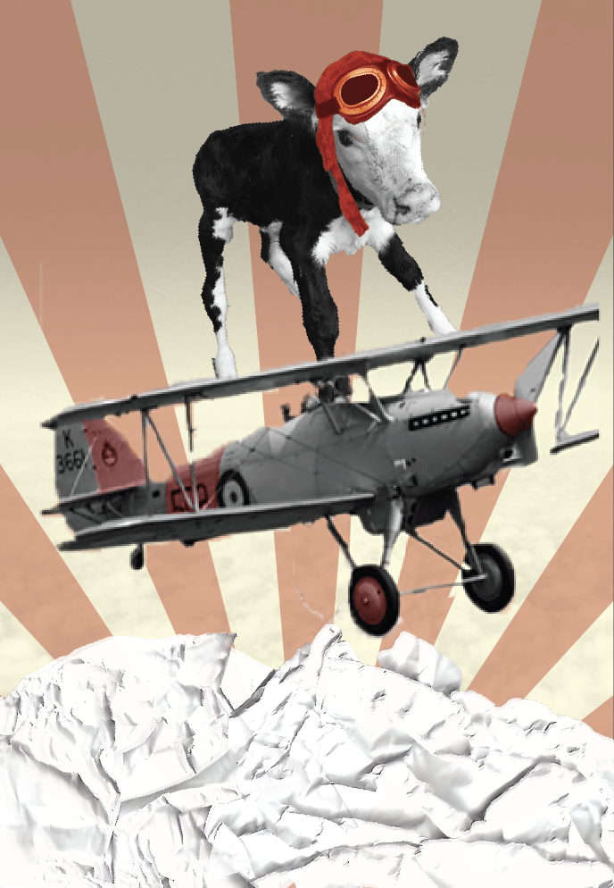
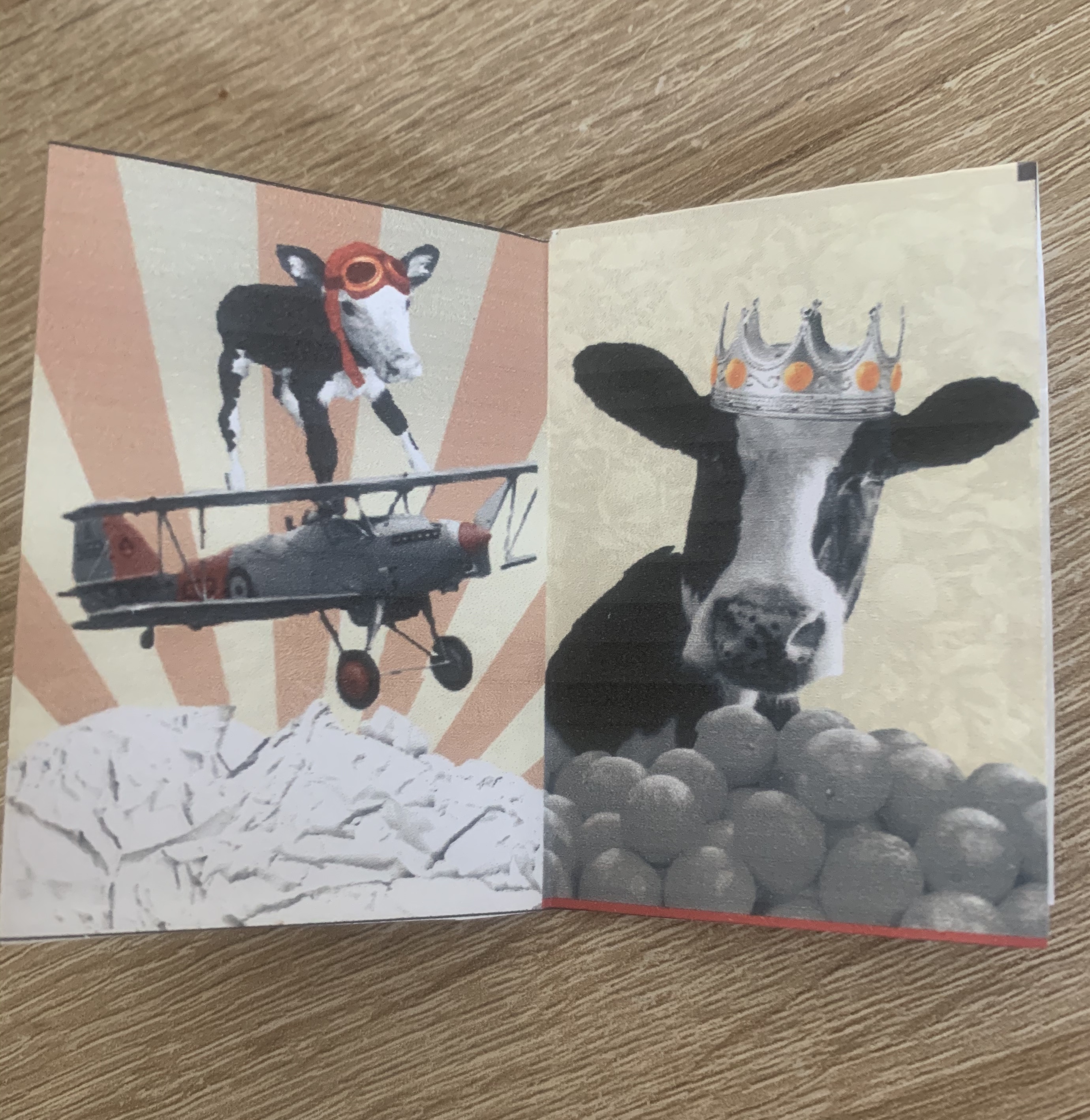
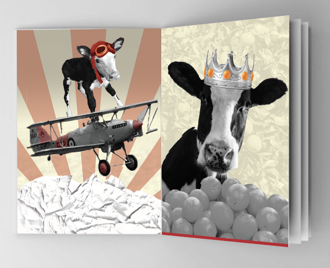
Conquerors of the Air
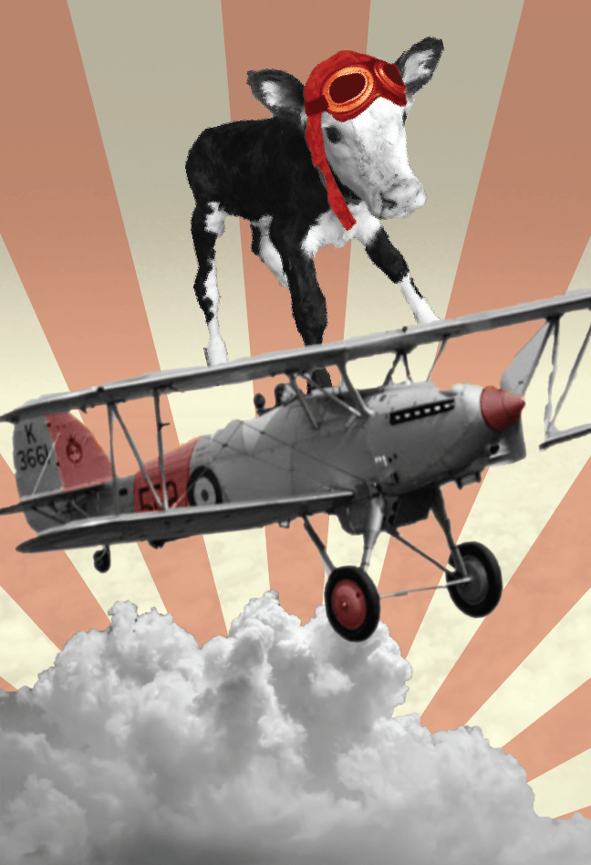
Taking the title of the poem into consideration I wanted to add a cow early on to clearly link the title to a few selected pages of the poem. I decided to create a wing walking cow image, which in the end turned out well. I did struggle with the background to this however I created the rayed effect as I felt it reflected not only the sun but victory which I related to Conqueror – this design has also been used in past constructivism art designs. I highlighted certain parts of the image red to keep up with the consistency of the theme throughout my designs.
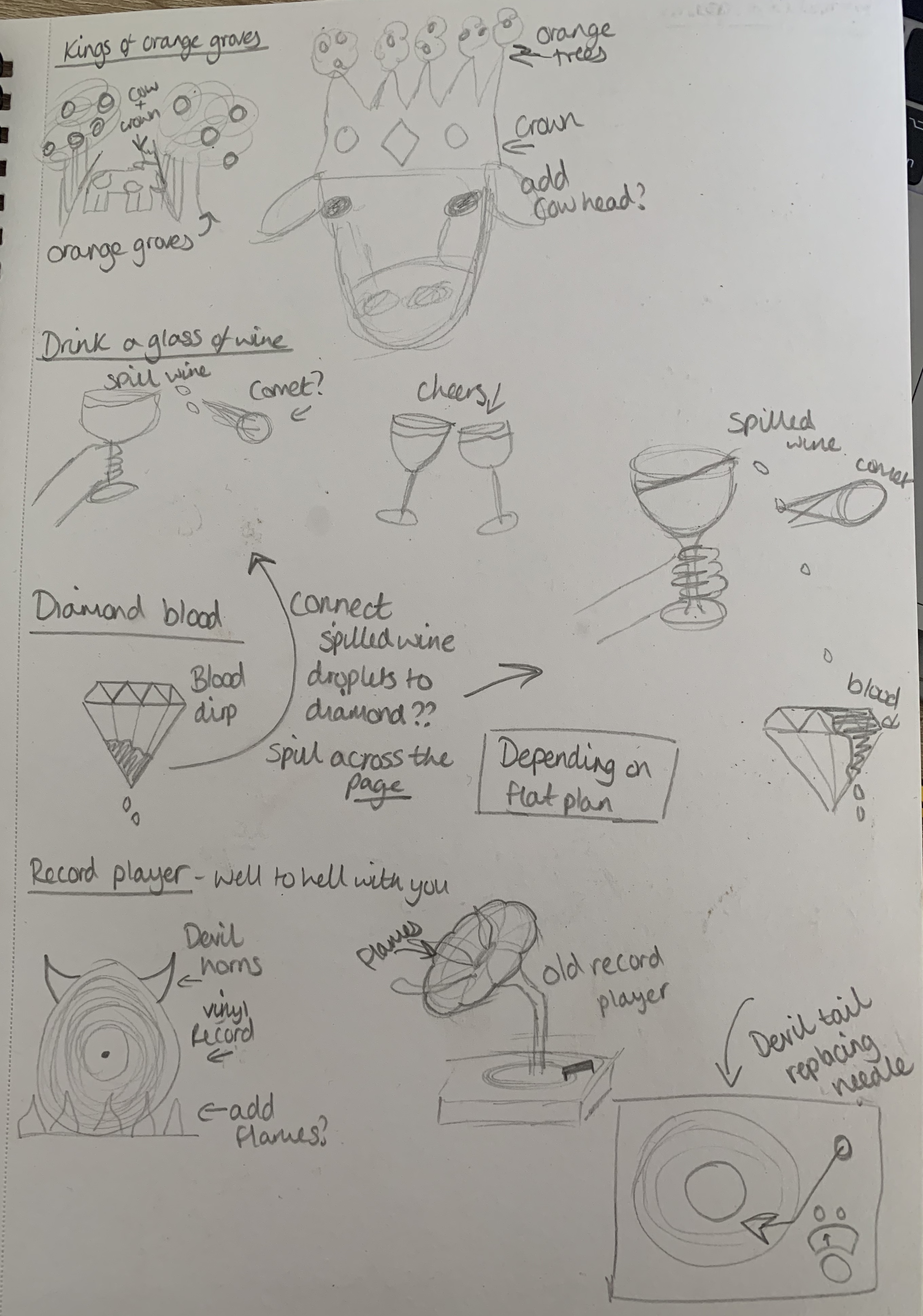
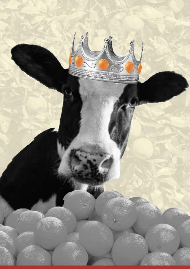
Kings of Orange Groves and Cattle
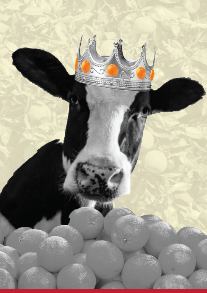
Following one of my sketches I decided to use a cow to represent as the king, wearing an orange encrusted crown, surrounded by heaps of oranges. I originally had the idea of converting the points of the crown into trees to clearly show the ‘orange groves’ but the transition between the crown and tree trucks looked terrible and would be too time consuming to make ‘perfect’. I opted for an orange tree background and decided to keep the colour of the oranges in place on the crown.
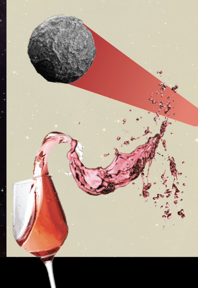
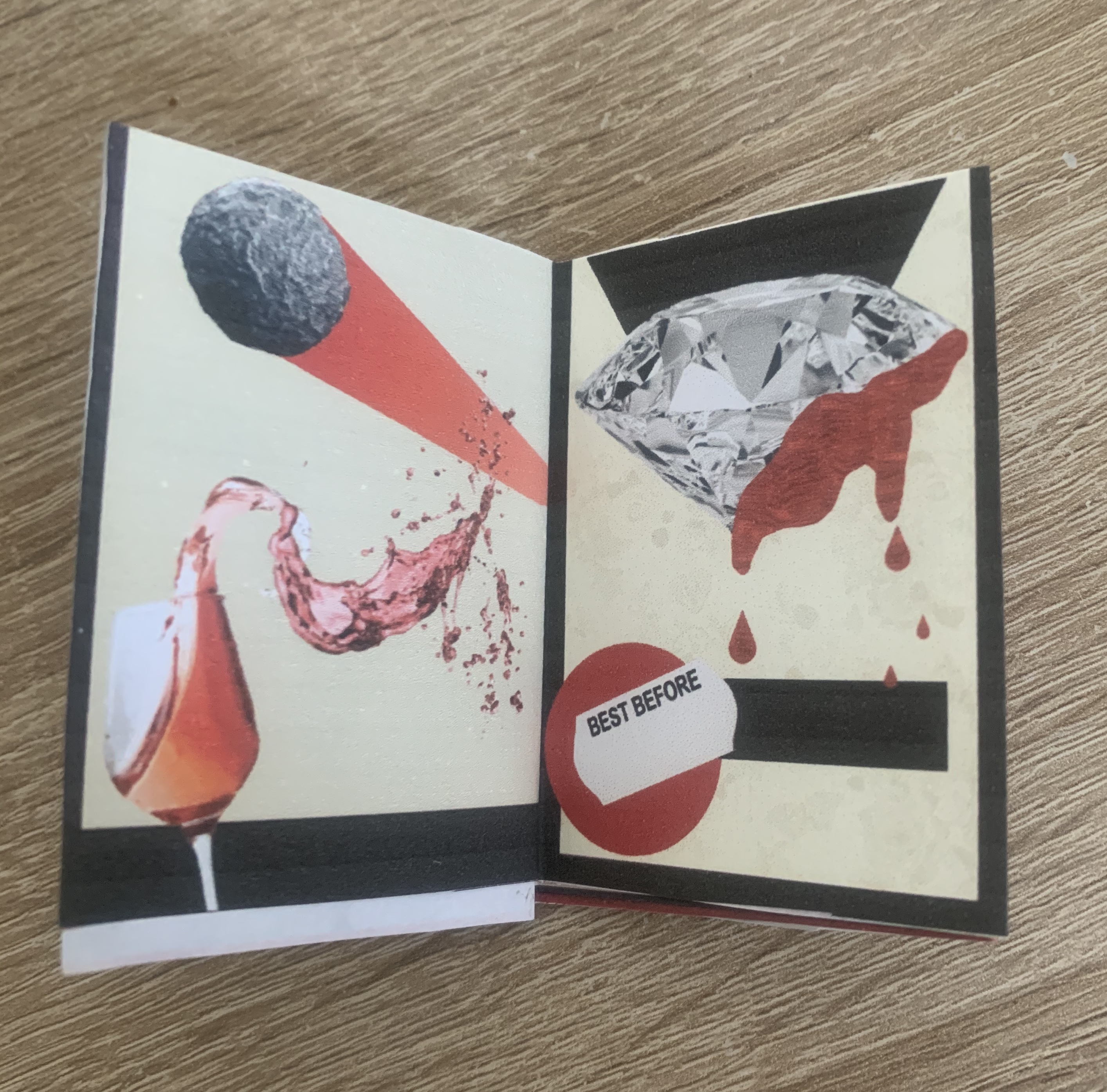
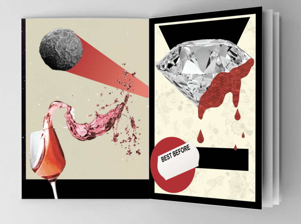
Drink a glass of wine to the health of the Comets
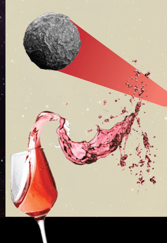
In my sketch pad I had noted that it would be interesting if I could connect the drops of the spilled wine to the ‘blood’ of the diamond (my next chosen phrase) but when trying to achieve this I realised it quickly became unsuccessful… I played around with this design for some time, trying out different ‘splash paths’ for the wine, I couldn’t achieve the correct positioning for the comet to come from the glass (this would of been more achievable if the art board was set it landscape) I felt a solid tail to the comet looked best, it also added to the abstract feel of the previous designs. I added a starry background to the design to fit in perfectly with the comet.
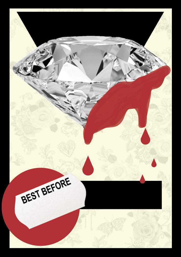
Expiring Diamond Blood
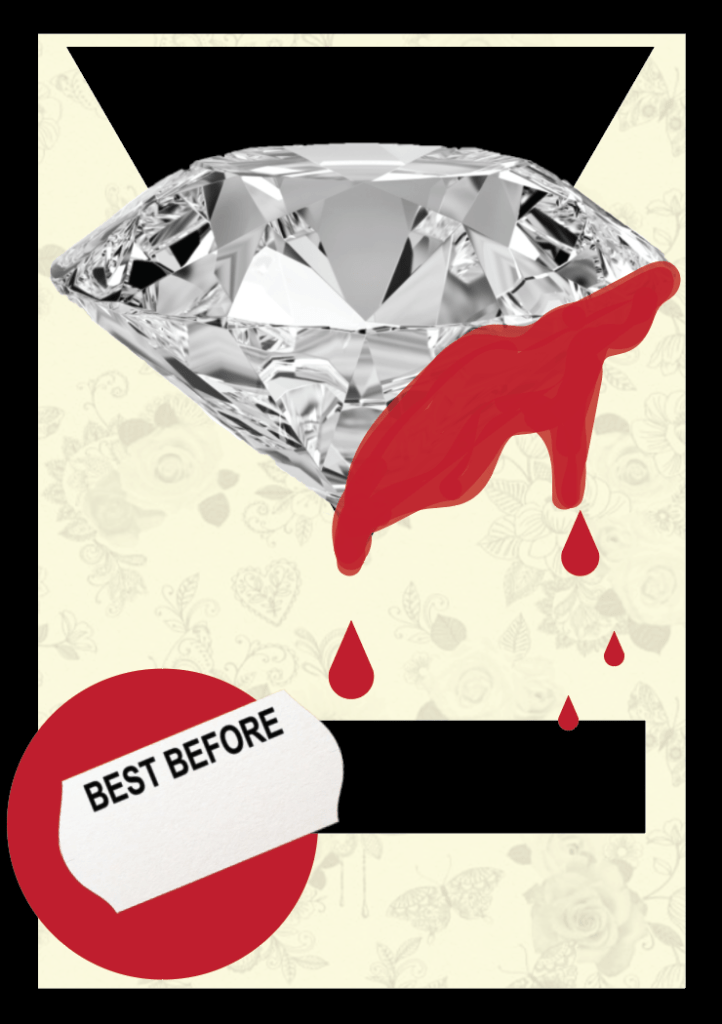
I decided to use the brush tool and freehand some blood on the side of the diamond so I could easily follow the shape of the diamond. I also added the best before sticker to emphasise the ‘Expiring’ term in the phrase. I added in a floral wallpaper background as I wanted it to add a slight feminine touch as diamonds are associated with females. I left this design as being very self explanatory.
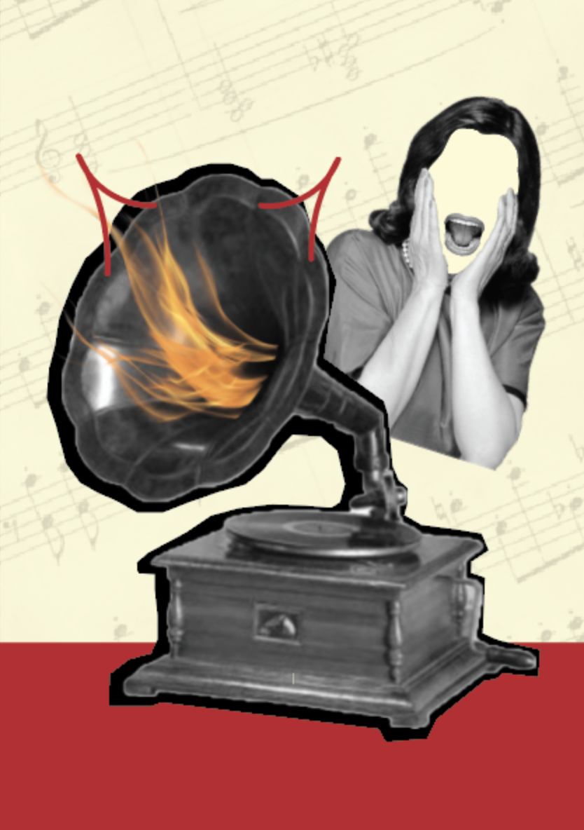
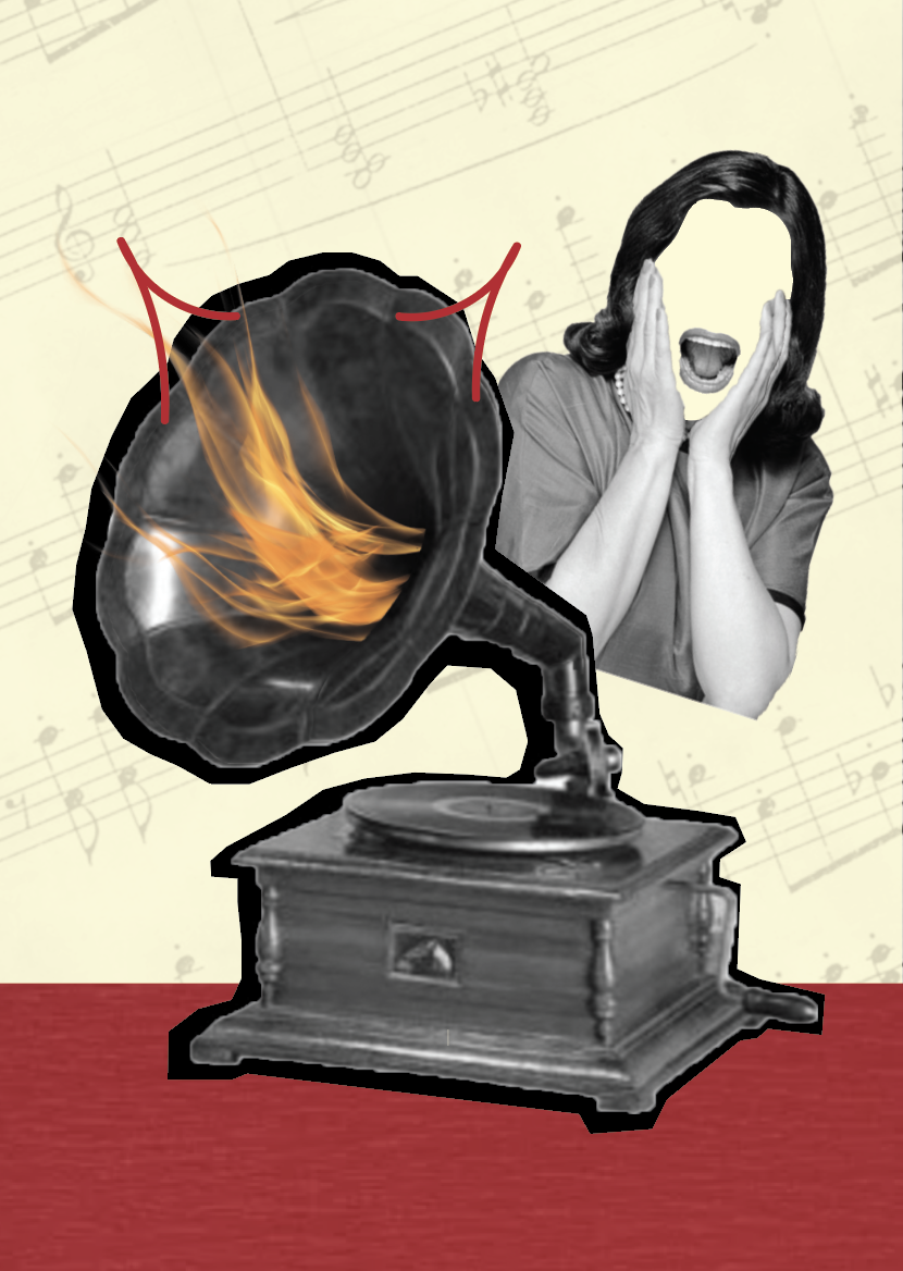
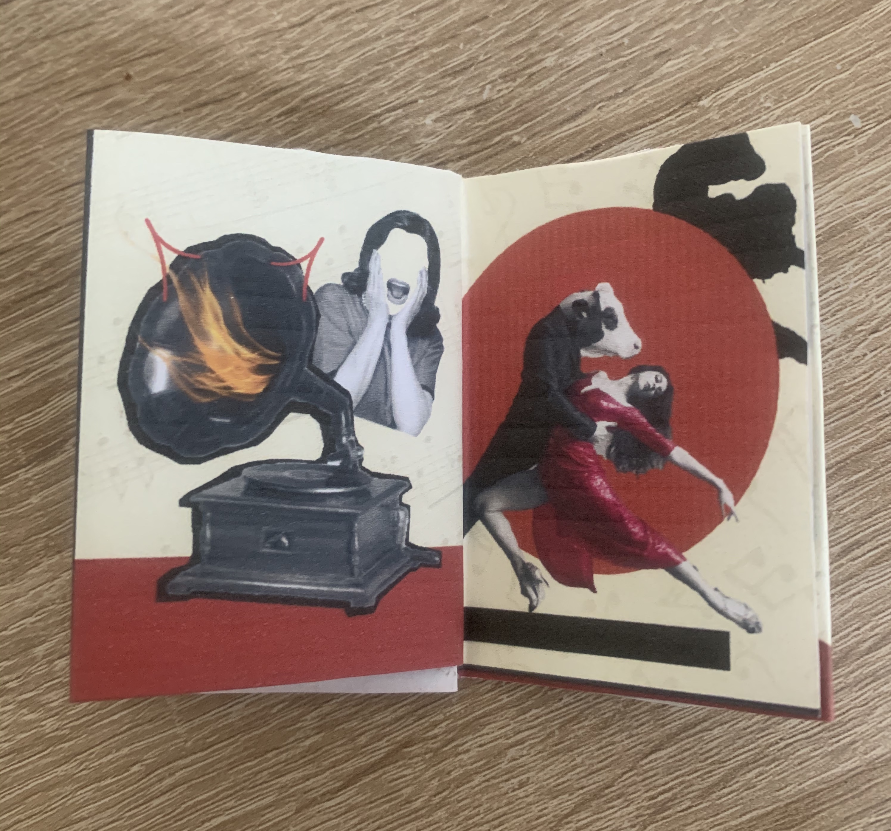
We’ll get a record player. Well, to hell with you
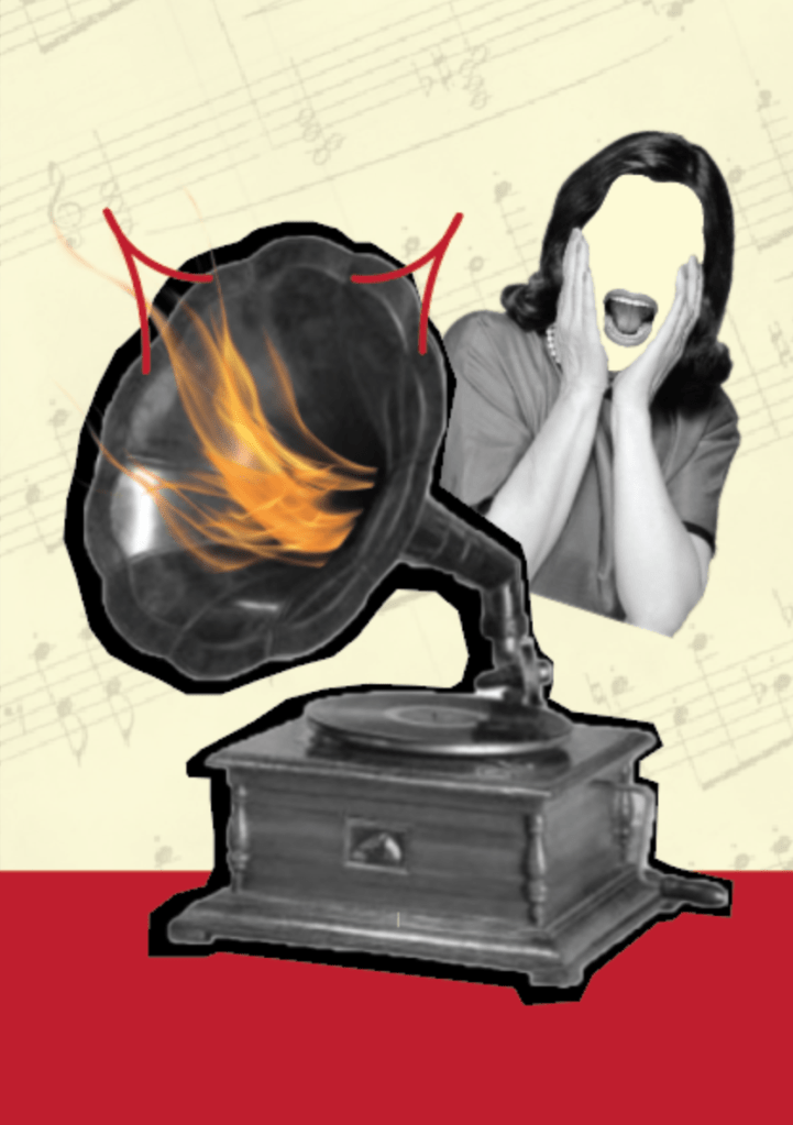
Using an old record player I decided to transform this into something ‘hellish’. I added flames coming from the centre of the speaker along with drawn devil horns. To add to the suspense of ‘hell’ I found an image of a woman screaming which I removed all features other than the mouth. For the background I added an old sheet of music. Im happy with how this came out as I felt it was one of the more challenging phrases.
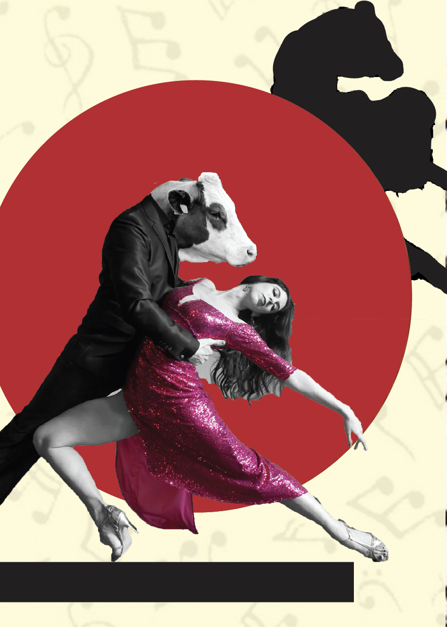
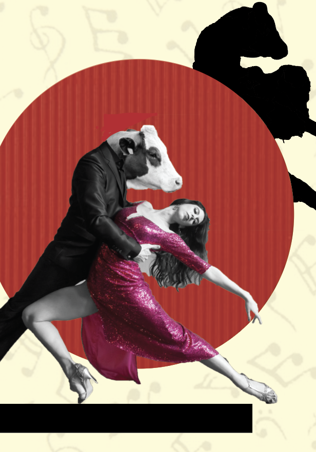
To Dance one Tango with Cows
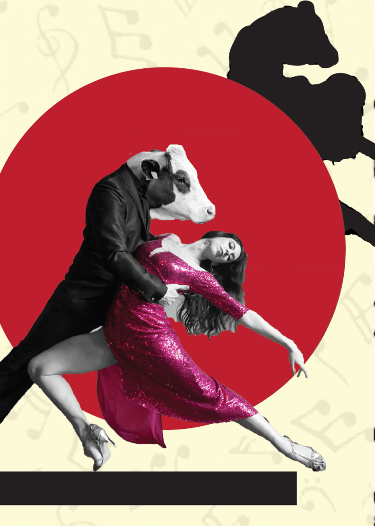
I felt this phrase was fairly simple to create and knew immediately what I wanted my focal point to be. One of the more simpler designs I didn’t want to over complicate the page, just to keep it short and to the point. I found an image of a couple dancing and replaced the males head with a cows head, I was drawn to the shape of which the female is making and felt it would fill the page nicely to which it did, by changing her dress to pink it stands out slightly from the red circular background, behind this I decided to add a silhouette. For the background I have chosen a musical notes, I did question between this and tango foot steps however I felt this linked in better.
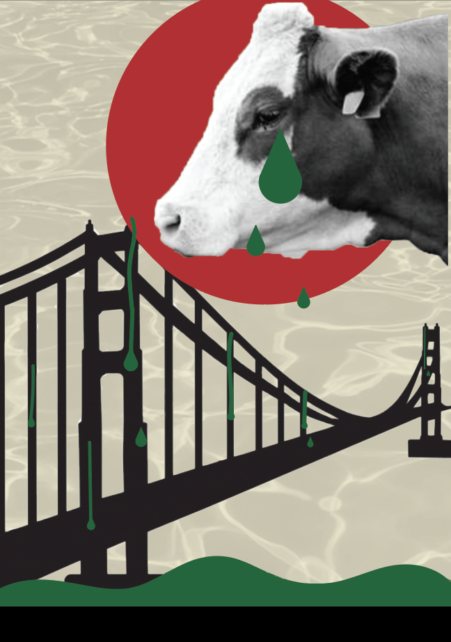
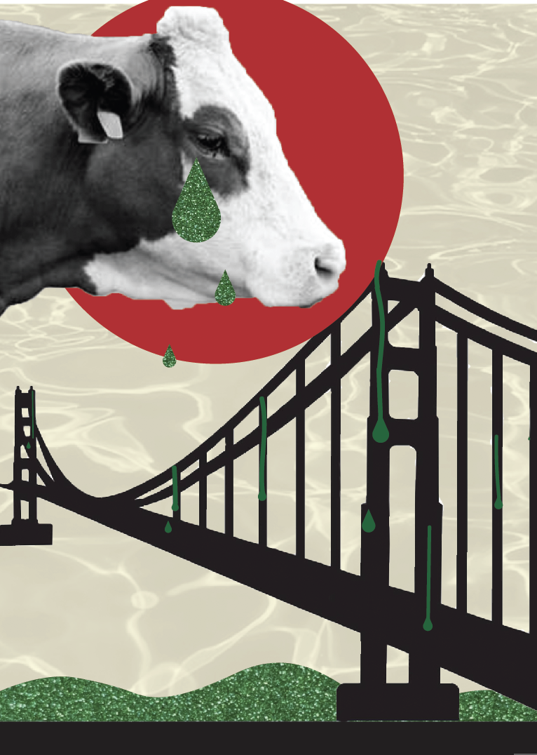
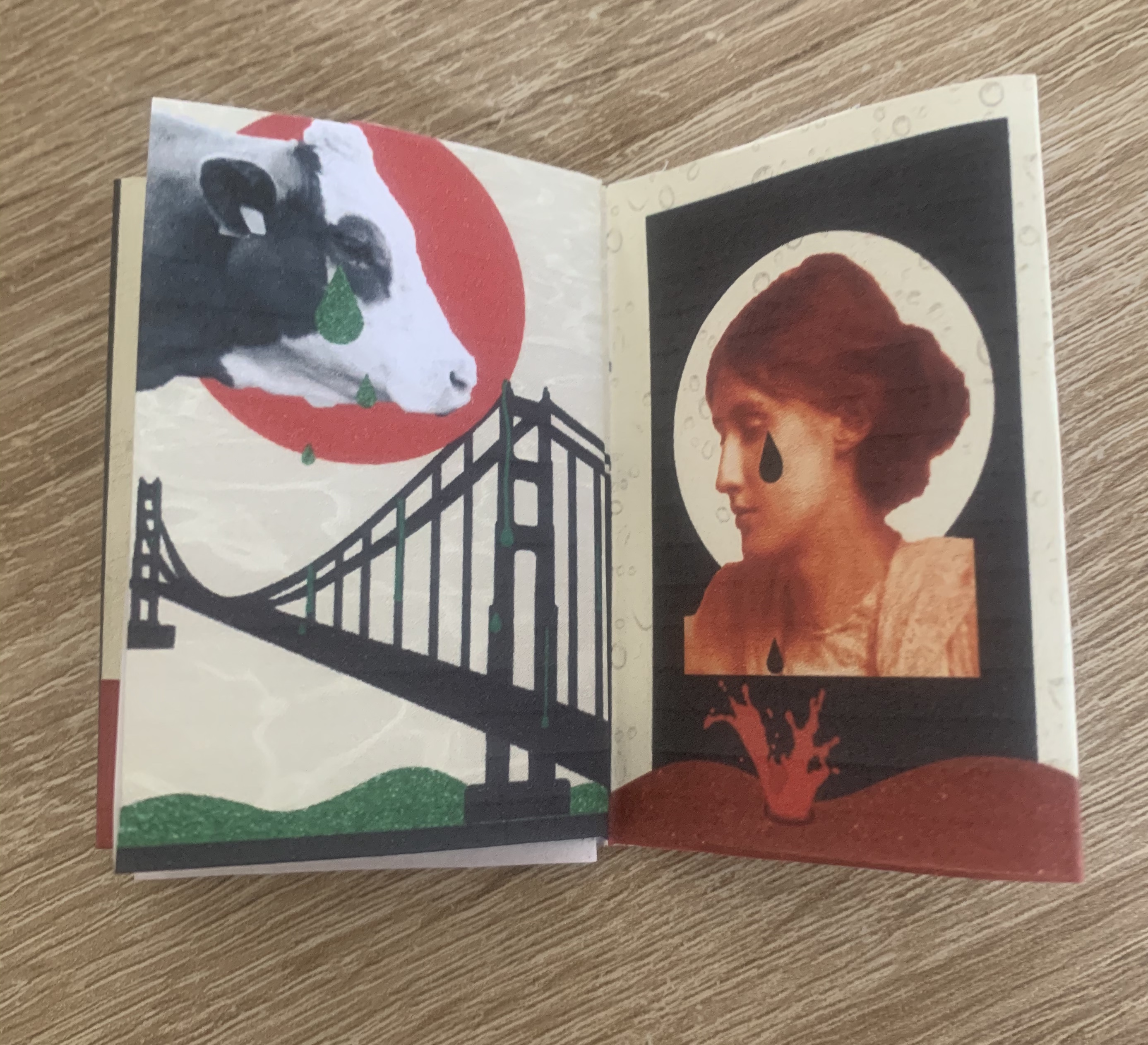
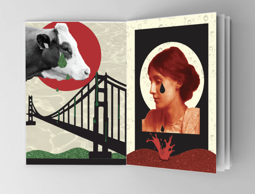
Build bridges from the tears of Bovine Jealousy
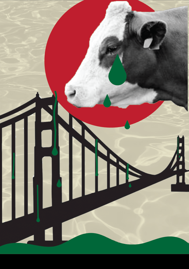
I decided to use green in this image as the colour links to jealousy (green with envy etc.) Using a silhouette of a bridge over green water, with tears running down some of the beams as well as falling from the cows face. For the background I added water to add to the impact of the tears. As noted in my sketchpad I wanted to connect this phrase with my last chosen phrase (tears of crimson girls) as they’re talking about both the tears of something. I thought the best way I could connect the two is by joining the water at the bottom of the page.
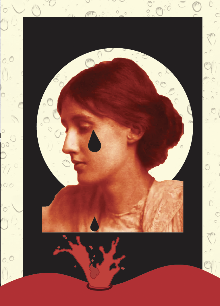
Tears of Crimson Girls
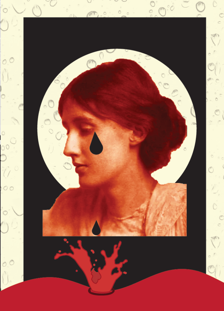
I tried a few versions for this phrase however came back to this design which was the first I mocked up. I felt it reflected the previous design well and gave slight connections. I changed the hue and colour balance of the image of the girl so that she is red to associate with crimson. I added a splash effect to show how the tears are running off her face along with a water droplet background.
After looking back at my designs and reading back through the brief I am unable to print my designs off onto sampled paper collected in previous exercise, so Im glad I managed to change the background on each design to give a varied effect on each page, however I feel I can push my designs further without having to print on different paper samples, I shall simply include these digitally.
I scanned certain types of samples onto my computer and the results are as followed.
Here I replaced the water (left) with some tin foil which I slightly creased to create a rippled effect.

Replacing the clouds (left) with screwed up pieces of greaseproof paper, this worked particularly well due to the easily manipulated paper.


I applied the same effect as the previous design by replacing the clouds with scrunched up paper.

Replacing the red hand drawn brush tool for red holographic paper. Im really pleased with how this turned out, its added more to the design and also the rippled effect helps give the appearance of dripping liquid.
Here I applied red crepe paper, I felt this gave a wood surface/table look which makes the block look more fitting to the page.

I replaced the flat round shape with red corrugated paper, I really like how this turned out, it reminds me of a show curtain revealing the dancers on stage.
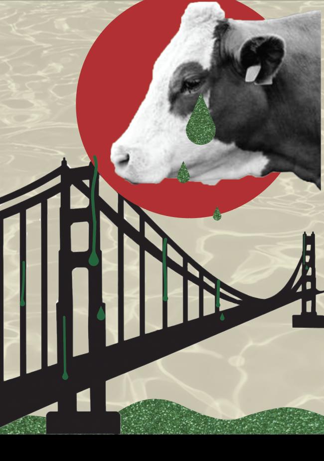
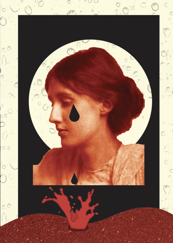
For both of these images I have replaced the plain red and green for red and green glitter card. Im really pleased with this as it add a shimmer to which liquid naturally does.
Final Designs


Adding the different textures of mixed media to my designs gave it the last push it needed! I am so pleased with the improvement it has made.
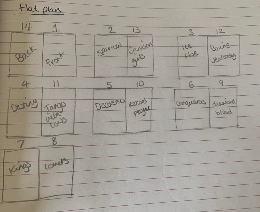
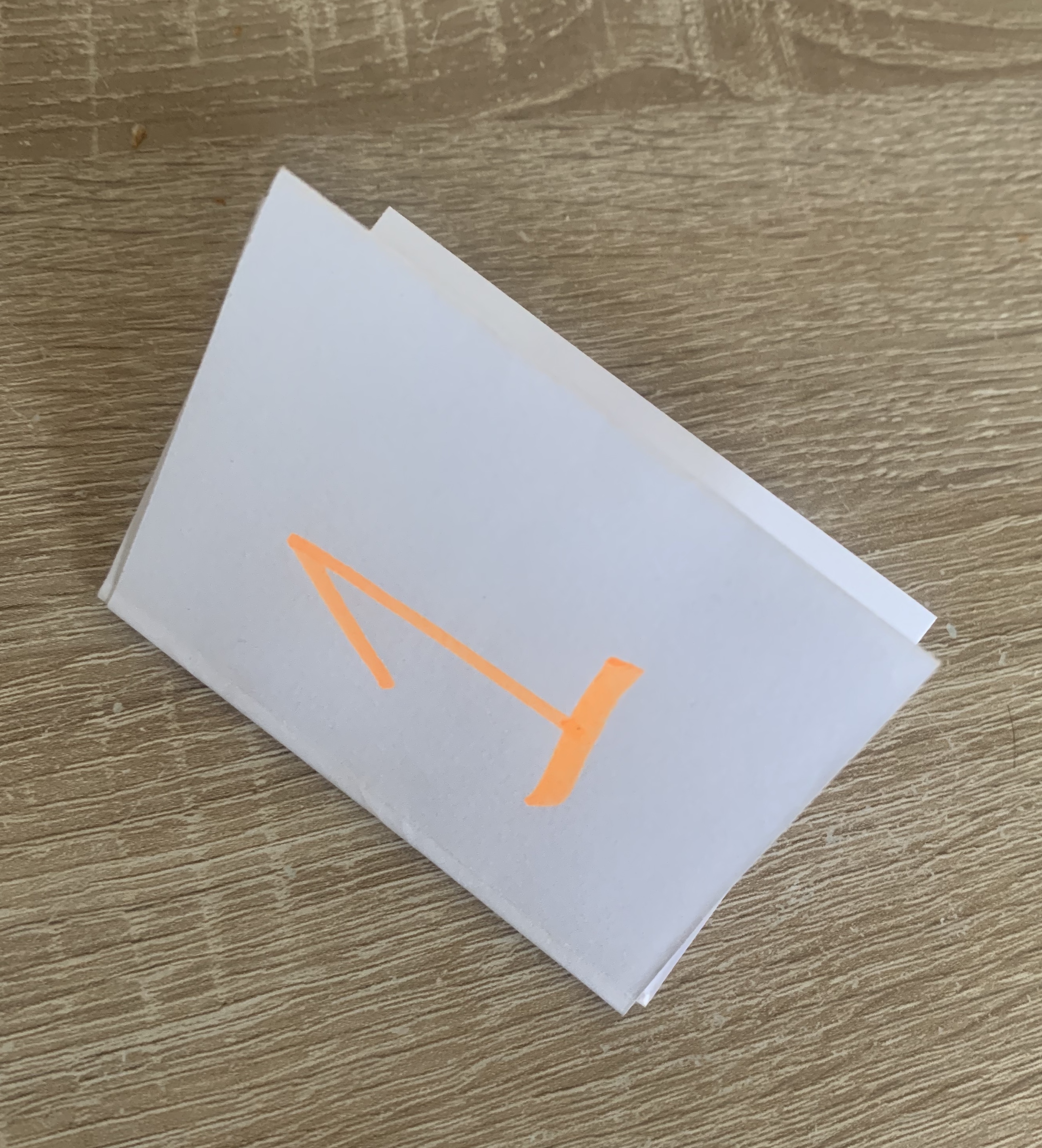
Now that I was completely satisfied with my designs I was ready to look back at my flat plan and print off my designs to see how they work in person.
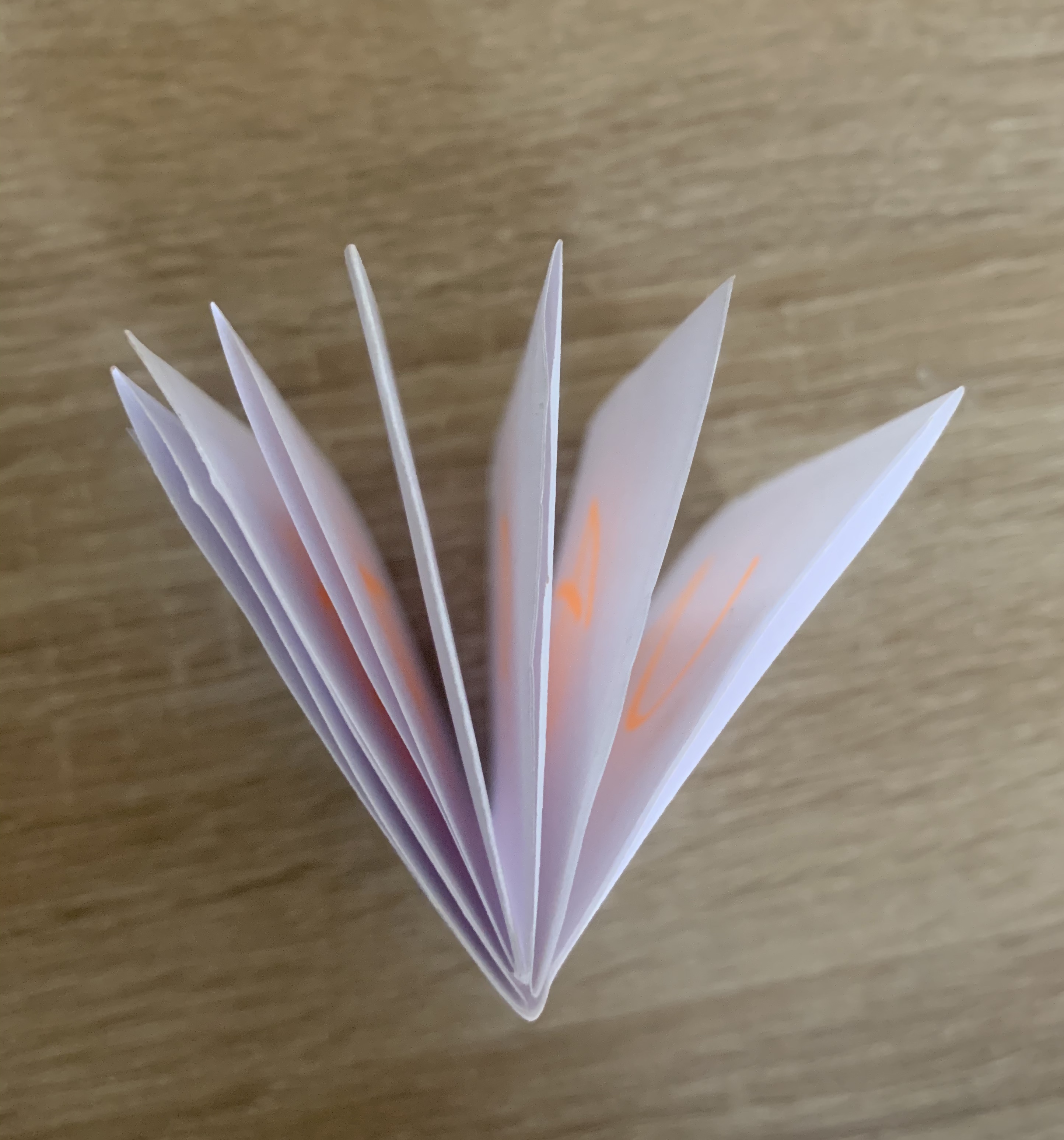
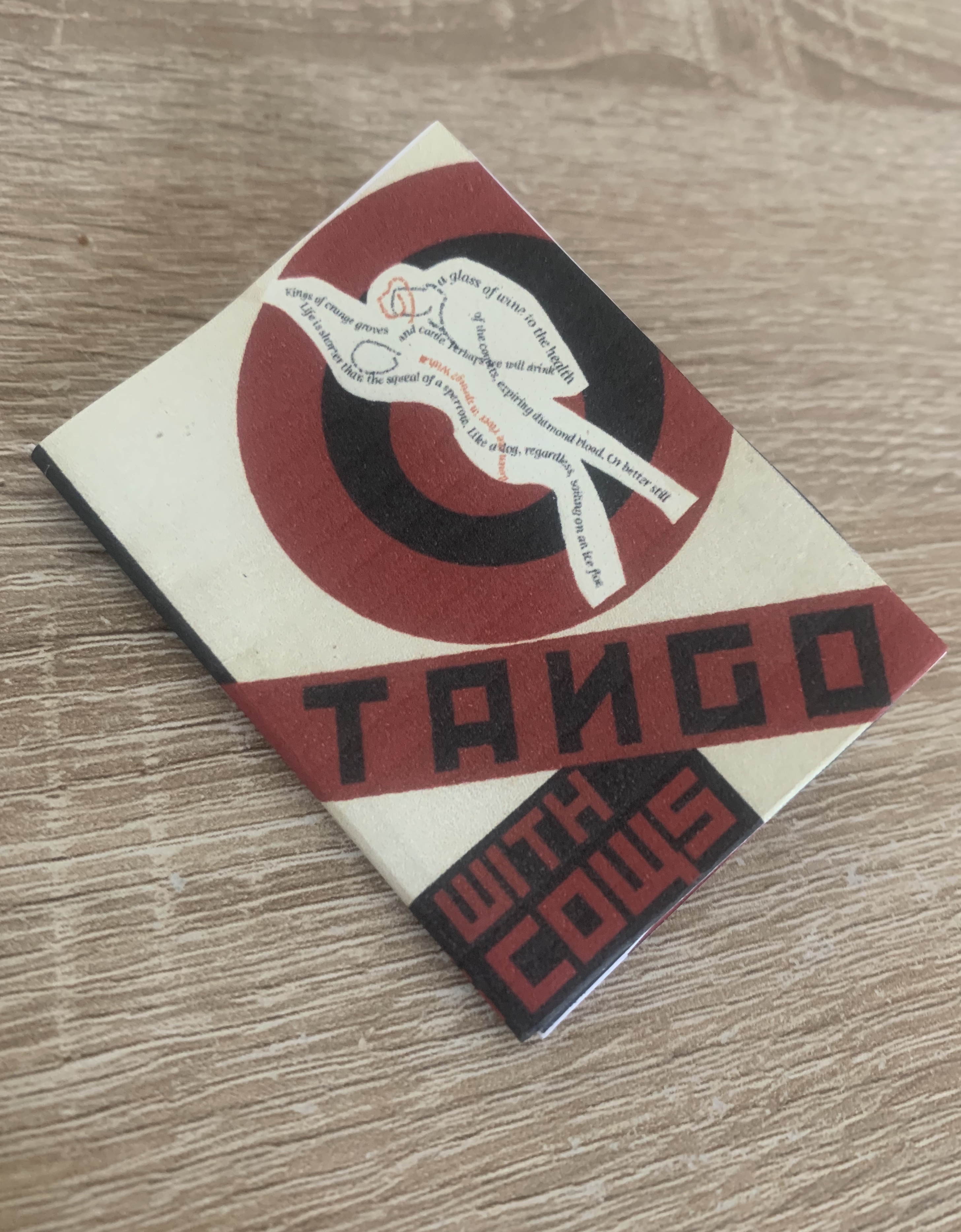
I revisited one of the previous exercise from this unit ‘Form and function: Paper Folding’ Here looking at some of the old paper folds I had created I decided that a 14 page accordion folded booklet would work best, although the scale of the booklet will be very small (5.25×7.42cm) it would still allow me to see my designs in a book form and to see how they look printed and off screen.
Below you can see the process of how I achieved this.
Digital Mock-up

Reflection
Im pleased with the final result to my sequencing images, I did spend a little longer than planned on this but in the end result it seems worthwhile. The designs I have created are more liner than non especially as they are in the correct order, however they can still be viewed as individual images. Im so pleased I took a mixed media approach within my designs, I feel this adds so much more to the designs. Seeing my booklet printed I’m happy with the fold I have chosen, especially with the tucked spare pages giving the booklet a spine. It would of been better to see it at a larger scale however that may come up in the next exercise as I understand this is about binding.

One thought on “Exercise 3: Sequencing Images”