
Brief: Concrete poetry, sometimes referred to as visual poetry is a form of experimental typography where the use of letter and word arrangements enhance the meaning of a poem. The typographic treatment of words within concrete poetry starts to add additional resonances through their scale, placement, overlay and styling, suggesting new ways to see and say the poem. Early examples of concrete poetry were by artists such as Kurt Schwitters and Visily Kamensky. The development of experimental typography flourished during the 1950s and 1960s with artists such as Dom Sylvester Houedard, Ian Hamiliton Finlay and Carl Andre. Often letterpress and the typewriter were used for experimental typography during this period.
Critical Writing Task
Identify and example of concrete poetry and write a short critique of the content, design and relationship between the content and form. How has the use of typography, layout, and space been employed to help generate meaning? Print out a copy of the poem and add notes directly onto the page. Write a brief summary of your thoughts, feelings and reflections on how concrete poetry creates new meanings.
As a starting point you may want to look at the following artists who practiced Concrete Poetry;
- Dieter Roth
- Max Bense
- Eugen Gomringer
- Ian Hamilton Finlay
- Henri Chopin
- Oyvind Fahlstrom
- Emmett Williams
- Geraldine Monk
- Mary Ellen Solt
- Ilse Garnier
Visual Task
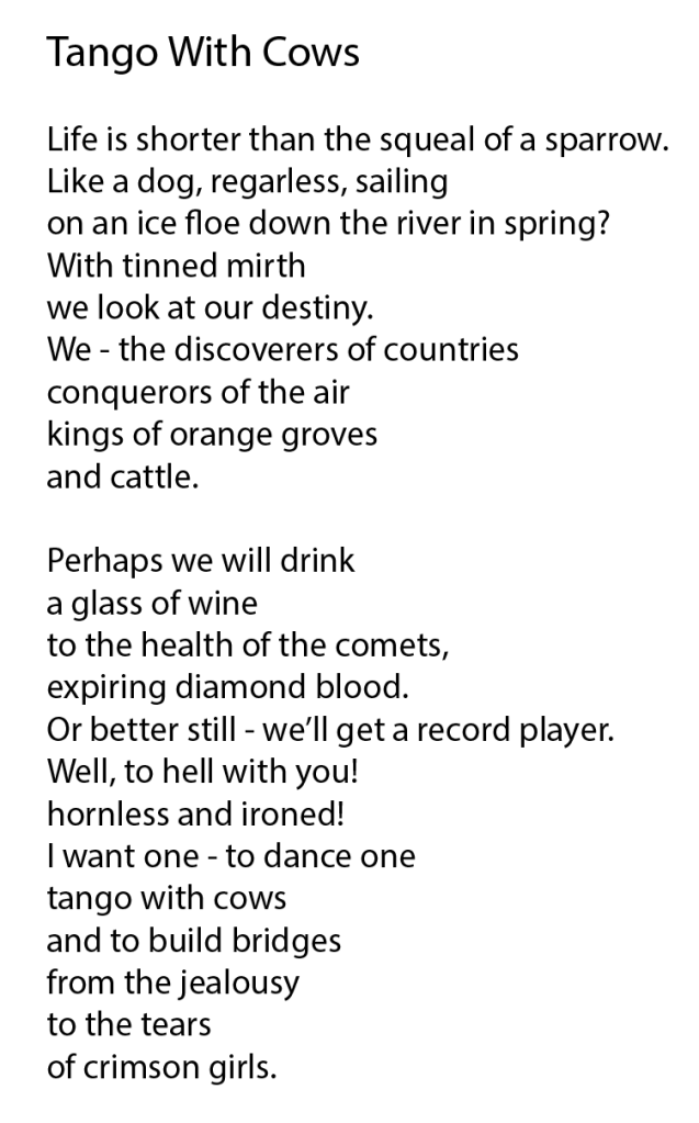
Use on typeface to create a playful design for the Tango with cows, 1914, by Russian Futurist Vasily Kamensky. Explore and experiment with the relationship between the meaning of the text and the form you present it. Think about what kind of typeface you choose as well, does it reflect the content of the text? How does the paper relate to the design? Decide in an appropriate scale and format for this page. Create a series of sketches and ideas, and chose one to develop into your final design. Print your design on one of the papers you have collected in the previous exercise.
Critical writing task
After researching the advised artists I found two in particular stood out to me, I really liked their work and felt it was more visually pleasing. The first artist I have chosen is;
Emmett Williams
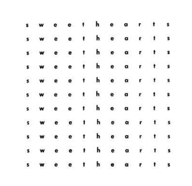
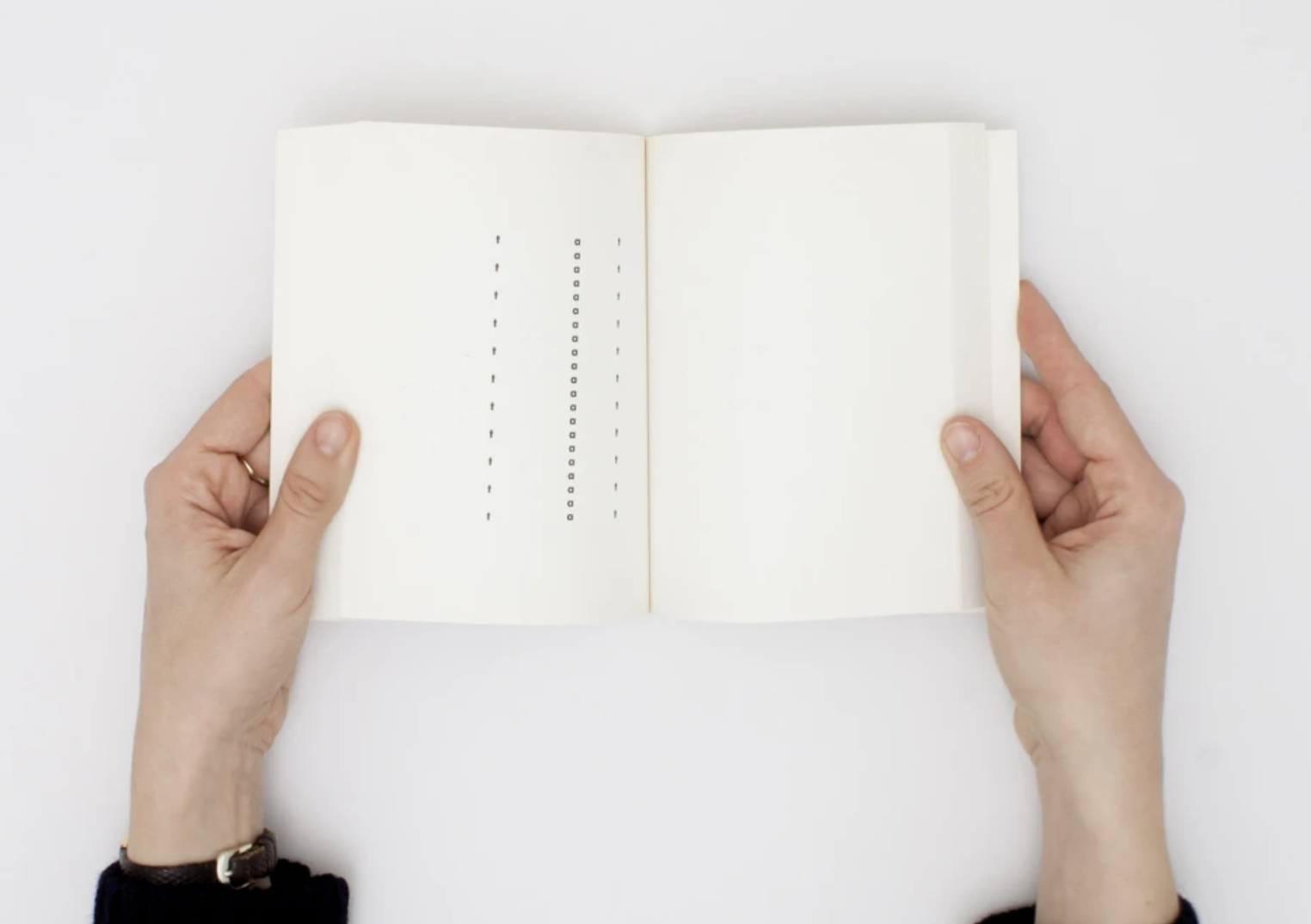
Emmett Williams was an American poet and visual artist, he created many concrete poems along with collaborations with fellow artists, paintings and books. I came across a book of concrete poems called ‘Sweetheart’. This book contains a number of different variations of the poem across the pages. Sweethearts is an anagrammatic encounter between a “he” and a “she,” whose entire vocabulary is derived from the word “sweethearts.”
http://www.sweetheartsweetheart.com/#131
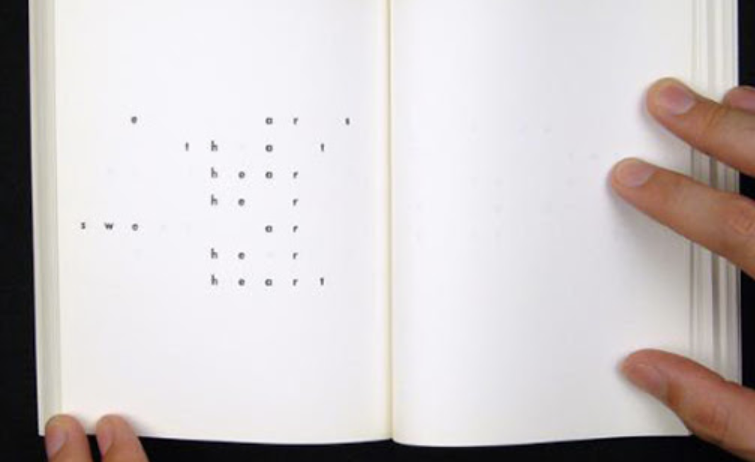
By clicking the link above you will be able to see the collection of Concrete Poems for the book, It makes more sense to see how each page/poem layout correspond with the next page. Together they create a mesmerising flip book that can also be read backwards with the front cover also being printed on the back so pages can be turned with either left or right hands.
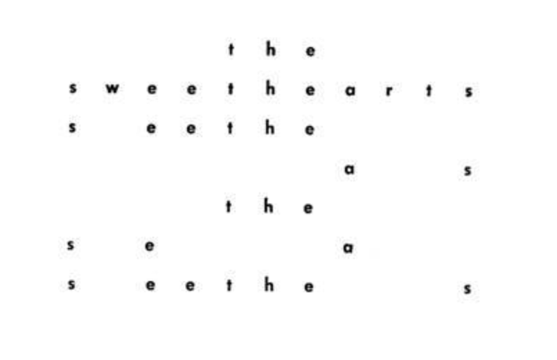
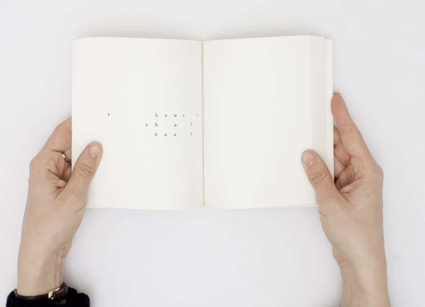
Below I have printed out a page of Sweethearts and made critique notes beside;
The layout throughout this book consists of the same spacing between each letter following a central grid, each page has identical grids with different characters removed to create unique concrete poems. The page of the poem above reads “The sea wets her sweet hat” I did find with other pages within ‘Sweetheart’ they appeared harder to make sense of what is being said, but together appear more of a visual piece. Wether it was intentional, I did notice that the staggered words clearly spelt out the title (as marked on the page). To each poem the relationship between the content and the form isn’t very clear but with this being said, once seen together with other versions of ‘Sweetheart’ contained within the book it shows the movement and diversity. Williams’s form generates a tone and type of poetry all its own.
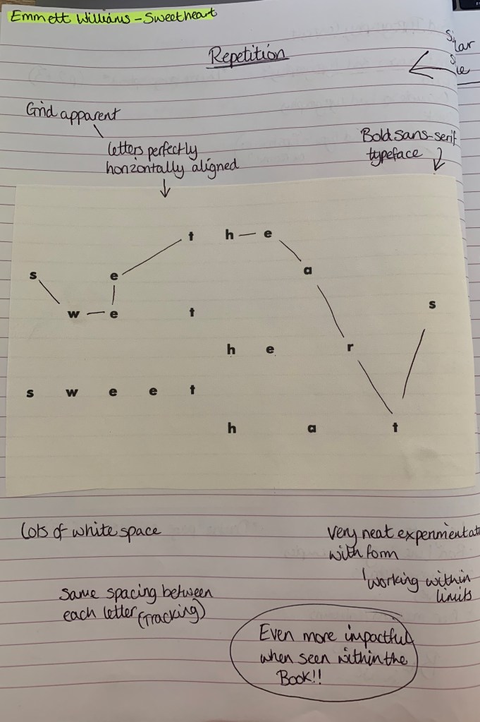
I found another interesting concrete poem which I originally thought was created by Emmett Williams however is actually created by Rob Giampietro who has taken huge inspiration of Emmett Williams. This concrete poem ‘Snowflake’ caught my eye by its clear visual representation of snowflakes falling. It was the similar layout and style which tricked me into thinking it was another by William’s!
This concrete poem shows clear representation of what the poem is about, to me this poem appears more peaceful rather than chaotic knowing that it is in relation to snowflakes. The poem reads: “No owls as we wake now. As flakes fake snow, we fake OKs. So now we owe. Lakes soak. Oaks flake. No snow owls. No snow as we wake.” This did take me a while to piece together as the large gaps between the characters makes it less legible – but this is what concrete poetry is about, it becomes more visual piece.
Mary Ellen Solt
The second artist I have chosen is Mary Ellen Solt, after reading parts of Solts’ book ‘Concrete Poetry: A world view’, I took a look at some of her work and was blown away, She has created beautiful and creative examples of concrete poetry, I was particularly interested by the pieces which appear in her book ‘Flowers in concrete’. Below I have chosen two poems to look into at a closer depth.

Marigolds (1968)
This shows a neatly positioned poem surrounded by busy circular patterns relating to the layered flower Marigold, these shapes are made up of script letters. The title itself is hidden within the poem using the first letter of each word. Personally to me, I cant make sense of the poem to the title… but the title and the imagery make perfect sense and cleverly represent the flowers. The positioning of these shapes could appear to how they would grow with some overlapping creating dense layering – as for the shapes there is no clear layout, but adds boldness to the page.
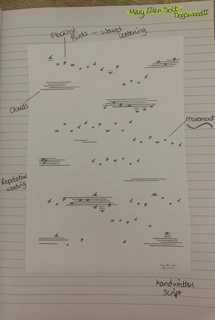
Dogswood II (1965)
When I first saw this I automatically thought of flocks of birds flying across a clouded sky, the movement in the letters help achieve this by picturing a bird per letter. The poem itself is repetitive with the only word in use of the title ‘Dogwood’ in an handwritten script. Again similar to the previous poem, I’m unsure of the link between the poem and the visuals, it seems that the link lies with the title and the visuals with these two examples.
Mary Ellen Solts work stands out to me as the visual imagery she has created is clear to the audience making her work relatable and fast to understand by being able to identify the visuals used in the artwork. The repetition of letters and words create understanding symbolic ideas within the visual.
Visual Task
Research
To begin with I wanted to research into the poem more.
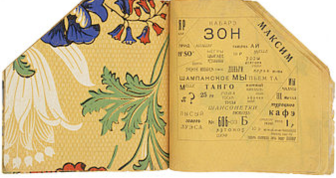
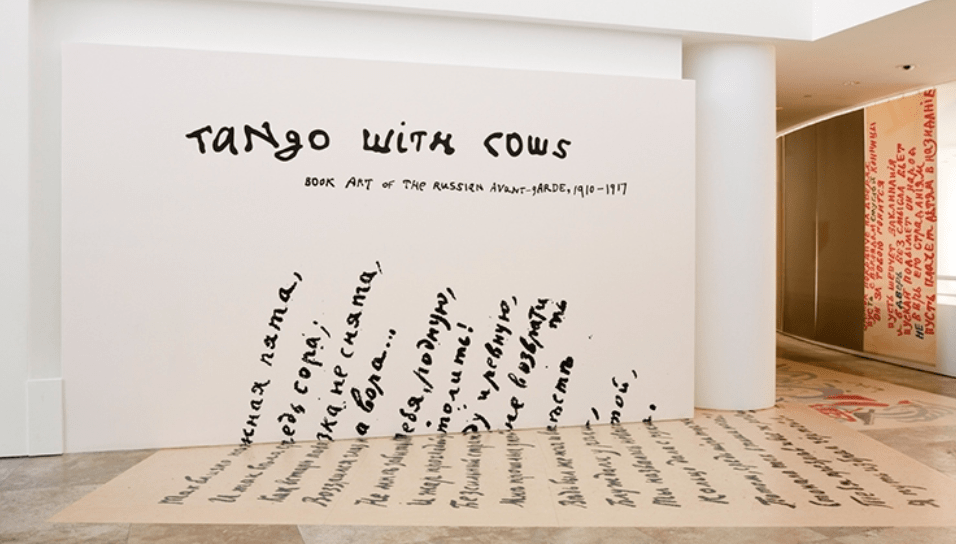
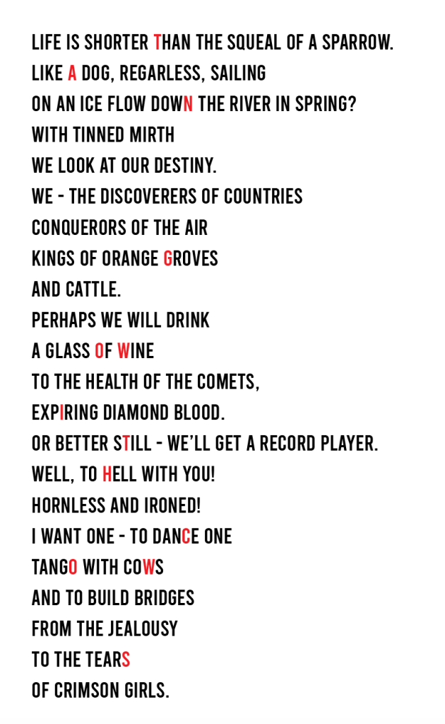
Tango With Cows: Ferro-Concrete Poems is an artists’ book by the Russian Futurist poet Vasily Kamensky published in Moscow in 1914. Tango with cows is also the name to one of the poems listed inside the book, along with 13 other poems. The work has become famous primarily for being made entirely of commercially produced wallpaper.
The poems are split into two sections; the first contains 8 concrete poems that use multiple fonts and unusual spacings to express sounds and textures. The second group of 6 are arranged with diagonal grids containing cubist paintings of Picasso and Brague, and moulds that are used to make reinforced concrete. These poems refer directly to aerial views, maps and floor plans. Only 300 copies were made of the book.
Tango with Cows explored the way Russian avant-garde poets and artists responded to the crisis of the failed 1905 revolution, the famines of 1911, the rapid influx of new technologies, and the outbreak of World War I through their book art.
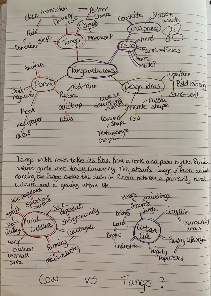
I wanted to create a mind map to help stimulate ideas, I originally started with just one then decided to create mind maps behind the meaning of the poem and chose rural culture and urban life as the two main focal points.
Developing Ideas
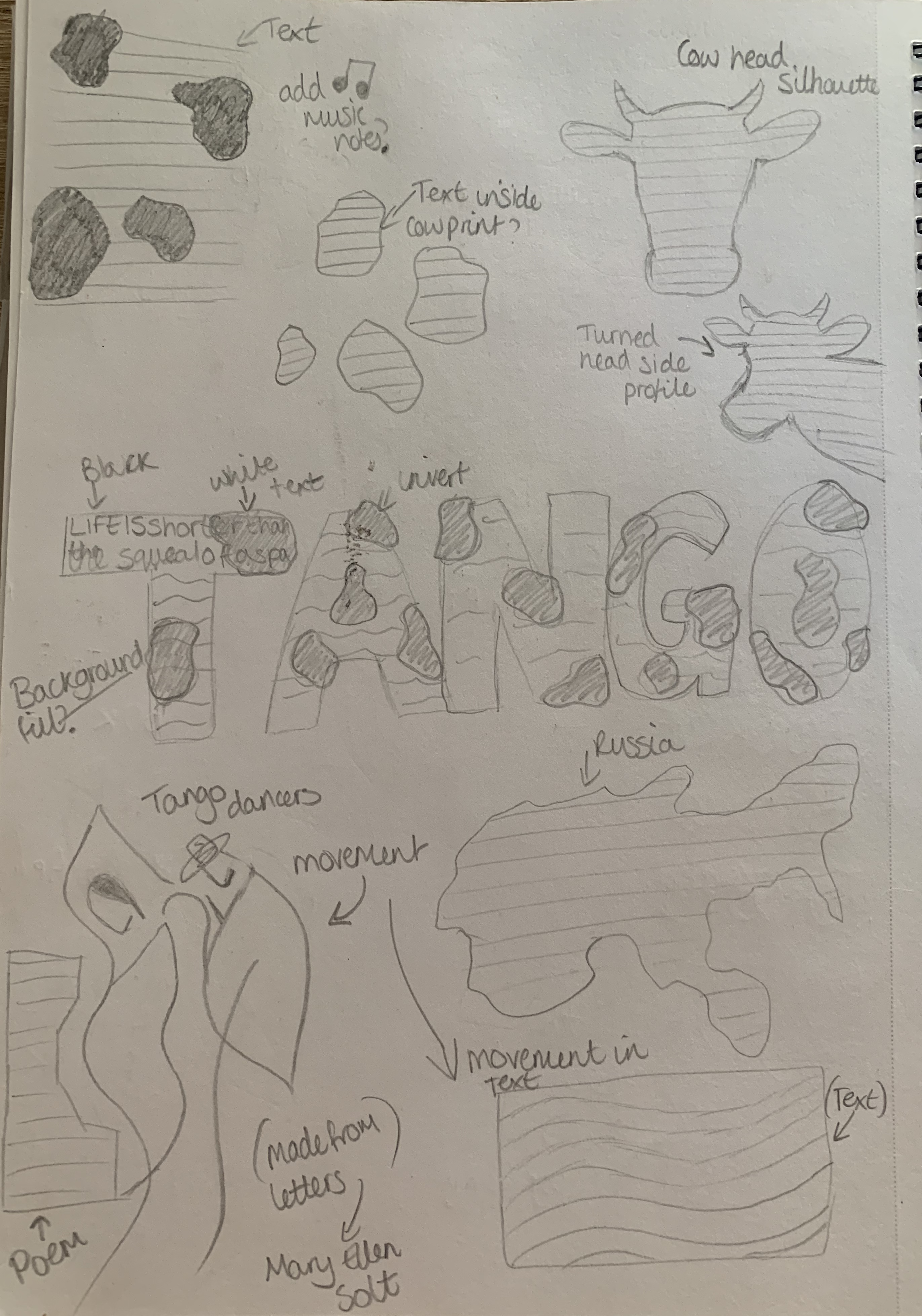
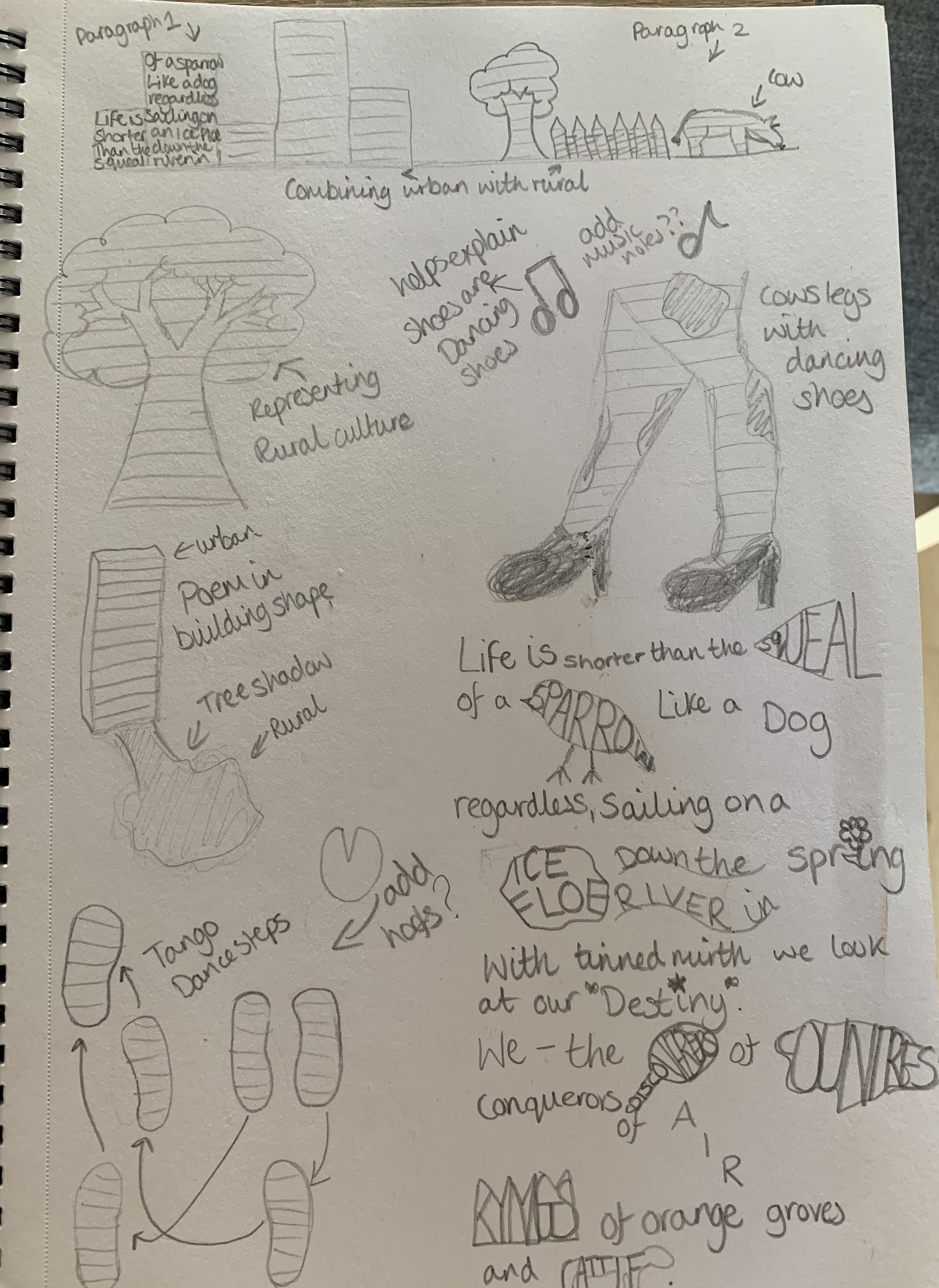
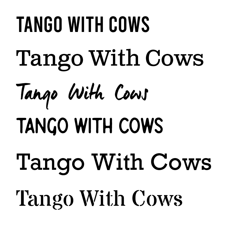
I sketched out a few ideas which came to mind after research and reading the poem. Currently I’m not sure which design I like best, I like the arrangement of the word Tango with cow print, I also find the playfulness of the cows legs in dancing shoes amusing. Before I develop my chosen design I want to determine which typeface I am going to use, below are a choice of fonts I feel reflect the poem well. I want a strong, bold and clear typeface to suit not only the poem but my design.
Design Process
I started of by mocking up the ‘Tango’ design, however I felt this was too simple and that I could push myself further with this exercise.
I then created my second design of the cow in dancing shoes, however again I didn’t feel satisfied with how it looked, It looks rather odd and doesn’t show much relation towards to title! I’ve now decided to go back to my sketch pad and rethink some designs. Rather than focusing on creating a shape I’d like to experiment with the layout of the words more along with the meaning to the words – to see if I can exaggerate them.
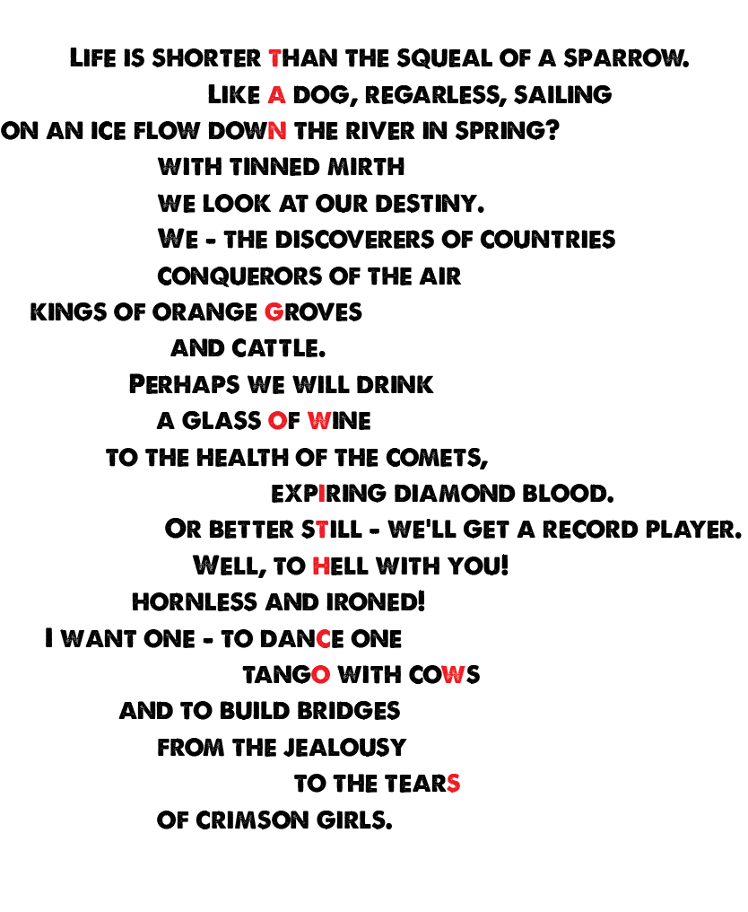
I looked at highlighting a letter from each row to spell out ‘Tango with cows’ however due to the size of the poem, this didn’t look as successful as I imagined, especially as I wasn’t able to spell out the title on each row, gaps formed causing it to break the sequence.
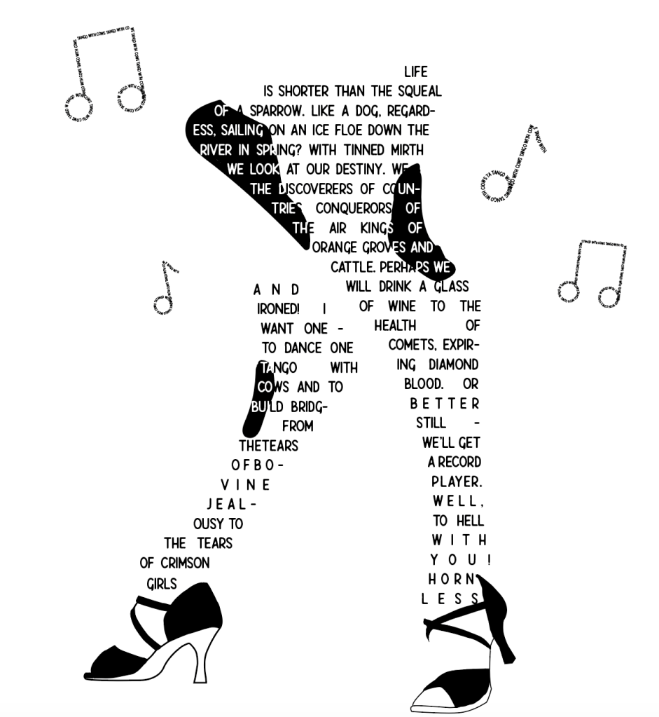
I wanted to give my dancing cow another go, I decided to rework the shoes and to add some music notes made from the title. This changed the way I saw the overall look, I wanted to keep to the black and white theme as I was focusing on the cows. I feel like this creates a playful and fun design for the poem.
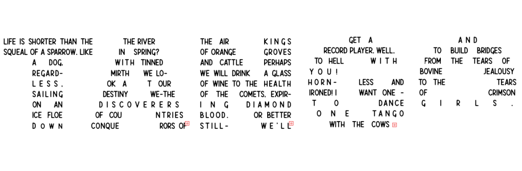
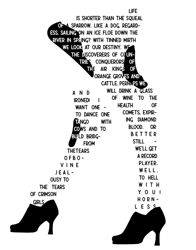
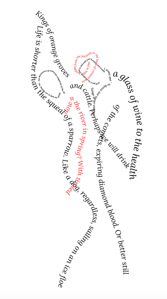
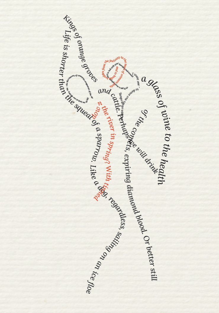
For my final design idea I wanted to try the dancing couple, I started off by taking inspiration from Mary Ellen Solt and creating the figures out of letters with the poem place to the side however felt this seemed too ‘lazy’ so instead of using letters to create the figures I used lines of the poem. This created a better overall look, I chose the serif typeface ‘Lora’ in italics to help capture the movement from not only the image but the poem itself.
Print Choices
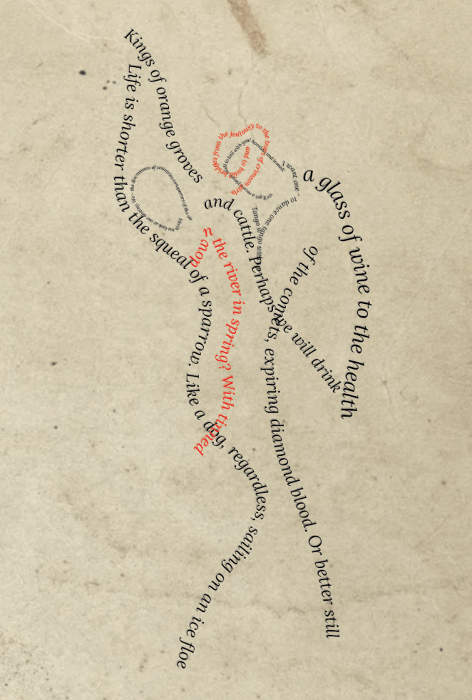
Unfortunately for the previous exercise I was only able to gather samples! So for this part I’m not physically able to print things but I have mocked up a few choices which I feel works well for the poem.
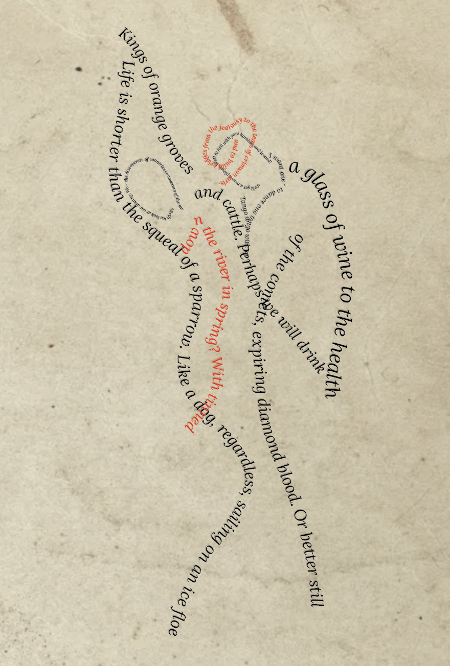
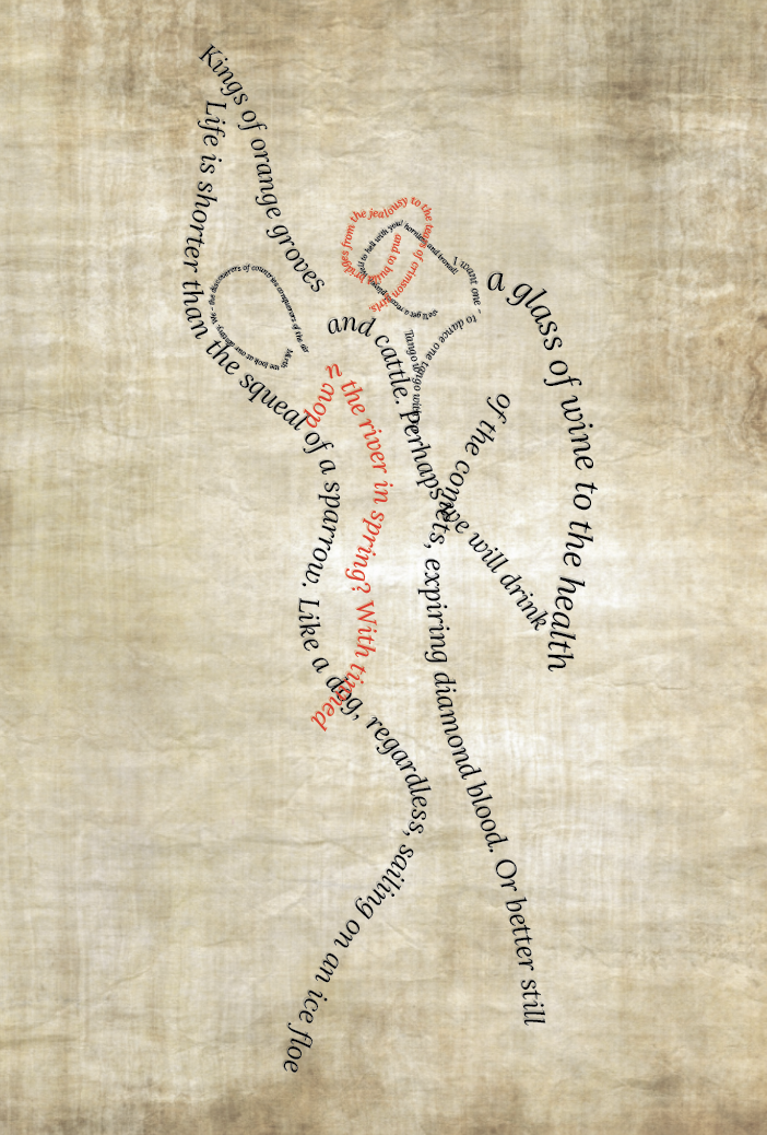
I wanted to use paper which added age to the poem, the papers I have sampled above are Kraft paper, parchment paper and hemp paper. By adding a light brown textured paper this gave a more natural feel, which reminded me of the countryside (relating to the rural culture aspect of the poem) and the modern clean design relating to the urban life of the poem. I feel the parchment paper (middle) is too ‘ancient’ looking – reminded me of a pirates treasure map? The Kraft paper seems to work best.
Final Design
Reflection
It was a struggle to get to the end result as I kept changing my mind on which design I liked best, it was also difficult to create a design to reflect the poem. For my final design I decided to shape the lines of the poem into a dancing couple changing the colour font red to help the illusion of a dress and a hat. My thought process behind the choices I made were as follows;
Font – I decided to use the serif font ‘Lora’ in italics, having the font in italics helped emphasise on the movement within the design of the dancers and also the poem itself. I felt when using a serif font it was easier to read the text in different sizes, It also added sophistication to the design. This helped highlight the more urban style of the poem.
Design – Compared to other design I had sketched this seemed to fit the poem the best, I did like the idea of the cow in the dancing shoes, however I just felt it wasn’t clear that the cow was ‘dancing’. I like the movement of the design, its very simple yet self explanatory. My only concern is that the order of the lines within the poem aren’t very clear to which way they should be read, I have placed them in a left to right order to make it as clear as possible.
Paper – Using Kraft paper as my paper choice I felt I was able to tie in the rural culture side to the poem, with the paper being biodegradable it automatically made me think of the countryside with its non bleached surface still retaining the natural wood colour.
Overall I hope that I have created a design which is fitting to the brief, as mentioned I did struggle with this exercise, I wasn’t sure which direction to take my design however I do feel I have learnt from this exercise.
