
The Golden Section, or Golden Mean, has been applied by artists and designers over the centuries to create harmonious formats for their work. In his extensive research, Tschichold discovered that many book designers were based on the Golden Section. Based on a mathematical formula, and directly linked to the Fibonacci series, the Golden Selection provides a method of creating and dividing space that is a useful working framework for the book designer.
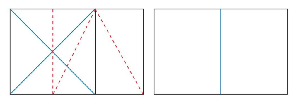
The red dotted line shows how a rectangle has been created from a square using the Golden Selection principle. It is then divided to form 2 facing pages.
Look into the golden selection more generally, by exploring how artists and designers have used these principles, and more specifically in book design, by looking at J. A. van de Graaf’s Canons of page design, Jan Tschichold’s grid designs, or other grid systems for organising the page.
After a little research I still didn’t feel like I completely understood what the golden selection was, that was until I came across an incredibly helpful video explaining the Golden ration theory. Here it explained visually the meaning and how to create your own golden ratio. I now feel confident that I understand what this all means! (https://youtu.be/CSoHCHQ3zJw)
What is the Golden Selection?
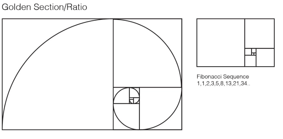
The Golden Selection/Ratio describes the perfectly symmetrical relationship between two proportions. Approximately equal to a 1:1.61 ratio, the Golden Ratio can be illustrated using a Golden Rectangle. This is a rectangle where, if you cut off a square (side length equal to the shortest side of the rectangle), the rectangle that’s left will have the same proportions as the original rectangle. The Golden Spiral is a spiral which has a growth factor of 1.618 It is found all over the natural and man-made world and is inherently aesthetically pleasing.
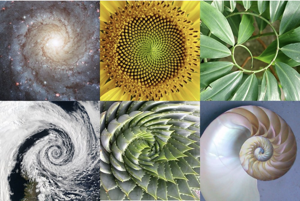
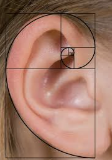
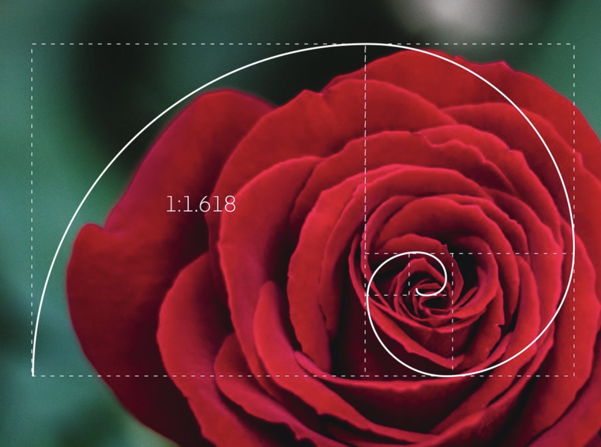
Golden Section in nature
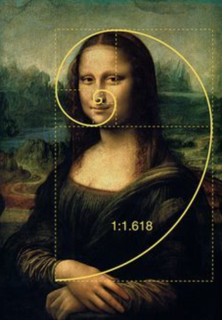
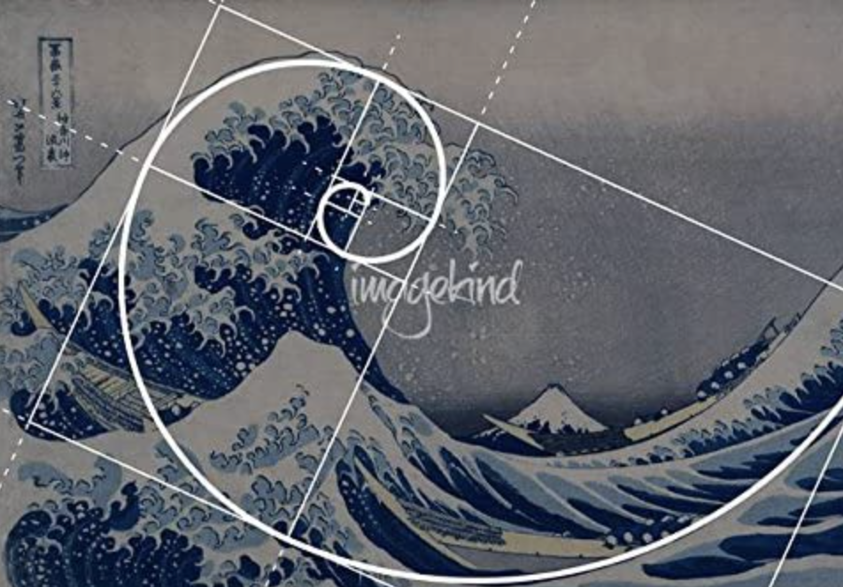
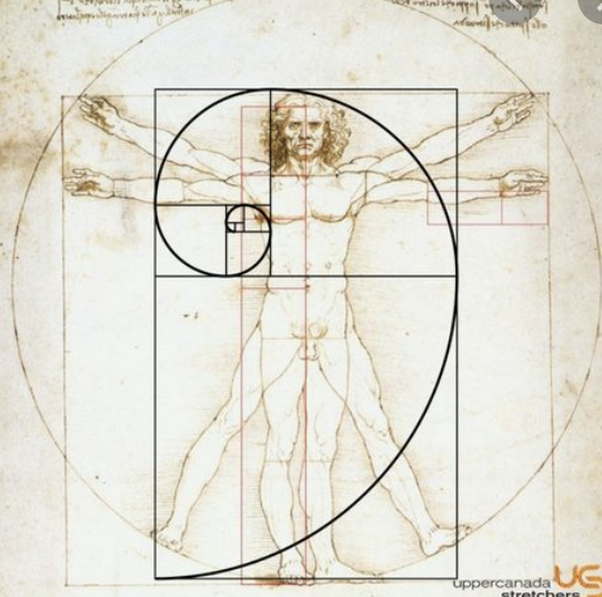
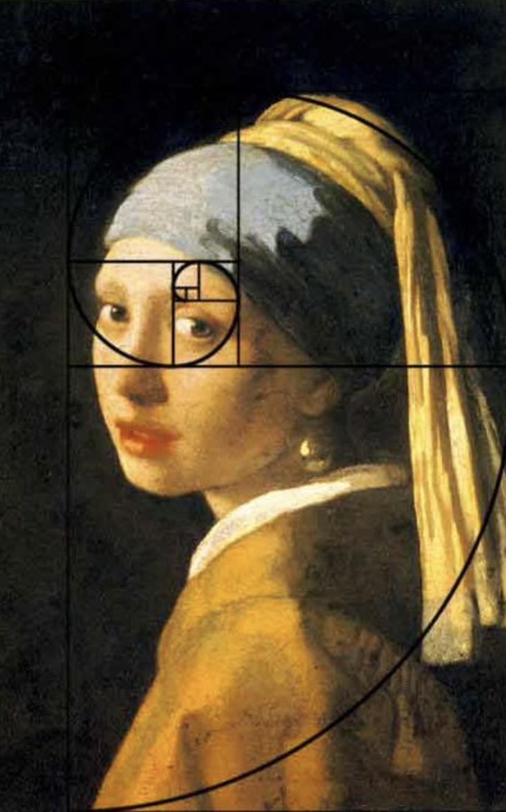
The Golden Selection in art
The Golden Selection in architecture
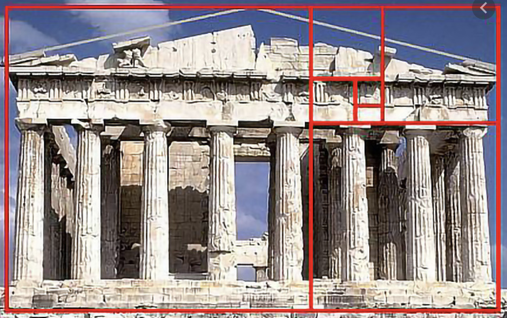
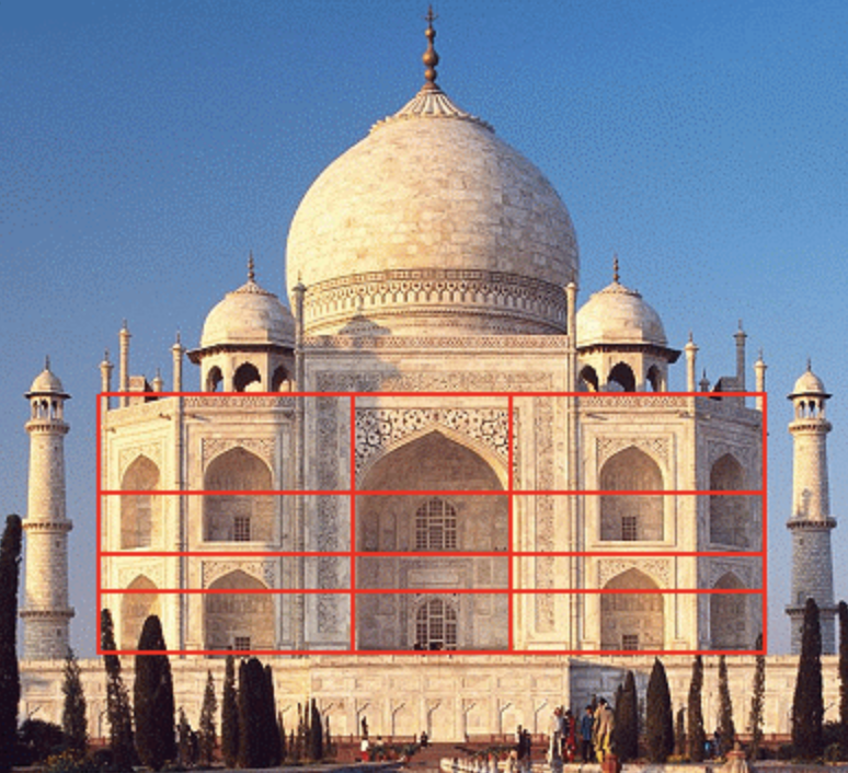
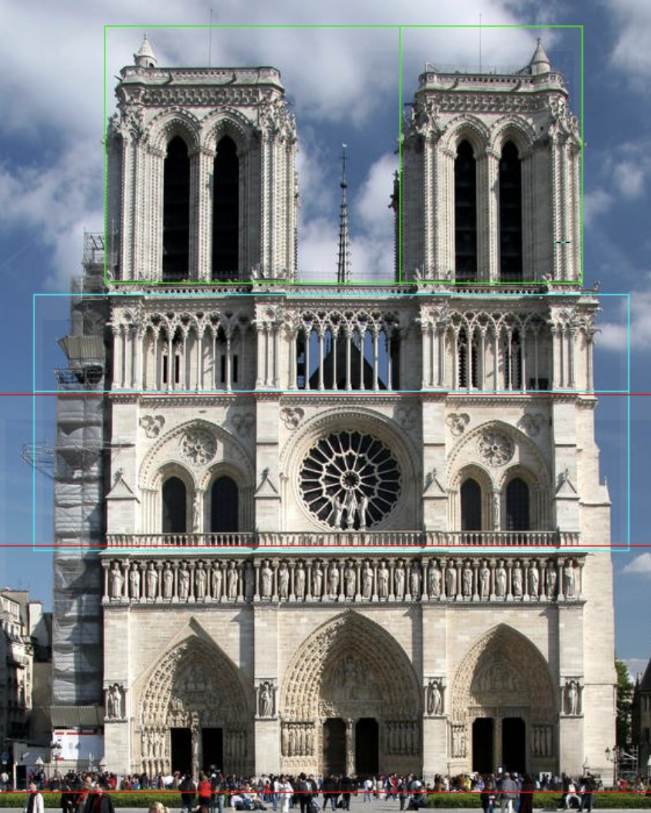
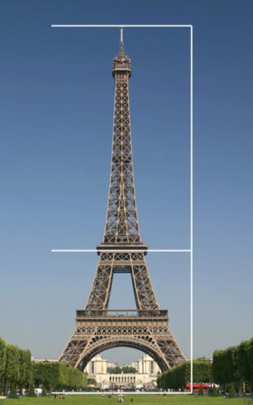
The above examples show the Golden Selection (1:1.681) occurring in natural and man made forms. It is clear to see how this makes things pleasing to the eye with its well balanced imagery. The Golden Section is found in the work artists and designers for hundreds of years, designers and architects have learned from the natural structures of the golden selection and by using mathematic equations they have been able to achieve the benefits for their own designs.
Golden Selection in book design
To help me in this area I started by looking at J. A. van de Graaf’s Canons of page design & Jan Tschichold’s grid designs
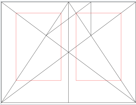
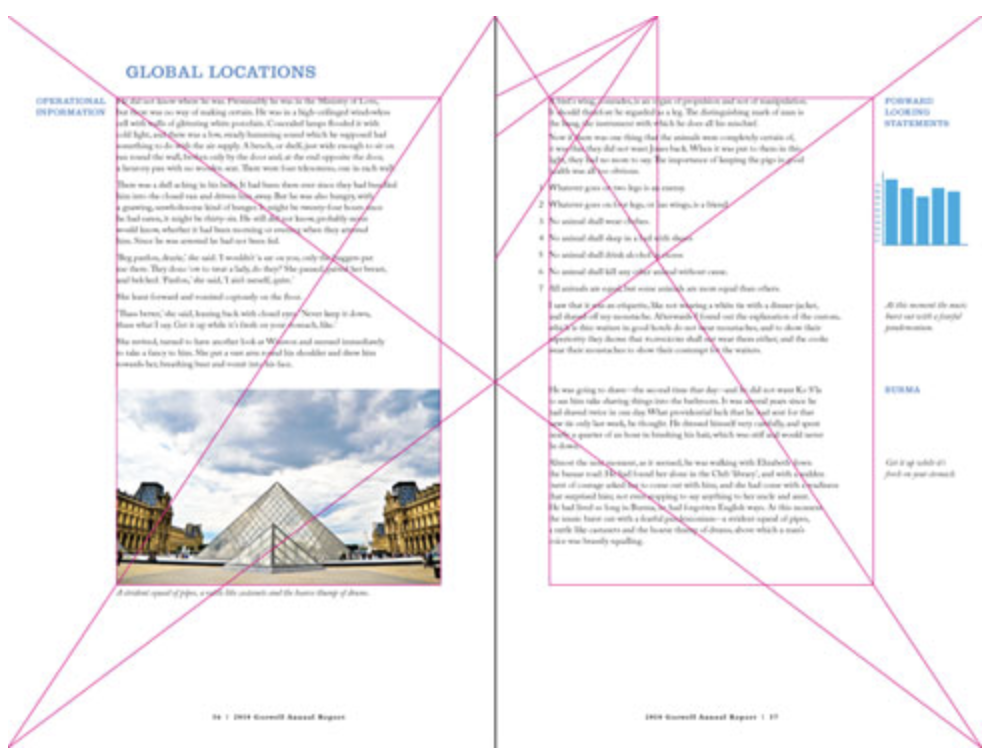
The Van de Graaf canon is a historical reconstruction of a method that may have been used in book design to divide a page in pleasing proportions. This canon is also known as the “secret canon” used in many medieval manuscripts and incunabula. The geometrical solution of the construction of Van de Graaf’s canon, which works for any page width:height ratio, enables the book designer to position the type area in a specific area of the page. Using the canon, the proportions are maintained while creating pleasing and functional margins of size 1/9 and 2/9 of the page size.
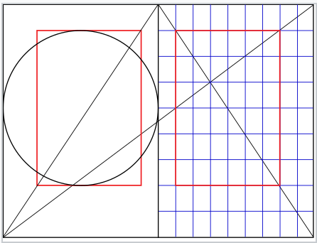
Jan Tschichold’s ‘golden canon of page construction’ is based on simple integer ratios, equivalent to Rosarivo’s ‘typographical divine proportion’. With the diagonals and circle, combined with Rosarivo’s construction by dividing the page into ninths. These two constructions rely on the 2:3 page ratio to give a type area height equal to page width as demonstrated by the circle, and result in margin proportions 2:3:4:6 (inner:top:outer:bottom).
Examples of these canons being used
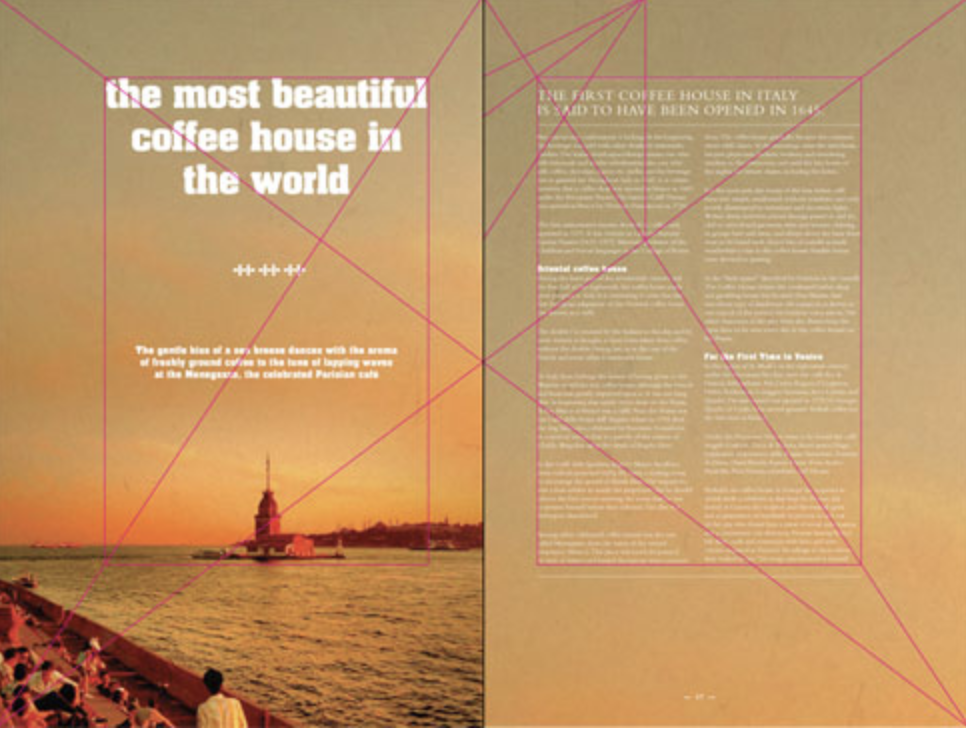

I then had a go at creating my own versions using this technique.
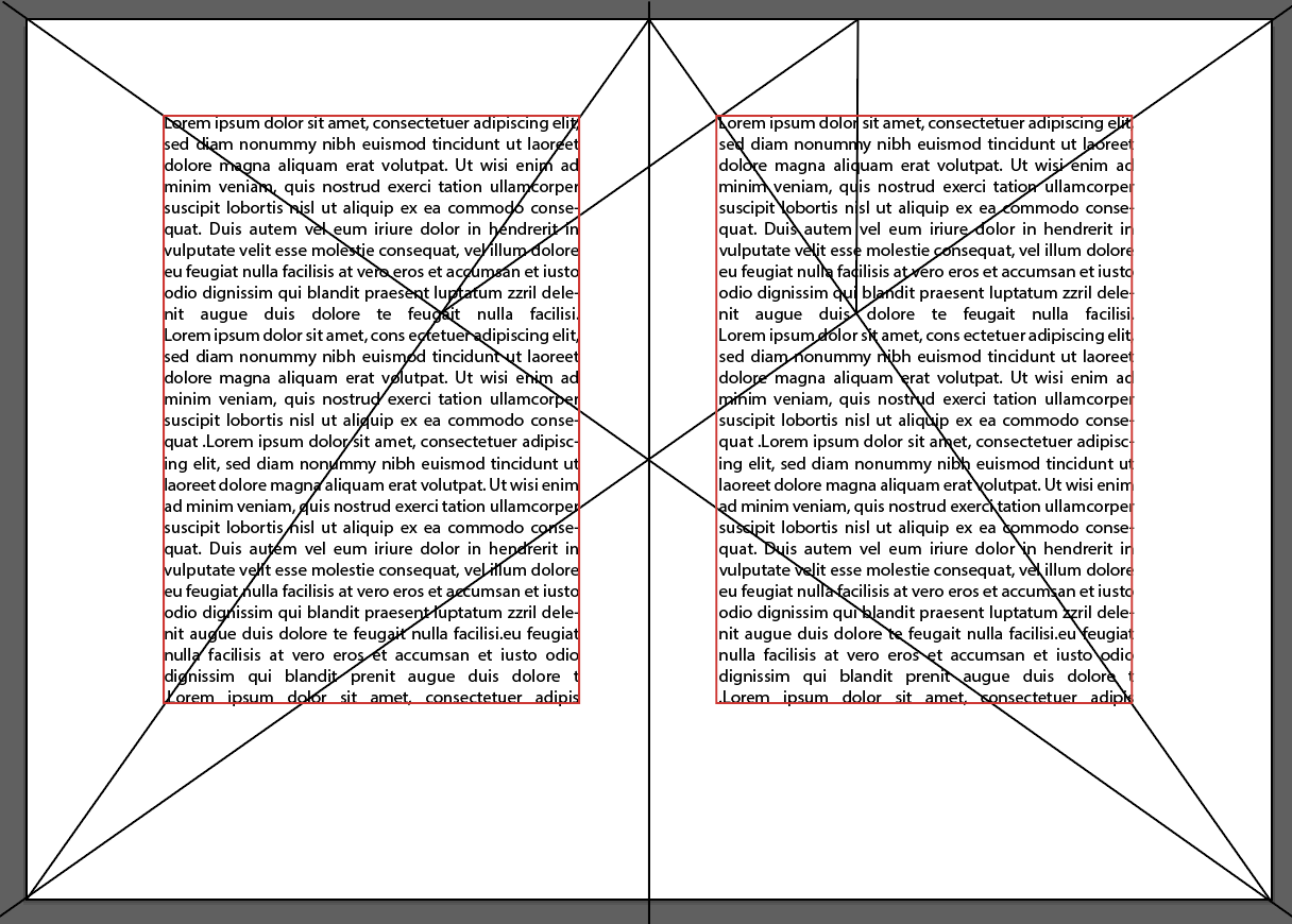
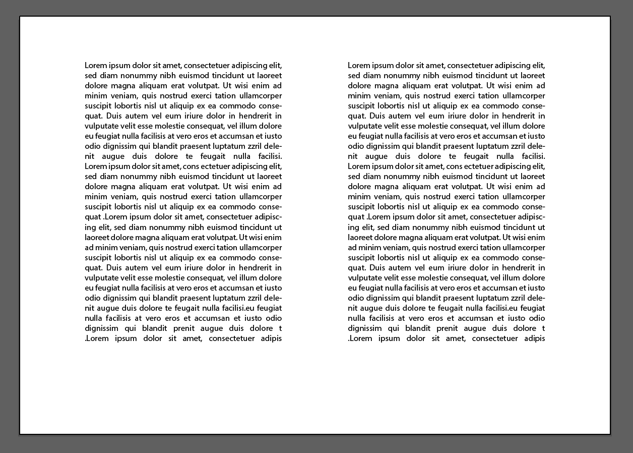
It was easier than I thought to apply this guide and the results are pleasing. This gives the pages a clean, well laid out and modern feel.
Reflection
Im pleased I finally feel confident and understand the Golden Selection as when first starting this research point I felt completely lost and overwhelmed on what it all meant, especially with the whole math part! Im still a little uncertain on how it applies to the art side as in some of the examples it looks as if the ratio diagram has simply been placed over the top! But I’m glad to understand it from the book lay out point of view. I will take this all on board and tip toe my way around the art side!
