
Below is an extract from Jules Verne’s 20,000 Leagues Under the Sea. Using a single typeface of your choice, lay out the test in as inventive a way as possible. Experiment with the letters and words, using typographic principles you researched in earlier exercises to significantly alter the arrangement of the text, its rhythm and readability.
Think about design group Tomato’s definition of typography – ‘Sound as from’ – and how this concept might apply to your own work. Use the content of the text to inspire visual ideas. How might you experiment with the type to communicate something of the essence of the descriptive content? Think about how the designers you researched in the previous section e.g David Carson and El Lissitsky, would approach the test – or artists like Marimetti and Schwitters.
It is important that you play with the text, with individual letters and words. How experimental can you be in making expressive typographic designers? Can you reveal something of the character and nature of the letterform by experimenting with scale and orientation, so as simple unassuming letter becomes a monumental, almost sculptural form?
Think about the sound of the words you are working with, how can your typographic decisions help to communicate these? As a book designer, you might be more drawn to analog or digital ways of working. Whatever your preference, try to mix and match both approaches. Your work on paper might become a starting point for digital experimentation with this text, or print out your initial ideas, so that you can experiment with what happens when you start to cut, collage or physically alter the text in some way. This physical work can be scanned to kick start a new digital stage.
Read the text through once before starting to manipulate the type. Make several designed versions of this passage, or parts of it, spanning several pages if need be. Feel free to focus on certain aspects of the text, or use the whole text within your designs. Use your learning log to reflect your creative decision making as well as sharing the various stages of your process.
I started off by reading the extract then decided to print off my own version of the text so I was able to make notes to start stimulating ideas.
To get a better understanding I was intrigued to find a little more out about the book and the story.
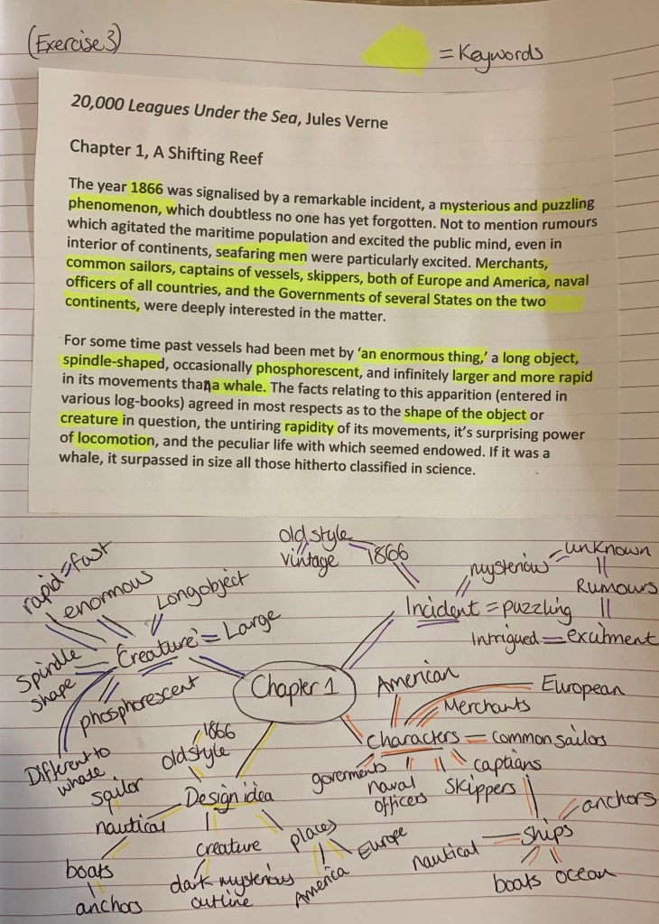
Written by Jules Verne in 1870, 20,000 Leagues Under the Sea is a book that tells us the story of three accidental visitors to an underwater world hosted by the mysterious Captain Nemo. They originally encounter the Nautilus in the Pacific Ocean as part of an expedition to find out what species of undiscovered whale has been damaging world shipping. However, far from encountering a whale that has wrecked world shipping. As the book progresses, the men hunt underwater, fight sharks, encounter Atlantis, and fight off giant squid.
I found a very informative clip online explaining the plot to the book (https://study.com/academy/lesson/20-000-leagues-under-the-sea-summary-quotes-characters.html) which allowed me to quickly broaden my knowledge.
Following the advice in the brief before starting my design process I wanted to research and remind myself how other designers have approached this kind of task.
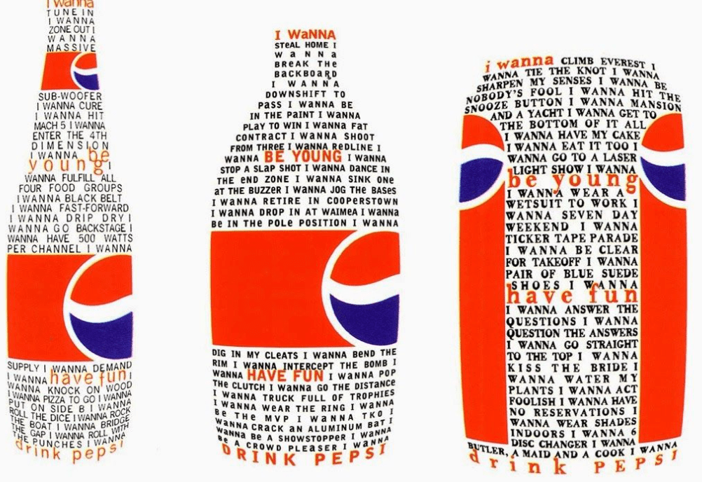
David Carson
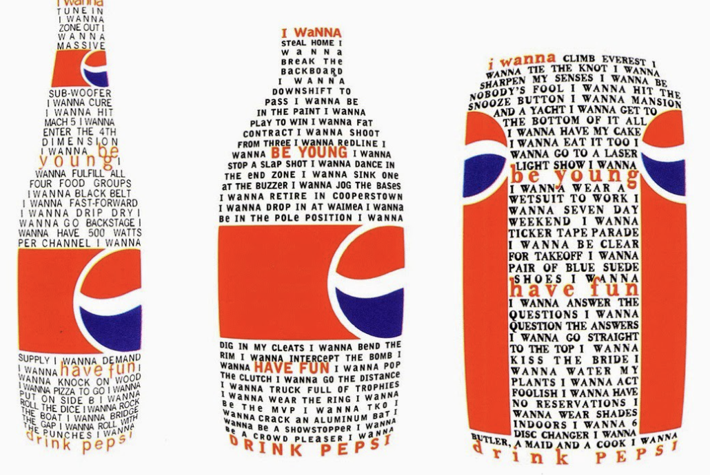
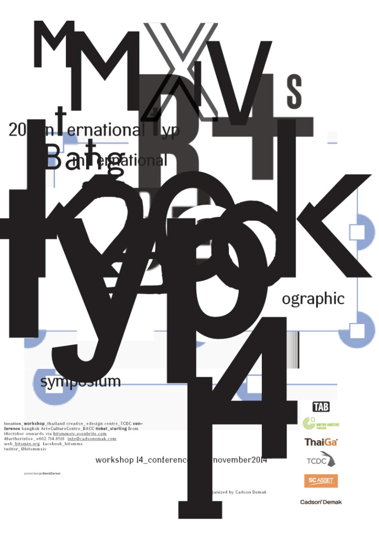
David Carsons is a very experimental designer and his style of work for this exercise has inspired me. No two designs are the same, the chaotic typography and pattern created with objects overlapping looks confusing yet holds the design together so well. I particularly like the Pepsi deigns and the mixed media collage – both very strong pieces of work which has given my ideas for this exercise!
Sketchbook Designs
Im not too sure where I want to go with this design however I wanted to experiment with a few different techniques.
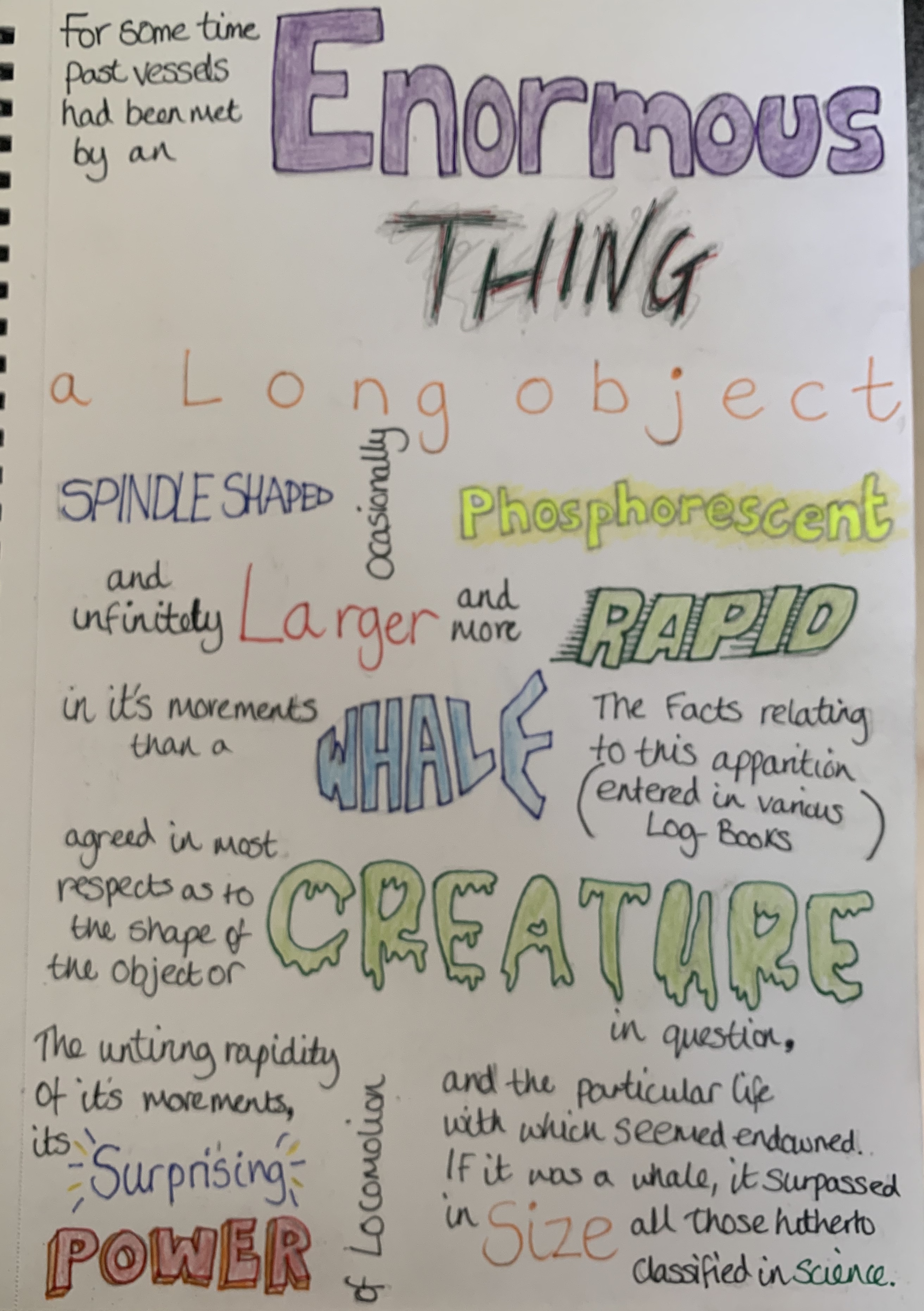
Firstly I decided to roughly sketch out the words visually, I done this as a quick thinking task as I didn’t want to think too deeply into the meanings at this point.
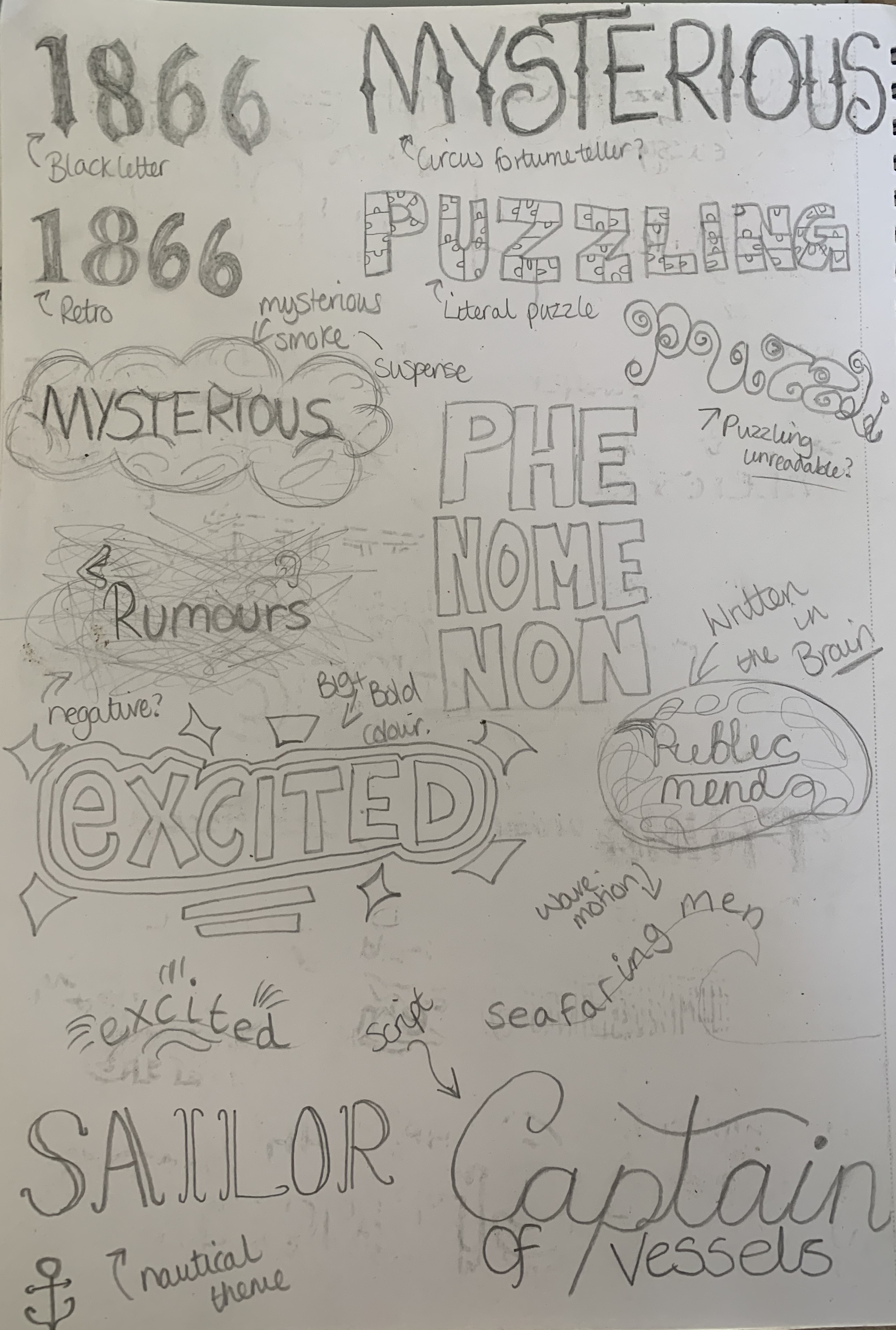
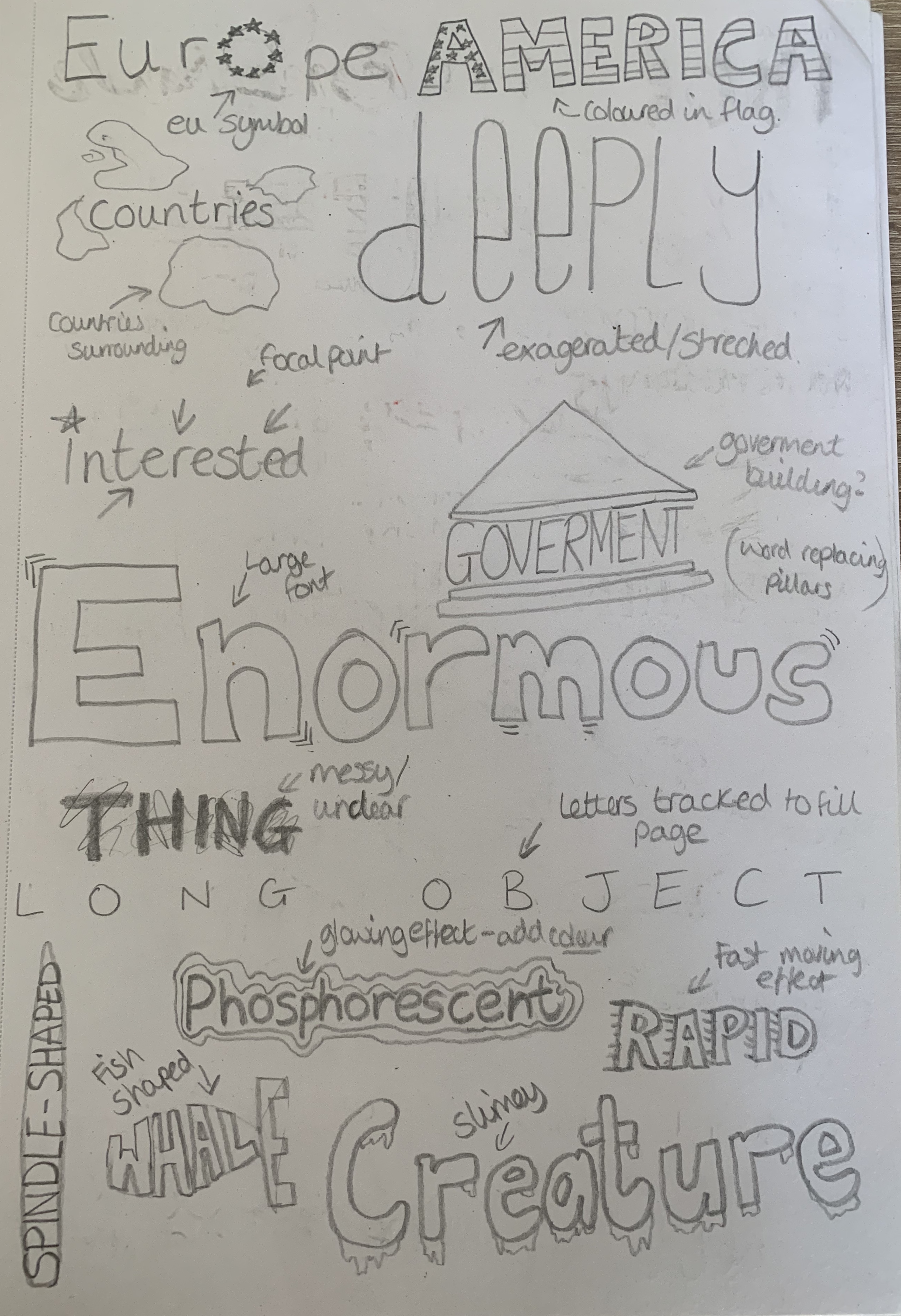
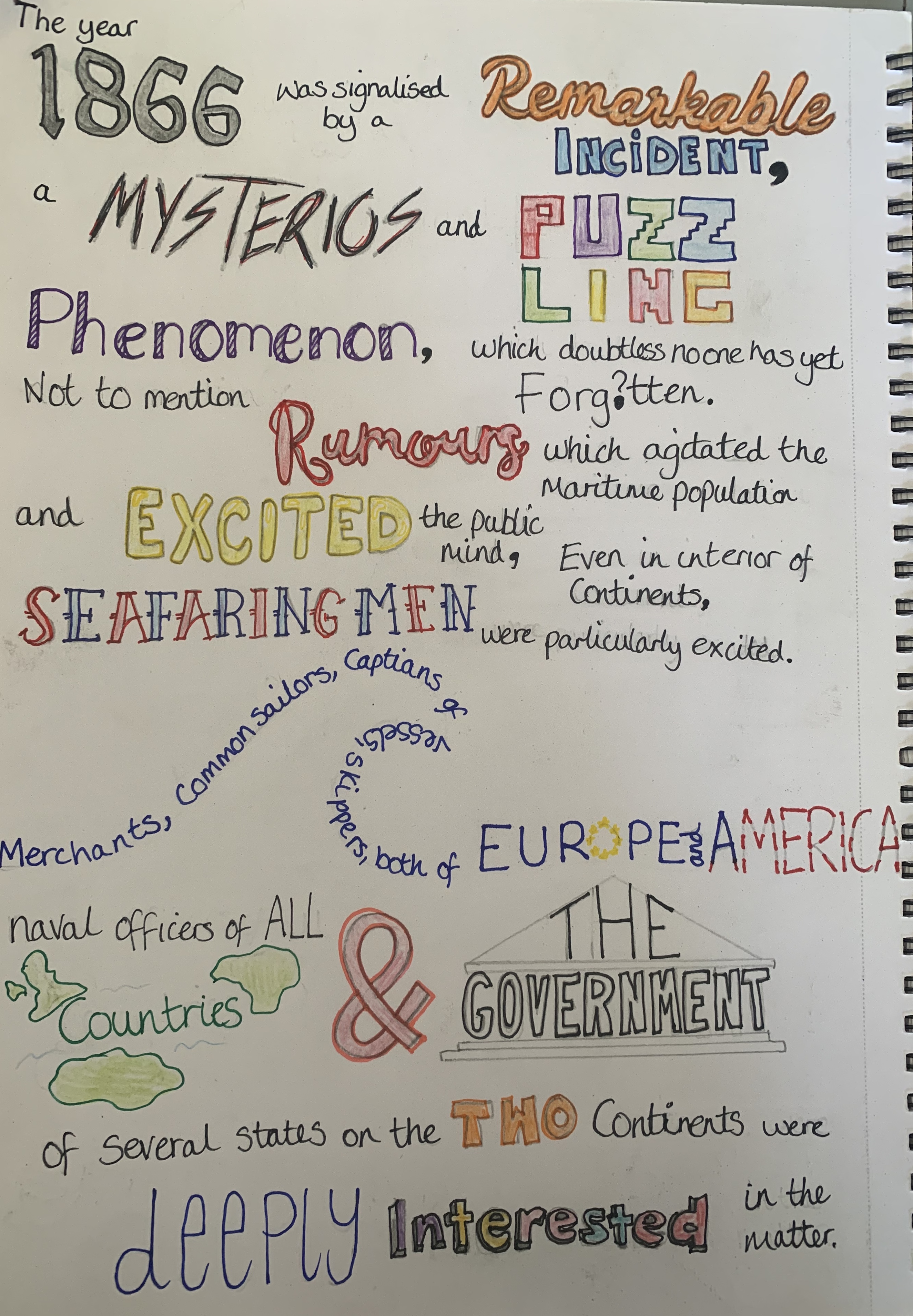
I then decided to write out the first chapter of 20,000 Leagues under the sea using some of the visual representations of the words. Some words are more successful than others, however I still feel that the meaning is expressed correctly. Perhaps if this was created digitally it may look neater however to me looks rather messy. Im glad I experimented with my sketchpad but I would much prefer to work digitally for this exercise. Also it wasn’t until after completing this I remembered the brief stated to use one typeface!
Design 1
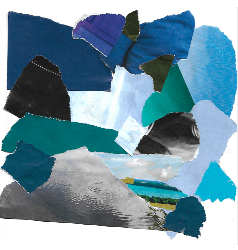
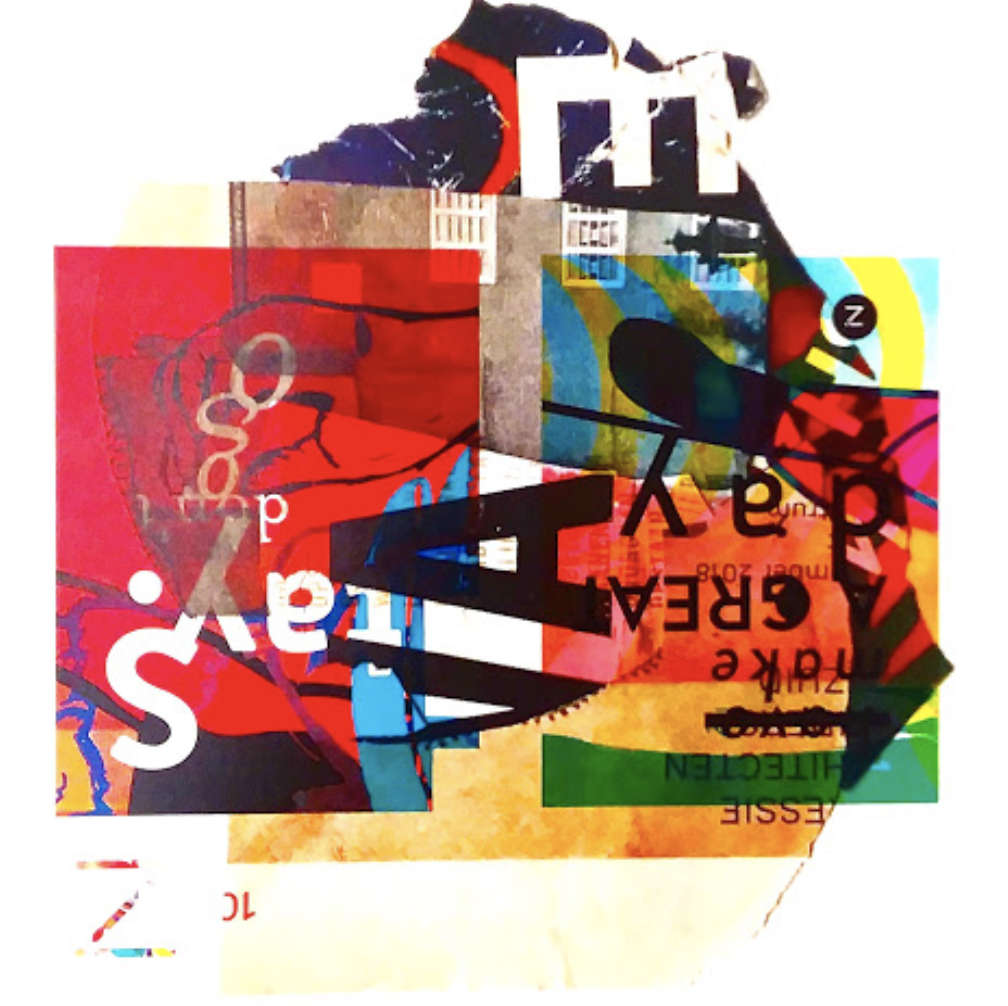
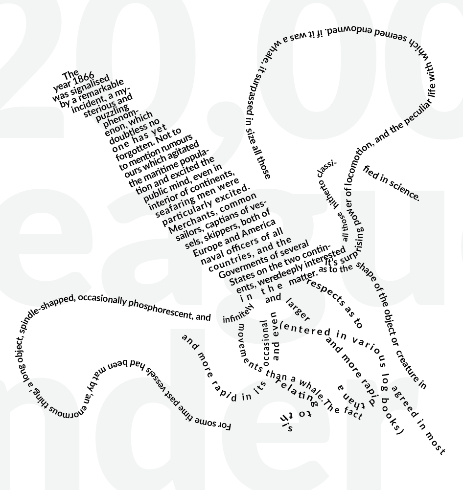
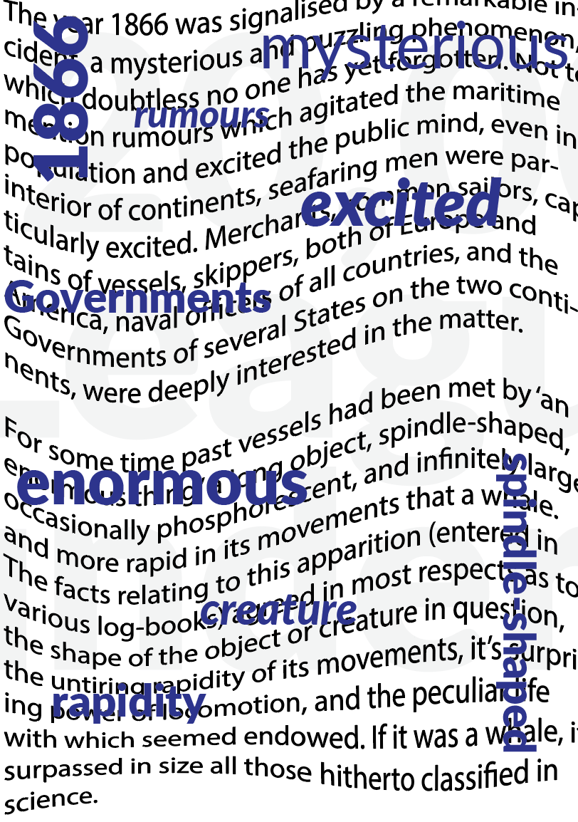
Inspired by one of David Carsons artworks I went ahead and tore off different shades of blue from a magazine along with images of water and created a collage and scanned it onto my computer. I want to use this as the background and apply the typography over the top. This is experimental and may not succeed however I really wanted to test this design out!
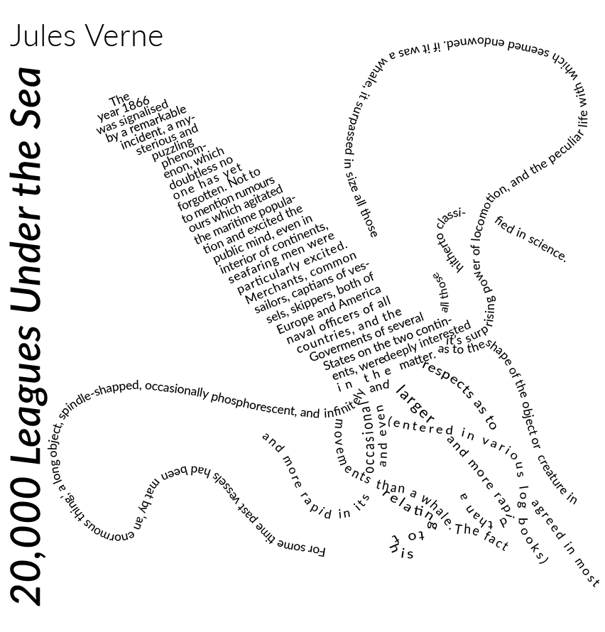
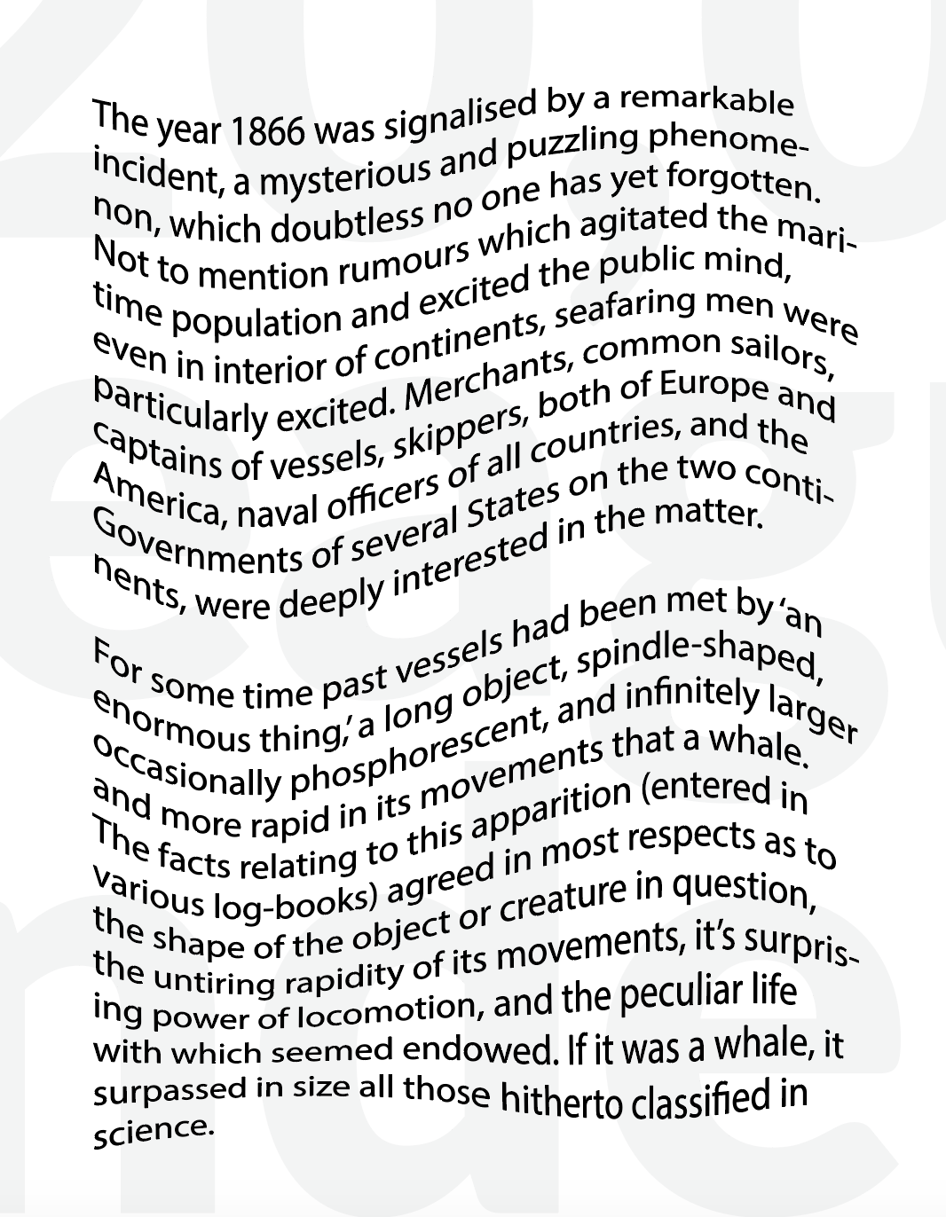
For my first typography experiment I decided to used the typeface Lato and make use of the variety of different font styles, adjusting the tracking, size and position of words to create an interesting layout. By adjusting these features I was able to select certain words to exaggerate them and make them stand out from the rest. I was slightly disappointed that it didn’t look how I wanted with the torn background, yet still looks interesting and creative on its own.
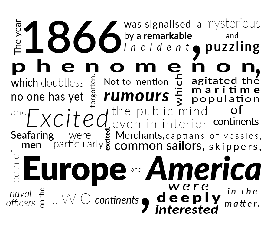
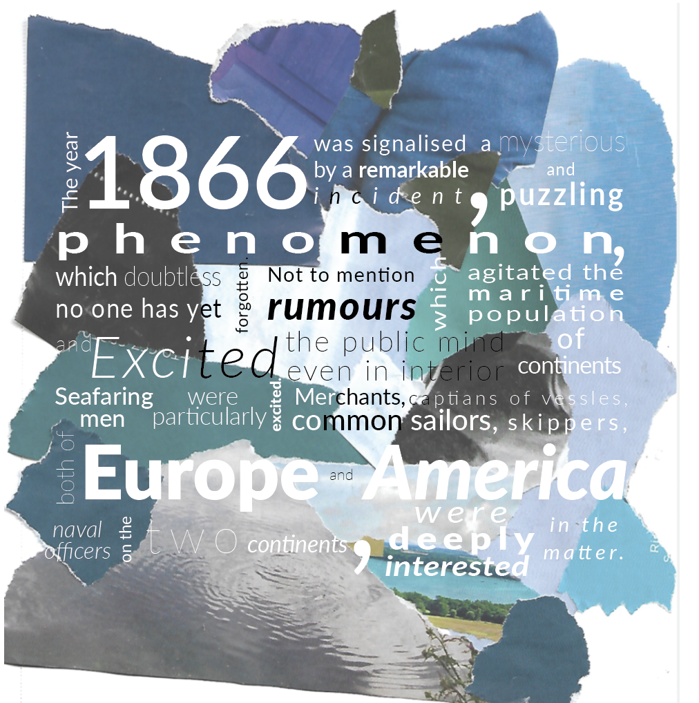
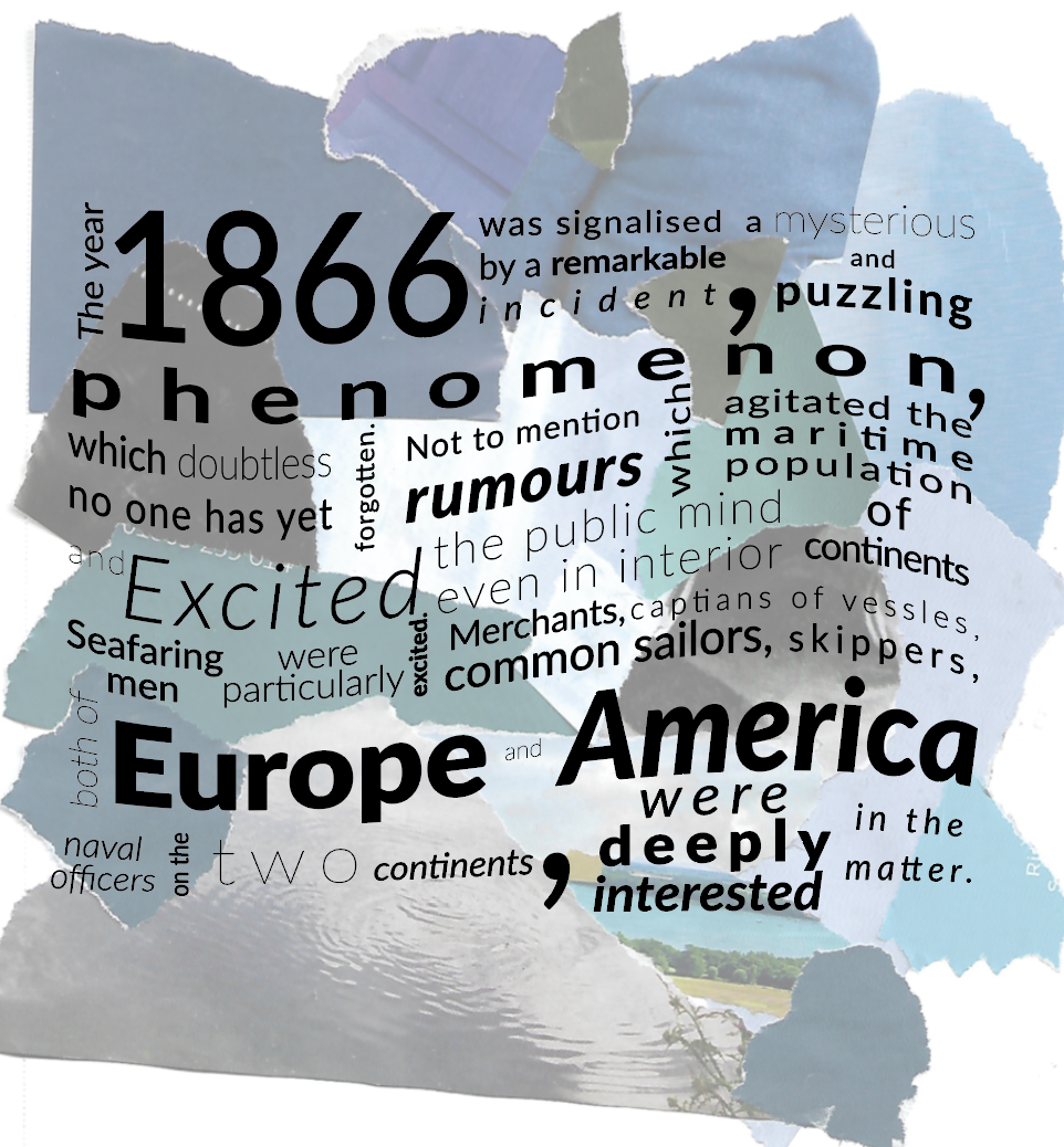
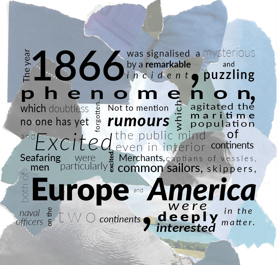
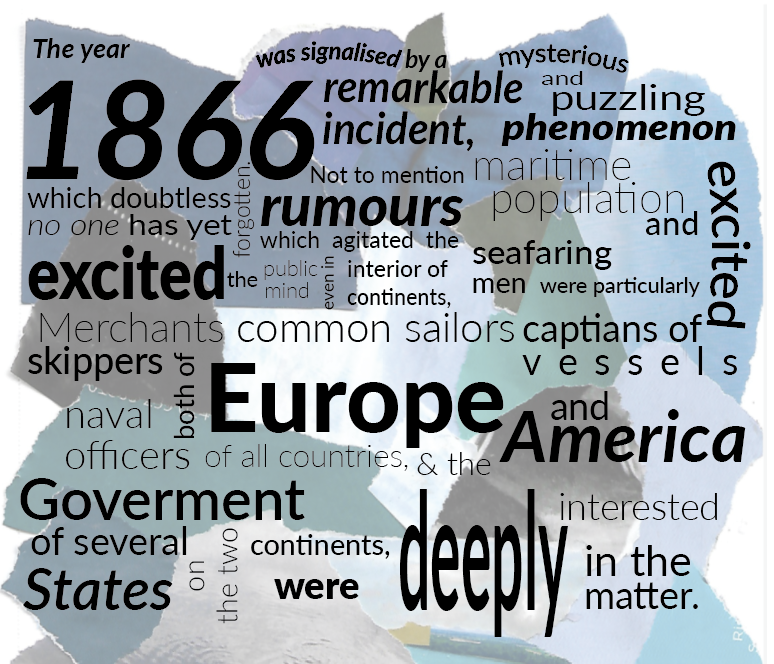
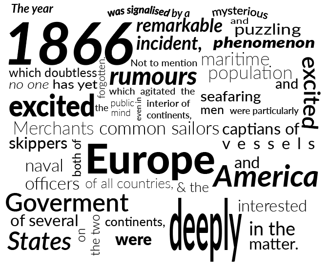
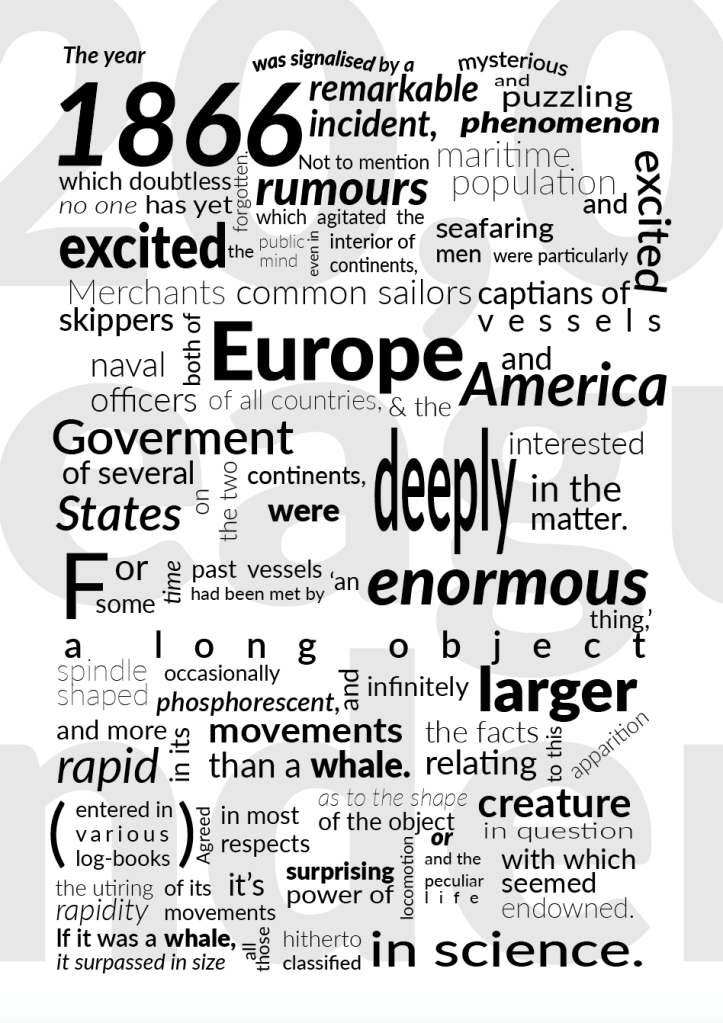
I completed the rest of the chapter and added in a large font of the title in the background. Im happy with the end result of this design, I feel it fits the brief as stated by using the same typeface in interesting ways. By adjusting the size, tracking and style I was able to achieve an interesting layout which adds contrast, I was able to highlight some of the keywords by making them larger and bold.
Design 2
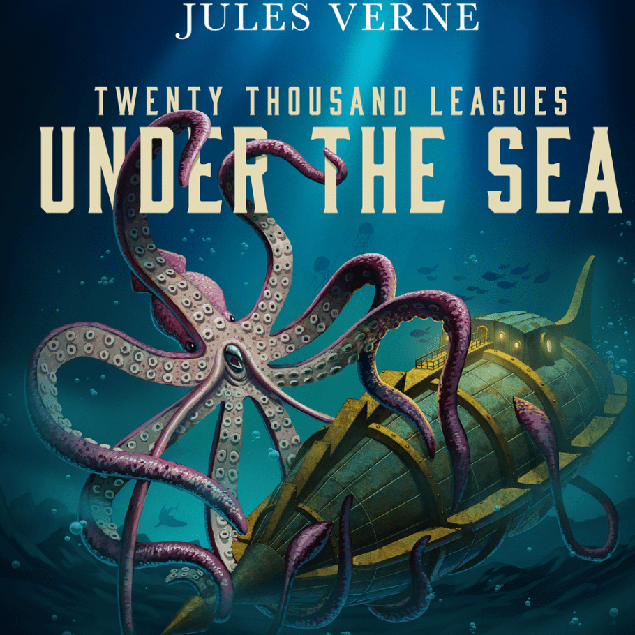
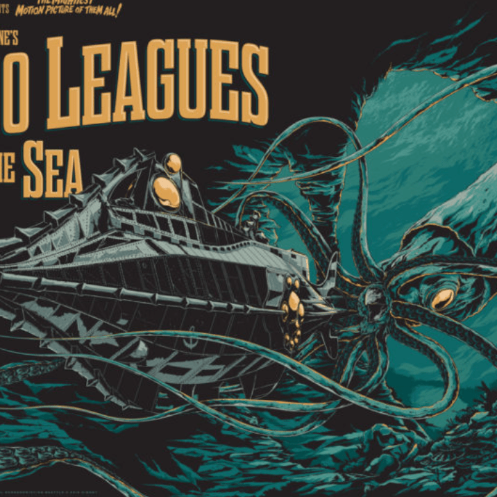
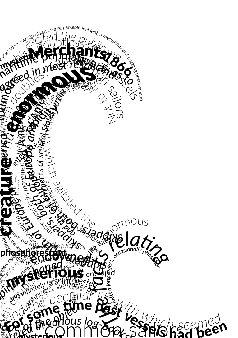
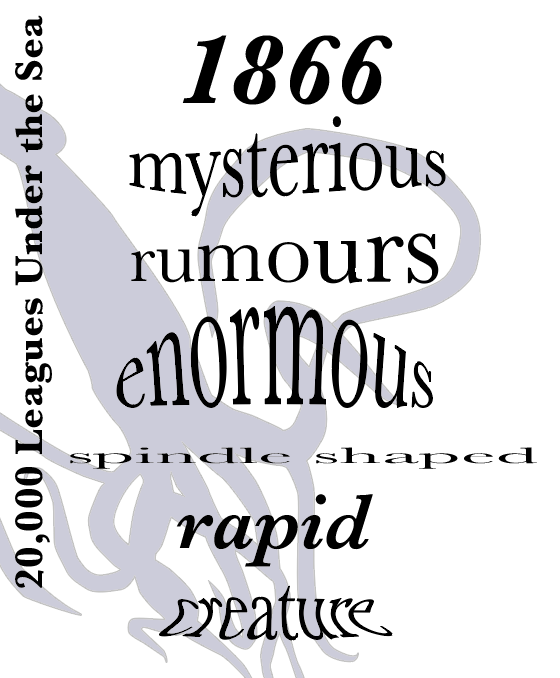
I looked further into previous designs of 20,000 leagues under the sea for further inspiration and found the majority of designs seem to feature the giant squid as mentioned in the book. Using this creature I wanted to create something again inspired by David Carson.
The image to the left is where I found inspiration for this design, I sketched out a drawing of a giant squid the simply filled the shape with the words from chapter 1.
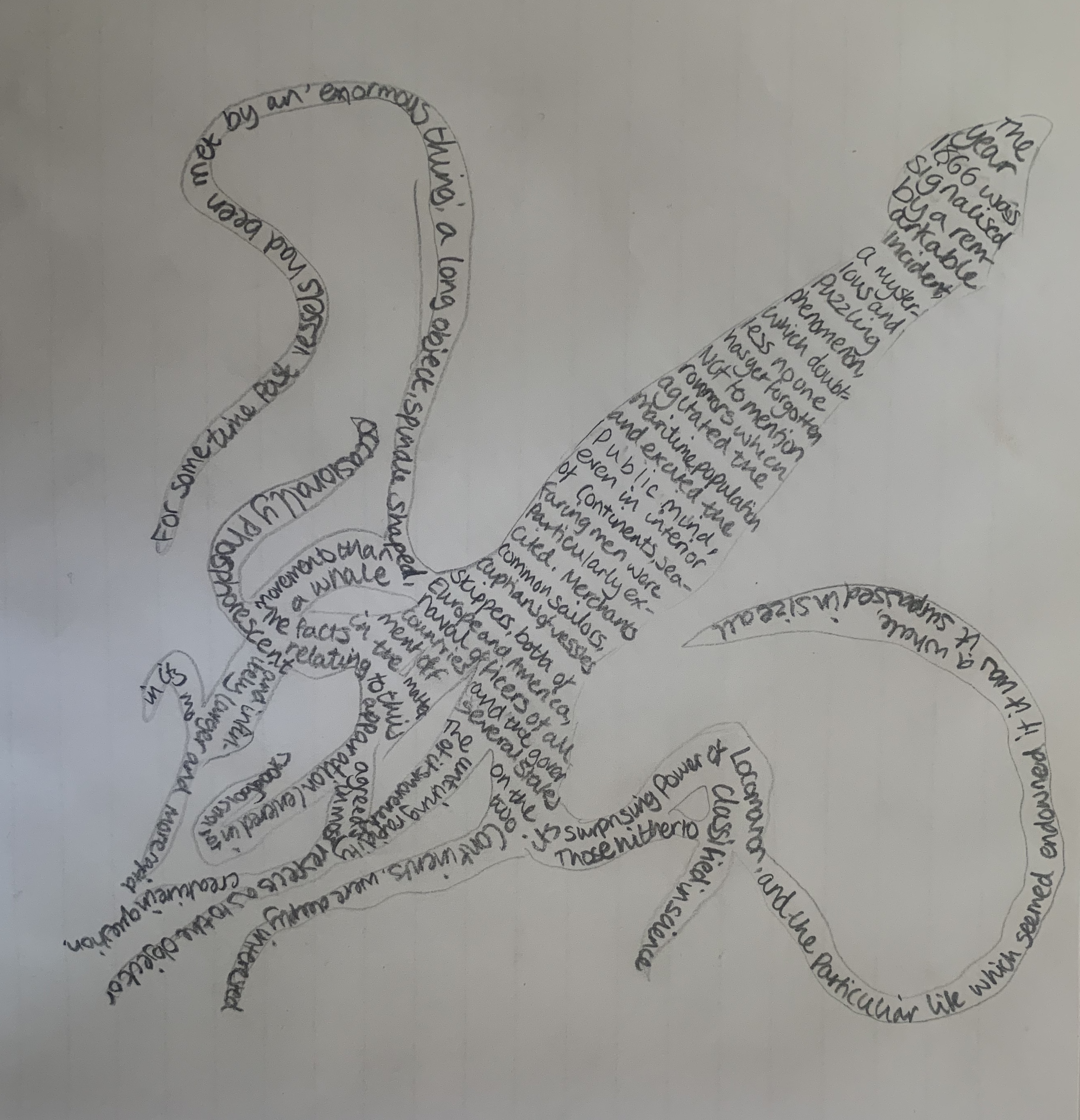
I’m really pleased with the outcome for this design, the text clearly symbols a squid in a creative way.
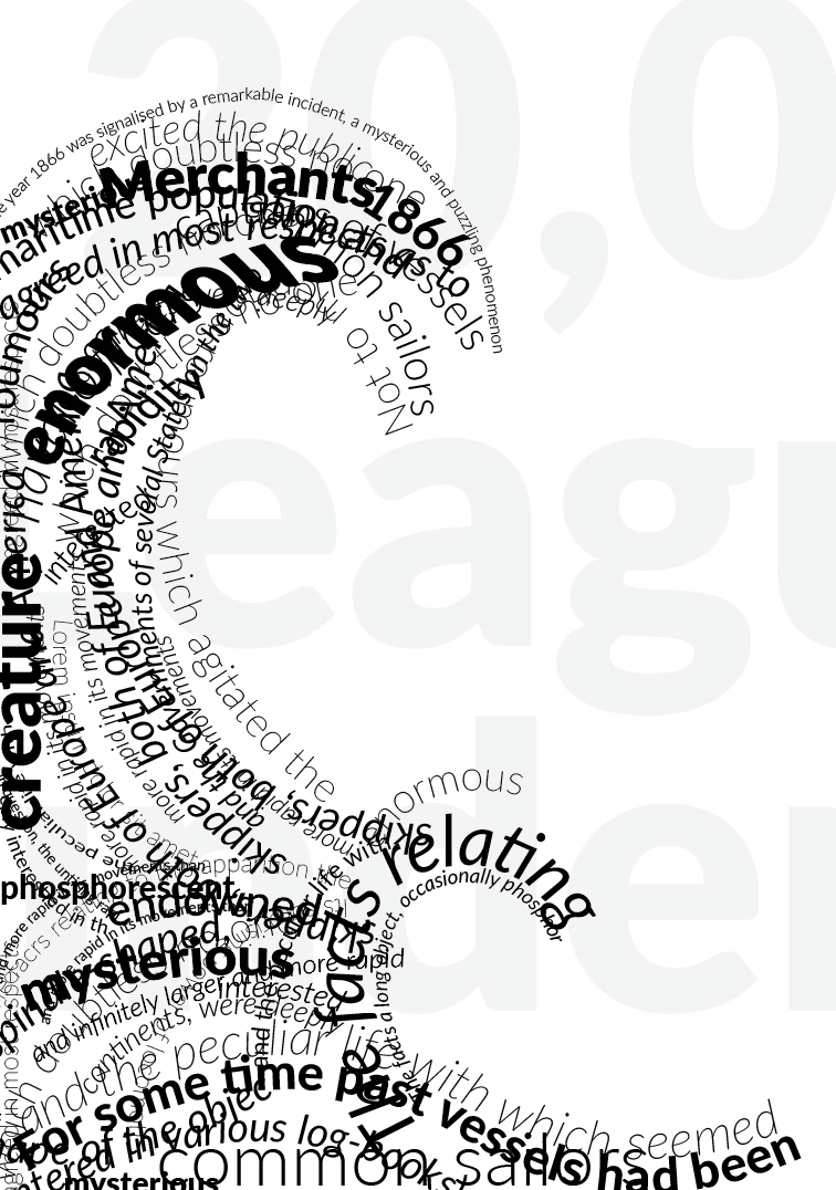
Design 3
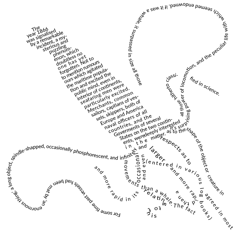
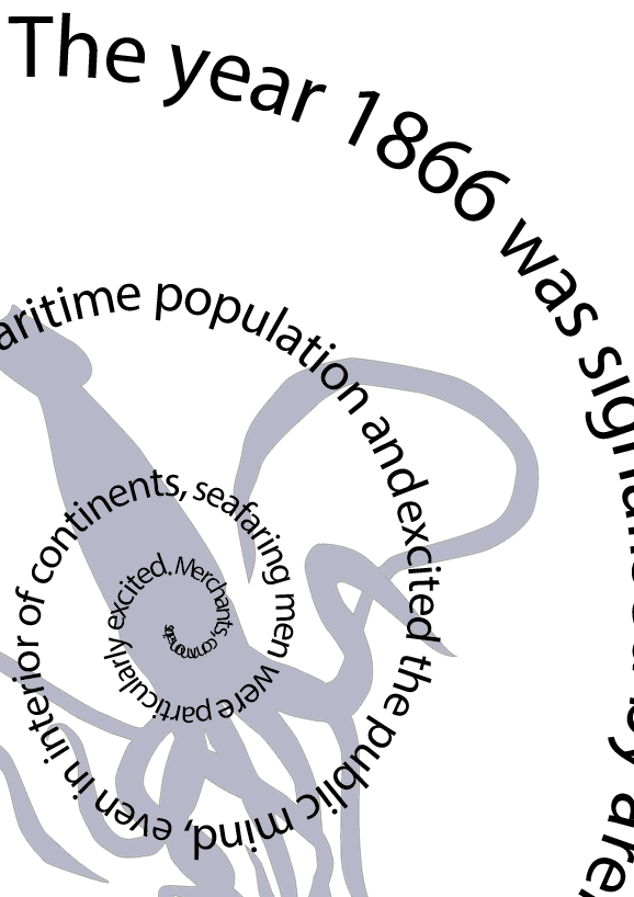
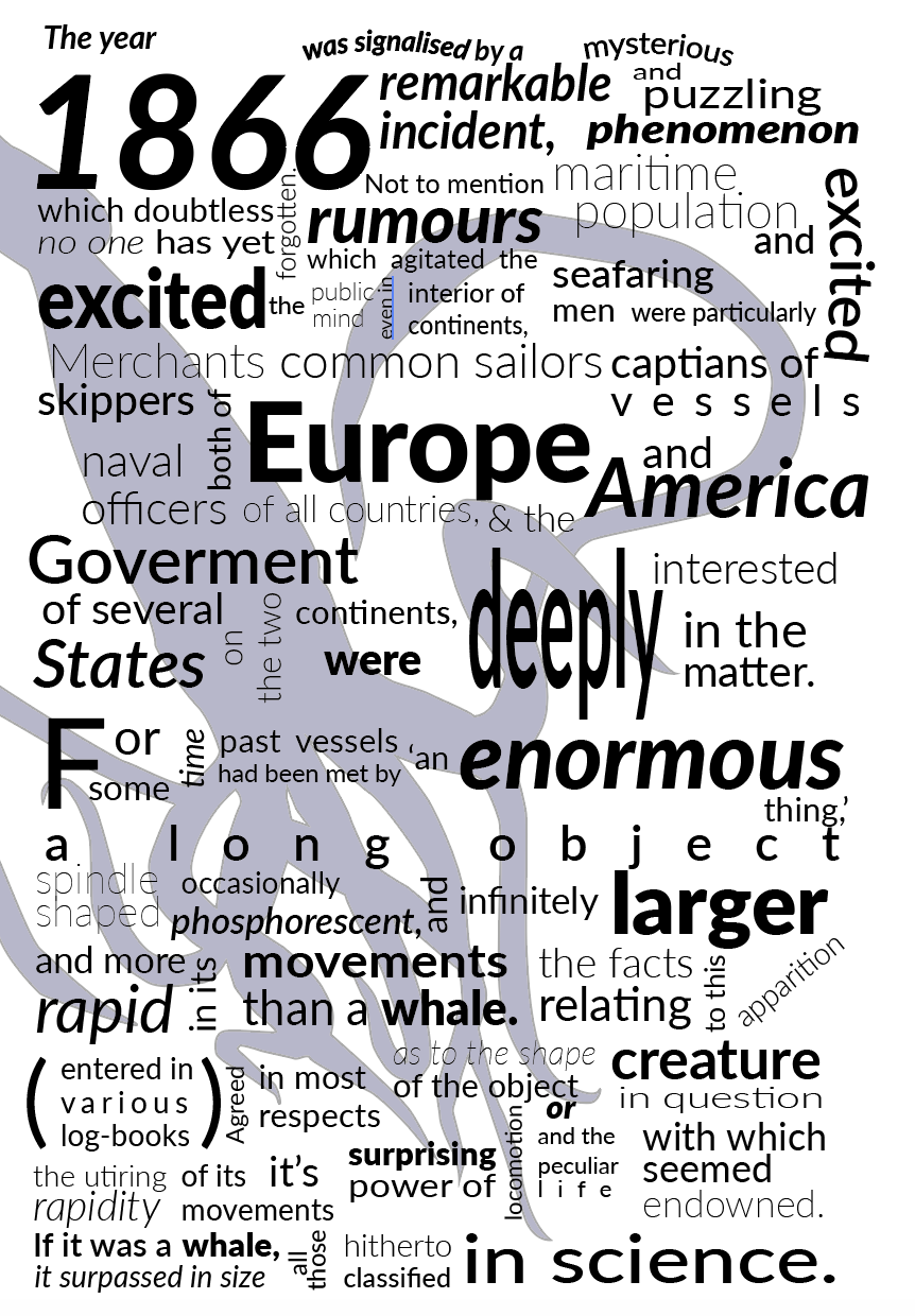
Following from the design technique above I wanted to create the shape of a wave, I overlapped the text as I wanted to experiment with this technique in a less structured and ‘messier’ way.

I think this is my favourite design out of all three, I like the roughness of the overlapping creating texture and contrast in the design. I gained inspiration for the wave design with the use of the golden ratio, along with the technique used in design 2.
Other design ideas
To ensure I was satisfied with my designs above I decided to try some fast thinking designs to create different variations using a single typeface to see if any other ideas came into comparison.
Although these are fast thinking designs and very rough, It has made me feel much more confident in the 3 designs I had previously created.
Final Designs

Reflection
I found this exercise slightly slow burning, it took me a while to move on between each of the design as I lost my ‘creativity’ however now looking back Im glad that I managed to get there in the end! I had experimented with colour however I felt the designs looked much stronger in black and white, it seemed to take away the focus from the words. Im glad to of been able to create successful experimental typographic designs, I feel that each design works well with the brief and each design is very different.
