
Brief: This two part exercise aims to understand the relationship between typography, the grid, and the page in more depth by analysing existing layouts and creatively developing alternative ones. Both of these activities will feed into assignment three.
Part 1 – Understanding layouts
Research into book layouts that you find interesting. These could be art or design books, or others that have more complex layouts that balance images, typography and other content across multiple columns. Trace the grid structure of your chosen double-page spread using tracing paper and a sharp pencil. Measure the margins, column width and depth, plus spaces between the columns. Transcribe the tracing onto a clean sheet of paper, drawing on the measurements. Compare your drawings to other double-page spreads within the same publication. Identify the similarities and differences – is there an underlying grid system and how does it adapt to deal with different content? Now recreate the same double-page spread using DTP software. Use your traced drawing measurements as a guide.
Part 2 – Experimental layouts
Extend the project by thinking about how you might radically change these layouts – what creative decisions around the grid would you make to improve these designs? Develop layout ideas that ignore the grid structure, challenge it, or offer radical alternatives to the existing layouts. Develop a range of ideas through thumbnail drawings and DTP layouts, in a similar way to the first part of the exercise. Use this as an opportunity to take creative risks, and find radically different ways to layout the existing content. This process might challenge any preconceived rules about how a layout should normally work. Reflect on the
process in your learning log.
Part 1 Understanding Layouts
I started off by collecting interesting design layouts, It was fascinating to see some of the way designers have presented their layouts to create unique and eye catching designs – however it made me question of how easy they would be to follow and read.
I then looked at layouts in magazines that I had, there are a few that I disliked (see first 3 images) These came from cheap gossip magazines & a tv guide. I dislike these because of how cluttered and crammed the pages look, there is too much to concentrate on and I don’t feel that the columns flow as nicely as the more ‘plainer’ layouts.
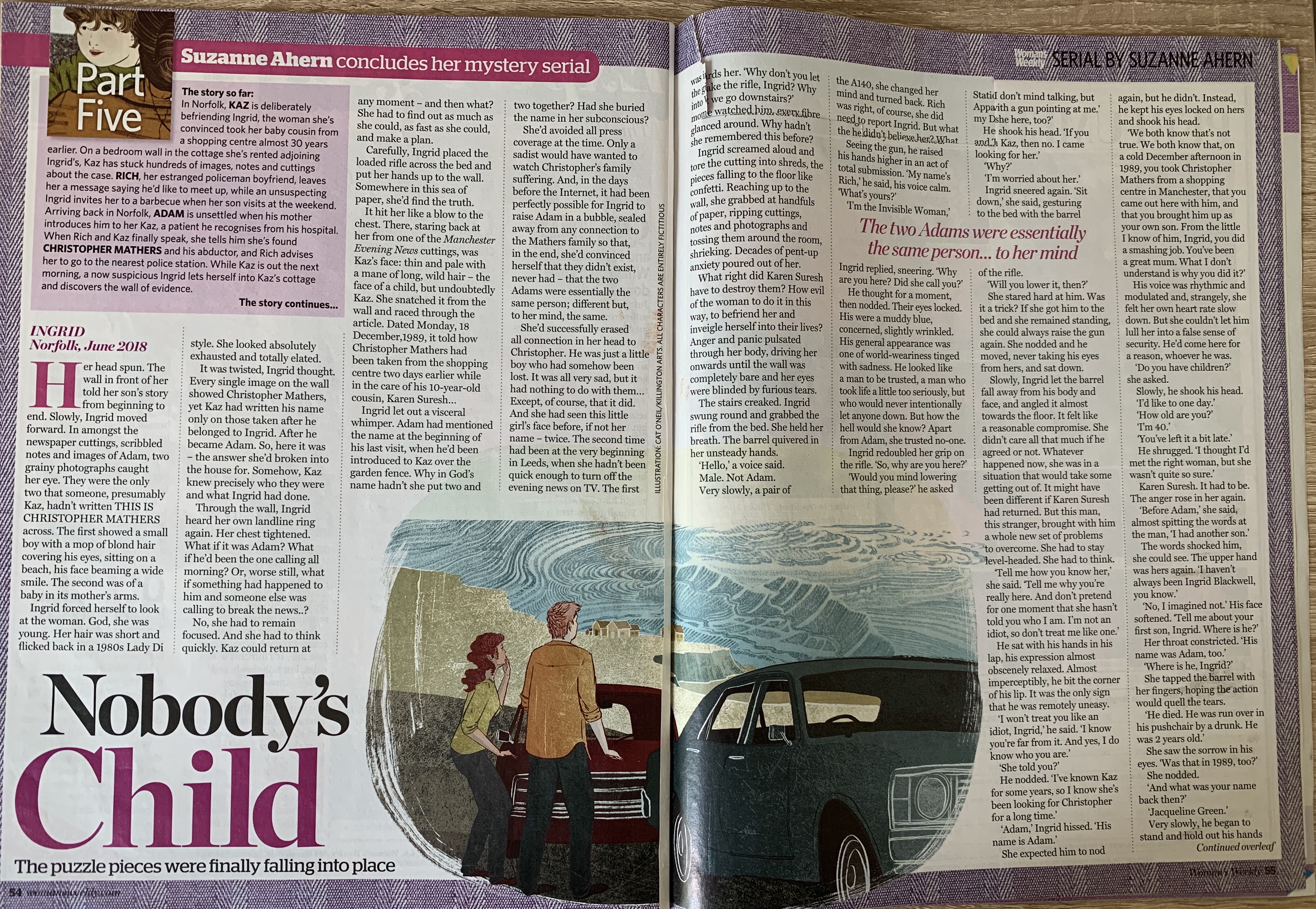
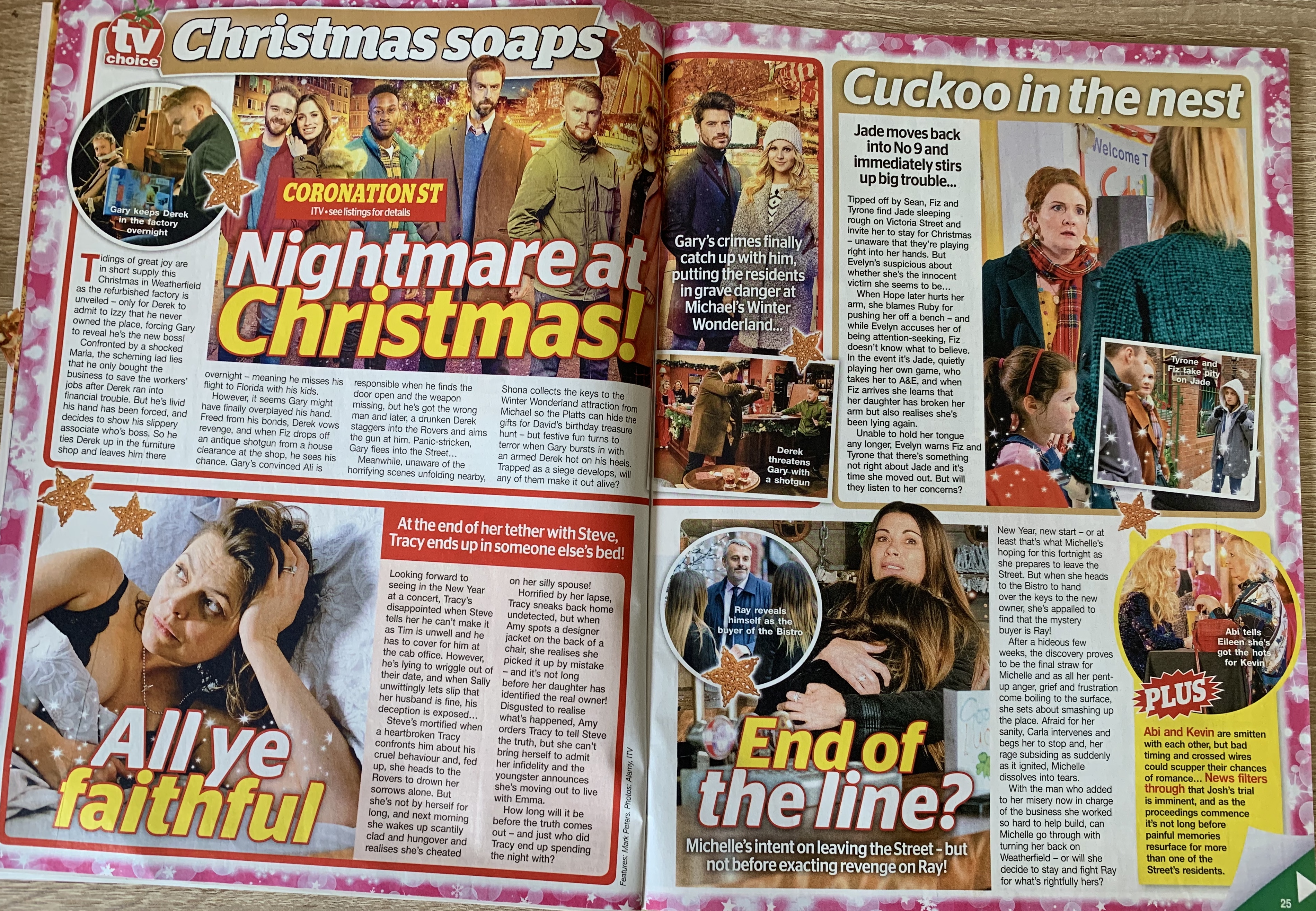
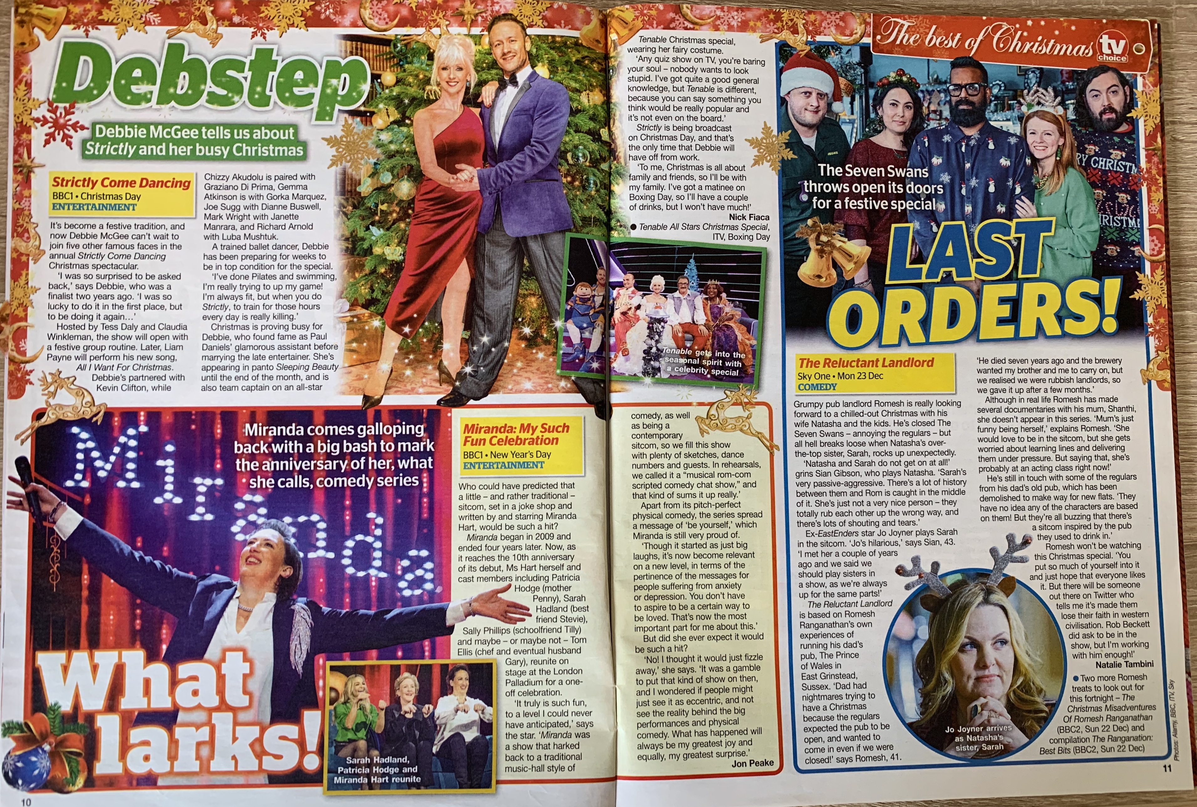
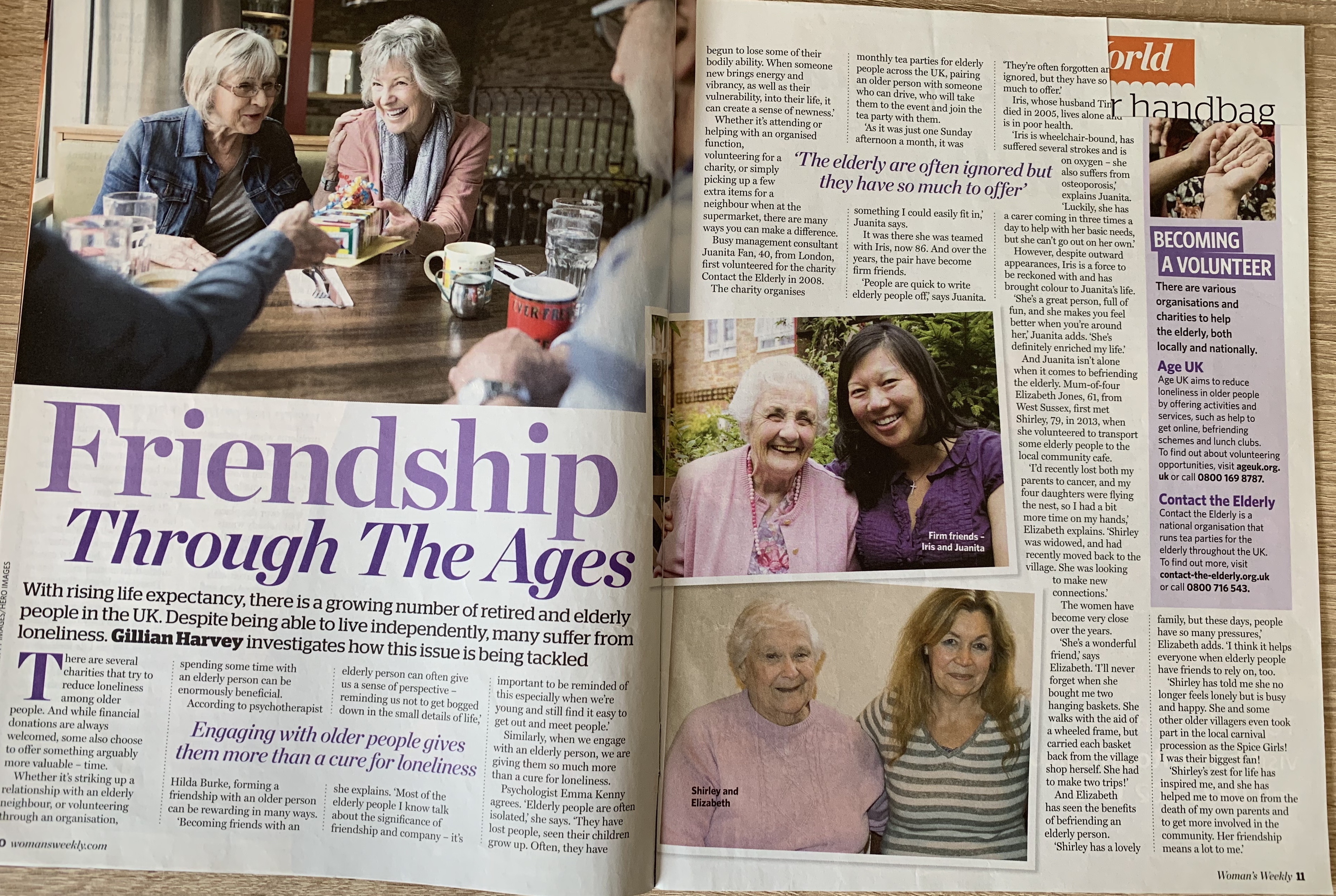
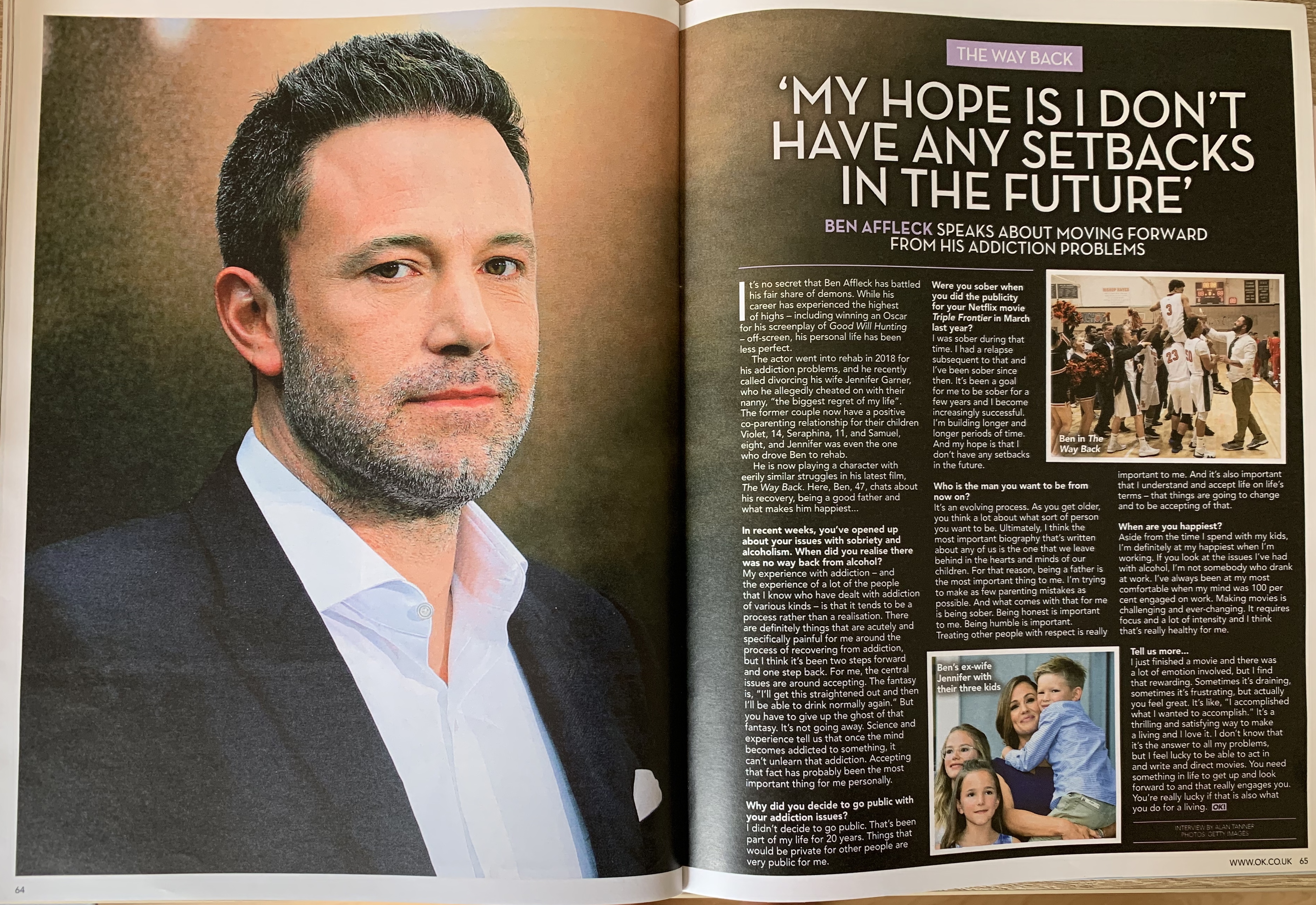


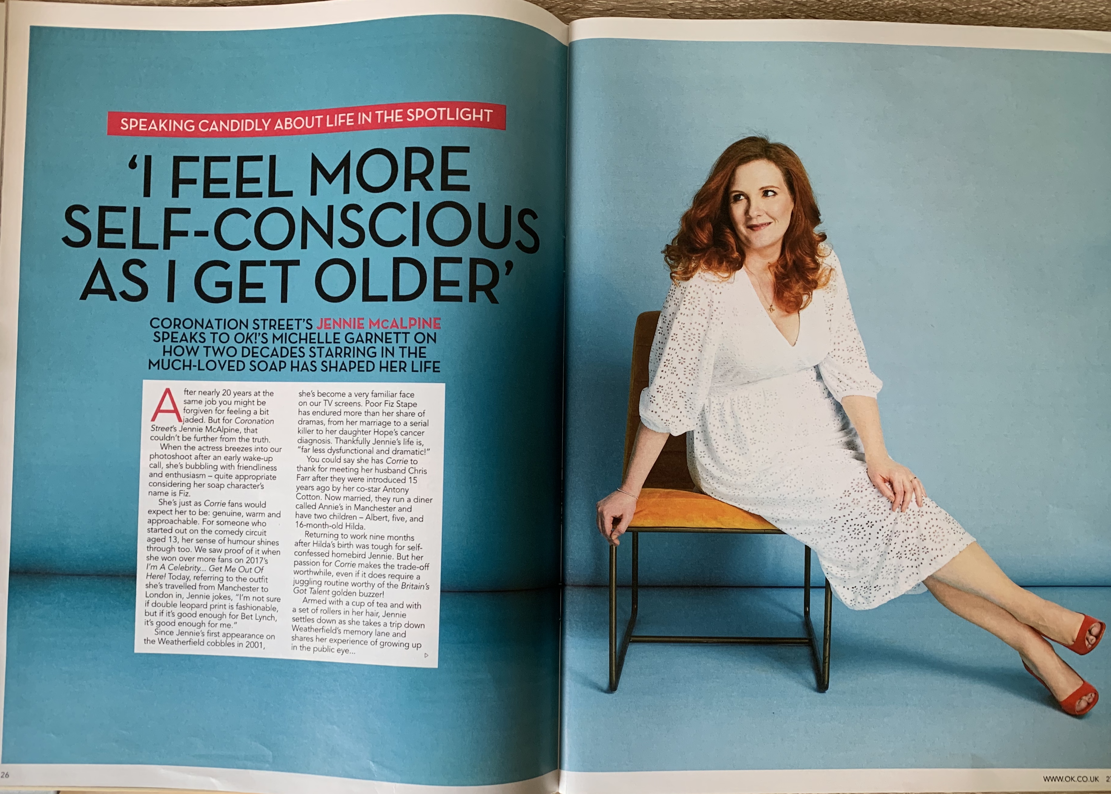
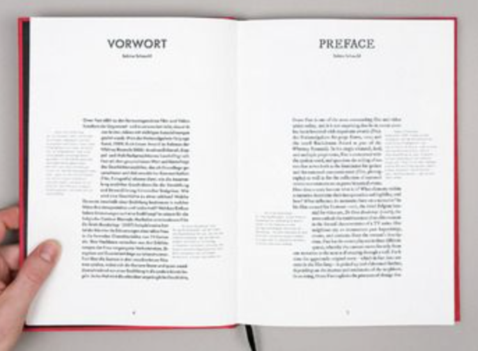
I was disappointed I didn’t have more of a selection to choose from, which reminded me that I needed to update my collection! However as you can gather I prefer more of a sophisticated layout where the columns are evenly spaced out with the use of large imagery.
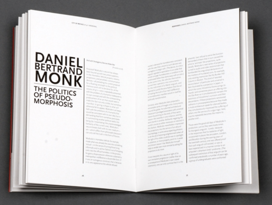
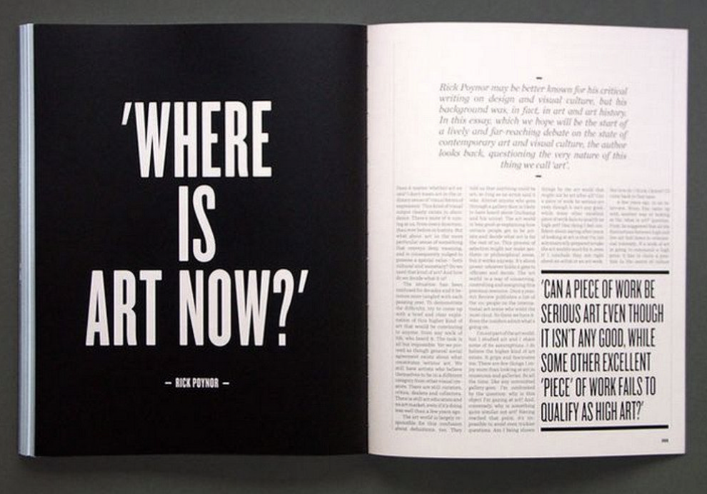
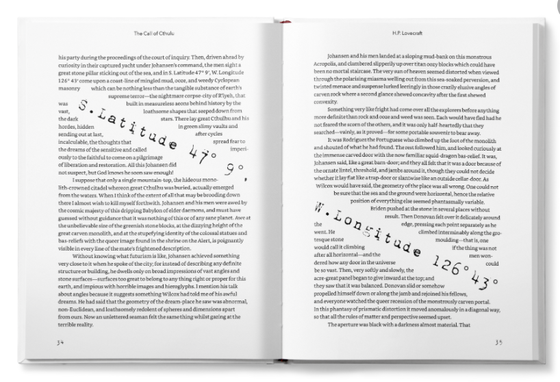
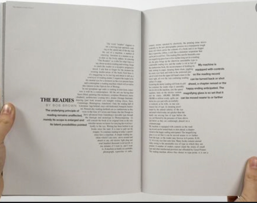
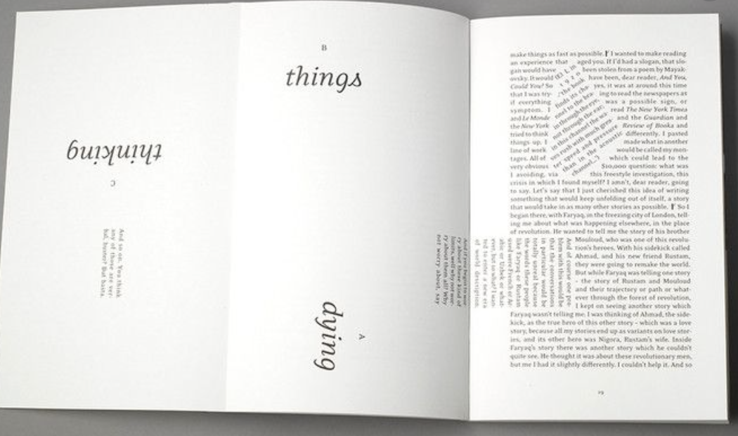
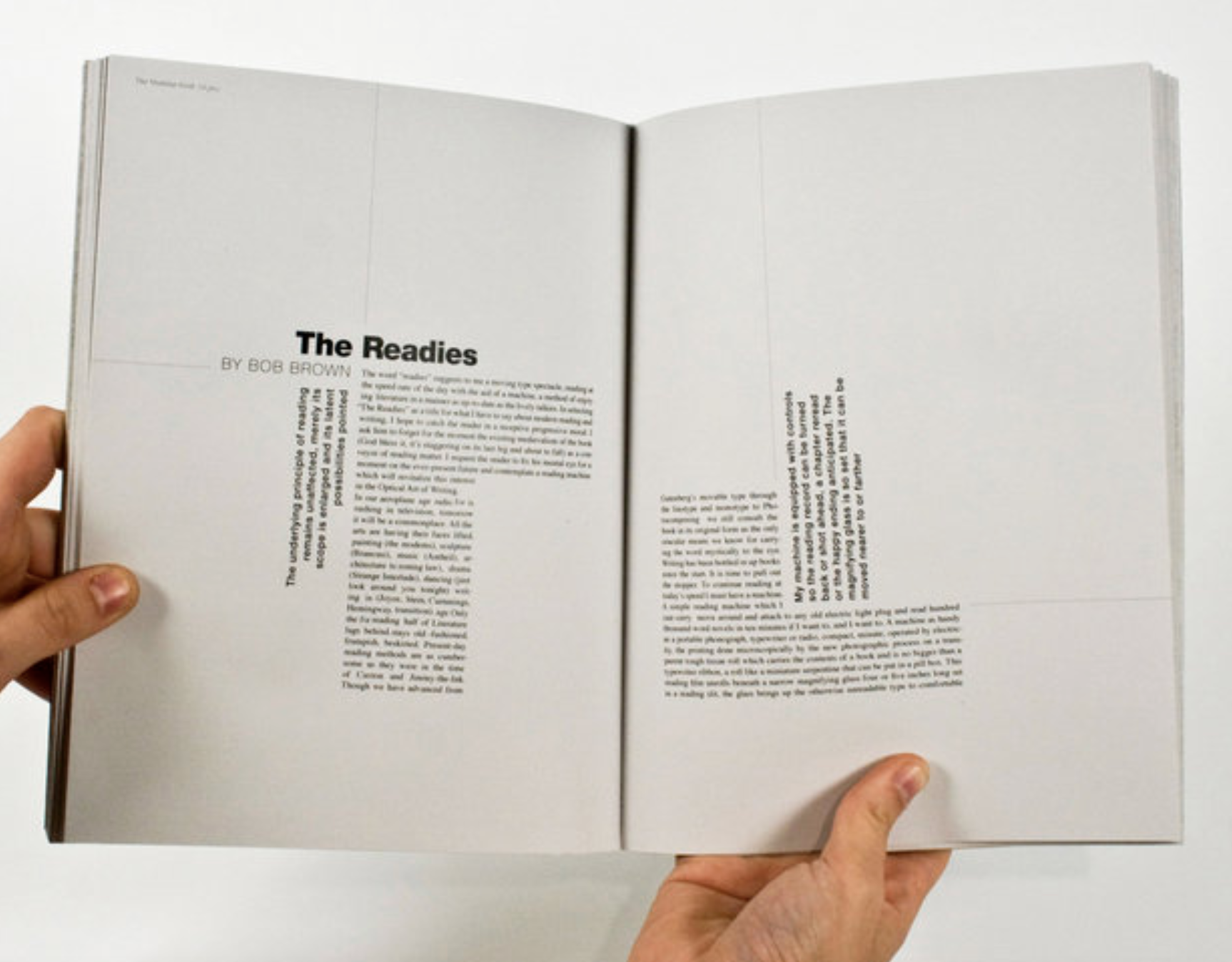
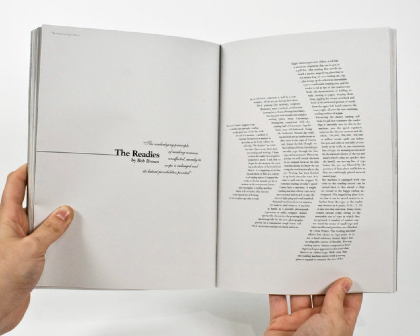
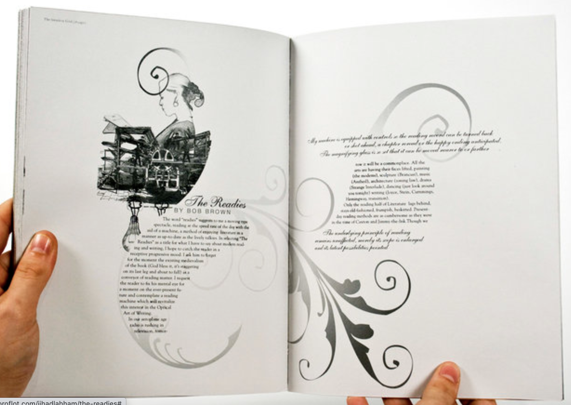
I wanted to see the difference between magazine layouts to a couple of design textbooks which I have. Of course the layouts for these are very different, these are more imagery based with the text in one single column rather than multiple. All these examples contain little text as they are more factual in relation to the images surrounding, other than the last image which is more textbook style than art book.
Grid layouts
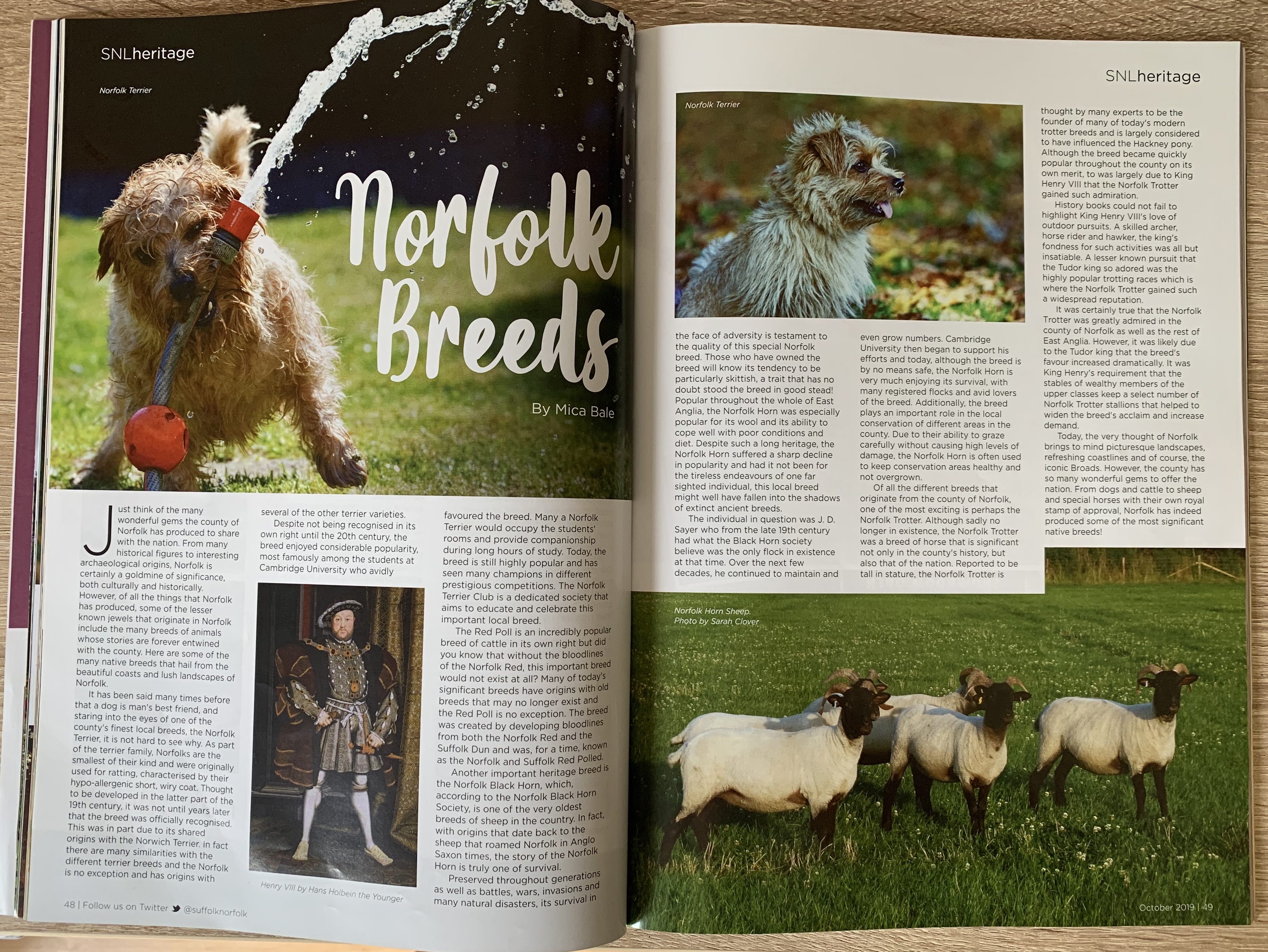
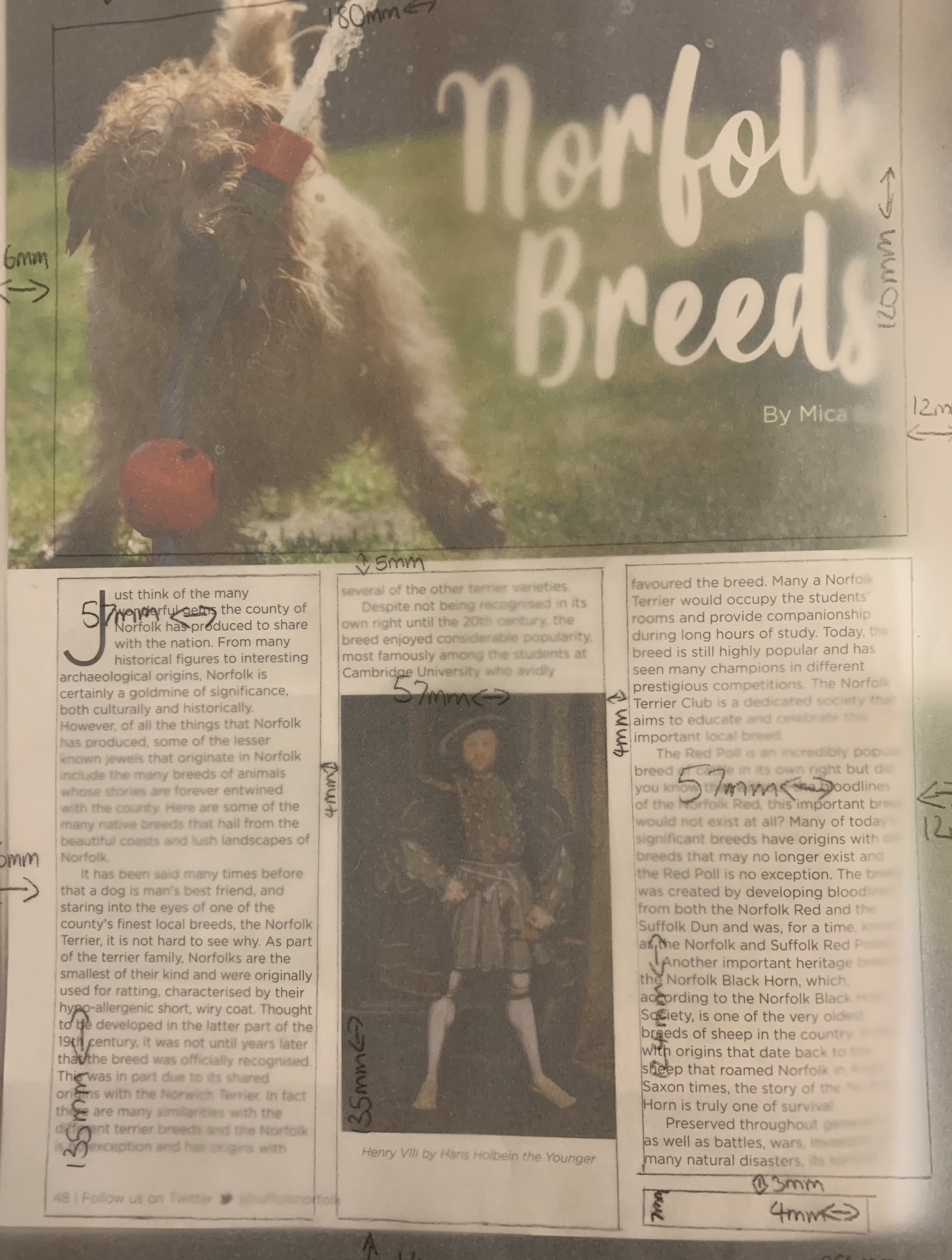
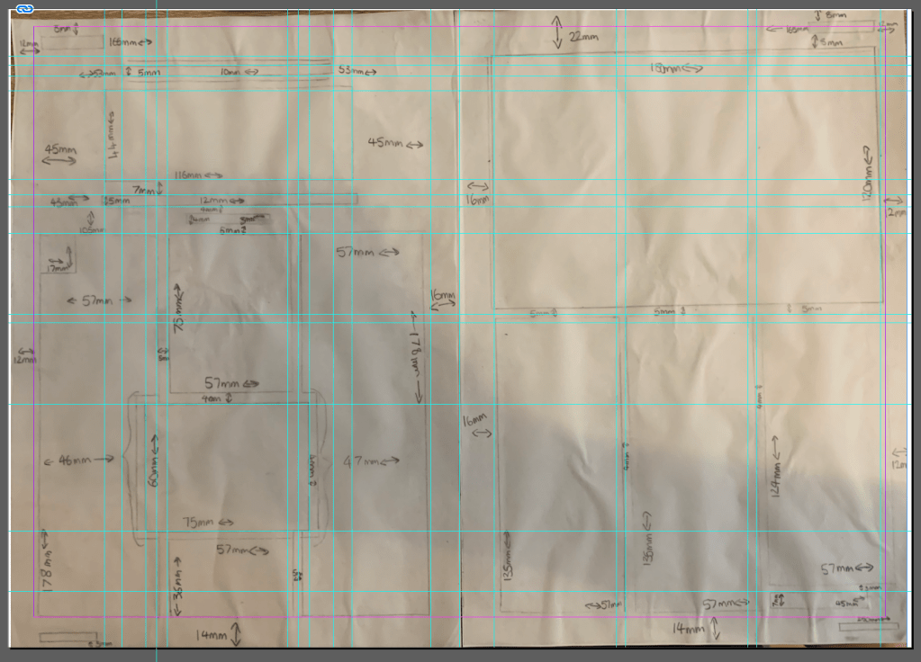
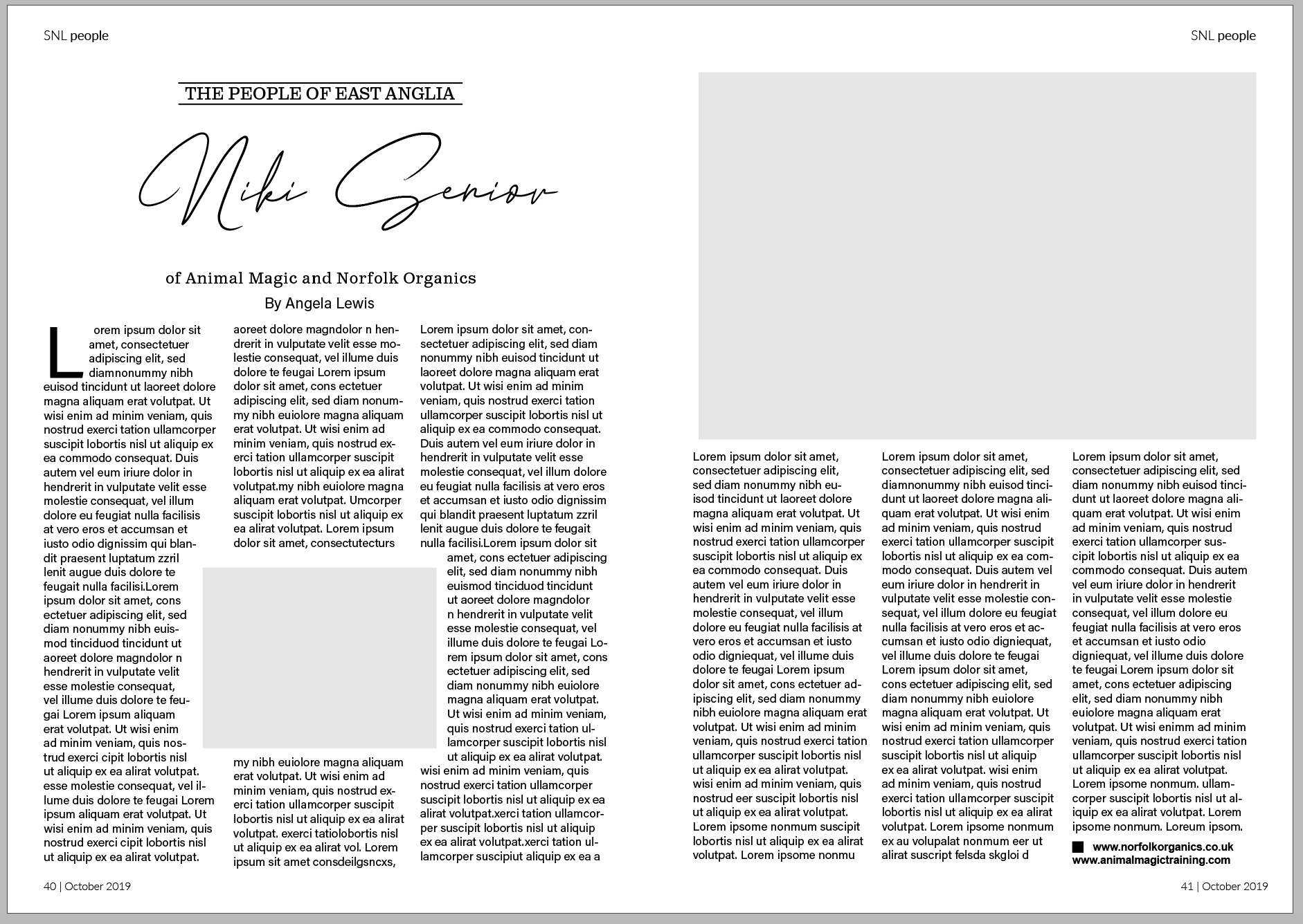
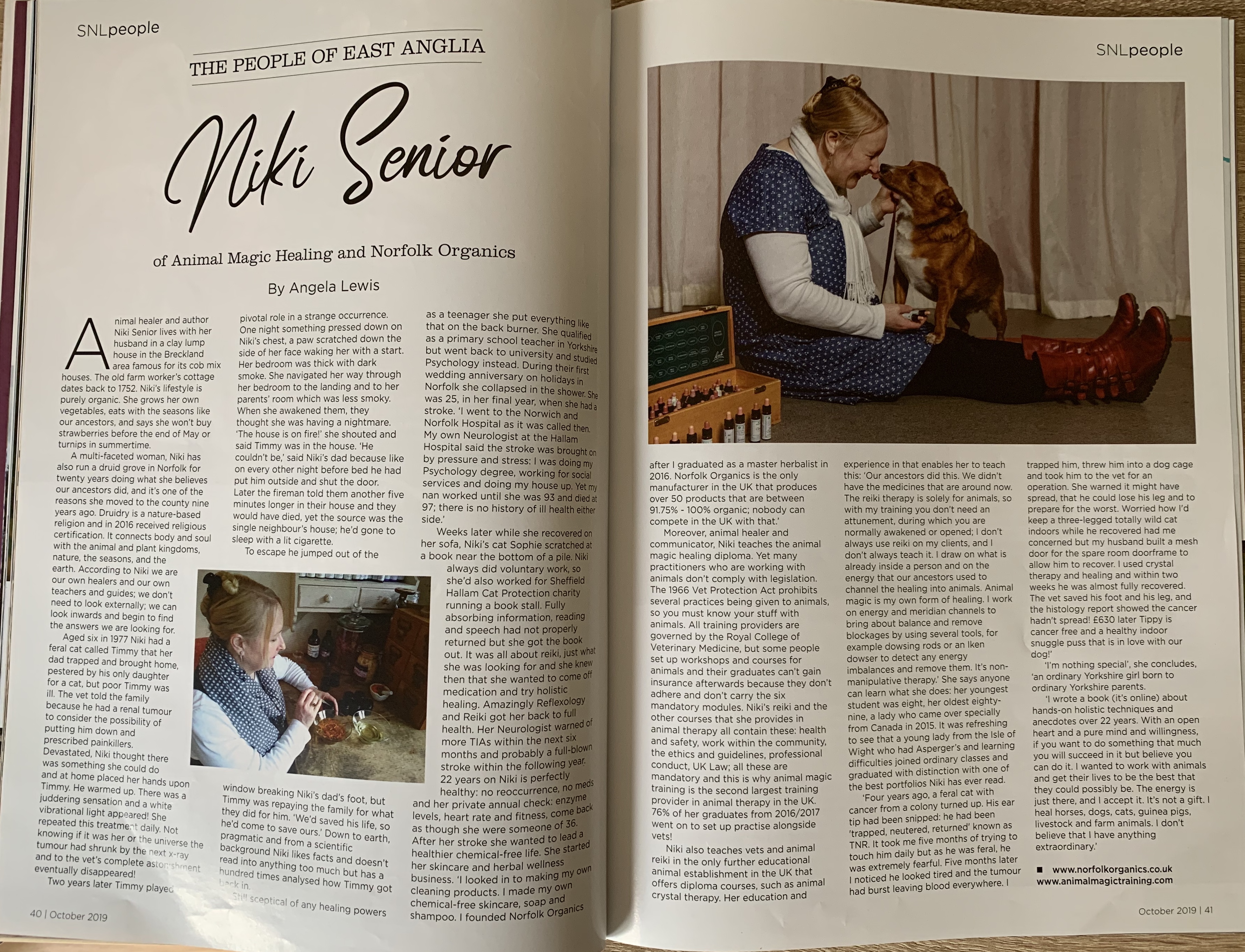
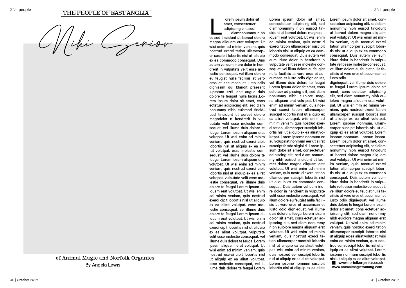
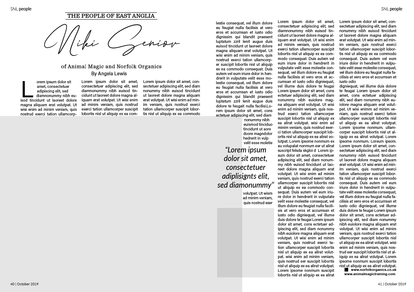
The design I wanted to look at the grid first is from a country life magazine called ‘Suffolk Norfolk Life’ October 2019. I liked this particular layout because of its clear structure and balanced images (small image on the same page as the title to even out the larger on the opposite page).
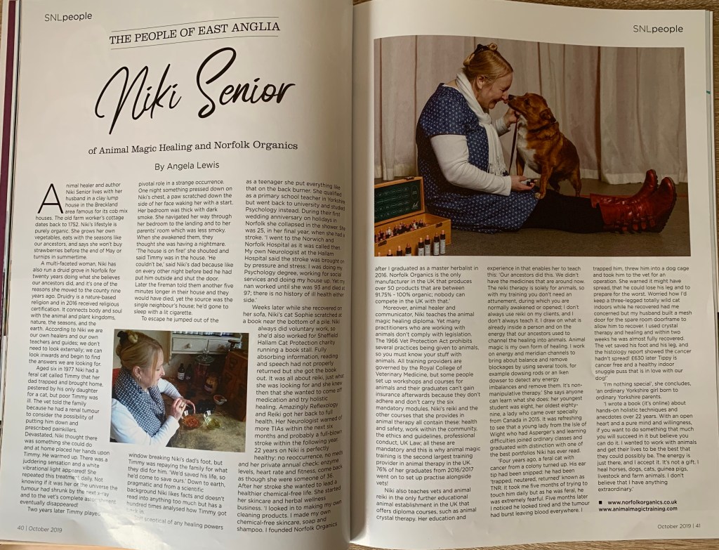
I started off by tracing the layout of this article measuring each column, image, title and margin to reveal the grid originally used. I had a slight issue of collecting the measurements around the inner joint of the magazine however soon overcome this by using the measurements of the front cover.
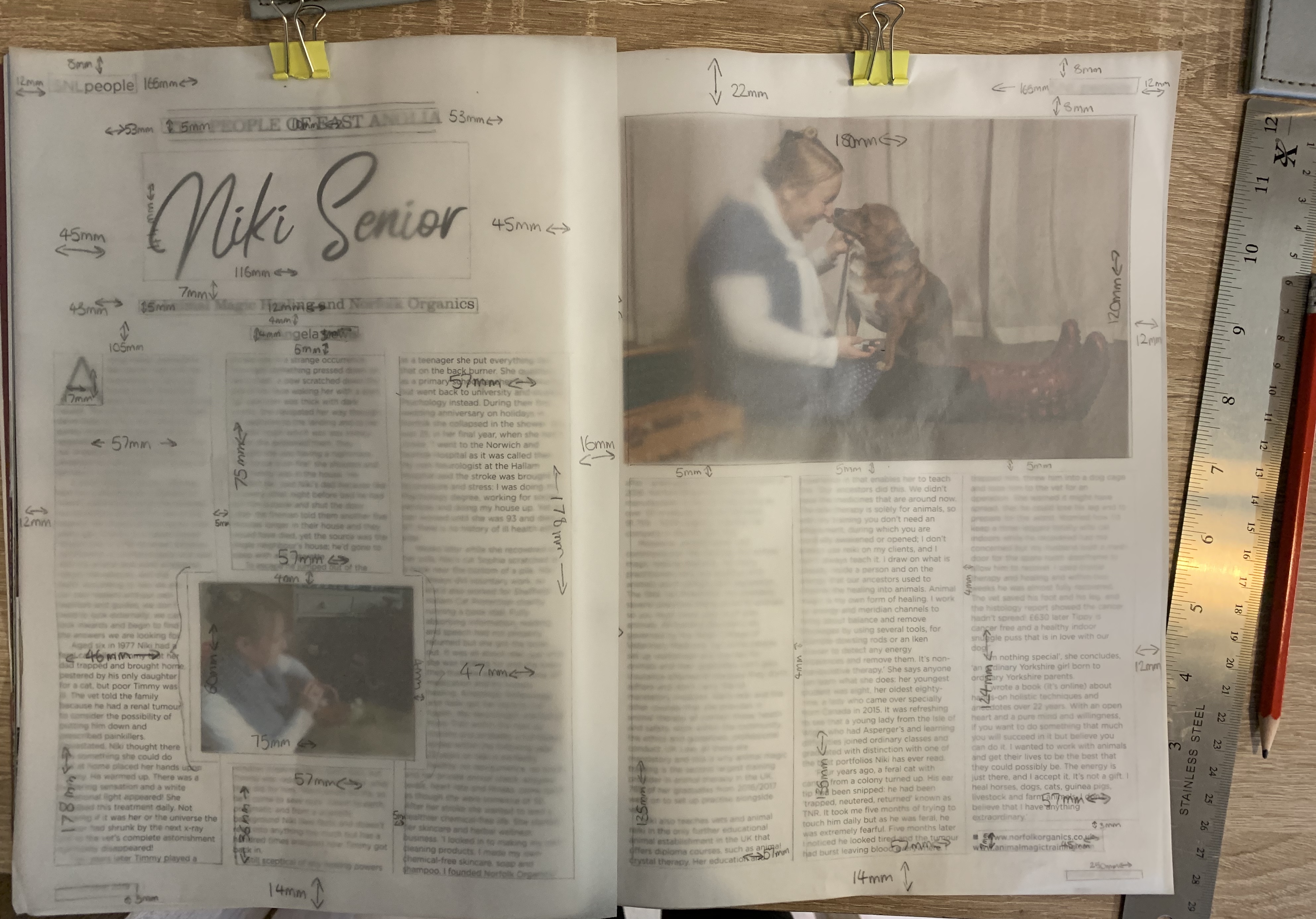
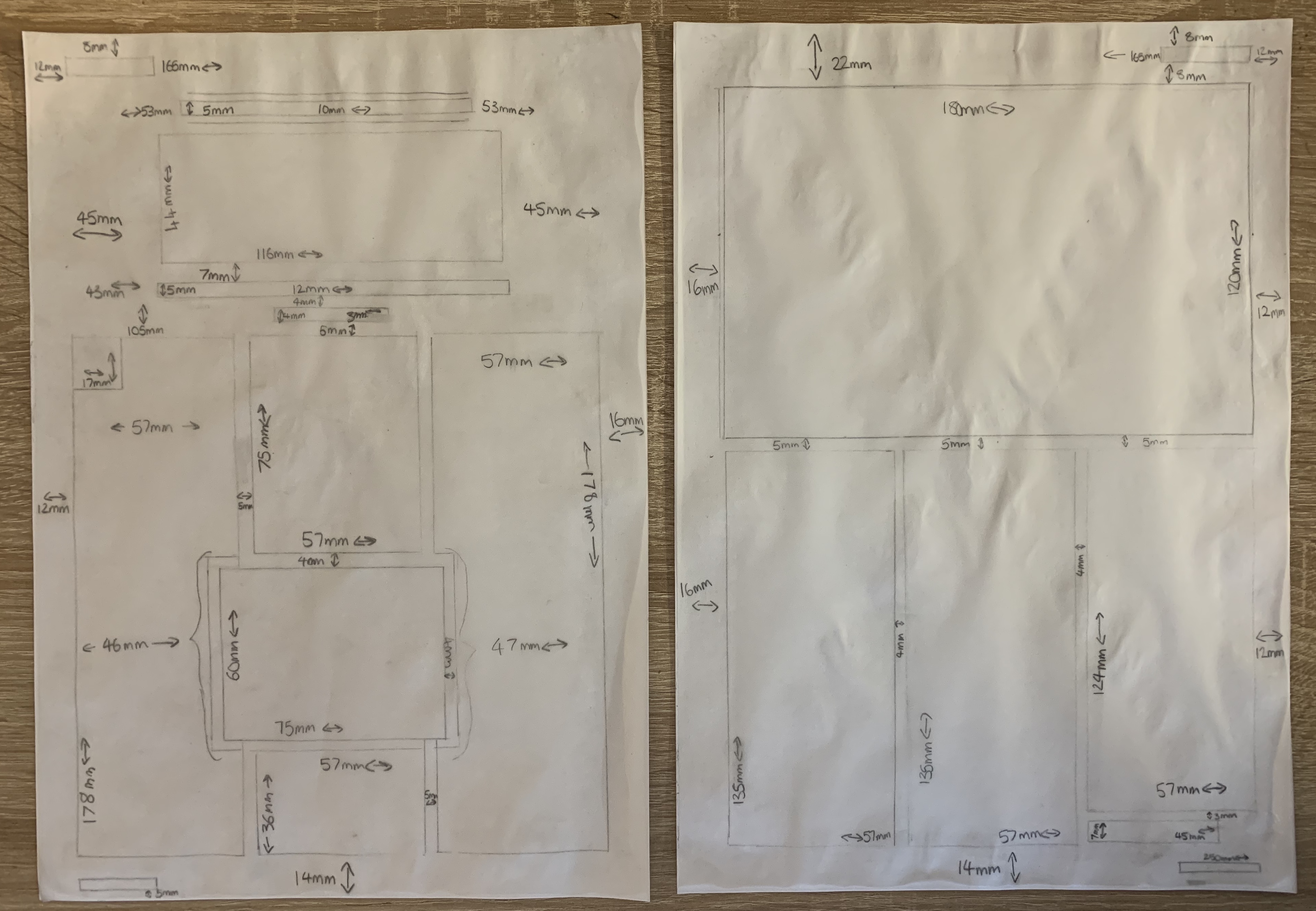
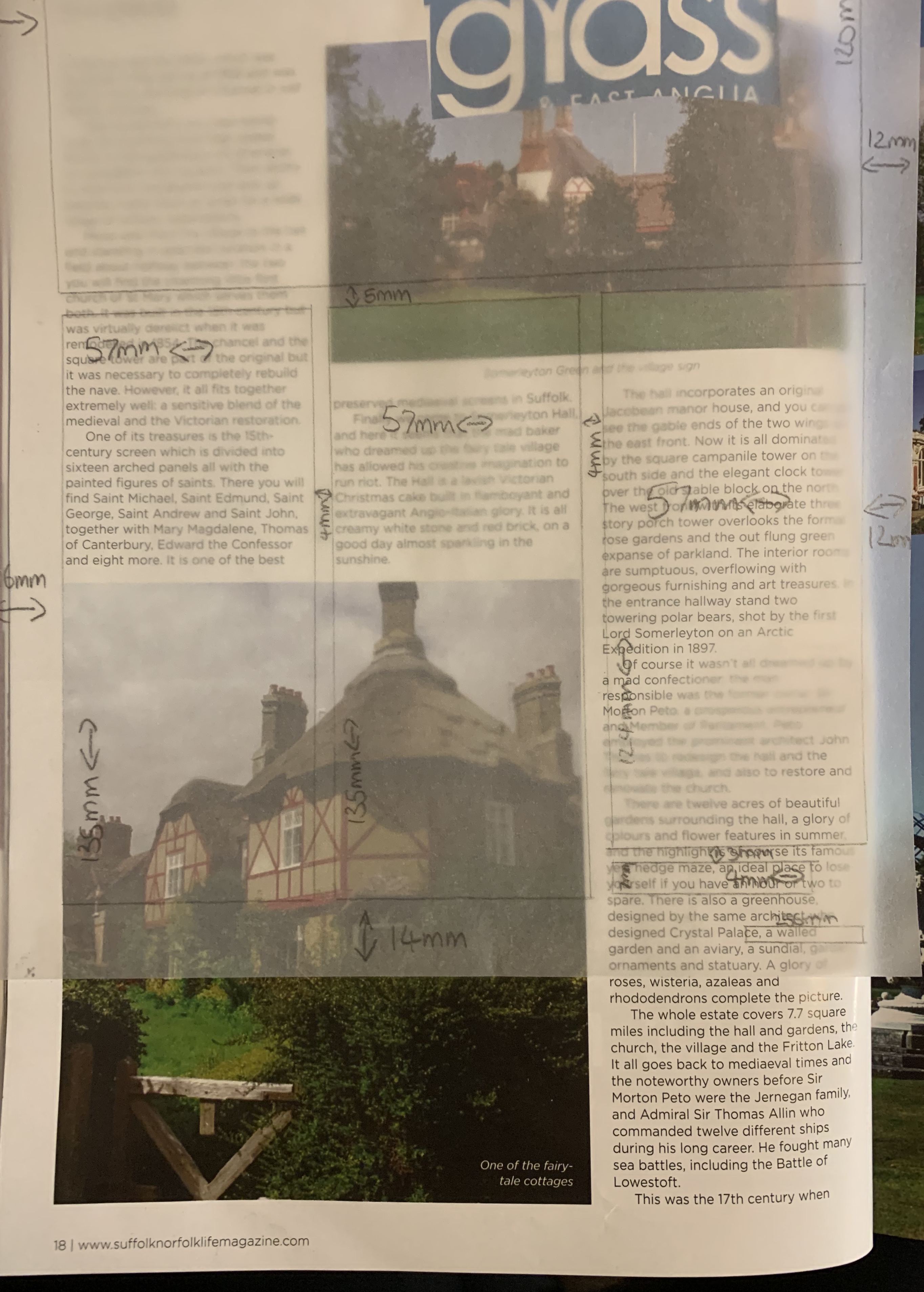
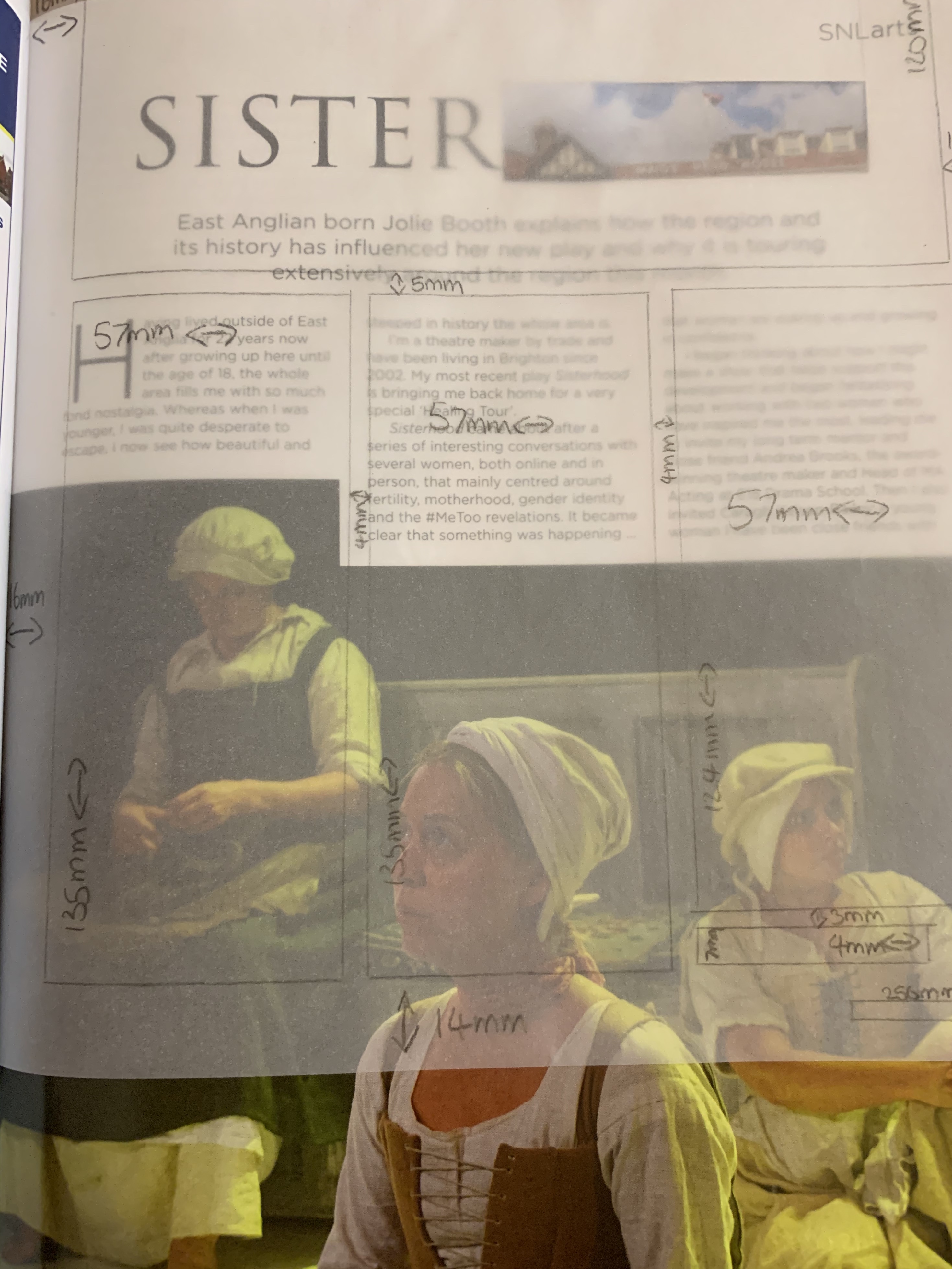
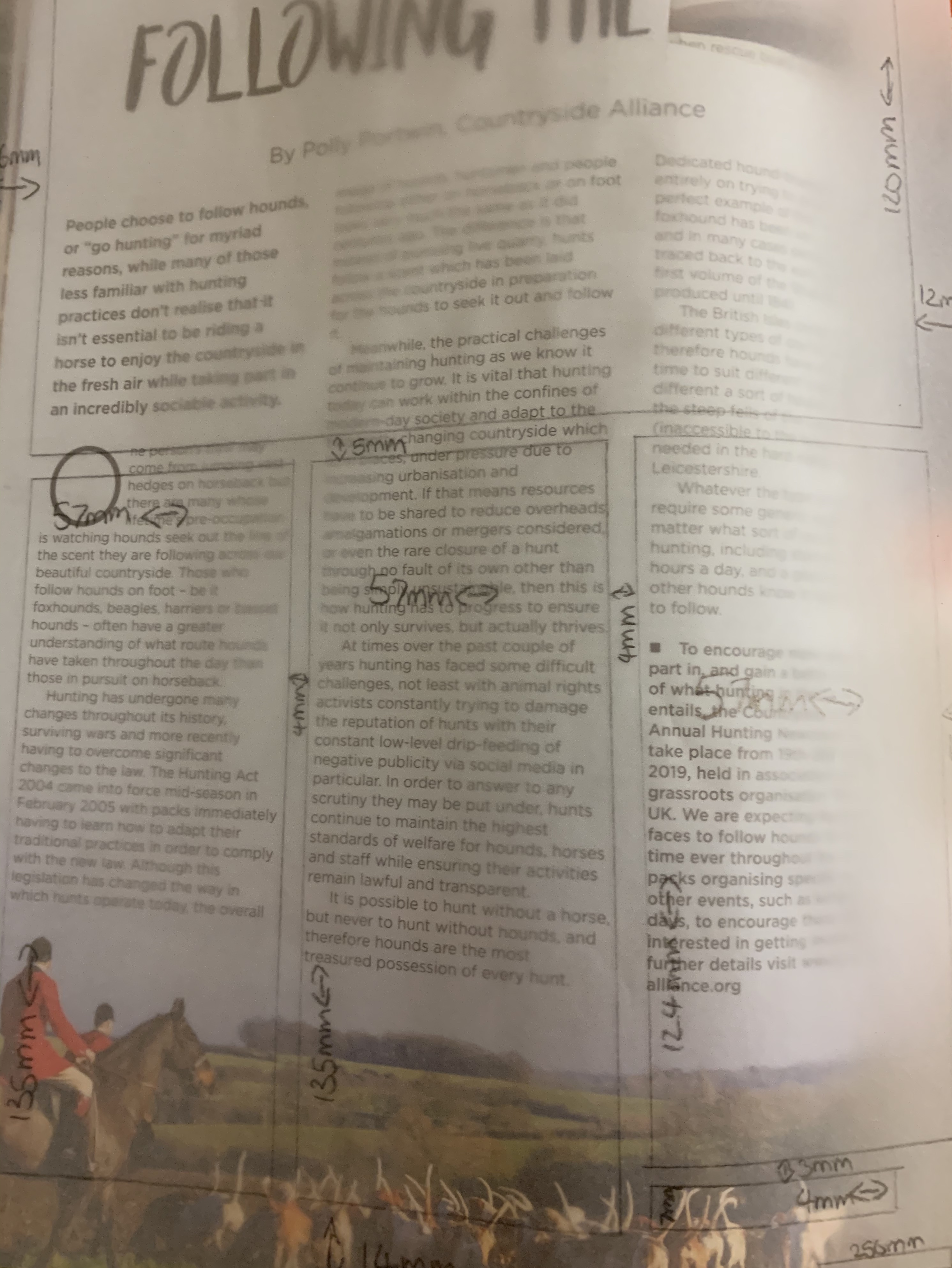
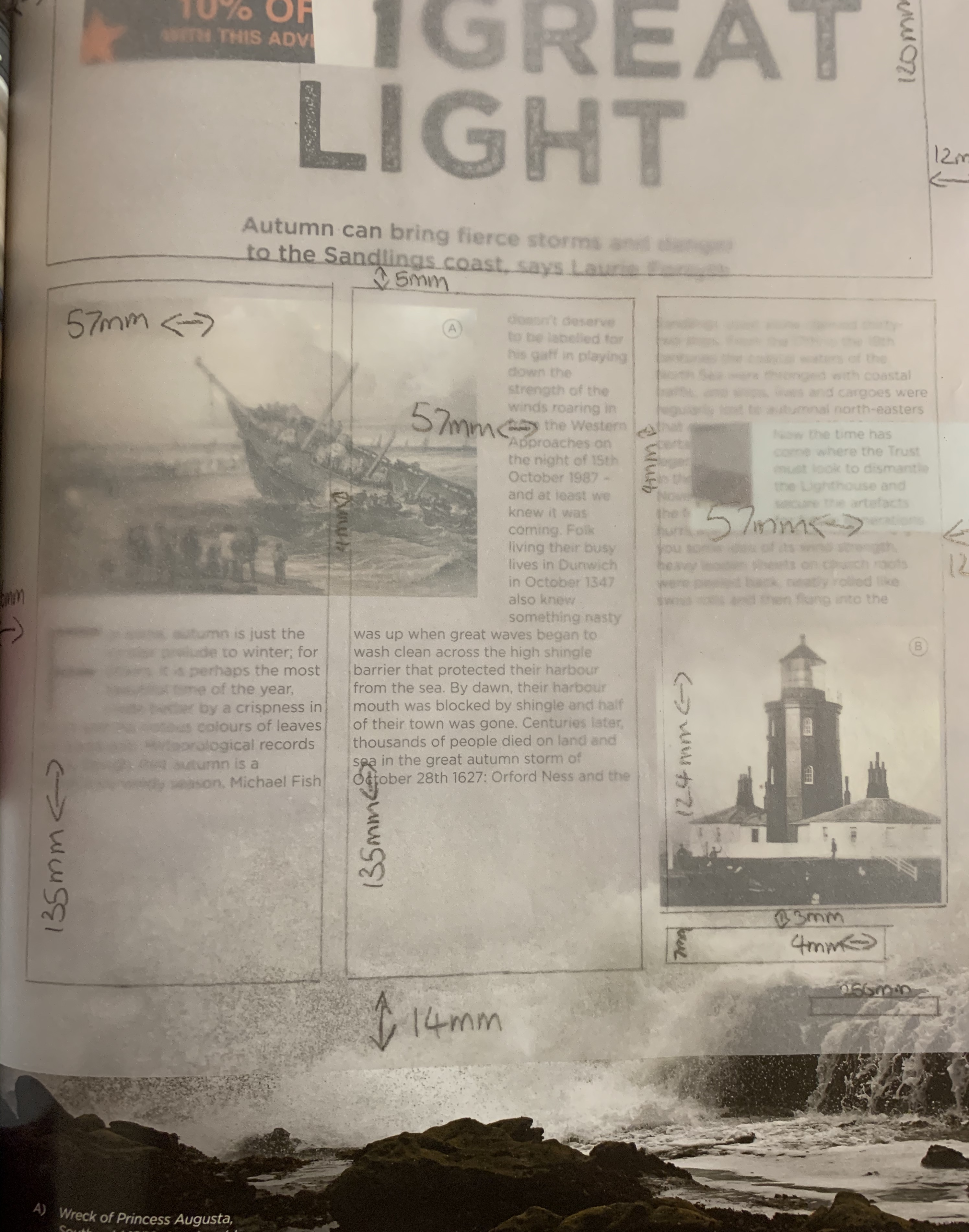
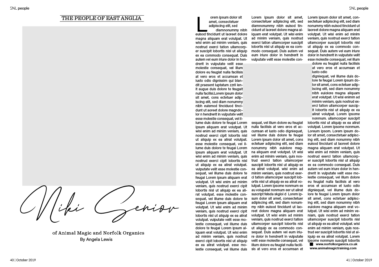
Flicking through the magazine I had noticed a number of the articles in this magazine held a similar grid guide with the columns in particular, making each article different by placing different size images in different positions, but this is something I hadn’t noticed prior to making this grid! Below you can see examples of different articles using the same grid.

Digital Mockup
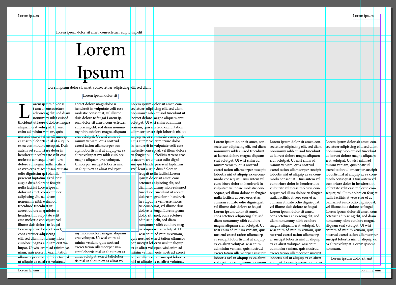
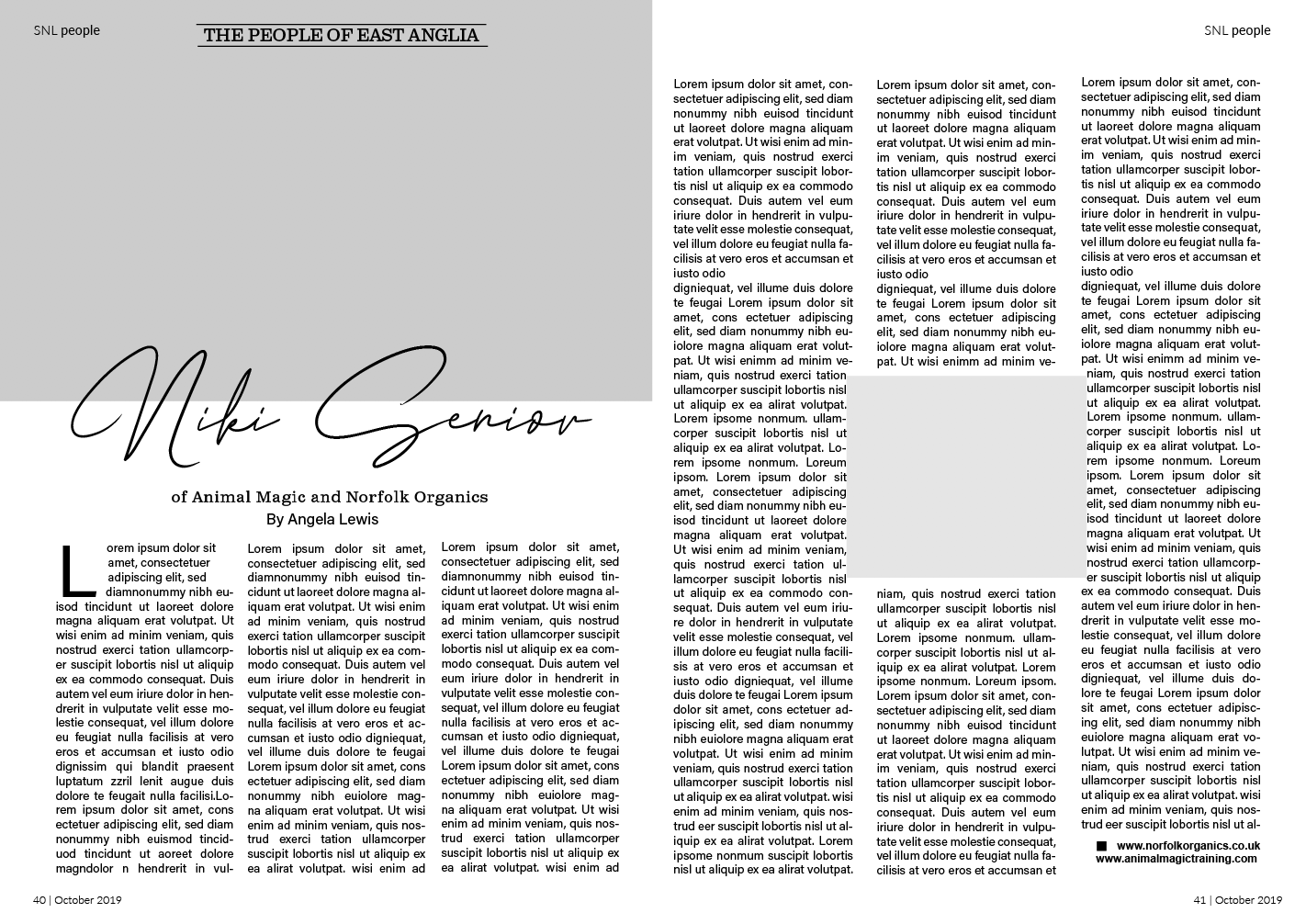
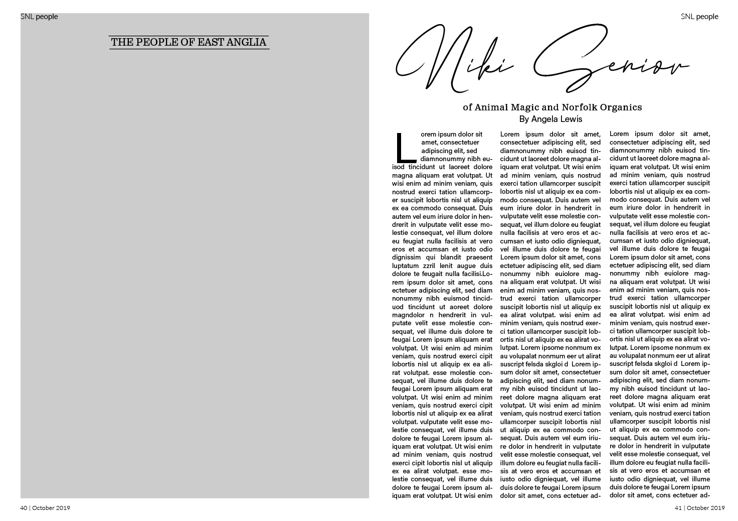
Using InDesign as this is a programme I’m not hugely confident in, so thought this would be the perfect opportunity to widen my knowledge around the software! Using the measurements I had made earlier along with rulers, I was able to create a digital version of the double page spread.
Although it looks very complex I found it easy to create this grid using in design, with the on screen rulers and and measurements beside I was able to do some quick maths to map out where guides needed to be placed. I uploaded a photo of my grid to help remember what went where but other than that InDesign provided a lot of help, making it easier for me!
Once the text boxes were in place and image boxes shaded in it quickly developed the structure of the double page spread and all fell into place.
Now that I had my double page spread layout complete I wanted to match the fonts used in the original. I used font squirrel and identifont to help find the typefaces.
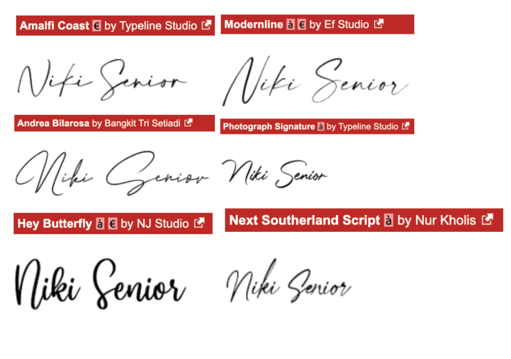
I had no luck locating the script font used for the title in this article, both font squirrel and identifont couldn’t give me a match. I decided to search through fonts on Dafont.com. Beside you can see a selection of similar fonts, I paid close attention to the formations of the letters with the strokes and widths. The font I feel matches best is ‘Andrea Bilarosa by Bangkit Tri Setiadi’. I successfully identified the subheading typeface as ‘Claredon’ and the body text as ‘NuOrder’.
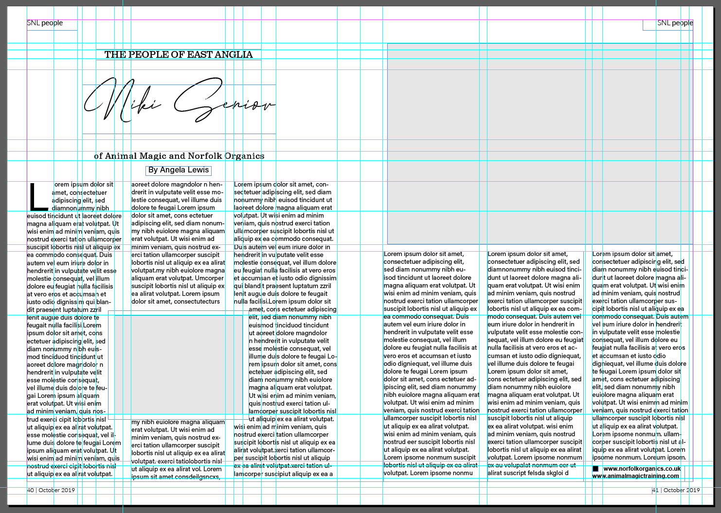
Here you can see my completed double page spread with typefaces matching the original.

Part 2 – Experimental layouts
After successfully recreating the double page spread, the brief now states to think about how to radically change the layout and what creative decisions could improve the designs around the grid.
I started off by sketching out a few ideas oh how to change the layout in more of a creative way.
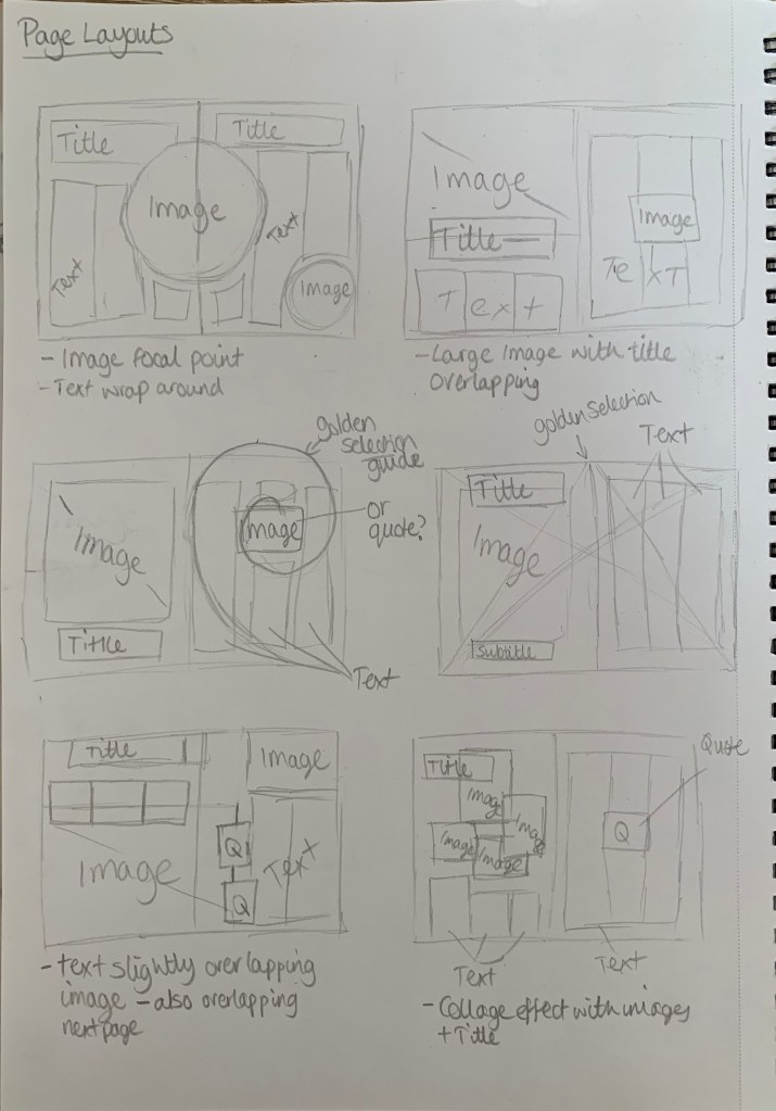
I kept in mind the golden selection whilst sketching out ideas, I wanted to be experimental with alignment and positioning. Although it was useful to sketch out some initial ideas, I do find it easier to experiment on screen to see what works best and is most pleasing to the eye. With saying that I jumped straight into InDesign to start experimenting with different layouts.
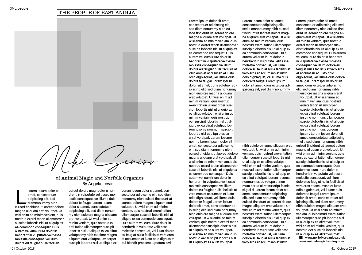
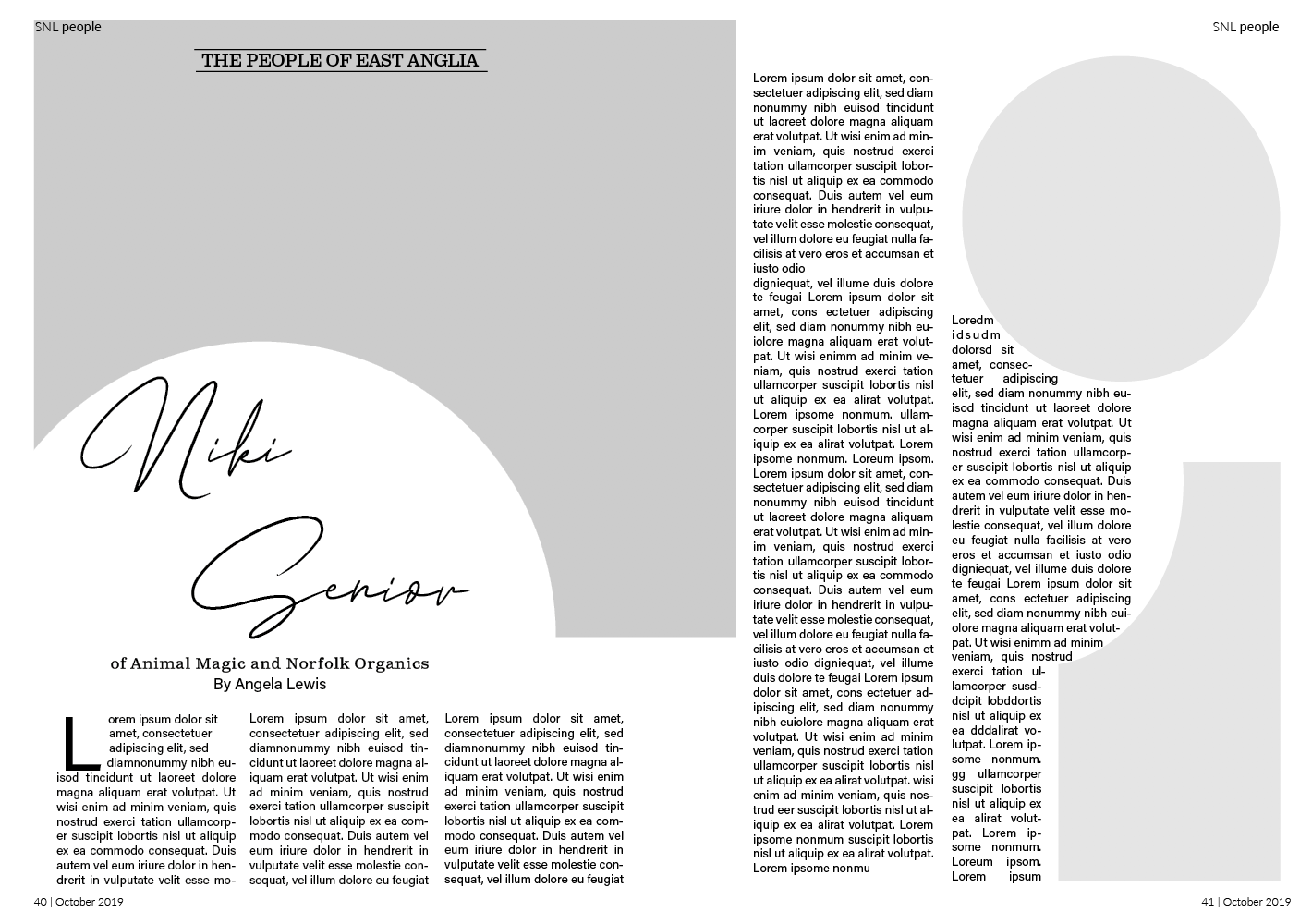
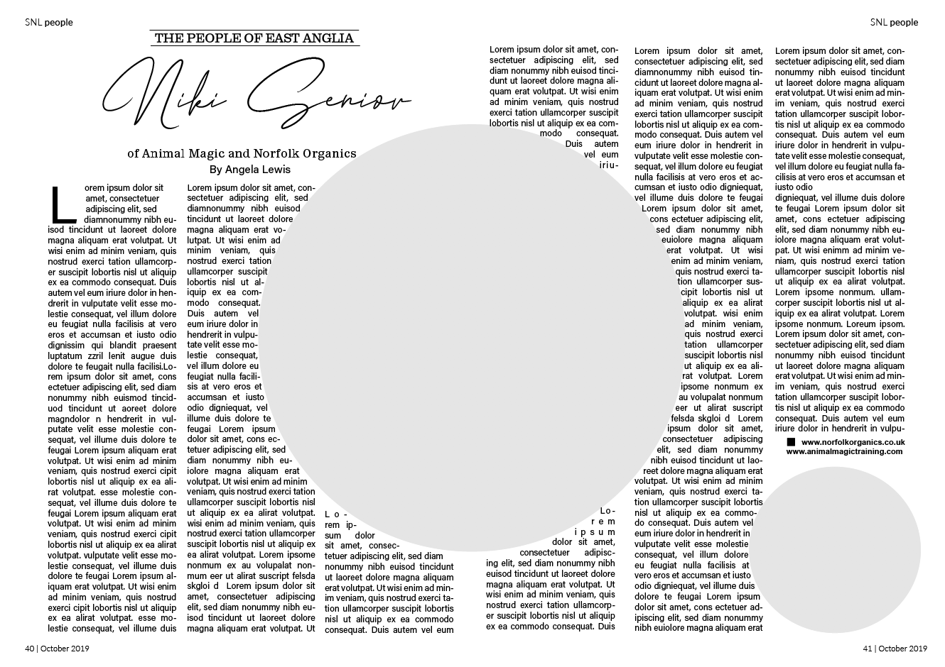

During my experimentation I aligned the columns, I felt this gave a cleaner appearance especially in the more complex layouts. I enjoyed playing around with the layouts however I did feel slightly challenged at times on how to make the double page spread more interesting. A few of the designs above didn’t radically change the layout however I did still keep in mind the type of magazine this came from and wanted the redesign to still be fitting with this genre.
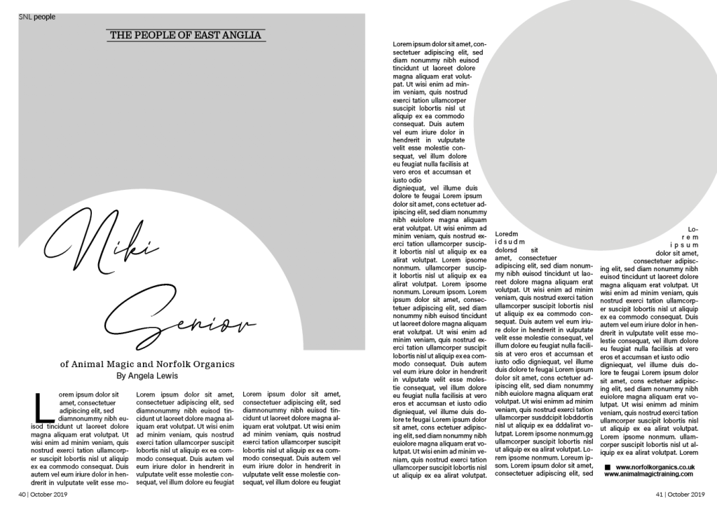
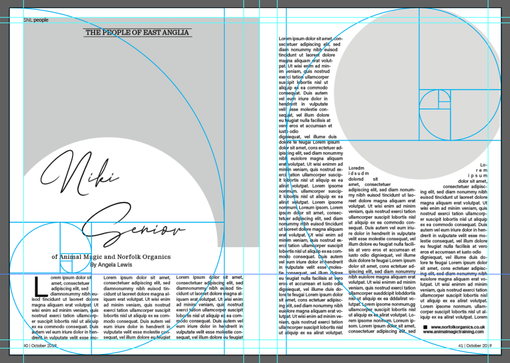
The layout above is my favourite redesign, I like the use of the circular image/cut out – however for the main image on the first page, the image choice could be an issue depending on how much image is lost from this cutout?? I aligned the columns to give a cleaner appearance, especially around the small circle. I followed the golden selection with this design for the grid creating a clear spiral on both pages as seen on the left.
Reflection
I enjoyed this exercise, I glad I took the time to fully understand the golden selection and even use the guide in my redesigns. At times I felt it challenging to get motivated however looking back I feel very positive about my redesigns. The exercise had helped me realise the importance of grids and how they can improve designs.
