
Brief: Create two books explaining and exploring the typographic and layout principles you have researched in this section.
Book 1: My Little Book of… Good Typography
Using reference material that you’ve gathered throughout the exercises and research tasks in Part 3, design a book which explores traditional ‘good practice’ in typography. What is readability and, as a designer, how can you aid it? Visually explain the typographic principles that we’ve touched on in part 3, such as type size, leading and line length. For example, you could demonstrate kerning by creating a page which looks at letter combinations applying this principle. Equally, explore good layouts and use grids to help support and design layouts that feel easy and engaging to read, and look at it. Be creative in how you do this, developing a range of options and possibilities. Show off your good typography skills as well as talking about what makes good typography in your text. To support this, find quotes and type rules by other typographers and examples of good typography within book design you can present and talk about. Your booklet should be a celebration of good typography, whatever you think that is.
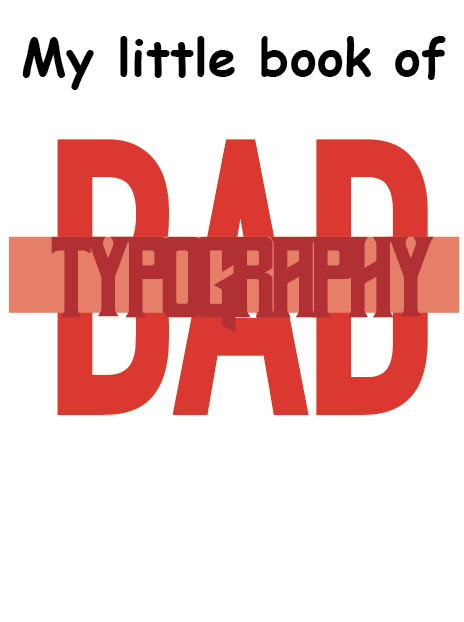
Book 2: My Little Book of… Bad Typography
The rules surrounding what constitutes ‘good’ typography are entrenched in tradition and convention, as you demonstrated in book 1. Having looked at ‘the rules’ surrounding readability and legibility, now is your opportunity to break them! Be inventive and experimental in how you explore what might constitute ‘bad’ typography. For example, negative leading, too-long line length and ‘inappropriate’ application of typographic principles may produce visually jarring and uncomfortable results. what does ‘bad typography’ mean to you and how might it manifest itself? Express you ideas in a visually imaginative way within your second book. This is an opportunity to be playful and push your design layouts, typography and ideas to the limits – celebrate bad typography through your designs and content. Again, find quotations you can work with or examples of bad typography to draw on.
Your books should each take the form of a simple eight-page booklet – folded, stapled or stitched. Design the cover and contents for each. When creating your content for both books, be aware of your audience, and how you might want them to engage with your content. While both these books are about typography, make sure you also include images within the text. These could be your own illustrations, photographs, or stand alone typography pieces that accompany your text.
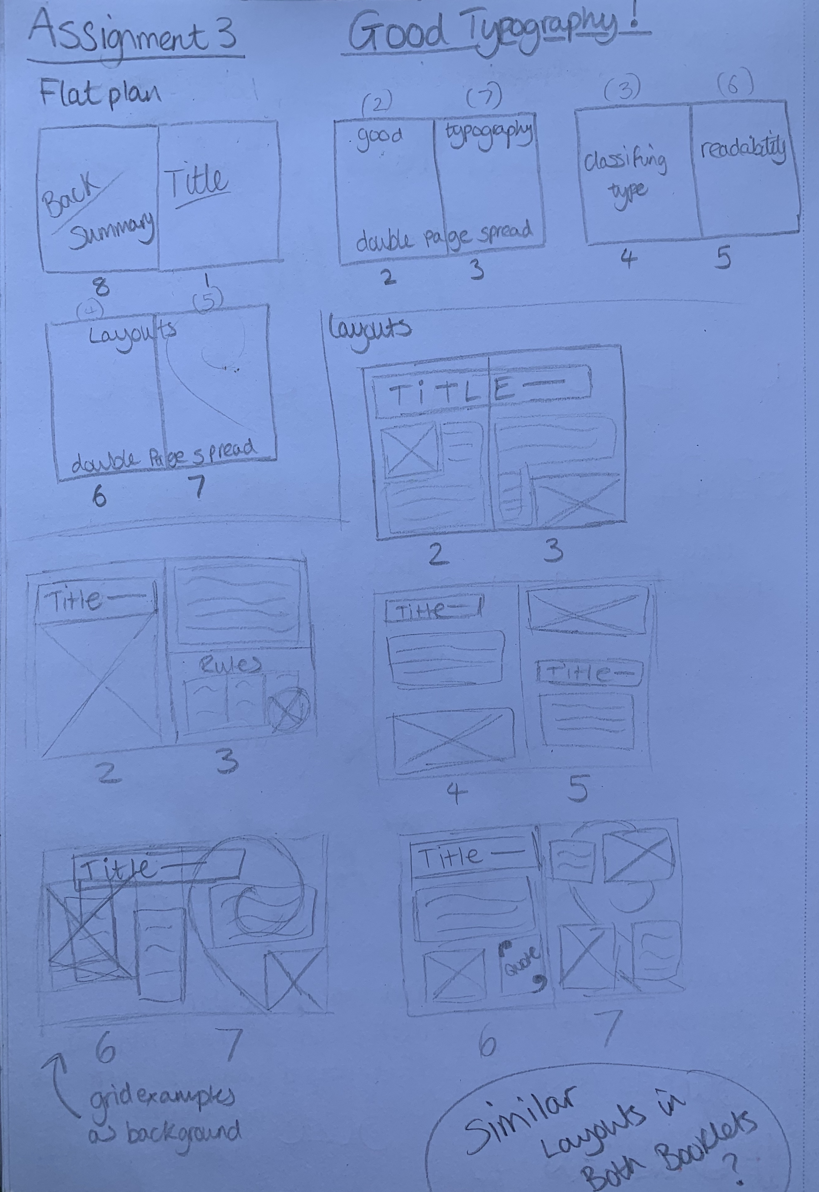
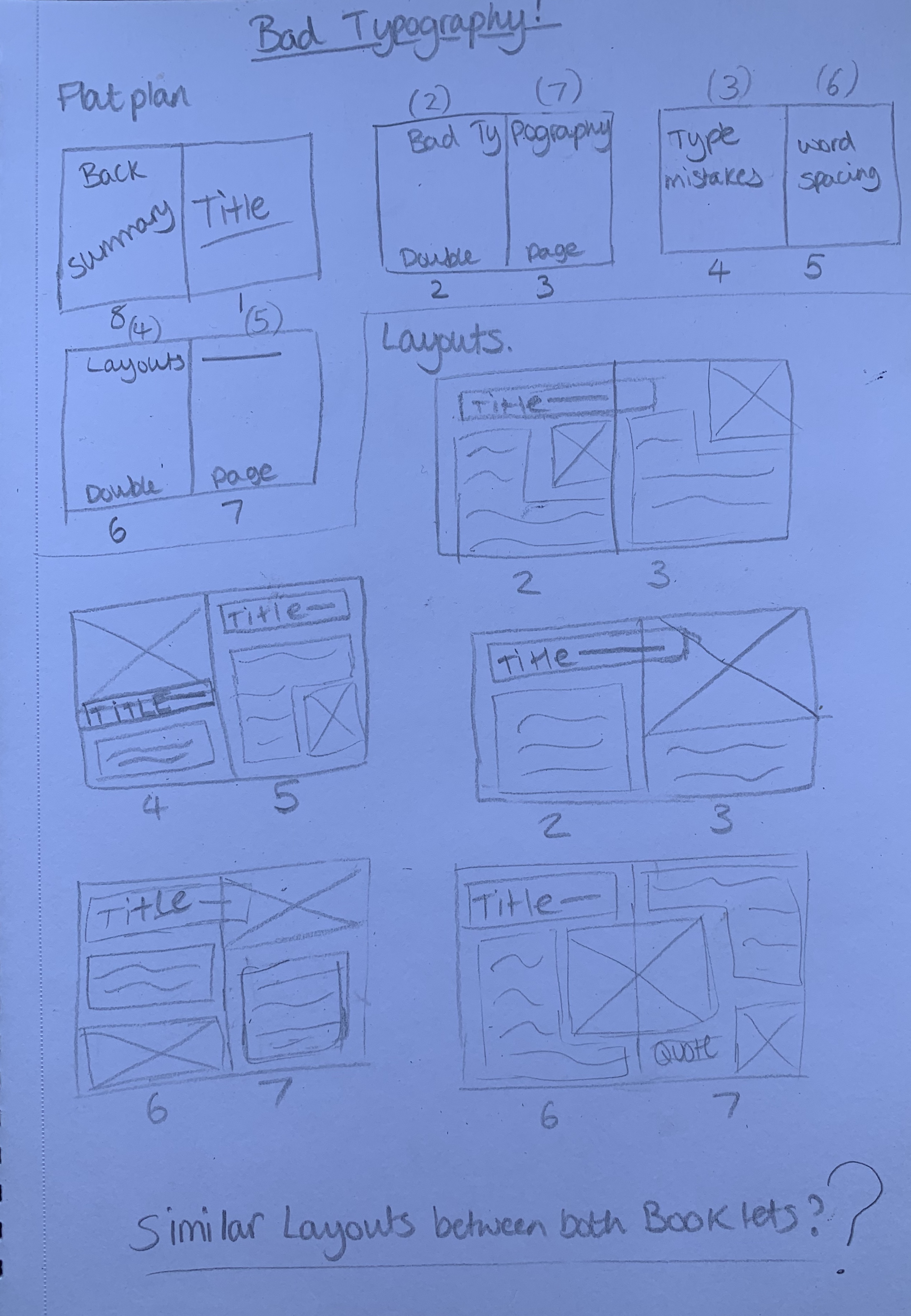
Use a flatplan to organise your content and indicate where important text and images occur, on a recto (right-hand) or verso (left-hand) page, or as a double page spread. Suggest images by a crossed box, as in the example for ‘front cover’ in the diagram on the previous page. These crossed rectangles indicate image boxes in desktop publishing (DTP) software, and are used in drafts and sketches to signify image material. There is no need to go into detailed drawing regarding text or image material at this stage. Text can be indicated by a series of thick horizontal lines, with main headings sketched in. Use the flatplan to familiarise yourself with the structure of a booklet. Note the blank pages and how they organised to complement the preceding or following page. Note the extent (number of pages) in the book and whether it has been printed in signatures, or sections.
Analysing the Brief:
This brief is split into two parts;
Book 1 : Good Typography – Design an 8 page booklet on good typography using the work gathered from previous exercises.
- Objective – Create a booklet based on Good Typography explaining and exploring the typographic and layout principles you have researched in part 3.
- Format – 8 page booklet, folded/stapled/stitched. Design cover and contents for each. Imagery and quotes as well as type
- Other information – Visually explain typographic principles, show off your good typography skills as well as talking about what makes good typography – a celebration of good typography. Include title, rules & quotes
- Target Audience – Everyone (particularly people with interest in design)
- Keywords from brief – Reference materials, readability, type size, leading, line length, demonstrate principle, grids, quotes
Book 2 : Bad Typography – Design an 8 page booklet on bad typography. Break the rules surrounding readability and legibility.
- Objective – Create a booklet based on Bad Typography. What does bad typography mean and how it manifests itself. Break the traditional typography rules.
- Format – 8 page booklet, folded/stapled/stitched. Design a cover and contents, use imagery and quotes as well as type.
- Other information- Be inventive and experimental in how you explore what mights constitute as bad typography.
- Target audience – Everyone (particularly people with interest in design)
- Keywords from brief – Inventive, experimental, negative leading, too long line length, visually jarring, playful
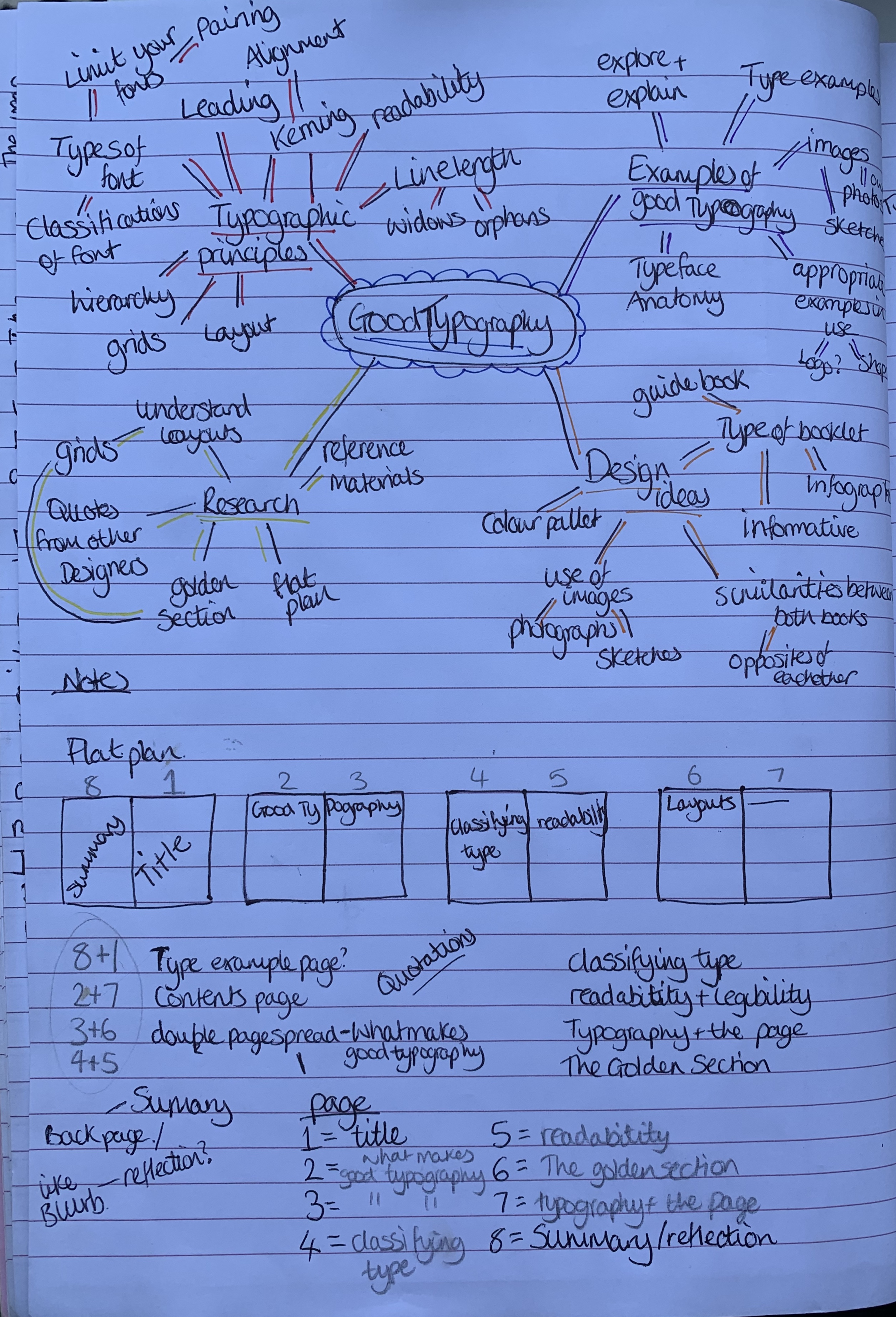
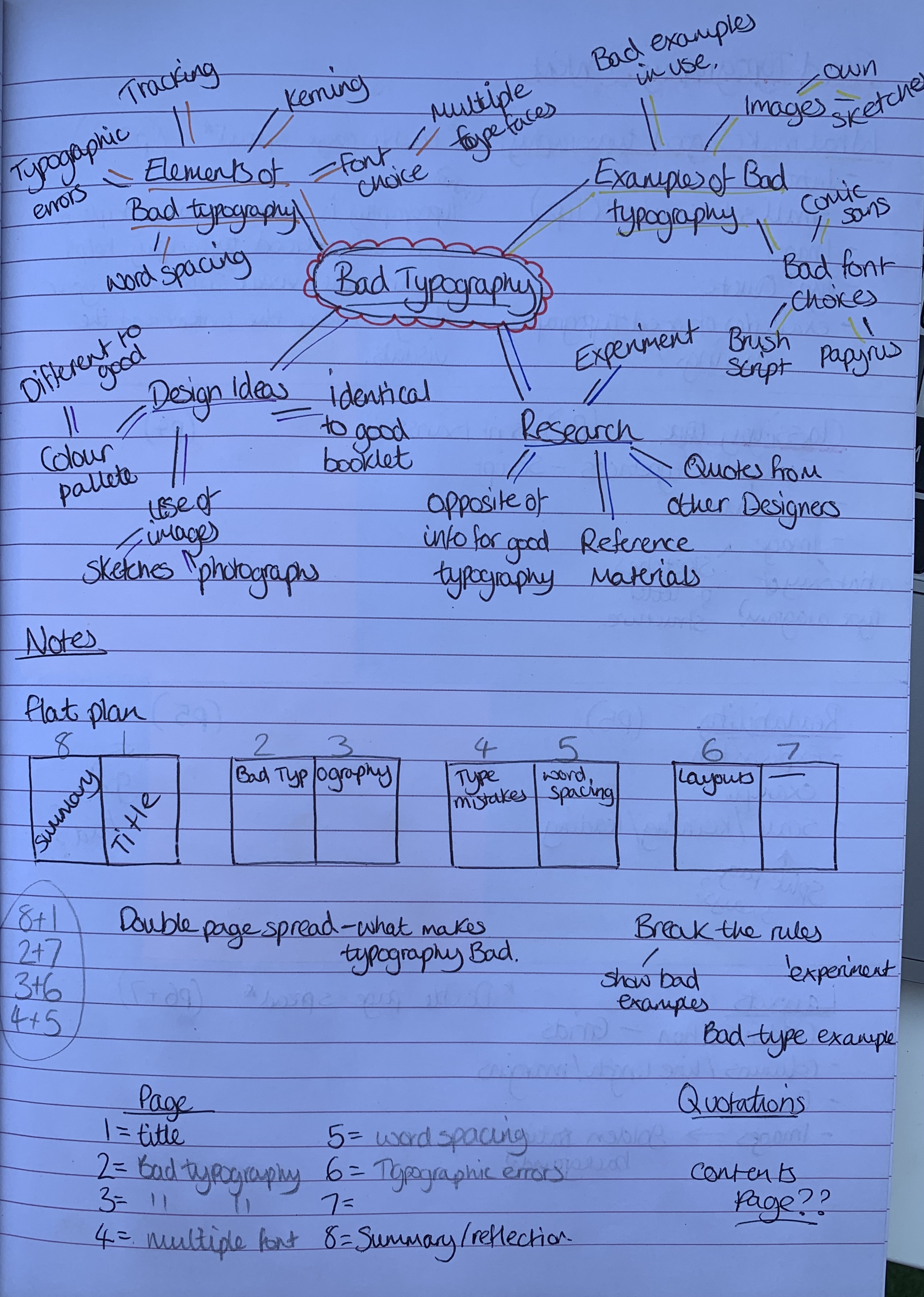
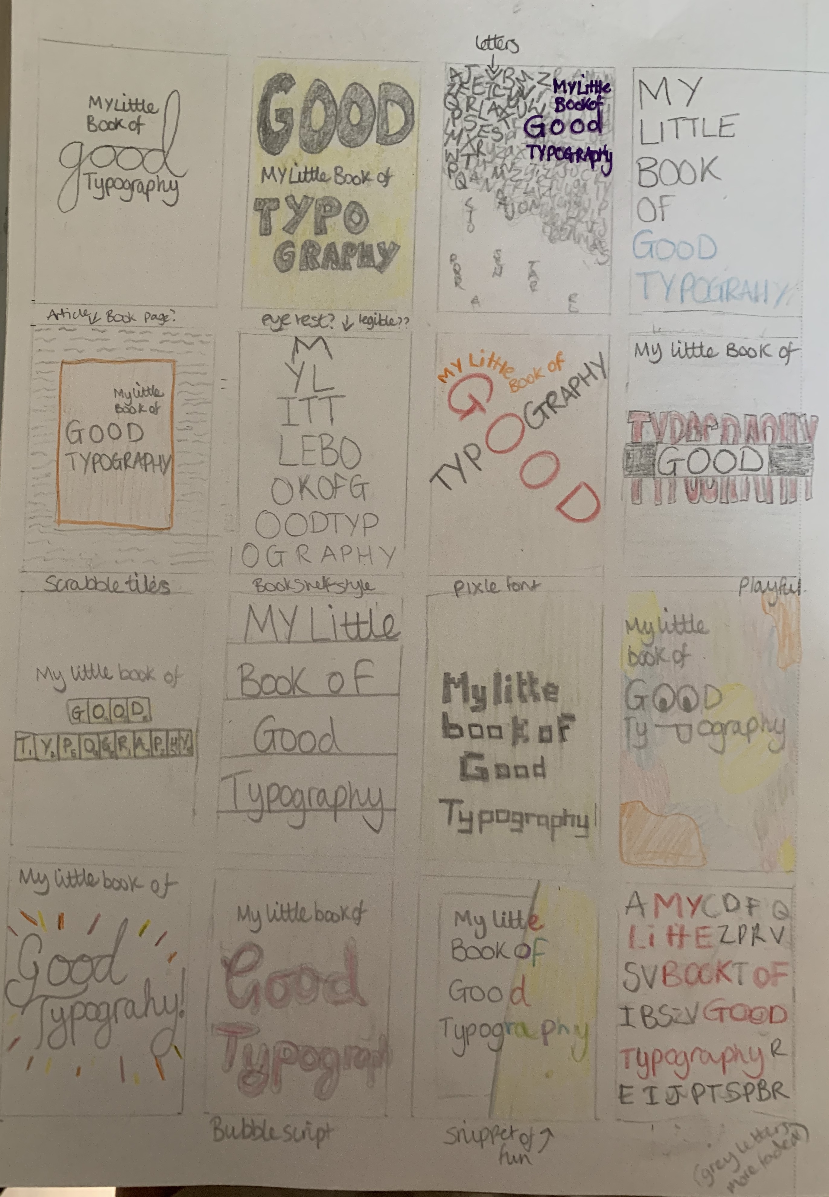
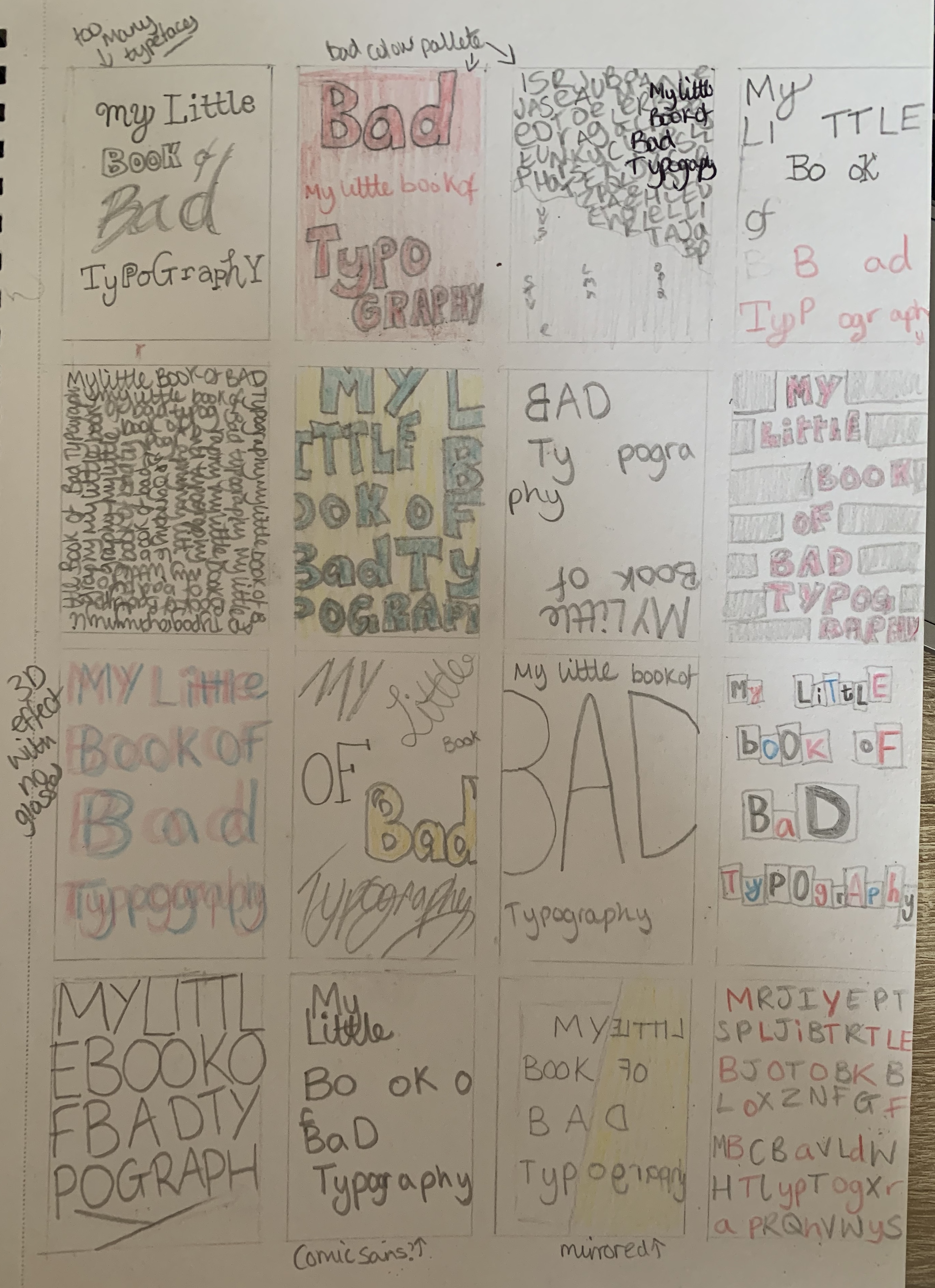
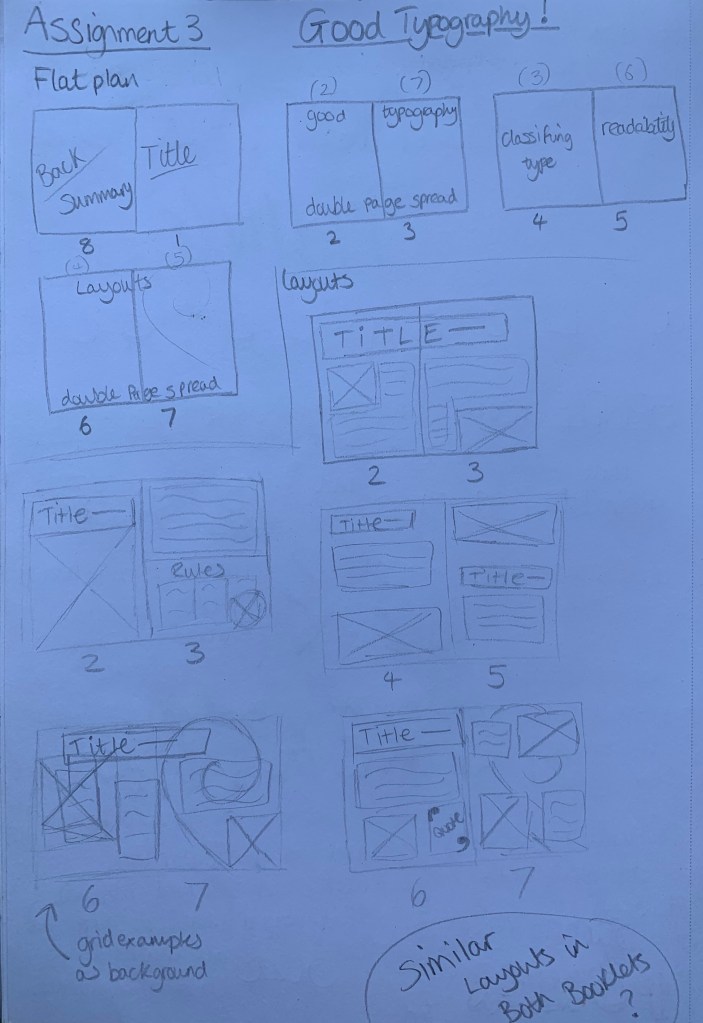
I started off by creating mind maps for both the good and bad booklet to stimulate ideas. I referred back to one of my folded booklet mockups from part 1 to help me visually see my booklet in order to start creating my flat plan.
I went straight in with planning my flat plan and deciding what topics my contents would cover. I decided against including a contents page as the booklet is so small, I felt it wasn’t necessary.
Now I had a plan to follow I decided to start my research for the chosen topics and also for inspiration from other designers.
Research
I re visited all of part 3 and made notes which I felt would be appropriate for my content, alongside doing further research reminding me of important factors used within typography.
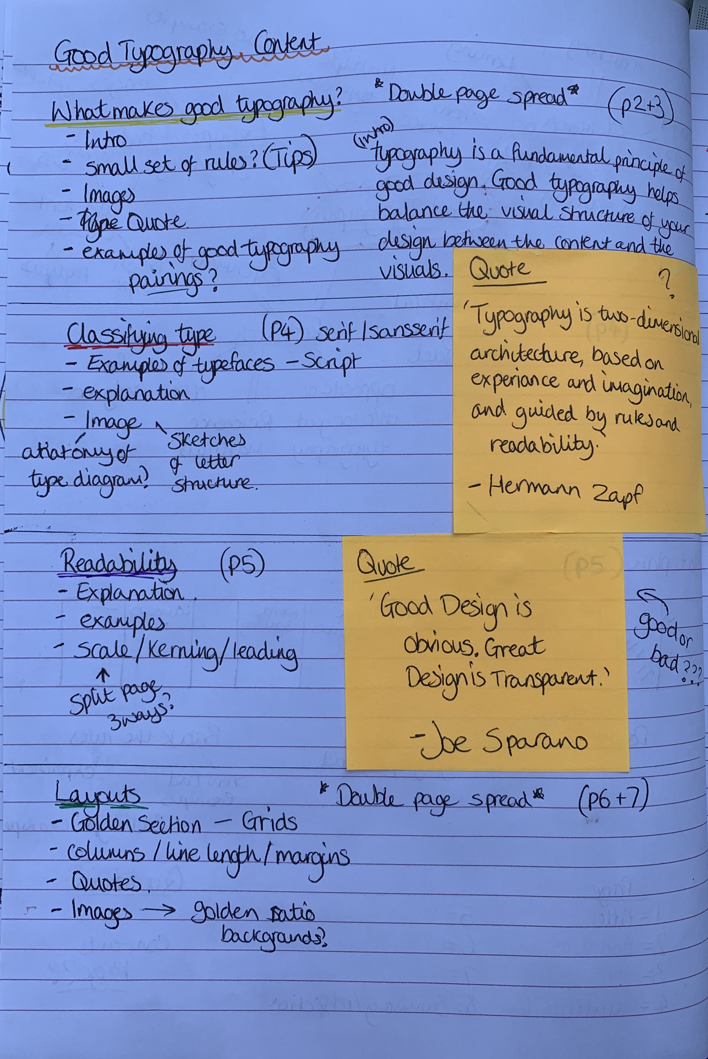
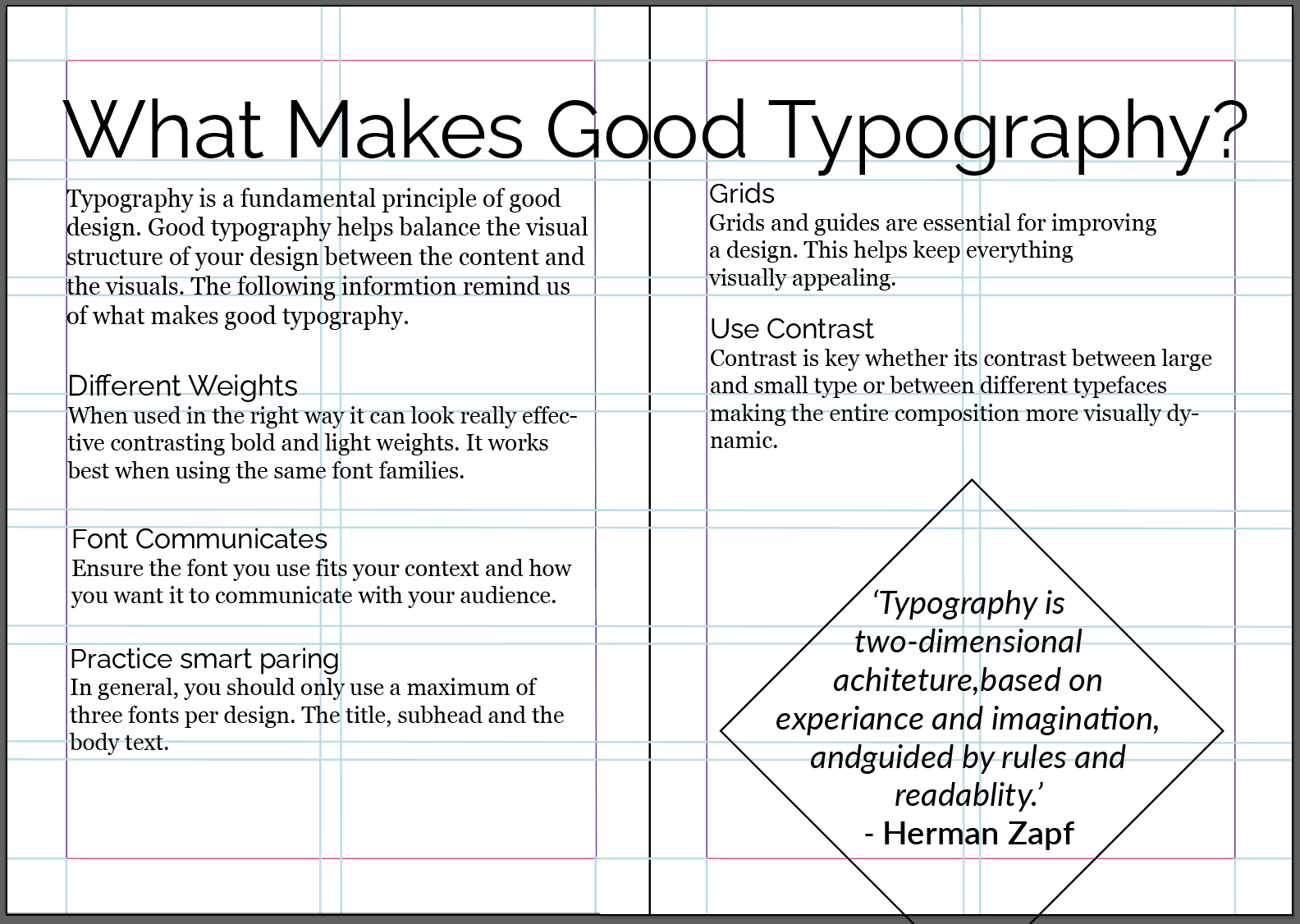
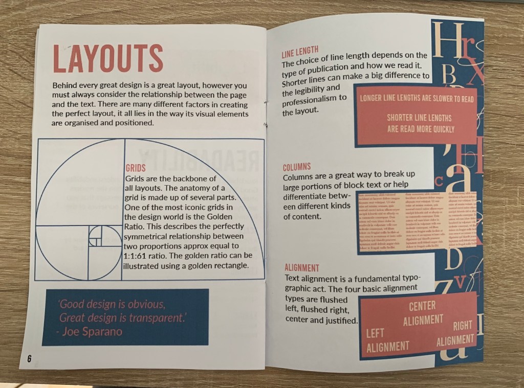
The contents for my Good Typography booklet will include;
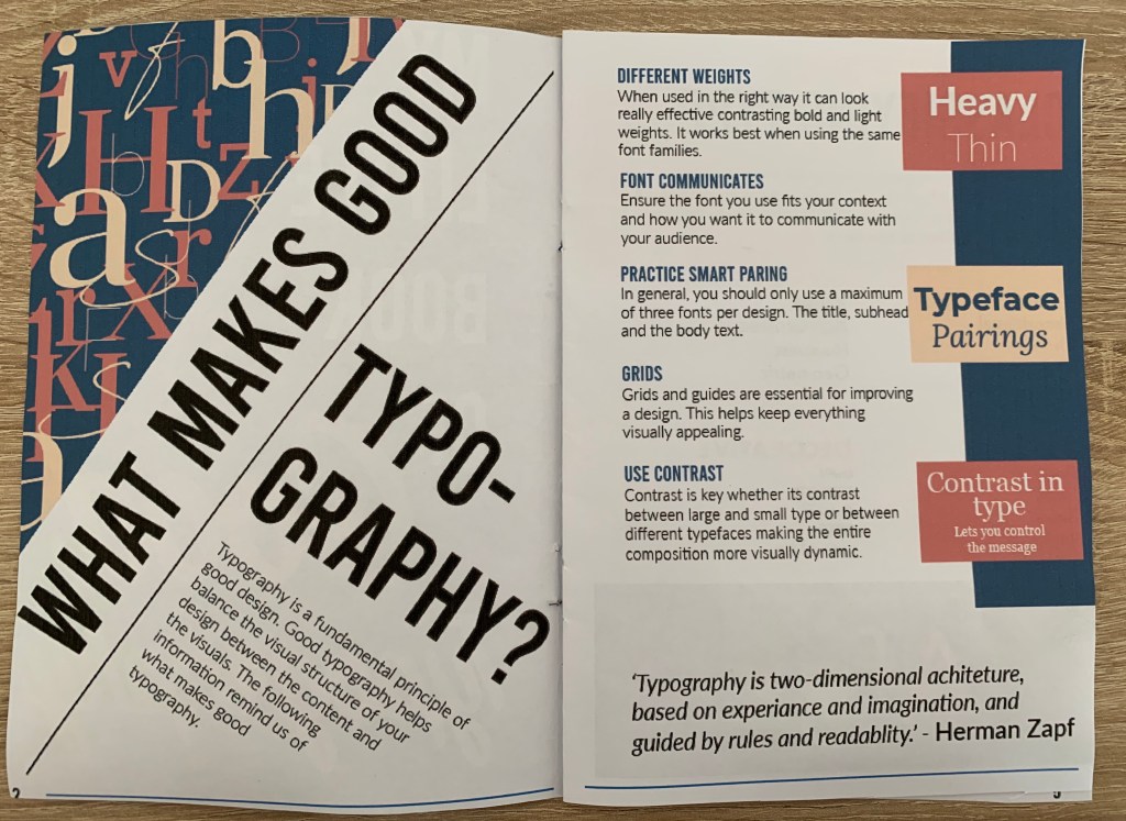
- What makes good typography? (Double page)
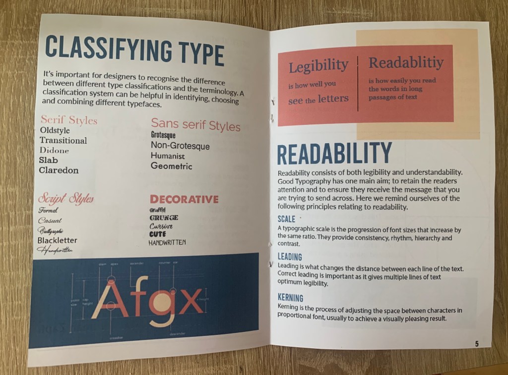
- Classifying type
- Readability
- Layout (Double page)
Each page will include useful information relating to the contents of that page, with the What makes good typography page as mainly an introduction to the booklet.
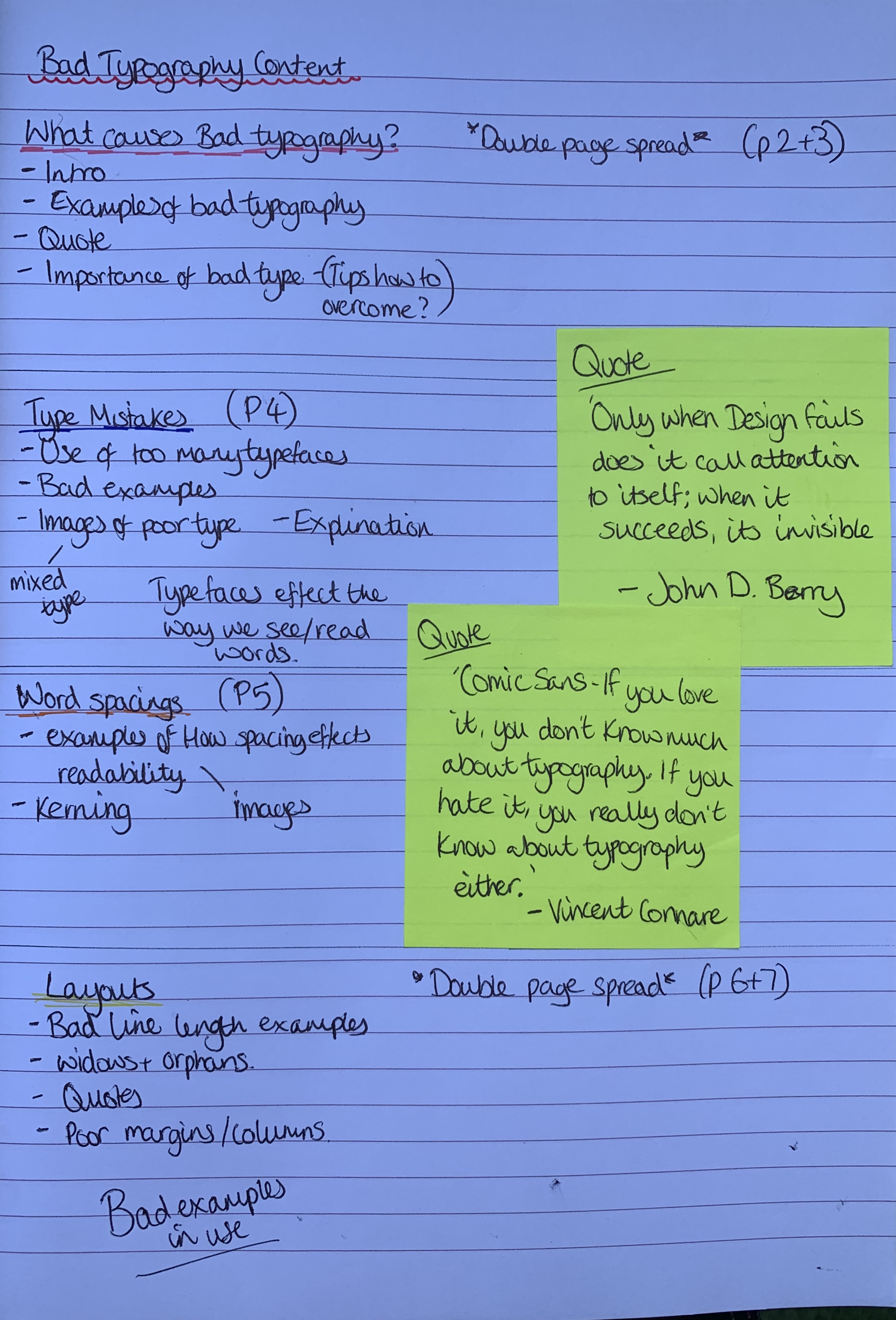
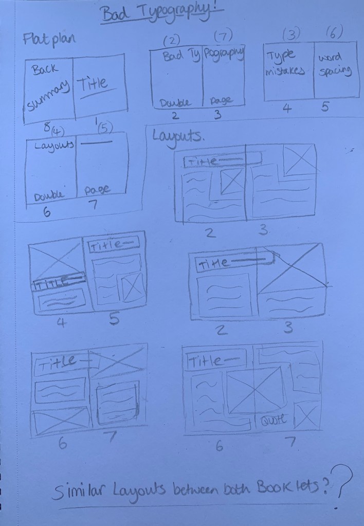
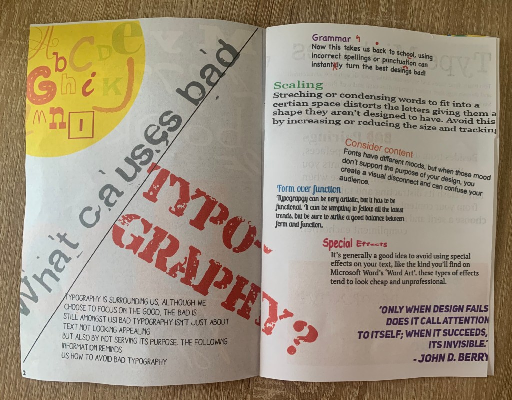
The contents for the Bad Typography booklet will include;
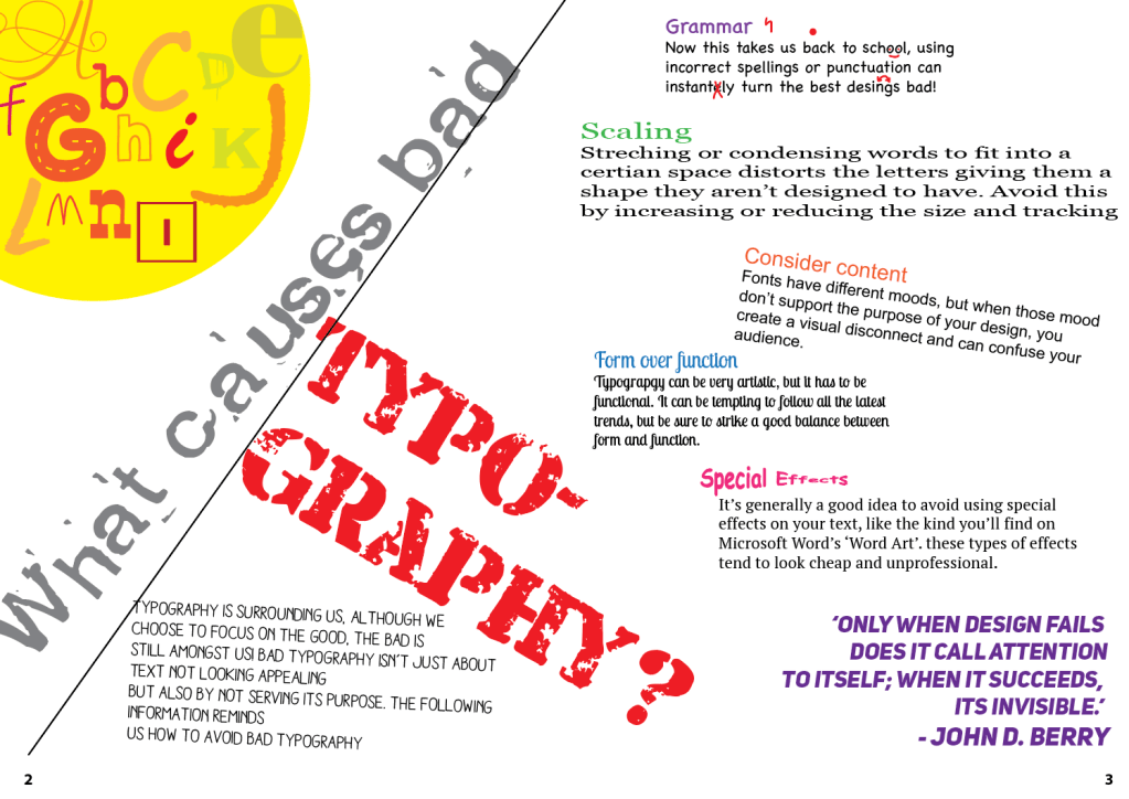
- What is bad typography? (Double page)
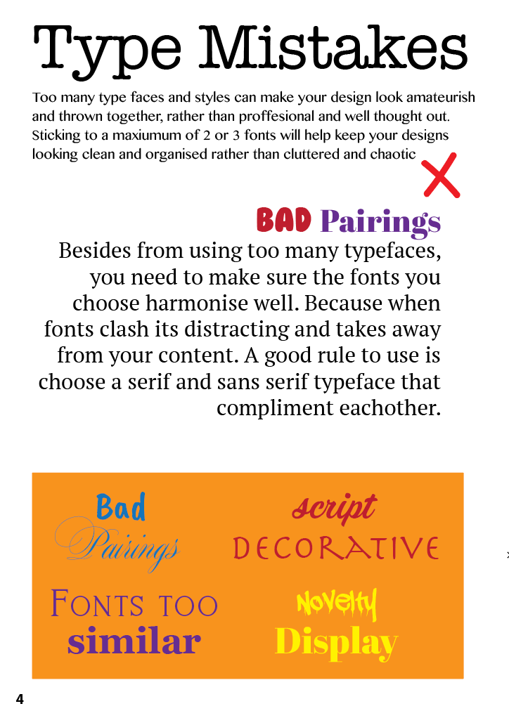
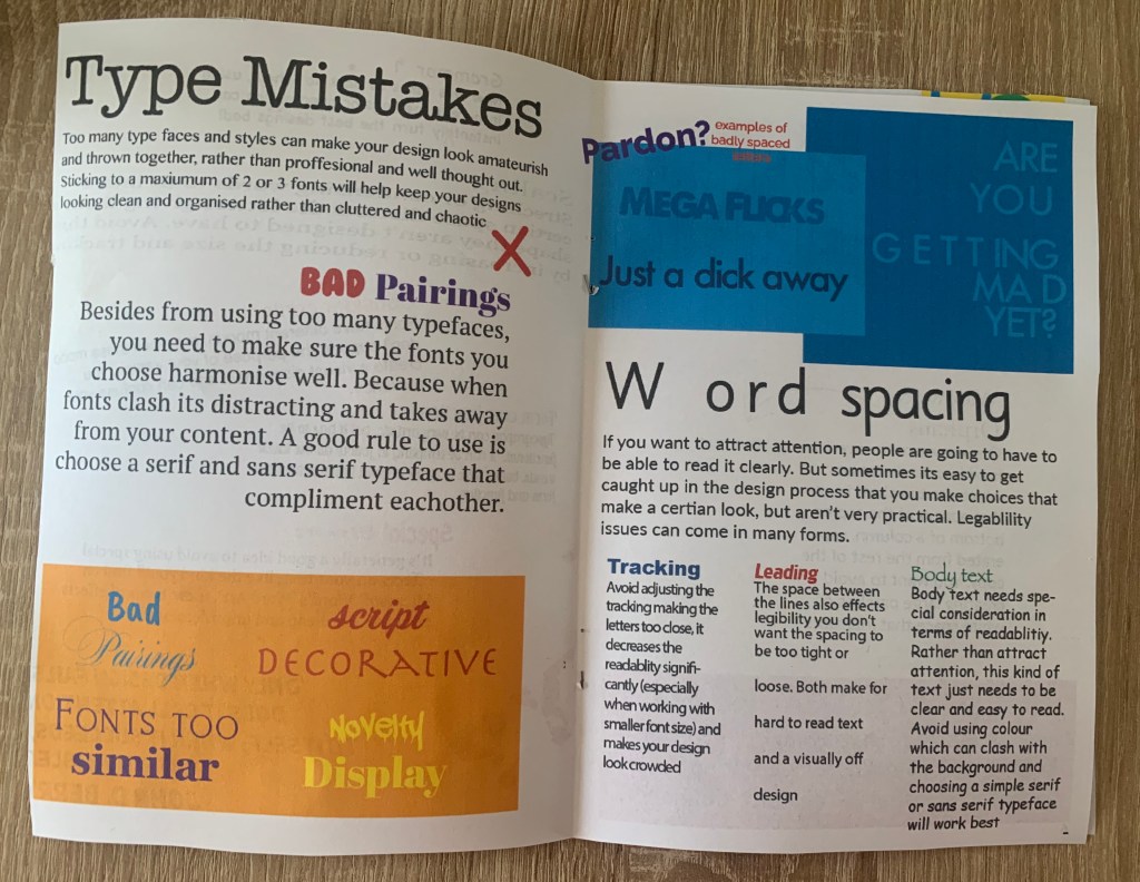
- Type mistakes
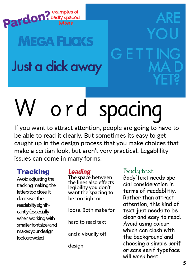
- Word spacing
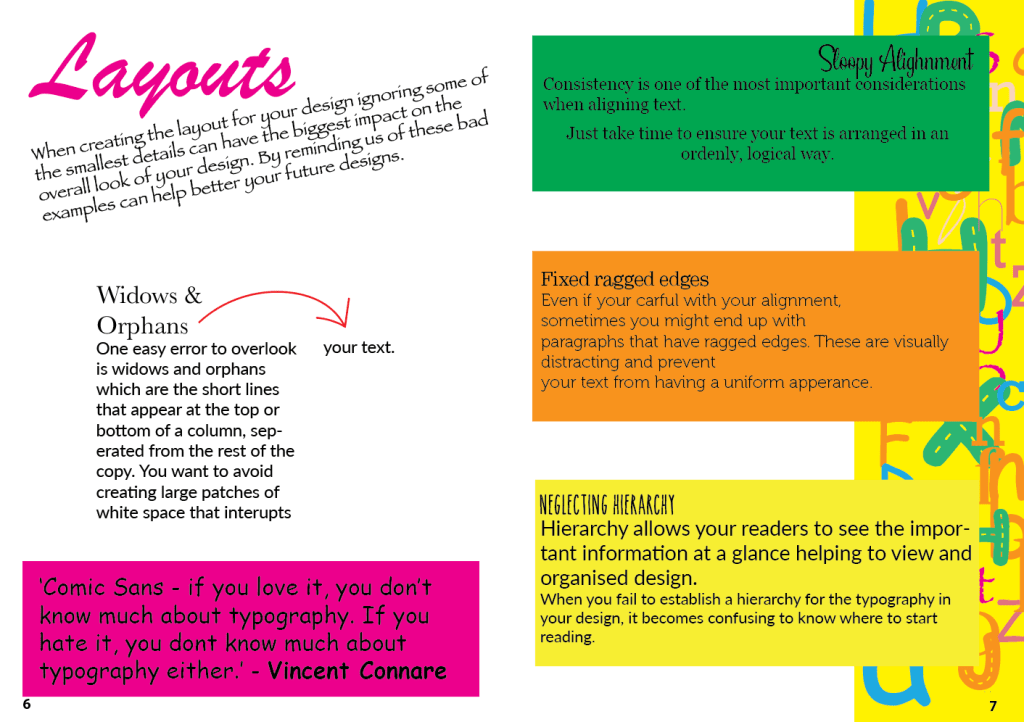
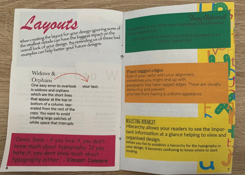
- Layouts (Double page)
Again the information will follow the appropriate title, I plan on creating the Bad booklet as a guide to counteract with the good book to show how things can be used badly and what not to do, This will make the booklets become the perfect learning pair.
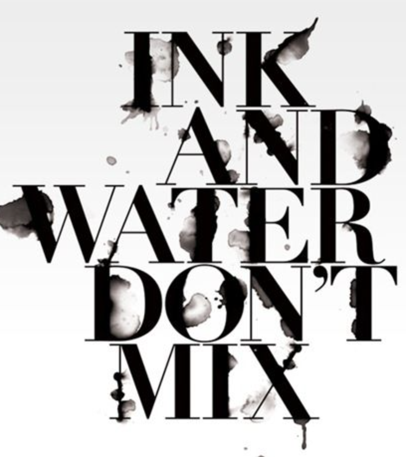
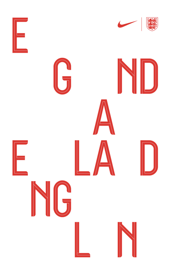
Craig Ward
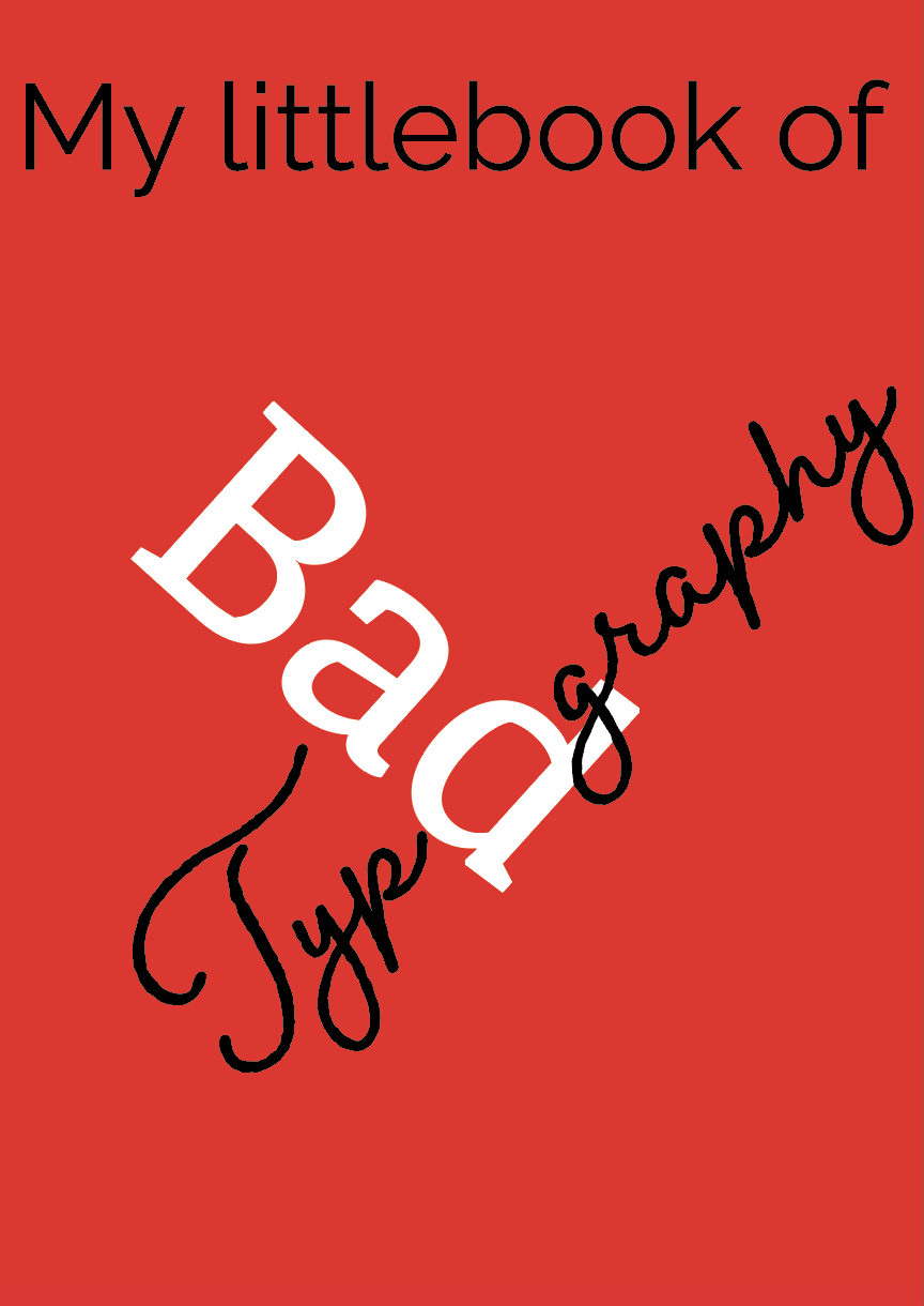
I wanted to look at inspiring typographers and came across Craig Ward. The design which caught my eye was the good/bad typography piece, I found some other interesting artworks too as shown below.


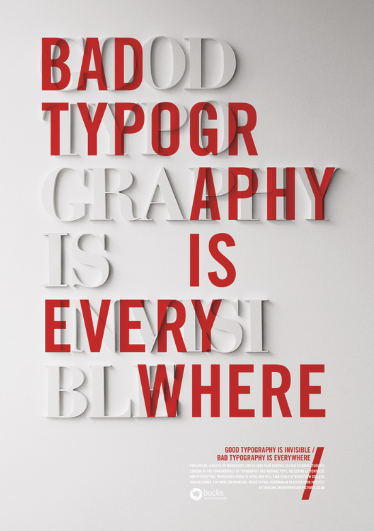
http://wordsarepictures.co.uk/
Craig Ward has created many typography designs for many different brands and campaigns. I like Ward’s impactful designs with clear and creative compositions. He plays with the grid layouts and effects within his type causing the audience to focus more on the design rather than to view it at a quick glance. This makes great inspiration for both booklets creating playful typography and pushing the boundaries in both a successful way for the good and in a confusing way for the bad booklet.
Design Process
Once gathering all the basic information needed I was ready to start my design process. The booklet I would like to create will be A5 in size and stapled. To make my designs even more impactful from good to bad I thought it would be an interesting idea to print the good booklet on better quality paper and the bad booklet on more of a basic paper – however this may effect the quality too much, so perhaps for an example I could print a single page on the lower quality paper to use as a small example? (something to consider later in the design process!!)
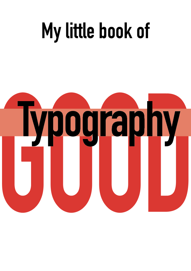
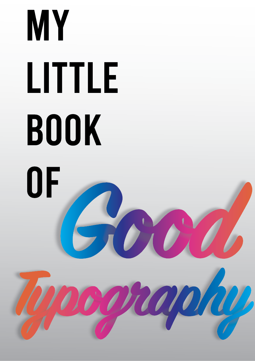
Good Typography
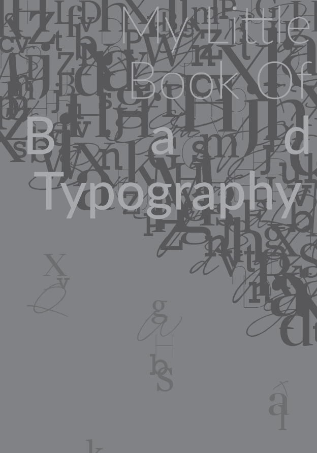
Bad Typography
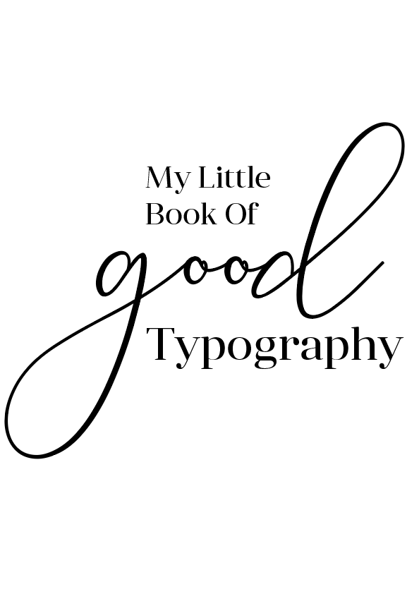
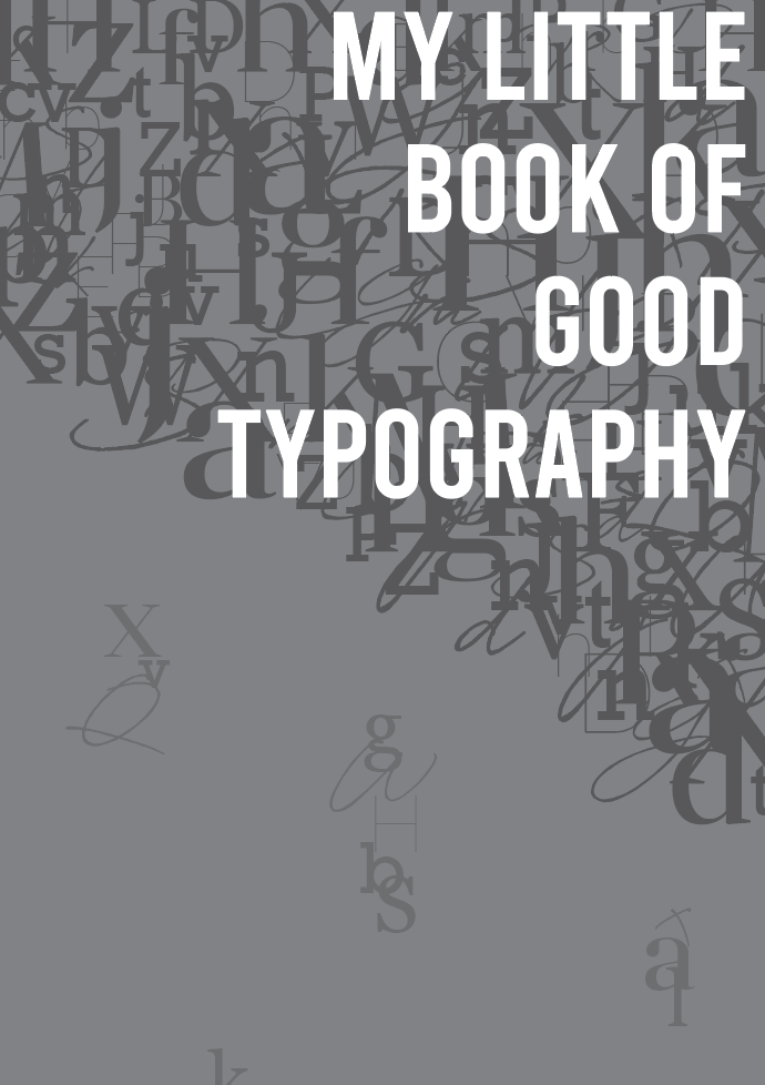
After digitally creating some of my sketches I needed to narrow down my choices, I was stuck between the two designs as shown below. I wanted to focus on my Good Typography design so that I can perfect this so that I could move onto creating my bad typography cover. I want both booklets to be the opposites of each other, this the same for the contents of each booklet.
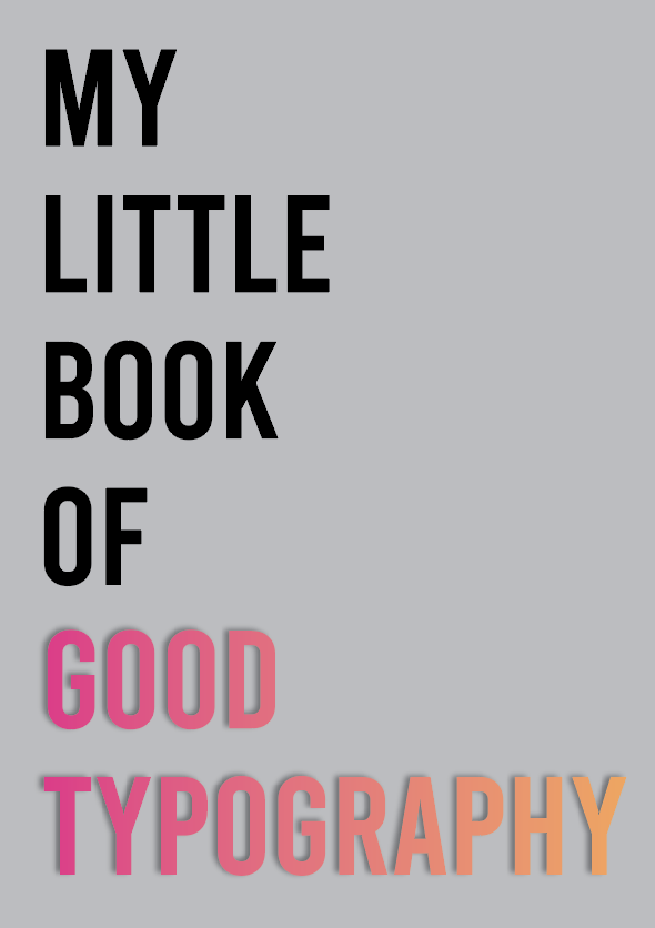

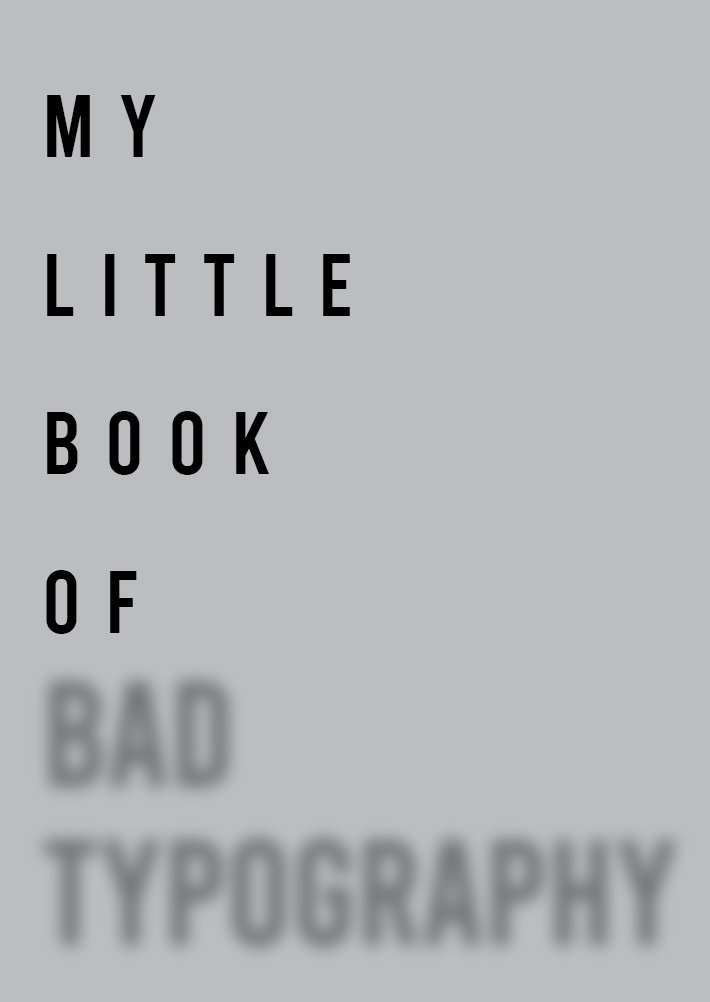
Design 1: I like the simplicity of this design, the clear bold ‘Bebas’ typeface fills the page nicely. The added shadow behind the words ‘good typography’ help for it to stand out along with the colour making this the focal point. I really like the composition of the text in this design, it looks clean and sophisticated.
Design 2: Slightly more detailed than design one with the added shadows in the type to create more of a 3D look, the words ‘Good typography’ grab your attention immediately.
I decided to experiment further with the designs as I didn’t feel satisfied with either design above.
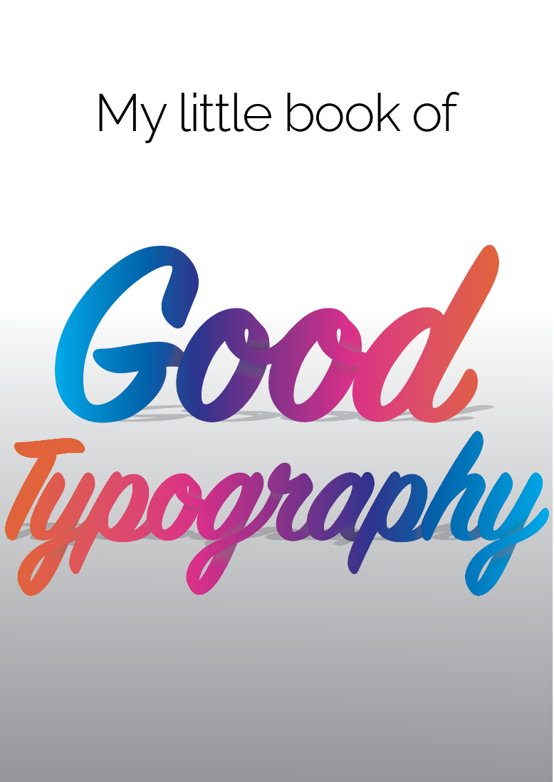
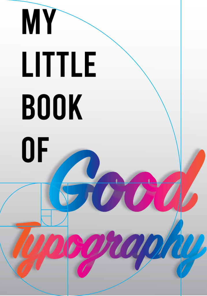
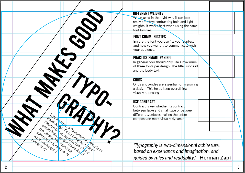
I ended up combining the two designs and came up with the design on the left. The text positioning fills the page and creates the perfect balance, I achieved this by using the golden ratio grid.
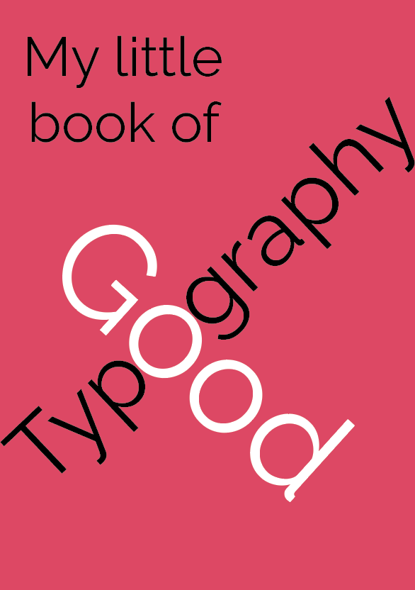
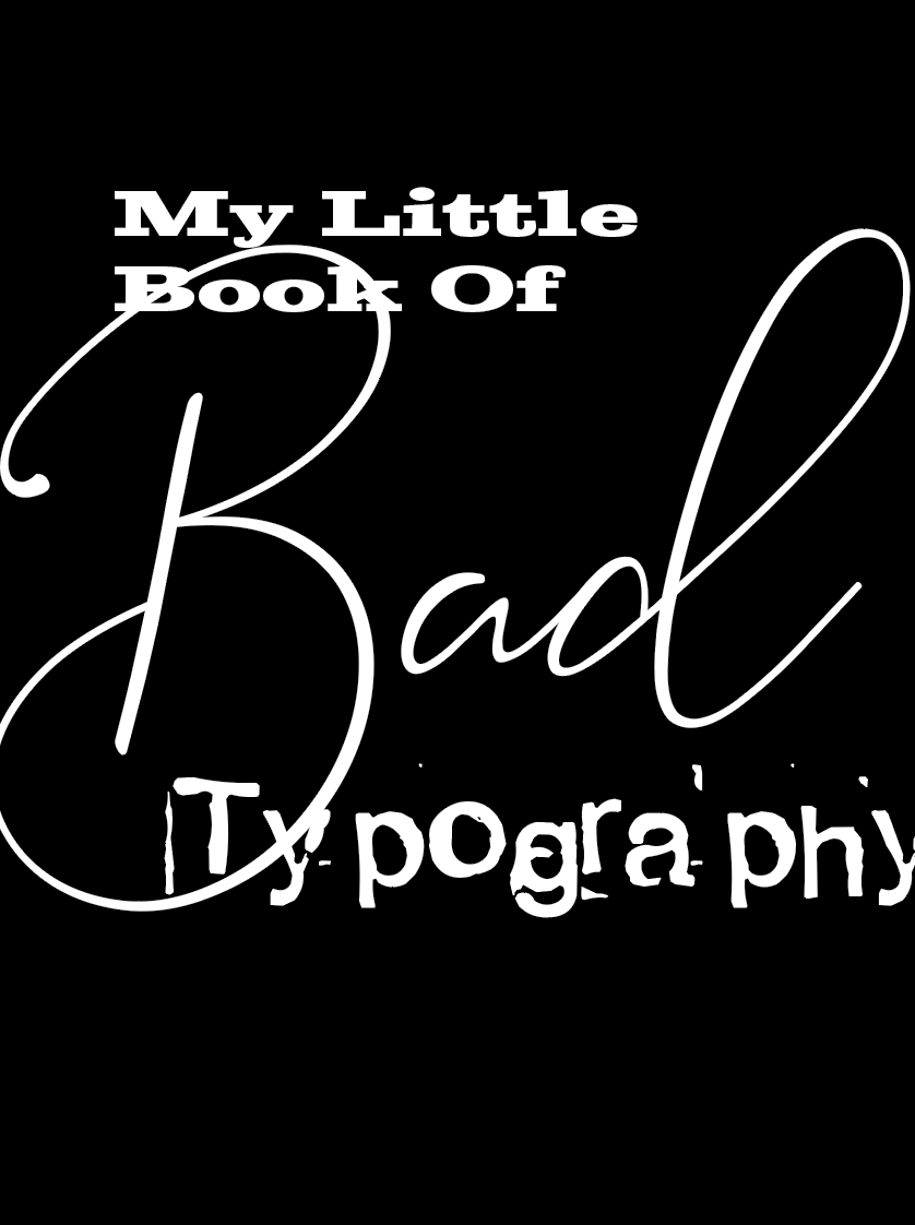
I then moved onto creating the cover design for the Bad typography book, originally I wanted both booklets to be the opposite of each other so this will be my first experiment.
Bad Typography
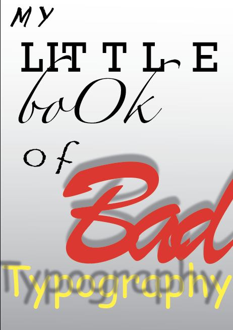
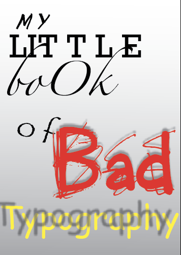
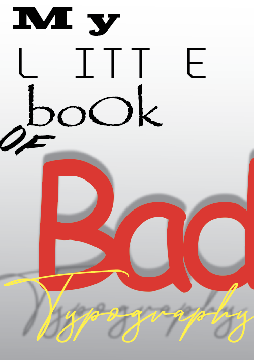
For my bad design I focused on using the fonts which are usually frowned upon such as, Comic Sans, Brush Script & Papyrus along with a mixture of too many other typefaces. I kept a similar layout as the good typography design just so they still remain as part of a series. I adjusted the kerning and had completely ignored aligning the text.

Content design
Now that I was happy with the covers I was able to move onto working on the contents for both booklets. I figured it would be best if I worked on each book side by side to ensure I create the correct conflict between them both. Following my flat plan I decided to make a start on the first double page spread of my booklet.
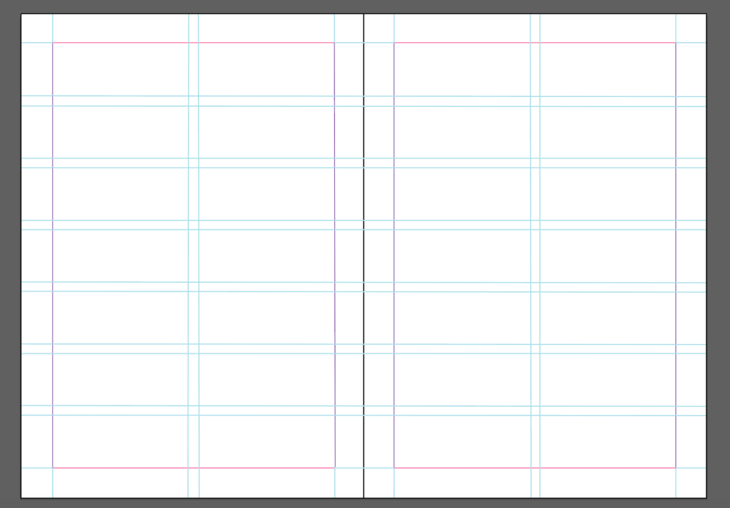
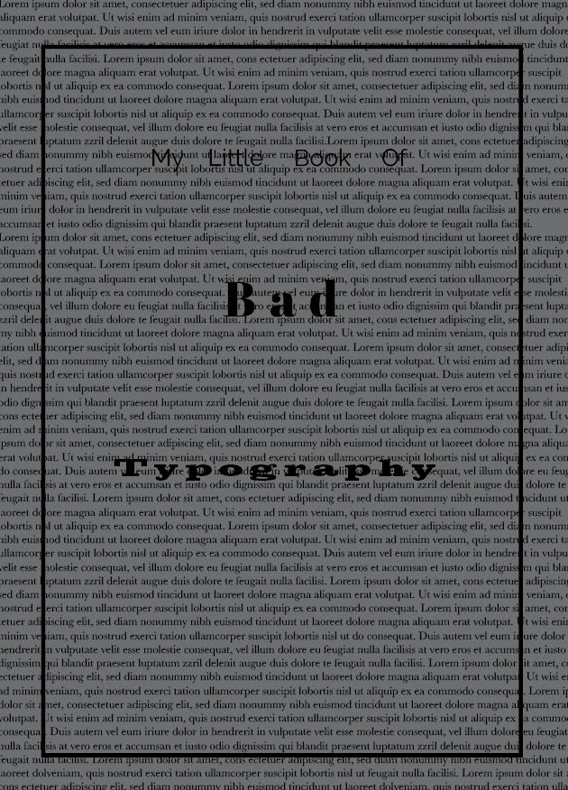
I started by creating all of my notes before hand so I knew how much text I had to work with in order to create the best grid for my booklet. I decided to use a modular grid, as this would be easy to follow with both booklets and each page along with the contents inside. I also wanted to keep in mind the golden selection grid. Once I was happy with my grid layout I started to experiment with layout ideas.

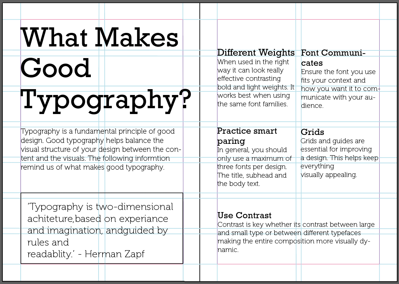
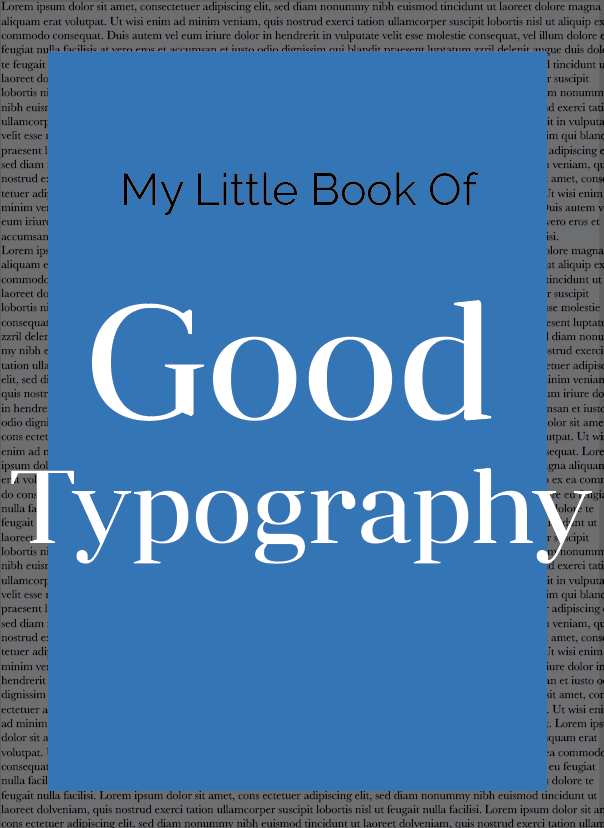
Out of the designs above, the first is my favourite, I like the way the title fills the page in an eye catching position along with the introduction paragraph. I plan on adding colour to the boxes on the right along with examples relating to some of the topics covered on this page. To fill the top left hand corner I will fill this with letters of different typefaces in the style of one of the designs used for one of my cover designs above. Another reason why this design feels pleasing to the eye is because the golden ratio applies within this design.
The contents for my booklets include
Good Typography; (reminder and advice guide)
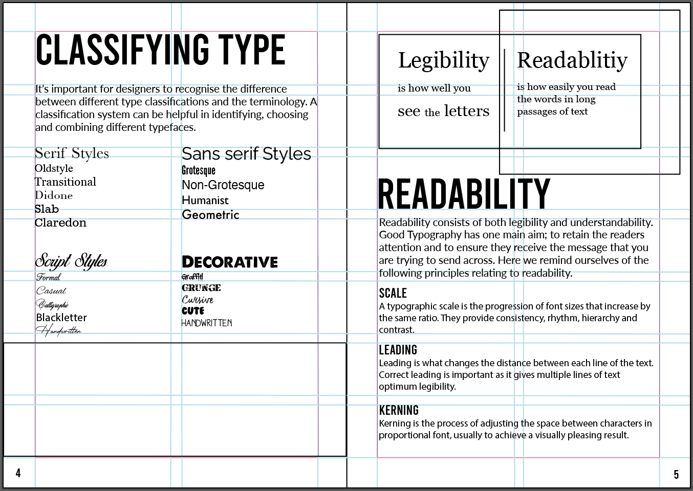
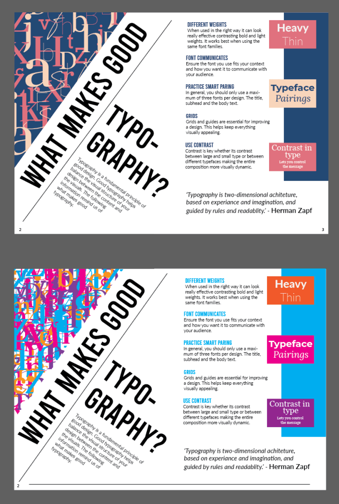
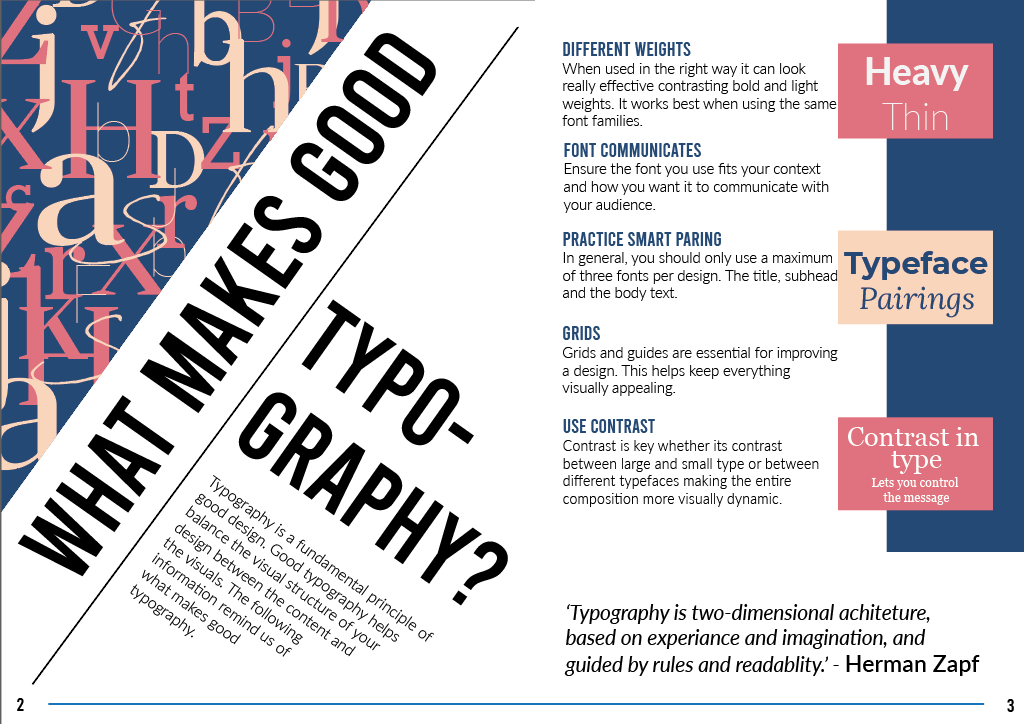
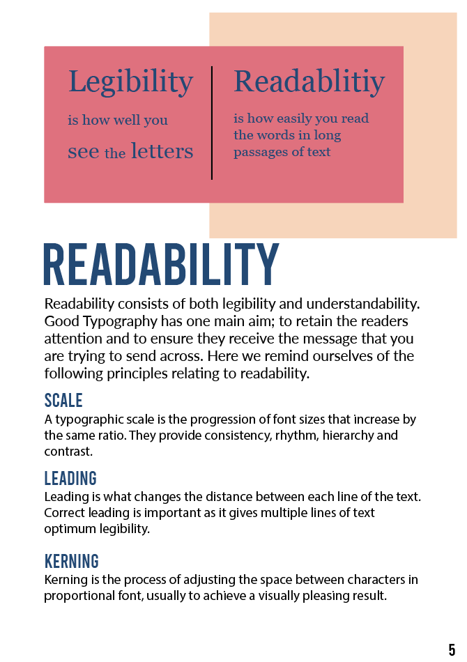
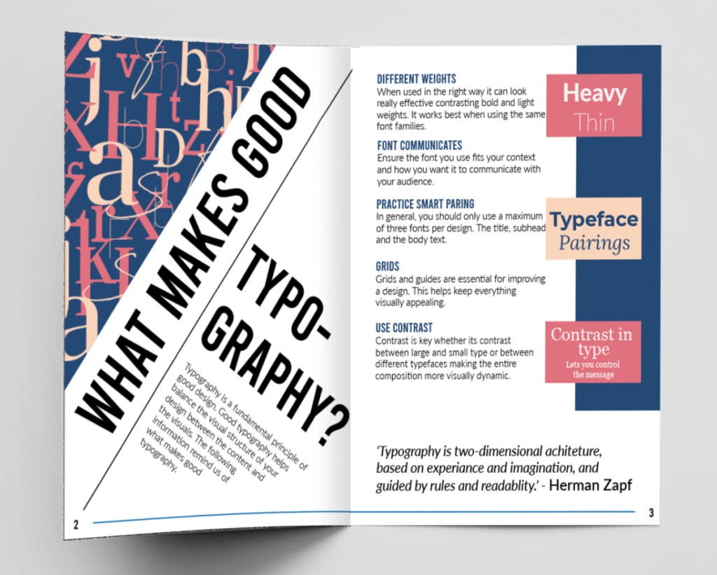
- What makes good typography? (double page) – Tips on what makes good typography and the terminology.
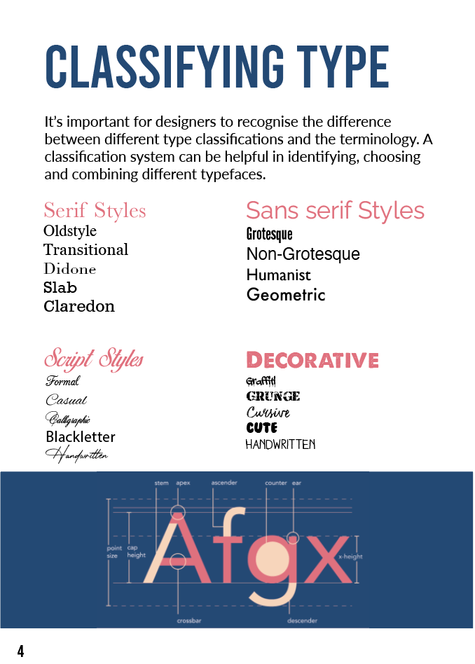
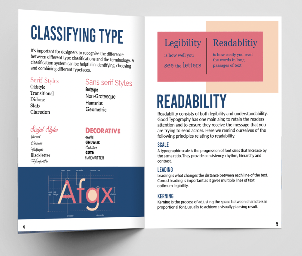
- Classifying type – Reminder of type classification and the anatomy of a typeface
- Readability – Reminder of principles relating to readability
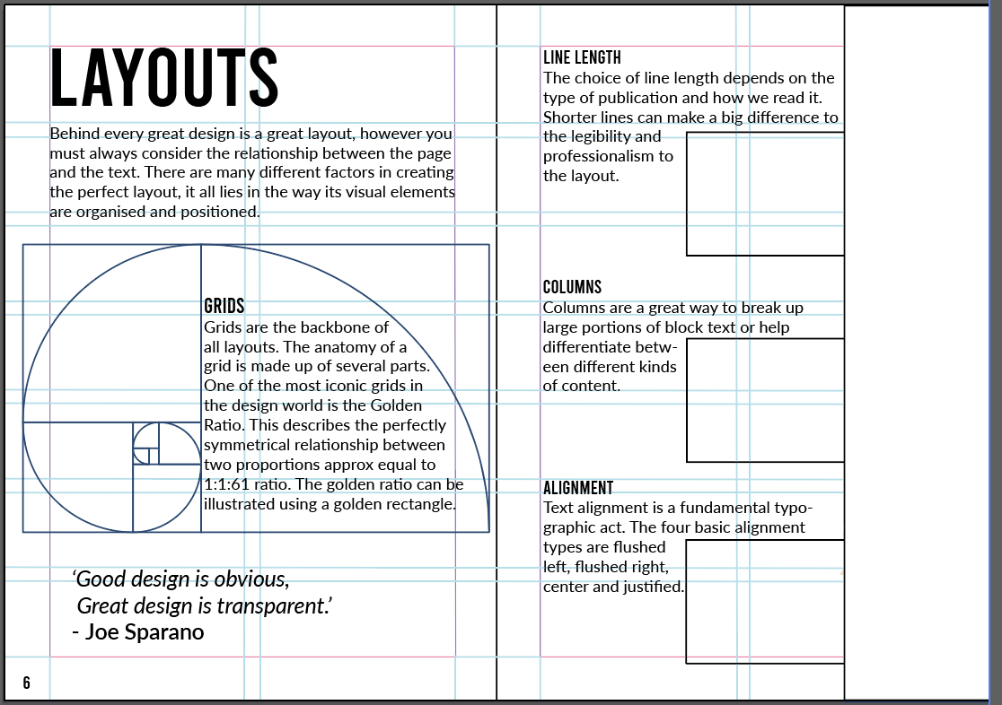
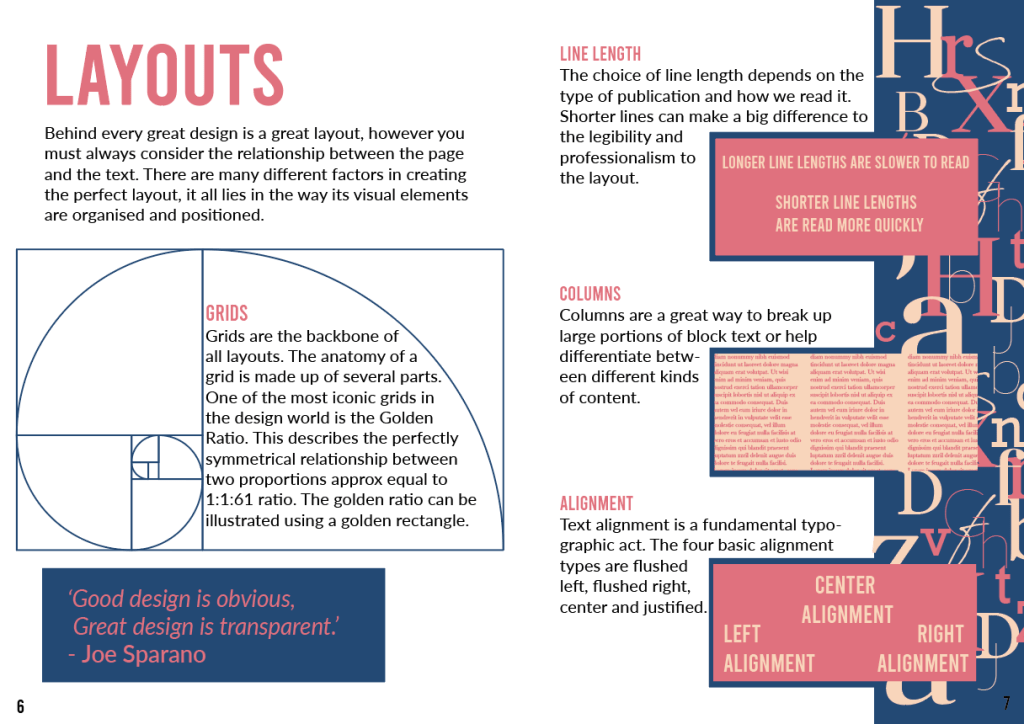
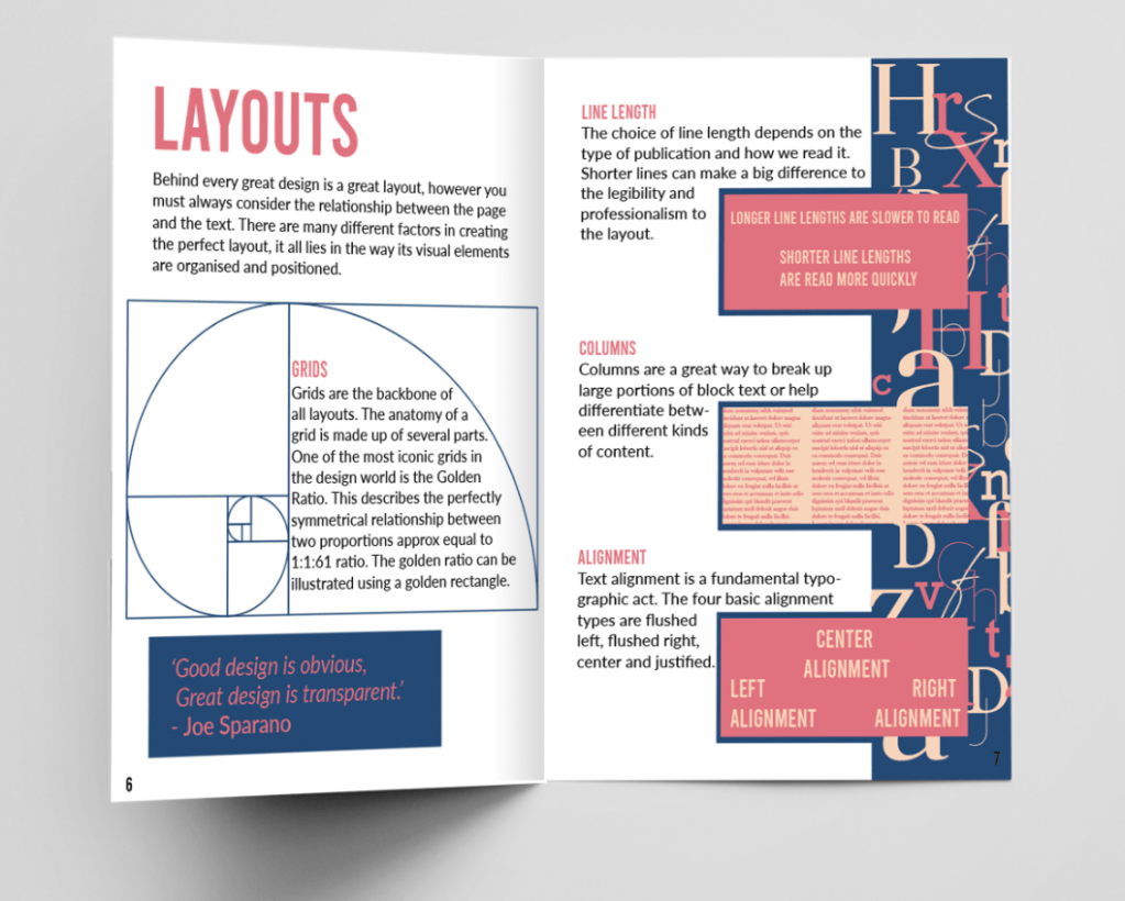
- Layouts (double page) – Different factors of what makes the perfect layout
Bad Typography; (a what not do to guide)
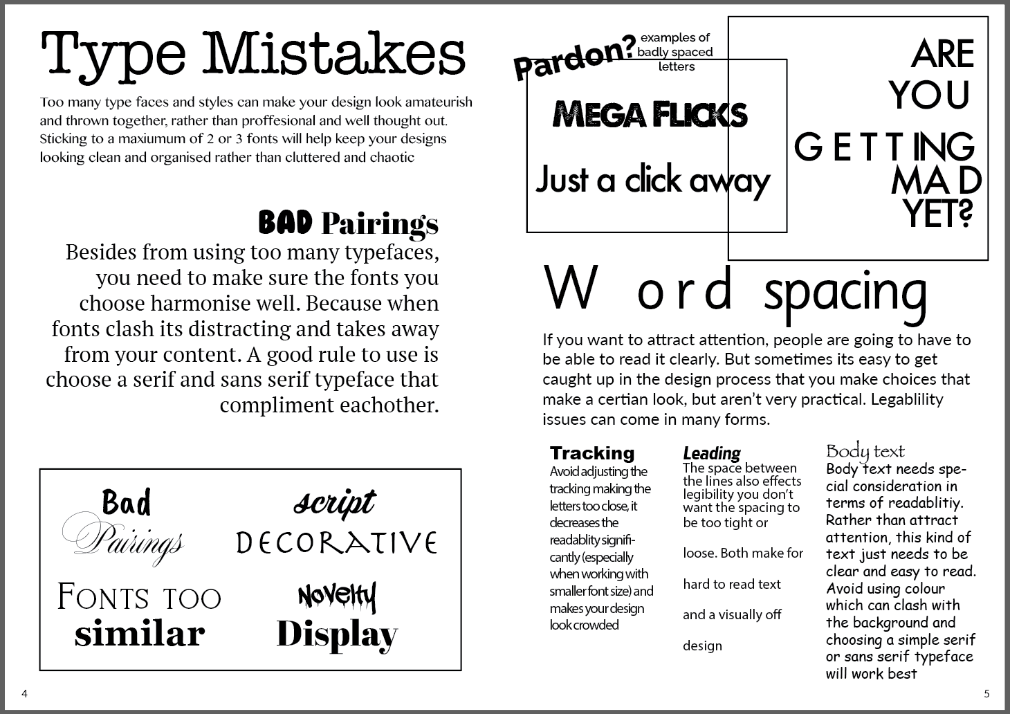
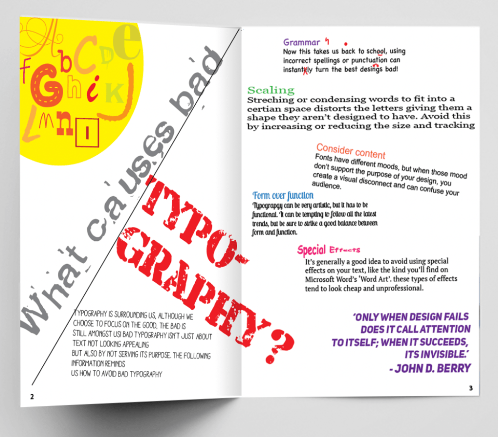
- What causes bad typography? (double page) – Pointers as to what makes bad typography
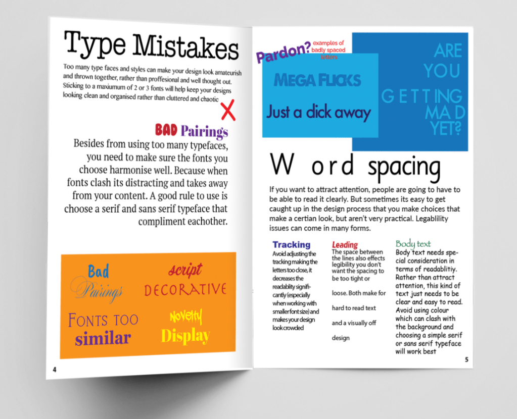
- Type mistakes – Focusing on bad pairings
- Word spacing – Advise and examples of how spacing can effect type
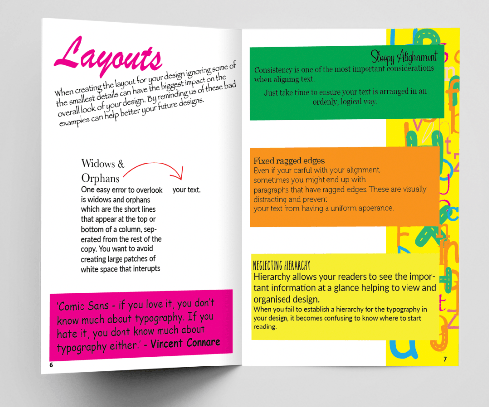
- Layouts (double page) – Reminding of how the small details can negatively effect the layout
Now that everything has been established I can work on the layouts for both my good and bad booklet, as mentioned previously I am going to work side by side with these so that I can achieve that ‘badly’ copied style to create a what not to do guide. Below you can see the layouts side by side.

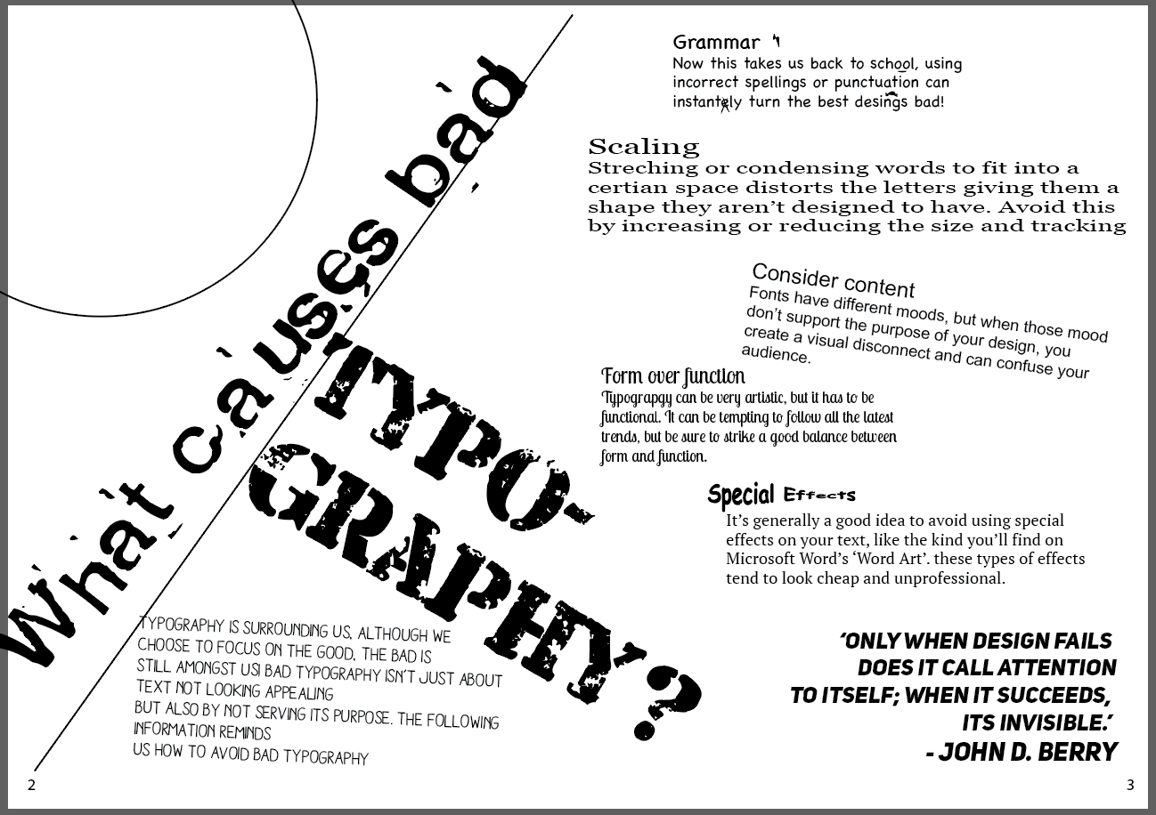
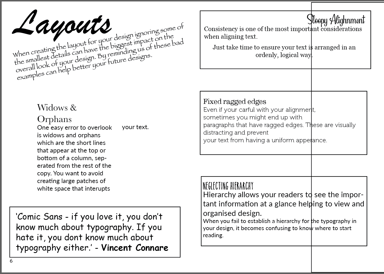
Im happy with the idea of each book being the wrong and right examples of each other, because they are almost identical it is clear to see that they are part of a set. For the bad typography booklet I completely ignored the grid and went against my designer instinct to create the layout and to show examples of bad typography in action, such as too many typefaces clashing, bad alignment and terrible kerning.
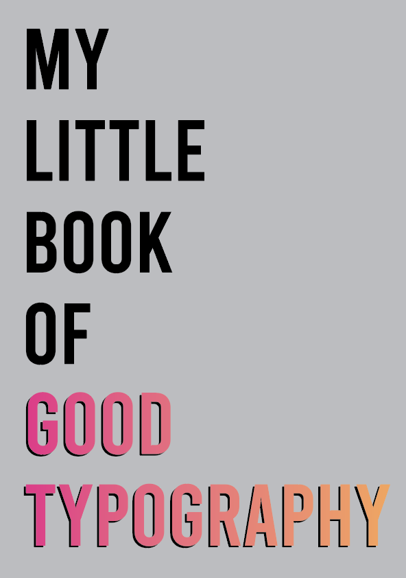
I then moved onto adding colour starting with the good typography booklet. I decided to use the colour palette used on the front cover however seeing these colour in use for the contents reminded me of something I would see in the bad typography book, the colours clashed too much and looked amateurish. I came up with a colour palette of blue and two different shades of pink, this has more of a sophisticated professional feel (see photo to left of bottom before and top after). I applied this colour palette throughout my booklet and also reapplied it to the front cover. For the Bad book I have used a mixture of bright clashing colours, I also used colour to help highlight the mix matching fonts – just to add extra offence!
Final Designs
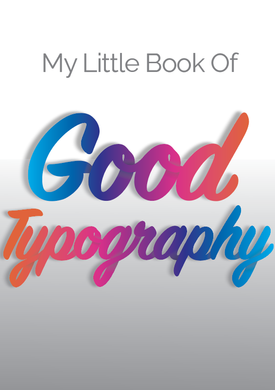
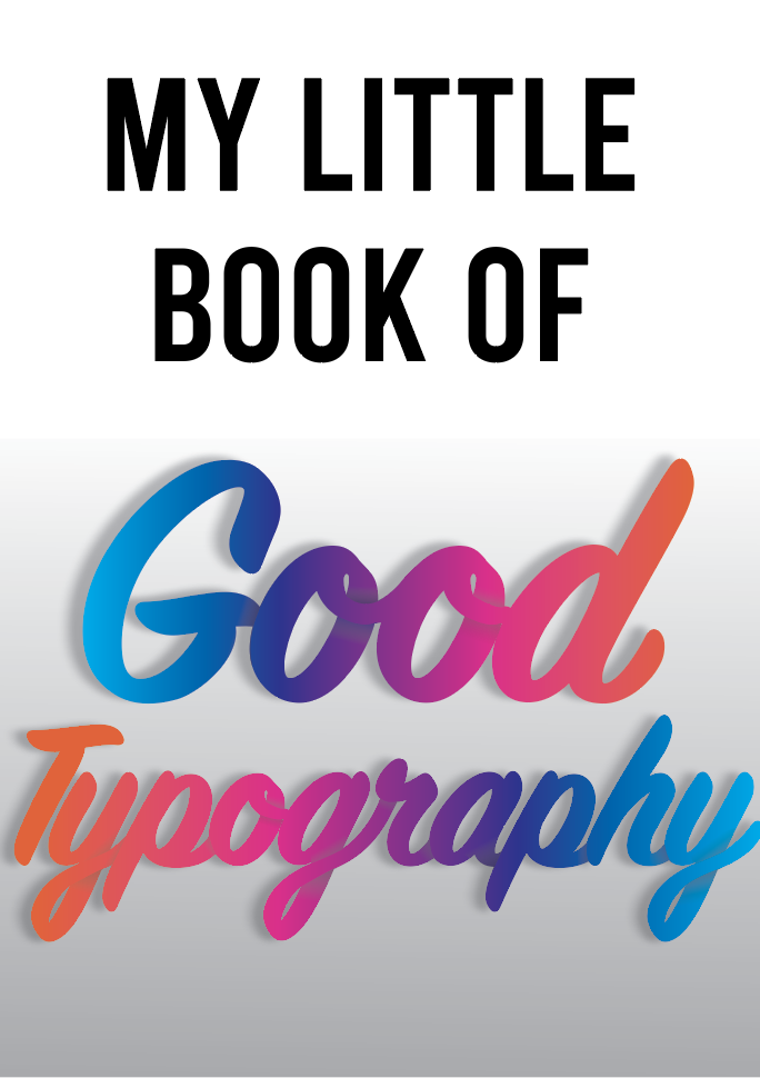
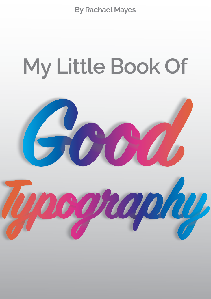
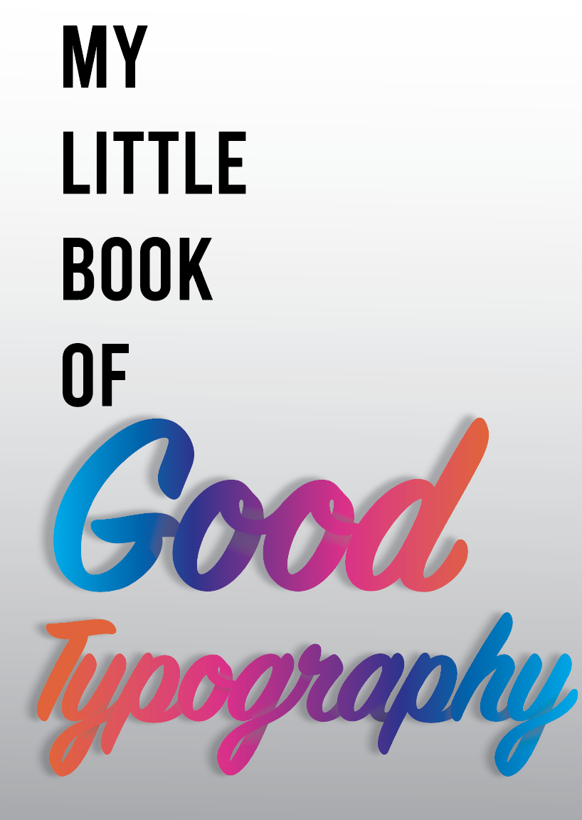
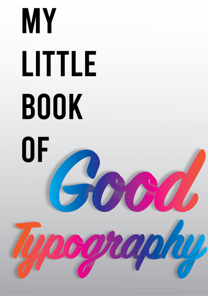
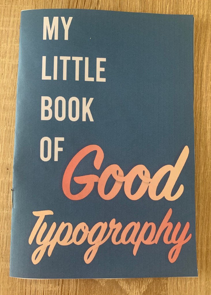
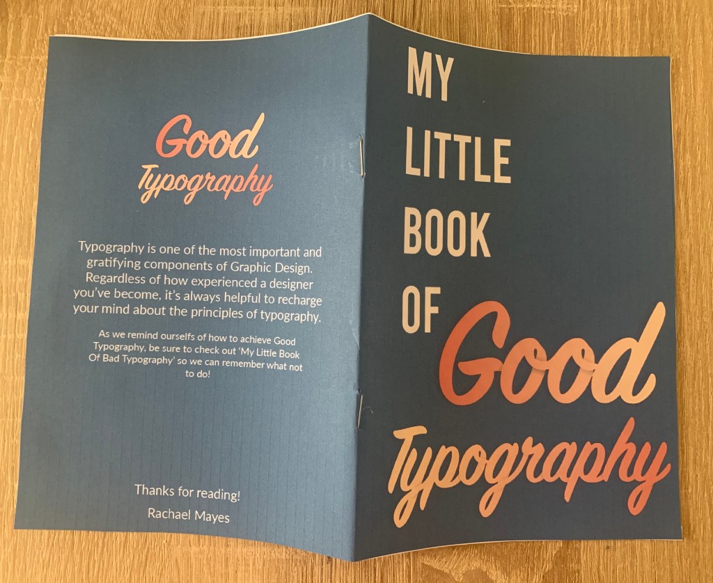
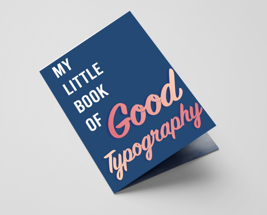
My Little Book Of Good Typography
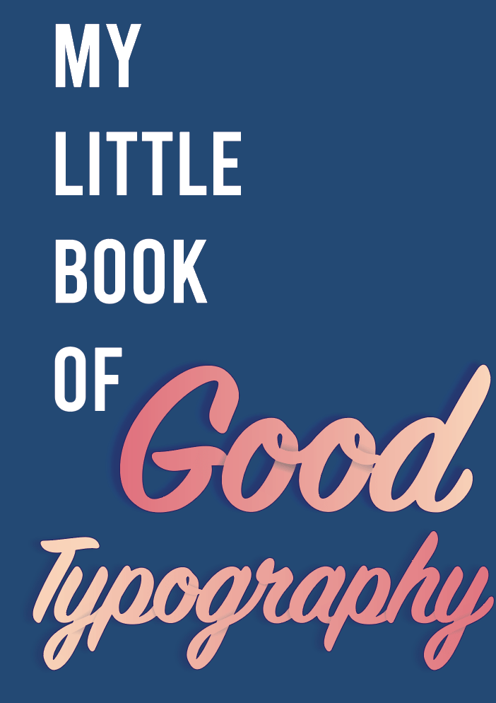
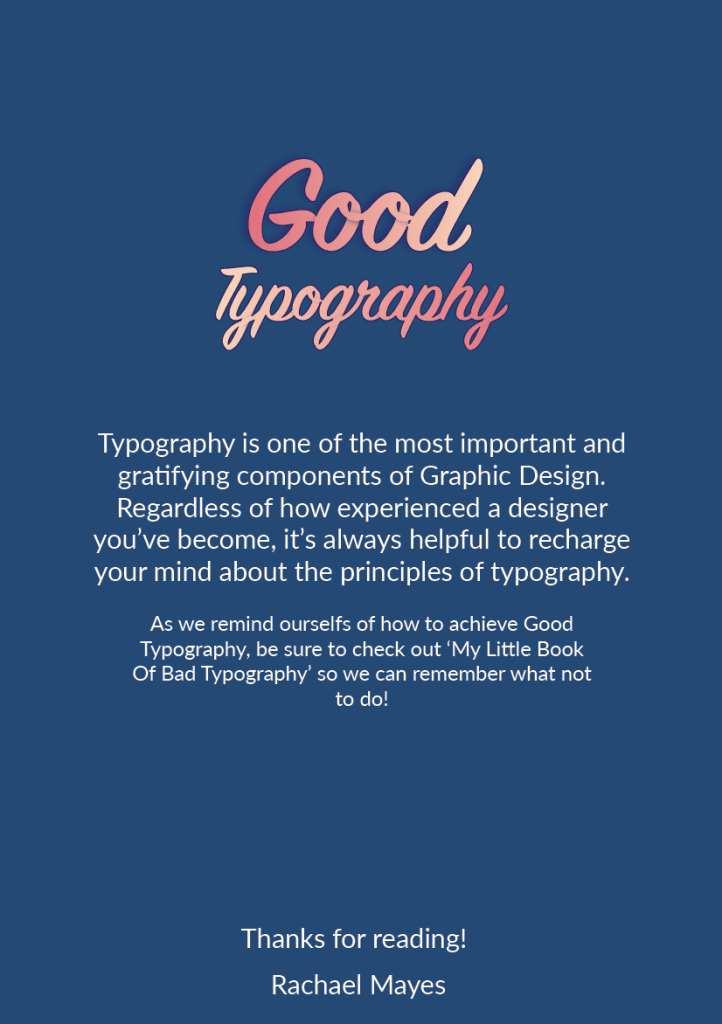
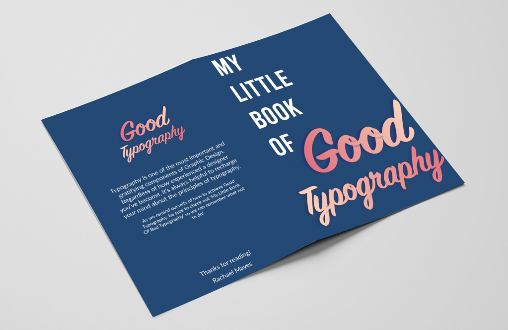
This booklet lists what I believe are some important principles for successful typography. Found with research, knowledge, quotations and examples, this would make a handy quick read for those who need to refresh their minds or seeks fast minimal advice/reassurance. This stapled A5 booklet will be printed on 130gsm silk paper, making it cheap to produce with extra protection of wear from being silk coated.
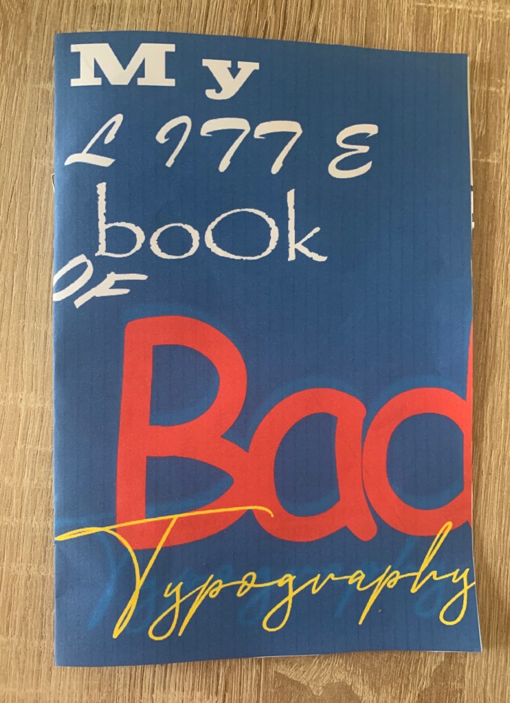
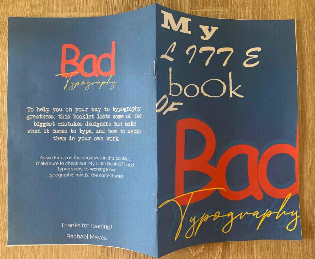
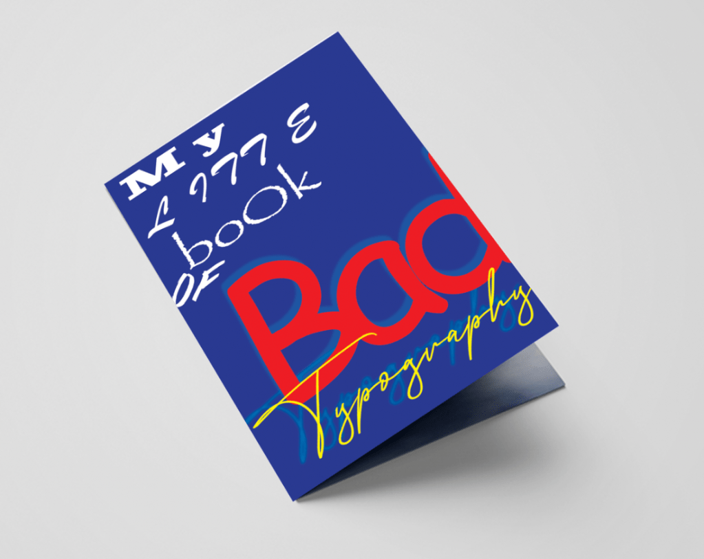
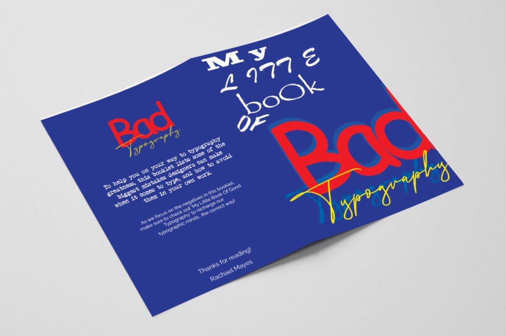
My Little Book Of Bad Typography
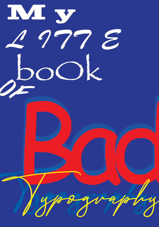
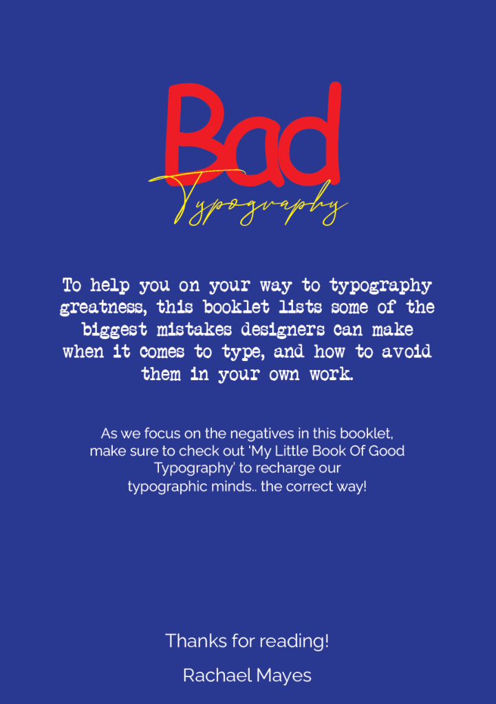
This booklet is a show and tell of bad typography! Here it lists all the mistakes which can cause havoc in your designs and reminds us of what to avoid from clashing typefaces to sloppy alignment. Filled with plenty of bad examples of what NOT to follow. This stapled A5 booklet will be printed on 115gsm uncoated paper – a slightly lower quality version of the Good Typography booklet (however will still be somewhat of good quality) So when seen side by side paper quality could be brought to light.
Mockups
I printed off both booklets with help of my flat plan to organise which pages are paired together for printing. Below shows the printed results. I printed the good booklet on 100gsm premium paper and the bad on 90gsm cheap printer paper, This made a noticeable difference in the quality of the booklets.
Digital Mockups
Reflection
Im pleased with the outcome of this booklet, Its refreshing to look back on my design process to see how my booklet has progressed, the colour palette is much better and helps the booklet to feel more professional and trusting – For future designs I will take time to test colour combinations in the design process. It is clear to see both booklets are part of a set, however still work well on their own (also with the additional advertising on the back suggesting the read of the opposite booklet). The content is informative and helped remind myself of the right and wrongs with typography, so hopefully will have the same impact on others!
Seeing my booklets in both printed and digital mockups helped me to feel even more confident in my designs, I believe they both work well with the brief and with each other, as well as individually. My only concern with the bad typography booklet is that I went too literal with the bad examples – although I suppose this is just my designer eyes watering from the amount of typographic errors!
I have enjoyed this assignment, its helped refresh my mind of the do’s and don’ts of typography. I enjoy looking back through the process to see how I got from start to finish and hopefully it is clear for others to see too.

One thought on “Assignment 3: My Little Book of…”