
Brief: Find as many examples of type as you can from a range of sources, including newspapers, magazines, flyers, leaflets, online and printed ephemera. Broadly classify them into serif and sans-serif groups. Explore your computer to see whether you have any of the typefaces mentioned on the previous page. Find other examples on your computer that relate to these classifications. Print these off and begin to create a collection of type samples.
Identify: Choose five different typefaces from your classification collection and now look for examples of how they can be used for reading in different contexts. For example, which typeface would be appropriate for a magazine, a science book or newspaper? Have you collected a typeface that might be suitable for all these subjects? As a way of testing out which typefaces might be appropriate for a particular job, also consider them as inappropriately as you can – find contexts in which they don’t work, look ugly or feel ‘wrong’ in some way. Do this by experimenting visually with your typeface choices.
Reflect: Consider and reflect on the nature of the type you are collecting. Examine and annotate printouts with your own impressions of the letterforms. Use descriptive words that express something of the form and character of the typeface. Follow the same process fro your ‘wrong’ typefaces as well.
Develop: Trace some interesting, unusual and everyday letterforms onto clean paper. This will help you to understand the distribution of weight of line within a particular letterform. Draw over the tracing to enhance the line and fill in the letterform with an even darker grey tone – H8 pencil is fine 0 to recreate the impression of print.
Document and present: The work you produce for this exercise will feed directly into your assignment, so collate your notes, printouts, traced letterforms and samples of type you have gathered. Consider how these could be inventively and visually integrated, and how your ideas could be creatively developed further for your assignment.
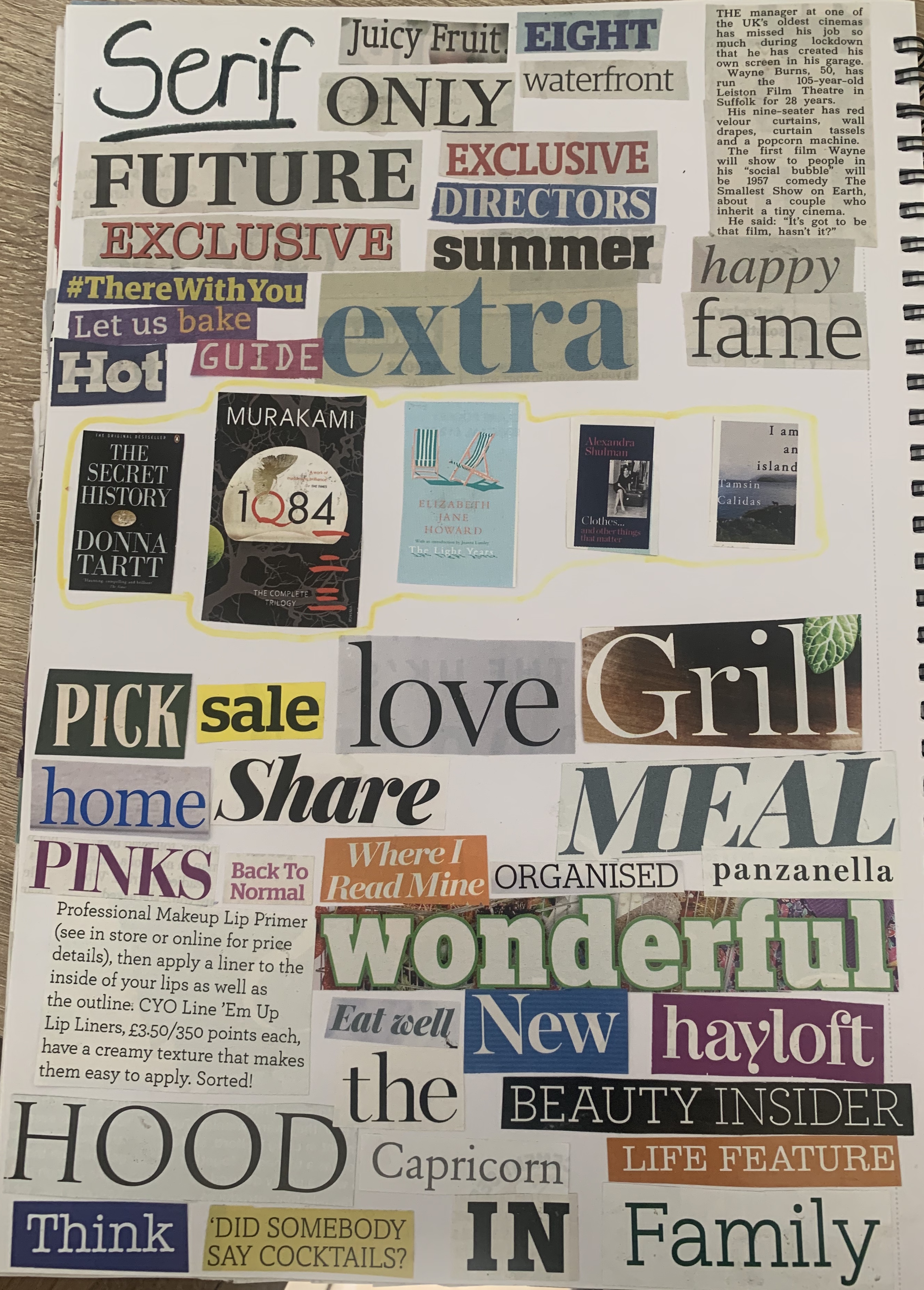
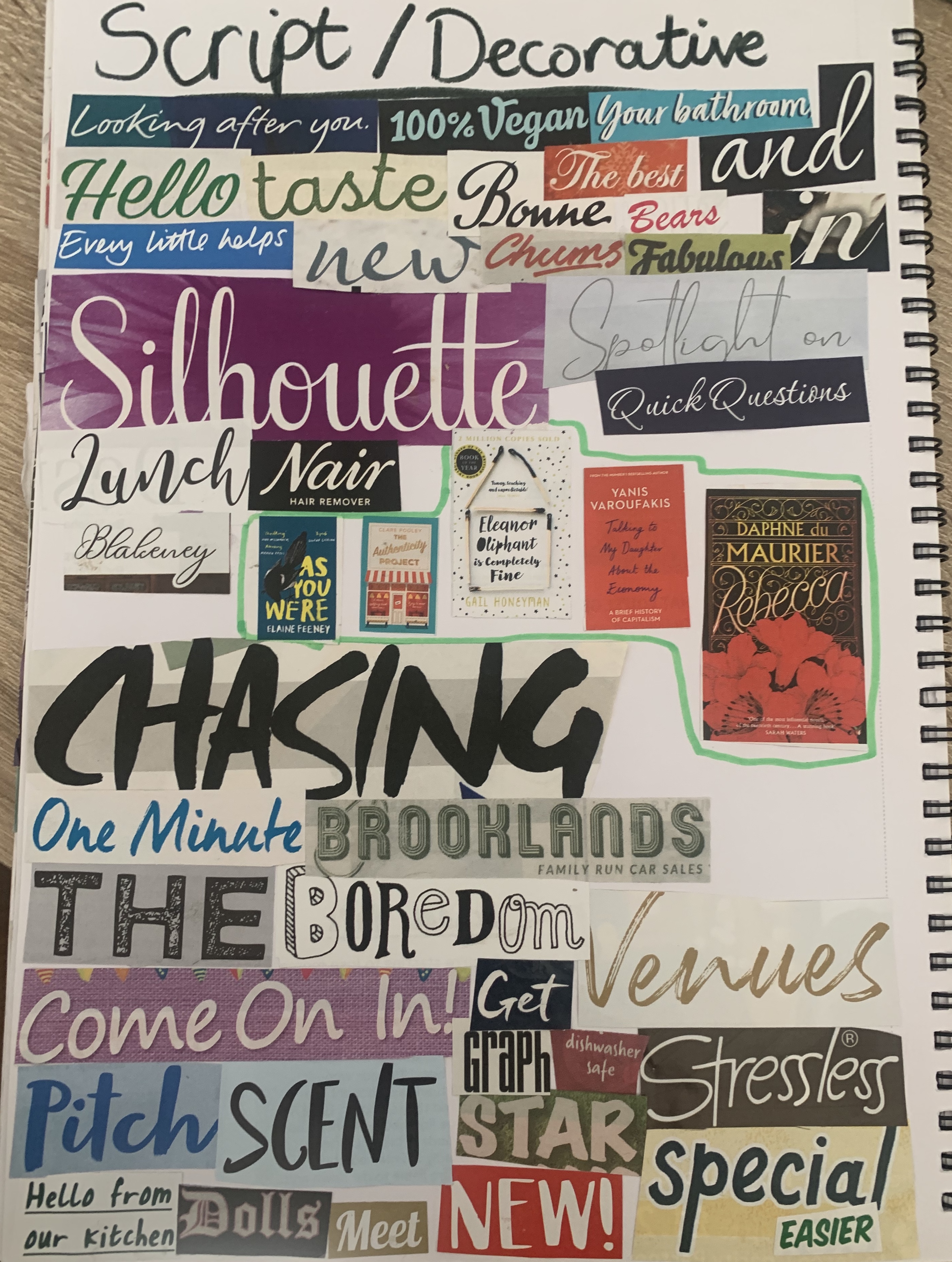
Following the structure of the brief I went straight into collecting type examples from a range of different sources. I collected newspapers, magazines, flyers and online type and created them into collages.
By creating collages I felt this allows me to easily compare typefaces with their weights, heights and style, showing a broad range of variety.
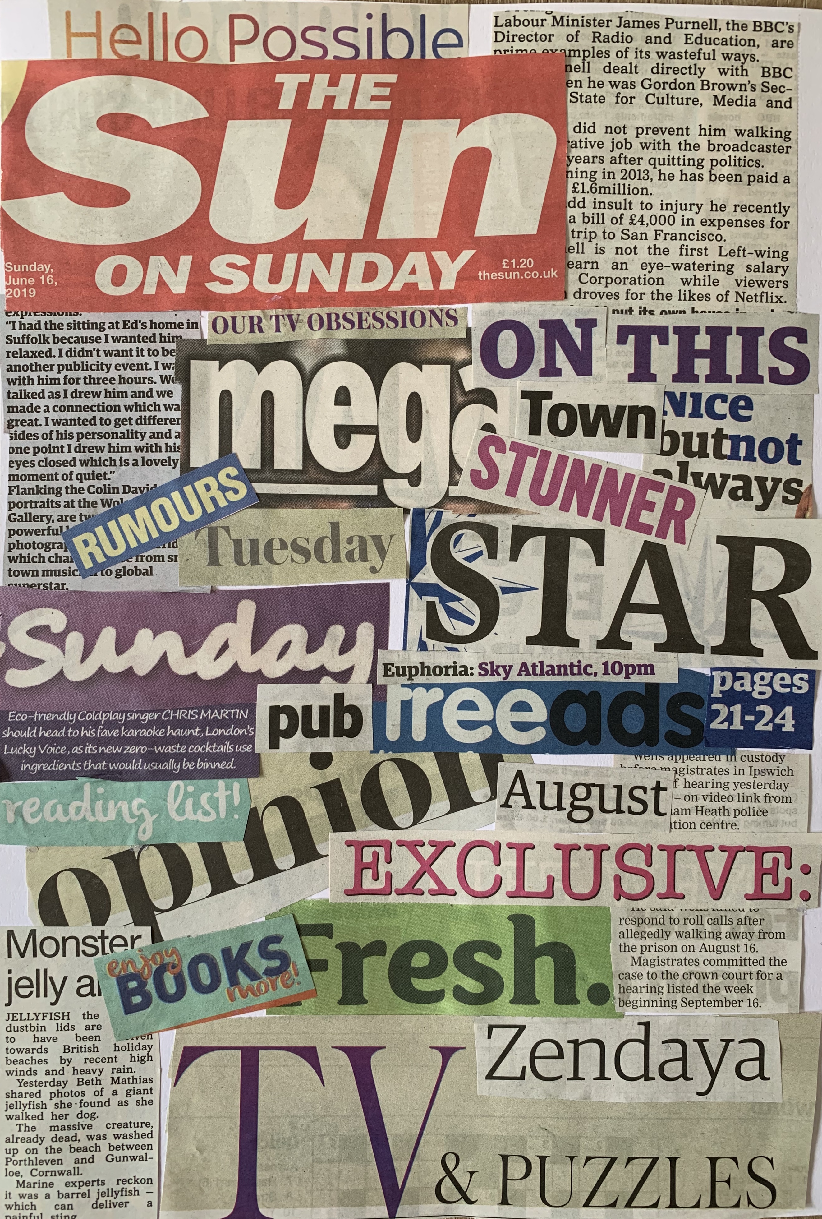
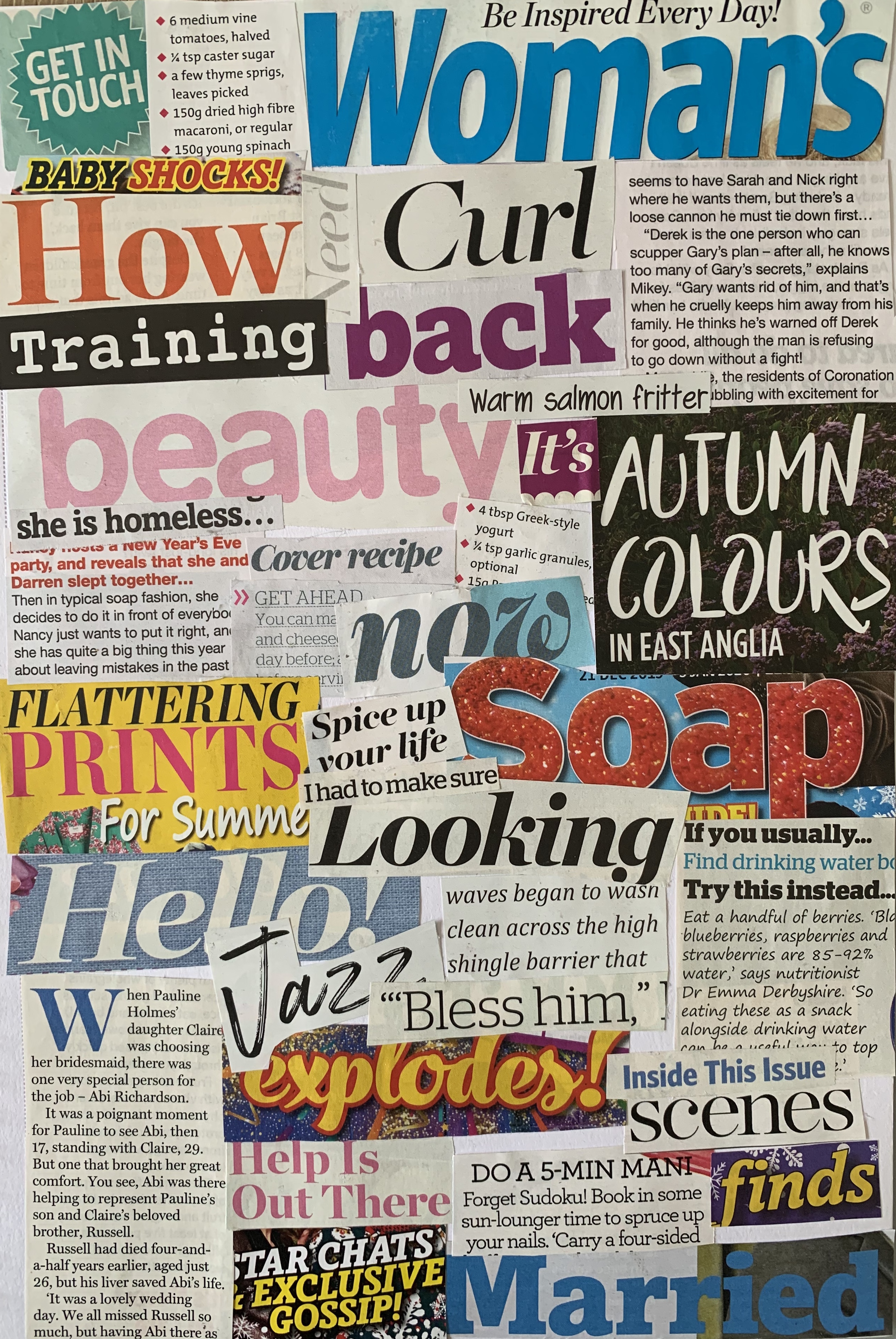
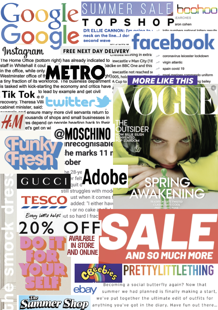
I started off by creating collages from newspapers, magazines and online. Each source uses a variation of typefaces including serif, sans-serif and script. After sticking these down I thought it would of been better to create a mixed collage depending on typeface rather than source! So I went on to create these from new cuttings, the results are as followed.
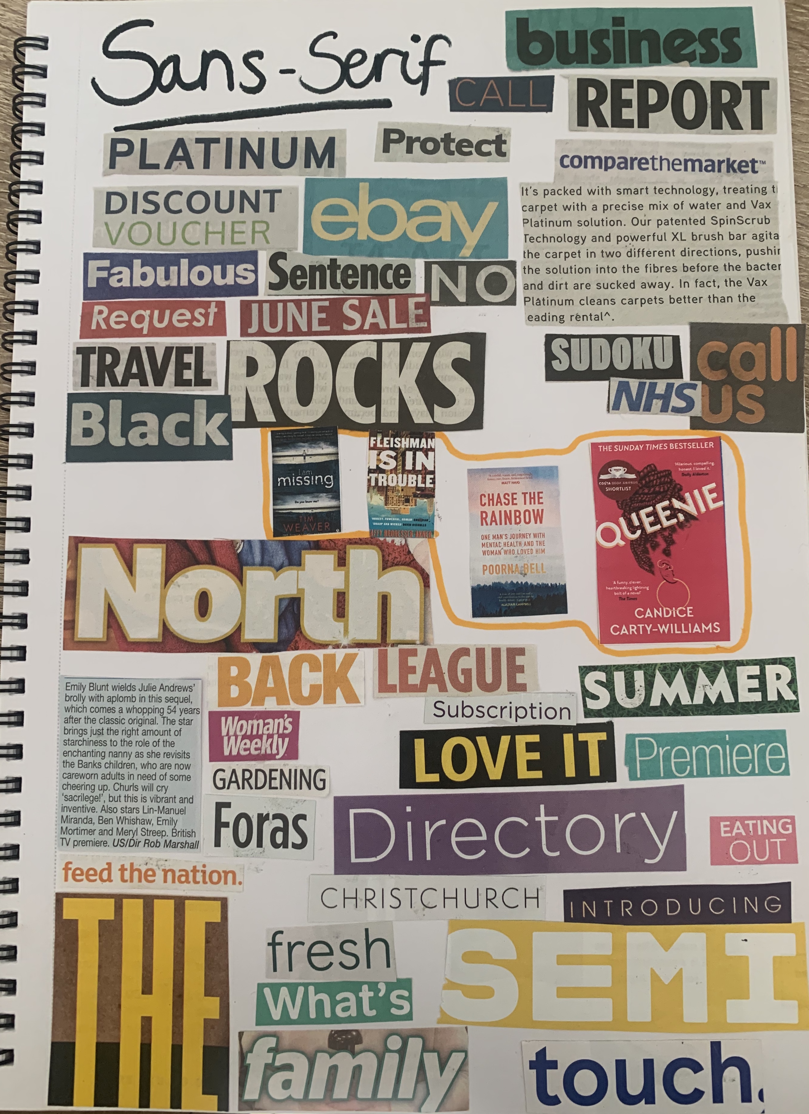
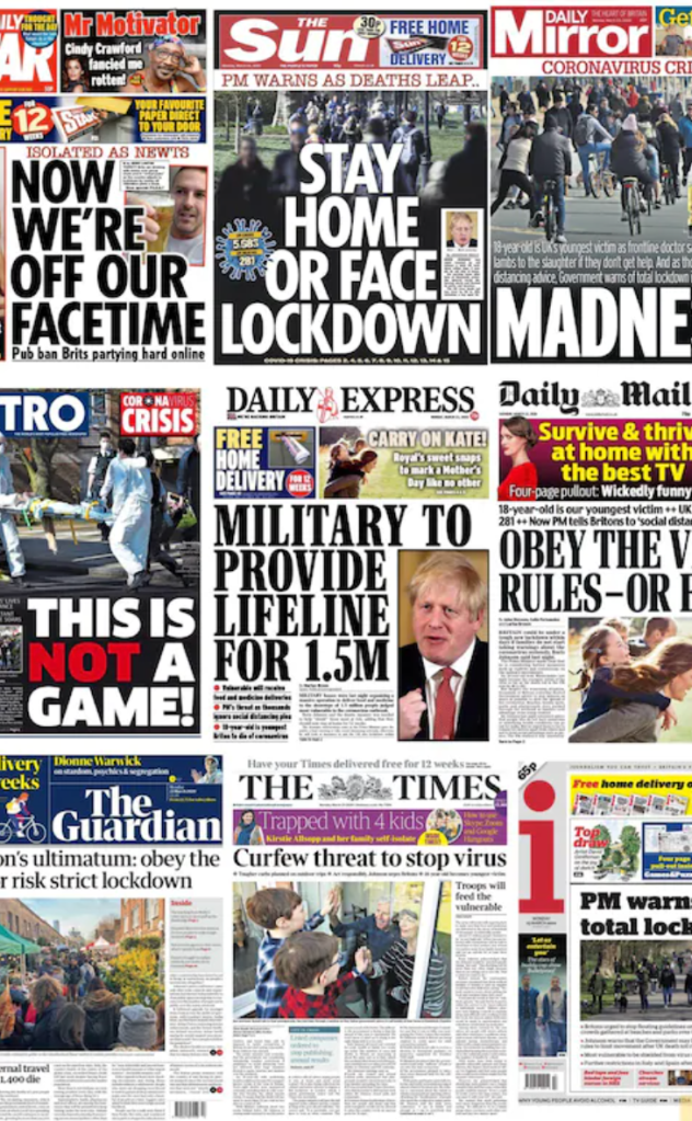
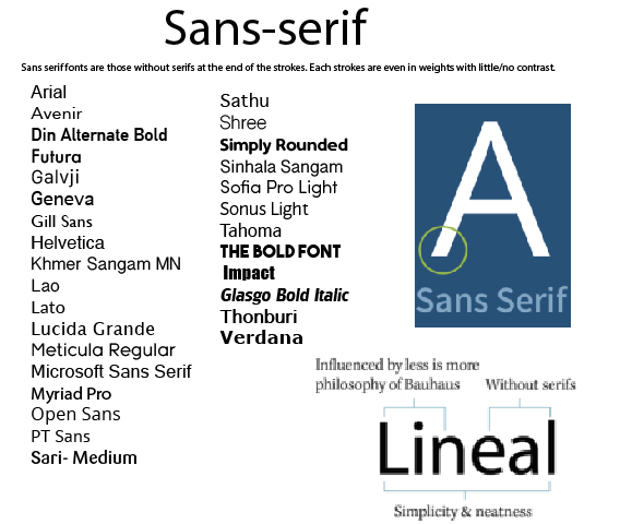
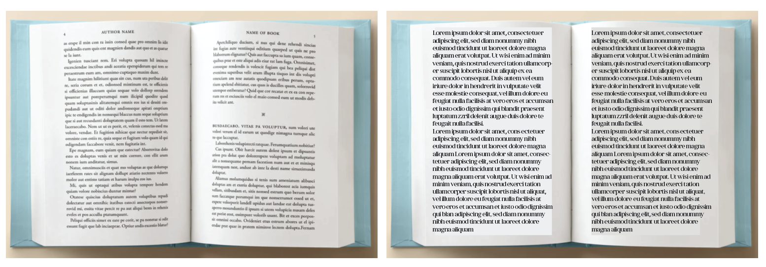
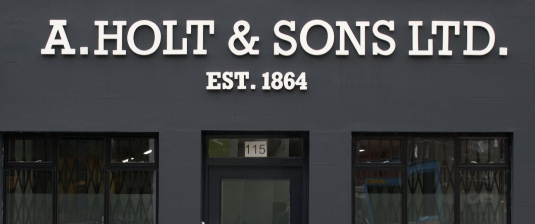
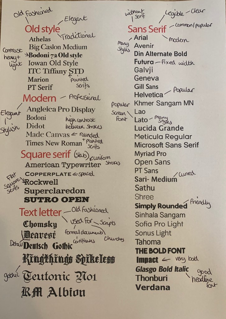
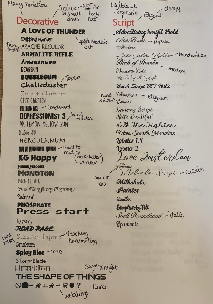
I collected a number of typefaces and arranged them into the correct groups. I noticed that Sans-serif tend to be used more commonly as titles, especially in newspapers – a clear bold font allows things to be read from a distance and to catch the readers attention. I also found sans-serif to be the chosen typeface in most adverts within the newspaper. The body text within papers is Serif, this has been said to help the reader skim read the text and for it to be easier to be read on a small scale.
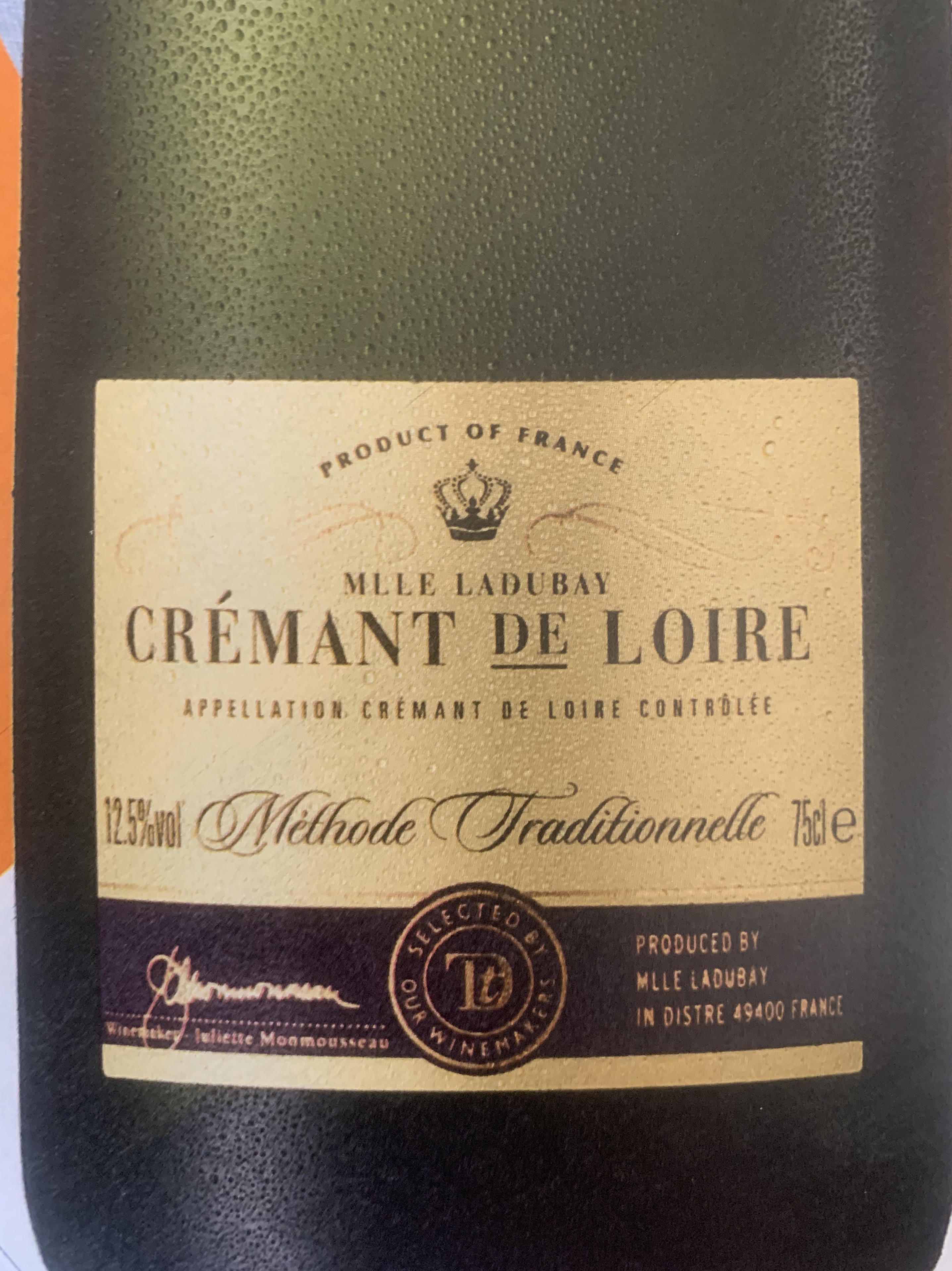
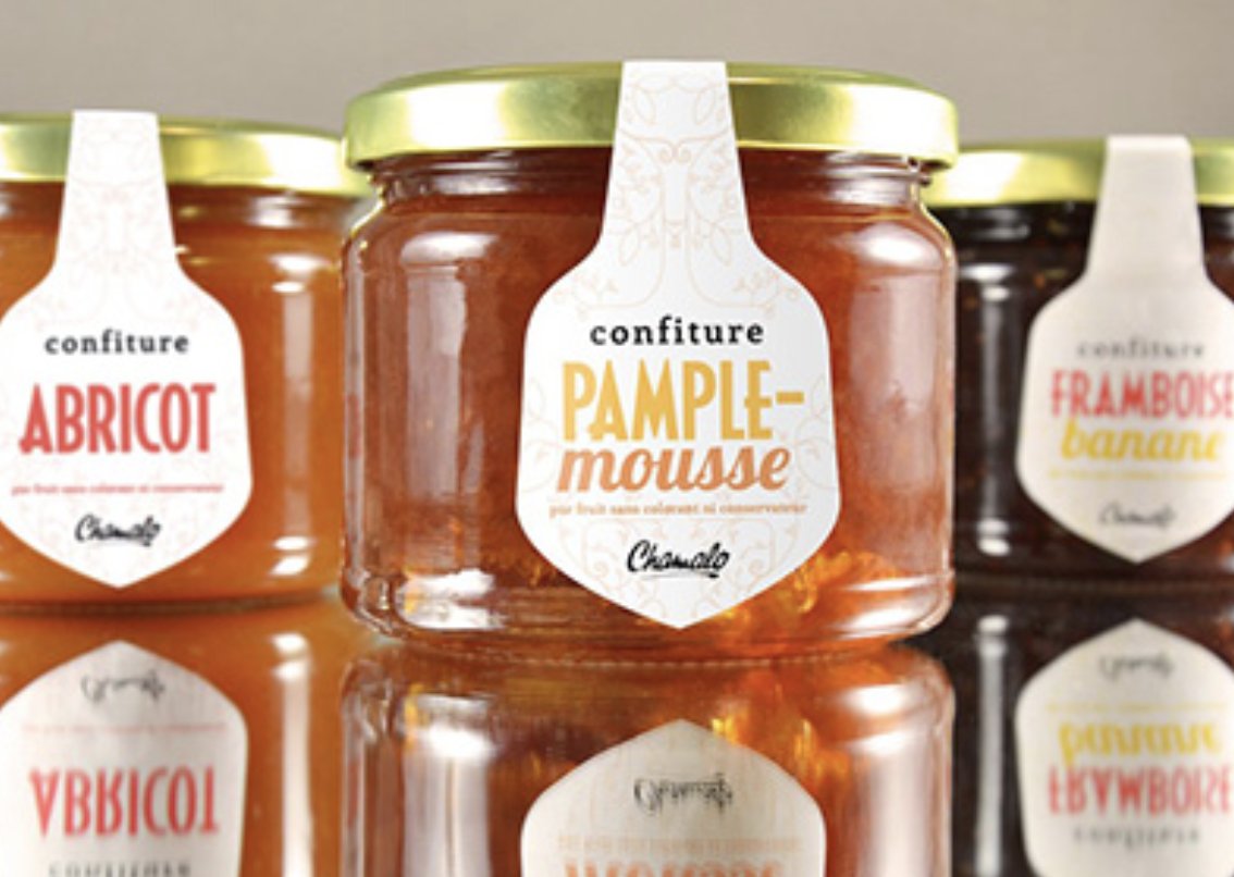
However reflecting on the choices of materials I have with me, they all seem to fall under the same genre (gossip magazines, cheap newspapers) As other papers such as The Daily Mail & The Guardian use serif fonts for their headlines, this gives these particular papers more class and seriousness when read and appear more expensive. The same goes for magazines, within my selection of mainly cheap gossip mags, I had a county magazine which included serif and script typefaces, this feels a lot more luxurious compared to the rest. As a designer it is important to remember these factors so that the work fits within the correct criteria. Typefaces are more important than we think!
Im glad I made the two collages, as whilst writing my reflection above I found myself referring back to the newspaper and magazine collages to see the varieties and quantities of typefaces used within. So both ended up become beneficial which was a relief that I hadn’t wasted my time, nor pages in my sketchbook!
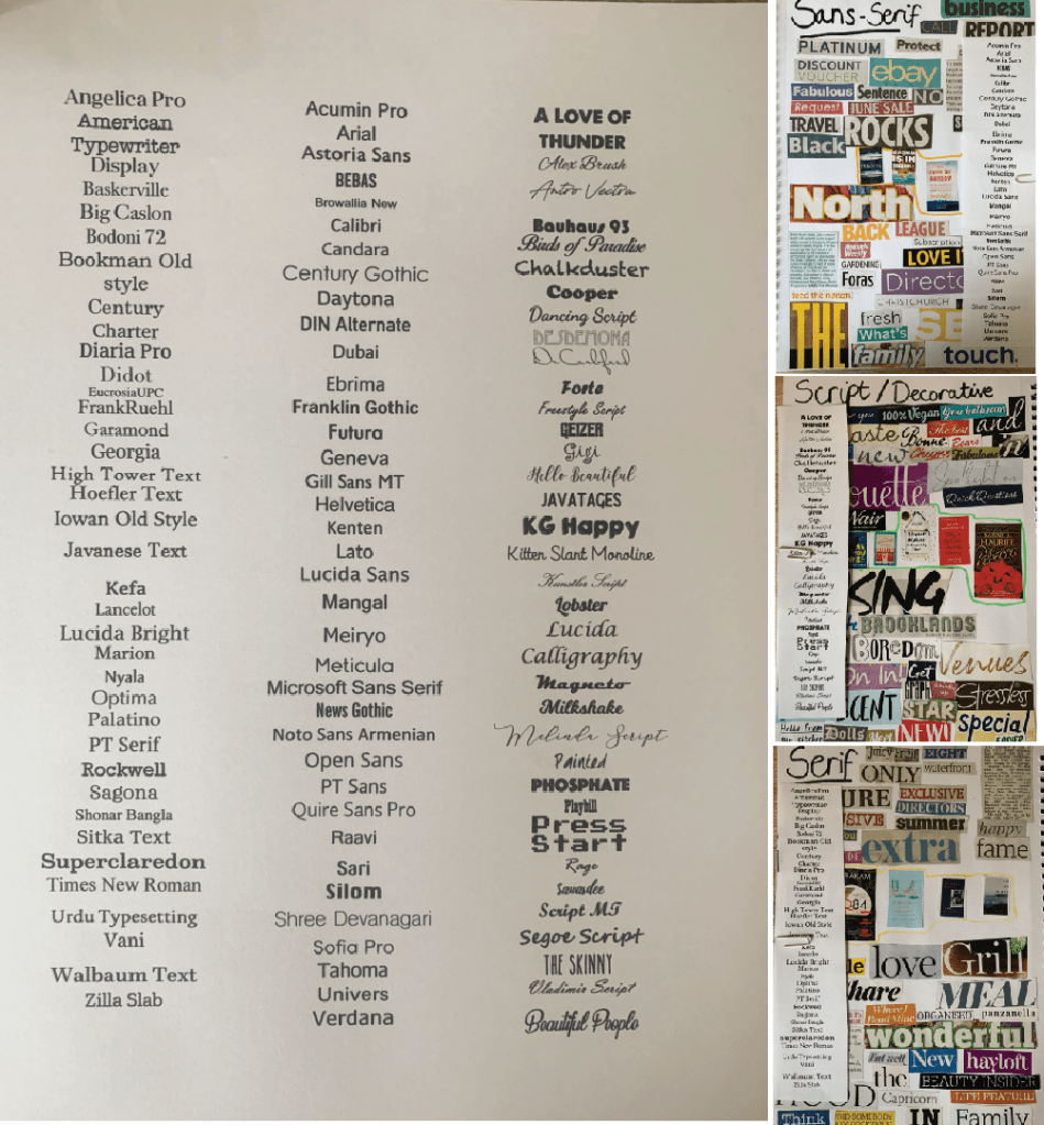
I then sorted through the fonts I have on my computer, I set each typeface to 14pt so I could see how each font varied with weights and x-height etc, I then cut each column and attached it to the collages.
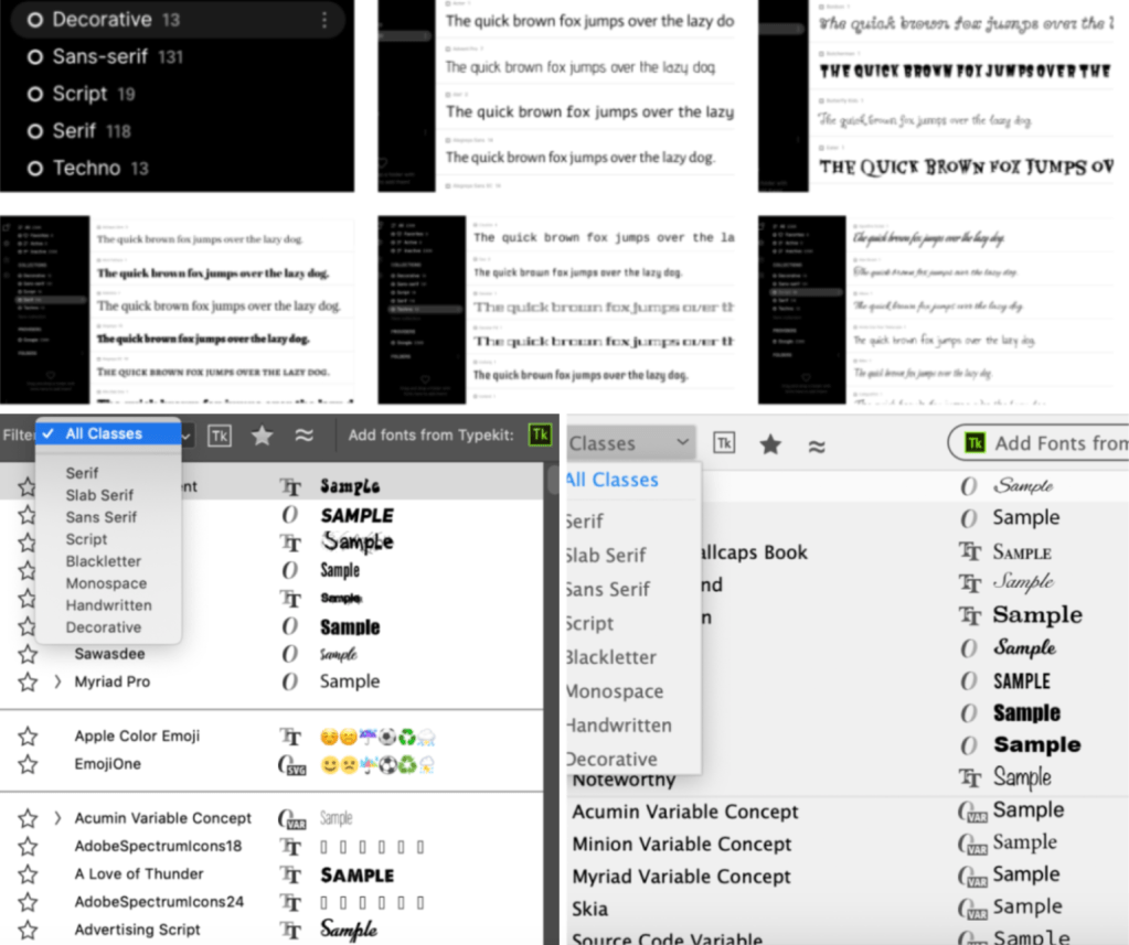
Because I have so many fonts on my laptop I decided to search for a font organiser online and came across FontBase. FontBase helps you quickly manage many fonts, create collections, organise your folders, and start using your fonts in an efficient way. Also both Illustrator and Photoshop have built in filters which sort each typeface into the correct folder.
Following the brief I sorted these fonts out into classifying type groups and added extra information, the results are as followed.
Each page contains the list of typefaces found on my computer along with a brief description of the category, an anatomy diagram and examples of other typefaces which I haven’t got downloaded. Once printed I was able to make brief notes along side some of the typeface.
Identify
For this part of the brief I needed to choose 5 different typefaces from my classification collection and look for examples of how they can be used for reading in different contexts.
The 5 typefaces I have chosen are;
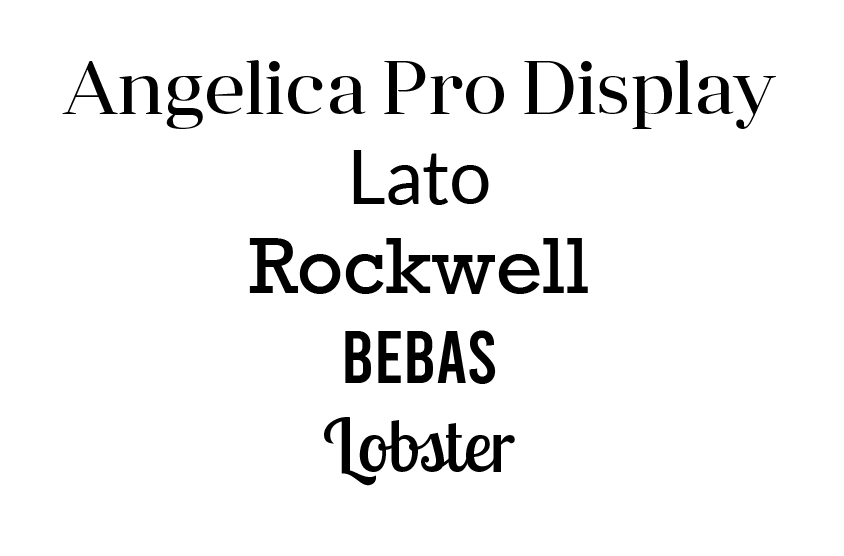
I have selected these particular fonts as I wanted include one from each classification category to give a variety of typefaces and for further exploration.
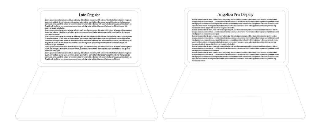
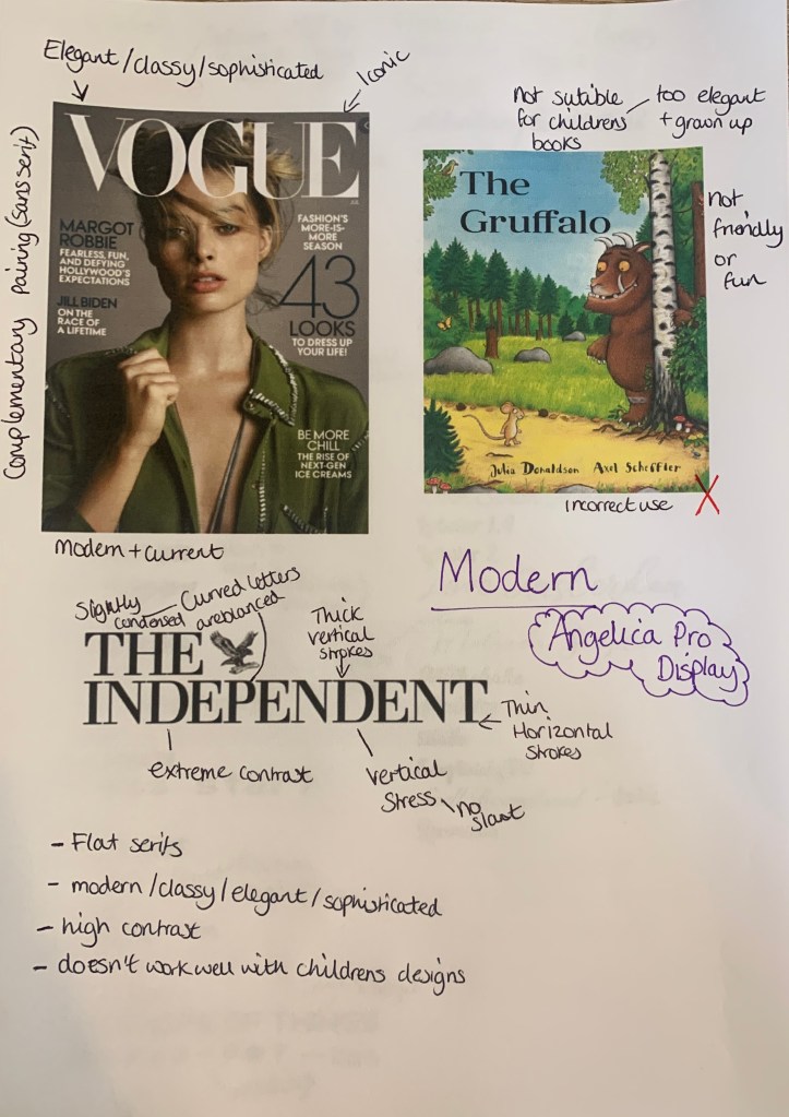
Angelica Pro Display – (modern)
Angelica Pro Display is a modern typeface. This Font Family is developed by Mint Type. They are freely distributed under the SIL Open Font License. Although it was hard to pin point designs used with this exact font, to get an idea of where this typeface has been used and works best, I have found a selection of modern typeface examples.
The Good


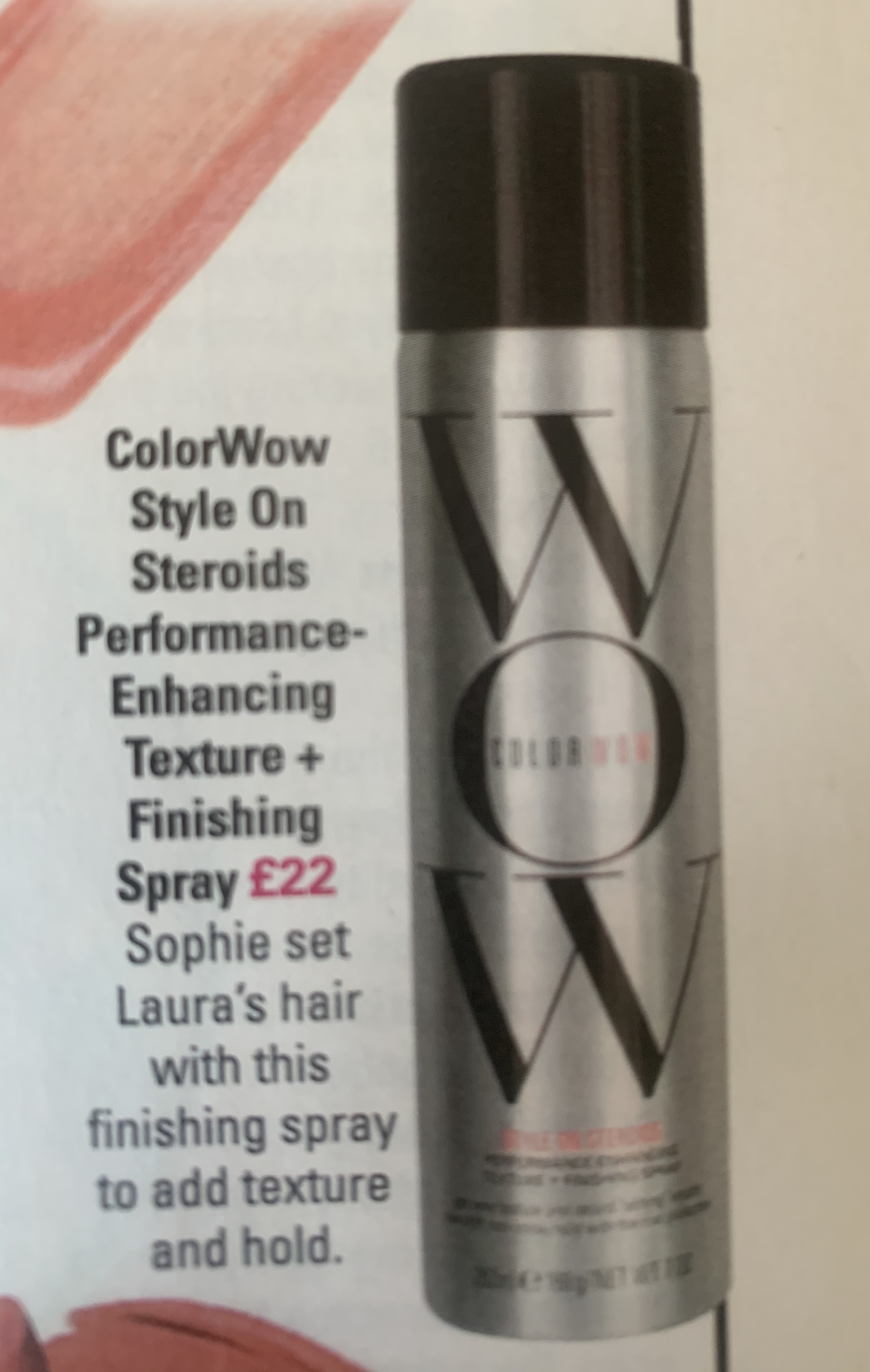
This font look expensive, sophisticated and look as if it represents products of high quality. I wanted to see how the use of typefaces can effect the appearance, and how it changes the way we the things written in this font. I have typed each of the above designs in Angelica pro display (equaling to the closet typeface used) against a mixture of alternative typefaces to see how they change the appearance.
The Bad (comparisons)
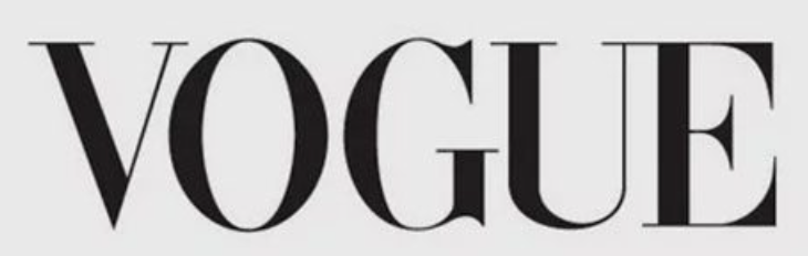
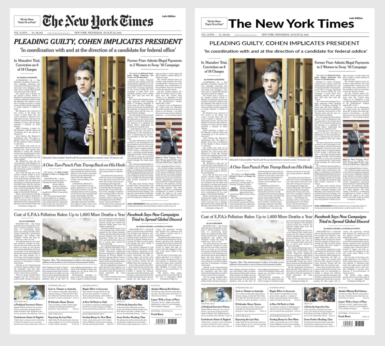
As you can see they change the look completely, this shows the importance of choosing the right typefaces. Although they have been changed to a mixture of typefaces, non of them work well or live up to the ‘high standards’ as the Angelica Pro Display font gives for said ‘brands’. They appear to look cheaper, unrecognisable and less professional. To give a higher impact I have used the alternative typefaces in replacing the original.
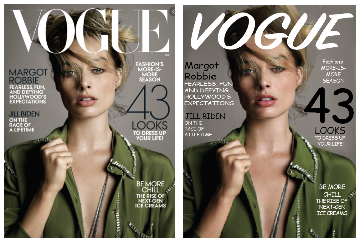
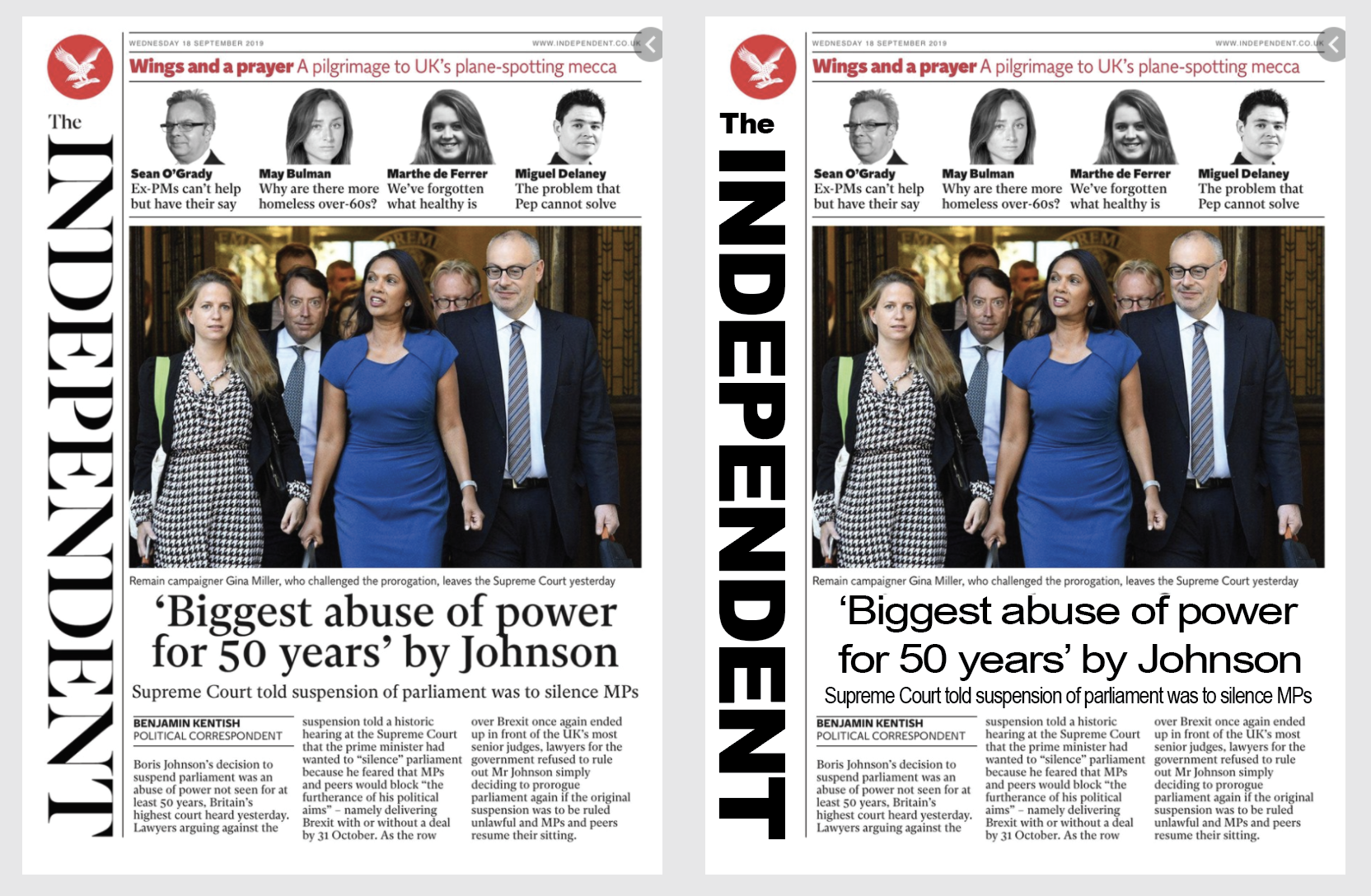
In both of the ‘re-designs’ this automatically takes away the seriousness and class away from both the magazine and newspaper when compared to the original. It shows how delicate the typeface is and how sophisticated it makes things seem; for example the Vogue magazine with the alternative typeface makes it seem like a cheaper gossip magazine, rather than the global successful fashion magazine that it is. The same with The Independent, it looks as if it could be a cheaper news paper in which some may say sells fake news.
& The Ugly!
Visually seeing the above typeface being used successfully against the alternative typefaces, I wanted to see where this typeface (Angelica Pro Display) would look bad and out of place. I have selected two options where I think the font would look out of place and ugly.
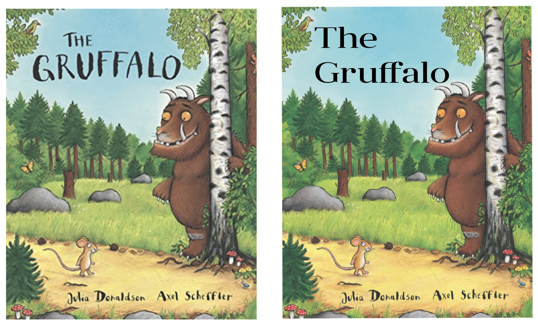
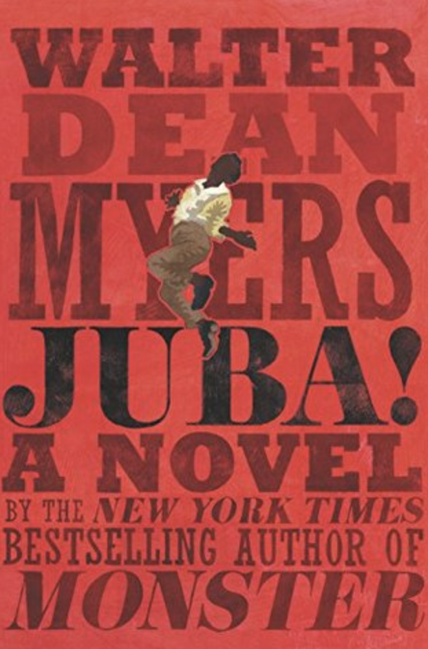
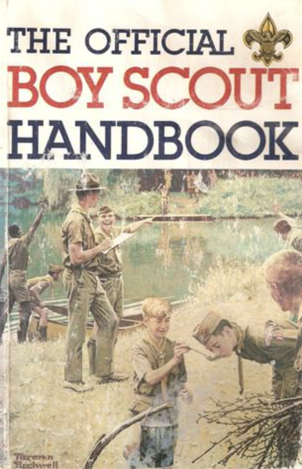
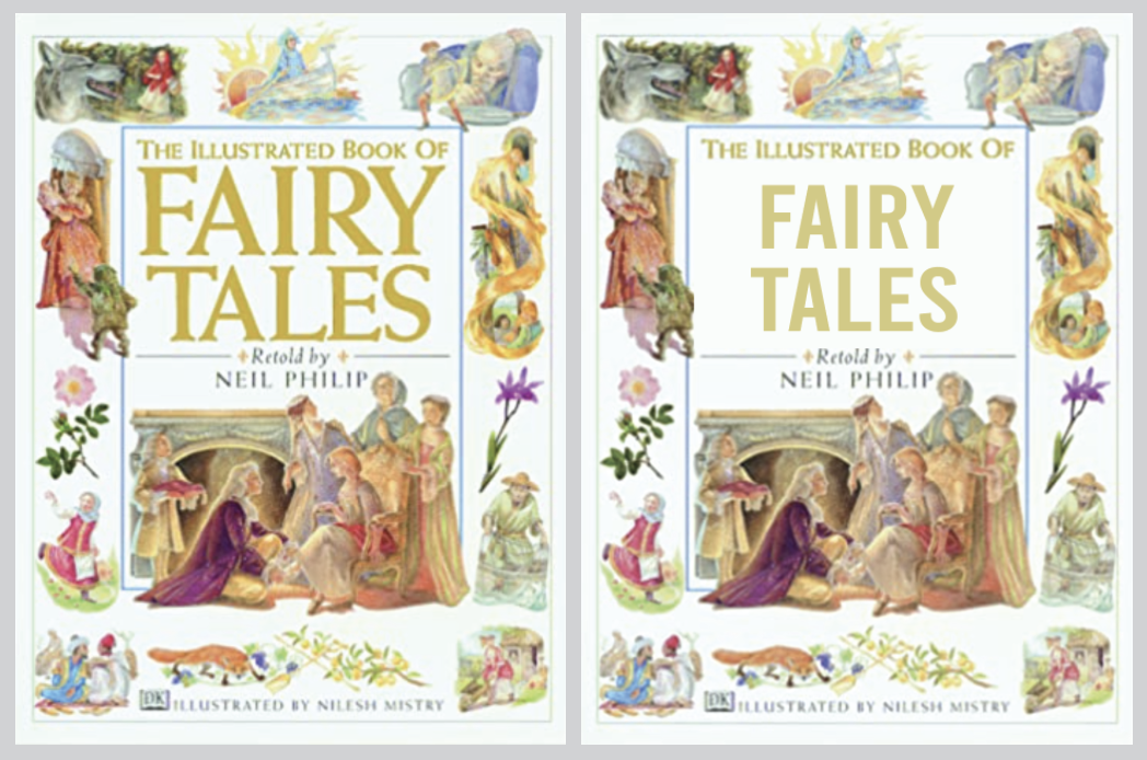
Angelica Pro Display would make a terrible body text font as when the letters are sized down to a smaller size, it becomes totally unreadable and a sight for sore eyes. I then replaced the font on a popular children’s book which I feel changes the cover, it makes it feel more serious and formal rather than the playful fun story that it is.
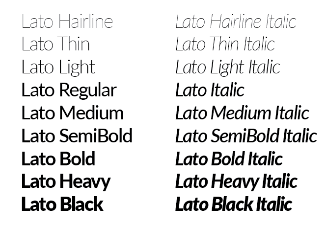
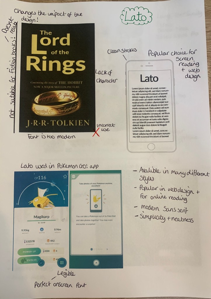
Lato – (sans-serif)
Lato is a sans serif typeface family started in the summer of 2010 by Warsaw-based designer Łukasz Dziedzic (“Lato” means “Summer” in Polish). In December 2010 the Lato family was published under the Open Font License by his foundry tyPoland, with support from Google.
I managed to find this incredibly useful website whilst in the search of Lato in use, (https://fontsinuse.com/typefaces/7521/lato) here it lists places where the fonts have been used.
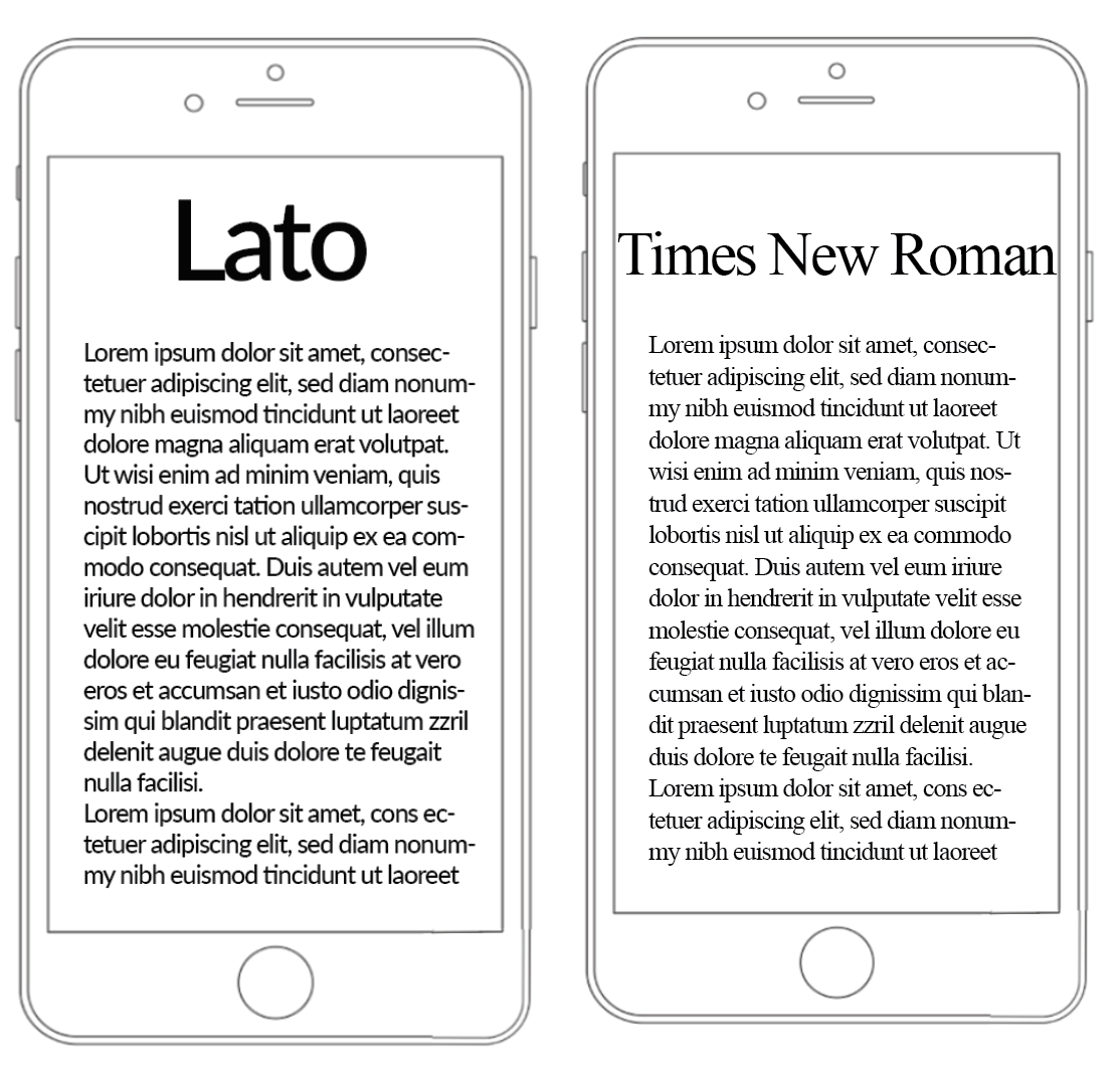
The Good


As you can see above, Lato is mainly used in wed design on websites and apps. The clean, crisp lines of this sans serif fonts is the main reason why many web designers prefer this type of font for on-screen use. It was interesting to discover that Lato was used in the popular Pokemon Go App!
There are many different styles available for this typeface, which would attract more designers to opt for this typeface, some of the thicker and thinner strokes also would make good pairings.
The Bad (comparisons)
As Lato is more popular in the wed design world I wanted to compare this typeface to others which wouldn’t work successfully on screen.
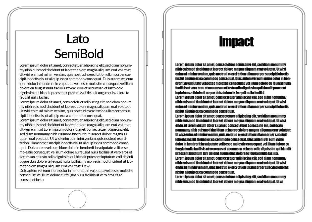
As you can see from the above examples, regardless of the size of the screen Lato can be easily read, this is due to its clean clear stokes which makes the font legible and easy on the eye. This typeface also has a modern feel to it which I feel oddly makes the technology look better? I feel the modern typeface with the modern technology make a complimentary pair.
& The Ugly!
Here I wanted to see where this typeface wouldn’t look as successful, my first thought was for it to feature on printed items to see how it would look.
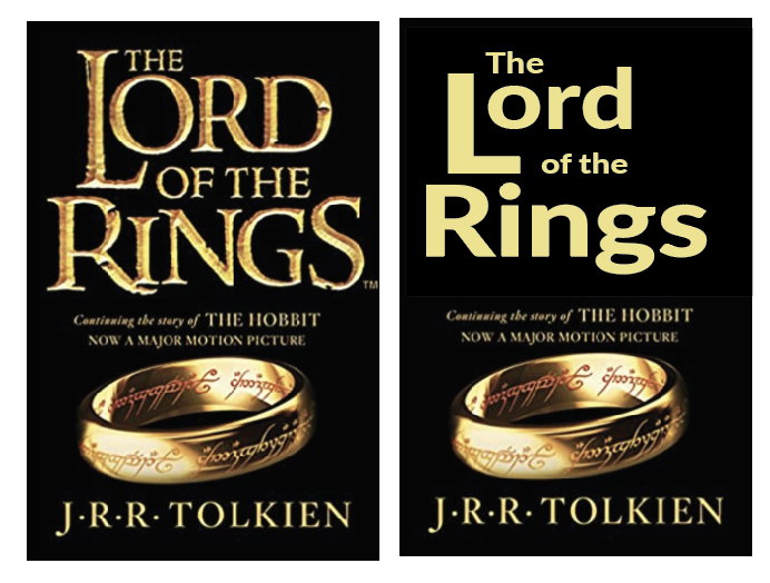
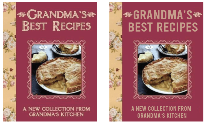
As you can see from replacing the main typefaces on ‘The New York Times’ newspaper it has given it a ‘homemade’ cheaper appearance. Lato is not suited for either of the above designs, The book cover of Lord of the rings looses a large impact from the medieval serif typeface used in the original.
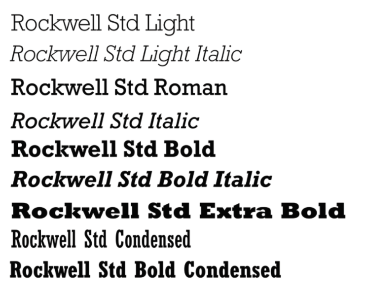
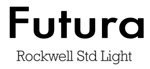
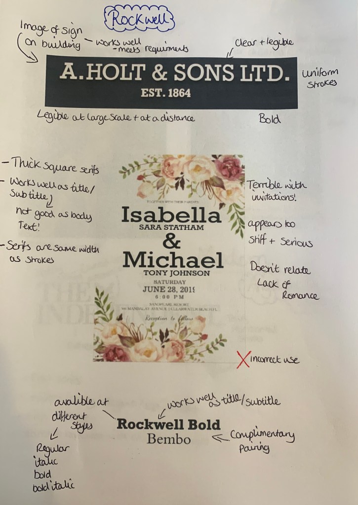
Rockwell – (square serif)
Rockwell is a square/slab serif typeface designed by the Monotype Corporation and released in 1934. This typeface is distinguished by a serif at the apex of the uppercase A, while the lowercase a has two storeys. Because of its monoweighted stroke, Rockwell is used primarily for display or at small sizes rather than as a body text.
The Good
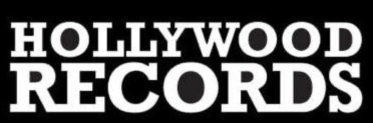
Rockwell appears to be a very bold and an attention grabbing font used in small doses to attract the attention of an audience. Although it is a serif font, it is bold and heavyset, making it a poor choice for large pages of text. Above its been used in a variety of ways from shop signs to book covers to logos.
The Bad (comparisons) – This ones not so bad!
Rockwell is available in a number of different styles, all which would make ideal headings/subheadings, but as mentioned before not ideal for body text. This made me think about which typefaces would make good parings with to create a successful design.
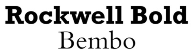
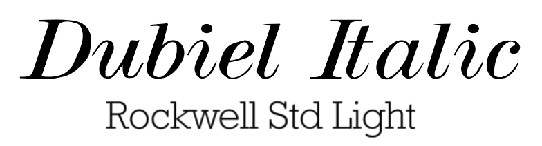

Although Rockwell can be a ‘bulky’ font, when paired with more delicate fonts such as Bembo & Dubiel Italic it creates the perfect balance for something you may seen in the pages of a magazine or in some cases the cover of books or posters.
& The Ugly!
Here I wanted to experiment with how Rockwell can be used badly and where it shouldn’t be seen!
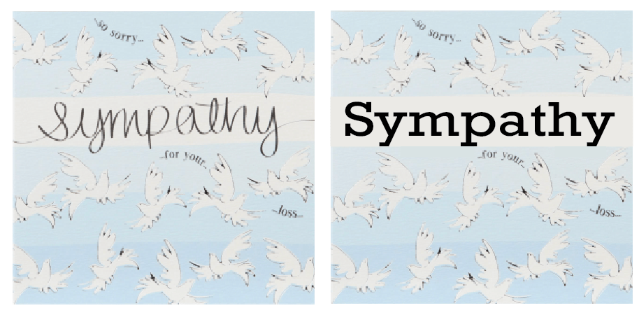
Because Rockwell is the opposite to a script typeface with its sharp, blunt serifs I thought this would be the perfect Not to do examples, as you can see the by replacing the script on items which are meant to be joyous and sympathetic it makes you read the words differently due to the font. This has been the first example so far of my selection which has made me feel this way.
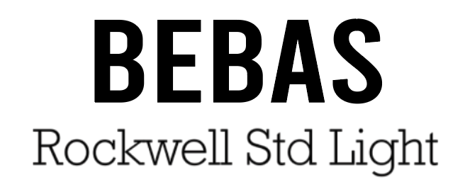
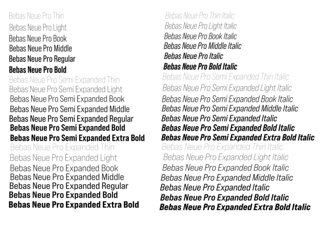
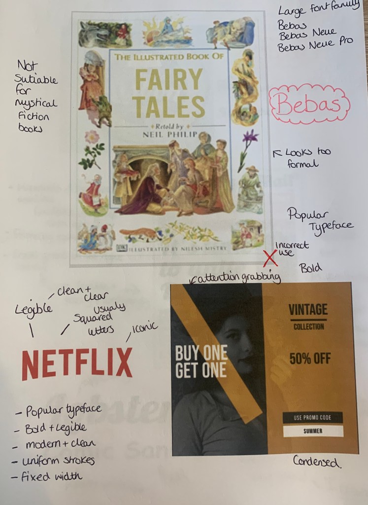
Bebas – (Display)
Bebas is a display family suitable for headlines, captions, and packaging, designed by Ryoichi Tsunekawa. It’s based on the original Bebas typeface. The Bebas family has had many adaptations over the years, the newest style out (2019) is Bebas Neue Pro, with 40 different styles making this typeface ascetically pleasing.
The Good

Bebas seems to be widely used from book covers, to posters, to album artwork even to the famous Netflix logo. This typeface seems to be a favourite due to its clear bold modern font which seems to fit in place with most designs.
The Bad (comparisons)
I found a couple of adverts online which used the typeface Bebas so I decided to compare these along with the Netflix logo with different typefaces.


Seeing the originals next to the ‘re-designs’ you can see why it was chosen in the first place, Bebas is bold and eye catching.
& The Ugly!
Finally I wanted to test out where Bebas isn’t suited and looks out of place.
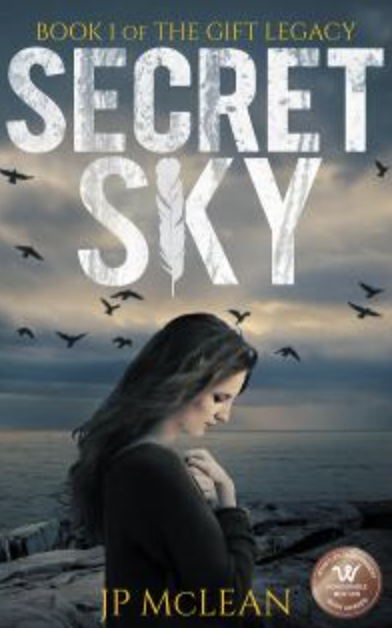
It was a little harder than with previous fonts to find a place where Bebas looks out of place, however I decided to achieve the highest impact I needed to replace Old style typefaces, this took a few goes but eventually settled on two which I felt Bebas looked out of place, it seems too modern for the style and design of the book. But as mentioned.. this was a challenge! (plus this is one of my go to fonts so I found it harder to dislike it)
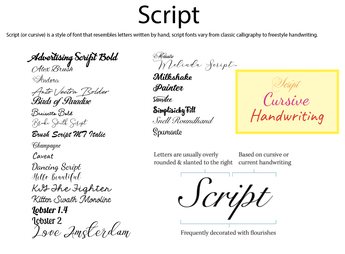
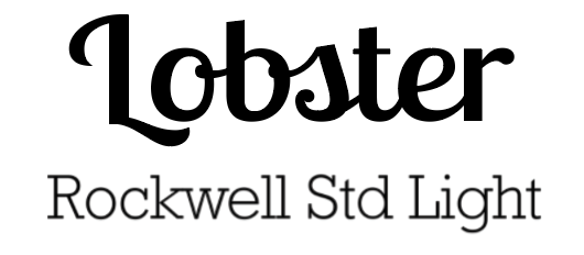
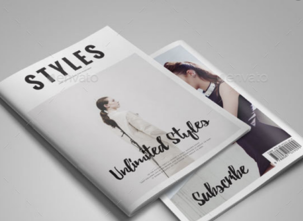
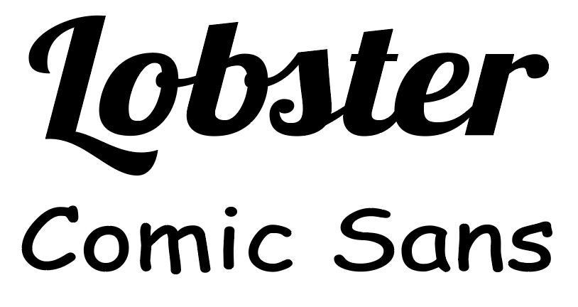
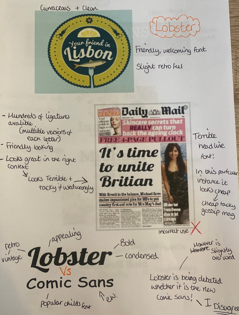
Lobster – (script)
A lovely Bold Condensed Script fully loaded with hundreds of ligatures and alternates giving us the possibility to have multiple versions of each letter. The font was created in 2010 and introduced to the Google font library.
The Good
Lobster seems to be used vastly across the design world in many countries. Upon research of this typeface I discovered that it isn’t loved by all, with many asking if this is the modern day Comic sans. I feel Lobster is much more elegant font, with its neat details, strong personality, and a large number of ligatures, which have been carefully designed. – So I strongly disagree with this being compared to Comic Sans.
The Bad – (comparisons)
I wanted to compare Lobster to other typefaces to see how it works in comparison to other typefaces. What better way to start than with Comic Sans!

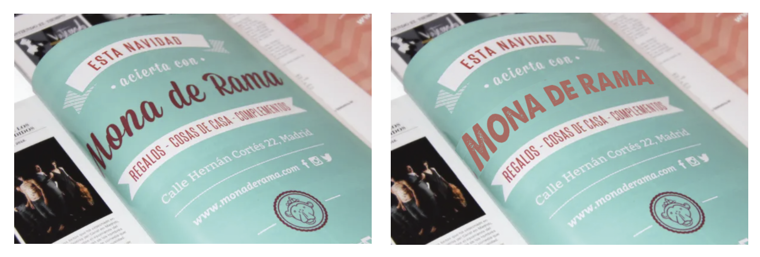
Lobster has a friendly and welcoming feel to itself, I especially noticed this in the ‘your friend’ image, the Serif typeface Baskerville gave this cheery image a more serious and well, boring feel to it.
& The Ugly!
Finally I wanted to see how Lobster would look in the wrong places!
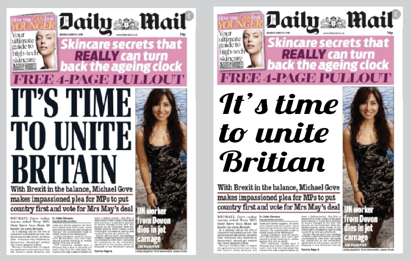
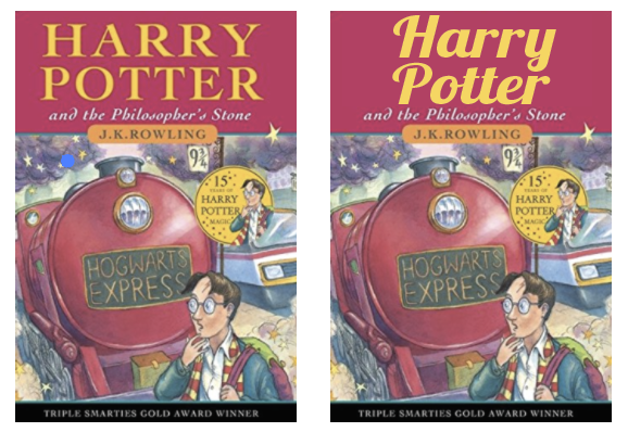
The Daily Mail headline replacement of Lobster was an easy bad choice, because when ever have you seen a script typeface on the front of a national newspaper? It’s difficult to read and looks out of place with the pairings of the other typefaces used. With the Harry Potter book although its doesn’t look as terrible as the previous, it’s still not the best choice for the type of book. Although I like the typeface Lobster, if used in the wrong context it can look rather… tacky!
Reflect
For this part of the brief I have been asked to consider and reflect on the nature of the type that I have collected and to annotate printouts with my own impressions of the letterforms.
I have made notes alongside some of the examples used above and came up with the following;
Develop
I needed to trace some interesting, unusual and everyday letterforms to help with the understanding of the distribution of weight of line within a particular letterform.
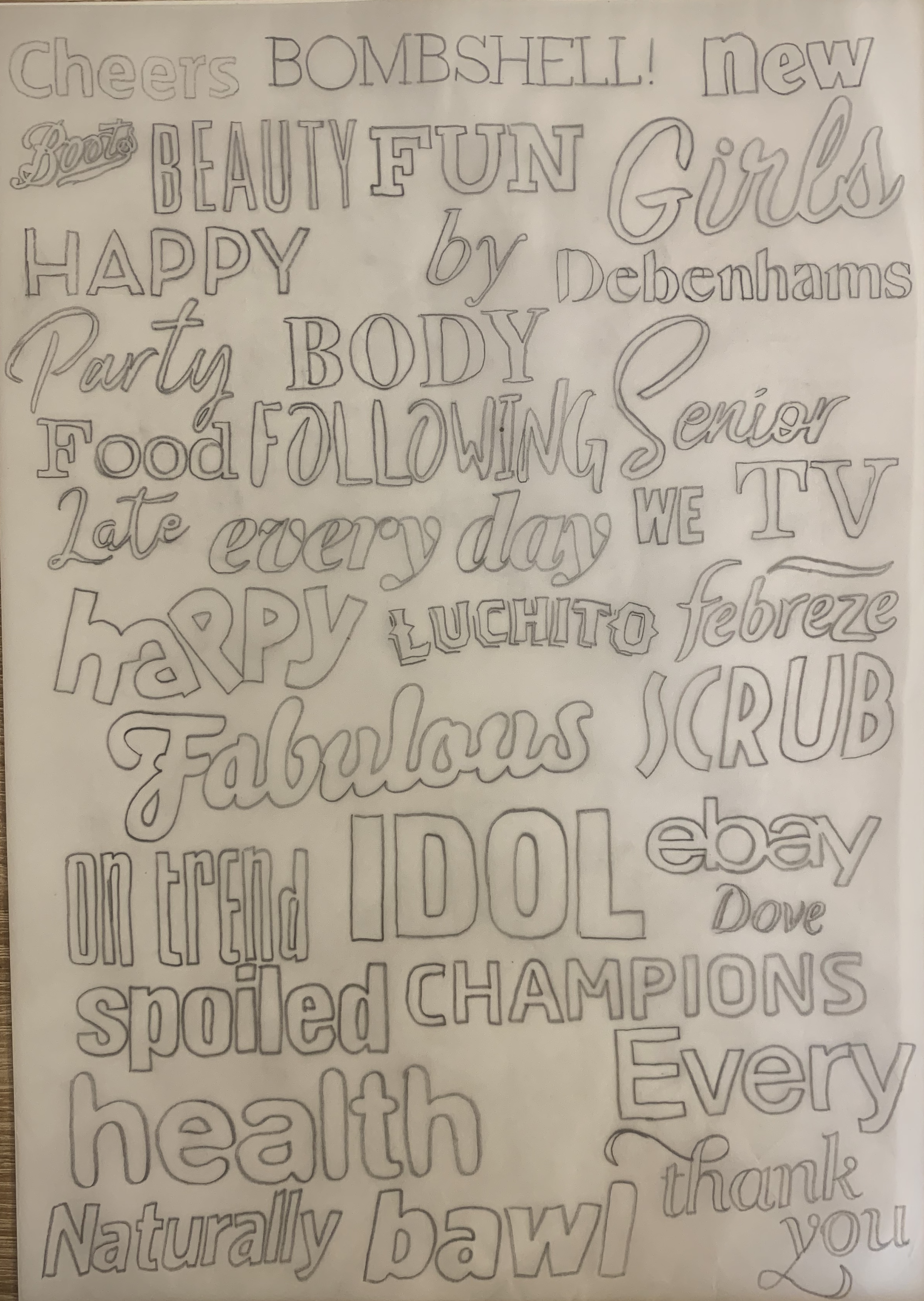
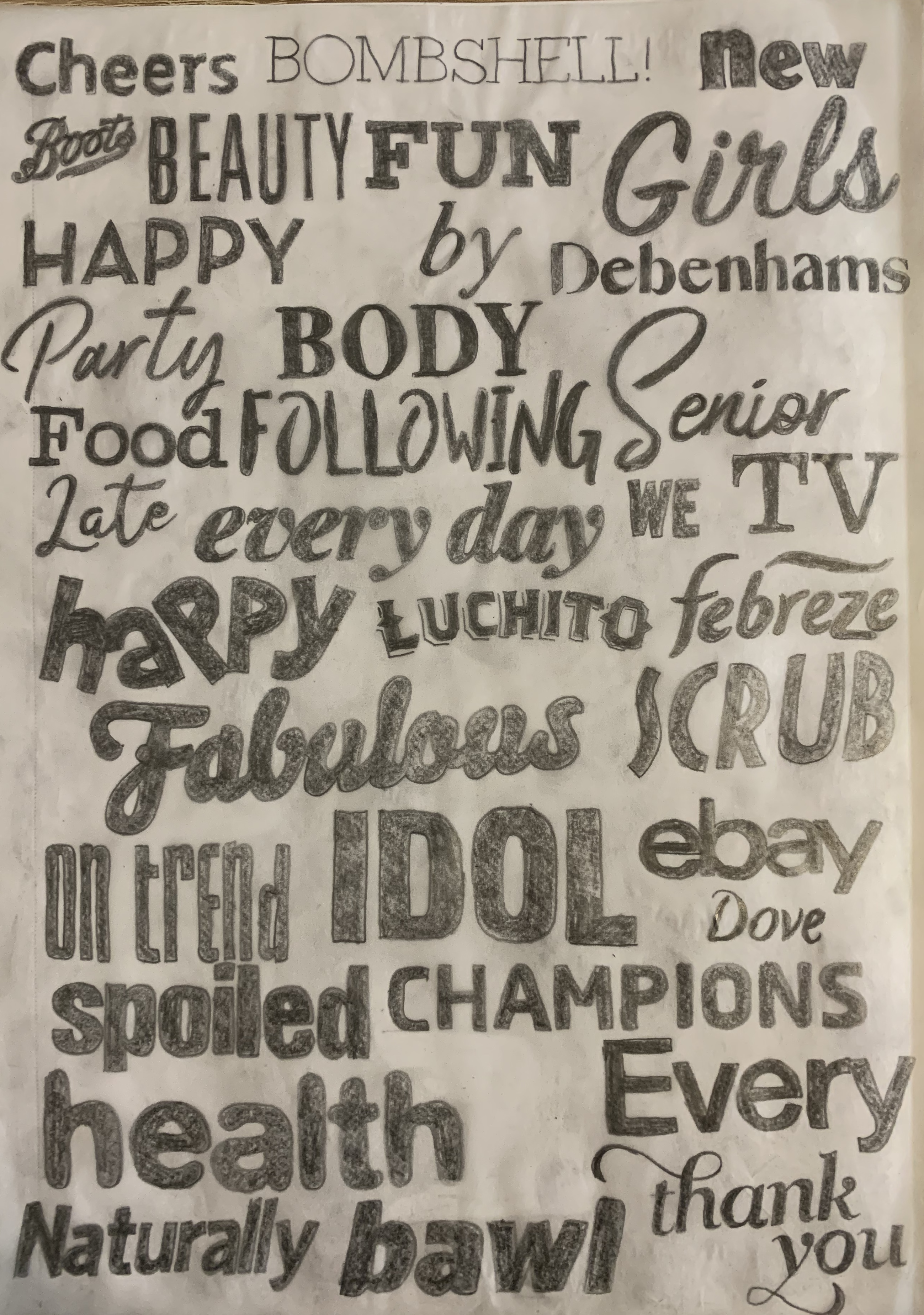
I used a mixture of magazines, leaflets and newspapers to trace over as many different typefaces as possible. Firstly I drew the outside of the letterforms to focus on the structure of the strokes, serifs and curves of the letters, this made me pay close attention! I then coloured these in to see the full effect of the typefaces. I found the script typefaces most challenging due to the various stroke widths and smoothness of the curves.
Reflection
I found this exercise really interesting, I have always been a fan of typography but haven’t explored it quite like this. It was good to test how and experiment how the typefaces can be used in the wrong context and to be seen in an unpleasing way. It has reminded me in the importance of choosing the correct typeface and how they can be read and what characteristics they carry in themselves.
