Brief: Identify a range of books that have fundamentally different functions in terms of how these books are engaged with – how they’re held, where they’re read, by whom, and for what purpose. Try to look at least six books, but you can extend this if you want to. The differences between these books might be determined by
their genres. For example, you might look at a cookery book, a biography of a sports personality, a travel guide, a work of historical fiction, a teenage film tie-in like Twilight, this course guide – the choice is yours.
Think about how each book’s form reflects its function. The front cover is an obvious starting point (and the focus on your upcoming assignment) but try to look more broadly than this. Think about things like page extent, paper quality, typeface, the weight of the book, imagery and more. Is the book illustrated with photographs, reproduced images or drawings? Are these concentrated in one or two places or distributed throughout the book? What about front matter and end matter? Historical novels like Hilary Mantel’s Wolf Hall may have family trees and/or a list of characters as part of the front matter. A scholarly biography will usually have many pages of end-notes and references.
Reflect on this in your learning log, with examples of some of the books you’ve selected. Identify how each book designer has reflected the genre and function of your chosen books in their final design.
Book Selection
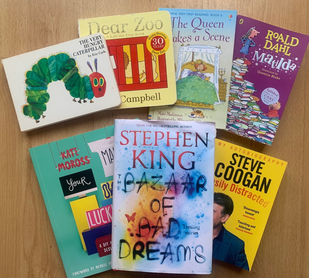
I have selected 6 different types of books to look at, I have tried to be as versatile as possible with my selection.
Book 1 – The Very Hungry Caterpillar by Eric Carle – Children’s board book
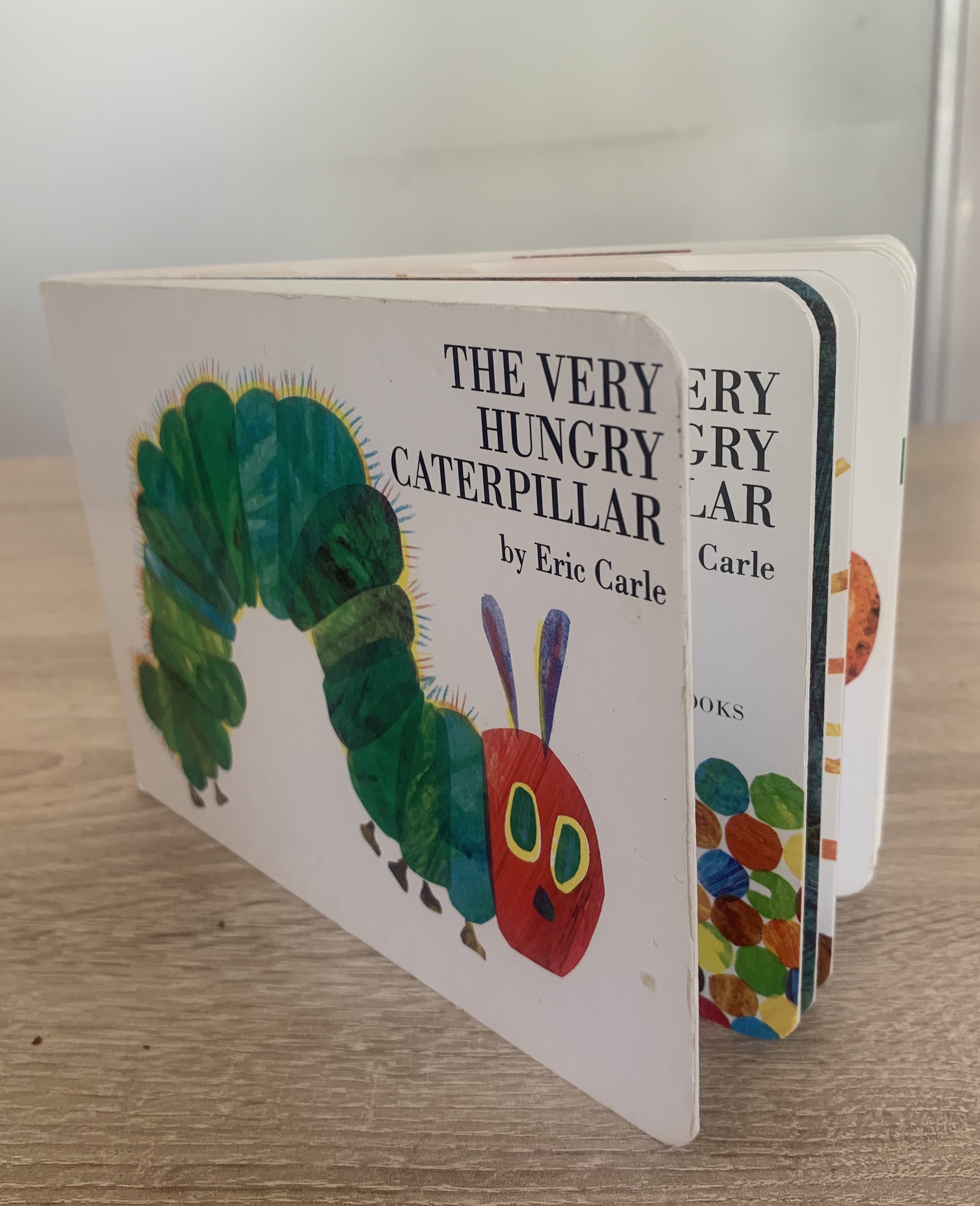
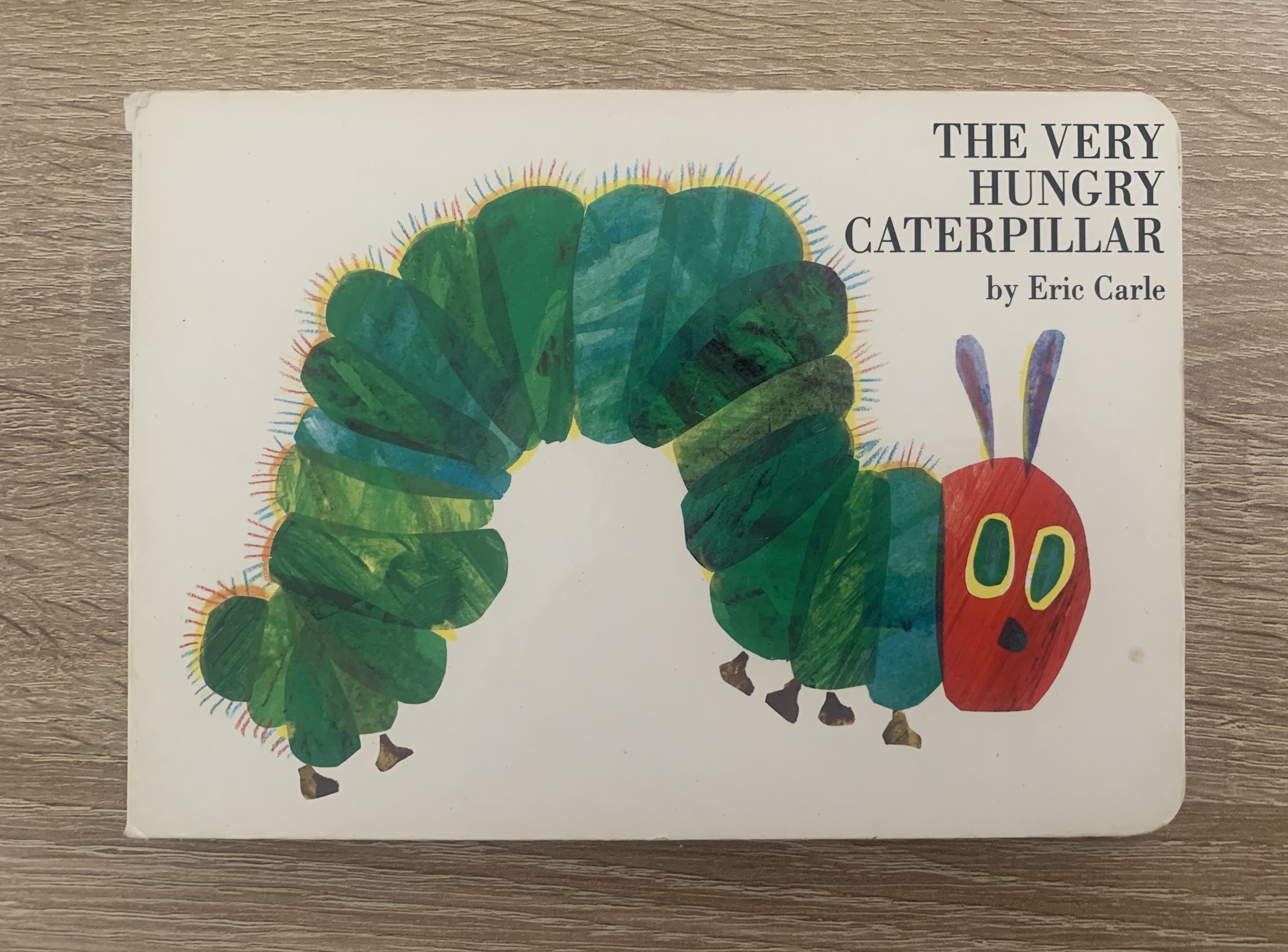
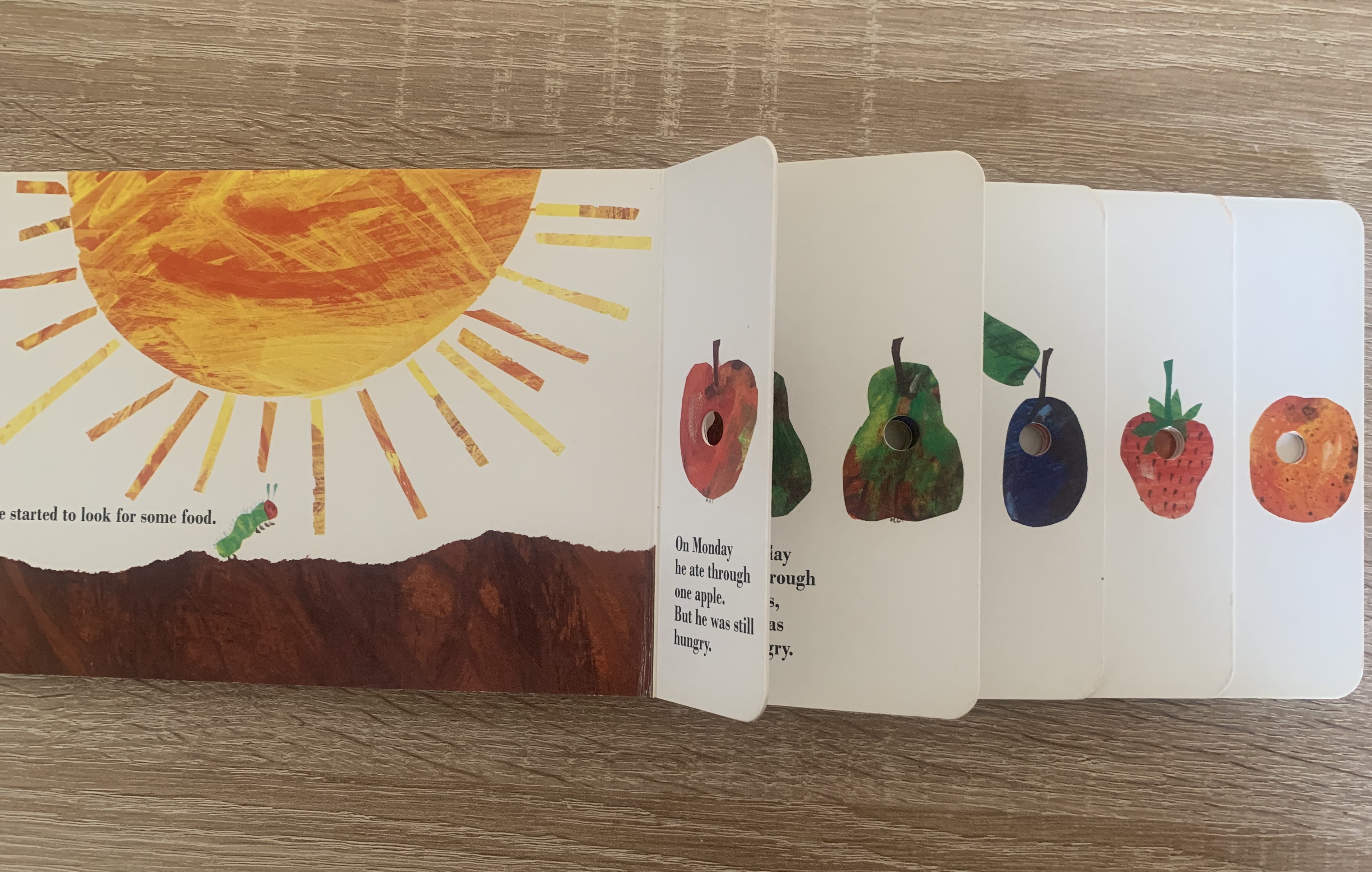
Upon first glance you will notice the mixed media illustration of the iconic Hungry Caterpillar on the cover, along with the title. The cover is simple and minimal and obvious that it is aimed at a younger audience. The same illustration style runs through each page of the book, these illustrations are made by different brush strokes, torn edges and coloured pencil. Within the book there is a particular part of the story where the caterpillar eats through various foods, four of these pages are cut shorter to create a step effect and contain a number of holes per page which are placed in the centre of food, this is made to look like the has caterpillar eaten through the pages and the food. This creates a fun and imaginative part of the book which children find amusing and fun, I think that this is clever and unique touch to the story.
With this particular edition of the book being a board book it makes it easier for young children to hold and turn the pages on their own, which helps them to feel involved. It’s also beneficial that they are harder wearing so children can view them without constant supervision of worrying about pages being torn or bent.
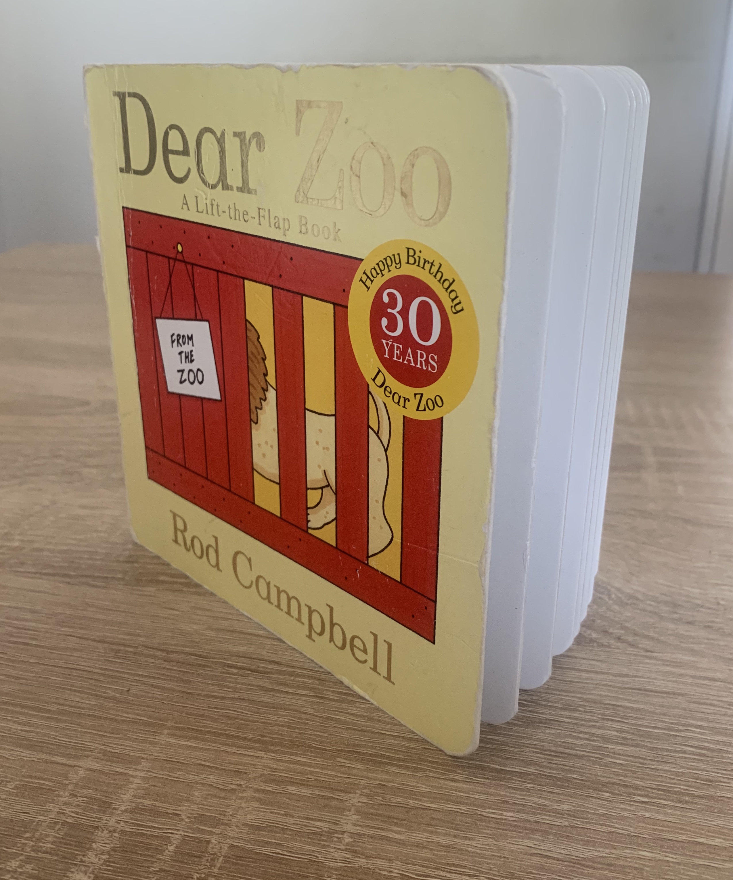
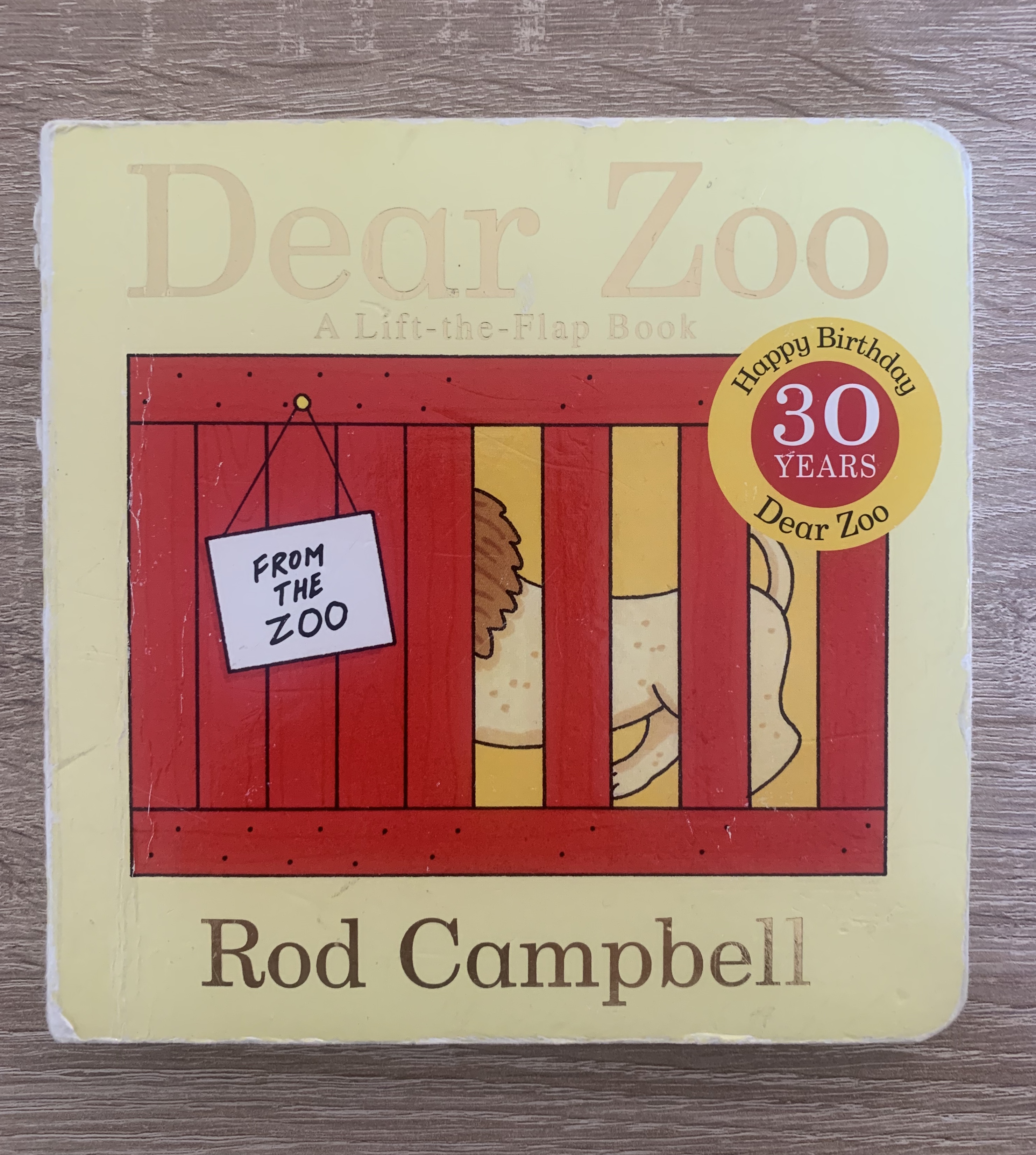
Book 2 – Dear Zoo by Rod Campbell – Children’s lift-a-flap book
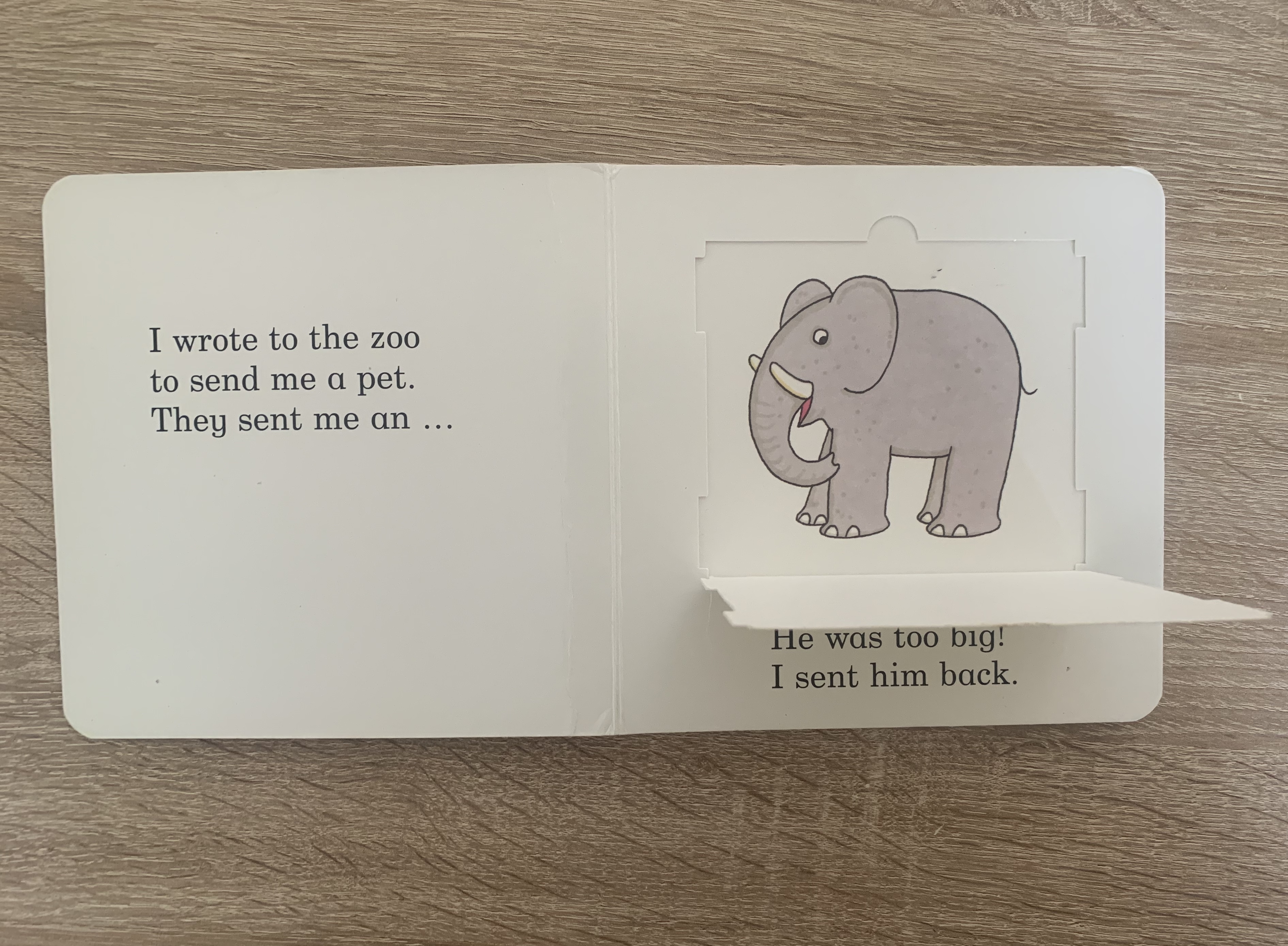
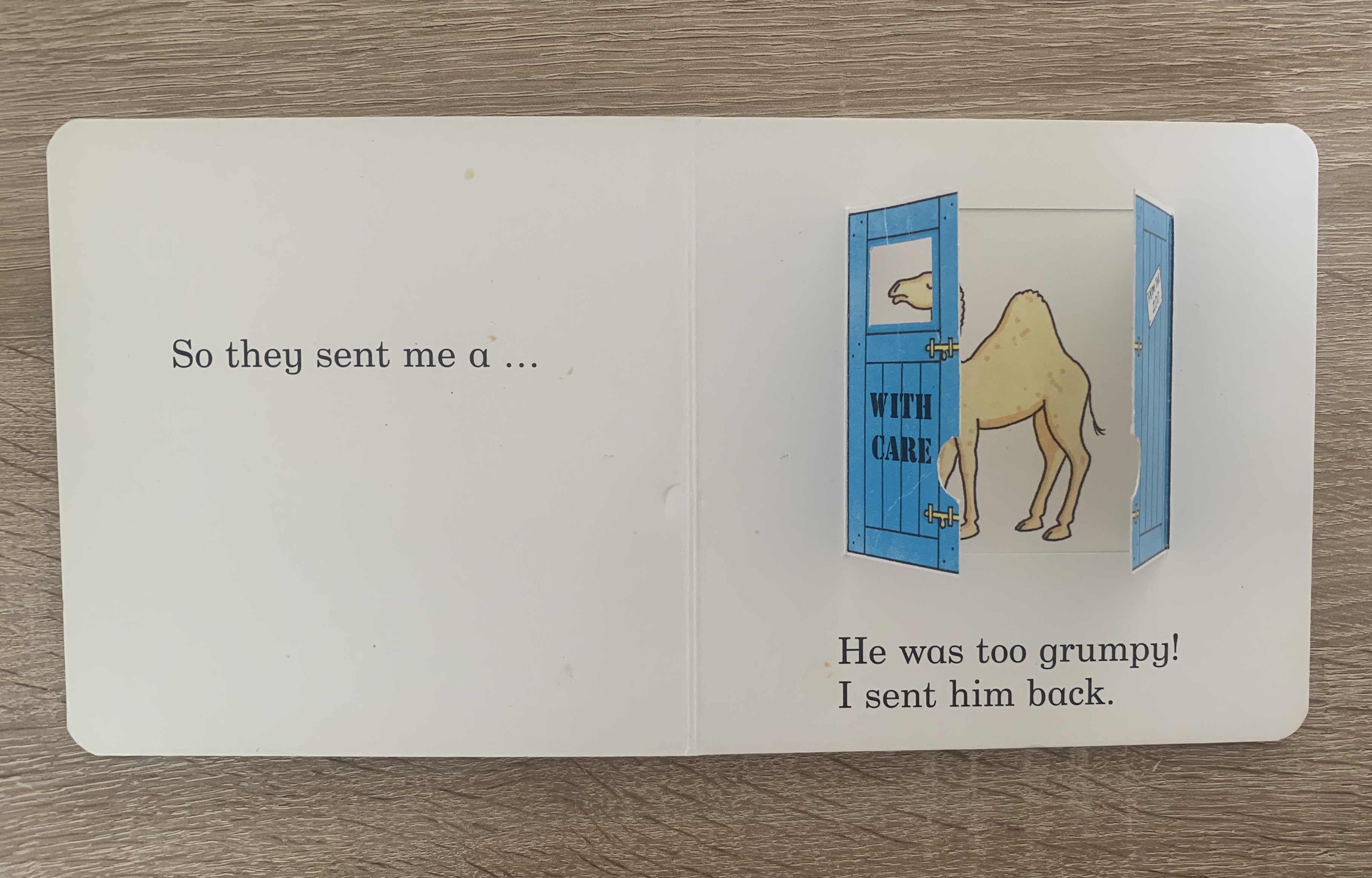
This book was dearly loved by my daughter when she was younger, hence the tatty-ness of the cover. This particular copy of the book is a 30year special addition so the font on the cover is gold foil with the birthday badge printed on. The contents of this book includes 1 flap per page where children are asked to discover what animal is hiding behind the flaps. The pages of this book are plain white with the first illustration we see being the flaps. The text on the pages are printed large and in short sentences, perfect for earlier readers and for children to recognise the pages and remember the story. This copy is a board book which makes it hard wearing for the not so delicate little hands. The flaps are mounted to the pages and made from thick card so this prevents them being torn off easily.
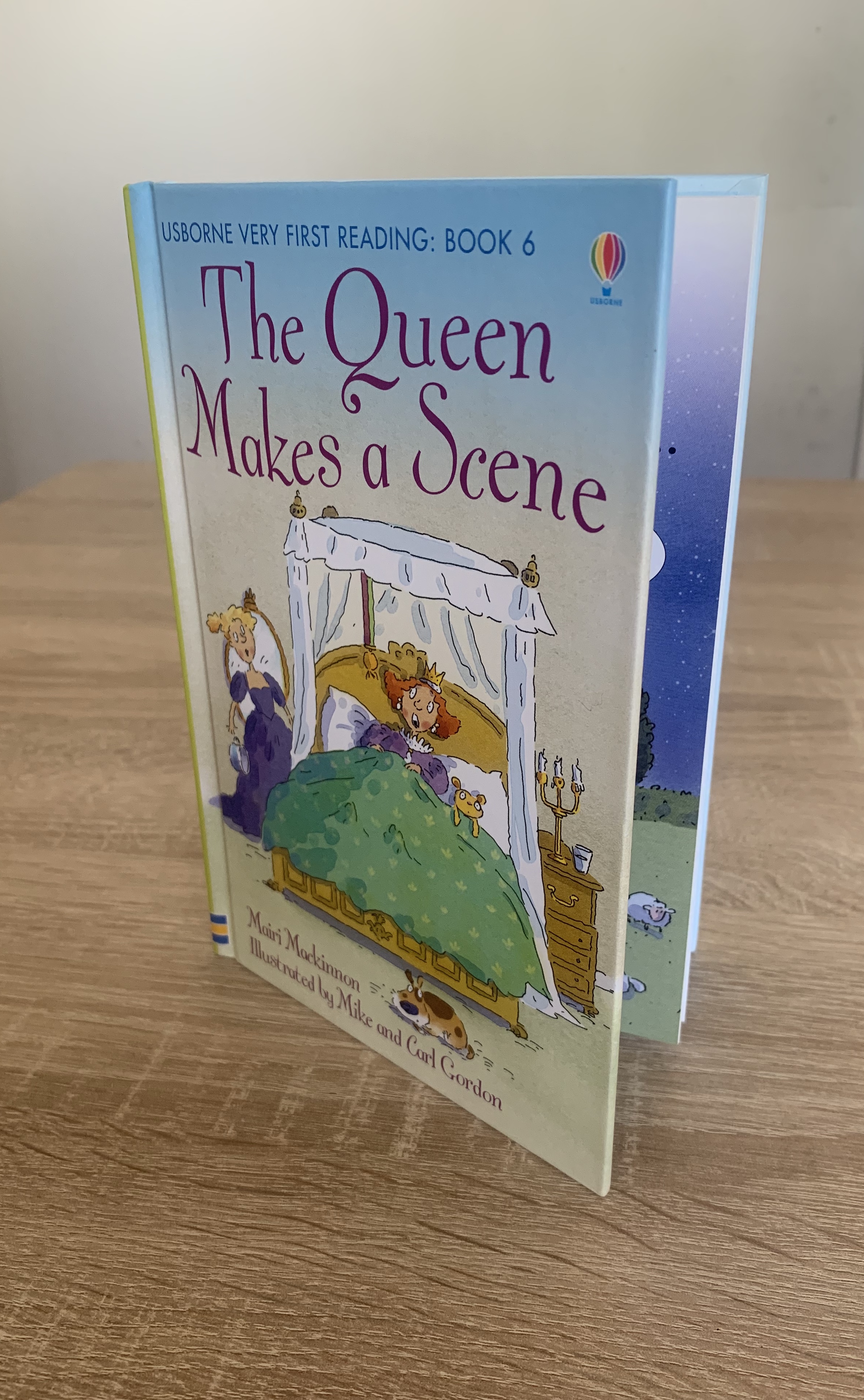
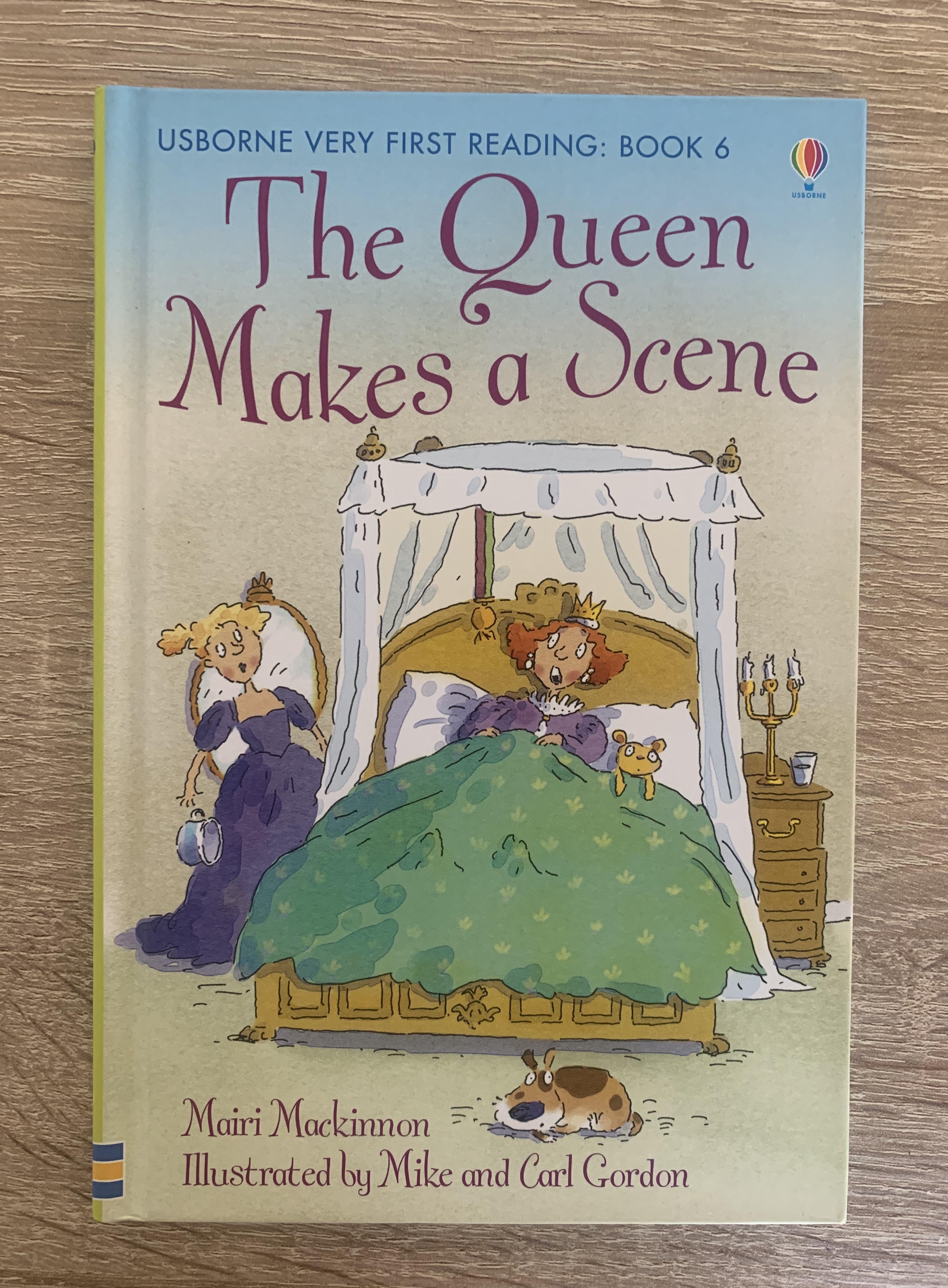
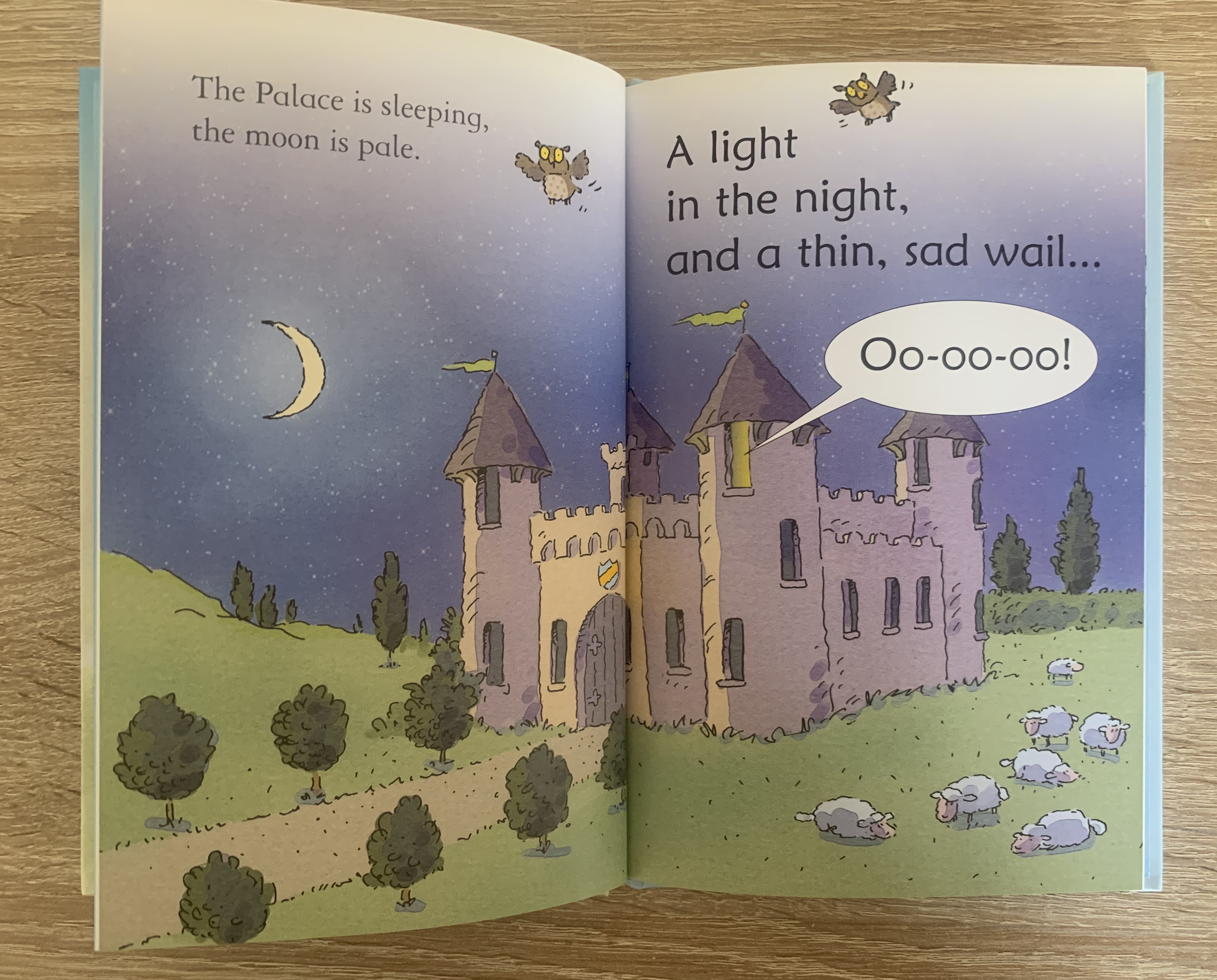
Book 3 – The Queen Makes a Scene by Mairi Mackinnon – First readers book
This was one of the first books I purchased for my daughter once she begun reading herself. The cover of this book is hardback, with a large illustration on the front. This particular book is a first readers book so not only is the font within large and in small sentences, it also includes guidance notes (on reading with your child) and puzzles at the end about the book. The pages inside the book are gloss coated which makes the colour of the illustrations print with more contrast.
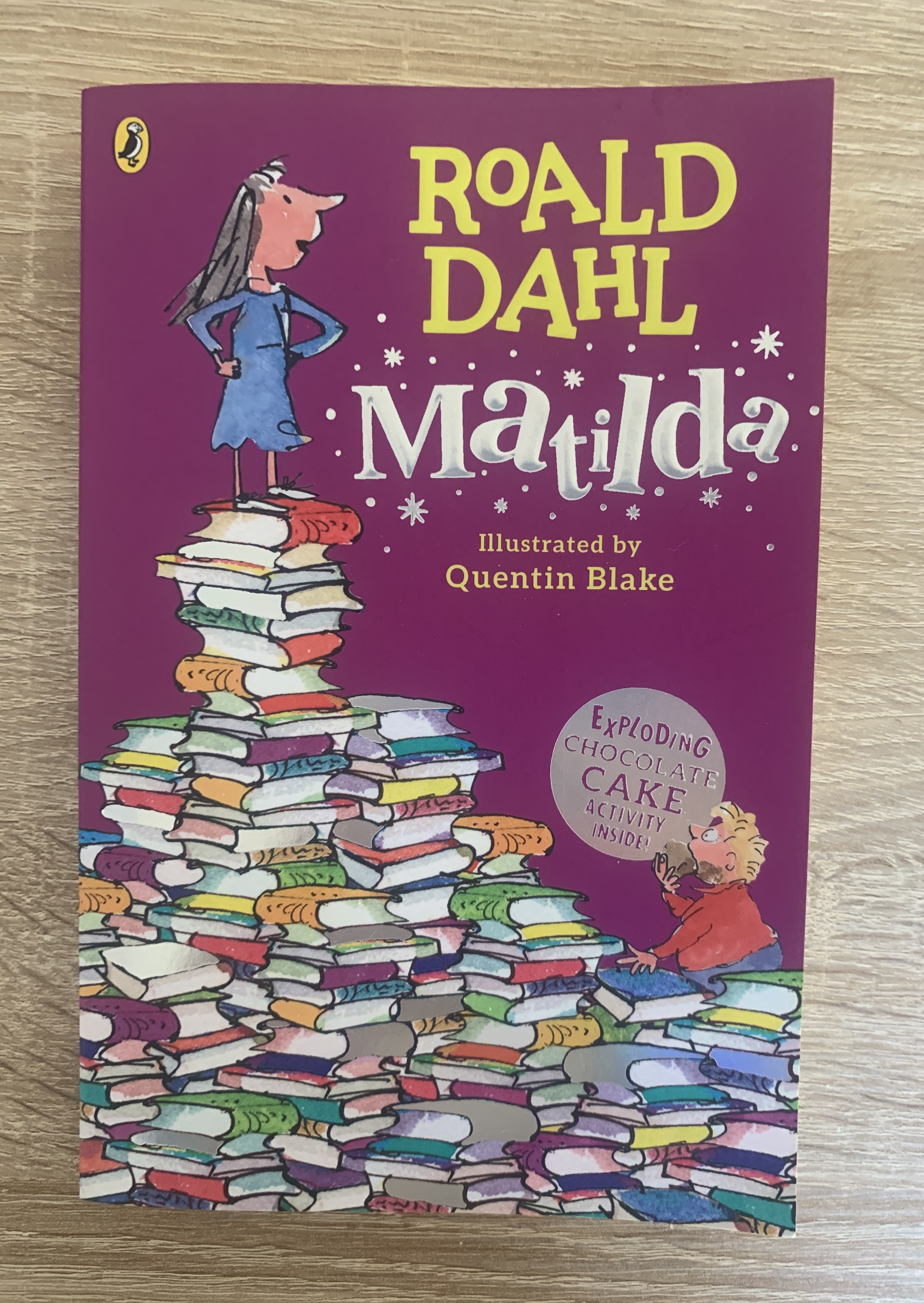

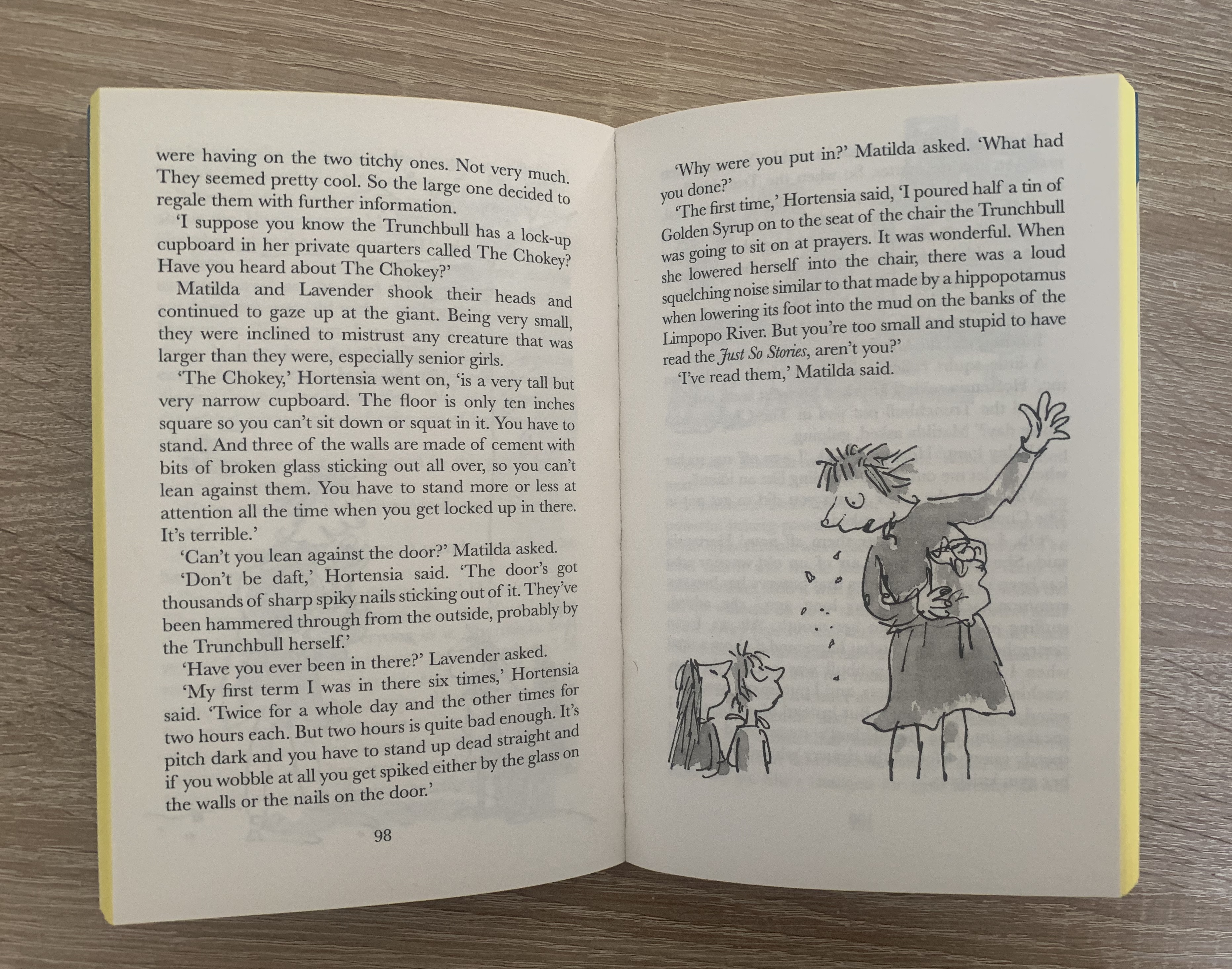
Book 4 – Matilda by Roald Dahl – Story book
There has been many different covers for this book over the past few years. The particular copy I am looking was released in 2016. The cover for this book is paperback and slightly embossed with holographic detail within the books and the title of the book. The edging of the pages are yellow so this gives the book a fun and different look to others. The pages inside hold slightly larger than usual font with the odd black and white sketch of the characters to help children stay interested and to visualise the characters. This is the perfect book for new young readers.
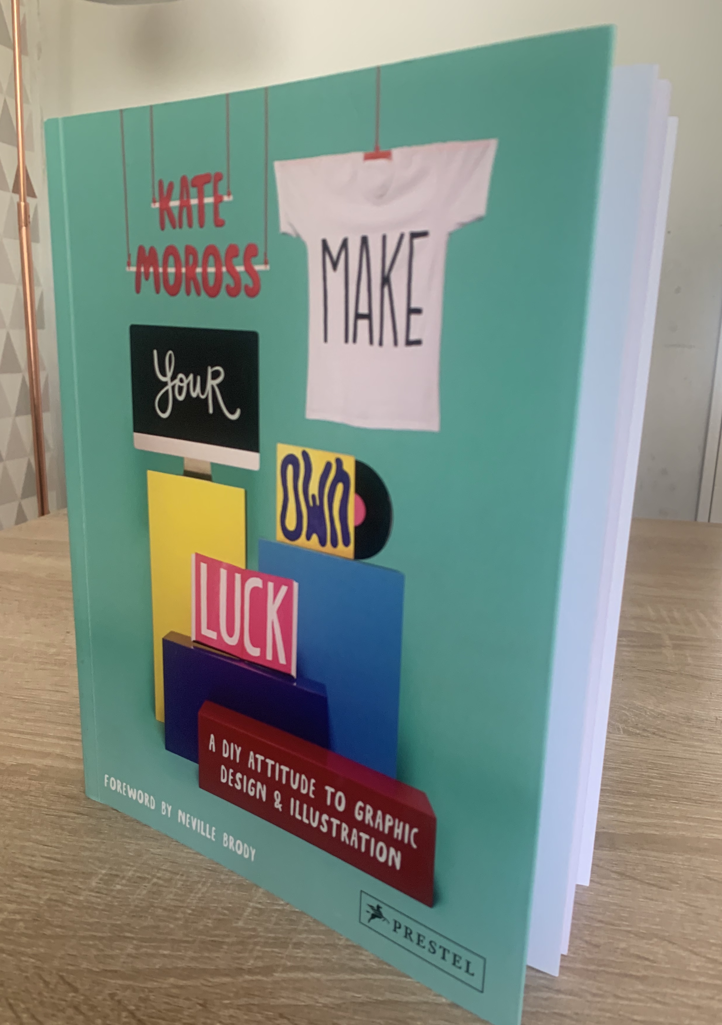
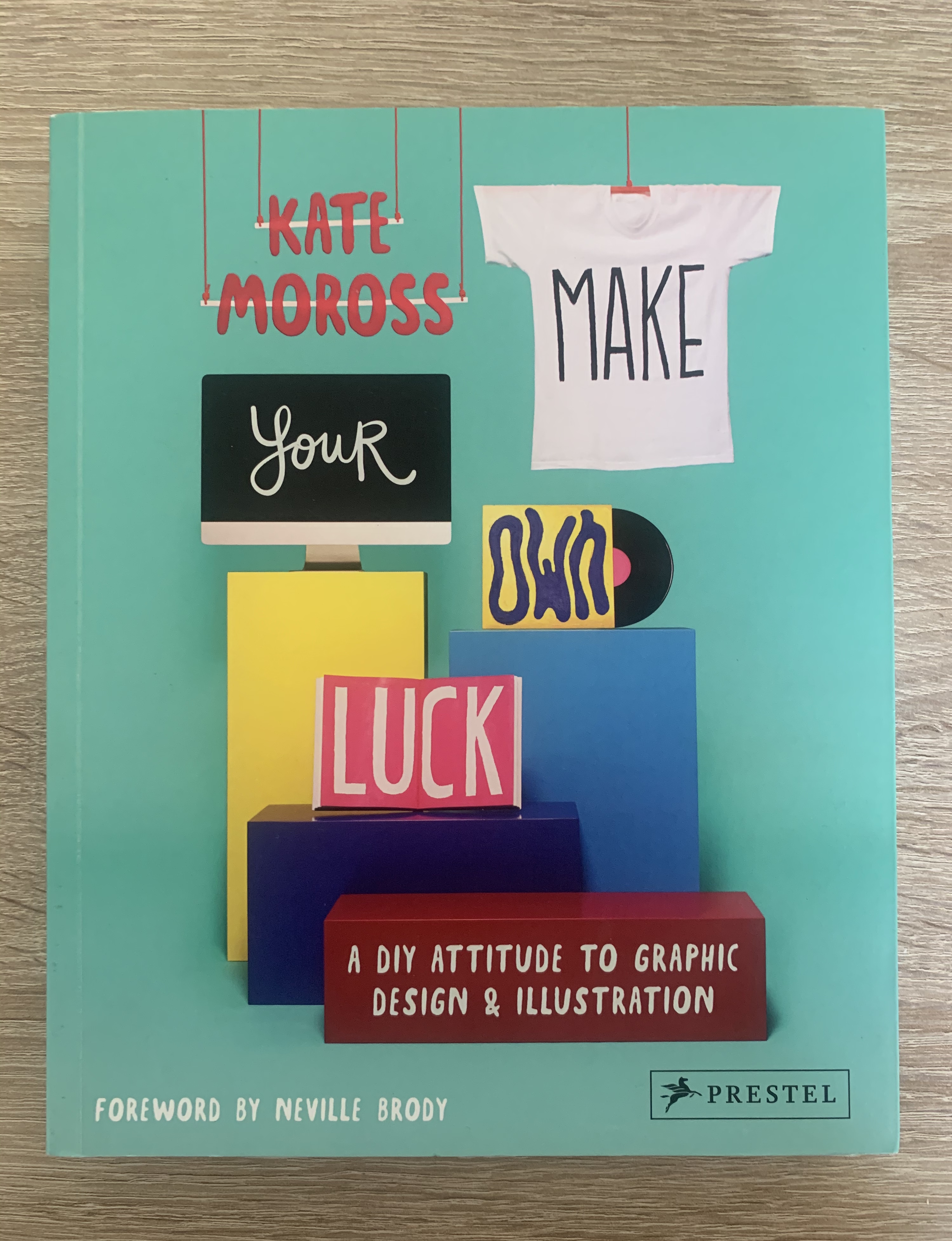
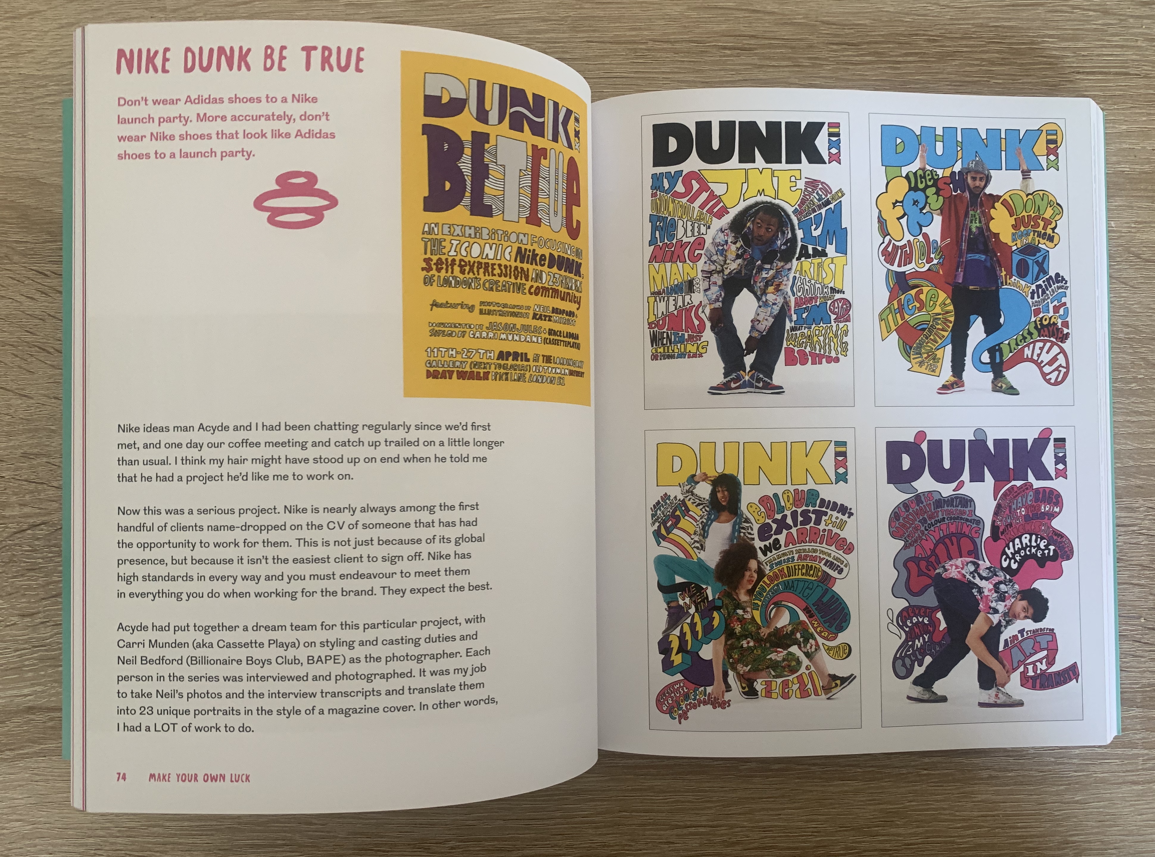
Book 5 – Make your own luck by Kate Moross – Reference book
This book I purchased during my first unit as I fell in love with Kate’s style of work and found it really inspiring. The cover to this paperback book shows different materials which Kate Moross’s designs and featured on such as clothing, books, graphics (pc) and cd covers. Inside the book consist of information about Moross’s work and plenty examples of her work. The use of colour and perfectly placed imagery makes a perfect reference book for students and fans of the artist. This book is different to those above as it consist more of images rather than words.
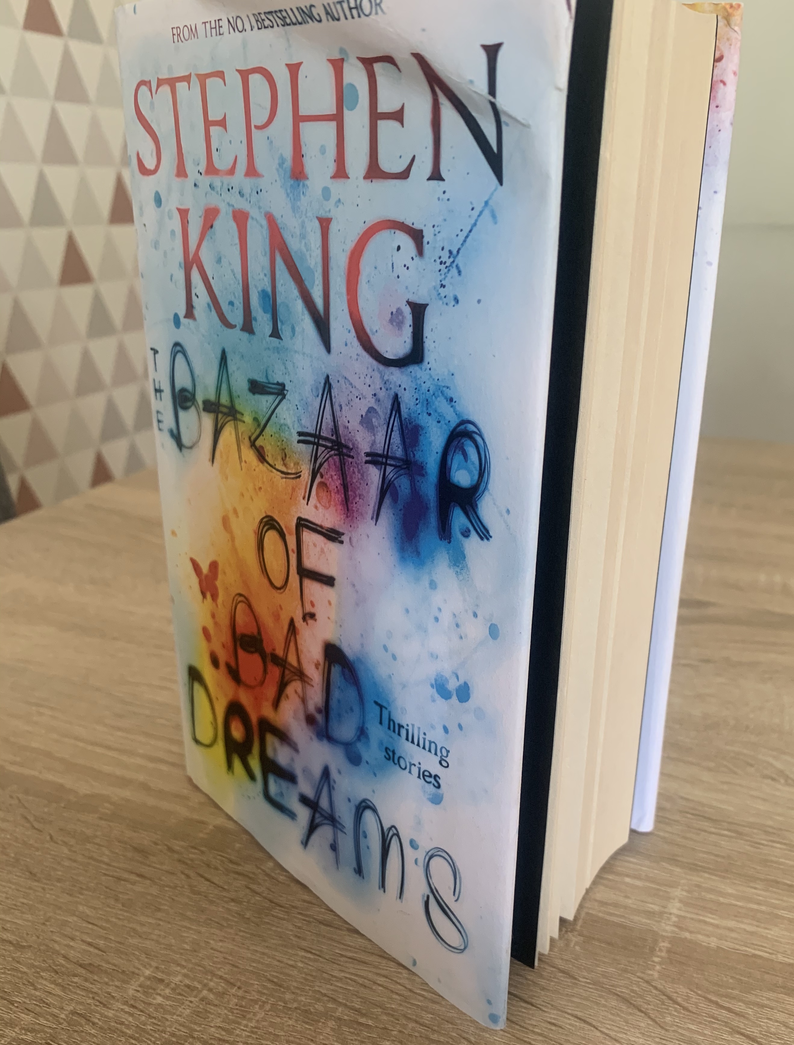
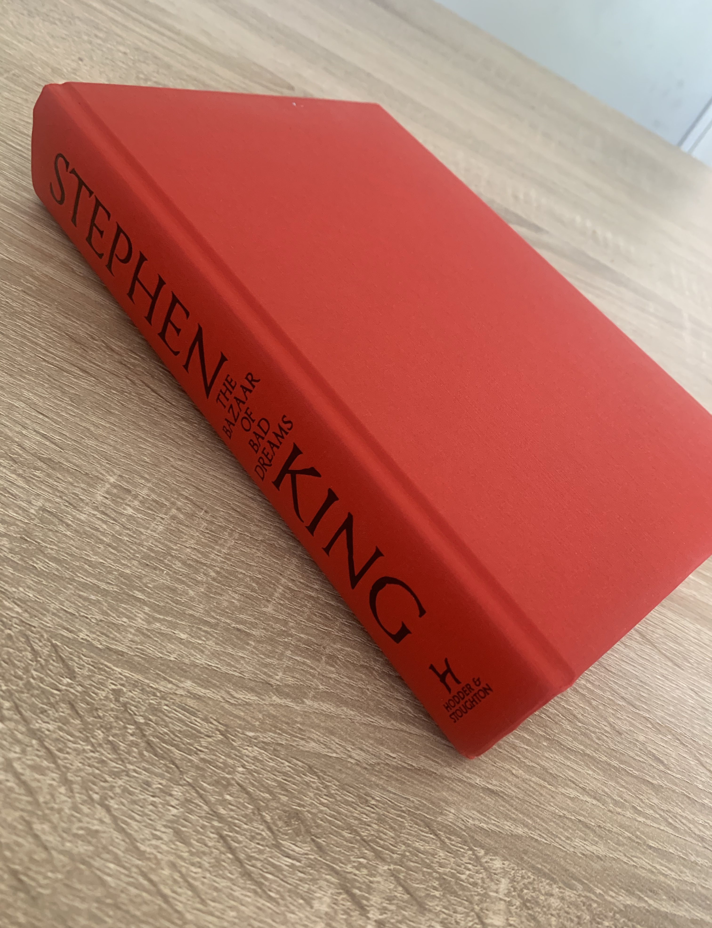
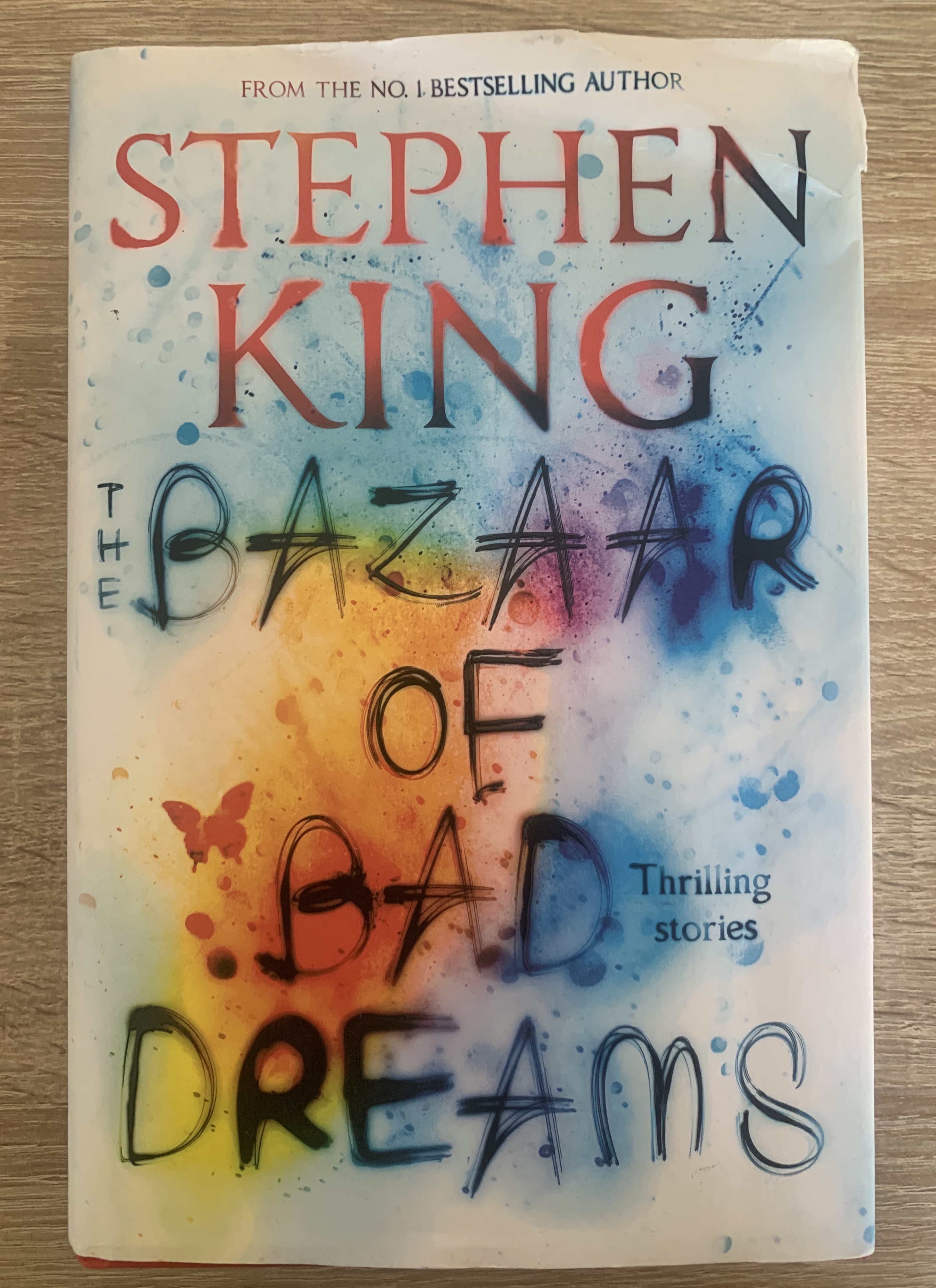
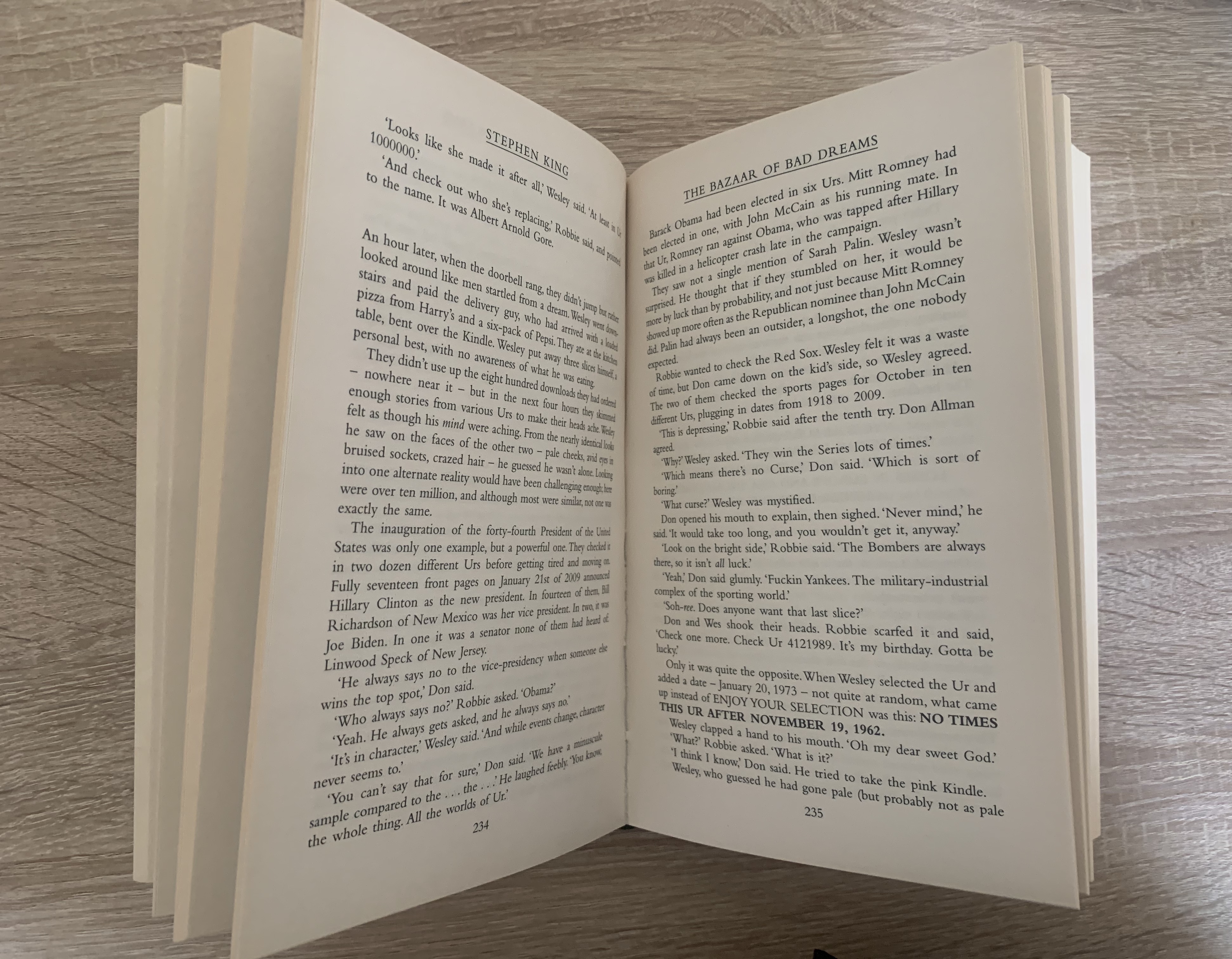
Book 6 – The Bazaar of Bad Dreams by Stephen King – Thriller book
My friend kindly leant me this book for research purposes. I’m glad I was able to analyse a hardback book to see how it differs between paperback. This book is well made, with a paper dust jacket revealing underneath a plain red linen hardback book. This book is much larger than all of the previous so of course makes it heavier, but this also feels very hardwearing and robust. At first glance of this book, you are able to tell by the quality that this is a book by a bestselling author, and with Stephen King’s iconically used typeface and position of his name on the cover makes it very recognisable.
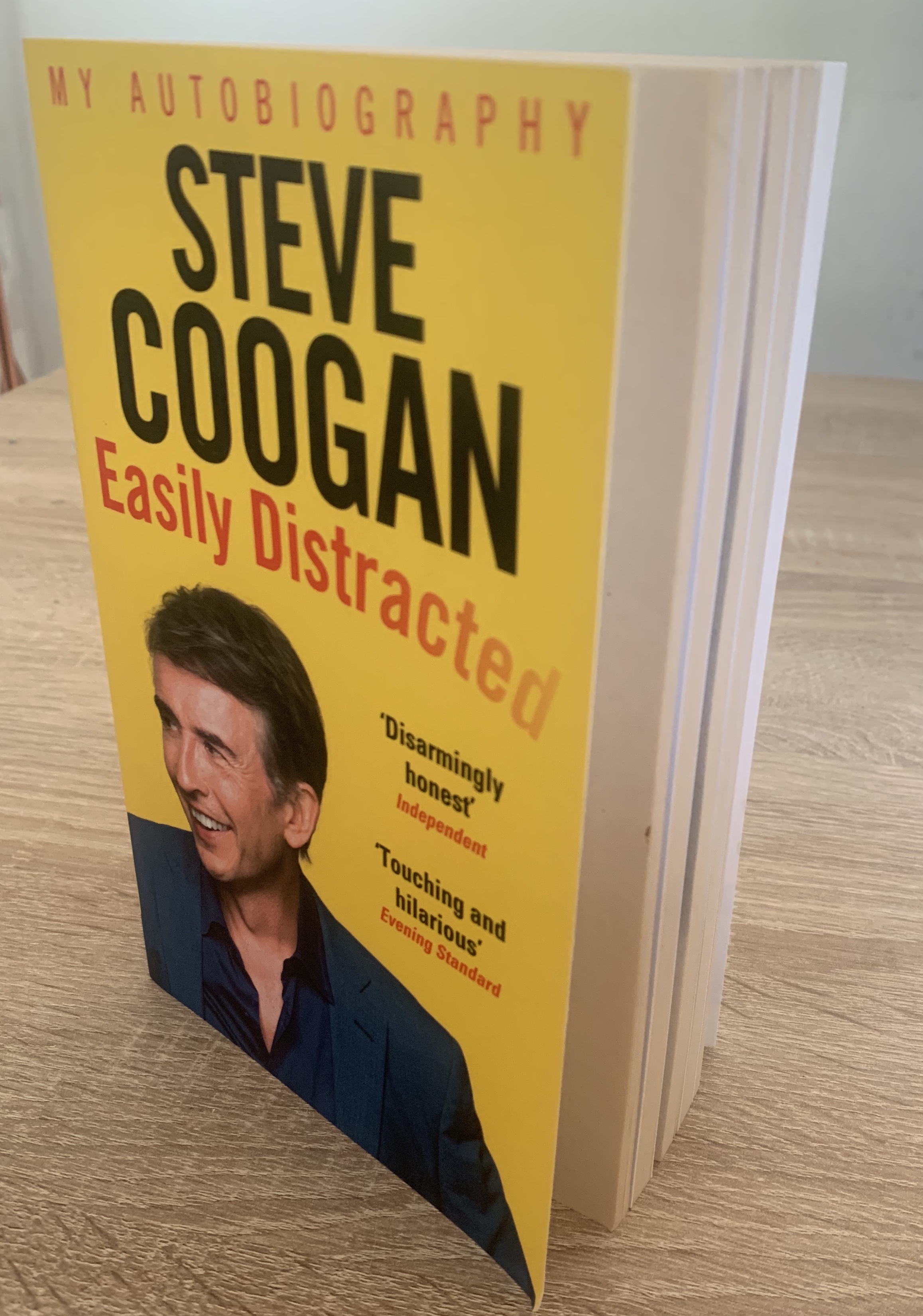
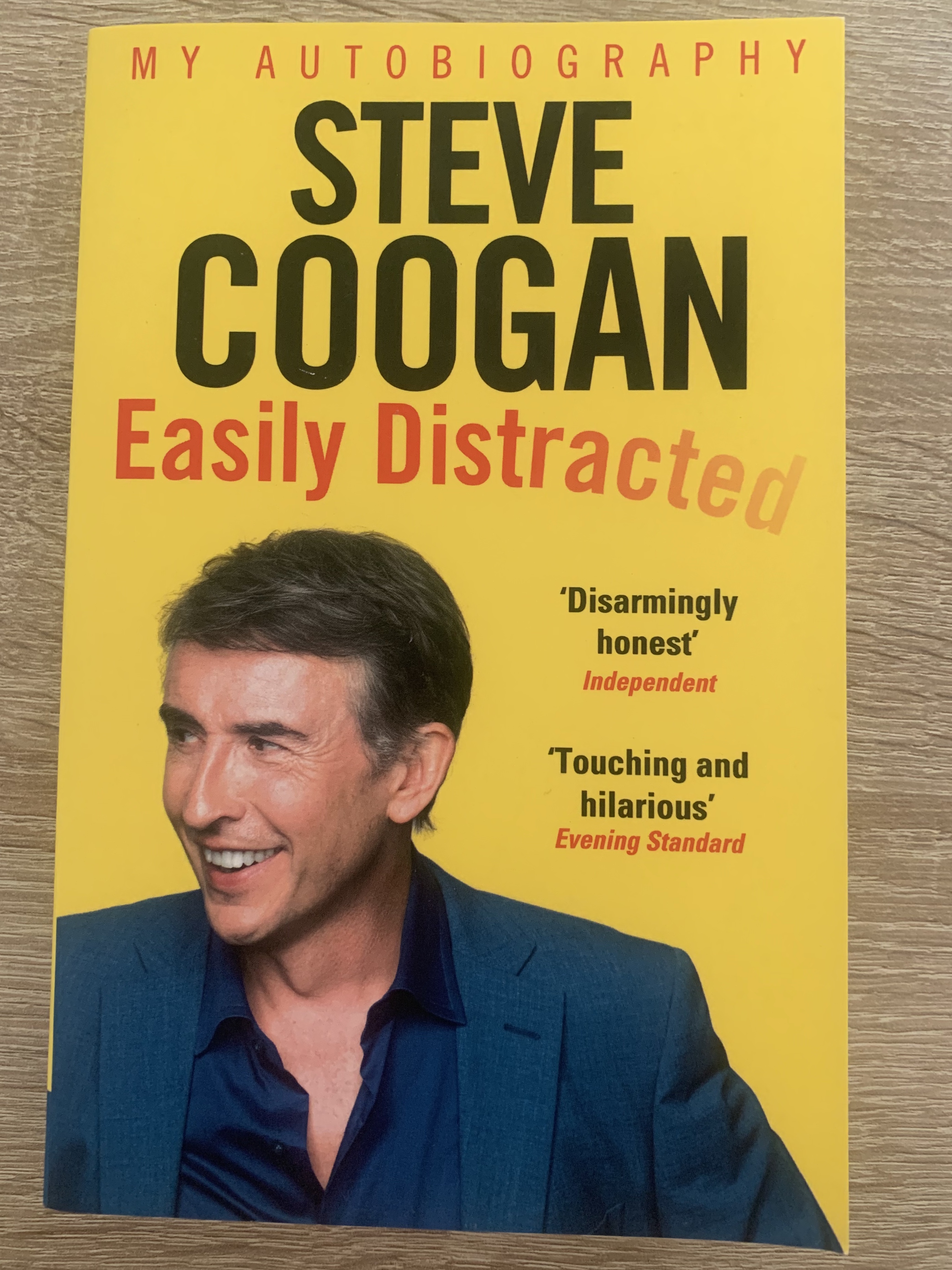
Book 7 – Steve Coogan Easily Distracted – Autobiography
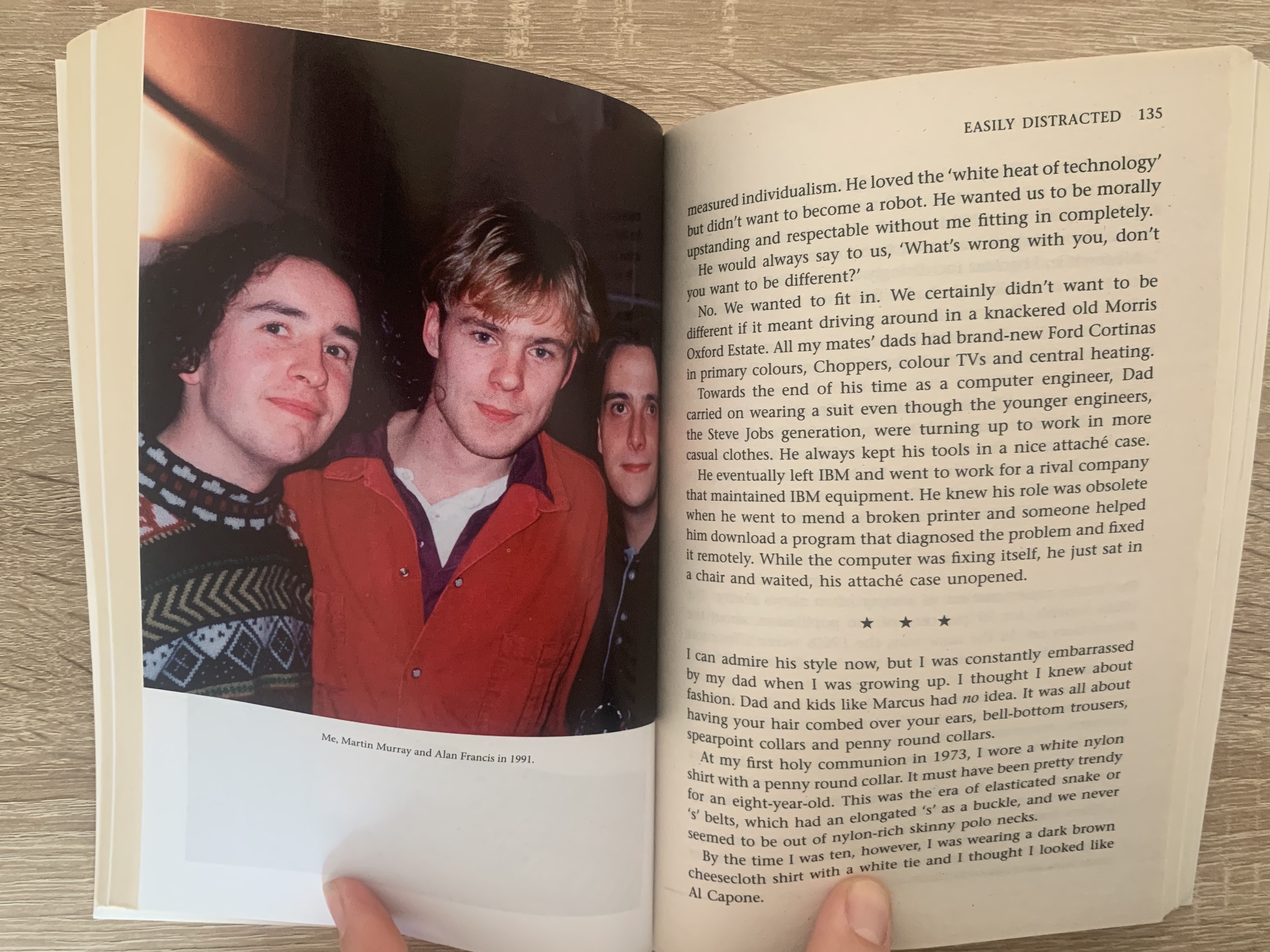
Again this book was leant to me by a friend, the reason for wanting to analyse this book was down to the select pages inside containing photographs. Automatically by looking at this book it is clear that it is an autobiography, with the large self portrait of the author and the large named title. Inside the pages consist of regular uncoated paper however split into 4 sections across the book are white gloss papers containing photographs relating to the author, this is quite common in most autobiography’s as it helps the reader visually relate to the author at that particular time/chapter of the book.
Reflection
I found it interesting looking at books this way to see how they vary between different genres, and to study the qualities of the book which is something not many do. It made me think of how the book is made to suit the audience, how the board books are thicker and more hardwearing and how they become finer and higher quality as they change between genres and target audiences.
