
Brief: Design the book format and cover artwork for two different versions of Daniel Defoe’s classic 1719 novel Robinson Crusoe. The publishers, Viking Press, have decided to re-release this title as a new pocket edition for readers on the move that reflects the adventurous nature of the story within a contemporary setting. This paperback version should have a modern visual feel that can compete with new titles in the bookshop. They also want a deluxe edition for armchair readers and classic book collectors that references the historical nature of the story and its associations. Produce book design ideas and cover artwork to reflect the content of the story across both formats and contexts. Be creative and inventive with both the look and format of these books.
As a side project to accompany the re-release of Robinson Crusoe, Viking Press has also asked you to design a new book called Washed ashore: The ultimate guide to surviving on a desert island by Rik Bennett. This is a ‘how to’ guide that should reflect not only the practical advice it offers, but something of the adventure of being a castaway.
The scale, stock and binding of these publications are up to you. The pocket edition needs to celebrate the functionality of the book as a lightweight, transportable object, and to connect to the story’s travel or survival themes in a contemporary way. The deluxe edition can present the content in a larger, finer, more luxurious, considered or explained way, that perhaps makes reference to the history of the book itself. Your designs need to be seen as part of a series across both versions, so think about how you adapt your designs to fit each format. The shipwreck guide needs to be seen as a separate genre, piggy-backing on the success of Robinson Crusoe. Develop visual ideas that can distinguish the survival guide from your Robinson Crusoe designs, while at the same time making some thematic connection between them.
Your design should include the front, back, spine and flaps of your covers – if you opt for a traditional book binding. You can also come up with alternative ways of binding, and therefore designing your books if you want to. Generate your own illustrations, photography or artwork for the covers, source copyright free images, or treat the covers purely typographically. This is an opportunity to be creative with both your design thinking and outcomes, so experiment, and test out a range of visual physical options.
You may want to extend your project also by designing a number of sample pages from the inside of the book. When creating sample pages, try to make a link between the cover design and the design of the inside pages.
Present your ideas by mocking up each of the books and their covers, and by presenting the overall spec of your designs (what paper stock you are using etc) Work through the design process, documenting it in your learning log as you go. Use rough drawings, notes, diagrams, mock-ups of your books, photographs of what you’re working on, and by saving different stages of any digital work to show your process. Talk about your creative process through notes and reflections.
Analysing the brief:
This brief is split into three parts;
Part 1 Paperback edition: Design the book format and cover for Daniel Defoe’s classic 1719 novel Robinson Crusoe. This will be a re-release pocket edition with a modern feel, aimed at readers on the move that reflects the themes of travel and adventure in a contemporary setting.
- Objective – Recreate the cover with a modern feel that competes with other new books on the shelves. The book needs to be portable and lightweight for the particular target audience. Reflect on the content of the story and connect to the travel/survival themes in a contemporary way.
- Format – Paperback, lightweight and suitable for traveling. Include front, back and spine designs. Scale stock and binding to be decided at later date – alternative formats can also be considered. Include Title, author & publisher
- Other information – Designs for part 1 & 2 need to be seen as part of a series
- Target Audience – Readers on the move – Travellers/commuters
- Keywords from brief – Modern, contemporary, survival, travel, portable
Part 2 Deluxe edition: Design a deluxe hardback collectors’ version of Daniel Defoe’s Robinson Crusoe, it should reflect the historical themes of the story and its associations. This version can present the content in a larger, finer, more luxurious way, suitable for armchair readers and classic book collections.
- Objective – Create a larger and luxurious cover for Robinson Crusoe. Reflect on the content of the story. Reference the historical nature of the story and the history of the book. This will be seen as a collectors book.
- Format – Luxurious, fine book suitable for armchair readers and collectors. Including front, back and spine designs. Scale stock and binding to be decided at later date – alternative formats can also be considered. Include Title, author & publisher
- Other information – Designs for part 1 & 2 need to be seen as part of a series
- Keywords from brief – Fine, luxurious, classic, historical, collectable, armchair reader
Part 3 Washed ashore deign: Design a ‘how to’ guide called Washed ashore: The ultimate guide to surviving on a desert island by Rik Bennet, that offers practical advice on what to do if you are shipwrecked, as well as reflect the theme of adventure.
- Objective – Design a shipwrecked guide which reflects practical advice and something of the adventure of being a castaway.
- Format – Include front, back and spine designs. Scale stock and binding to be decided at later date – alternative formats can also be considered. Include Title, author & publisher
- Other information – This guide needs to be in a separate genre to the first two books – i.e. an instructional manual rather than a novel, yet still keep a thematic connection between them.
- Keywords from brief – Shipwreck, guide, practical, adventure, castaway, Robinson Crusoe theme, desert island
Research
I wanted to start off my research by toughly researching the book Robinson Crusoe, to me the name is very familiar but not the book.
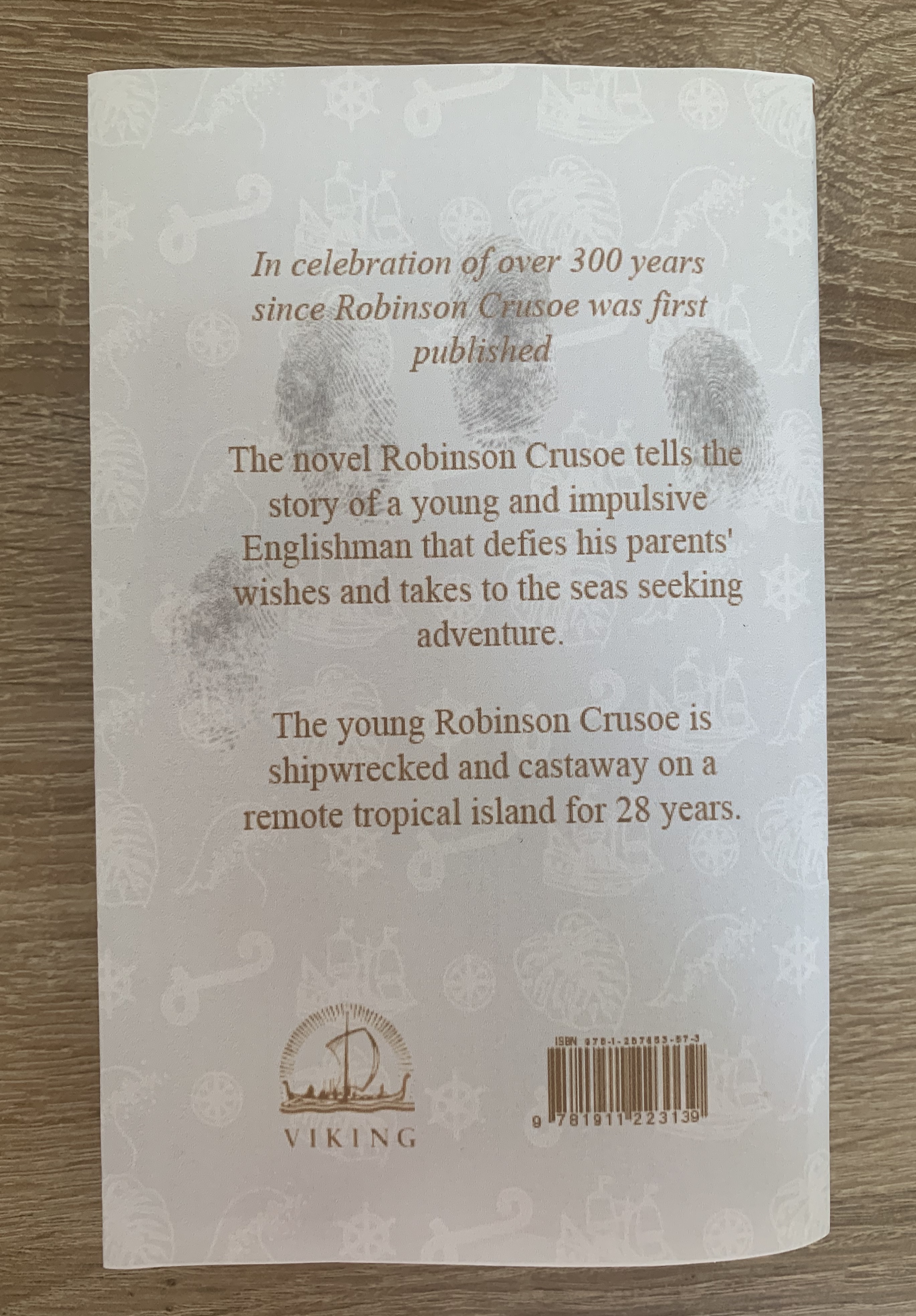
Robinson Crusoe is a novel by Daniel Defoe, first published on 25th April 1719. The first edition credited the work’s protagonist Robinson Crusoe as its author, leading many readers to believe he was a real person and the book a travelogue of true incidents. Epistolary, confessional, and didactic in form, the book is presented as an autobiography of the title character, a castaway who spends 28 years on a remote tropical desert island near the coasts of Venezuela and Trinidad, encountering cannibals, captives, and mutineers, before ultimately being rescued. The story has been thought to be based on the life of Alexander Selkirk, a Scottish castaway who lives for four years on a Pacific island called ‘Mas a Tierra’, now part of Chile, which was renamed Robinson Crusoe Island in 1966.
Despite its simple narrative style, Robinson Crusoe was well received in the literary world and is often credited as marking the beginning of realistic fiction as a literary genre. It is generally seen as a contender for the first English novel. Before the end of 1719, the book had already run through four editions, and it has gone on to become one of the most widely published books in history, spawning so many imitations, not only in literature but also in film, television and radio, that its name is used to define a genre, the Robinsonade. (https://en.wikipedia.org/wiki/Robinson_Crusoe)
I also found a very useful website: https://www.sparknotes.com/lit/crusoe/facts/
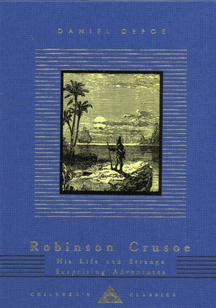
After learning about the book and the plot I wanted to visually research Robinson Crusoe, I started off by distinguishing what the appearance of Robinson Crusoe is, these images include movie/tv actors playing the role, paintings and sketches from various artists.

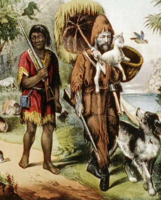
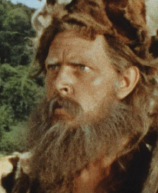
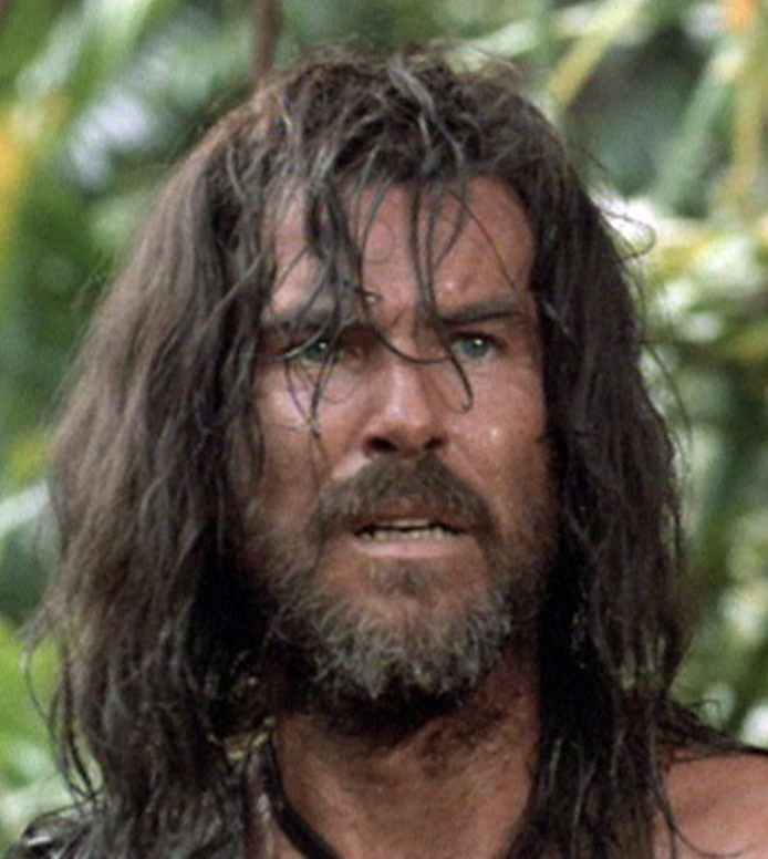
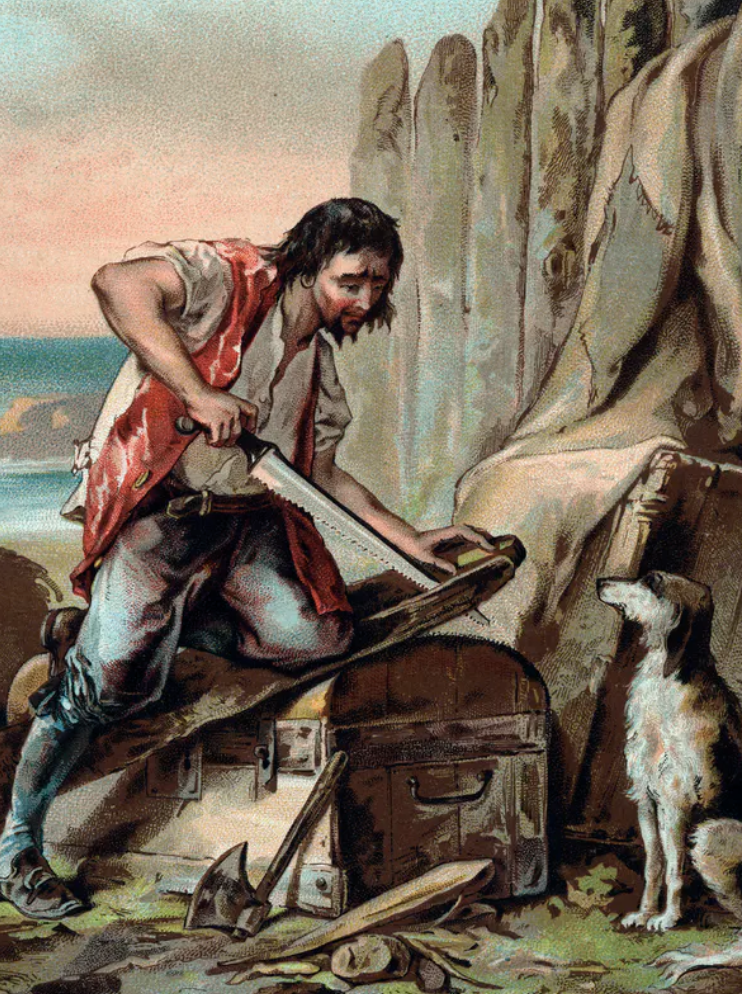

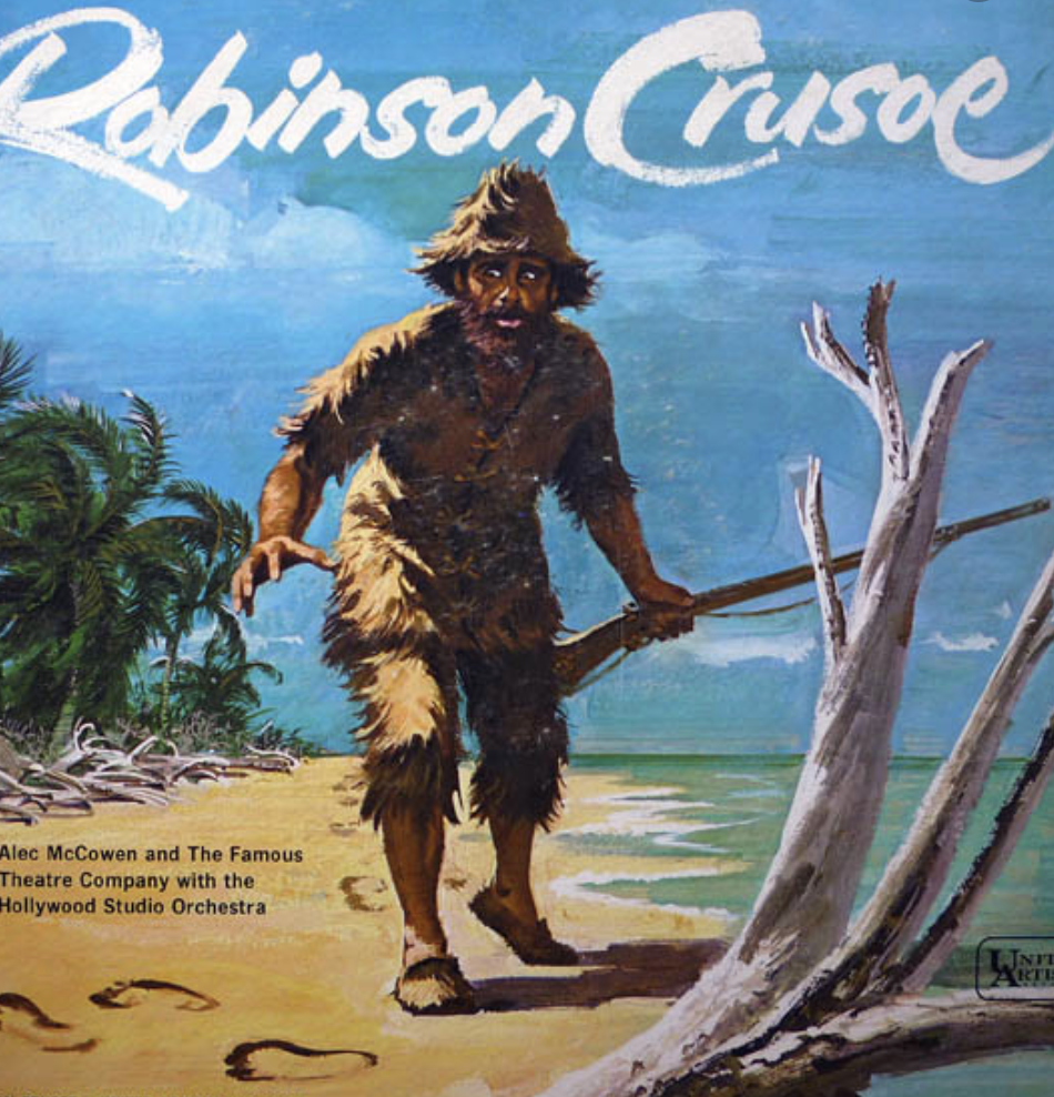
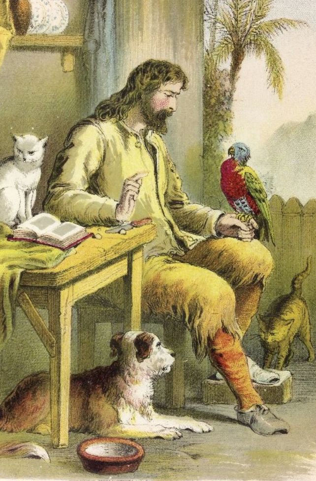
Images of Robinson Crusoe; (Source: Google Images)
Below are some book cover designs which I came across on the Waterstones website. The designs all contain a theme of beaches, sandy footprints and pirates as well as the title being large and eye catching. Although it is clear what the motifs are, each design is still carries its own style. I am particularly drawn to the first cover with the jungle leaf boarder, this stands out to be because it is bold, different to others and suits the adventure genre of the book.


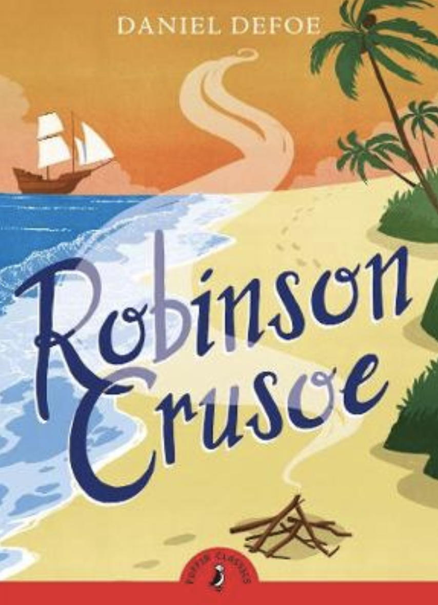


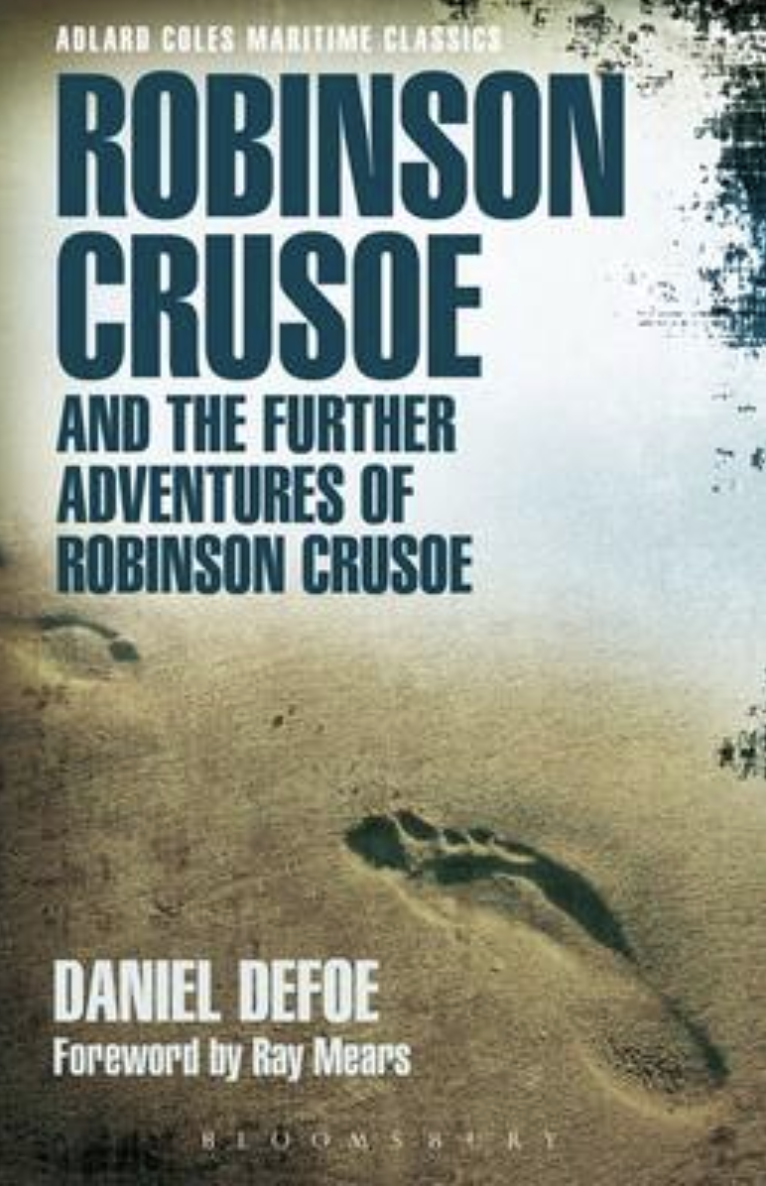
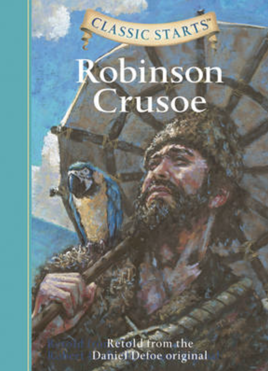
Book covers sourced from: https://www.waterstones.com/books/search/term/robinson+crusoe/page/1#p_3546206
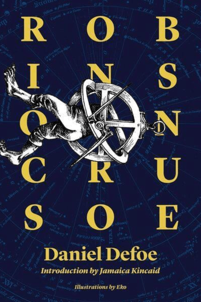
2019, Illustrated by Eko Publisher: Simon and Schuster Group
This particular cover stood out to me with its unusually placed illustration amongst the typographic cover. The dark navy background contains what appears to be a ships radar map, which creates an interesting and background. The illustration appears to have worn bare feet but the body has been replaced with an old sundial compass, again imaginative and clear that the designer has thought outside the box when designing this. This is something I want to make sure I achieve during this assignment so I find this quite inspirational. The type of imagery used helps the reader to recognise that the story is set in the past from the black and white sketched image with the vintage sundial compass.
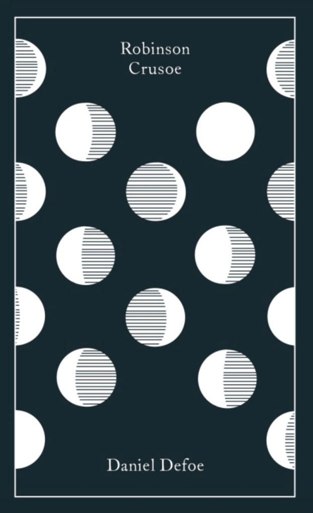
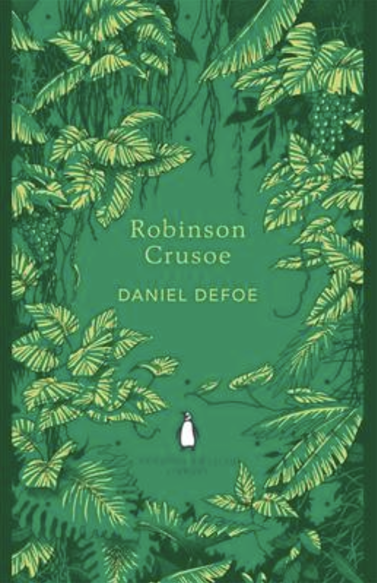
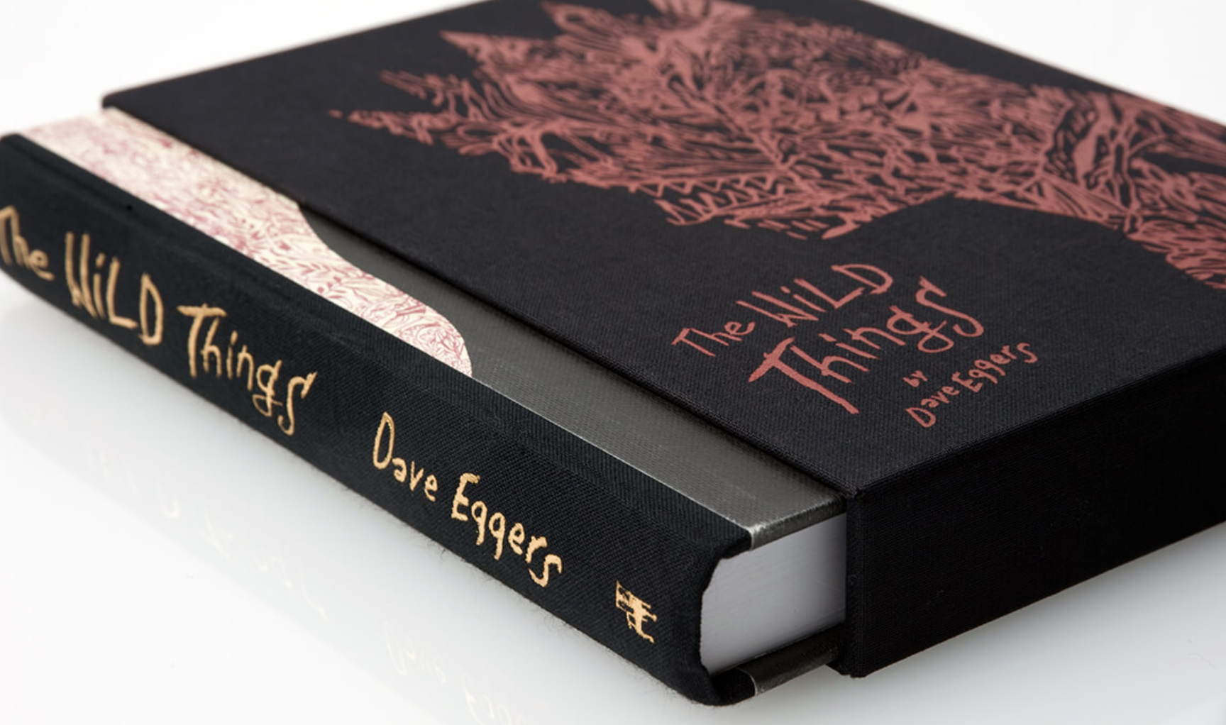
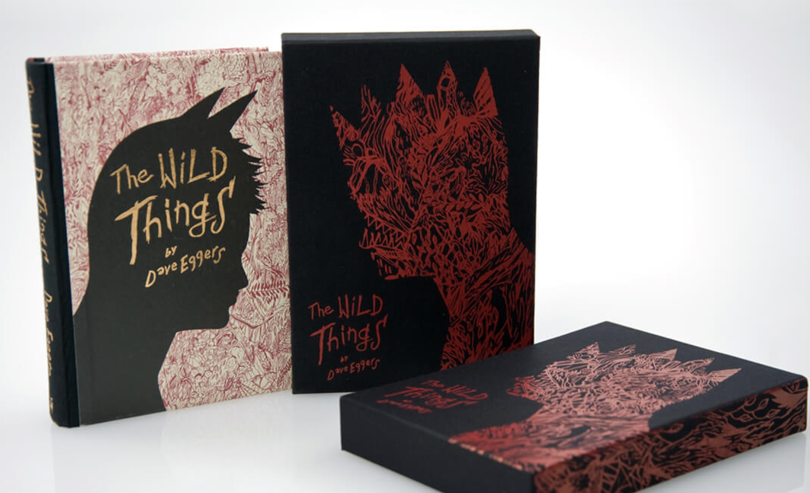
2013, illustrated by Coralie Bickford-Smith Penguin clothbound classic
This clothbound edition has a foil stamped design making this more of a Deluxe edition. The design doesn’t really explain what the books about, to me this looks like different stages of the moon perhaps? Which could represent the passing of time Robinson spent on the island. Thinking back to previous exercises, the pattern used is very much Coralie’s style with the use of repetitive pattern and clear typography.
1993, Penguin Books Children’s Classics
Again this is another Deluxe cloth bound book with foil detail, this book looks classic and mature even though its a children’s book. It is pared with elegant typography and simple lines surrounding what looks like an original image. This book is apart of a series with the same layout featuring on all books, giving them all a classical appearance.
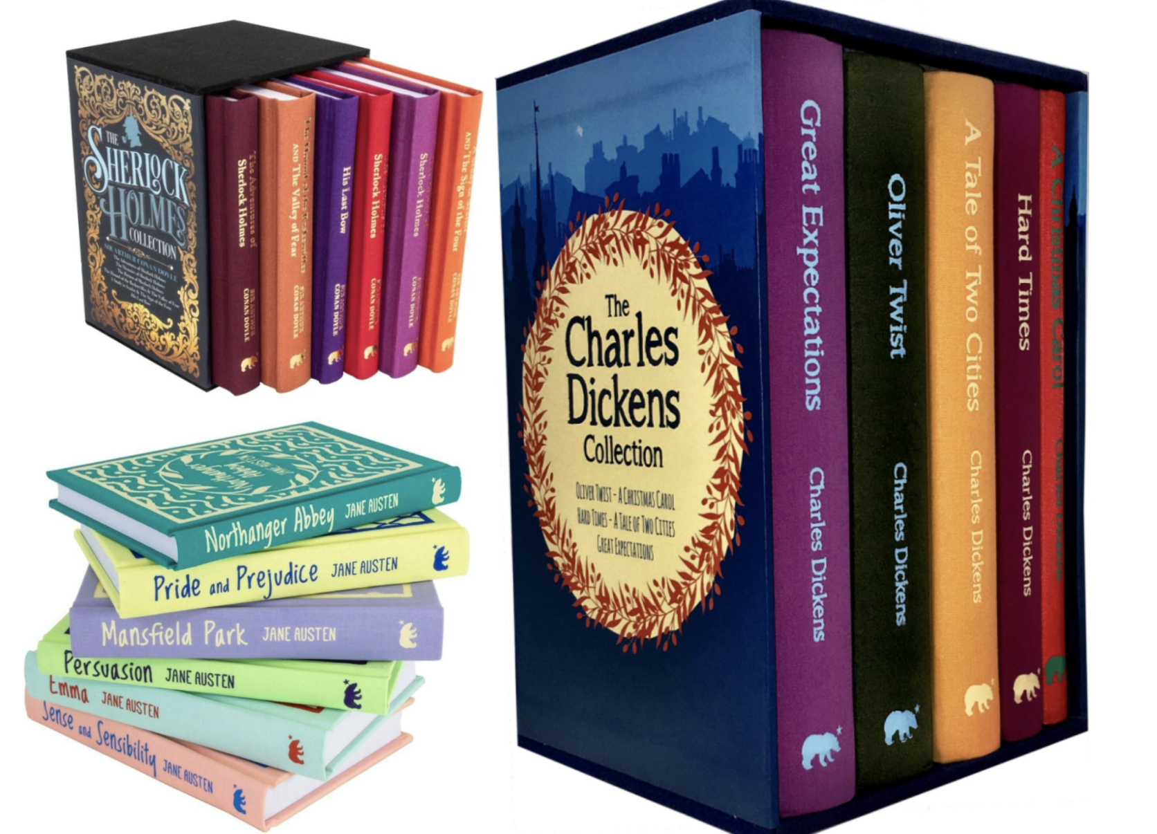
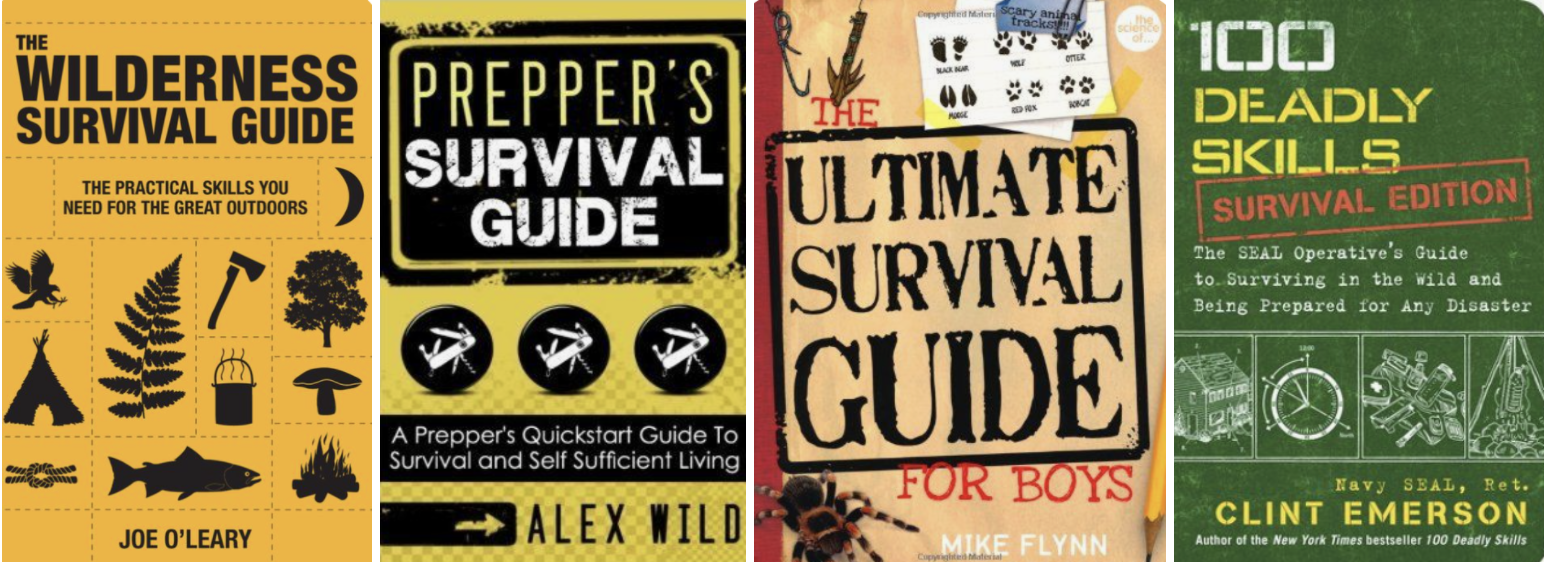
Adventure Genre – I looked into other books from the same genre to see if there are any design styles apparent and each varied, although some of the main motifs are; Darker colour palettes, formal typefaces, detailed imagery, title as the focal point. This gave me a little guide as to what to the design of the genre is about.
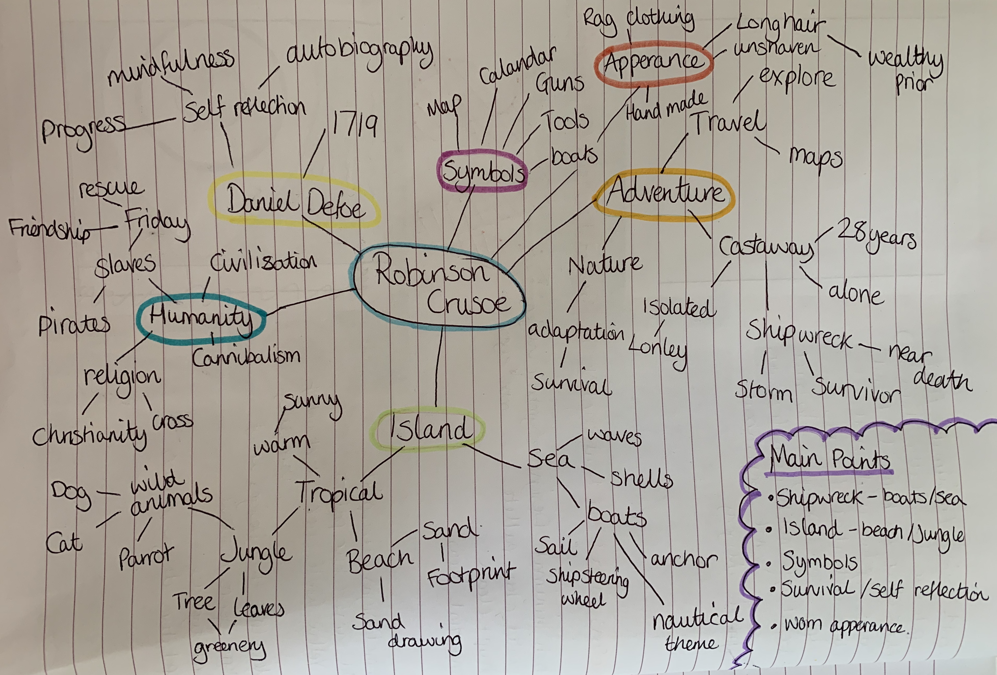
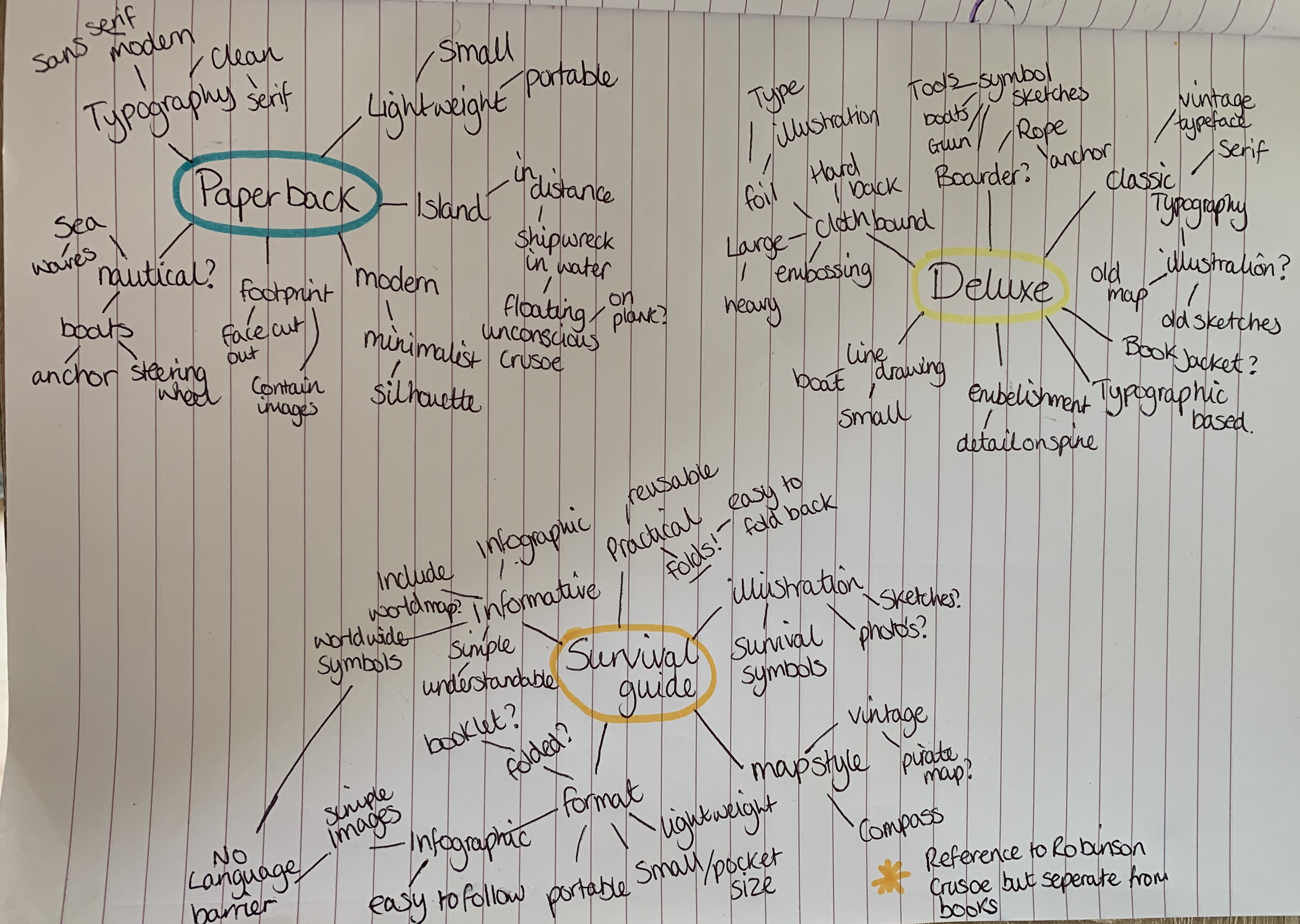
I created two mind maps, one focusing on Robinson Crusoe and the other on design ideas for the three books.
Design Ideas and Further Research
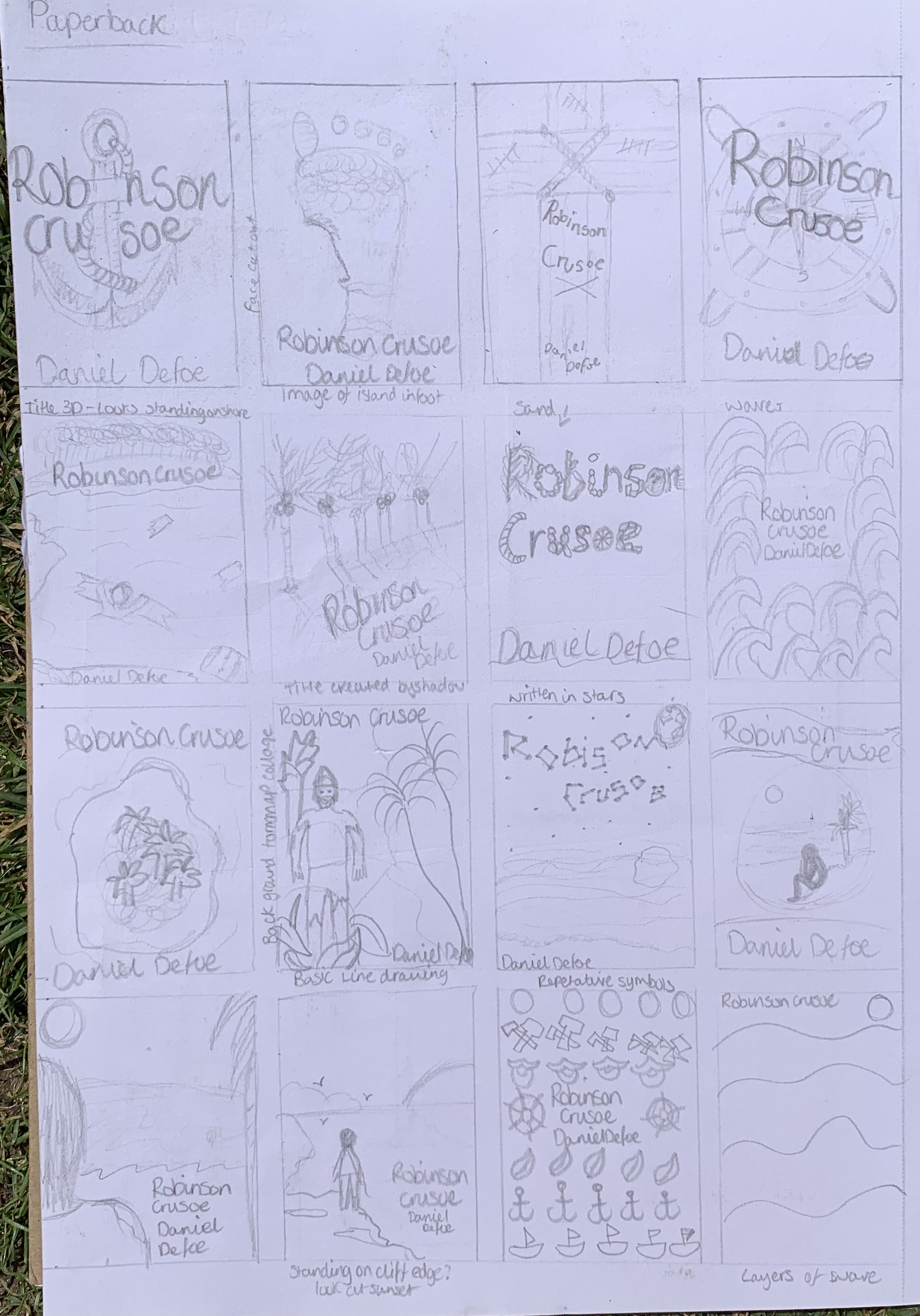
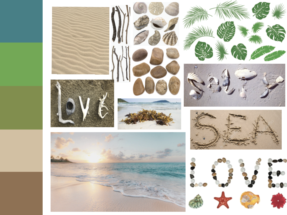
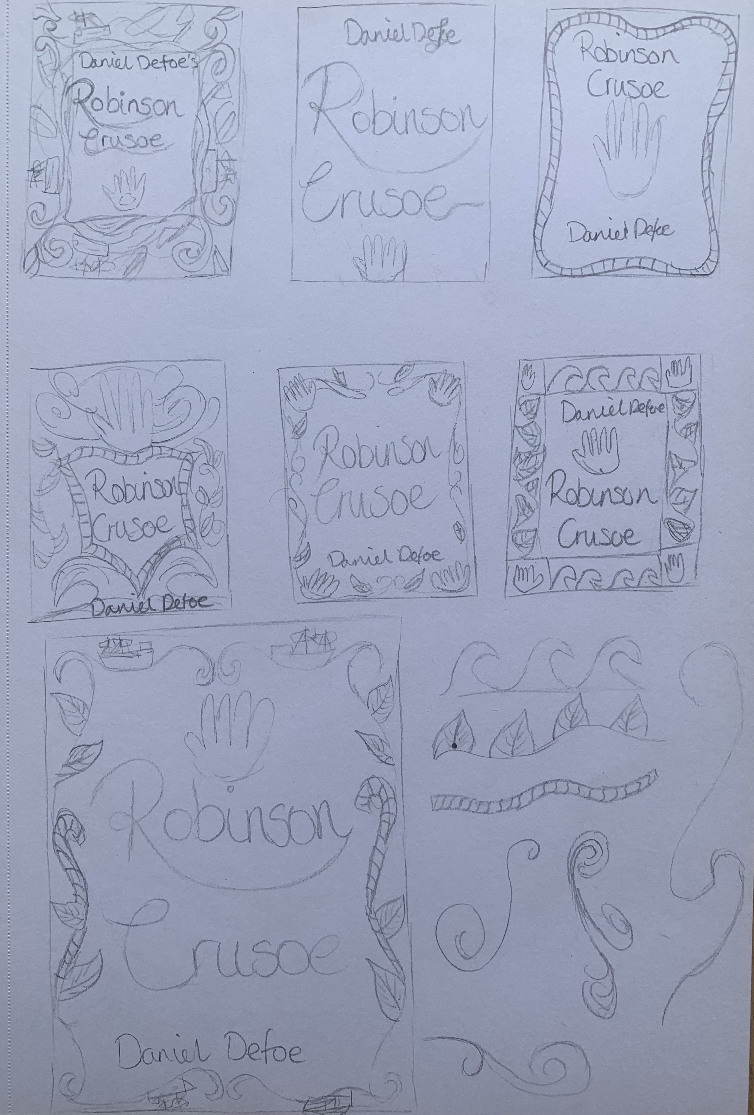
I started to sketch some thumbnail ideas to see which ones I wanted to look further into. To start my design process I decided to narrow down my sketches by focusing on a couple of designs, creating a more detailed sketch along with a mood board.
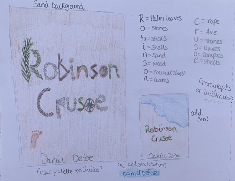
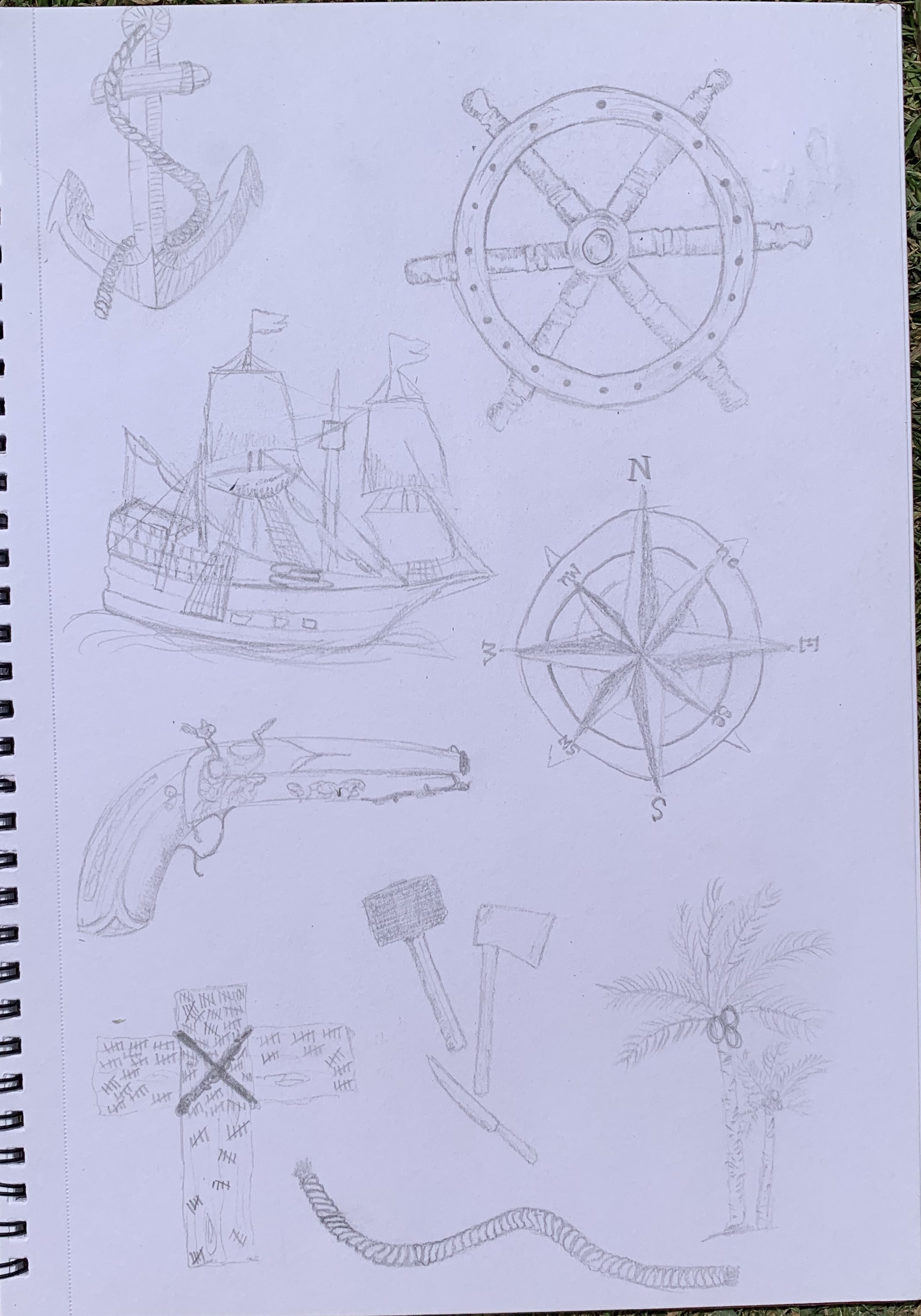
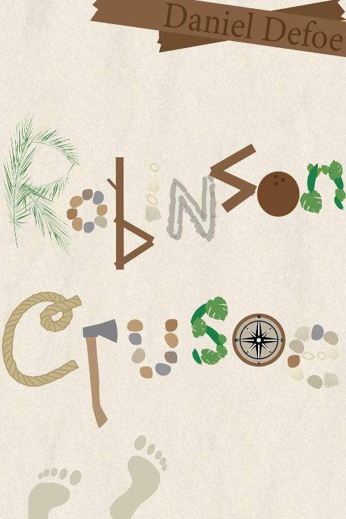
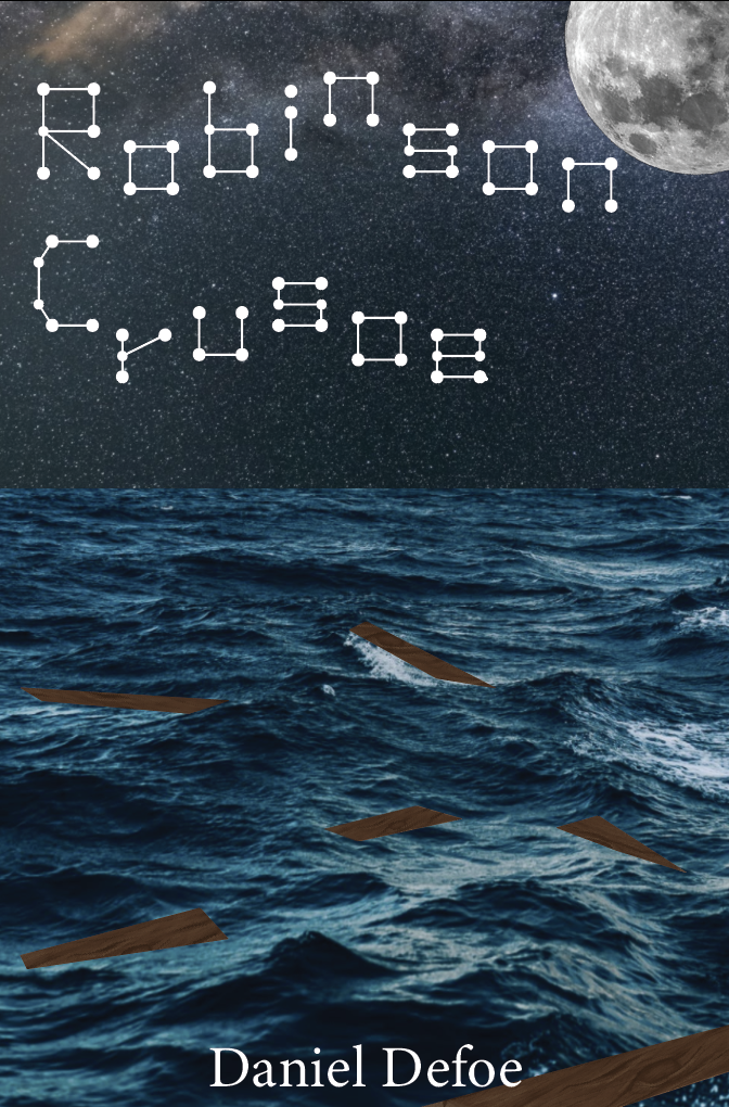
The first sketch I looked at was a typography cover with elements making up the letters. I thought about the different elements and objects that could be found on a desert island along with key objects from the book. I like the idea of this being made entirely out of objects, creating a unique cover. My only concern would be the limited colour palette, but by adding a snippet of the ocean it may give the pop of colour the cover needs. This will be something to experiment with.
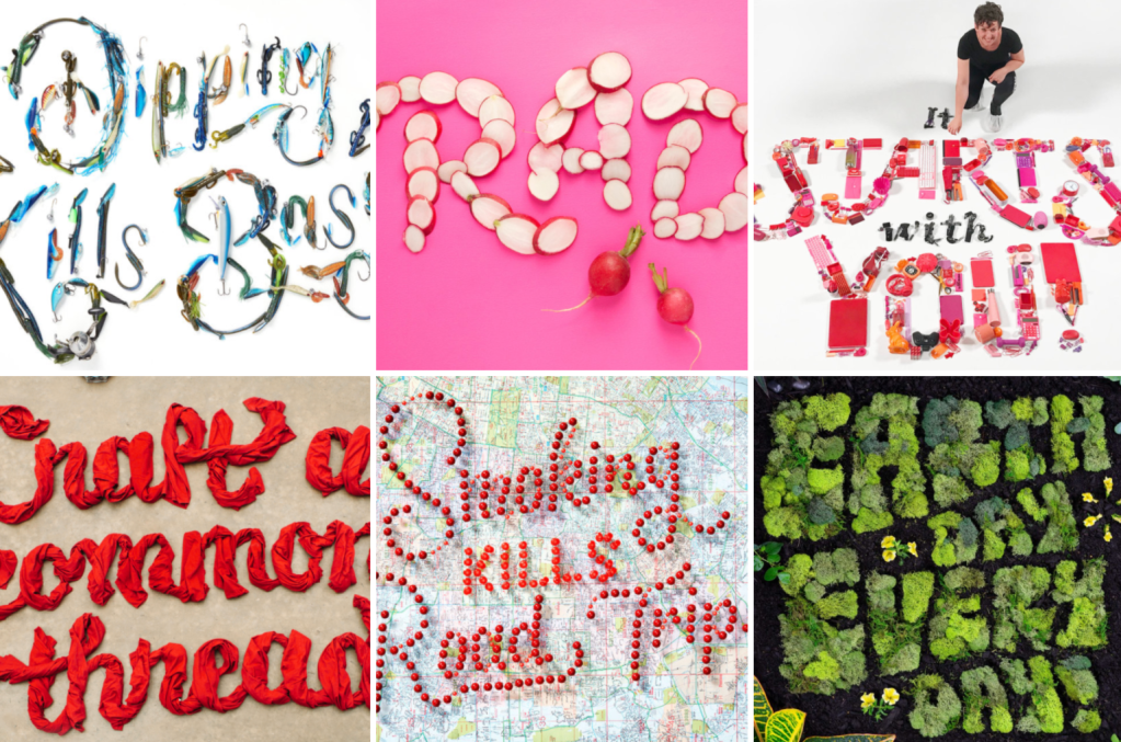
I came across the artist Danielle Evans who is famous for her food typography, I found her work inspiring for this design. https://marmaladebleue.com/
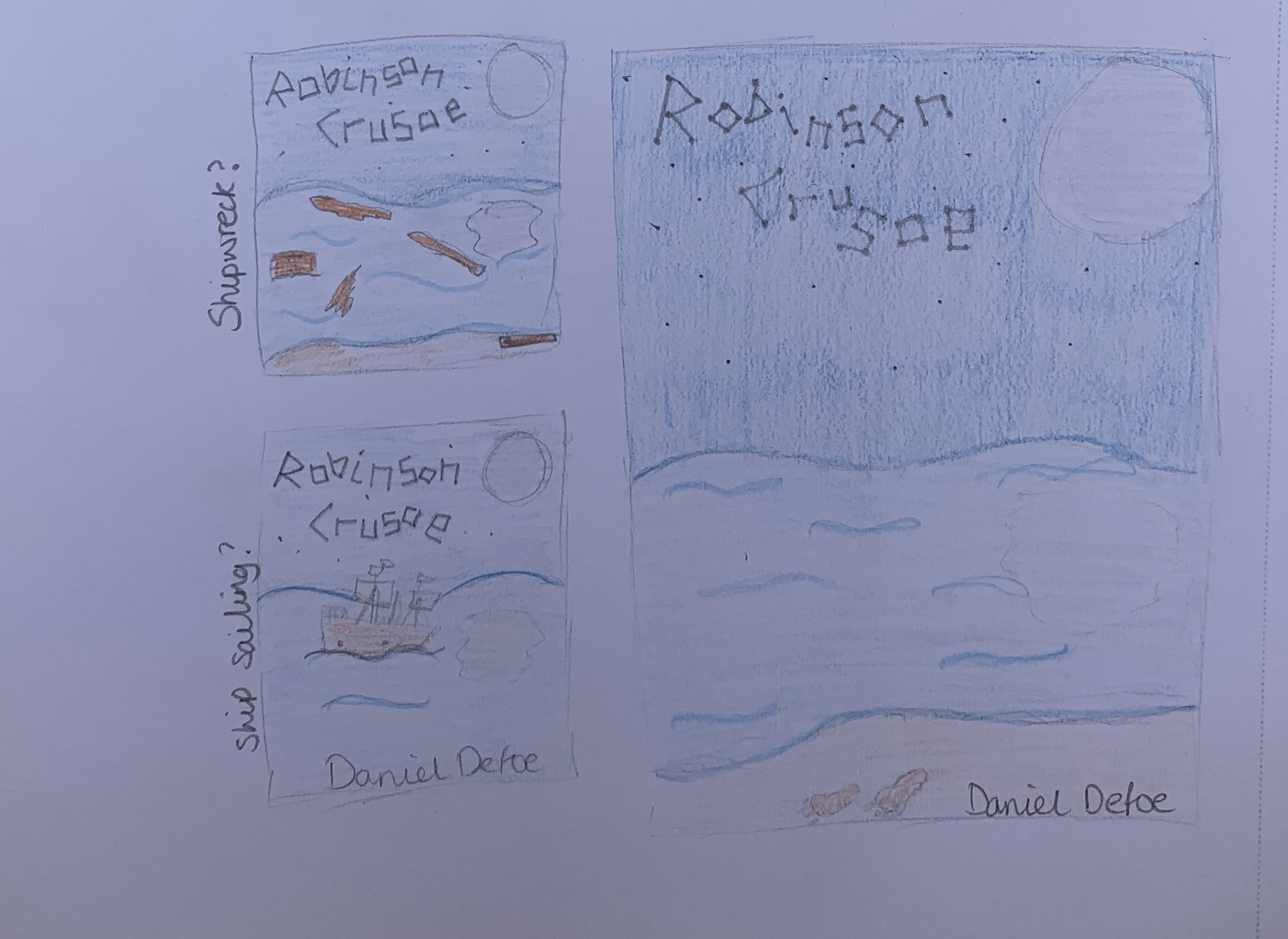
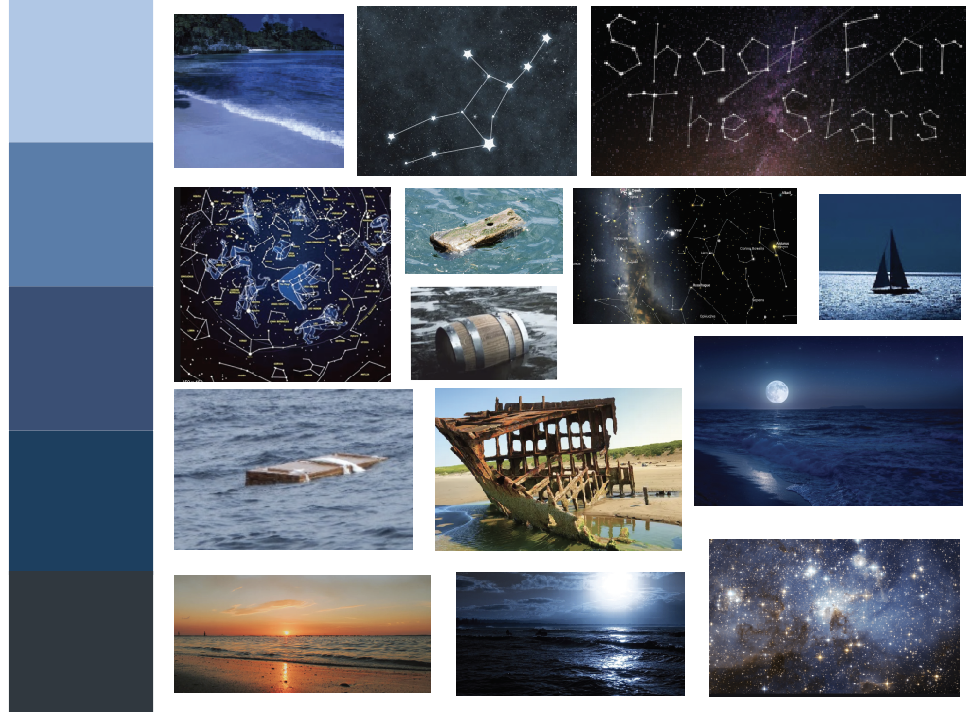
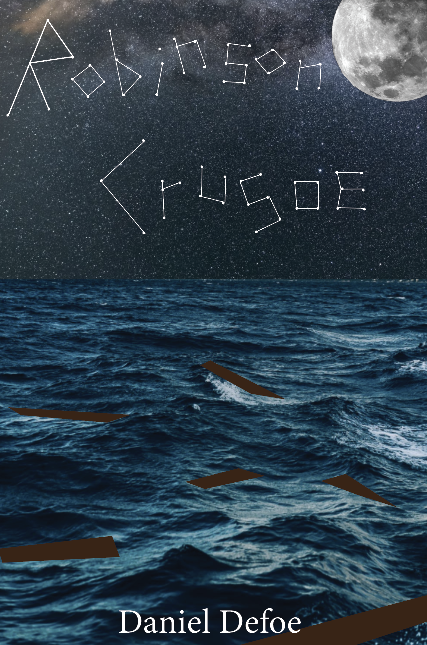
The second design I looked further into was the ‘written in the stars’ design. After sketching out I decided the ship wrecked cover would be more fitting creating a cover more relatable to the story. I feel this design is different to any other existing covers for the book.
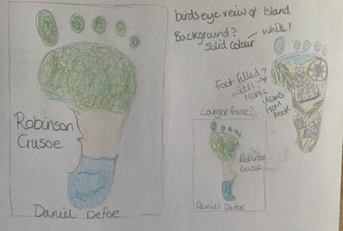

After sketching out the larger design of the footprint masking the island, I thought of including the key symbols from the story within the footprint rather than it just being a birds eye view of the island. By adding in these elements it creates a more intriguing design causing more concentration when studying the image.
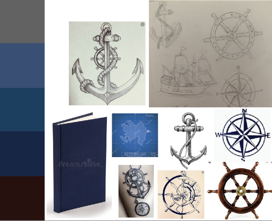
Looking at my sketches of the anchor, wheel and compass I decided to look at combining these three items giving the book a nautical theme focusing on the sailing part of the book, before the ‘disaster struck’. I would like to experiment with this design and the visual dynamics to see which layout works best. This design would also be worth thinking about for the more Deluxe version too.
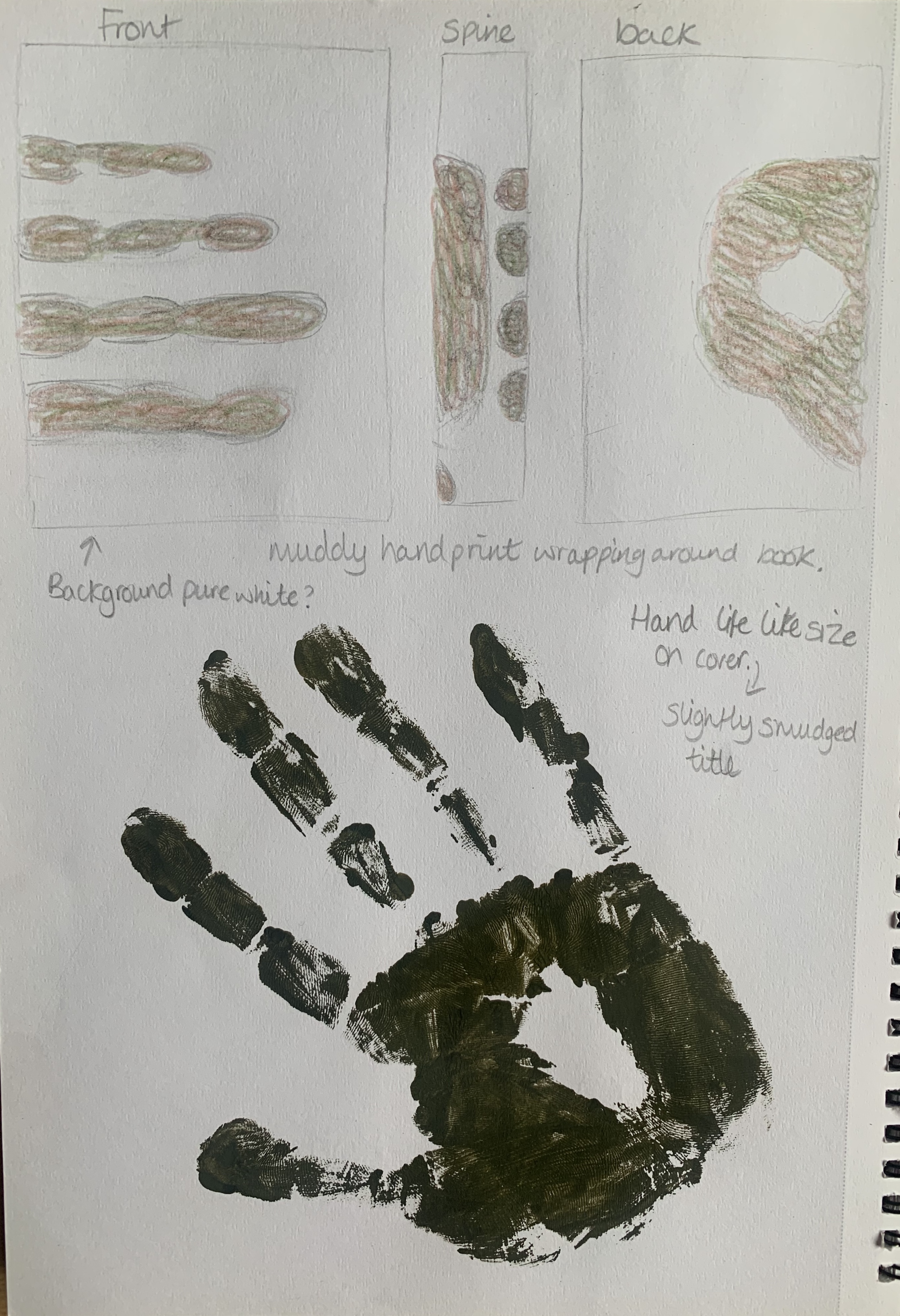
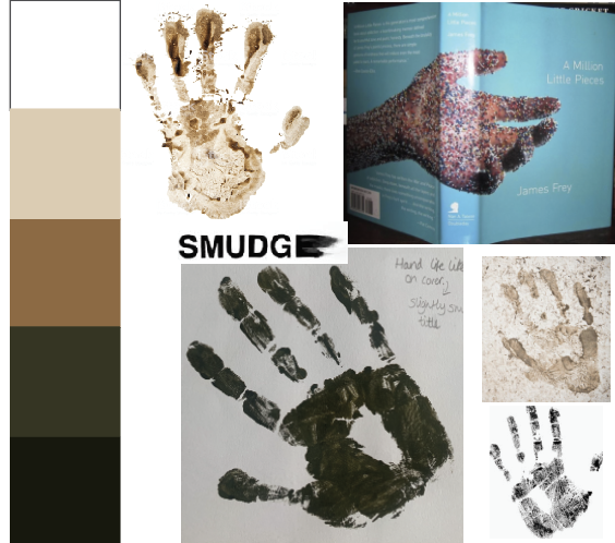
My final design is one which isn’t included in my thumbnail sketch’s, this design came to me whilst creating my mood boards. I like the idea of having a crisp white background with a dirty muddy handprint wrapped around the book, looking like it was held by someone. I then remembered from a previous exercise the cover ‘A Million Little Pieces’ by Rodrigo Corral which I found very interesting. At this moment the handprint design is my favourite.
Visual Ideas
To move onto the next step I decided to roughly mock up each design to see how they worked visually.
Design 1


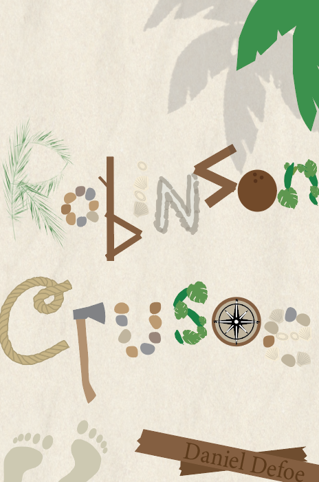
For the typography cover, whilst sketching I was concerned about the limited colour palette and thought about adding part of the ocean to add more colour. Although this is a very rough mockup I am happy with the look of the design and feel its has potential, however I am still keen to try out the other designs first to see which looks the best.
Design 2
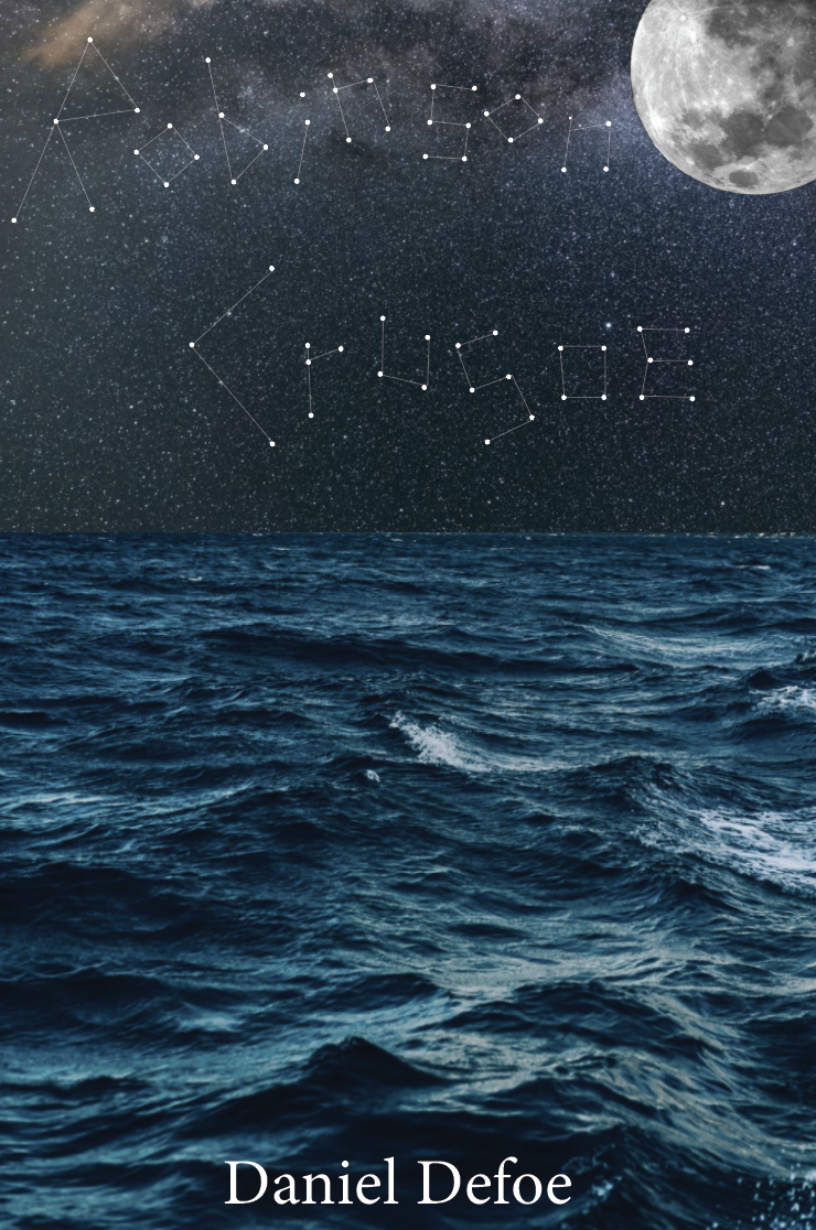
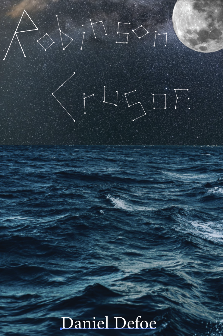
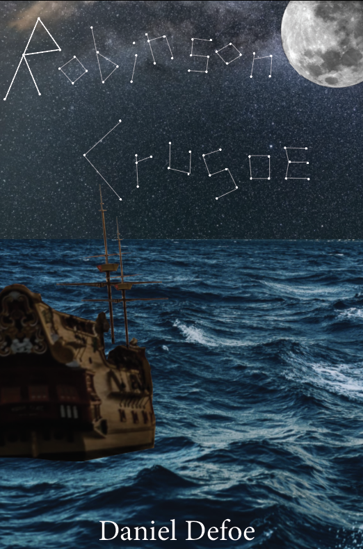
Again for very rough mock ups I feel that the last design suits the book best, by adding the remains of a shipwreck it helps tie the cover in more with the story. If I decide to focus on this design further, I would experiment with the title more, perhaps try make the letters look neater.
Design 3


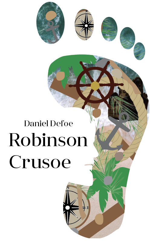
This design came out better than expected. I prefer the last design, however is it too plain and un-relatable to the story? An idea to carry forward with this design would be to consider using an actual bare foot print to add more depth and texture to the design.
Design 4
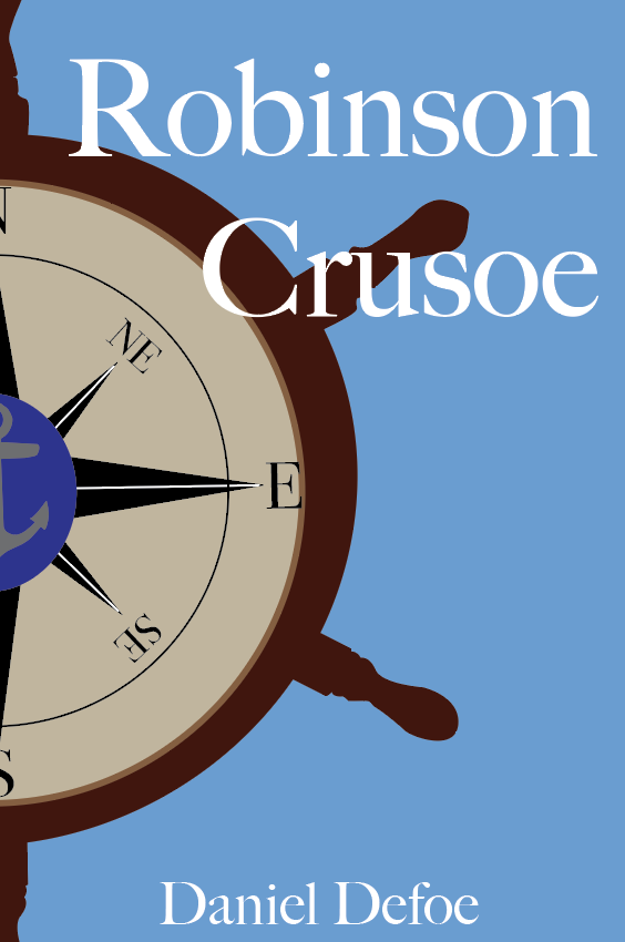

With more detail added I think this could be a good option for the Deluxe version, having a deep navy cloth book with gold foiled title and detailed image with the layout of the second design.
Design 5
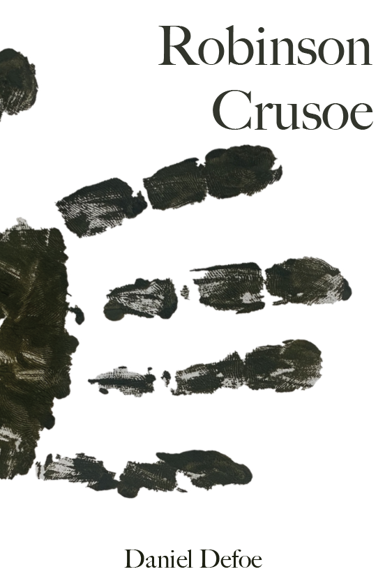

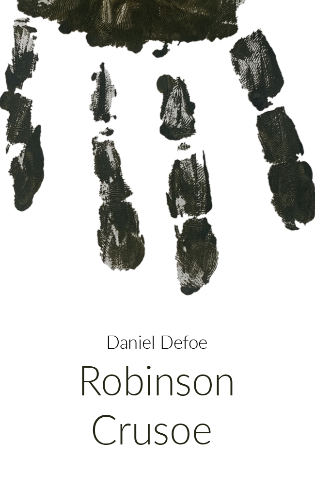
I like how this design turned out, I feel it shows survival without giving too much of the story away. The plain white background gives the book a modern crisp feel. I did attempt to add a background of tree bark however I felt that this took away some of the impact of the design and the handprint looks out of place.
Out of all the designs above I like both the constellation design (design 2) and the handprint design (design 5). I will work further on both of these designs to see which one I will use as my final cover.
Pocket Book (Paperback)
After visualising some of the ideas above I felt I was ready to move onto the designing of the first cover. I wanted to remind myself before moving on what all the requirements are for the book set in the brief.
The book needs to be portable and lightweight for the particular target audience. Reflect on the content of the story and connect to the travel/survival themes in a contemporary way.
I also need to think about the format of the book including the scale, stock and binding techniques.
Design Development
Design 1
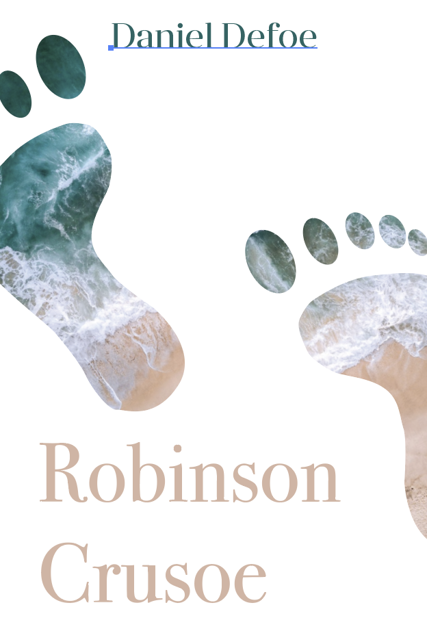
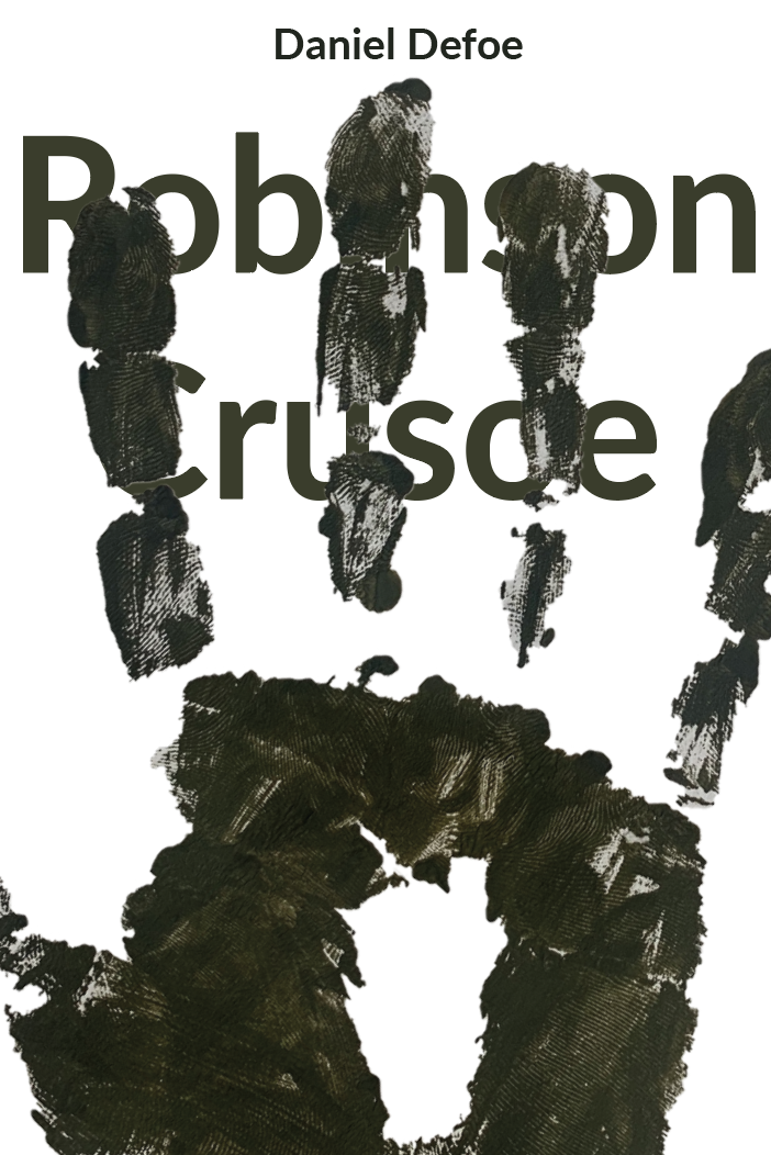
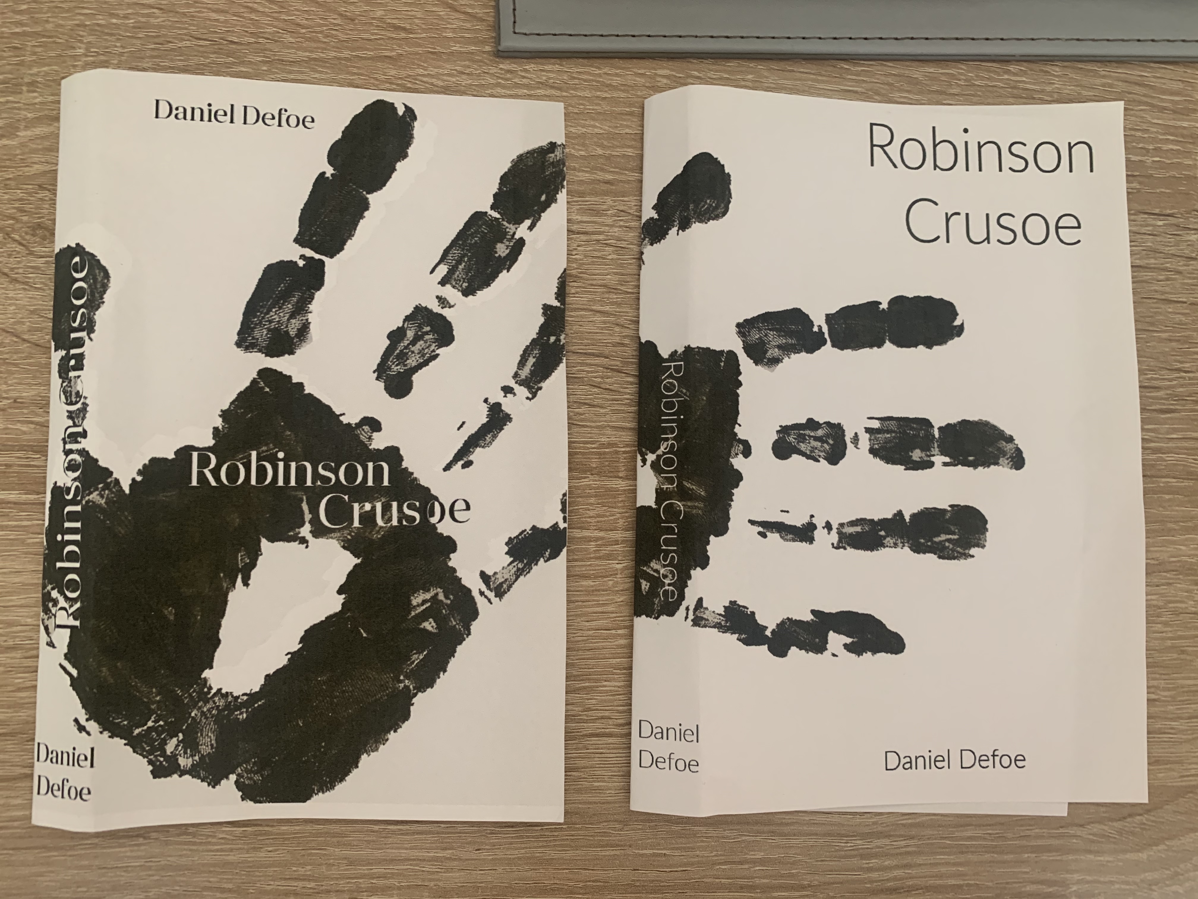
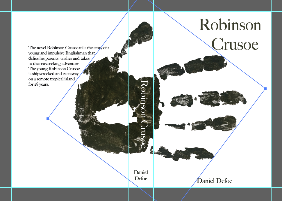
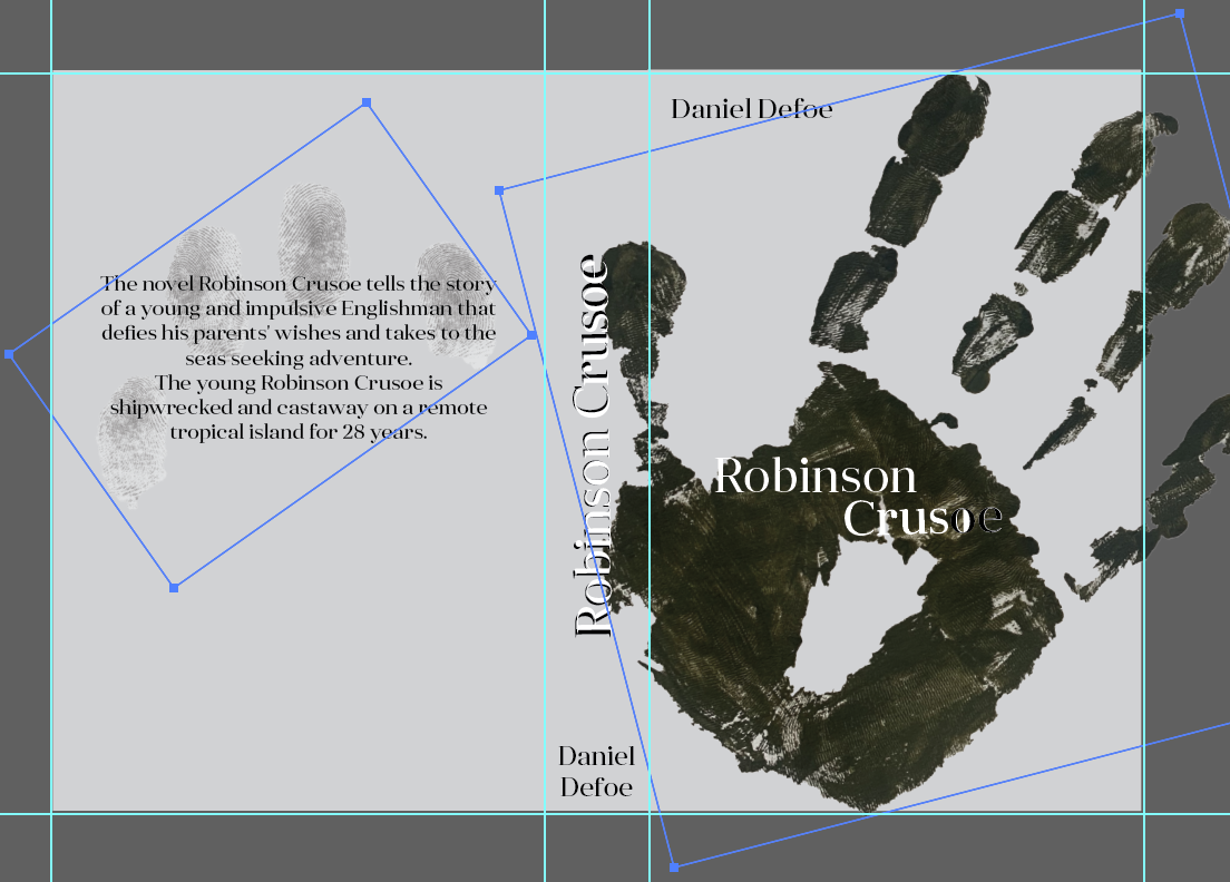
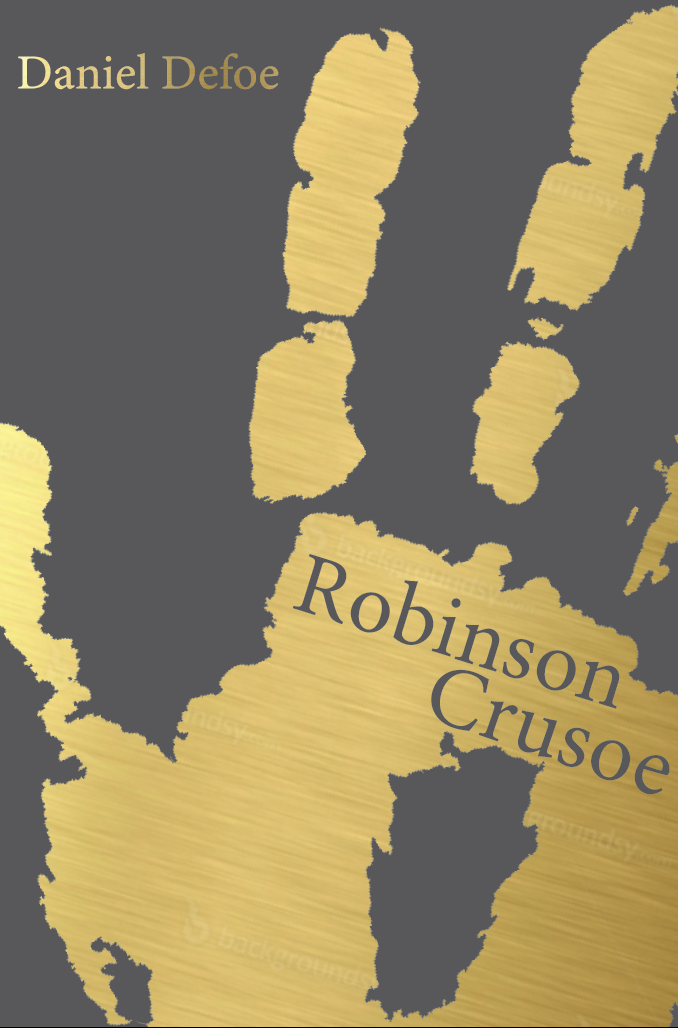
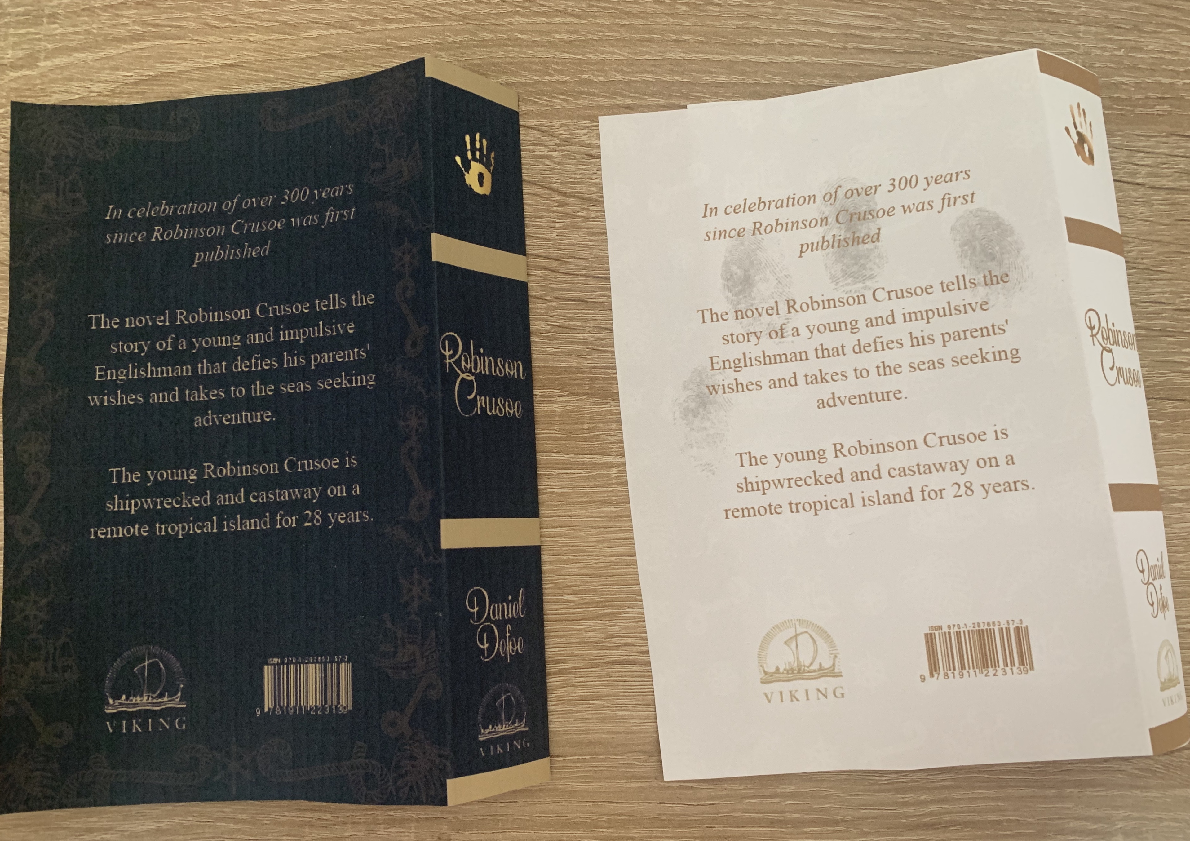
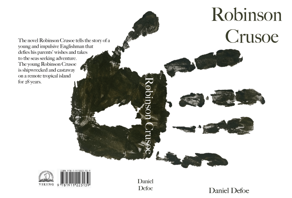
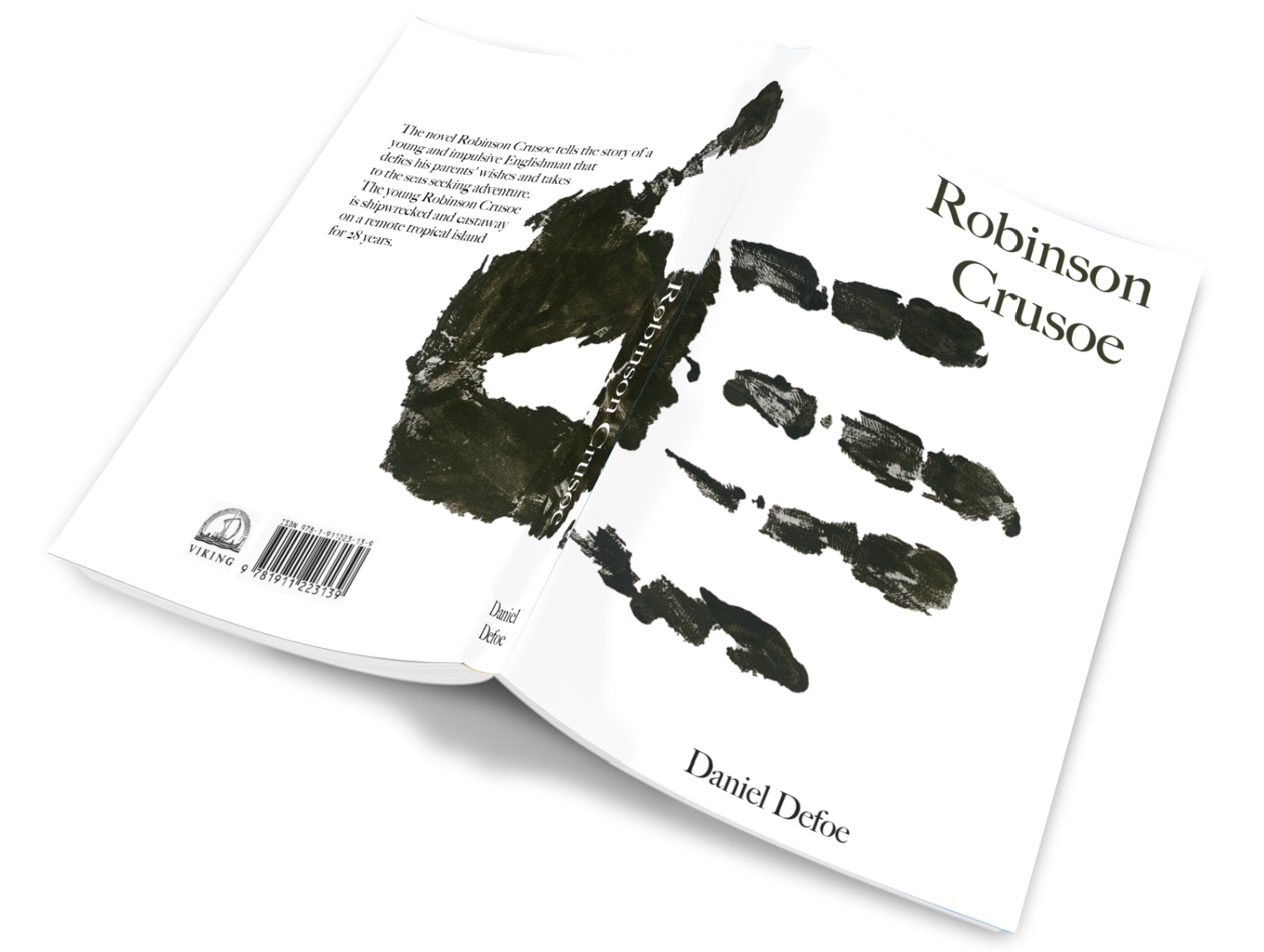
Starting with my favourite design – the handprint design I feel is minimal, clean and modern. I experimented with the colour palettes, positioning and typefaces.
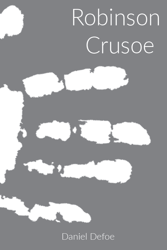


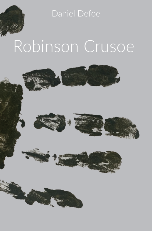
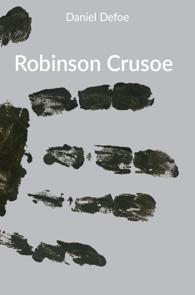
I like the placement of the handprint wrapping around the book against the crisp white background and the clean clear typeface.
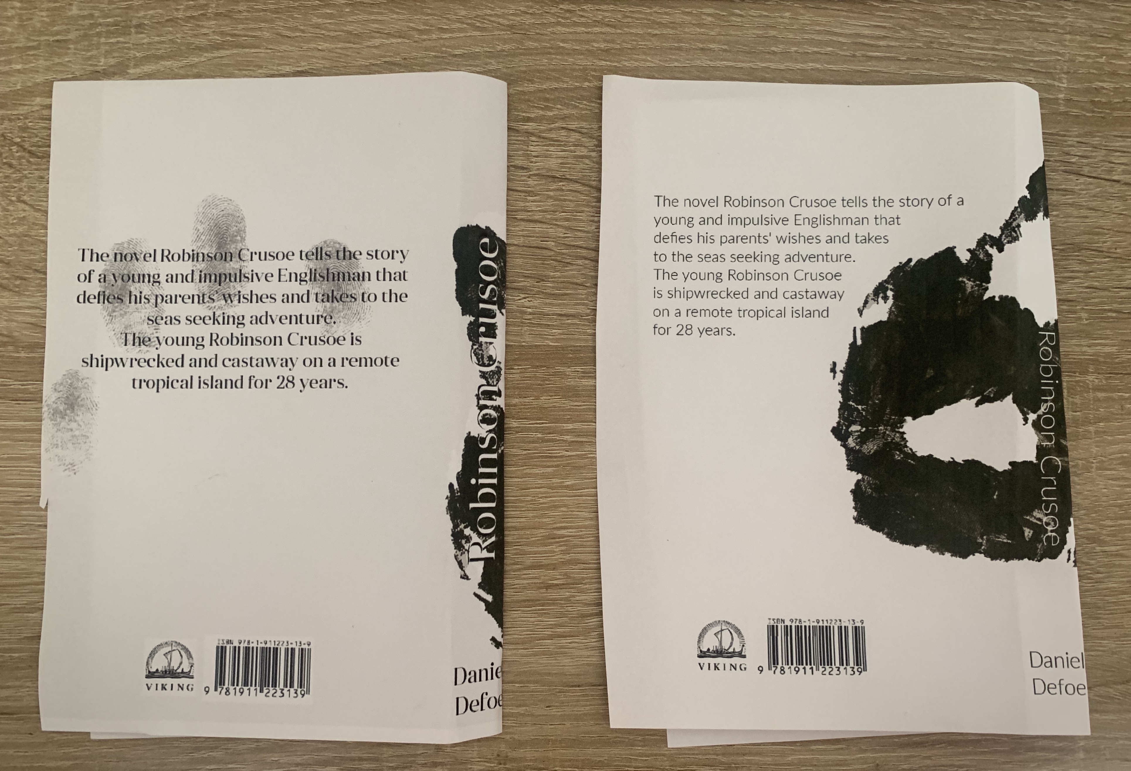
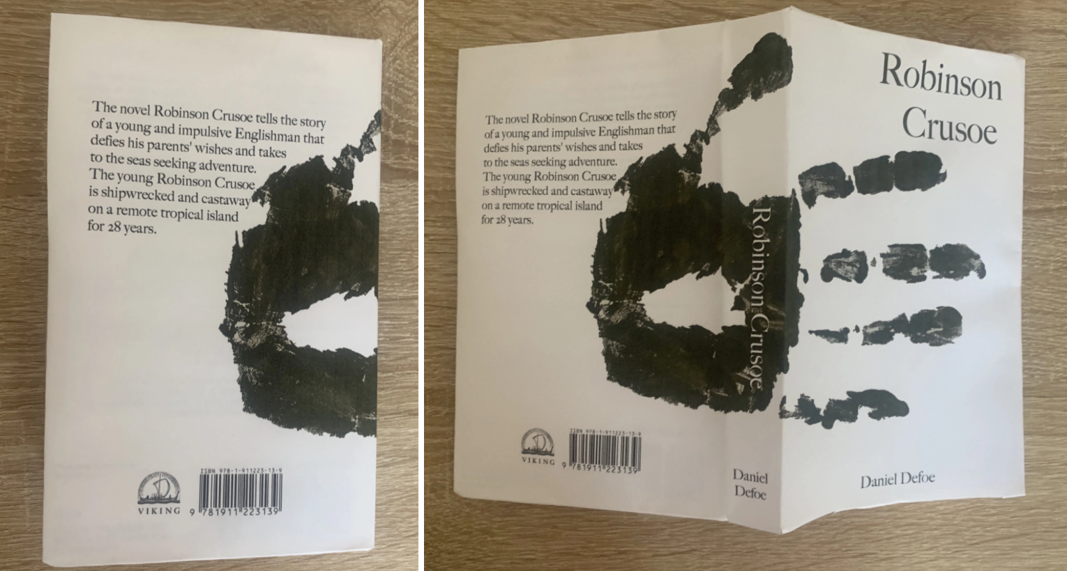
I also like the design below which shows more of the design on the cover, rather than just the fingers of the handprint. I added a free stock image of fingerprints on the back cover to save it from becoming too plain. I feel the only way I could choose from the top and bottom designs is to print them off and mock them up as a real book.
Design 2
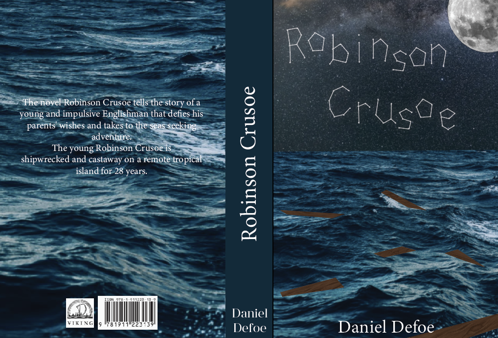
I liked this design because I felt it was completely different to the other designs I had seen of Robinson Crusoe. It shows remains of a shipwreck lit by the nights sky, with the title and name ‘Robinson Crusoe’ written in the stars.
I wanted to focus on the lettering first, it needs to be more detailed and neater but still holding the constellation factor.
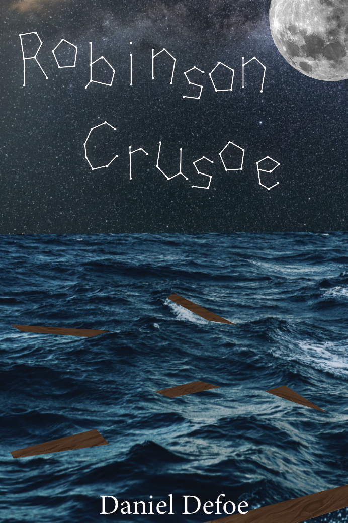
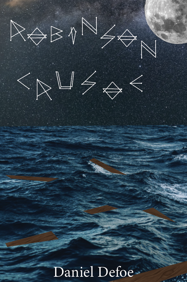
Although I like the idea of this design, I’m not keen on the text for the title. I feel it lacks professionalism however Im glad I attempted to test out different text options.
Mock-up
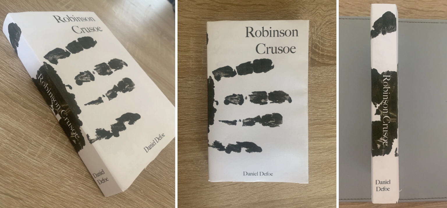
After printing both the handprint designs I like the design on the left, with the handprint more visual on the cover is slightly more appealing, I like the way the text inverts as it overlaps too. The design on the right is interesting as my initial vision for the handprint design, I feel this is modern, minimal and interesting. I feel biased to both these designs and unsure of which I prefer.
When asking for feedback the majority preferred the left design especially with the fingerprint detail on the back, and others liked the way the hand wraps around the book creating an interesting and unusual design.
I think it will be easier to determine which design I will use for my final cover once I look into the deluxe designs, to see how they look together.
Book Format & Design Requirements
Once I was happy with my chosen design I decided to think about the format of the book. The first step was to determine the size of the book. I found an interesting article about trim size (https://blog.reedsy.com/standard-book-sizes/) here it spoke about standard book sizes in publishing and for certain genres. As mentioned in the brief I decided to stick to the smallest trim size available to achieve a pocket sized edition – This is 4.25″ x 6.87″.
The spine should be flexible in order for pages to be bent around to give the reader the ability to hold the book single handedly, and bound with glue.
A matt coated cover with the handprint being slightly embossed would give the book a modern and ‘expense on a budget’ feel for this book, I feel it would really help impact the design too to be able to run your fingers across the book and feel the raised handprint. Or the image of the hand could be printed in Spot UV to add a texture difference to the cover, However this may be costly considering its only for a pocket edition.
The paper should be smooth and thin allowing that pages to neatly fall back into the compact size, adding a textured paper/thicker paper would add bulk to the book and cause tension on the spine.
Looking back at the paper samples I received from ‘Mixam’ and ‘Solopress’ I found a few samples which I would consider using, I made notes on these along with photos (below)
Deluxe Cover (hardback)
Following on from the chosen design of the paperback I wanted to think about how I could create a more deluxe version as the brief has stated they need to be seen as part of a series.
I also reminded myself that the brief had said to create a larger and luxurious cover for Robinson Crusoe. Reflect on the content of the story. Reference the historical nature of the story and the history of the book. This will be seen as a collectors book.
The mentioning of referencing the ‘historical nature’ of the story worried me as the design I had come up with for the paperback is more modern, this questioned me as to how I can create a cover with similarities to be seen as part of a series, yet linking to a historical nature.
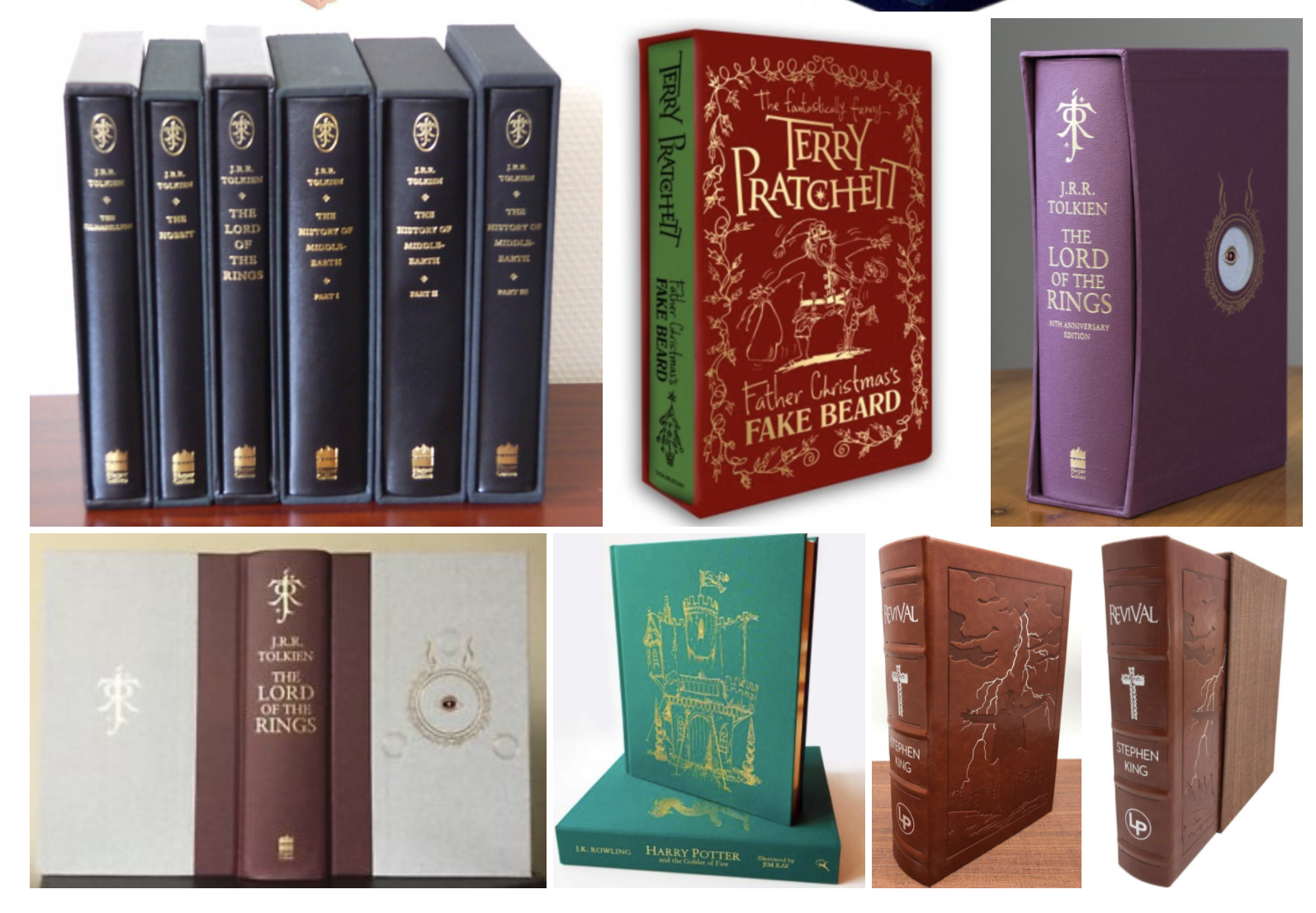
Most Deluxe books are cloth covered, some in slipcases with gold foiled details and mainly consist as typography covers. These are all features to keep in mind for the design of my cover.
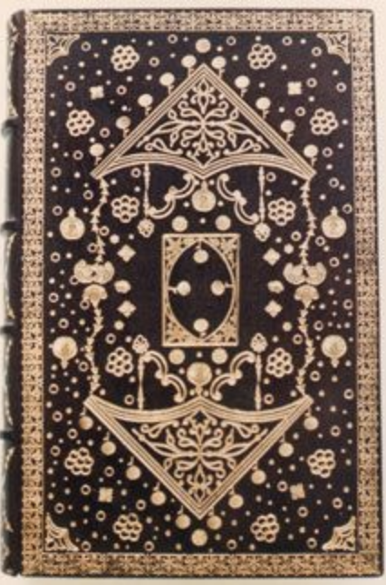
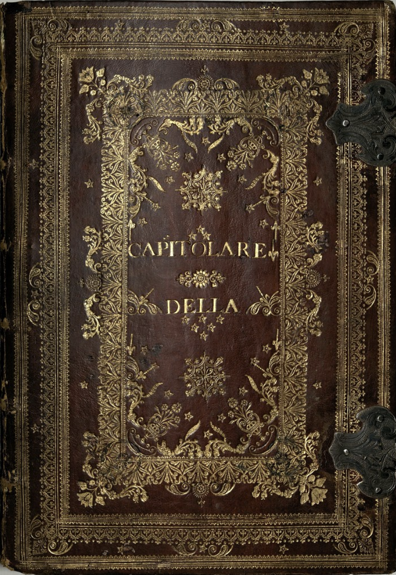
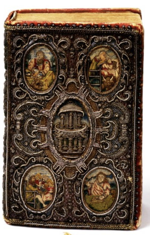
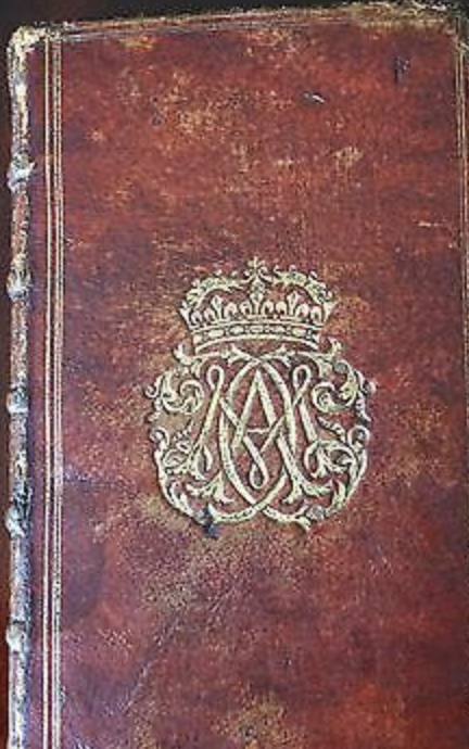
Thinking of the historical part of the brief I decided to look at book covers from the 17th century to see what their main design features are. It seems they use a lot of filigree detail in the designs, this pattern could be something I use within my design.
Design Development
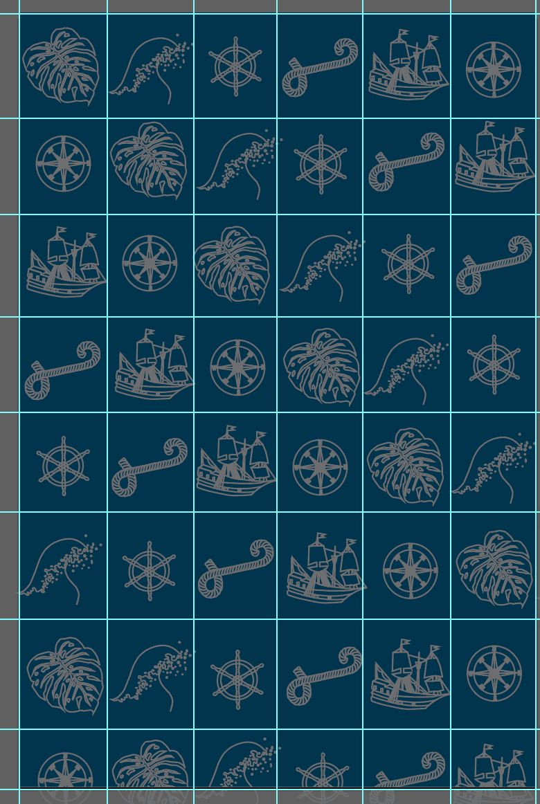
I started off by creating some sketches focusing on ornate filigree, I feel by combining this, the handprint and a few other elements relating to the story I can link back to the historical nature and by including the handprint, it can then be seen as part of a series.
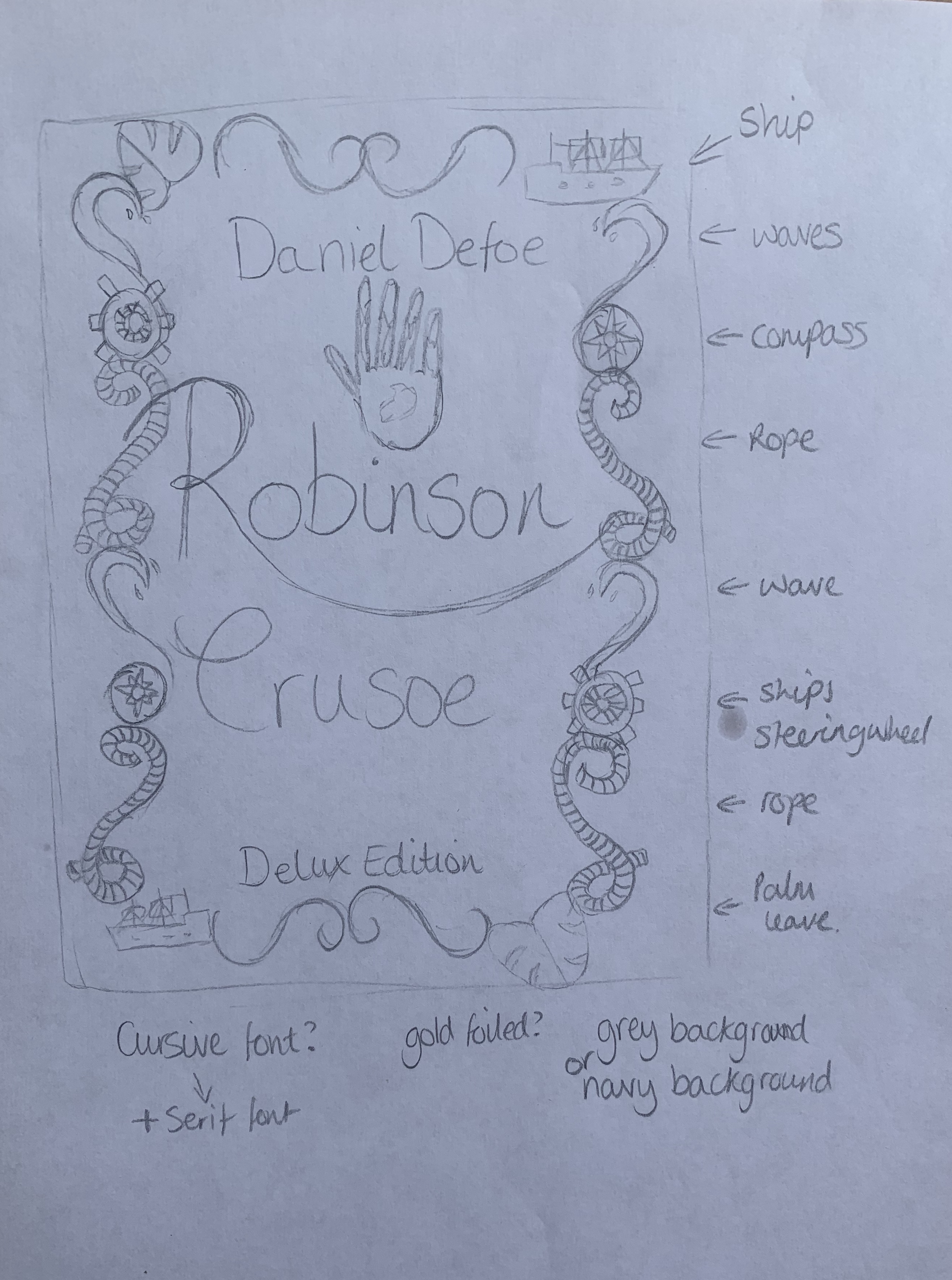
Visualising Ideas
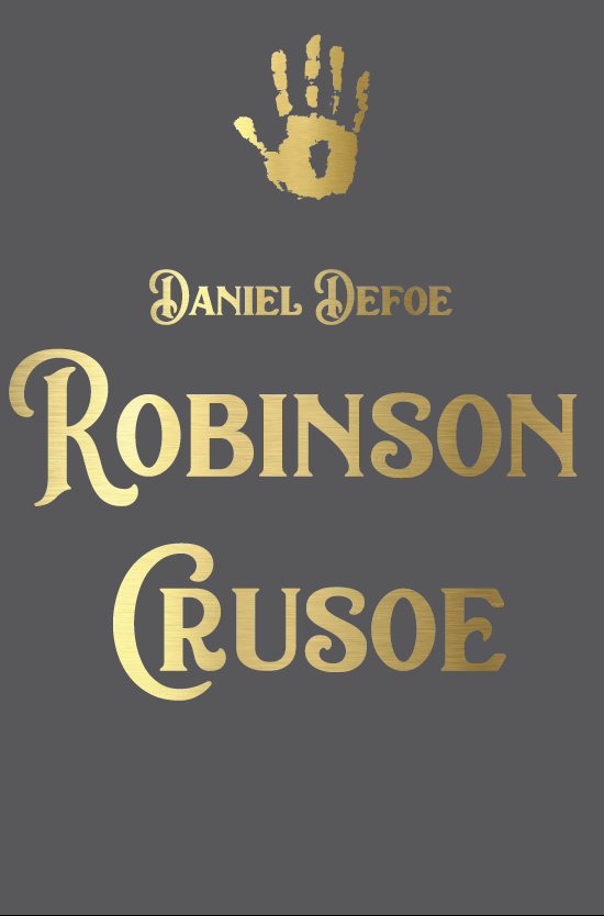

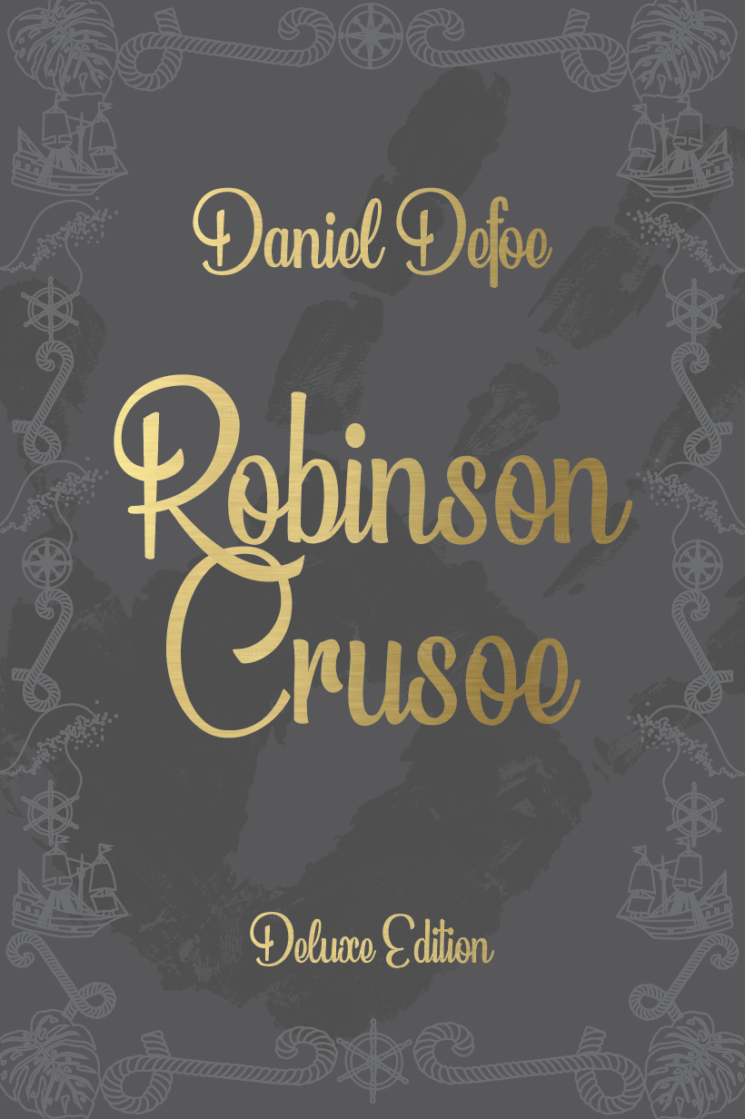
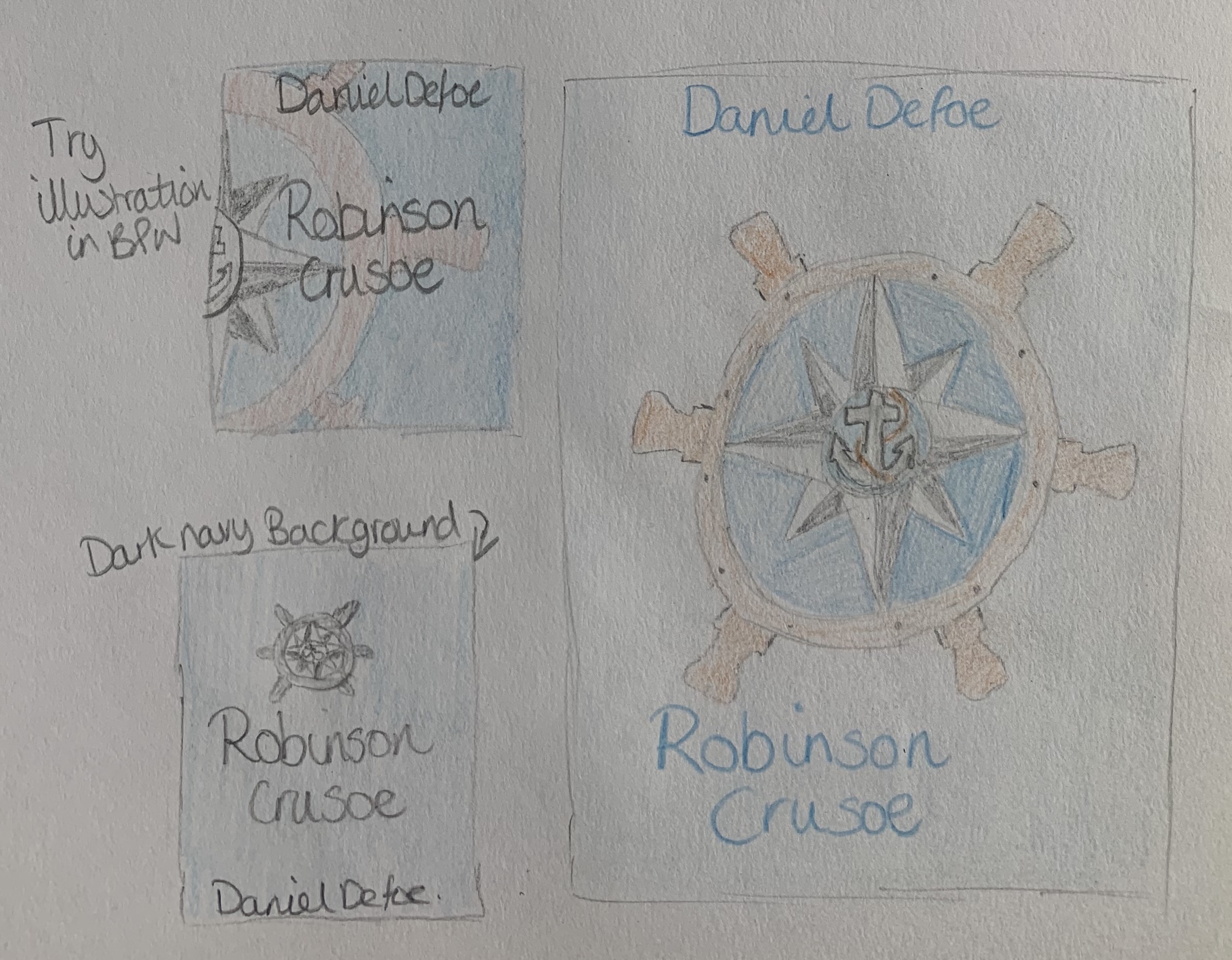
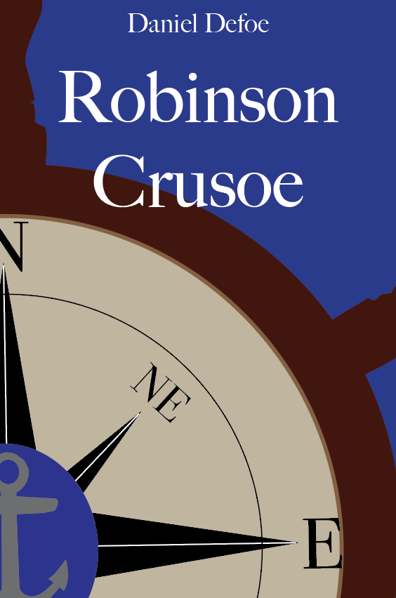
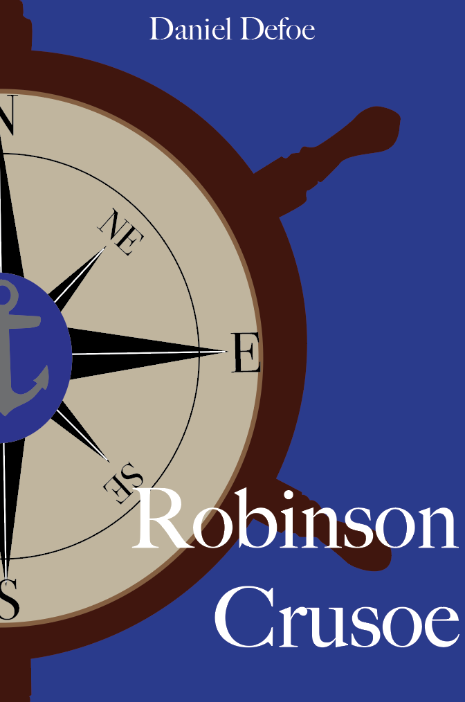
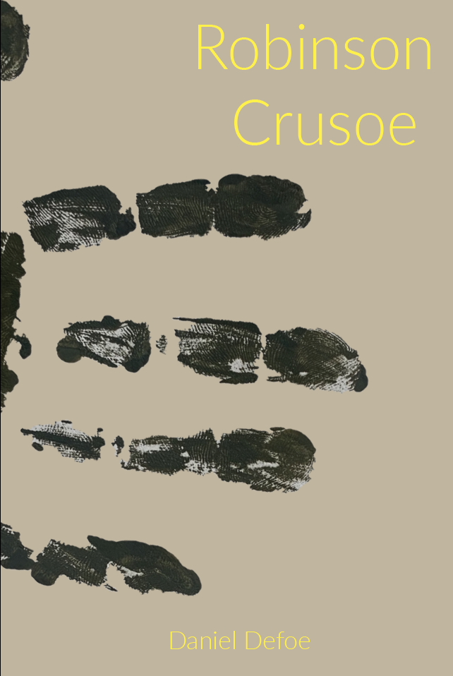
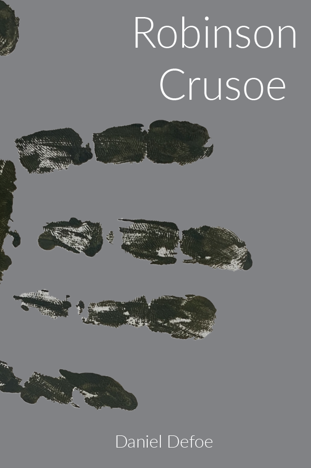
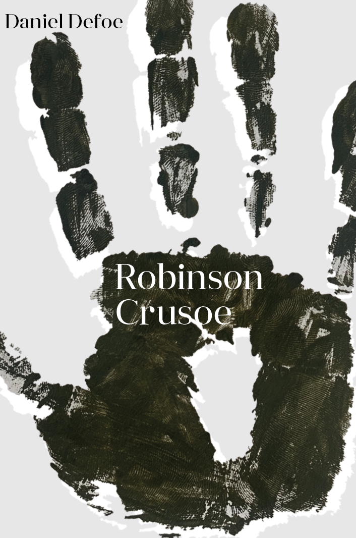
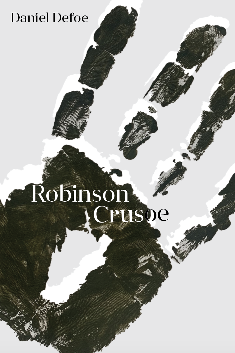
I experimented with different layouts in attempt to have this cover look luxurious yet relatable to the paperback cover. I created a border out of items relevant to the story, taking slight inspiration from the ornate filigree designs. I wanted to keep a script typeface as I feel this adds class and extra detail to the design. Out of all the above variations I think that the deep navy background works well with the gold lettering.

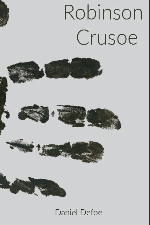
Reflecting on the design above to the design of my pocketbook I struggled to see the connection between them two (for them to be seen as part of a series) so I decided to follow one of the layouts created for the paperback and rework it to give it a deluxe feel, to see if this worked better.

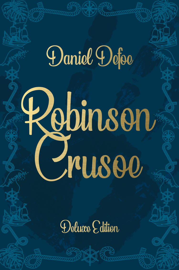
Seeing the two designs side by side I now feel the design on the right is much more suited as part of a series with the bronze foiled letters and faint patterned detail in the background. However the left design does show more of a historical look.
Mock ups
I printed off both designs so I could see how they looked in person.
Left design (navy) – The background came out far too dark and needs to be lightened slightly so that boarder detail is more present, however this design does has a classic historical feel. My only worry is that it isn’t relatable enough to the pocketbook edition to be seen as part of a series!
Right design (white) – A similar issue as before with the backgrounds, this needs to be slightly darker so that the detail of the symbols in the background can be seen. Im unsure if the spine suits the design but attempted to create an historical element within the cover. By using a similar design as the pocketbook this makes it clear that the books are part of a series.
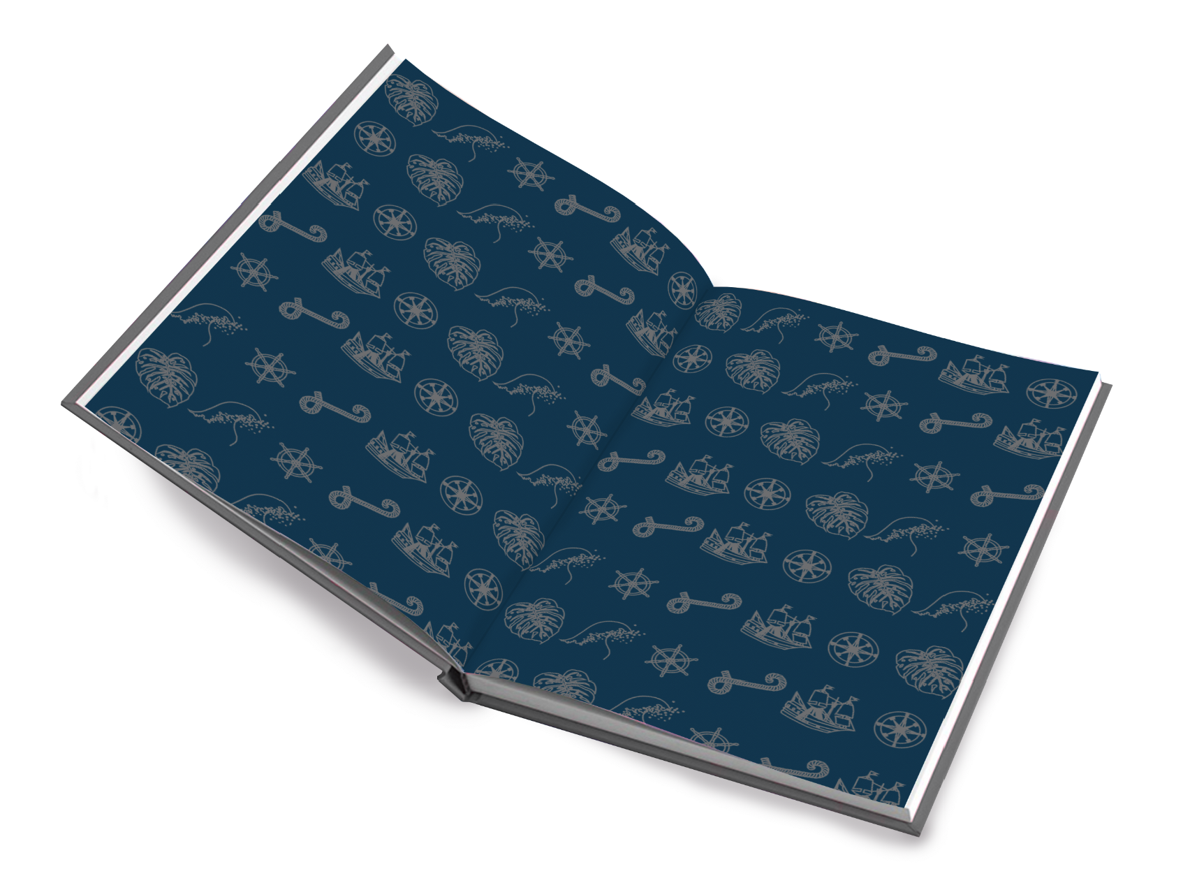
Endpapers
After taking the time creating these symbols used in the boarder of the first deluxe design I didn’t want them to go to waste so decided they would make great end papers for the deluxe edition. I experimented with different coloured backgrounds however I feel that the dark teal would add a nice contrast between the light cover and the pages.


Book Format & Design Requirements
Once I was happy with my chosen design I wanted to look at different size deluxe books. I found a very helpful website listing all the standard book sizings (https://digital.imprint.co.uk/paperback-book-size/) This may come in useful for the remainder of this course! As mentioned in the brief I decided to choose one of the larger trim sizes to achieve high luxuriousness – This is 6″ x 9″.
There are a few more features to think about for a deluxe book rather than a paperback, such as; Dust jackets, boards & the textures, end papers, binding techniques – headbands etc.
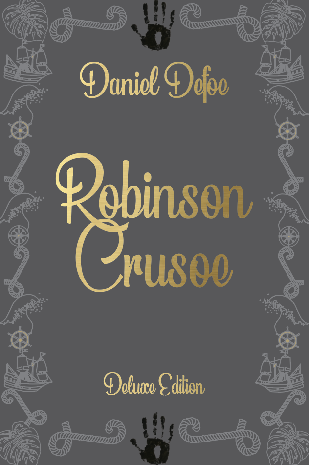
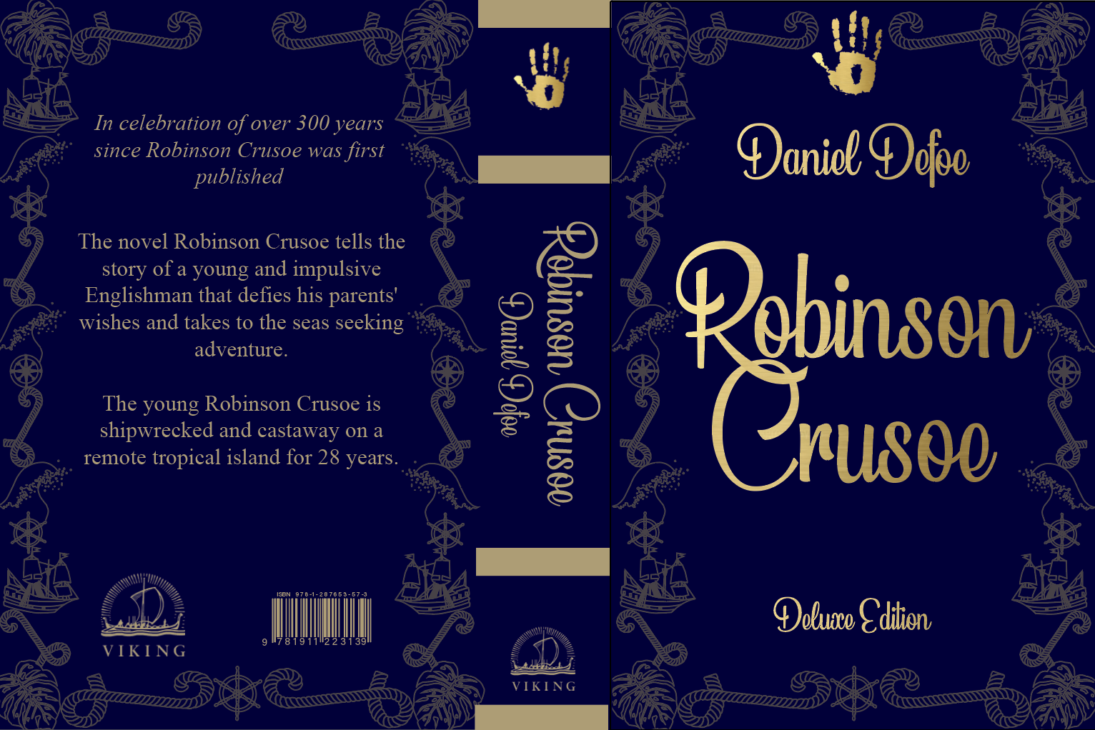
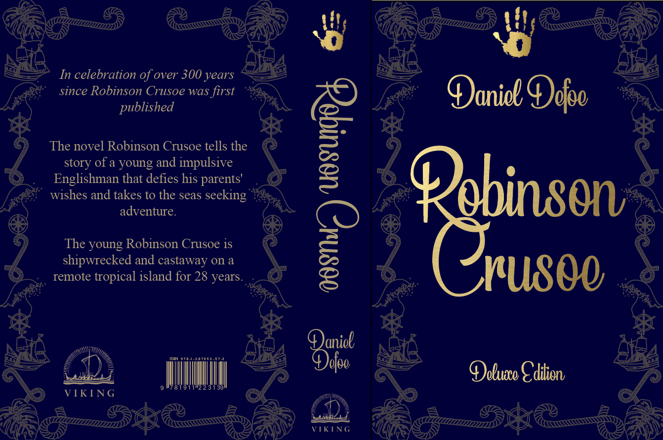
For my deluxe edition I have decided to create a slipcase, I feel this will be a good competitor to previous existing copies of the book and also against other books on the market. This will help mark a 300 year edition appealing to collectors and fans of the book.
The book itself will be cloth covered with the slipcase matt laminated with spot uv, for a smooth finish with an eye catching glisten to the handprint (which I also plan to use on the pocket edition)
The paper used should be smooth and of a higher quality allowing the pages to neatly fall back into place (minimum 100gsm).
Slipcase Research
Protective covering where the book (or a set of books) is slipped in for protection leaving the spine exposed. Slipcases are lined with either paper or suedel.
Slipcases provide five side protection of the book, leaving the spine of the book facing the observer. This means the books are protected from dust, light and other influences such as neighbouring books when placed on a shelf. Not only do slipcases protect the books, they also present the book in an attractive way, which is why many collectors are interested in them.
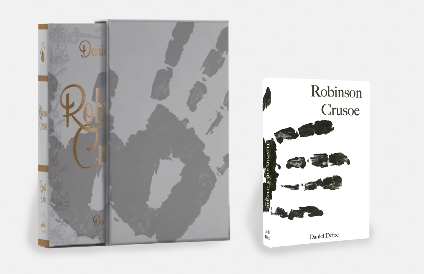
Final Designs
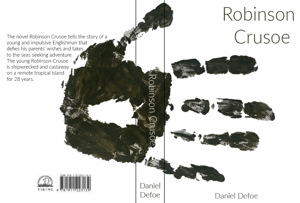
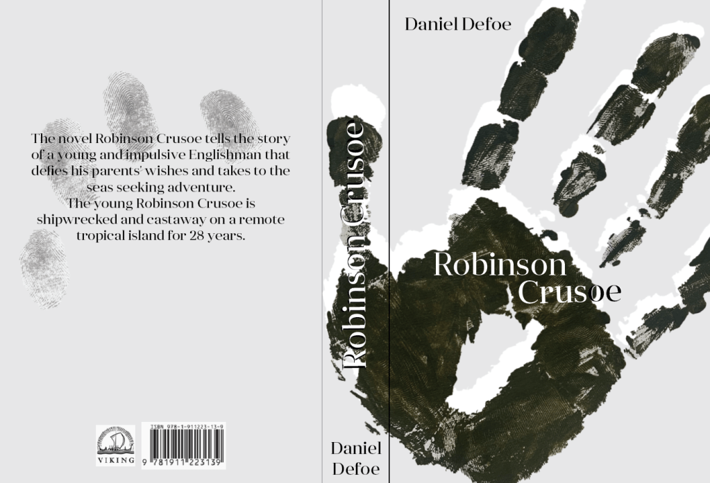
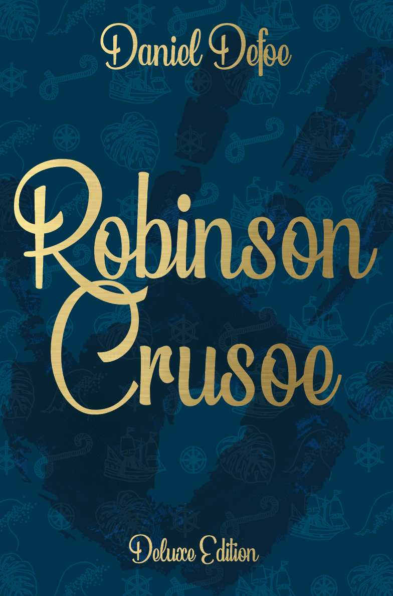
Pocket book edition
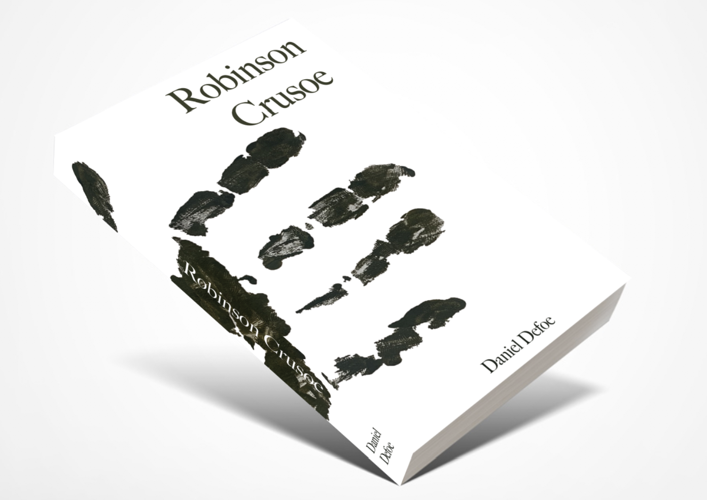
I have chosen this design for my pocketbook as I feel the design is modern, unique and compelling.
The cover of the paperback edition will be 300gsm matt laminate finish to give the book protection and extra durability. The pages will be printed on 80gsm bond paper to keep the costs down and bound together using Eva-con R Adhesive. The size of the book is 4.25″ x 6.87″ with a 2cm spine.
Reflection
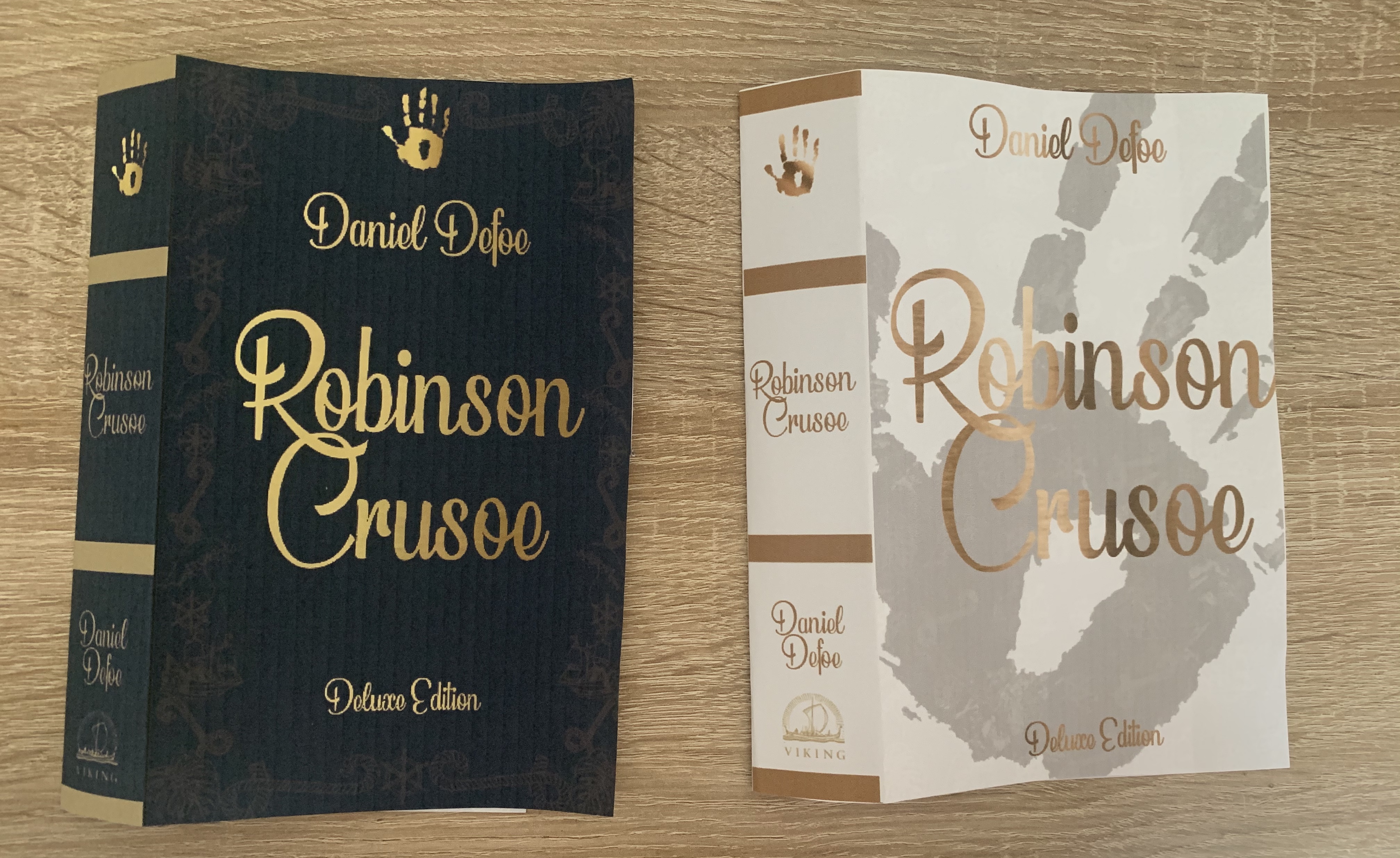
I’m really pleased with the outcome of this cover, I love the simplicity of the design and feel it fits the brief well. It is also very different to existing versions of the book. I did a lot of backwards and forwards between two of the final designs, however feel I chose the right one in the end. The feedback I have received from this cover has been positive with comments impressed by the wrap around image.
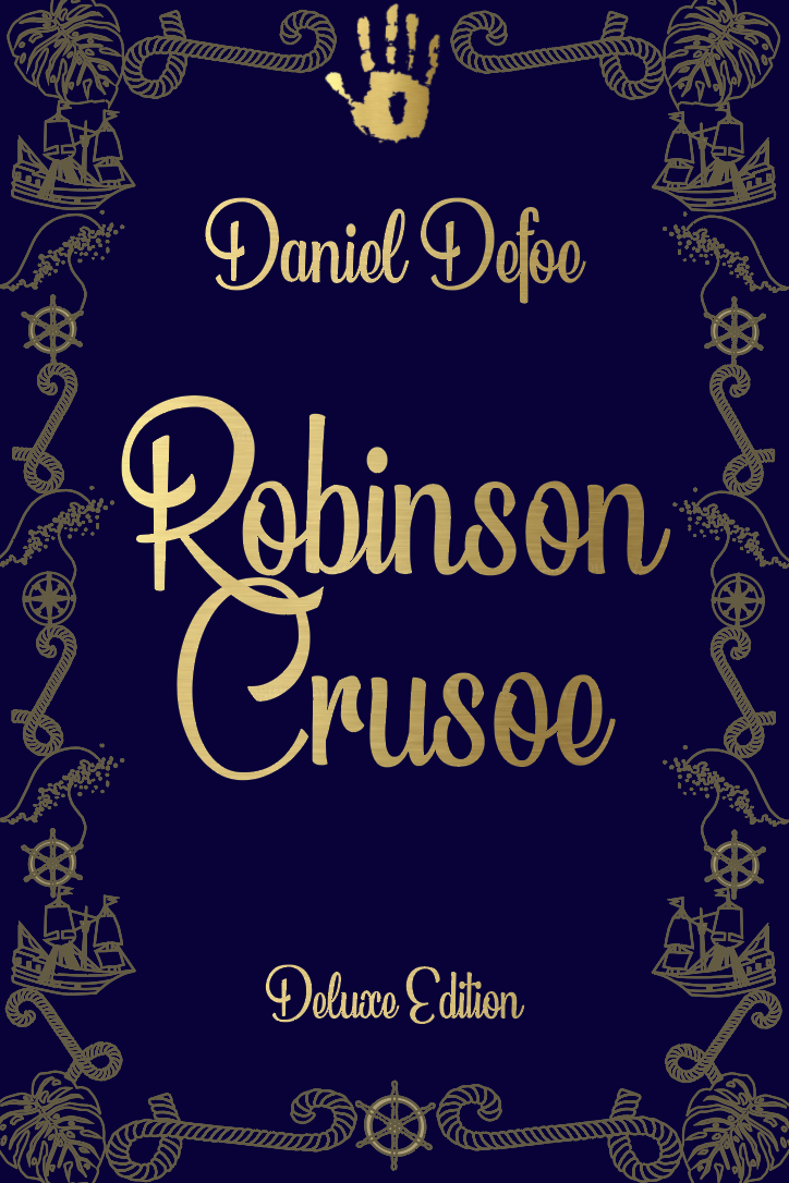
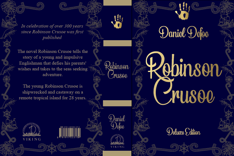
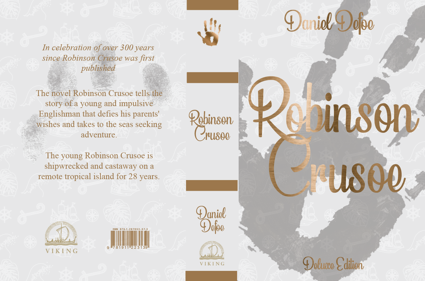
Deluxe edition
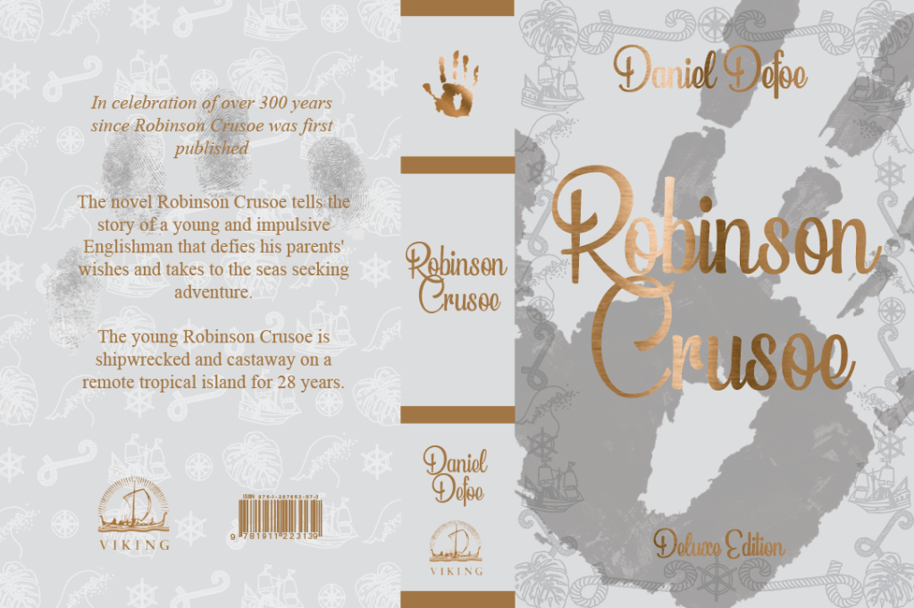
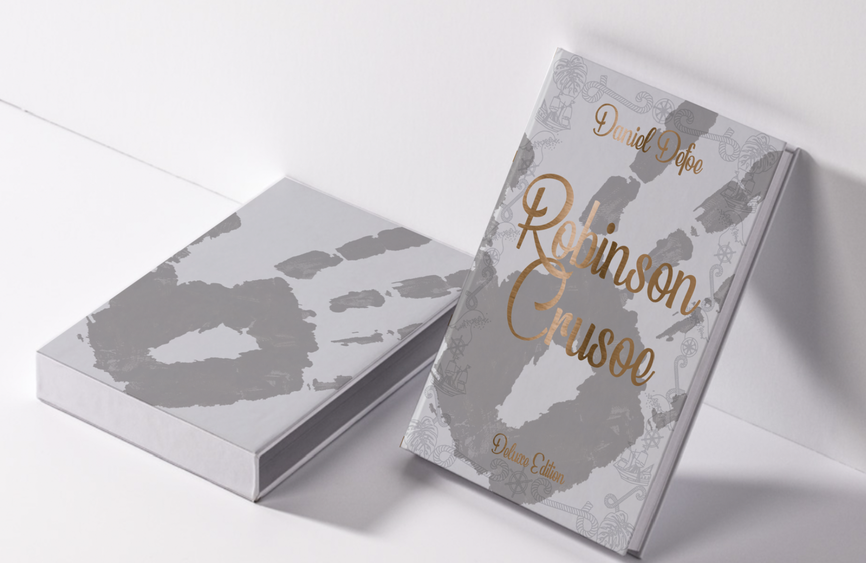
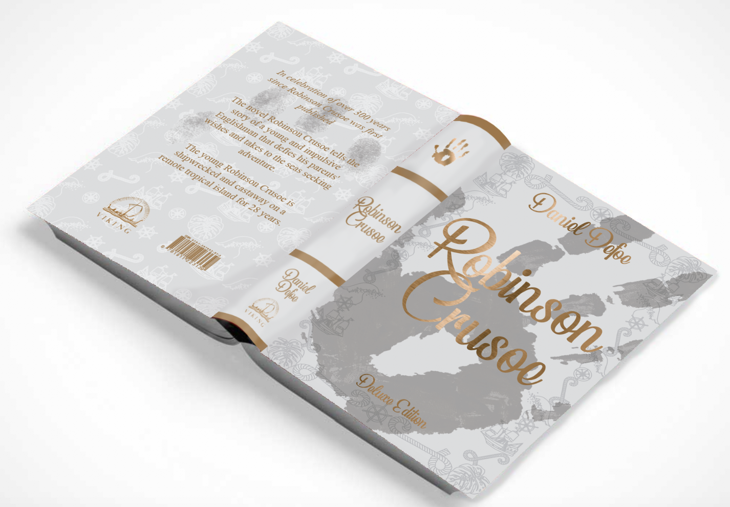
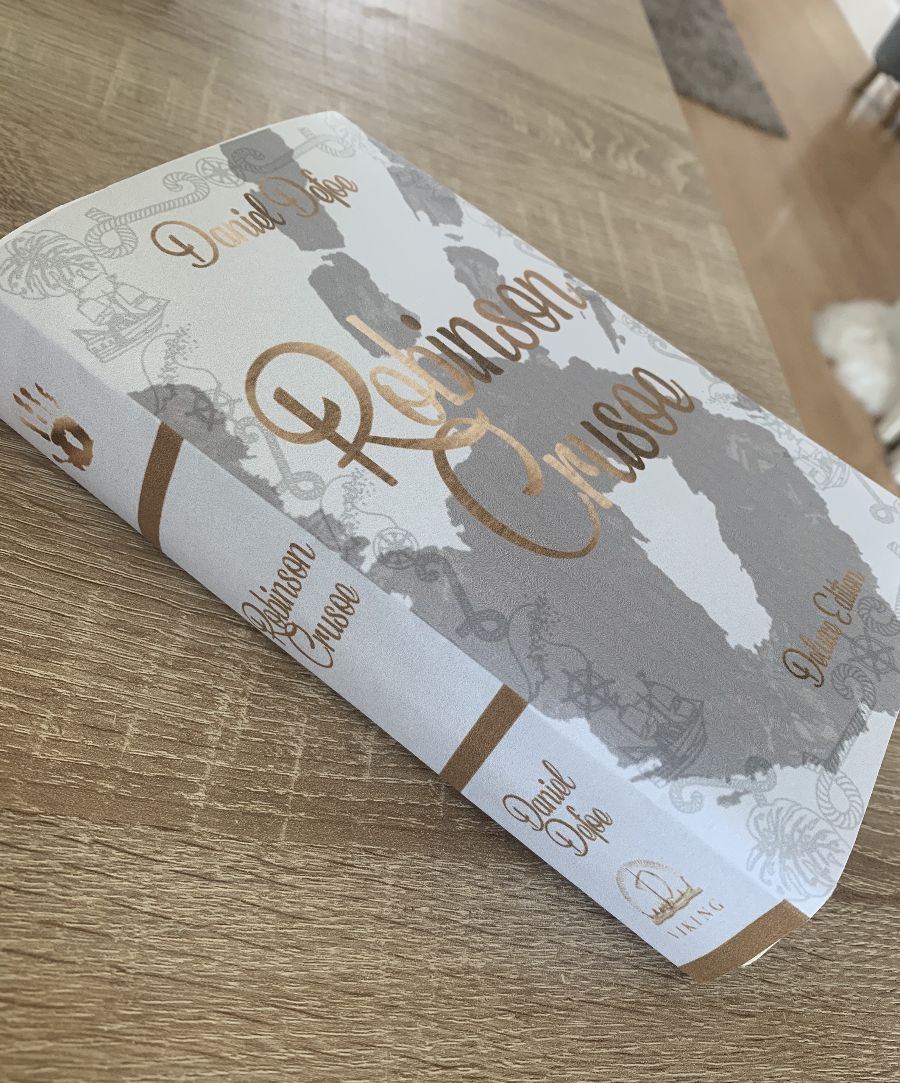
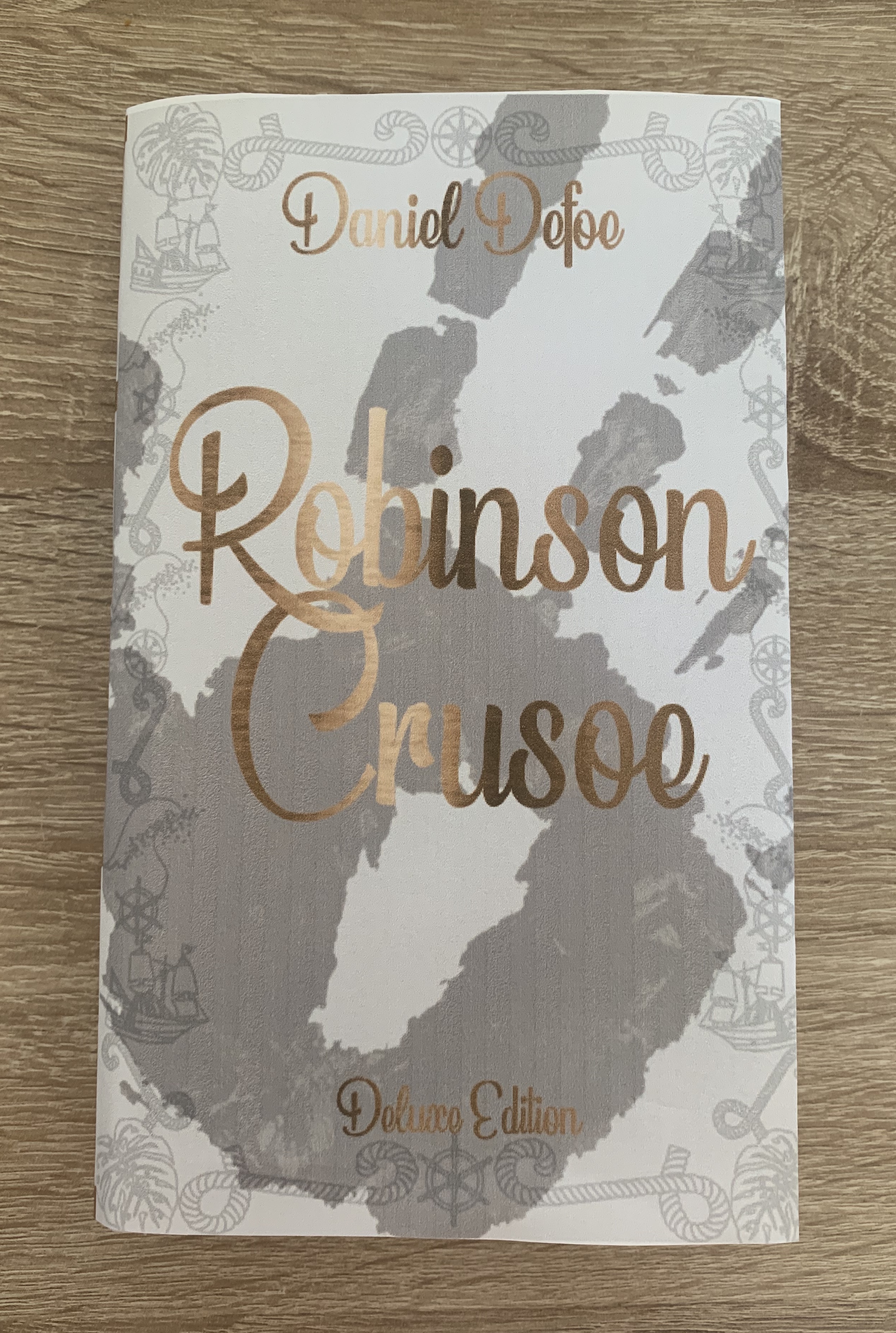
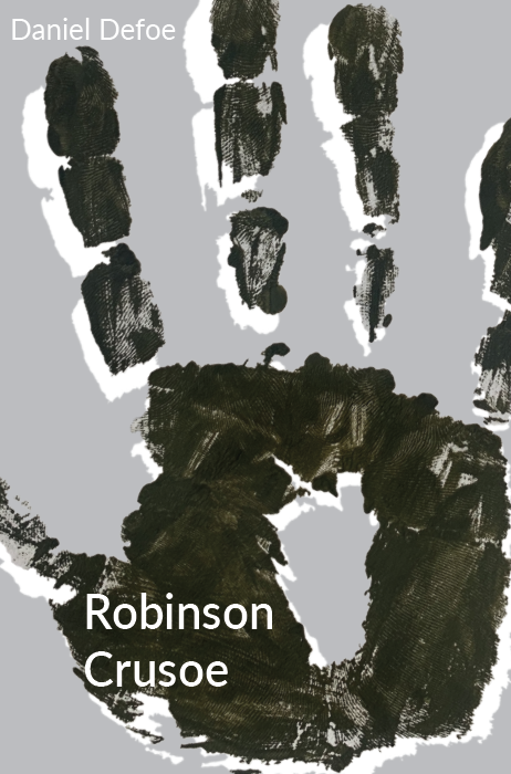
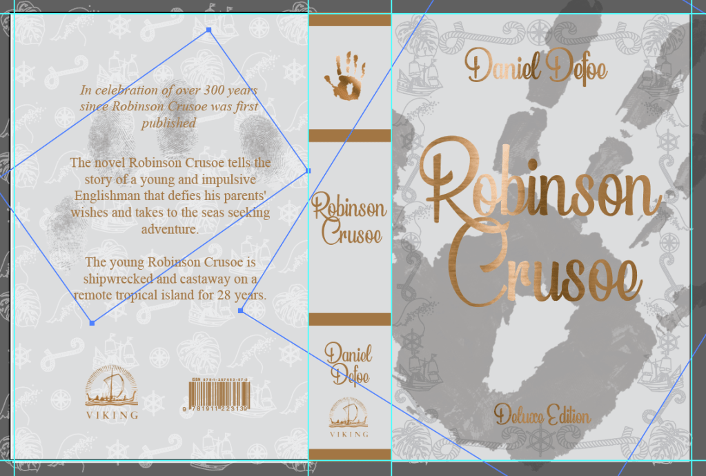
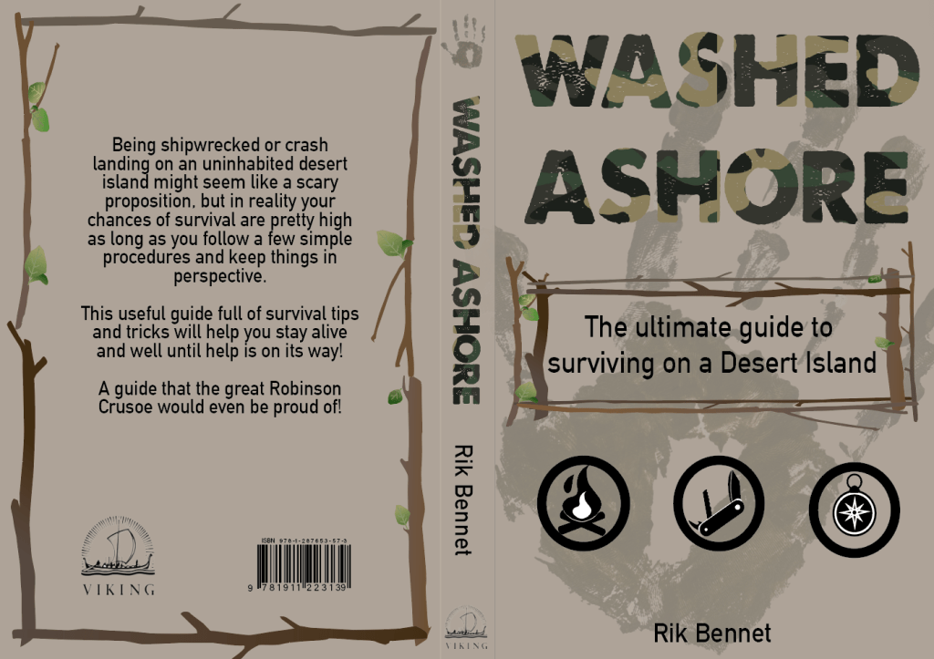
In the end I decided to combine the boarder from the first deluxe cover onto the layout of the second, I felt this eased my worry over the lack of the ‘historical’ feel. I have created a plain slipcover with just the handprint on in the same position as the book within, I felt it looked more endearing without placing the title on the slipcase, making the audience want to sneak a peek at what the book is.
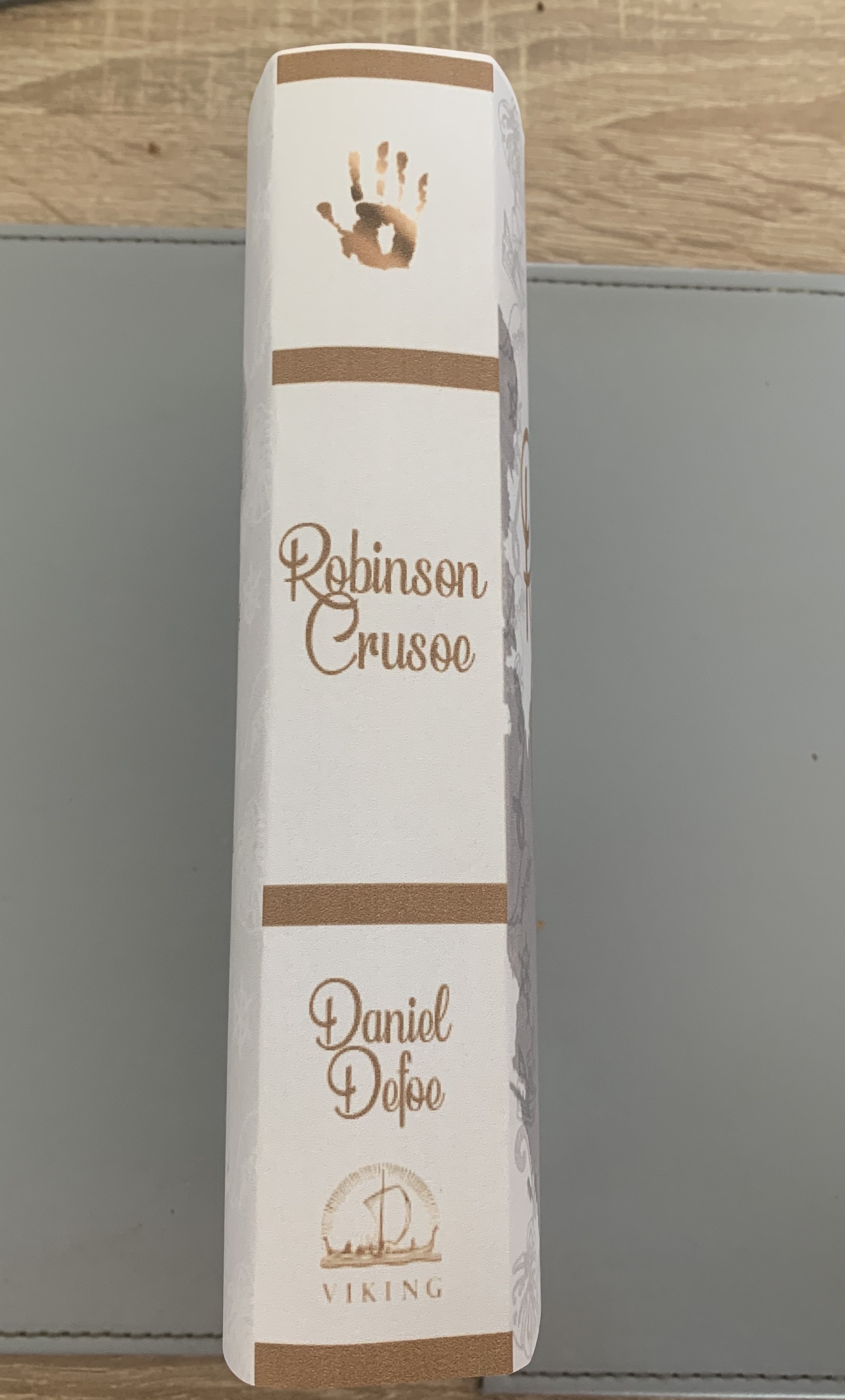
The cover of the hardback cover will be made from 1500 micron board covered cloth with the design printed onto it, all the text on the cover will be a brass/copper foil along with the handprint on the spine. The endpapers will be printed onto 150gsm matt paper. The pages will be printed onto 120gsm bond paper, casebound into the cover with grey headbands for finishing touches. The slipcase will be made of a slightly thicker board of 2000 micron board with the handprint design on the outside coated in a matt laminate finish with spot uv applied on the handprint, the inside of the slipcase will be lined with the same design as the end paper to give it a complete finish.
Reflection
Im very happy with how my books turned out in the end, It took me a while and a lot of backwards and forwards with my deluxe version but I’m really pleased with my end result. I feel that both books look great on their own and also side by side. I feel that both designs fit the requirements asked for in the brief. The feedback I have received for this design have been great with many liking the finer detail of the book such as the detailed boarder and the fingerprints on the back of the book.
How to guide
Now to move onto the final part of the brief ; to design a how to guide. I wanted to remind myself of the requirements for this part.
Part 3 Washed ashore deign: Design a ‘how to’ guide called Washed ashore: The ultimate guide to surviving on a desert island by Rik Bennet, that offers practical advice on what to do if you are shipwrecked, as well as reflect the theme of adventure.
- Objective – Design a shipwrecked guide which reflects practical advice and something of the adventure of being a castaway.
- Format – Include front, back and spine designs. Scale stock and binding to be decided at later date – alternative formats can also be considered. Include Title, author & publisher
- Other information – This guide needs to be in a separate genre to the first two books – i.e. an instructional manual rather than a novel, yet still keep a thematic connection between them.
- Keywords from brief – Shipwreck, guide, practical, adventure, castaway, Robinson Crusoe theme, desert island
I started off by going straight into research of these guides.
Research
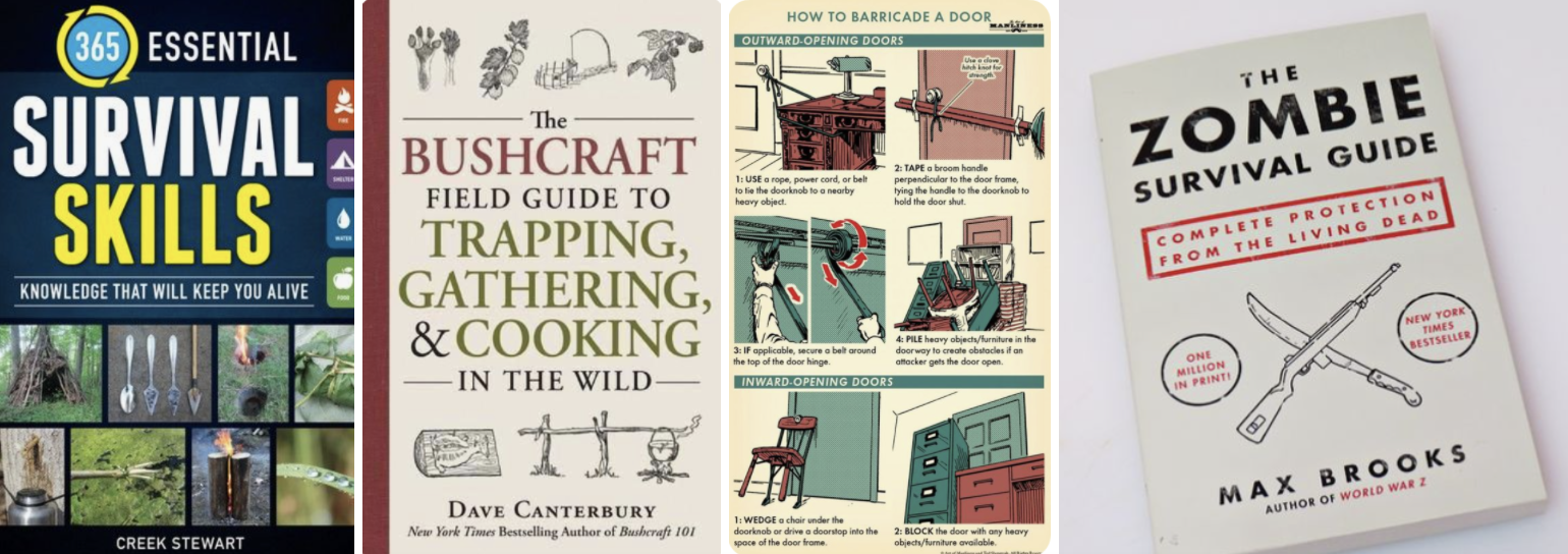
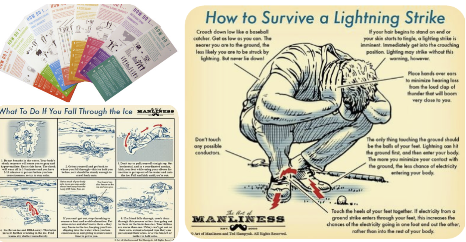
Key Conceptual Motifs
- Bold titles – stamped typefaces
- Very informal
- Images/illustrations
- Simple colour palettes

I then moved onto making a mind map to help stimulate ideas. Thinking back at my Robinson Crusoe designs, it will be easy for me to incorporate the handprint in some way.
I sketched out some ideas for this cover, I didn’t want to over complicate the design as from my research most covers seem to be simple and more typography based than illustration based.
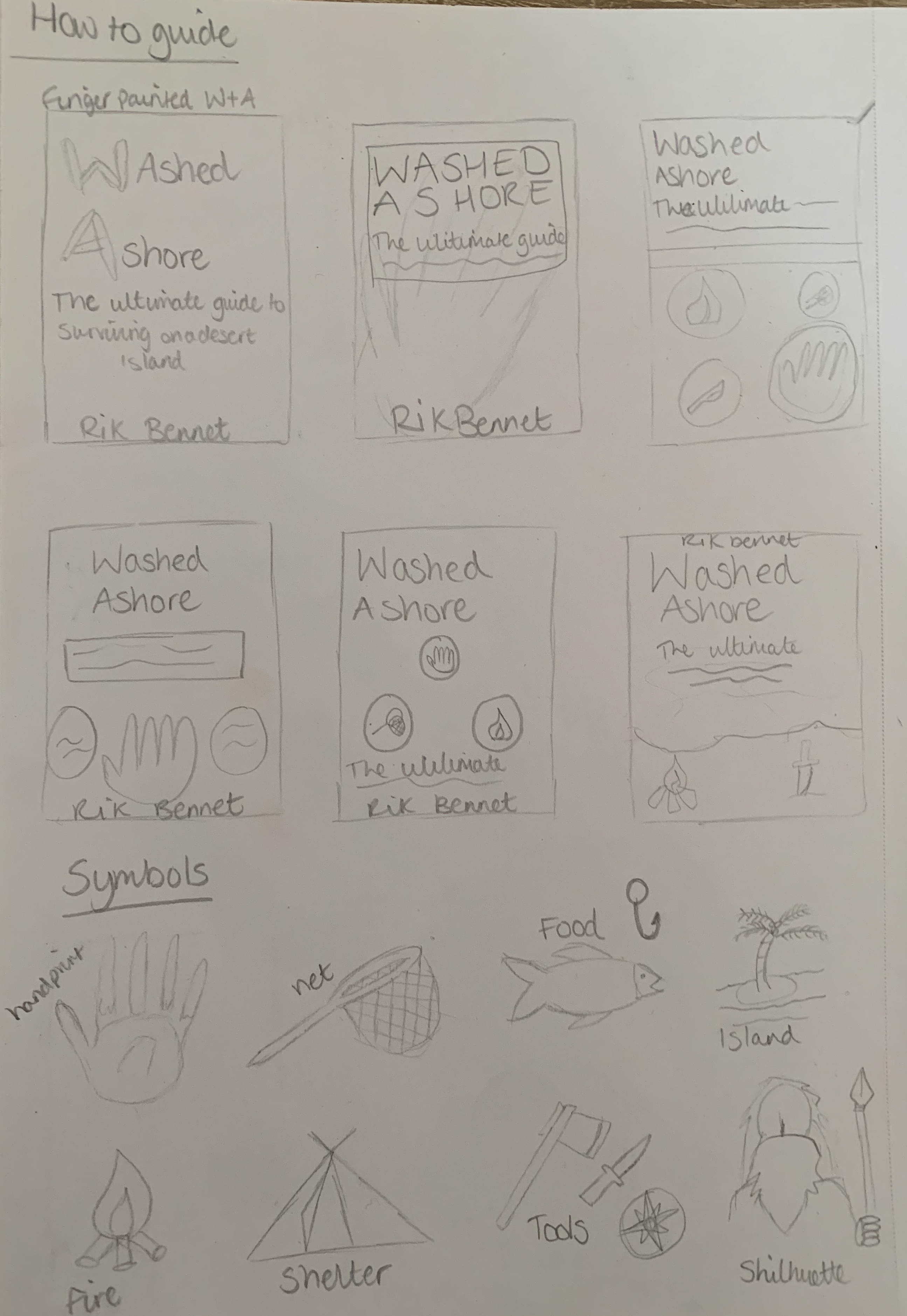
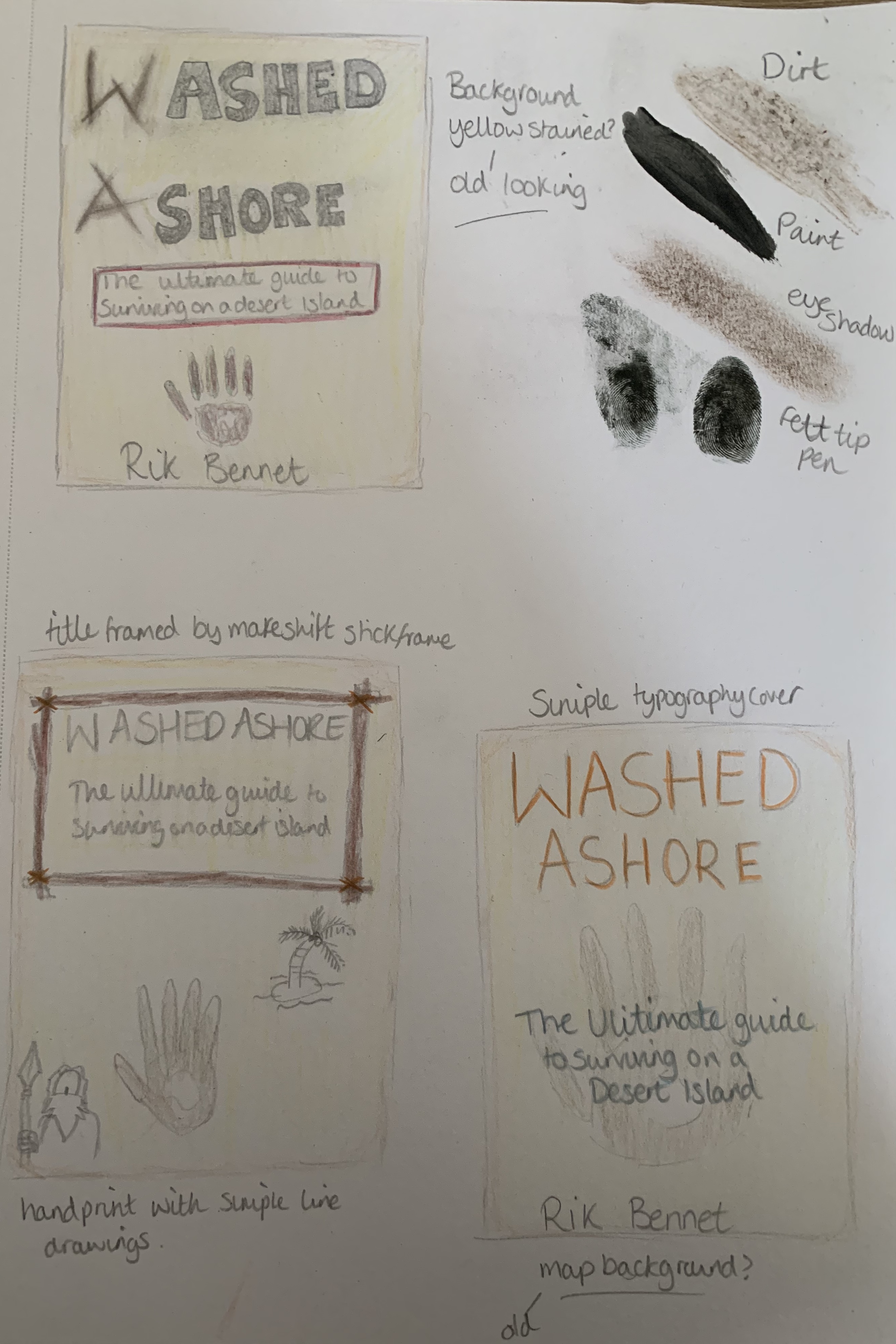
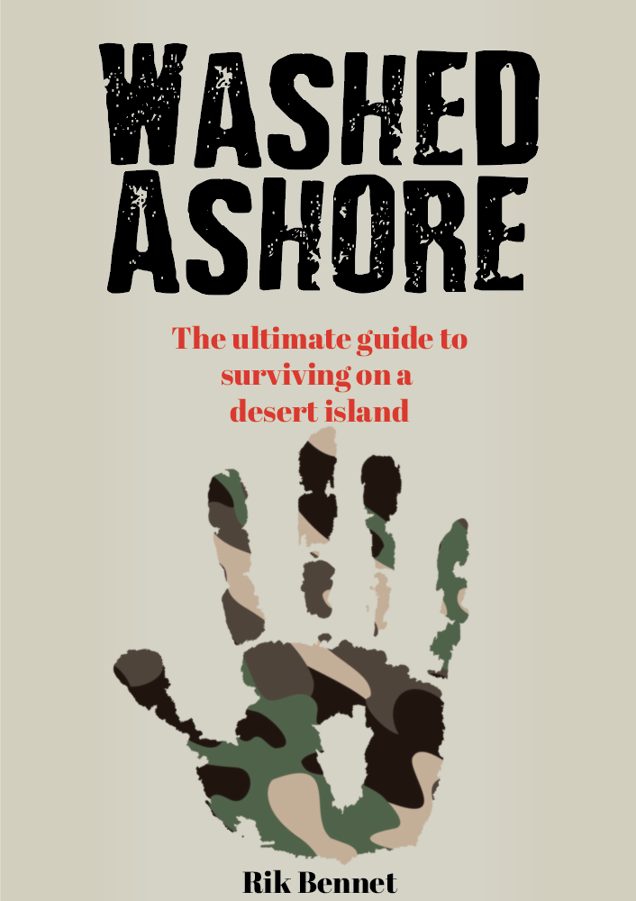

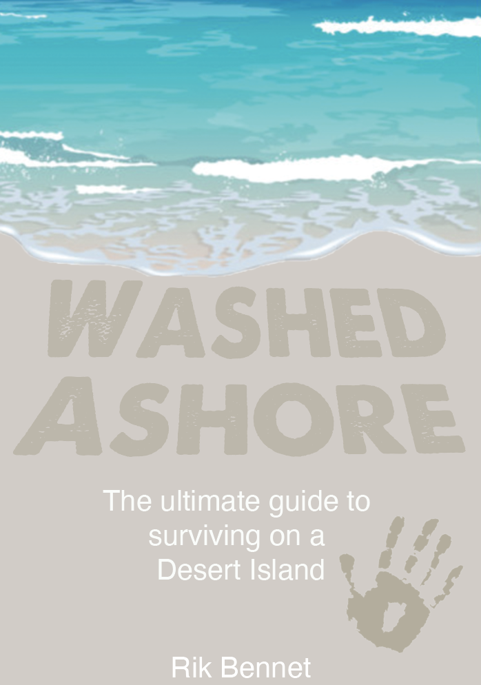


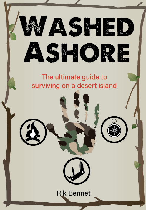
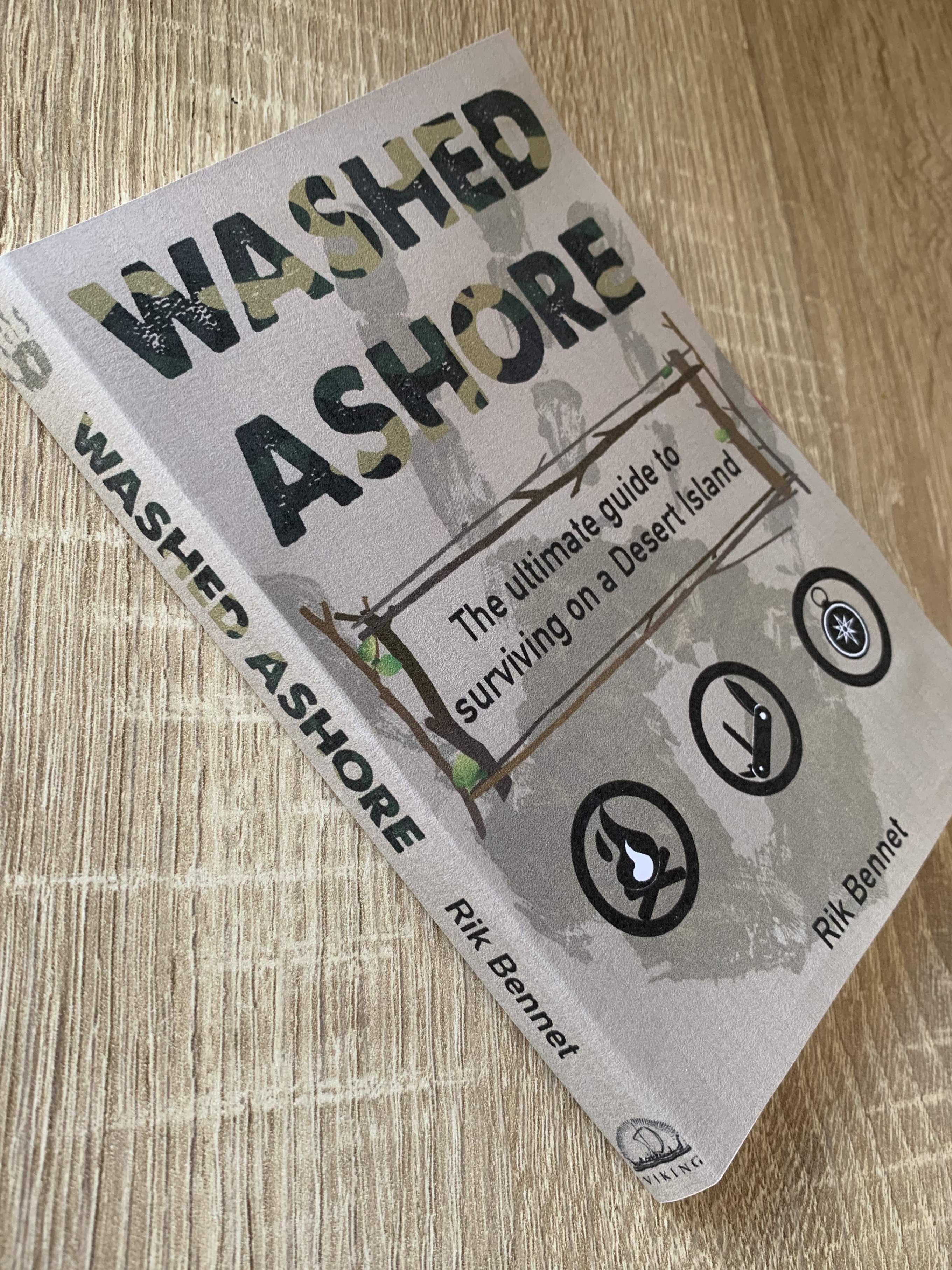
I created a few variations of the washed ashore cover following my sketches and with the key motifs in mind. Its fortunate that the main design feature of both my Robinson Crusoe design is the handprint which again works well for this genre. As you can see from the beach designs I lost myself slightly as they seem more fitting for a book rather than a guide, but by creating a few of the icons its helped achieve a more informative cover suitable for the guide genre.
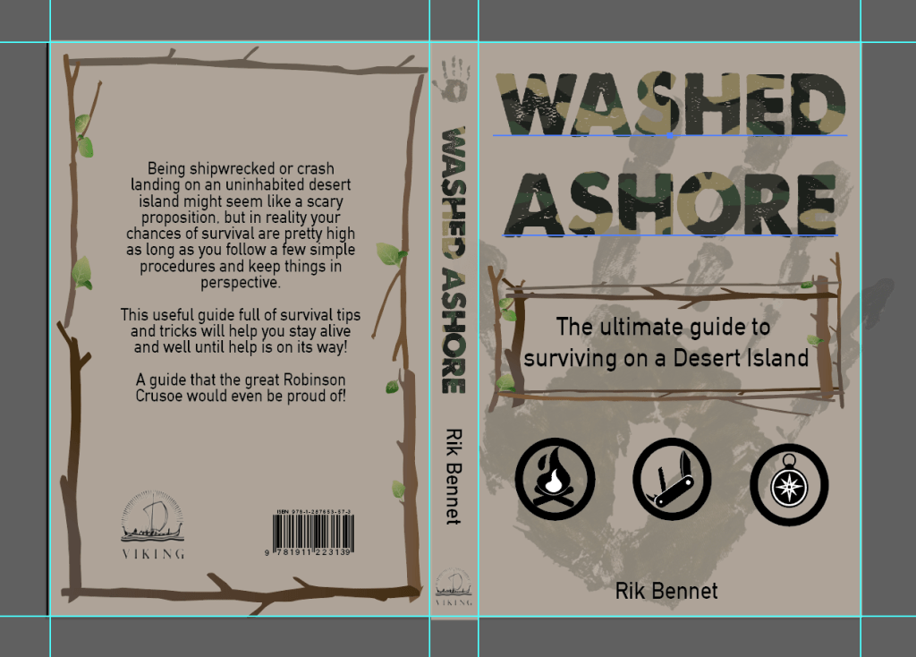
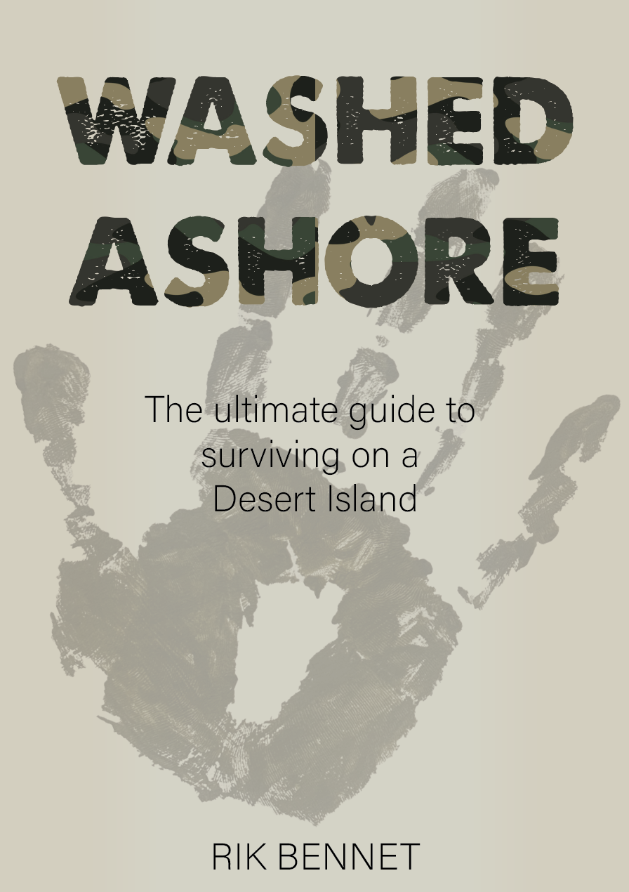
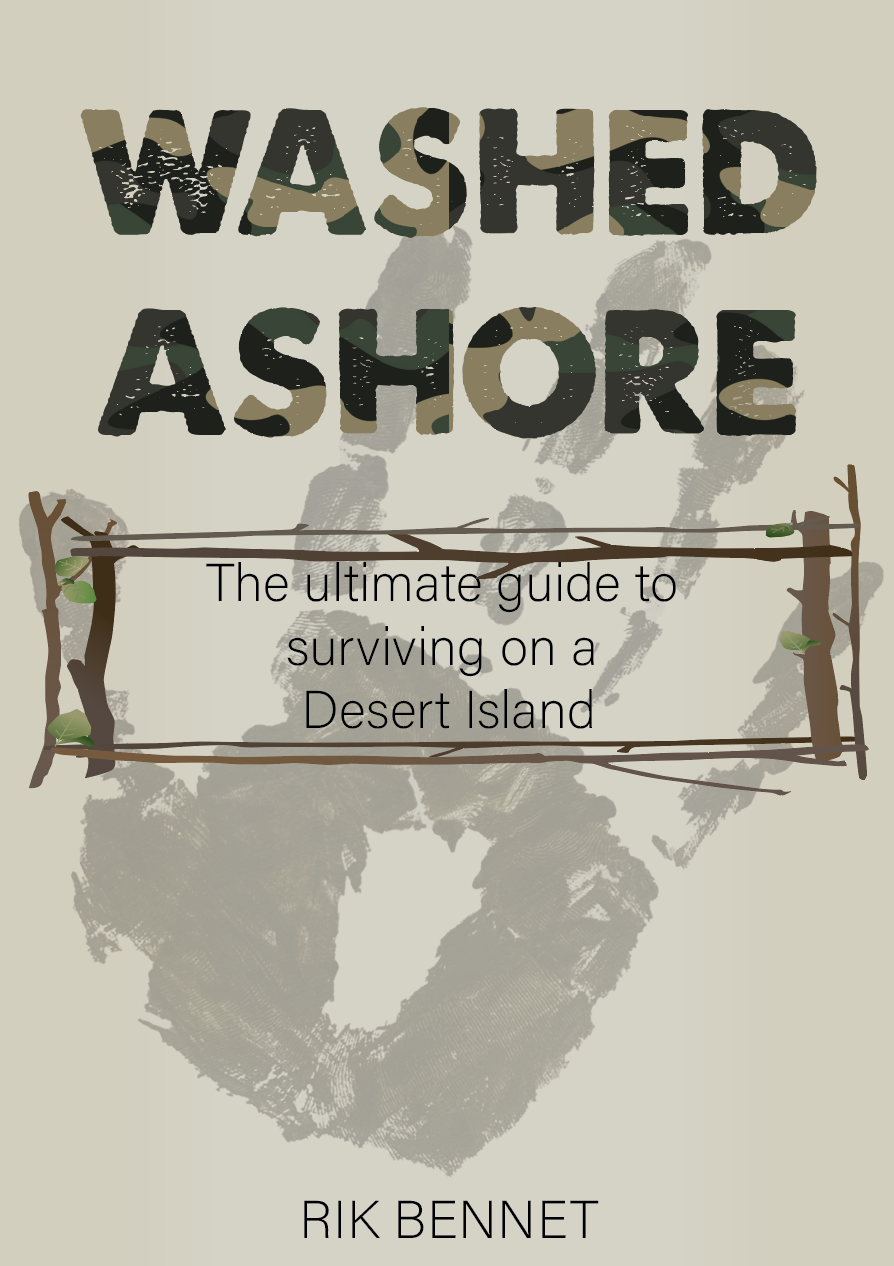
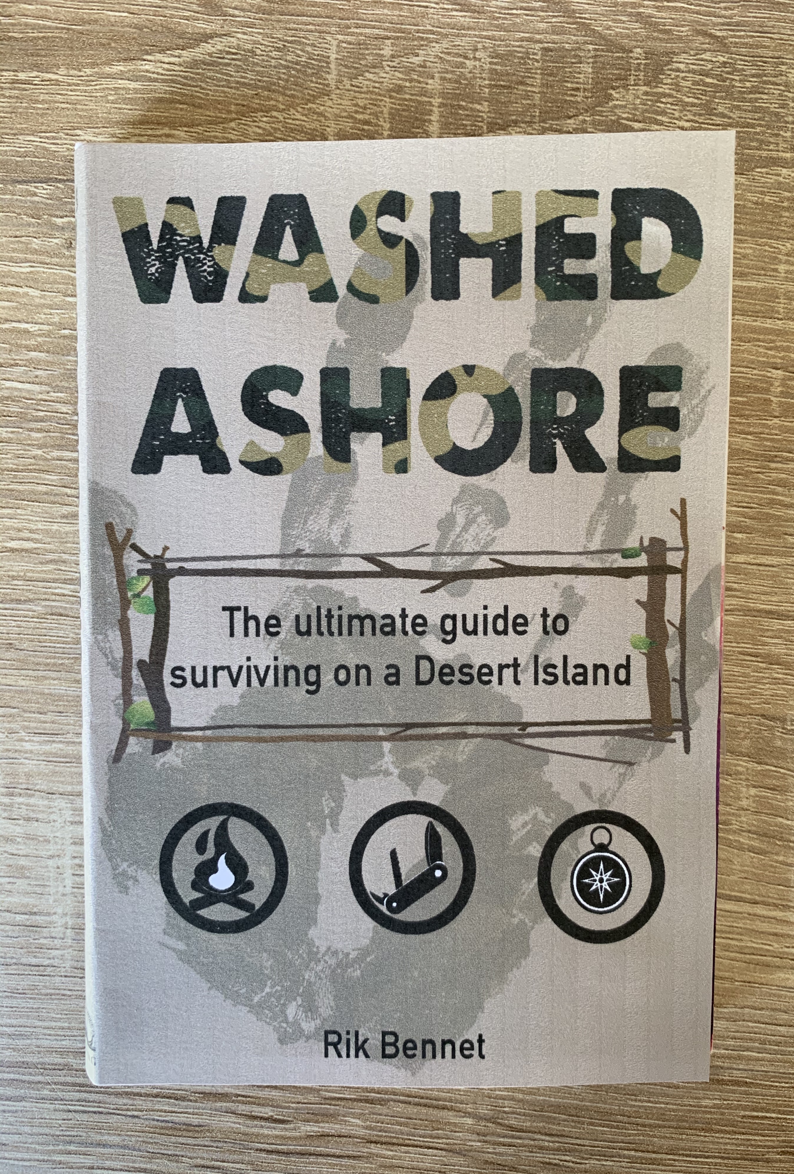
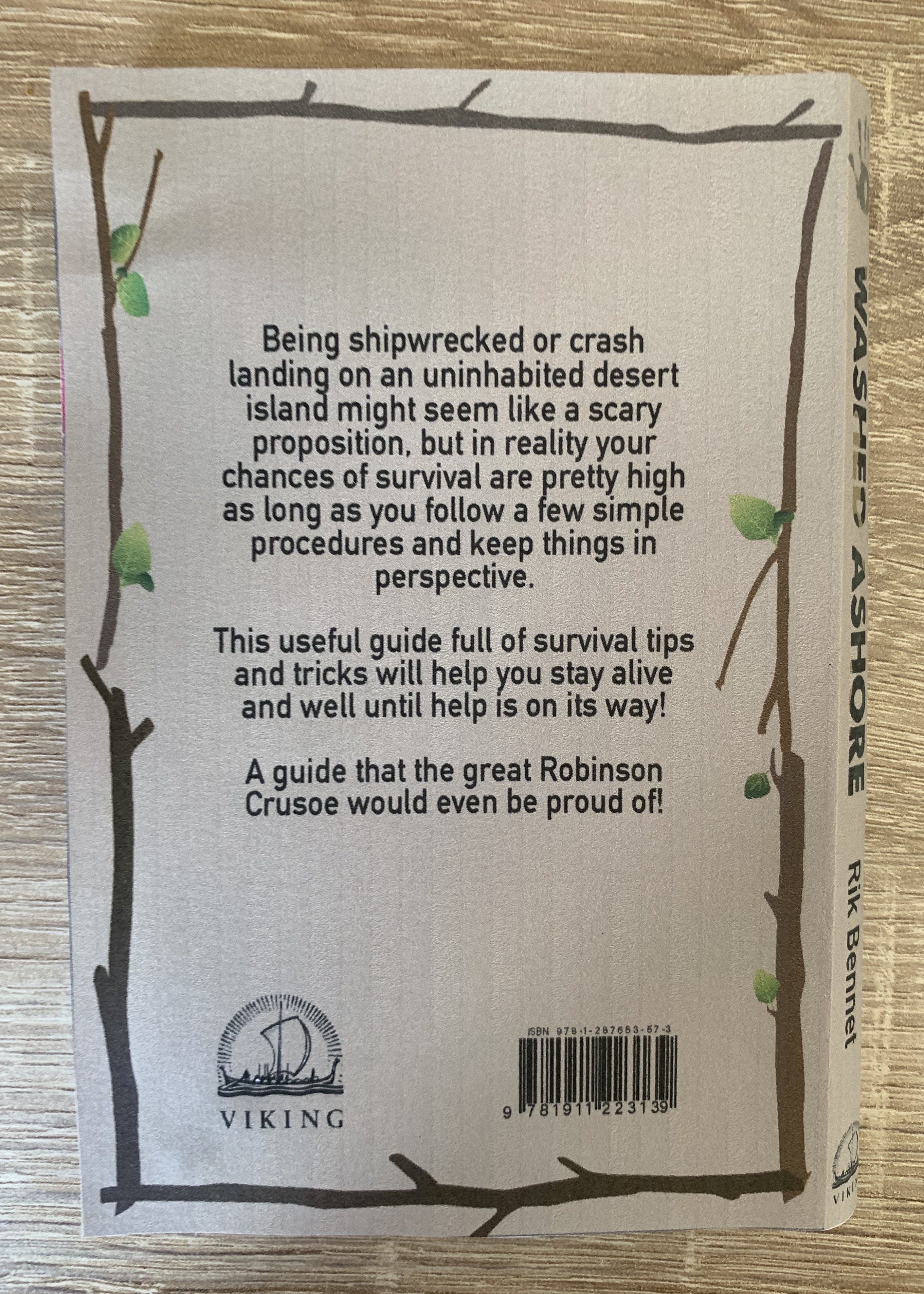
I decided to choose the second from last as my final design. This design fitted the genre the most, with its simple colour palette and use of icons, It’s simple and to the point. I combined the boarder from one of the other designs and used it on the back cover to frame the blurb. I chose a bold typeface with a worn effect, masked with camo print to add to the survival theme and also fitting in with the key motifs from research.
Book Format & Design Requirements
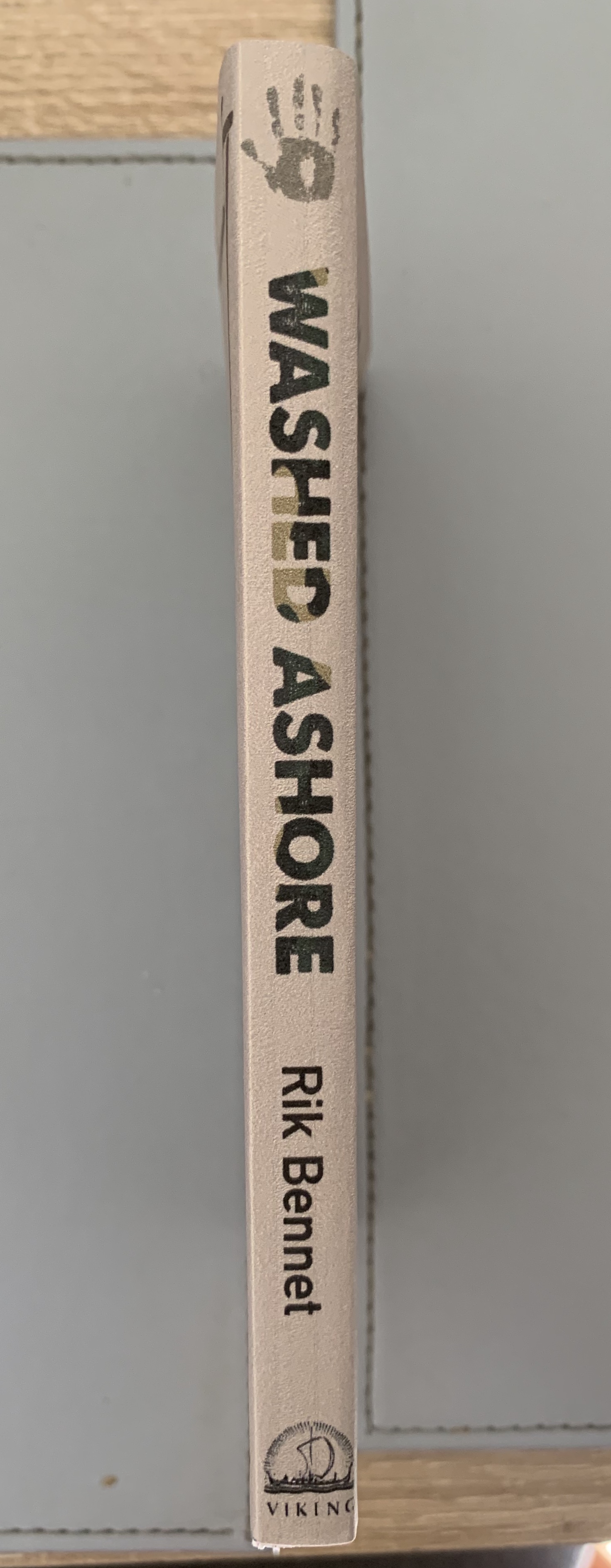
Once happy with my design I decided to think about sizes for this guidebook. I wanted to think about size as one of the main features, as if the book was small enough it could become an essential for someone traveling. The sizing I decided on was 4″ x 6″ with a 1cm spine.
The spine should be flexible in order for pages to be bent around to give the reader the ability to hold the book single handedly, and bound with glue.
Silk coated paper would give the cover added protection and also limits the amount of ink and moisture that the paper can absorb. It also makes it more opaque and resistant to wear and dirt and hence less liable to finger marking.
The paper should be smooth and thin allowing that pages to neatly fall back into the compact size, adding a textured paper/thicker paper would add bulk to the book and cause tension on the spine.
Mockups

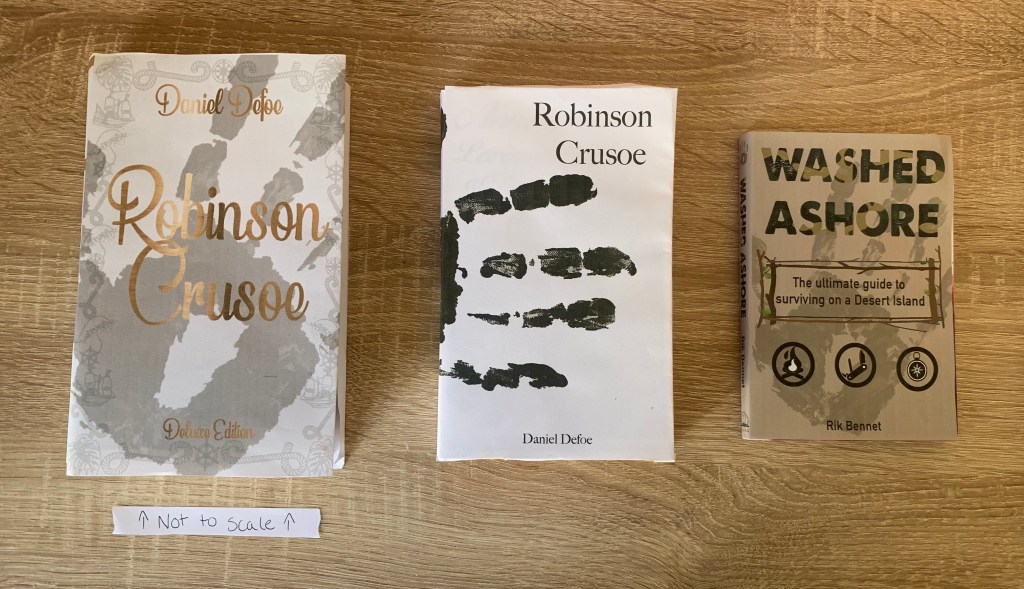
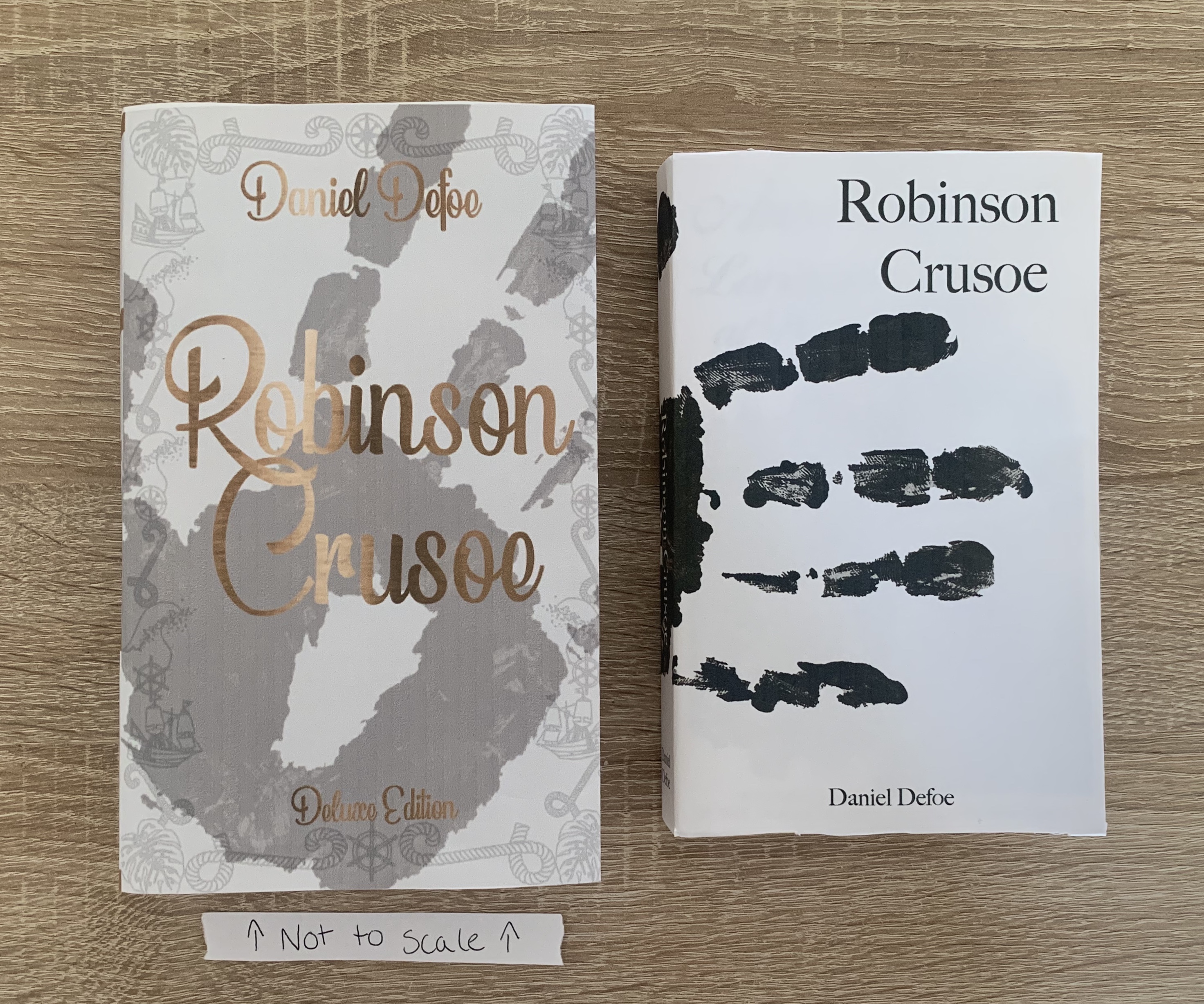
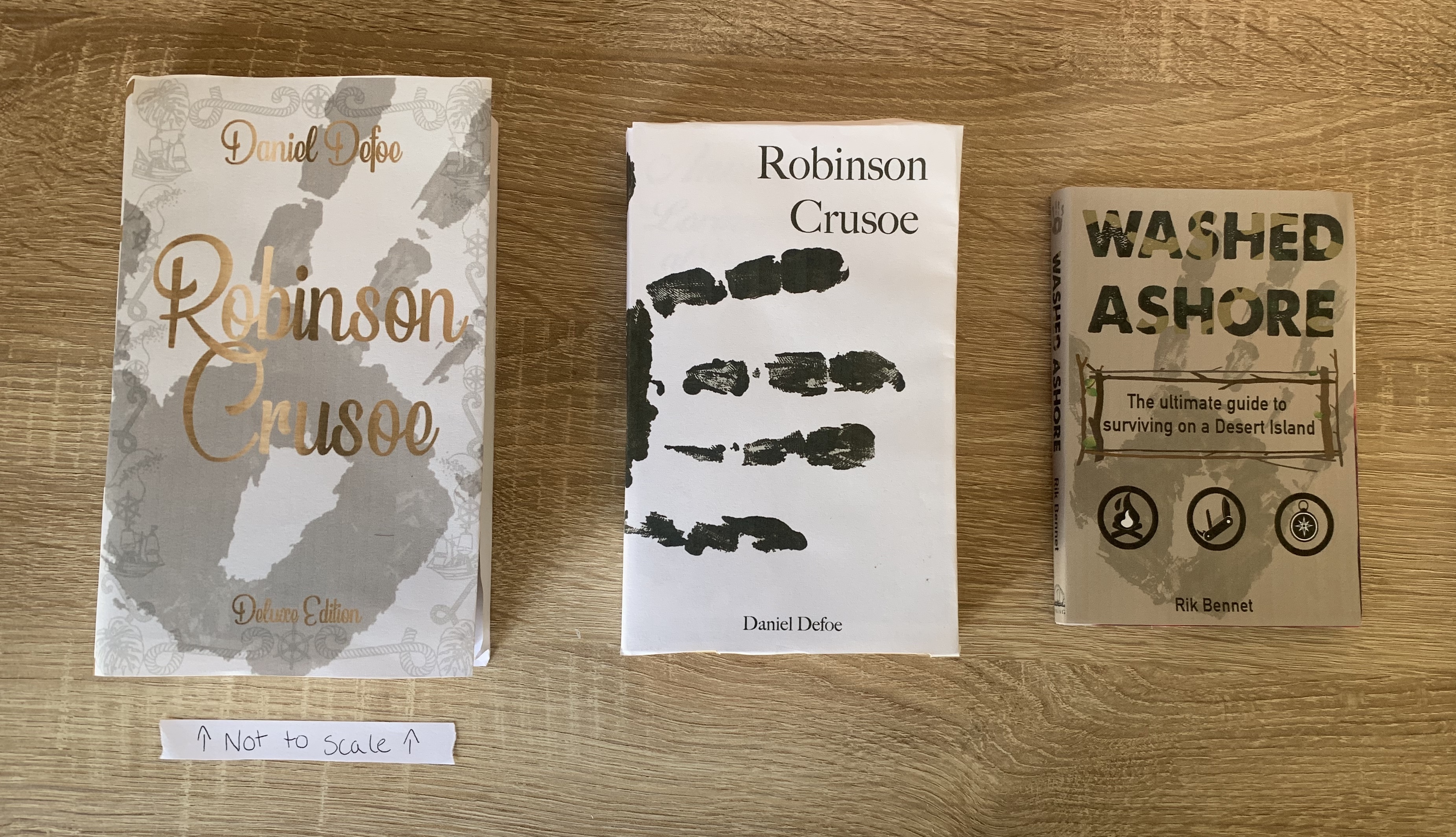
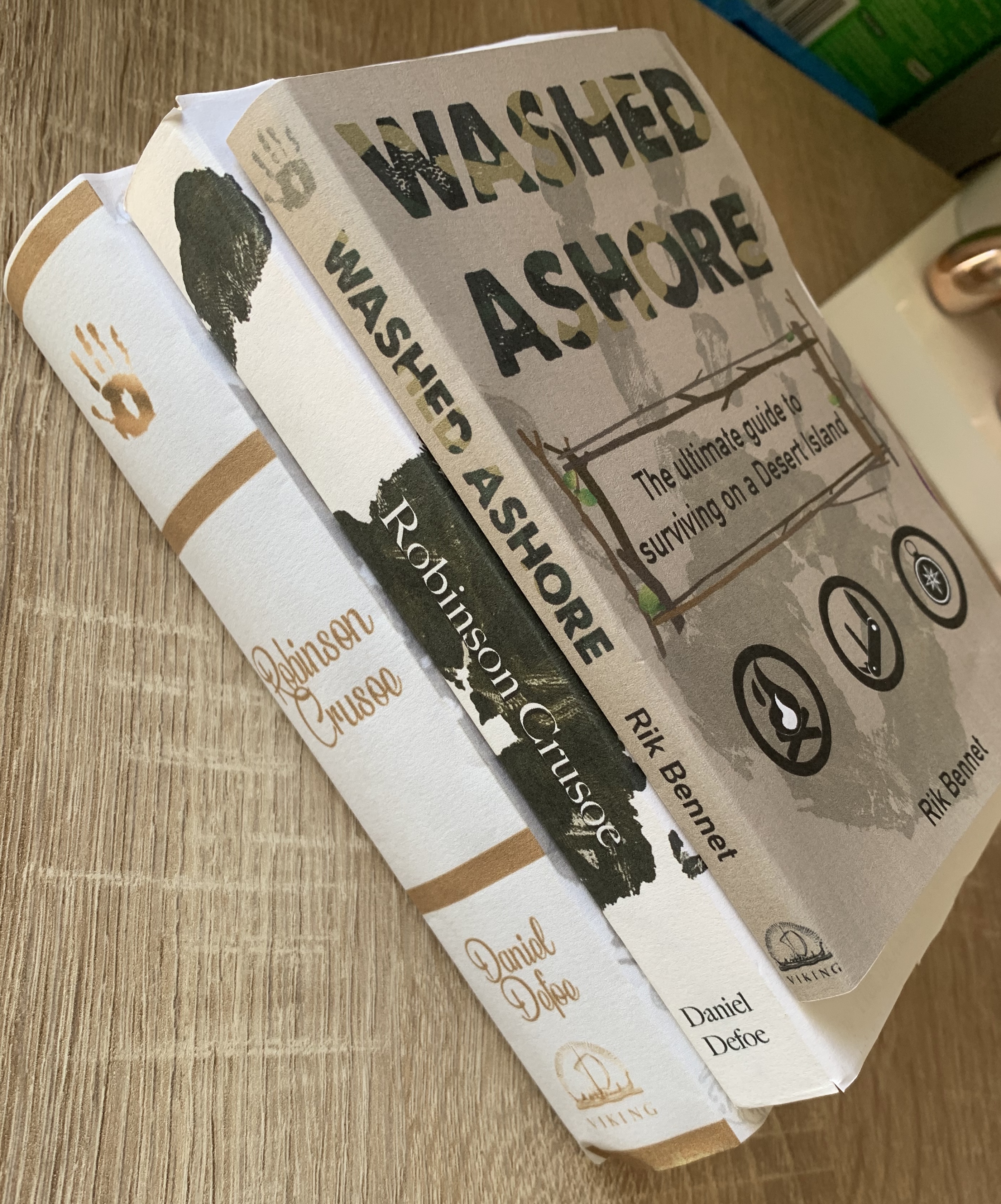
Placing the book beside the other books (deluxe version not to scale!) I feel that the sizing is perfect, although smaller it is still readable and manageable and would be perfect to accompany any adventurer on the move!
Final Design
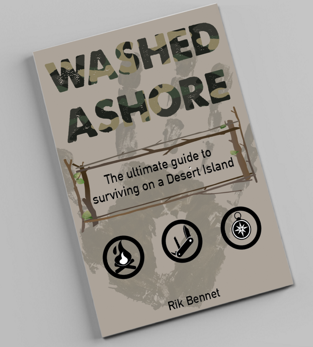
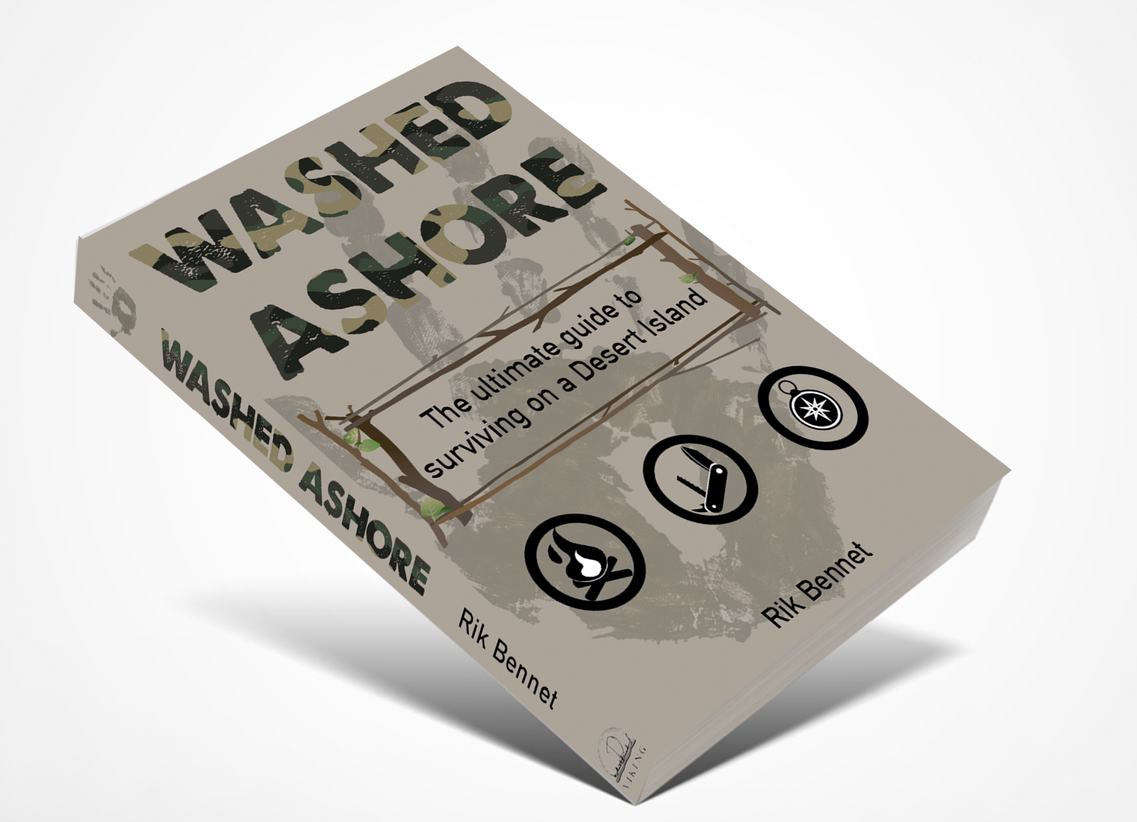


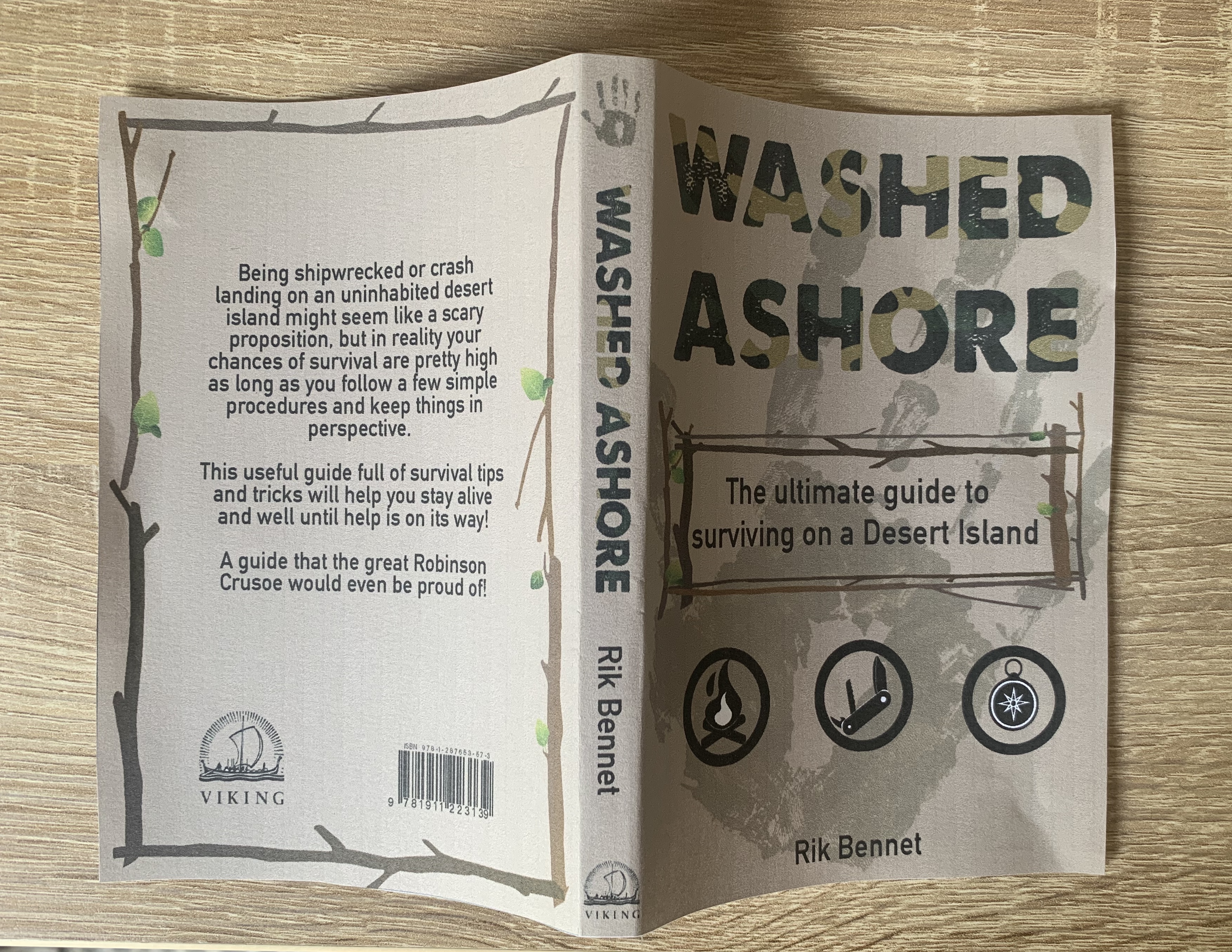
Im pleased with how my final design looks both printed and mocked up digitally. I was pleased that I was able to use the handprint as a mean feature on this book as well as the two previous designs, yet have all three books look unique to themselves.
The cover to this book will be made from 250gsm silk laminated paper for durability and added protection. The pages will be printed on 80gsm bond paper to keep the costs down and bound together using Eva-con R Adhesive. The size of the book is 4″ x 6″ with a 1cm spine.
Reflection
I have enjoyed this assignment and feel I have developed more knowledge and confidence towards book design. Looking back at my finished designs I am really pleased with how they turned out. I found the materials part of the books slightly challenging however I was grateful to have orders some sample books from companies during one of the previous exercises, this made it easier to touch and feel the different paper types and narrow down to my chosen piece. I also found the previous exercises in the buildup to this assignment useful – for example exercise 3 – book designers, here I discovered Rodrigo Corral’s design for ‘A million little pieces’ which gave me the inspiration of the handprint and the placement of it wrapping around the book.
Due to the pandemic I was unable to do a few things which I would of done, such as visiting local libraries and bookstores to examine existing Robinson Crusoe books and to also look at different size books to help with the sizings of the books which I created. I also would of considered having my designs printed onto better quality papers to see how the design works etc. But I am still happy with the work that was created.
Overall I feel that my designs are successful and live up to the brief. I am looking forward to hear my tutors feedback and to see if any improvements are to be made.

One thought on “Assignment 2: Form and Function”