
Brief: Based on your work from the previous exercises, think about how your designs within the context of the book. For example, visually explore how your artwork sits within the format of your A5 pamphlet – how the page might frame the artwork, how different pages sit together or how you might begin to develop a
narrative across multiple pages. This process might suggest new ways of presenting or developing your work. Think about how you want to finish your artwork, whether this is through typography, illustration, photography, drawing or another format. Critique your work – what has the format of the pamphlet offered you, how might your ideas develop further, and how has your understanding of creative book design changed through this exercise?
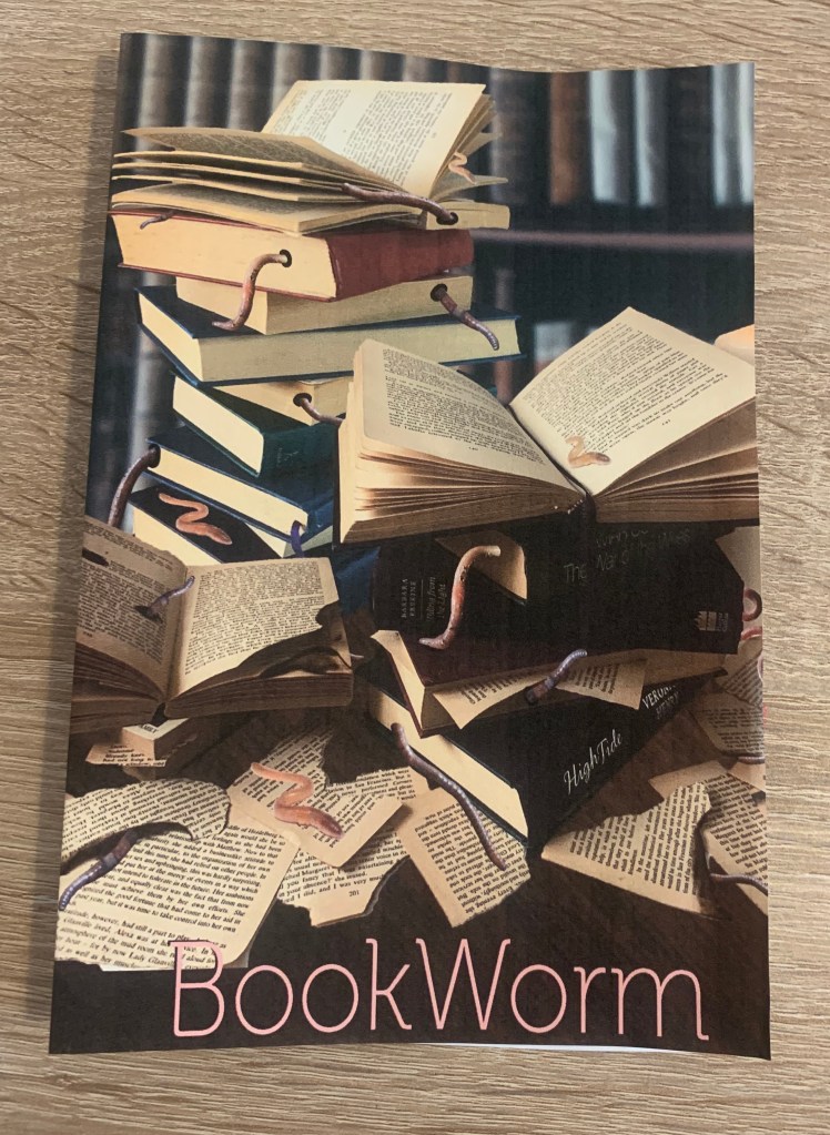
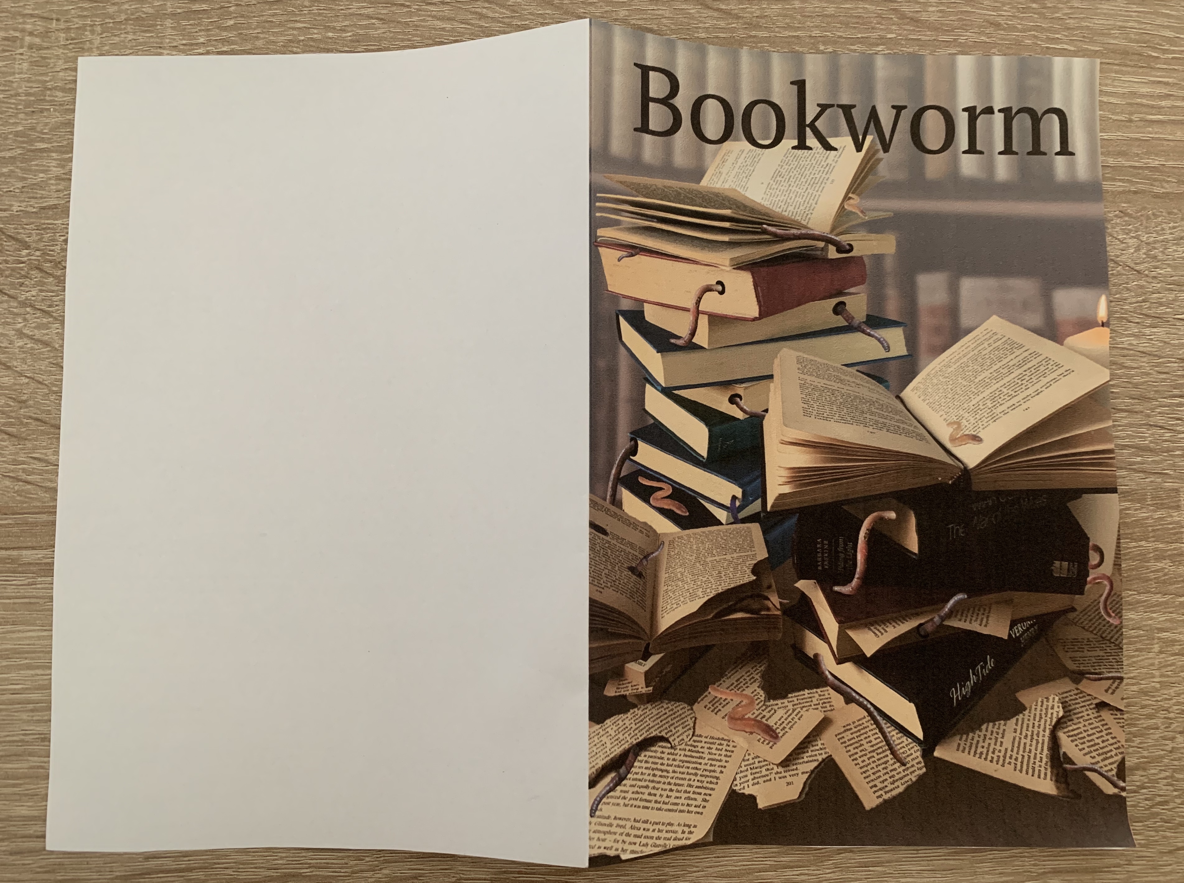
During my work in exercise 5, I printed off my artwork to create an A5 fold. I printed this with no bleed as I mocked it up as a book. Seeing my design printed was helpful to see if anything needed to be developed further.
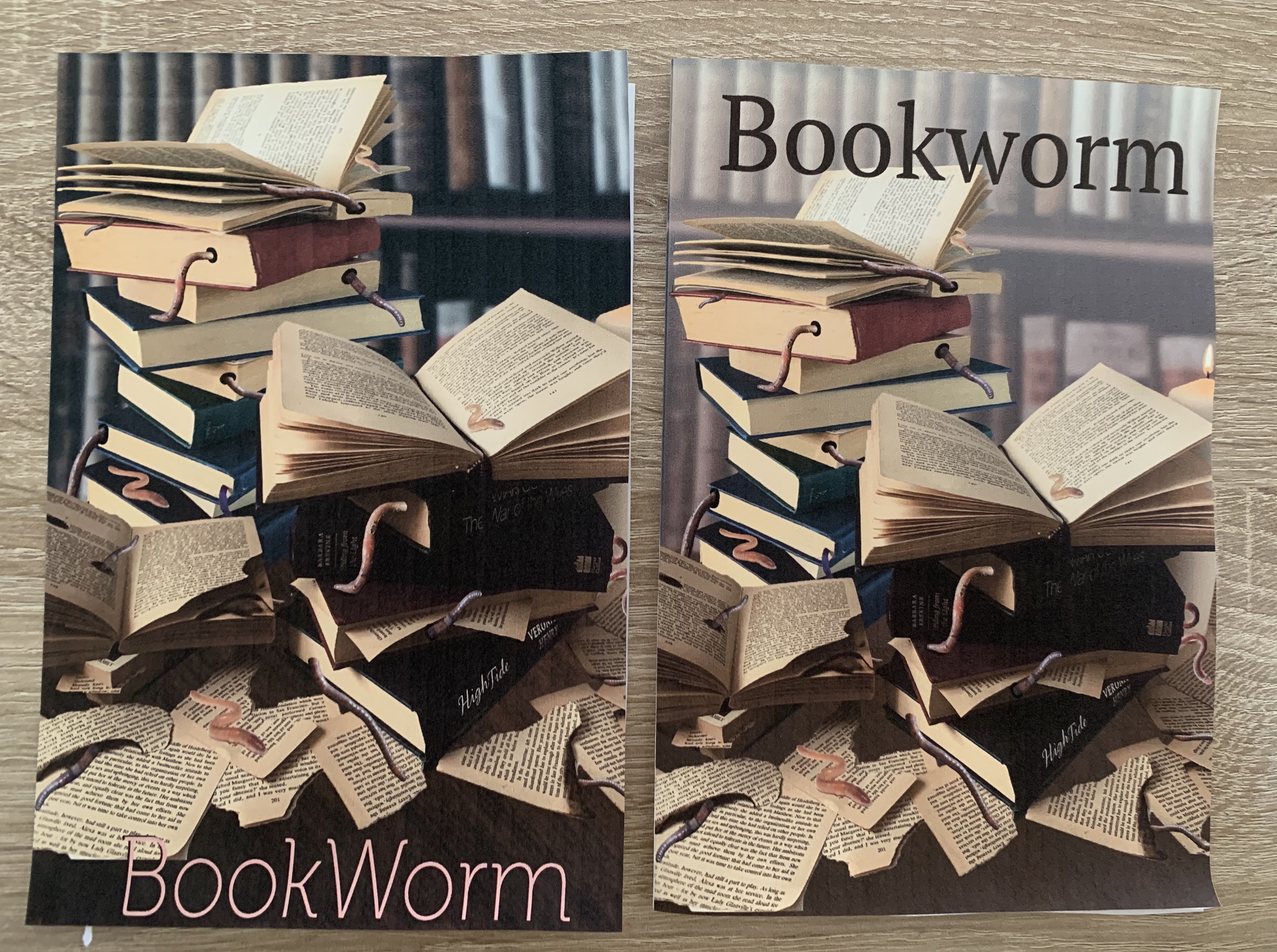
One of my main concerns with this design is that it was a lot darker printed than I wanted, I feel like the main focal point of the stacked books and worms gets lost with the darkness of the background, it all seems to merge together which I find makes it less appealing. However during my design process I had noted that I wanted the image to look as if it was set in an old dimly lit abandoned study, so from that respect I feel it fits my criteria. I have just changed my mind slightly after seeing the design printed off, it really shows the importance of experimenting with mockups.
I looked at the pros and cons for my design whilst it was printed in front of me;
Pros
- Phrase is easily recognisable in the design
- Eye catching
- Gets the point across
Cons
- Quite dark
- Typeface used?
- Too realistic that it looks very false?
- Background?
I wanted to work on the cons before I moved any further, I decided to work on the background as not only would this lighten up the design, but it would be interesting to see if with the use of a different background it could make me feel more relaxed about the realistic-ness of the design.
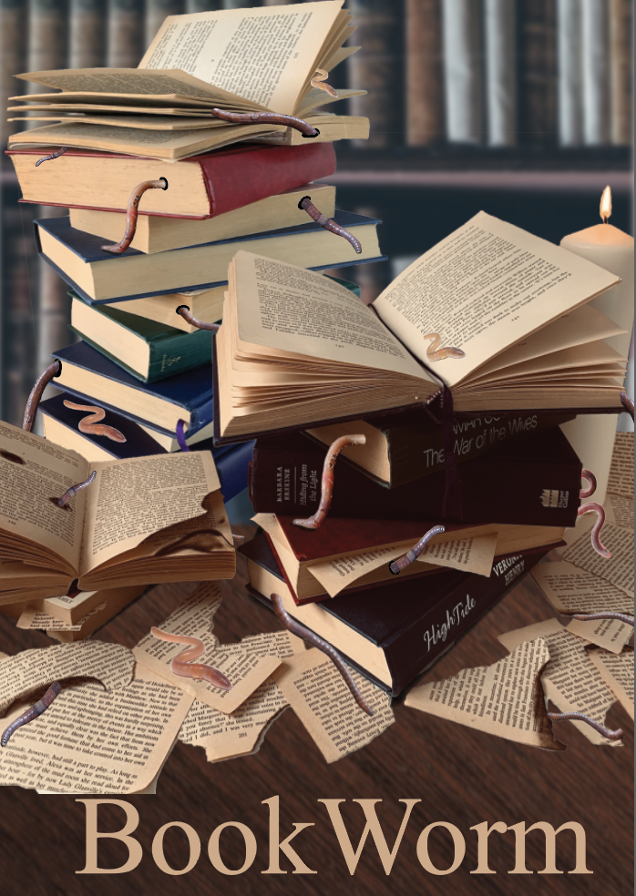

After experimenting I decided that the books looked odd when placed on a coloured background I feel that they need to look as if they are placed on some sort of surface, I then came up with the idea of placing the books onto a page however this just looked too busy, not knowing where the focal part of the design is. In the end I decided to change the opacity on the background so it made the books stand out and not all merge together. I think this works much better. I was also cautious about overlapping the title with the image at first however I feel this works well.
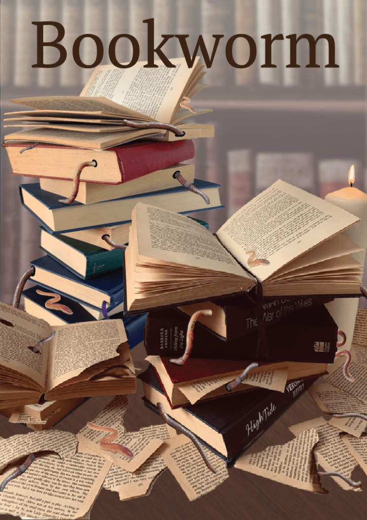
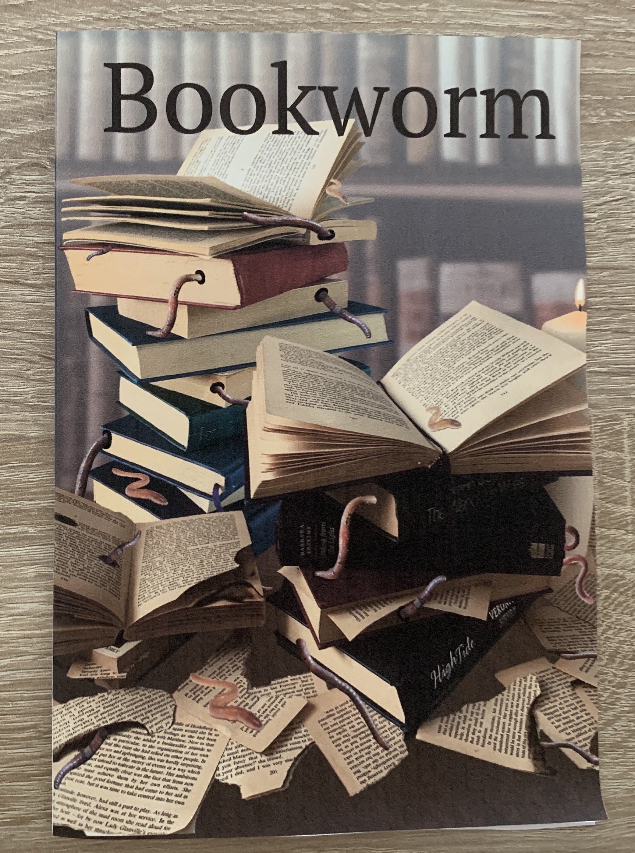
I printed off my new design to see how it looked as a folded mock-up. I felt that by lightening the background it has made a huge difference, the before design looked far too dark and everything seemed to blend together, where as now the focal point is the stacked books and the worms. The font used is also more noticeable.
Self Critique
I feel that my design is strong and relatable to the phrase. The design itself is very obvious and self explanatory, with a ‘say what you see’ feel. I think the design looks much better and is stronger after the last few steps of developing and visually critiquing the designs. Once printing off my design and folding to to create a pamphlet I feel it has brought the reality to the design. Although I haven’t thought about the contents of what would be inside, I would be willing to explore further into what could be include and how this would create a narrative across the pages. An idea would be to include a two section evaluation, one of the phrase; being of the readers love for books and the other being of the bugs that infest books? Calling it the bugs and the books. Or perhaps creating a 2 in 1 pamphlet with covers on both the front and the back pages (back being flipped upside down) and the centre pages of an illustration to separate the two parts. (reversible double sided document). Thinking of the contents of the pamphlet would encourage my ideas to develop further, as I would need to create inside pages and a back page. These ideas would all stem from the contents layout which I would pursue.
I feel that I have gained a larger understanding of creative book design during the past few exercises. It has made me aware of how the cover will narrate the contents, and I have found it very interesting on how new ideas keep arising from visualising the artwork.
