
Brief: Firstly, review your visual ideas based on from the previous exercise through a process or critical evaluation. Which ideas are you drawn to? Which ideas have ‘legs’ – possible interesting outcomes which are worth pursuing? Often the ideas which are the strongest are those which have depth, or many layers of association. Perhaps you are initiatively drawn to a particular idea. Select a few ideas you would like to push further. Use your learning log to record your thoughts.
Now, do you need to undertake any research to help move your selected ideas on? The form your research will take depends on the individual elements of your idea. Find source material that helps informs your ideas. For example, by doing objective drawings or taking photographs, to understand your subject better, and to consider aspects of composition. You can use both primary and secondary sources of research in this way. Research feeds into the development of your visual work, informing and advancing your ideas. Document this phase of the work accordingly.
The developing your ideas stage is about building on your initial ideas by reworking them, adding the visual or other insights gathered through your research, and testing out different versions or possibilities. Spend 45 minuets developing the possibilities of one of your ideas. How many different ways can you visualise this? If you want to develop a broader range of ideas, the repeat the previous exercise to generate more possibilities, potentially using a different phrase as a starting point. Use your learning log to document this process of review, research and development.
Visualising your ideas is the culmination of all your primary work in which you work up some more developed visual sketches and ideas. This artwork can be hand-drawn illustrations, photographs, and/or include typography. The presentation can be a little rough around the edges but should show the main elements of your designs. Select the strongest variation of your ideas from the previous research and development exercise to start exploring how you can visualise them within a mock-up.
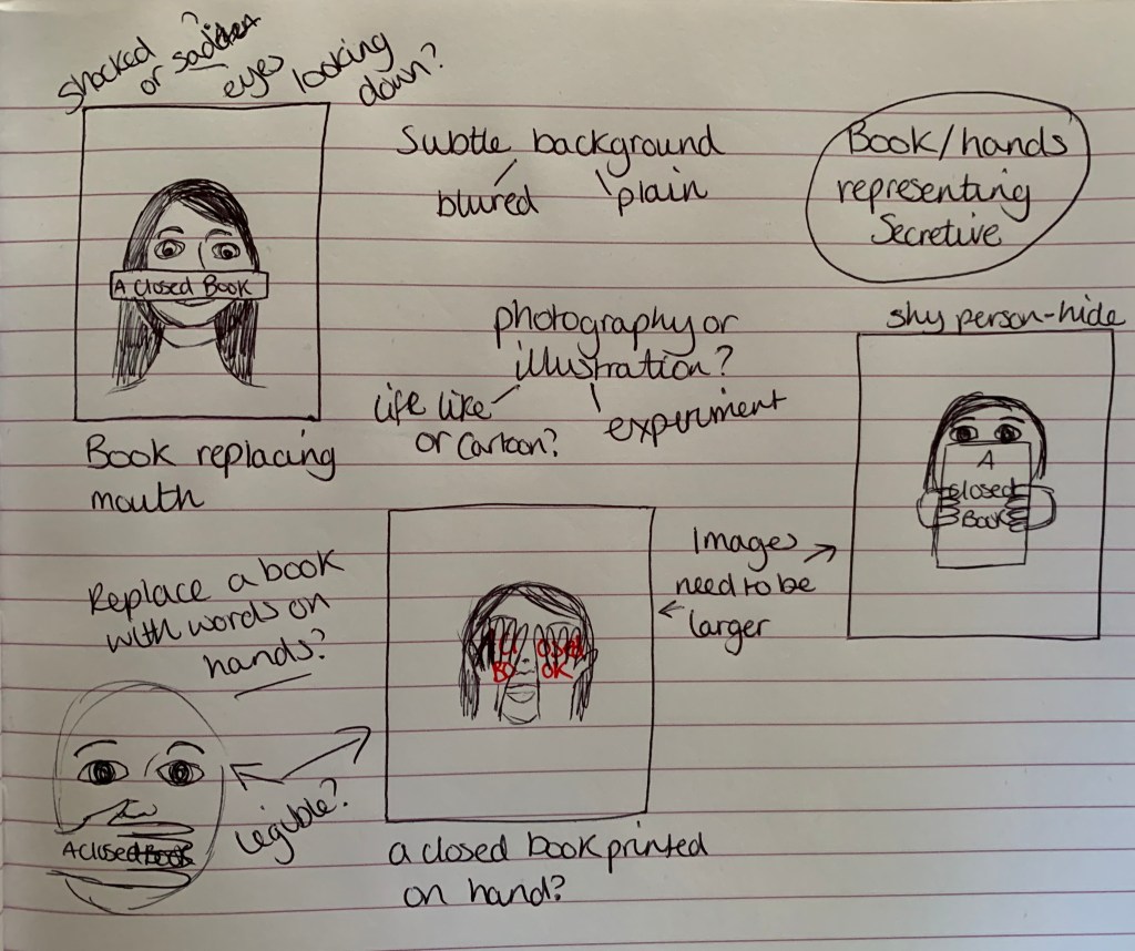
Visual Ideas Design 1 – A Closed Book
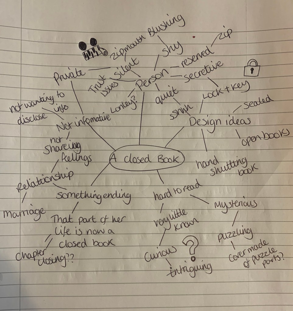
Out of the above thumbnail sketches I am drawn to the hand holding the book (to experiment both up close and a far images), The bottom left sketch of the open book background, and the sketch of the woman with the book in front of her mouth.
Hand holding book: I am intrigued to try both versions of this book, one to visually see the hand keeping the book closed, and the other to show a real visual representation of a life sized hand holding closed the book. I will experiment with photography and illustration for this design.
Open pages: I like the play on words for this design with the whole background being made of open books and the typography of ‘A Closed Book’ made to stand out. The best way to achieve this is by having the background in black and white, or of a tinted colour? And to choose a clear but formal typeface and colour.
Woman and book: The idea behind this sketch is to show either a shocked or shy expression on the woman’s face with the spine of a book in front of her mouth. This is to try represent how being a closed book represents someone who is shy, quiet and reserved. The woman could either seem shocked that her mouth has been replaced – without her realising she is hard to read and is reserved, or it could be expected by the woman and she could just simply have a shy blushing expression on her face. I will experiment with both photography and illustration for this design.
Further Research
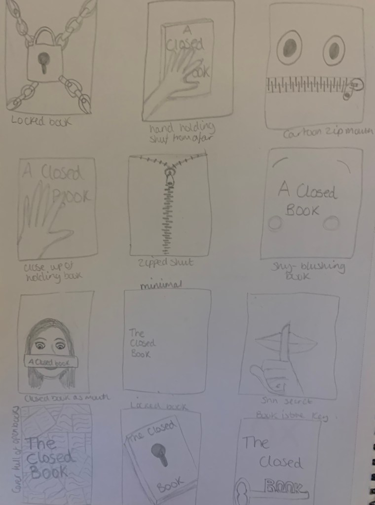
I didn’t feel there was any more necessary research I could do on ‘a closed book’. So instead I have decided to look further into each sketch and note down design elements to help narrow down my final design.
Hand holding book
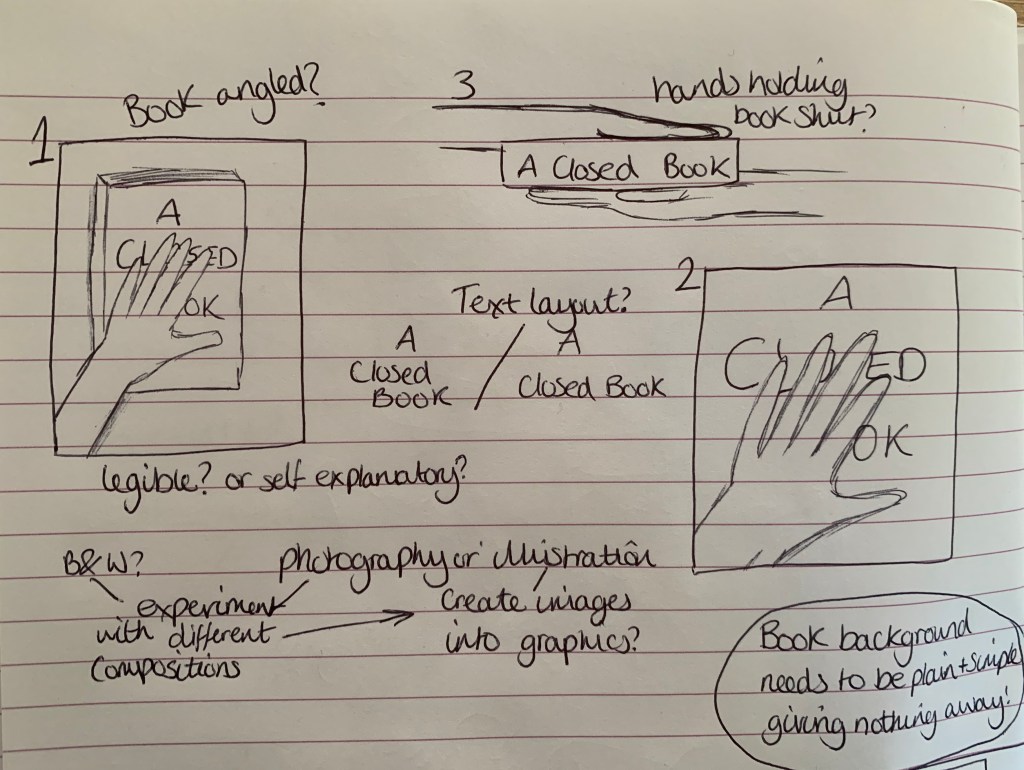
For this design I felt that it would be best to create a plain background for the book, to give the sense of mystery which will relate to the phrase, so the cover will simply consist of typography half hidden underneath the hand, so I need to make sure that the typeface I choose is legible even though half of the letters will not be visible. I am still unsure of whether I would like the book to look like sketch 1, 2 or 3 at this stage. Once I experiment with the photography side of the design this should help me determine which image will work best for the design. I just need to make sure that the design carries the correct message behind the phrase.
Open Pages
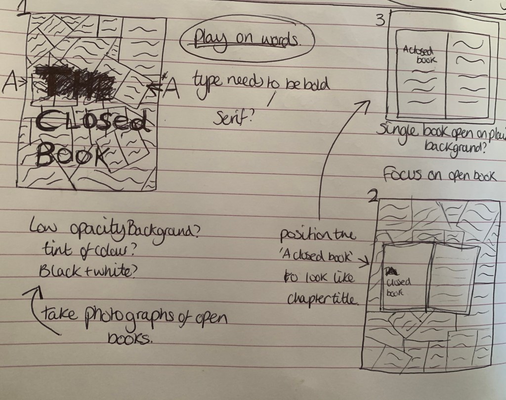
I am intrigued to see what this design looks like as it is portraying the opposite of the phrase. The design with stands out for me the most is still the original sketch 1. I think with a low opacity background and to experiment with colour tints, this could make a strong, endearing design. The typeface would need to be strong and bold to stand out amongst the heavily detailed background.
Woman holding book
Im slightly unsure of which approach to take this design, I am worried that it won’t look as effective as I want it to be. However I am still very keen to experiment with this. Whilst focussing on this design I thought it would be more effective to eliminate the use of a book, as all previous design are based on actual books within the design. I like the thought of having a hand covering either the face or the mouth of a person and the text to be placed over the top almost as if it is in-printed on to their skin. When I do come to experiment with this design I will also try other creative positions. After having the idea to steer away from the obvious (not using books in the design) it has now made me question the strength of the previous designs… are they too predictable????
Developing Ideas
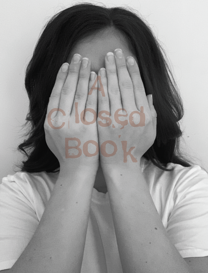
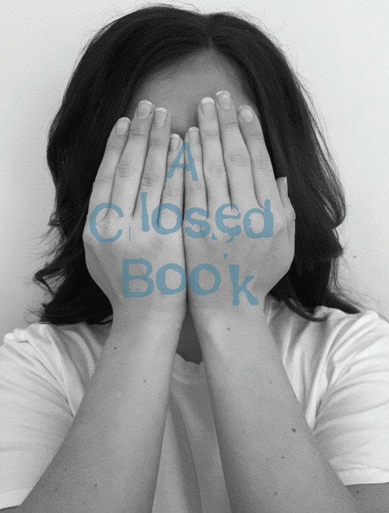
The design I have decided to develop further is the hands over face design, as part of the woman holding book idea. The reason for choosing this design is because I liked the fact it doesn’t include a book, I wanted to think of something more creative, yet still noticeable to the phrase.
I started off by experimenting with my photography skills and taking pictures of different positions and angles. The results are as followed;
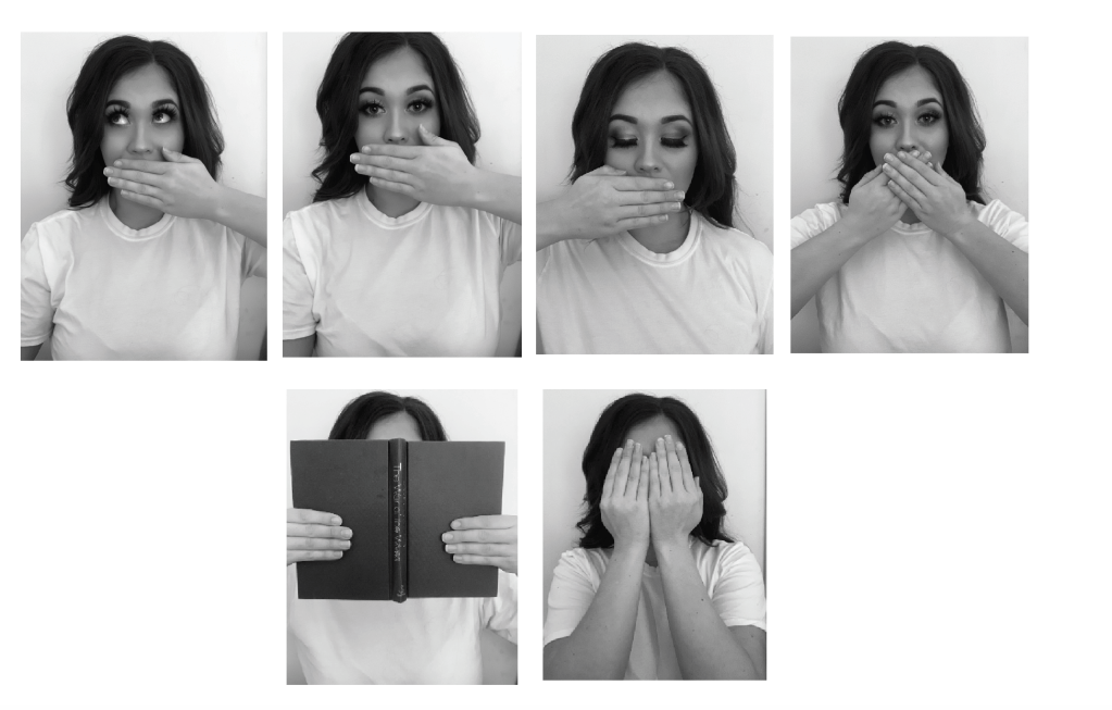
I felt that the image looking straight into the camera with the one hand was strong, I also liked both hands in front of the face. I went on to add text.
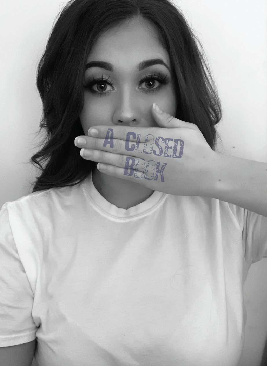
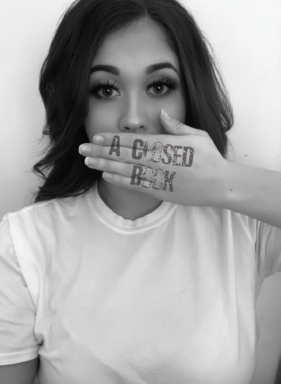
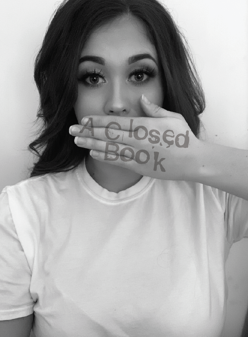
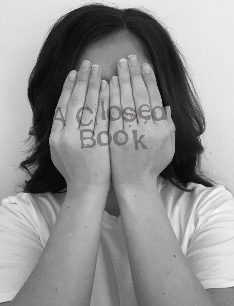
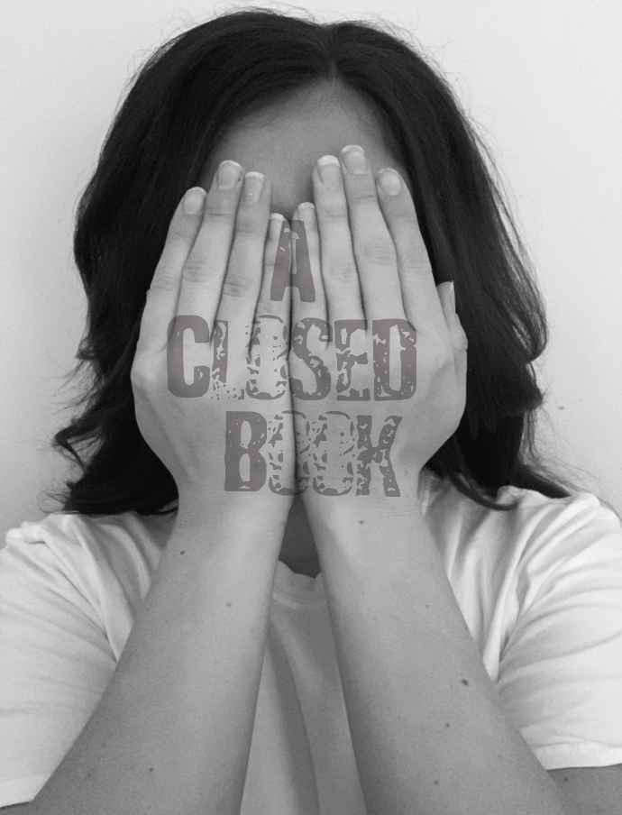

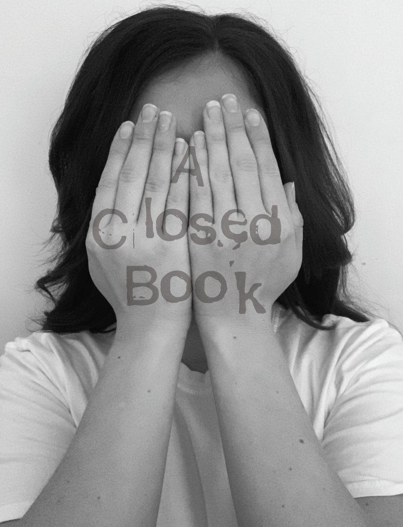
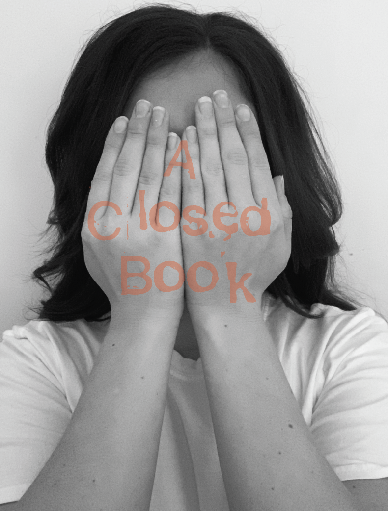
I felt that the stamp effect typeface works best for this particular design. Out of both images I feel that both hands covering the face is more fitting to the phrase, as this gives nothing away. You can see non of her face giving an intriguing feel.. What does she look like? Why is she hiding?
Visualising Ideas
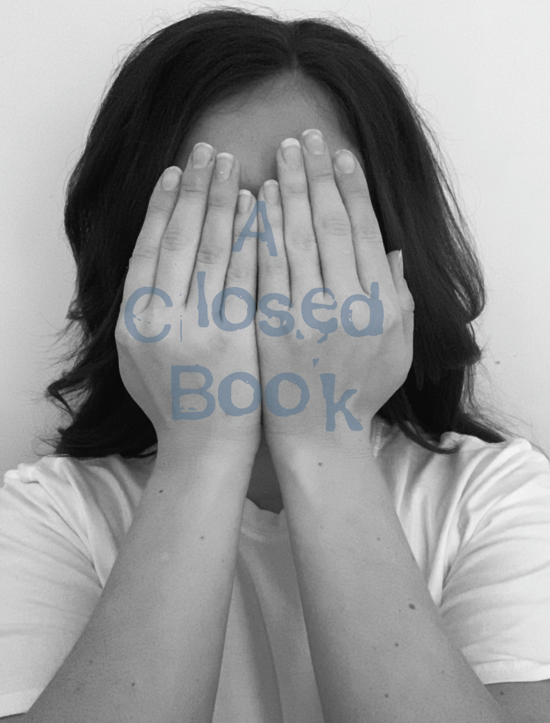
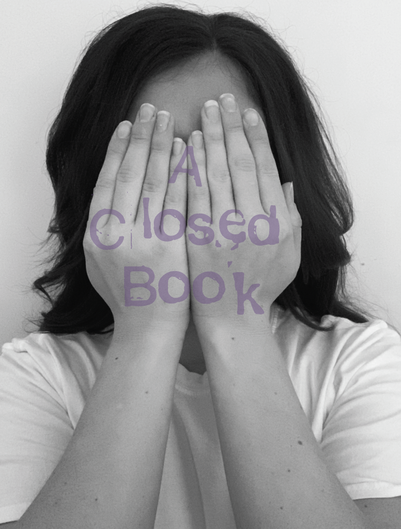
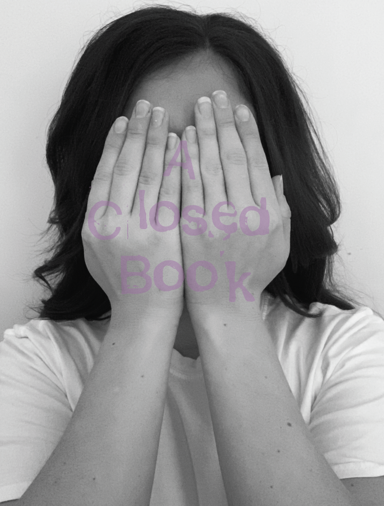
I wanted to experiment with adding colour to my design so I firstly thought about how particular colours stimulate different moods and feelings. In this case the colours associated with the phrase would range from blue stimulating feelings such as shyness, worry, sadness to purple being mysterious.
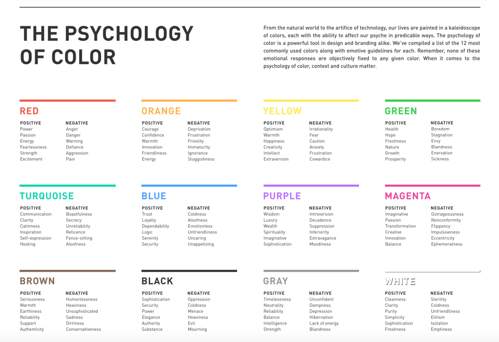
The Psychology of Color in Branding
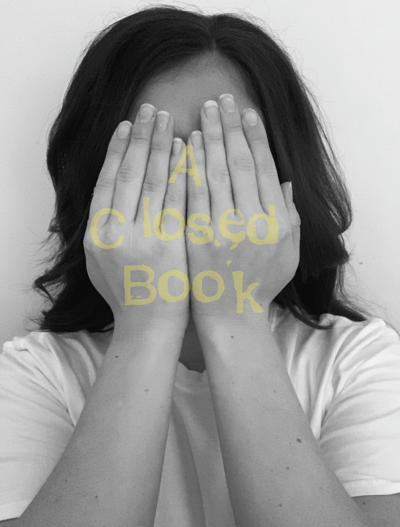
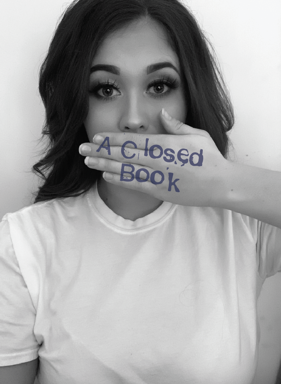
Although as mentioned previously about using colours relating to stimulating emotions, I wanted to experiment with the brightness of colours, the yellow and red create a strong contrast against the black and white image.
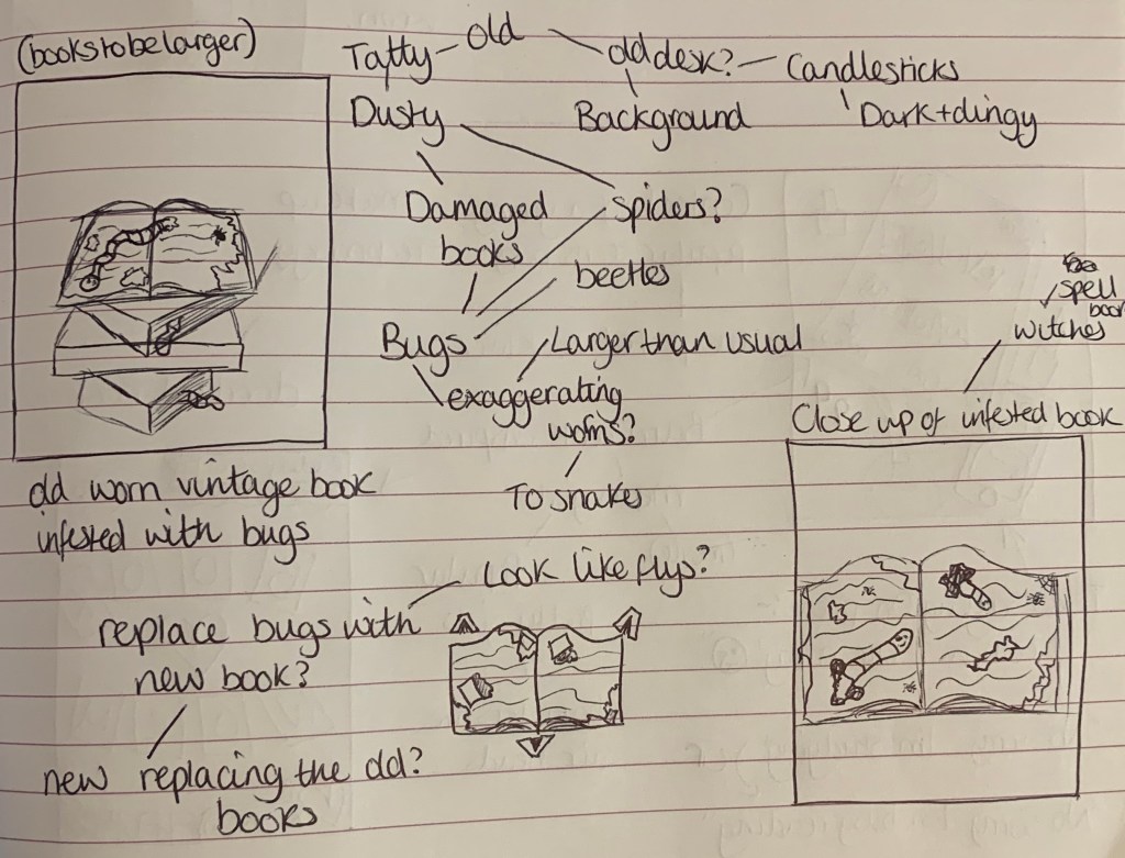
Visual Ideas Design 2 – Bookworm
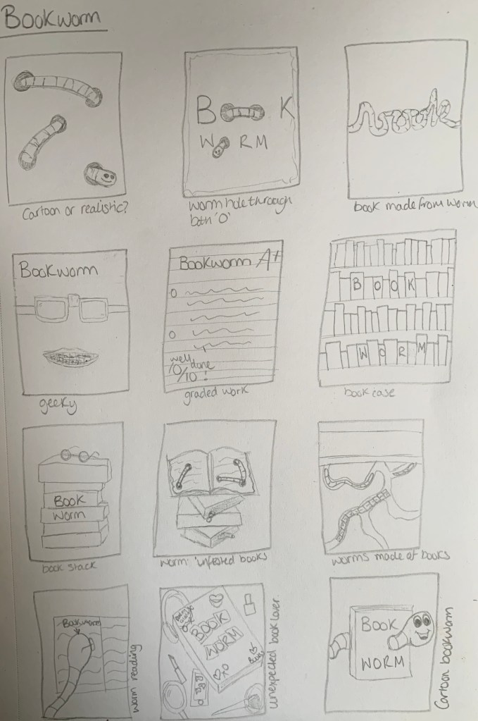
Out of the above sketches I am drawn to the word book made from a worm, the stack of books with the worm coming from the pages and the worm made of books underground. I also like the bottom centre design of an unexpected book lover, I have created the cover of a book in the style of ‘Mean girls – Burn book’ surrounded by other girly items and technology.
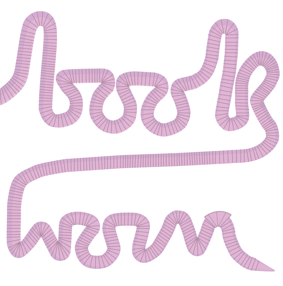
Worm Word: I like the idea of this design with the word ‘Book’ being made from a worm to create a say what you see design. To make it clear that it is a worm I will make sure to include a head at the end of the ‘k’ rather than the design carrying on past the edge.
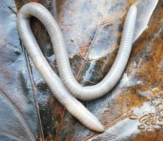
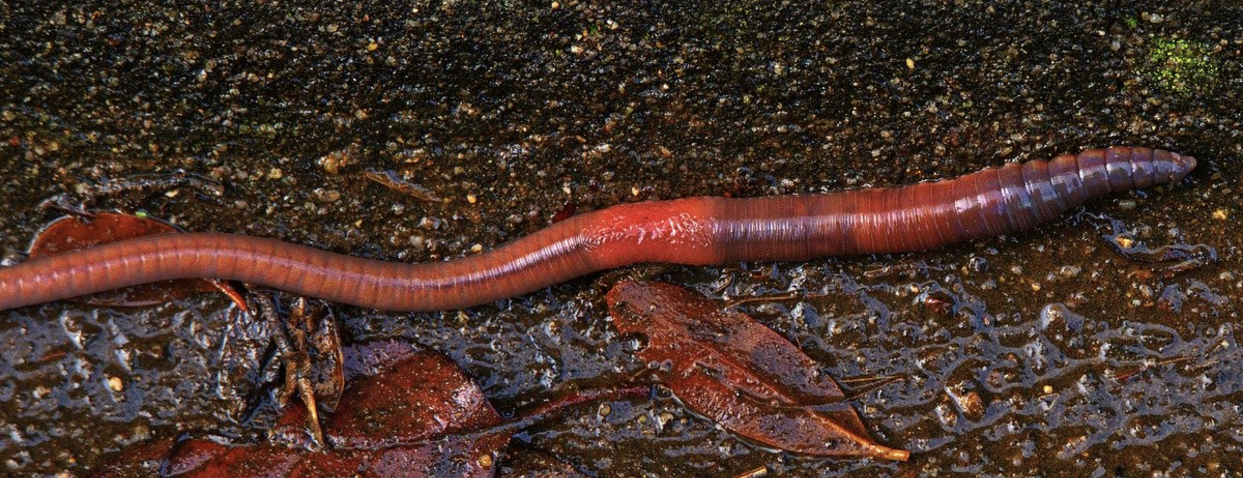
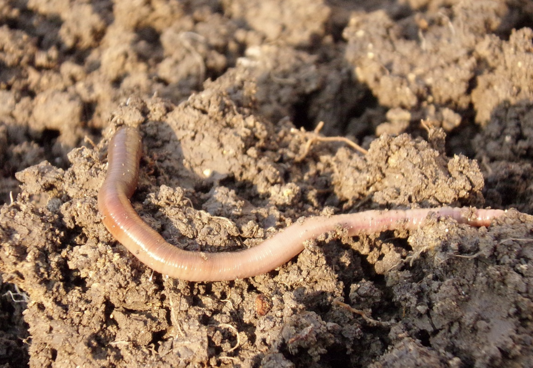
Worm infested book: With this design I feel I can be a little more creative and experimental. After researching actual bookworms rather than the phrase I have found that these particular insects eat their way through the pages and sometimes can make their way from cover to cover if undisturbed. I feel that I can rough up a vintage looking book by tearing some of the pages, maybe burning some edges and just make it look very old and ancient. I would also experiment with the worm, this could look like a snake more than a worm.. is it to be an image or illustration? Can I use things to represent as the worm/bugs? Smaller books eating a bigger book? – I seem to be stimulating lots of thoughts with this design.
Worm made of books: For this design I thought of creating an underground view of worm tunnels, within these tunnels would contain worms and one large central worm made from books. I would need to experiment on wether the books will be open or closed however I think closed books for the body and an open for the head.
Unexpected book lover: I decided to create a design looking like the contents of a bag have been emptied. I imagined the owner of the bag looking like a young, trendy teen who nobody would expect to be a book worm, as the stereotypical image of a person who is a bookworm are either of an older generation or to be ‘geeky’. This would also carry a message of everybody loves to read, they just haven’t found the right book.
Further Research
I found the technique I created with the above design helped stimulate further design ideas.
Worm word
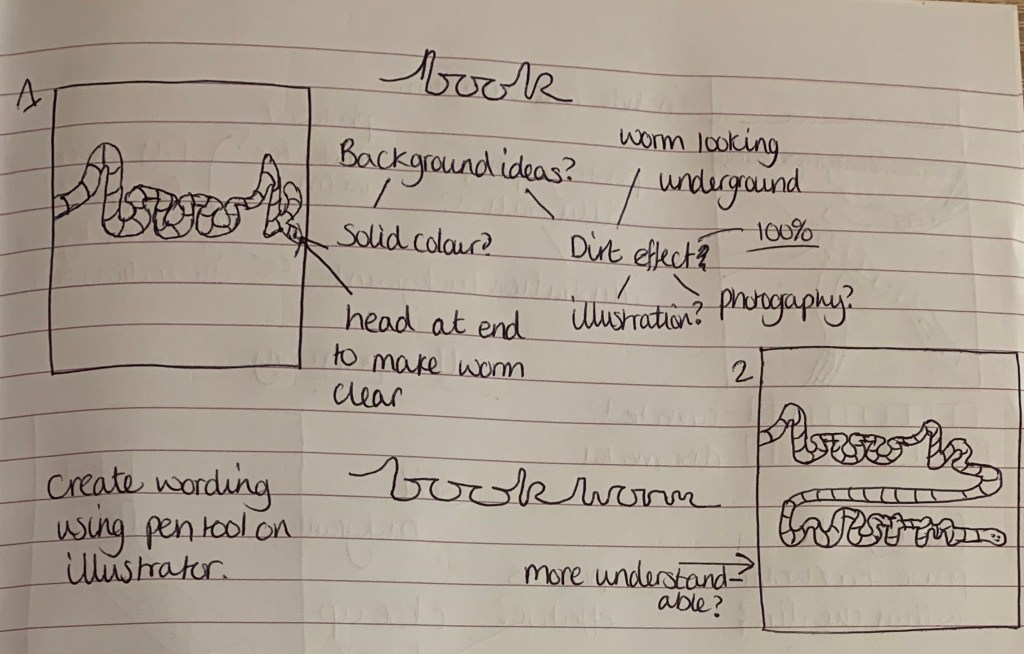
Im looking forward to see how this design looks once created. I think by adding the word ‘worm’ onto the end it makes the design clearer as to what its supposed to be implying, also it fills the page better. I liked the idea of the background being an image of soil. I would create the wording in illustrator using the pen tool as I’m not going to find a typeface which fits what I am after, I will simply draw my design, upload it, then trace over.
Worm infested book
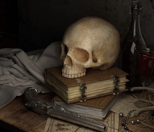
I wanted to take this design from the approach of book eating bugs. I imagine the scene of this being in a dark old fashioned abandoned study dimly lit by a candle stick in the background, the desk would be made from a dark polished wood, covered in thick dust with a stack of books which have been infested with bugs. This then made me think of witches and it being an old creepy spell book. However I’m not sure if my imagination is running off course with the phrase, I just wanted to come up with a design not so obvious to the phrase. However I’m not sure if the background will over complicate the design and take away the focus of the books. This will be something I can experiment with.
Worm made of books
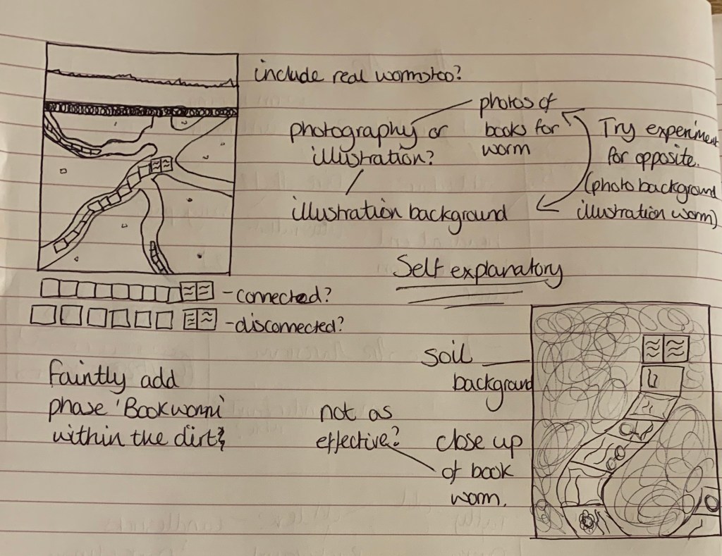
I think this idea would make an interesting design. I like the thought of the whole art board being full of design rather than having a focal point and a background. I will experiment with both images and illustrations of books which would make up the worm. I envision this design to br bright, colourful and fun.
Unexpected book lover
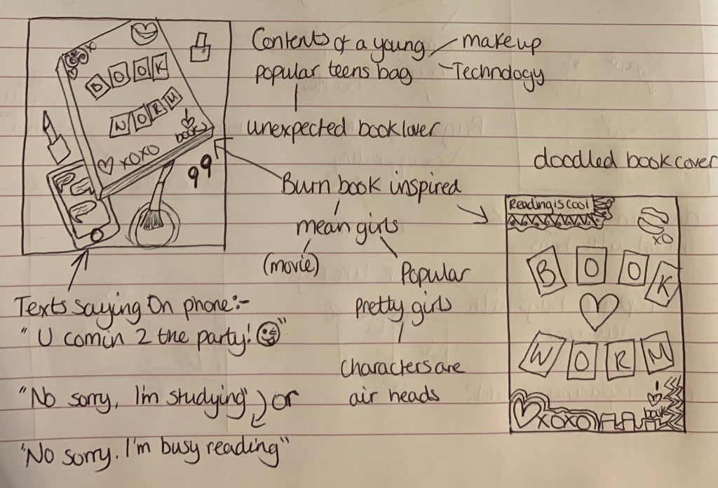
For my final idea I wanted to create something which appears to be the opposite stereotype of a bookworm, which is typically known as someone who is geeky and quiet. I was inspired by the ‘Burn Book’ from the movie ‘Mean Girls’ for the cover design of the book, along with the spilled contents of a young popular female teen who could be an unlikely book lover.
Developing Idea 1
I am keen on developing two ideas for this phrase, one being of the worm word and the other of the bug infested books. I feel that these both will make interesting designs which give off different examples of the phrase Bookworm.
Worm Word
I started off by gathering relatable images to help gather inspiration and stimulate thoughts.
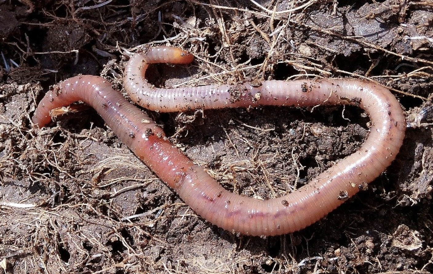

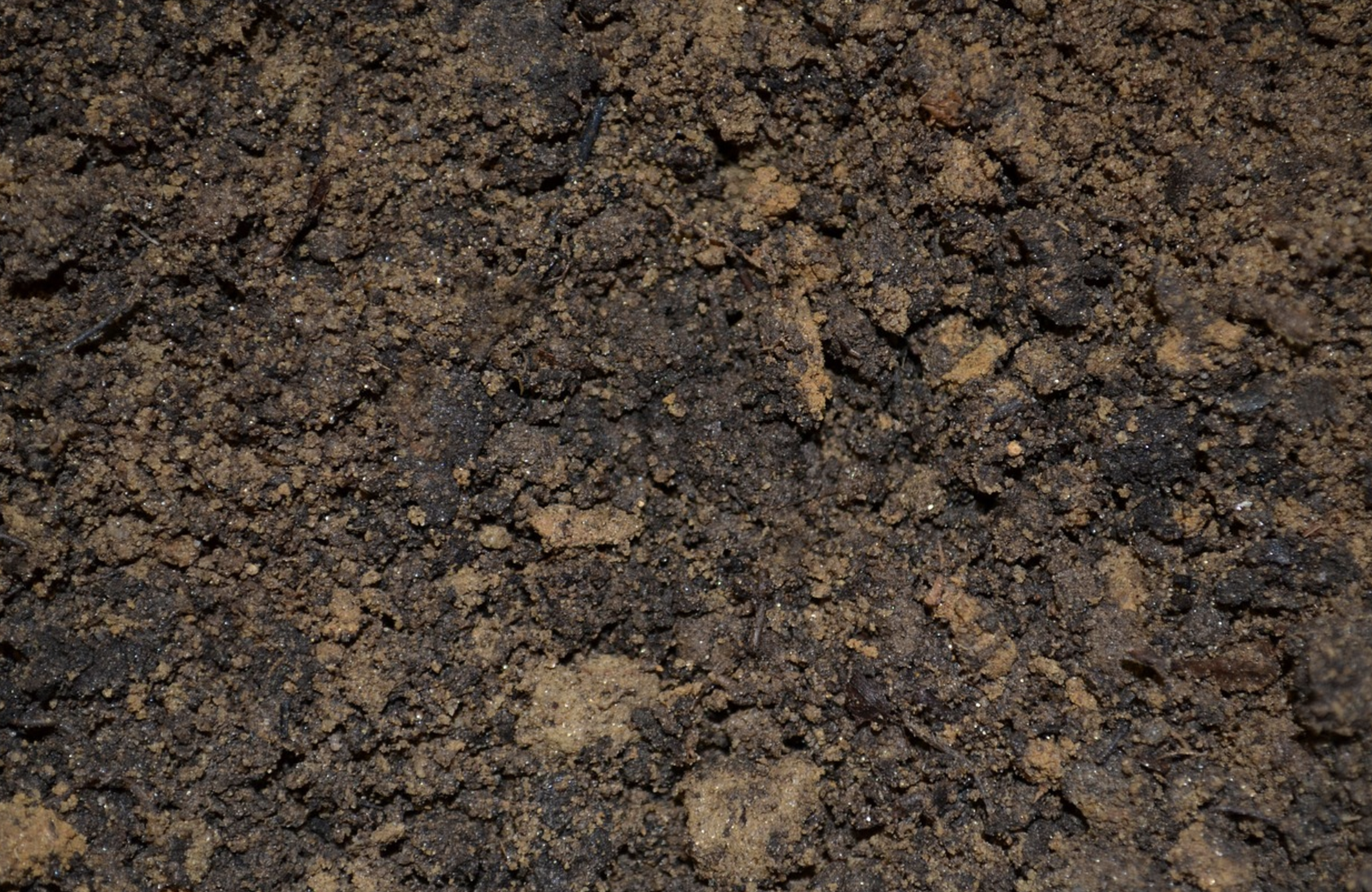
Images found on Pixabay.com (https://pixabay.com/images/search/earth%20worm/ https://pixabay.com/images/search/soil/)
I then went to my sketchpad and drew up my design on a larger scale to my thumbnail so that I can upload it onto my computer ready to trace over in illustrator.
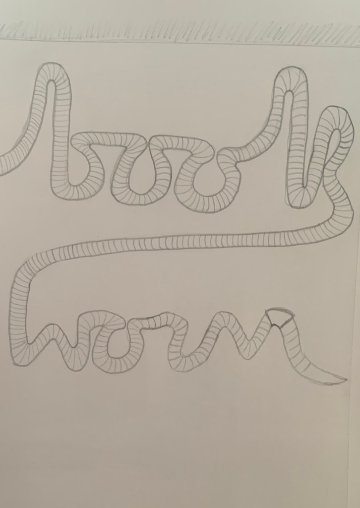
Although the wording isn’t perfect, I thought with it being a little rough it would look more believable to be a worm.
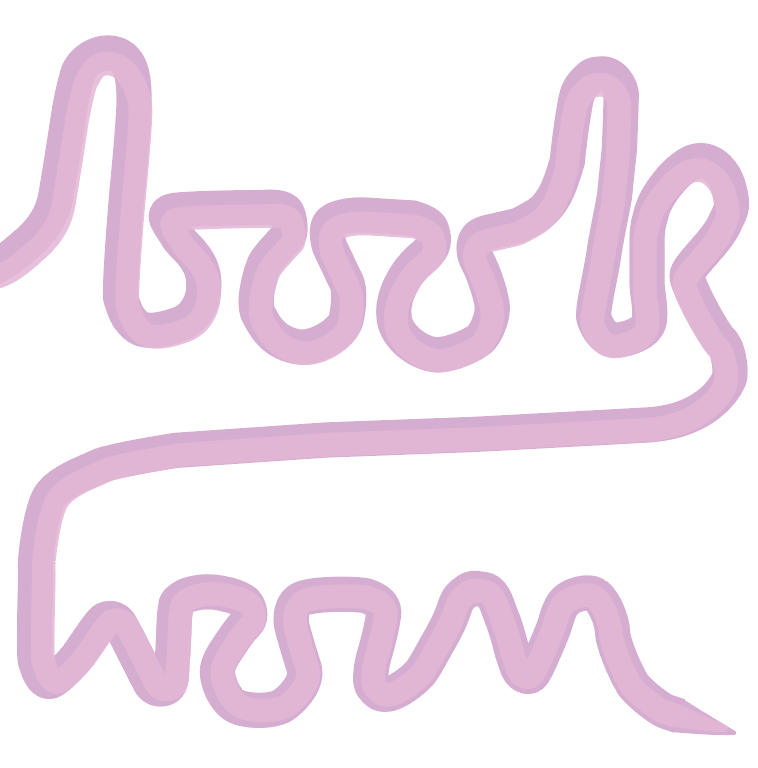
Visualising Idea 1
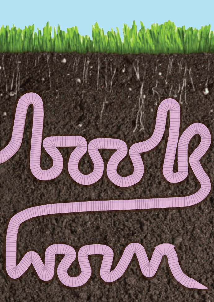
Above is the finished result of the ‘worm word’. This didn’t turn out as well as I had originally expected. I feel that although it is clear what the design is representing it isn’t as strong as I had hoped. I am still glad that I experimented with this design and visually developed it.
Developing Idea 2
Worm infested book
I gathered images relating to my design to help stimulate ideas further.


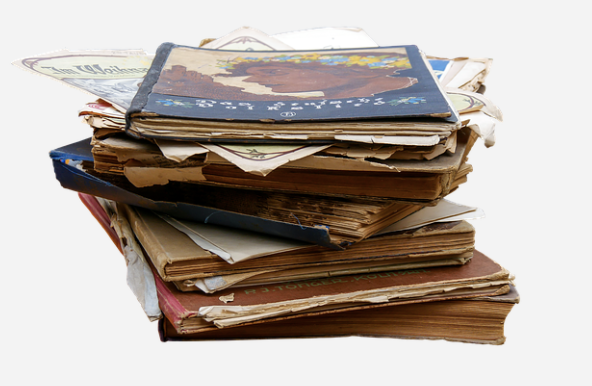
Images sourced from Pixabay.com (https://pixabay.com/images/search/stack%20books/)
Whilst looking at the images above, it reminded me of gothic things, I then started to think about snakes with this design. Instead of going to my sketchpad I decided to test out some sketches on old book pages. I really like this look! I just think that for this particular design I have a more detailed idea in mind. (I will defiantly remember this for future exercises if required)
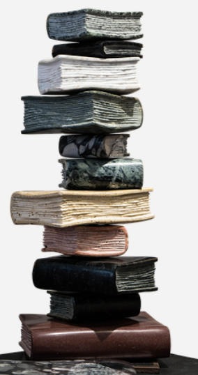
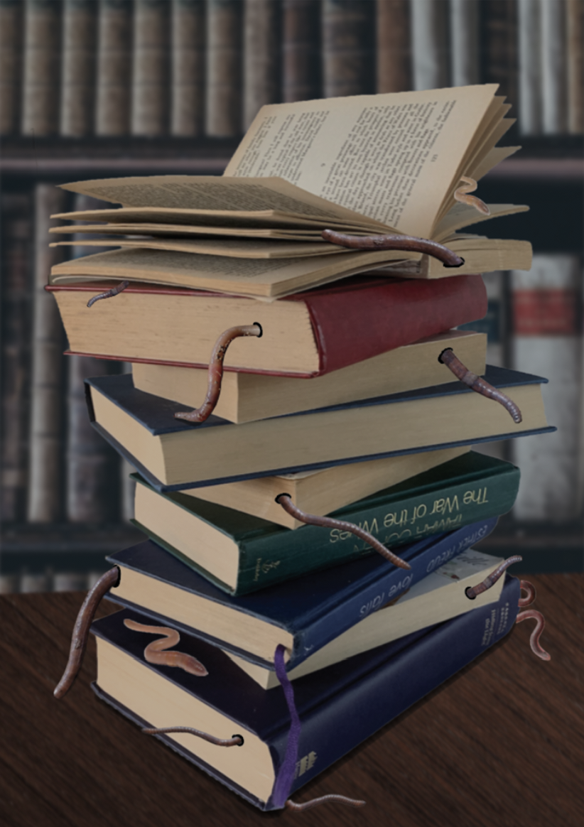
I decided to gather some books and experiment with different positions of books. I then took photos of the successful compositions from different angles and using different filters.
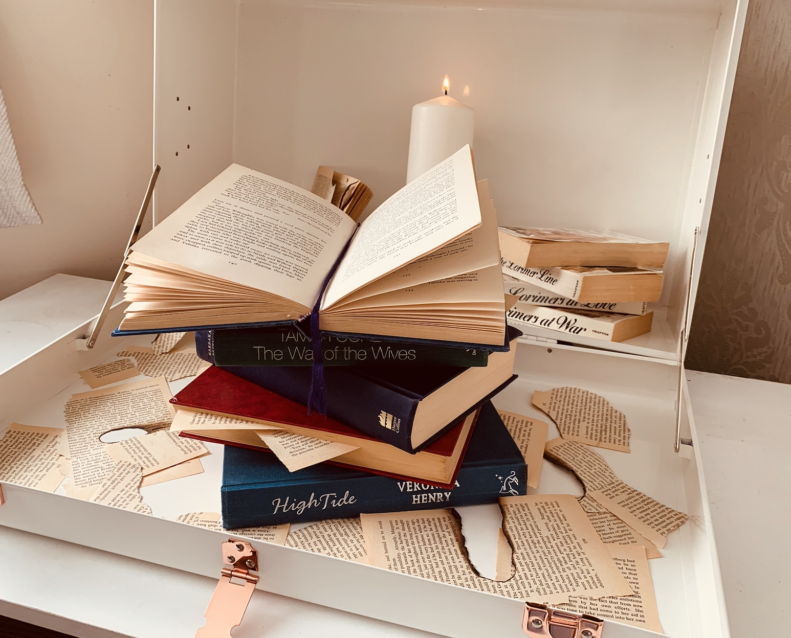
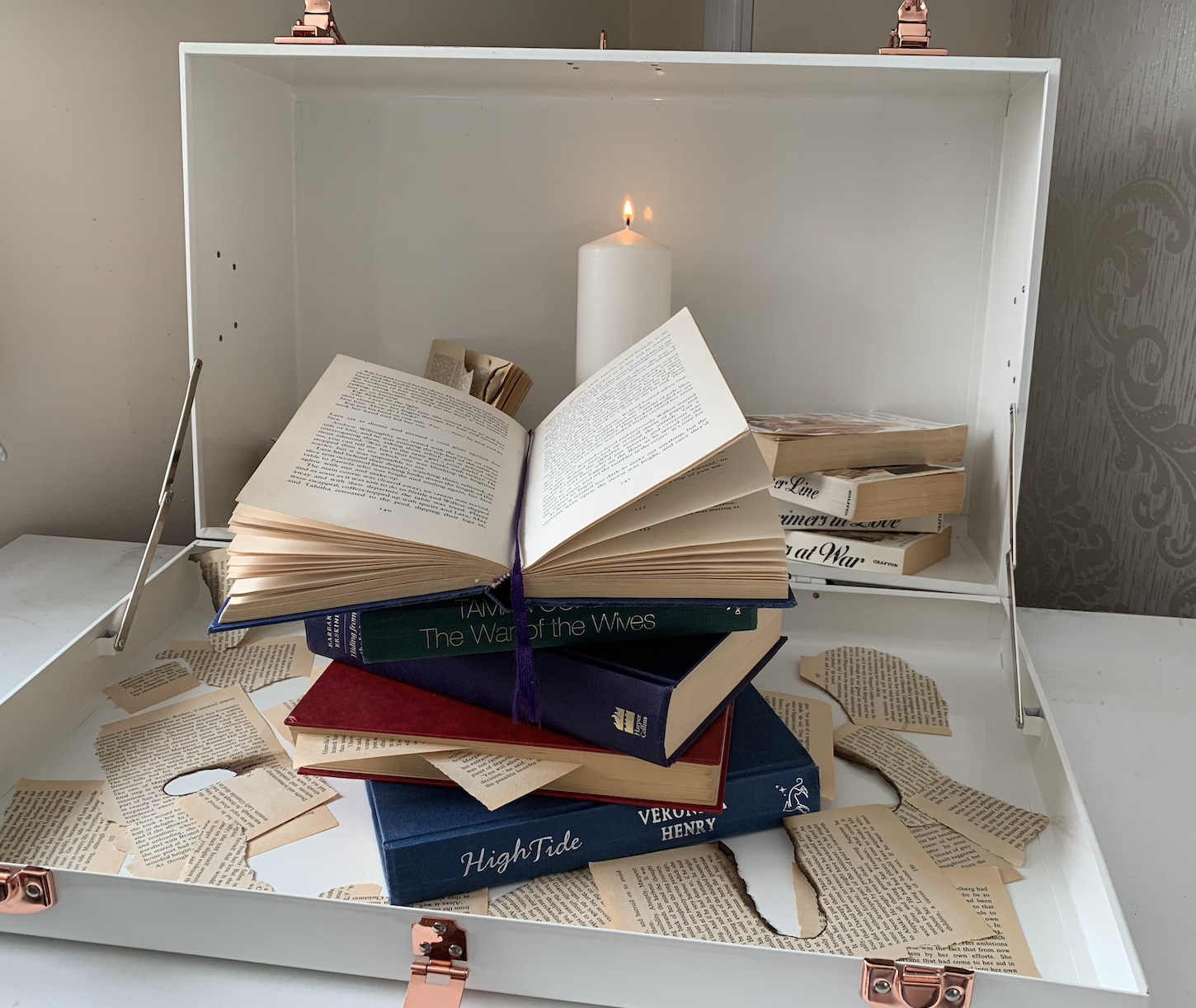
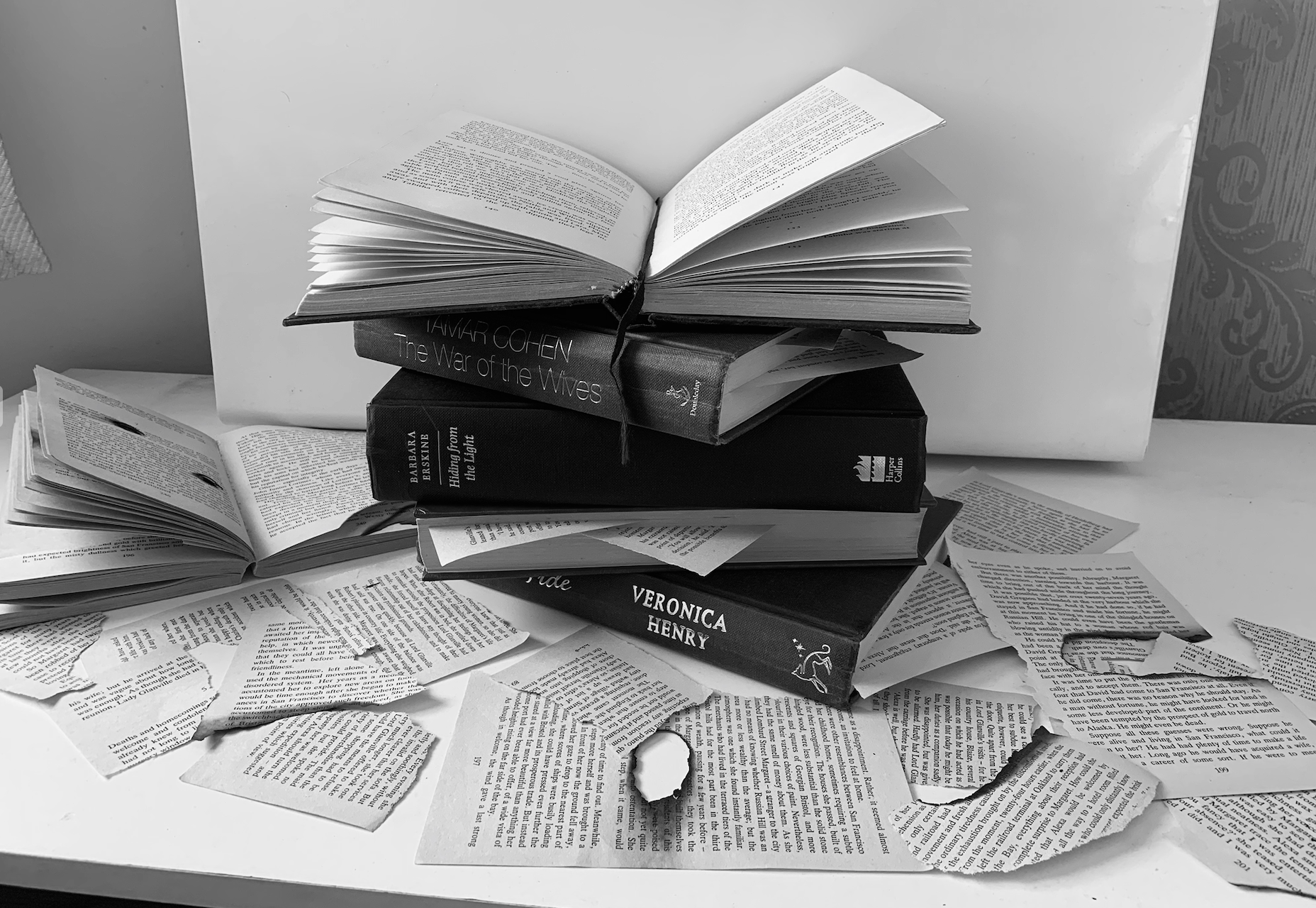
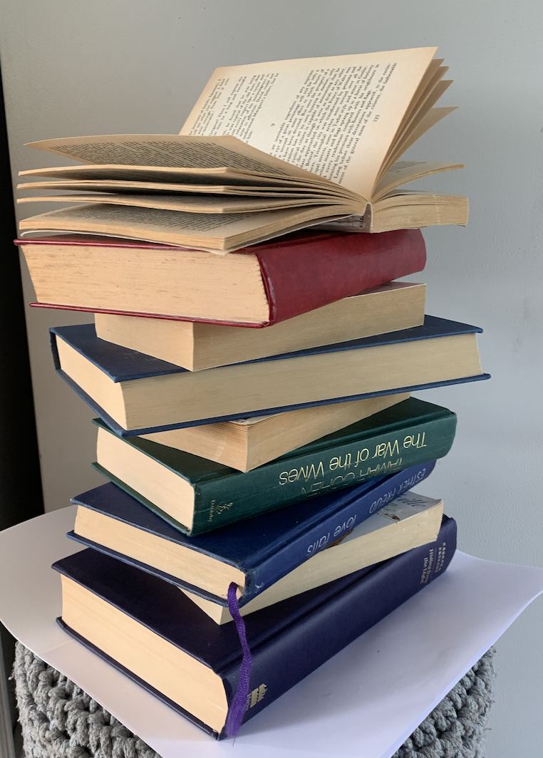
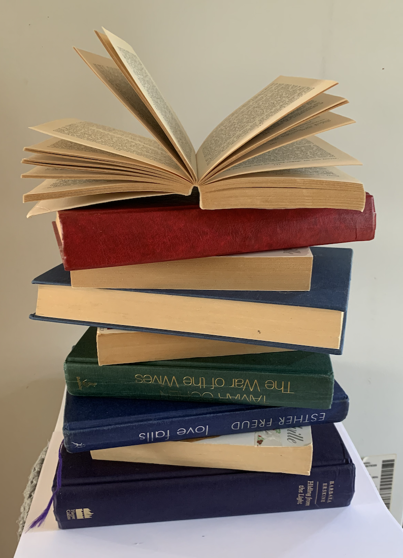
I really like the position I have created in these photos, I will add some bugs and worms within the images to achieve my desired idea.
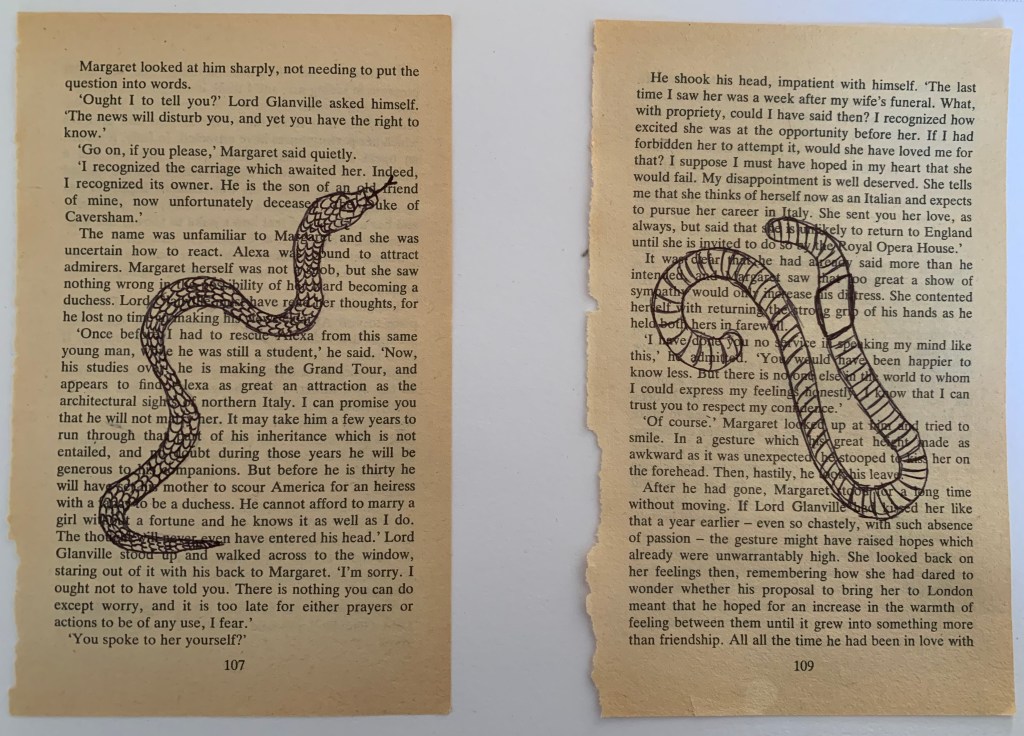
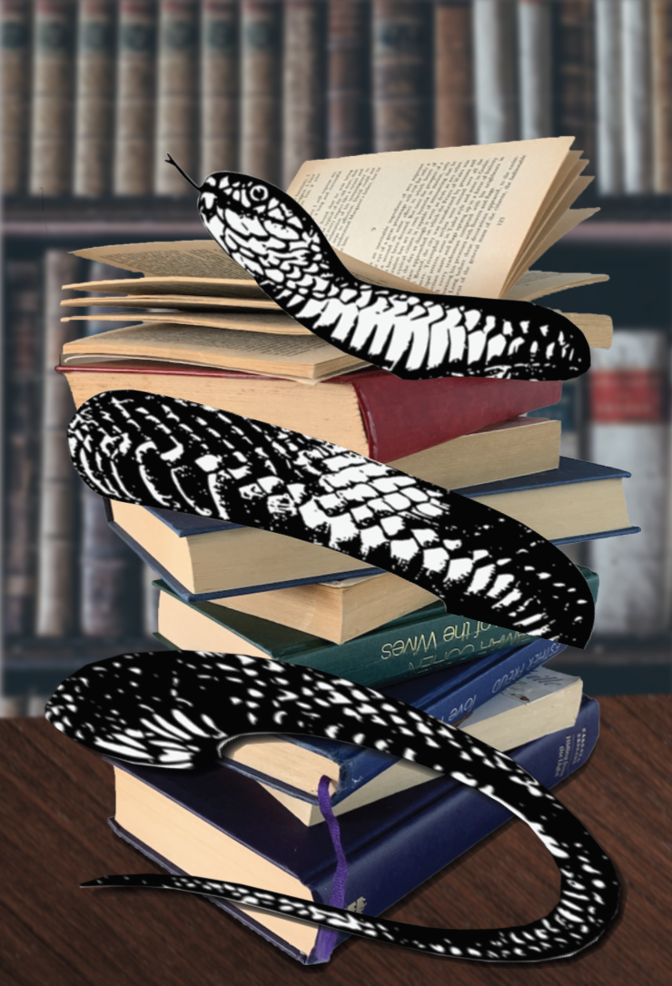
Upon studying my images and with the idea of snakes in mind as mentioned above, I attempted to add in a vintage looking snake sketch to one of my designs. I liked this look however I felt it took away the meaning to the phrase.
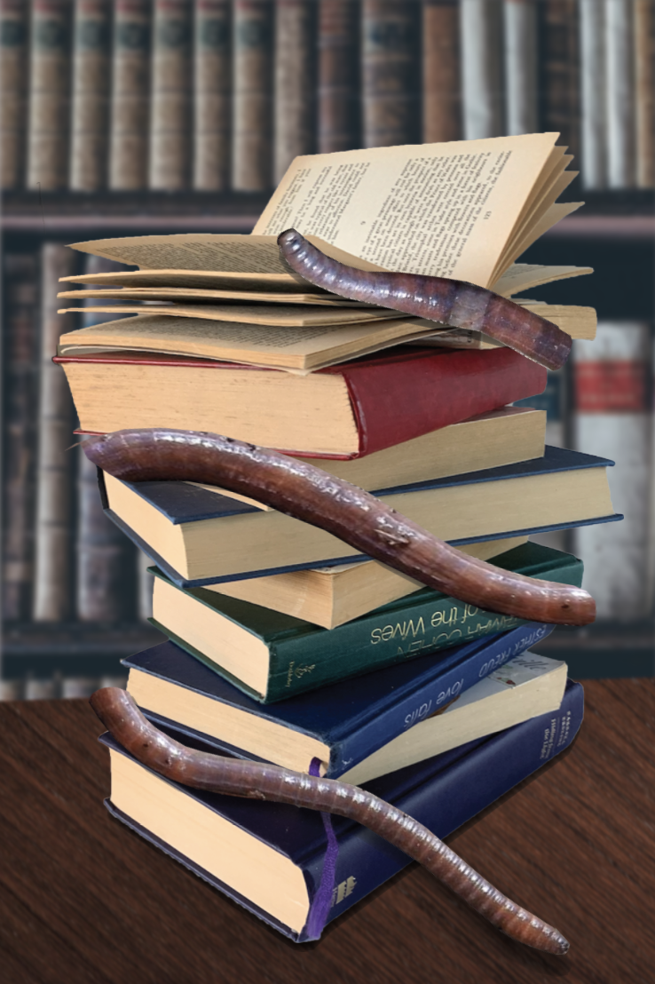

I felt that both the wrap around effects wasn’t as successful as I had hoped, however I started to like the look of my original design with the worms weaving their way through the books.
All worm images sourced from – https://pixabay.com/images/search/soil%20worm/
Visualising Idea 2

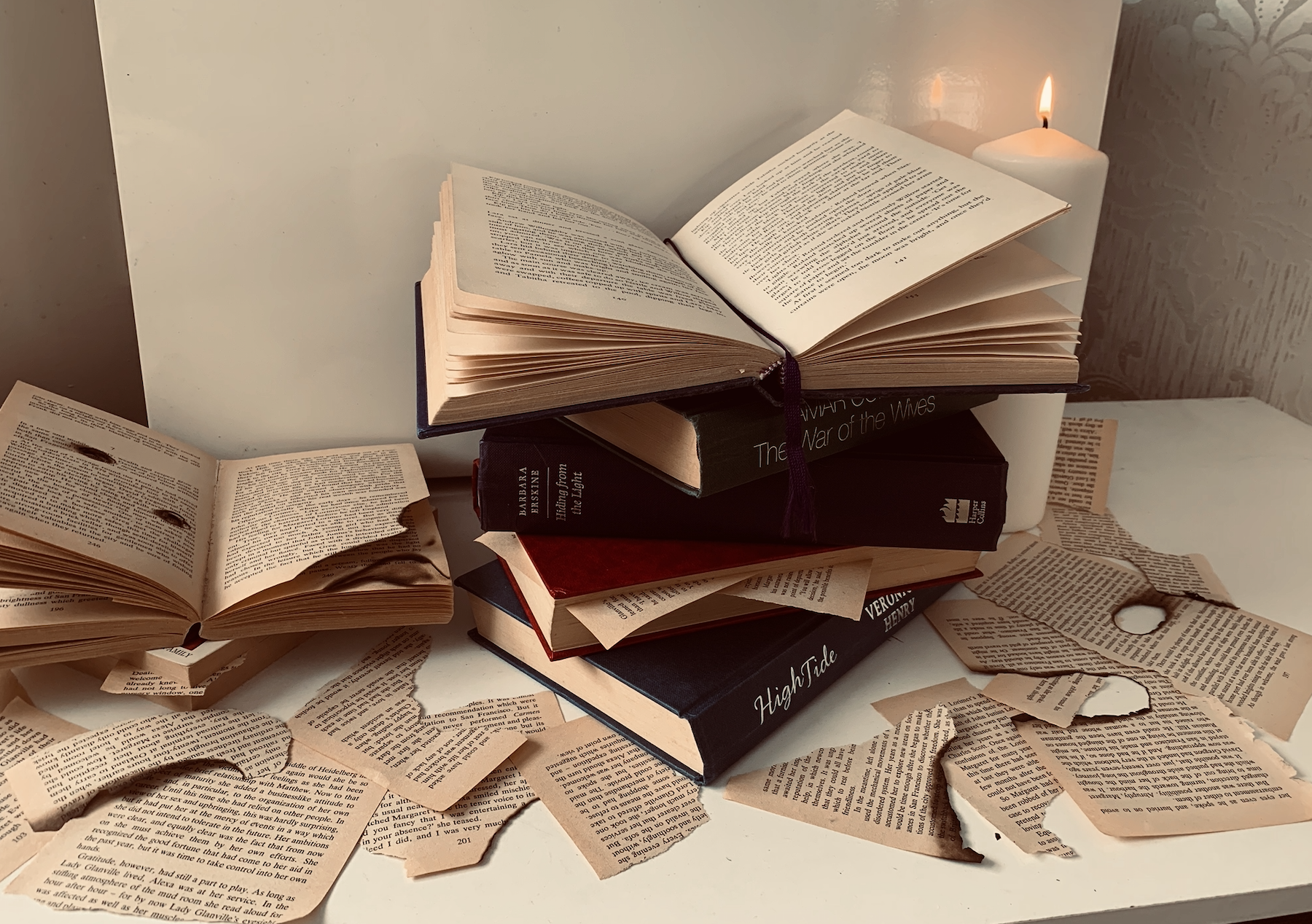
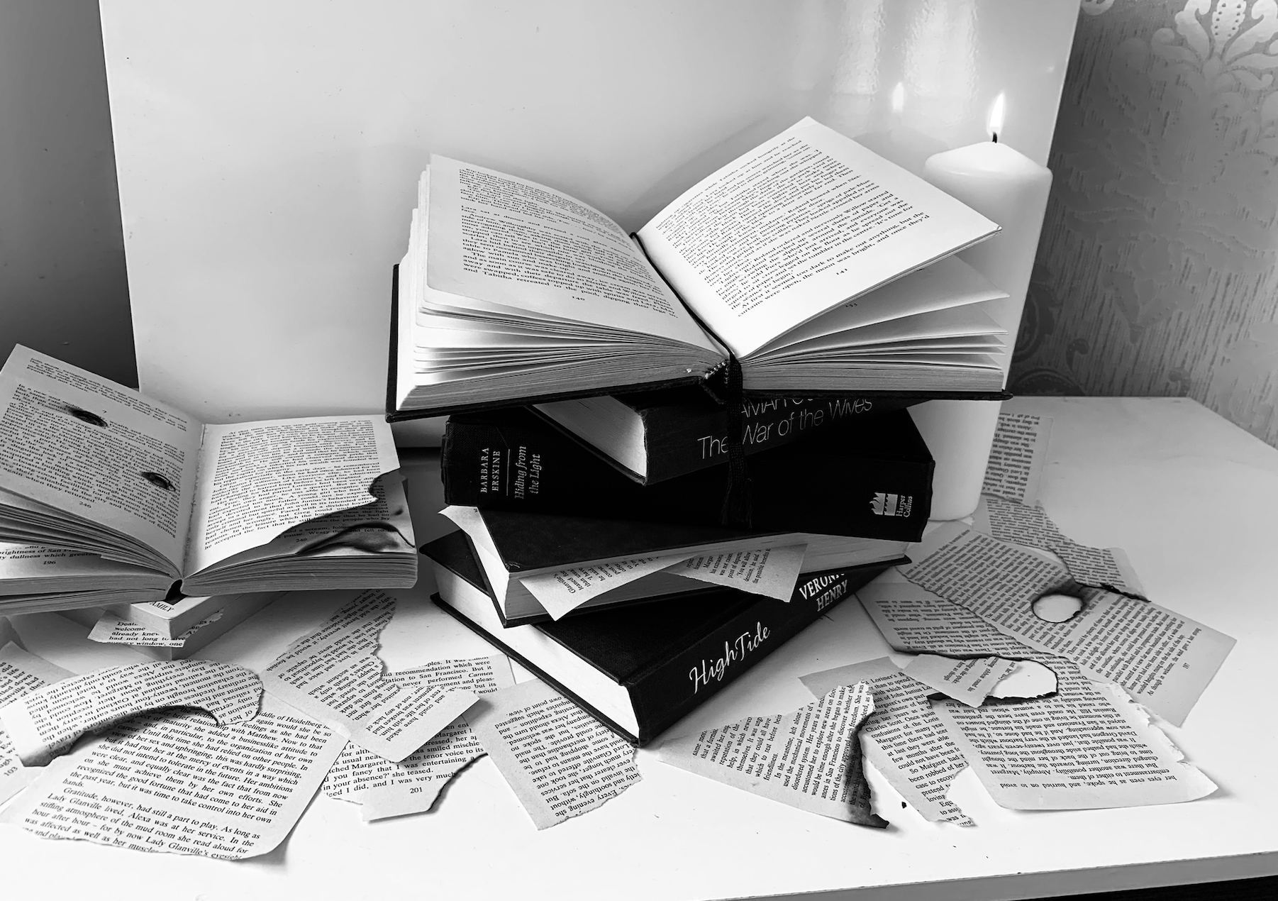
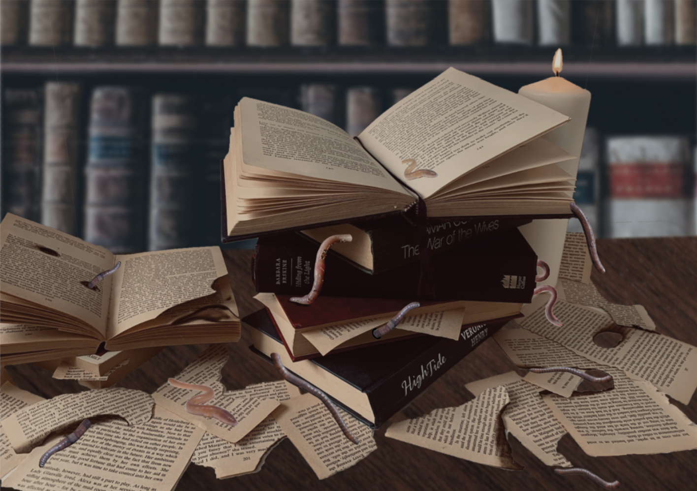
When looking at both designs separate I couldn’t decide which one I preferred so I experimented with merging them and found the end result successful. I also forgot at the time of taking my photos that the image needed to be portrait rather and landscape so that I could create a realistic mock-up, so I scaled down the image to fit an A5 art board. I prefer both combined as I feel it fills the page nicely, looking like the scene could be from an old abandoned study.
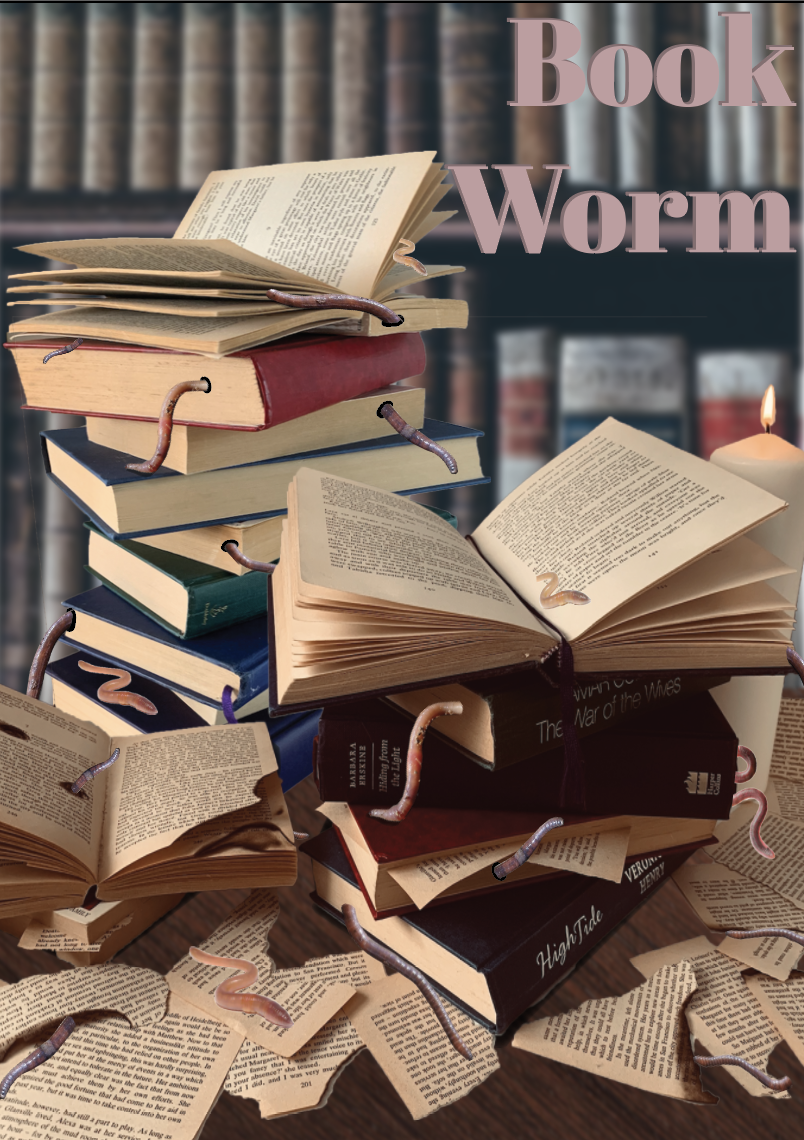
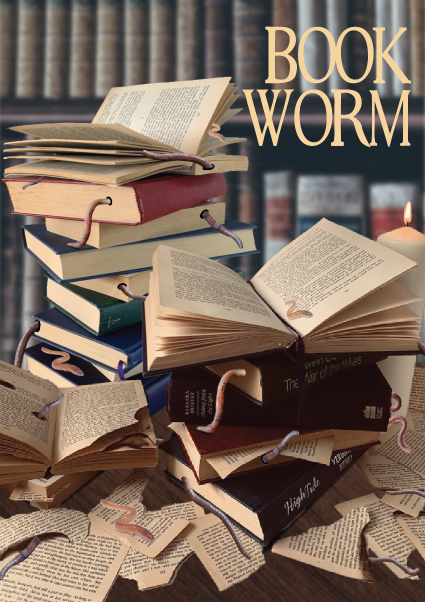
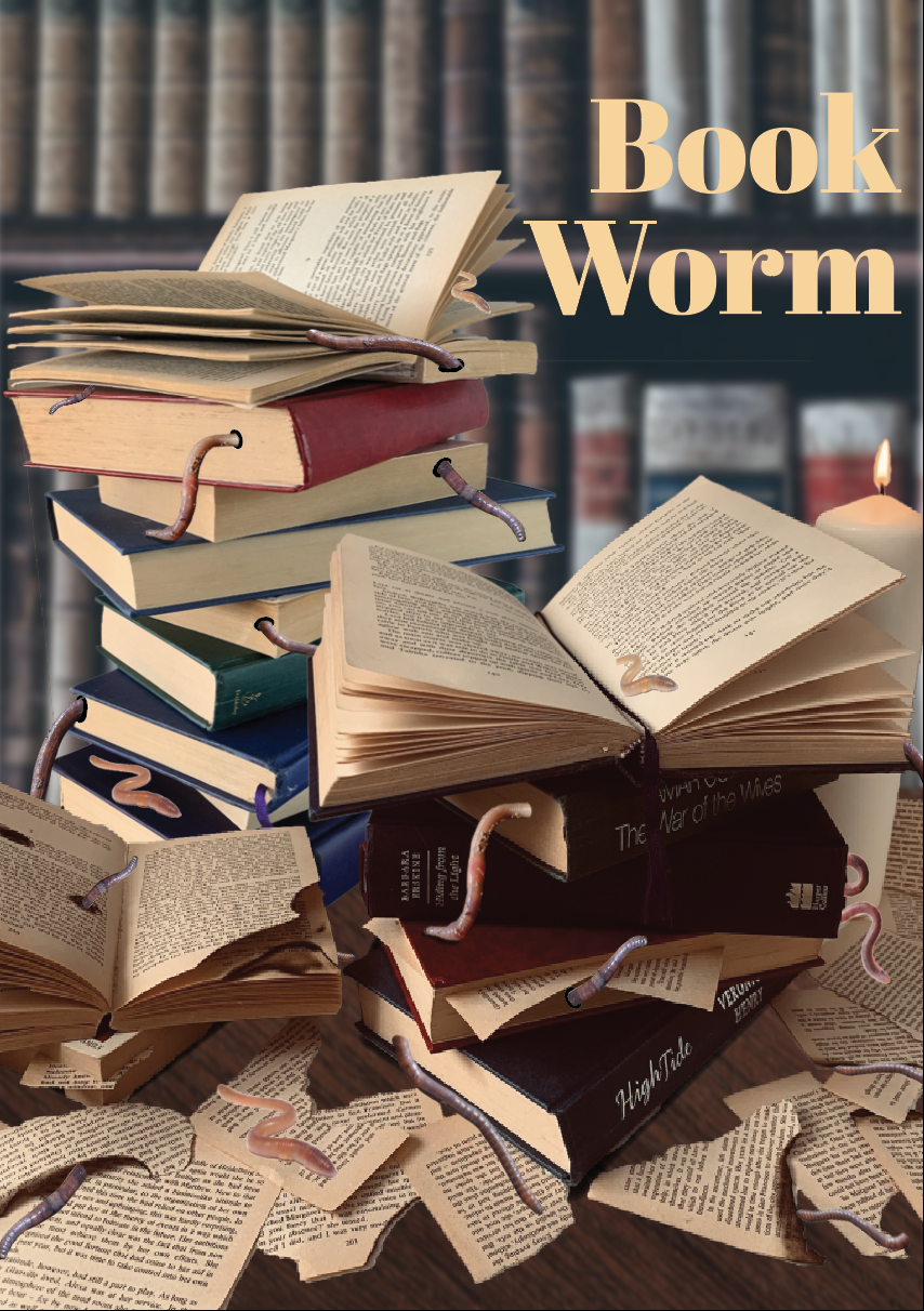
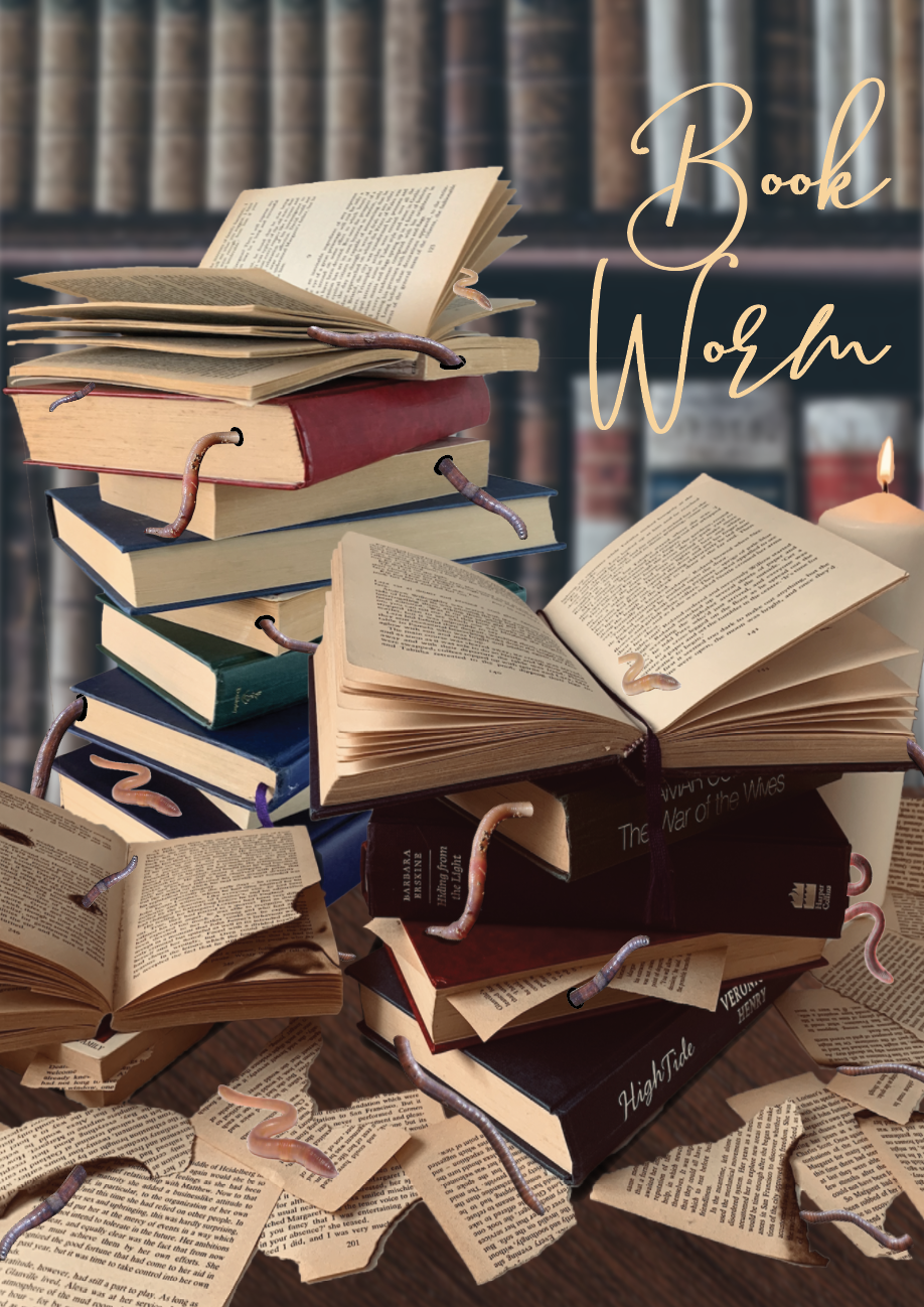
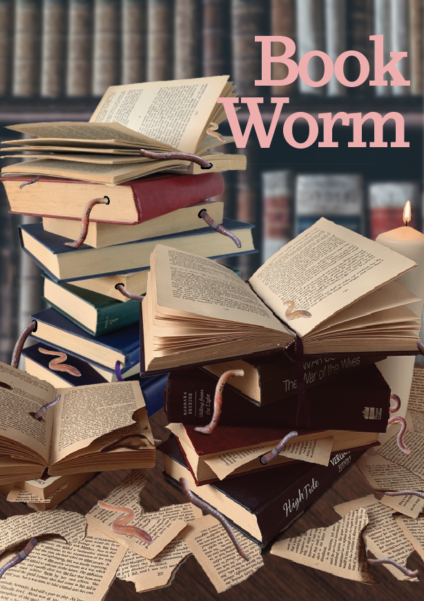
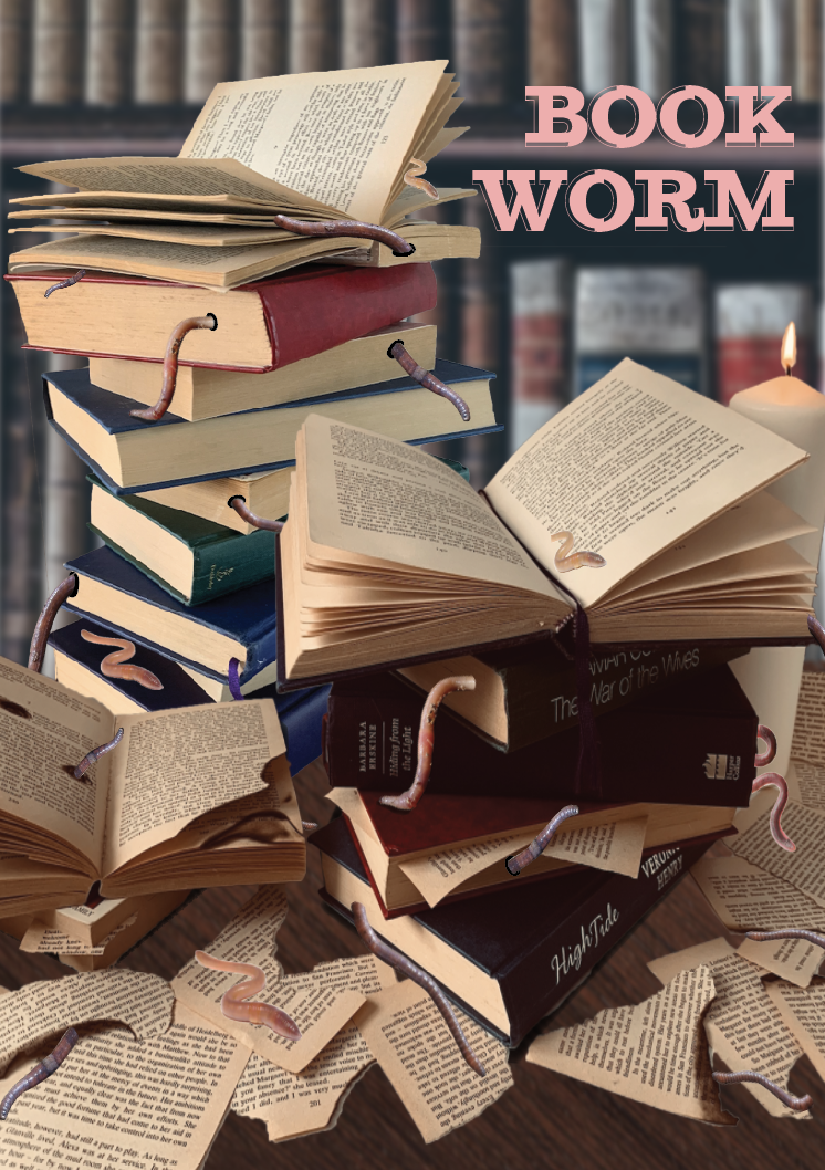
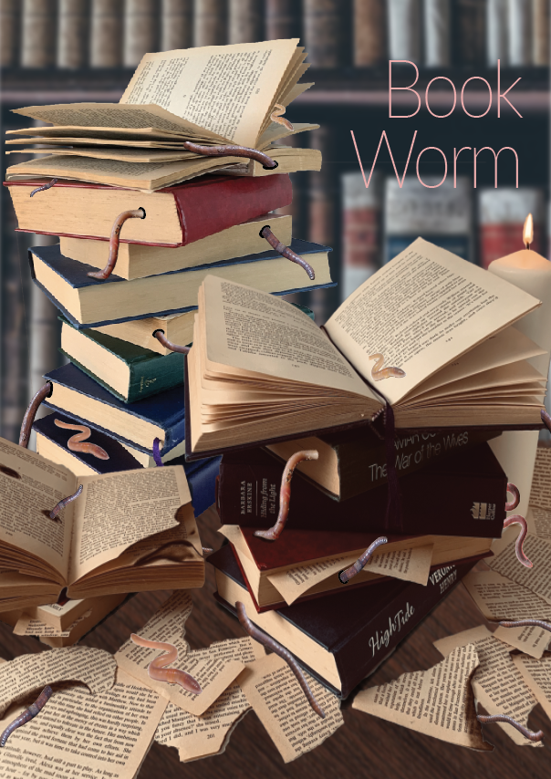
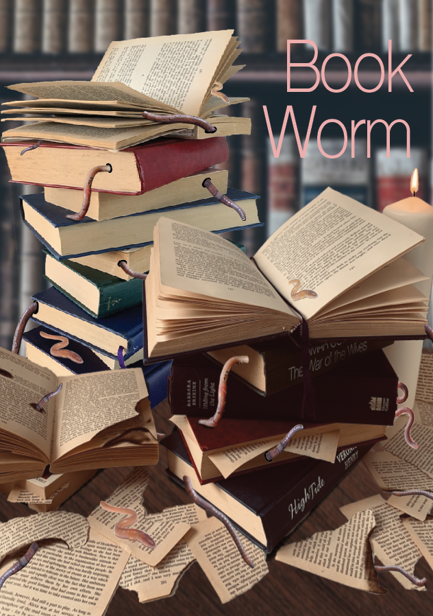
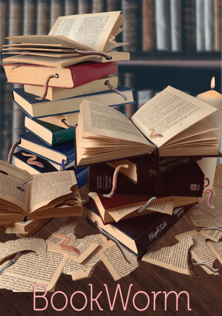
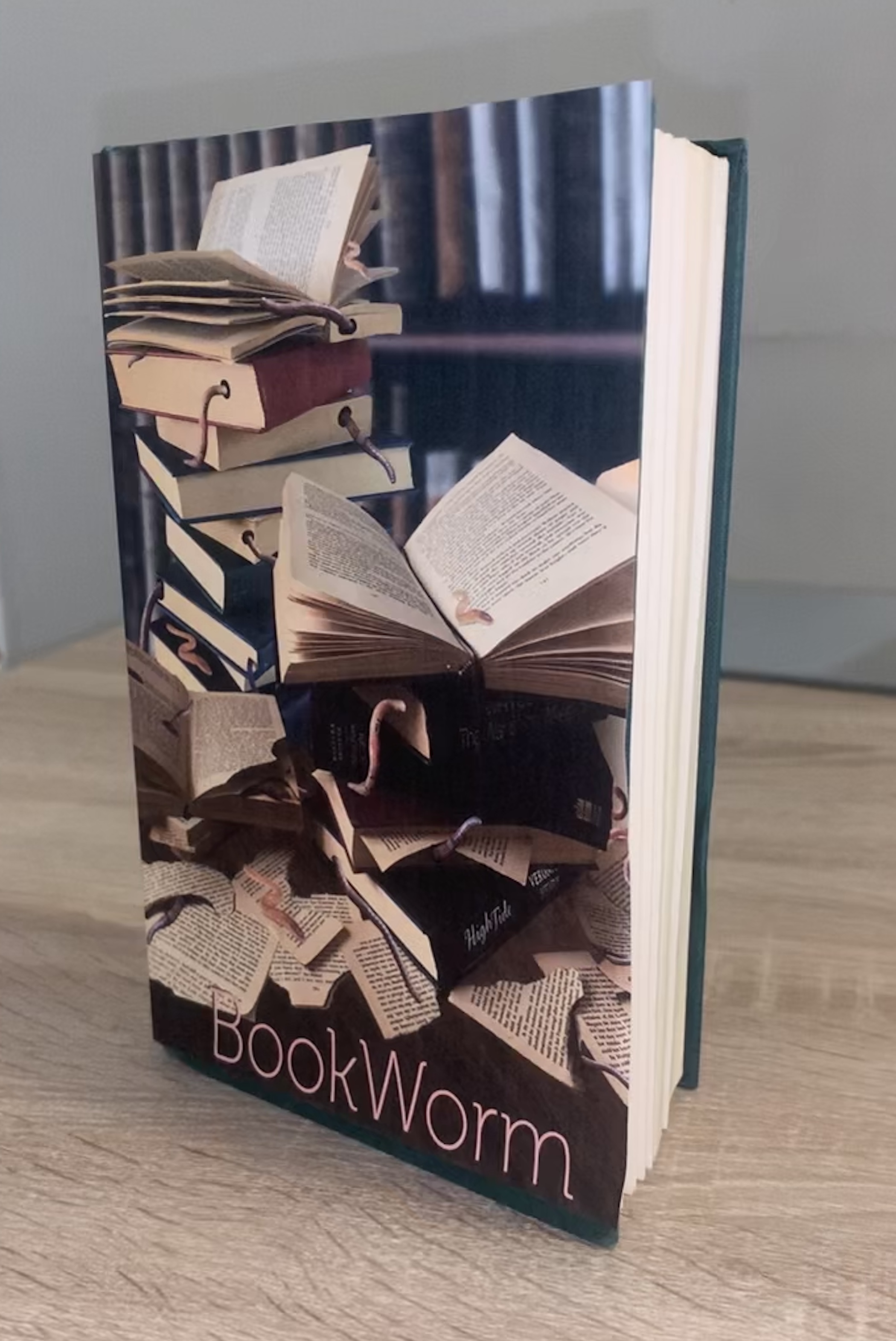
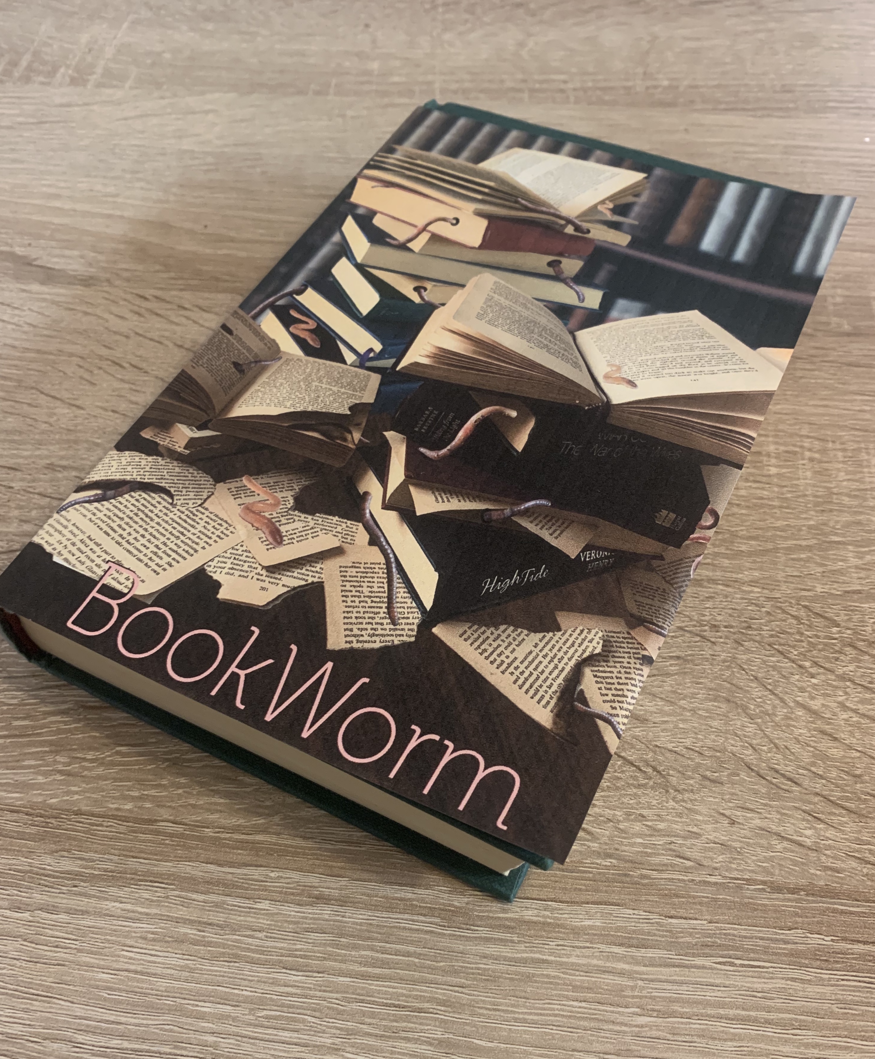
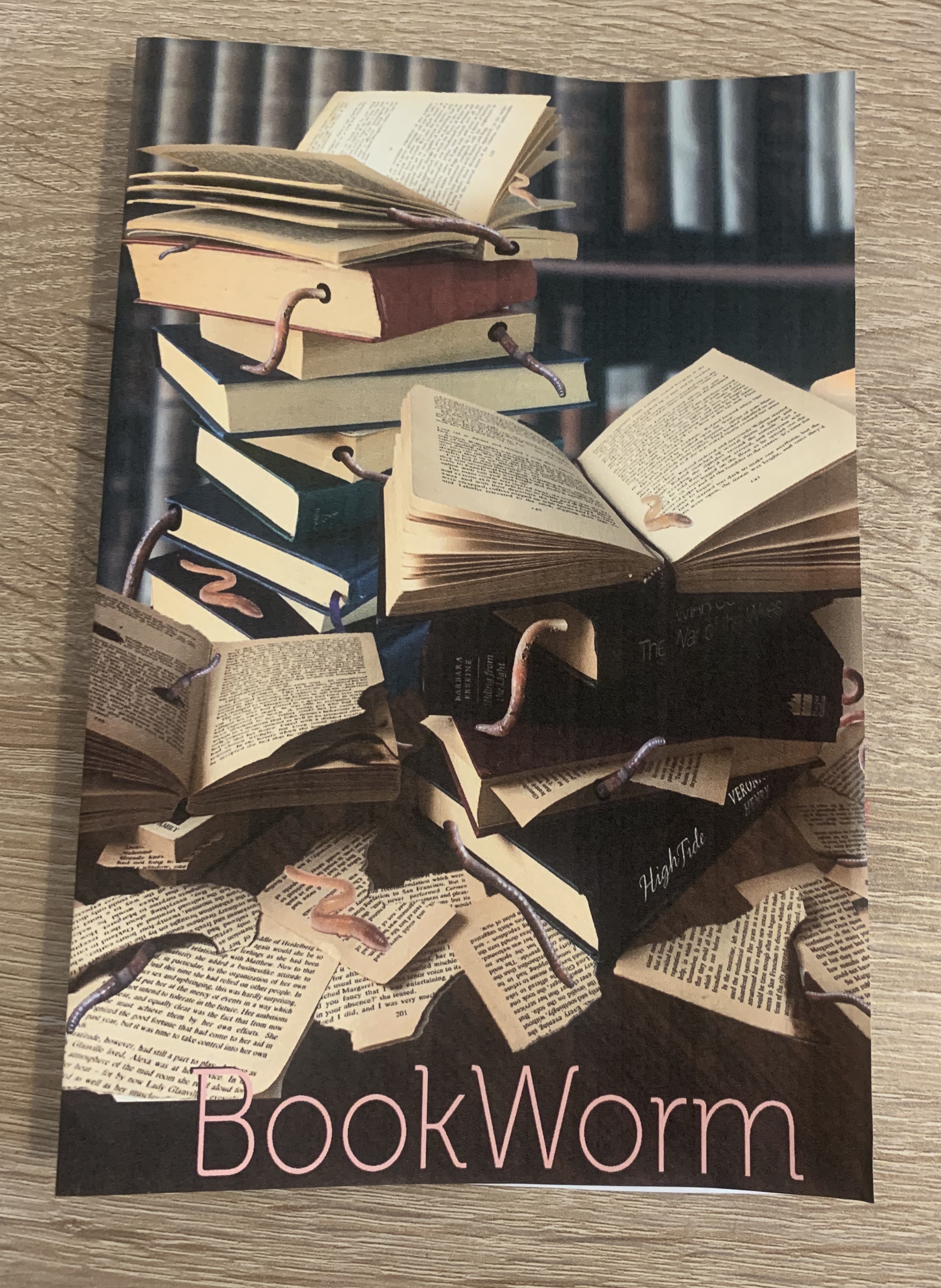
I printed off my design to see how it looked as a mock-up. I was happy with the results however I’m not sure wether to try out different typefaces, but I’m happy with the positioning of the text rather than in the top right hand corner. The image printed out a little darker than I had hoped so thats something to remember to take into consideration.
Reflection
I ended up spending a lot more time on this exercise than planned, however I am happy with my end designs and have a clear Idea as to which one I will be developing further. I’m really pleased with the worm infested books design. My only worry is that the brief isn’t very clear, I presume that I am designing a book cover in relation to the phrase??
It’s interesting looking back at the work to see how new ideas have progressed and shows the importance of research and how ideas can develop.
