
Brief: Using your research into artists’ books and fanzines as a starting point, think about their physical or design qualities, and creatively apply some of these approaches to your own designs. For example, there’s a distinctive visual quality to many fanzines which comes from a ‘cut and paste’ approach to designing and through the use of cheap photocopying and printing. Punk fanzines in particular make a virtue out of having limited resources, no computers and little, or no, formal training as graphic designers. Use your sketchbooks to experiment with a similar ‘cut and paste’ approach by cutting and collaging magazines and other material. What does this approach offer you as a book designer? Alternatively, you can find other ideas you would like to test out in your sketchbook. You don’t need to make any finished designs, just give yourself room to experiment and try things out.
Design Process
Firstly with the information still fresh in my mind from the previous research task, I wanted to note down a few design qualities which both artist’s book and fanzines contain.
Design qualities of Artist’s books:
- Decorative
- Multi-purpose
- 3D – pop up, folded
- Personal
- Mixed materials
Design qualities of Fanzines:
- DIY – amateur
- Black and white
- Photocopied – low quality
- Cut & Paste
- Personal
I then went on to researching what it takes to actually create a Fanzine. There are plenty of articles online which I found helpful: https://thecreativeindependent.com/guides/how-to-make-a-zine/ This particular article I found which helped stimulate a few ideas.
Design 1
For design 1 I decided to create a collage of random images from cheap gossip magazines and newspapers. There is no purpose to this fanzine, I just wanted to experiment with different images, different cut and paste techniques (Torn pages, carefully cut images and layering). I then photocopied the original to see how it would look, I like the grainy effect of the photocopy, however on some of the images it has shown up very faintly the reverse of the page. I have also used hand drawn illustrations and writing to try and include as many qualities as possible.
Design 2
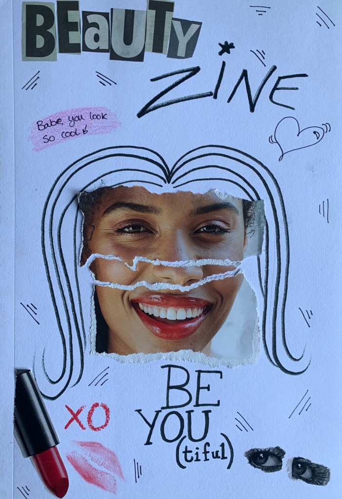
For this design I wanted to create more of a theme to my fanzine, and although beauty zines don’t exist I thought the images used where fitting. I wanted this fanzine to become less of a college so I limited myself to the amount of images used and decided to add my own illustrations and hand written content, similar to a lot of those in my research. I used a line doodle to fill the white space of the page, and drew on hair for the image. I was slightly disappointed to see the visibility of the lipstick print on this as although you can see what it is it didn’t show up as planned, nor did the pink pencil behind the writing up the top.
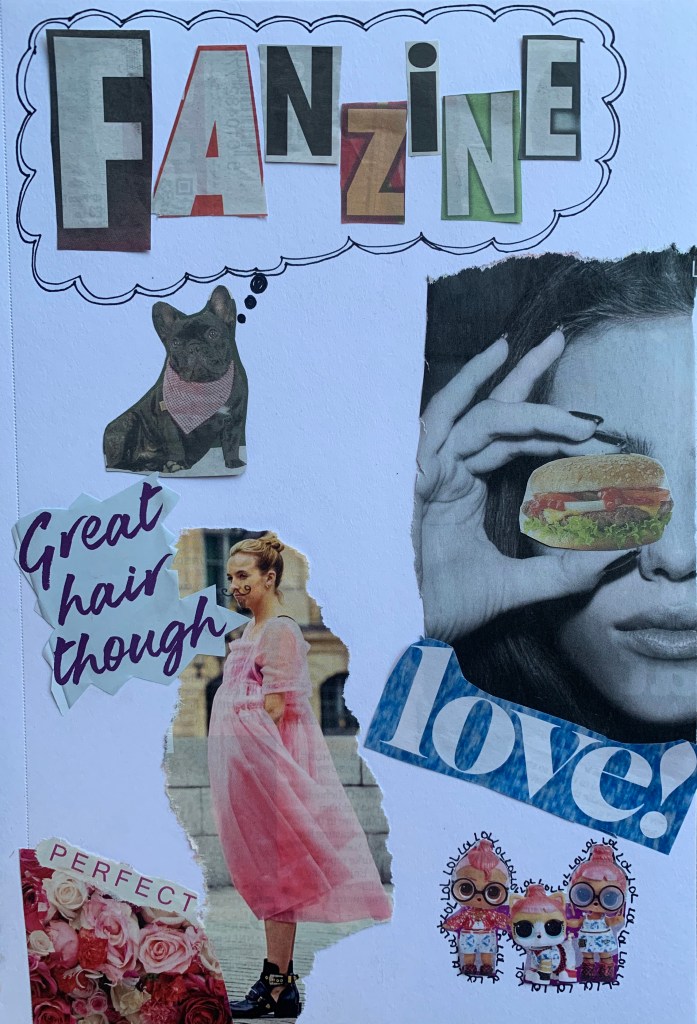
Design 3
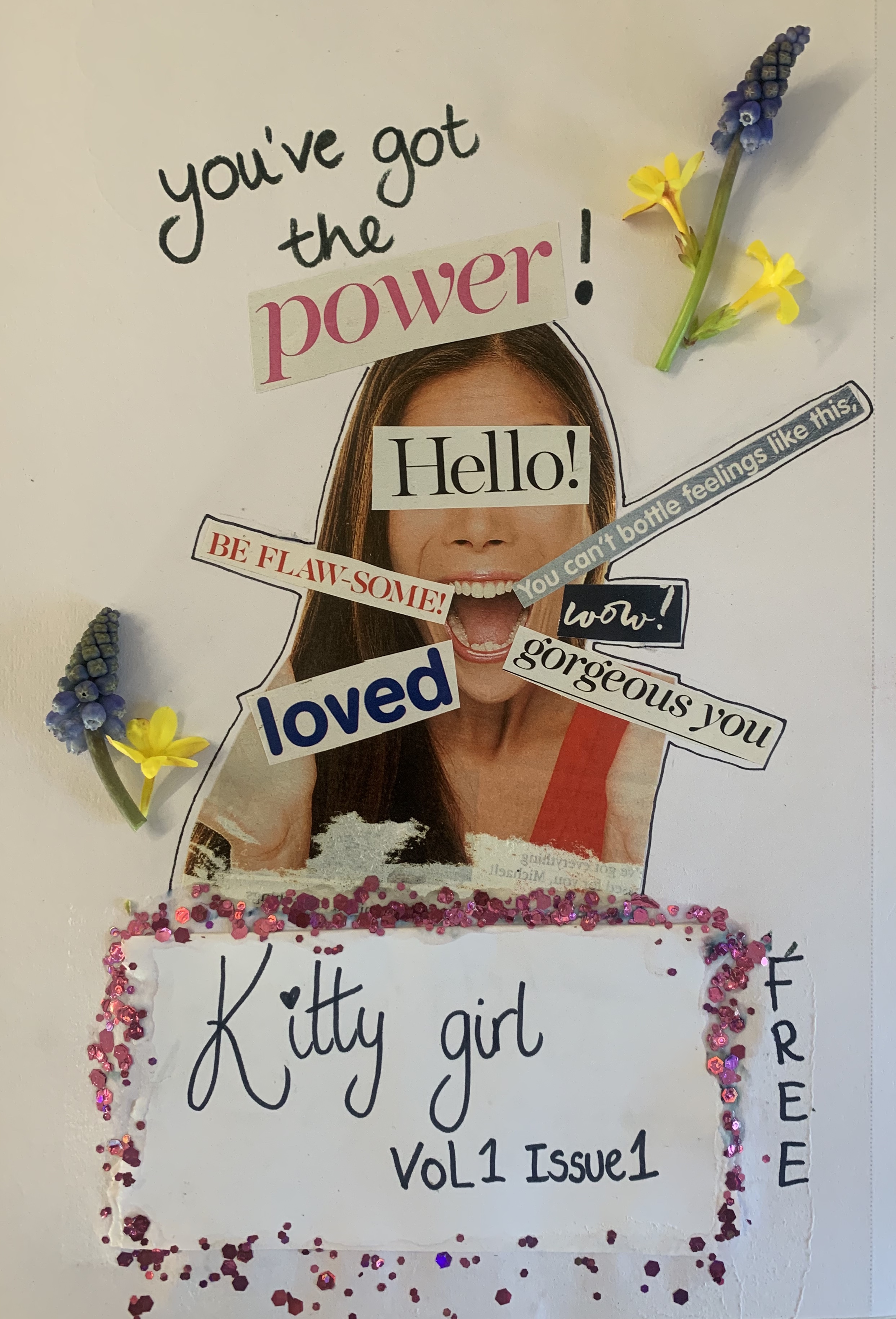
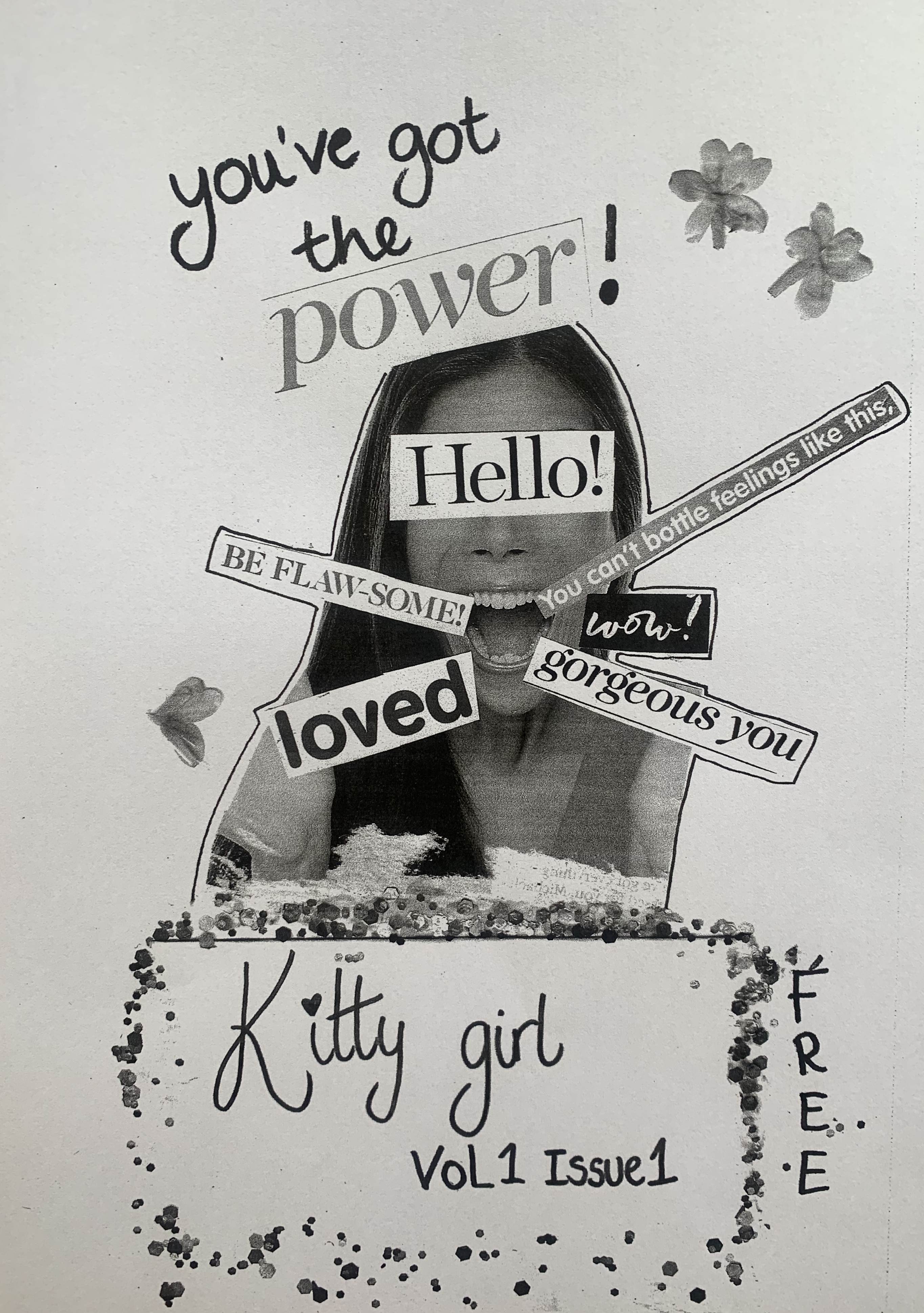
After my experimental designs I wanted to try create a real looking Fanzine, so I went back through my magazine and newspaper clippings to see if there was a particular theme that I could create. I decided to create a ‘girly zine’ after all thats what the majority of my magazines featured. I have combined the use of cut and paste and hand written text. I stumbled towards the end of this zine as I wasn’t happy with my writing of the title so ended up having to cover it with another piece of paper. I tried different techniques to make this look fitting and ended up creating a glitter fade to hide the join. Im really disappointed I made the mistake underneath however I had to carry on working with what I had, after all Zines aren’t meant to be perfect! As a last minuet idea I decided to add a few flowers to to give the zine an extra feminine touch, however the bluebells didn’t photocopy very well and left too much shading in the background due to the thickness. Im unsure of my thoughts on the photocopied flowers however I’m glad to of experimented with them.
Reflection
I really enjoyed this exercise, I love to work hands on and this was the perfect brief. However during this exercise I had to keep reminding myself that I was creating a Fanzine and not a Photomontage poster, as originally for design 2 I had created a face made up from a variety of different images!
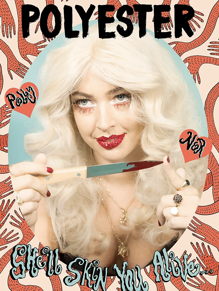
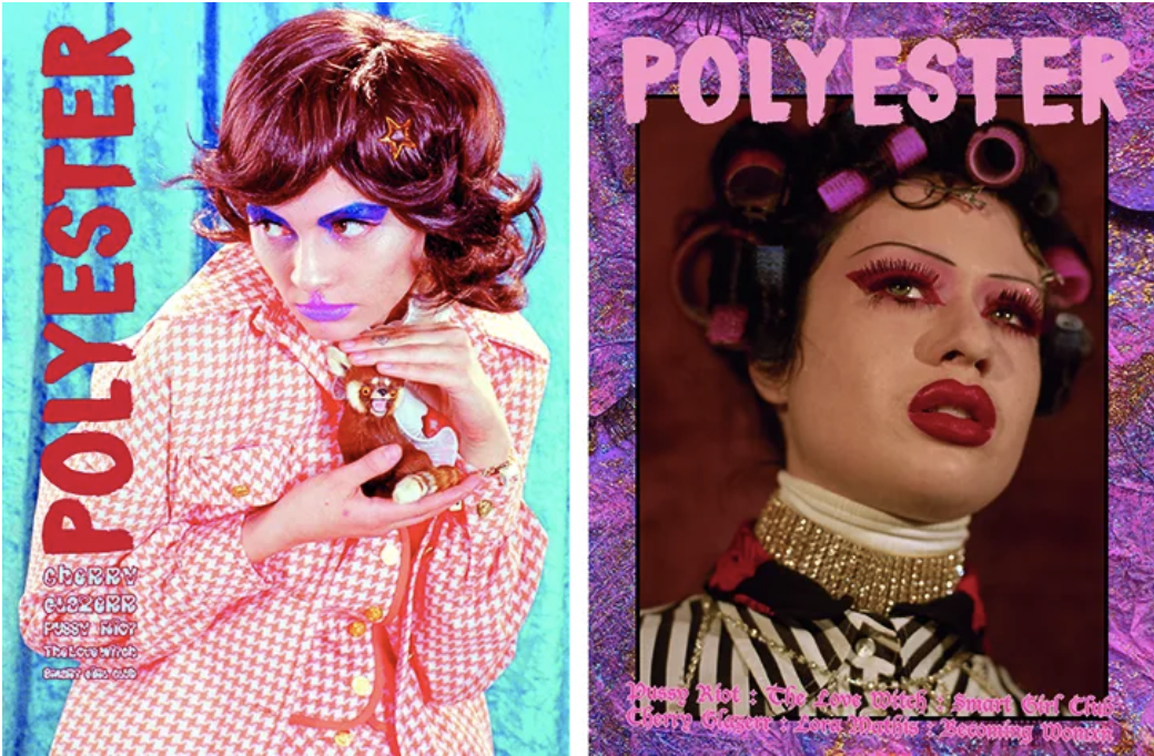
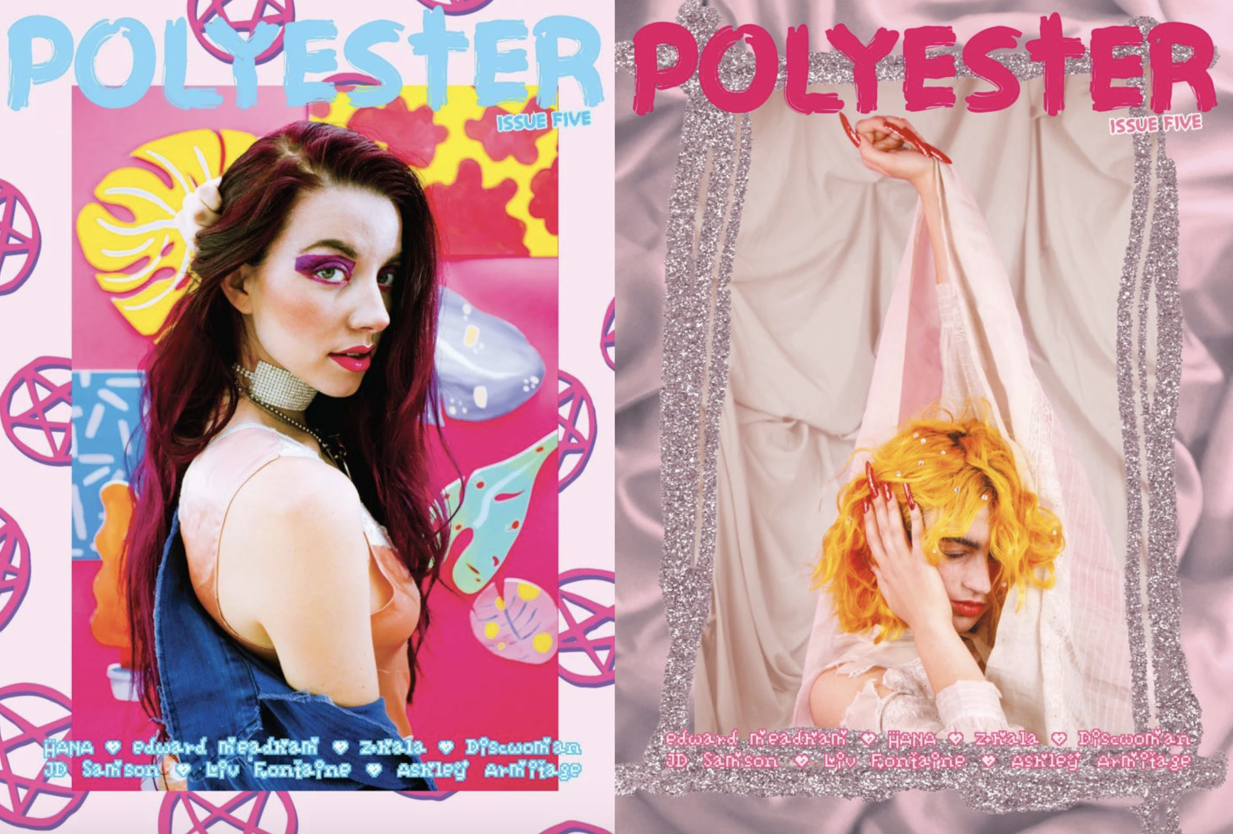
During this exercise I decided to look up Zine artists and came across Ione Gamble. Ione founded Polyester Zine in 2014, Polyester is one of London’s leading, independently published, feminist identity and culture publications. I found her work really quirky, cool and modern. It was Ione’s work that inspired me to use glitter on Design 3.
References:
Zine guide: https://thecreativeindependent.com/guides/how-to-make-a-zine/
Images used: Boots Beauty magazine July/August 2018 // The Sun on Sunday 16/06/19 // Take a Break Issue 21 // Daily Star 28/11/19
Ione Gamble: https://www.ionegamble.com/polyesterzine
