
Brief: Your first assignment asks you to create a small publication or fanzine based on your interest in books and their design. It allows you to introduce yourself, and your interests in book design, so that your tutor can get to know you and your work better.
Your fanzine can be digitally printed or handmade. Aim to design a sixteen-page simple folded and stapled A5 fanzine, though you can add more pages or change the scale, if you want to. You can use any medium or materials to generate your artwork and make you publication. You may want to work much larger and reduce your artwork for the fanzine. While visually it doesn’t have to look like a punk fanzine, try and embrace the lo-fi ‘cut and paste’ attitude, so you’re making the work relatively quickly and not too preciously. Be creative with this task both in terms of the content and how you choose to present it, this could extend to challenging some of the assumptions about what fanzine should look like, or how its made.
Use the work you have produced so far, in the earlier exercises, as a starting point for your content. Not all of this material needs to be included in your fanzine. You may want to develop new visual ideas, or add to the work you have already produced.
As a guide, your fanzine should contain the following elements:
- Introduce yourself – say something about your relationship with books. Why are they important to you? Communicate this through writing and images.
- Your creative process – how do you work creatively, what sort of process do you follow to research and generate ideas, and what are your preferred mediums to work in. Say something about you as a creative practitioner and your approach. Show your approach to book design through your design decisions and the hands-on sense of immediacy and energy that is an attribute of fanzine design.
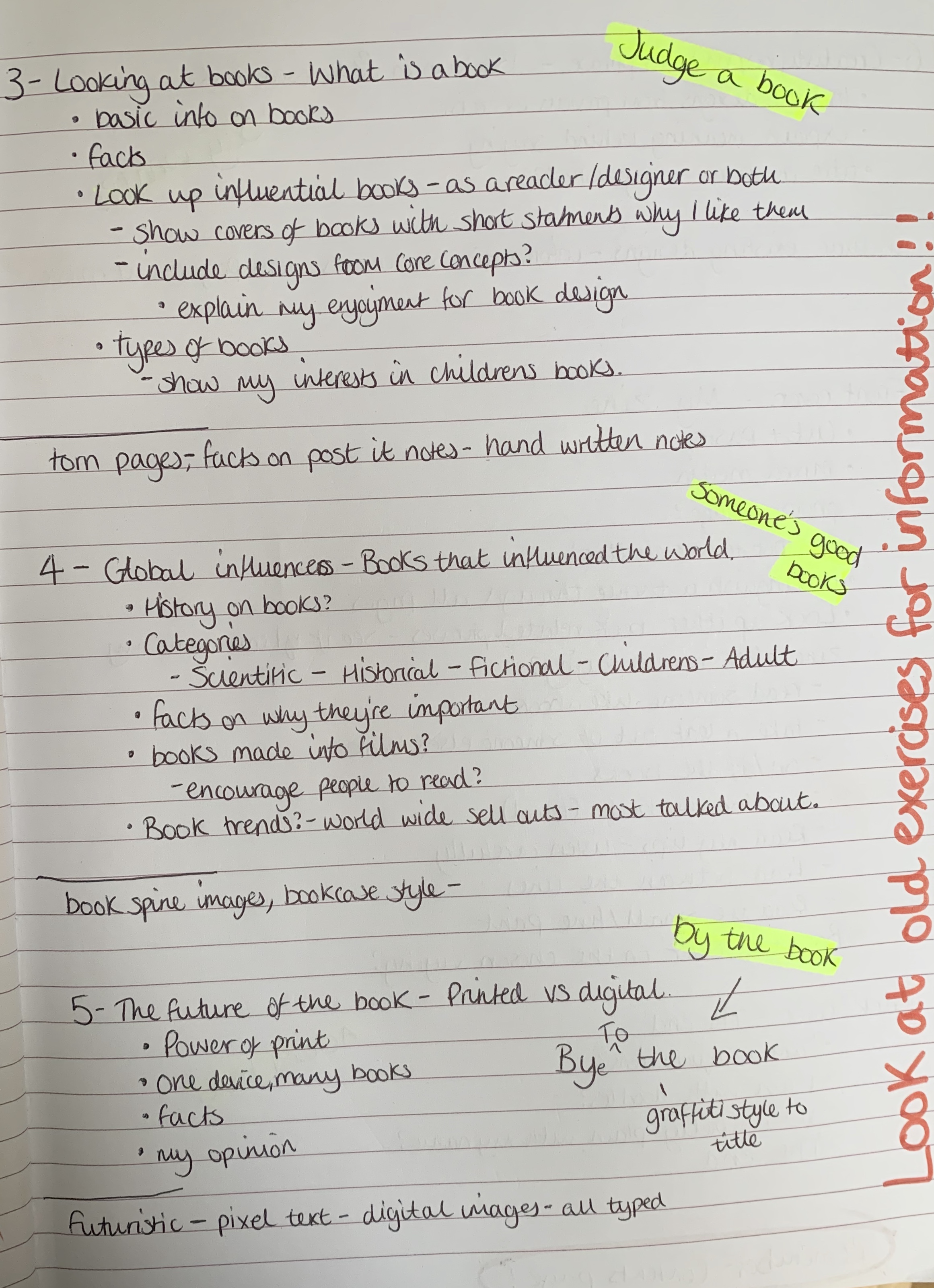
- Looking at books – present the most interesting books you’ve looked at, or those you find influential as a reader, designer or both? Present a selection of books, or focus on one particular example to present in more depth. Think about how you can present these books, and your reflections, in visually engaging ways.
- Global influences – which books with a wide reaching scientific, artistic, historical, political, geographical, fictional, poetic, religious or other impact have you chosen. Present them along with a brief rationale as to why, or how these books have affected you personally. Again, can your designs echo the ideas in these books anyway?
- The future of the book – where do you see the book heading? Show and tell. Try and summarise your thinking into a seres of short statements, quotations, images or ideas. Be creative in how you approach this.
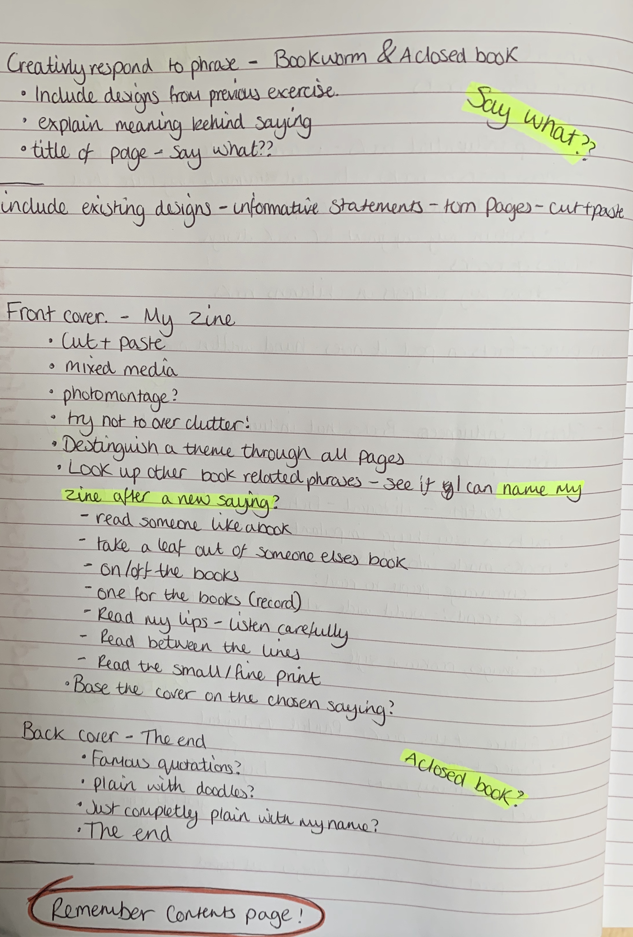
- How can you creativly respond to one or more of the following book related sayings – Bookworms, A closed/open book, The oldest trick in the book, You can’t judge a book by its cover, In someone’s good/bad books, or, by the book. Use your fanzine to present your ideas. Can any of your images, text or ideas also feed into your cover designs?
Using your learning log, keep notes to accompany the making of the publication. These notes could cover why you decided to portray what you did, what you included and what you omitted. See it as a way to document and reflect on your creative design process. Remember that this is an opportunity to experiment with your ideas, so document your creative process, the various stages of your work, and any ideas you rejected along the way. Aim to do this visually by photographing, scanning or taking screenshots of your work in process and sharing them in your learning log. As your first book, there’s room to make mistakes, take creative risks and enjoy the creative process, so don’t worry too much about getting it ‘right’. If your visual research takes you away from the above categories, that’s fine, after all they are just prompts to start the dialogue about your interest in book design.
Analysing the brief
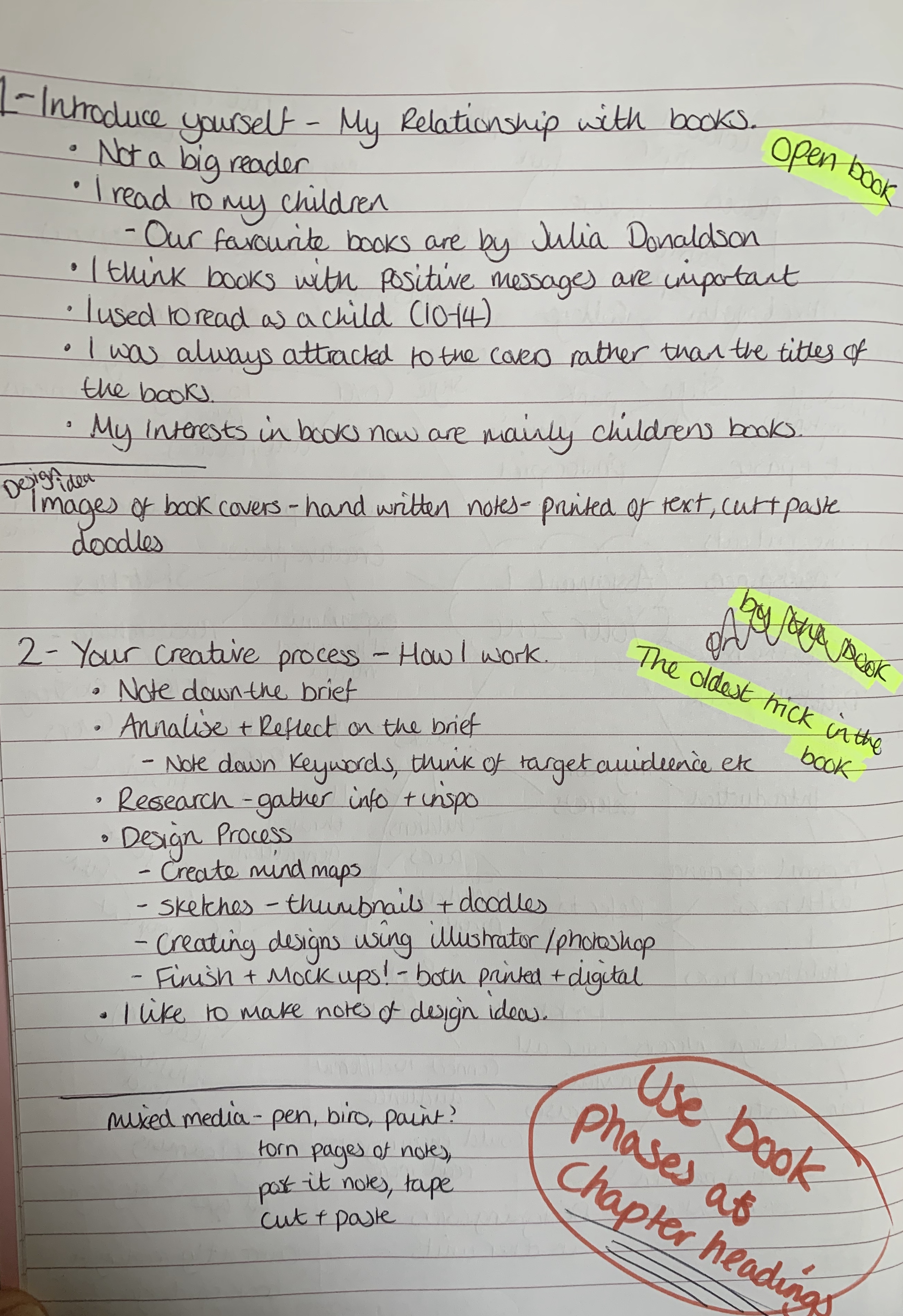
For this assignment the brief is asking me to create a fanzine to introduce myself and my relationship to books to present to my tutor, as well as putting into practice the skills and knowledge I have learnt from the previous exercise’s and tasks.
Keywords: Fanzine, A5, Interest in books and their design, 16 page, simple folded, any mediums or materials, lo-fi cut and paste, be creative.
Reflections on brief: I feel slightly overwhelmed by the brief and the amount that we have to contain, although the majority of the contents we have already covered in previous exercises. However I do feel sometimes being chucked in at the deep end will help confidence grow upon completion.
Generating ideas
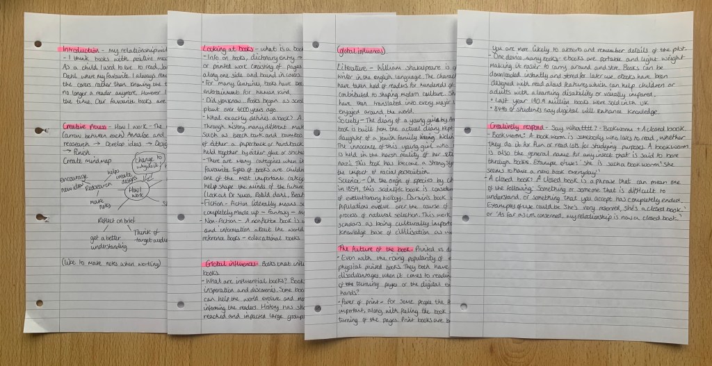
I started off by creating a mind map on things to consider when making my zine. I usually start off my creative process by researching however I thought if I have ideas in mind I can concentrate on research relating to those topics or themes.
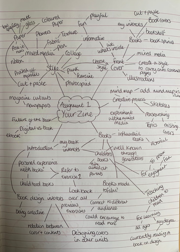
After creating my mind map I wanted to make notes of what each page could feature following the bullet points in the brief. I felt this would be the easiest way to start ideas flowing by making these notes. I will treat these as a guide, which I can add to when new ideas steam.
Research
I wanted to refresh my memory on fanzines so I started to gather some ideas of inspirational zines and the styles that I would like my zine to include.
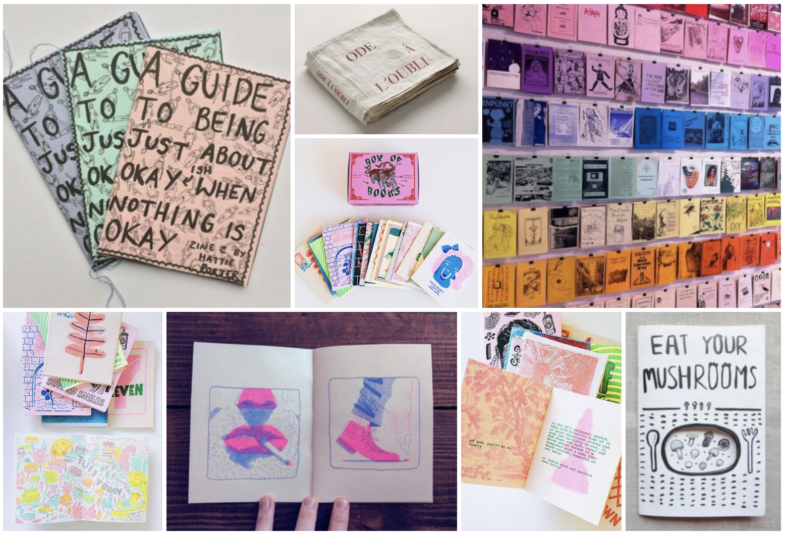
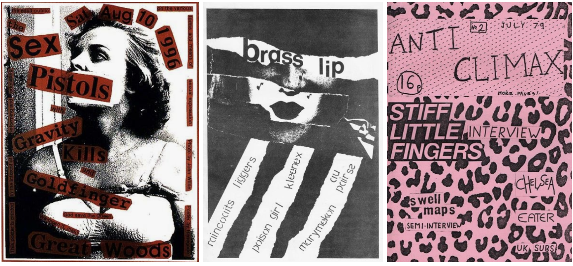
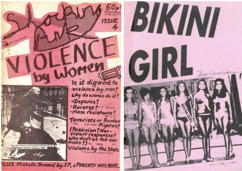
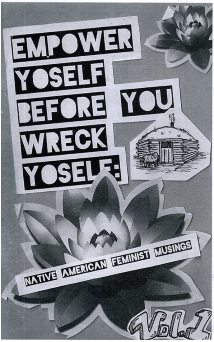
All images sourced from Pinterest (https://www.pinterest.co.uk/search/pins/?q=zine&rs=typed&term_meta[]=zine%7Ctyped)
As you can see from the selection above, I am attracted to the use of colour and bold writing. At the moment I am unsure if I would like my zine to appear in colour or for it all to be photocopied in black and white to give a lo-fi look, or if I would like to create more of a digital zine. This will be something I will experiment later on.
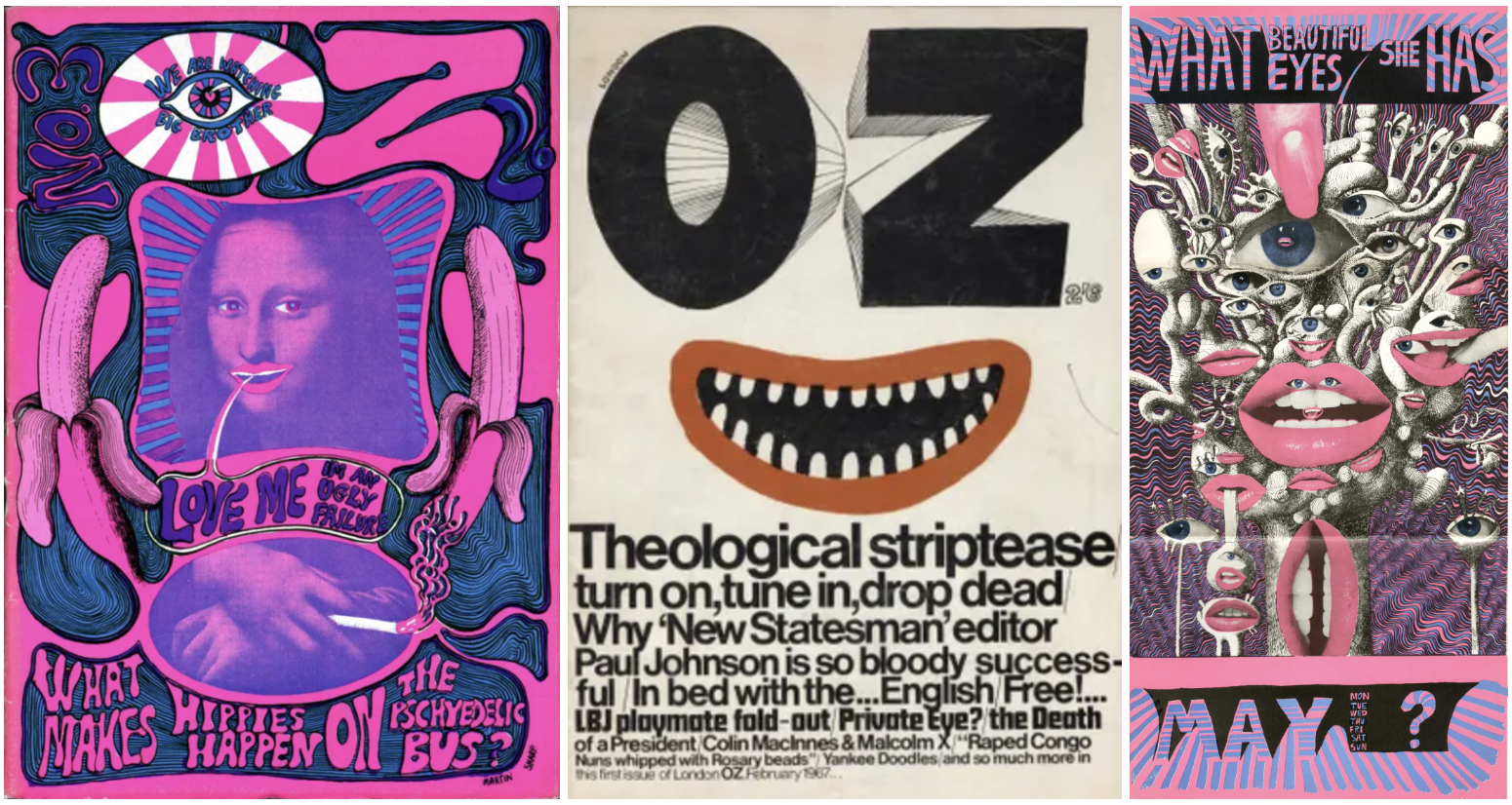
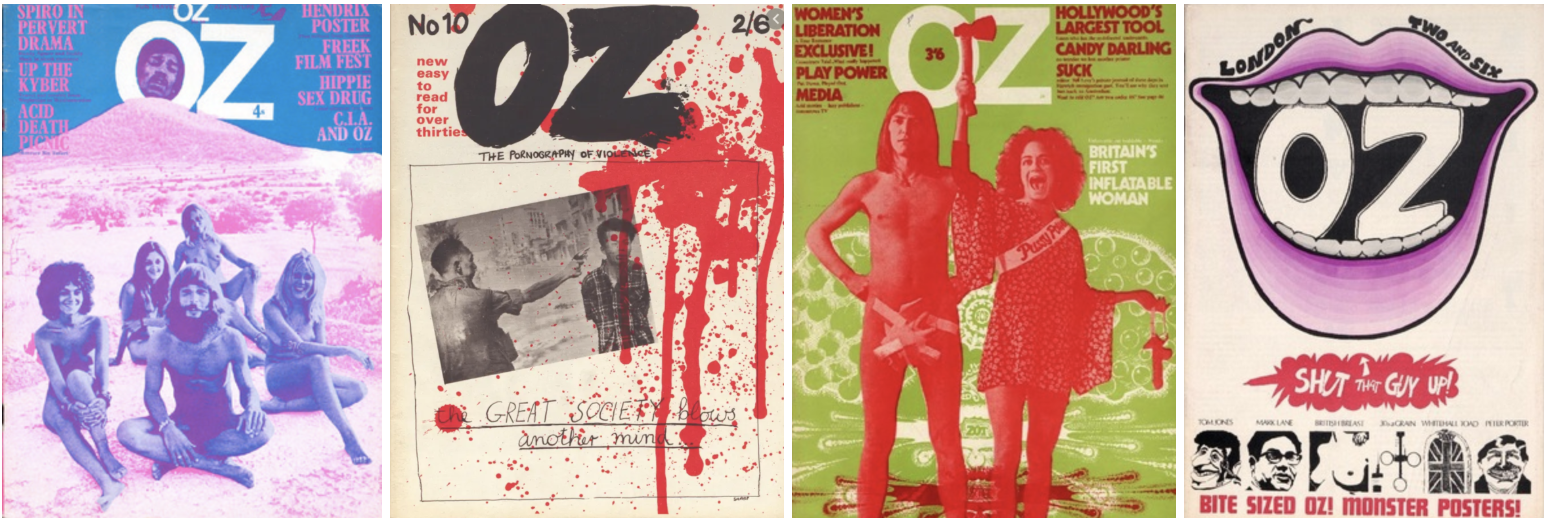
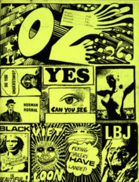
https://ro.uow.edu.au/ozlondon/
I came across the zine ‘OZ’ which was an independently-published, alternative/underground magazine associated with the international counterculture of the 1960s. I find the designs visually exciting, interesting and inspiring, especially the first with the Mona Lisa image which was the first Oz zine I came across.
https://issuu.com/caseyrawson/docs/classzine_2020_online
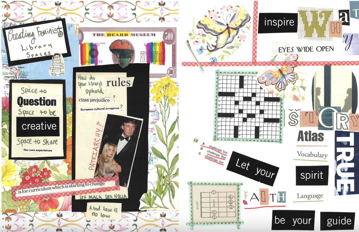
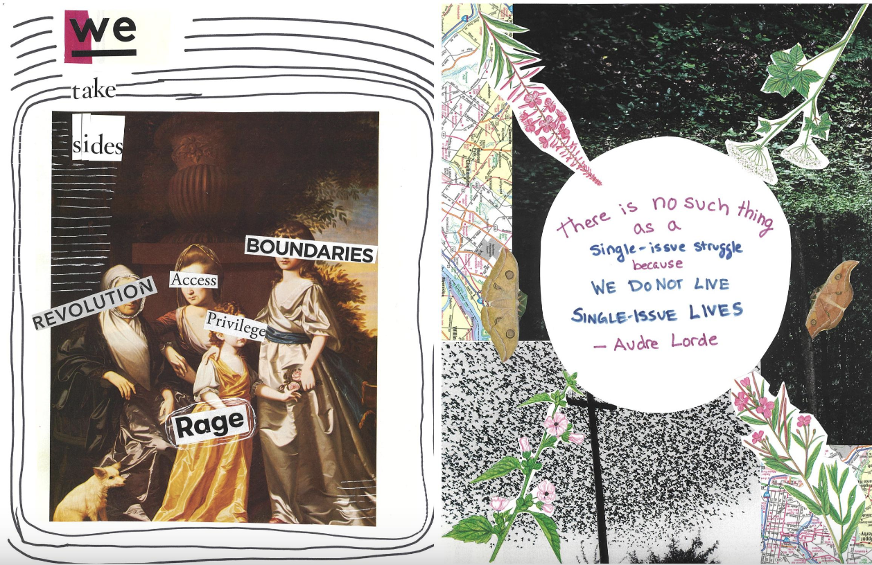
During my previous module I used issuu.com frequently during appropriate exercises, so I searched in zines and came across a few digital versions. This is the first time I have ever seen a zine from front to back rather than just seeing the front covers. I found it very helpful and interesting to see the contents of the zine and to see how it has been laid out. This particular zine is called ‘Critical Library Pedagogy: A Collaborative Zine’, it was made in a school for a Library Instruction and Pedagogy course.
https://issuu.com/jeannecoppens/docs/zinefinal_for_issuu
Another interesting zine which I came across on issuu.com was ‘Another University is Possible! Zine’. The contents of this zine are different from the last, it seems that this is more informative with articles on one page and the opposite page being more zine like with the use of collage and written notes.
Its interesting and helpful to see the contents of a few zines to give me inspiration and a slight guide for my work.
Mixed media
I started to think about mixed media as this is something I would be interested in using for my zine. I love the effect of different textures and mediums coming together within an art board. Firstly I started off by gathering general information and looking at different art works/artists.
In visual art, mixed media is an artwork in which more than one medium or material has been employed. Assemblages and collages are two common examples of art using different media that will make use of different materials including cloth, paper, wood and found objects. (https://en.wikipedia.org/wiki/Mixed_media)
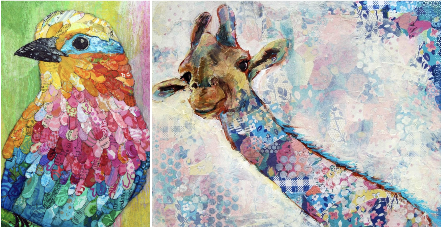
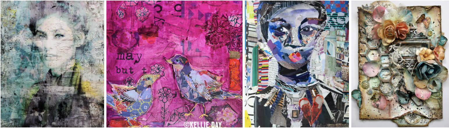
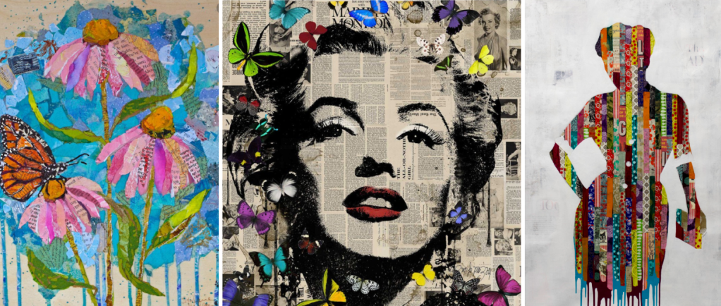
All images sourced from google images
Intrigued by the Marilyn Monroe piece above, I decided to look further into the artist as not only is it one of my favourite mixed media art works that I came across, I also feel it is very fitting to this unit as it is painted on magazine/newspaper articles and book pages. The artist’s name is Veebee Veebee, upon research it seems that the artist doesn’t want to be known according to their website; ‘I don’t want much to be known “about me”. I am not trying to be elusive as some people might say. I just think what is important is the artwork, not the artist. I want you to have my work on your wall, not based on who I am, where I have studied or where I have exhibited my work. I don’t want to get between “YOU” and the artwork. I want to live quietly behind it…’. I thought this was very powerful statement! I feel many people are influenced more on bragging who their artwork is by rather than the actual art itself.
I found a few more pieces which I found inspiring.
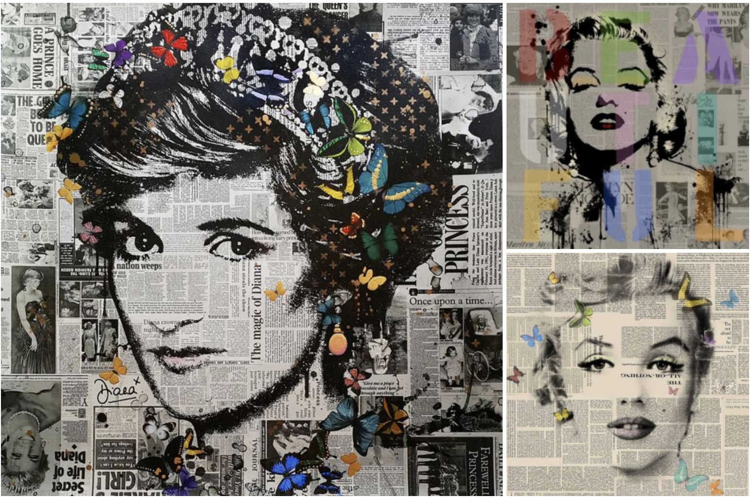
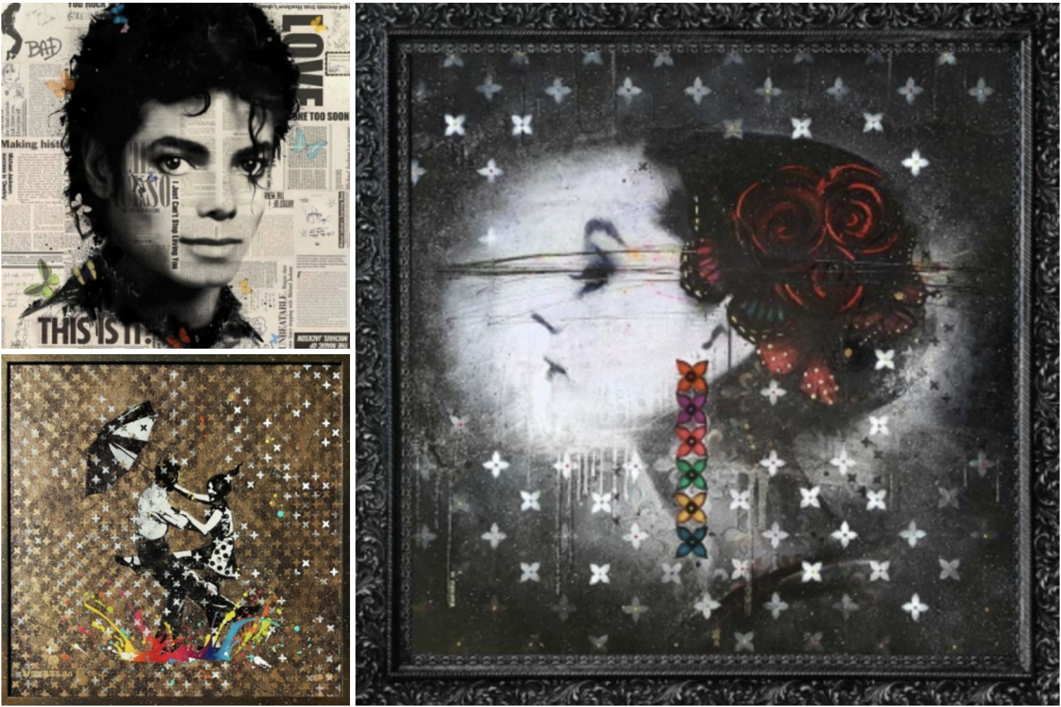
https://www.veebee.co/search/for/mixed+media/?scroll=238
I think the easiest and most organised way that I can research information relating to each of the elements listed in the brief will be to do it as I go along.
Developing Ideas
After researching mixed media I wanted to explore different mediums that I could use within my zine, I gathered different types of paper – Lined paper, scrunched up paper, brown paper, post-it notes, tissue paper, graph paper, grid paper, hand writing paper and card. Along with different pens, pencils, paints and embellishments. I want to add a variety of texture to my zine and make it as fun as possible.
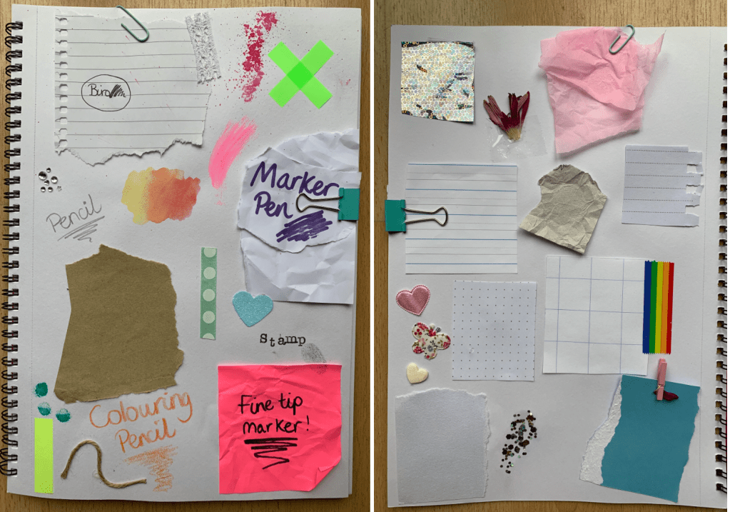
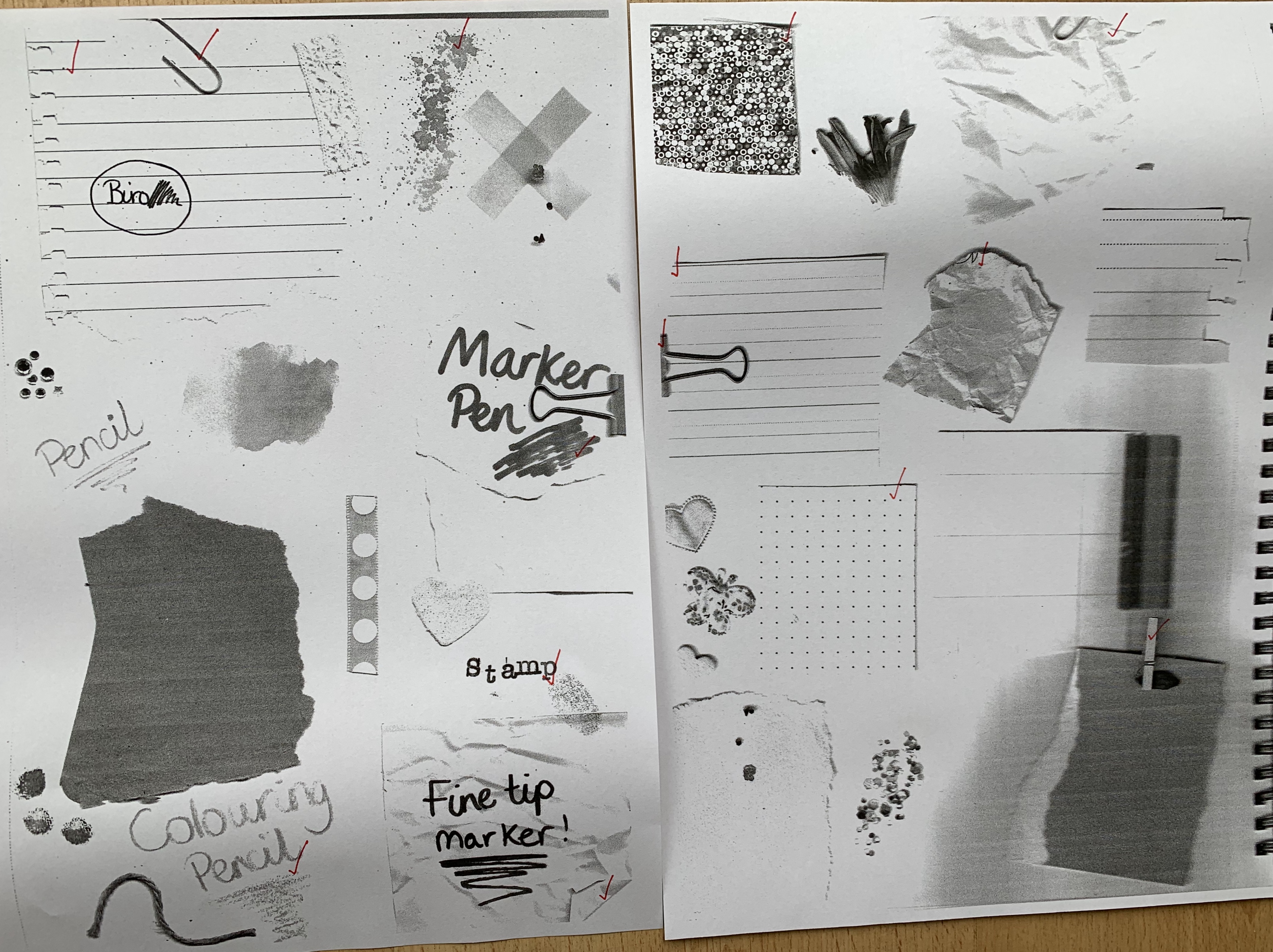
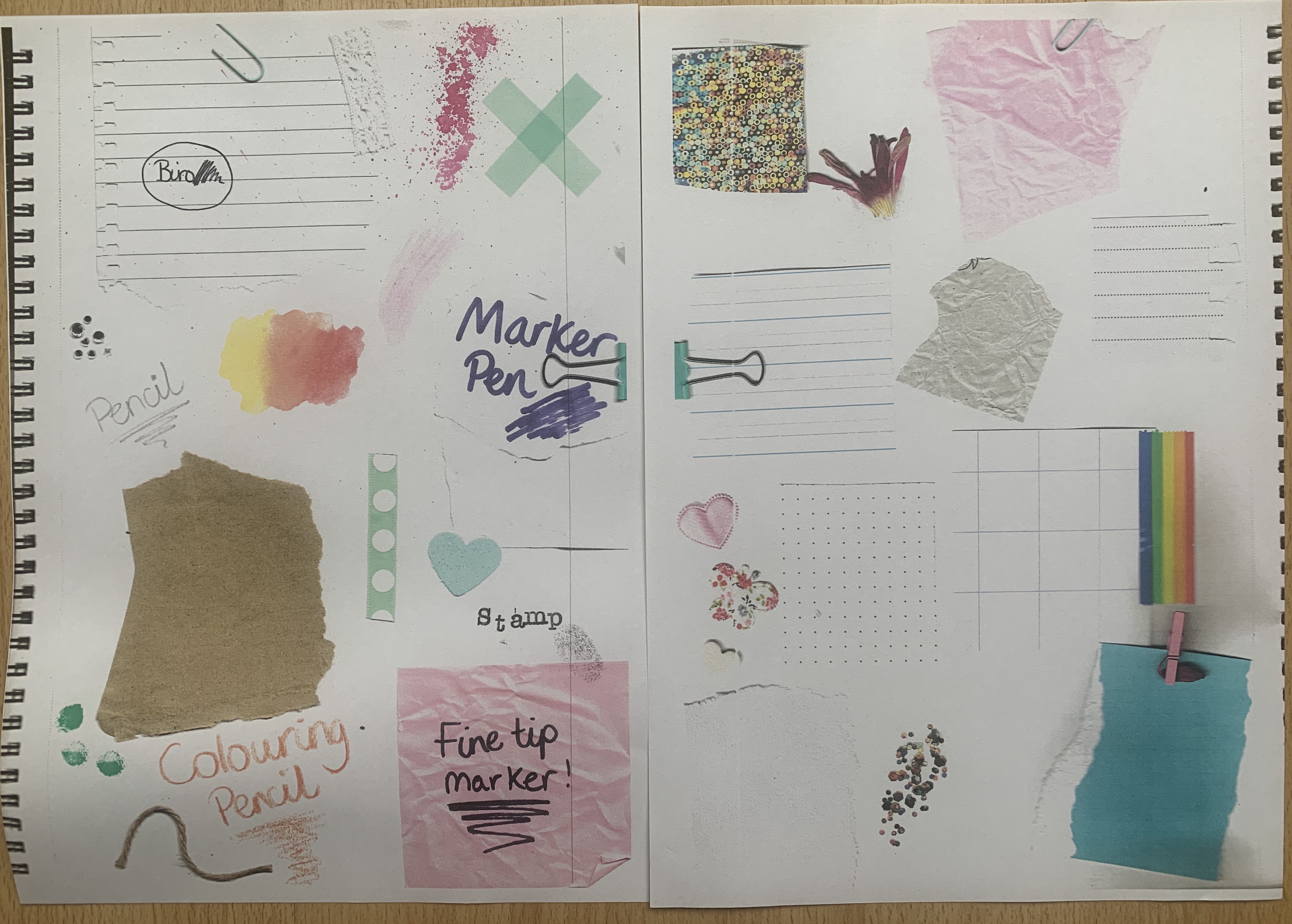
I then scanned both pages of mediums to see how they appeared both in black and white and in colour. A few worked better than others, I like the thought of each topic having a different style paper background, e.g one plain, one lines, one graph etc. some however seemed to fail, but I’m glad I experimented with everything I could find around my house, this will be time saving for future projects too!
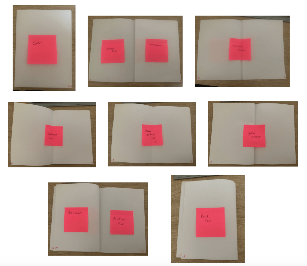
I decided to create a mock-up of my A5 zine. I felt this would help me to visually look and organise the way my zine is laid out. It will also help when it comes down to organising each page for print as I will clearly be able to see the relationship between the pages and distinguish the ‘printer pairs’.
Thumbnail sketches
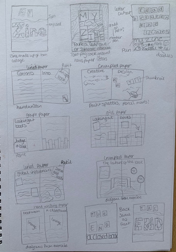
Once I had created my mock-up knowing which topics belonged to what pages, I decided to sketch a few layout design ideas. I didn’t want plan too much for my zine as I feel that they are best created without structure, however I like to work with a slight guide.
Design Process
I started off by gathering all my chosen elements for my zine by scanning different types of paper and by using paint marks and splats.
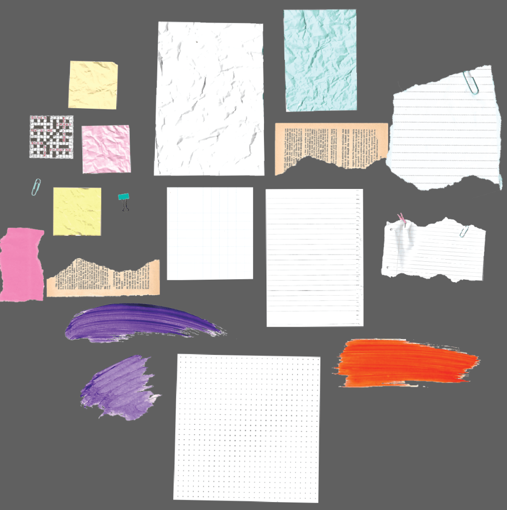
I scanned everything then cut out each element in photoshop. I decided I wanted to use type rather than my actual handwriting because I thought this would be easier to edit as I go along rather than being limited to whatever material I had written on. My plan is to create a digital fanzine with a handmade cut & paste look. I will then test out the end results in both colour and black and white copies.
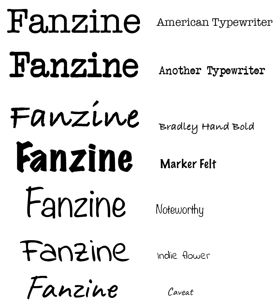
Before I started creating my zine I wanted to gather all my written work so I knew how much room I had to play with per page. I wrote up all of my notes containing information from previous exercises and with new information found via research. I followed the guide I had made right at the start where I listed what should be included with each heading. I tested out some handwritten typefaces along with typewriter typefaces and narrowed the choice down to 4; Another typewriter for headings, American Typewriter for large amounts of text and Caveat as the main handwritten font with Noteworthy as
After feeling happy and confident with my written work I went into Illustrator to create my zine with my sketches and notes beside me. I didn’t want to plan to far ahead with what went where as I felt this could take away the handmade effect if it looks too structured and perfect.
Im really happy with the look of my zine so far and feel the use of bright colours helps my personality shine through into my work. I downloaded images from Pexels.com, printed them off, cut and scanned back onto my computer so it followed the style of the zine. I also used my own designs such as book covers from previous exercised during Core Concepts, the illustration I made for The future of the book infographic and the designs for the book phrases, I felt by adding in these graphics it would help make my zine even more personal.
I found my plain mock-up which I created at the beginning of this assignment extremely helpful for this next part, by opening up the mockup I could see which page needed to be paired with what in order for it to be printed correctly.
I then printed out my first mock-up of my zine, I found the double sided printed slightly challenging at first and found myself really needing to concentrate on which way I place the printed paper back into the tray however once I figured it out it was easy to remember. Once printed I decided to critique my work in order to print off my final design.
I made notes on each page, one of the main problems on most of the pages was the art boards had been lost within the printers bleed, so I knew I had to adjust the printer settings for this issue. I had corrected a few spelling errors and slightly moved a few text boxes but other than that I was happy with how everything looked. My next experiment was to see how it looked photocopied in black & white.

Seeing my zine in black and white after seeing and designing it in colour I feel it takes away a massive effect to the zine and also takes away some character. Some of the text and elements where lost when printed in black and white too. I prefer my zine in colour as I feel it gives the best impact and also when stated in the brief this assignment is to introduce ourselves to our tutor in the way we present out work, and the use of colour is something I would consider as one of my designer styles, if I have the opportunity to use colour in a design I will give it 110%.
Design mock ups
Firstly, I created a printed mock up of my zine. I had a successful experience with the printing on this mock up following my critique from above, this was a bonus as it saved time and materials.

I came across http://www.flipsnack.com which allowed me to create an interactive digital version of my zine. This feature will be really helpful for my tutor to see my zine clearly and to get the full impact. (see link below)
https://www.flipsnack.com/Rmayes/screenshot-2020-03-05-at-10-03-27.html
Reflection
I really enjoyed this assignment, I found it fun and imaginative. I love to work physically with materials and experiment with what works and what doesn’t. At first I felt slightly overwhelmed with the amount work that was being asked to do but once I read through everything properly it wasn’t as daunting as I thought, most of what we were asked to do we’ve covered during previous exercises.
Reflecting back on my zine I am happy with the end result. Im glad I experimented with different elements and also with my zine in black and white. I decided to include on each page a different phrase which could slightly relate to the contents of the set page, I thought this would be a good way to creatively respond to the terms. Below I have written slight analyses of the pages for my zine:
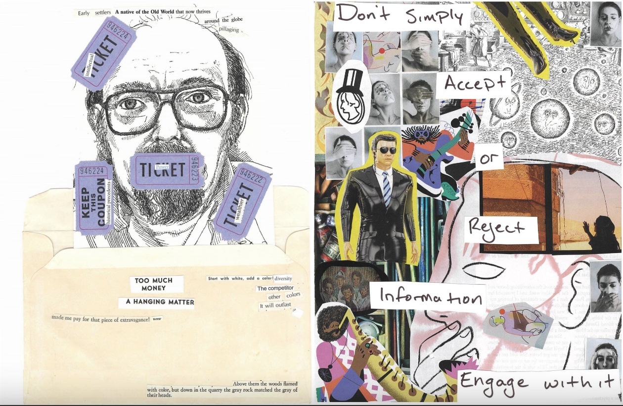
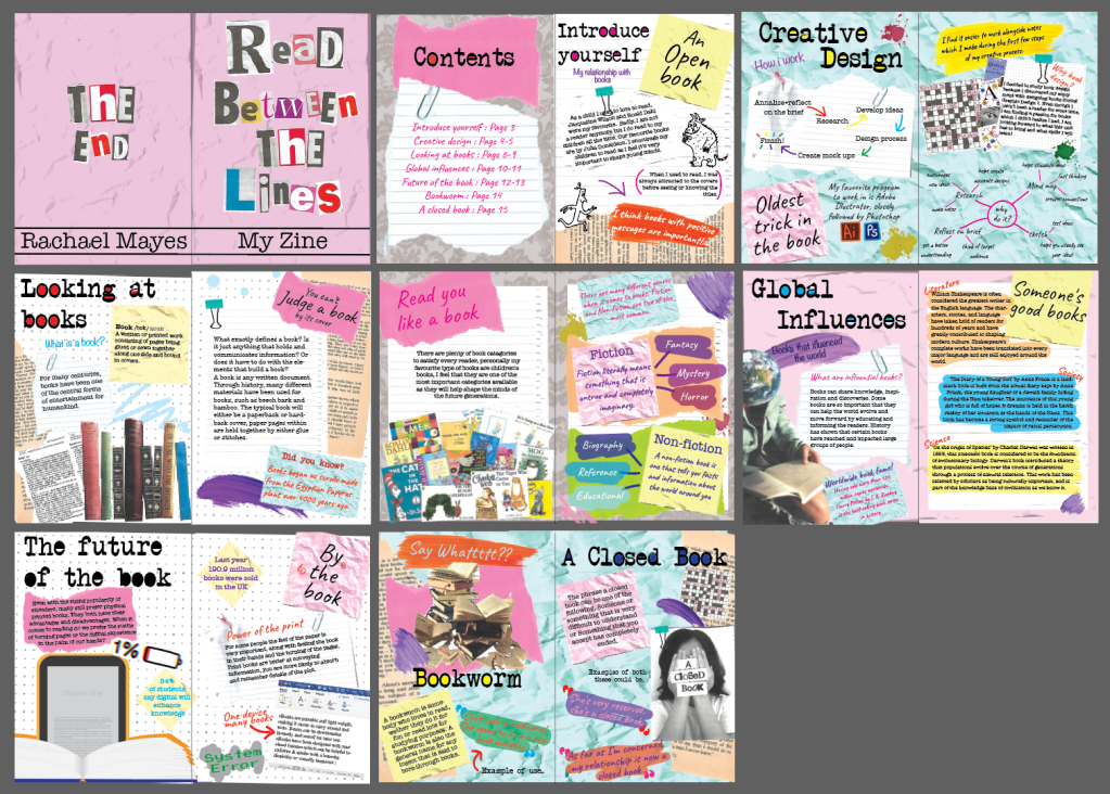
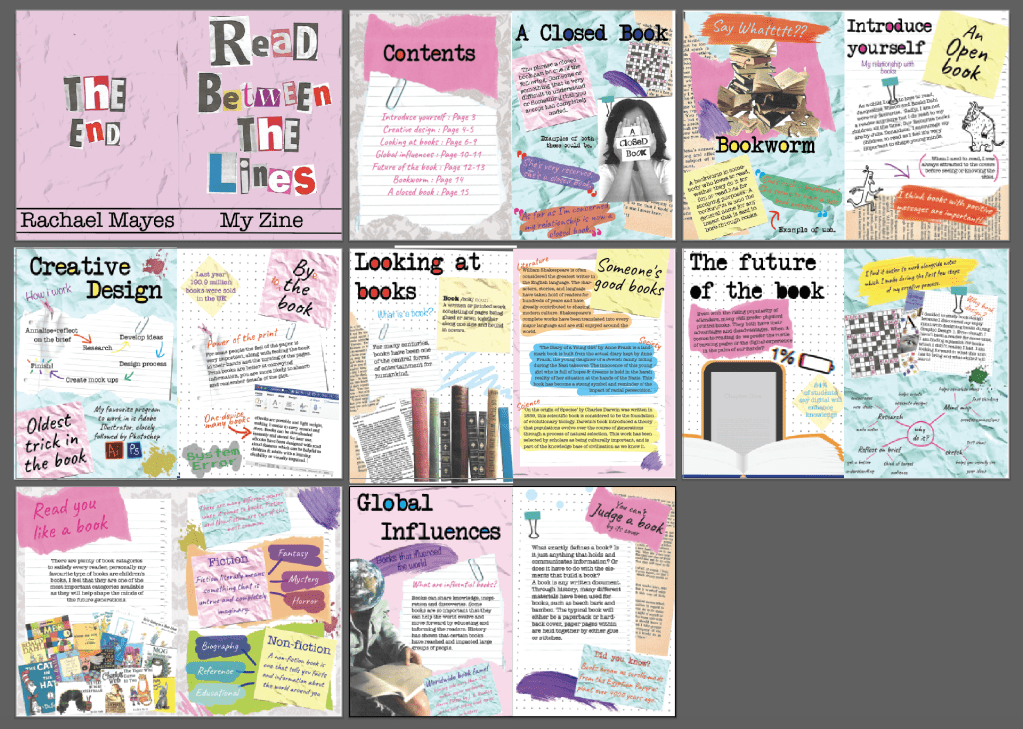
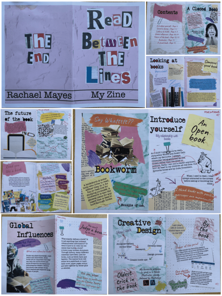
- Front cover – For the cover I decided to name my zine after a book related phrase, I cut out letters from newspapers and magazines, scanned them and placed it over the top of a previously scanned image of crumpled paper, to add colour I used a coloured rectangle with low opacity. I feel this creates a strong, clear, eye catching cover. I wanted the theme of cut and paste to be present from the very beginning.
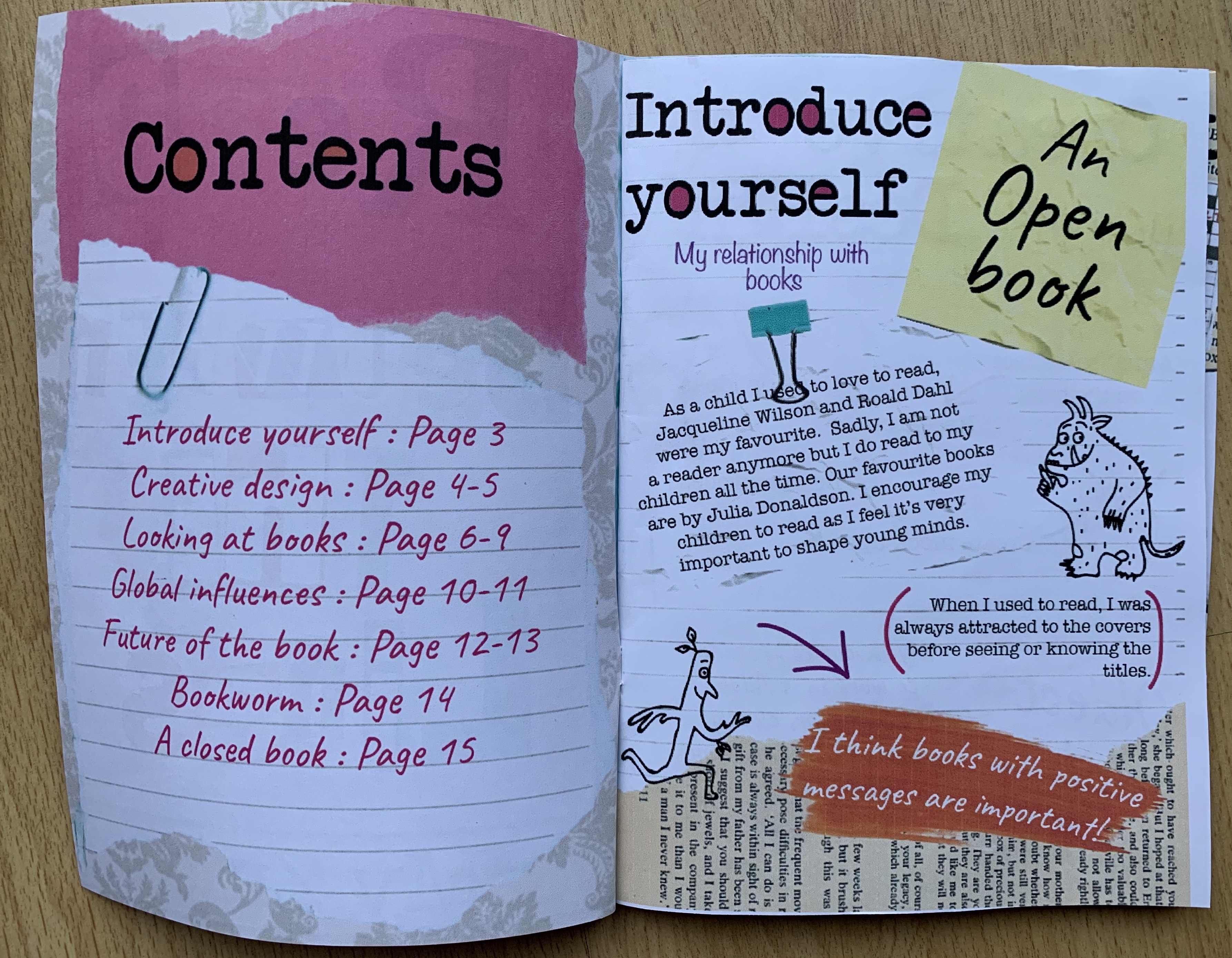
- Contents page – For the background of the contents page I used a stock image of ‘Damask print’ and lowered the opacity to make the pattern softer, I wanted this page to be subtle and minimal as I knew the majority of pages would be busy and full.
- Introduction – I found the introduction challenging, as mentioned I don’t have a strong relationship with books so I started off feeling stuck with words, instead I spoke about the relationship I try encourage my children to have. I sketched the illustrations from two books we enjoy reading which are Stickman and The Gruffalo, I then uploaded these onto my laptop and traced over the top using the pen tool in illustrator, I thought this would create a nice personalised touch. I decided to use the phrase ‘An open book’ for this page as I was opening up and introducing myself so felt this fitted perfectly.
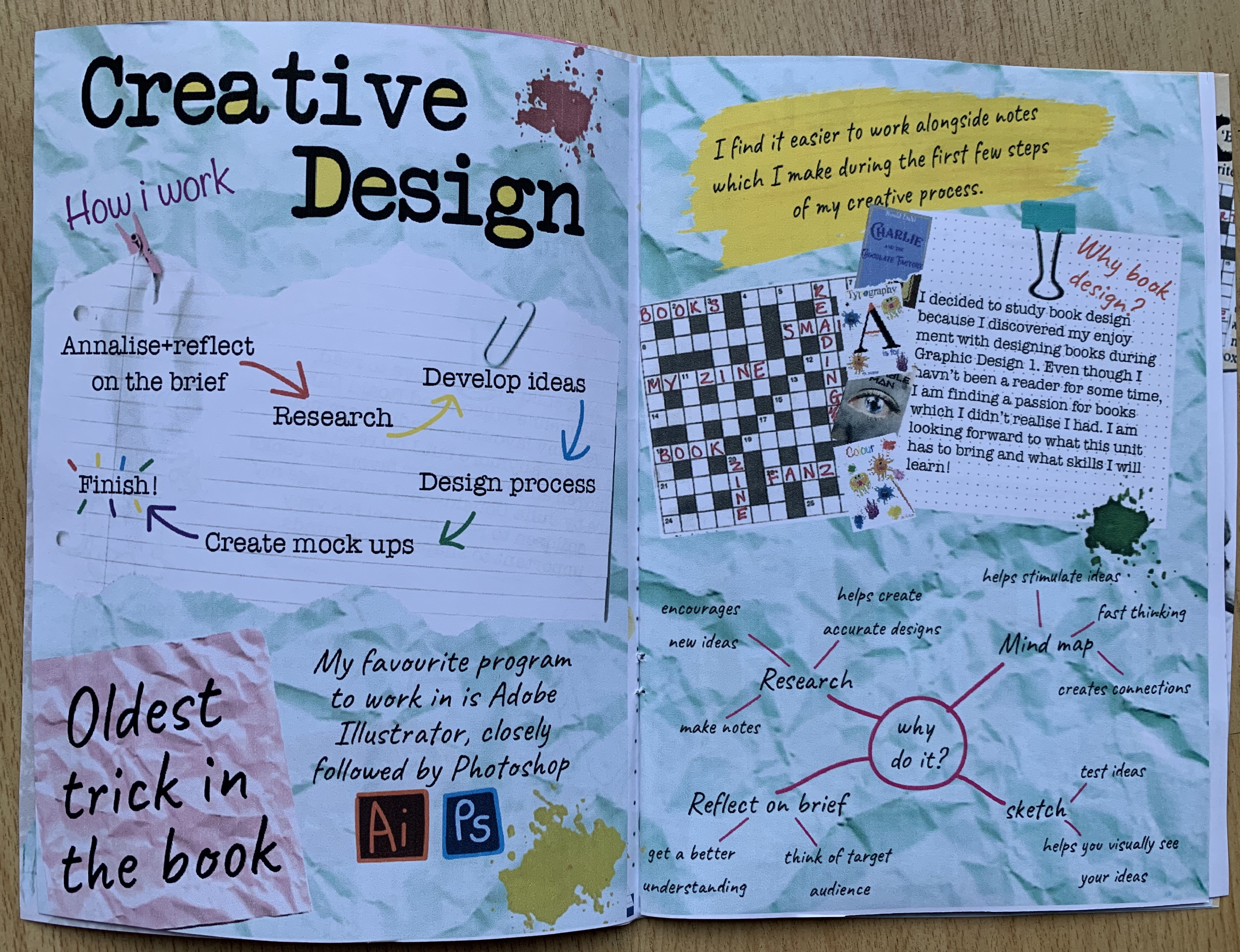
- Creative process – I wanted this page to be clearly set out as for some this process can be messy whereas I tend to work neatly and organised and wanted it to reflect here. I listed a basic flow chart of how I work with a more detailed mind map on the opposite page. I added 4 of my own book designs on this page to add in a personal touch, I also spoke about why I decided to choose this unit. I used the phrase ‘Oldest trick in the book’ as just before now.. I thought the meaning was similar to following rules – however! I have just searched it up and seen the actual meaning is dishonesty! So this has been a learning curve for me as it was something I didn’t research properly.
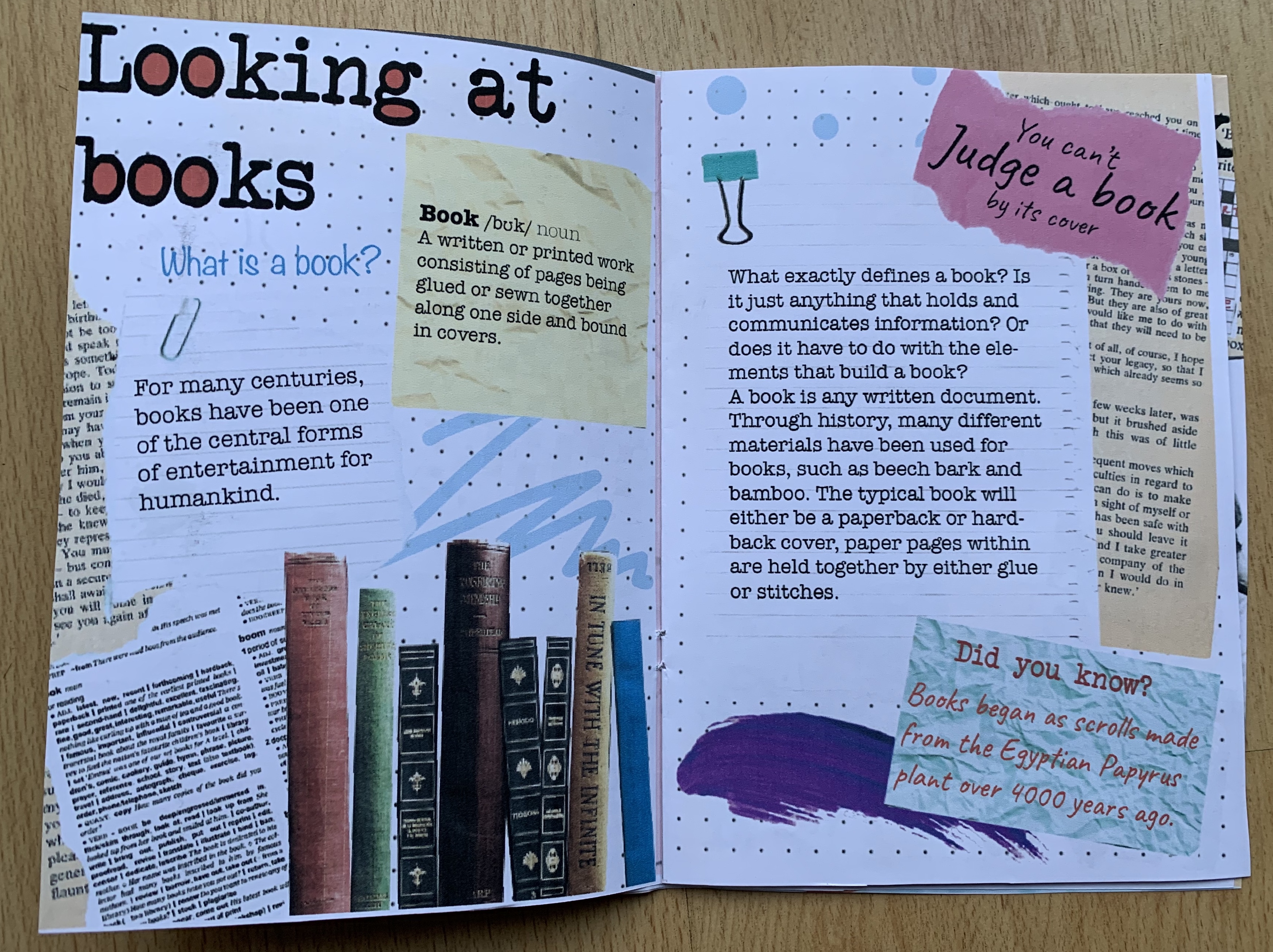
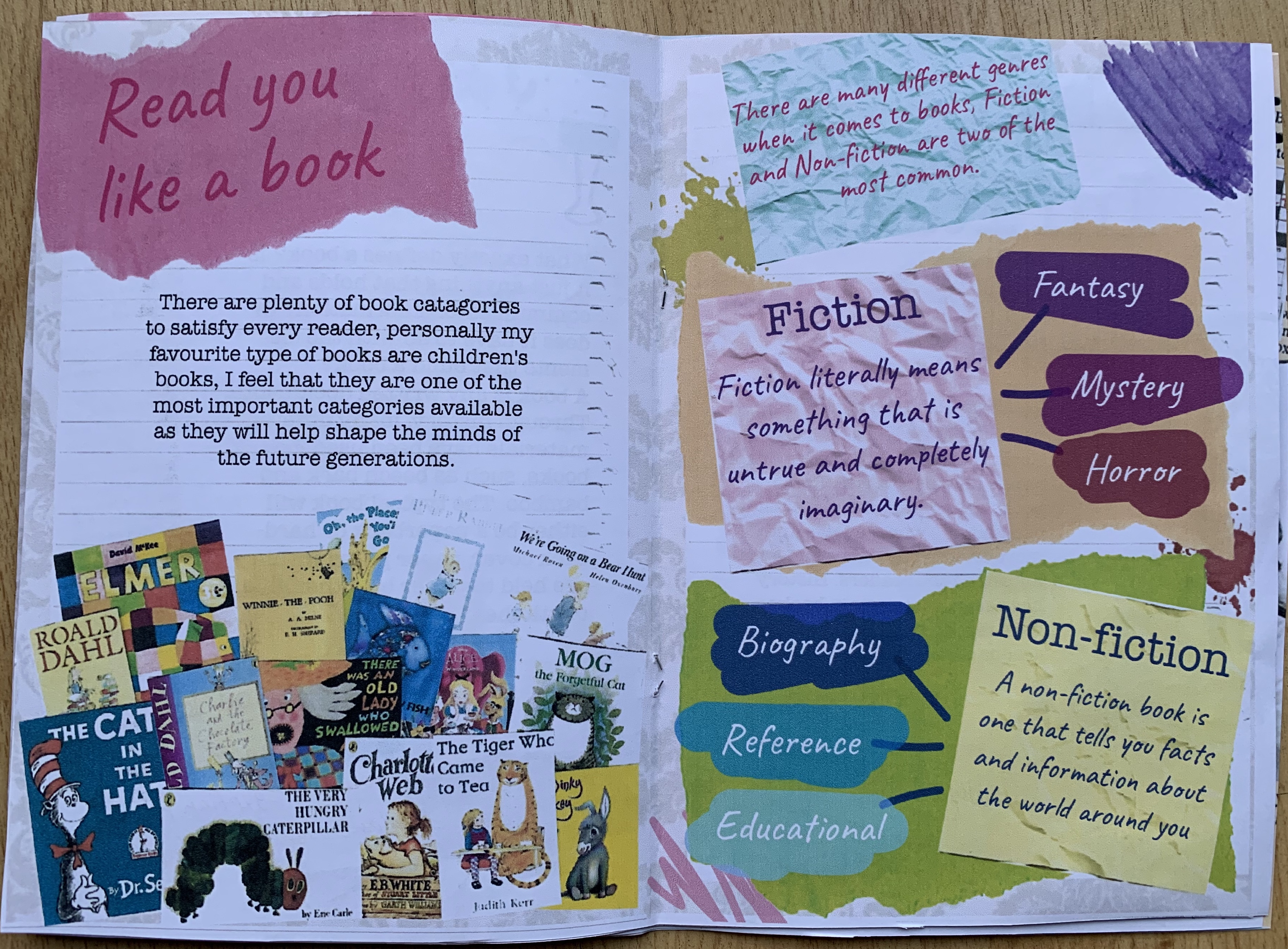
- Looking at books – I decided to create this topic as a 4 page spread, I felt that It would be the easiest to talk about and give information on. The first two pages I decided to give information about the book, this included the dictionary entry for the word book (Cambridge dictionary) and facts. I printed off some book spines found on pexel.com, then cut them out and scanned them back onto my laptop to give the image a more grainy cut and paste effect. On the following page I decided to talk about my interest in children’s books and again printed off a few children’s book covers, cut them out and scanned them back in. I like the collage effect on this page. I then spoke about the two main book genres being fiction and non-fiction. I changed the colour balance of one of the torn pieces of paper in photoshop to create two different coloured papers to give a more colourful effect. I used two phrases for this topic, one per page, for the first I chose ‘You can’t judge a book..’ I felt this was fitting considering I was talking about the history and facts behind books themselves. And the second ‘Read you like a book’ because I had opened up about what I feel is important and gave information on other genres.
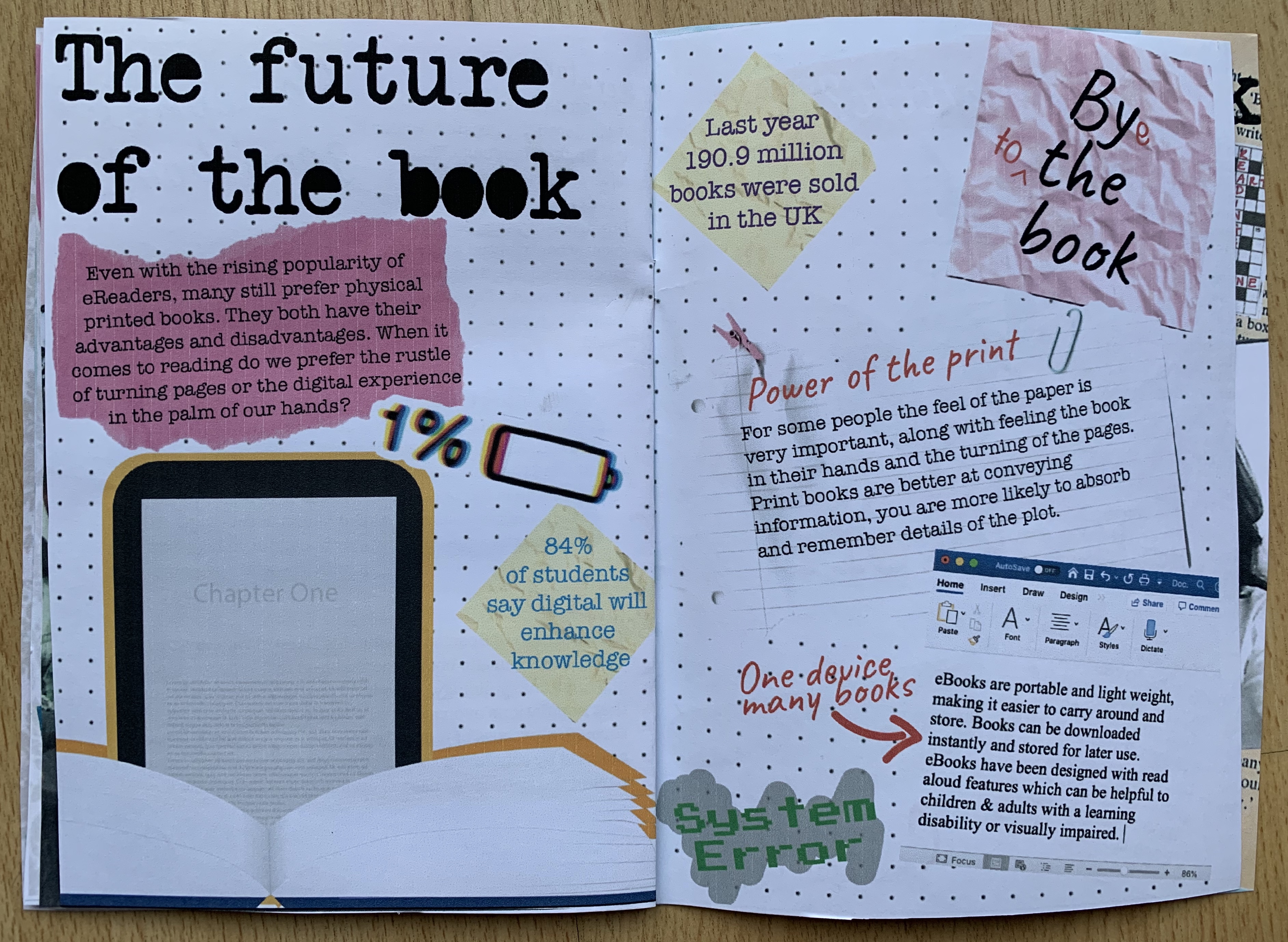
- Future of the book – I used all information from one of the previous exercises for these pages, including the illustration of the book and the eReader. I split my information into pro’s for both digital and printed, for the printed I kept the text on lined paper but for the digital I added a screenshot from Microsoft word to enhance the digital effect. I played on the phrase ‘by the book’ by adding an ‘e’ to create bye and adding in ‘to’ so that it would read ‘bye to the book’.
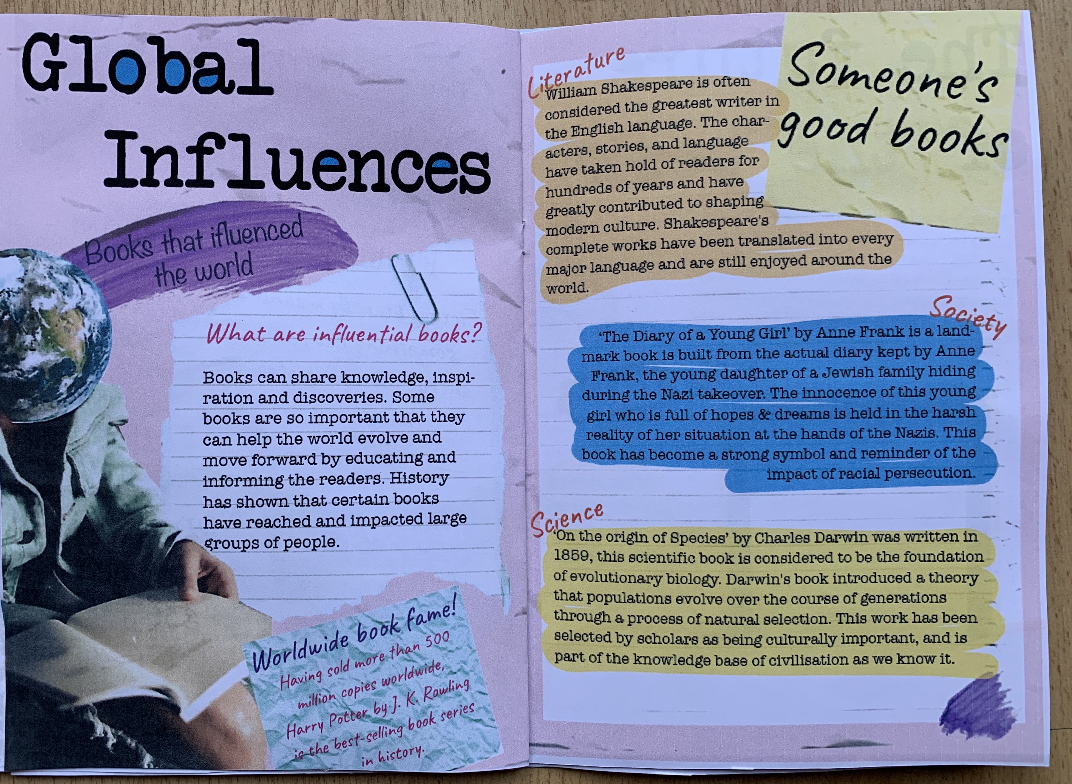
- Global Influences – I started off by explaining what a global influence book is then went on to referencing 3 different book genres which I believe are global influences and have effected the world in some way. I wanted these two pages to be fairly minimal and simple as I had included a lot of text so didn’t want to over complicate the pages, so I went for the same background as the front cover with lined paper placed over the top. I found an image of someone sitting reading a book on pexel.com and wanted to combine an image of the world (also found on pexel.com) so printed both out and experimented with different layouts, one was as the earth as the head and the other was the earth coming out of the book. I chose the phrase ‘Someone’s good books’ as I felt it fitted the topic best, as it has a positive meaning.
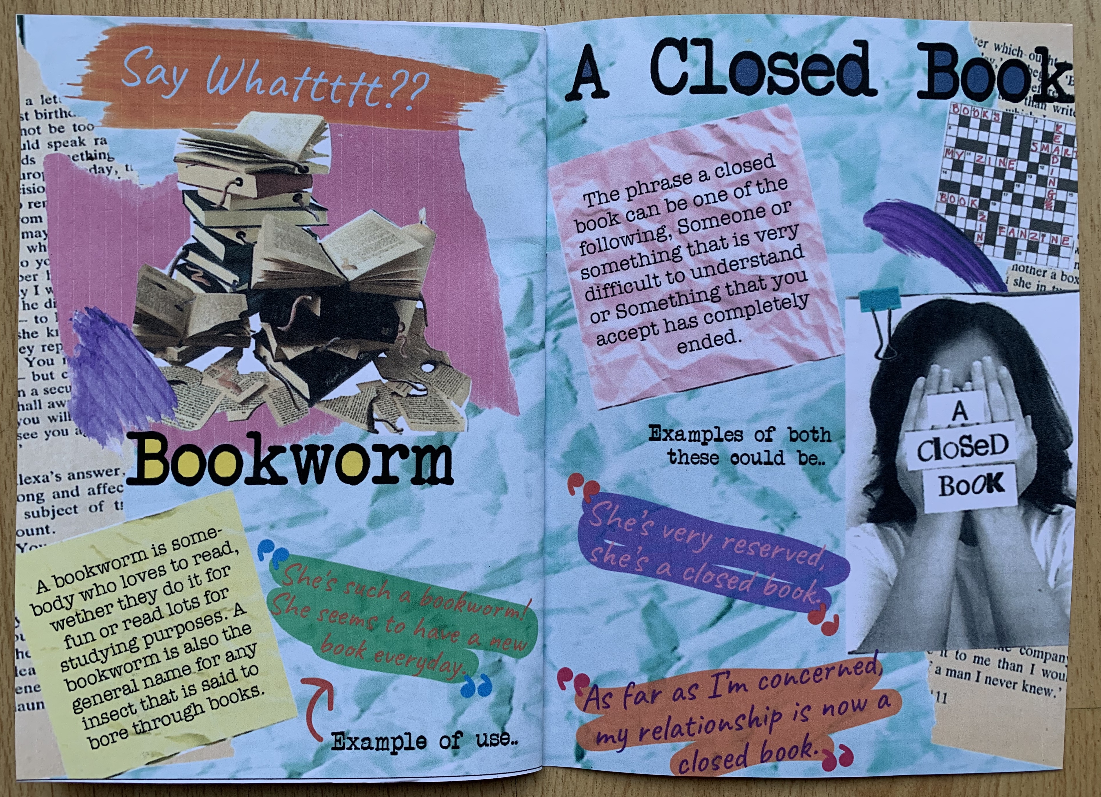
- Bookworm & a closed book – For both of these I included my designs used in the previous exercises and included the meanings behind the phrases.
Overall I am pleased with how everything looks and feel confident in my design. I didn’t want to over think things too much with this as I felt it could take away the zine effect if it looked too structured and ‘perfect’. I really enjoyed this assignment and appreciate how much the previous exercises helped and developed skills for this assignment.
References
Books https://www.pexels.com/photo/pile-of-assorted-title-book-lot-selective-focus-photographt-1130980/
Person holding book https://www.pexels.com/photo/person-reading-book-3314544/
Children’s book cover: Google images
Earth https://www.pexels.com/photo/astronomy-cosmic-cosmos-dark-355935/
